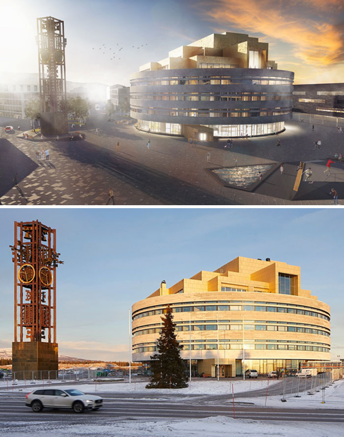
Architectural visualizations are crucial to the design and planning phases of a project. They help communicate ideas, gather feedback, and make informed decisions before construction begins.
However, when you compare the finished building with its initial representation, sometimes you don't see the shining sun reflecting in its windows and the greenery around it that's more lush than that in the Garden of Eden.
So to remind you that what we see isn't always what we get, here's a collection of pictures that exemplify the contrast between the promised ideal and reality.
This post may include affiliate links.
Design Submitted By The Architect vs. How The Contractor Ends Up Building It
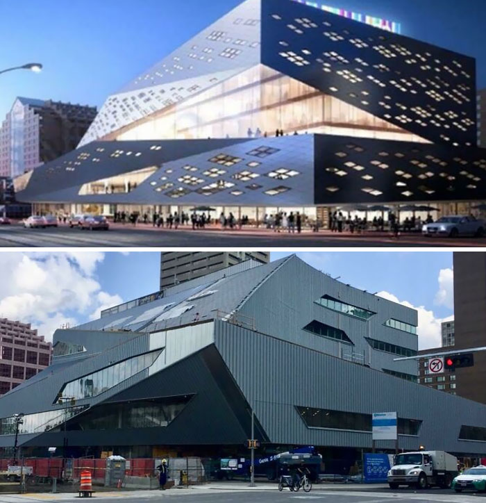
Stanley Milner Library In Edmonton, Alberta
At this point, the phenomenon in these pictures is virtually a trend. In one of his articles for The Guardian, British architecture and design critic Olly Wainwright explains how he tends to find himself observing thesis projects produced by the best and brightest students of the UK.
But what he is struck by the most isn't the technical skill or imagination, but rather the sheer lack of connection these projects have with actual, built, imperfect architecture: "Time and again, the projects seemed intent on fleeing the real world of people and places, scale and context; retreating instead into fantasy realms of convoluted forms with no seeming purpose."
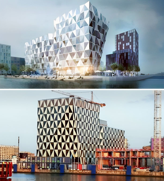
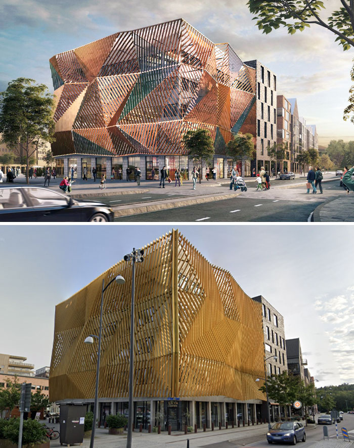
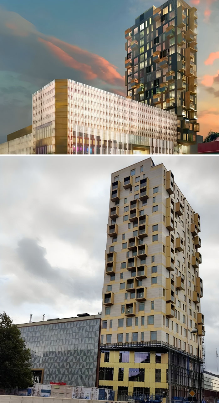
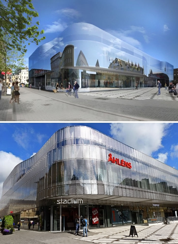
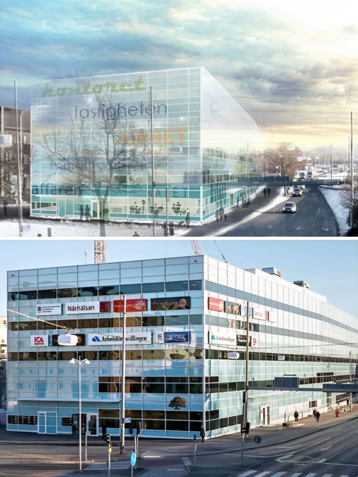
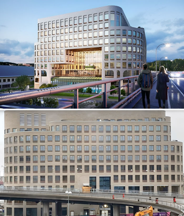
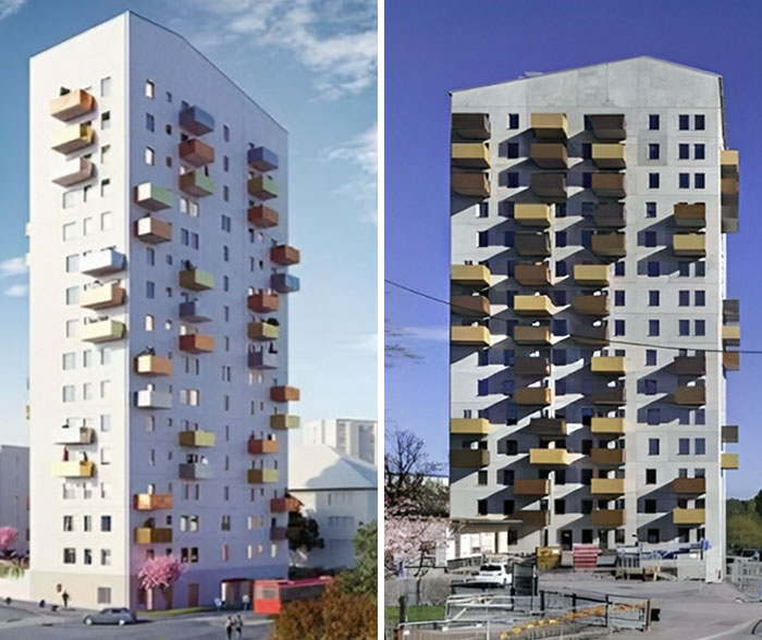
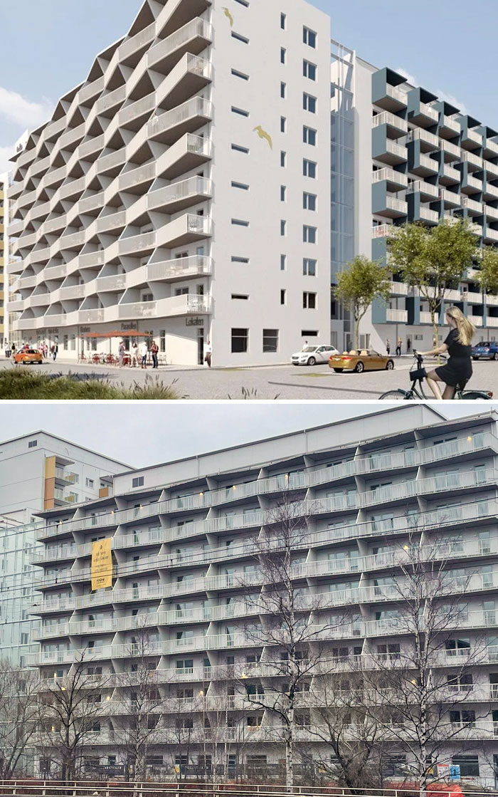
Such A Big Difference Between The Rendered Photo And Reality. Prisma, Helsingborg, Sweden
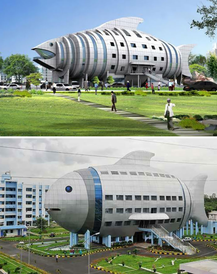
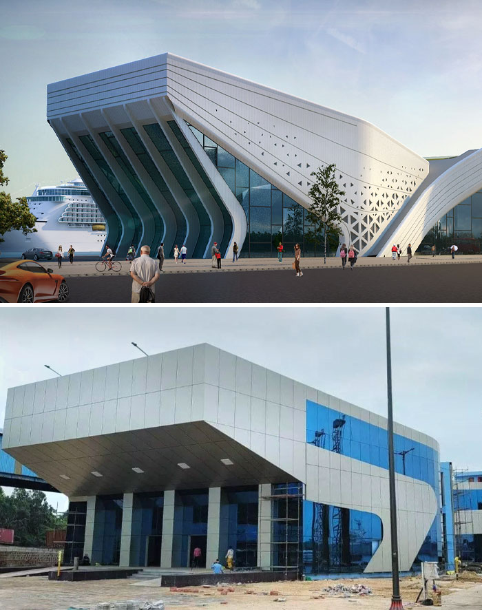
Vizag International Cruise Terminal In Visakhapatnam, India
Ugh…this is so misleading. The terminal was supposed to launch this fall and has been delayed. The first picture was one of several submitted and not the final design. There are no actual cruise ships that currently visit Visakhapatnam yet. The delay is until March and the angle of this photo is also misleading. It’s a beautiful building and once landscaped and after construction is completed, it will be exactly what was ordered.
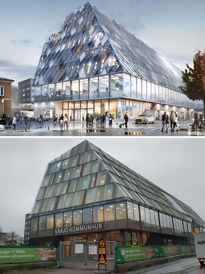
Växjö's New Municipal Building. Render vs. Real Building
"There [are] scaleless worlds of splintered shards and riverine landscapes, in which forlorn mechanisms had been implanted like post-apocalyptic ruins of a distant-future race," Wainwright explained.
"Clouds of lines and layers were regularly employed as a smokescreen to disguise the fact that there wasn't really an idea at all: visual complexity masking conceptual thinness."
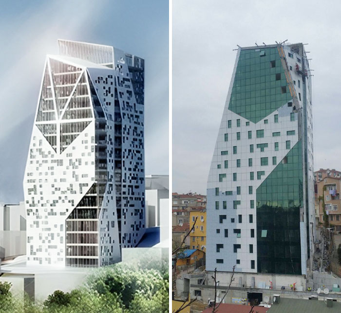
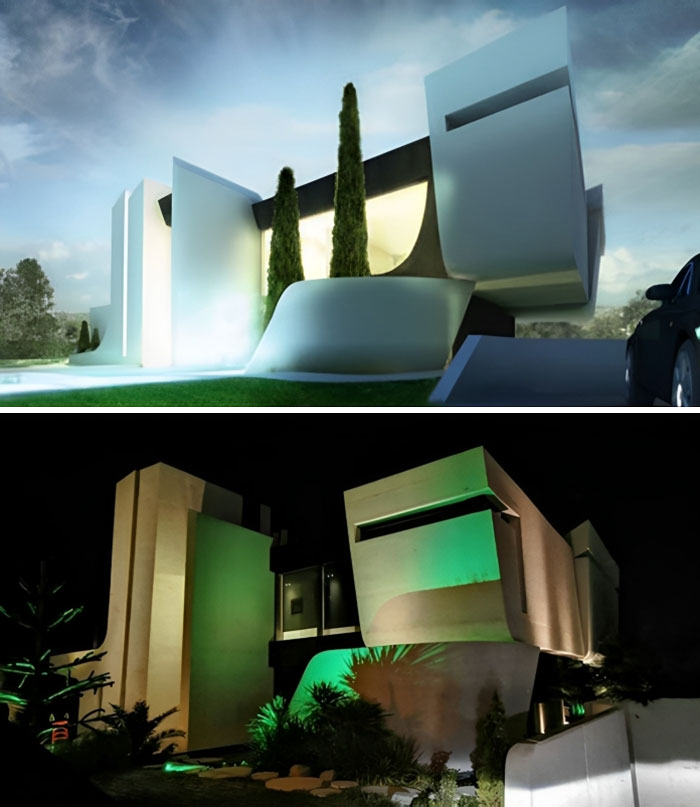
Residence Trea In Istanbul, Turkey
It's a design engineer who draws these buildings in Revit. Graphic designers focus on print media and multi media designs.
Load More Replies...All the "reality" pictures are taken in the worst lighting. The poor lighting doesn't even give it a chance. How about better lighting in the reality pictures or have the concepts rendered in suboptimal conditions like the real images.
The artist drew completely modern buildings around it, whereas in real life they're quite awful.
Load More Replies...I don't get either one. Is that the same Turkey whose leader recently said (the equivalent of) that the Earth is flat ?
another sad, too bad, they didn't built it per that design; and why couldn't the architect make it look better instead of this
Located In Central Halmstad
In order to sell projects, they brighten up the facades and exaggerate the number of pedestrians and cyclists in their render. They also invent greenery that doesn't exist.
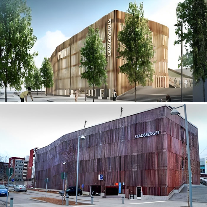
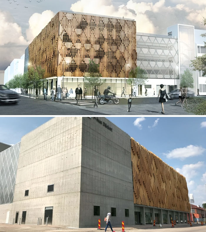
The So-Called Stadsberget In Piteå. Although It Is A Parking Garage, The Illustration Shows A Car-Free Environment With A Lot Of Cyclists And Pedestrians
It literally looks like a falling apart corrugated shipping container.
Urbanist Vanessa Quirk agrees that it's a trap many architecture schools have fallen into, not just in the UK but around the world.
"It's not just a symptom of the misguided nature of architecture education. It's also symptomatic of architecture's obsession with the image of architecture, an image completely detached from reality," said Quirk, who is the interim president of the board at Urbanist Media, a non-profit trying to elevate underrepresented voices and preserve the places that matter to them.
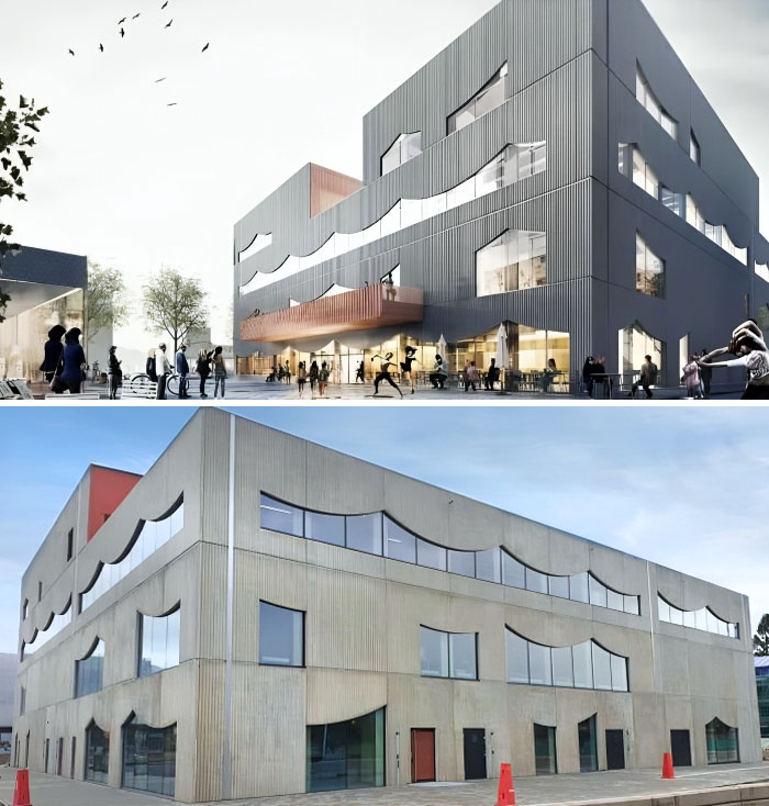
Spektrum In Nya Hovas. Rendering vs. Actual Result
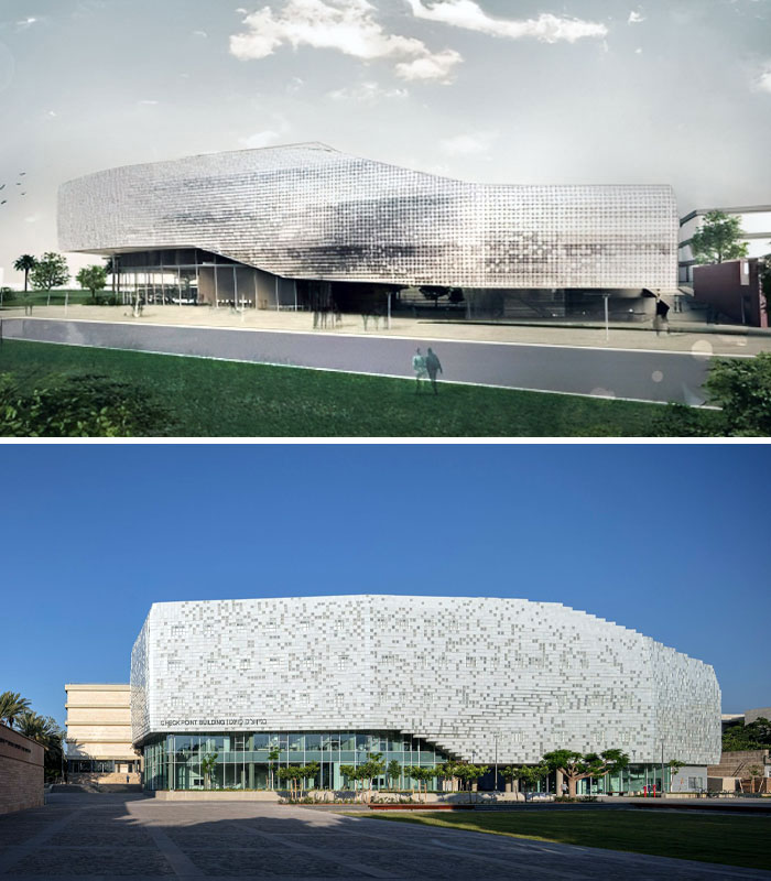
Tel Aviv University's "Building Of The Future"
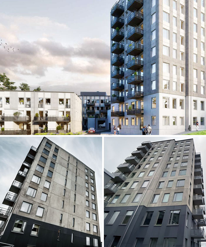
I Wonder How The People Who Bought Apartments In This Apocalyptic-Leninist Bunker Nightmare Feel About Their Investment
a horrifying result -- at least the trees look better IRL than the render
Quirk believes the idea of the "perfect" architectural image is not only propagated by professors who prioritize the rendering over its practical implications (causing students to spend hours perfecting visuals instead of perfecting the design).
In her eyes, the architectural media shares the blame. "[It] presents a flood of glossy shots that 'sell' an idealized architecture to the public and, frankly, architects themselves."
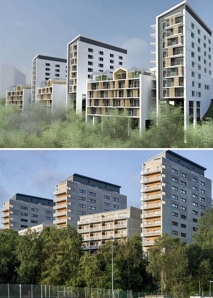
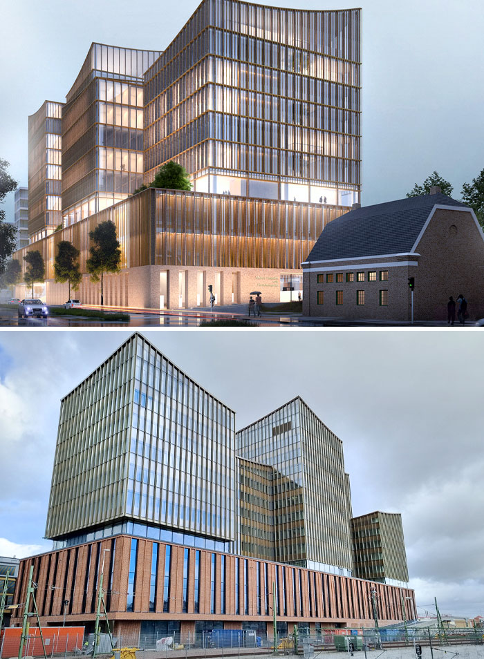
Vision vs. Reality. Platinan In Gothenburg, Sweden
Söders Höjder In Helsingborg, Sweden
The real building doesn't shine very much, and the reality is painful. Söders Höjder in Helsingborg is Sweden's third ugliest new building in 2023 and also the building with the year's worst fake view.
The Vision Of This Building Looked Great, But The Reality Is Very Disappointing
The New Hotel At Halmstad's Travel Center. It Looks Like A Haunted Hotel
The danger of this is that the image exists independent of the concept, to be evaluated as a graphic, or as Quirk put it, "The architecture itself is erased, eclipsed by its image."
The proliferation of such pictures could lead clients and the public at large to expect from architecture and architects a degree of quality, perfection even, that is impossible to deliver in the real world, and thus, disappointment.
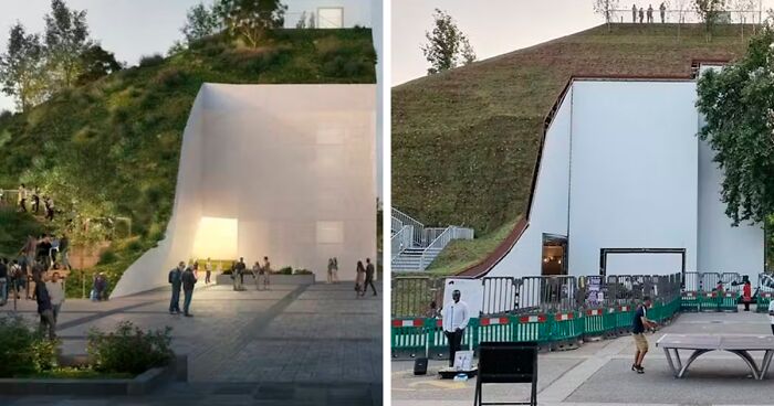
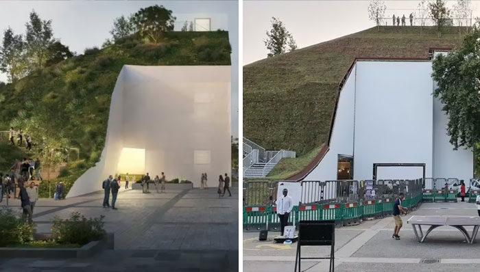
The Plans For The Marble Arch Mound On The Left Regarded Spectacular In Comparison With The Way It Had Really Been Constructed
This Monstrosity Of Selma Center In Gothenburg, Sweden
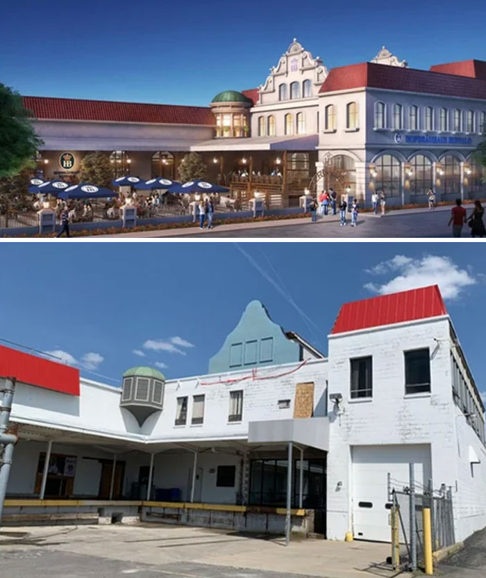
This Is A Building Concept For A Hofbräuhaus (German Beer Garden-Type Restaurant Chain) In Buffalo, But Failed To Be Built Correctly Or Finished At All
The Same, But Different
Slightly idealized renderings are often seen as necessary means to sell the idea of a design to a client, in which case a bit of artistic leeway becomes an unavoidable evil.
However, as Quirk asked, once that idea is sold, "what happens when a more realistic rendering, one which shows as truthfully as possible how the building will look (air conditioning units and all) is presented?"
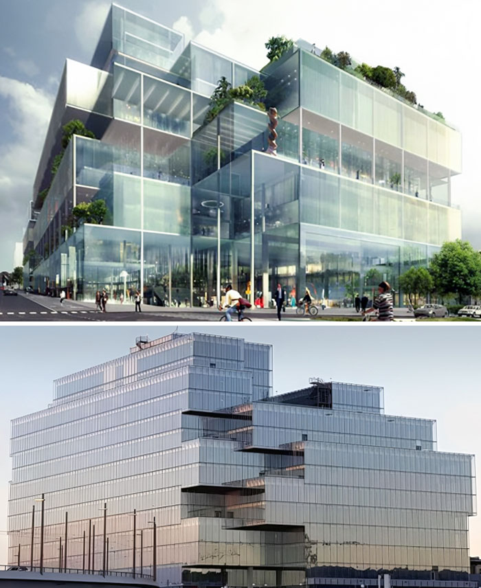
If You Can't Design A Nice Building, You Can Always Try To Hide The Building Completely. Unfortunately, It's More Difficult In Reality Than In The Picture
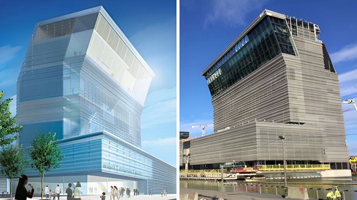
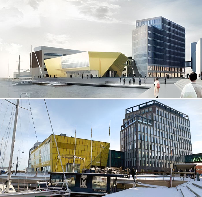
The New Munch Museum In Oslo Opened, And It Might Not Look Exactly Like The Vision Picture
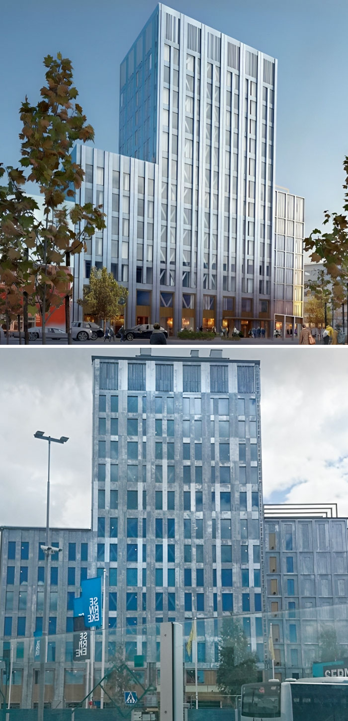
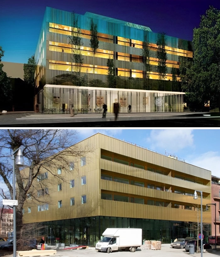
Vågen Was Sweden's Fifth Ugliest Building In 2022
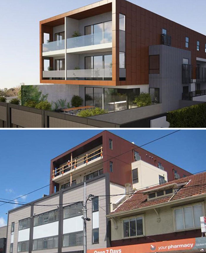
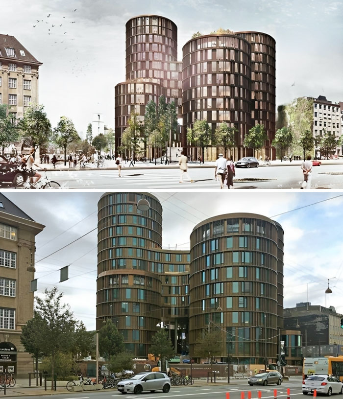
If they used the copper colored cladding, this would actually be close to the rendering.
A Different Angle But The Message Is Still Clear - Horrendous
goes to prove that some people cannot think in 3 dimensions -- as a design professional it's worse crime than being a colour-blind air force pilot.
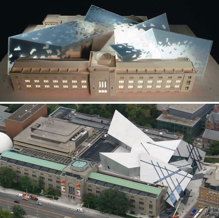
Royal Ontario Museum: Expectations vs. Reality
When the rendering sets expectations far higher than anyone can achieve, does the realistic one become useless?
Is the stylized version of the rendering actually bad for architecture in general?
Should everyone just stick to models and forget renderings altogether?
I guess, time will tell.
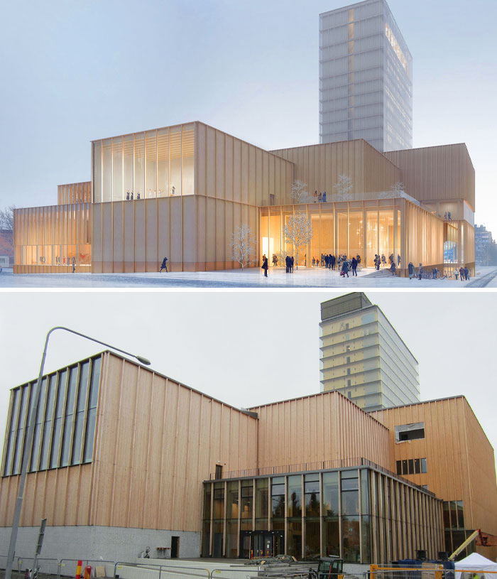
Sara Cultural Center In Skellefteå, Sweden. In Reality It Looks Very Sad
If the architect would take into account how the exterior will look on gray overcast days, it might improve the appearance of these modern stark structures.
Glasiaren, Gothenburg. The Building Turned Into Something That Resembles An Old Refrigerator With Ugly Magnets
Totalitarian New Box In Kungsängen, Sweden. The Gray Color Looks Way Worse Than It Should Be
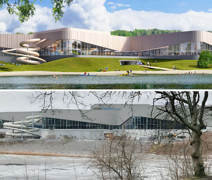
The Vision And Reality Of Kv. Poolen The New Bathhouse In Frösunda, Sweden
Malmö's New District Court In Sweden. Vision vs. Reality
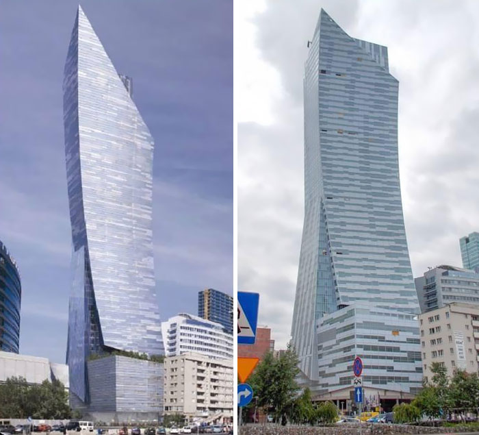
A Skyscraper In Warsaw, Poland
Funny How Buildings Just Change Color
Yet if you didn't knew that rendering than the actual building is quite pleasant.
Sven-Harry's Art Museum In Vasaparken, Stockholm
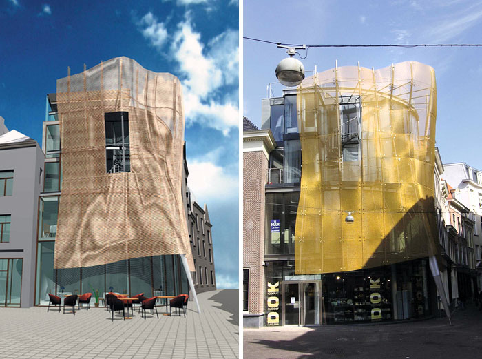
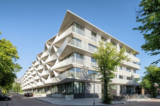
"Bal Gown" In The Hague, Netherlands. It Had The Potential
The Render Of Däcket Car Park And The Reality Of It
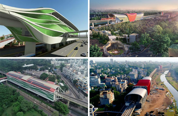
Planned vs. Actual Pune Metro. Left - Sant Tukaram Metro Station, PCMC. Right - Deccan Gymkhana, Pune
Citygate (Getingboet) In Gothenburg, Sweden. Those Windows Look Really Different
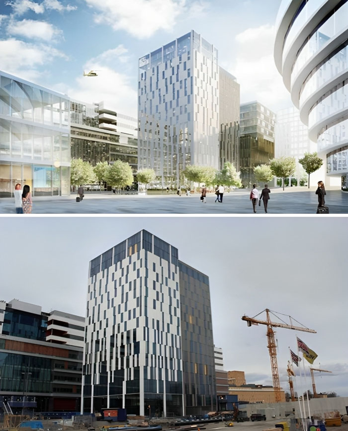
The Elite Hotel Carolina Tower At Nya Karolinska In Hagastaden, Stockholm, Sweden
According to the vision, the place would suddenly become much brighter when the hotel will be completed. Unfortunately, they were wrong.
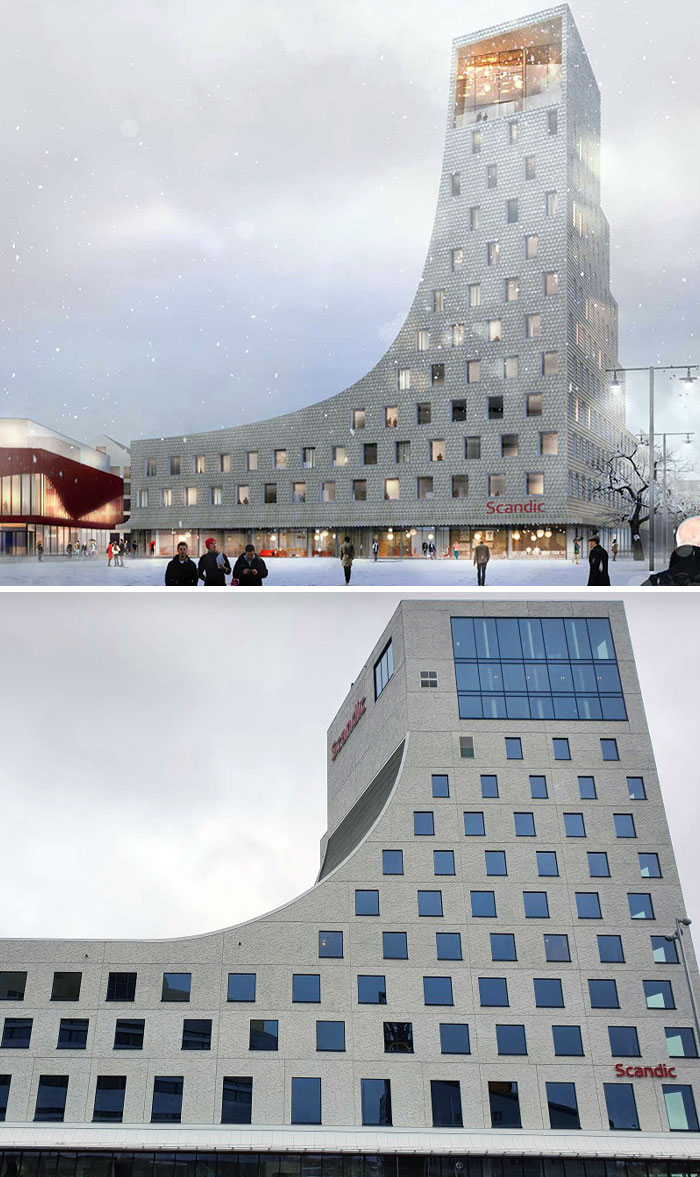
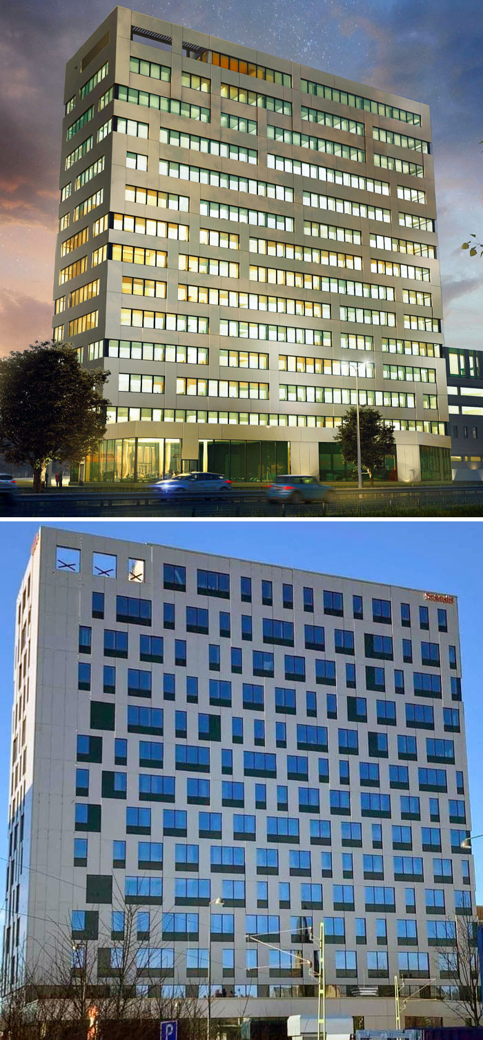
The Render One Looked Way Better. Scandic Central In Örebro, Sweden
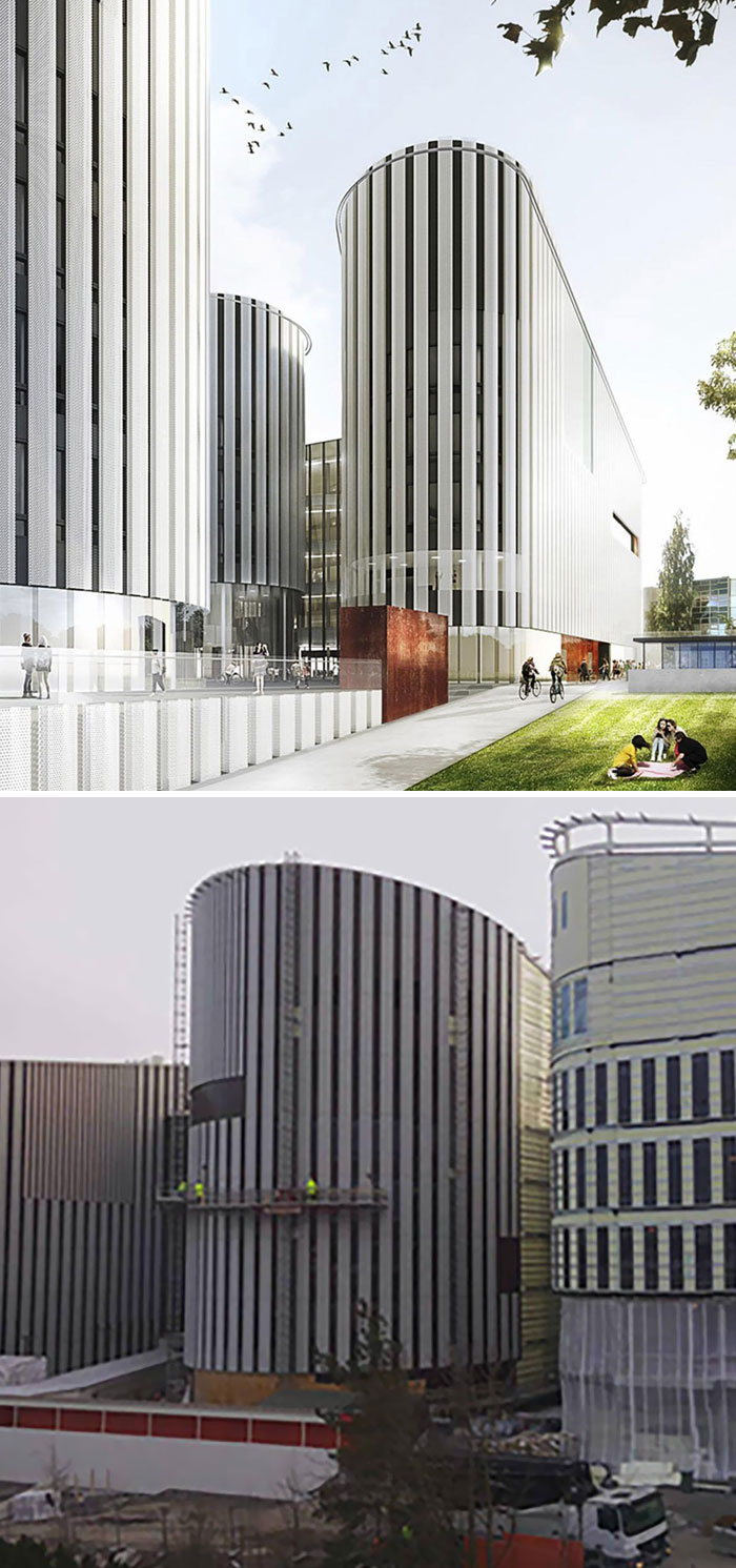
An Expectation Image Of Metropolia's Myllypuro Campus vs. An Image From Reality
Kalmar House Stella In Sweden. At Least They Tried?
Please stop taking pictures from different angles and in different day times to compare and then say "they not delivered what they promised"...
A New Landmark Was Built In Kallhäll, Stockholm
The result angered the residents who had expected a white house. Those responsible replied that they saw no problem with the illustrations: "We have done what we said we would do. Not everyone can love a house."
From Render To Reality
Not that bad, I actually like the real building. They should merely change the color of the light, to blue or white for instance.
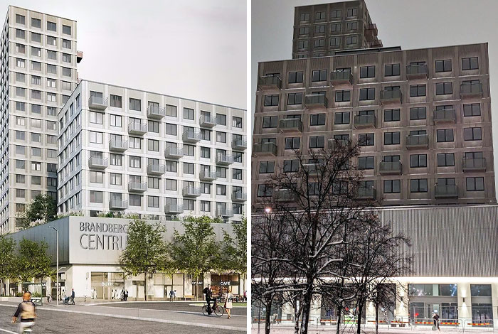
Vision Picture For Brandbergen Centre. It Didn't Turn Out Exactly As Planned
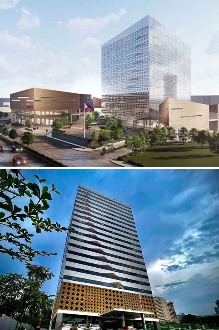
Metropolitan Manila Development Authority Headquarters: Expectation vs. Reality
Reality Is Bleak Compared To The Rendering World
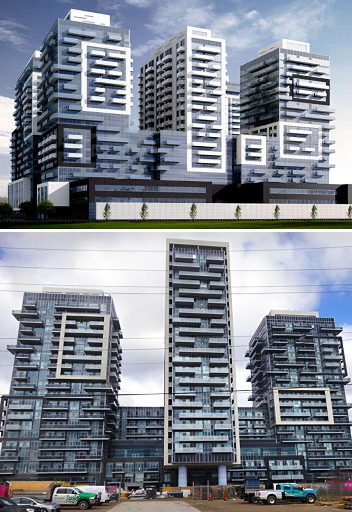
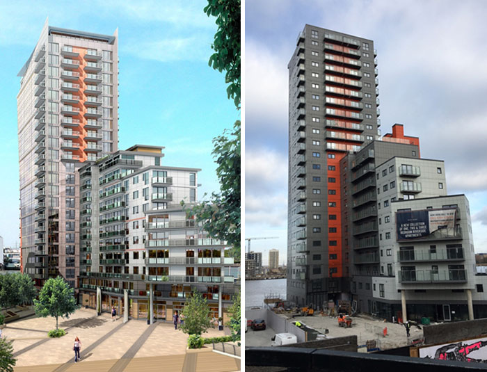
The Completed Mast Quay Phase II Built-To-Rent Development Is Substantially Different From The Scheme That Was Originally Permitted
I like the real one better. It's cleaner/tidyer. The rendered building is too chaotic.
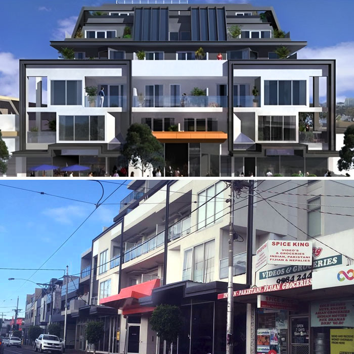
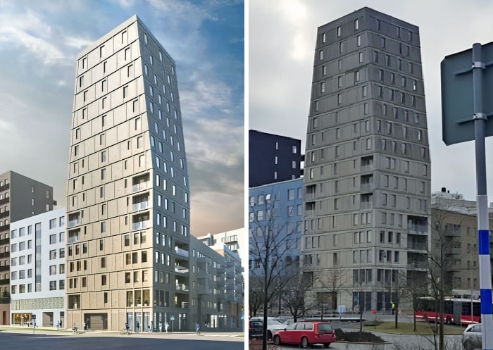
An Apartment Building Near Stockholm
This Disappointing Building In Gothenburg, Sweden
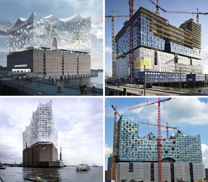
Elbe Philharmonic Hall. In The Renders Of This Project, Hinged Glass Facade Resembles A Perfect Blanket, Almost Weightless. However, In Reality The Facade Does Not Show The Same Effect
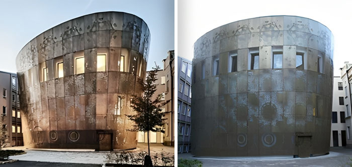
The Humanistic Theatre, Uppsala. It Mostly Looks Like A Giant Hot Tub In The Wrong Place, Complete With A Small Hatch At The Bottom Where You Can Let The Bath Water Out
Architect: Here is a very pretty design! Civil Engineer: Here is what is structurally possible to build.
Civil engineer addition: And what is within building codes.
Load More Replies...This list is telling me one thing if I ever need to have a building built avoid Sweden.
Many are disappointments because the projections are on a sunny day, all lights turned on, thinner, and taller. Also, glass buildings are imagined almost transparent, which seems impossible at least in daylight.
I think that's sort of false advertising. Window tinting/coating is definitely a thing that needs to be done for the sake of all the people working in the building (and maybe birds), so I would consider it a problem that buildings are portrayed as being transparent when they literally can't be.
Load More Replies...The reason could be that swedish design plans are available online. Easy to get.
Load More Replies...So many of them are really nice and I don't get why people would complain about the lack of people or bikes in the real image. And so many of them are photographed from a different angle and a at a different time of the day or maybe season. For sure it looks different.
Article writers still hasnt figured out that foot traffic isnt always constant lmao
Load More Replies...Most of these look like they had massive building costs cuts. Where the architects dream encountered the reality of available money.
That's also an explanation for some... maybe they couldn't get the materials they wanted in time and had to take what they can get in time...
Load More Replies...So we learn there's two questions clients have to ask when seeing architect renderings: 1. What material is the building made of that's going to give it this cool glow? 2. How about showing me a drawing where the interior lights are turned off?
Exactly. 3. Can you give me a drawing without trees and people, on a cloudy day, from a less flattering angle?
Load More Replies...This list makes gottenburg, Sweden a place with ugly buildings everywhere. Looks like architects in Sweden have no clue about reality when it comes to building materials. Not the builders fault.
My sense is that most of these are merely early concepts and design exercises vs final design. The builder didn't just "build them differently" as is implied. Sloppy and lazy article BP.
Ok. So many of these were from different angles so cannot possibly be contrast and compared. Of those taken from close to the same angle, numerous have a complaint about how much traffic is in the picture? As if the developer of the building has any control whatsoever over decisions made by municipalities in designing roadways. Then you have several that actually came out better than the render. Finally, you have some with legitimate gripes. But, would go to show just what happens when you base contracts upon the lowest bid. Not the ability to make things happen according to plan. Just the lowest bid. You get what you pay for.
I think the main thing that's gone wrong (design wise) is that the key aspects that made it a pretty building are often removed or changed. Like changing ratios of how far apart the windows are, how thick the facade is, how inset the windows are. And don't even get me started on some of the super labour intensive/almost impossible parts of some designs. Or the fact that some designs don't even have good shapes, balance and ratio's before they're built and they still get chosen?! Ah, rant over, hope you have a lovely day :)
Basically they're not as shiny, that seems to be the main difference.
The Swedes really love to hate on their architecture, huh? One thing I was expecting to find on this list is the Turku funicular in Finland. A lovely cable car cabin turned into a literal dumpster that's been out of order more days than it's been running.
Used to love bored panda now every article comes to two adverts I am done finally bored panda sold out
I want some of what those saying "it’s just different angles and lighting" are smoking.
A contributing fact that sweden is overrepresented could be that design plans are available online and easy to get when you are making threads like this. It could be just as bad in other countries but the designs are harder to get.
Fake light vs real light and angles make a big difference for most of these.
Unfettered design ambition versus budget and practical building restrictions...
My entry would've been the Millenium Tower here in San Francisco. I'd first show the plans, and then show a picture of it leaning because it's started to unintentionally tilt. Someone messed up bigtime and I still think the issue hasn't been solved. lmao 47387_500x...e860d8.jpg 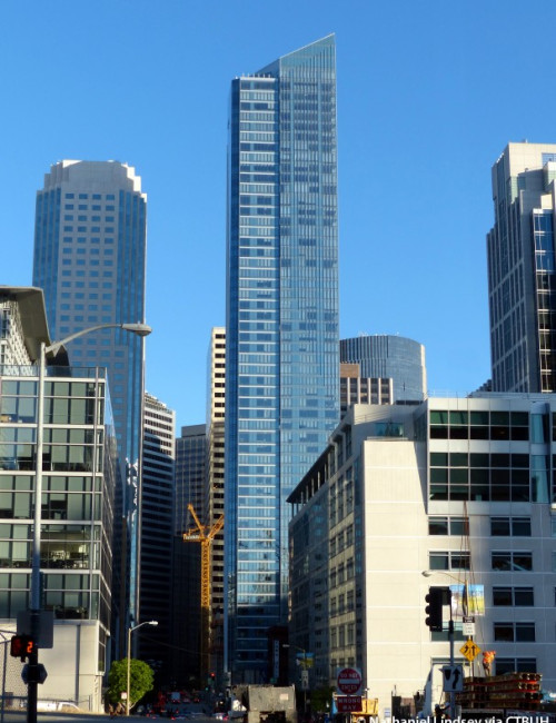
As of June it is leaning 29 inches at the base. Still the contractors are busy pointing fingers at each other while the powers that be are saying-move it along folks, nothing to see here. Multi million dollar condos that people bought and now they can't live there and they can't sell them. No bank or lending institution will finance a loan. Must be miserable for the owners, but I do get some strange satisfaction thinking better you than me. Hard to work up a year for the people who can afford this. Wonder if/when it will fall. A small tremor perhaps?
Load More Replies...Architect: Here is a very pretty design! Civil Engineer: Here is what is structurally possible to build.
Civil engineer addition: And what is within building codes.
Load More Replies...This list is telling me one thing if I ever need to have a building built avoid Sweden.
Many are disappointments because the projections are on a sunny day, all lights turned on, thinner, and taller. Also, glass buildings are imagined almost transparent, which seems impossible at least in daylight.
I think that's sort of false advertising. Window tinting/coating is definitely a thing that needs to be done for the sake of all the people working in the building (and maybe birds), so I would consider it a problem that buildings are portrayed as being transparent when they literally can't be.
Load More Replies...The reason could be that swedish design plans are available online. Easy to get.
Load More Replies...So many of them are really nice and I don't get why people would complain about the lack of people or bikes in the real image. And so many of them are photographed from a different angle and a at a different time of the day or maybe season. For sure it looks different.
Article writers still hasnt figured out that foot traffic isnt always constant lmao
Load More Replies...Most of these look like they had massive building costs cuts. Where the architects dream encountered the reality of available money.
That's also an explanation for some... maybe they couldn't get the materials they wanted in time and had to take what they can get in time...
Load More Replies...So we learn there's two questions clients have to ask when seeing architect renderings: 1. What material is the building made of that's going to give it this cool glow? 2. How about showing me a drawing where the interior lights are turned off?
Exactly. 3. Can you give me a drawing without trees and people, on a cloudy day, from a less flattering angle?
Load More Replies...This list makes gottenburg, Sweden a place with ugly buildings everywhere. Looks like architects in Sweden have no clue about reality when it comes to building materials. Not the builders fault.
My sense is that most of these are merely early concepts and design exercises vs final design. The builder didn't just "build them differently" as is implied. Sloppy and lazy article BP.
Ok. So many of these were from different angles so cannot possibly be contrast and compared. Of those taken from close to the same angle, numerous have a complaint about how much traffic is in the picture? As if the developer of the building has any control whatsoever over decisions made by municipalities in designing roadways. Then you have several that actually came out better than the render. Finally, you have some with legitimate gripes. But, would go to show just what happens when you base contracts upon the lowest bid. Not the ability to make things happen according to plan. Just the lowest bid. You get what you pay for.
I think the main thing that's gone wrong (design wise) is that the key aspects that made it a pretty building are often removed or changed. Like changing ratios of how far apart the windows are, how thick the facade is, how inset the windows are. And don't even get me started on some of the super labour intensive/almost impossible parts of some designs. Or the fact that some designs don't even have good shapes, balance and ratio's before they're built and they still get chosen?! Ah, rant over, hope you have a lovely day :)
Basically they're not as shiny, that seems to be the main difference.
The Swedes really love to hate on their architecture, huh? One thing I was expecting to find on this list is the Turku funicular in Finland. A lovely cable car cabin turned into a literal dumpster that's been out of order more days than it's been running.
Used to love bored panda now every article comes to two adverts I am done finally bored panda sold out
I want some of what those saying "it’s just different angles and lighting" are smoking.
A contributing fact that sweden is overrepresented could be that design plans are available online and easy to get when you are making threads like this. It could be just as bad in other countries but the designs are harder to get.
Fake light vs real light and angles make a big difference for most of these.
Unfettered design ambition versus budget and practical building restrictions...
My entry would've been the Millenium Tower here in San Francisco. I'd first show the plans, and then show a picture of it leaning because it's started to unintentionally tilt. Someone messed up bigtime and I still think the issue hasn't been solved. lmao 47387_500x...e860d8.jpg 
As of June it is leaning 29 inches at the base. Still the contractors are busy pointing fingers at each other while the powers that be are saying-move it along folks, nothing to see here. Multi million dollar condos that people bought and now they can't live there and they can't sell them. No bank or lending institution will finance a loan. Must be miserable for the owners, but I do get some strange satisfaction thinking better you than me. Hard to work up a year for the people who can afford this. Wonder if/when it will fall. A small tremor perhaps?
Load More Replies...
 Dark Mode
  No fees, cancel anytime


