Out Of This World: 30 Times Architects Outdid Themselves With These Alien-Like Buildings
Whether you’re walking the streets of a city you know like the palm of your hand or someplace completely unfamiliar, some buildings might make you stop dead in your tracks. It’s because some architectural gems are so astonishing, they never cease to impress the passersby or catch their attention, be it for all the right or wrong reasons.
A little bit of both can be found on today’s list dedicated to unique architecture. While the majority of edifices presented here today are some of the most impressive architectural wonders there are, some might seem bizarre at best, but that just makes one appreciate the former even more. Scroll down to find the pictures of the architectural gems below and enjoy.
Below you will also find Bored Panda’s interviews with an Architectural Psychologist and Professor in the School of Architecture at the University of Nevada Las Vegas, Dak Kopec, and Danish Kurani, who, back in 2021, Fast Company named one of the world’s Most Innovative Architects.
This post may include affiliate links.
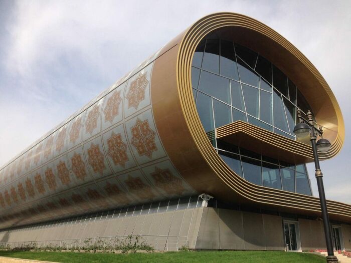
National Carpet Museum, Baku, Azerbaijan
I love it when the architect incorporates the inside meaning with the outside!
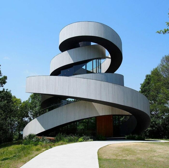
Ribbon Wedding Chapel In Hiroshima, Japan
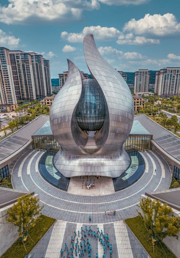
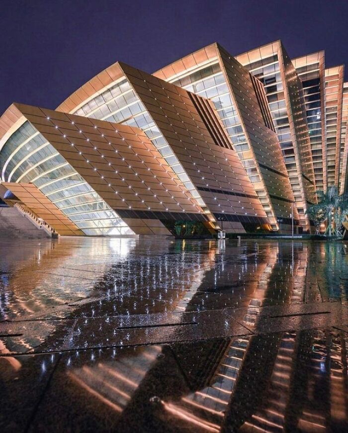
Science And Technology Museum, Wuhan
I like it. To me, it looks like the hands of learning holding Earth.
It’s not easy to determine what makes an edifice an example of great architecture, especially since whether or not an individual likes it is a highly subjective matter.
However, there seems to be some universal features that distinguish poor architecture from that of a higher level and, according to Dak Kopec, it’s features that display an evolution of design that mirrors the evolution of society. “These features should evoke intrigue and fascination,” he told Bored Panda in a recent interview.
Expanding on the ways architecture mirrors the evolution of society, Kopec pointed out that some societies are rooted in tradition but are bringing modernization into the fold. “The Shanghai Oriental Pearl TV Tower, for example, brings in a robust foundation or concrete pillars that are emblematic of the cultural ties to the past. The three spheres represent the Heaven, Man, and Earth mantra of the Buddhist faith, and the use of red symbolizes luck and fame, combined with the fragility of glass representing movement toward an uncertain future. When this building was finished in 1994, it told the story of its era.”
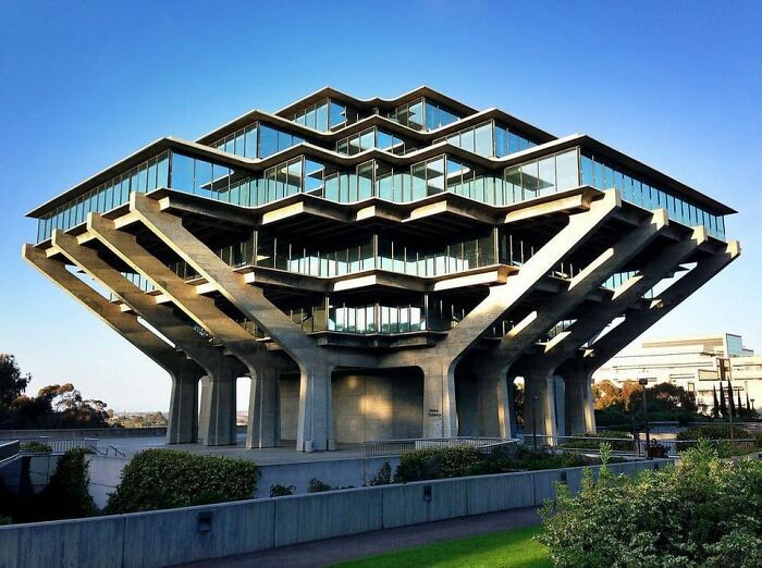
Geisel Library - 1970
No Clue What This. Wenzhou, China
When it comes to the link between architecture and society, the former doesn’t seem to tend to a specific aspect or principle related to the latter. The expert pointed out that there isn’t one thing that is more important than another; however, he did suggest that nowadays, society seems to be quite invested in the history or certain locations or sites.
“In today’s world, where people seem interested in the backstory of places, I think buildings that couple [specific] design intentions with the design thoughtfully and uniquely will be more apt to be embraced by the people,” Kopec told Bored Panda.
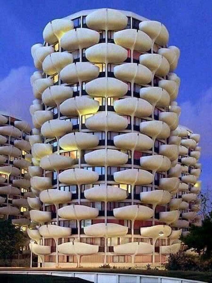
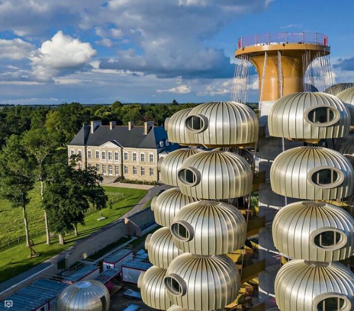
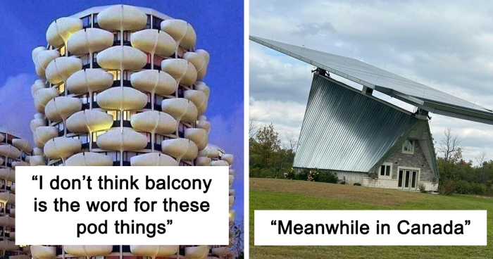
I Dont Think Balcony Is The Word For These Pod Things
Ooooh I see what they are supposed to be! They should have painted them green and the rest pink and blue
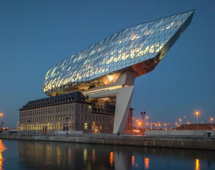
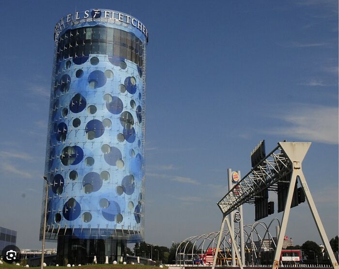
Port Authority, Antwerp, Belgium (2016)
Um... What Is This?
Bearing people’s preferences in mind when designing the next architectural wonder is important not only because of the extent to which it is likely to be embraced by the public. It’s also crucial because, depending on its purpose, the building itself can influence the way people feel inside it; it’s safe to assume that no one wants to feel uncomfortable in a place they frequent on a daily basis.
“Poor architecture is generally associated with outdated design trends. In a workplace environment, this can take away from employee pride in one’s organization. In a healthcare setting, this can evoke questions of credibility, and in resorts, this translates to a lower star rating. New construction must remain current with design trends, or it risks being passed over, forgotten, or labeled as something unflattering,” Kopec explained.
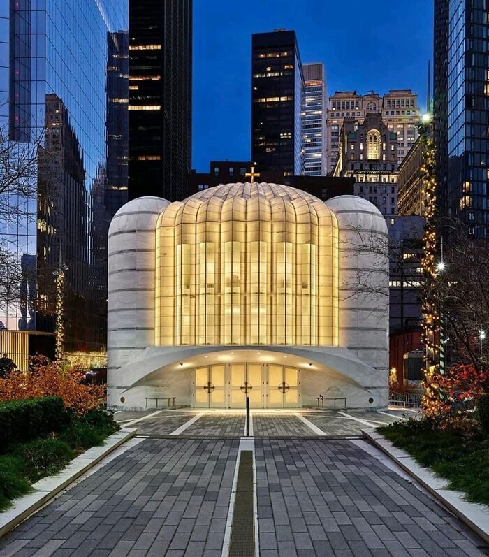
This Is The New Greek Orthodox Church In Lower Manhattan Designed By Santiago Calatrava
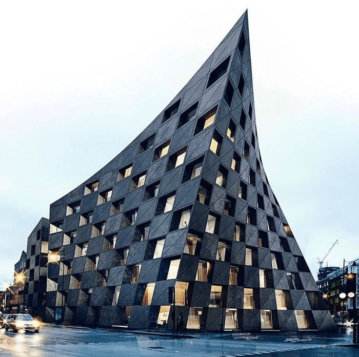
Shoreditch Hotel In London
The Halgrims Church Is A Fine Example Of Brutalist Expressionism
“It is important to note that the impact of design and architecture on well-being can vary depending on individual preferences, cultural backgrounds, and specific needs. Good design considers the diverse needs and experiences of the people who will be using the space,” another expert, Danish Kurani, an architect and the creator of the Baaham design philosophy, shared with Bored Panda.
Kurani expanded on how good architectural decisions can affect people’s well-being, pointing out that they tend to influence their physical and mental health, productivity and creativity, and social connections.
Discussing the first one—physical health—the expert suggested that well-designed spaces can promote physical health by providing adequate lighting, ventilation, and access to nature. “For example, buildings with well-positioned windows and natural light can improve mood and productivity, while spaces with good air circulation can reduce the risk of respiratory issues.
“Additionally, well-designed neighborhoods with walkable streets and access to parks can encourage physical activity and reduce the risk of chronic diseases.”
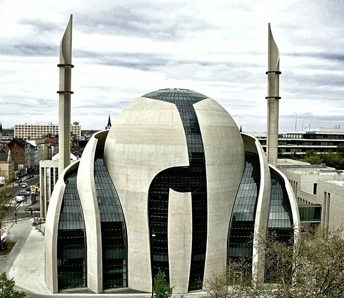
The Central Mosque - Cologne, Germany
As a Muslim - I don’t like it. I understand it is a matter of taste, but it just seems deprived of any symbolism and has no “warmth” to it. I also don’t like the grandiosity of new religious construction opposed to tasteful, humble incorporation of the temple in the environment. Muslim after all means humble among other things.
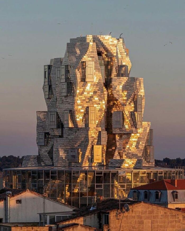
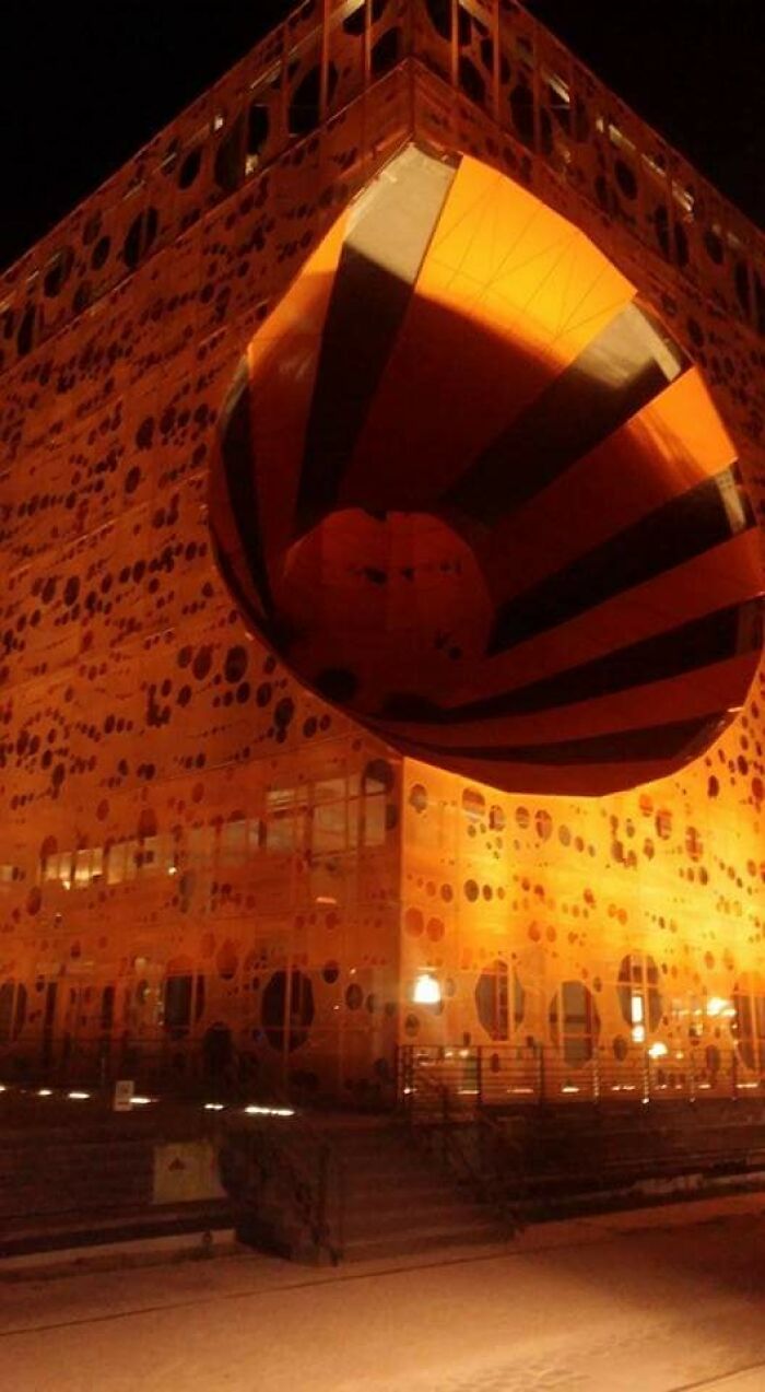
Luma Arles. Often Called An Architectural Folly. Or A Crushed Soda Can By The Locals. I Like It. Arles, France
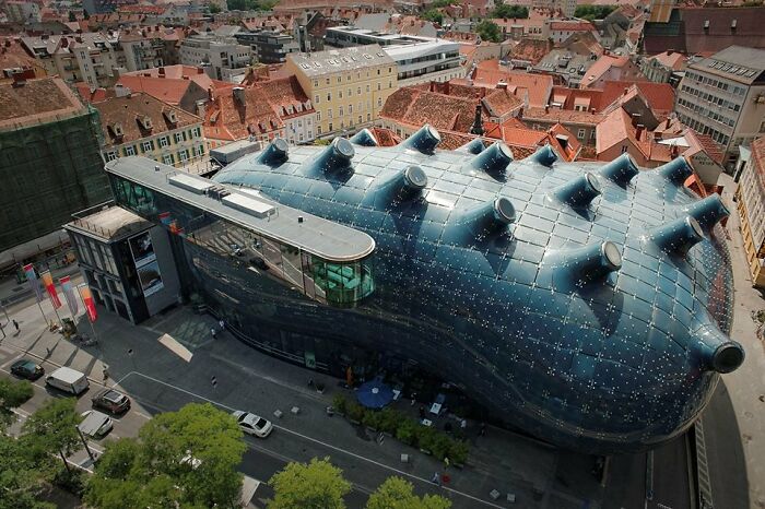
Kunsthaus (Art House) Graz Art Museum (Aka The "Friendly Alien"), Graz, Austria - 2003. Designed By Colin Fournier And Sir Peter Cook
“Well-designed spaces can have a positive impact on mental health by creating a sense of calm, reducing stress, and promoting relaxation,” Kurani continued. “For example, spaces with natural elements such as plants and greenery can improve mood and reduce anxiety. Additionally, spaces that provide privacy and quiet areas can help individuals recharge and find moments of solitude in a busy world.”
Discussing the third aspect on his list, he suggested that well-designed workspaces can enhance productivity and creativity, too. “Spaces that are comfortable, organized, and aesthetically calm can improve focus and concentration, leading to increased productivity.”
Lastly, according to the expert, well-designed spaces can facilitate social connections and improve relationships. “Spaces that are inviting, comfortable, and inclusive can encourage social interaction and community engagement. For example, well-designed public spaces such as parks and plazas can provide opportunities for people to gather, connect, and build relationships.”
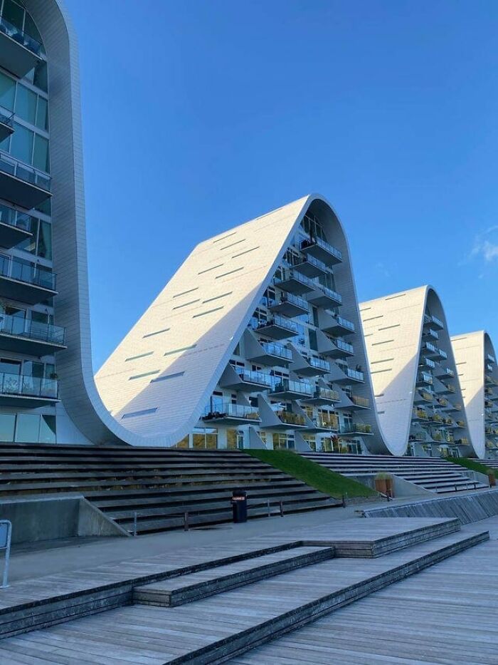
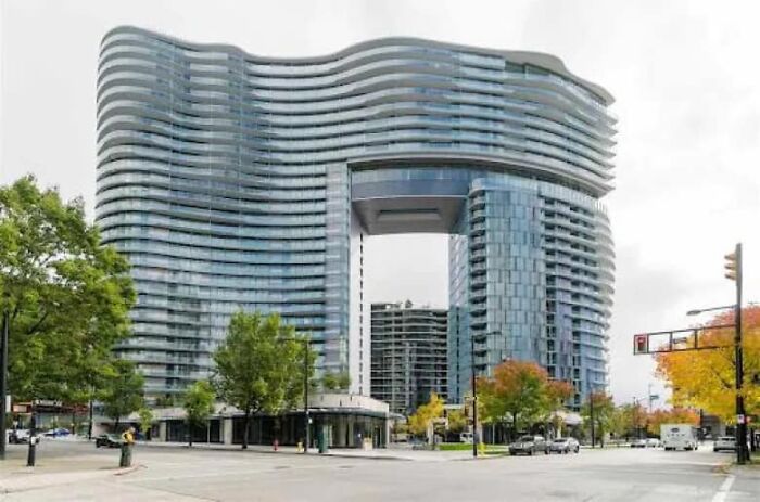
"The Wave" Residential Building In Vejle, Denmark
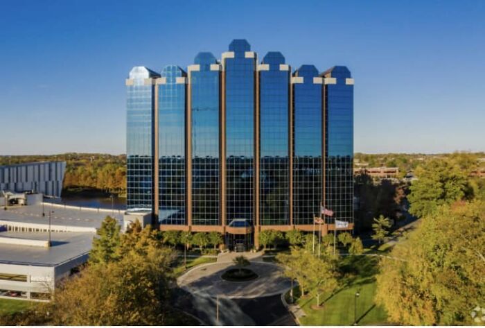
The “Toilet Bowl Building” Was Voted Virginia’s Ugliest Building By Business Insider Readers
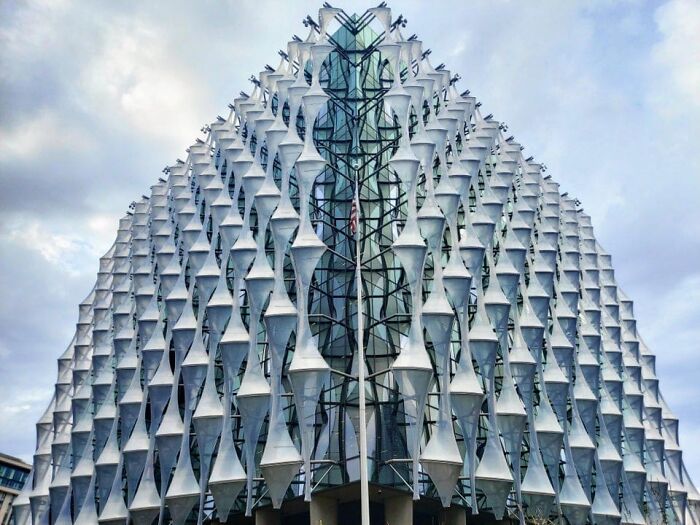
Us Embassy In London, UK
Seeking to avoid making people uncomfortable with the design, it’s important to consider certain factors, the main ones of which, according to Dak Kopec, are the local culture, geography, and climate conditions.
“The building’s design should build upon, modernize, and reflect the people of the region,” the architectural psychologist told Bored Panda. “In terms of well-being, an expert on social norms and expectations should also be included. For example, a building with a dramatic cantilever would work well for a hi-tech office but would not be appropriate for a hospital where people are often scared and feel vulnerable.”
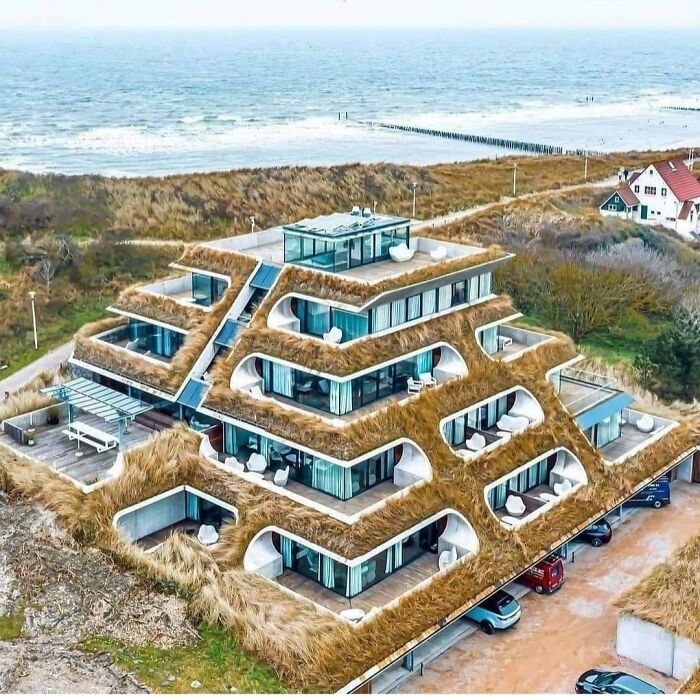
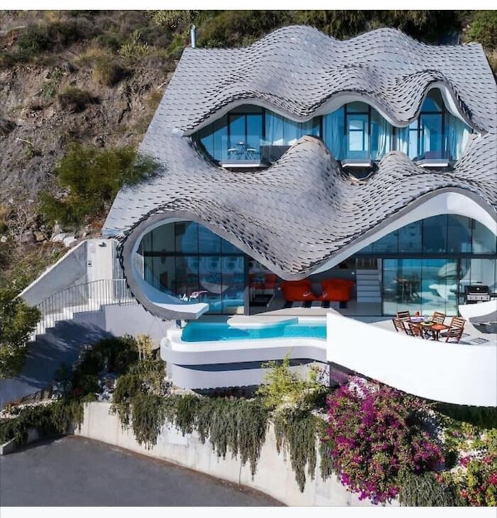
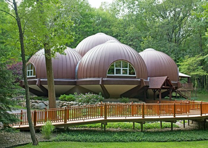
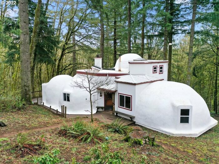
It’s Actually A Real House. It Was Featured On Netflix’s World’s Most Extraordinary Homes
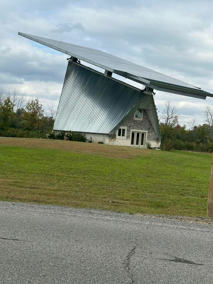
Meanwhile In Canada
Found Elsewhere On The Interwebs
Kurani seconded the idea that it’s crucial to take the environment into consideration when coming up with certain designs and architectural decisions. “Over the past 20 years, I’ve developed a design philosophy that reflects our reciprocal relationship with our environments: We influence our spaces, and they influence us. This philosophy is called Baaham.
“The word ‘baaham’ comes from my native language of Urdu, and it refers to two things working together in unison. This is how I think of us and our environments.”
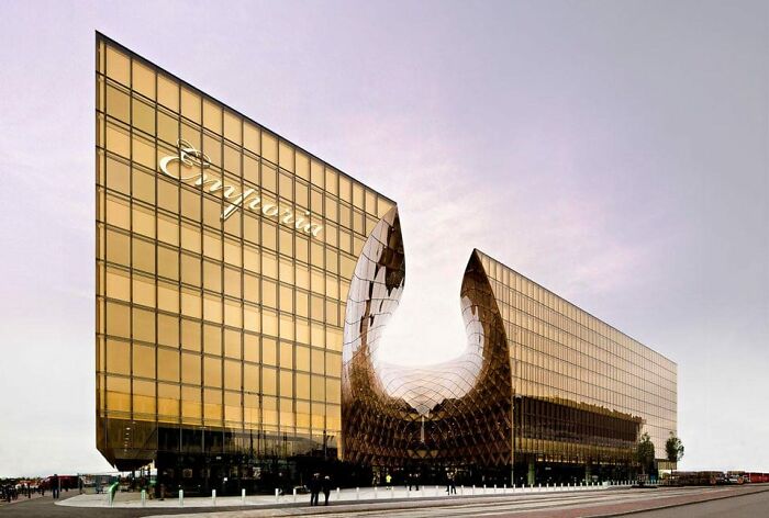
Grand Shopping Center, Facts Emporia, Malmo, Sweden
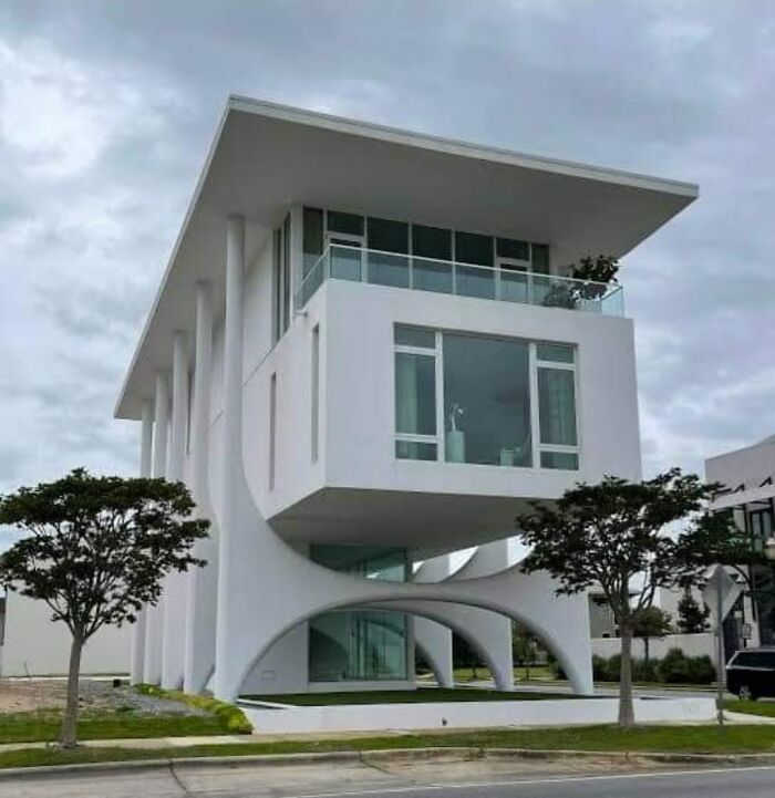
A Good Friend Of Mine Discovered This In Florida. I Wonder What Would Oscar Niemeyer Say About It?
What’s The Inside Like?
Didn't realize that some alien species traveled through the universe in onion bulbs.
Baaham entails several design principles, which Danish Kurani discussed with Bored Panda:
- Look within - put the people who predominantly use a space at the center of that space’s design—their needs, goals, and aspirations—and then design outward.
- Solve real problems - prioritize solutions over style. Think practically about what people need from their space on a daily basis, and find form through function.
- Design for change - harness the power of the built environment to nudge people in positive ways. Recognize that needs change over time, so designs should be adaptable.
- Follow nature - like nature, collect feedback on what’s working and what isn’t to refine designs. Make the space work for, not against, our evolutionary and biological needs.
- Build locally - source materials and approaches to construction from the area in which you’re building. Minimize the use of materials that do more harm than good to us and the planet.
- Embrace details - consider the finer details to ensure your design works, not just looks good. The details will also make it more beautiful and people will use it more.
- Zoom out - judge an object’s usefulness based on how well it supports both the surrounding environment and the other principles. Consider unintended consequences.
“For any space we design, we must consider these principles. They ensure that whatever we build serves the needs of users, the surrounding stakeholders, and the wider ecology of plants, animals, and the earth itself. Too often, designs are made to be flashy or bold just for the sake of being unique. This isn’t good enough,” the architect added.
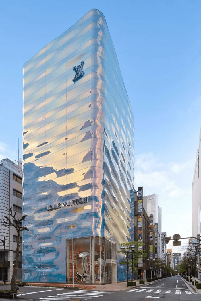
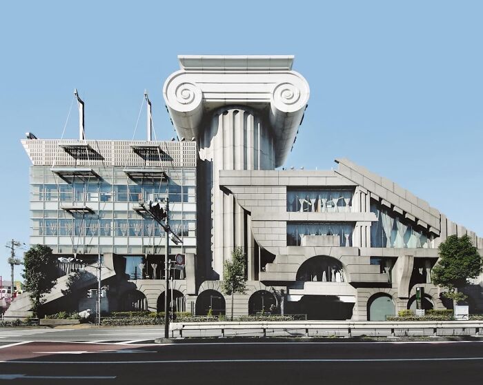
Louis Vuitton’s Flagship Ginza (Japan) Store
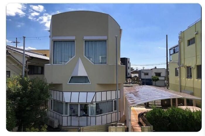
As Kids, Whenever We Passed This Building, We’d Laugh And Laugh, As If We Were The Only Ones Who Saw It
Baby Borg Cube. Decorative, Not Functional
According to Kopec, other aspects to focus on, seeking to take one’s architecture to the next level, are making sure that the structure is unique and memorable while being tasteful, that it is cutting edge in technology, and pushing the limits of what has already been done.
“My favorites are often rooted in concepts as opposed to shape,” he shared with Bored Panda, revealing that some of his personal favorites, when it comes to architectural wonders, include the Sydney Opera House, Taipei 101, Heydar Aliyev Centre, and the Jean-Marie-Tjibaou Cultural Center.
If you’re still on the lookout for your own personal favorites, check out this list of examples of architects and designers really outdoing themselves, and you might just find something you love.
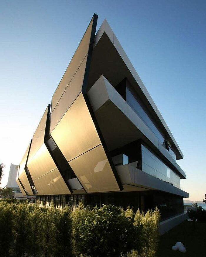
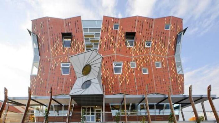
Mi’costa Hotel Residences, Cesme, Izmir Peninsula Of Turkey (2013) By Uras X Dilekci Architects
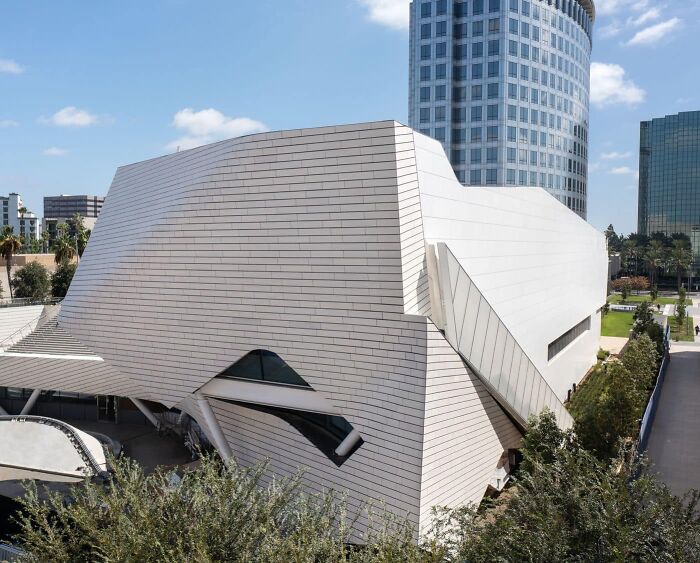
The De Young Centre For Performing Arts
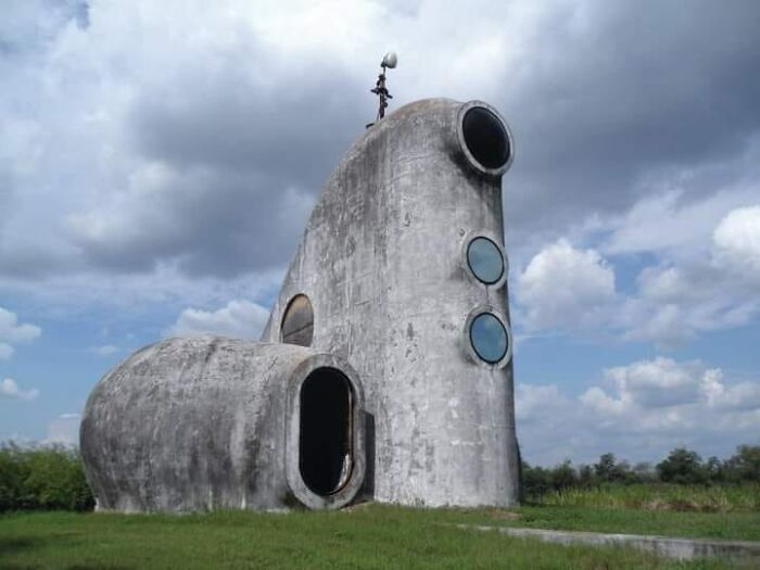
Not In The Western Hemisphere
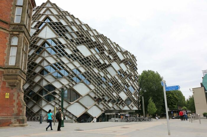
Diamond Building At The University Of Sheffield, United Kingdom
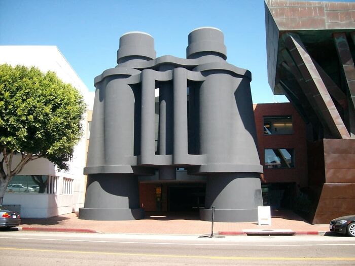
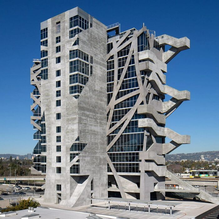
The Binoculars Building In Venice Beach
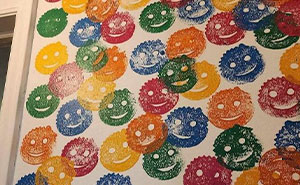
What Is This? Soda Experiment Gone Wrong? Architect Parent And Their Toddler Do Project Together?
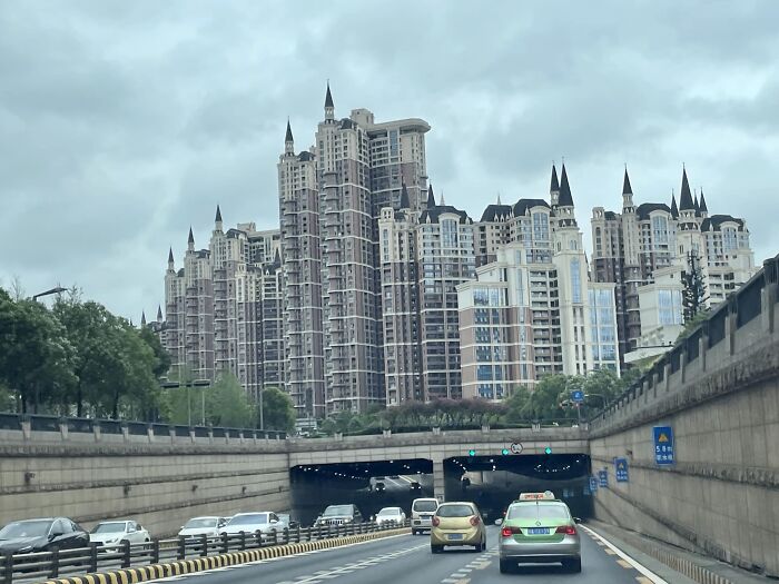
Who Wants Some Chinese Gothic Style Apartments?
In all honesty, for a billion-unit apartment building with presumably reasonable cost constraints....it's great!
This Is An Exercise In How To Make This Much Square Footage Feel Absolutely Claustrophobic
Not Sure What It Is, But I'm Pretty Sure It's Malignant
Less Is A Bore
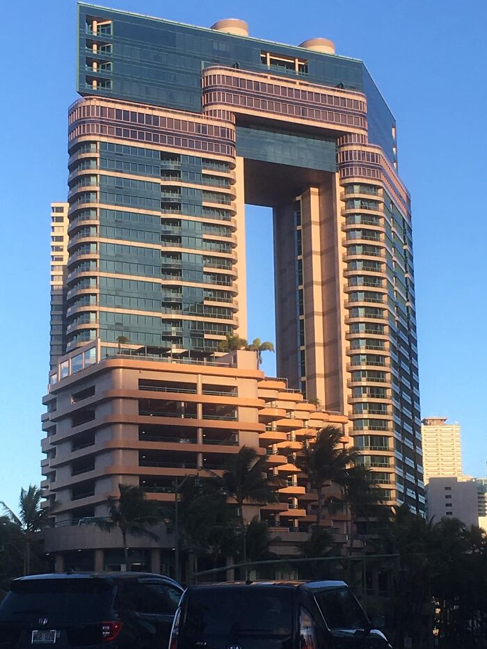
This One May Not Seem Strange But There Is A Glass Bottomed Pool Suspended 200 Ft Off The Ground
Los Angeles
Talk About A Building That Fits In With Its Neighbors! Woohoo! But, Who's Going To Clean Those Windows?
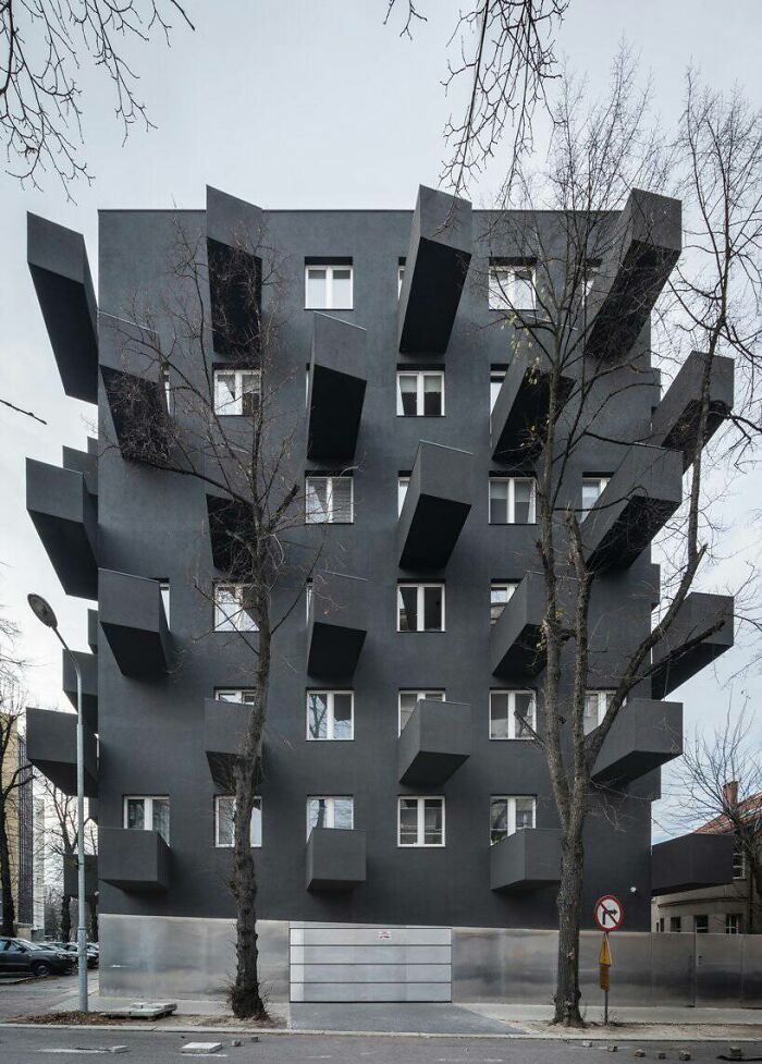
Apartment Building In Poland
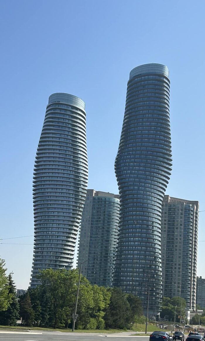
Located In Mississauga, Ontario
Orange Julep In Montréal
That has been there for a very long time... I had my first ice cream there in 1957 according to my mother, and the structure was far from new even then...
But Can It Blow Up A Planet?
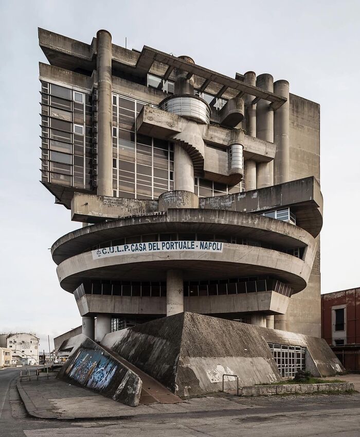
Casa De Napoli - Aldo Lori Rossi
It’s The Leasing Office Of An Apt Complex
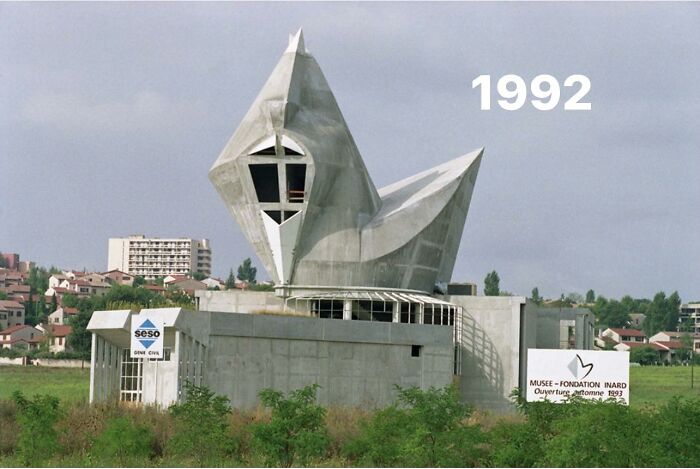
I Present To You This Building Built Around 1990 Which Was To Be A Place For Art Exhibitions, Built By A Parisian Art Gallery Owner
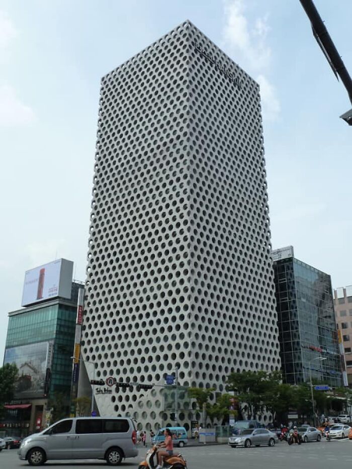
Gangnam, Seoul
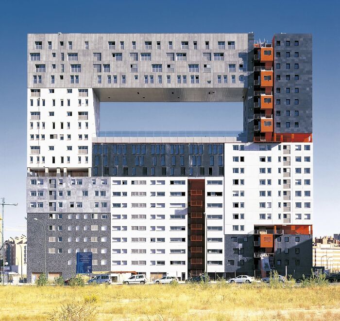
Mirador Building, Madrid
A Lot Going On Here (None Of It Good)
Can Someone Explain What This Is?
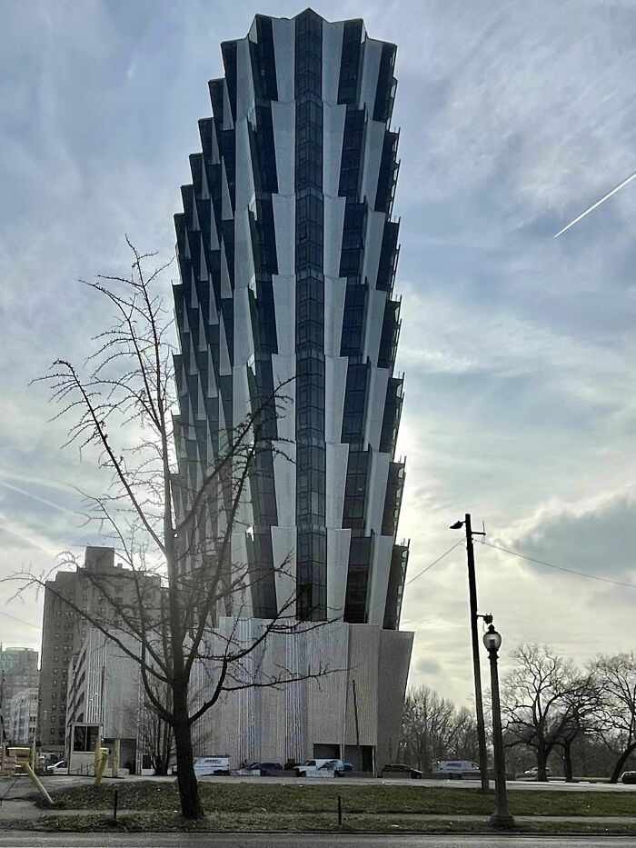
New Apartment Building In St Louis Missouri
Tower Near Obere Augartenstrasse
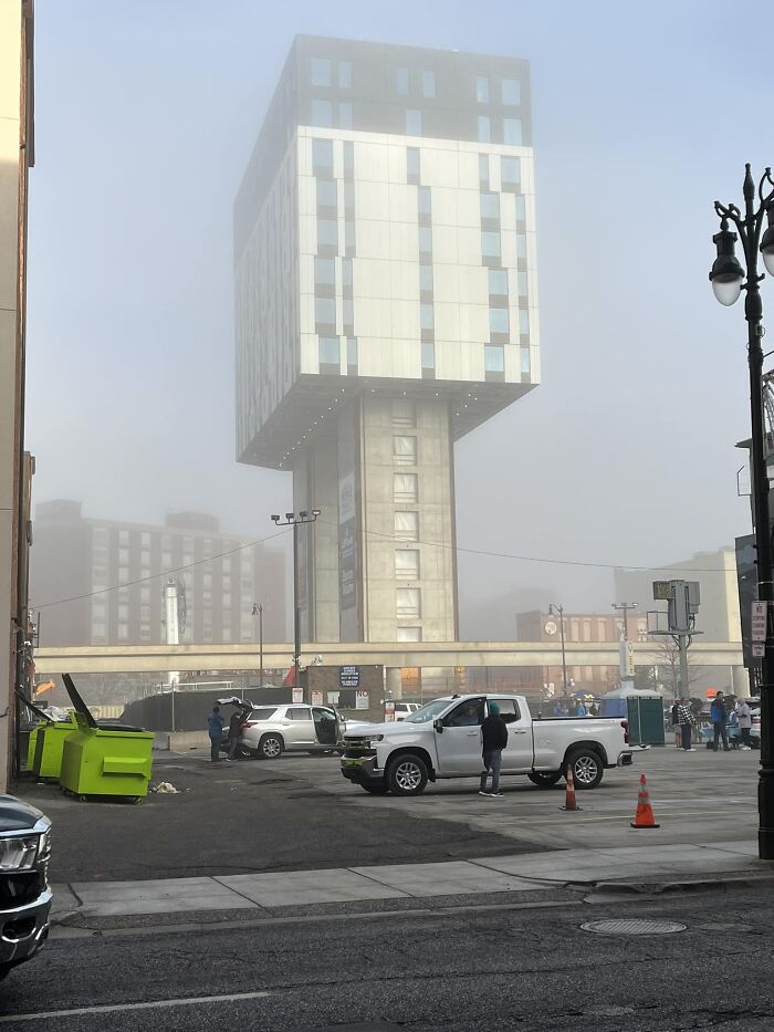
Anyone Know About This In Detroit?
Being a civil engineer myself, I pity all those poor colleagues and their teams who had to realize these things. Their names are never known, only the one who made the drawings and then left, only to return at the opening, to be praised. The hissy fits the architecs throw when confronted with "physics on earth are not cooperating with that design" are never made public.
Architects design dreams. Engineers make dreams realistic.
Load More Replies...I'm surprised that the Ontario College of Art and Design didn't make the list (https://www.pinterest.ca/pin/ontario-college-of-art-and-design-university--405605510176329544/).

 Dark Mode

 No fees, cancel anytime


