50 Absolutely Dumb Signs For Those In Need Of A Good Laugh, Courtesy Of This Group (New Pics)
Signs are an important part of our everyday lives. They tell us which exit to take when driving on the highway, help us choose which bathroom to use, inform us when businesses are open or closed and alert us to dangers, such as wet floors and dogs that may bite.
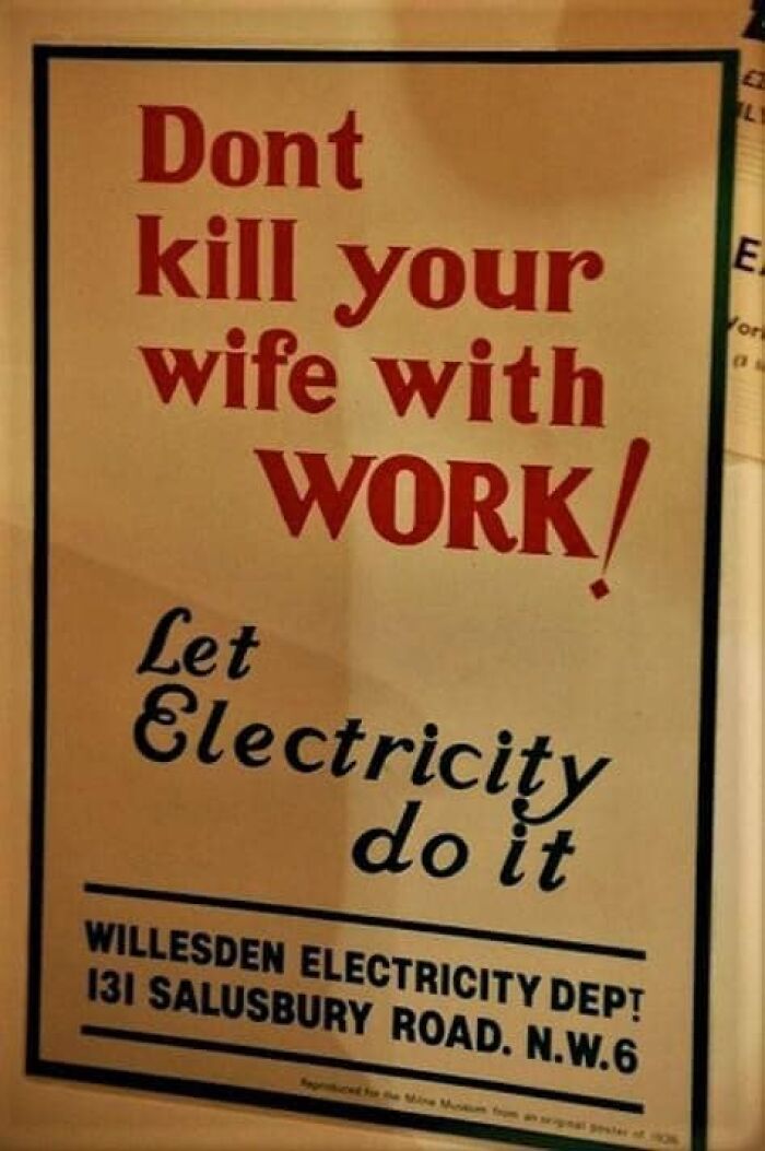
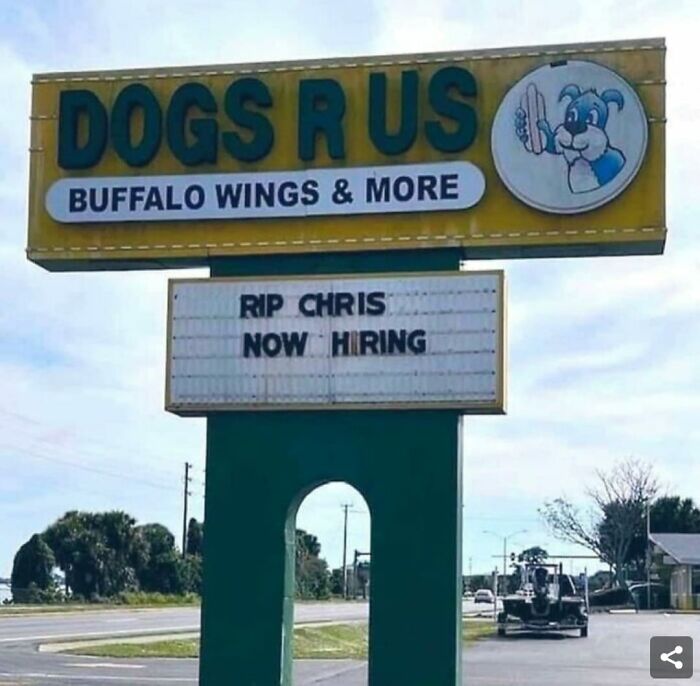
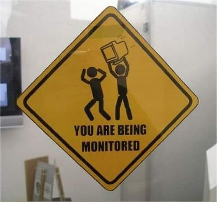
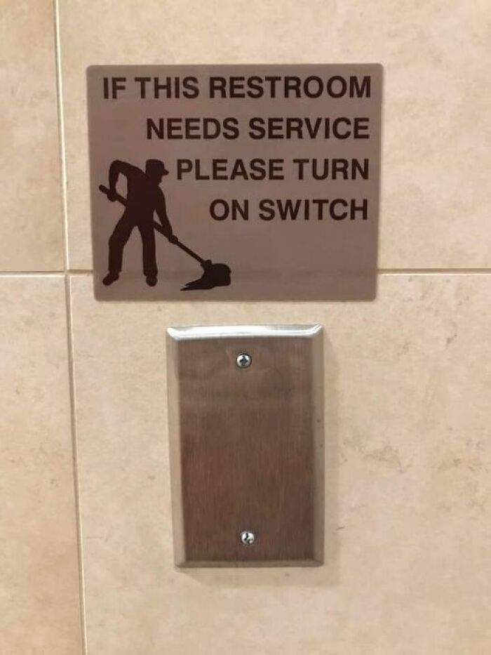
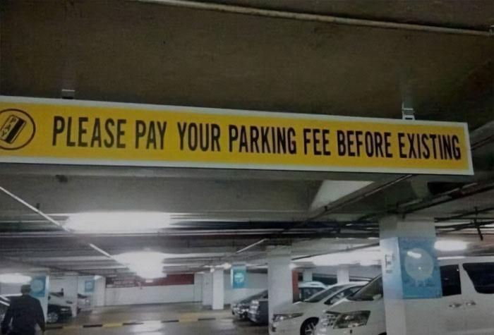
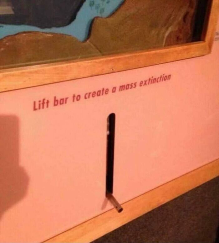
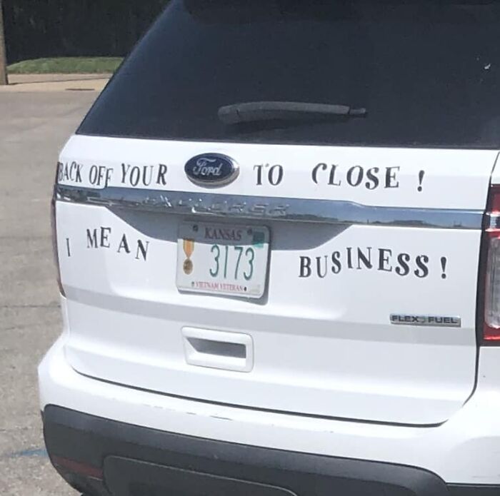
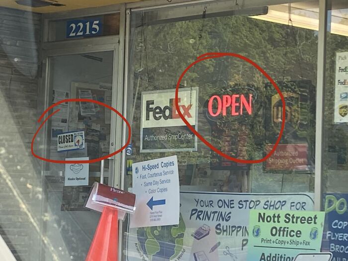
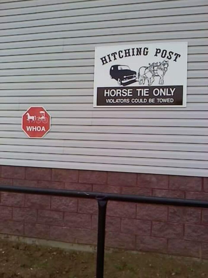
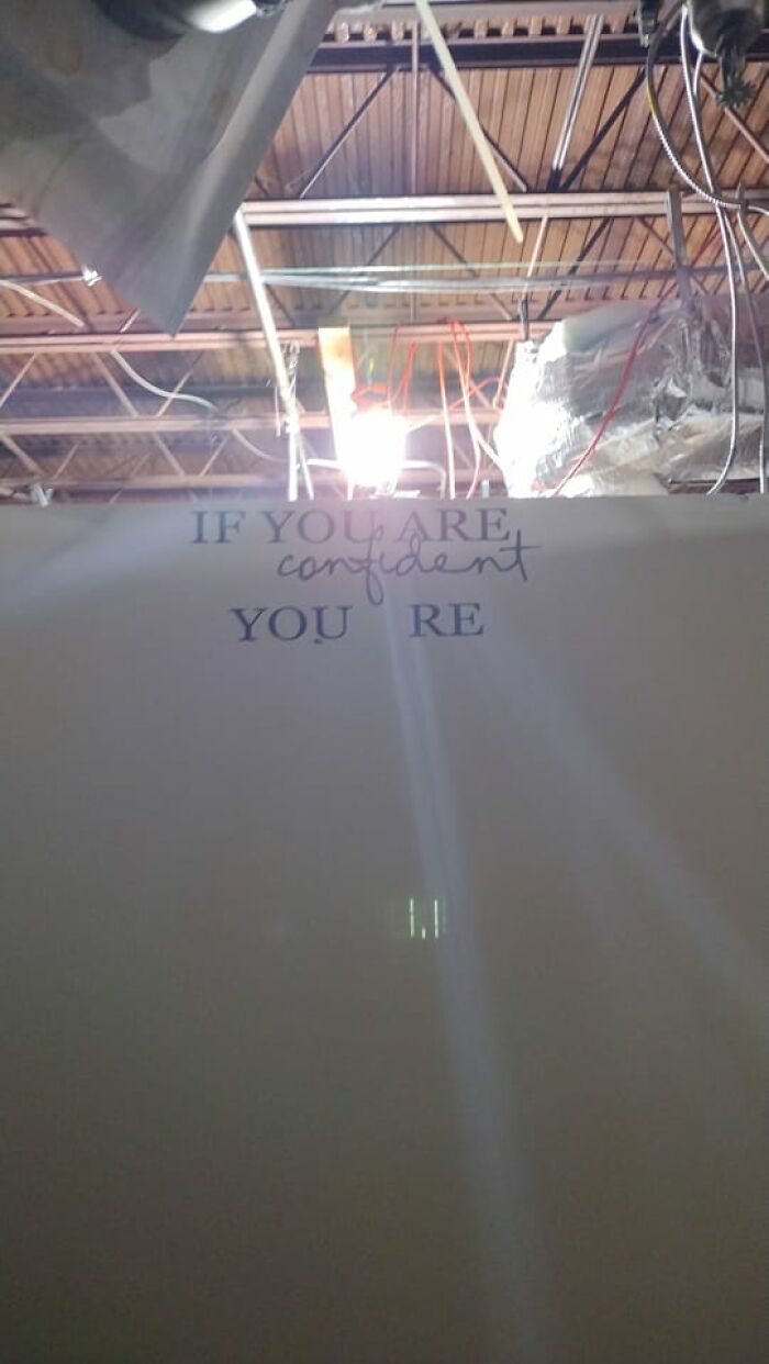
Occasionally, however, we are lucky enough to stumble upon signs that are so poorly made, their primary goal seems to be simply entertaining us. Lucky for us, the Facebook group Useless, Unsuccessful, and/or Unpopular Signage catalogs all of these terrible signs from around the world, so below, you’ll find some of the gems group members have recently shared. Enjoy viewing these pics, and be sure to upvote the signs you can’t believe actually exist!
This post may include affiliate links.
What is it about making signs that proves to be so challenging? Typically, there’s a clear message that needs to be communicated, and in theory, it’s easy to get it across. “No parking.” “No dogs allowed.” “Deer cross here.” “Out of order.” Yet for some unknown reason, sign makers across the globe seem to have trouble getting their point across often, and we thank them for their terrible service at their jobs. Because now we get to enjoy all of these hilarious signs!
The Useless, Unsuccessful, and/or Unpopular Signage Facebook group has been around since February 20, 2021, and it has a simple mission statement: “This group is for bad/dumb/down right stupid signage found anywhere.” That’s all the group needs though, as it has amassed 6.3 thousand members in the past couple of years and continues to grow all the time. 214 new members have been added in the past week! So if you’re looking for a place to find comically bad signs, we highly recommend joining. And even if you’re not very active on Facebook, you can enjoy some of the best finds from the page right here!
We’re big fans of Useless, Unsuccessful, and/or Unpopular Signage here at Bored Panda, so this isn’t our first time covering the group. And the last time we featured this hilarious community, we were lucky enough to get in touch with Jerome Davis, one of the group's administrators. Jerome was kind enough to have a chat with us and explain how the page began in the first place.
“UUUs got started, honestly, after another group got a little too pushy and was kicking people out for silly reasons, and sometimes for no reason at all,” he shared.
And when it comes to why group members love these silly signs so much, Jerome says, “Many just think it’s funny to see how laziness and carelessness becomes immortalized in signage!”
Jerome also provided some insight into what the Useless, Unsuccessful, and/or Unpopular Signage community is like. “We’re a friendly group managed by a handful of friends,” he previously told Bored Panda. “We don’t do the hateful stuff and try hard not to ‘ban hammer’ if we can help it. Most are fairly active with membership from across the globe.”
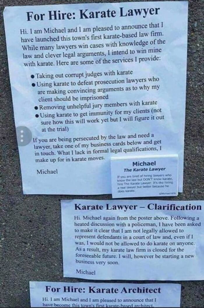
Wait, I want to see the rest of the karate architect poster!
We also asked Jerome if he had any personal favorite UUU signs. “Stupid road signs and shop signs are hands down the best!” he shared. And finally, the administrator noted that he’s always on the lookout for new signs to share with the group as well. “All the time!" he says. "It’s a challenge to find new ones.” Something tells me this article will inspire others to start keeping their eyes peeled for hilarious signs as well.
In a previous Bored Panda article, we were lucky enough to get in touch with CEO of the South Carolina-based company The Sign Chef, Tim Harrelson. Tim, the Sign Chef himself, was kind enough to have a chat with us about why great signage is so important. “Between the physical world and the online world, the competition for attention is at an all time high,” he shared. “Simultaneously, attention spans seem to be at an all time low. Our senses are constantly being bombarded! Moving forward, organizations need to be strategic in how the content is displayed on their signs.”
The Sign Chef also explained his company’s process for designing the best signs. “Most graphic designers start with the size of the sign - then the lettering & graphics are added. Think backwards," Tim explained. "A more strategic approach can be taken by having the design reverse engineered for maximum impact. This design strategy starts with the viewing distance. How far away does your target audience need to be able to read the sign?”
“Once the distance is measured, a Letter Sizing Calculator can be used to scientifically determine the very best letter sizes,” Tim continued. “As an example, what is the best letter size if the viewing distance is 110 feet? When you type 110 feet into the calculator, you’ll instantly see 22 inches is recommended for maximum impact - easy.”
Tim also shared about some of the most amazing signs him and his team have had the pleasure of creating. “We recently created the World’s Largest Dibond Sign Display for Mahopac High School in New York,” he shared with pride. In his email to me, Tim attached a photo of the impressive sign that looks easily over 15 feet tall, featuring the school’s logo of a massive M with an arrow across it. He also shared a beautiful retro, flashing neon sign to go on Route 66 advertising Eufloria dispensary in Oklahoma.
Are you feeling inspired to be on the lookout for all of the poorly made signs you can find around you now, pandas? I’m sure if you keep your eyes peeled, you’re certain to stumble on some terrible spelling or questionable messages. We hope you’re enjoying these pics, and please remember to keep upvoting all of your favorites! Then, if you’re interested in checking out Bored Panda’s last article featuring this hilarious Facebook group dedicated to useless, unsuccessful and/or unpopular signage, you can find it right here!
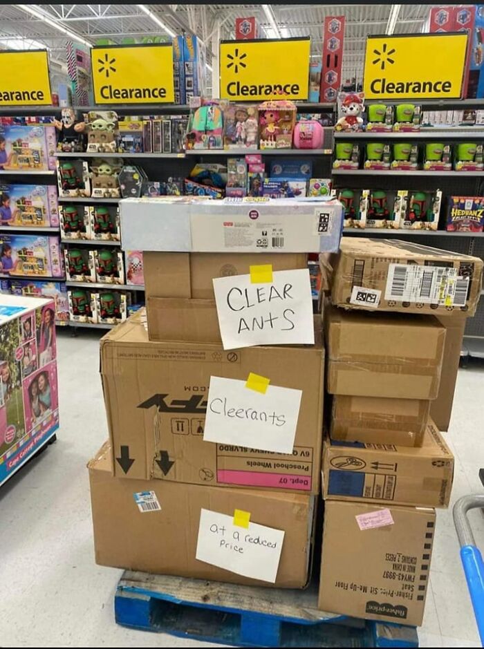
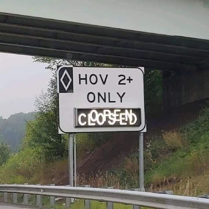
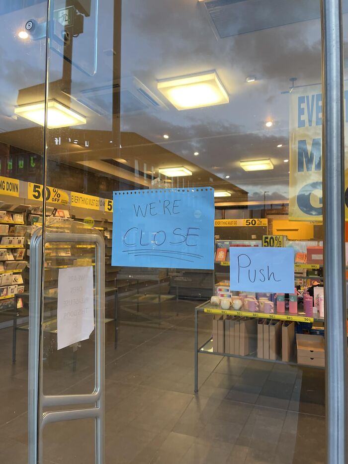
If only there had been some indication close by of how to spell "clearance"...
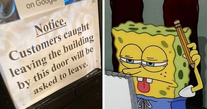
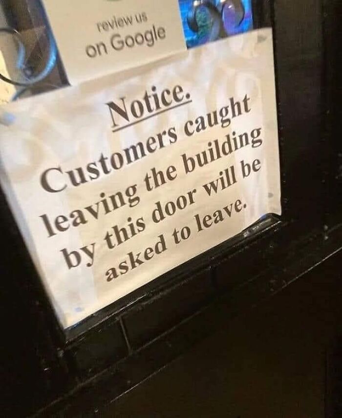
Who is the unfortunate person who gets to enforce this? Same guy who checks to see if you are wearing underwear?

 Dark Mode
  No fees, cancel anytime


