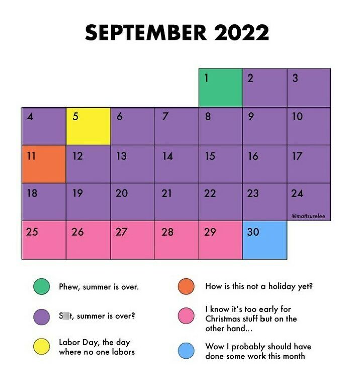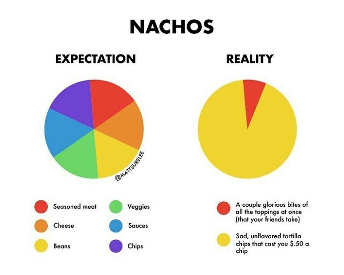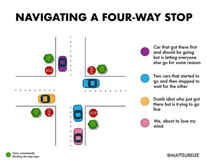
“Thousands Of Charts, Dozens Of Laughs”: 30 New Honest And Funny Charts From Matt Shirley That Perfectly Sum Up Our Lives (New Pics)
InterviewCharts and graphs are often associated with important data and boring presentations, or math lessons back in school, which were not equally fun for everyone. However, charts can be fun, and Matt Shirley, better known as Matt Charts, is here to prove it again.
The chart connoisseur never ceases to amaze his followers with amusing and oh so relatable content. His works cover everything from social anxiety to taxes, Tinder dates, dentist appointments, and so much more (the guy even managed to turn Rick Astley’s iconic song into a chart). Unsurprisingly, his insight in the form of colorful sketches has amassed over 419 thousand followers on Instagram, and quite a few here at Bored Panda as well. We’ve gathered some of his newest masterpieces on this list for you to enjoy, so wait no longer and scroll down to see for yourself that charts can indeed be fun.
More info: Instagram | MattShirleyCharts.com | Facebook | Twitter | Patreon
This post may include affiliate links.
Like This Chart If You Like This Chart
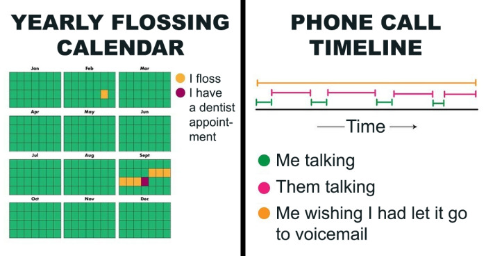
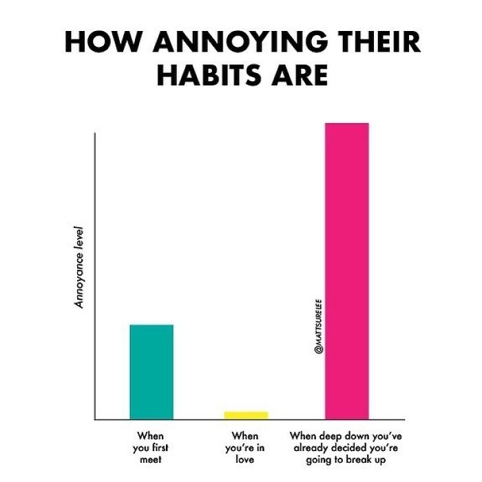
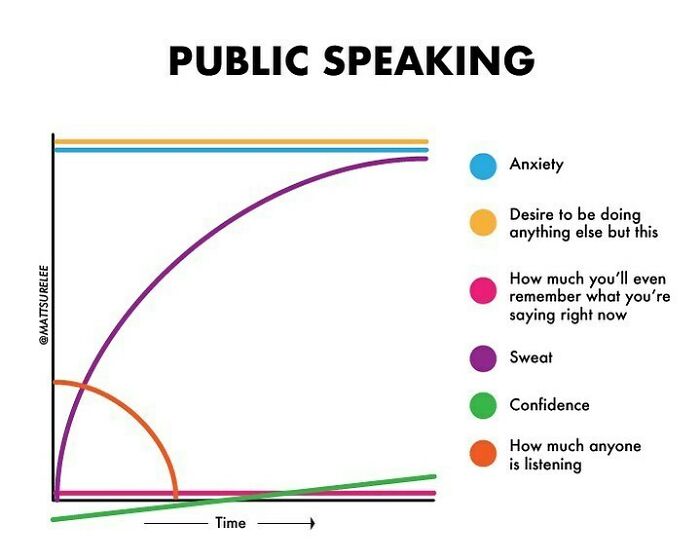
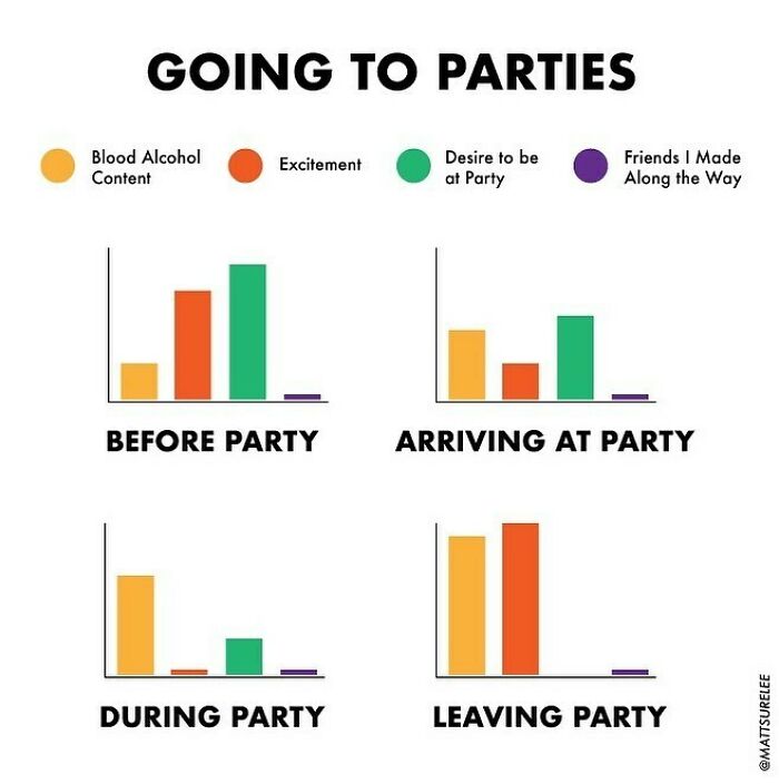
Matt Charts is an expert at what he does. His charts might look simple, but they’re somewhat genius in the way they capture the essence of certain situations. Such as social gatherings, for instance; quite a few of Matt’s works show how people’s emotions change in different settings, such as a party, a meeting, or even when a phone call is due (for some of us, trying to force yourself to pick up the phone can take longer than the call itself).
In one of his previous interviews with Bored Panda, Matt revealed that his ability to create things people can relate to goes back to his childhood. “I had an intense desire to make people like me. So I really thought about what I did from other people's perspectives,” he said.
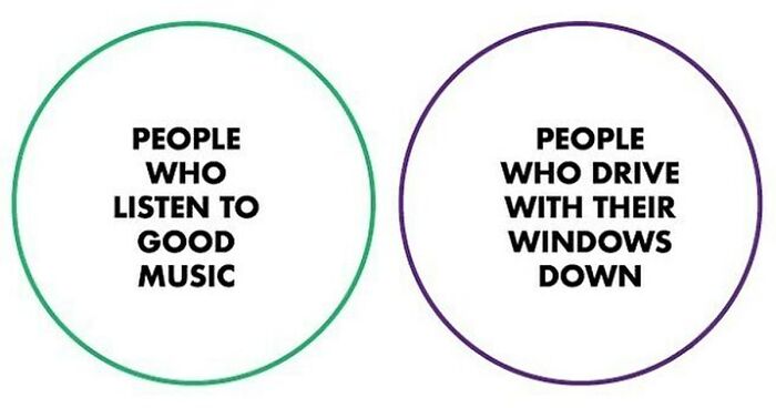
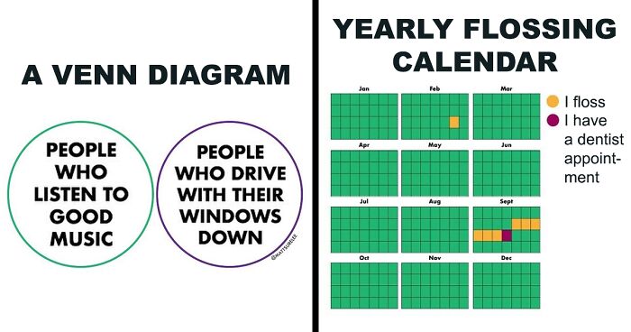
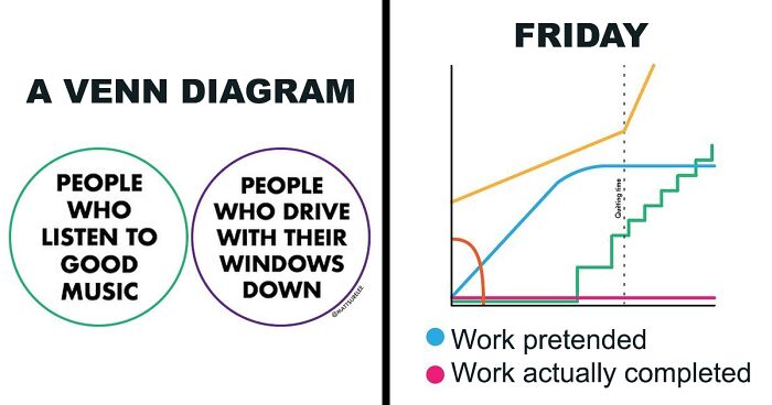
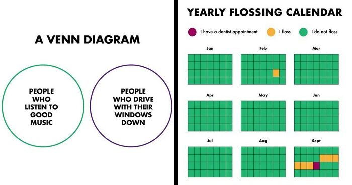
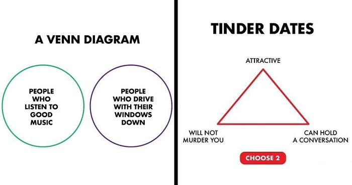
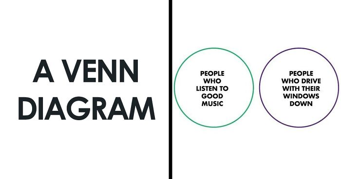
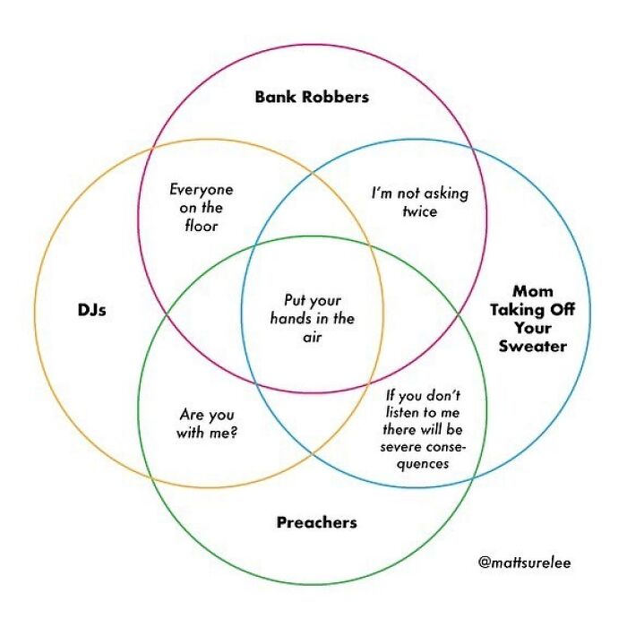
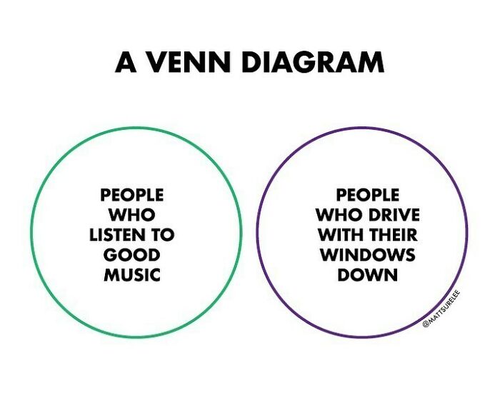
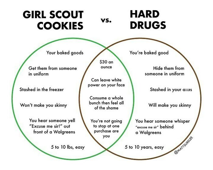
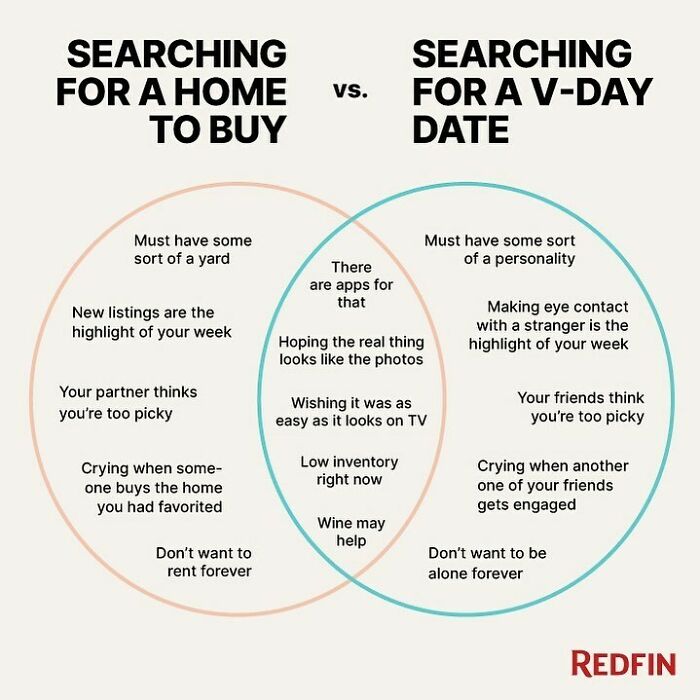
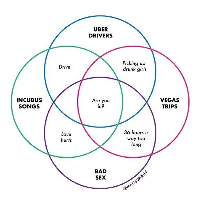
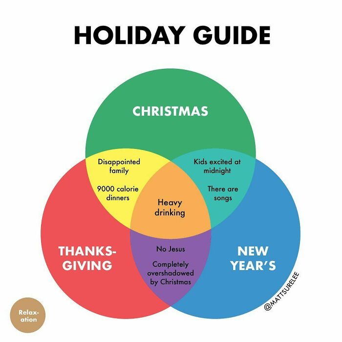
A Little Venn I Made
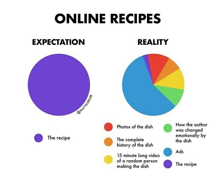
I’m Looking For A Good Stew Recipe If Anyone Has One
I avoid amateur recipe sites for this reason (and also because their recipe testing can be a bit ht and miss). I don't mind a little bit of narrative about the recipe (and if you've ever read any of Patricia Wells or Jane Grigson cookbooks you'll know how interesting the snippets of background can be) but dear god - don't make me read your life story to get a recipe for cupcakes!
Being relatable is one of the factors that make Matt’s works so great. Over the years, he’s posted over 1.9 thousand graphs on his Instagram alone, which have attracted 419 thousand followers already. There are thousands of more admirers on other platforms, such as Facebook and Twitter, all of whom add up to quite an impressive fan base.
When asked what has changed the most since the very beginning of his chart-paved path, Matt told Bored Panda that he finds it interesting how much the Internet's sense of humor has changed over the last ten years. “It's hard to explain but there has definitely been a shift in what performs well over the years, which is to be expected, I suppose. In terms of what I've learned about myself, I think it's very easy for me to get stuck in a rut and have a one-track mind in terms of what kind of content I make and what kinds of jokes I make. I have to shake myself out of this from time to time.”
Tag Someone Who Listens To Bad Music Loudly
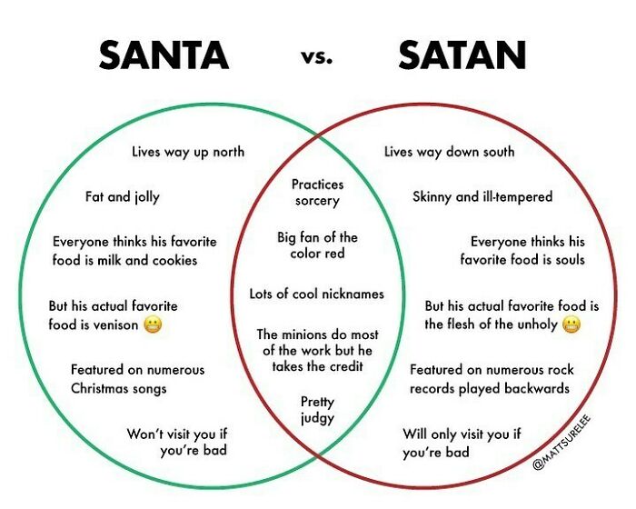
🎅🏼 vs. 👹
Matt told Bored Panda that he typically tests the graphs on one of his other social media accounts or on Reddit to see if they perform well. “I can usually get a sense of whether or not people like them from there, which is probably too much of a business way of looking at it, now that I think about it. I should probably just put everything out there and see what people like. This is my perfectionism coping mechanism coming to light for sure,” the artist admitted.
“Currently, I am enjoying talking about very specific events that we go through like The Last Day of School or Driving to Swimming Lessons. I think there's something relatable to these types of things that are fun to tinker with,” he added.
It might be difficult to explain why people enjoy the graphs that make them go “that’s exactly how I feel!”; however, chances are that it’s related to the so-called mere exposure effect. The term refers to the psychological phenomenon of people liking things they are familiar with, whether it’s advertisements, other people, music, or—in this case—situations depicted in colorful graphs.
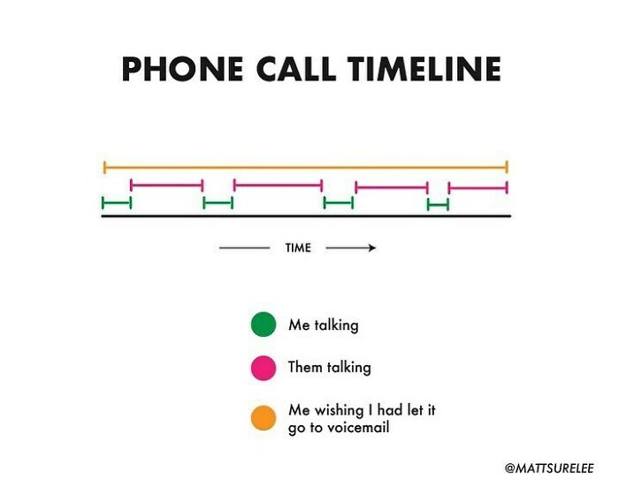
☎️
___________________________________________: Me wishing the conversation was over...
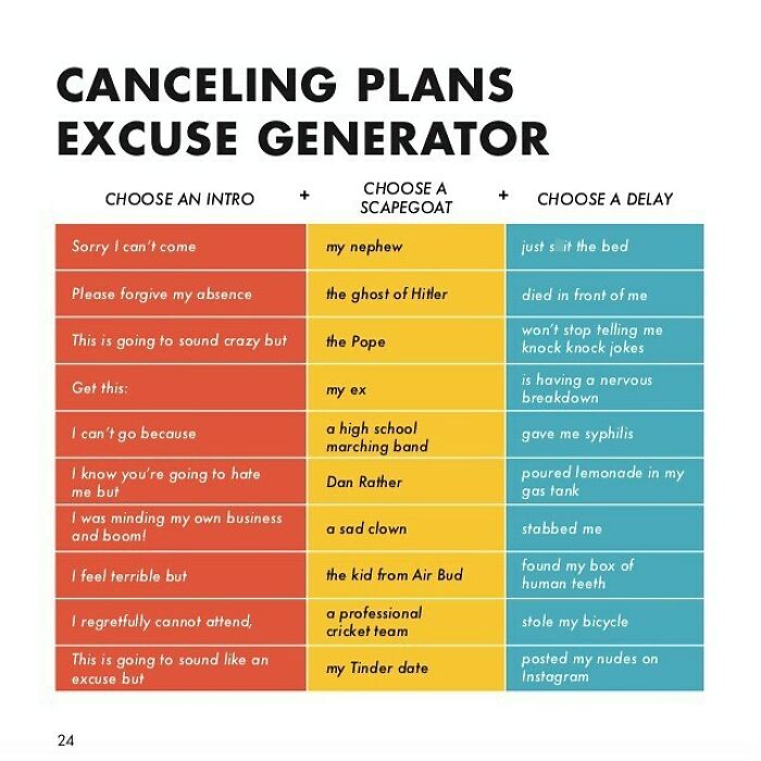
Here’s A Chart From My Book Which You Can Get From The Link In My Bio. It Makes A Good Gift If You Ask Me
"I was minding my own business when BOOM! The Pope posted my nudes on Instagram!" uhhhh idk how I feel about this LOL
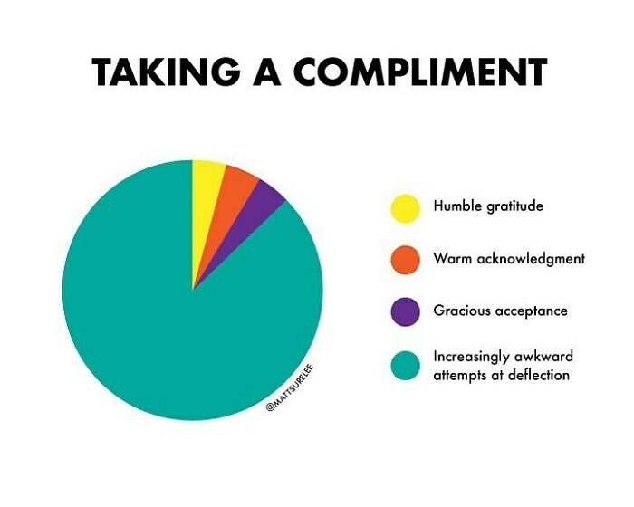
Tag A Bad Compliment Taker. I Tag Myself
According to Verywell Mind, the mere exposure effect often works without us even realizing it. We might think we like something simply because we do, while in reality, it’s related to the phenomenon, for which there might be several explanations. One of them is that exposure helps combat uncertainty, as we are less afraid of or anxious about the things we know or have been exposed to before.
The second explanation for the mere exposure effect is that familiarity makes processing easier—something we’ve encountered before requires less effort in comprehending it. In addition to that, familiarity can also have a comforting effect and reduce tension and anxiety, which is one of the reasons people tend to watch the same TV series again and again.
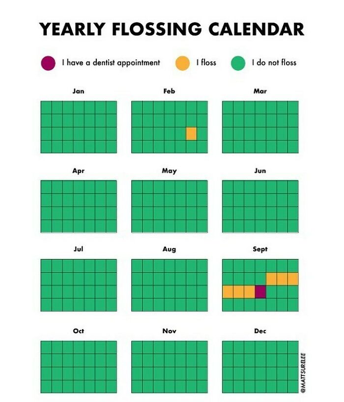
I Have A Dentist Appt
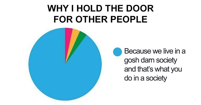
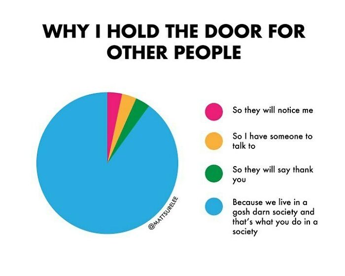
Tag Someone Who Has Strong Opinions About Holding Doors
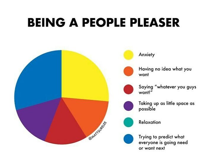
For My People Pleaser Friends
Creating charts about any and every situation people come across in life allows Matt to stay relevant and relatable, but does not put him in too small of a box. He’s told Bored Panda before that he’s not confined to a certain field of expertise, which helps when it comes to inspiration: “If I'm not feeling inspired to create something on a certain topic, I can always look in the complete opposite direction for something that activates the creative juices”.
Recently, Matt revealed to Bored Panda that one of his current favorite works is the Partner Heat Map. “I like it because it harkens back to when I made everything on a whiteboard and challenged my art skills.”
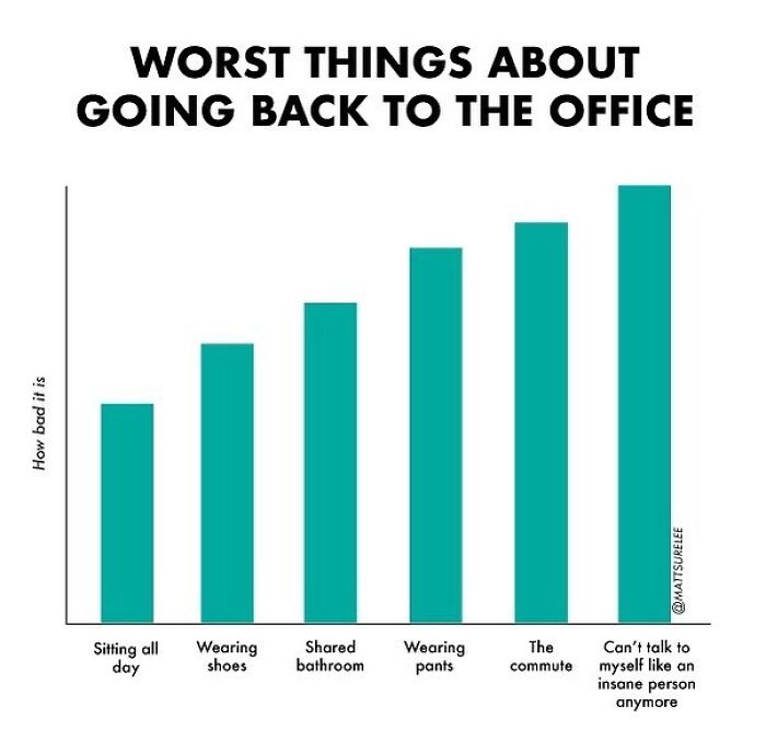
For Folks Who Had To Go Back To The Office 👖
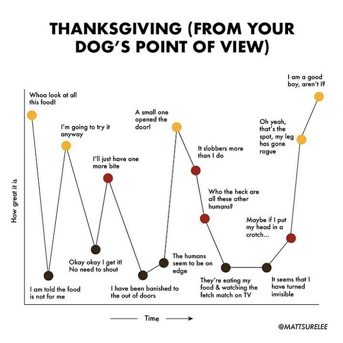
Let’s Watch The Fetch Match 🐶
Holy S**t The Angry Comments... Hope You're Doing Well Matt, Ignore The Sensitive Ones
When it comes to the creative process, Shirley said that if the idea makes him laugh, he hopes it might cheer up his followers as well, and goes from there. Sometimes he draws inspiration from current events as well.
“In general, I like to do things that are light-hearted so it's natural that some of the more light-hearted news stories are right up my alley,” he’s told Bored Panda before. “And then, of course, I can always draw off my own experiences, whether it's working from home or dealing with isolation or my thoughts on anxiety.”
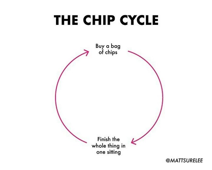
Chip Cycle
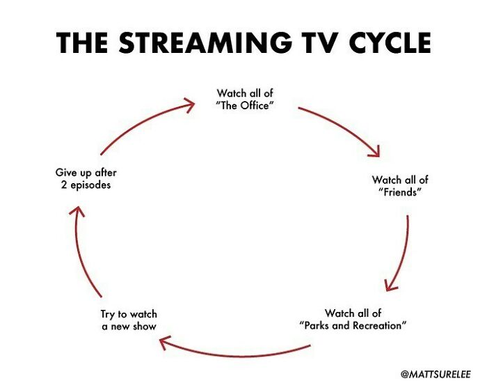
Drop Names Of Shows You’ve Given Up On Recently
Or... Watch Office-Watch Office-Watch Office-Watch Office-Taylor Swift
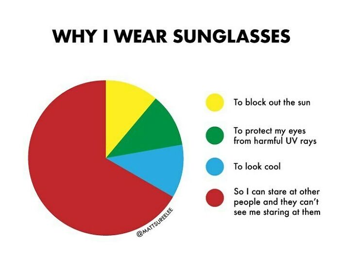
😎
Its oddly comforting knowing that you cant see where I'm looking. Idk why though.
The constant change of events and the artist’s creativity allows Matt to continuously come up with new ideas his followers seemingly enjoy. "I've always been worried that my content would be for a specific time and place,” he once told Bored Panda, “and then people would get tired of it and move on, but so far I've been able to keep it fresh and explore different topics that people seem to like."
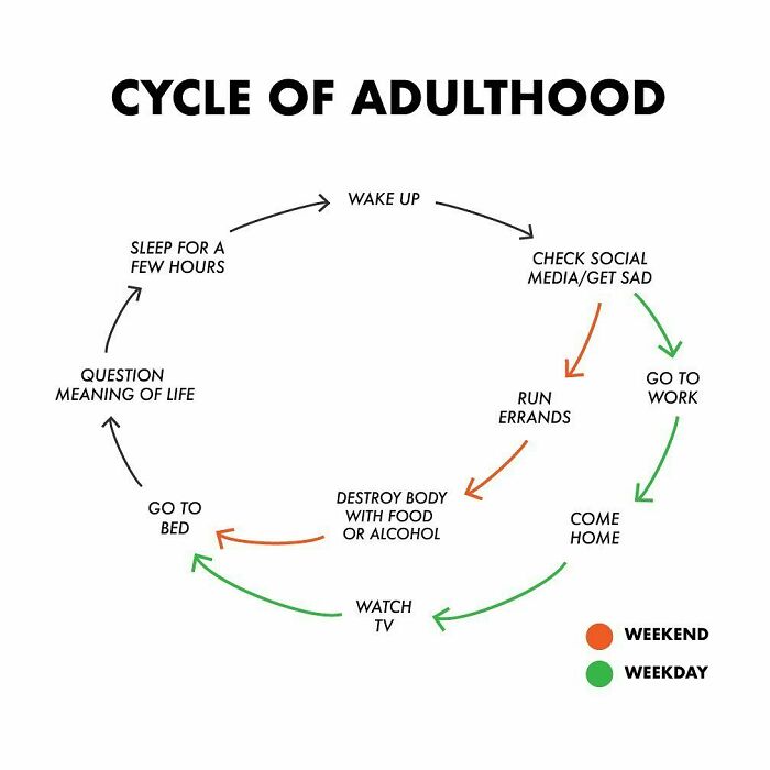
Should I Make A Part 2 On This?
"Question meaning of life' is so true. It would be like 2 AM, and I would get these random philosophical thoughts about the meaning of life while I'm trying to sleep LOL
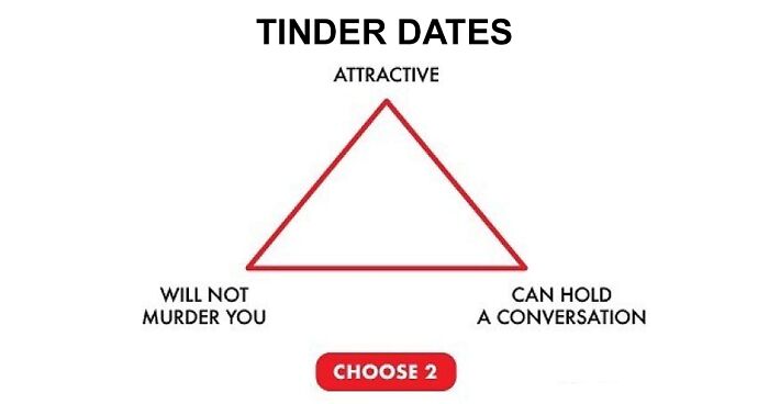
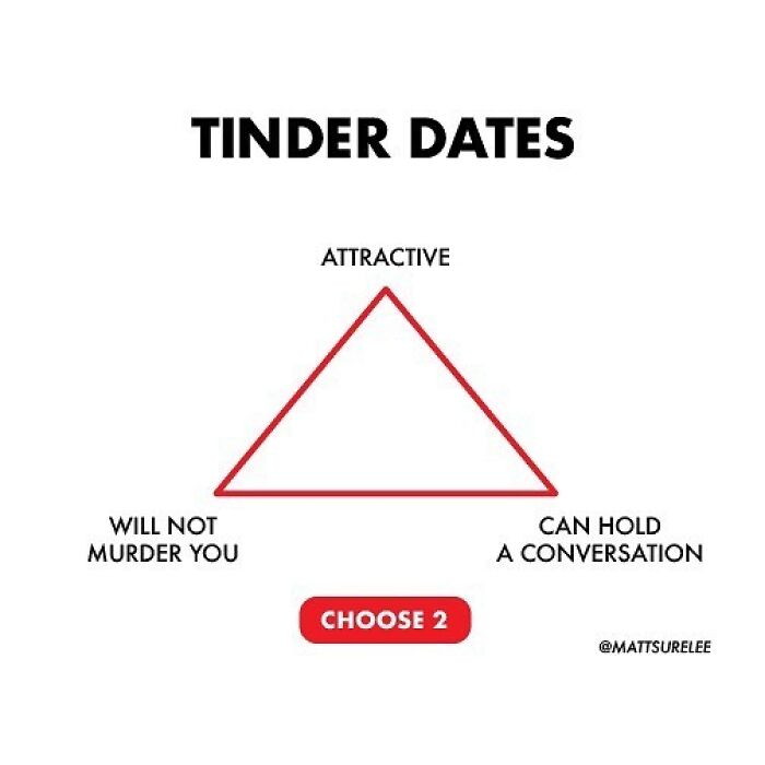
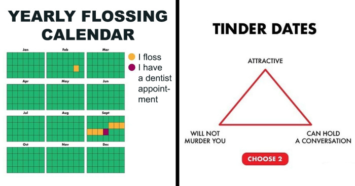
Tinder Chart
I'll take "will not murder you" and "can hold a conversation". I don't care about physical attractiveness
Marketing Charts pointed out that entertainment-related social media accounts are the second most popular ones people choose to follow; they are preceded only by accounts of users’ friends and family members. Moreover, people online look for content creators who are funny, first and foremost, as well as trustworthy, and authentic. Based on the amount of followers Matt Shirley has and some of the comments under his posts, it’s pretty safe to say he covers all three of the main points.
In addition to that, the chart aficionado told Bored Panda he tries to come up with a new chart every day. That means he shouldn’t run out of content any time soon, which is especially important, considering that people spend more and more time online. “I typically still come up with a new chart every day,” Matt said in a recent interview, “but I may not post something every day which means I have a lot of charts that haven't seen the light of day yet.“
According to Statista, the percentage of the population using the internet rose by a whopping 30% in the US over the last two decades, reaching 91.8% in 2023. Global statistics show that nearly 65% percent of people in the world (adding up to around 5.18 billion) are internet users, and roughly 60% of them are social media users.
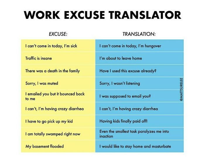
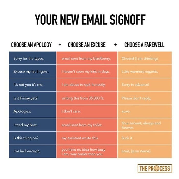
It’s Your Job To Use One Of These At Work This Week
why stay home and masturbate when you cna do it with friends FRIENDSHIP
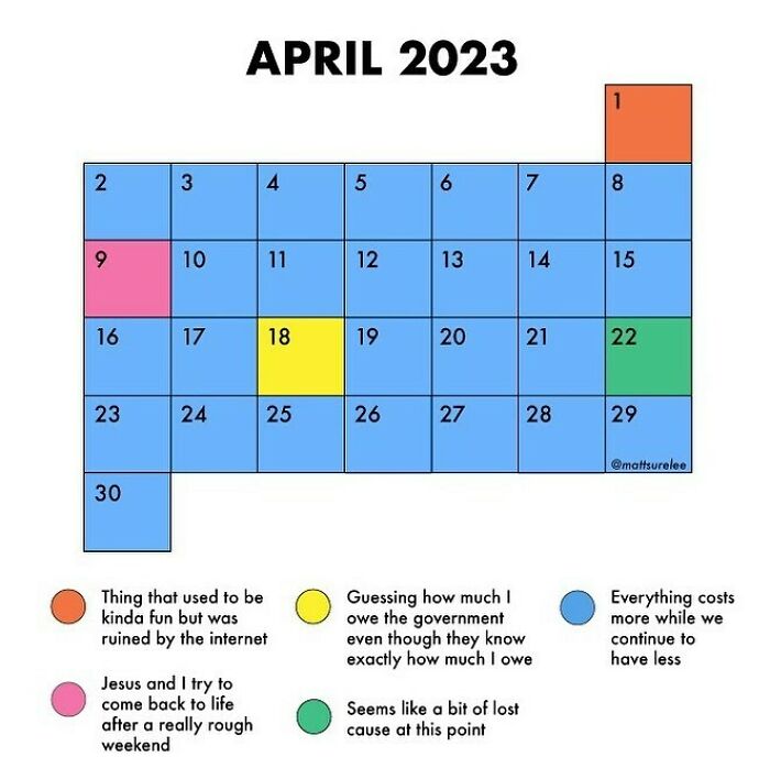
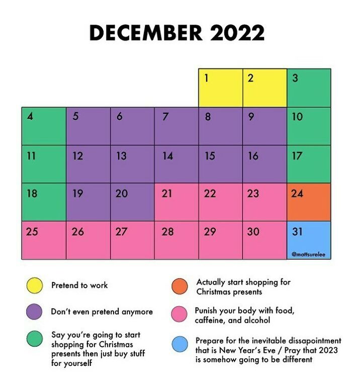
A Few Days Late With This
omg yess the Falklands invasion of 1982 was like soo fun until it was totally ruined by the internet
Even though Matt’s colorful images are mostly created for entertainment purposes (as his Instagram bio reads, “Thousands of charts, dozens of laughs”), charts can be a great way to present and memorize important information. MindTools pointed out that visual representation allows people to understand data rather quickly. That is why the creator should aim to keep it simple; the main purpose of a chart is to invite further exploration of a topic, including the necessary data, instead of cramming it all into one image.
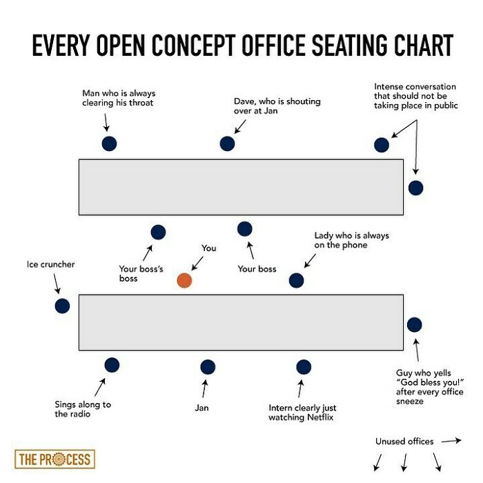
Every Open Concept Office Ever
I once had a desk near to the three office assistants. One hummed randomly (not actual tunes, just deranged bee mode), one frequently discussed her very adventurous sex life with the other two, and the third had a persistent (but sadly not terminal) cough. We weren't allowed to wear headphones.
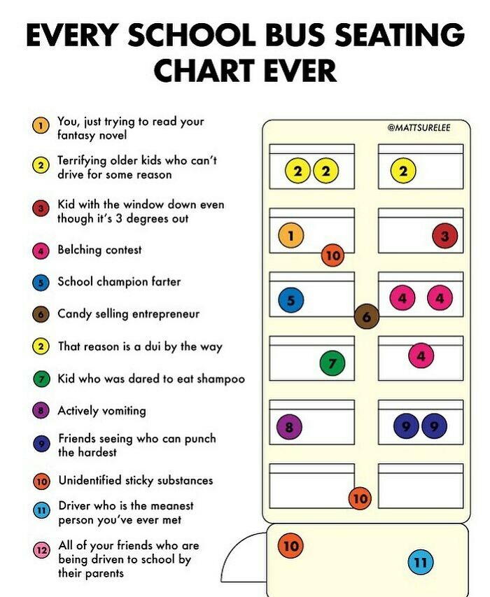
🚌
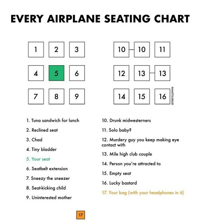
ooo yes mr bus driver (11) kicked a kid off a school bus for playing with (10) that I was on once and he had to ask a stranger for directions because he didn't have data, luckily random bus children (2s) with snapchat made sure he didn't get murdered in a random alley
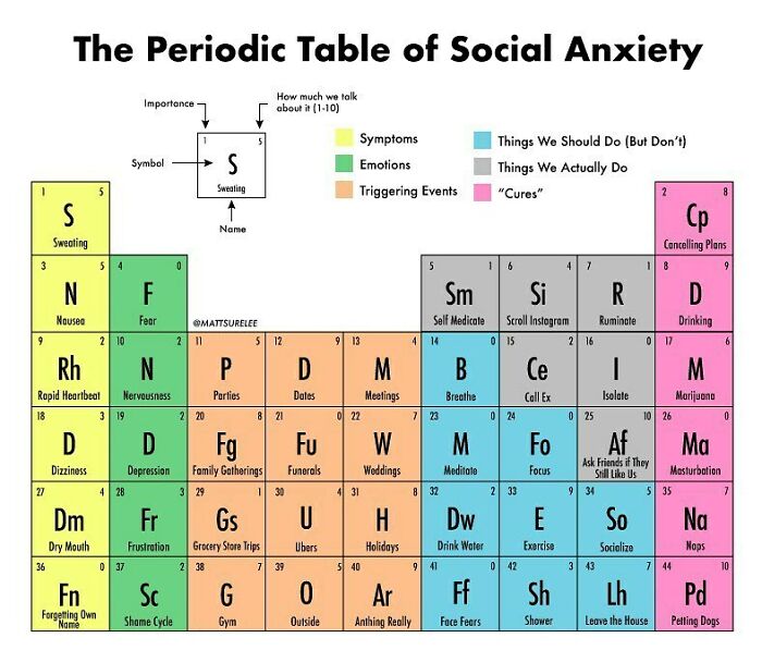
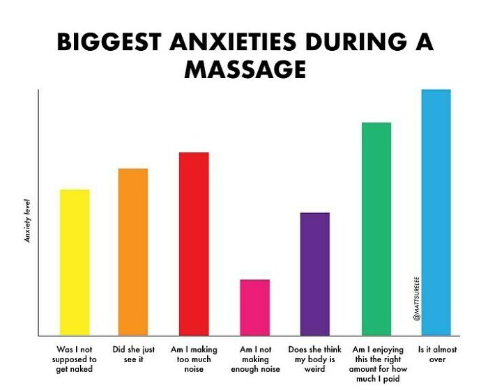
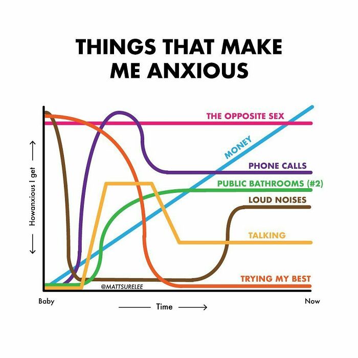
You Can Put This In Your Story If You Are Familiar With Social Anxiety, I Don’t Mind
Ok but triggering events should just be squished into one box labelled “People”.
If you’ve enjoyed browsing Matt’s charming charts on this list, make sure to give the previous collections a go as well, which you can find here, here, here, here, and here. There’s plenty to see there, and we sure hope there’s plenty coming up in the future as well.
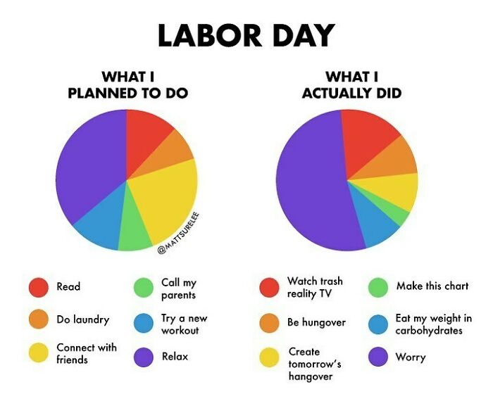
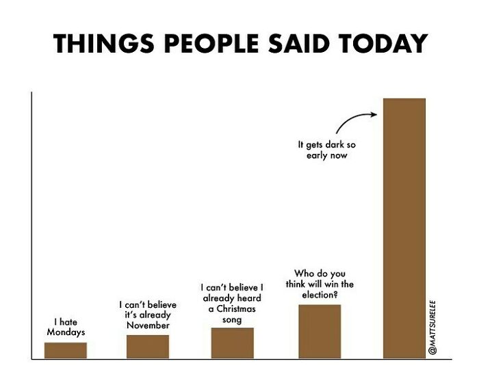
Topical
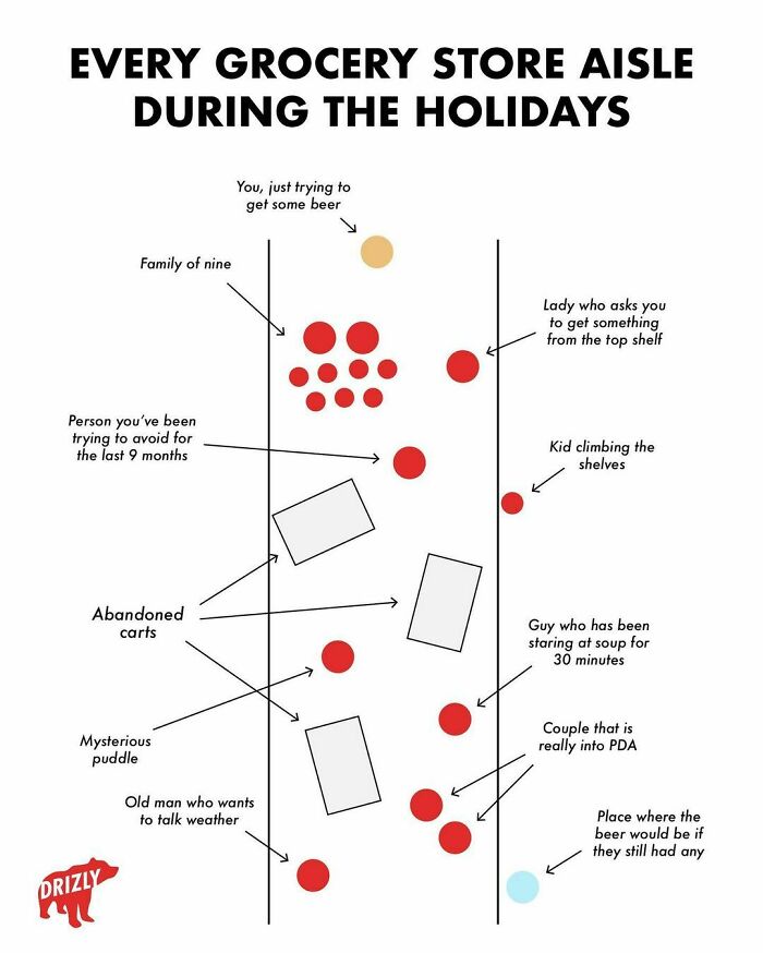
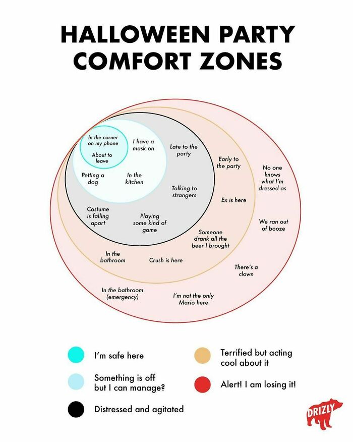
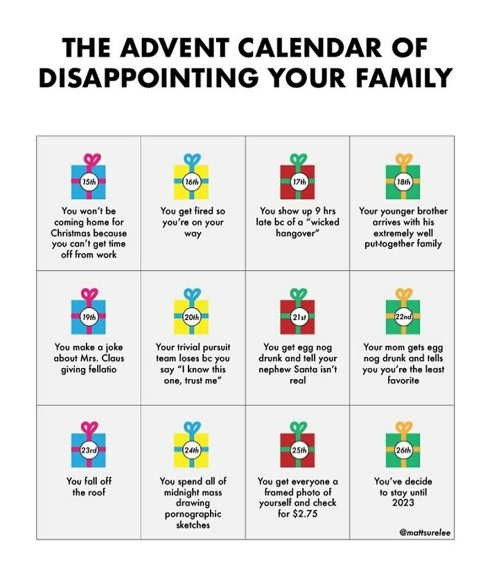
A Little Holiday Chart I Made For @drizlyinc
I am the guy who has been staring at soup for 30 minutes. Let me look at the soup in peace.
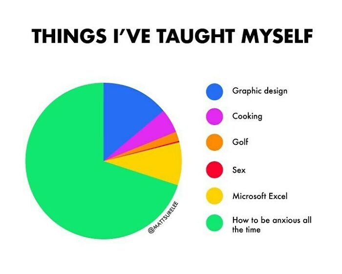
I’m Pretty Good At Adobe Illustrator These Days
I’ve taught myself to be a nervous wreck who brings problems instead of solving them like a normal person

 Dark Mode
  No fees, cancel anytime


