50 Design Fails That Are Beyond Ridiculous, As Shared On This Popular Online Group (New Pics)
Most of us can intuitively tell whether something is designed well or if the end result falls way short of what it should be like. The more we’re exposed to ads and products—both great and god-awful—the more our sense of taste develops.
Ever since 2011, this popular subreddit has been sharing examples of epic design fails that are beyond hilarious. In fact, they’re so bad, it’s mind-boggling that the people behind them green-lit them! We’ve collected some of the worst offenders to share with you, Pandas, so scroll down and upvote the designs you love to hate the most.
This post may include affiliate links.
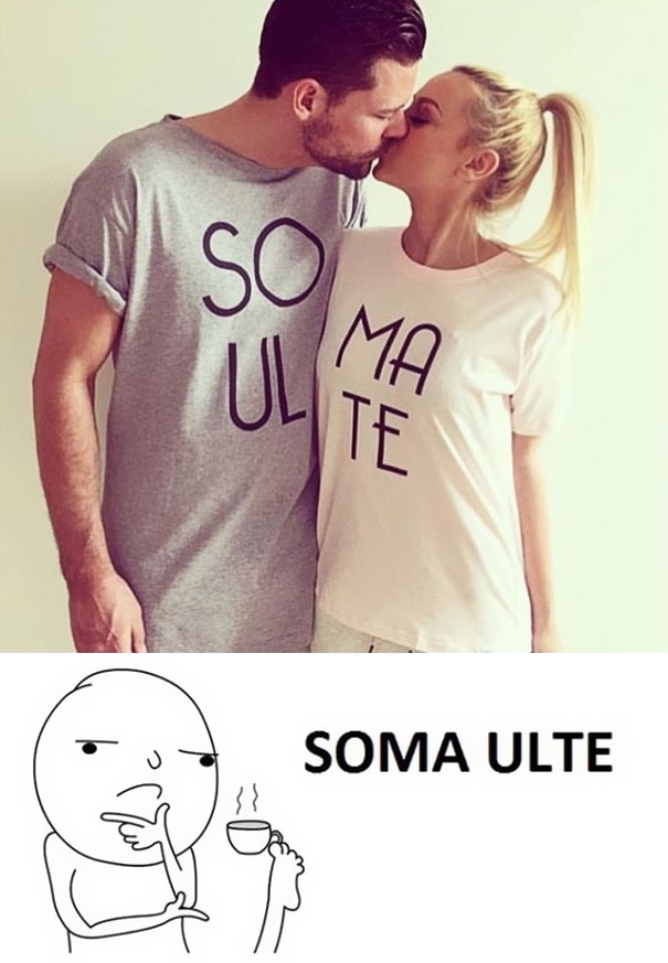
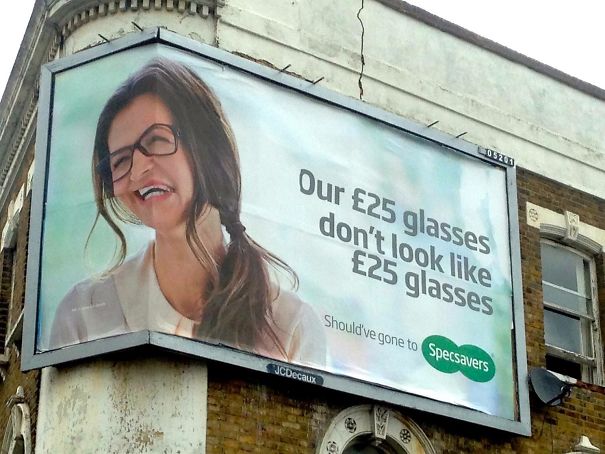
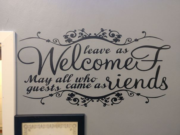
Being Gay Was A Sin They Said
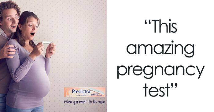
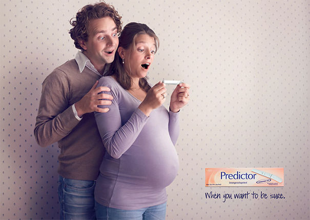
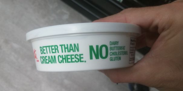
This Amazing Pregnancy Test
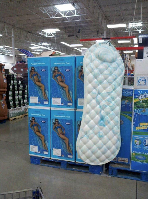
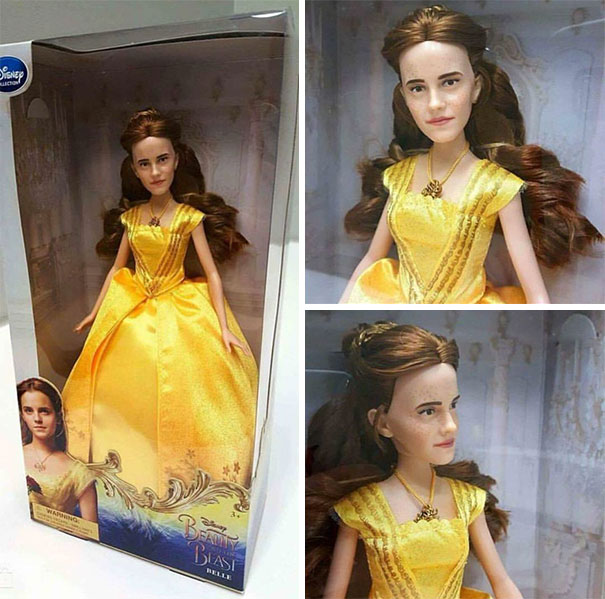
This Could Have Been Avoided With 1 Focus Group (of Women)
The subreddit has been poking fun at horrible and hilarious designs all the way since 2011. Over the past 12+ years, the community has grown absolutely massive. At the time of writing, the group had 3.4 million members.
Years pass, seasons change. But what stays constant is people’s appetite for shaming truly awful product and ad designs. (What changes, however, is how the internet reacts to names like the subreddit’s that use gentle curse words. These days, you can’t even mention them in full without some social media megacorps frowning in your general direction!)
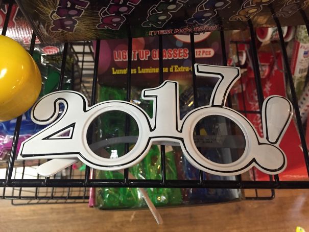
What About When You Cross Your Legs?
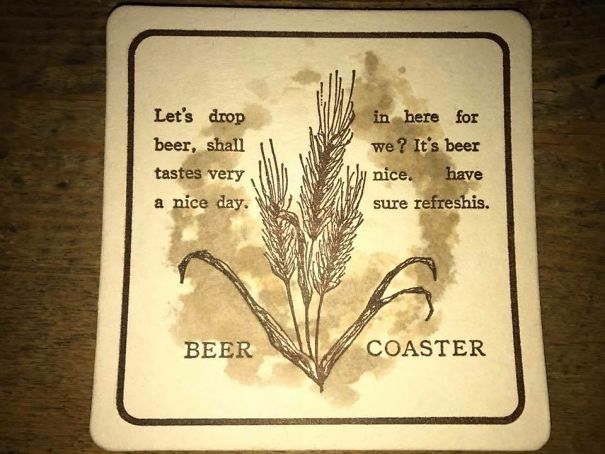
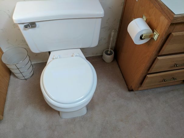
So, It's Fine Then?
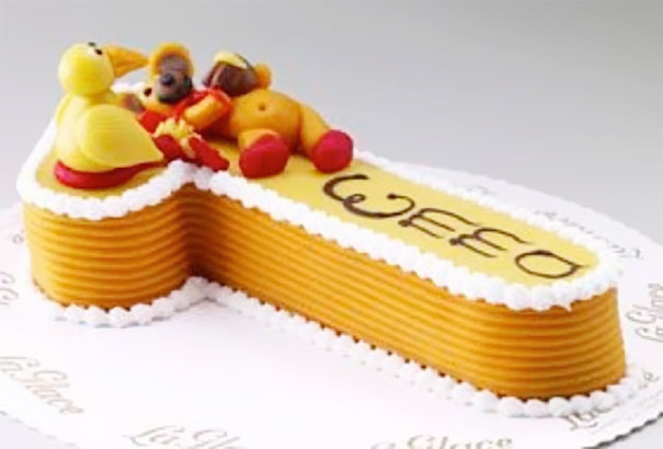
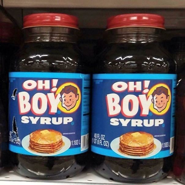
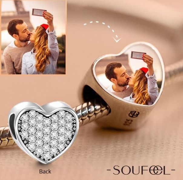
Okay. I Know This Cake Is A Number 1 And It Says “emma," But It Looks Like A Dick With Balls That Says “weed"
The subreddit’s moderators have created a fantastically detailed wiki that explains what does and doesn’t count as a bad design. For instance, amateur artwork or signs don’t belong in the online group because they were made by, well, amateurs. Similarly, broken things also don’t count.
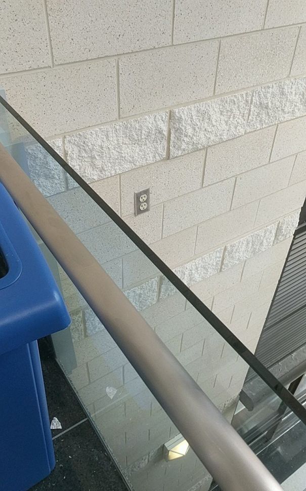
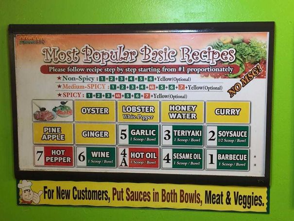
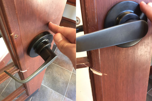
Seems A Bit Counterintuitive
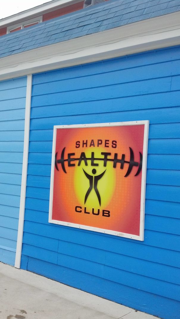
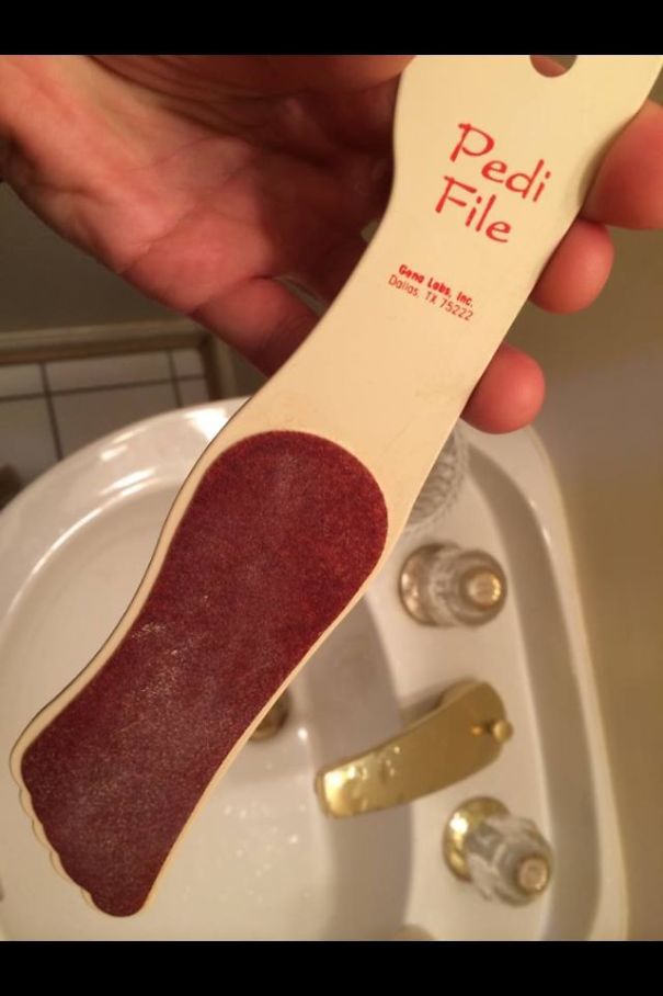
Love Handles
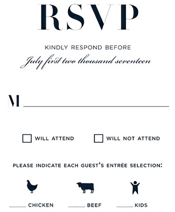
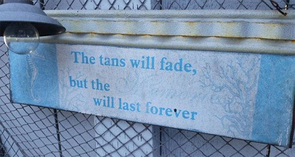
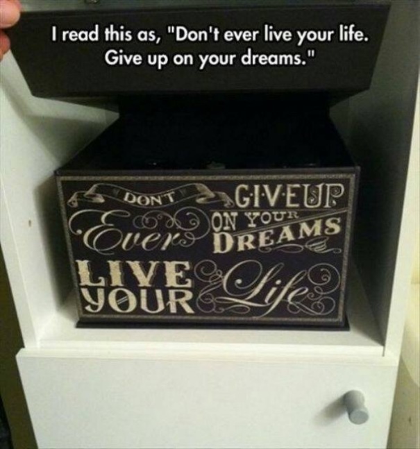
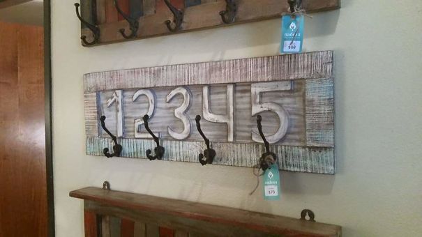
Our Wedding Is Going To Have Three Delicious Meal Choices
And don’t even think of posting the Roman numeral for 4, IIII, as an example of awful design because it’s a fairly common alternative way to write IV. Meanwhile, unintentional errors like manufacturing defects also don’t count as examples of bad design. Neither do novelty items or obvious satire.
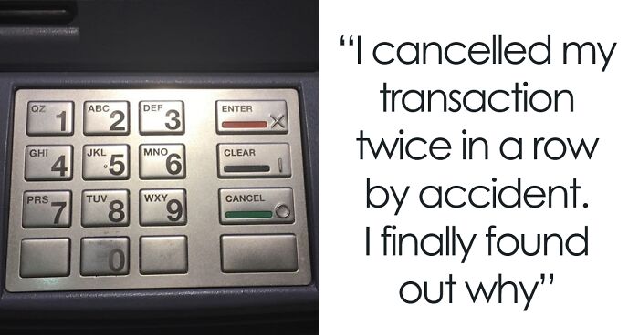
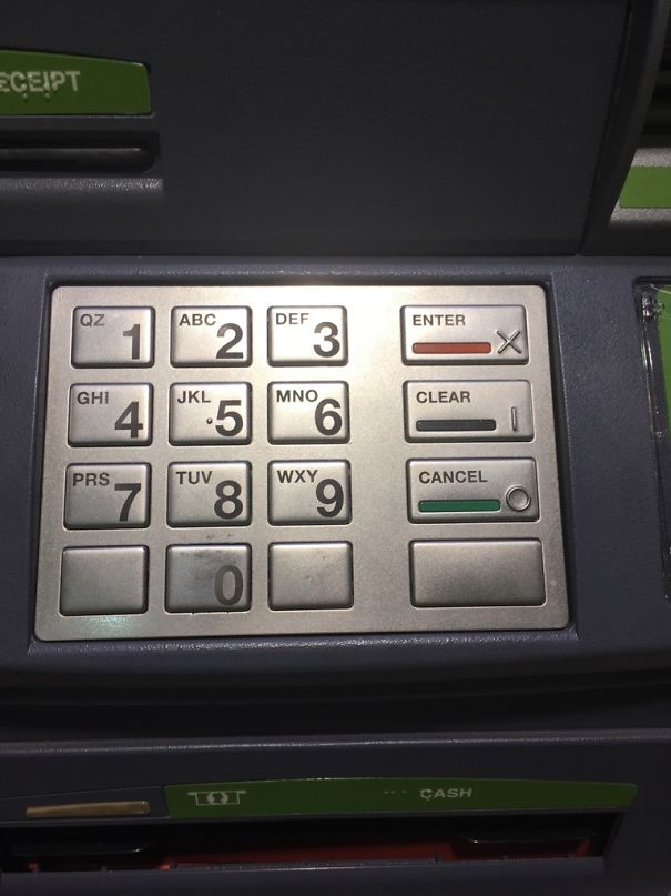
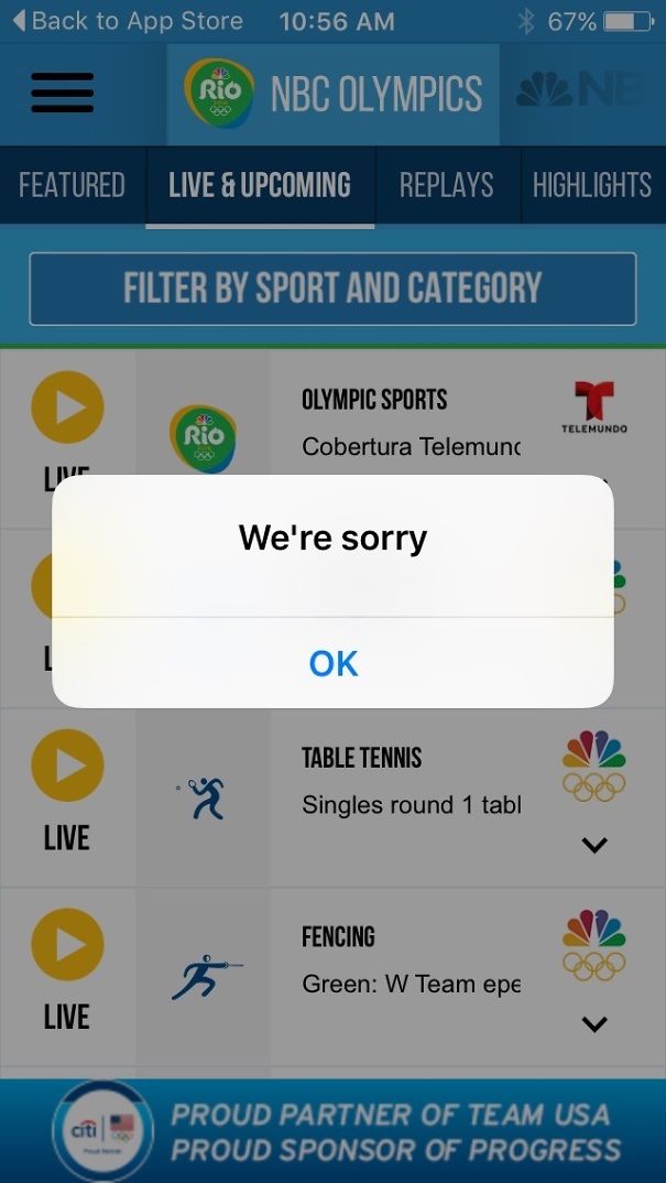
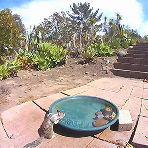
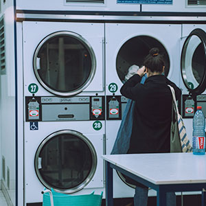
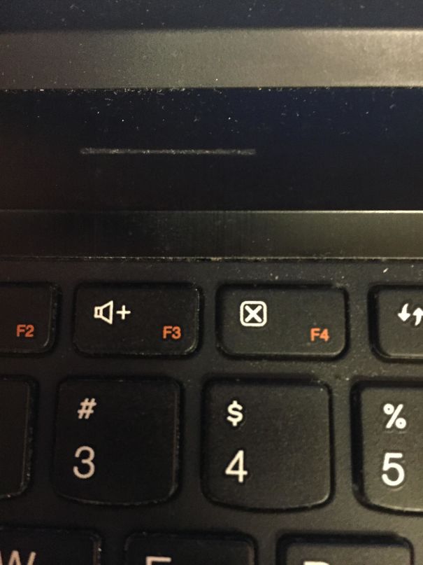
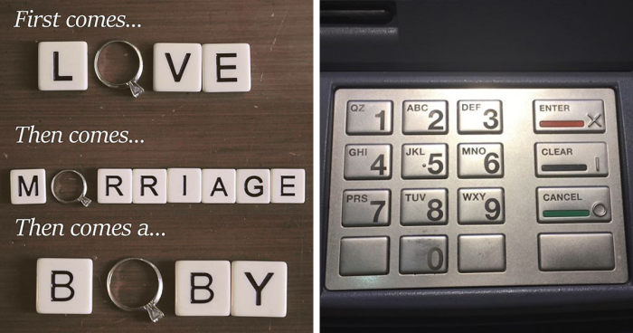
I Cancelled My Transaction Twice In A Row By Accident. I Finally Found Out Why
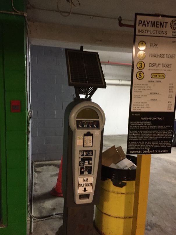
A Solar Powered Parking Meter In An Underground Garage
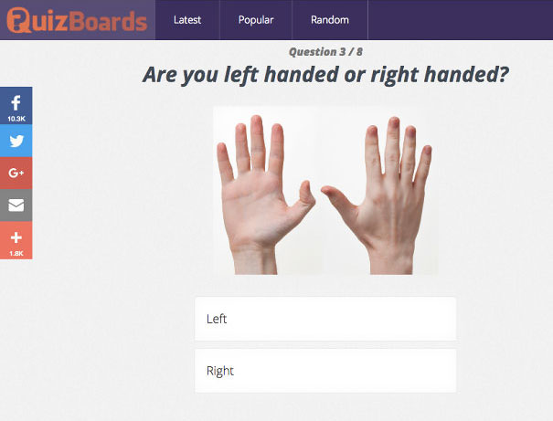
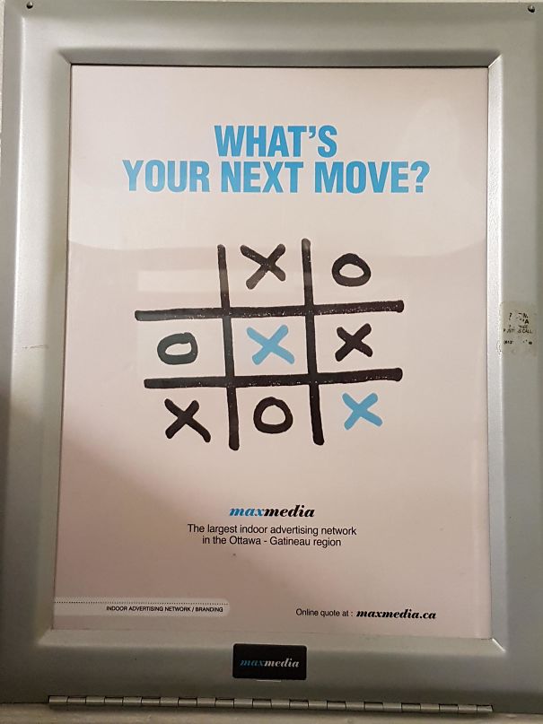
"How Do We Make It Clear That It's A Male Hand Without Seeing The Nails?"
The mod team encourages its members to be original. So you shouldn’t be sharing any pictures that fall into the list of the top 150 most popular reposts. Software designs, hate symbols, and memes also don’t have any place on the sub. Meanwhile, all members ought to be as civil as possible, avoid sharing any personal information, and ensure that they write awesome descriptive titles for their posts.
My Arms Are About 7 Feet Long, So This Wasn't An Issue For Me
No Thank You, I Think I'll Pass
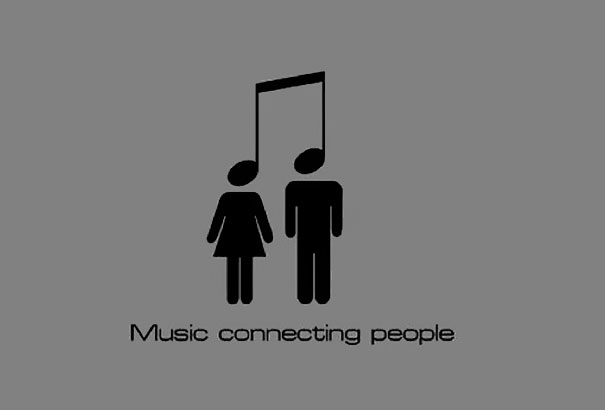
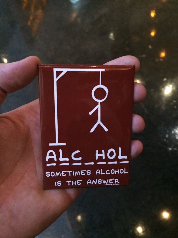
This Music Poster Looks Like A Guy And Girl Being Hanged
A while ago, interior design expert and then-editor at These Three Rooms, Ariane Sherine, had shared her thoughts on taste and aesthetics with Bored Panda.
“When it comes to aesthetics, 'bad design' is a very individual thing that comes down to personal taste,” she said that our personal tastes and (dis)likes affect our judgment of products and interiors.
Thanks For Reminding Me
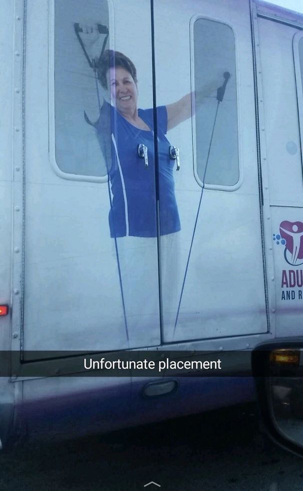
This Bus
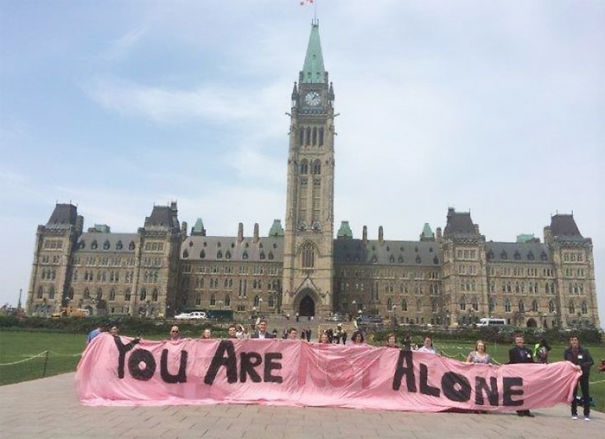
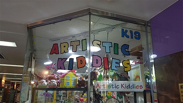
Artistic Kid Dies
“It's perhaps more helpful to talk about 'bad design' as design that doesn't function as it should—for instance, a kitchen that doesn't have what's called 'good flow', where you have to walk impractical distances between complementary appliances and where the dimensions of the 'kitchen work triangle' (the distance between fridge, sink, and hob) aren't practical,” the design expert said.
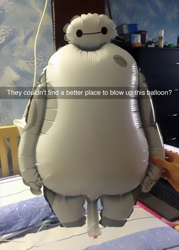
This Unfortunately Designed Kid's Balloon
This Jfk Memorial
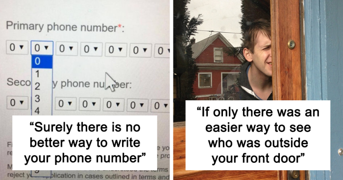
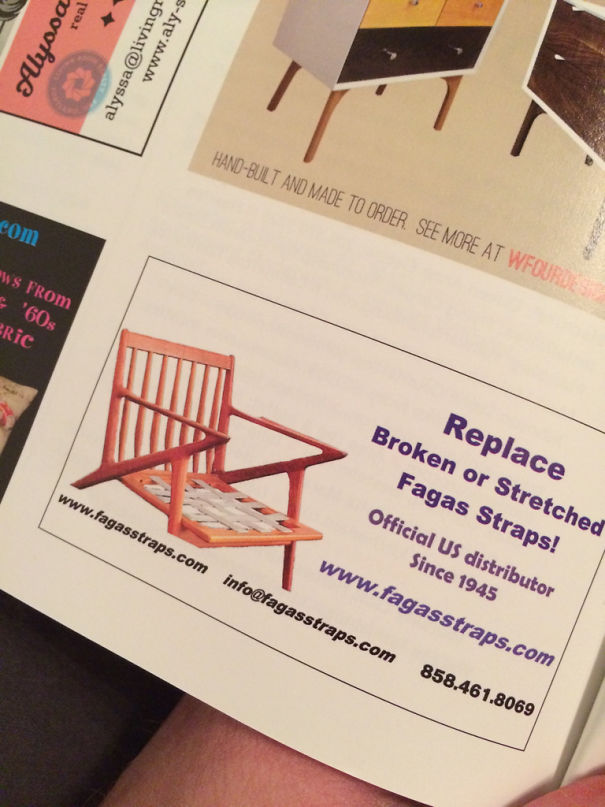
Surely There Is No Better Way To Write Your Phone Number
“A kitchen where there isn't enough storage, where potentially dangerous appliances aren't located safely, and where cornflakes and milk are placed at opposite ends of the room is what I'd call 'bad design,'” she shared that a poorly-crafted space can be a huge headache for someone in their day-to-day lives.
“‘Good design' is where a lot of thought and effort has been put into structuring and renovating a house so it's perfect for the people living in it. It takes account of their aesthetic preferences but also focuses on the concepts I mentioned before, paying close attention to detail,” she told Bored Panda.
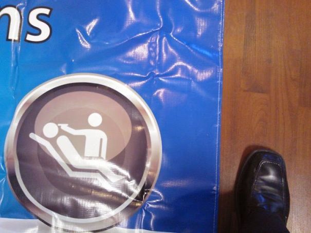
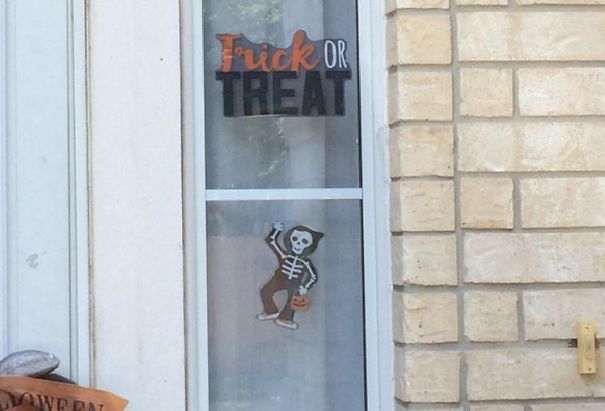
When Your Dental Banner Features An Execution
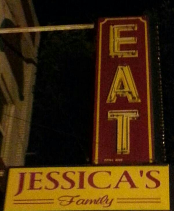
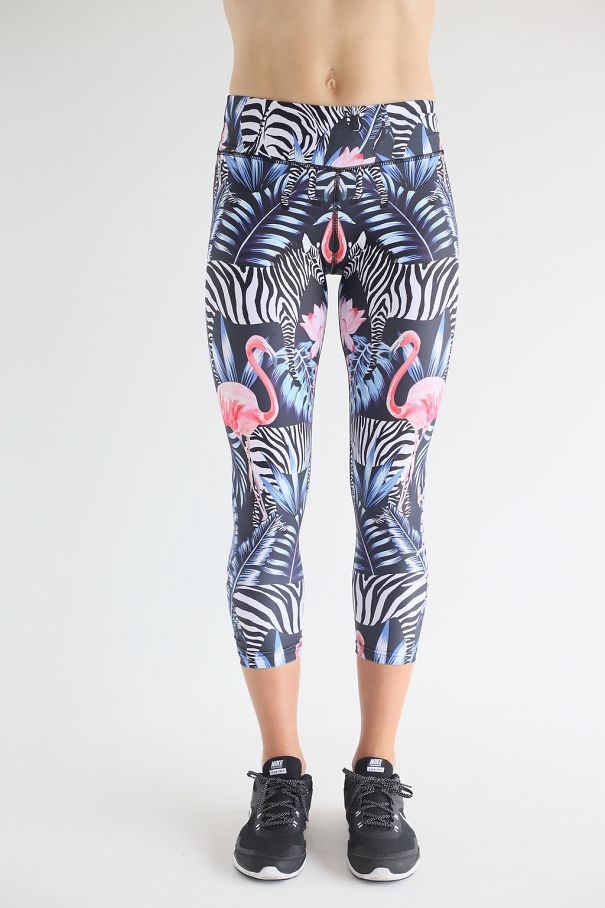
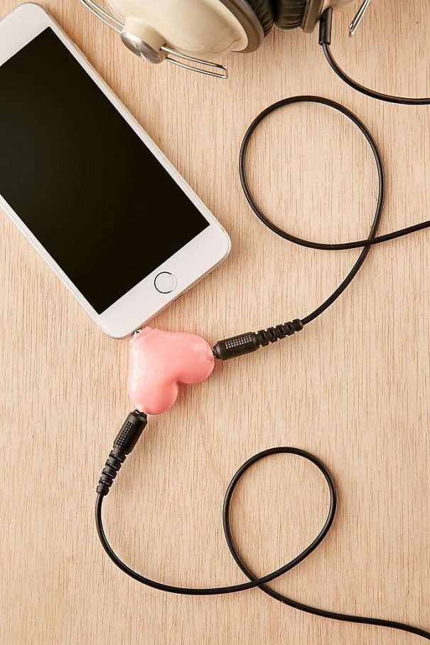
Two Flamingos, One Vagina
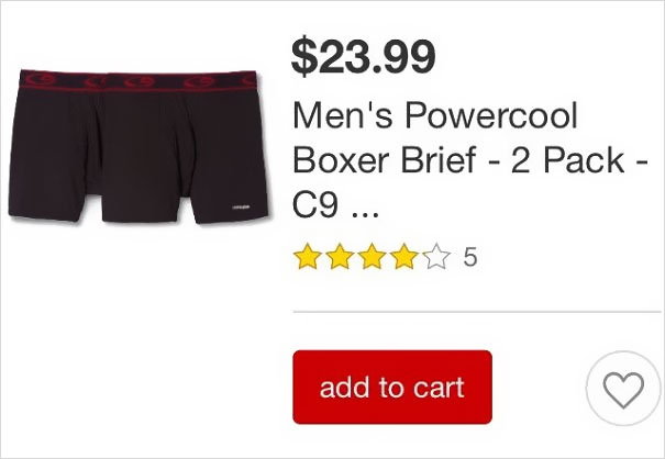
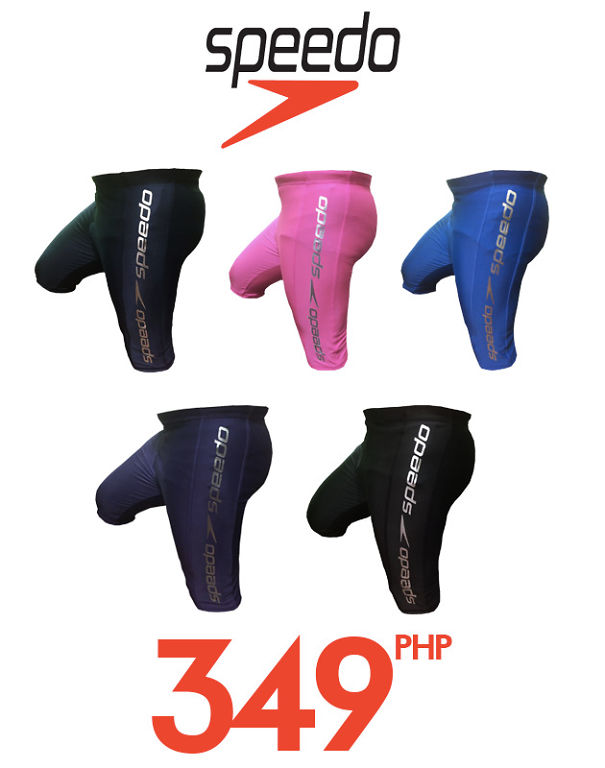
Another Example Of Unrealistic Body Expectations For Men
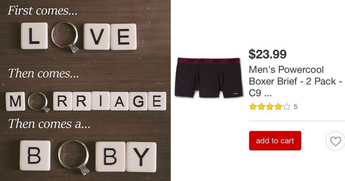
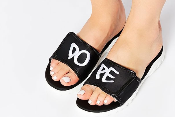
They're actually meant to be worn more than once. You just move over to the next pair on the next day.
if i could fill those, I'd have another career entirely. bum chicka wow wow.
I really should read all comments before i post. You beat me to it.
Load More Replies...I don't know which is funnier the picture or the comments. I am laughing.
put your wallet in there and no pickpockets can get it (would be uncomfortable tho)
It's for your third leg. Very considerate of them to make it a feature.
They are for The Tripods from BBC TV series in the 1980s. (released to DVD in 2009)
"The only true way to ascertain whether a design is going to be a commercial success is to make it available for sale, market it widely, and see how many people buy it. But success is different to taste. Personally, I think taste is all about understatement, minimalism, and neutral decor. But again, that's only my personal opinion!" the design expert told us during another interview, earlier.
“This will differ for each person, but for many people, loud and garish colors used liberally in the home would signify a lack of taste. Then again, I can think of designers who have based their entire career around the use of color and loud prints," she said that there aren’t any hard and fast rules.
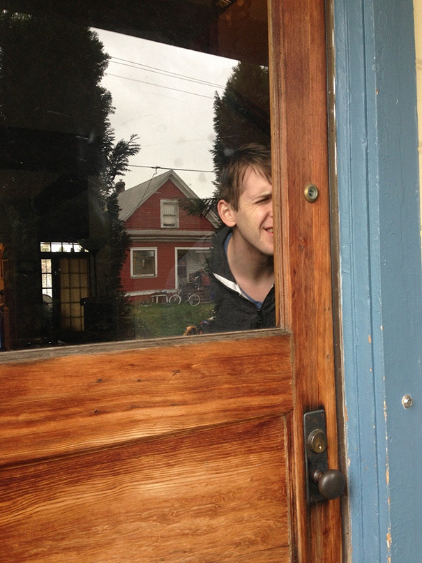
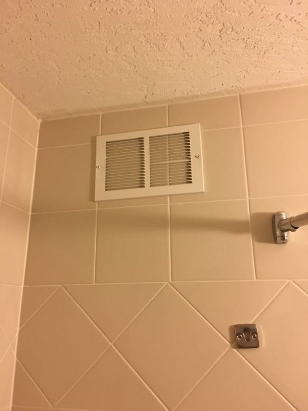
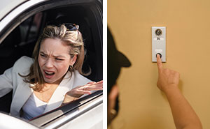
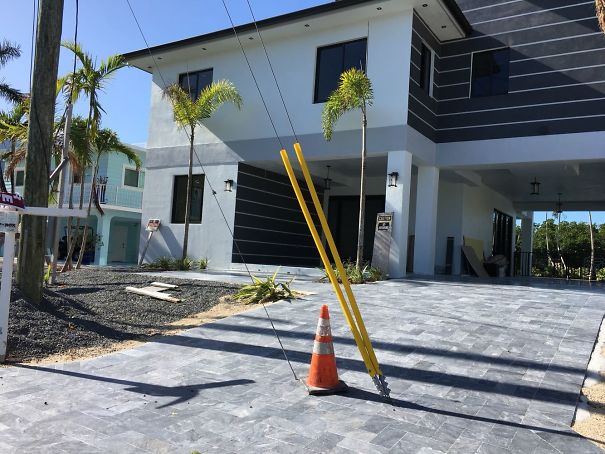
If Only There Was An Easier Way To See Who Was Outside Your Front Door..
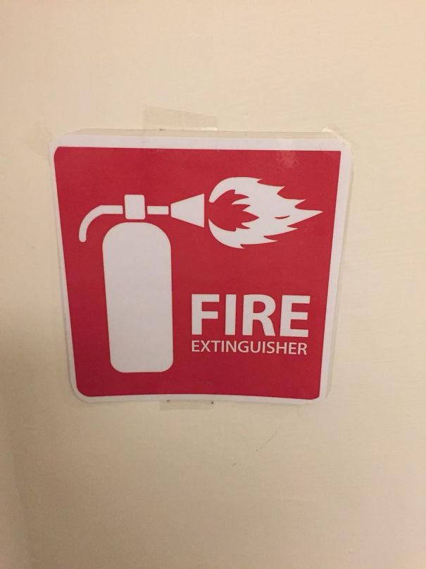
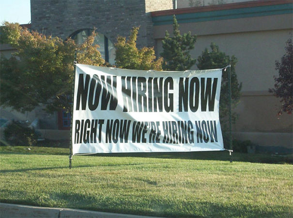
F**king Hurry!!
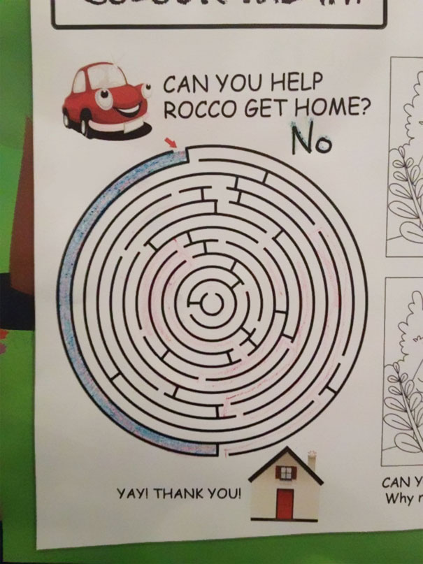
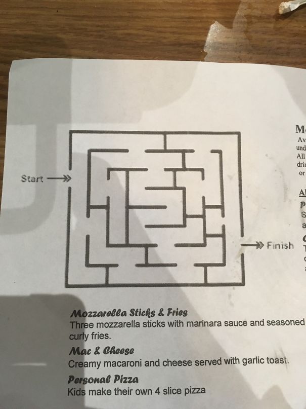
This Maze Game
When it comes to furniture, you have to consider functionality, not just aesthetics. "Does the furniture function as it should? Is it likely to collapse or break easily? If seating, is it comfortable? I mean, my idea of aesthetic hell would be a bright purple inflatable sofa with lime green spots, but your mileage may vary! The question of comfort and function is a less subjective one,” the design expert shared a few of the considerations you should keep in mind when thinking about interiors.
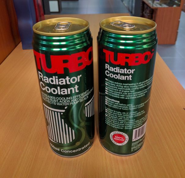
I Needed Red. Guess Which One I Grabbed At First
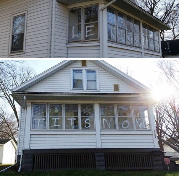
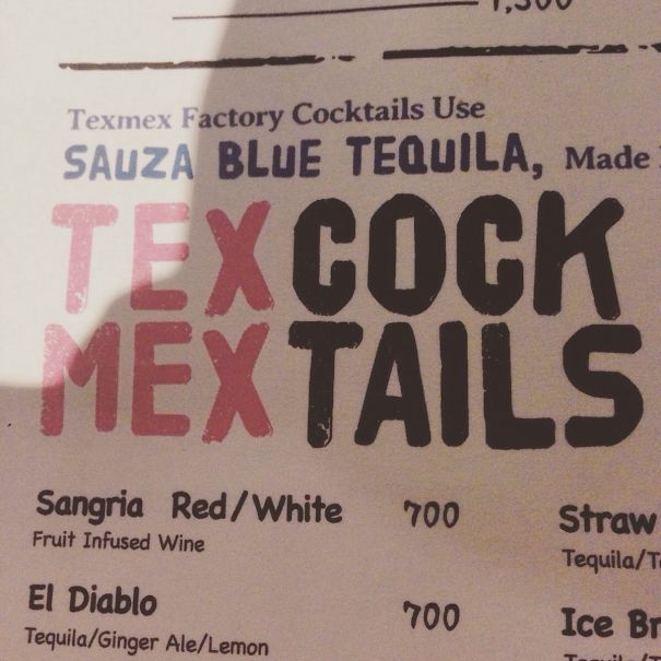
Le Tits Now
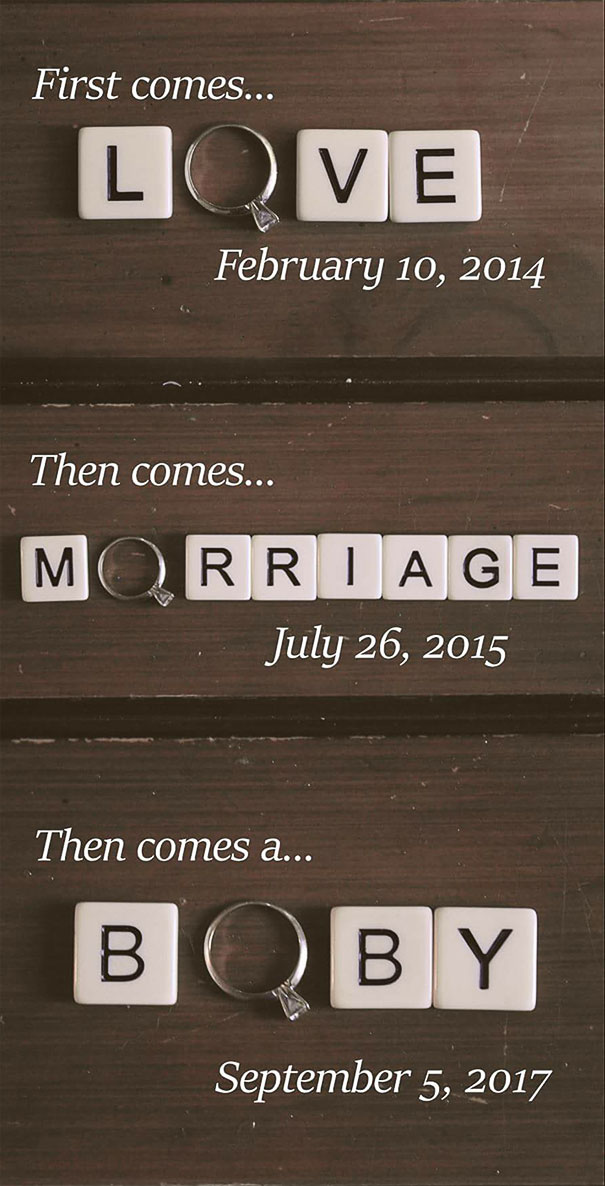
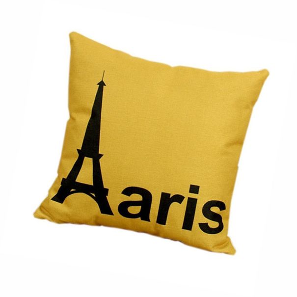
Love, Morriage, Boby?
Tell us all about which of these pics and fails made you cringe the hardest, Pandas. Meanwhile, for some more amazingly awful designs, check out Bored Panda's previous features right here, here, as well as here.
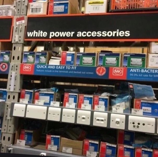
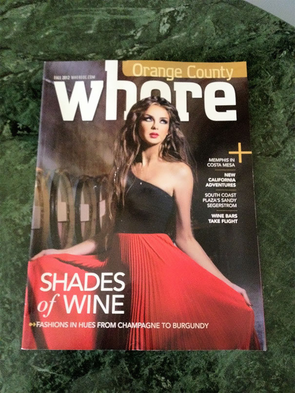
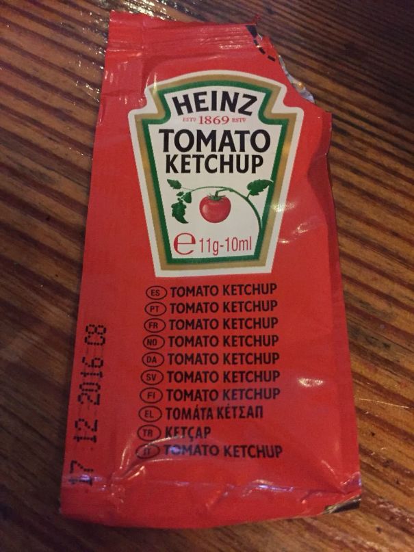
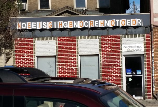
How Much Do You Trust Your "Multilingual" Ad Designer?
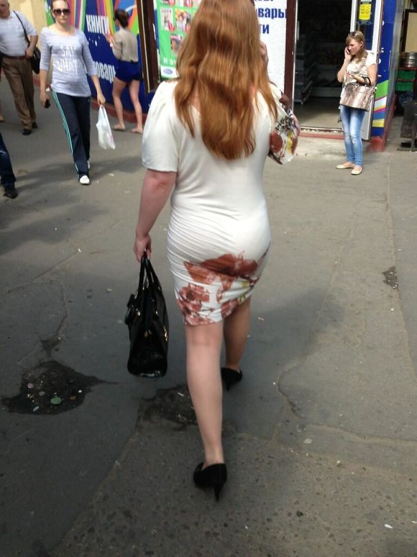
This Flower Print Dress
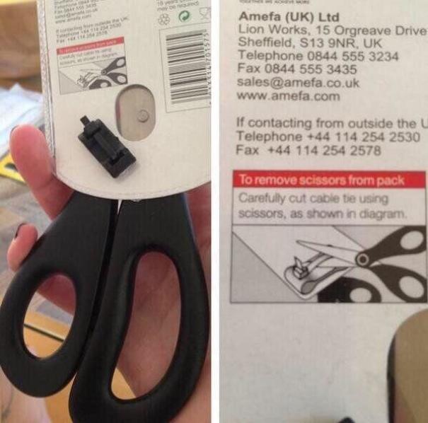
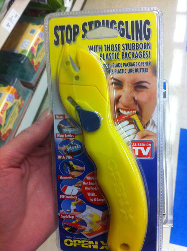
If Only I Had Some Scissors...
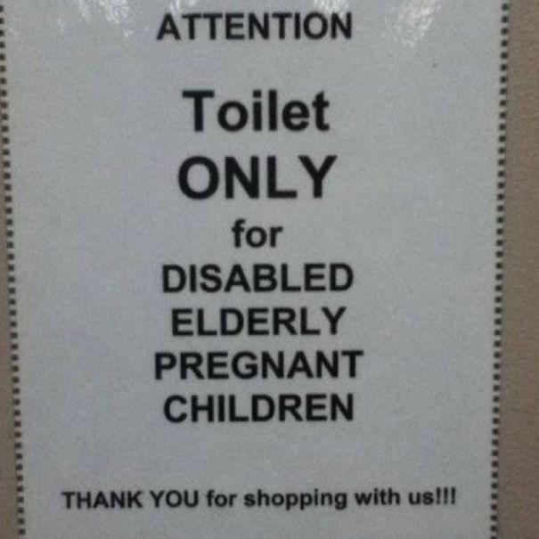
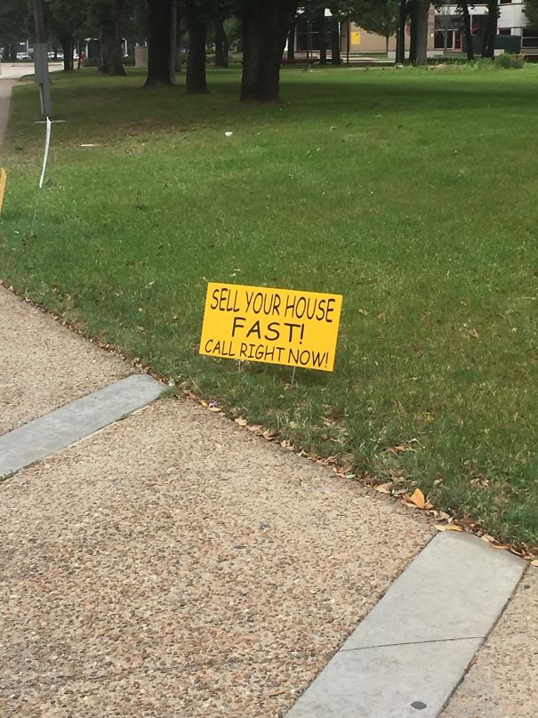
Attention
Meme Says It All...
If You've Got It, Flaunt It
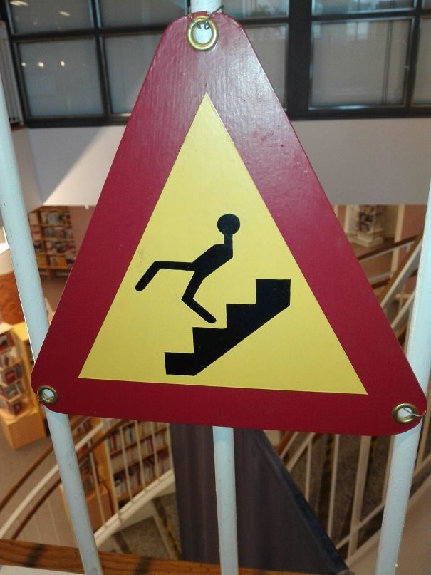
This Warning Sign
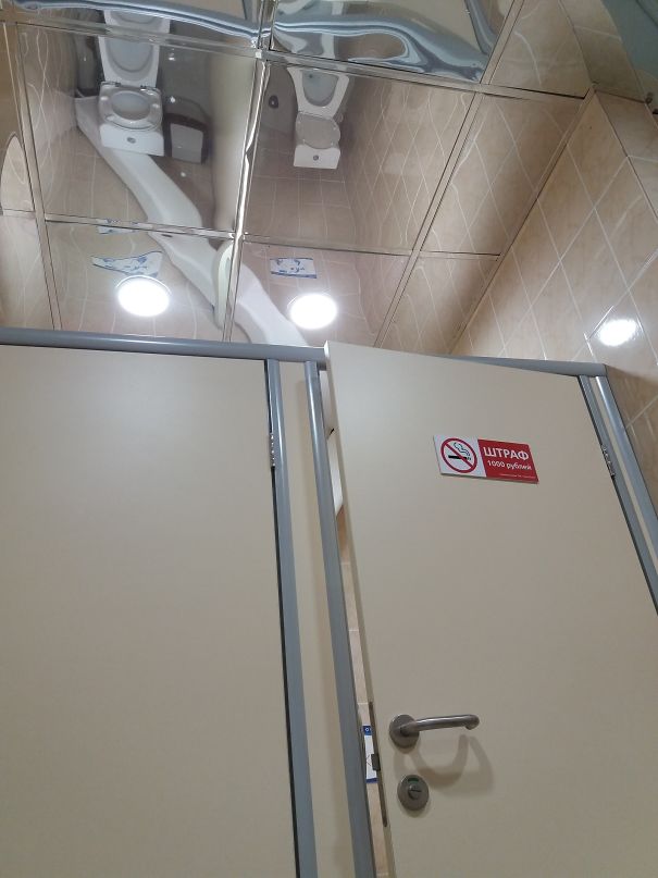
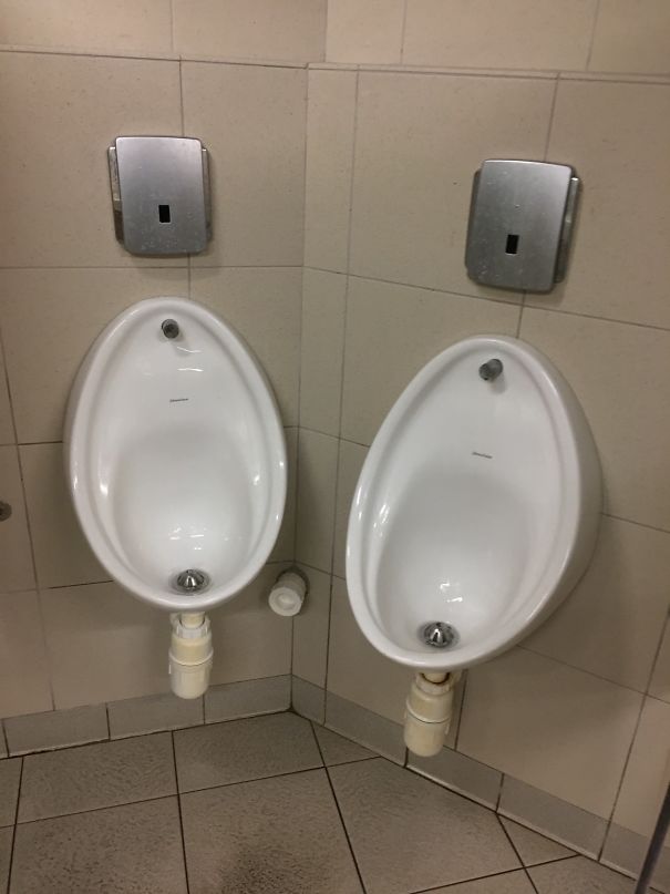
Toilets And Mirror Ceiling
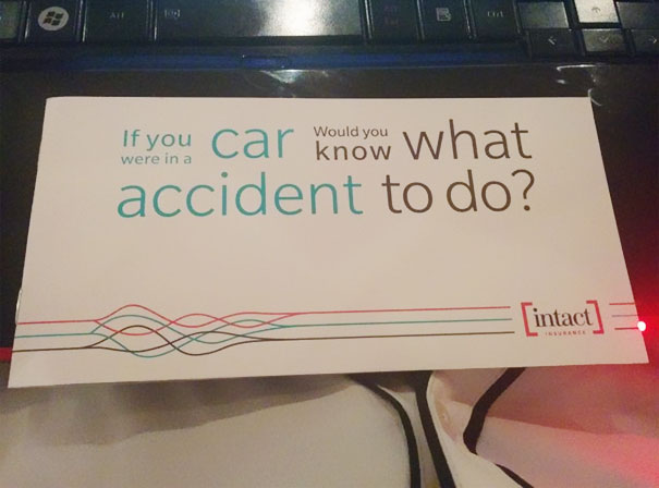
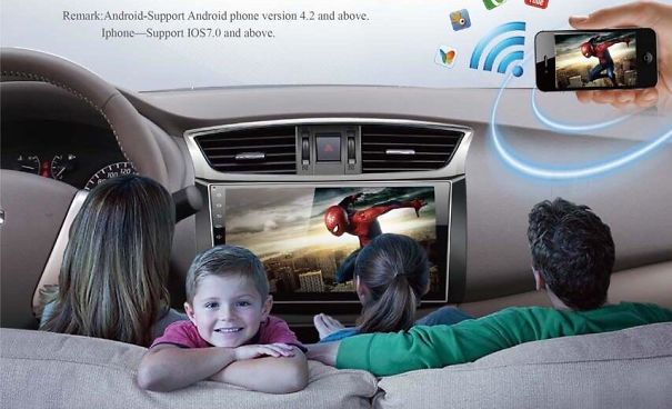
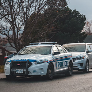
If You Were In A Car, Would You Know What Accident To Do?
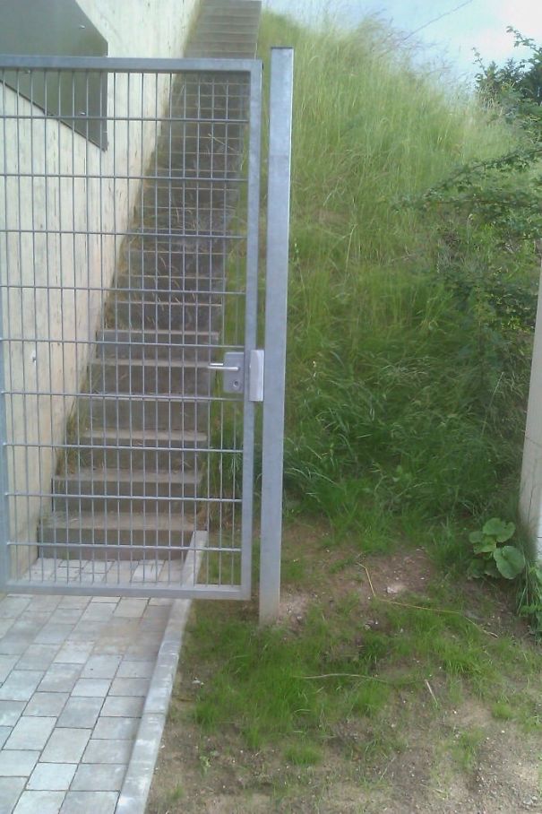
No Way Anyones Getting Past That
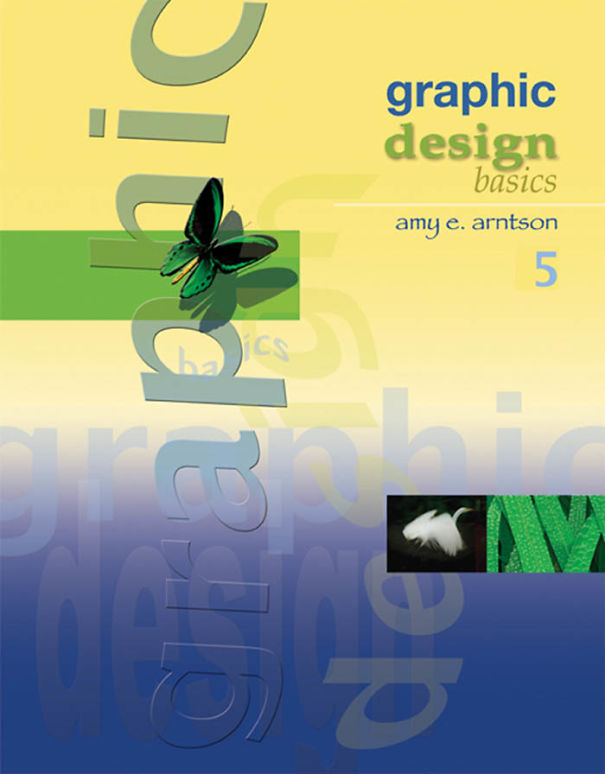
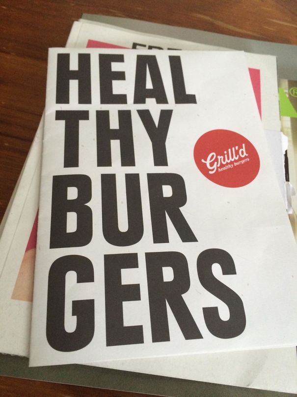
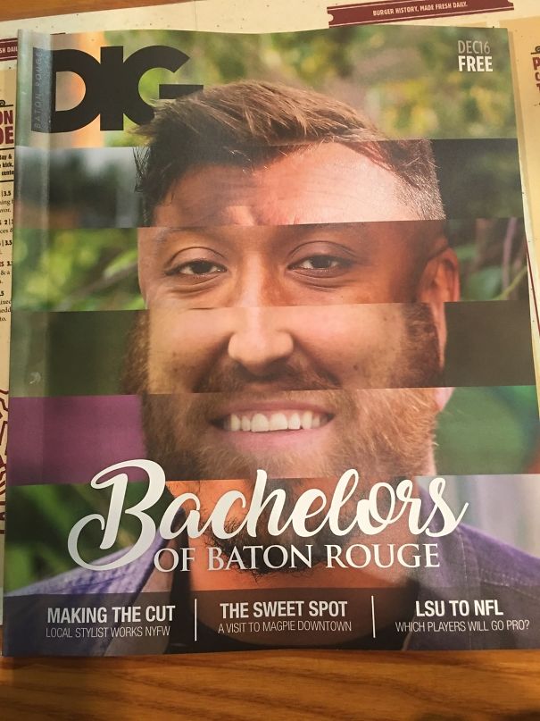
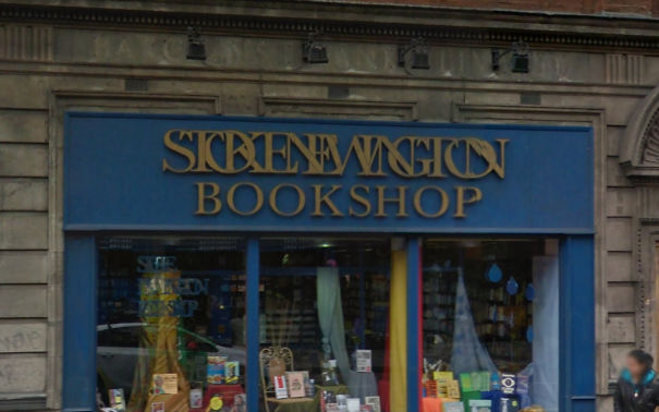
Sometimes It's Okay To Judge A Book By Its Cover
I Was Looking For Those...
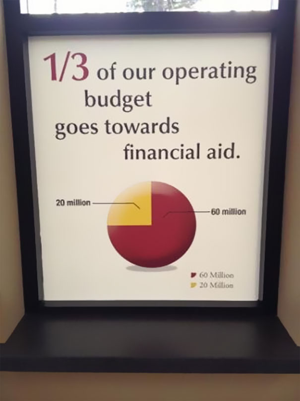
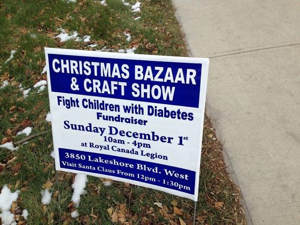
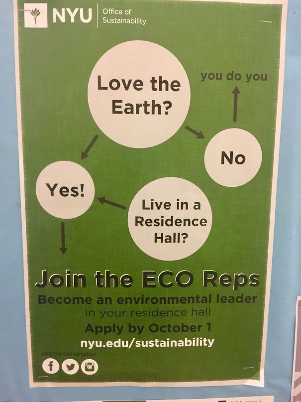
This University Isn't Very Good With Fractions
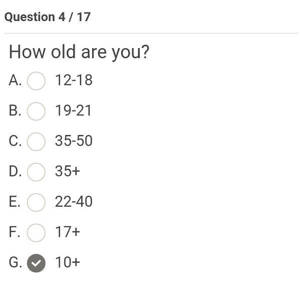
What's My Age Again?
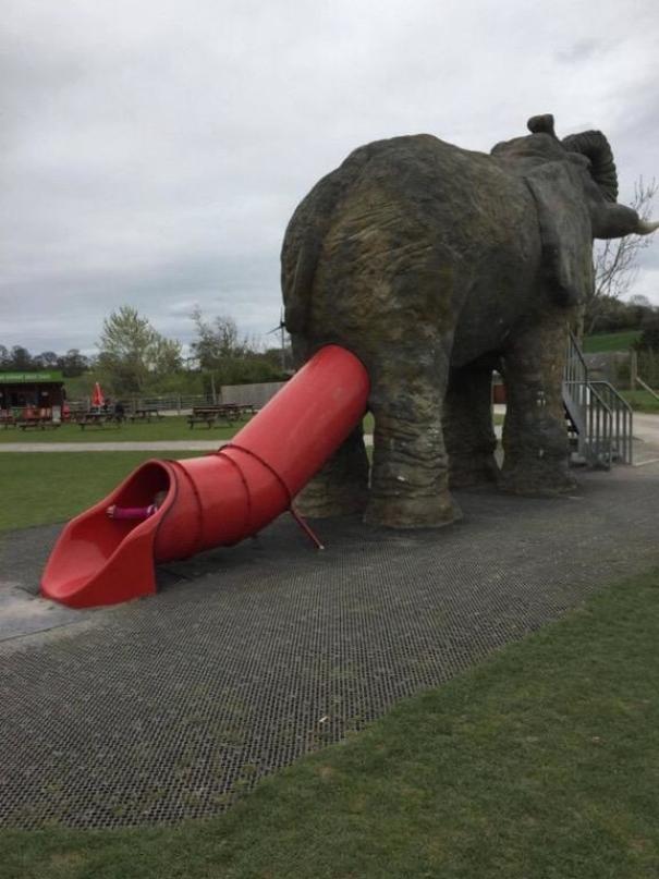
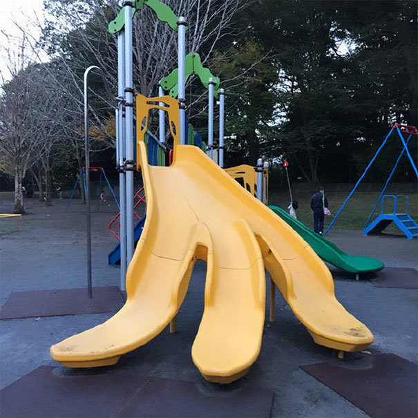
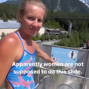
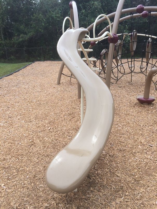
This Awful Slide Placement
What A Great Packaging Choice
Never Split Your Legs When You Slide Down!
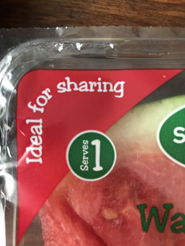
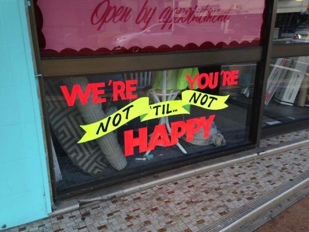
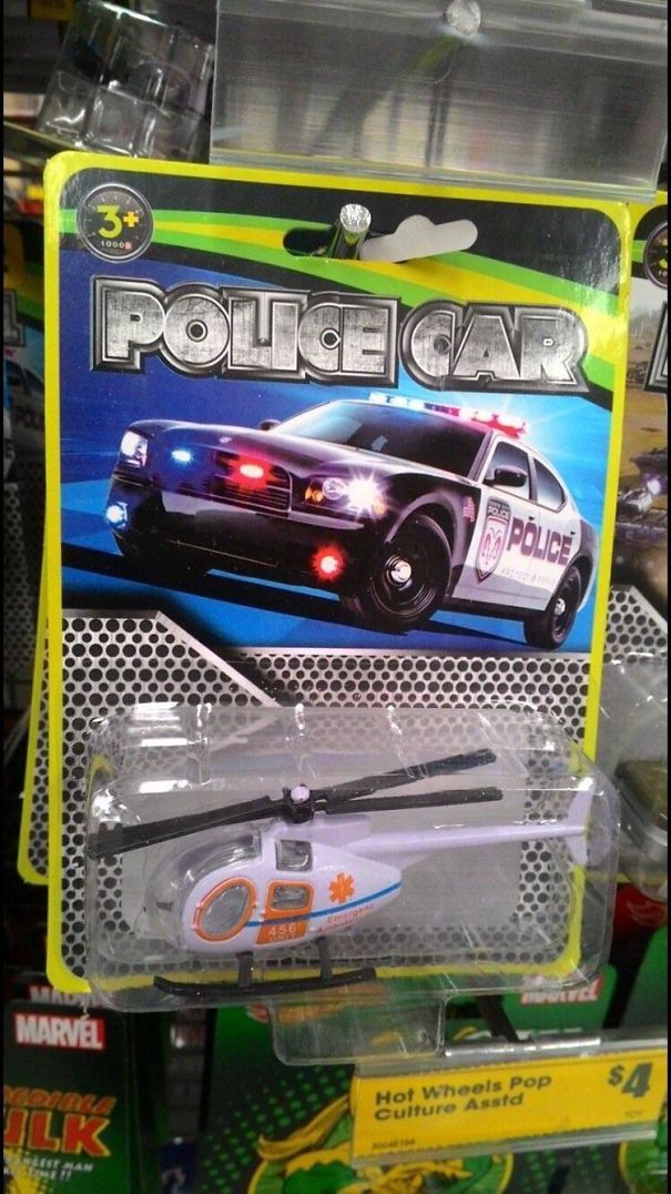
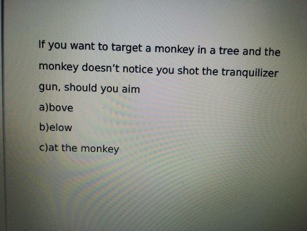
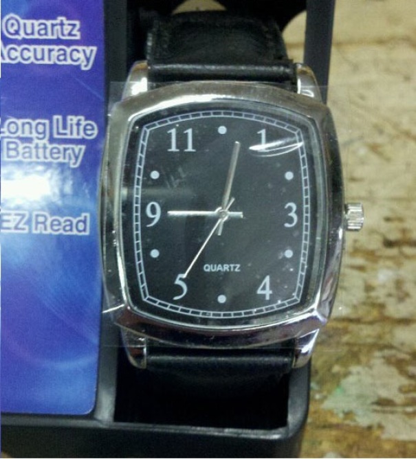
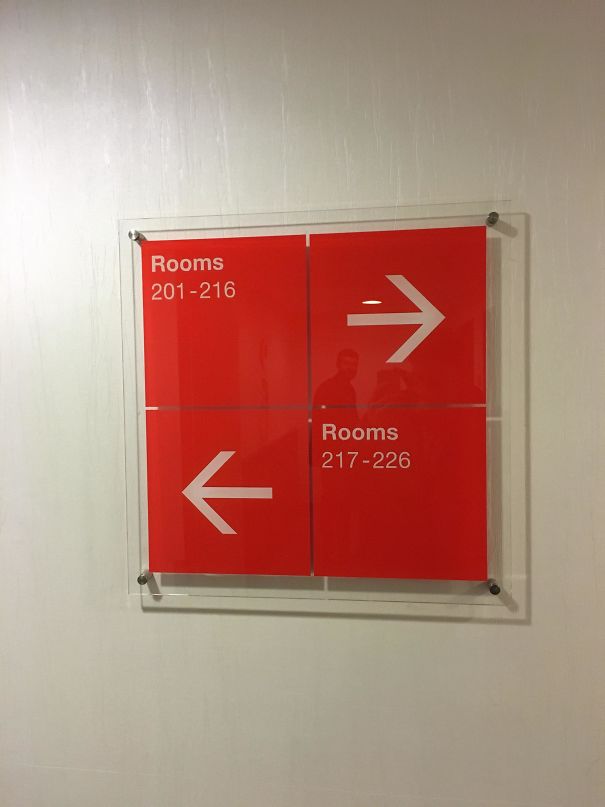
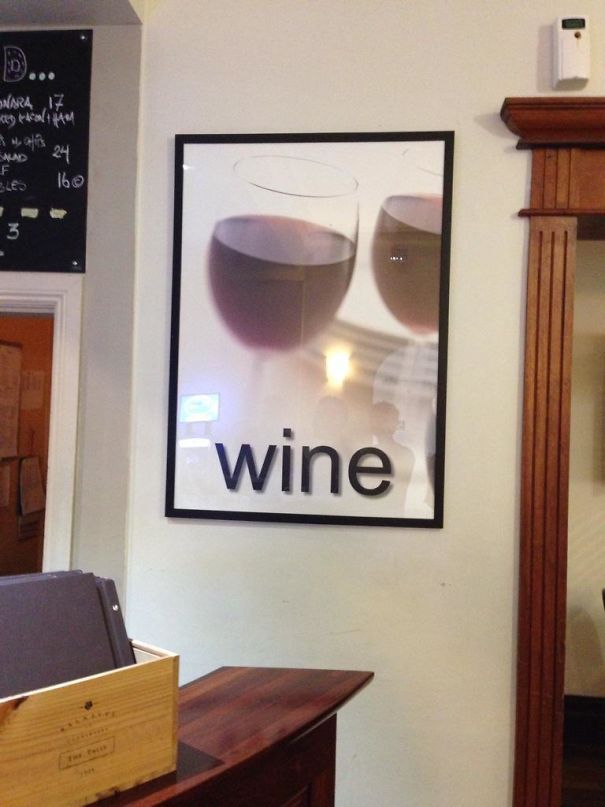
Which Is It?!
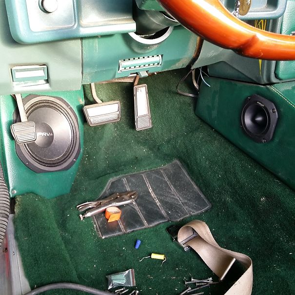
I Have No Idea What I'm Doing
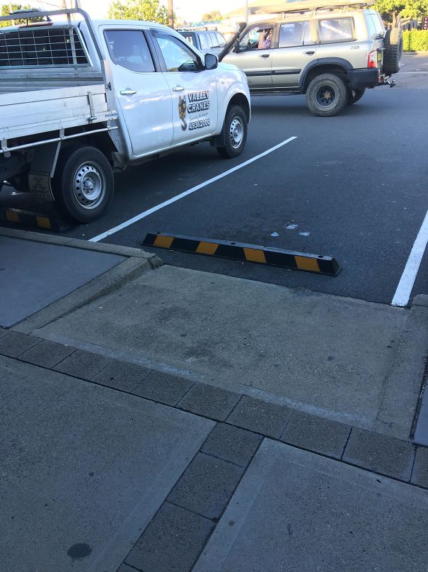
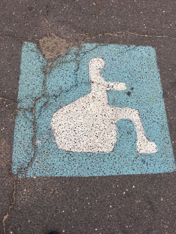
Good Luck Wheelchairees
"New Pics" the title says... lol, some of these are old enough to pre-date the internet.
Me too! Perfect before-bed routine, looking at bored panda posts ^^
Load More Replies..."New Pics" the title says... lol, some of these are old enough to pre-date the internet.
Me too! Perfect before-bed routine, looking at bored panda posts ^^
Load More Replies...
 Dark Mode
  No fees, cancel anytime


