Whoever Designed These 50 Things Deserves Jail Time, But Will Have To Settle Being Shamed In This Group Instead (New Pics)
There are moments in all of our lives when we look around, astonished, wondering where all the quality went and why we’re surrounded by low-effort, unaesthetic garbage. American science fiction author and critic Theodore Sturgeon is credited for coming up with the idea that “ninety percent of everything” is going to be rubbish. It’s known as Sturgeon’s Law, and its effects can be seen in all areas of life, including design.
That’s where this massively popular subreddit comes in. It’s an online group that is dedicated to sharing the most epic and legendary design fails that range from cringe-worthy to beyond ridiculous. We’ve compiled a list of the latest worst offenders for you to enjoy, Pandas.
Bored Panda reached out to Matt Johnson, PhD, to hear his thoughts on Sturgeon's Law and how it applies in modern times, as well as how bad products can affect the reputation of an entire brand. He was kind enough to shed some light on the topic and revealed how the emotionality of a consumer can actually trump the functionality of the product. Johnson, PhD, is a neuroscientist, founder of the Human Nature Blog, and author of Branding That Means Business. You'll find our full interview with him below.
This post may include affiliate links.
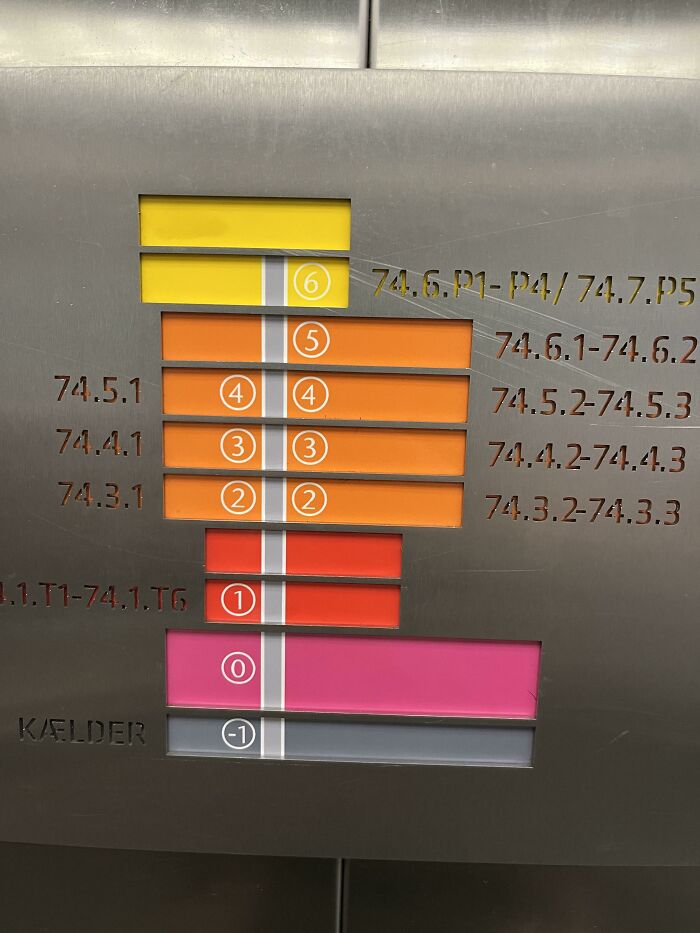
Fly To Europe And Have A Stroke
"Although Sturgeon’s Law is not based on any empirical evidence, it does contain a kernel of truth. And while the 90% threshold is up for considerable debate, this loose figure seems to capture the general consumer sentiment towards content and products," Johnson explained to Bored Panda.
"It also speaks to the general threshold for subjective appreciation of art, products, and creative output: since there is so much out there, the consumer must triage. You can’t think everything is amazing, or 'amazing' becomes meaningless. In this way, regardless of the intrinsic quality of the goods, they’ll appreciate and enjoy the top ~10%."
A Life-Changing Experience
This Map At A Coffee Shop
According to the neuroscientist, the law has become even more true now, in 2023. In his opinion, the threshold for how much rubbish is created now is "likely raised to 95% or higher," as more and more people have the tools to put their work and products on the market. "This comes down to the rise of digital media, generative AI, and the incredible ease of self-producing. As the skill and capital requirements to create new products have become less and less, the sheer volume of creative works has exploded," Johnson said.
"And while this has increased the number of exceptional works, it has also made it harder for people to separate the good from the bad, making their thresholds even higher."
Bored Panda was very interested to learn about the emotional aspect of consumers evaluating the quality of products. We were also curious whether a single bad product could have a large impact on the reputation of an entire brand. "The emotional component is huge," Johnson told us.
The Land Is Blue And The Water Is White. I Am Not Proud To Say That I Spent Multiple Minutes Trying To Figure Out Why All The Cities Were Underwater
For Reasons Unknown, South America Has Completely Been Replaced By Africa
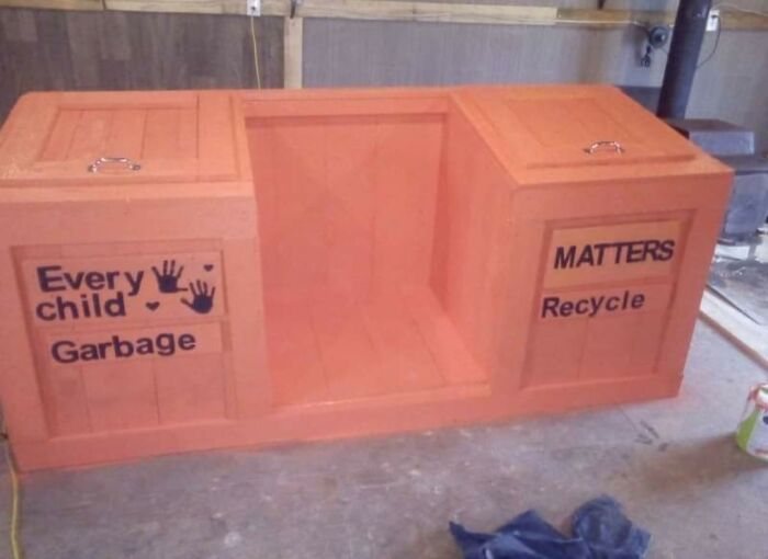
Just Feel Bad About This One, Good Intentions Gone Wrong
"If the consumer feels positively towards a product, 90% of the battle is won. In fact, emotionality can easily trump the functionality of the product; if a consumer feels good about it, they’re much more forgiving about how it works. For example, many argue that from a purely functional standpoint, the iPhone is inferior to the Google Pixel. But of course, the emotional feelings towards the iPhone (largely stemming from the Apple brand), easily overcome this and then some," the neuroscientist gave us an example of how this works.
Meanwhile, the reputation of any brand is closely tied to the reputation of the products it produces. "If the product dips below expectations, the reputation of the entire brand suffers." To reduce risk, brand managers spend a lot of time on brand architecture: creating distinct brands within a company's portfolio.
"For example, Volkswagen AG (the company) owns the Volkswagen brand, and also Porsche, Bentley, Ducati, etc. This de-risks the spillover effect across these brand assets. In this way, if something goes wrong with, for example, the Volkswagen Taureg, it won’t impact their perception of Porsche, etc."
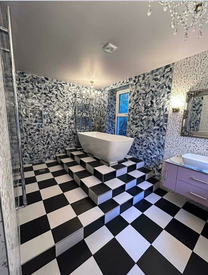
Slippery When Wet, I Fell Down Just Looking At The Picture
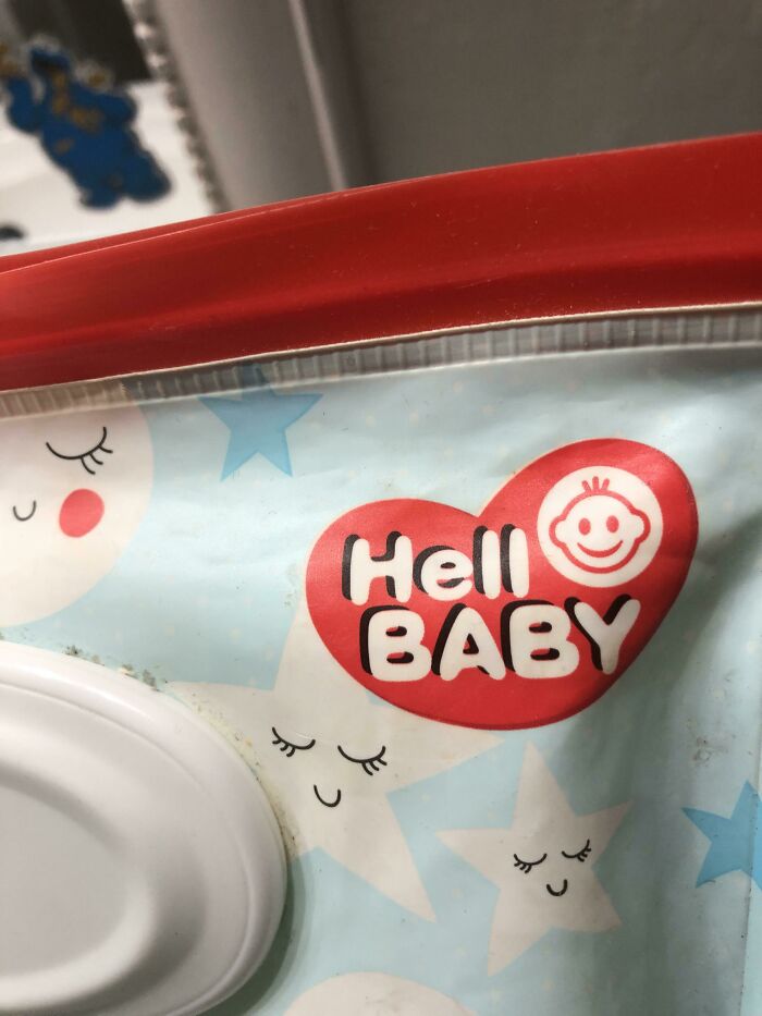
My Son Who Just Started To Read, “Hell Baby. Hell Baby. Hell Baby!!!”
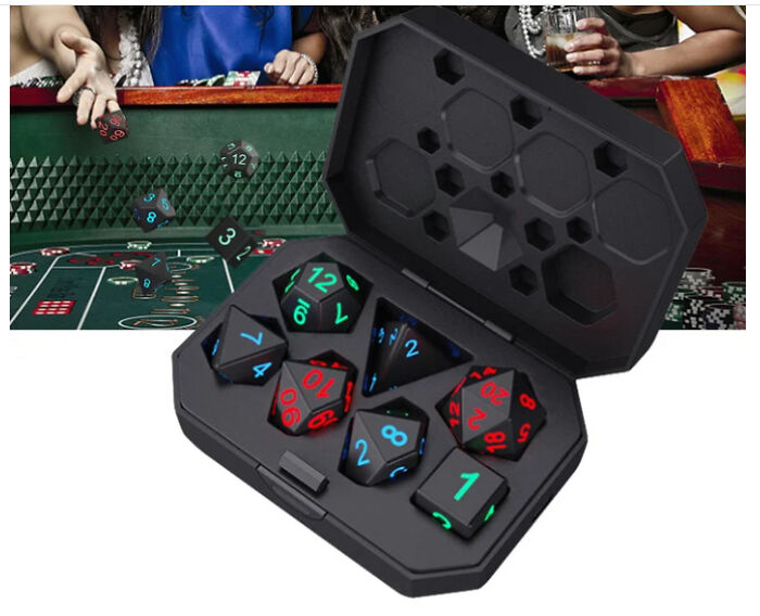
Whoever Edited This Photo To Sell D&d Dice On Facebook Doesn't Know What They're Actually Used For
The bad design-focused subreddit has amassed a whopping 3.4 million members since it was established in 2011. And there’s a lot to love about the online group.
The community has a ridiculously good sense of humor, so you’re bound to see a lot of examples of low-quality designs that are going to get you to chuckle. What’s more, the entire sub is a crash course in taste. Or, well, rather the lack of it. If you work in any creative or design-related field, it’s a place that teaches you what mistakes to avoid.
Unsurprisingly, members of the subreddit are encouraged to stay on-message and only post examples of rubbish design. What this means, in practice, is that there has to be an obvious lack of taste or functionality seen in professional products. The key word here is ‘professional.’ So broken items, manufacturing defects, or clearly amateur designs don’t fit the bill here.
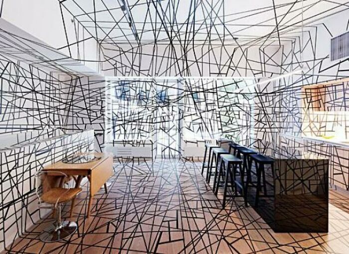
I'll Take Your Sofa Kitchen And Raise You This Tangled Line Kitchen (With Line Covered Appliances Hidden Against The Wall)
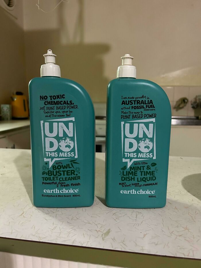
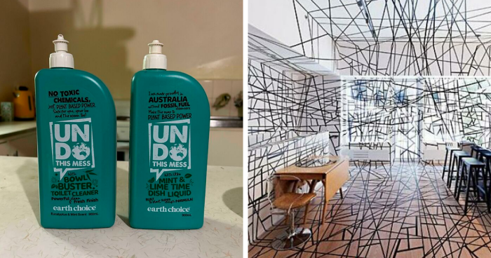
One Is A Toilet Cleaner, The Other Is For Washing Dishes. Choose Wisely
The Words They Chose To Have Standout Color
Similarly, the multi-million-member community is told to be as original as possible. So if you’re a fresh-faced Reddit recruit, check out the sub’s top 150 posts so you know what not to share with the community. Everyone enjoys new content instead of the same old carousel of pics, so don’t be shy and do a bit of research.
Meanwhile, the team running the group points out that some designs aren’t bad, even if they might look like that on the surface. For instance, clocks with the Roman numeral 4 written as IIII instead of IV do not count. That’s because IIII is a common alternative way of writing IV. Again—research!
Probably Wouldn't Be Such A Bad Idea If Every Angle Wasn't Slightly Off
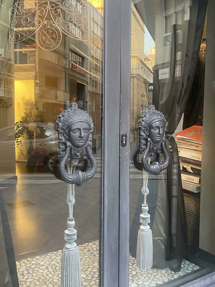
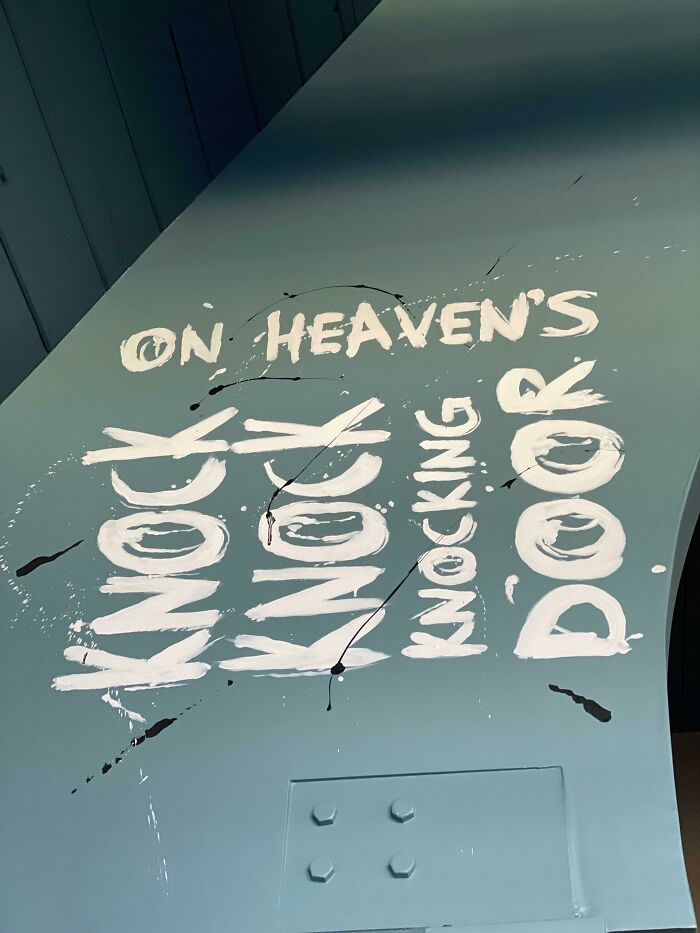
Door Knockers On Glass 👌🏻
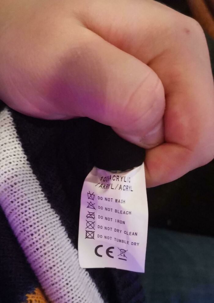
The Sweater I Bought Cannot Be Maintained
Come on. Just magically suck out the dirt with your magic wand. It’s not that complicated.
As elsewhere on the web, be as courteous to all the other internet users as you can. Legitimate discussions about design, aesthetics, and consumer culture are perfectly fine. So long as they don’t devolve into name-calling, spiteful comments, or sharing someone else’s personal info online. If you need any additional info about, well, anything, the sub has a detailed Wiki. Meanwhile, if you have any questions, feel free to get in touch with the moderators.
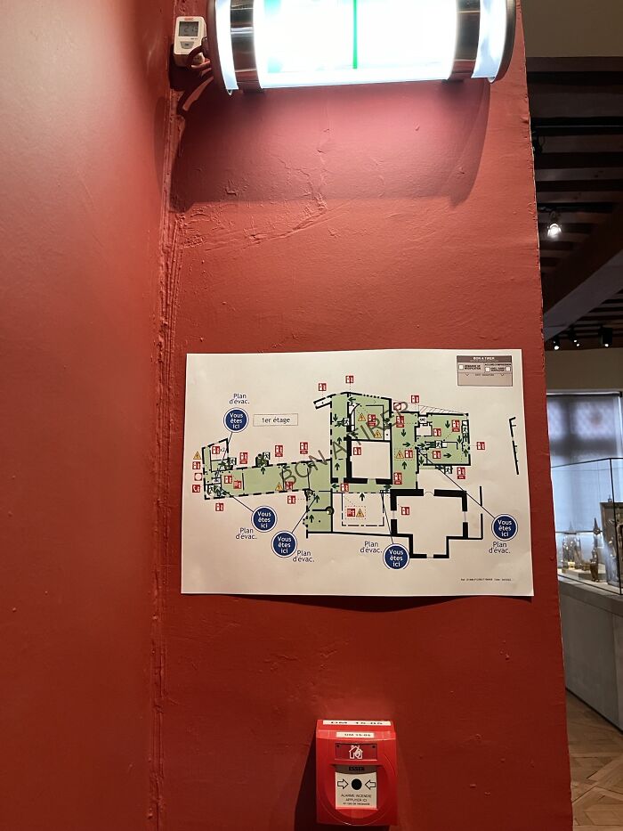
Each Of The Blue Dots On This Fire Escape Map Says “You Are Here”
Every One Of Them Is Playing On The Wrong Side Of The Capo
The shadow of the bow on the violin looks like a cliche Italian guy’s mustache
Probably The Worst Logo I've Ever Seen. It's For A Plastic Surgeon
Being a good designer means being great at communication and having unparalleled knowledge about your field. Tim Antoniuk, a design expert from the University of Alberta, previously told Bored Pada during an interview that a lot of responsibility rests solely on designers’ shoulders when it comes to the quality of a building project.
"It's hard, but that's why the best designers get paid so well for their outstanding work. They do great design/aesthetic work, but they also create efficiencies and they foresee and spot (some) problems from happening,” Antoniuk explained to us before.
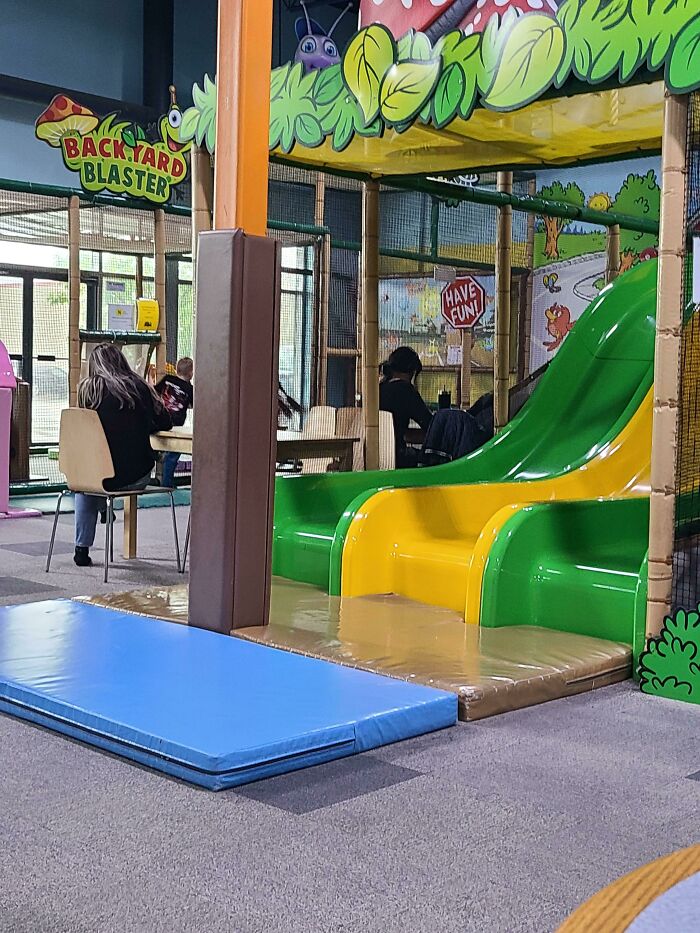
At Least It's Padded?
Pikachu What Have They Done To You!?
And yet still slightly less creepy than the pikachu vagina bouncy house. EDIT: To clarify, it is a large inflatable pikachu for kids to play in that has an unfortunate entrance point. Photos have been around for a long time but I guess a number of folks never saw it. Firestorm nicely provided a link. --- https://www.kotaku.com.au/wp-content/uploads/sites/3/2017/08/21/qvhga8kihion1q2q7wtg.jpg?q=65&w=1280 ---
This Poor Design On A Real Estate Agent's Building
"Many jobs can not just stop because a designer is not onsite or is not able to be reached. That said, builders need to honor the designer's vision, but again, if there is 'fuzziness' in the drawings or plans, decisions will be made by people that we may not want to make them,” the design expert said.
"We exist in a field that is ever-changing with the introduction of new materials, new construction requirements, and restrictions," Antoniuk told Bored Panda that a builder has to be able to communicate their vision to the contractors and stay on top of changes and novelties in their field of work.
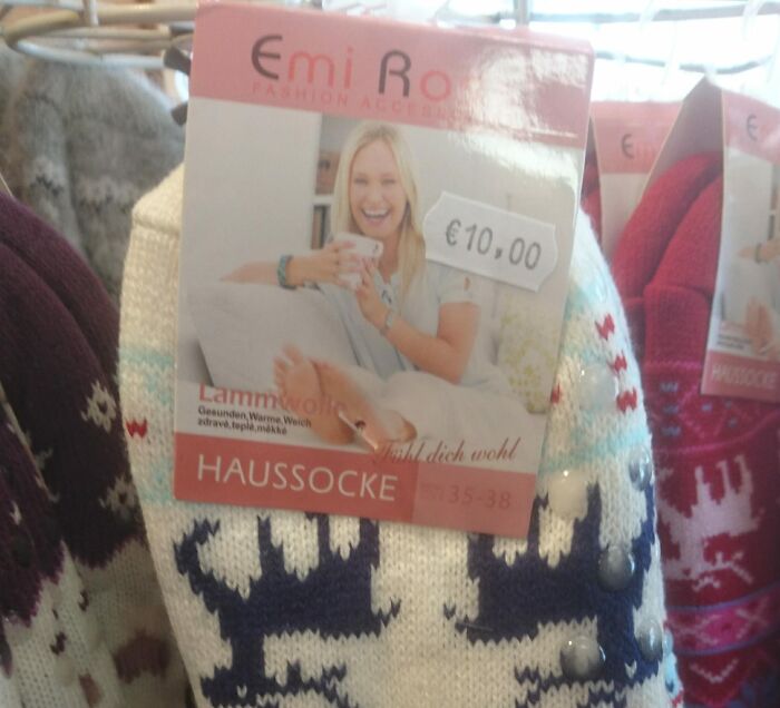
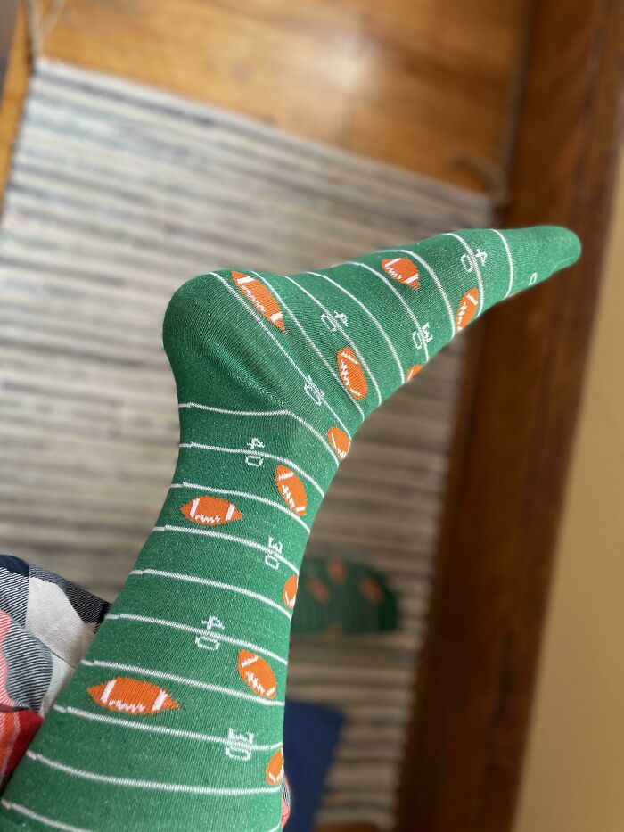
Sock Model Not Wearing Socks
Restaurant Bathroom Sink, Made From... Wood
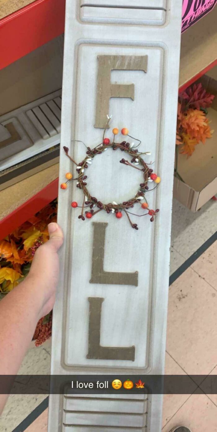
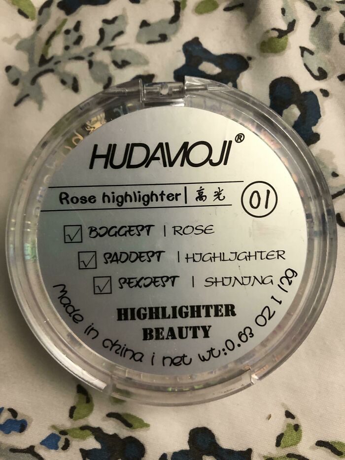
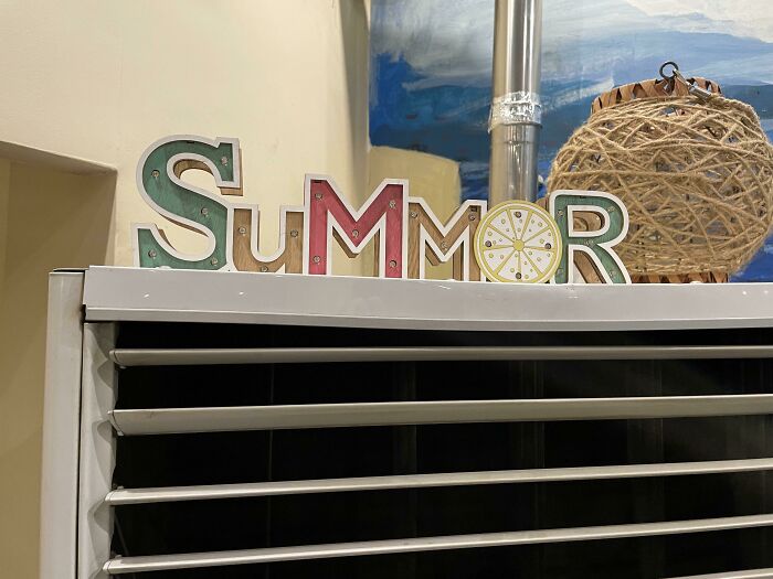
Foll Is My Favorite Season
During another interview with us, Antoniuk explained to Bored Panda that good design often relates to ergonomics and “the usability and functionality of the products and services and systems.” Good design is intuitive, deeply sympathetic, empathetic to the user, and emotional. “It is a catalyst for giving us feelings,” the design expert said.
However, he noted that, in his opinion, “far too many people expect poor design that doesn’t really work well.”
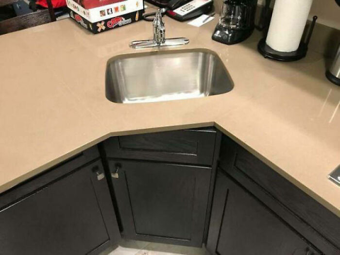
Quite The Opposite Of An Open Concept Kitchen
Ad On The Road That Imitates Real Street Signs
Business Center Logo Looks Like A Guy Taking A Dump
For some more awful and hilarious design decisions, take a peek at Bored Panda’s earlier features here, here, and here.
Meanwhile, feel free to drop by the comments and tell us all about the designs in this list that you loved to hate the most. We have our favorites in mind for the top spots, but what are yours?
Toilets For Disabled People Are Located Upstairs In A Restaurant In Stockholm
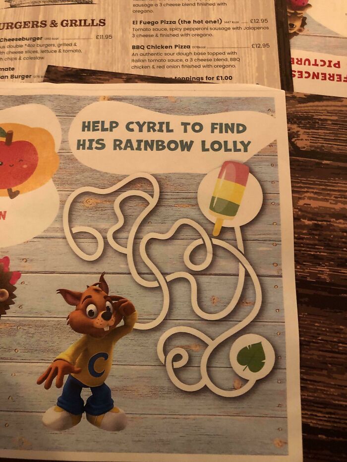
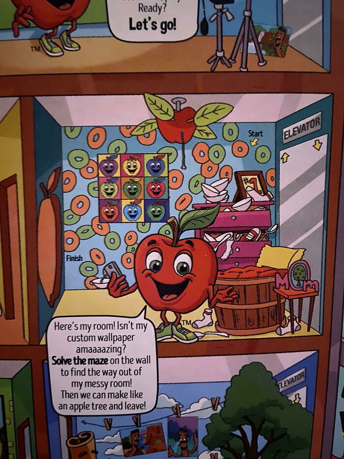
There Is No Way To Complete The Puzzle
I guess the moral of this story is that Cyril should settle with a leaf instead?
Horse With Eyes On Front Of Its Head
A horse is a horse of course of course - unless that horse is a creepy a..s alien wanting to eat your brains.
That ain't Mr. Ed for sure. Wibler would be dead and in the back field somewhere.
Load More Replies...Eyes on the front meant to hunt eyes on the side meant to hide. I guess whatever this horse wants to eat is doomed
it looks like the first version of sonic that they redesigned
Just google "Leo gripsholm slott" (slott=castle). It´s a swedish taxidermy pride! :D
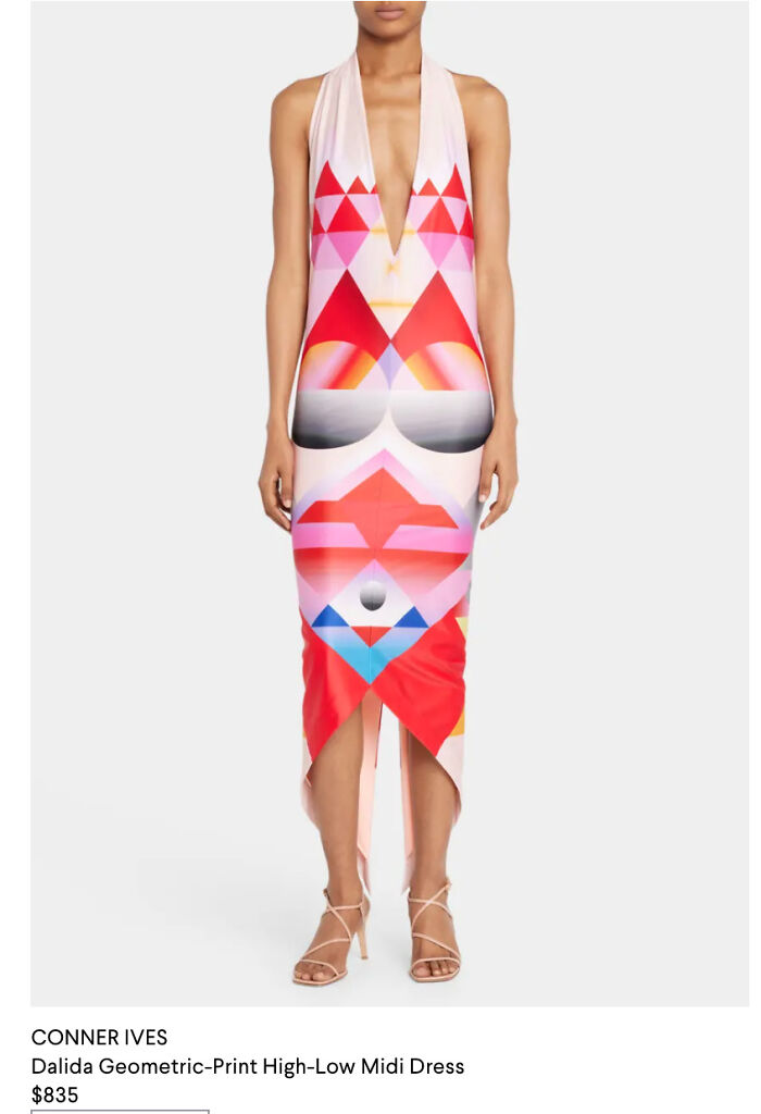
Simultaneously Too High And Too Low - This Dress
The Last Two Steps On These Stairs Are Higher Than The Previous 50
Tie Dye Socks That Look Like Someone Used Them As Toilet Paper
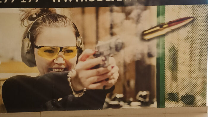
This Shooting Range Ad That Shows A Gun Firing A Cartridge
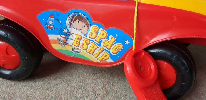
Ride On Spac Eship
Prizes On Offer At The Clinic
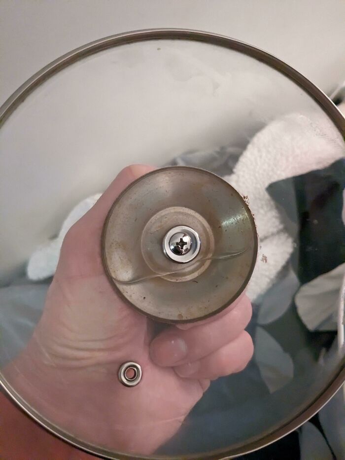
The Handle Of This Pan Is Heavier Than The Pan Itself, Making It Fall Over Immediately
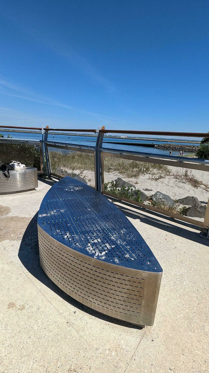
Stainless Steel Bench At The Beach. The Temperature Today Is 31°c
A lot of beaches have grills so you can have a picnic. This beach lets you roast your own nuts
Hotel Room Light Switch Hidden Behind Pillows, So You Wake Up Inexplicably In The Middle Of The Night
Someone Put Up This Sign On A Corner Near Me
This Infographic Uses Blue For Hot And Red For Cold
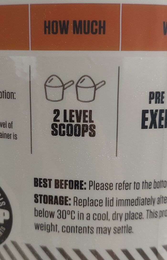
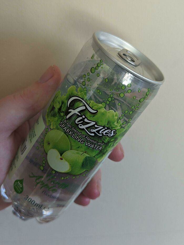
I Now Have Trust Issues With Cooking Instructions
“Thou Shalt Use 24 Point Font. Thou Shalt Not Use 23 Unless Immediately Proceeding To 24. 22 Is Right Out!
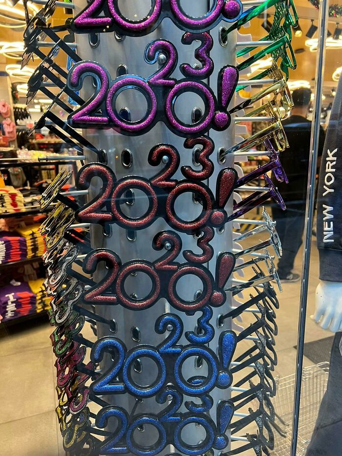
My Grandma Bought A Condo That Was Built In 2018, I Just Noticed This
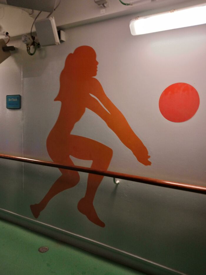
Arms (Found On A Cruise Ship I Was On Last Week)
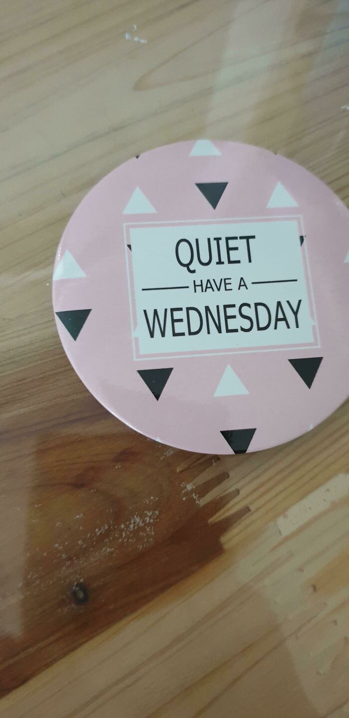
May I Have A Wednesday, Please
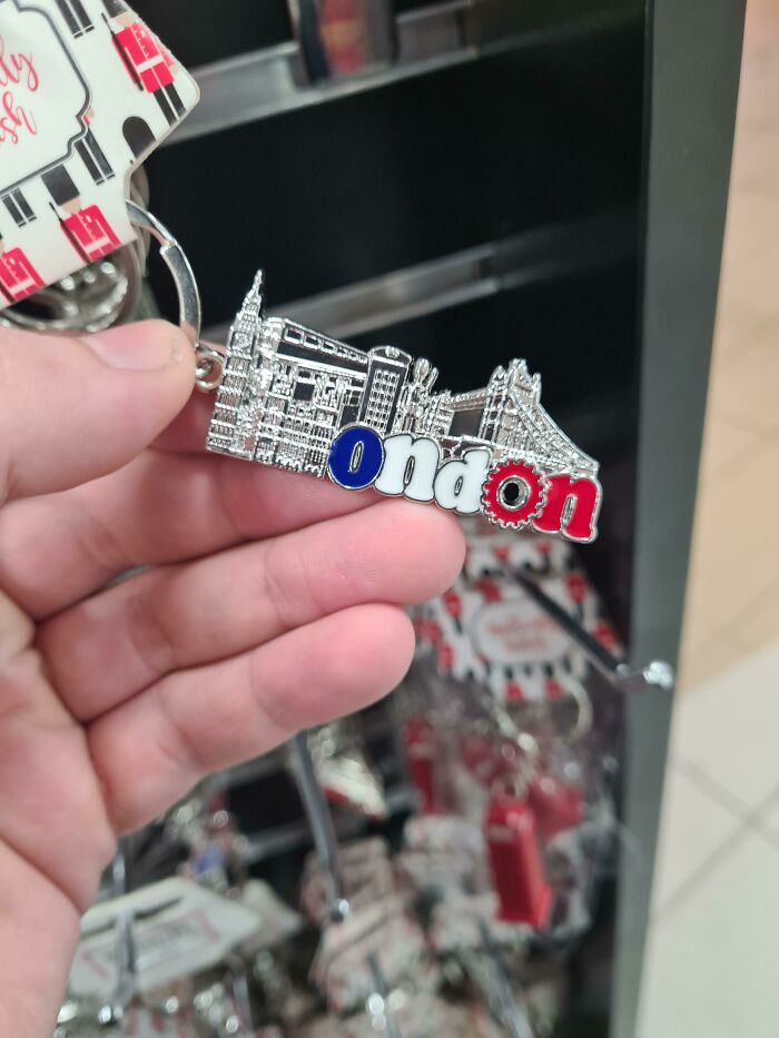
Good Old 'Ondon
Neighbors Went Upscale In Their Sidewalk Replacement, But Picked Incredibly Slippery Pavers
This Double Sided Exit Sign
Mmm Yes, I Sure Do Love Living In Tevas
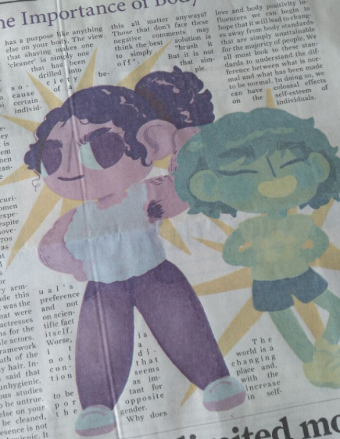
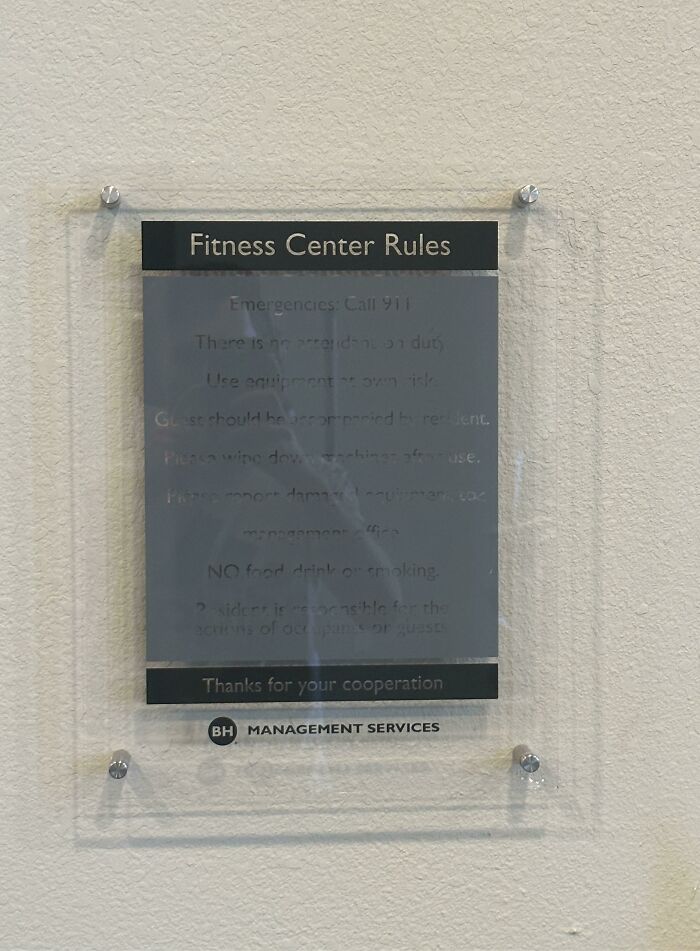
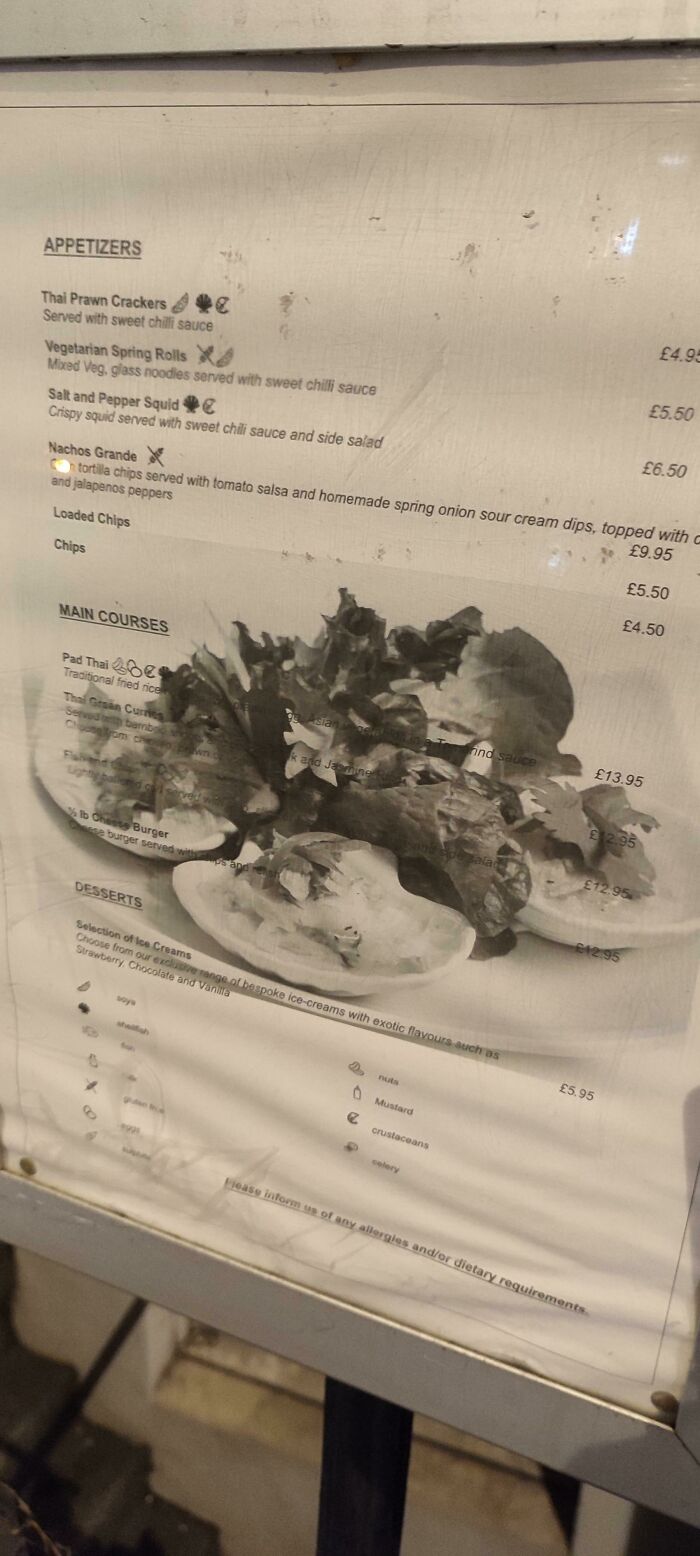
How about using black ink instead of pale grey? First rule of typography: Make it legible.
How about using black ink instead of pale grey? First rule of typography: Make it legible.

 Dark Mode
  No fees, cancel anytime


