Guy Goes Around NYC Redesigning Fliers For People, Making Them Way More Appealing For Free
Interview With ArtistIf you think that print fliers are an outdated marketing concept, you are wrong. Apparently, people still widely create and distribute print fliers. Unfortunately, not all of these designs are eye-catching. And if they are, it’s a good chance that it’s not for their satisfying aesthetics.
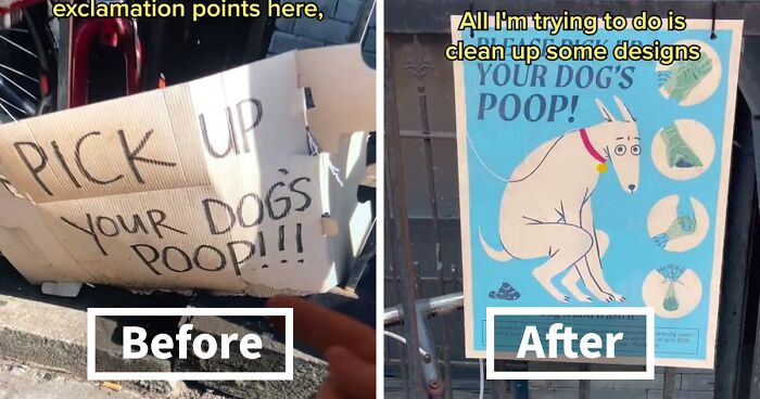
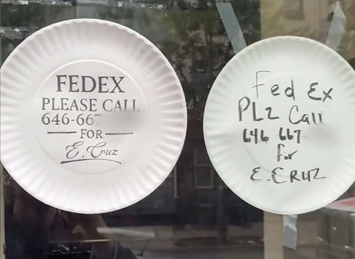
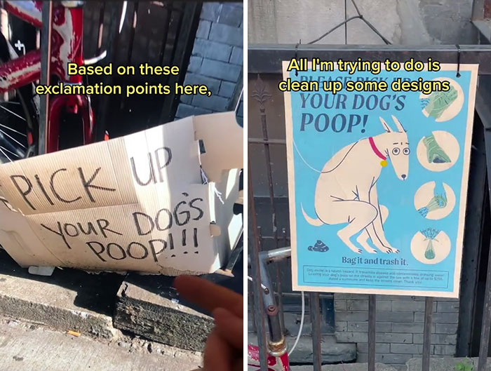
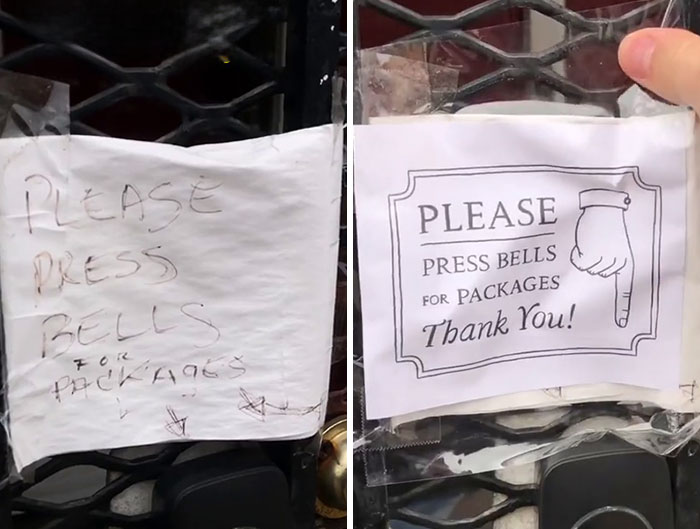
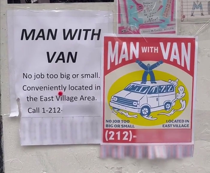
Fortunately, the digital artist Max on TikTok comes to the rescue. On his account, he has a series where he redesigns various fliers around New York without anyone asking him to.
More info: TikTok
TikTok user @cool_lookin_bug posts these wholesome videos of him redesigning various fliers he finds on the streets in NY, and, well, folks online are mesmerized
Image credits: cool_lookin_bug
“So, I’ve been redesigning signs in New York City without anyone asking me to”
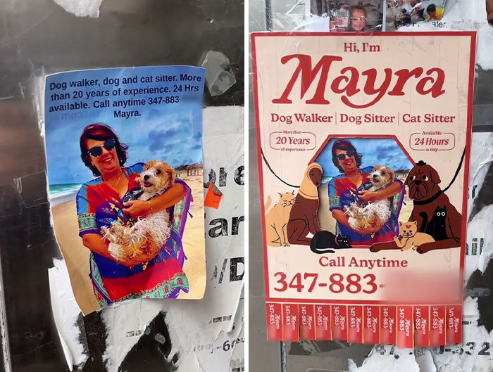
“For instance, take this flier that I found for Mayra the dog walker. Don’t get me wrong, this photo is incredible. But in a city with a million signs on the street, Mayra’s design just doesn’t pop.”
“So, I went ahead and made Mayra a logo by modifying a vintage font”
Image credits: cool_lookin_bug
“Then I added some cute illustrations and comforting colors that reflect the warmth and playfulness that shines through in her photo. I couldn’t draw Mayra in a way that would top this, so I found a way for her original photo to shine through my design.
But hold on just a second.”
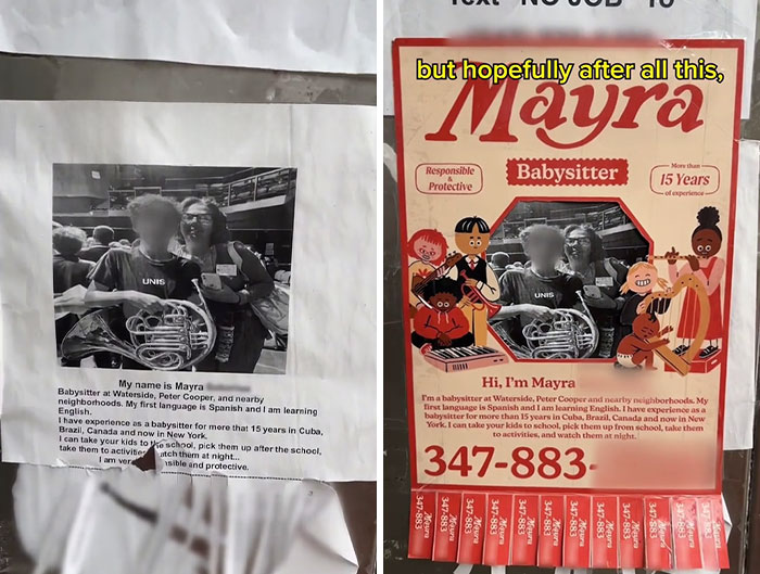
“As I’m putting up Mayra’s flier, I noticed a second Mayra flier. Guys, Mayra is a certified hustler”
Image credits: cool_lookin_bug
“It’s a good thing I already established her brand identity, which makes creating the second flier for her babysitting business much easier.
See, I don’t know who Mayra is. But hopefully, after all this, the Mayra brand, the Empire is gonna be known by the whole neighborhood.”
Image credits: cool_lookin_bug
Check out this video here
@cool_lookin_bug Welcome to the Mayra extended universe. Music by @Miles? #art#design♬ original sound – MAX KOLO
TikToker user @cool_lookin_bug is also known as Max Kolomatsky or Max Kolo. He is a digital artist and filmmaker who is based in New York City.
Max works as a freelancer. Some of the more notable projects of his career are:
- Being an illustrator for the New York Times;
- Being an animator of commercials for Vans Shoes;
- Being a creator of a viral web series for Adobe;
- Being a director of a music video for Sony.
On TikTok, Max went viral for posting videos about redesigning various fliers and signs without anyone asking him to.
Image credits: cool_lookin_bug
Bored Panda reached out to Max himself. Make sure to check out his Instagram!
Max told us a story about how he came up with the idea for this TikTok series. “I spend hours walking around New York looking to find a flier or sign that is not only poorly designed but also posted with good intent. I prefer to help individuals and small businesses, people with wholesome goals. These hidden-gem flyers, ones with charm, aren’t easy to find. So when I come across something I’m excited to redesign, it’s like discovering a treasure and the ideas just come flowing.”
He also added some thoughts about the aesthetic inspiration for the designs. “I’m someone who is constantly taking photos of things that I like, collecting screenshots from Instagram, and building Pinterest boards. I love pushing the boundaries of my art style and these flier redesigns are a great way to challenge myself as an artist.
I always begin by considering the target audience and brand characteristics of whatever I’m redesigning — What vibe should this flier give off? Then I try to find a way to make it creatively exciting for me as well.”
Max shared that since the project went viral, he keeps getting plenty of requests from small businesses, who ask for his help with designing their fliers. “It’s a bit overwhelming for me because there are so many people who deserve a good flier. Freelance art is the way that I pay my bills, so I unfortunately can’t be the guy who designs everyone’s flier for free. I will certainly continue to redesign flyers around NYC for free, anonymously. But for now, I’m sticking with the ones that I find on the street myself.”
Image credits: cool_lookin_bug
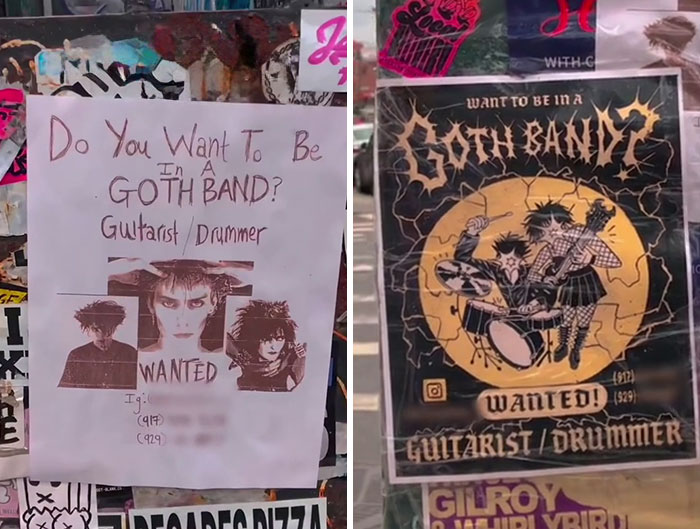
Lastly, the creator told a story about a design story that stood out to him. “I very much enjoyed doing the flier redesign for this goth band, Miss Teen America. When they were looking for new bandmates, they had a really simple, amateur flier posted all over Brooklyn and I did an anonymous redesign of it. I thought my redesign looked sick, I was very proud of it!”
But the story did not end there. Max continued: “I couldn’t help but notice a lot of folks in the goth community thought that the original sign was more fitting for goth counterculture. This was a turning point for me because it made me reconsider what things I should be redesigning. Redesigning something professionally makes it stand out more on the street and might be more beautiful. But it also makes something feel less home-grown and more expensive. For many goths, it’s cool for a flier to look amateur.
This was a really valuable lesson for me and helped me move forward with this project in a more thoughtful way. In the end, though, the goth band found my video and LOVED the flier. They wanted to meet me so we hung out in the park and I gave them signed copies of the flier I had designed — great people.”
Image credits: cool_lookin_bug
Moving on from Max to the concept of fliers itself, did you know that the earliest form of the modern flier first appeared during the Renaissance period in Italy? And that is just the modern version; more primitive ones existed even before that. Printed fliers were a game changer in the area of information communication to wide audiences.
Soon after its “birth”, it could be said that it even became an art form. Or a vital part of marketing art. Although, it should be noted that it was not used only for advertising, but for the spread of propaganda, political, religious, and scientific ideas too.
Many movements in history were successful because they spread their messages through these pieces of paper. For example, the Suffrage movement in the early 1900s used fliers to promote their cause. And so, they played quite a significant role in the success of feminism.
Image credits: cool_lookin_bug
And that is just one of the examples. Just think how many various other movements or businesses have used fliers to spread their messages. Let’s imagine an alternative reality where the idea of fliers was not created. It’s probably a way different reality than ours, right?
And in that reality, Max Kolomatsky would have to come up with a different idea to go viral (if going viral is even a thing there).
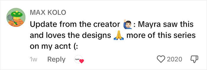
But since in our reality, Max can create this TikTok series, let’s look at the comments on the video about Mayra’s poster. There, the creator himself came back with the update that Mayra saw his videos and loved the designs. Most of the comments from other people praised Mayra for her dedication to her craft and wished her success.
People online were praising Mayra, whose poster Max redesigned, for her hustle
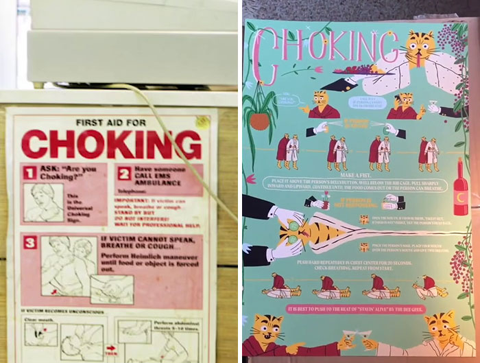
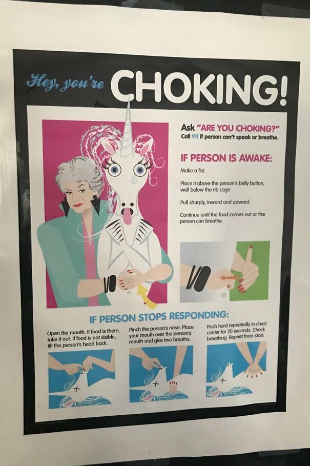
I don't like the choking one. That needs to be plain and simple and easy to read so the information can be seen at a glance during an emergency. I mean it's cute and all, but I can read almost everything and see the phone number on the first one, and I can't on the second one.
agreed, the redesign is a bit overwhelming and the text is small.
Load More Replies...Funny, as I would now have refrained from forming this Goth Band - as the new Flyer makes them look like they are totally into (Death) Metall. Quite the opposite to 80s/90s Goth that the first flyer indicated (Edit: me, grammar and spelling will never become friends)
Load More Replies...I don't like the choking one. That needs to be plain and simple and easy to read so the information can be seen at a glance during an emergency. I mean it's cute and all, but I can read almost everything and see the phone number on the first one, and I can't on the second one.
agreed, the redesign is a bit overwhelming and the text is small.
Load More Replies...Funny, as I would now have refrained from forming this Goth Band - as the new Flyer makes them look like they are totally into (Death) Metall. Quite the opposite to 80s/90s Goth that the first flyer indicated (Edit: me, grammar and spelling will never become friends)
Load More Replies...
 Dark Mode

 No fees, cancel anytime
























64
10