Besides being bona fide artwork, an album cover also has several important missions to achieve. First, it has to capture the audience's attention and stick out of the crowd. For that, the illustration or the photo has to be either thoroughly original or a cleverly regurgitated familiar image; it also doesn't hurt if it's on the controversial side of things. Another 'must' for an album cover design is representing the essence of the music and the soul of the band itself. A pretty big ask for such a small, single image! Aching to see which of the album artworks succeeded in these tasks and took the title of being the greatest ever? We do too! And for that, we've compiled a thorough list of the greatest album covers ever!
Of course, we do not doubt that you've already seen at least the top 30 of them, but did you know the stories of these artworks' conceptions? Neither did we, so we took the time to dig a bit and wrote the stories under the top 30 submissions for your consideration and amusement. Some of the album covers were, in fact, happy accidents, while others caused serious accidents being made (we're talking about you, Pink Floyd). So all you have to do now is scroll down below, check out the greatest album covers of all time, and vote for the ones you fancied the most. Just play fair and don't base your votes on your music preference this time, but rather the artwork! Also, don't forget to share this list of iconic album covers with your friends, as they too might like to learn the stories behind them.
This post may include affiliate links.
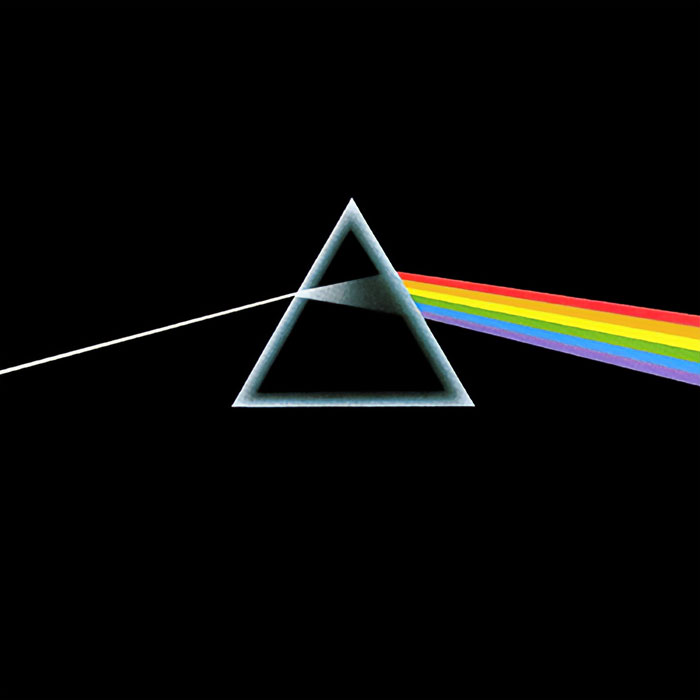
Pink Floyd - The Dark Side Of The Moon (1973)
For their eighth studio album, Pink Floyd continued working with Hipgnosis (an English art design group) and George Hardie, who have previously designed covers for several bands’ albums. The cover design for The Dark Side Of The Moon was inspired by a photo of a prism with a light beam projected through it; it was found by one of the Hipgnosis group members in a photography book. The design stands for three elements: the band’s stage lighting, the album lyrics, and Wright’s wish for ‘a simple, bold, and classy’ design. It was also the first time that Pink Floyd felt confident enough of Waters’ lyrics to print them on the album’s sleeve.
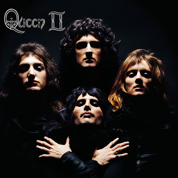
Queen - Queen II (1974)
As the Roman numeration indicates, Queen II is the second album by Queen. Mick Rock, a well-known rock photographer of the time, was engaged by the band to create a cover for this particular album. According to him, the band hoped to get a cover that would grab people’s attention since their first release failed to do so miserably. It’s fun to know that this iconic photo was inspired by a similar one of Marlene Dietrich, taken in 1932. While Mick Rock argued that the photo might be pretentious, all Mercury cared about was that it was absolutely fabulous.
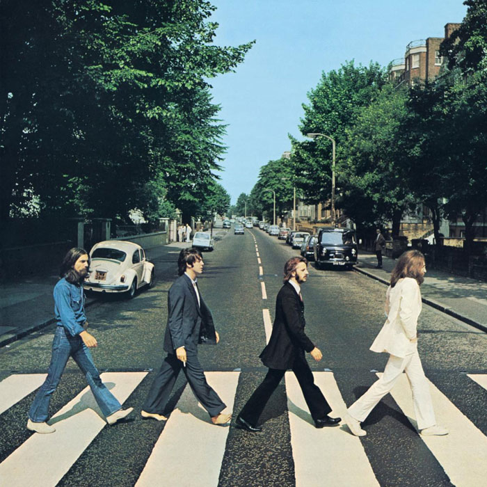
The Beatles - Abbey Road (1969)
Abbey Road is the eleventh album by The Beatles with a cover that’s probably the most widely imitated throughout the music industry. Here, you can see the band strolling across a street near Abbey Road’s record studio. The legendary photo was based on MacCartney’s ideas and sketches and taken by Iain Macmillan. He had only ten minutes to take six photos while a police officer held the traffic behind him. A fun fact is that the car visible in the photo (a white VW Beetle) got its license plate stolen right after the release of the Abbey Road album - some souvenir.
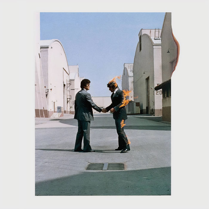
Pink Floyd - Wish You Were Here (1975)
Wish You Were Here is the ninth album by Pink Floyd with a cover design by Storm Thorgerson. The album’s cover design plays on the themes of absence and unfulfilled presence and the idea of fearing showing your true feelings so as not to ‘get burned.’ Hence, one of the businessmen in the photo is literally on fire. The photo of two people sharing a handshake - an often empty gesture - was hidden behind opaque shrink-wrap and only visible upon tearing it off. The band loved the end design of the cover so much that they even burst into a spontaneous round of applause upon inspecting it.
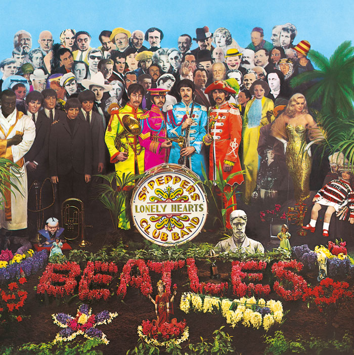
The Beatles - Sgt. Pepper's Lonely Hearts Club Band (1967)
Sgt. Pepper’s Lonely Hearts Club Band is the eighth album by The Beatles with a cover design by two pop artists, Peter Blake and Jann Haworth. Once again, it was based on MacCartney’s sketches, and the famous crowd behind The Beatles were all cardboard cut-outs. Except for the figures of the band themselves from the Beetlemania era - those were wax sculptures borrowed from Madame Tussaud’s museum. A couple of The Beatles - Lennon and Harrison - had requested Hitler, Jesus Christ, and Mahatma Gandhi to be put in right beside them, but, fearing controversy, EMI declined their wishes. Only Ringo had no wishes for the cut-outs, stating that ‘it’s all fine by me.’
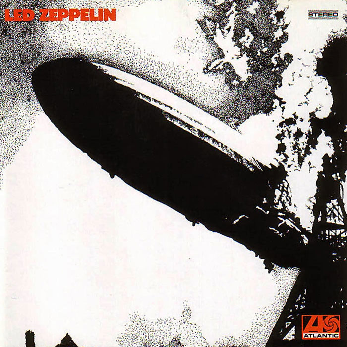
LED Zeppelin - LED Zeppelin (1969)
This was the debut album of LED Zeppelin, released in 1969 with a picture of burning Hindenburg chosen by Page on its cover. The entirety of the supervision of the design was handed over to George Hardie, whose name you’ve already seen and will see a couple of more times on this list - an album cover magician. The original photo of the burning Hindenburg was taken by Sam Shere in 1937 and was altered to fit the band’s vision.
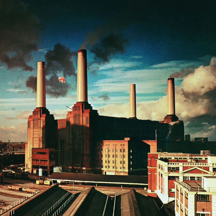
Pink Floyd - Animals (1977)
Animals is the tenth studio album by Pink Floyd with a cover, unusually, designed by Waters (although they also employed Hipgnosis to come up with some ideas). The shooting of the picture has quite a funny story to it - on the second day of the shooting, the helium-filled pig balloon broke free of its moorings (there was no marksman to shoot it down on that day) and disappeared out of view. The wind carried away this pig to the area of Heathrow airport, causing panic and delayed flights. After a while, the helium pig landed in Kent and was recovered by a farmer, who was furious about the massive swine scaring his cows. Finally, the balloon was superimposed on the photos of the Battersea Power Plant.
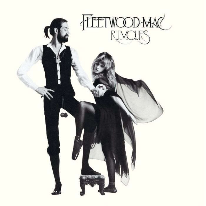
Fleetwood Mac - Rumours (1977)
Rumours is the eleventh studio album by Fleetwood Mac released in 1977, often considered the band’s magnum opus. In the cover photo, you can see Stevie Nicks dressed as her ‘Rhiannon’ stage persona, posing with Mick Fleetwood. Herbert Worthington took the bizarre photo and, although there’s no particular explanation to what is going on in there, it was made to look mysterious on purpose. And to the question about those danglies between Fleetwood’s legs… Well, there’s no answer.
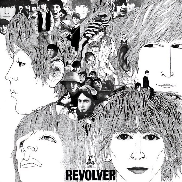
The Beatles - Revolver (1966)
Revolver is the seventh album by The Beatles with a cover drawn by German-born bassist and artist Klaus Voormann. Voormann’s artwork was partly-drawn and partly made as a collage, using photos taken by Robert Freeman in 1964-65. The inspiration for this artwork was taken from the works of nineteenth-century illustrator Aubrey Beardsley, whose works were highly influential on fashion and designs of the 1960s. Each of the Beatles’ members is depicted seemingly in another state of consciousness, with images tumbling and pouring out of their heads.
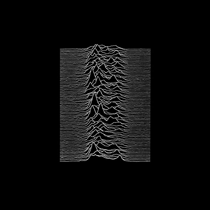
Joy Division - Unknown Pleasures (1979)
Unknown Pleasure is the debut album by the English band Joy Division, released in 1979. The iconic album cover used now for T-shirts, mugs, notebooks, and everything else you could think of isn’t composed of random lines. Those lines, in fact, are radio wave patterns from the pulsar (a rotating neutron star) called CP 1919, and this particular image was found in The Cambridge Encyclopedia of Astronomy.
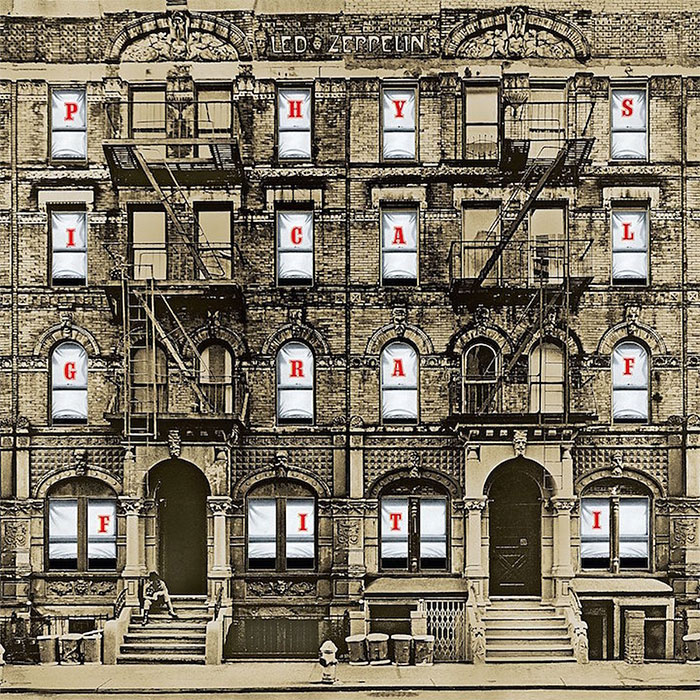
LED Zeppelin - Physical Graffiti (1975)
Physical Graffiti is the sixth album by Led Zepellin. It was released as a double album in 1975. The album’s cover was designed by Peter Corriston, who used a photo of two New York City tenement block buildings. The interesting part is that the sleeve was a die-cut, and by moving it, you could either see Physical Graffiti spelled out in the windows or pictures of various famous people as well as the band. This was a truly innovative design for the time and even got nominated at the Grammys for the best album package in 1976.
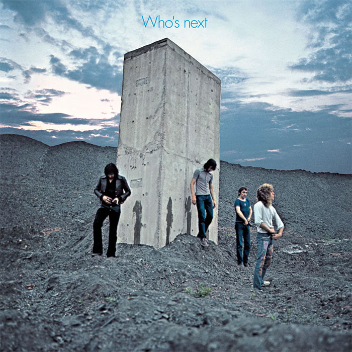
The Who - Who's Next (1971)
Who’s Next is the fifth studio album by The Who, which was released in 1971. On the cover, you can see the band members seemingly having just urinated on a massive concrete piling protruding from a slag heap. The photo was taken by Ethan Russell in a town called Easington Colliery and was somewhat inspired by Stanley Kubrick’s movie 2001: Space Odyssey.
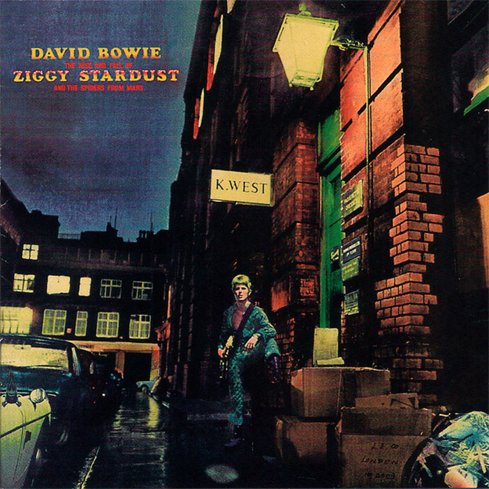
David Bowie - The Rise And Fall Of Ziggy Stardust And The Spiders From Mars (1972)
The Rise And Fall Of Ziggy Stardust And The Spiders From Mars (often shortened to Ziggy Stardust for convenience) is the fifth album by David Bowie, released in 1972. The photo used for the album cover was taken by Brian Ward in monochrome and recolored by illustrator Terry Pastor. He also retouched the typography that was initially pressed on the photo using Letraset. The whole vibe of the retinted photo is trying to tell the audience that Bowie is, in fact, a visitor from another world and dimension. The glowing sign seen in the photo was that of a furrier company called K.West, who, upon discovering that their sign was used for a pop music album cover, took it down, wishing for no association with this kind of culture.
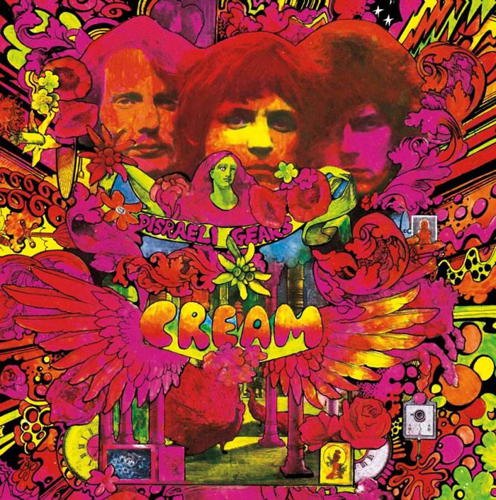
Cream - Disraeli Gears (1967)
Disraeli Gears is the second studio album by the British band Cream, released in 1967. The album cover was designed by an Australian artist Martin Sharp, and this is his vision of the band’s music - warm, electric, and fluorescent. The photos used for this psychedelic collage were taken by Bob Whitaker, who’s very well known for his work with The Beatles, sort of a star photographer. Besides trying to capture the essence of Cream’s sound, the artwork was also inspired by Cambodian statues of deities, with ancient trees growing right on them. The association shows like this - band members’ faces with the music swirling right from their heads.
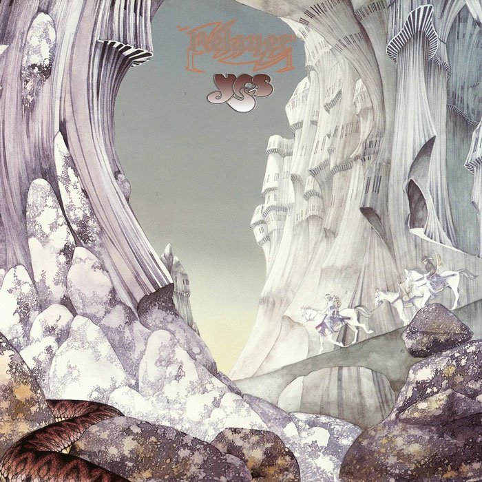
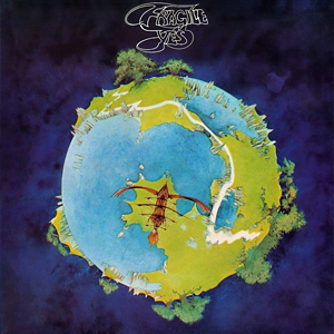
Yes - Relayer (1974)
Relayer is the seventh album by an English prog-rock band called Yes, which was released in 1974. The album’s artwork was designed and illustrated by Roger Dean, who has worked with the band since 1971, starting with designing their logo. For the Relayer album, Roger chose to depict a gothic cave, merging into an impenetrable fortress, an ultimate castle. The warriors on horseback, also depicted on the cover, refer to the lyrics of The Gates Of Delirium - a heavily war-themed song. By 2020, the original painting by Roger Dean went on sale for 6 million dollars.
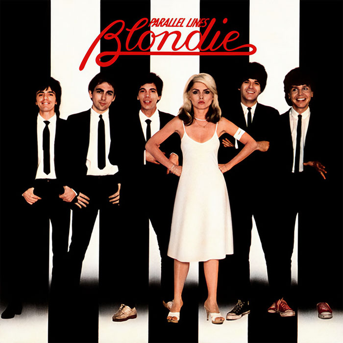
Blondie - Parallel Lines (1978)
Parallel Lines is the third album by the rock band Blondie, released in 1978. The album took its name from an unreleased track written by Debbie Harry; only the lyrics were included in the first vinyl edition of the album. The iconic photo was taken by Edo Bertoglio and was chosen by the band’s manager, despite the members feeling strongly against it. The simplicity and the sternness that the image is showing make the artwork instantly recognizable and iconic.
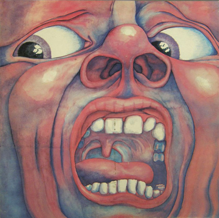
King Crimson - In The Court Of The Crimson King (1969)
In The Court Of The Crimson King is the debut album by the prog-rock band Crimson King, released in 1969. The painting used as this album’s cover was done by a computer programmer Barry Godber, and it is Barry’s own face. Sadly, Godber died shortly after the release of In The Court Of The Crimson King, making it his only album cover design. Now, one of the band members owns the original painting, describing it as reflecting their music to its bare bones.
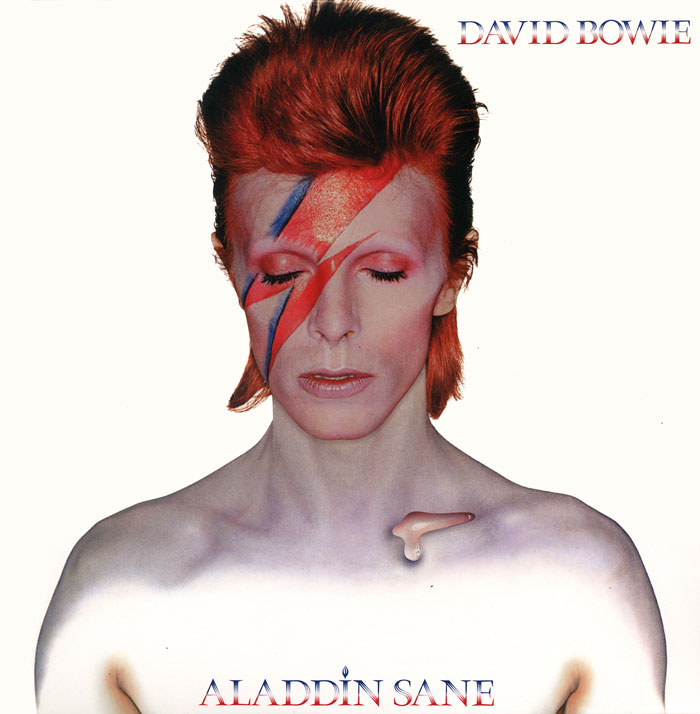
David Bowie - Aladdin Sane (1973)
Aladdin Sane is the sixth studio album by David Bowie, released in 1973. The title of this album is a pun on ‘A Lad Insane,’ which was initially expected to be the main title. Brian Duffy shot the absolutely iconic image gracing the cover of this album in his north London studio. It is known that the lightning bolt crossing Bowie’s face was copied by Duffy and makeup artist Pierre Laroche from a National Panasonic rice-cooker in the studio. The makeup was completed by a vile purple wash, evoking the image of a death mask. Upon its release, the image quickly became the center of talks - some deemed it offensive, while others found it daring and revolutionary.
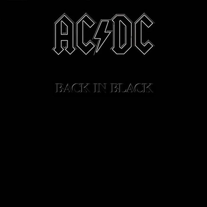
AC/DC - Back In Black (1980)
Back In Black is the seventh album by Australian band AC/DC, which was released in 1980. According to Angus Young, the cover was a sign of mourning for their lost band member, lead singer Bon Scott, replaced by Brian Johnson on this album. And though Atlantic Records disagreed with the cover, they accepted it with the condition that the AC/DC logo would be outlined in grey.
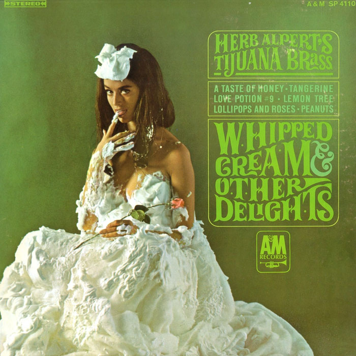
Herb Alpert's Tijuana Brass - Whipped Cream & Other Delights (1965)
Whipped Cream & Other Delights is the fourth album by Herb Alpert’s Tijuana Brass, released in 1965. Besides having enjoyed great success with sales, this album also became an icon of classic pop culture because of its cover, of course. It depicts model Dolores Erickson (who was three months pregnant at the time) wearing chiffon and doused in shaving cream. The cover became so widely popular that several bands have since parodied the photo for their own albums, even playing with the title. For instance, Soul Asylum’s album named Clam Dip & Other Delights.
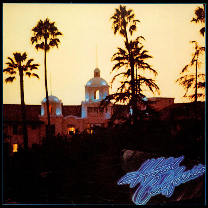
Eagles - Hotel California (1976)
Hotel California is the fifth album by American rock band Eagles, released in 1976. The building you see in the photo is the legendary Beverly Hills Hotel, shot just before sunset by David Alexander. The later cover design was provided by John Kosh (or simply Kosh) - a legendary English graphic designer and album cover creator. The band wanted to depict the titular Hotel California with a slightly sinister edge, and this photo worked like a charm. Since the vantage point seen in the image wasn’t a usual one, it took some time for people to discover that it was The Beverly Hills Hotel, but once they figured it out, the hotel threatened legal action over the use of the image.
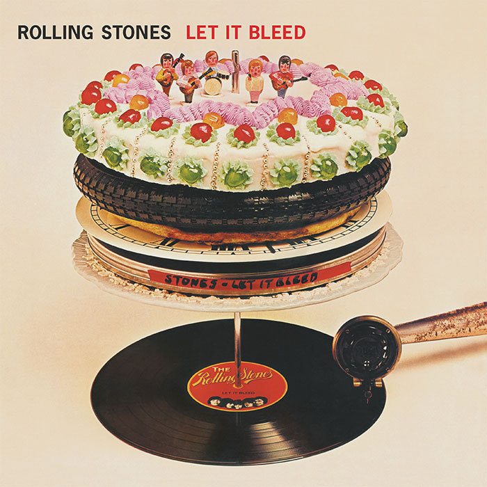
Rolling Stones - Let It Bleed (1969)
Let It Bleed is the eighth British and the tenth American studio album by the Rolling Stones, released in 1969. The picture that you see on the cover isn’t a collage or a superimposed image, but rather a surreal sculpture designed by Robert Brownjohn. Although Mick Jagger initially asked M. C. Escher to design the cover (who politely declined), it was this version that was among the ten chosen by the Royal Mail for a set of ‘Classic Album Cover’ postage stamps released in 2010.
Supertramp - Breakfast In America (1979)
Breakfast In America is the sixth album by the English band called Supertramp, released in 1979. The album’s cover resembled the view of Manhattan from an airplane window and was designed by Mike Doud and Mick Haggerty. The center figure in the image is Kate Murtagh, an American actress and singer-comedian, dressed as a waitress mimicking the pose of Lady Liberty. The Lower Manhattan skyline seen in the photo is created by using cornflake boxes, syrup jugs, and all sorts of stuff typical to a diner’s environment sprayed white. Breakfast In America won the 1980 Grammy award for the best album packaging, beating albums by Talking Heads and Led Zeppelin.
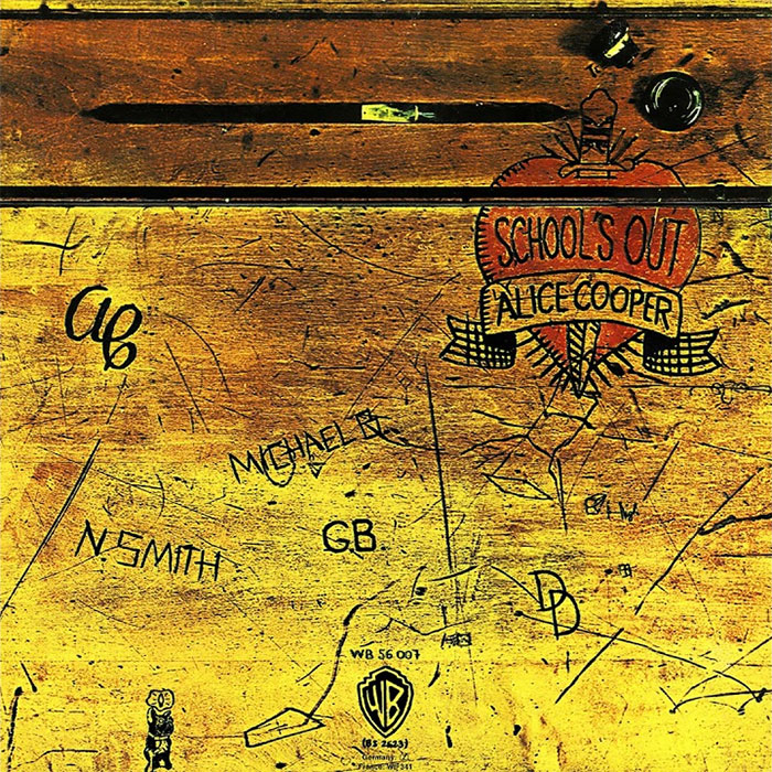
Alice Cooper - School's Out (1972)
School’s Out is the fifth album by the American band Alice Cooper, which was released in 1972. The original album cover was designed by Craig Braun and had the sleeve opening in the manner of a real school desk. The vinyl inside was wrapped in a pair of panties, though it was later discontinued upon discovering that the paper garment was highly flammable. You can still see the original desk of which the photo is taken displayed in The Hard Rock Cafe in Las Vegas.
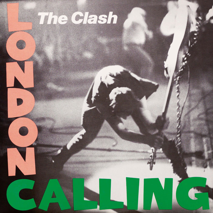
The Clash - London Calling (1979)
London Calling is the third album by English rock band The Clash, released in 1979. In the cover photograph, you can see the band’s bassist, Paul Simonon, smashing his Fender Precision Bass, whose remnants are now displayed in the Museum Of London. The rest of the cover was designed by Ray Lowry, who made it look like a homage to Elvis Presley’s self-titled album (which you also saw on this list). The Royal Mail also chose this album cover for their set of ‘Classic Album Cover’ postage stamps issued in 2010.
Metallica - Master Of Puppets (1986)
Master Of Puppets is the third album by Metallica, released in 1986. The artwork for this album was designed by the band themselves and their manager Peter Mensch. The illustration, depicting white cemetery crosses tethered by strings and manipulated by hands emerging from the blood-red sky, was painted by Don Brautigam (you can see his initials on the lower right corner of the painting). The cover depicts an overall theme of the album of people being subconsciously manipulated and easily disposed of.
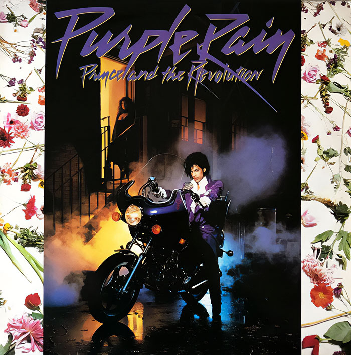
Prince - Purple Rain (1984)
Purple Rain is the sixth studio album by Prince, released in 1984. On the cover, you can see Prince sitting on his customized 1981 Hondamatic Honda CM400A motorcycle (a purple one, of course). There’s also his movie co-star and love interest of the hour Apollonia in the background standing in a doorway of a back alley. The alley is actually in the Warner Bros Studio Backlot in California, and the location was designed to look like a New York tenement area. And as for the flower arrangements behind the photo - who knows, those were probably Prince’s idea also, knowing how much he cared about the stuff considering his one true love - music.
Dio - Holy Diver (1983)
Holy Diver is the debut album by the heavy metal band Dio, released in 1983. The cover artwork was painted by Randy Berrett and featured the band’s mascot, Murray, spinning heavy chains above waves where a priest or a minister is chained and floating. You can see Murray on several of Dio’s albums, always as sinister as he can be. And although the band stated that it is a pure coincidence, if you flip the logo upside down, you can interpret it as saying ‘DIE’ or ‘Devil.’
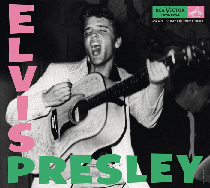
Elvis Presley - Elvis Presley (1956)
Elvis Presley (known in the UK as Elvis Presley Rock ‘n’ Roll) was the debut album by the singer, released in 1956. Initially, it was thought that the cover photo was taken by Popsie Randolph (since he was the only credited photographer on the album), although it was later discovered that the actual photographer was William V. ‘Red’ Robertson. This iconic design was echoed on the albums by The Clash, F-Punk, and Chumbawamba, just to name a few.
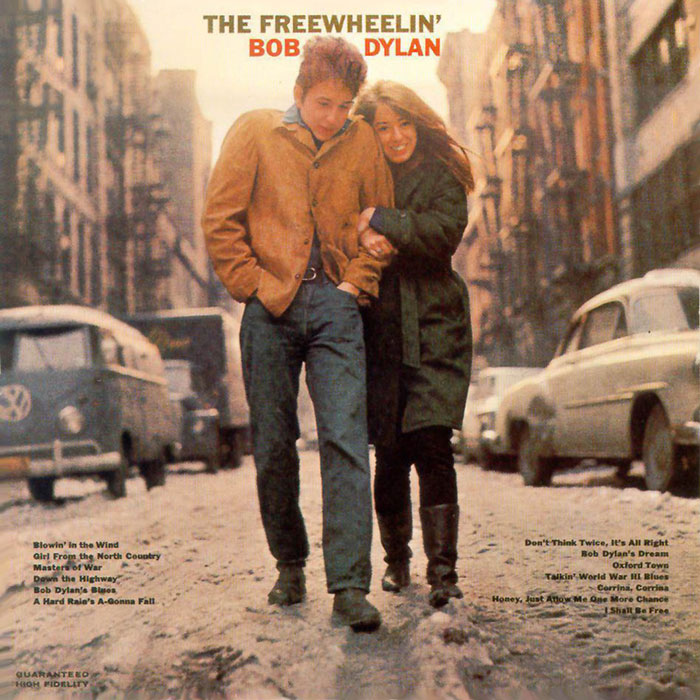
Bob Dylan - The Freewheelin' Bob Dylan (1963)
The Freewheelin’ Bob Dylan is the second album by singer-songwriter Bob Dylan, released in 1963. The photo used as this album’s cover depicts Dylan and his girlfriend at the time, Suze Rotolo, strolling in the middle of Jones Street in the West Village, New York City. As Suze remembers, Dylan was wearing a thin jacket for ‘the look,’ and she was terribly cold dressed in an oversized sweater and a bulky coat, making her feel like an ‘Italian sausage.’ The cover, being unscripted and down-to-earth simple, was a revolutionary one, compared to the stiff and polished covers of pop and folk albums at the time.
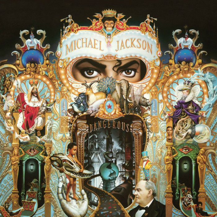
Michael Jackson - Dangerous (1991)
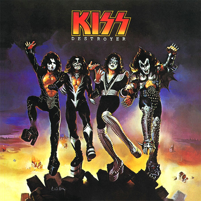
Kiss - Destroyer (1976)
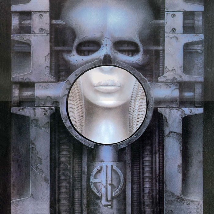
Emerson, Lake & Palmer - Brain Salad Surgery (1973)
This one looks really cool. Hmmm I've never heard of this album or this band
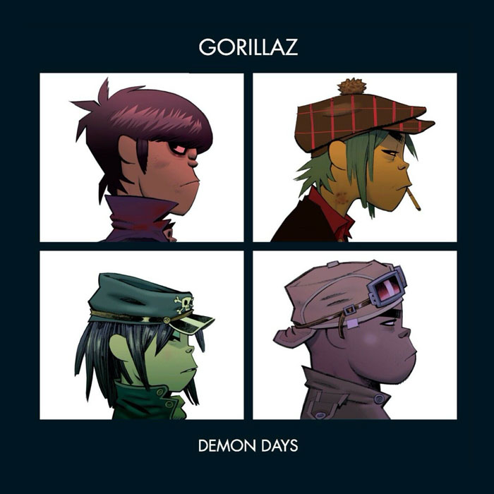
Gorillaz - Demon Days (2005)
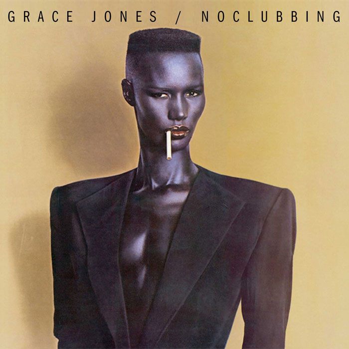
Grace Jones - Nightclubbing (1981)
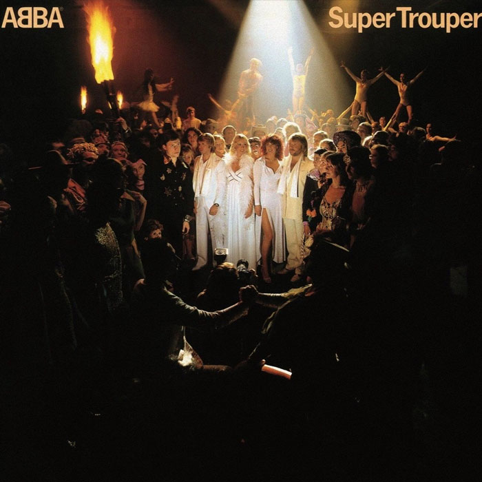
ABBA - Supertrouper (1980)
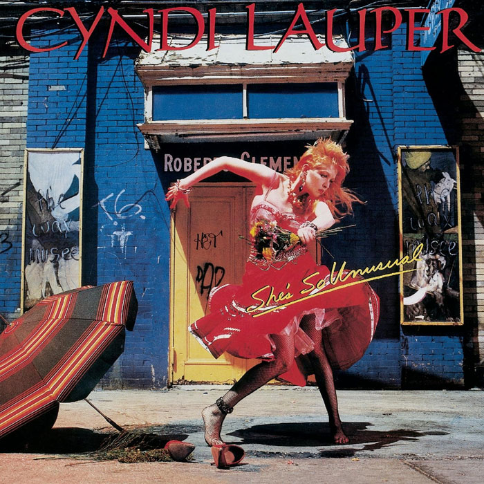
Cyndi Lauper - She's So Unusual (1983)
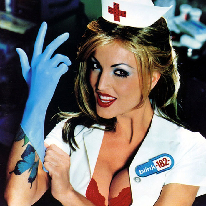
Blink 182 - Enema Of The State (1999)
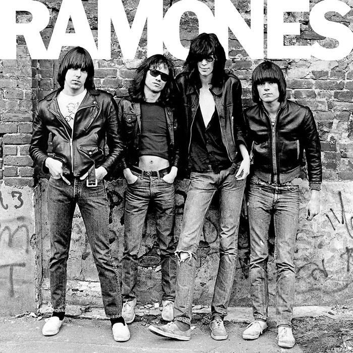
Ramones - Ramones (1976)
Thirty years ago, I was sitting with two friends on a bench in a north London Underground station. It's pretty late, well after closing time, and we were almost the only ones there. Suddenly this tall bloke with a red spiky mohawk, Doc Martens, piercings, etc , stalks past us. Without breaking stride, he looks at us and snarls, "Oi've been to see the Ramones!". And continues on his way.
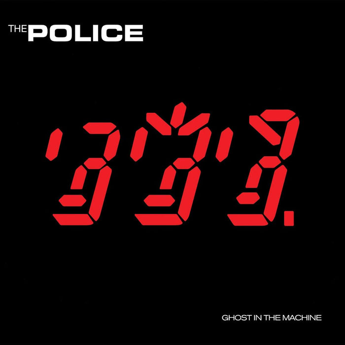
The Police - Ghost In The Machine (1981)
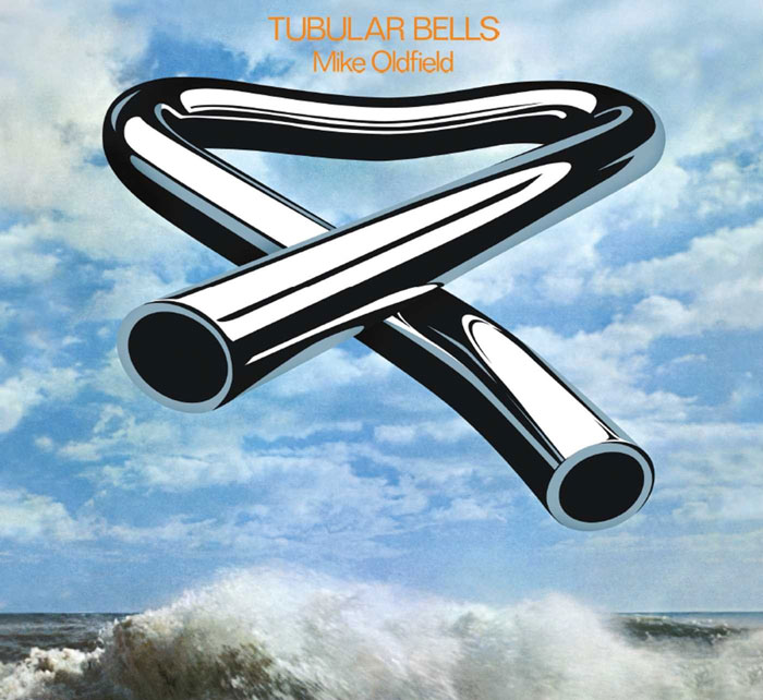
Mike Oldfield - Tubular Bells (1973)
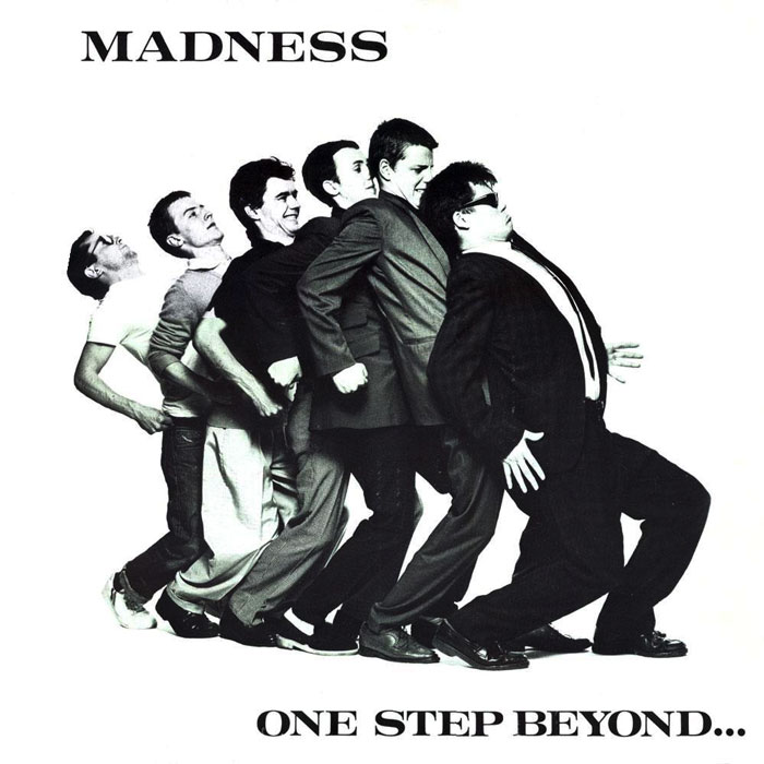
Madness - One Step Beyond... (1979)
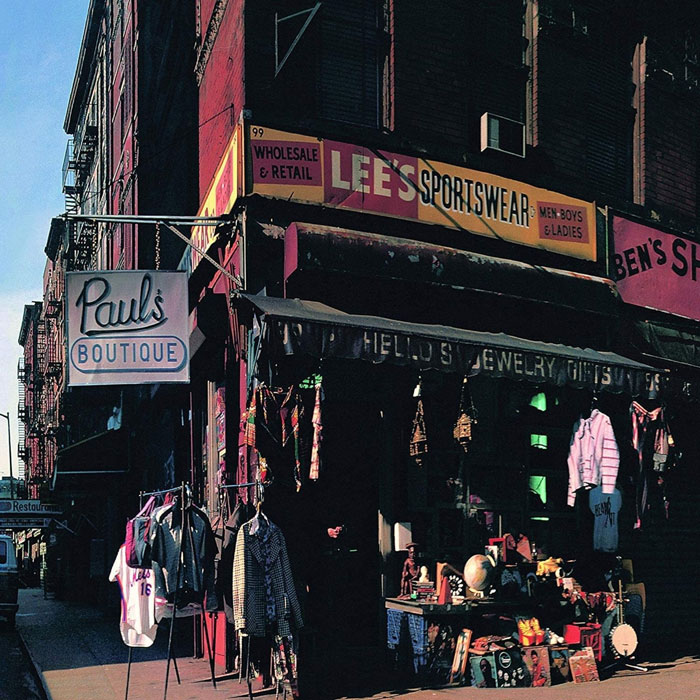
The Beastie Boys - Paul’s Boutique (1989)
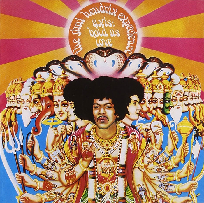
Jimi Hendrix Experience - Axis: Bold As Love (1967)
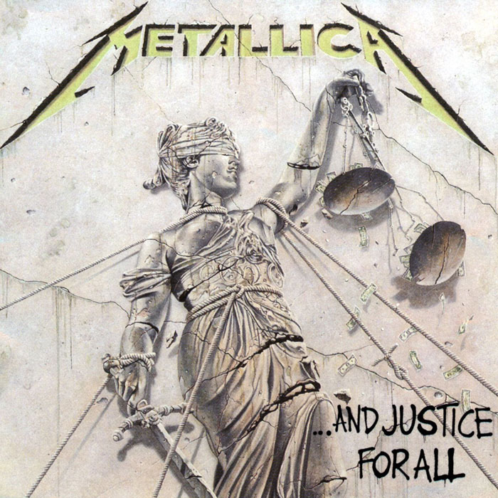
Metallica - ...and Justice For All (1988)
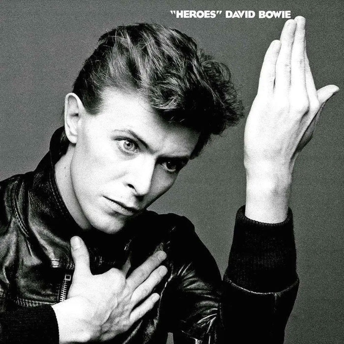
David Bowie - Heroes (1977)
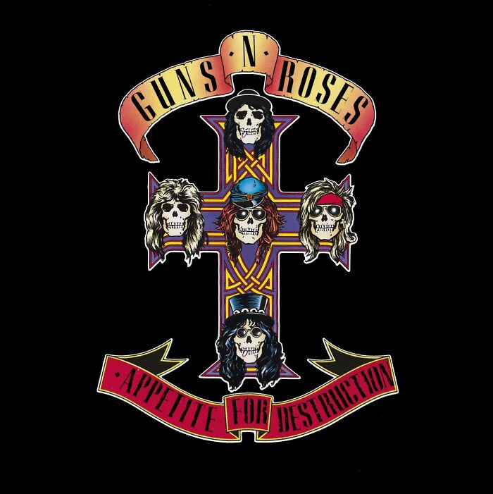
Guns 'N' Roses - Appetite For Destruction (1987)
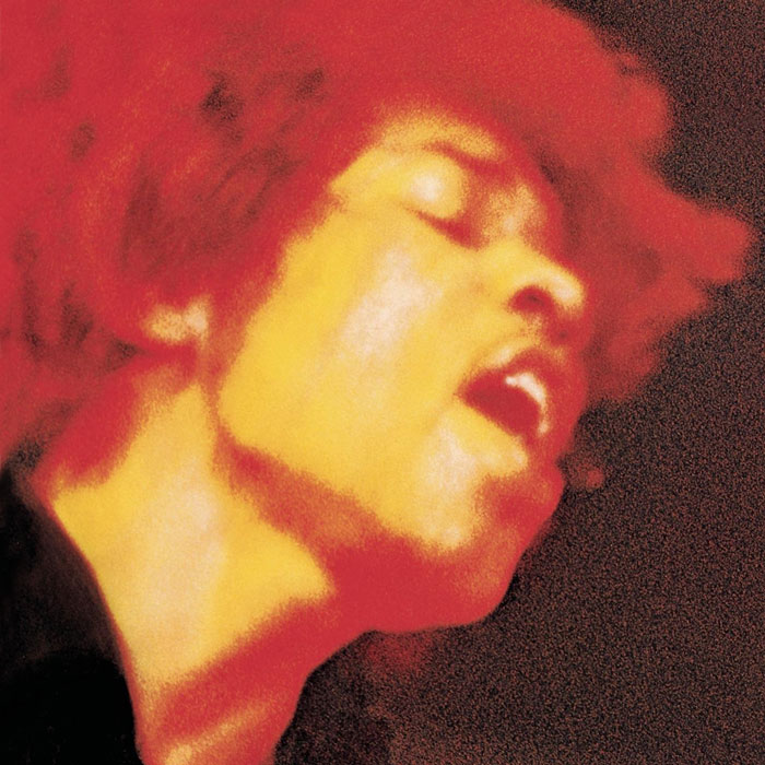
The Jimi Hendrix Experience - Electric Ladyland (1968)
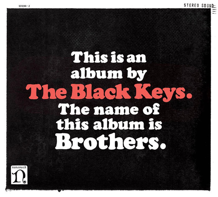
The Black Keys - Brothers (2010)
Björk - Homogenic (1997)
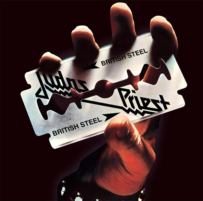
Judas Priest - British Steel (1980)
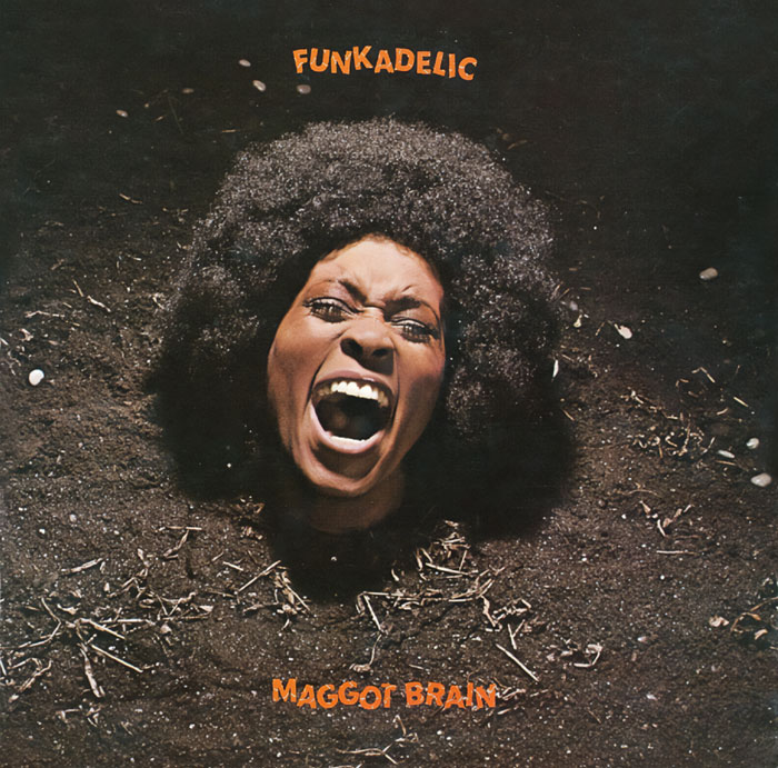
Funkadelic - Maggot Brain (1971)
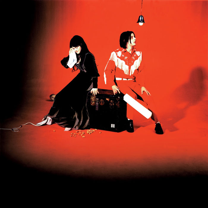
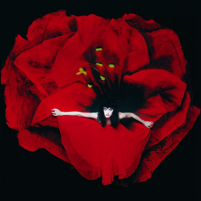
The White Stripes - Elephant (2003)
Florence + The Machine - Lungs (2009)
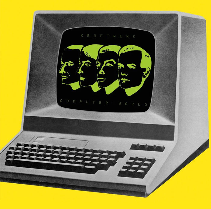
Kraftwerk - Computer World (1981)
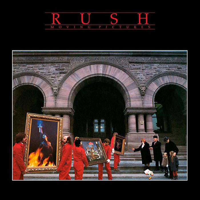
Rush - Moving Pictures (1981)
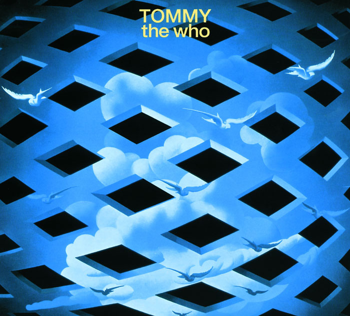
The - Tommy (1969)
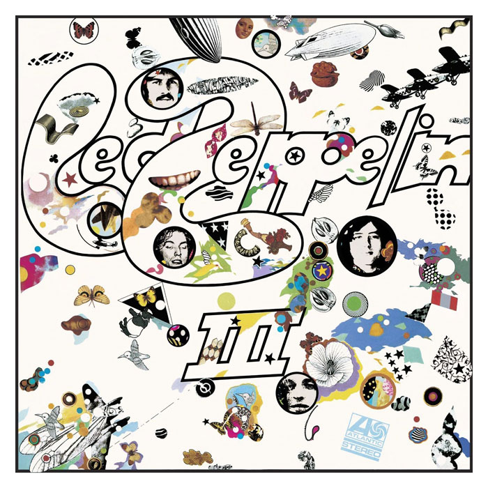
LED Zeppelin - LED Zeppelin III (1970)
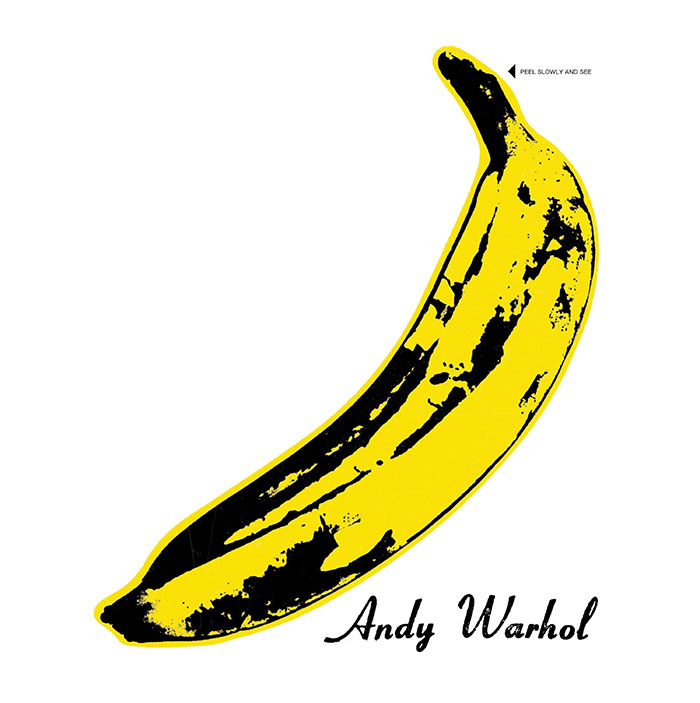
The Velvet Underground And Nico - The Velvet Underground & Nico (1967)
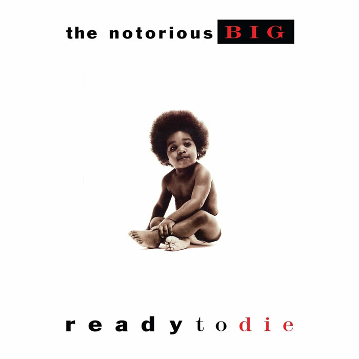
The Notorious B.i.g. - Ready To Die (1994)
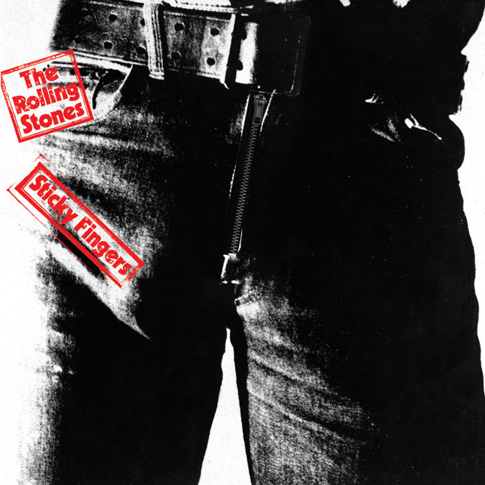
The Rolling Stones - Sticky Fingers (1971)
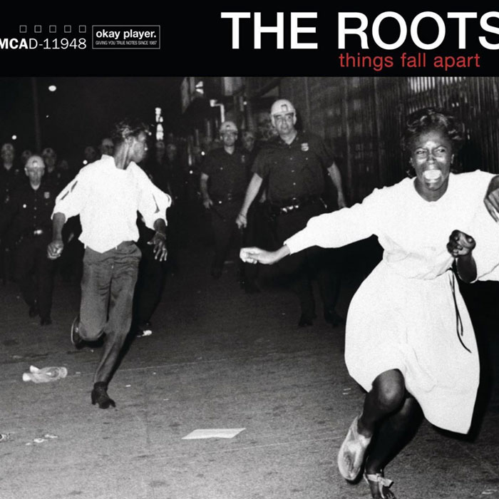
The Roots - Things Fall Apart (1999)
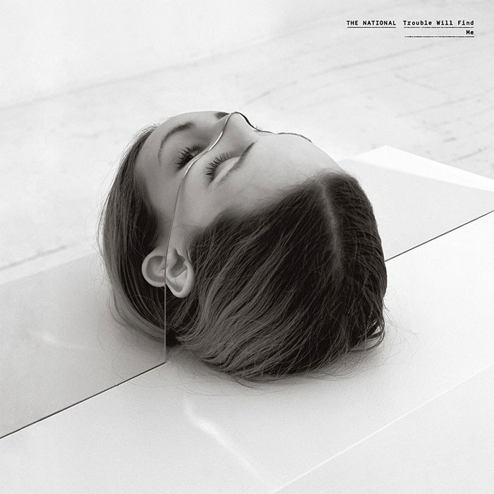
The National - Trouble Will Find Me (2013)
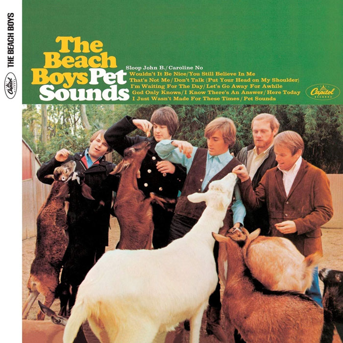
The Beach Boys - Pet Sounds (1966)
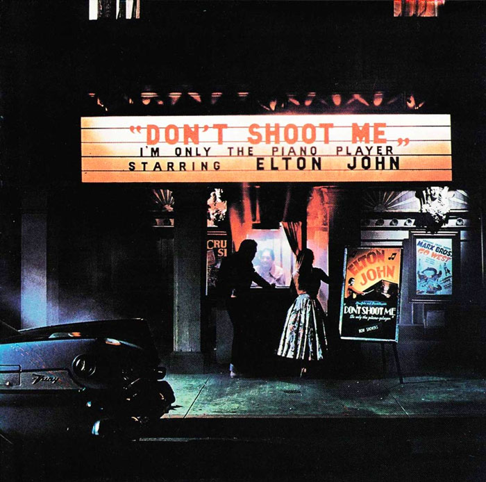
Elton John - Don’t Shoot Me I’m Only The Piano Player (1973)
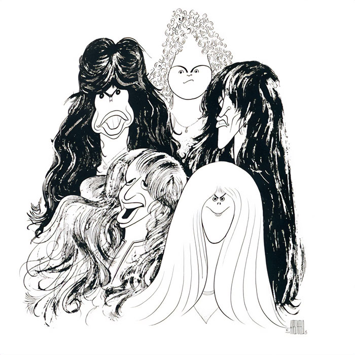
Aerosmith - Draw The Line (1977)
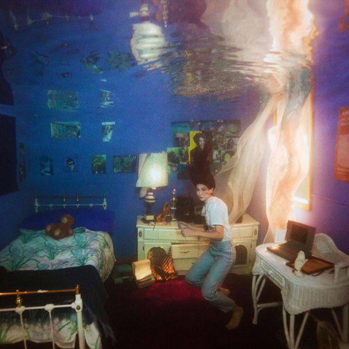
Weyes Blood - Titanic Rising (2019)
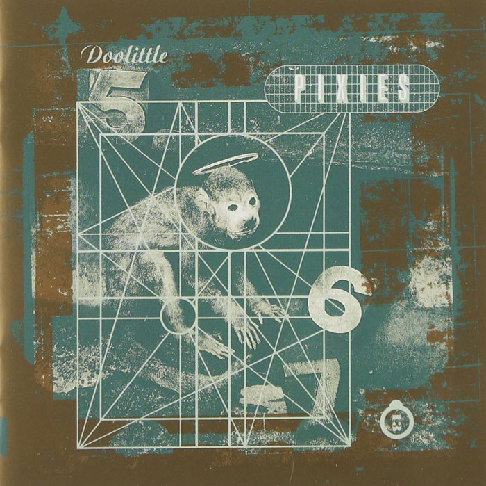
Pixies - Doolittle (1989)
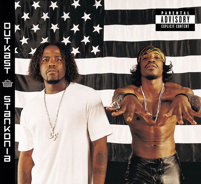
Outkast - Stankonia (2000)
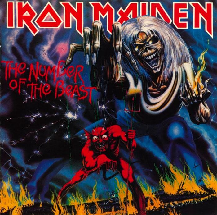
Iron Maiden - The Number Of The Beast (1982)
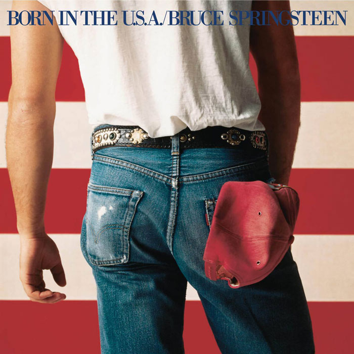
Bruce Springsteen - Born In The U.S.A. (1984)
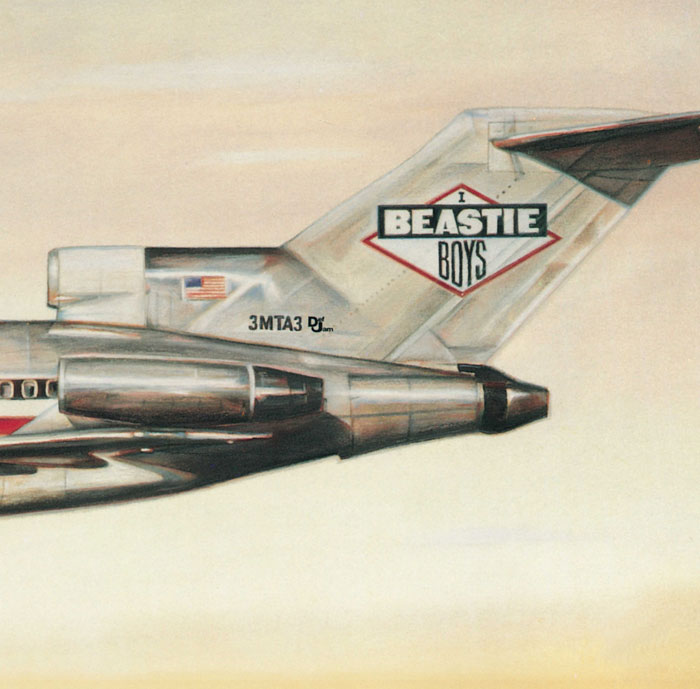
Beastie Boys - Licensed To Ill
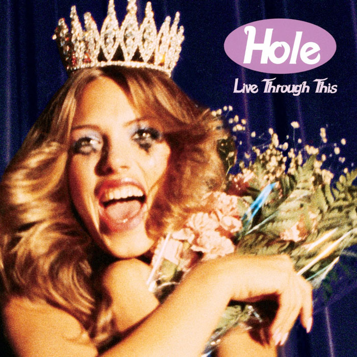
Hole - Live Through This (1994)
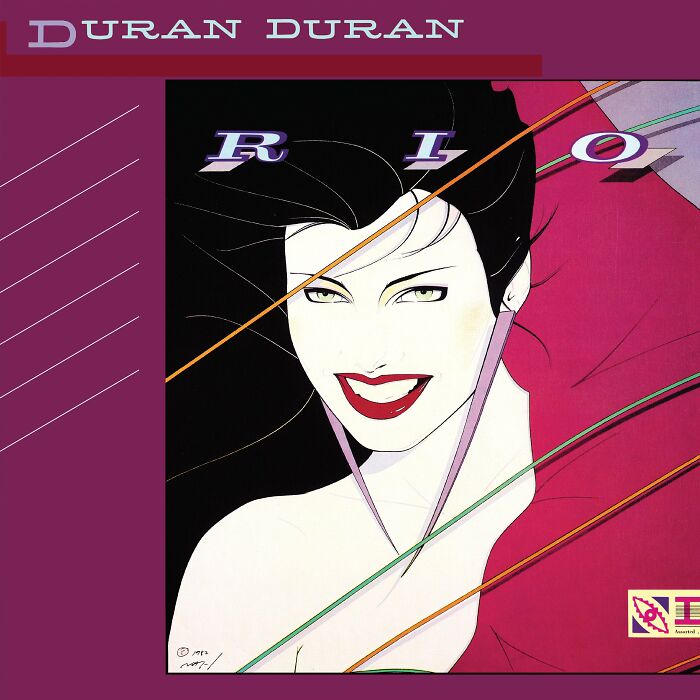
Duran Duran - Rio (1982)
Steely Dan - Aja (1977)
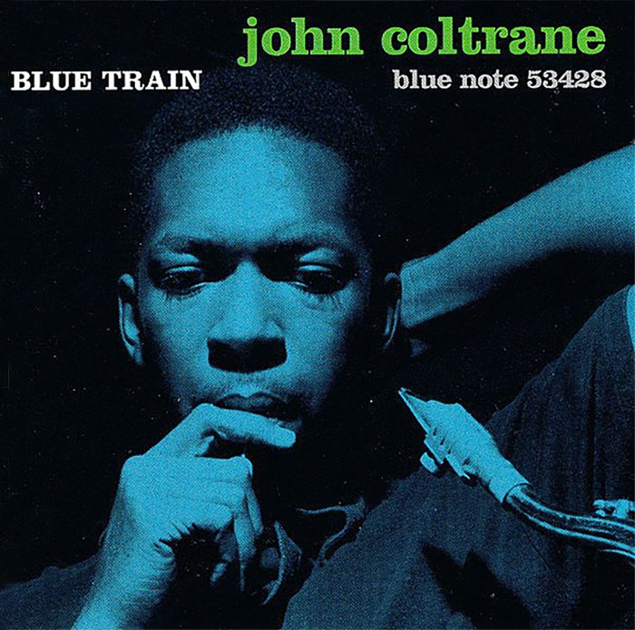
John Coltrane - Blue Train (1958)
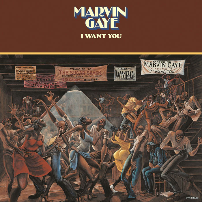
Marvin Gaye - I Want You (1976)
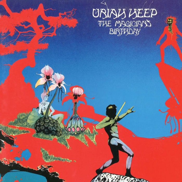
Uriah Heep - The Magician's Birthday (1972)
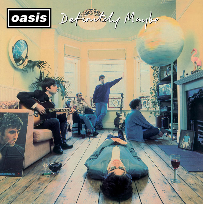
Oasis - Definitely Maybe (1994)
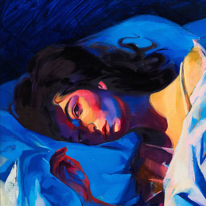
Lorde - Melodrama (2017)
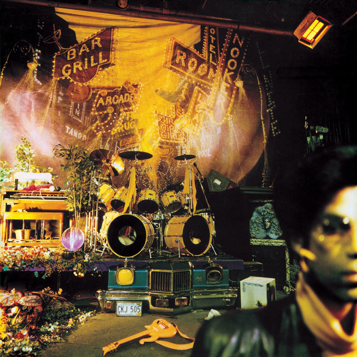
Prince - Sign O' The Times (1987)
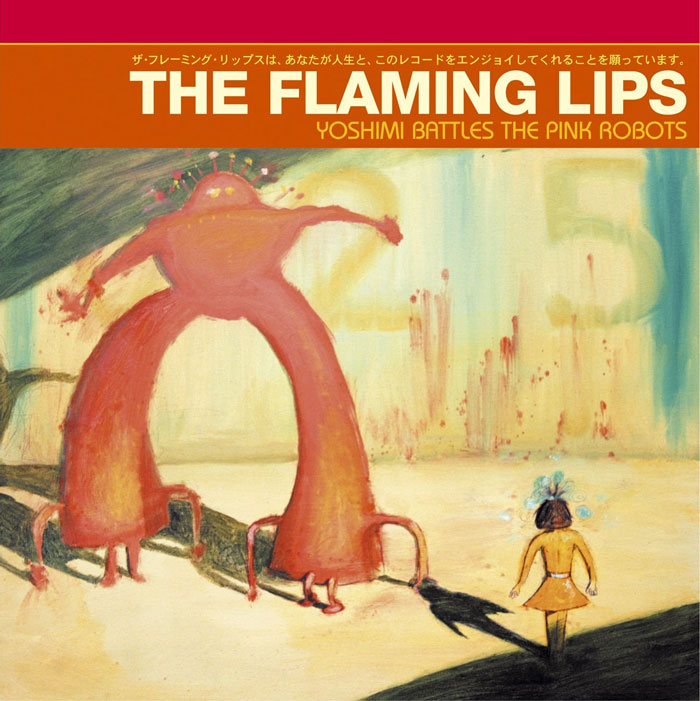
The Flaming Lips - Yoshimi Battles The Pink Robots (2002)
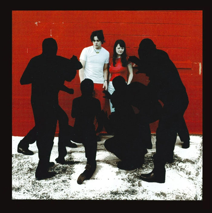
The White Stripes - White Blood Cells (2001)
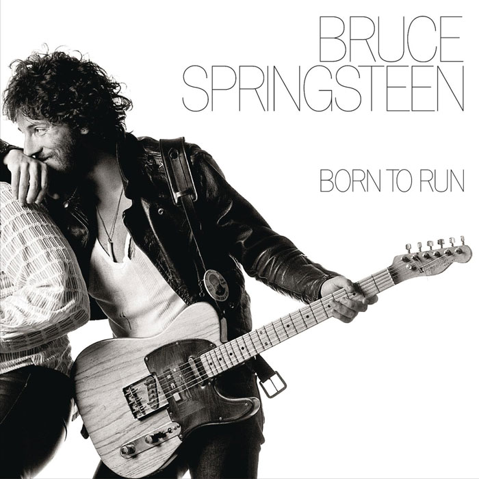
Bruce Springsteen - Born To Run (1975)
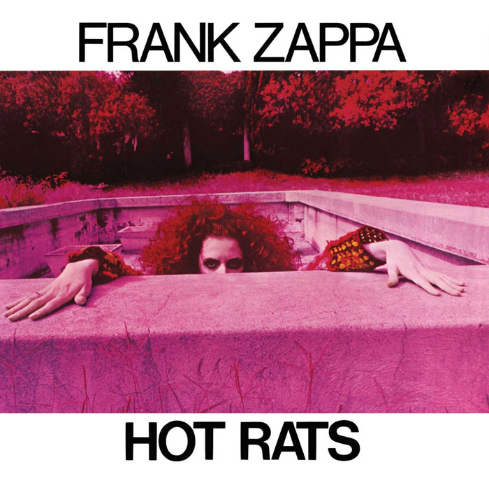
Frank Zappa - Hot Rats (1969)
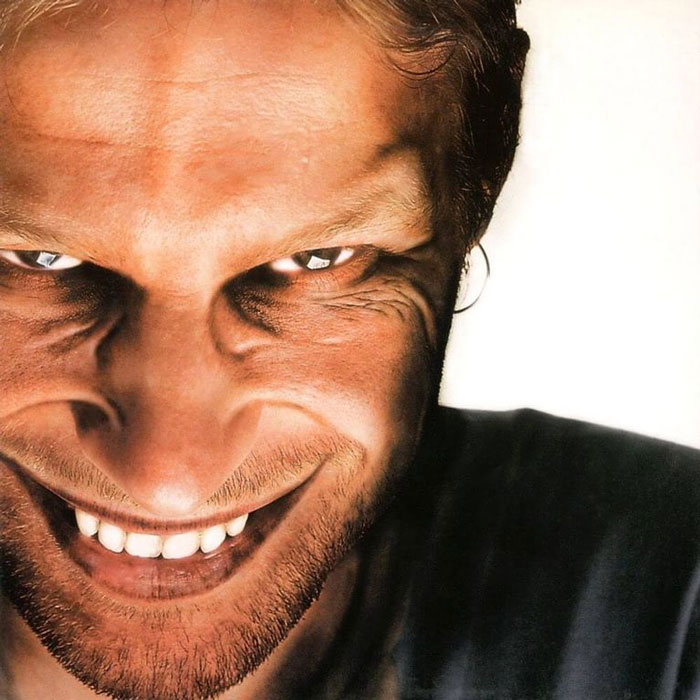
Aphex Twin - The Richard D. James Album (1996)
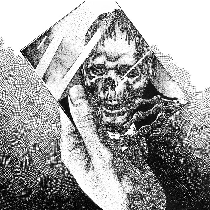
Oneohtrix Point Never - Replica (2011)
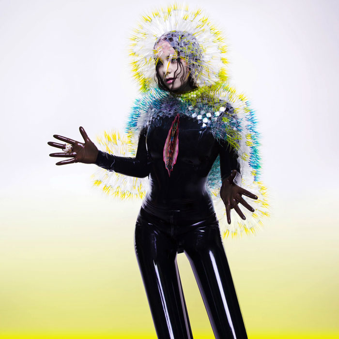
Björk - Vulnicura (2015)
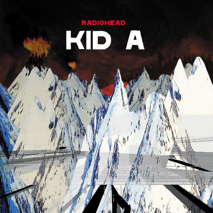
Radiohead - Kid A (2000)
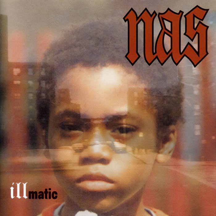
Nas - Illmatic (1994)
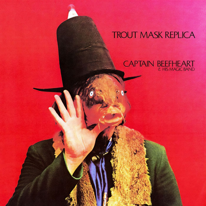
Captain Beefheart And His Magic Band — Trout Mask Replica (1969)
Joni Mitchell - Hejira (1976)
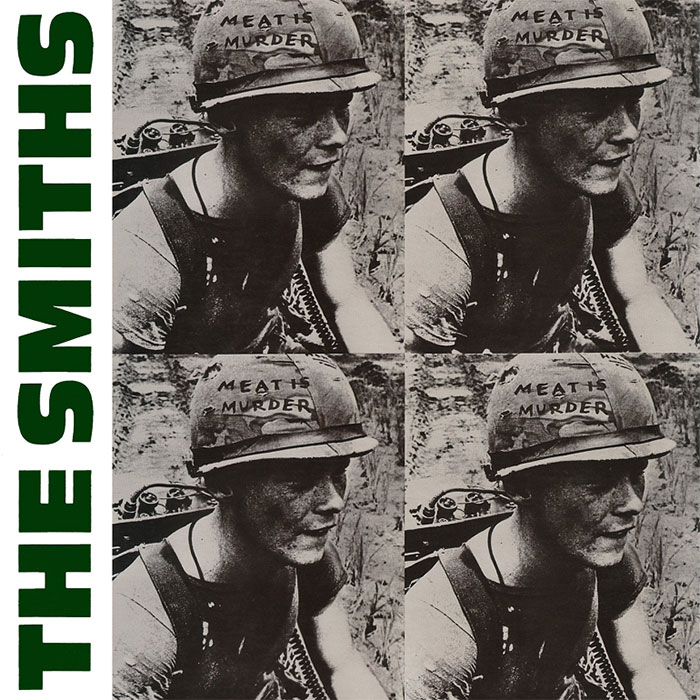
The Smiths - Meat Is Murder (1985)
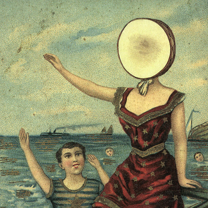
Neutral Milk Hotel - In The Aeroplane Over The Sea (1998)
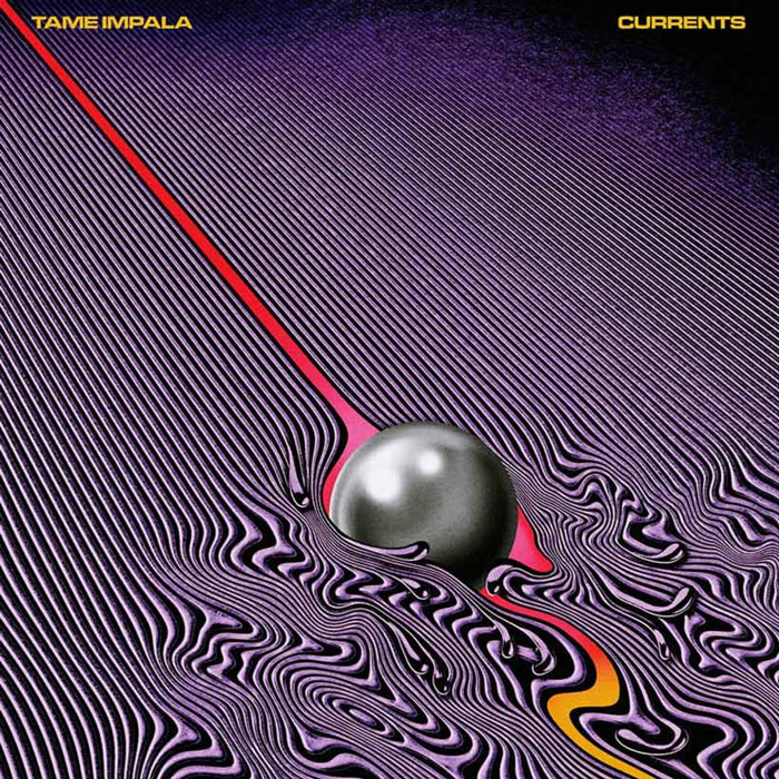
Tame Impala - Currents (2015)
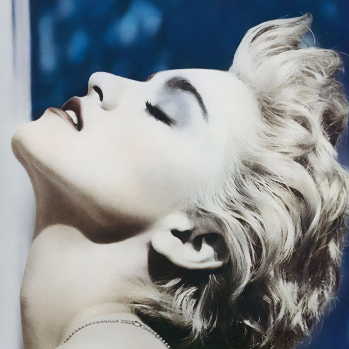
Madonna - True Blue (1986)
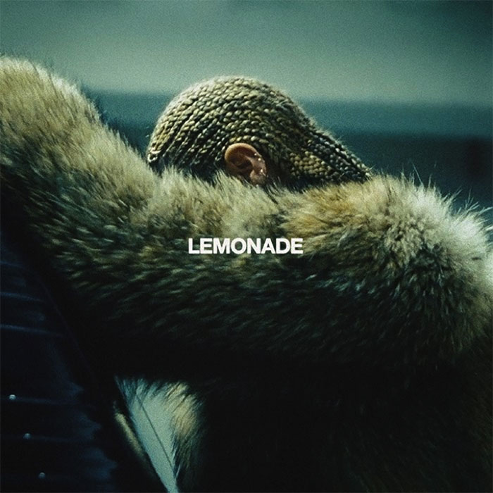
Beyoncé - Lemonade (2016)
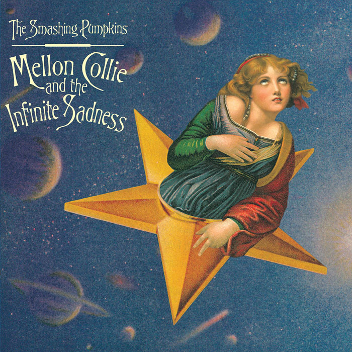
The Smashing Pumpkins - Mellon Collie And The Infinite Sadness (1995)
U2 - War (1983)
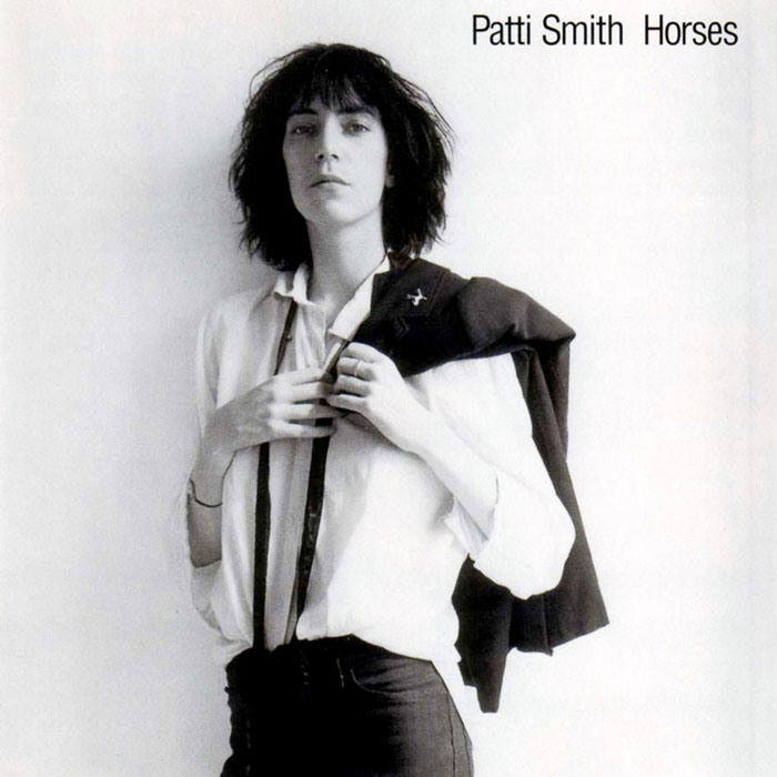
Patti Smith - Horses (1975)
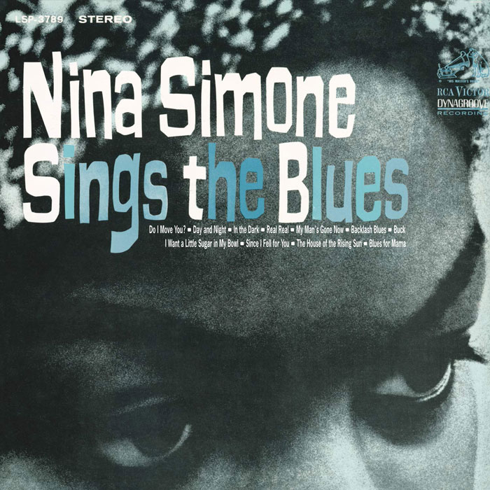
Nina Simone - Sings The Blues (1967)
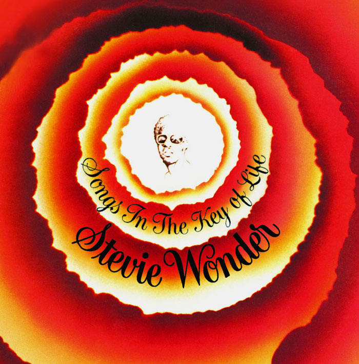
Stevie Wonder - Songs In The Key Of Life (1976)
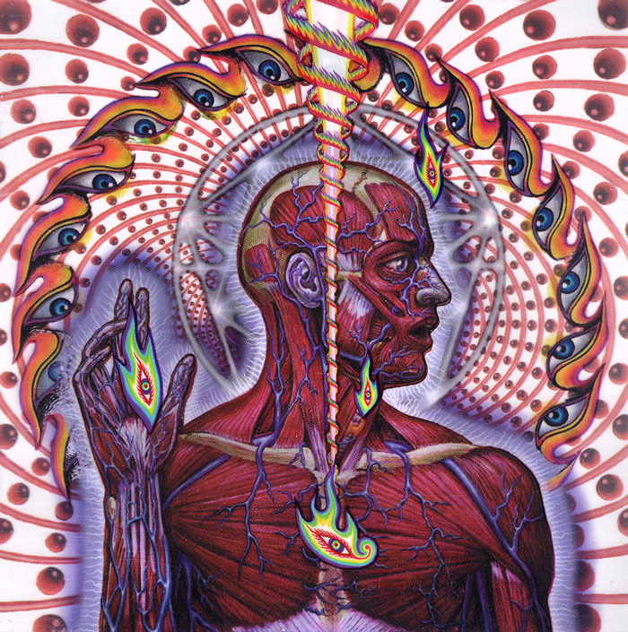
Tool - Lateralus (2001)
Lauryn Hill - The Miseducation Of Lauryn Hill (1998)
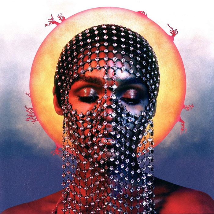
Janelle Monáe - Dirty Computer (2018)
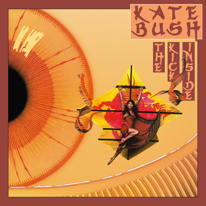
Kate Bush - The Kick Inside (1978)
FKA Twigs - LP1 (2014)
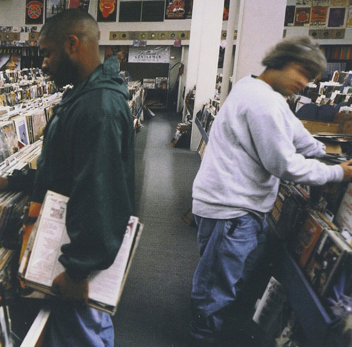
DJ Shadow - Endtroducing..... (1996)
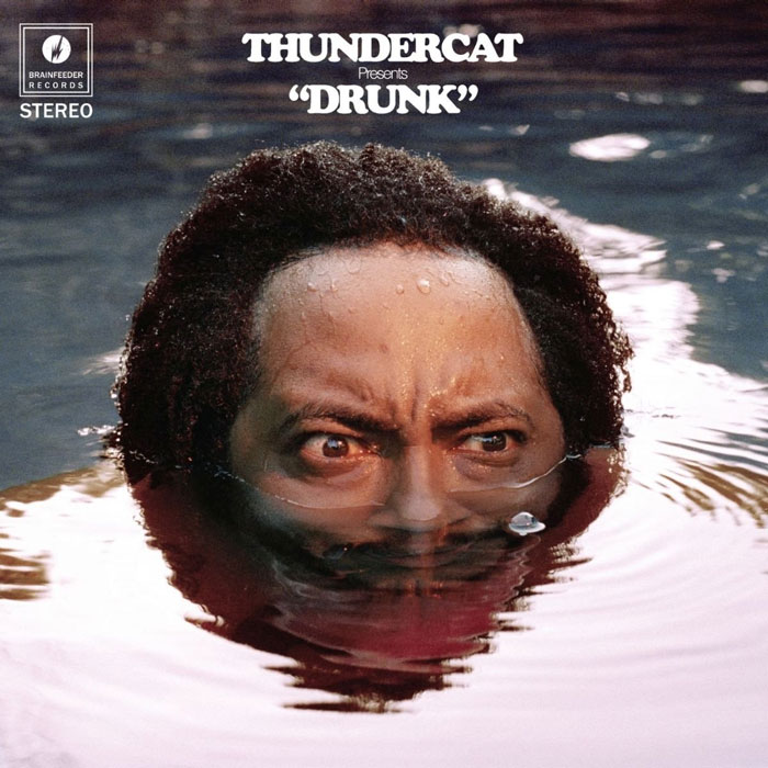
Thundercat - Drunk (2017)
It’s Blitz! - Yeah Yeah Yeahs (2009)
Beck - Odelay (1996)
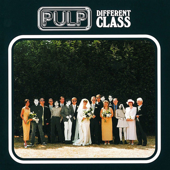
Pulp - Different Class (1995)
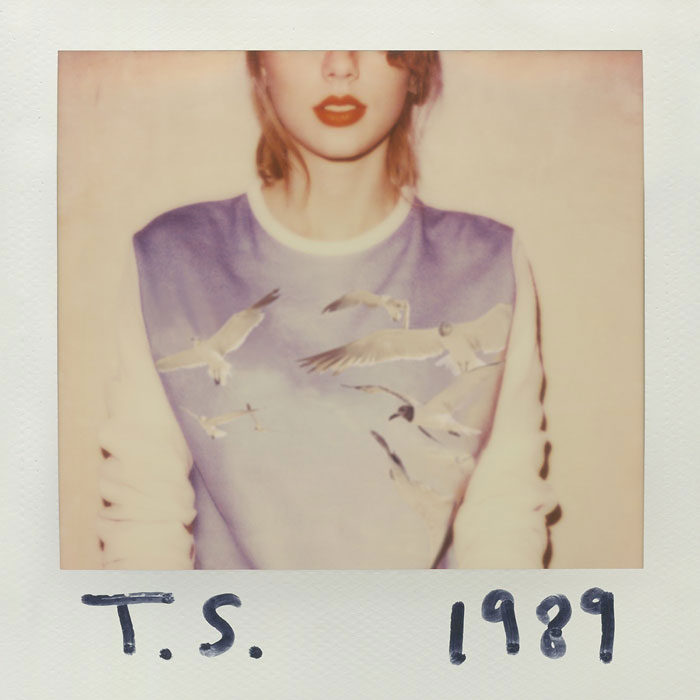
Taylor Swift - 1989 (2014)
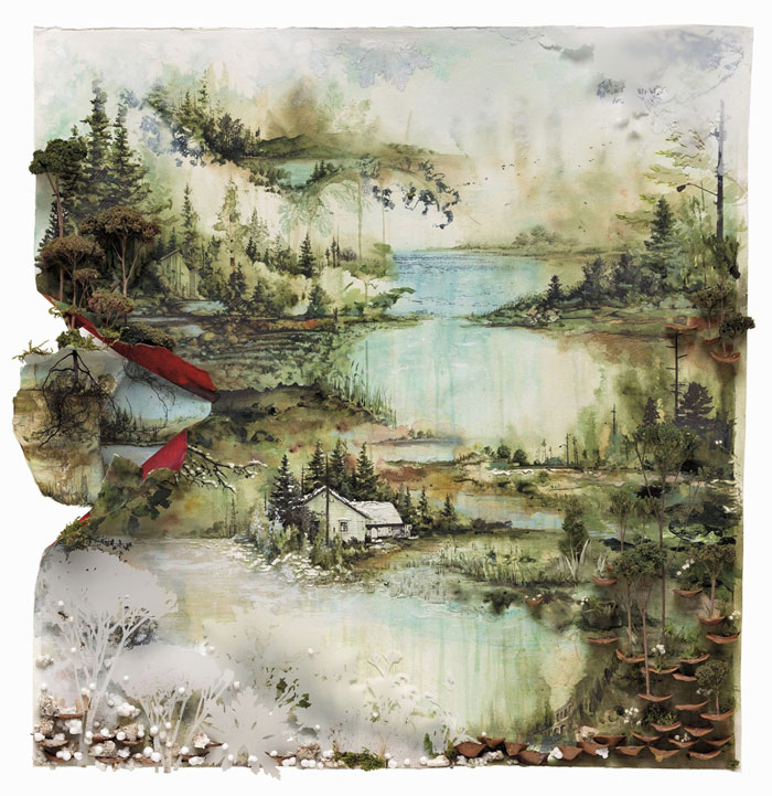
Bon Iver - Bon Iver (2011)
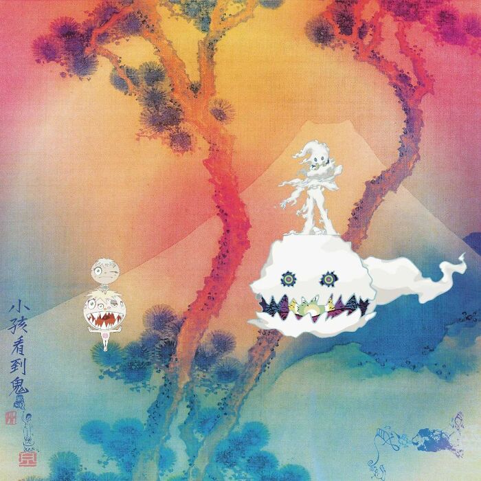
Kids See Ghosts - Kids See Ghosts (2018)
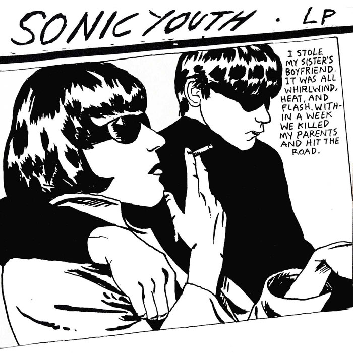
Sonic Youth - Goo (1990)
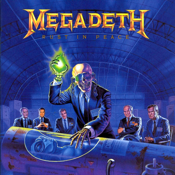
Megadeath - Rust In Peace (1990)
Toto - Turn Back (1981)
Massive Attack - Mezzanine (1998)
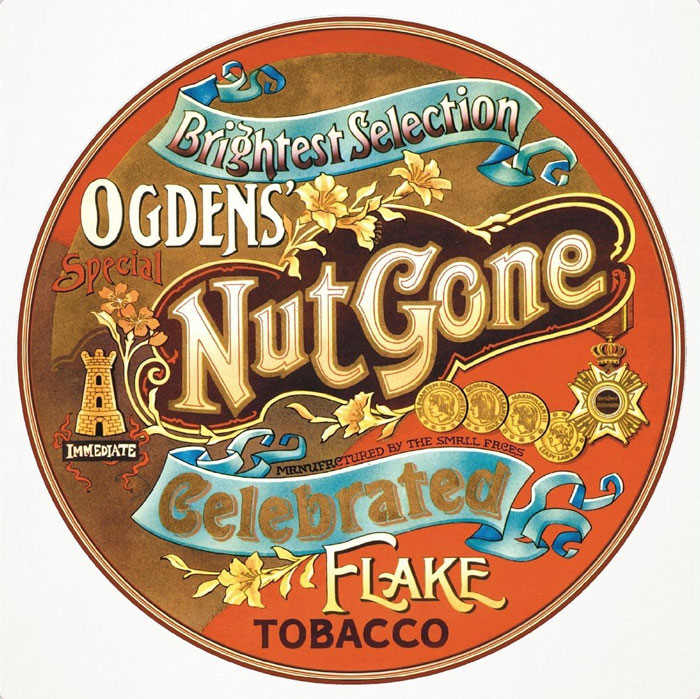
Small Faces - Ogdens' Nut Gone Flake (1968)
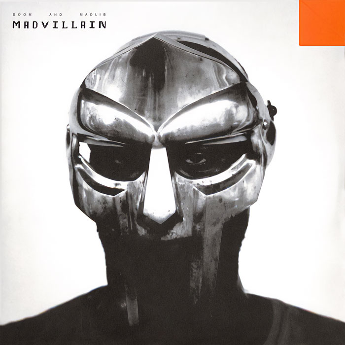
Madvillain - Madvillainy (2004)
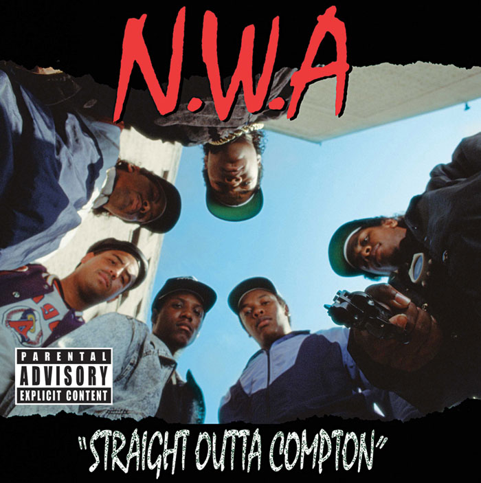
N.W.A. - Straight Outta Compton (1988)
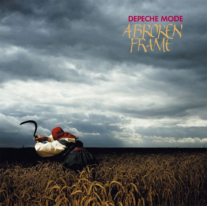
Depeche Mode - A Broken Frame (1982)
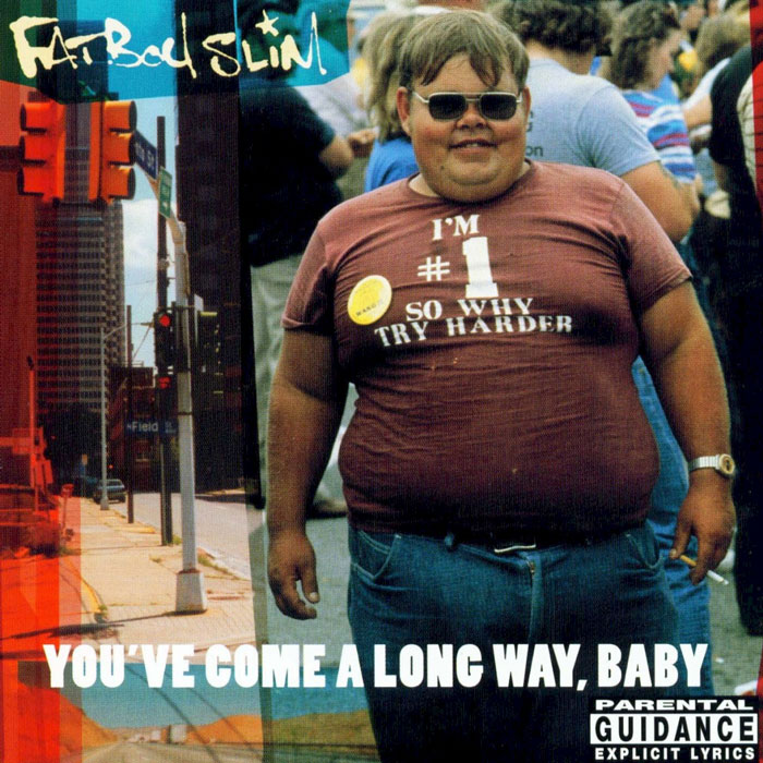
Fatboy Slim - You've Come A Long Way Baby (1998)
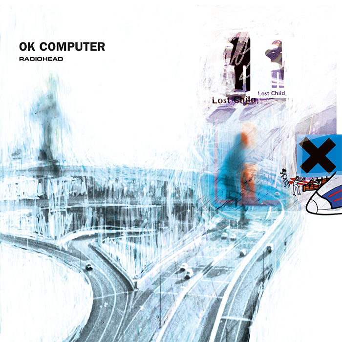
Radiohead - Ok Computer (1997)
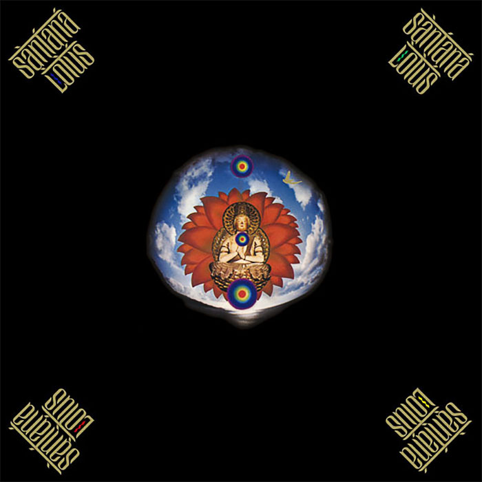
Santana - Lotus (1974)
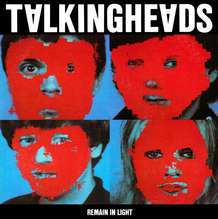
Talking Heads - Remain In Light (1980)
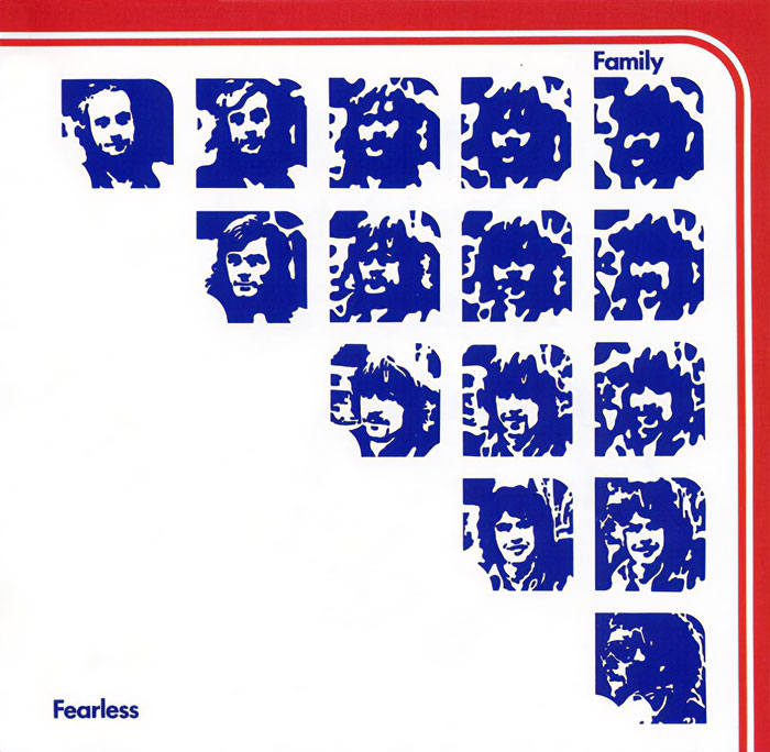
Family - Fearless (1971)
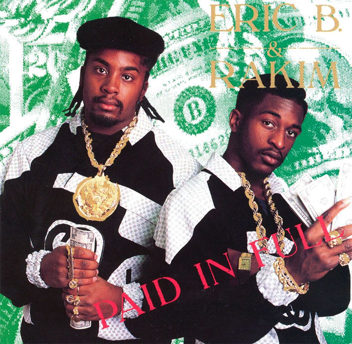
Eric B & Rakim - Paid In Full (1987)
Jamie xx - In Colour (2015)
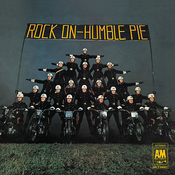
Humble Pie - Rock On (1971)
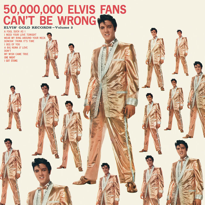
Elvis Presley - 50,000,000 Elvis Fans Can’t Be Wrong (1959)
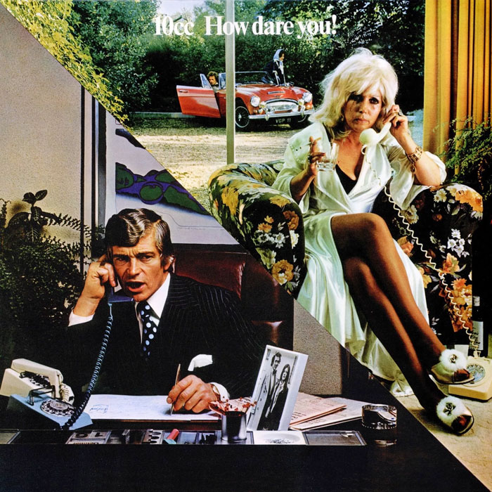
10cc - How Dare You! (1976)
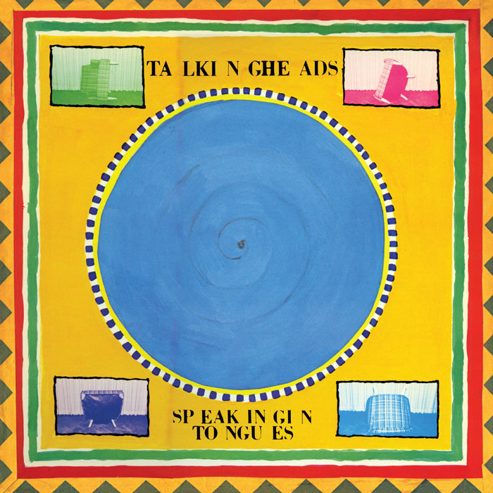
Talking Heads - Speaking In Tongues (1983)
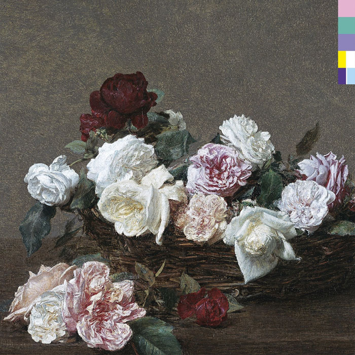
New Order - Power, Corruption & Lies (1983)
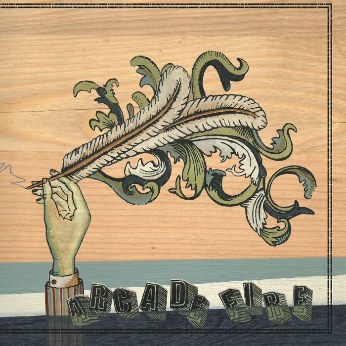
Arcade Fire - Funeral (2004)
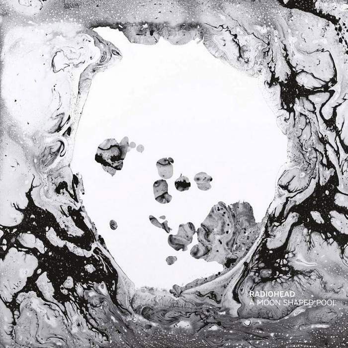
Radiohead - A Moon Shaped Pool (2016)
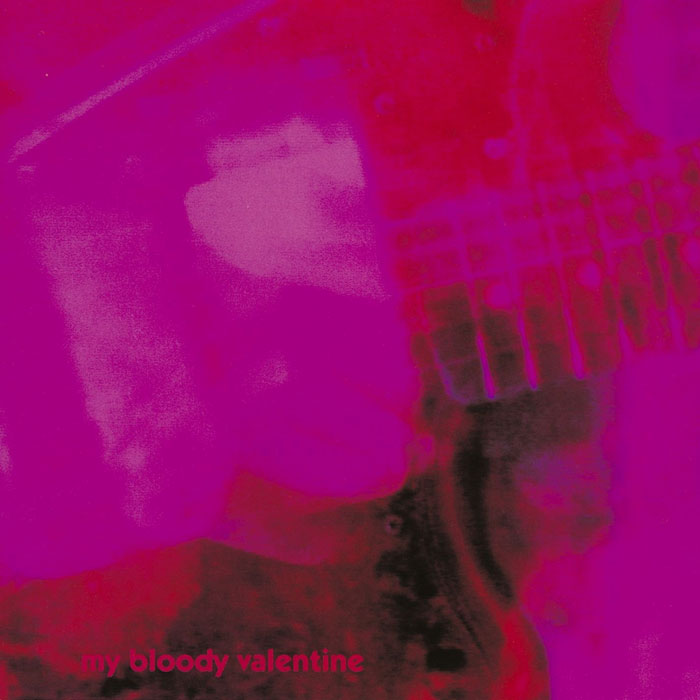
My Bloody Valentine - Loveless (1991)
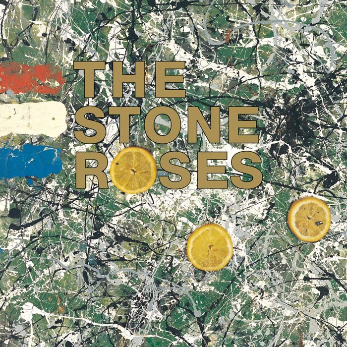
The Stone Roses - The Stone Roses
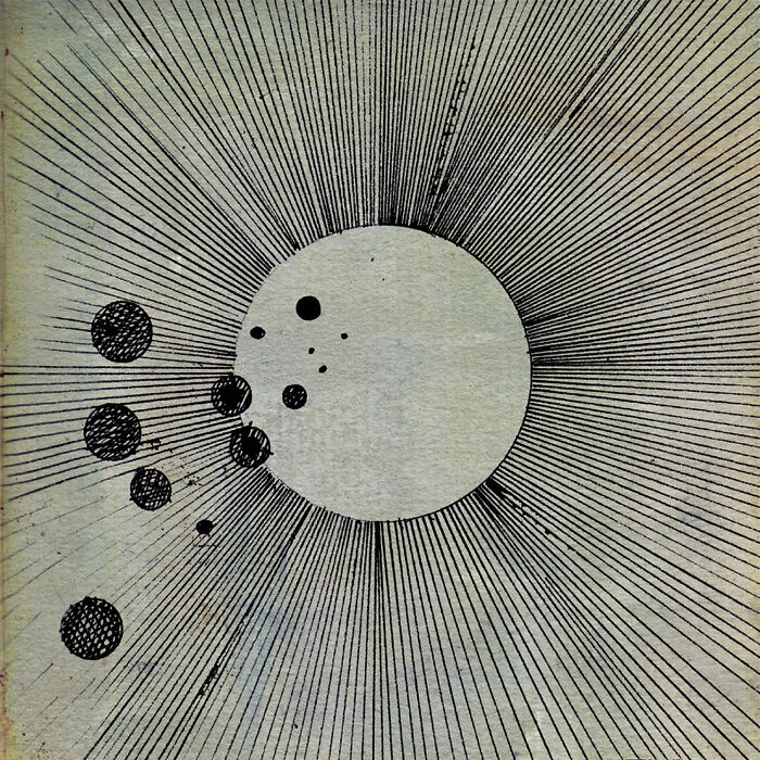
Flying Lotus - Cosmogramma (2000)
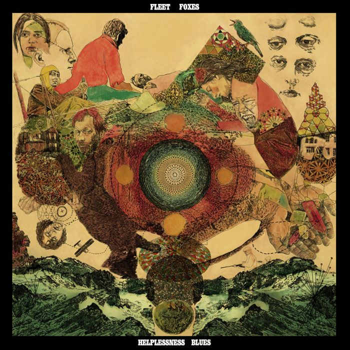
Fleet Foxes - Helplessness Blues (2011)
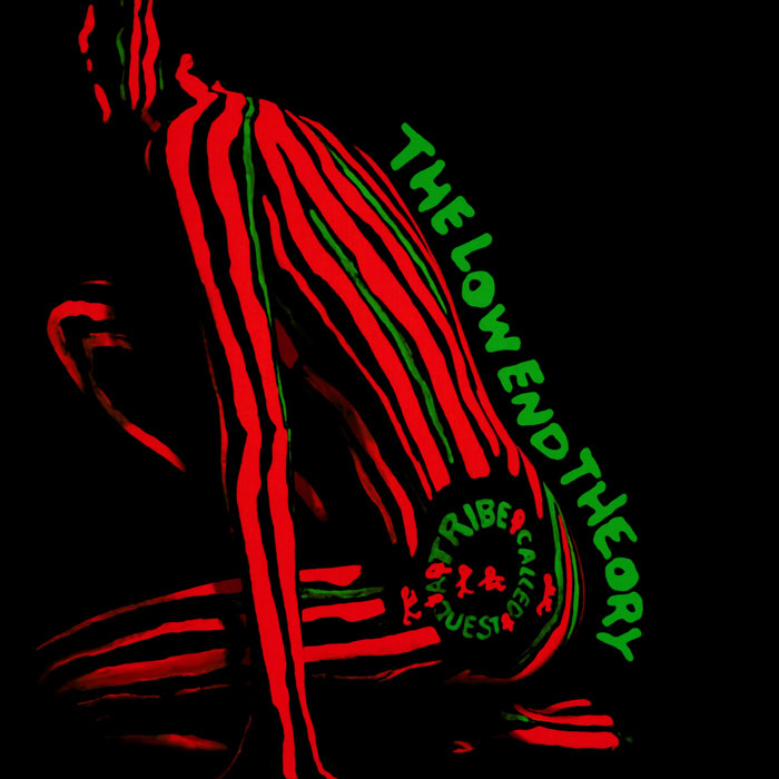
A Tribe Called Quest - The Low End Theory (1991)
Public Enemy - It Takes A Nation Of Millions To Hold Us Back (1988)
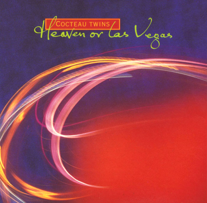
Cocteau Twins - Heaven Or Las Vegas (1990)
The Smashing Pumpkins - Adore (1998)
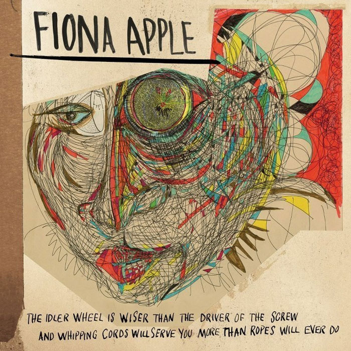
Fiona Apple - The Idler Wheel... (2012)
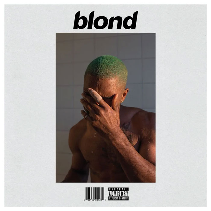
Frank Ocean - Blonde (2016)
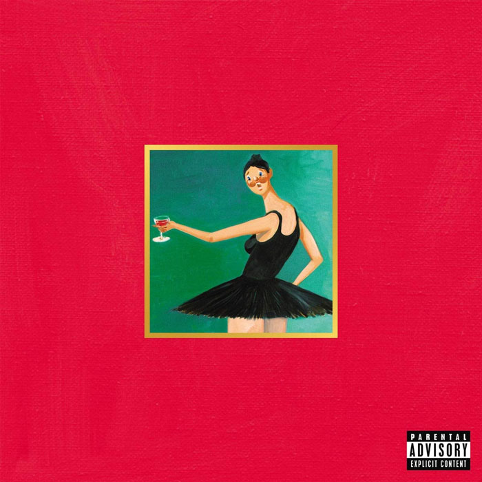
Kanye West - My Beautiful Dark Twisted Fantasy (2010)
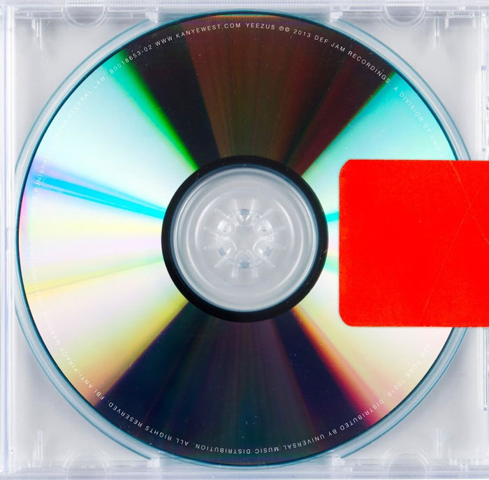
Kanye West - Yeezus (2013)
Some of these were cool or iconic, most of them I did not recognize :/ and I feel like there are some honorable mentions that didn't show up on this list
Most of them were from older times which is good but I also wish there was more diversity by including some more newer albums too.
Load More Replies...Most of these are very famous albums and people vote because of that, not because the design or the photography is good. An example: The Beatles crossing a street is not a creative design, nor a good picture or even a good setting. Oh, but the album is a great one

 Dark Mode

 No fees, cancel anytime


