20 Of The Best Graphic Designs From The 2023 International Design Awards
Get ready to be amazed by the exceptional talent showcased in the "20 Spectacular Graphic Designs" curated from the prestigious 2023 International Design Awards (IDA) winners. This exclusive collection offers a glimpse into the world of graphic design excellence, featuring awe-inspiring creations from visionary designers worldwide.
The International Design Awards is a renowned platform that honors outstanding achievements in various design disciplines, including graphic design, product design, and architecture, among others. Designers of all backgrounds are encouraged to submit their work for a chance to be recognized on a global scale. With submissions open until May 30th, there's still time to showcase your creativity and innovation. Plus, early submissions enjoy a special 10% discount on entry fees, making it even more enticing to join this esteemed community of design innovators.
Don't miss this opportunity to celebrate the transformative power of graphic design and elevate your creative journey with the International Design Awards.
More info: idesignawards.com | Instagram | twitter.com | Facebook
This post may include affiliate links.
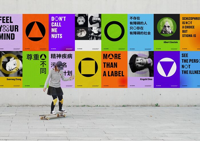
"Remove Public Stigma Of Mental Illness In China" By Yibei Chen
Bronze in Multimedia / Social media campaign
"Public stigmatization of mental illness in rural China demonstrates common stereotypes and negative attitudes towards individuals with mental illness, which leads to severe social discrimination and rejection such as social isolation, withholding employment and opportunities, and less respect. This project will take advantage of graphic design strategies to build up an anti-stigma program, which aims to bring general knowledge of mental illness to rural residents, establish an immersive exhibit and provide design support, and partner with the Chinese government to develop a mobile App."
These designs showcase a wide range of styles, techniques, and concepts, reflecting the diversity and innovation within the field of graphic design. From minimalist and modern designs to intricate and vibrant creations, each piece demonstrates the creativity and versatility of graphic designers in addressing various aesthetic and functional needs.
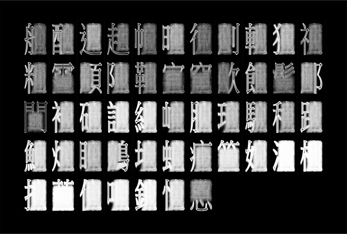
"Hanzi Gong" By Jenwei Huang
Gold in Multimedia / Other Graphic Designs
"The Chinese character is the most ancient language within the four main writing systems in the world, among which, it is even the only language that is in use today.
"Hanzi Gong" is inspired by Kangxi Dictionary (1716), containing 47,035 characters (in Traditional Chinese) and categorized by 214 radicals. Through computer algorithms, the wireframe with thousands of words is thus created with 18,046 characters and 50 (1) radicals, with in total 51 series of artworks."
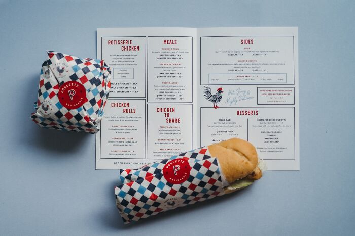
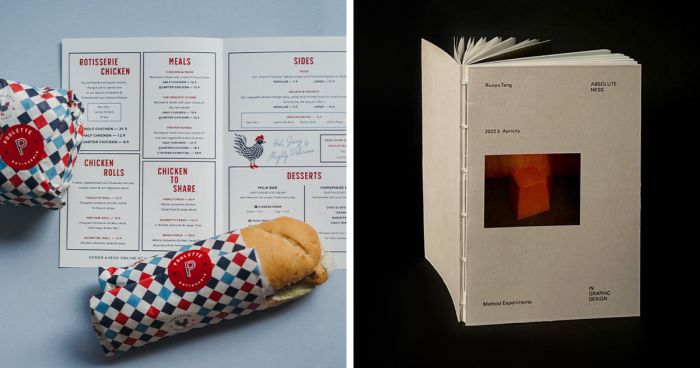
"Poulette Rotisserie" By Ceren Burcu Turkan
Silver in Multimedia / Brand Identity
"Poulette means chicken in French and was the perfect choice for a casual take-away and dining restaurant from Australia. The restaurant's branding and color palette were inspired by the aesthetics of old French restaurant signs and facades while incorporating a modern twist.
The chicken illustration created for the brand can stand alone as a representation of the restaurant's identity, without the need for any accompanying text. The playful nature of the icon is balanced by the use of simple typography, which lends a modern and timeless quality to the logo."
"poulet" is chicken, "poulette" is a young female chicken, but the most used meaning of this word could rather be translated by chick :D and in the 40's !
Platforms like the International Design Awards play a crucial role in fostering global recognition and appreciation of graphic design by providing a prestigious platform for designers to showcase their work to an international audience of peers, professionals, and enthusiasts. Through competitions and exhibitions, such platforms elevate the visibility of outstanding graphic design talent, facilitating networking opportunities and collaboration across borders.
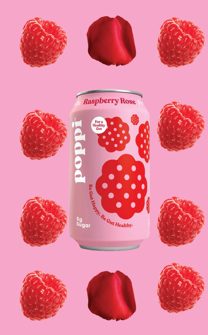
"Poppi: Flavors That Pop" By Alexandra Suarez, Isabella Cascio
Gold in Multimedia / Online Advertising Design, Bronze in Multimedia / Brand Identity
"This is a stop motion video campaign for the brand of soda Poppi. For this campaign, the focus was on the flavors. Showing the different flavors in a very visual and appealing way. The theme is colorful and really highlights the flavors and the fruits they derive from because Poppi does use fresh fruit juice. This campaign is graphic, text, and color-heavy. Included is the presentation with concepts, the hero shots, and videos."
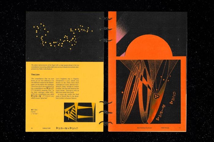
"The Celestial Archivist" By Aarushi Menon
Gold in Print / Books, Gold in Print / Print Editorial, Emerging Graphic Designer of the Year
"The Celestial Archivist is a conceptual booklet created as a hypothetical promotion for the Neenah Astrobrights line of papers. It compares the role of the night sky as the archival medium of the universe’s history to the role of paper as the archival medium of humanity’s history."
The showcased designs at IDA 2023 offer insights into the evolving role of graphic design, indicating a growing emphasis on sustainability, inclusivity, and digital innovation. As technology advances and societal values evolve, graphic designers are expected to play a more integral role in shaping user experiences, communicating complex ideas, and driving positive social change through visually compelling and meaningful designs.
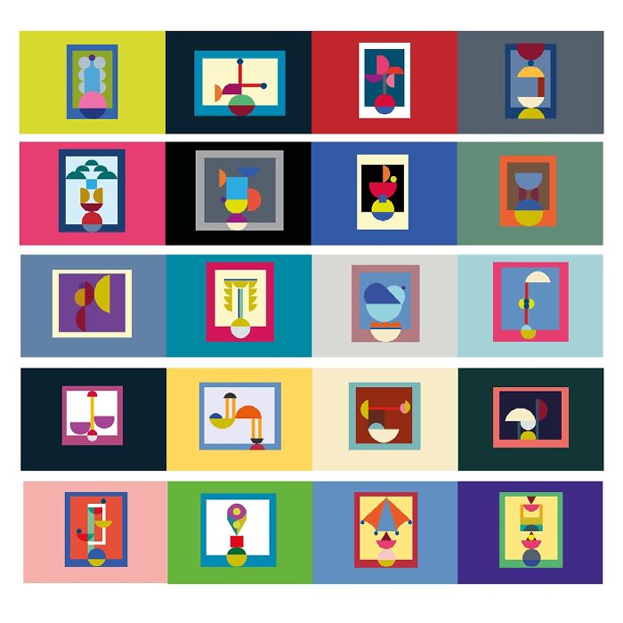
"Obj-Activity" By Chiara Zhu
Bronze in Multimedia / Other Graphic Designs
"We are surrounded by designed objects that make us do a sequence of actions every day. Obj-activity is an homage to the world of things and design objects, things are 'firmed points of existence' according to the philosopher Byung-Chul Han. In a world based on 'info-spheres' the existence of design continues to have relevance and importance against the immateriality of information. The project is a collection of hybrid objects that play with a name both in Italian and English. Each picture seems to be balanced on a half circle that expresses the idea of 'equilibrium'."
These could be great poster designs, or used on textiles like tote bags, shower curtains, t shirts,etc. This is my favorite.
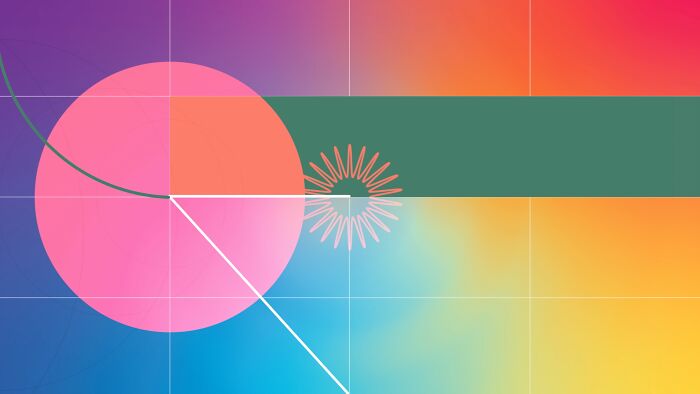
"When A Circle Starts To Dream" By Peiyao (Heather)tang
Silver in Multimedia / Animation
"My creative journey began with a dream In the dream, geometric shapes kept transforming. The scene became increasingly surreal and colorful, which inspired me to turn my dream into a conceptual animation. I put a lot of effort into exploring and researching the color and rhythms. I depicted a conceptual psychedelic dream where each frame stands alone yet remains connected to the whole. The shapes exude symmetrical beauty, with subtle asymmetries reminding the audience of its artificial origins. The frames combine to create a dream-like effect, making each one a treasure waiting to be discovered."
For aspiring graphic designers seeking recognition and success in their careers, I would recommend focusing on honing their craft, staying updated on industry trends and technological advancements, and building a strong portfolio that showcases their unique style and capabilities. Additionally, networking with fellow designers, seeking mentorship opportunities, and participating in competitions like the International Design Awards can provide valuable exposure and feedback to further propel their careers forward.
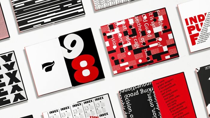
"Rhythmic Structure Of Typography" By Yiwen Zhang
Gold in Print / Books, Gold in Print / Print Editorial, Graphic Design of the Year
"For centuries, art and music have been helping people explore conflicts and themes that influence their actions, thoughts, and emotions. This project studies the positive impact of punk culture on social mental health. Based on the DIY, rebellion, and self in the punk spirit, it forms a coherent and interactive musical narrative style through solid visual language. Its innovative and inclusive concept provides a creative outlet for the rise of art therapy in modern society, allowing the public to express their thoughts, emotions and experiences in an unconventional and unfiltered way."
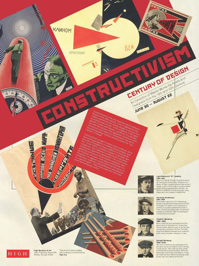
"Constructivism Exhibition Brochure And Poster" By Vitalijs Kuceba
Silver in Print / Zines And Flyers
"In Constructivism, the role of the artist was re-imagined – the artist became an engineer wielding tools, instead of a painter holding a brush. For the Constructivists, artworks were part of a greater visual program meant to awaken the masses and lead them toward awareness of class divisions, social inequalities, and revolution. The Constructivists believed that art had no place in the hermetic space of the artist’s studio. Rather, they thought that art should reflect the industrial world and that it should be used as a tool in the Communist revolution."
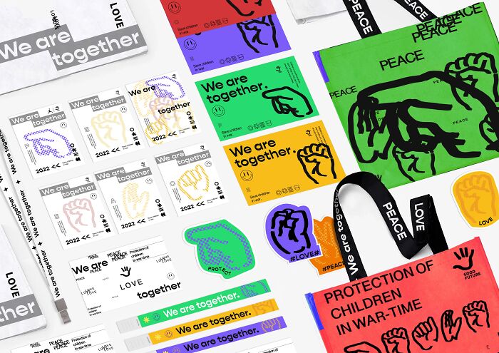
"Good Future" By Mingwang Cao
Gold in Multimedia / Brand Identity
"The Good Future graphic concept aims to convey the idea of protecting children in times of war. The 'Good Future' graphic calls on the public and the government to care for and protect these children. The Good Future graphic incorporates the form of sign language. The sign language is rich and natural, combining a graphic representation of sign language with the theme of child protection in war. The representation of the hand is profound and versatile. It seems to say let us use our hands to change it, to embrace this poor child with our hands and to call the world to love peace."
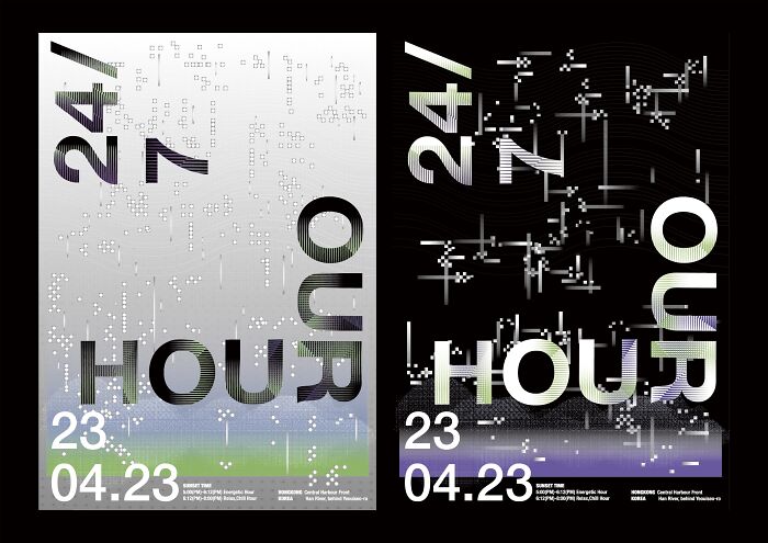
"24/7 Our Hour" By Jimin Hur
Silver in Print / Posters
"'24/7 Our Project' is a collaborative coursework project between students from Hong Kong Polytechnic University and Hongik University in South Korea. This project required us to design posters for an imaginary concert based on a playlist selected by the students. Our group created 2 posters that represent the 2 main music genres chosen: Relax & Chill, and Energetic. We selected songs for the concert lineup based on different times of the day. We used overlapping layers to capture the essence of each genre. Overall, we want to show the importance of music in our daily lives through this poster."
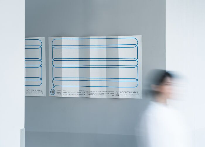
"Accumulate" By Hou,yi-An
Gold in Print / Key Art
"'Ordinary stories are an opportunity to unlock life and design'.
Imagine all the things that happen in "life" are stacked up one on top of the other. It may be a simple thing, a memorable sentence, a thought-provoking book, a song, a film, a collaboration.... ..... All these things, big and small, build up a "stack".
We are constantly exploring design in our lives, thinking independently and analyzing carefully, throwing out questions, putting forward hypotheses, and through communication and dialogue with each other, letting millions of traces pile up, the self-training mind keeps flowing and draws down a moment to build up together, and the overlapping traces, the ordinary story, is an opportunity to open up life and design so that the process of growth - the overlap - can be emphasized. The spirit of ...... continues to accumulate.
In order to convey this idea, we planned an activity that called for students in Grade 112 to record Podcasts and have conversations. We chatted about their daily lives, interesting stories, and the painful process of making the podcasts. We learned about their stories and captured their different perspectives on 'Stacking', recorded all the words, and presented them in the posters with localized lighting. By combining text and visuals, we use minimalist images and elongated posters to tell the story of how life is made up of processes, traces, and twists and turns that continue to pile up in the course of an ordinary day. The stories that we care about and are concerned about are then extended outwards, bringing emotion and inspiration to the audience."
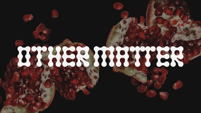
"Othermatter" By Hyunji Jun
Gold in Multimedia / Website Design, Silver in Multimedia / Brand Identity
"Othermatter is an online platform to introduce fashion designers to innovative biomaterials that can minimize the environmental impact. Our goal is to make it easy for fashion designers to explore and source various materials and enable them to collectively change the fashion industry more sustainable. Our logo comes from the form of a living cell, which can be fabricated into a fabric swatch or the iconic modular typography. Neon point color communicates the creativity and energy of the pioneering interdisciplinary fashion design field."
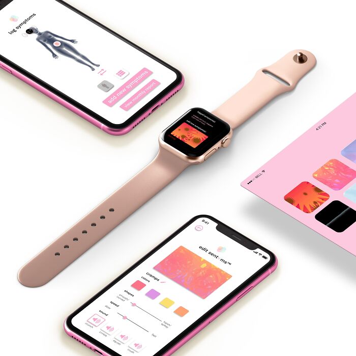
"Sentoms" By Shani Abass
Gold in Multimedia / Mobile / Web Application Design, Bronze in Multimedia / Interface Design
"Sentoms are multimedia pain icons (incorporating sound, motion, and color) that can be edited and used to log pain symptoms via mobile and wearable applications.
They are designed to increase specificity in clinical pain communication and supplement verbal descriptions, which can often be misinterpreted.
The apps also include resource libraries, messaging with healthcare providers, and curated physical and therapeutic exercise plans with progress tracking.
Use cases beyond chronic pain include aiding those with language barriers or (non-verbal) autism in clinical settings."
I don't know why this was downvoted. This is such a crucial concept! I recently attended a seminar with several health care professionals who were discussing the many problems with the current number based pain assessment system. A redesign that features colour and location seems like an interesting reboot.
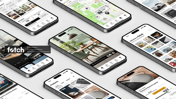
"Fetch" By Jung Joo Sohn
Gold in Multimedia / Interface Design
"In a rapidly advancing tech world and an expanding consumer market, the service 'fetch' aims to integrate sustainable e-commerce, AI recommendations, and efficient product management. Our goal is to revolutionize how users buy, sell, and manage second-hand items, promoting sustainability and affordability through an AI-driven marketplace. Fetch uses AI-generated images and a user-friendly warranty system to help users visualize products in their own space, making it easy to manage all items. This enhances confidence and convenience in second-hand shopping while encouraging sustainable choices."
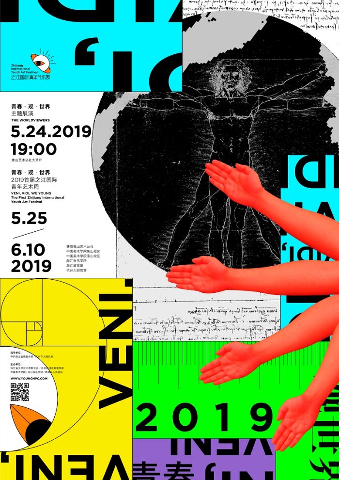
"Zhijiang International Youth Art Festival 2019" By Peitao Chen
Silver in Print / Corporate Identity, Gold in Multimedia / Brand Identity
"Zhijiang International Youth Art Week takes 'Youth, View and World' as its core concept. The logo graphic uses the eyeball and the earth to design evolve and explore the 'worldview' and 'youth view' of the young people of the era. 'View' is a 'view' that maps the world view of young people and the concept of youth in the world. 'View' is also 'watching'. It is a pair of eyes full of curiosity and desire. It implies the questioning and confrontation of the identity of young people in reality. The pursuit of the future."
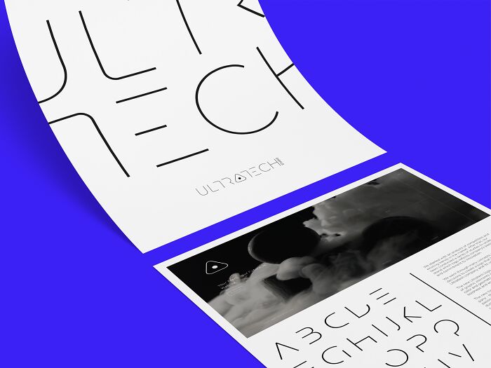
"Logo Design For The Ultratech Studio" By Aliaksandra Nazarkina
Gold in Multimedia / Brand Identity
"We are NZR, an international retail design and branding studio founded in 2015.
The project we are excited to present is the branding of Ultratech Studio, a company specializing in innovative technologies for enhancing business processes. The resulting style and logo are a distinctive fusion of graphic elements and a custom font, meticulously crafted to resonate with the company's core values. We opted for a color palette comprising white and graphite, complemented by simple and strict geometric shapes, in order to convey the brand's audacity and its forward-thinking approach."
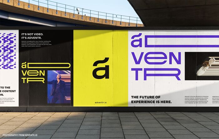
"Adventr" By Elaine Chaw & Jerome Harris
Gold in Multimedia / Brand Identity
"Adventr is a platform of endless possibilities. Empowering creatives to bring an entirely new realm of experiences to life, they believe that the next generation of interactive, connected media should be accessible to everyone.
We were approached to create a brand that would articulate the rebellious and cool freedom of exploration, calling to action the creative seeker in us all. We honed in on a typographic representation centered around the concept of movement and interaction, visually showcasing the transition between choices users can take when immersing themselves in the content."
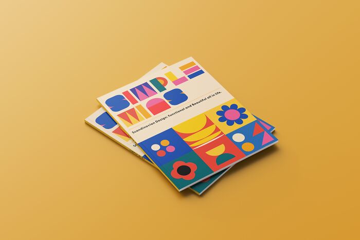
"Simple Wins" By Yongtai Huang
Bronze in Print / Collateral Material, Gold in Print / Catalogs
"I designed the exhibition catalog and collateral about Scandinavian furniture design."
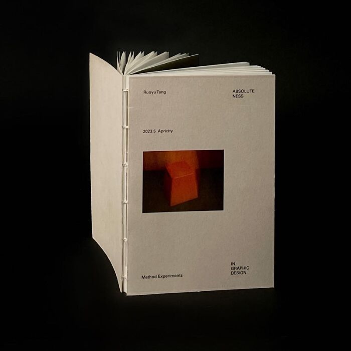
"Absoluteness In Graphic Design" By Ruoyu Tang
Silver in Print / Print Editorial
"Designers use straightforward, mediocre, and superficial visual language and text to output the content to readers. And the audience receives directly what the designer wants to convey. In this book, I want to clarify that designers can create infinite possibilities for the audience to imagine, instead of limiting the audience’s thinking. Today, designers need to use design elements smarter, and they also need to trust their audiences to 'imagine' and 'feel' the beauty behind their designs."
... and grey, cardboard-looking book cover is how the convey this? Can you judge a graphic-design book by its cover?
To be clear: this is the KIND of article that I would love more of! Any criticism I've expressed is towards the individual nominees; the fact that I don't care for them does not change the fact that the topic is stimulating. So good for Bored Panda on this, even if not so good for the IDA judges. IOW: MORE PLEASE!
Exactly. I DO NOT WANT TO READ ABOUT NAKED CELEBRITIES. I DO NOT. I don't even want to have to scroll PAST articles about naked celebrities. That's what Buzzfeed is for.
Load More Replies...Cold, abstract to the point of being devoid of humanity. It's enough to make a Verdana font seem like Shakespearean poetry or Michelangelo's Pieta. The violence towards the people that brutalism represented has raised its ugly, and I do mean ugly in the most fundamental sense, head once again. (With a few exceptions. "Poppi" isn't exactly earth-shaking, but it's appealing.)
I've been around long enough to see trends reused constantly, making everything feel unoriginal. But the point is, proper graphic design for product and information should be clear and serve its purpose. It shouldn't prioritize artistry at the expense of clear communication. While some ads might be more artistic, those creators would likely struggle in traditional graphic design positions that demand clear and functional communication.

 Dark Mode

 No fees, cancel anytime


