Designer Fixes The ‘World’s Worst Logos’ (9 Pics)
Interview With ArtistA brand logo can make it or break it in the big game. Just look at the most iconic logo designs—from Apple to Nike, there’s something genius, yet so simple about them. But that’s an exception rather than a rule.
Italian graphic designer Emanuele Abrate knows very well how bad logos can be. From unclear messages and typography gone wrong to designs that are just too far to be saved altogether, these are some of the problems Emanuele is targeting in his new project. And “The worst logos ever, redesigned” does exactly what it says. Emanuele has picked 9, in his opinion, of the worst company logo faux pas that could be saved from a distasteful limbo. He interpreted them in his own ways and the results are down below.
Bored Panda contacted Emanuele based in Cherasco, Northern Italy to find out more about the idea behind his project. “I had the idea of redesigning the worst logos ever for a long time. I’ve been coming across the articles about bad design logos with unclear messages from all over the world for several years (one of these articles I think I read on Bored Panda,)” he told us. Scroll down to read the full interview below and check the new logos!
More info: EmanueleAbrate.com | Behance.net | Facebook | Instagram
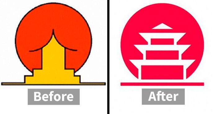
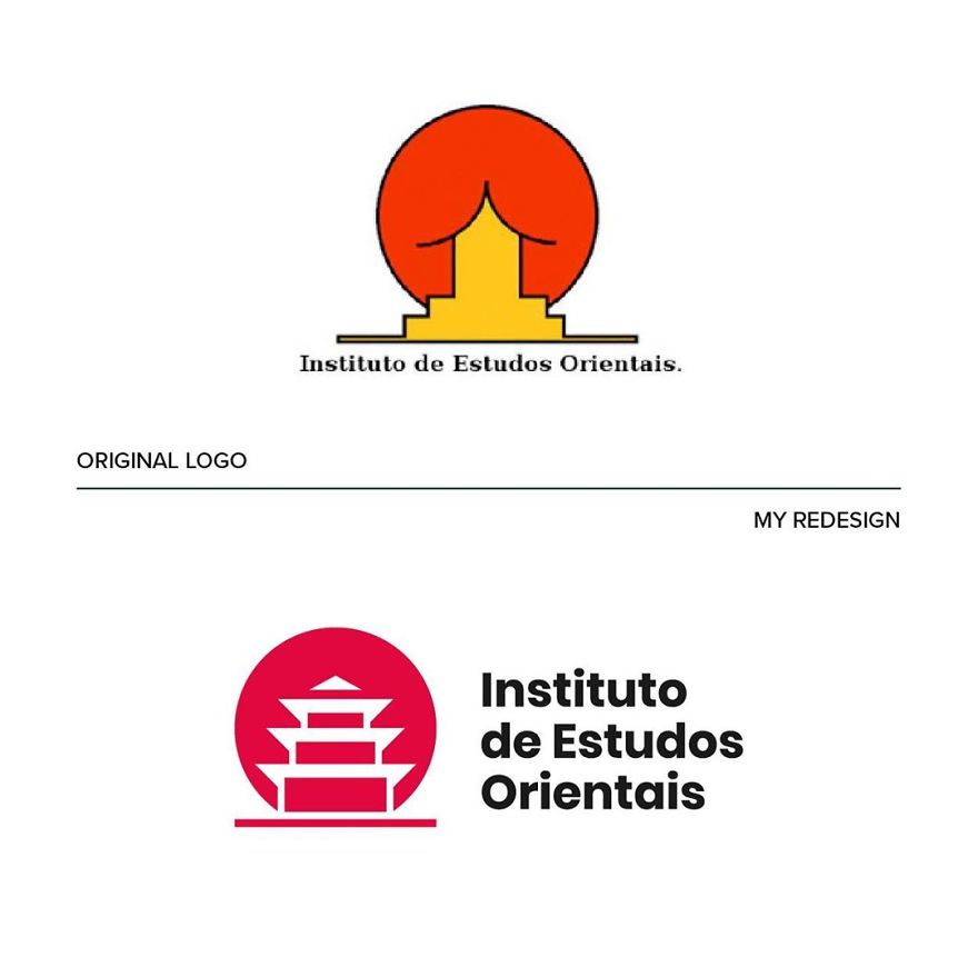
Instituto de Estudos Orientais
Image credits: emanueleabrate.com
Image credits: emanueleabrate.com
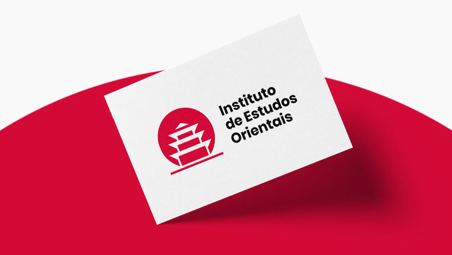
This particular case is a great example of a logo with ambiguous message. “I wanted to keep the concept unchanged, working on the negative space and enhancing the figure of the pagoda,” he writes on Behance. Emanuele eliminated the outline for a fresh and modern look. He also aligned the typography with the pictogram and converted the font to sans serif, which “matches the symbol better.”
Emanuele selected 9 of what he thought were the worst logos and rolled up his sleeves. “I was trying to figure out how I would approach them if they were really commissioned to me.” The result is not only fun but also “educational and helps to understand that design is not only aesthetic but, above all, it’s about problem solving.”
The designer believes that the best logos are those “that manage to indelibly enter people’s minds through simplicity and that manage to create an effective and coherent visual ecosystem with the brand they represent.”
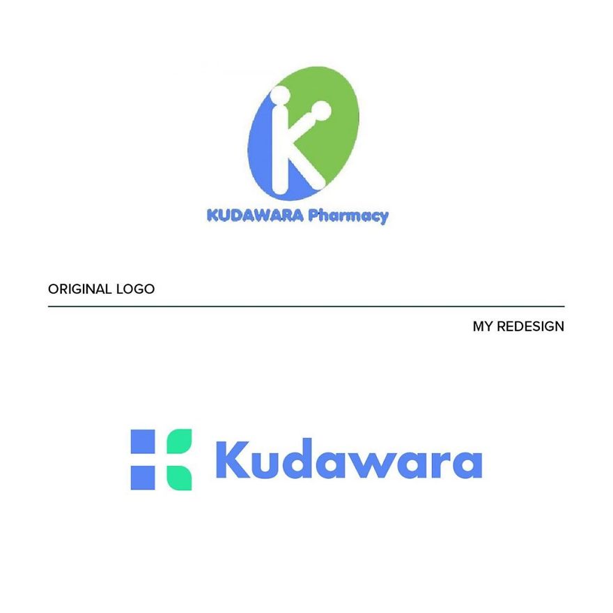
Kudawara Pharmacy
Image credits: emanueleabrate.com
Image credits: emanueleabrate.com
Image credits: emanueleabrate.com
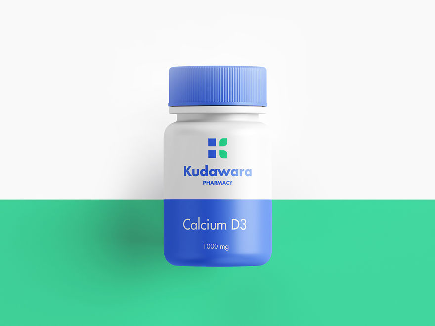
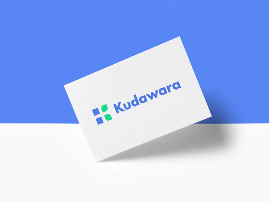
Emanuele believes there are many different problems with this logo. He names a couple of them: “a poor use of typography, disproportionate elements, and the defective use of shapes that creates an ambiguous message.” He said he was ready to delete the whole thing and keep the K as a lettermark only. “I used simple shapes to build the letter K and give a sense of trust linked to nature.” Plus, “In the negative space you can also see a cross (a distinctive element in the pharmaceutical field).”
Fire Prevention Products
Image credits: emanueleabrate.com
Image credits: emanueleabrate.com
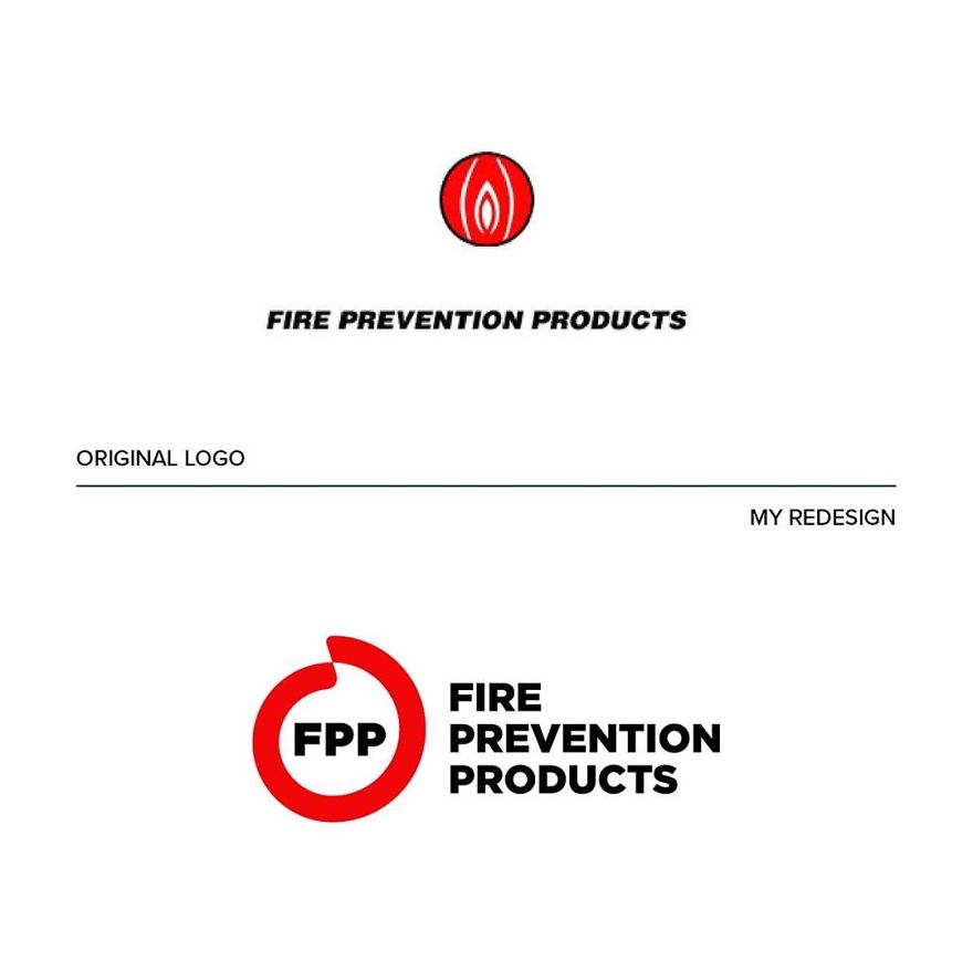
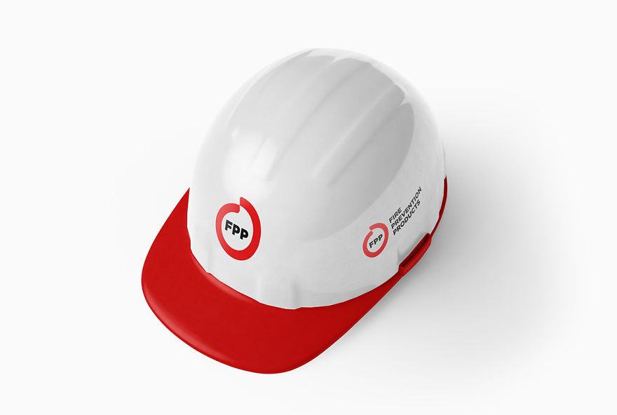
“This logo suggests that something ‘down there’ is on fire, uh là là!” joked the Italian designer. Of course, it doesn’t hold the sense of safety one would expect. “That’s why I decided to develop a new concept starting from circular shapes that enclose the figure of a flame in the negative space.” The name has been shortened to the acronym “FPP,” which gives the logo great recognition even if the full text isn’t present.
Emanuele said he’s “a big fan of the work of Chermayeff & Geismar & Haviv and I fully agree with their philosophy” because “their logo design projects are the ones that best resist the ‘test of time.'” Such logos should be both simple and unusual enough to look appealing. A good logo should also always “have an interesting concept and be in line with the company identity which it represents,” he commented.
Mama’s Baking
Image credits: emanueleabrate.com
Image credits: emanueleabrate.com
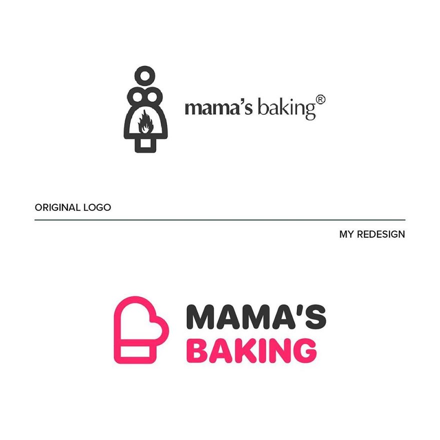
Emanuele has given this logo a whole new concept. The idea was inspired by “the figure of the mother who cooks with passion.” Imagine her taking the hot pan out of the oven. “I started from the oven mitt as an iconic symbol, and tied it with a heart for the message of love and passion.”
The Computer Doctors
Image credits: emanueleabrate.com
Image credits: emanueleabrate.com
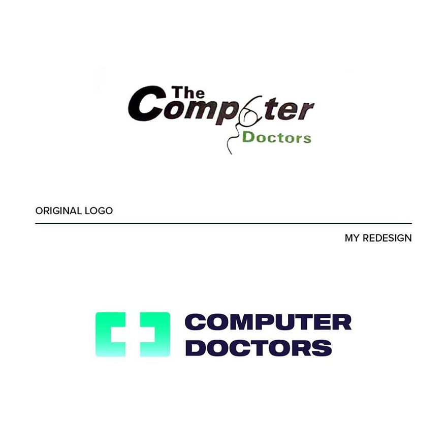
Emanuele dubbed this design so bad that “nothing could be saved of it.” Thus he came up with a new concept that combines the worlds of technology and health care. “The idea behind the new logo was to start from the shape of a monitor to insert a cross in the negative space and at the same time enhance the initial letters C and D,” he explained.
Clinica Dental San Marcelino
Image credits: emanueleabrate.com
Image credits: emanueleabrate.com
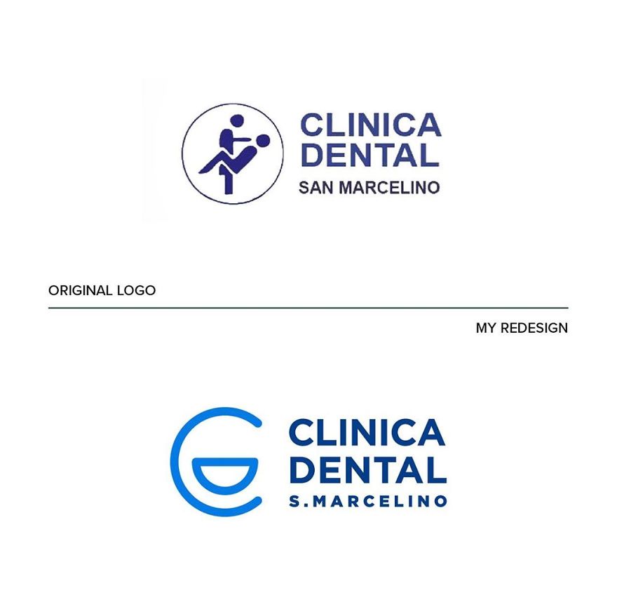
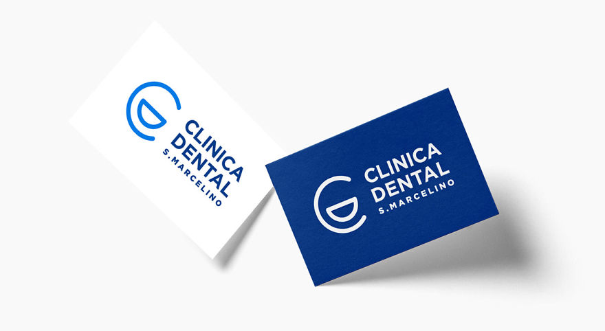
“A dentist or a seducer?” That’s what came to Emanuele’s mind when he saw this one. “The logo is so unclear that I came up with a simpler and less descriptive solution.” Thus, he arranged the letters C and D so that they form a smiling face. “The clean, rounded lines and the blue color are intended to convey a sense of confidence and cleanliness,” he commented.
Emanuele currently teaches a course called “Logo Hero” that provides all the education you’d need about logo and brand designs. He also manages “Logofonts” on Instagram, where he reveals what kind of fonts famous logos are using. In fact, “the idea for this page was inspired by the success of my project on Behance.”
OGC (Office of Government Commerce)
Image credits: emanueleabrate.com
Image credits: emanueleabrate.com
Image credits: emanueleabrate.com
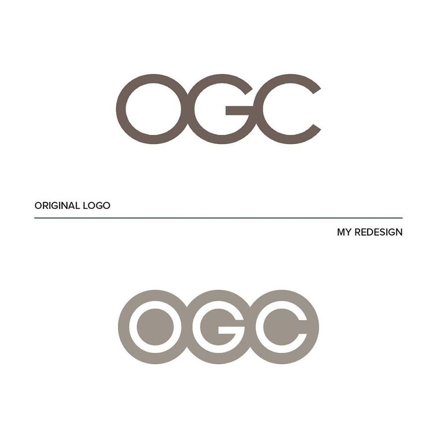
At first, it seems like the original OGC logo has nothing wrong with it. “But by rotating the logo, you can see a rather embarrassing figure (definitely not a good move for a government agency),” explains Emanuele. That’s why he restyled the logo by enhancing the letters, eliminating the outline and giving it a modern look.
Safe Place
Image credits: emanueleabrate.com
Image credits: emanueleabrate.com
Image credits: emanueleabrate.com
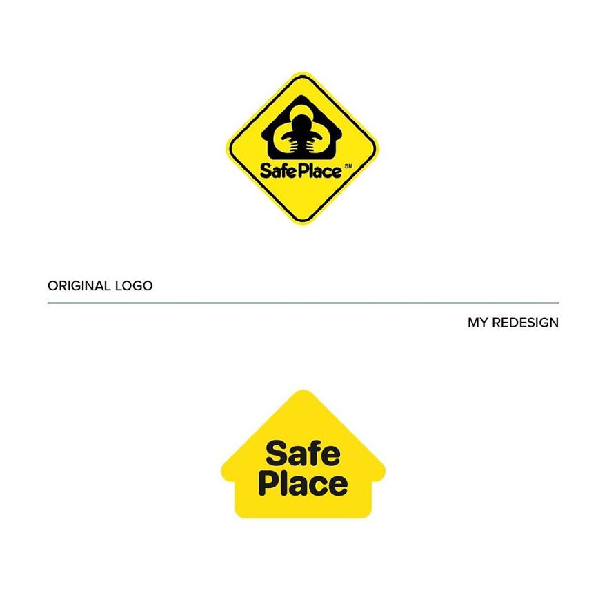
This case has just too much going on: “It’s all shapes inside shapes inside other shapes.” Emanuele rolled up his sleeves: “Ok, let’s do some tidying up, let’s take away everything that is superfluous: the house is the only really evocative element of this logo and so, let’s enhance it!”
Arlington Pediatric Center
Image credits: emanueleabrate.com
Image credits: emanueleabrate.com
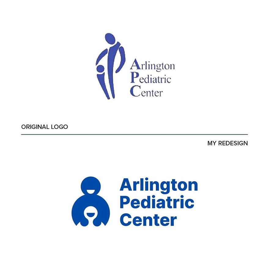
The new logo starts with the same concept, but it’s more confident. “The simple and circular shapes make the pictogram friendly and warm. I also replaced the typography with more modern but still institutional sans serif.”
3.9Mviews
Share on FacebookWell, at least the big figure isn't forcing the little figure into fellatio anymore...
Load More Replies...All but a few of the originals takes my mind in the way wrong direction. I can't help but wonder what the original designers were thinking, or the people who approved of those designs and decided to make use of them...
I agree that pretty much all the originals were terrible, but some of the redesigns are pretty flat too.
Look at world's most famous logos. Aren't they simple if not just stylish brand names sometimes even without any or just very simple graphic elements? (gucci, armani, vuitton, apple, nike, adidas, google, microsoft, audi, bmw, etc). Many people thinks logo should be something elaborated but actually a logo should be able to communicate an idea in the simplest and immediate way is possible
Load More Replies...Well, at least the big figure isn't forcing the little figure into fellatio anymore...
Load More Replies...All but a few of the originals takes my mind in the way wrong direction. I can't help but wonder what the original designers were thinking, or the people who approved of those designs and decided to make use of them...
I agree that pretty much all the originals were terrible, but some of the redesigns are pretty flat too.
Look at world's most famous logos. Aren't they simple if not just stylish brand names sometimes even without any or just very simple graphic elements? (gucci, armani, vuitton, apple, nike, adidas, google, microsoft, audi, bmw, etc). Many people thinks logo should be something elaborated but actually a logo should be able to communicate an idea in the simplest and immediate way is possible
Load More Replies...
 Dark Mode

 No fees, cancel anytime



















557
194