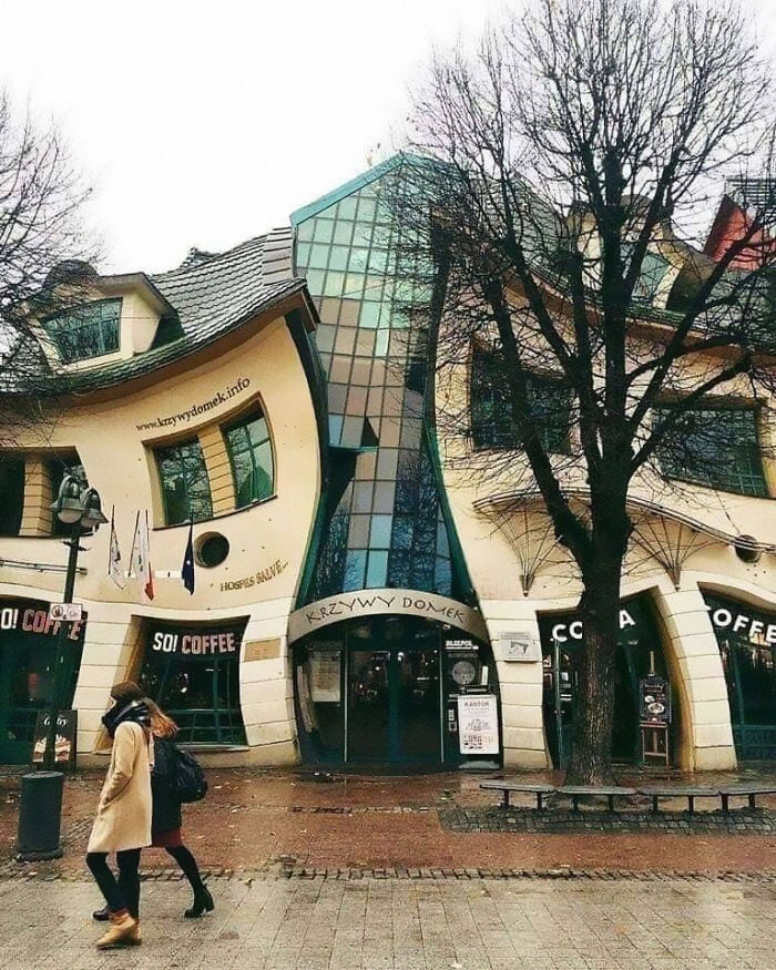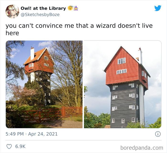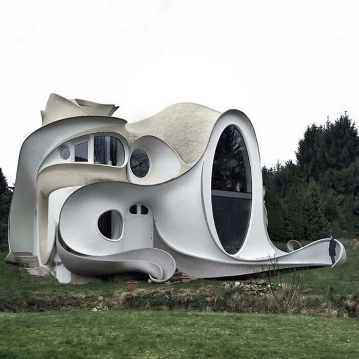
‘That’s It, I’m Architecture Shaming’: 40 Architecture Examples That Look So Bad, People Just Had To Shame Them
Some buildings will absolutely fascinate you with their stunning designs, genius architectural decisions, and the sheer power of their aesthetics. This article isn’t about these kinds of buildings, however. Nope! Not all buildings are made equal, you see, and the ‘bad’ ones need to be shamed publicly so that others don’t copy their designs. So we’ll be focusing exclusively on just plain terrible architectural decisions.
And the worst of the worst end up on the ‘That’s It, I’m Architecture Shaming’ Facebook group where users mercilessly prod and poke bad design. It’s fun, it’s educational, it’s something cool to scroll through during your next coffee break.
Remember to upvote your fave photos that you love to hate and be sure to follow the architecture-shaming Facebook group if you like their stuff. They’re a growing community with awesome content.
Bored Panda spoke about what separates good and bad design, the need to democratize the access to quirky private property designs, as well as about the roles that architecture plays with an expert in the field from Sweden who has a background in urban planning. You’ll find our full interview with her below.
This post may include affiliate links.
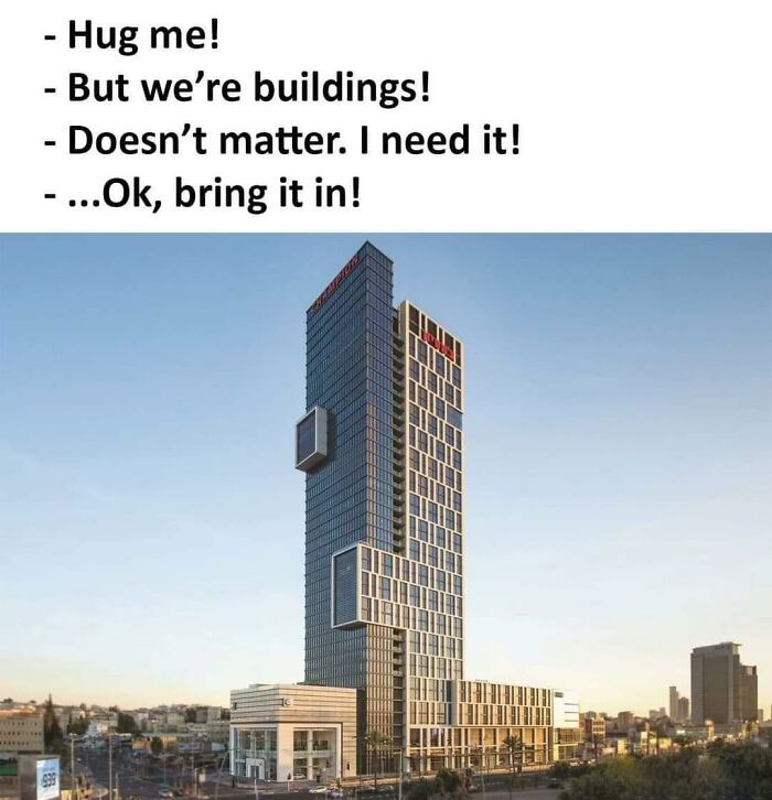
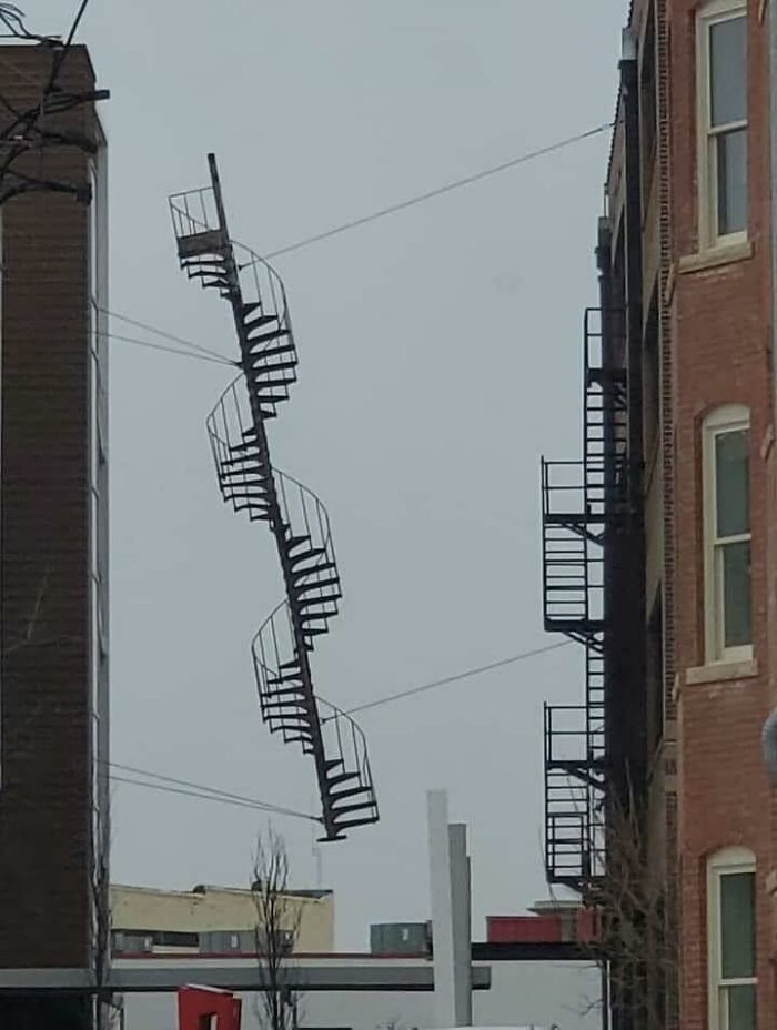
I Dunno, Slim Doesn't Seem To Be Digging This Situation
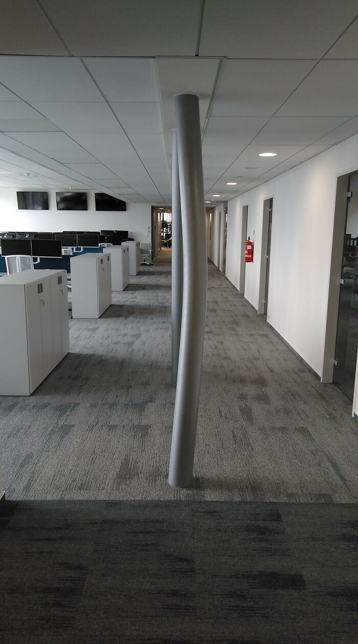
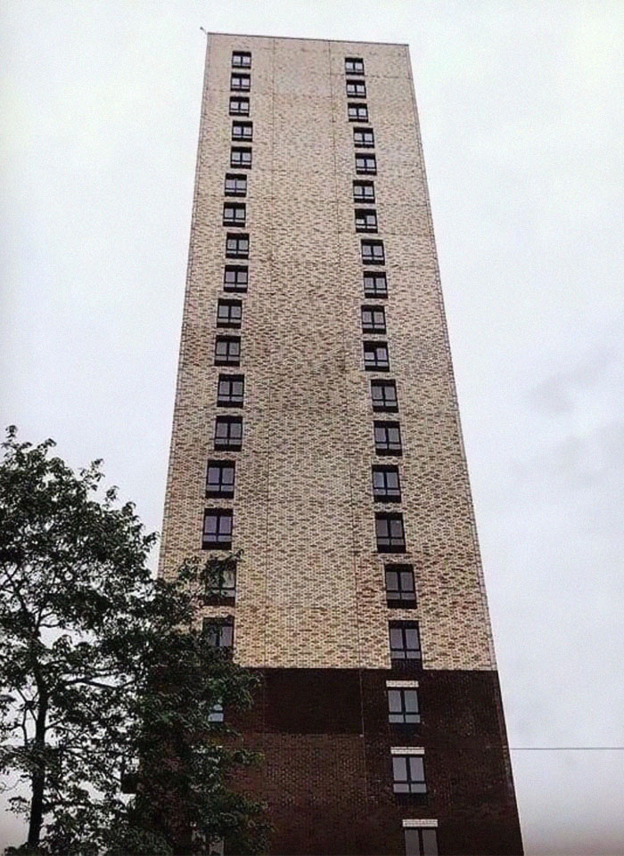
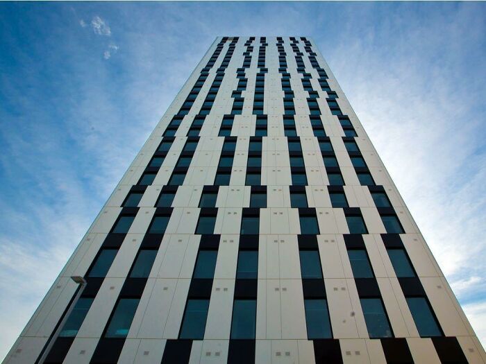
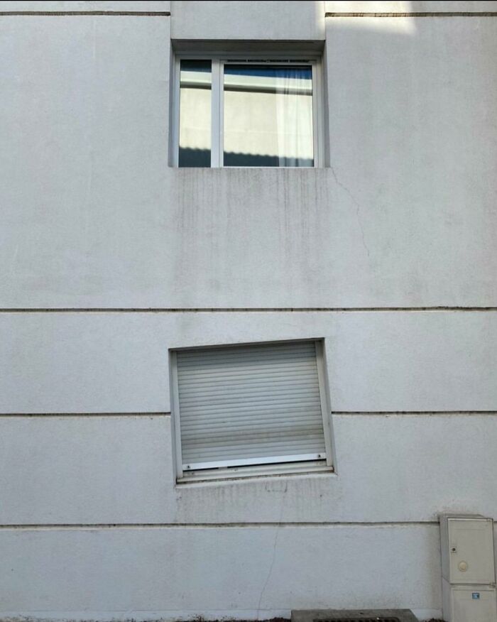
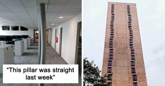
This Pillar Was Straight Last Week. This Is The First Floor Of A Seven-Floor Building
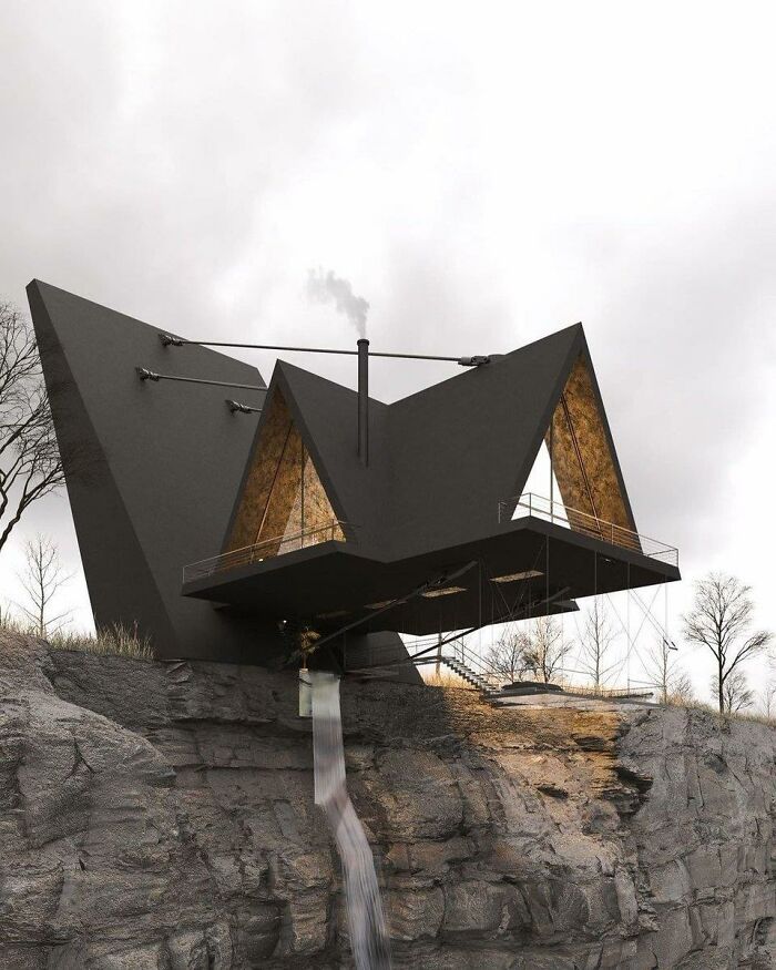
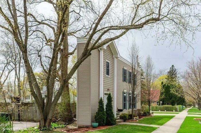
I Do Not Give A Damn How Well It’s Cantilevered Or How Strong The Struts Are. I Do Not Have The Kind Of Luck It Would Take To Set Foot In This House
The Sweden-based urban planning expert explained to Bored Panda that while public spaces must meet safety and accessibility standards, aesthetic standards can be much more fluid for buildings. The expert spoke to Bored Panda on the condition that she remain anonymous. (Remember, just because you're an expert in something and want to be helpful doesn't mean that you always like the limelight... unlike quirky architecture which just begs you to look at it!)
“Most of the time, the elements of the built environment should be in harmony amidst each other and with the surroundings. However, sometimes, something bolder and out-of-the-box might form an engaging contrast,” she said. However, the urban planning expert shared with Bored Panda that, in her personal opinion, our built environments have to engage us, as well as stimulate our minds and senses. In fact, she believes that architecture’s ability to make us think is one of its most powerful aspects.
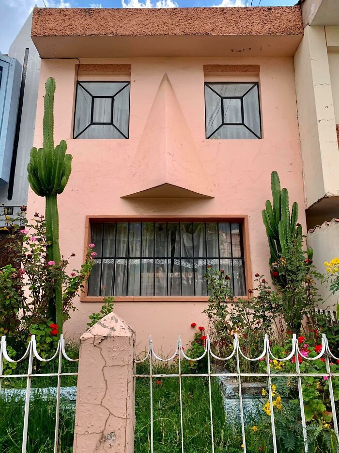
The Cactus Is *chef’s Kiss
This Is Not Photoshopped
That Gives Me Anxiety
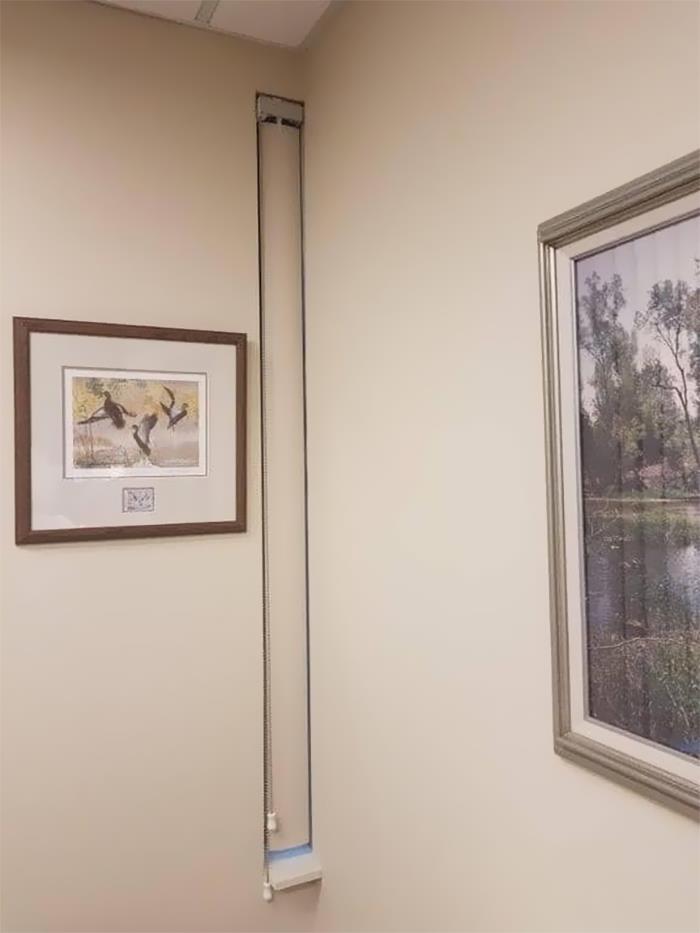
And this, my dear children, is why we learn basic measurements in school
“There are circumstances where the architecture should create a sense of calmness and safety, yet there are instances in which it is not bad if the architecture provokes us and makes us think, ‘Why don't I like the look of this building?’”
The urban planner said that we should give people the freedom to express themselves as they wish when it comes to designing their private property. As long as they have the means, nearly everything is allowed, in her opinion.
Opera And Ballet Theatre Of Cheboksary (Russia)
Top: original picture
Bottom: slightly photoshopped picture
A Friend Of Mine Cross-Posted This And It Made Me Think Of Y’all
I Might Like This If Those Were Slides
“Quirky architecture comes from our innate desire to demonstrate our uniqueness. However, not everyone who has the means has an average taste for aesthetics. Yet, as long as it is for the people who inhabit or use their private space, I mean why not?” she told Bored Panda that as long as you’re not actively harming anyone else with how bad your designs are, you should be able to be as unique as you want. Even if it falls short of objective aesthetic standards.
Who Remembers Those Gerbil Enclosures That Look Like This?
This Looks Like A Place A Villain Would Live
I’ll Meet Your Brutalism, And Raise You This
However, the expert acknowledged that others in the industry might not see things the way that she does. Others, she said, believe that private property must be in harmony with the surroundings.
“But, I think that we should not cross that thin line where architecture becomes reserved for only the wealthy and for those with ‘good taste’ (whoever decides that). I’m only talking about private property here, though. When it comes to public space, there should be a consensus between the public and the professional about the design,” she said that the rules for the private and public spheres are very different.
Um... What Is This?
Art Nouveau On Psychedelics
I Wonder Who Thought This Would Be A Good Idea
The urban planning expert also had some advice when it comes to design. “Firstly, even though I often advocate for unconventionally looking buildings, I do not encourage purposefully provocative architecture. The building should be designed with the intention to accommodate and protect society. It should create a sense of safety but not be boring,” she told Bored Panda that we ought to strike a balance between uniqueness and service, expression and community.
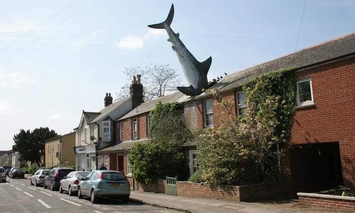
“Sharkitecture”
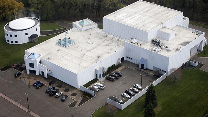
Can We All Just Take A Moment And Acknowledge That Prince Produced Some Great Music, But He Lived In A Water Treatment Station
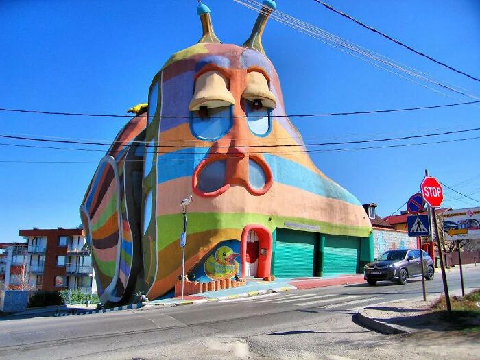
The “Snail House” In Bulgaria Actually Does Look Like A Snail
What’s more, the expert from Sweden pointed out that accessibility, inclusiveness, and empowerment should also be key features of any architectural project. “Also, I prefer somewhat complex but systemic designs. Minimalistic and box like floor plans are good in some cases where easy access is necessary (for example, hospitals) yet they can be completely mind-numbing while more complex floor plan designs are more mind-stimulating (for example, good for schools, in my opinion).”
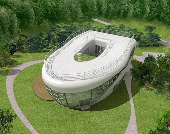
Toilet-Shaped House (Named Haewoojae), Built By Sim Jae-Duck, The Chairman Of The Organizing Committee Of The Inaugural General Assembly Of The World Toilet Association
Interesting Concept
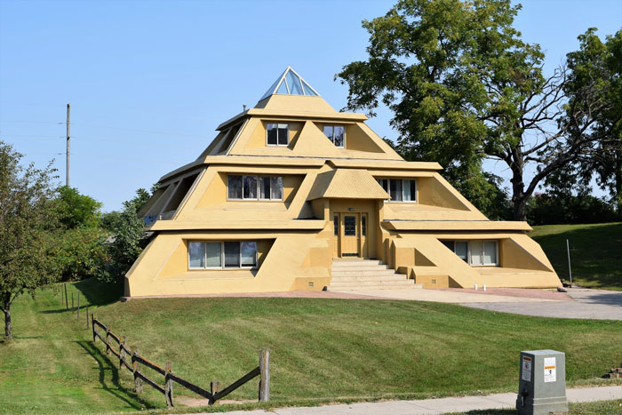
A House I Used To Drive Past In A Little Iowa Town. All I Ever Heard From Locals Was That This Place Had A Terrible Leaking Problem When It Rained
I think you got the wrong place, Giza. You might be in de-Nile about it, check with your mummy. Carrying these puns is hurting my back, I'd best go see a Cairo-practor.
At the time of writing, the ‘That’s It, I’m Architecture Shaming’ community had 64.1k members. However, it’s growing so rapidly, that by the time you’re reading this, dear Pandas, that number could be much, much higher. Just in the last week alone, the group grew by over 7.3k members. And they’ve made upwards of a thousand posts in the last month.
They Drew The Line At A Fountain In The Kitchen
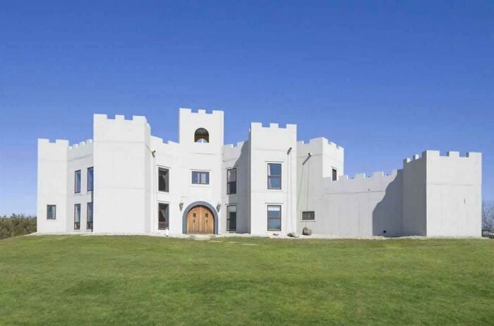
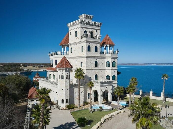
You Too Can Have Your Own White Castle
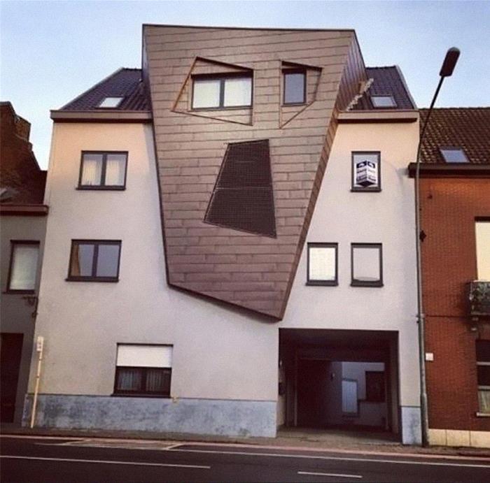
I Will Haunt Your Dreams! Residential Building In Belgium
Because of this fast growth and the issues that came with it, the administrator of the ‘Architecture Shaming’ group, Oregon-based Matthew Brühn, addressed the community and the changes that took place in April. In short, the rules are much more structured now.
I Think Syndrome From The Incredibles Lived Here
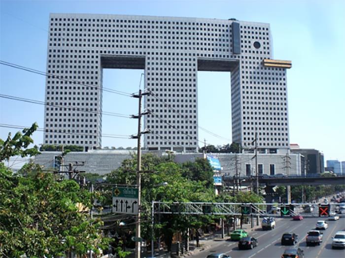
Bangkok's Elephant Building. The Tusks Are A Bowling Alley In My Imagination
Why?
Matthew pointed out that the admins have been getting tired of the “massive influx of negativity” that came with more and more members joining the community. While the admin expressed his admiration for how wonderful many members are, he also noted that the group will start filtering out overly-aggressive posts.
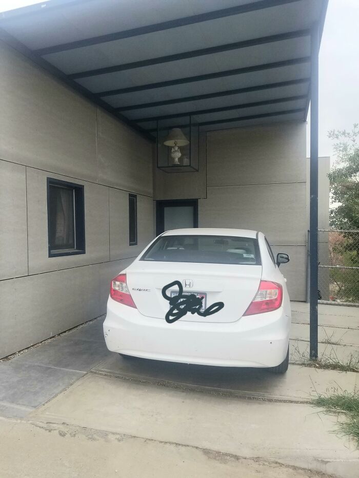
Saw This On A Walk Today. A Table Lamp, In A Glass Box, Hanging From The Roof Of A Carport
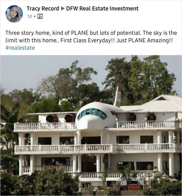
This Is Plane Awesome
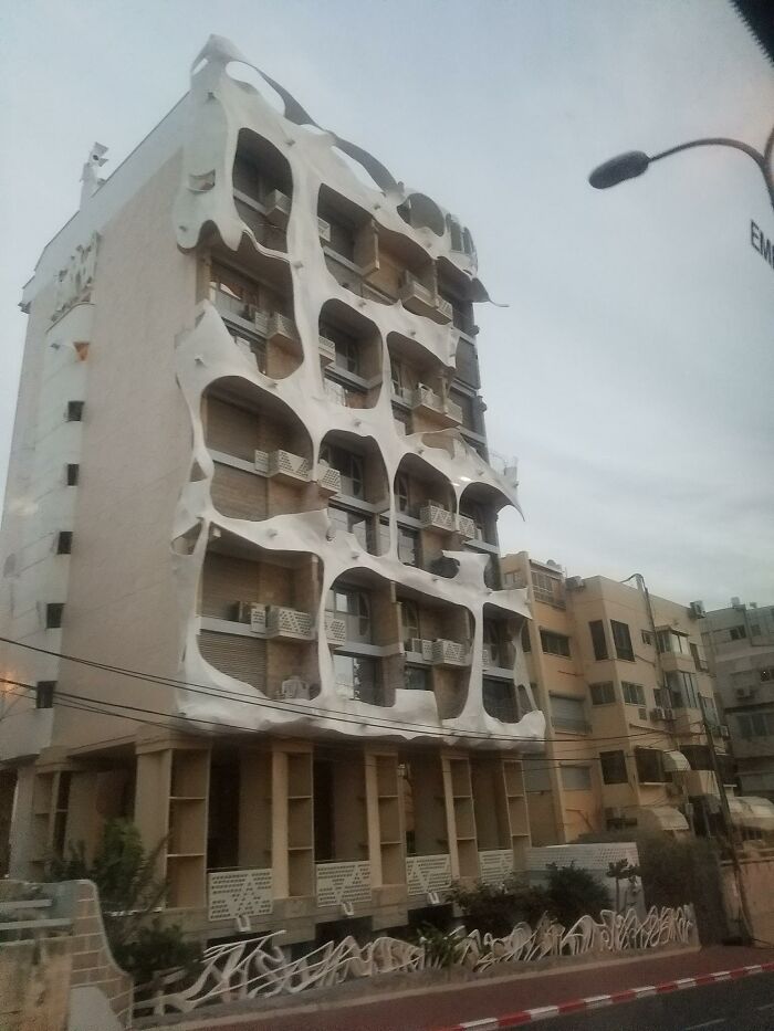
Spotted This Gem In Tel Aviv
“Don’t take it personally; we’re just trying to create an atmosphere where we can all have fun and be kind. There’s now the equivalent of a small city of us all here now, so that will be more difficult,” Matthew pointed out. He added that mentions of politics and religion will be deleted while all potential new members have to answer some questions before they get in. Which, at the end of the day, leads to a friendlier and happier community that, we're sure, plenty of you Pandas will want to join.
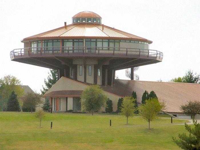
Kind Of Reminds Me Of A Church (Granted, A Strange One) But It’s Actually A House With A 6,000 Sq. Ft. Garage… And Its Own Car Wash
Surrealist Neighborhood
Forbidden Waffle In Santiago
This Building Has My City In A Uproar
Please Don't Take It Too Seriously, Just A Surprised House
This Place Is All Curb Appeal
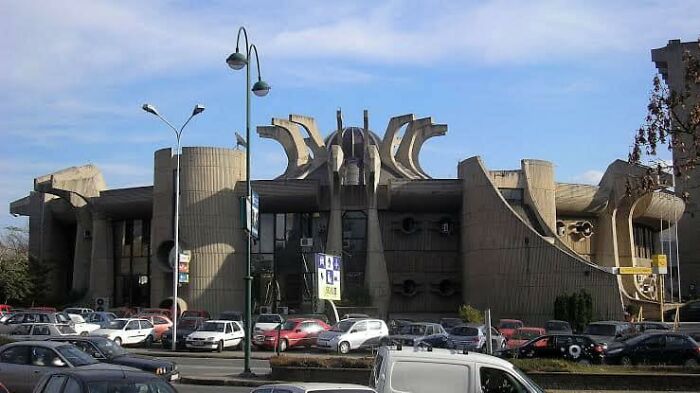
The Glorious Flower Of Communist Brutalism That Is The Former Central Post Office In Skopje, Macedonia. Some People Want It Preserved
Definitely preserve it! Might not be pretty but it certainly is unique and a sign of the times.
Or they could paint it; color would do wonders for it.
Load More Replies...So ugly it becomes interesting and should be preserved as a warning.
Sure! Whatever gets forgotten from history usually gets repeated in the future.
Load More Replies...It's hideous, but it's a gorgeous work of art compared to some of the crap in Washington, DC
Why Washington ?there are ugly buildings every where as this post proves
Load More Replies...I would leave that up to the people, through a public vote to preserve it or not.
I work with a dozen or so people that are originally from Skopje. Gonna have to ask them about this building.
I don't even like the name. Too bad that destroying it wouldn't take away all that it represents..
It's not so bad, really. Just the Shinobi gear on the roof top is kind of disturbing and spiderish.
Why? Preservation is for nice or cool or beautiful or not this monstrosity!
It's, at least, far more interesting visually than most examples of brutalist design. Not my cup of tea, but I understand. And painting it would make it look ridiculous. It could do with some more gardening around the base, maybe even some on the roof, peeking out to soften it some. It DEFINATELY could use a good power wash.
Reminds me of when some folks in Cheyenne Wyoming wanted the '60's post office preserved as historical. It was a brick box, folks.
I would, I find it stupid cancelling our past or judging it with our present values. Never forget, and if it's bad don't repeat.
Nightmarish, but preserve it. Perhaps it will influence a budding architect to never do anything like it.
Nope, not my scene. But I suppose they could make it look better with some pretty paint!
The "people who want it preserved" is the Braille Institute of the Baltics
This is very good. Most people nowadays won't like the naked concrete anymore, but you don't see that kind of creativity any more either. It would be a huge loss to tear it down. What are you going to replace it with anyway? A supermarket? A stell-and-glass office complex? Modern cube-shaped houses? Which of that would look better?
I thought brutalism was that you never did more than what is absolutely necessary, i.e. you could see on the outside what was on the inside. This is not like that...
You're right but we capitalists are not exactly sin-free either.
Load More Replies...Just
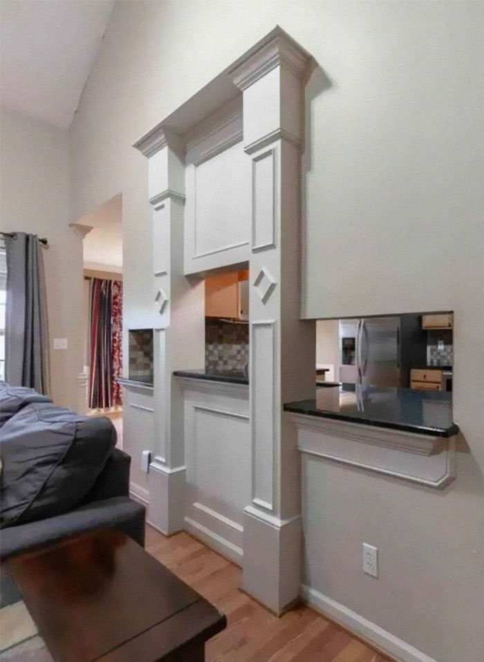
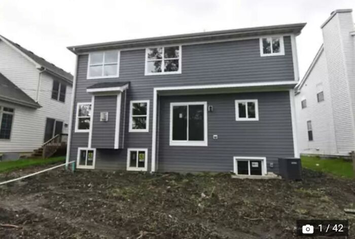
I’ve Been Looking At Homes Trying To Get Ideas For When We Move In A Few Years And I Came Across A House That Was Perfect In Every Way Except One
What in the ever living fudge is this - one pass thru is ‘eh, but this one has three-at different levels plus the added detriment of the worlds worst architectural detailing around it. Please someone else tell me that you hate this as much as I do. I know it’s probably more interior design but it’s just so ugly.
It would have been nice to just have it open plan instead of that weird floating fireplace.
Car Dealership Trying For More Of A Classy Look!
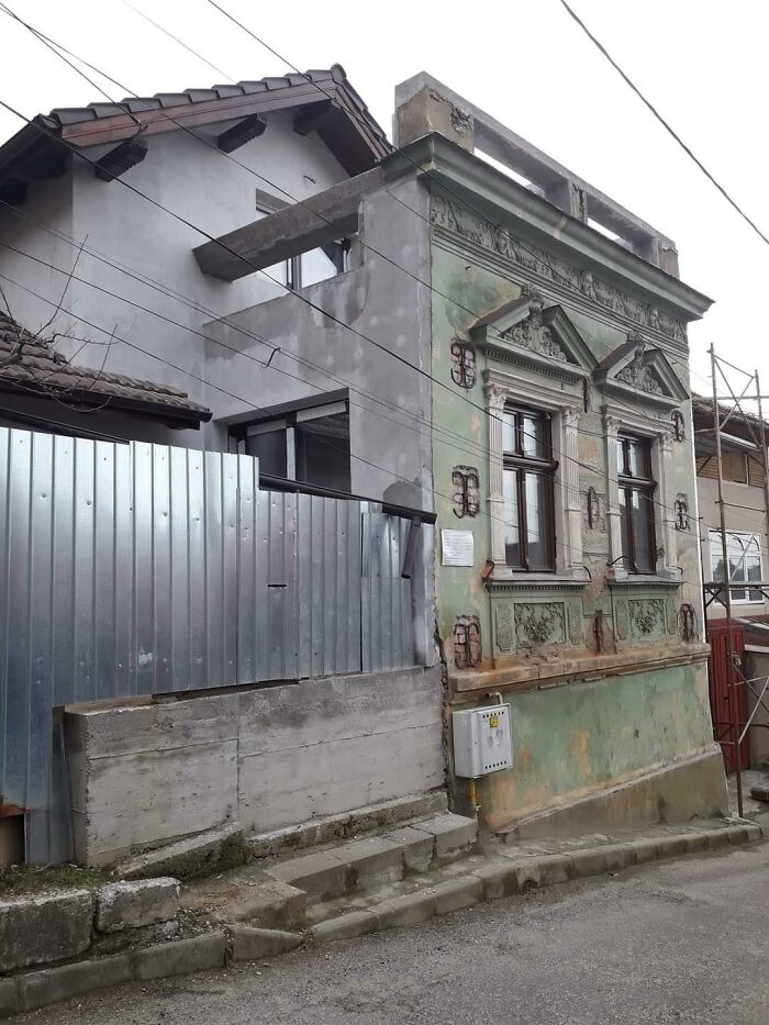
Keeping The Old Facade Because The Law Says So
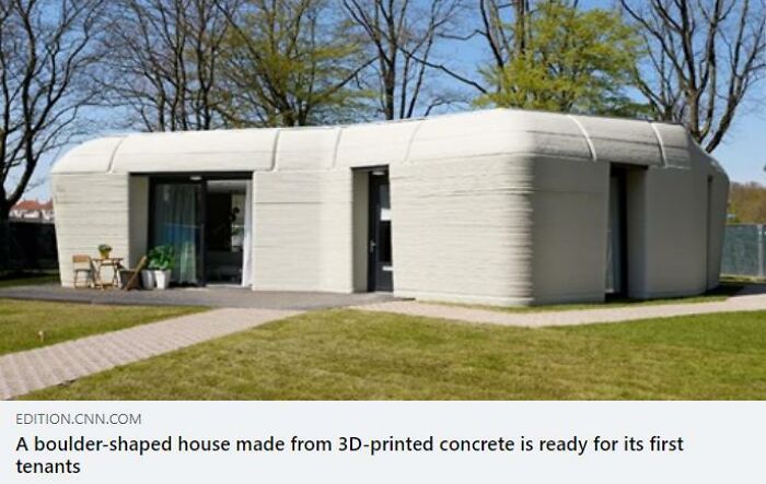
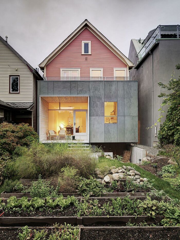
I Appreciate Efforts At Creativity, Sustainability, Affordability. I Really Do. But Do They Have To Be So Ugly? This Looks Like A Bad Public Washroom
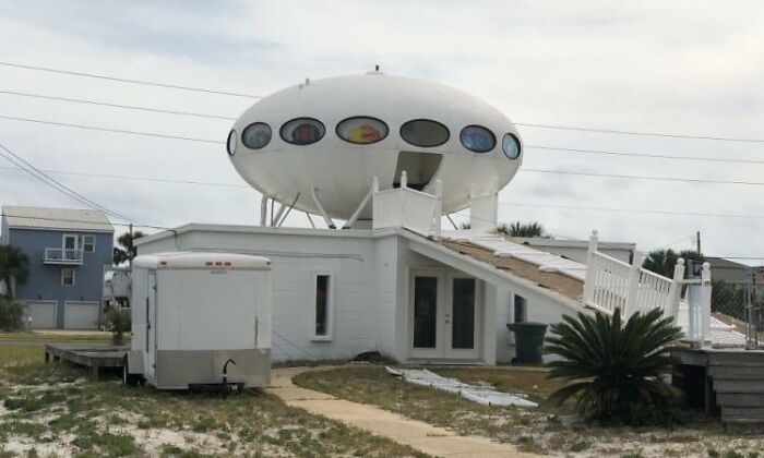
Pensacola House
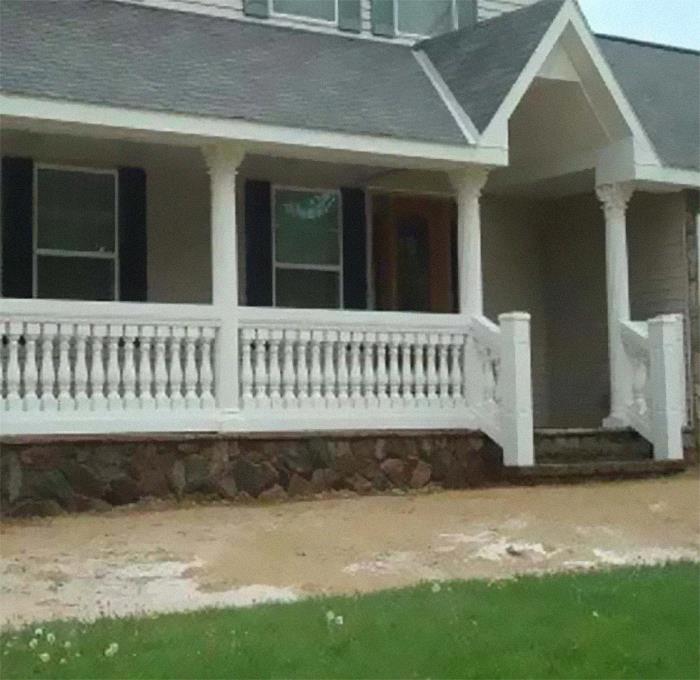
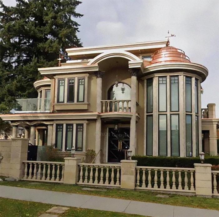
Victorian Balusters With Greek Columns. This Is So American It’s Painful
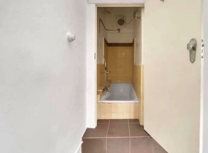
I Think They Put A Bath Where A Closet Was
If You Want To Live In A Cheesecake Factory And You Enjoy Really Drafty Showers
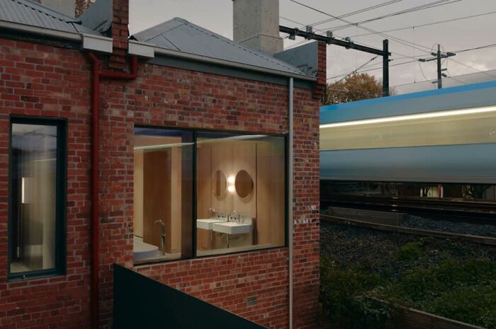
“The Clients Insisted On A Big Window In What Must Now Be The Least Discreet Bathroom In Melbourne.” Note The Train
There are no blinds or curtains. apparently people on the train call the hotel downstairs & ask if they know they are baring all
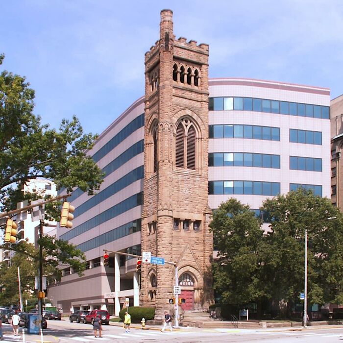
Here’s A Building In Pittsburgh. They Tore Down The Church But Left The Steeple. Built An Insensitive Building Behind It
This happened in my city years ago. An underground shopping mall was built underneath a Catholic church. The church had to be physically moved back several hundred feet to accommodate the mall's front entrances. The church was resistant to the initial offers to purchase their land. But, some firm pitched them the right offer. Money speaks louder than God, apparently.
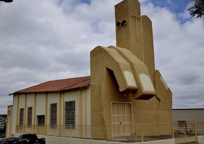
This Bothers Me
Saint Benedict Church, Andrelândia, Minas Gerais, Brazil. Built In 1989
No, Because I Need To See Actually Bad Architecture And Not Just Something That’s Historic Or Non-Traditional
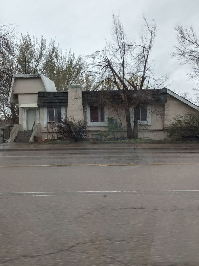
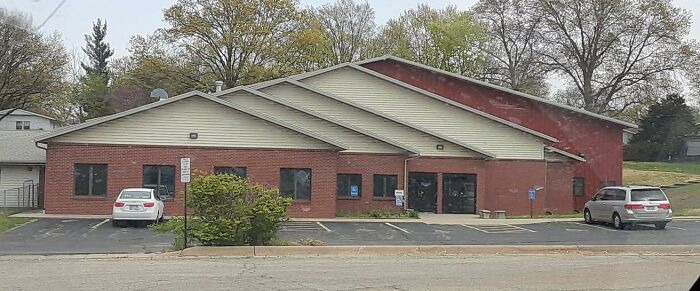
I Don't Think A Paint Job And Landscaper Would Help This Poor House Down The Street From Me
Oh my gosh, this is in the city I grew up in and I HATE IT SO MUCH, IT"S SUCH AN EYESORE
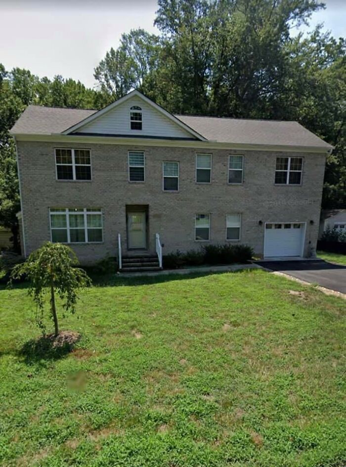
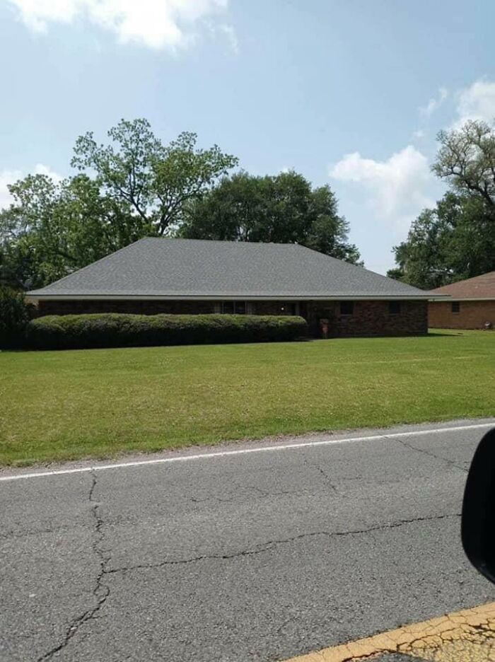
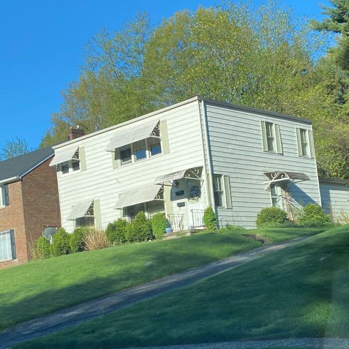
I Give You, The Most Boring Roof Ever Built And A House With Very Little Natural Light Coming In
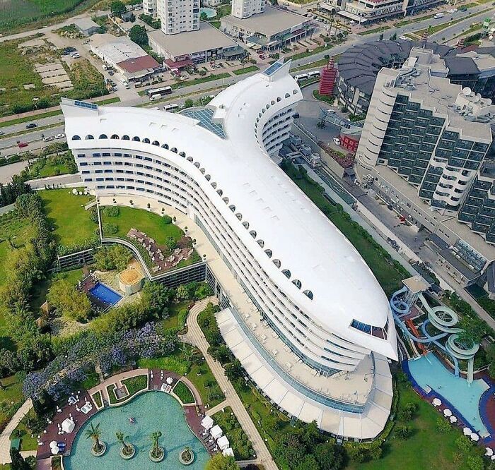
Concorde De Luxe Resort In Turkey
Has Anyone Ever Brought Up How Hideous Boston's Logan Atc Tower Is?
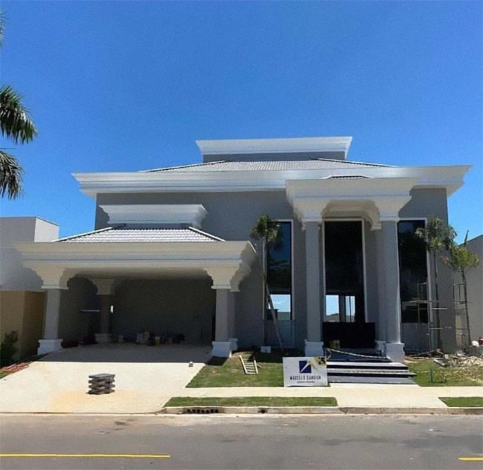
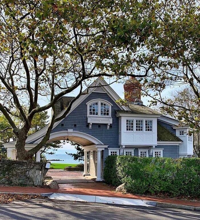
Just In Case You Ever Wanted To Open A Drive-Thru From Your Crib
It is a porte-cochère. Literally a "coach-door". It is considered a very fancy feature for a house. Technically, the White House portico is one too.
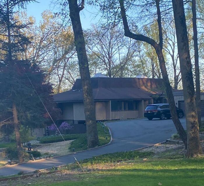
I’m At The Pizza Hut I’m At The Mod Suburban Home I’m At The Pizza Hut / Mod Suburban Home
This Building Has Been In My Hometown For Ages, But I Never Noticed It Until I Joined This Group
The architect clearly got their inspiration from The Sims' automatic roofs.
I Never Realized How Important It Is For The Roof To Hang Over A Little Bit
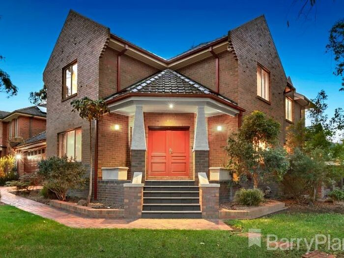
House I Found While Browsing Properties In Melbourne, Australia
Oh, I Live In A Gated Community. It’s Very Posh
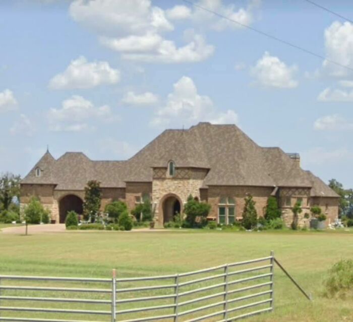
Feast Your Eyes On This Mcmansion Beast. Complete With Roof Nub Quartet, Stupid Turret, And Parasitic Garage
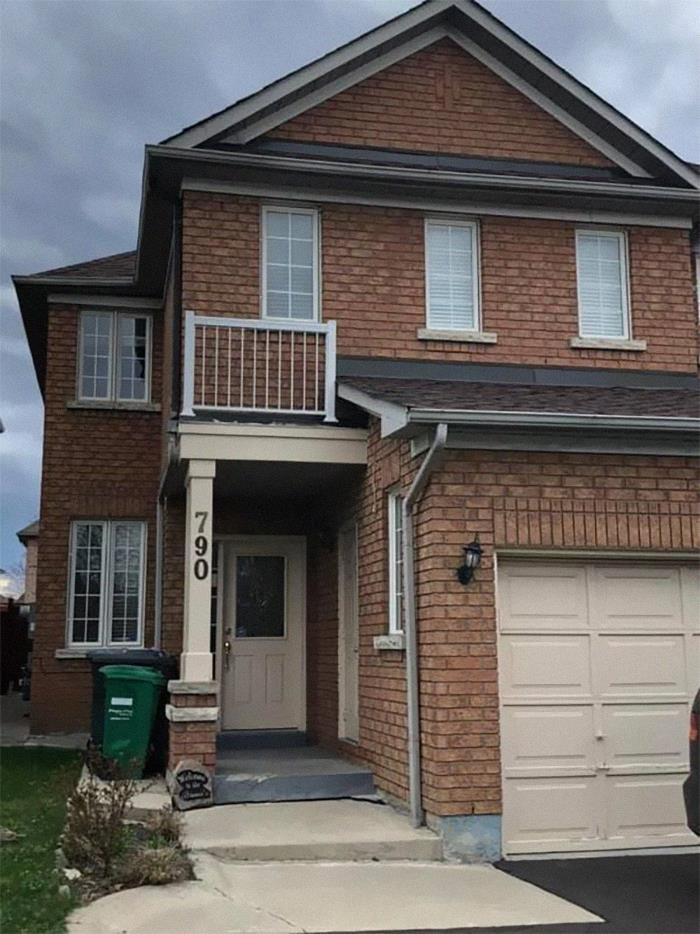
Neighbors Had Some Material Left, Contractor Cut Them A Deal On A Monstrosity
I Mean, Come On
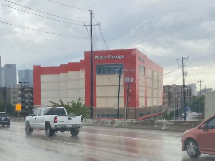
This. The Building I Hate Most In Dallas And I Have To Look At It Every Time I Drive To Work
Looks like something a four year old would build in Minecraft but, no, someone actually got paid to design this butt ugly monstrosity that blocks an otherwise cool view of downtown.
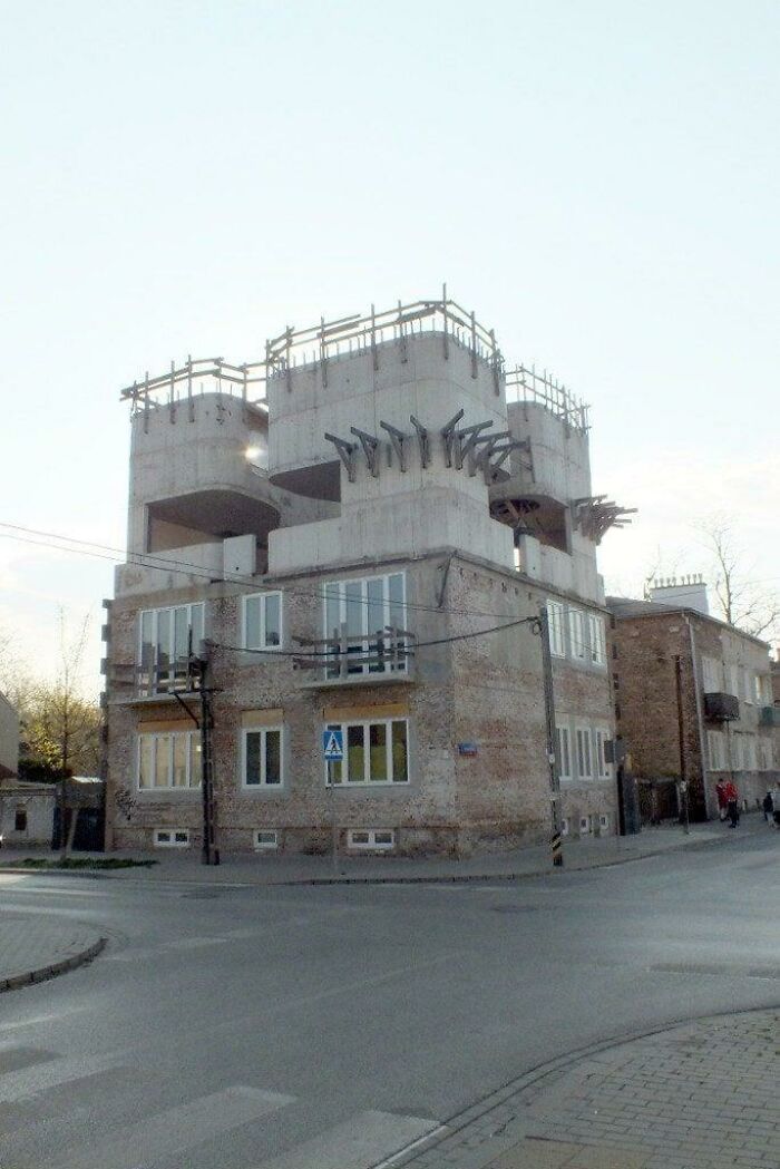
Warsaw. Poland. Don't Know Why
The Asymmetry Would Drive Me Nuts
I kinda... Like it? 😅 But even if I didn't, symmetry makes houses usually look pretty awful, so I'm a bit confused about the title.
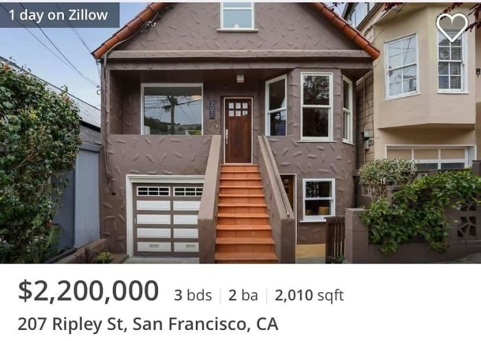
Another In The Bizarre San Francisco Tradition Of Stucco Treatments That Look Like Skin Diseases. The Kitchen Is To Die For — The Facade Doesn’t Deserve That Attention To Detail?
I would have rather seen it clad in the metal sheeting it's trying imitate than this!
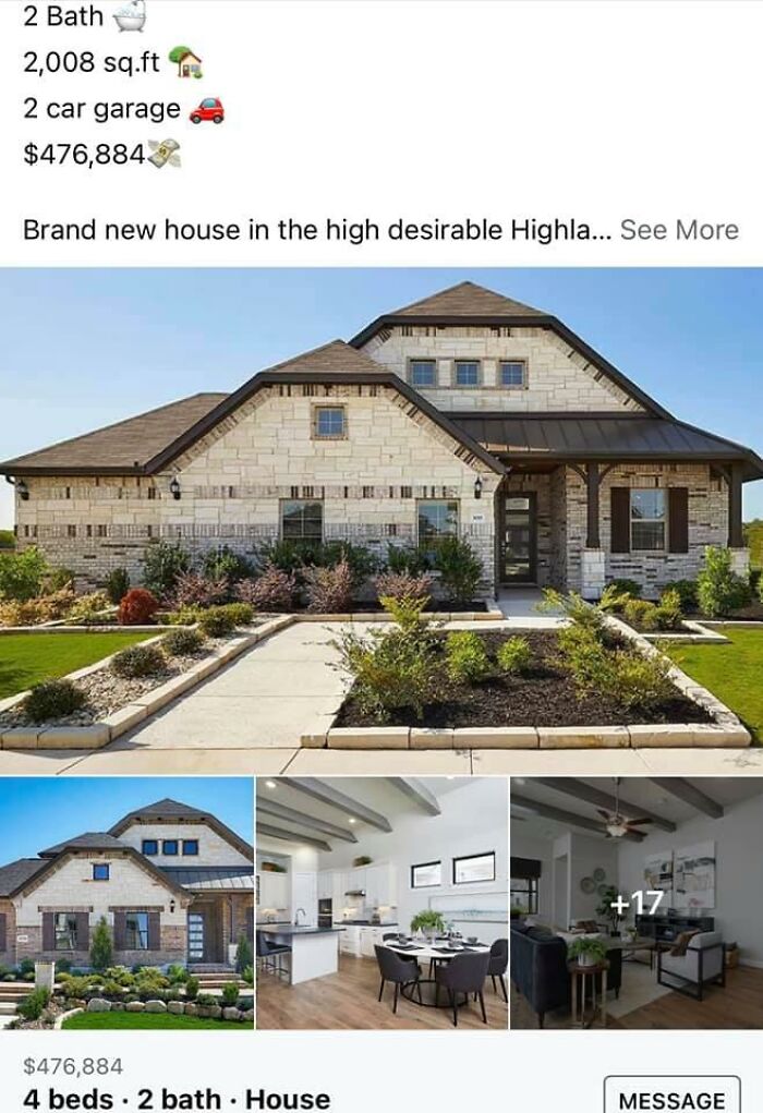
Whatttttt Is Thissssss. The Front Of The House Looks Like It’s Made Of The Spare Parts From The Other Builds
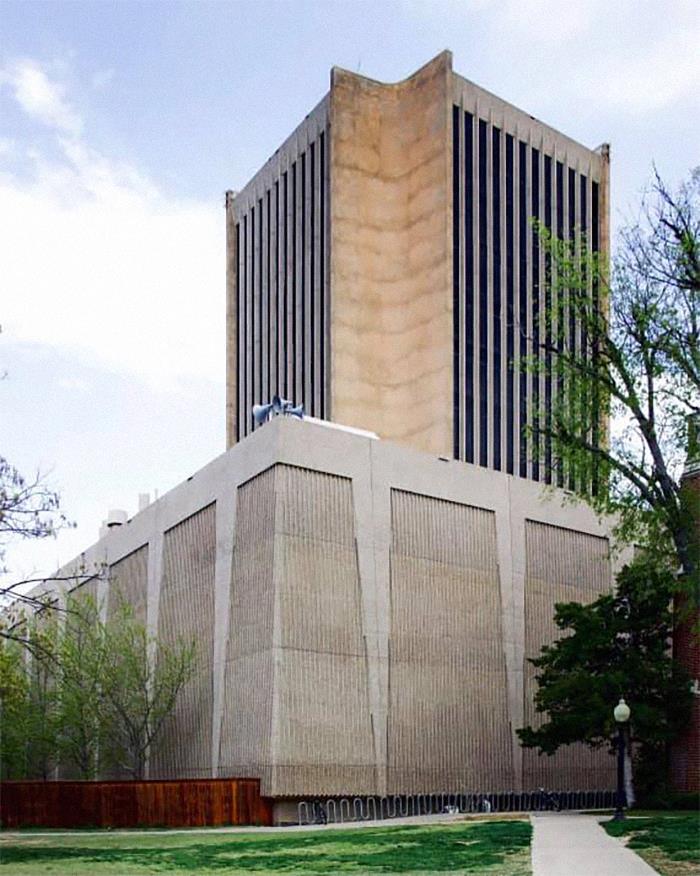
The “Blender” On The Campus Of The University Of Oklahoma. That’s All One Building. I Took Math Classes In This Thing Back In The 90s
A lot of these are quirky, whimsical or simply trying. If you want real architectural shame, try the lazyass soulless glass skyscrapers that dominate most cities or the shoebox sized apartments with tiny windows or the cheap concrete slabs that make up a lot of retail units or transport hubs
I like a lot of these; and those I don't like, I still respect for trying something different. Never understood why architecture couldn't be more playful. Everyone loves a Huntervasser or a Gaudi building, why don't we have more like them!?
*Hundertwasser, German for hundred water ;) And I agree, it's art after all.
Load More Replies...Why blame the architect? The building owners decide what they want and the architect follows their ideas. As for shoddy construction, again can't blame the architect.
It’s ‘architecture shaming’, not ‘architect shaming’. Reread the heading.
Load More Replies...I don’t think the majority of these are “architectural shame” they’re architectural creativity. A shame would be structurally unsafely designed. Most of these are quirky & unique & that should be applauded imo
You missed one in this set...Its a church in Poland called Swiatnia Opatrznosci Bozej (Temple of Divine Providence) but by a lot of people its just called "The fruit juicer". Not sure why but i have a hunch... swiatynia-...60bbc1.jpg 
I really don't know whether to upvote the taste catastrophes or the small number of "strange, but I like it" ones.
National Library of Kosovo deserves a mention here! It's pretty quirky! DSC_0811-6...48308e.jpg 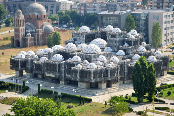
I adore brutalism. I can't explain it, but I want to go inside every time I see one.
Load More Replies...Loved this post. I found some were very interesting and some looked reDICKulous. PS Theron Roberts get a fkn life you muppet!
I love lots of these. What is wrong with trying to be different? It beats boring!
Of course i have no taste but I liked a lot of these. If I had the money to build something that would upset the status quo I'd do it too. Who wants a world full of " little pink houses "?
Some of these, I will bet, have some very interesting people living in them. Definitely not your cookie-cutter suburban.
Love sky scrapers. And respect original designs they add a lot to any city or town
Oh c'mon, make up your mind; some of them were listed on your "really cool and original" count...
Some of these are ok, it's just the stone/woodwork and the roofs. Others are whimsical, but some were just plain awful.
Now you do not need anyone to explain you why most people hate modern art, do you ?
A lot of these are quirky, whimsical or simply trying. If you want real architectural shame, try the lazyass soulless glass skyscrapers that dominate most cities or the shoebox sized apartments with tiny windows or the cheap concrete slabs that make up a lot of retail units or transport hubs
I like a lot of these; and those I don't like, I still respect for trying something different. Never understood why architecture couldn't be more playful. Everyone loves a Huntervasser or a Gaudi building, why don't we have more like them!?
*Hundertwasser, German for hundred water ;) And I agree, it's art after all.
Load More Replies...Why blame the architect? The building owners decide what they want and the architect follows their ideas. As for shoddy construction, again can't blame the architect.
It’s ‘architecture shaming’, not ‘architect shaming’. Reread the heading.
Load More Replies...I don’t think the majority of these are “architectural shame” they’re architectural creativity. A shame would be structurally unsafely designed. Most of these are quirky & unique & that should be applauded imo
You missed one in this set...Its a church in Poland called Swiatnia Opatrznosci Bozej (Temple of Divine Providence) but by a lot of people its just called "The fruit juicer". Not sure why but i have a hunch... swiatynia-...60bbc1.jpg 
I really don't know whether to upvote the taste catastrophes or the small number of "strange, but I like it" ones.
National Library of Kosovo deserves a mention here! It's pretty quirky! DSC_0811-6...48308e.jpg 
I adore brutalism. I can't explain it, but I want to go inside every time I see one.
Load More Replies...Loved this post. I found some were very interesting and some looked reDICKulous. PS Theron Roberts get a fkn life you muppet!
I love lots of these. What is wrong with trying to be different? It beats boring!
Of course i have no taste but I liked a lot of these. If I had the money to build something that would upset the status quo I'd do it too. Who wants a world full of " little pink houses "?
Some of these, I will bet, have some very interesting people living in them. Definitely not your cookie-cutter suburban.
Love sky scrapers. And respect original designs they add a lot to any city or town
Oh c'mon, make up your mind; some of them were listed on your "really cool and original" count...
Some of these are ok, it's just the stone/woodwork and the roofs. Others are whimsical, but some were just plain awful.
Now you do not need anyone to explain you why most people hate modern art, do you ?

 Dark Mode

 No fees, cancel anytime


