I see great things in your future, pandas. The fact that you’re reading this article right now is a great sign. I see many laughs and good times ahead of you, and along with this good sign, I see plenty of useless, unsuccessful, and/or unpopular ones as well. But don’t worry, those aren’t metaphorical ones!
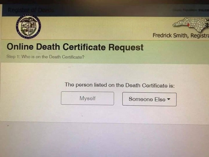
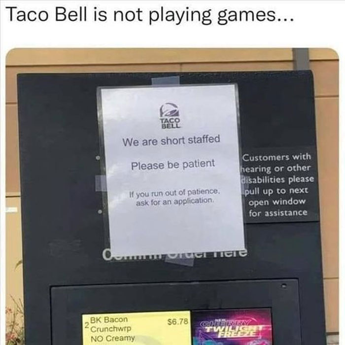
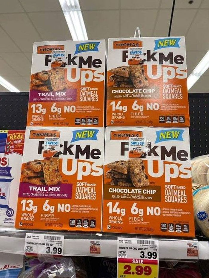
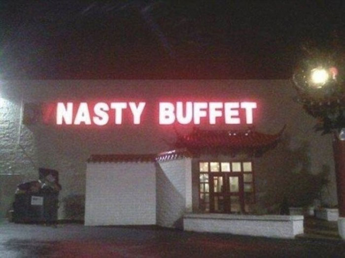
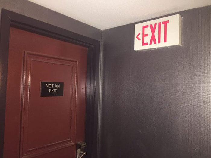
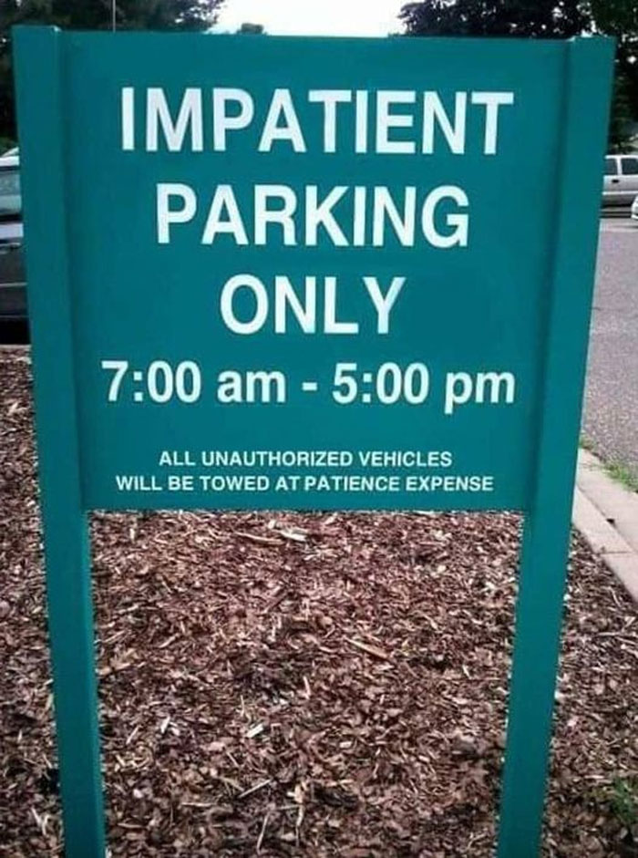
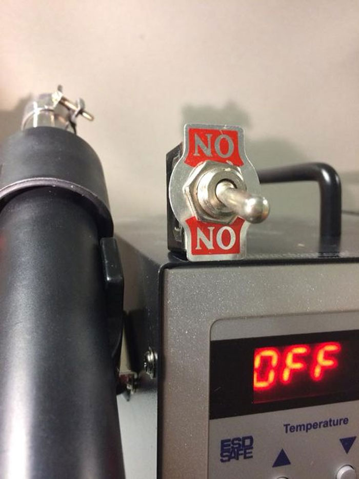
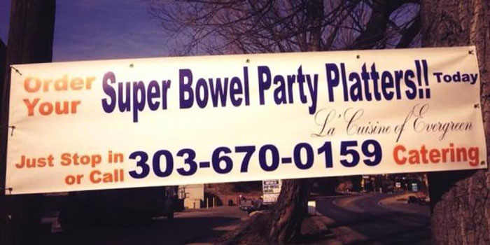
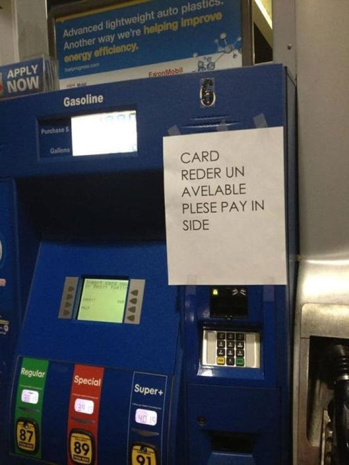
Below, we’ve gathered some of the most hilarious and confusing photos from two Facebook pages dedicated to, you guessed it, useless, unsuccessful and/or unpopular signs. From tragic spelling errors to signs that serve absolutely no purpose (other than to entertain us, of course), these signs have it all. Keep reading to also find interviews with Laura Carter Chagnon, one of the administrators of UNSUCCESSFUL, USELESS AND/or UNPOPULAR SIGNAGE, and Jerome Davis, one of the administrators of Useless, Unsuccessful, and/or Unpopular Signage. And don’t forget to upvote all of the signs that you think take the cake for being the most absurd!
This post may include affiliate links.
Signs are all around us. We use them to know which streets to turn onto while commuting to work, to know which restroom we prefer to use, to know whether or not we’re allowed to park somewhere, to know whether or not a business is open, and for countless other things. Signs are a vital way of conveying information. But when they’re done poorly, they can be extremely confusing, jarring, and/or unsettling. Somehow, there are plenty of useless, unsuccessful, and/or unpopular signs out there in the world, because these two Facebook groups, Useless, Unsuccessful, and/or Unpopular Signage and UNSUCCESSFUL, USELESS AND/or UNPOPULAR SIGNAGE, seem to have unlimited content.
Combined, the two pages under almost identical names have nearly 6,000 members, and receive hundreds of posts each month. They aren’t the first groups of their nature on Facebook, as we’ve covered a similar one on Bored Panda before, but just like the creators of these signs can’t seem to get enough of pumping out pointless signage, the internet can’t seem to get its fill of these UUU signs. Anything from misspellings that lead to hilarious confusion to contradictory signs being placed in the same location can be found on this list, but at least these signs can serve one purpose well: entertainment.
To gain more insight into how one of these groups, UNSUCCESSFUL, USELESS AND/or UNPOPULAR SIGNAGE, came to be in the first place, we got in touch with one of the page’s administrators, Laura Carter Chagnon, who was kind enough to have a chat with Bored Panda. “My husband Stephan is a photographer and has a great sense of humor, so he decided to put together this group,” she shared. “It has been fun to watch it grow, especially when new people find new and crazy signs to share.”
And when it comes to why people love these signs so much, Laura says, “I think people love to see these signs because they are actually out there in the world, either by someone’s mistake or miswording of something. Which is something that happens to everyone so we can easily relate.” She added that the group’s members are quite active, as well as her and her husband, so when they have free time to spend in the group, they get to interact with many different people. “We chose this group because it wasn’t specific to anyone and has such a broad spectrum it could literally touch anyone’s lives and help bring us all a little closer together,” Laura shared.
Laura was also kind enough to share about some of her and Stephan’s favorite UUU signs. “My favorite sign is one we found on a trip to New Brunswick at the Bay of Fundy. It’s the one where they have a diagram on the bathroom door showing how to sit on the toilet properly. The picture shows one diagram where the figure is squatting on the rim of the seat with their feet. It makes me wonder how they came up with that and how much they enjoyed making people laugh,” she told Bored Panda. “My husband's favorites are the ones lacking punctuation or that have a typo that changes the entire meaning of the sentence.” They’re constantly finding new great (or not so great) signs though, as Laura added that they’re always on the lookout.
Here’s a joke I know about a dog. A dog sees a poster that advertises a job listing. The qualifications are “must be able to operate a computer, must be able to code, must be bilingual. We are an equal opportunity employer”. After seeing this, the dog goes to the head office and asks for the job. The employer says that he can’t hire a dog when the dog pointed to the lines on the poster that said “we are an equal opportunity employer”. The man sighs and asks, “can you operate a ccomputer?” The dog turns one on. “Can you code?” The dog develops a perfect and smoothly running website in under 20 minutes. “Well you’re good but there’s no way you’re bilingual.” The dog looks at the man straight in the eys and says, “meow”
We were also lucky enough to get in touch with Jerome Davis, one of the administrators of Useless, Unsuccessful, and/or Unpopular Signage, to hear how his group got started, and he was kind enough to answer our questions. “UUUs got started, honestly, after another group got a little too pushy and was kicking people out for silly reasons, and sometimes for no reason at all,” he told Bored Panda.
We then asked Jerome why he thinks people love these UUU signs so much. “Many just think it’s funny to see how laziness and carelessness becomes immortalized in signage!” he shared.
And when asked about his community, Jerome told Bored Panda, “We’re a friendly group managed by a handful of friends. We don’t do the hateful stuff and try hard not to ‘ban hammer’ if we can help it. Most are fairly active with membership from across the globe.”
The administrator also shared what his personal favorite UUU signs are. “Stupid road signs and shop signs are hands down the best!” he told Bored Panda. And finally, Jerome noted that he’s always on the lookout for new signs to share with the group as well. “All the time! It’s a challenge to find new ones.”
In a previous Bored Panda article, we reached out to Tim Harrelson, CEO of the South Carolina based company The Sign Chef, to hear more about the importance of great signage. “Between the physical world and the online world, the competition for attention is at an all time high,” Tim shared. “Simultaneously, attention spans seem to be at an all time low. Our senses are constantly being bombarded! Moving forward, organizations need to be strategic in how the content is displayed on their signs.”
The CEO also shared a bit about how the process of designing signs goes for him and his team. “Most graphic designers start with the size of the sign - then the lettering & graphics are added. Think backwards," Tim previously told Bored Panda. "A more strategic approach can be taken by having the design reverse engineered for maximum impact. This design strategy starts with the viewing distance. How far away does your target audience need to be able to read the sign?”
“Once the distance is measured, a Letter Sizing Calculator can be used to scientifically determine the very best letter sizes,” he continued. “As an example, what is the best letter size if the viewing distance is 110 feet? When you type 110 feet into the calculator, you’ll instantly see 22 inches is recommended for maximum impact - easy.”
According to the Sign Chef himself, the most important factor to consider when designing a sign is the legibility of the message itself. “Of equal importance is the message itself,” he added. “What is the core message people need to grasp in an instant?”
And when it comes to the sign Tim is most proud of his company creating, he shared with Bored Panda, “We recently created the World’s Largest Dibond Sign Display for Mahopac High School in New York.” In his email to me, Tim attached a photo of the impressive sign that looks easily over 15 feet tall, featuring the school’s logo of a massive M with an arrow across it. He also added a beautiful retro, flashing neon sign to go on Route 66 advertising Eufloria dispensary in Oklahoma.
It’s a bit embarrassing that humans have had such a hard time mastering the art of signs, because according to Pyramid Visuals in the UK, signs have been in use since the Paleolithic Age, around 18,000 BC. Apparently, back then, signs were not only used to communicate, but were even ritualistic and spiritual, filled with nature symbolism. “The word ‘sign’ derives from the ancient Latin ‘signum’ and it means mark or token,” Pyramid Visuals explains on their site. “The Romans were the first to recognize how valuable signs are and they introduced the first road sign system to indicate distances and direction.”
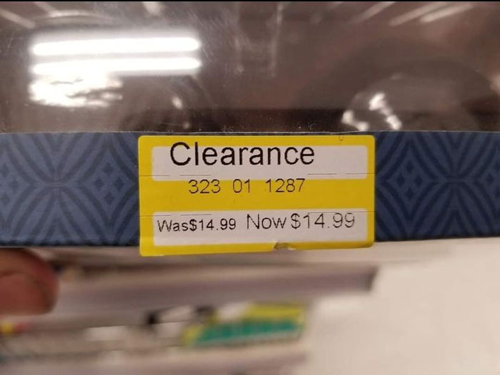
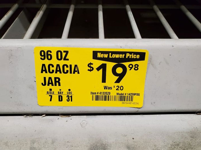
I mean, just seeing a clearance sticker already means I'm probably buying it
Are you starting to believe in signs, pandas? The good, the bad, and the extremely pointless? We hope you’re enjoying these bizarre and unpopular signs; perhaps you’re even feeling inspired to start snapping pics of the weird signs you encounter out in the world too! Keep upvoting the pics that you’d like everyone else to see, and then if you’re interested in checking out even more useless, unsuccessful and unpopular signs, you can find Bored Panda’s last article on the same topic right here!
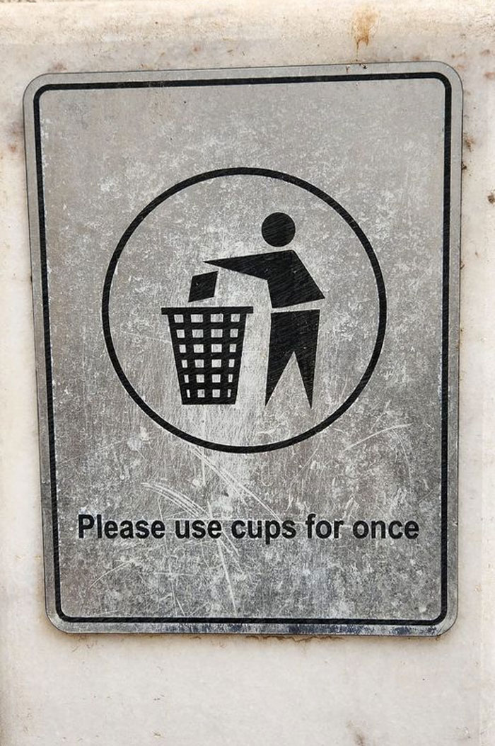
Obviously English is not their mother tongue. Not really funny or weird. At least they tried and made it understandable. That's actually impressive.
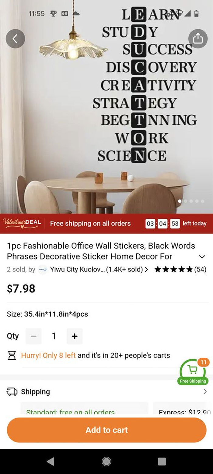
This is... interesting. Some of these things aren't useless or whatever, they probably just got lost in translation. I think the staff need to come up with better names for some of these articles
This is... interesting. Some of these things aren't useless or whatever, they probably just got lost in translation. I think the staff need to come up with better names for some of these articles

 Dark Mode

 No fees, cancel anytime


