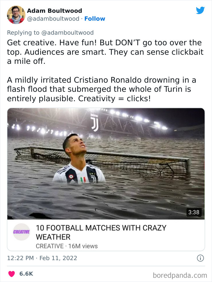
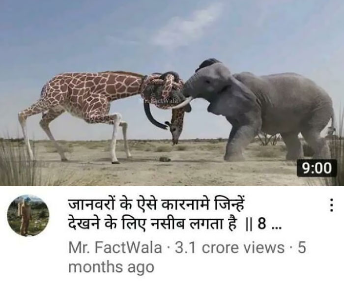
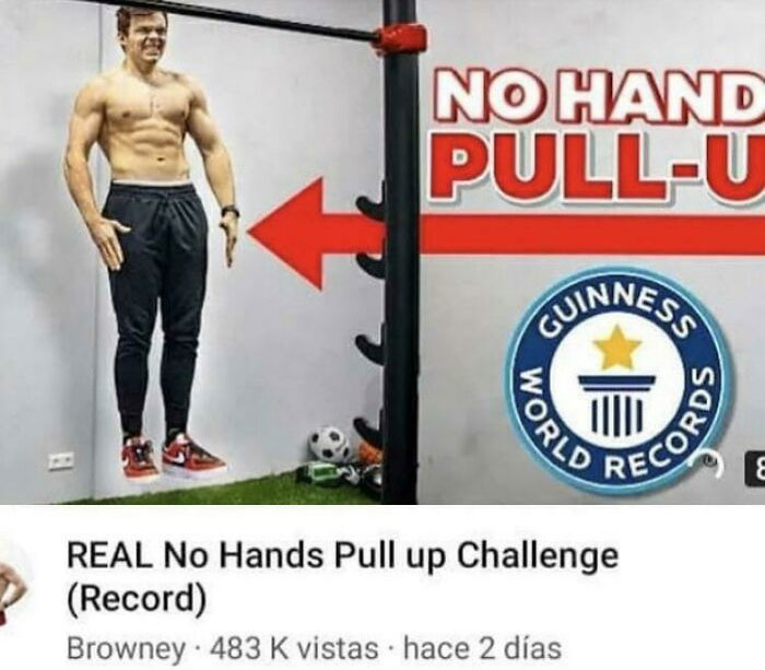
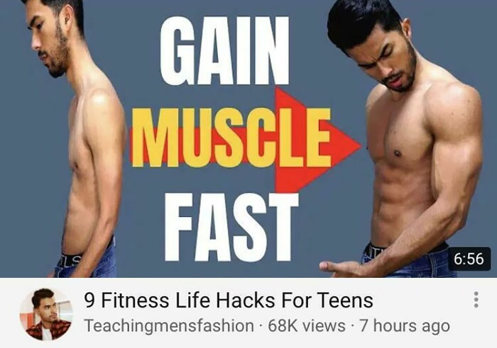
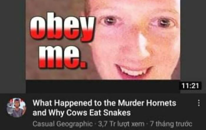
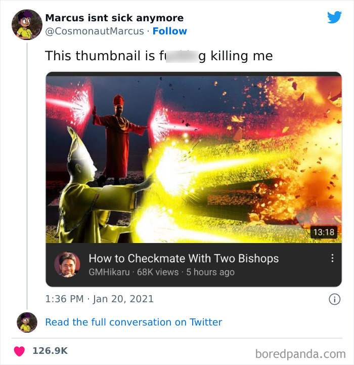
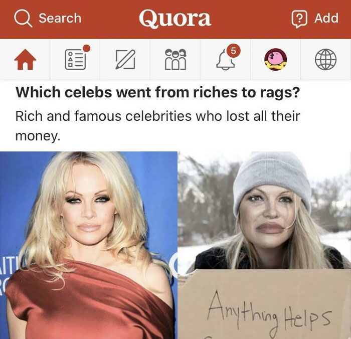
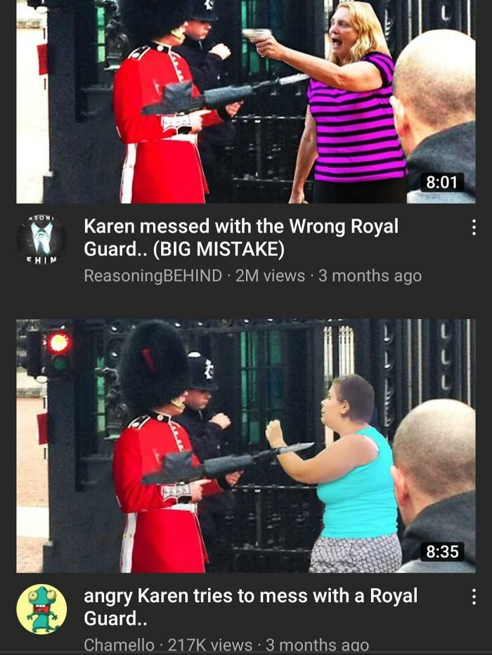
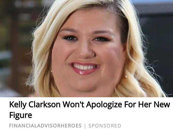
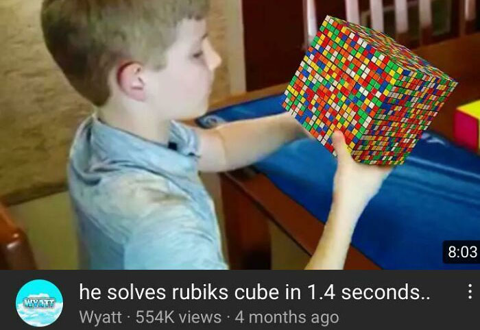
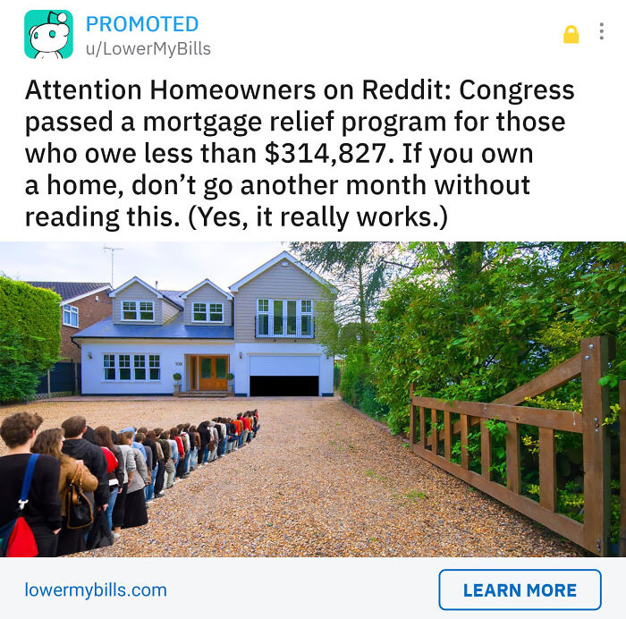
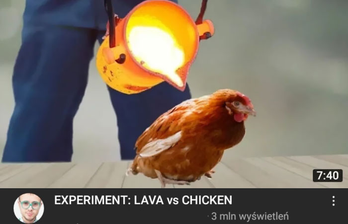
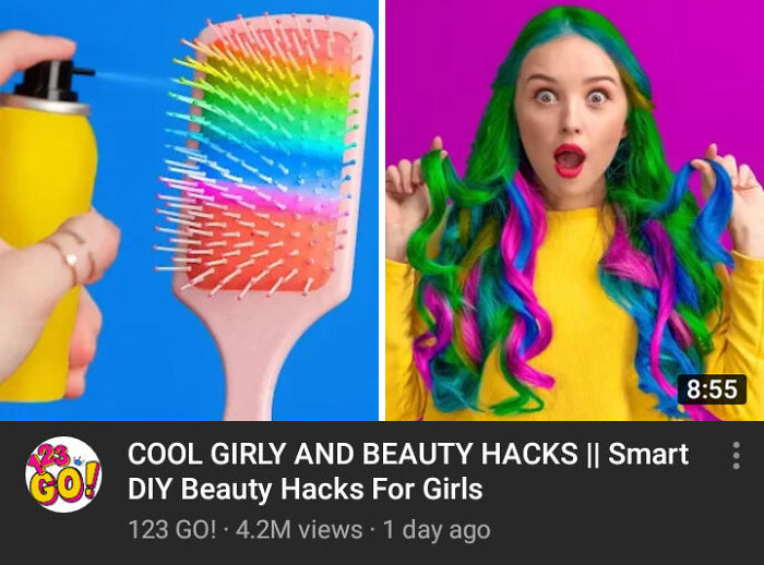
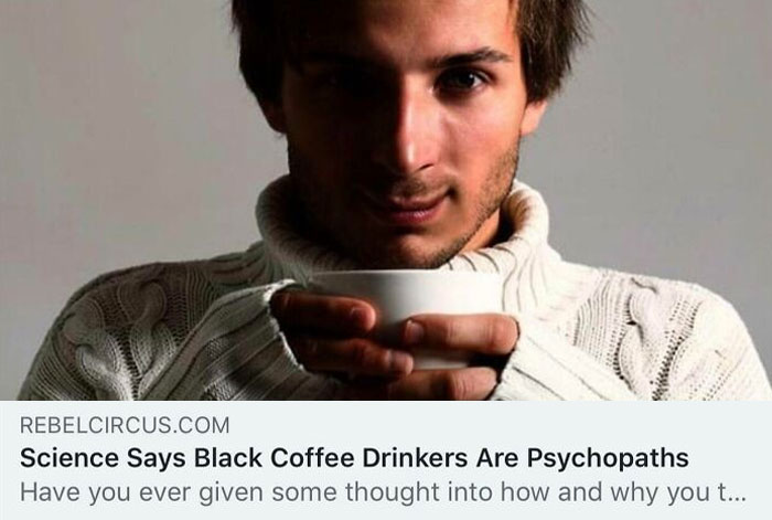
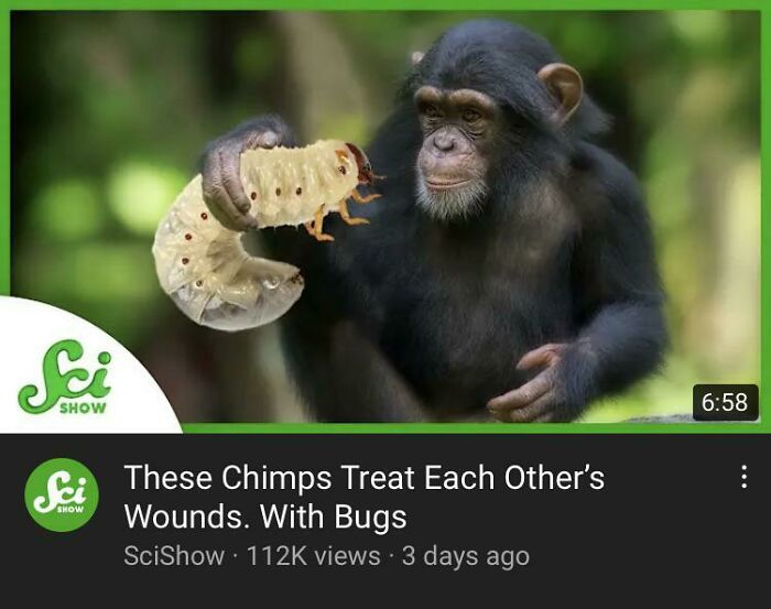
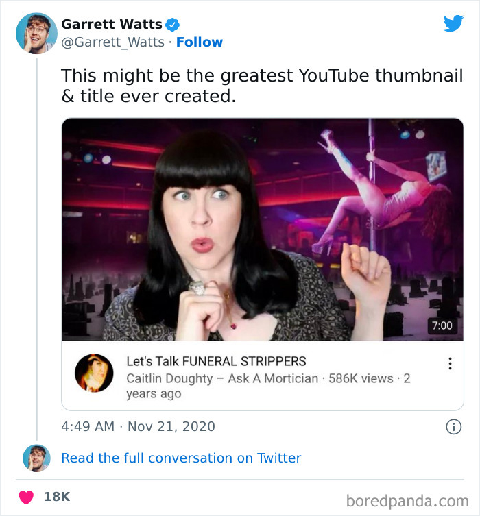
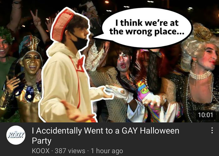
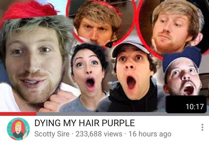
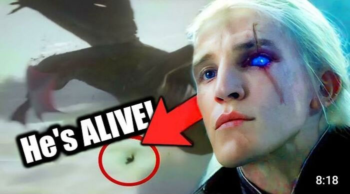
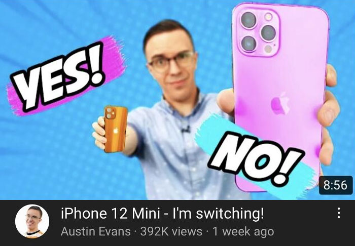
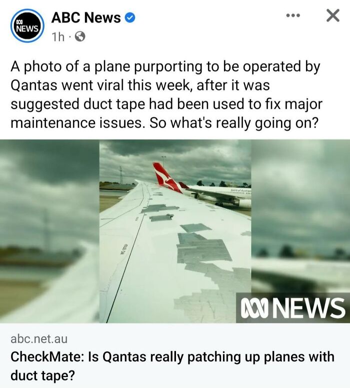
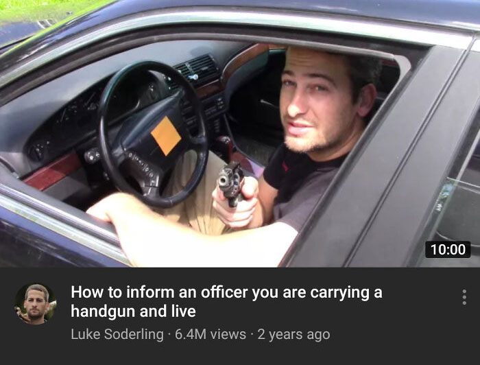
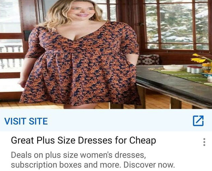
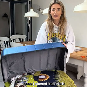
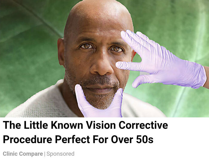
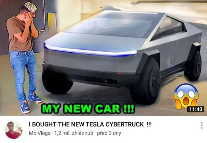
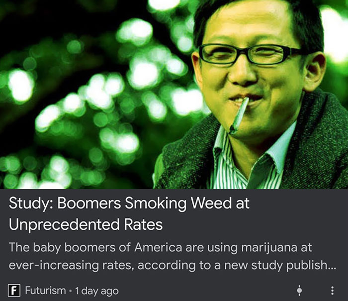
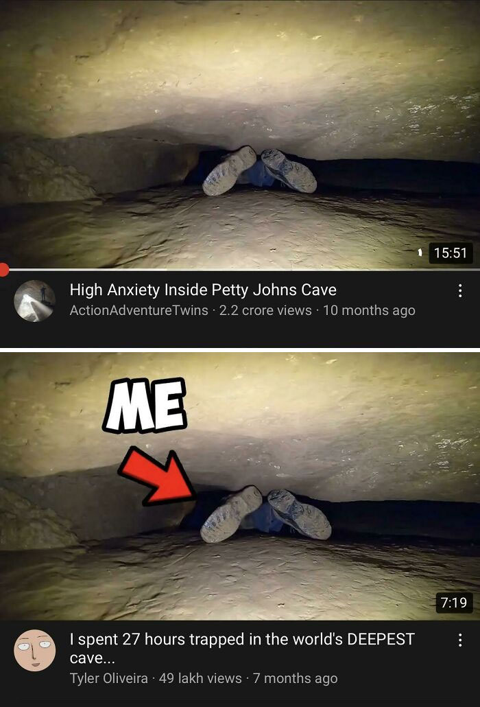
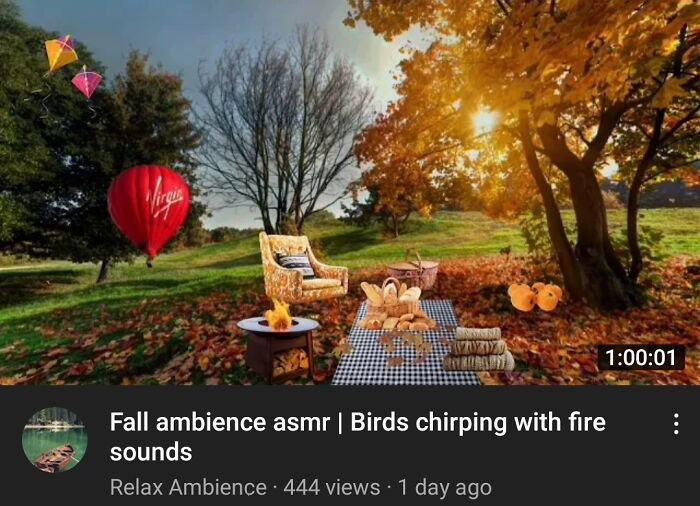
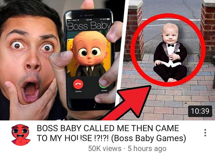
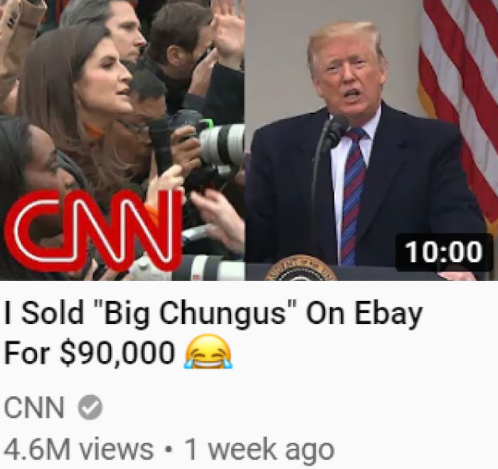
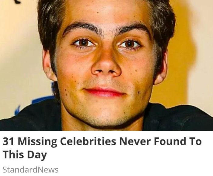
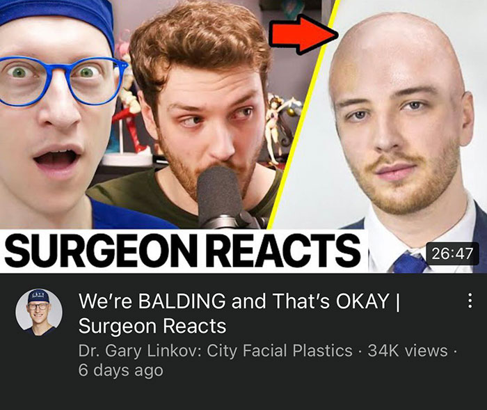
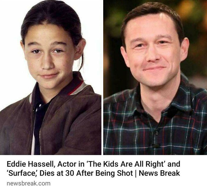
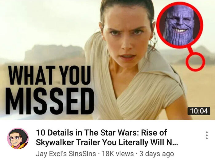
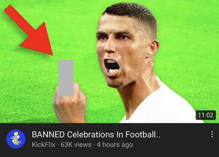
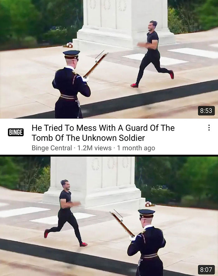
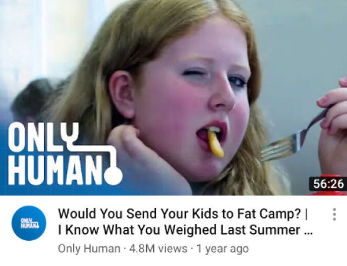
They say that we should never judge a book by its cover—oh, but we all do! The title and cover image that content creators use can make or break their online career. And the sad truth is that no matter how good your content is, nobody will read or watch it if it’s not marketed the ‘right’ way. And a lot of that depends on pandering to constantly-changing algorithms, whether YouTube’s, Facebook’s, or something else.
So, naturally, content creators learn to adapt (their livelihoods depend on it!) and change how they make thumbnails, in order to please their AI overlords and capture their (potential) audience’s attention. However, the result is that some creators go waaaaaay too far.
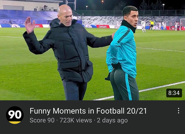
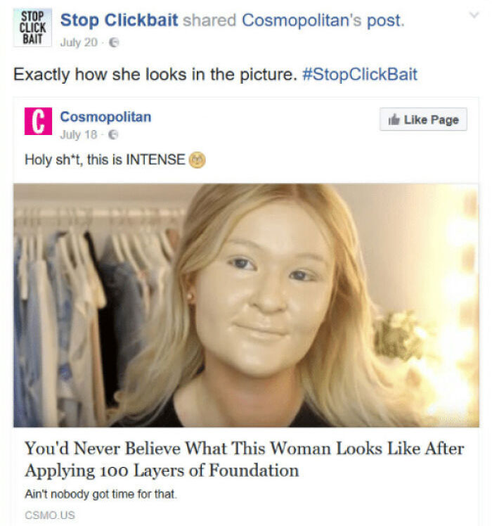
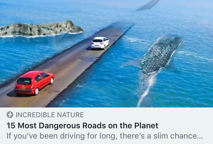
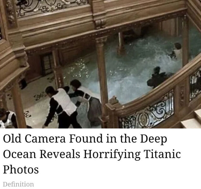
The thumbnails they make are so over-the-top, so ridiculous that they’re in a league of their own. Here at Bored Panda, we’ve collected the most epic fails from all over the net to share with you. Check out just how bad things can get below, and don’t forget to upvote your fave worst offenders, Pandas! Are there any clickbaity thumbnails that you’d actually have clicked on? Tell us in the comments, we swear we won’t judge you.
Bored Panda reached out to content creator, comedian, and broadcaster Trev Lewis for a chat about thumbnails, keeping up with algorithm changes, as well as whether or not a bad thumbnail might mean that otherwise quality content will be ignored. Read on for our full interview with him!
This post may include affiliate links.
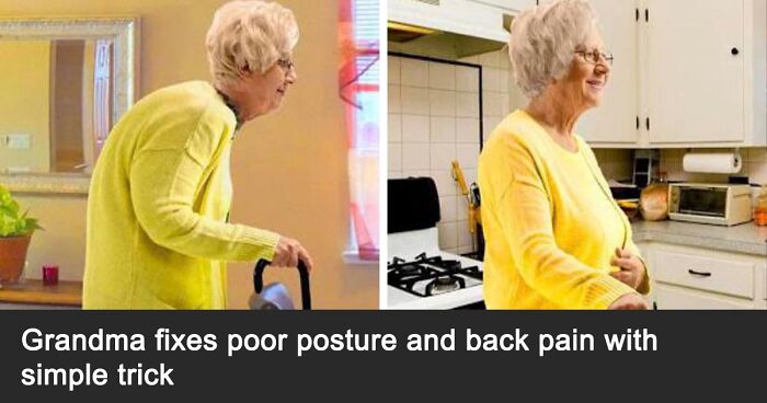
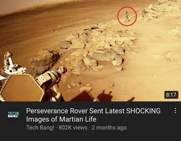
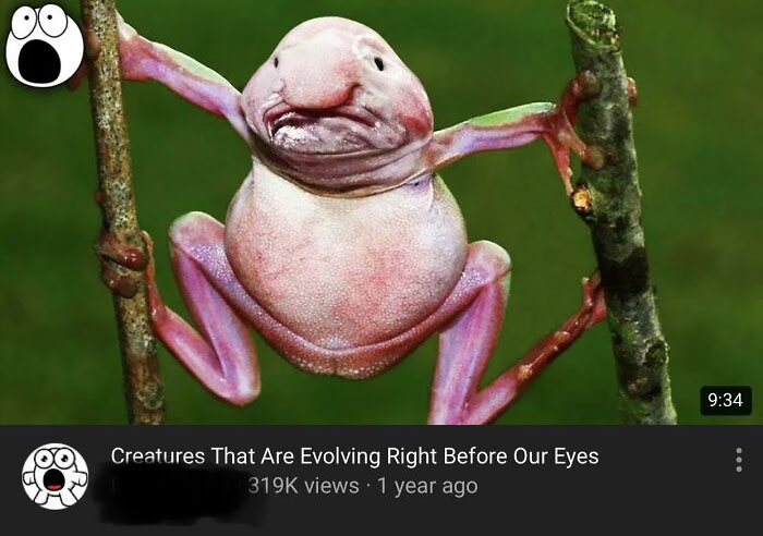
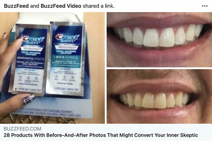
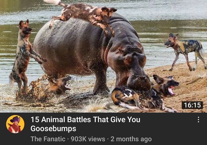
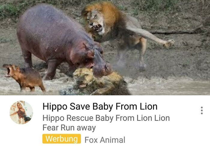
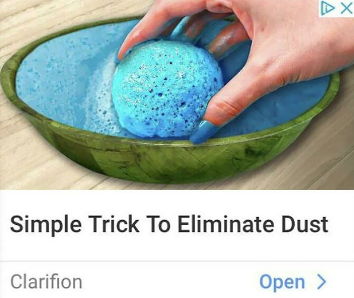
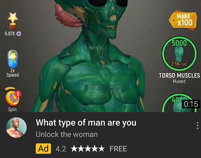
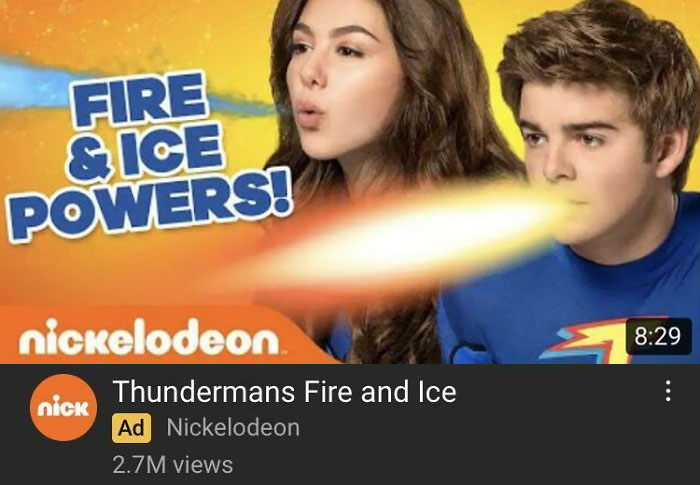
This Youtube Ad
"Thumbnails are as important to content as covers are to a book. The old adage goes, 'Don’t judge a book by its cover.' But the reason that became an adage in the first place is because that’s precisely what many of us do. It is a simple fact that if the first impression people have of your content is unpleasant, they are vastly less likely to interact with it further," content creator Trev pointed out that most of us are quick to judge.
"To that end, I wouldn’t say a thumbnail is the most important part. If the content itself is garbage, people will still quickly click away and never return. So you have to make sure you’ve got a good product on the other side. But it’s a very symbiotic relationship, the thumbnail and the content. They need each other to thrive." In short, an engaging, quality thumbnail with no good content to back it up will just leave people disappointed. You have to do both parts well.
"Changing an algorithm is a pretty big undertaking. It’s not something companies can pull off every day, or even week. They also understand that changing the algorithm frustrates many of the top users of their platforms. Still, companies are always pressured to 'innovate,' even if something isn’t really broken. This often results in the kinds of changes that perplex many of us on the other side of them. It always comes down to revenue, so any change you’re seeing was a dollar-focused calculation," Trev explained to Bored Panda.
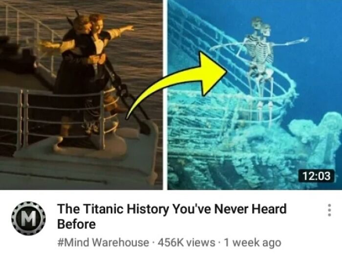
Great Chase
What do you mean? Of course this is totally real! You know how dangerous these baby cars are, right??
Why? Just Why?
"Usually when a company changes its algorithm, they will announce these changes at a Keynote event or some other business setting. The press generally reports on these developments, particularly tech journalists. I don’t know how many content creators make it a priority to fill their feed with tech journalists, but they would be very wise to do so," he said.
"The news industry was hit particularly hard when Facebook decided to modify its algorithm. Business pages also saw their reaches plummet for a few years. I owe much of my success to staying current with Facebook’s plans, which is how I learned ‘Groups’ would be greatly favored by the algorithm going forward. The pressure is certainly there to stay up-to-date with the trajectory of these platforms, and how your personal brand is compatible within their fluid ecosystems."
Trev told us that he fully believes it's still possible for quality to content to grab peoples' attention despite a bad thumbnail.... "if the title itself is tantalizing enough."
"But it's very rare that a title, no matter how sensational, can carry all of the weight. A thumbnail doesn’t have to be a masterpiece (they almost never are), but it definitely has to be something that can grab the casual scroller’s attention," he noted.
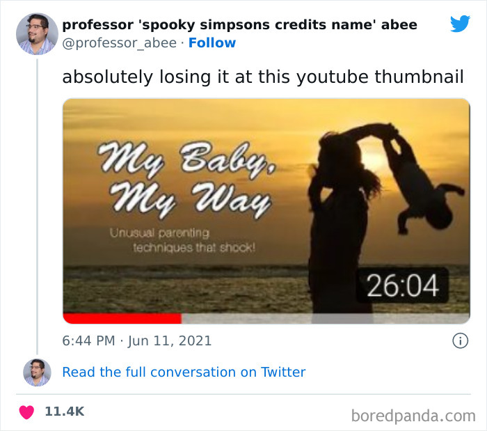
Doing Yoga With A Baby
I Can't Stop Laughing
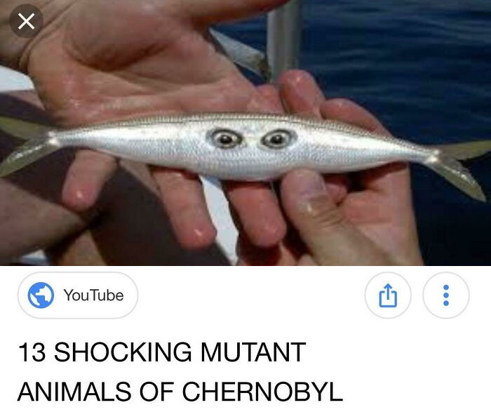
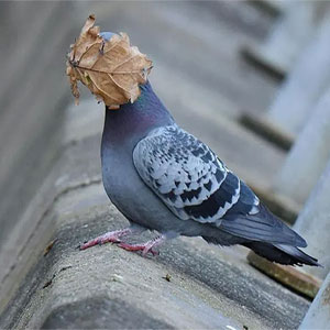
Pretty Sure The Second Image In This Thumbnail Is A Dog Holding A Pinecone
"A good question for a content creator to ask themself is, 'Will this video seem interesting to people who aren’t already interested in the topic?' If you can make a sports thumbnail that would catch the attention of someone who is not a sports fan, that’s a good thumbnail. Generally, you want to strike a balance between expanding your reach without compromising what it’s about in the first place," the broadcaster told us.
However, trying to appeal to everyone might lead you to quickly lose any substance at all, the content creator pointed out. The result? You end up appealling to no one. "But if you’re too niche, or you only care about catering to the people who are already interested, you’re not going to have your content seen by a substantial audience. Some people might be fine with that, but overwhelmingly creators publish content because they want the world to see it."
Youtube Clickbait Thumbnails That Get Millions Of Views
Oh, This Thumbnail Sure Is Unforgettable
Are You Still Going To Complain About Leg Space In Economy Class Flights?
It might be helpful to think of thumbnails as small and highly colorful digital signs: they’re all vying for your attention. The most intriguing and eye-catching ones usually get clicked on, especially when paired together with a title and topic that the audience is interested in.
And no matter how immune to ads and digital influence we think we are, many people have clicked on ridiculously over-the-top thumbnails before simply because they wanted to see what the ever-loving frick the video or article was going to be about.
Some time ago, Bored Panda spoke about clickbait with media expert and comedy writer Ariane Sherine, from the United Kingdom. She explained why it is that clickbait works.
“Clickbait works because people are desperate to know the 'one weird trick that doctors don't want you to know!' or similar. When it turns out that the trick is actually something really mundane, readers feel cheated," she noted that the audience can have wildly different expectations from what the content offers.
“This instinct towards drama and not empathy doesn't show humanity in its best light,” she noted why ‘bad’ news tends to be more dramatic.
“[People] want to ogle at what's happened because it's dramatic and entertaining and scary, but it's also a warning of what could happen to them if they're not careful.” It’s why people tend to migrate towards more negative news topics than positive ones.
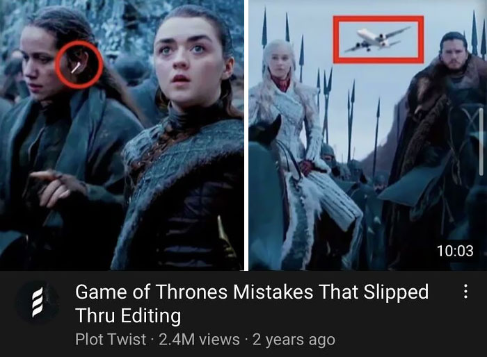
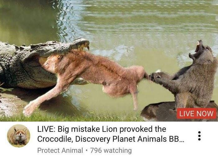
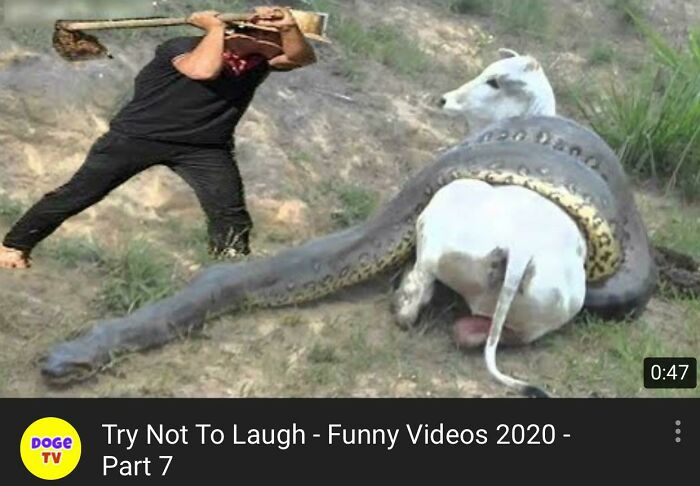
Yes, That Looks Very Real
yyyyeah im gonna go ahead and say that "Plot Twist" made all of this up
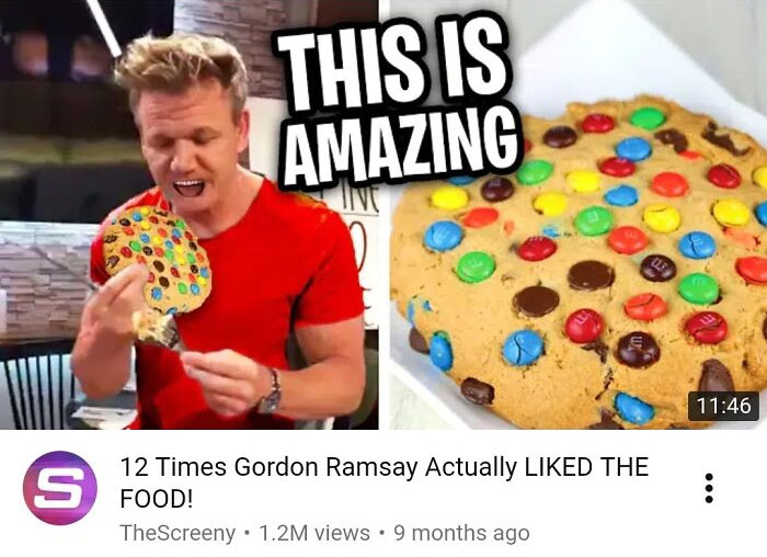
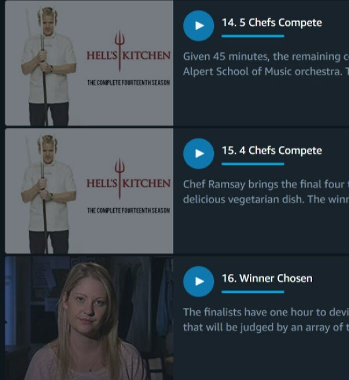
Wow Gordon, That Cookie Must’ve Been Delicious
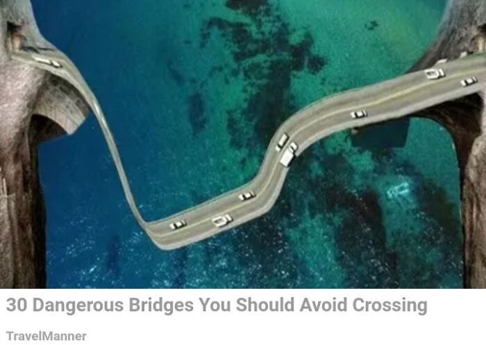
Scariest Bridge
Maybe this bridge will finally stop the damn kids from asking "Are We There Yet?"
However, the media expert warned that clickbait has to pay off. For instance, if you have a headline that draws the reader in, you’ve got to back it up with quality content. Otherwise, you might lose a potential long-term audience member.
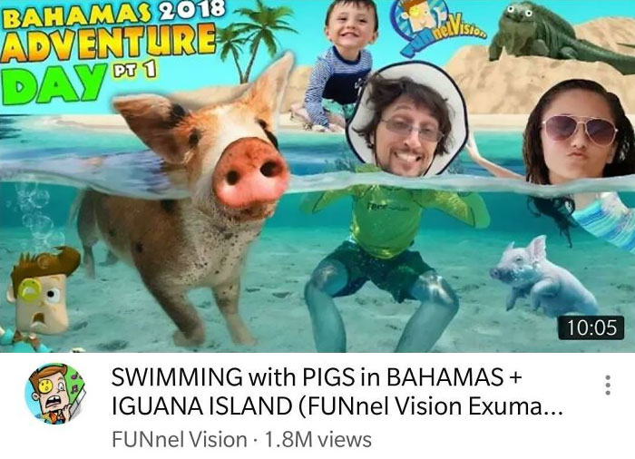
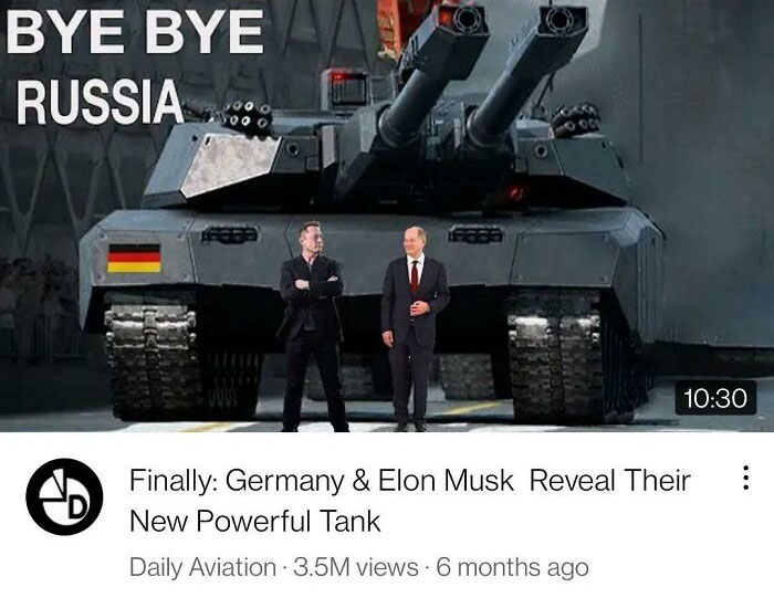
Not A Single Element In This Thumbnail Is Real
Even the child looks confused as to why he's been photoshopped there.
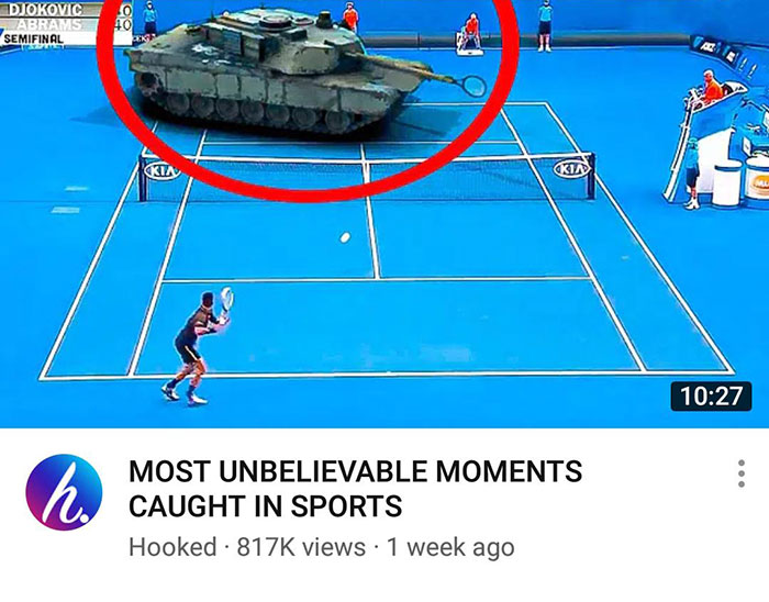
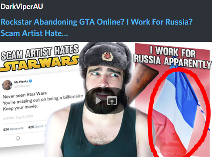
This Clickbait
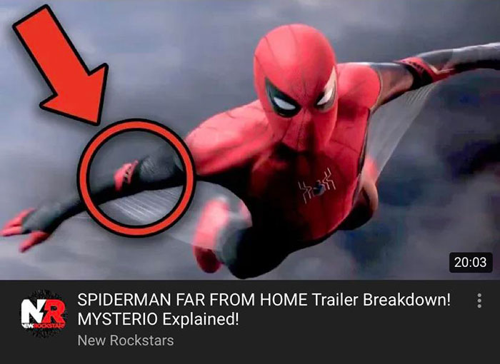
good thing they put the red circle. i never would've noticed the tank without the circle to draw my attention!
Amazing Thumbnail
Now, whether or not the content creator is focusing on short-term rewards or long-term growth is another question entirely… Unfortunately, if someone relies on clickbait, it’s usually the former. Good content creators need to intrigue internet users and hook them in, but don’t feel the need to lie to them.
Is This Where Milk Comes From?
Youtube Thumbnail Gone Too Far
I Deserve An Award For Finding The Worst Thumbnail Ever
Professor Lisa McLendon, from The University of Kansas, told Bored Panda earlier that signs have to put clarity and brevity above everything else. “You only have a second or two to get your message across, so you want people to understand quickly with zero confusion.”
Meanwhile, taking the time to edit and proofread your material is essential. Checking in with someone who might tell you if your sign/thumbnail/cover works can also help you down the line.
They've Gone Too Far
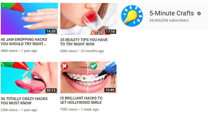
5 minute crafts is awful and constantly lies/fakes in their stuff. Anne Reardon's covered some of their vids, along with Bossom vids and some other channels. A lot of stupid s**t, but also a lot of *dangerous* things.
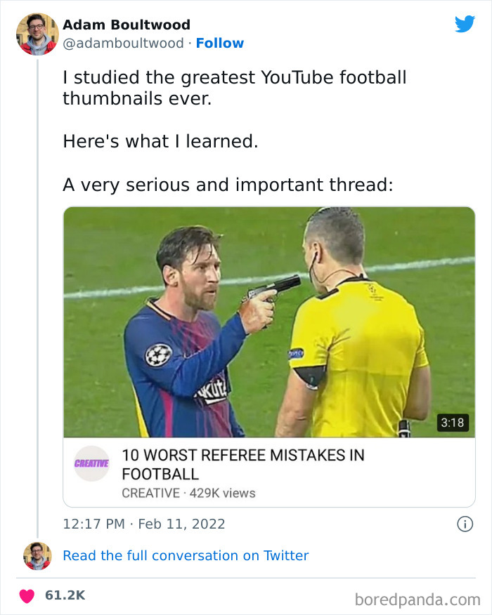
Talk About Thumbnails
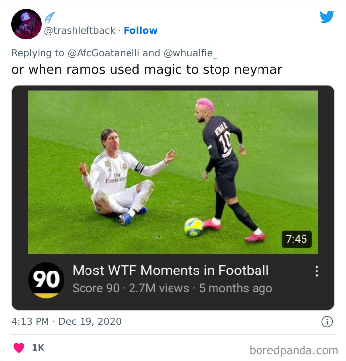
No Way
"Don’t carve an error in stone. It’s embarrassing and expensive to fix. Proofreading before you produce, whether it’s stone or not, is absolutely necessary," the professor said that proofreading is cheaper than having to fix the mistake later. However, that works mainly for physical signs (the embarrassment part still applies, though). In the digital sphere, it’s far easier to edit and adjust on the fly… though ideally, you won’t have to!
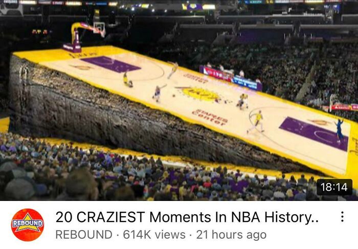
Crazy Basketball Thumbnail
This Youtube Thumbnail I Came Across
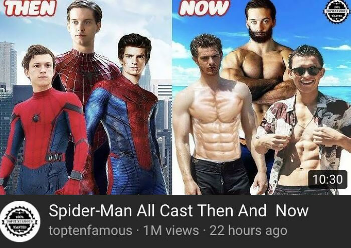
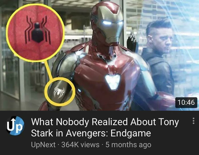
Wow, Spider-Man Got Ripped
"Choose your font with readability in mind. It should be clear and readable at a distance; you don’t want to make people puzzle through a swirly script," the professor noted that the font that you use is very important for readability.
And readability is actually incredibly important. Matt Johnson, from Hult International Business School and Harvard University, previously told Bored Panda about the fluency effect, “the relatively robust behavioral science phenomenon that the more fluent a font is written in, the more likable and trustworthy the message.”
He Could Have Photoshopped More
This Youtube Thumbnail
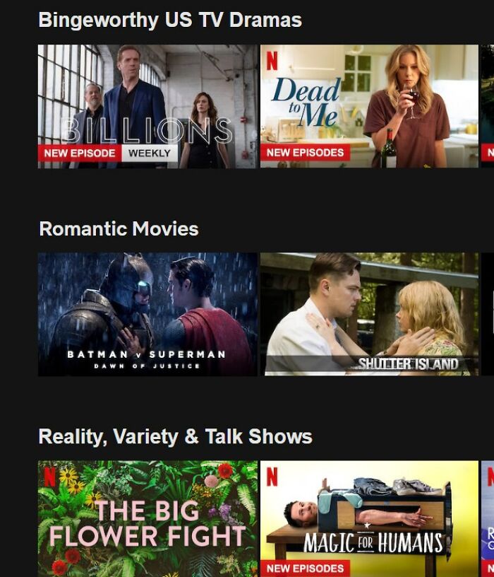
Think Someone Used The Completely Wrong Thumbnail
It’s in part due to the fluency effect that more and more brands are opting for similar-looking logos, especially in the online space. Readability means getting the message across, meaning the (potential) customer is left satisfied… or at least far more satisfied than they’d be if they were left to puzzle out what was going on.
Fast Dogs
The spotted cat dog....I think cheetahs around the world would be offended by this.
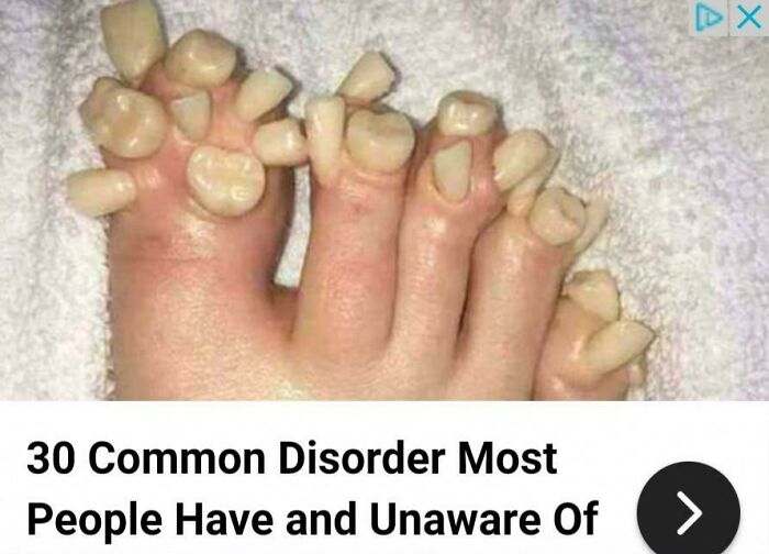
This Clickbait. Yes, So Many People Have Toe Teeth
Seriously, Who Allows These Thumbnails?
Ugh, uncooked noodle phones are SO last year. I use uncooked steak, like all modern-day fellas
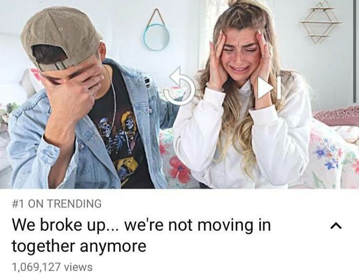
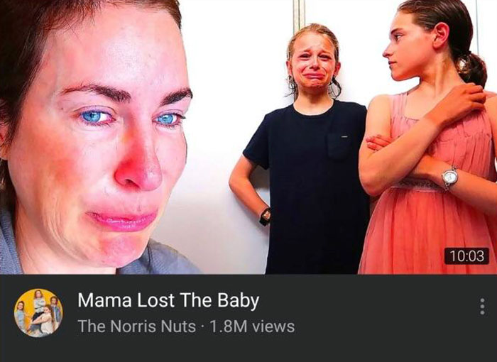
Fighting Through The Tears. Remember To Like And Subscribe, Guys. This Is So Hard. Merch 20% Off
#1 on trending. My last spark of hope for humanity just died cold, alone and afraid.
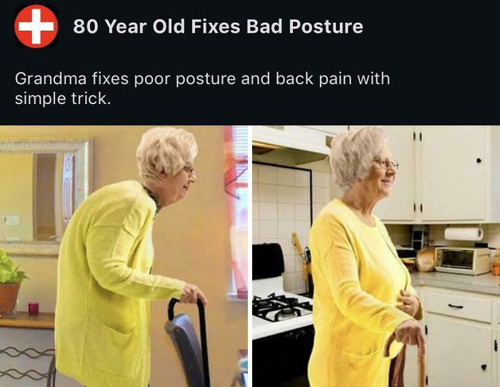
Her Posture Was So Bad It Made Her Arms Bigger And Bent The Door Behind Her
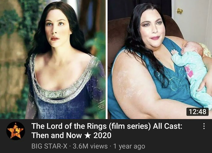
This Shameful Clickbait Thumbnail Of Liv Tyler
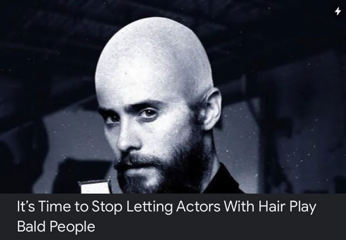
Bald People
Don't be silly. Megamind is blue. This dude is grey, so it must be Megamind's cousin, Averagemind.
Load More Replies...If we reversed that and stopped all the actors with NO hair from playing hirsute ones, it would be empty schedule for many.
Ugh, I can't stand ... hair ... washing ...... nope, I got nothing.
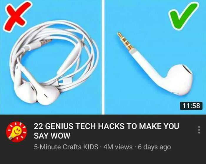
Third Most Subscribed Youtube Channel Uses The Most Questionable Thumbnails I've Ever Seen. Some Of Them Encouraging The Use Of Hot Glue In Extremely Dangerous Ways
5 Minute Crafts is evil. They've promoted thousands of dangerous "crafts" over the years, and of course Youtube isn't going to kill these moneymakers anytime soon.
These Clickbait Youtube Videos
The Thumbnail For This Fake Story Is A Call Of Duty Map
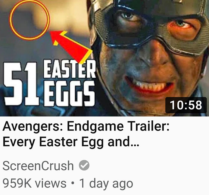
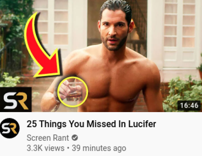
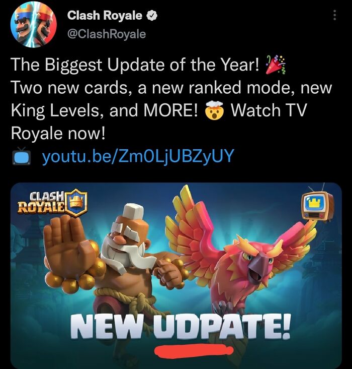
Channels That Clickbait You With Red Circles On Nothing
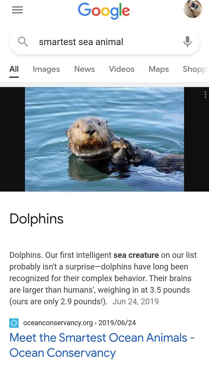
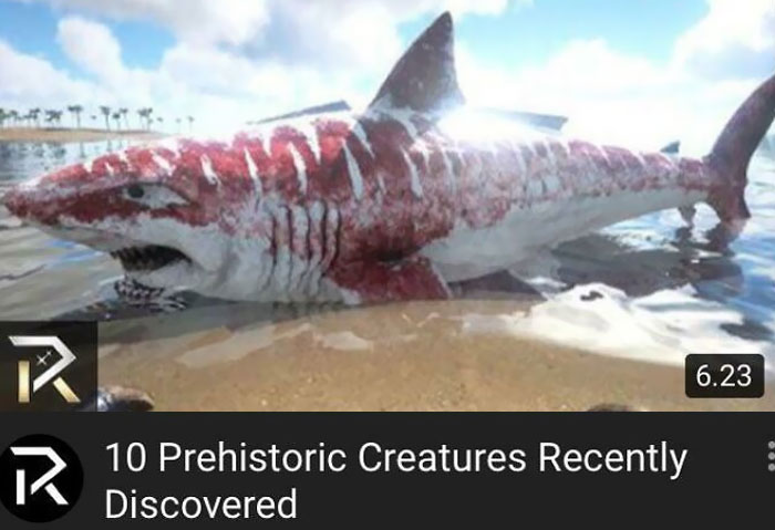
It's In The Water, It's A Mammal, Probably A Dolphin
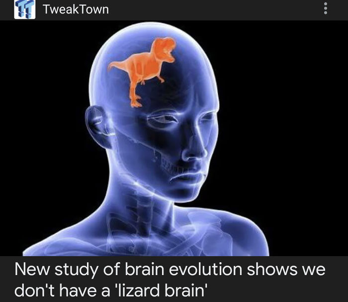
Lizard Brain
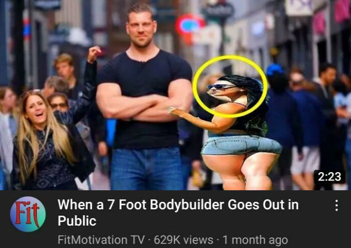
Why Is She Like That
Idc Bye
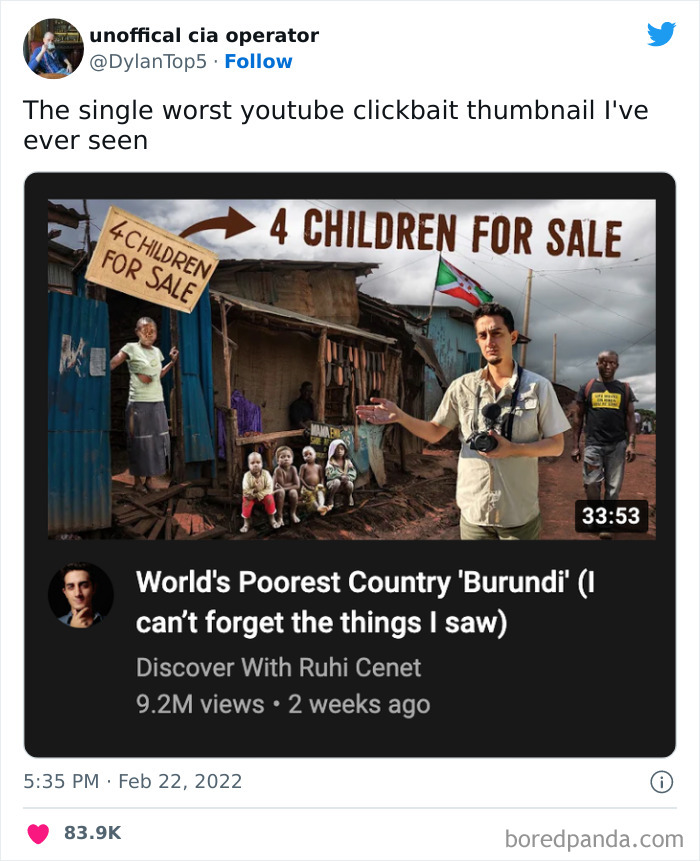
Worst Thumbnail I’ve Ever Seen
Cursed Clickbait
Nice Arm, Ted
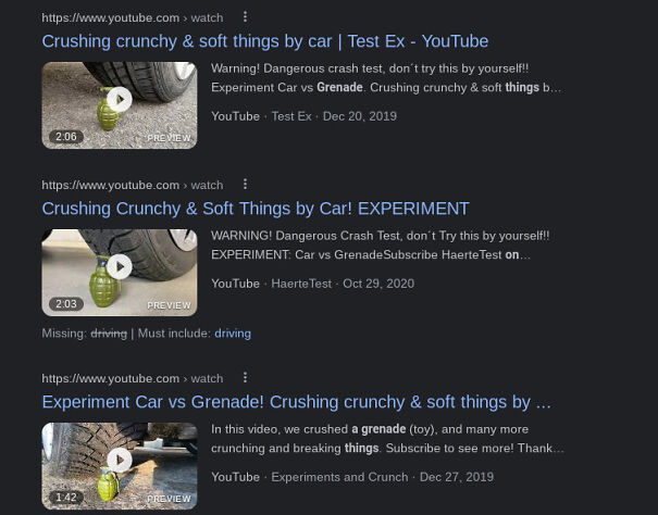
Duck vs. Car
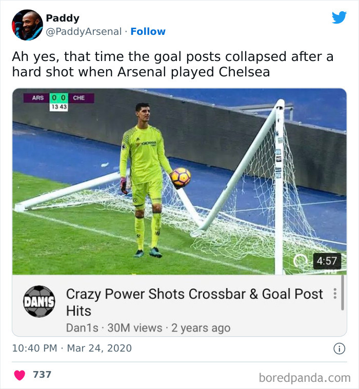
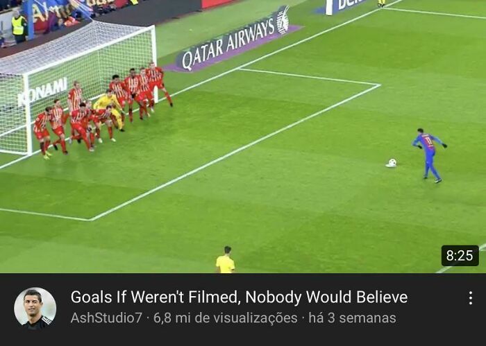
Remember This Match Arsenal Scored A Powerful Goal Against Chelsea That Broke The Goalpost
Bidinflation
OK this seems like it was meant to be an exaggerated representation, not mindless clickbait.
When You Only Have One Thumbnail For News From NLR
Eh, Close Enough
I sense a vague Venom reference. Upvote uploading...
Load More Replies...Any thumbnail with a person with their hands on their cheeks mouth open is usually a no no.
I will admit up until middle school I definitely would've clicked on these articles
I bet most of these are the ones you see here , right on Bored Panda lol.
Look at the number of views. Why on earth would they stop ?
Load More Replies...I sense a vague Venom reference. Upvote uploading...
Load More Replies...Any thumbnail with a person with their hands on their cheeks mouth open is usually a no no.
I will admit up until middle school I definitely would've clicked on these articles
I bet most of these are the ones you see here , right on Bored Panda lol.
Look at the number of views. Why on earth would they stop ?
Load More Replies...
 Dark Mode
  No fees, cancel anytime


