30 Times People Encountered Such Bad Designs, They Just Had To Shame Them On This Online Group
InterviewWhile not every product can be as design-savvy as an iPhone or the McDonald's arches, it’s fair to expect at least some level of common sense, user friendliness and aesthetic appeal. Sadly, that’s not always the case.
Whether it’s as basic as an advertising leaflet or product packaging, or something more advanced like a window display or a shiny billboard, not all design is fail-proof. There’s even a corner on Reddit called Design Fails dedicated to the most notorious faux pas in the design world.
Below we wrapped up some of the most eyebrow-raising examples that make you wonder how on earth they got approved.
This post may include affiliate links.
Taken From R/Funny
Palm Trees With Christmas Lights
To find out more about what happens when a design turns out not as good as it was anticipated, Bored Panda reached out to Laura Vanagaite, an international freelance graphic designer who specializes in branding and social media content creation.
According to Laura, using the word ‘bad’ regarding design is not quite correct. Yet, it doesn't matter what we call it, the reality stays the same: “we judge design work anyway for its design and our eye catches mistakes very fast,” Laura explained.
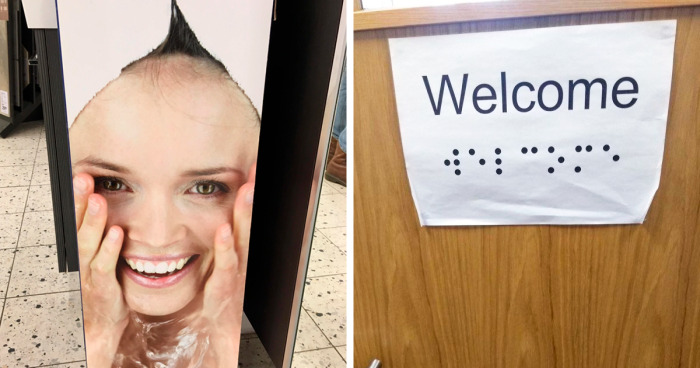
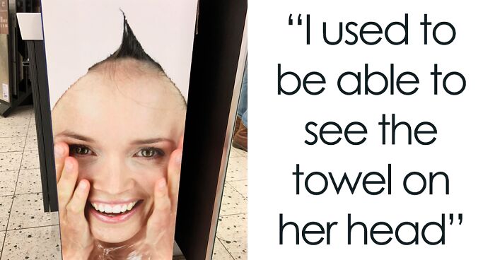
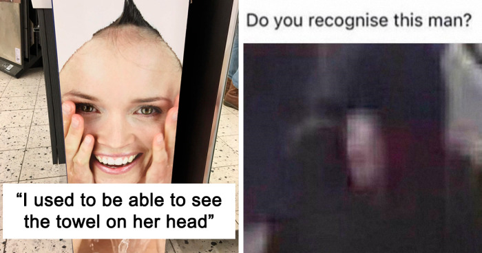
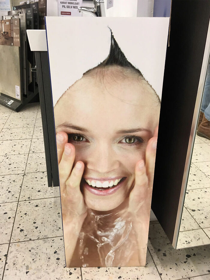
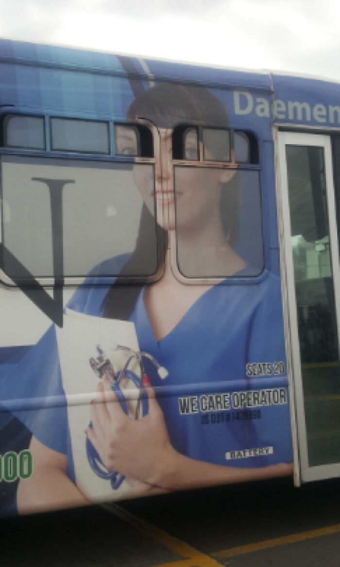
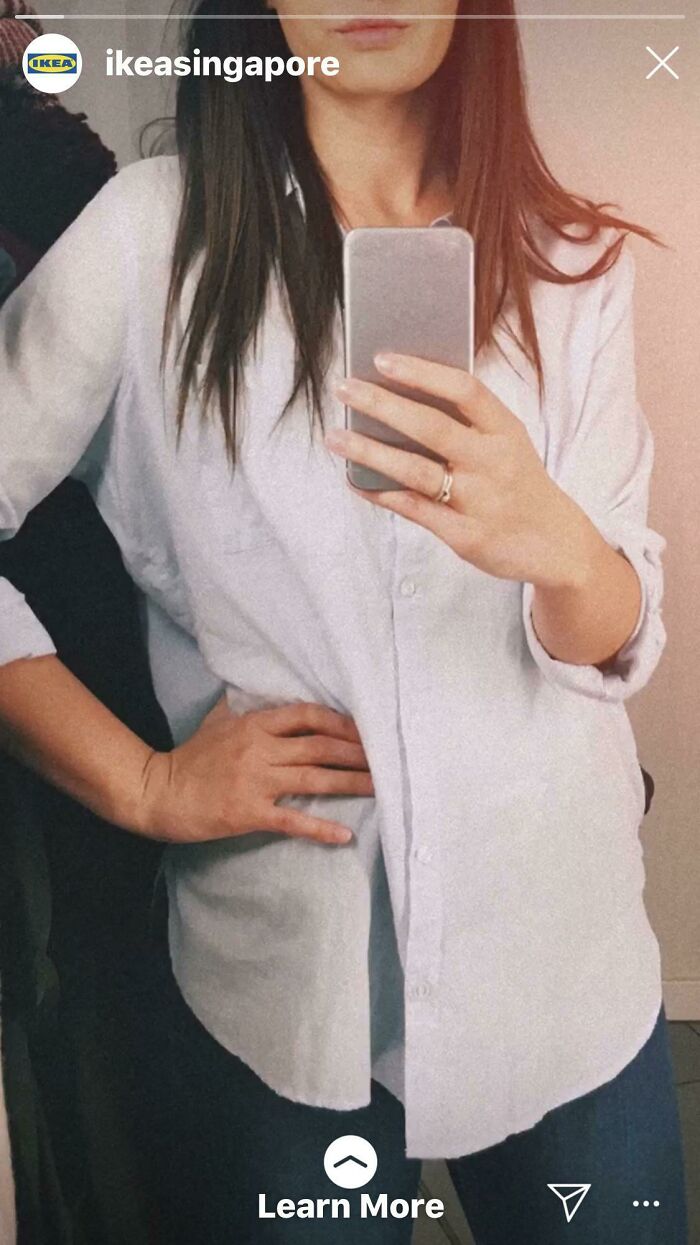
I Used To Be Able To See The Towel On Her Head
Who Was The Genius
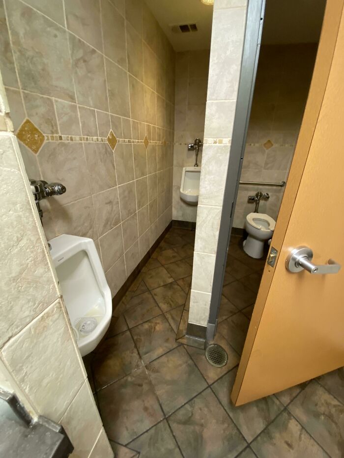
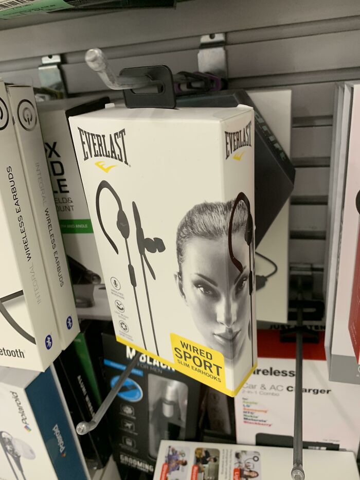
Too Cheeky
The graphic designer explained that this is because “our brain needs less than a second to bring up a judgment, and way more time to rationalize on the topics of ‘bad’ and ‘good.’”
“Once we spot a mistake, we tend to stop collaborating with the agency or brand because we believed that they are more reliable and able to deliver a good result. If the final result is made with mistakes, you definitely don’t want to waste your time to clean up a mess again and as well pay for the badly done service,” Laura explained.
She added that in the end, for any business, it is important to build concrete trust with the customers.
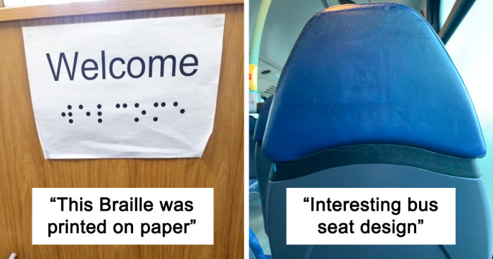
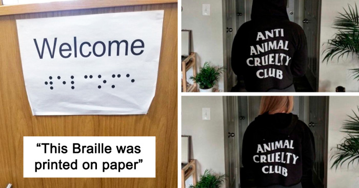
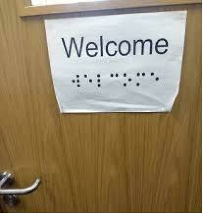
This Braille Was Printed On Paper
Oh Dear
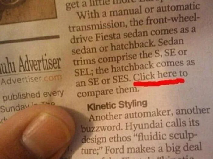
Click Here On A Newspaper
When asked who is in charge of the mistakes left in the final design, Laura said: “When most people hear ‘human error’ they do not see the details, they see the person who is completely to blame.” There can also be some sort of communication issue or the fact that a designer was less skilled. “But this should always be foreseen by the manager who is in charge from the beginning,” Laura said.
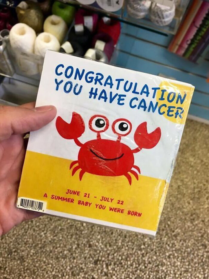
Congrats
I'm not sure the more correct "You are a Cancer" would really be any better
Ha! I have a Snoopy trophy that says "CANCER" on top and then a small description of the sign. My husband saw it for the first time and asked if there was something I hadn't told him yet XD
"A summer baby you were born". YODA out there writing books in his twilight years.
I immediately thought of Yoda when I read that XD
Load More Replies...It definitely looks like the card was poorly translated from another language or designed by someone who did not have the best command of English grammar.
Load More Replies...Hmmm, dark humor.. now Im known to have a humor that is darker than my own future, but i don't find this funny....
Thirty-two years ago, I was in a hospital day-room after a long day of tests and scans, and had just received confirmation of a cancer diagnosis that the doctors thought was incurable. I opened an old magazine and saw the word CANCER in capital letters. I was really stunned, but then I looked further down the page and saw it was the weekly star signs. Cancer was in big letters because it was the current sign for that month. Anyway, here I am, over 30 years later, clear of cancer!
The most unfortunate zodiac name. And it probably came first too. Don't quote me, I could be wrong.
"A summer baby you were born", "Congratulation"? I think this was lost in translation
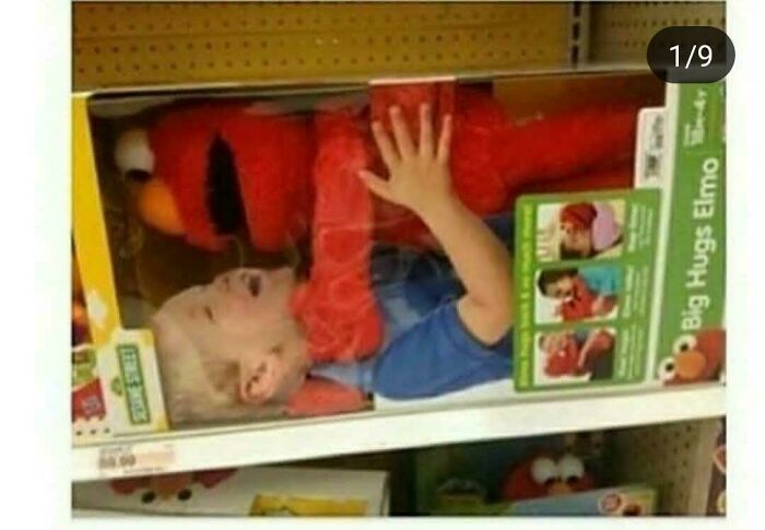
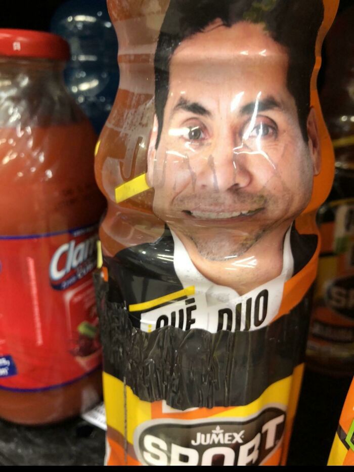
Elmo Is Tierd Of Children Now
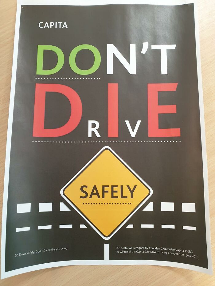
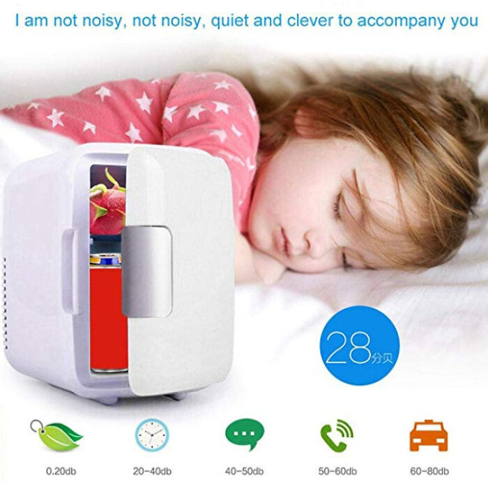
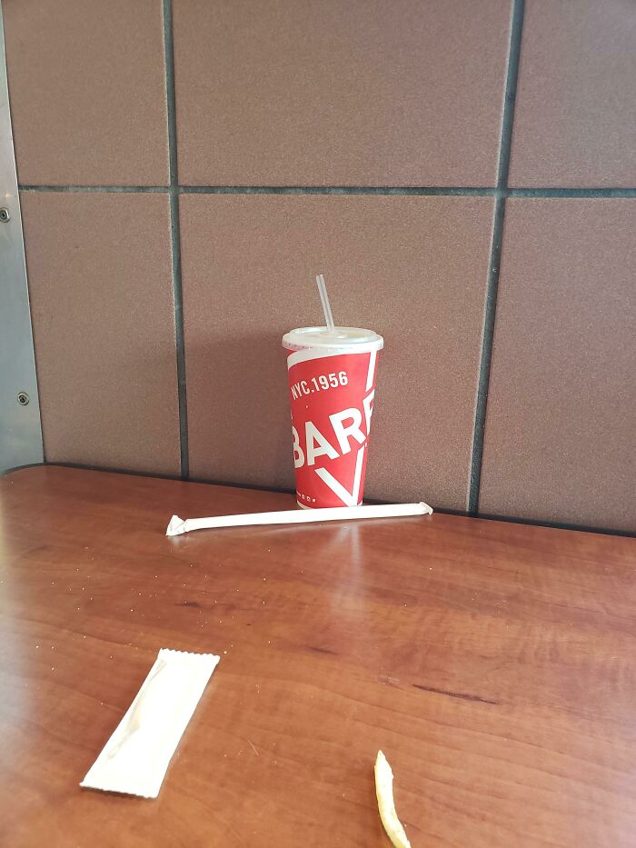
Kind Of A Crappy Design If You Ask Me
“When you hire an expert in any field, you expect that things will be done the right way and that the mistakes that you would have made won’t happen. If it is a team, it means that the project manager did not pay attention to the final design and just approved it without looking, which shows a lack of professionalism and also not caring too much about the client and the project,” Laura explained.
There Are So Many Interpretations
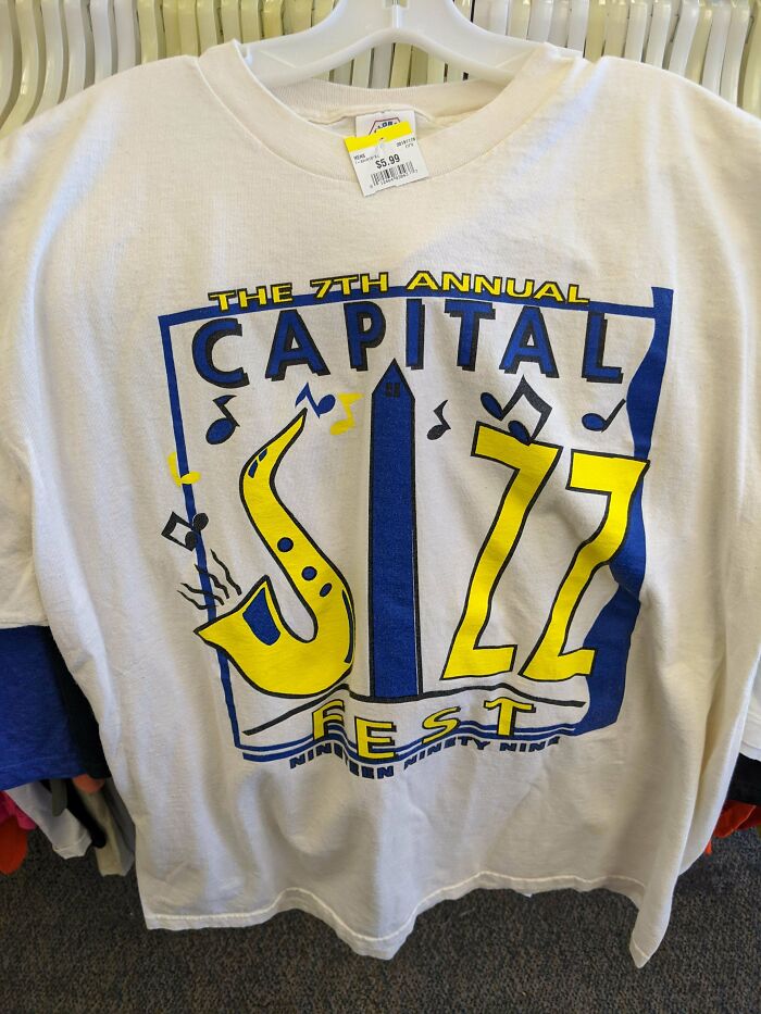
Ohhhhh, You Mean Capital Jazz Fest
Ok Milka, I See You
We also asked Laura about how the designs get approved and how they reach the end consumers. She said that the design gets evaluated by personal preferences.
“To define the role of the client and designer, from the beginning there should be a clear brief from the clients' side and as well the designer should come up with the most important questions which will be solved in the design process.”
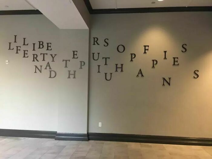
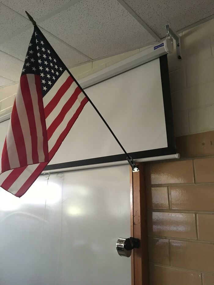
Life, Liberty And The Pursuit Of Happiness....i Think
Yeet
Yess Milk
Another step is the design-review approval which, Laura said, “is typically done by either a design-review board or with the project manager. Once everything gets approved from the management part, then it can be sent to the client to receive either corrections or the complete approval.”
Laura concluded that communication is key and designers should not be left alone during the process. “It is teamwork and the support both from the management part and the creative part is a must.”

 Dark Mode
  No fees, cancel anytime


