Guy Makes Honest And Funny Charts That Sum Up Our Lives, And Here Are 30 Of The Best Ones (New Pics)
Interview With ArtistMatt Shirley is a legend, a visual genius, and a master of social insight. Odds are that you know of his work even if you aren’t aware of his name. His creative and hilarious charts have been gracing social media sites for years, and you’re bound to have stumbled upon one of his creations. They’re as quirky as they are funny. And they’re incredibly relatable (even if some of us won’t say it aloud).
We’re not the only ones who think so. A whopping 419k people follow Matt on Instagram, waiting for his hottest new graph doodles, straight off the digital press. We really wanted to show you what the artist’s been up to recently, so we’ve collected his best newest doodles to share with you, dear Pandas. Scroll down, upvote your fave graphs, and be sure to follow Matt on social media. Why? Because he’s awesome and we know you love his stuff.
Bored Panda reached out to Matt to see how he's doing, and he was kind enough to answer our questions. Read on to see how he feels about his popularity, what he does to stay creative, and why consistency in posting might not be the only thing that new content creators should focus on.
Oh, and if you can’t get enough of the artist’s funny and honest charts about being a real-life human being, don’t worry, we’ve got you covered. When you’re done with this list, check out Bored Panda’s earlier features about his work here, here, and here.
More info: Instagram | MattShirleyCharts.com | Facebook | Twitter | Patreon
This post may include affiliate links.
Matt is still over the moon that people enjoy his charts. "I'm very excited people still find my stuff to be entertaining," he told Bored Panda via email.
"I've always been worried that my content would be for a specific time and place and then people would get tired of it and move on but so far I've been able to keep it fresh and explore different topics that people seem to like," he shared some of his hopes and fears.
The creator was very candid with us that he's "always worried about losing the creative edge," as well as doing only the things that are easy. It's an issue that many artists must feel like they've had to tackle at some point in their careers.
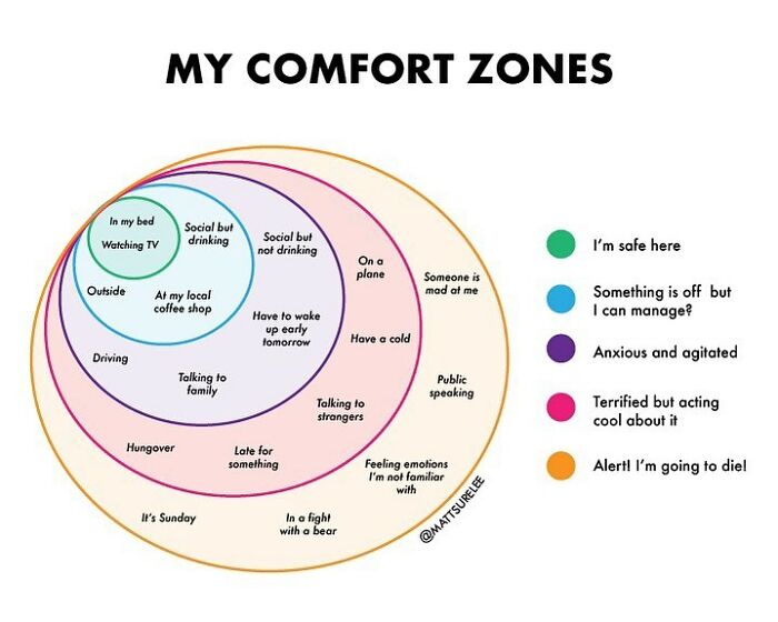
"I've run into this quite a few times over my career. I will find myself a little burnt out and not seeing my content as very funny which usually means I need to try to switch it up and get out of my comfort zone. In theory, I always want to try new things, new mediums, new topics, but in practice, it's a lot harder to get yourself to do this," he explained.
Bored Panda also wanted to get Matt's opinion on discipline, considering how consistently he makes and posts content. It's a character feature that many artists would give a lot for.
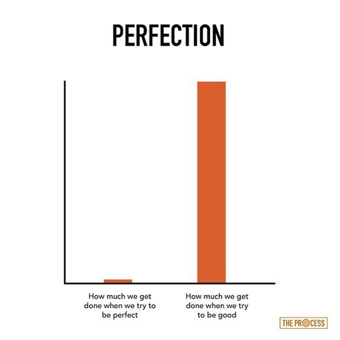
"I know a lot of people say consistency is key but I think that's a bit overstated. Of course, you don't want to go a year without posting but to take a month or week or day off is not a big deal. It's much more important for the content to be quality," he said that there has to be a happy balance between consistency and quality.
"For me, I treat it as my job and at this point, it's not too difficult to come up with an idea or two every day," he said.
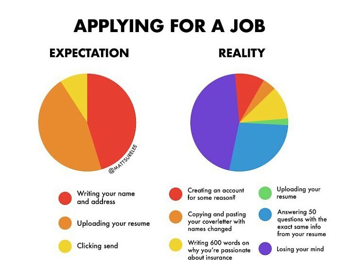
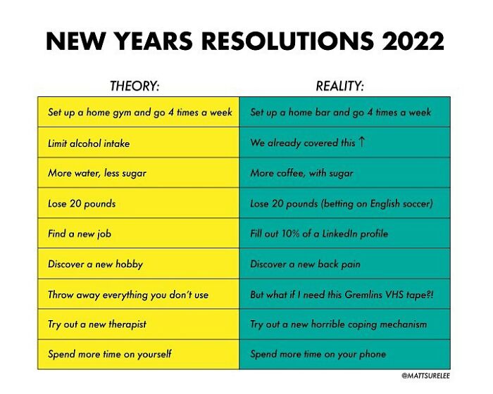
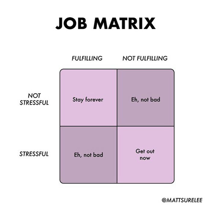
I wish people would just accept an email attachment it is so pathetic this thing of filling out the same contents over and over. I mean why bother having a resumé in the first place then??
During a previous chat with Bored Panda, Matt told us that he’s “always loved” things that are related to visuals and design. He said that it was a natural fit for him to try and do something similar on his Instagram page.
“Sometimes, it is a challenge to keep motivated, but the good thing about charts is that you can pretty much do one on any topic,” he shared with us.
“I'm not confined to a certain field of expertise which helps with inspiration. If I'm not feeling inspired to create something on a certain topic, I can always look in the complete opposite direction for something that activates the creative juices,” Matt opened up to Bored Panda about how he keeps the creativity flowing.
Charts are a great medium for sharing humor with people. They’re very to-the-point and pack a lot of punch in bite-sized bits of content.
“I like charts because they don't require a lot of reading and there's an inherent discovery process whenever you are trying to figure out what a chart is trying to depict, whether it's for entertainment or data-driven,” the artist told us.
“The only limitations I've found are with the types of jokes you can include. If you want long-winded setups and character-driven jokes then charts are definitely going to be difficult to work with,” Matt explained that charts allow for concise and snappy jokes, nothing too deep.
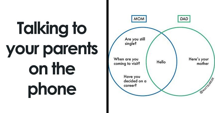
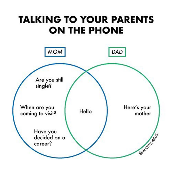
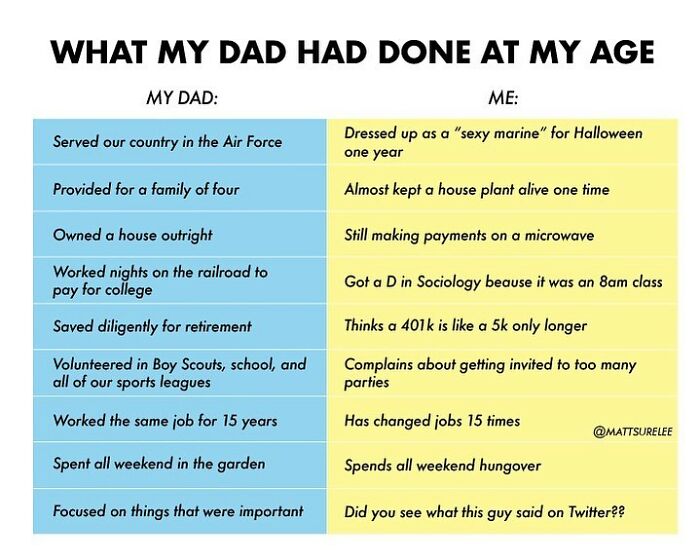
This isn't true for me, but I have friends who have parents like this 😆
Meanwhile, during a couple of more recent talks with Bored Panda, the chart and graph virtuoso revealed that “it’s actually quite difficult” keeping up with current events. Sure, they might make for great content, but being up-to-date with all the freshest news, all the time can be exhausting. Matt picks and chooses what he engages with.
“I tend to not pay attention to the news too awfully much because I find that it's not exactly great for my mental health, so I have to pick and choose the types of current events I talk about with my charts,” he told Bored Panda
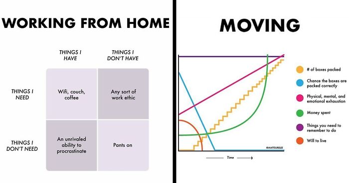
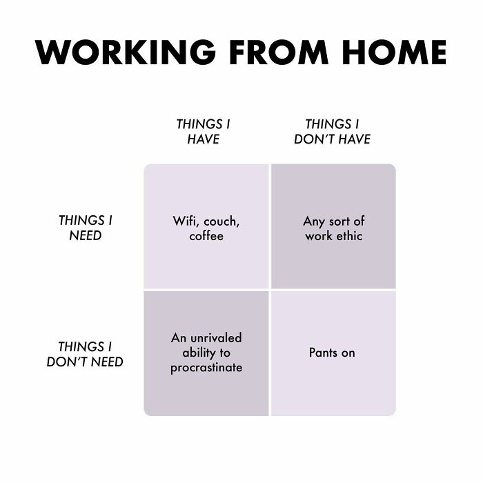
“In general. I like to do things that are light-hearted so it's natural that some of the more light-hearted news stories are right up my alley. And then, of course, I can always draw off my own experiences, whether it's working from home or dealing with isolation or my thoughts on anxiety,” he shared a glimpse into his creative process with us.
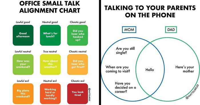
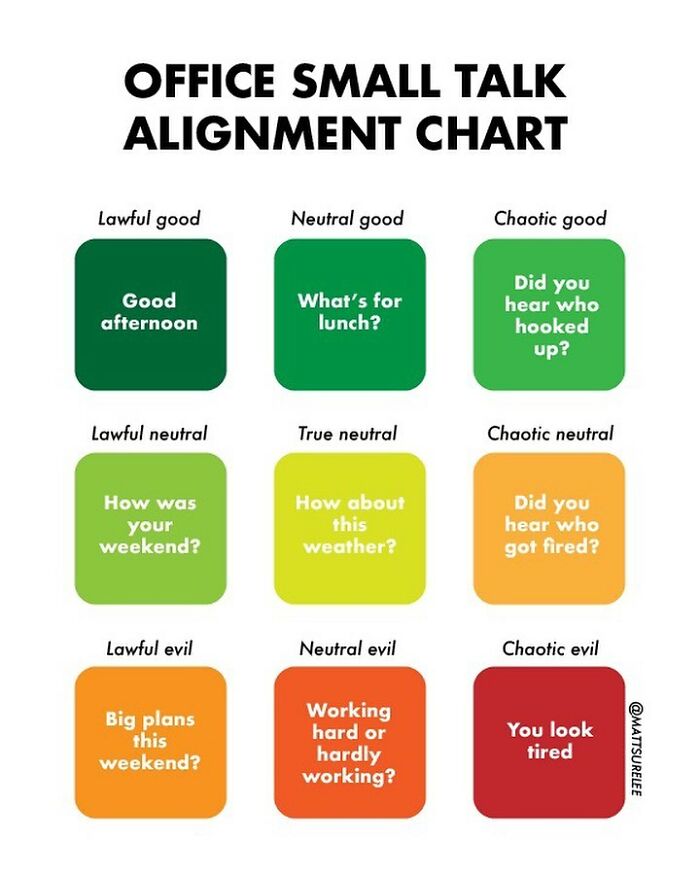
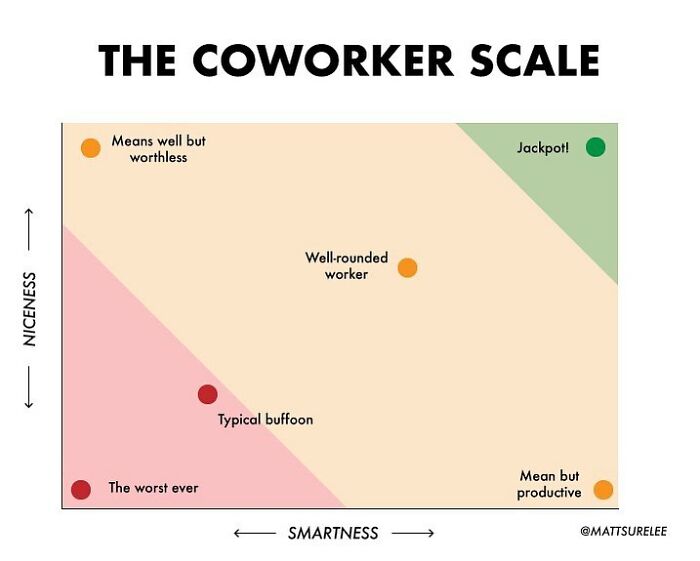
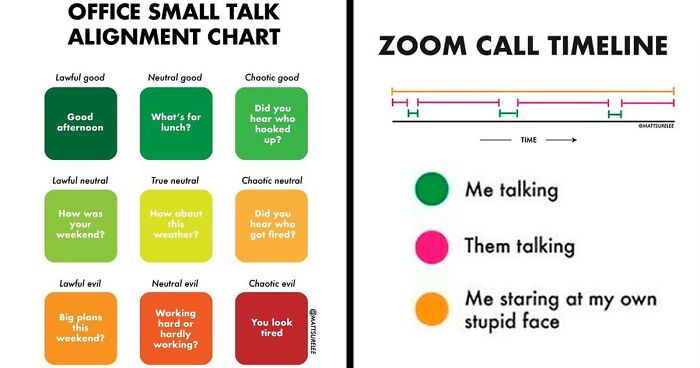
I exist in the lawful good and I am annoyed by anyone who is outside of that.
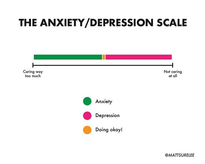
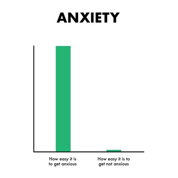
Living with anxiety, it's mostly green and pink for me. And no yellow. Definitely no yellow.
When Matt first started out venturing into the world of digital virality on Instagram, he was drawing his charts on whiteboards. However, he eventually upgraded and went fully digital.
“This worked great at first, but eventually I found that I would often make mistakes that were almost impossible to fix on a whiteboard and I moved to more graphic design charts,” he said.
According to Matt, going fully digital has allowed him to be more flexible. Now he can draw multiple things each day. Moreover, he can reuse certain templates, “so I don't have to measure and draw the same pie charts or tables over and over again.”
In other words, digital art makes the entire work process much faster. Besides, Matt enjoys the variety of colors that he can use digitally. You just can’t get the same effect with whiteboard markers.
“I absolutely didn't expect anything when I started. But it's very nice to find out that other people see the world in the same way I do,” the creator said that he never expected his chart art to take off as much as it did.
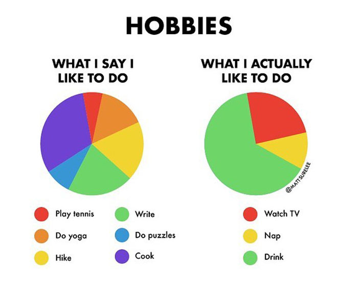
I do like football/soccer a lot....but you just can't beat a good afternoon nap.
Not everything that Matt draws ends up on social media, even though he draws pretty much every single day. He feels that some of his charts aren’t “up to snuff” and end up in his computer archive, never to see the light of day. He feels that the content that genuinely makes him laugh will make others laugh as well.
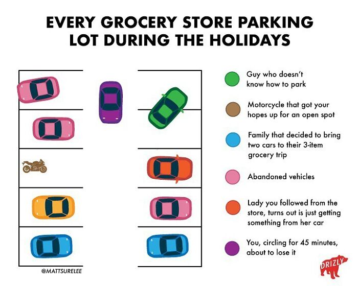
It's missing 1) the other circling cars looking for a spot and beating you to all of them 2) the giant pickup or other rude vehicle taking up two spaces, 3) the reserved spots (needed for folks with limited mobility and/or kids) but currently empty, 4) the space with something broken or spilled that you don't want to chance driving through, and 5) the "empty" space that turns out to be a cart return.
So, Pandas, which of these charts were your faves? Which ones resonated with you the most and why? Cuz, we gotta say, we relate to most of Matt's work. Do you have any ideas that you wish the artist would illustrate in the near future? Tell us all about it (and more!) in the comment section at the bottom of this list.
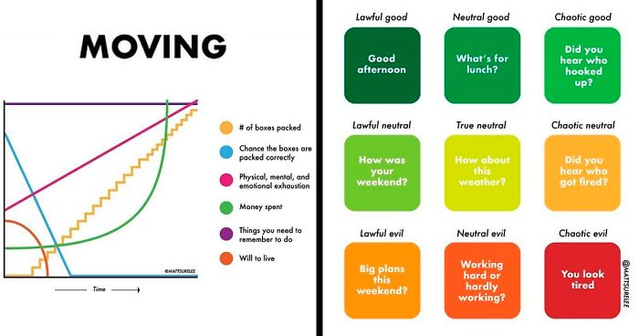
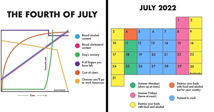
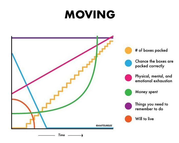
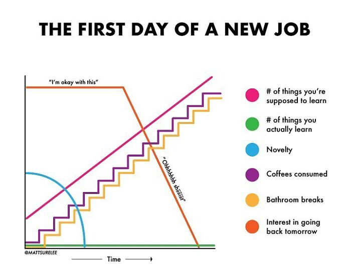
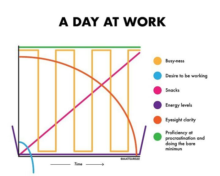
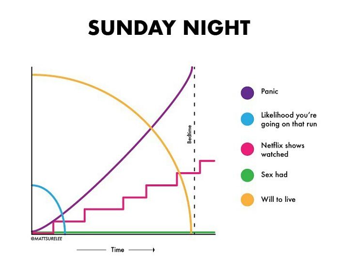
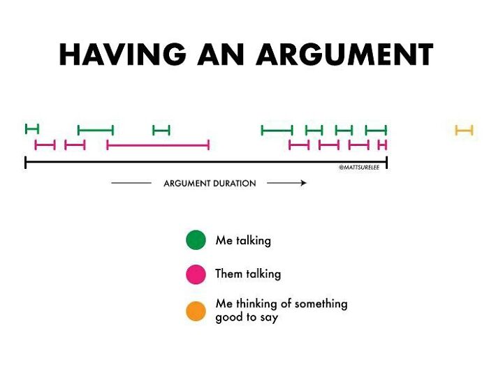
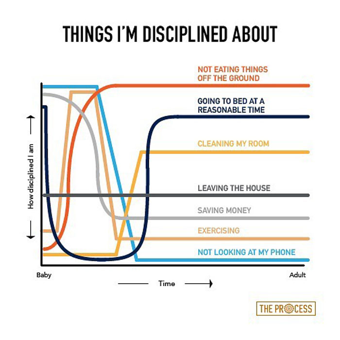
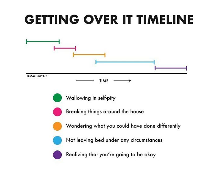
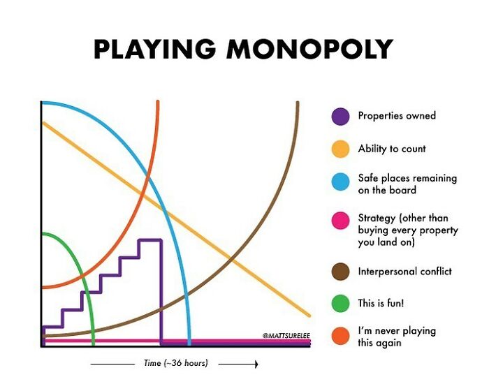
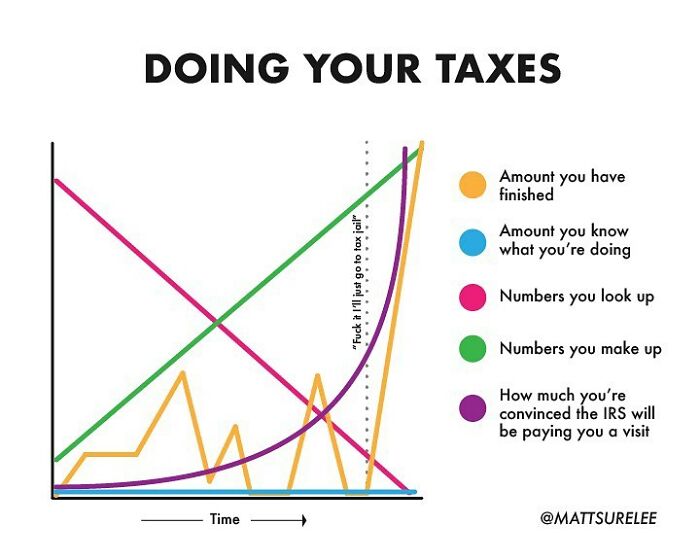
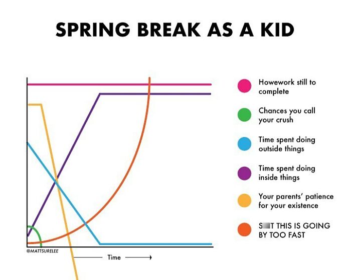
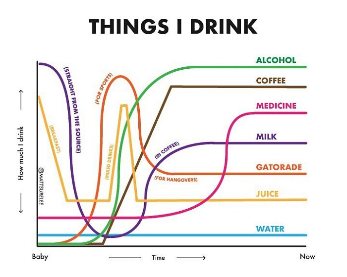
The purple is wrong, the line should go straight up vertical at the starts and ends
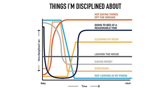
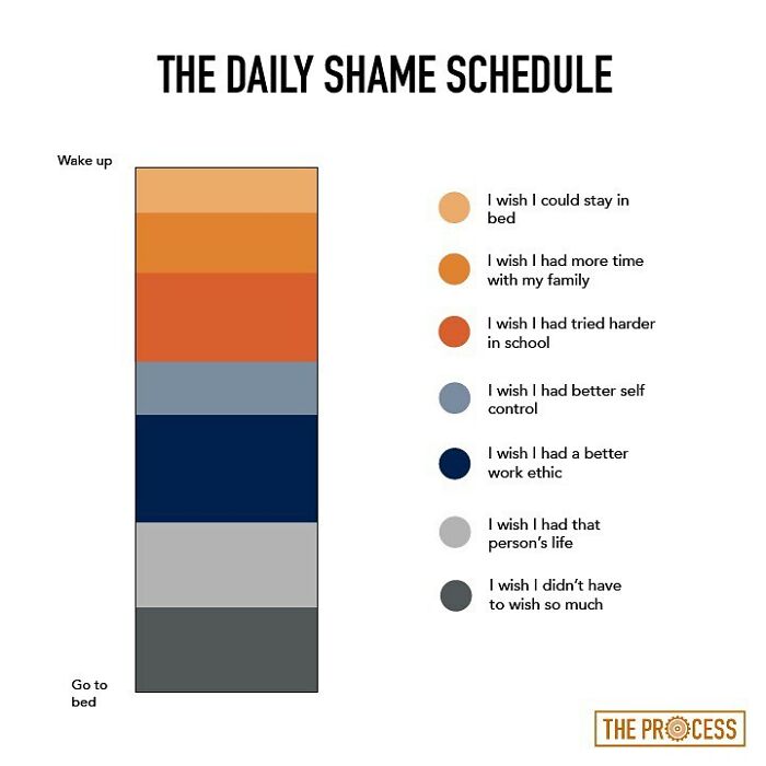
Why does it feel like this explains so much of our lives? It kinda makes me sad. (quietly laughs through the pain)
It makes me sad to know that every decade in my life I thought I would have it all figured out by the next decade but it never happens. These graphs at least let me know I’m not alone
Why does it feel like this explains so much of our lives? It kinda makes me sad. (quietly laughs through the pain)
It makes me sad to know that every decade in my life I thought I would have it all figured out by the next decade but it never happens. These graphs at least let me know I’m not alone

 Dark Mode
  No fees, cancel anytime


