40 Of The Worst Planning Examples That Were ‘Imposed On Our Environment’, According To This Twitter Page (New Pics)
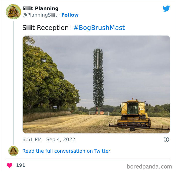
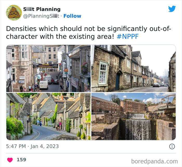
The Twitter account '[Bad] Planning' calls itself a "celebration of all the [messed up] stuff imposed on our environment." And regardless of how you feel about the need to have one, the account gives exactly what it promises.
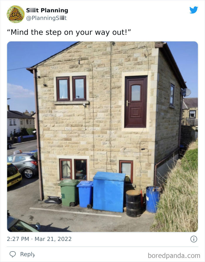
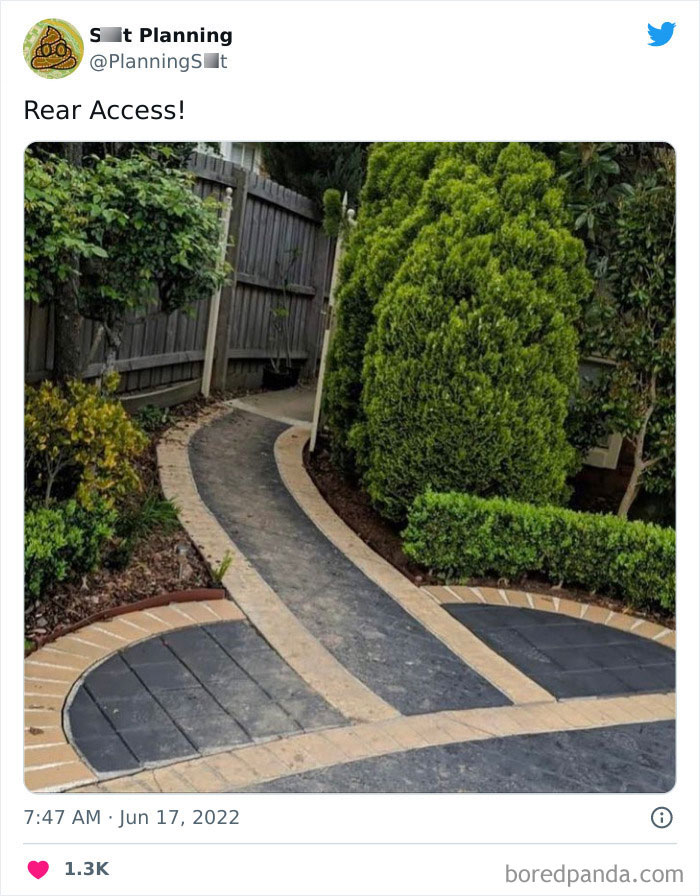
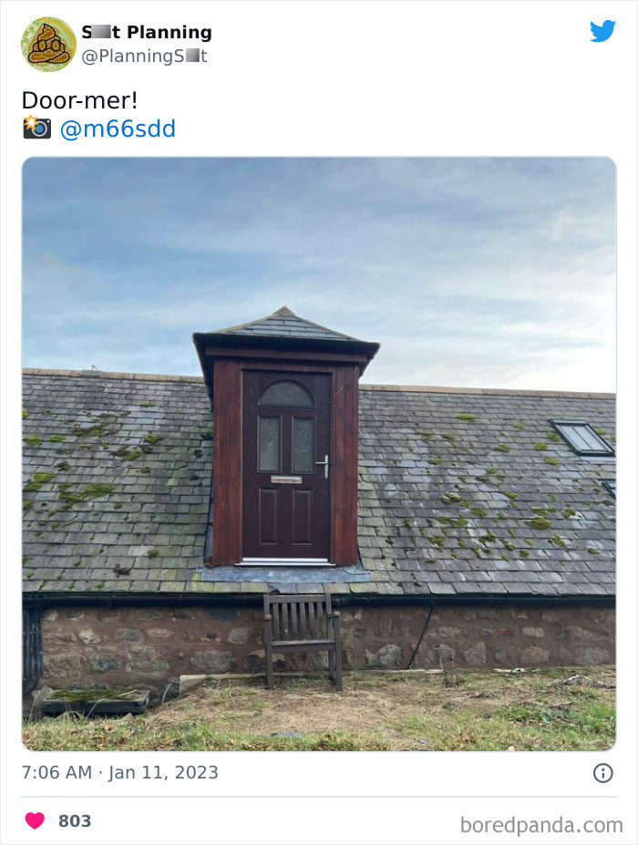
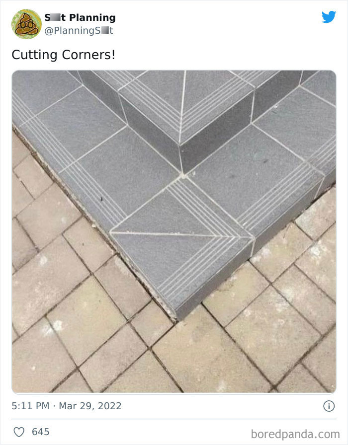
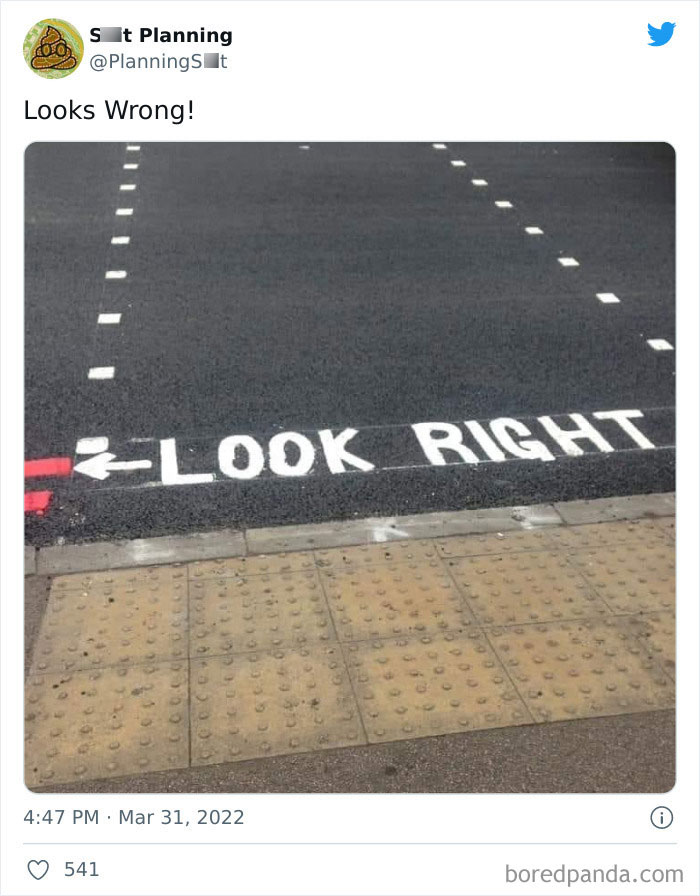
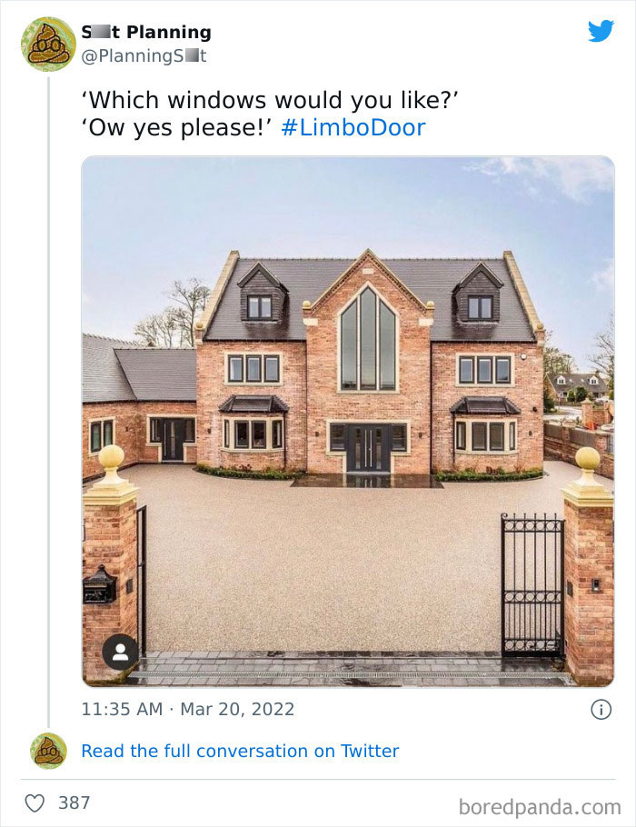
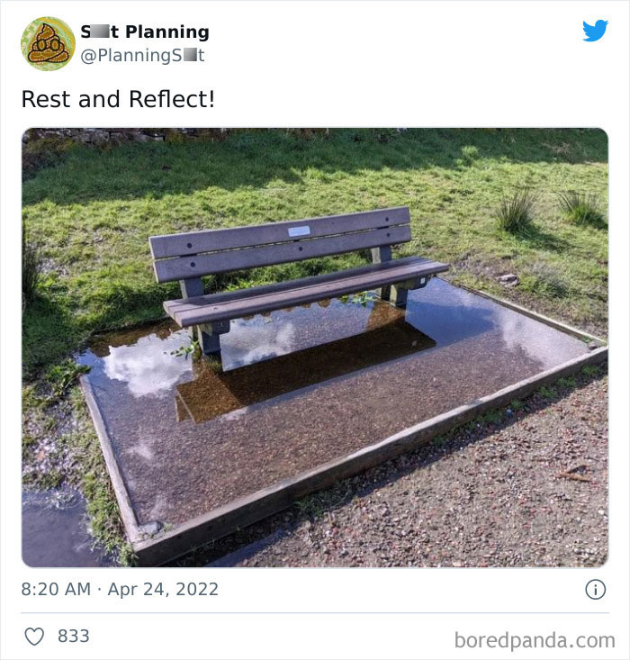
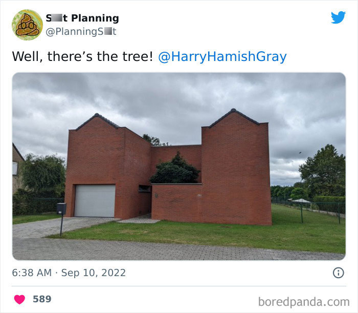
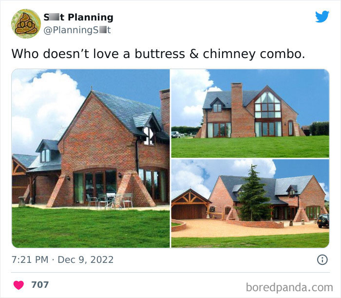
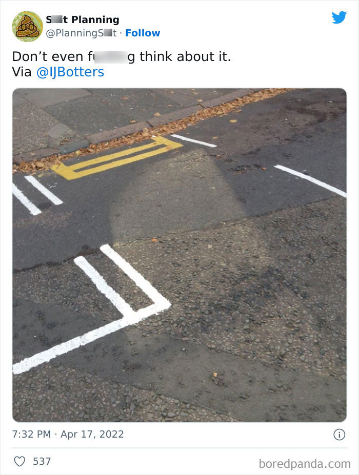
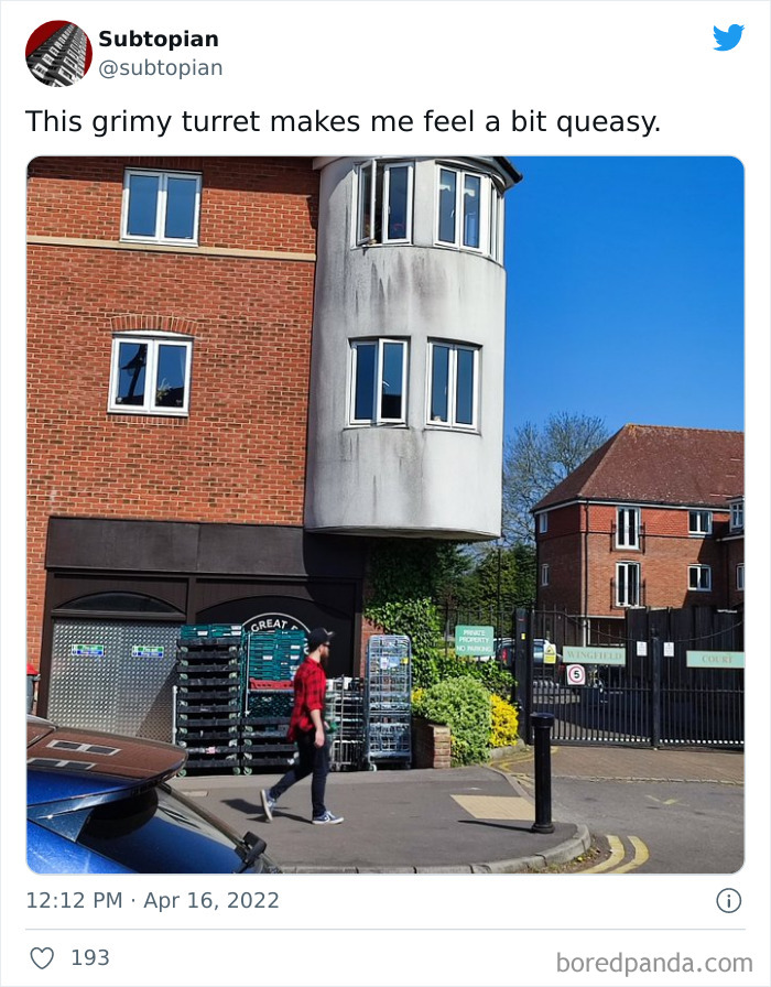
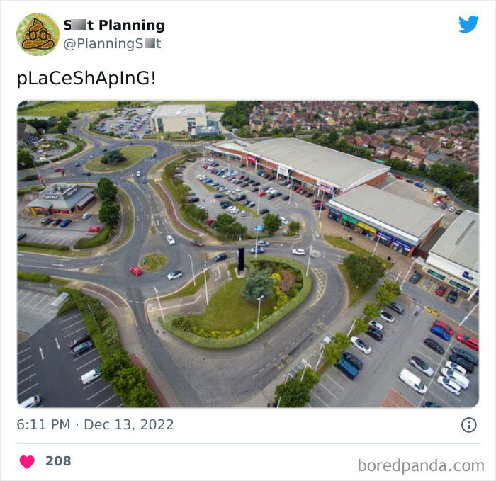
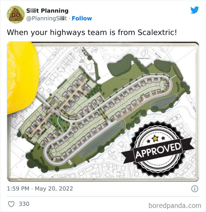
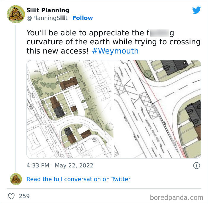
Focusing on everything from minor hiccups such as misleading road markings to more extreme cases of incompetence, like deadly-looking crooked turrets above a pedestrian lane, '[Bad] Planning' holds nothing back when calling out architects, planners, surveyors, engineers, and other "environmental ne'er do wells."
I guess it's true what they say, the bitterness of poor quality remains long after the sweetness of price is forgotten. (A statement the account proudly 'wears' on its cover image, too.)
More info: Twitter
This post may include affiliate links.
Currently, over 55% of the world's population lives in cities, and this is expected to rise to 68% by 2050, with nearly 90% of the increase in the urban population occurring in Asia and Africa. (For instance, the proportion of China's urban population has increased from 17.92% in 1978 to 58.5% in 2017).
The urbanization process has brought about the rapid socio-economic development of cities, yet its speed has also led to some development problems, such as over-consumption of resources, increasingly prominent pollution, frequent occurrence of 'urban diseases' and extreme weather events, continuous deterioration of living environment quality, etc., which have brought new challenges to sustainable urban design.
After experiencing three generations of historical paradigms including traditional, modernist, and green urban design, the technical concepts and methods of the practice have acquired some brand-new content with the increasing development of digital earth, smart city, internet, and artificial intelligence, further forming the fourth paradigm of digital urban design based on human-computer interaction.
This new paradigm takes the reconstruction of morphological integrity theory as the goal, the human–computer interaction as the approach, and the transformation of technical methods and tools as the core features.
Furthermore, digital urban design can play a key and supporting role in the preparation, implementation, and management of urban planning, highlighting the characteristics of history, culture, and landscape patterns, promoting fair and just social norms, and creating a livable and sustainable environment.
The digital city is one of the basic symbols of transformation from the industrialization era to the informatization era, which generally refers to the ability to effectively acquire, classify and store, automatically process and intelligently identify massive data in the category of urban natural, social, and economic systems.
Taking advanced information means to support the city planning, construction, operation, management, and emergency response can effectively improve the level of government management and service, and also promote the sustainable development of a city.
ive just read all the comments on this... am i the oldest person here im 33years old haha
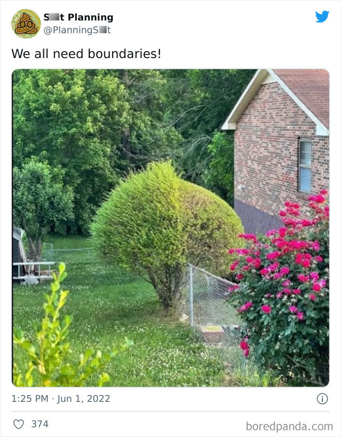
Tbh i dont like the perfectly trimmed tree, the one on the left is mich more pretty and natural
However, even if the fails we see in the pictures are becoming rarer, there's still the long-time conflict between urban development and historical protection.
Cities have been facing the dual challenges of renewal and decay, development and preservation. The general development trend of urban design for historical cities, historical blocks, and sections is to protect buildings and insert new ones through ‘weaving and patching’ on the premise of striving to preserve the original historical structure of the old city and the integrity of sections, thus forming an orderly progression of metabolism.
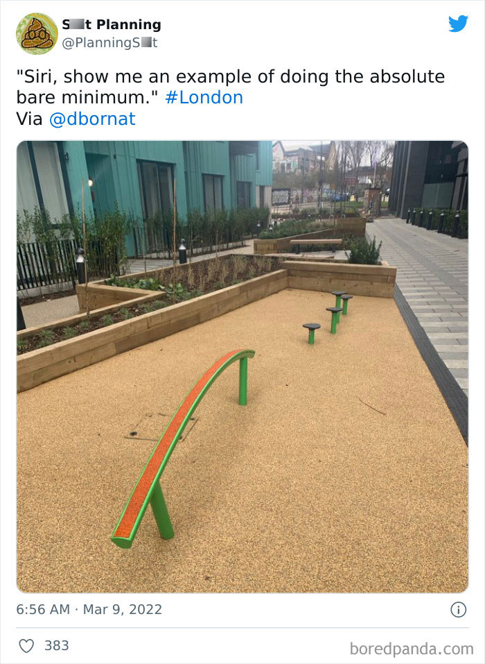
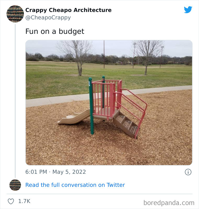
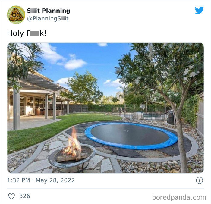
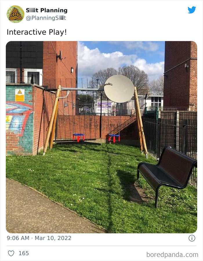
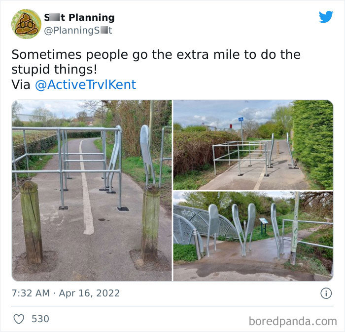
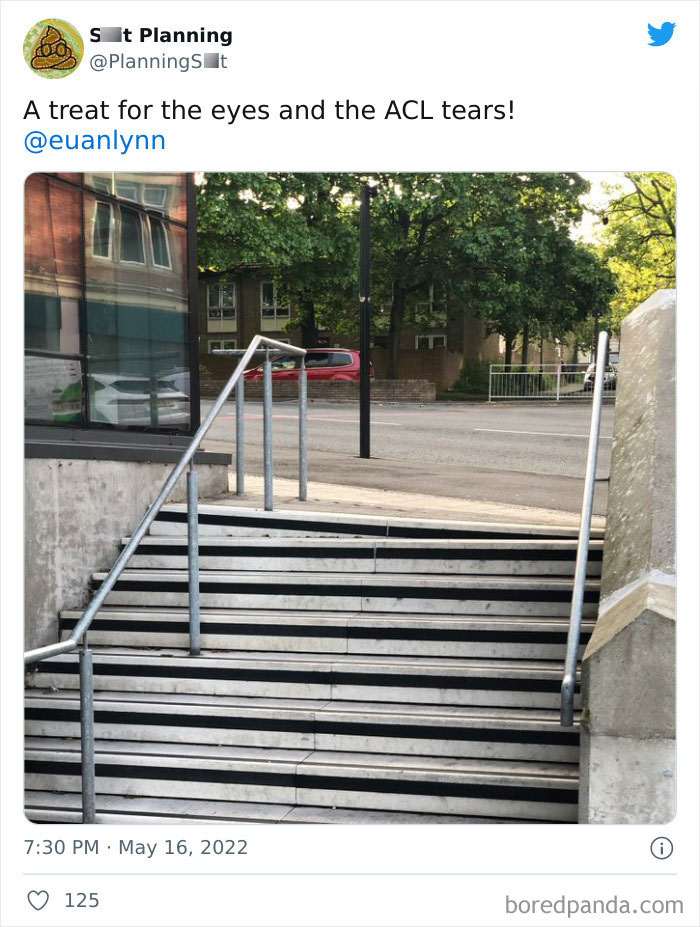
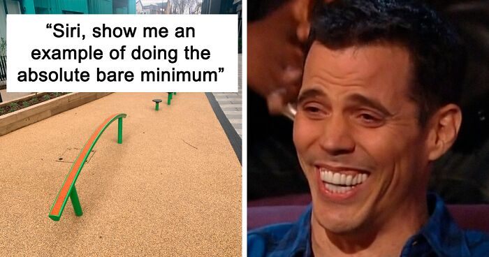
"Elite obstacle course"*. *Children must be supervised as this is very dangerous
Overall, the enormous variety of types of projects on which planners work, the lack of consensus over processes and goals, and the varying approaches taken in different cities and countries have produced great variation within contemporary urban planning. Nevertheless, although the original principle of strict segregation of uses continues to prevail in many places, there is an observable trend toward mixed-use development—particularly of complementary activities such as retail, entertainment, and housing—within urban centers.
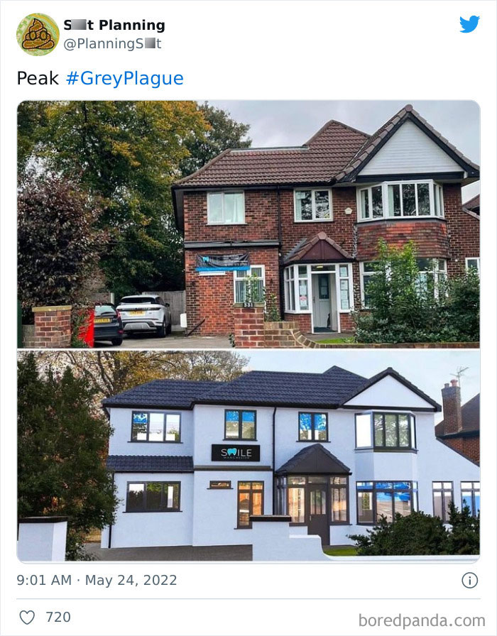
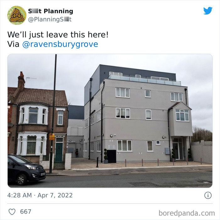
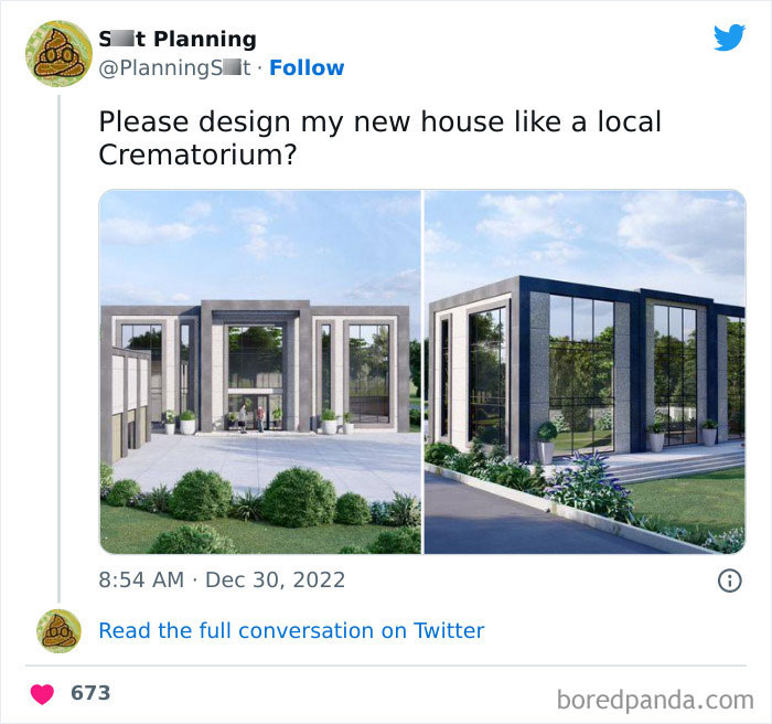
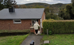
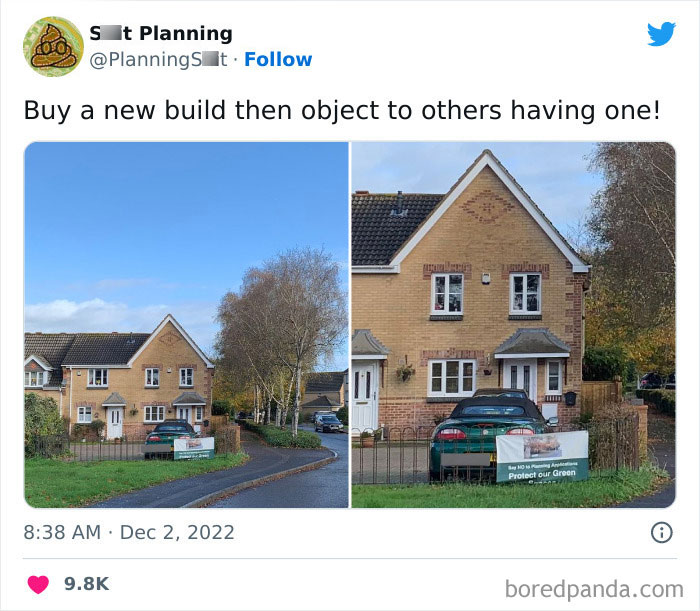
I assume it's a dentists now? Tbf, for a dentists I prefer the new one, so if it really is a dentists, I get it. The original looks like someone's home (and probably was?), the new one looks like I can actually trust them to take cere of my teeth properly.
I like it. I don't like grey; this looks somewhat blue. I like old-fashioned architecture, but they actually seem to have preserved it. It was in serious need of repair, with a very high possibility that the brickwork was falling apart; they don't seem to have destroyed anything; I'm OK with businesses looking like homes, this simply looks more open, better lit, more inviting. The expansion was absolutely in line with the rest of the house.
"smile' says the board. This was most likely renovated to become a dental clinic and the owner wanted it to look like one.
So the house looks modern and trendy, which obviously makes everything so much better. /s I *hope* they insulated it (looks like it's an old solid brick house) and opted for the cheaper plaster-and-paint finish rather than adding another layer of bricks - that would be understandable. But if they actually just painted it I hate hate hate them.
Load More Replies...I cannot see another white house with black windows. this has become so boring and so bland. This isn't a taste, it's the lowest common denominator at this point. It was unique when one or two people wanted a clean line minimalist look, but rows and rows of these are reminiscent of the song "little boxes". enough, develop some personal taste! Sorry all, rant over.
This style seems to be THE THING in upper-class neighborhoods in Southern California. I’m seeing so many 40’s homes turned into this particular black and white aesthetic. Anyone know the correct architectural word for this style? Genuinely curious.
California casual? I live in South Cali and I am so bored of stucco!
Load More Replies...I like it. Not all old buildings need to be kept in their original states.
This makes sence... You will notice the second one has an extension. When you get planning permission it will normaly say "extension to match current exterior". So if you can't get the same sort of bricks you can render/change the "existing apperence" before you apply then you are able to match it ... cos it's just render.
I f*****g hate it when people paint brick and stone!!! Just my opinion tho... idiots!!!!
City planning as practice and discipline relies upon public policy as an instrument for producing a more equitable and attractive environment that, while not radically altering human behavior, nonetheless contributes to improvements in the quality of life for a great number of people. So let's hope that even a Twitter account dedicated to sharing memes can help raise awareness and engage the broader public in discussions about city planning issues.
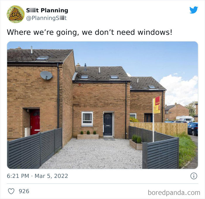
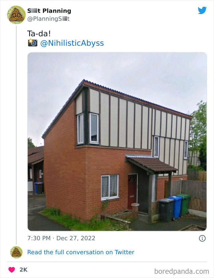
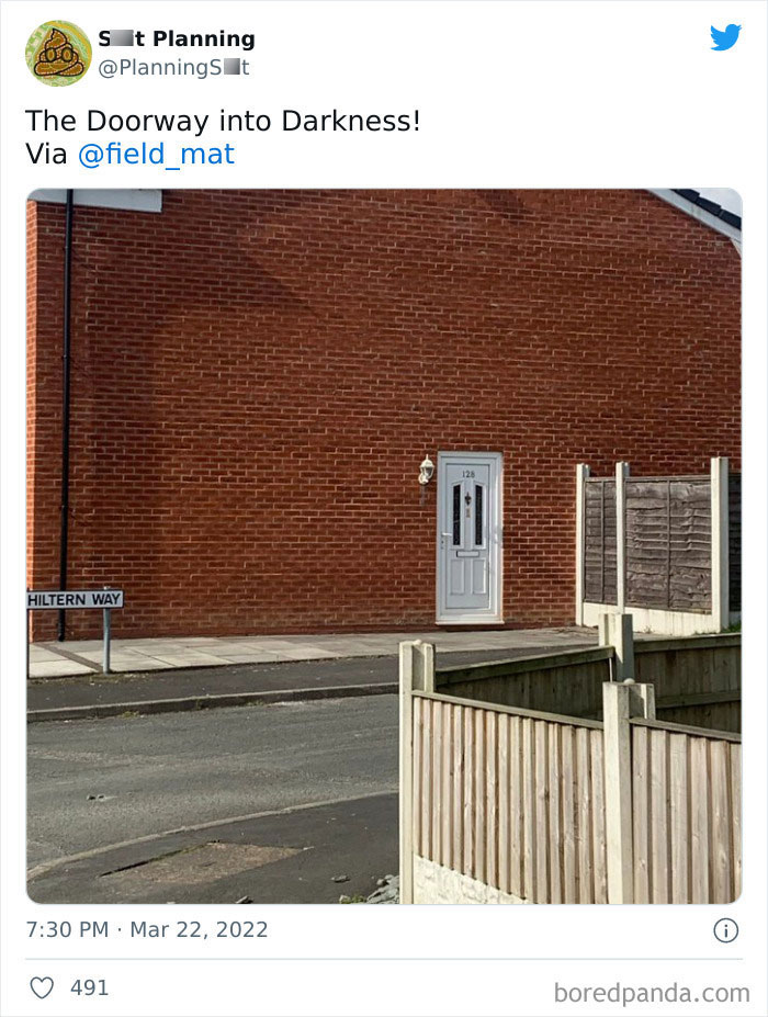
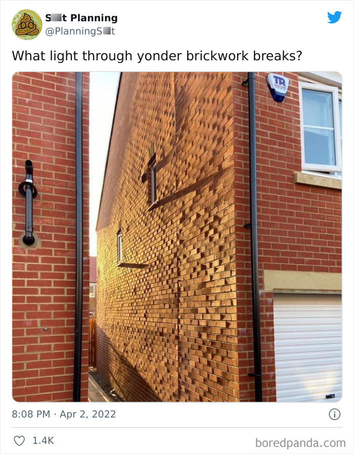
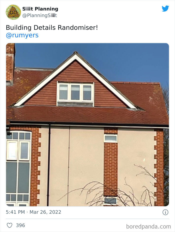
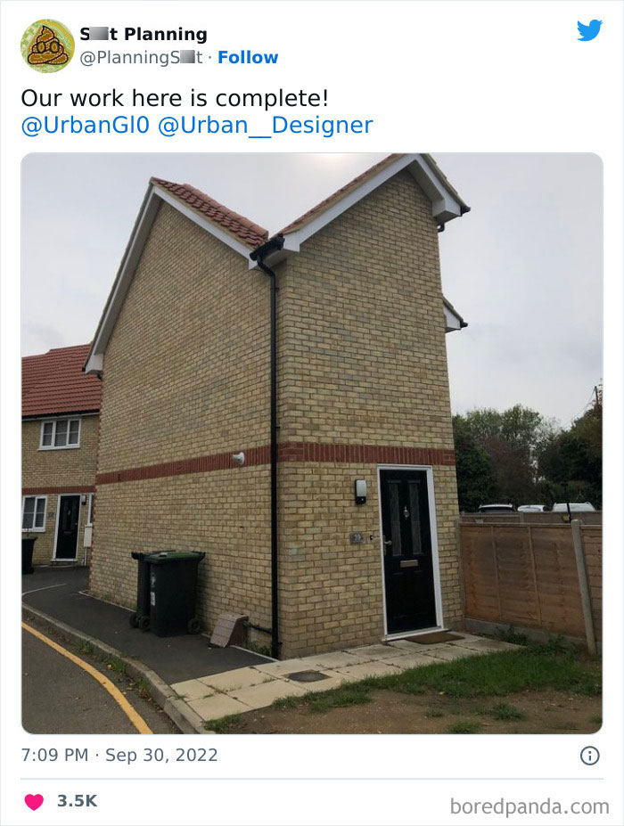
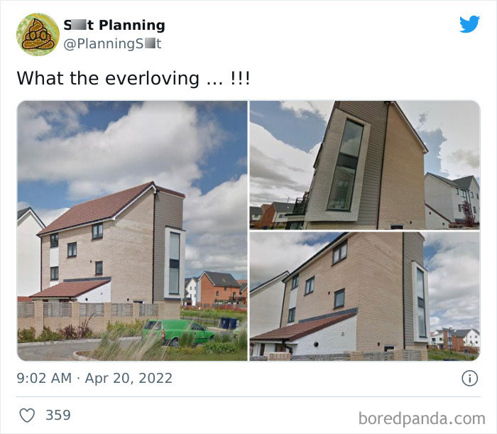
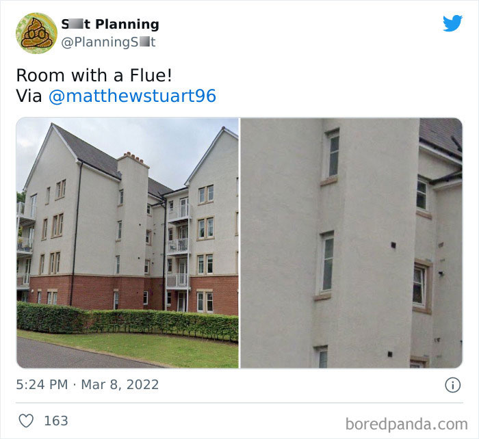
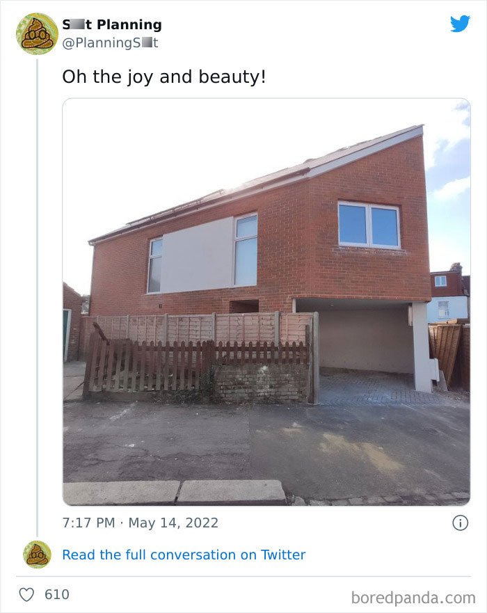
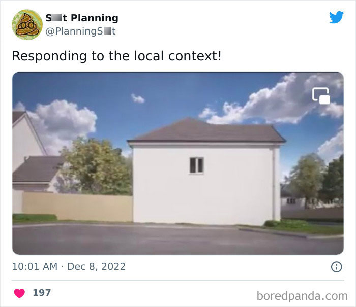
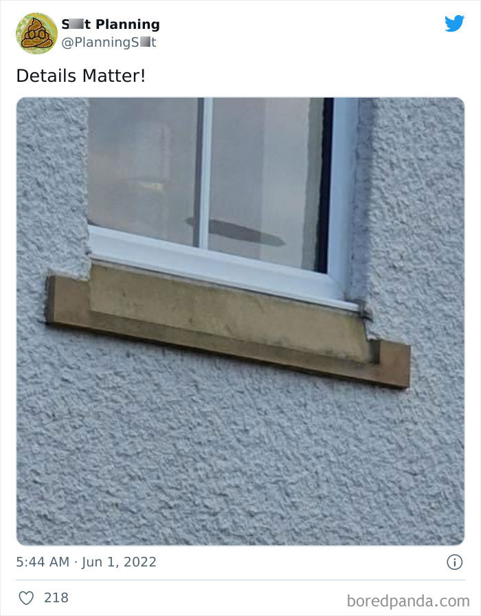
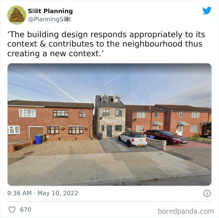
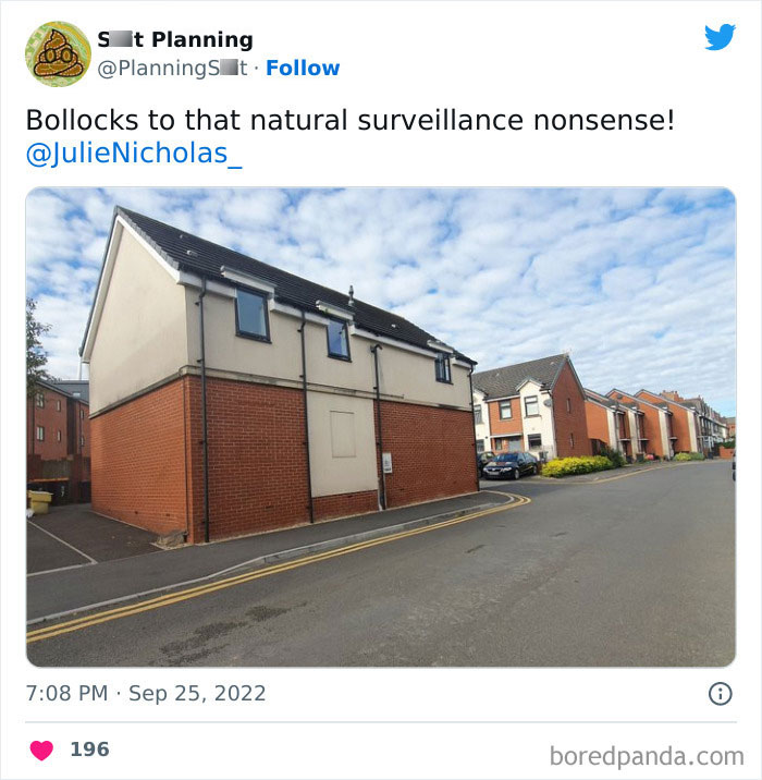
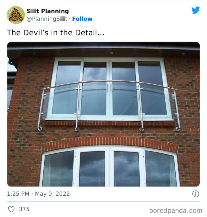
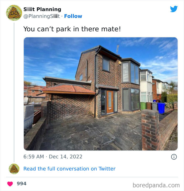
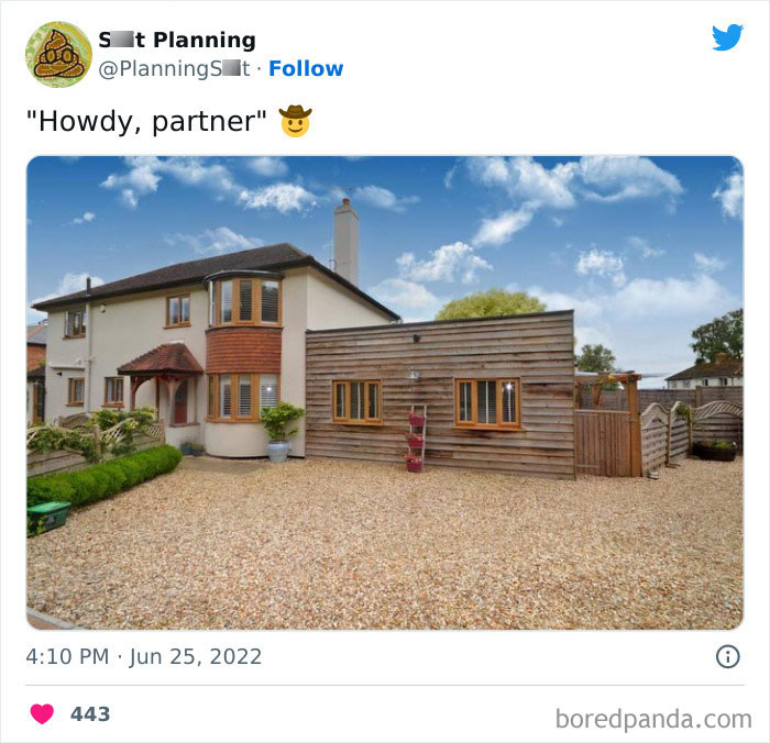
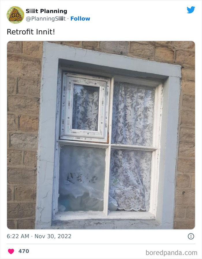
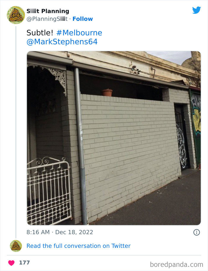
Probably due to one of the perculiarities of UK planning law. This is an extension to an existing property, possibly a garage that has been converted, and it likely didn't have windows on that side in the original plans. They would have to have got permission to put windows in facing that way, and it was probably objected to as it overlooks a bungalow (off camera to the right). This is the side of the property and it has multiple windows front and rear. [I found it on Google maps]
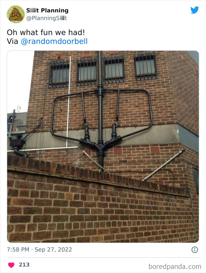
When you accidentaly multi-click ctrl+v a few times in cityscrapers (or whatever the hell that game is called)
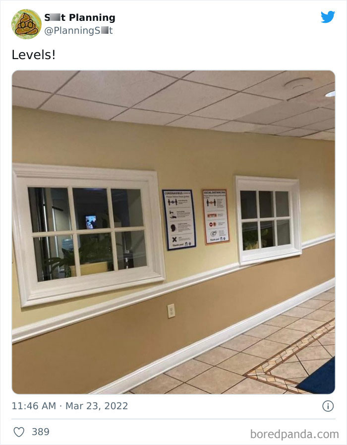
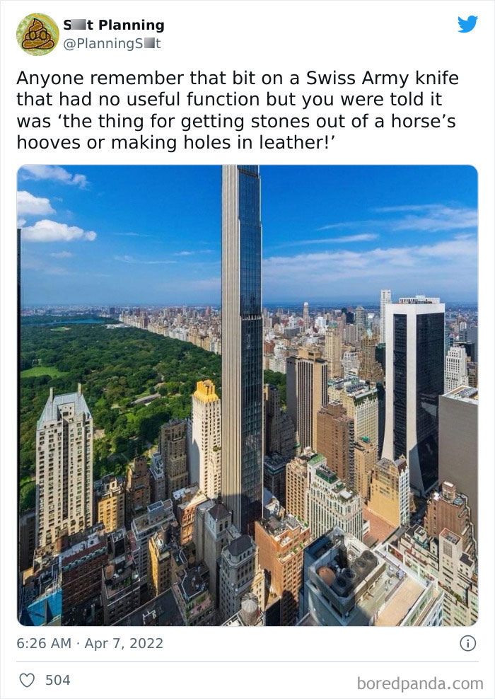
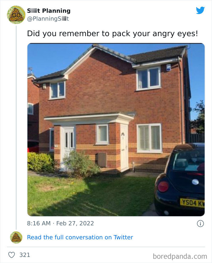
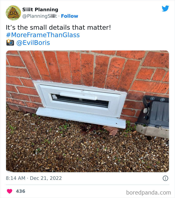
Looks like the windows I would draw onto city buildings as a little kid
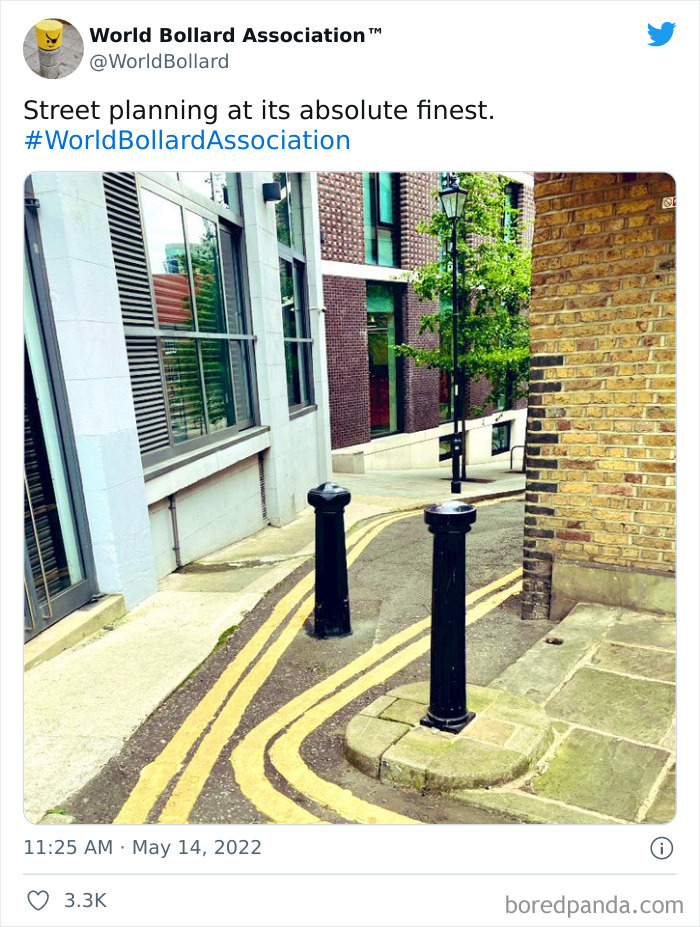
This is to prevent motocycles to get there, and yes this is a pain to use
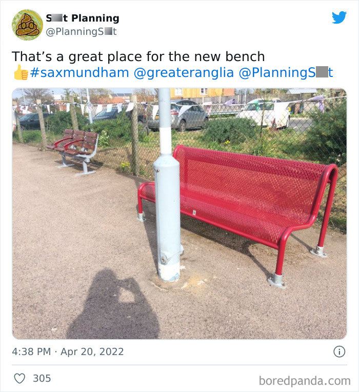
Saxmundham - go figure ; I lived near here for 3 years back in the 90's and it was a bit off kilter then, looks like it's more so now.
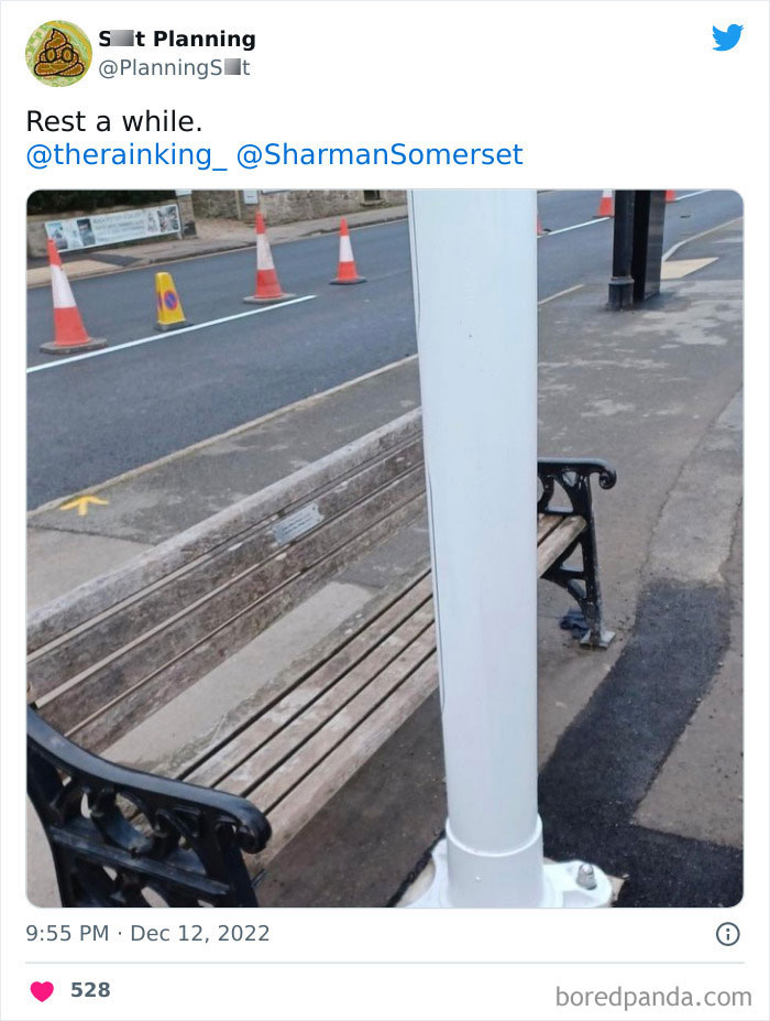
... and when you have rested enough, you can pole dance on a grand scale.
How TO spot an american post ... European cities, building around the road from medieval times. Step out of your countryside pumpkin
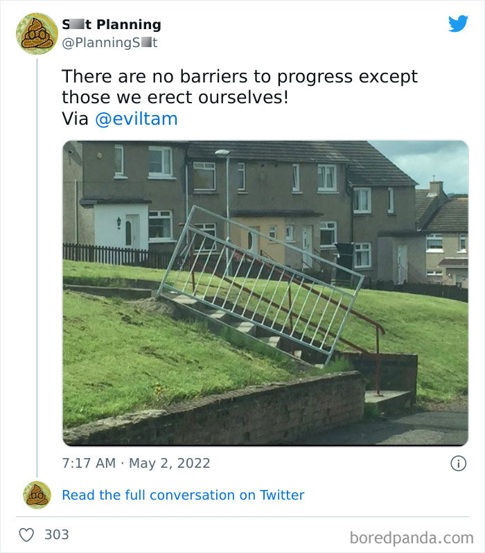
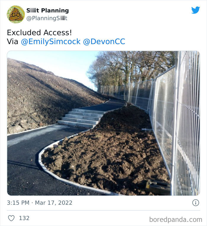
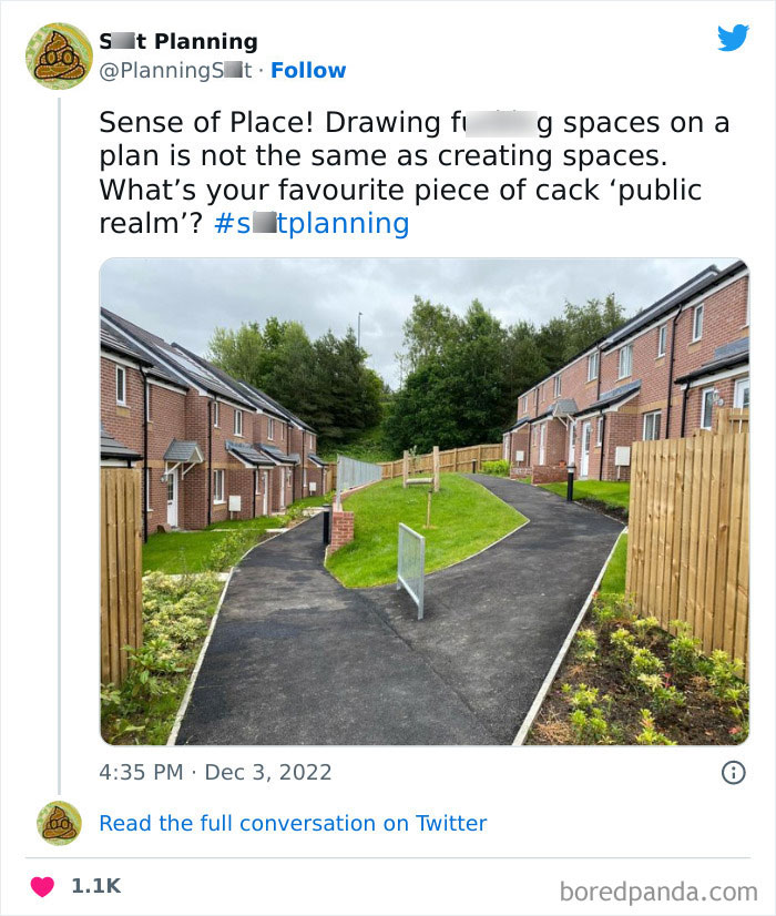
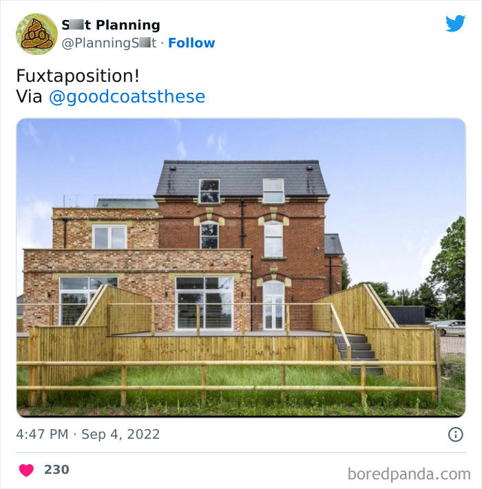
That just looks like temporary fencing, no doubt it will be removed once work is complete
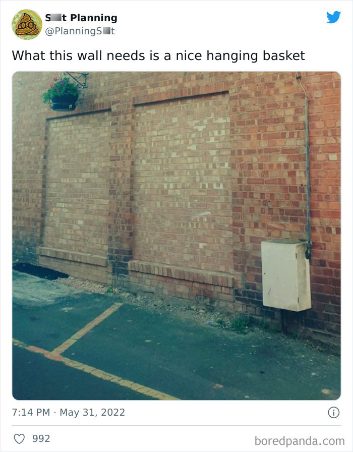
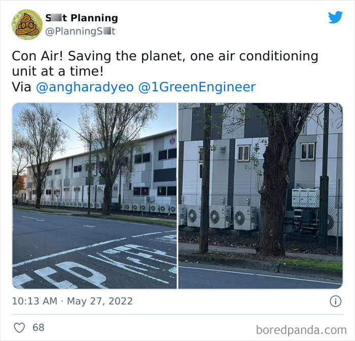
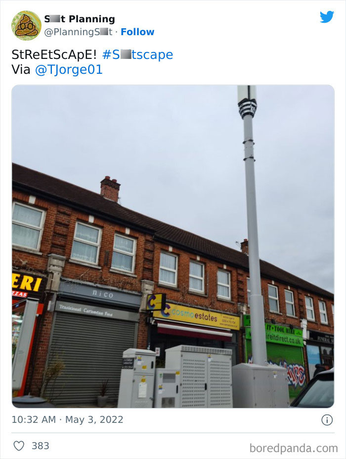
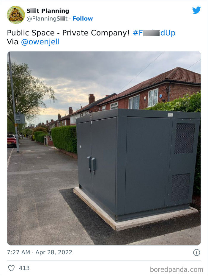
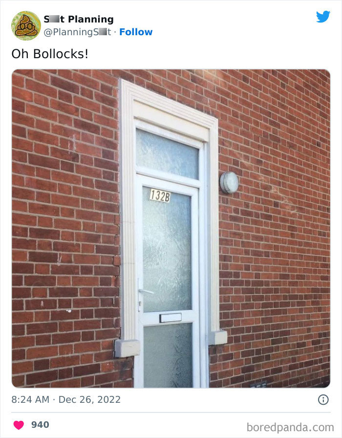
I don't get the outrage. Isn't this just a transformer that has a locked shell? It helps to power the area. You see them in a lot of places, usually at the end of large neighborhood streets and near large complexes.
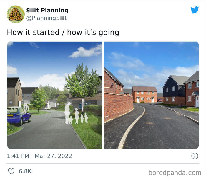
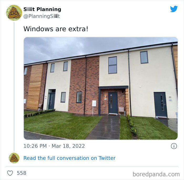
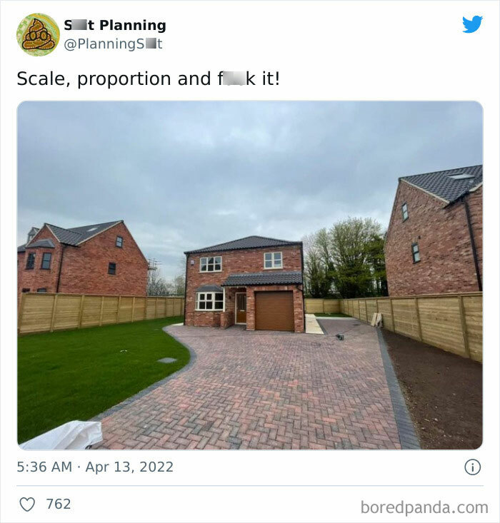
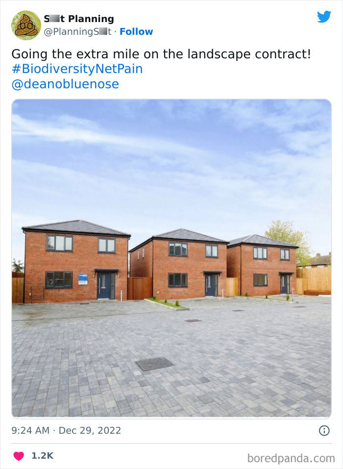
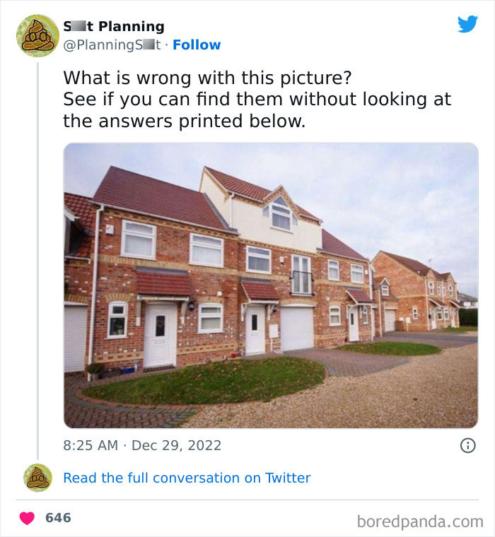
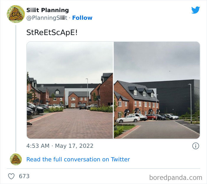
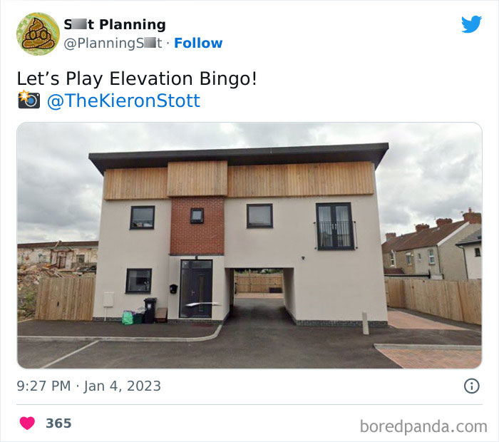
That huge white third floor in the middle house. The vertical window in the middle house. Well, actually the squeeze on the middle house too. Then the 4th house over seems so tiny too.
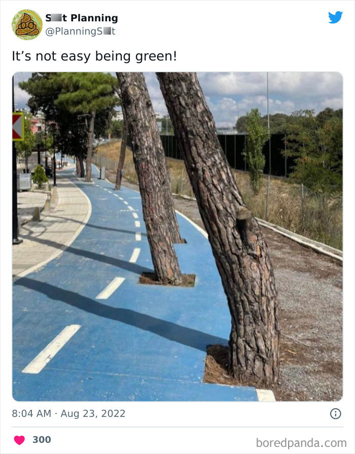
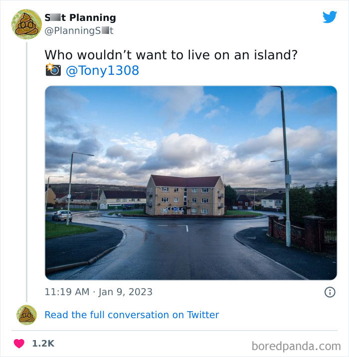
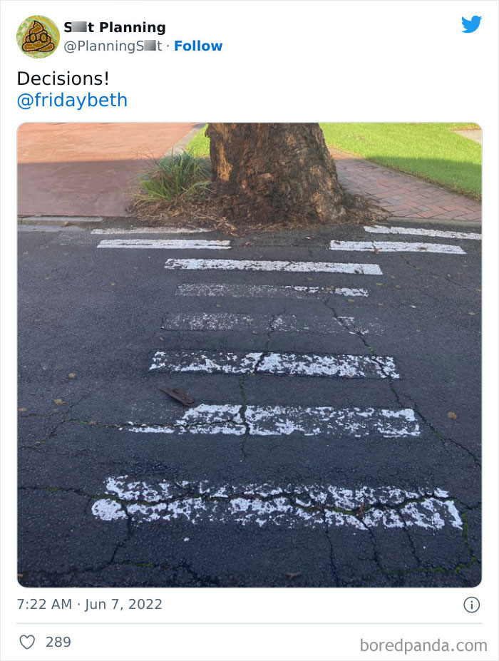
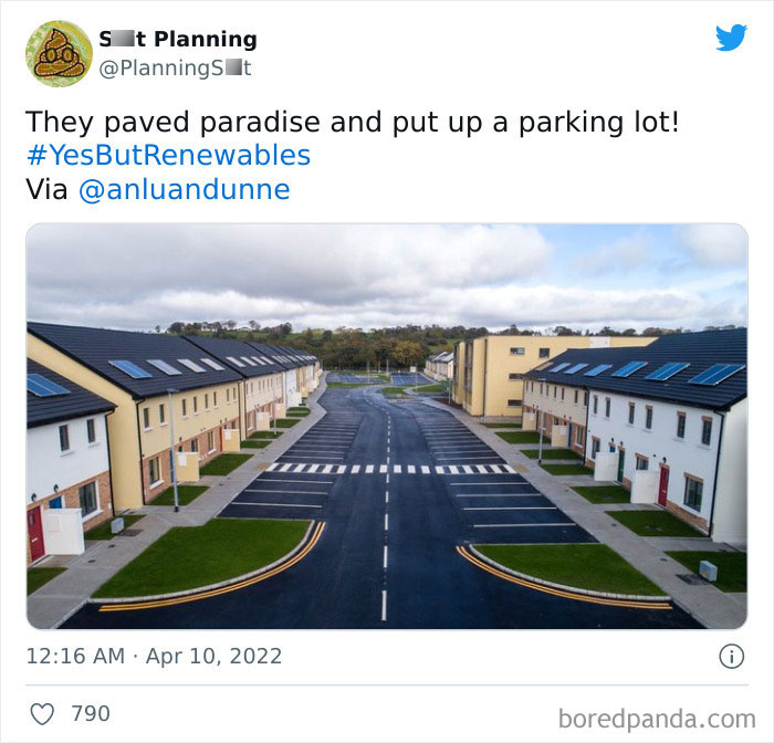
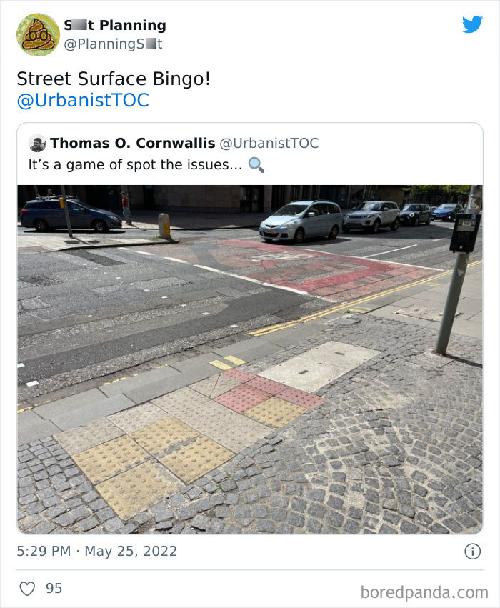
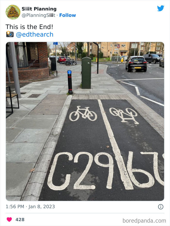
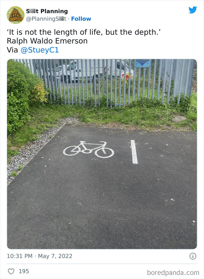
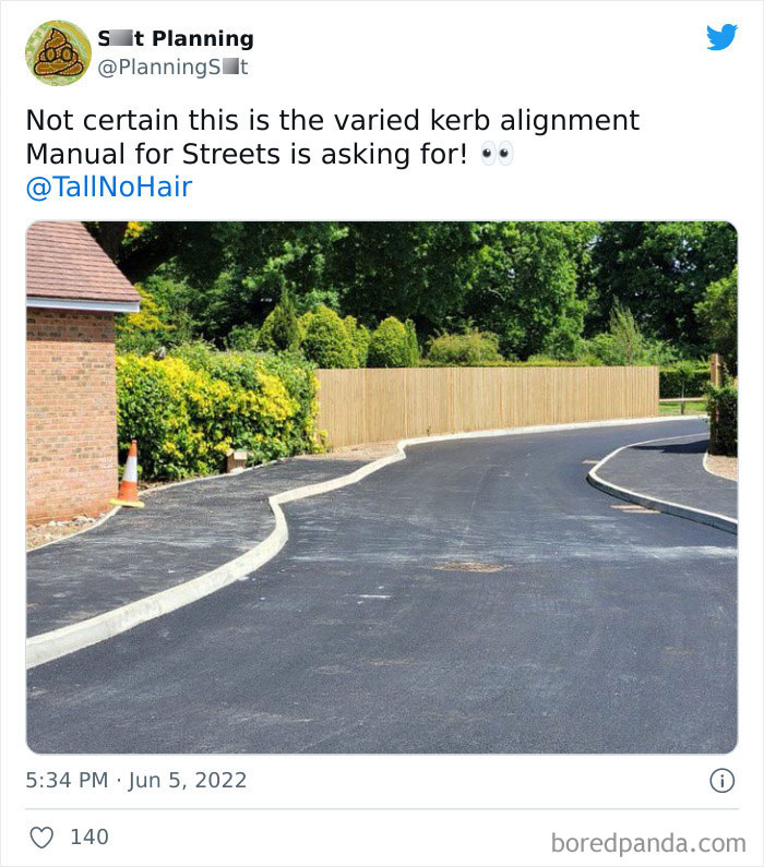
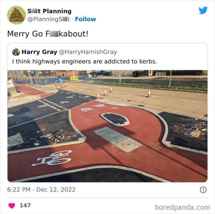
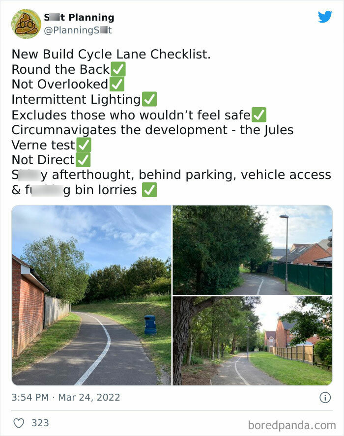
Not sure why the titles are so aggressive. There's no round about here, just a lane divide. And yes, a curb to help keep bicyclists safe from cars. Why are these problems?
heeeee... you know what ? It's got style... Ecclectic but kinda stylish
Inner city resident just sick and tired of all the break and enters
When, as an article editor, you confuse "design" for "architecture".
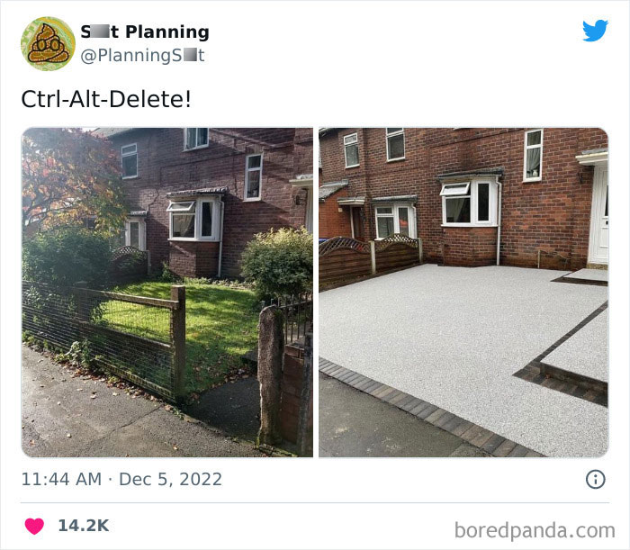
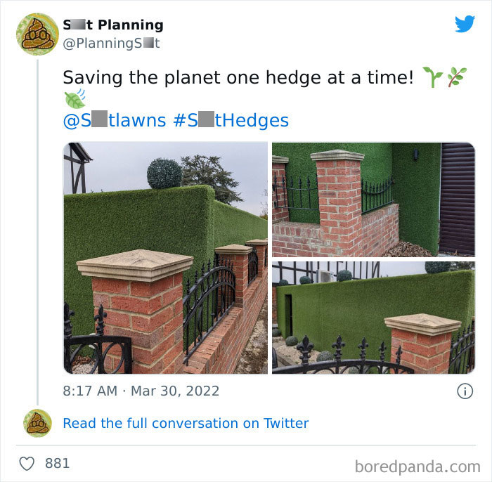
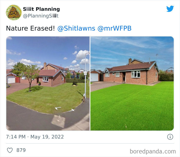
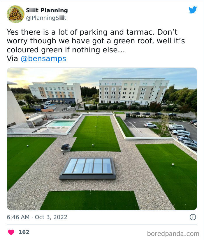
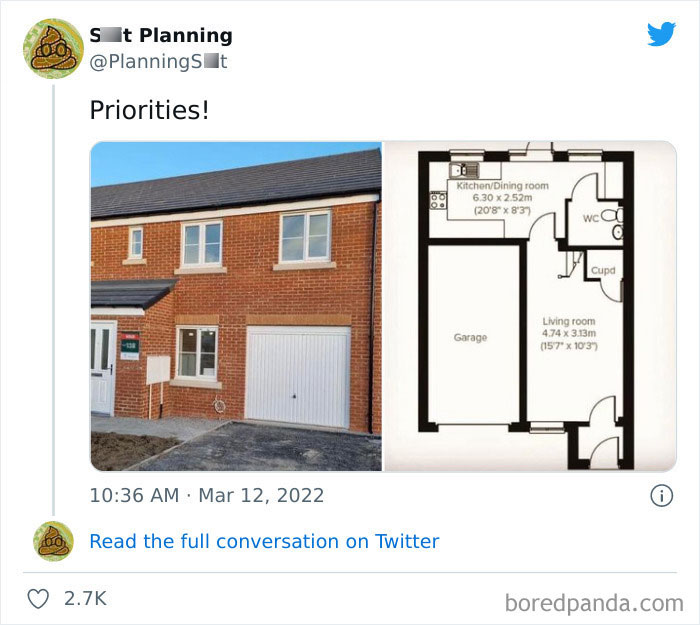
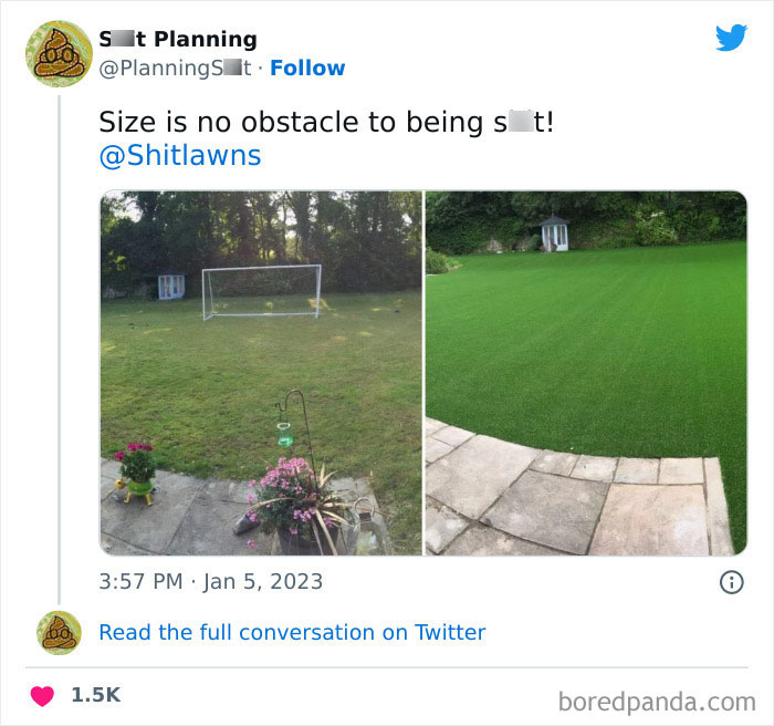
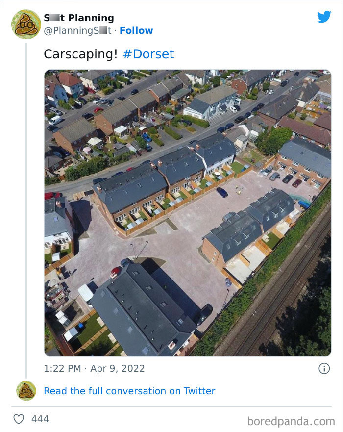
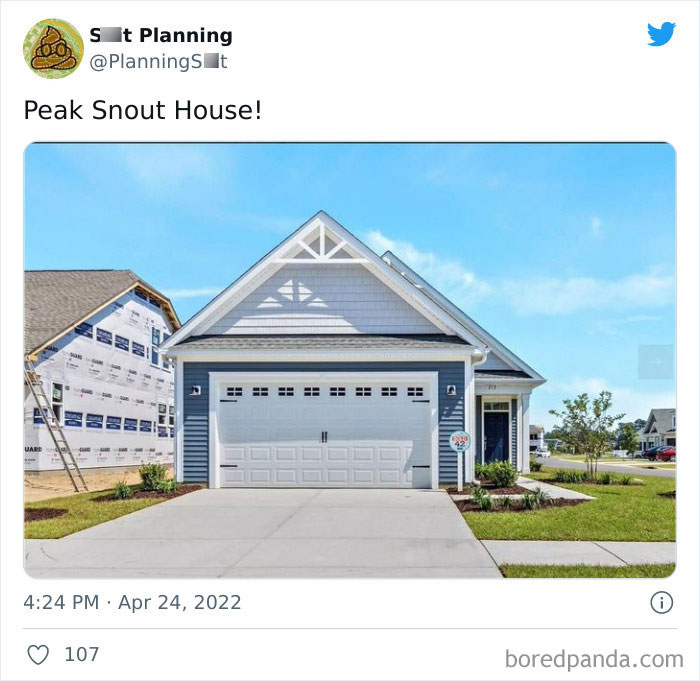
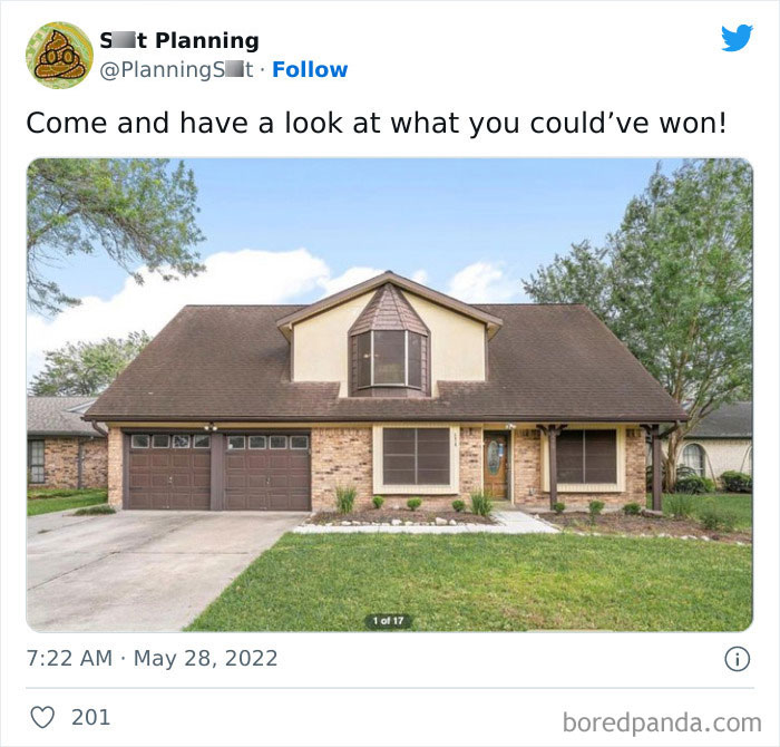
Lot of whining about practical choices here, stuff like fake grass/hard surfaces rather than grass might well be for elderly or disabled. Also stuff like a garage taking up a fair bit of your ground floor - what with exercise equipment, bikes and a workshop/tools I want more garage space not less especially if they can’t have a shed. Each to their own.
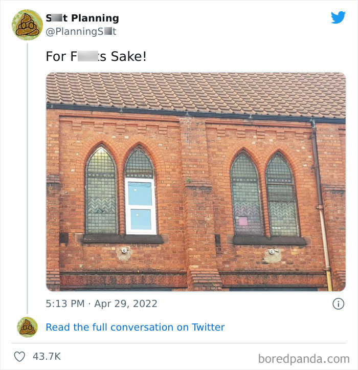
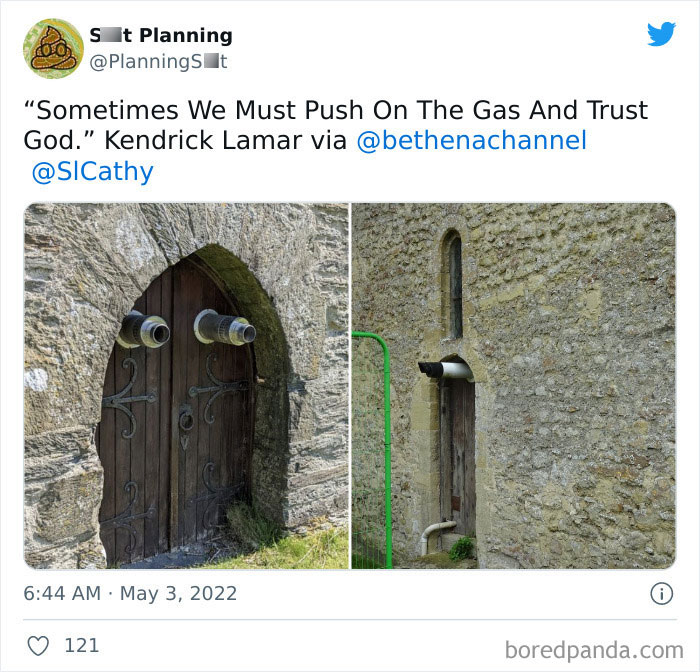
Most (like top: Plastic window in old church) are poor maintenance/ cheapskate caretakers. But title says "116 Architects" and URL says "planning-fails". Totally useless.
Load More Replies...Please change the title, most of these have nothing to do with architects.
URL is older than title --- it's already been changed once! A lot were from Twitter "S**t planning" hence in a "planning-fails" topic, but nothing to do with planning either.
Load More Replies...When, as an article editor, you confuse "design" for "architecture".
Lot of whining about practical choices here, stuff like fake grass/hard surfaces rather than grass might well be for elderly or disabled. Also stuff like a garage taking up a fair bit of your ground floor - what with exercise equipment, bikes and a workshop/tools I want more garage space not less especially if they can’t have a shed. Each to their own.
Most (like top: Plastic window in old church) are poor maintenance/ cheapskate caretakers. But title says "116 Architects" and URL says "planning-fails". Totally useless.
Load More Replies...Please change the title, most of these have nothing to do with architects.
URL is older than title --- it's already been changed once! A lot were from Twitter "S**t planning" hence in a "planning-fails" topic, but nothing to do with planning either.
Load More Replies...
 Dark Mode

 No fees, cancel anytime


