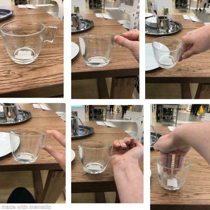
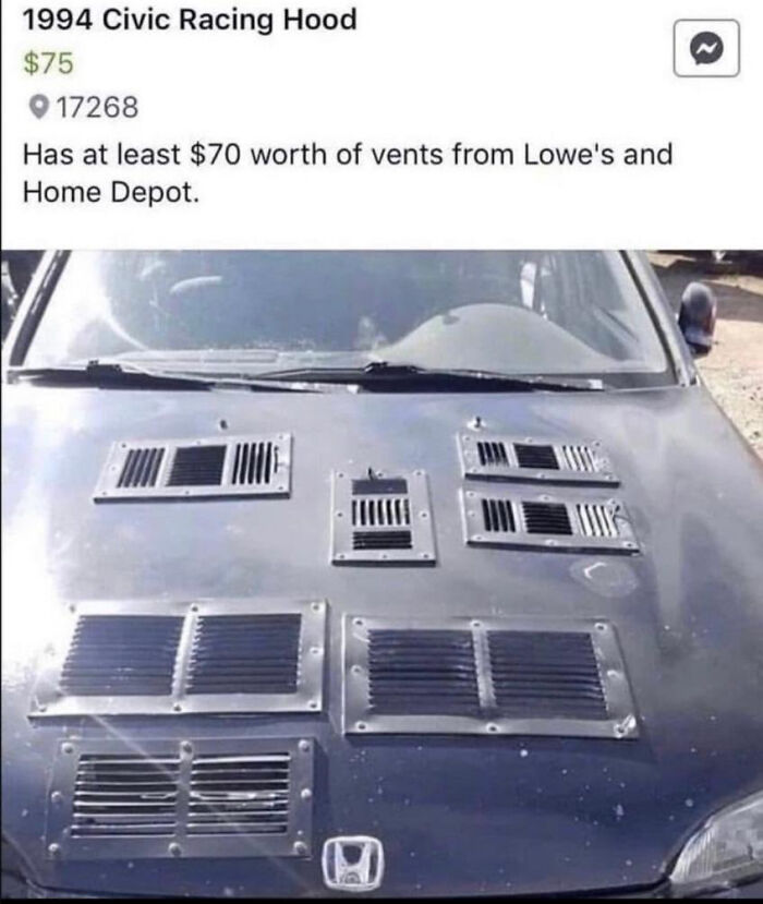
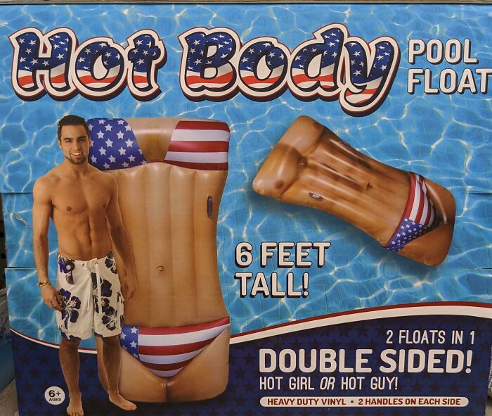
It is absolutely fascinating to discuss the balance between function and form when it comes to various designs. Here’s the problem, though: many people tend to assume that a product, ad, or work of art has to necessarily be either aesthetic or super-functional if it doesn’t strive for balance. How naive! We’re here to show you that there are some truly horrible design ideas out there. Awful taste, as well as awful execution, is putting it mildly.
And that’s where the ‘Awful Taste And Awful Execution’ (aka ATAAE) online community comes in. A subreddit uniting 81.5k members, it’s a celebration of everything that’s awful, taste-wise. We’ve collected some of their best (or would that be ‘worst’?) pics to share with you. The images are a great reminder that you, Pandas, have far better taste.
Scroll down, and let us know which of these designs you loved to hate the most by giving them a big ol’ upvote. Oh, and don’t be shy—share your honest thoughts with everyone in the comments.
This post may include affiliate links.
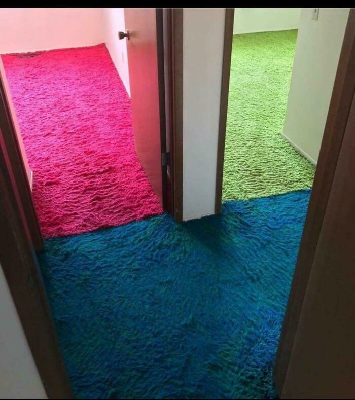
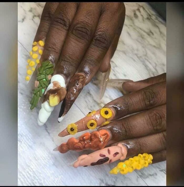
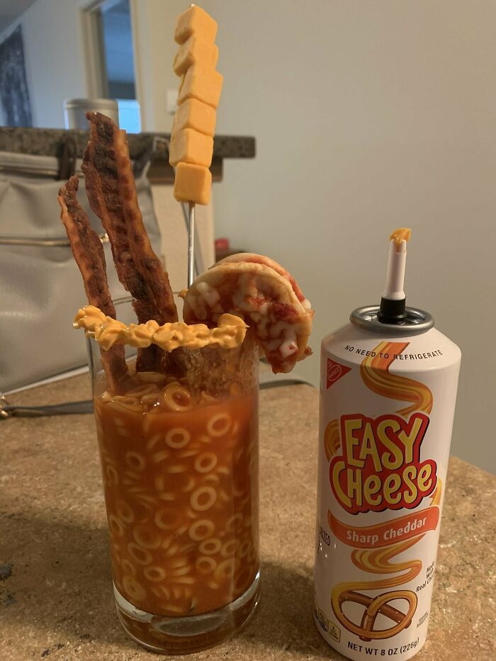
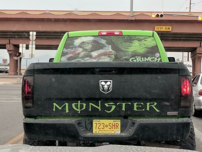
Both Of These Look Like Cow Shit Mixed With Dog Vomit. I Pity Their Poor Family
i think for the sake of your family's safety just stop cooking for the rest of your lives
Ariane Sherine, the editor at These Three Rooms, was kind enough to answer Bored Panda's questions about taste, interior design, and aesthetics.
"Interior design is much harder than it looks. It's actually more difficult to find combinations that do work well together! Generally speaking, pair like with like, so: brights with other brights, neutrals with neutrals, pastels with pastels, neon with neon, muted colors with other muted colors, etc." she listed what homeowners should keep in mind if they want to leave a positive impression and avoid jarring visuals.
"The same is often true for materials, so if you like natural materials like rattan and bamboo then go for a natural scheme. If you prefer synthetic materials, ditto," she said.
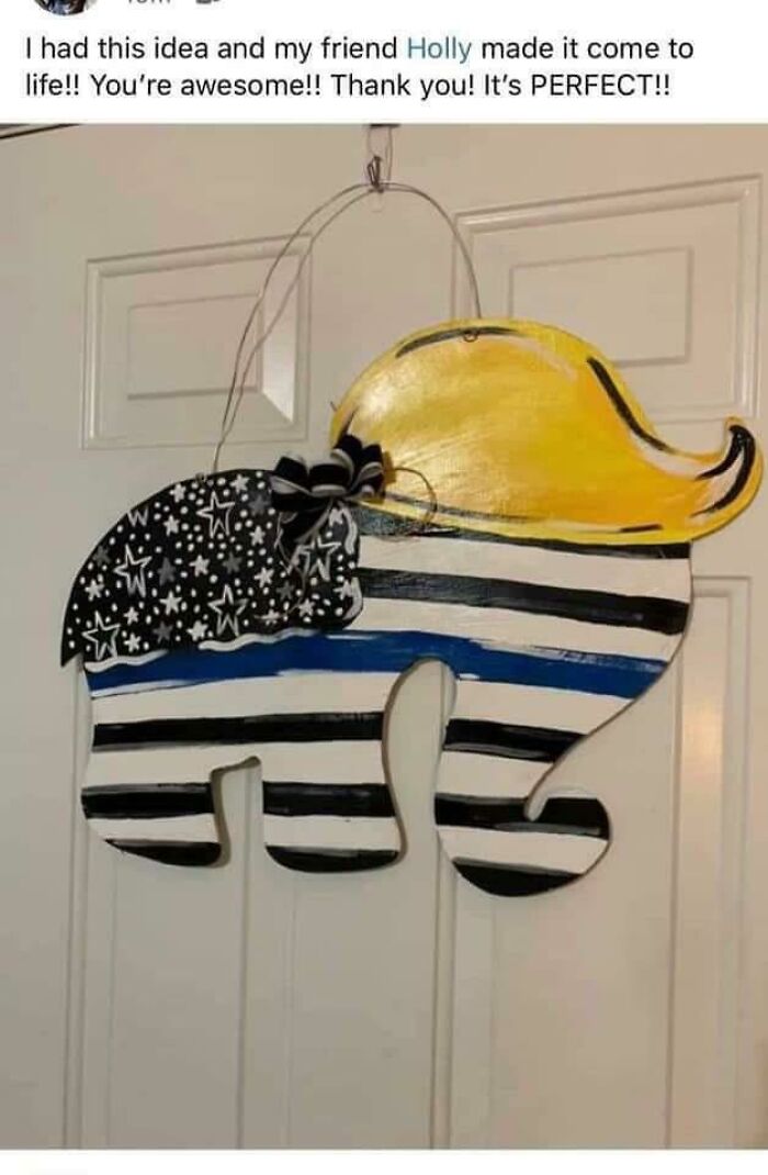
Maga-Themed Wedding Dress
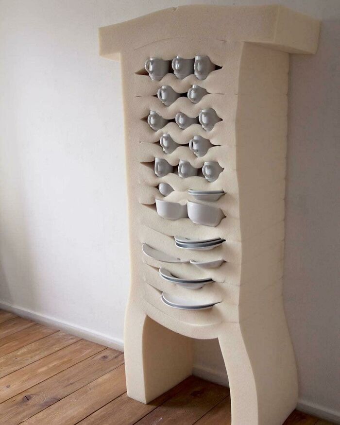
Curves
We were interested to get the interior design expert's opinion on first impressions, specifically what guests would notice first when entering the kitchen or bathroom.
"First off, they notice how clean and tidy and fragrant the room is. You can have a wonderfully stylish kitchen or bathroom, but if it's dirty and smells terrible that'll be your guests' overall impression of it," Ariane, from These Three Rooms, said that no matter how aesthetic and stylish everything looks, it doesn't count for much if you haven't gotten the basics right.
"Secondly, they'll notice how it functions and what their experience of it is: is there enough loo paper or kitchen towel? Does the hand wash smell nice? Does the loo flush? Do the appliances work? And lastly, they'll notice the décor. Décor is subjective but an empty loo roll definitely isn't!"
Yeah Nice
Do we really need two Dakotas? They're basically the same state. I think it's time to merge them together and save some money on paperwork.
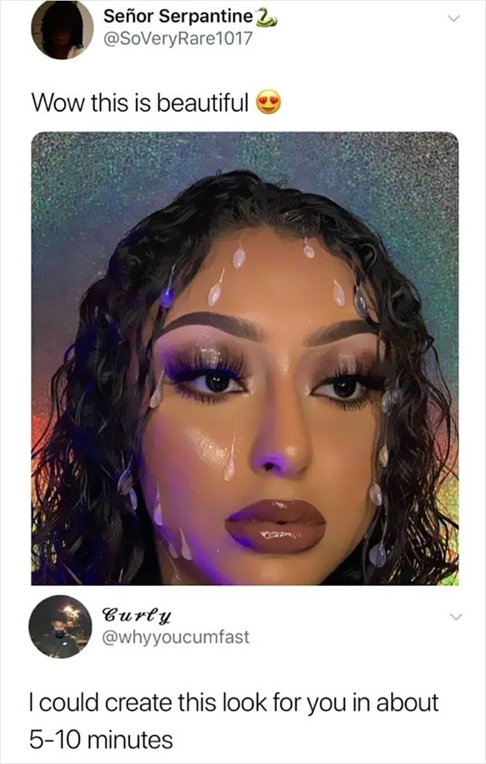
What Exactly Is On Her Face
Reminds me of that old Dexy Midnight Runners song ... "Come on Eileen" 😎
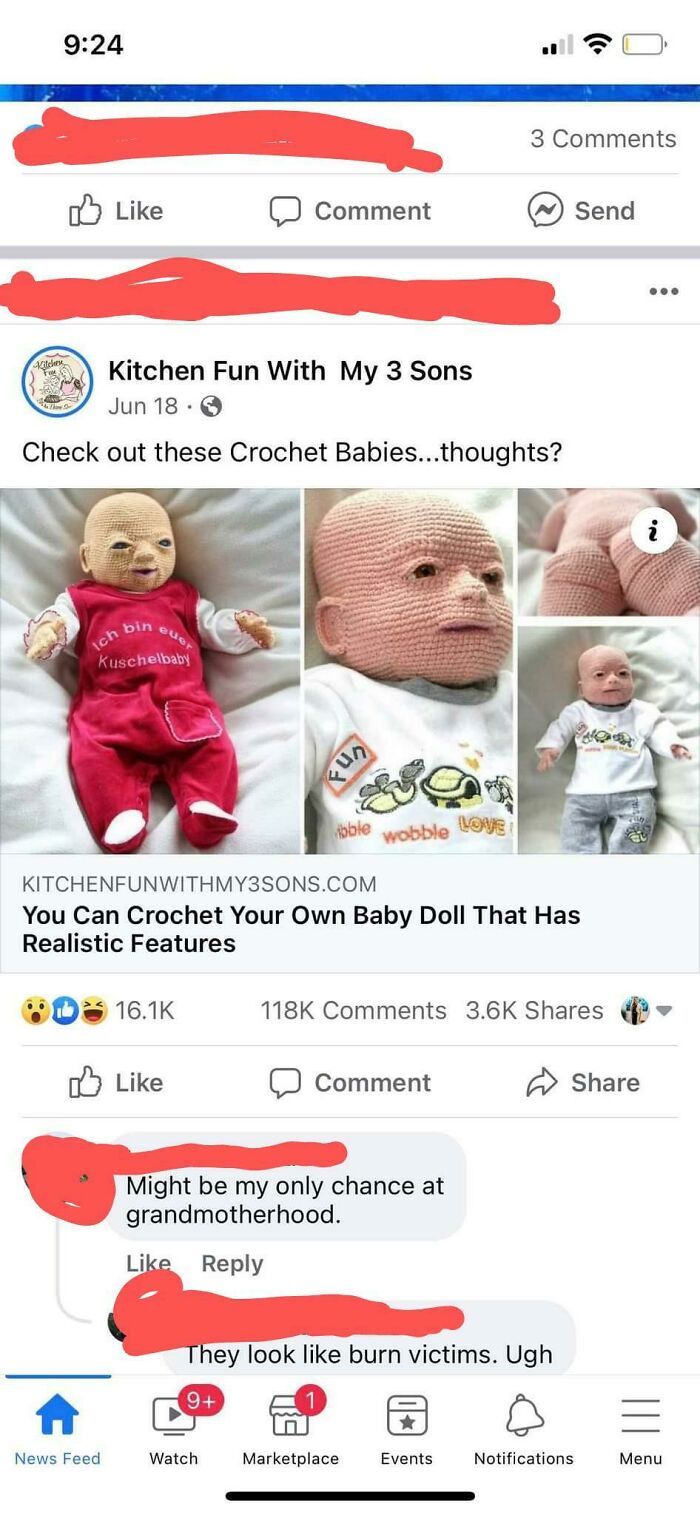
This Baby Announcement -- Sent To Relatives
Finally, Ariane shared her thoughts about embracing what we love, no matter what others might think about our design decisions. At the end of the day, what matters is that you're happy. She noted that you could apply this to all of your life choices, not just design and taste.
"It's all about being confident in yourself and knowing that it doesn't matter what others think of your style. As long as you're happy, who cares whether Aunty Pat thinks your sofa's garish?!"
This Is The Logo Of A Local Bakery. Looks Like The Angel Is About To Eat Some A**
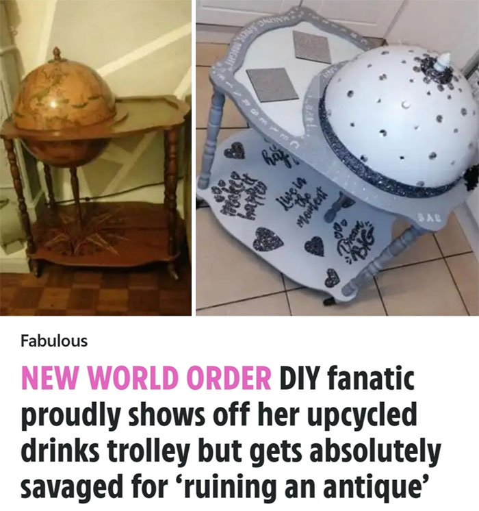
Out Of This World! I Was Told You Guys Would Appreciate This!
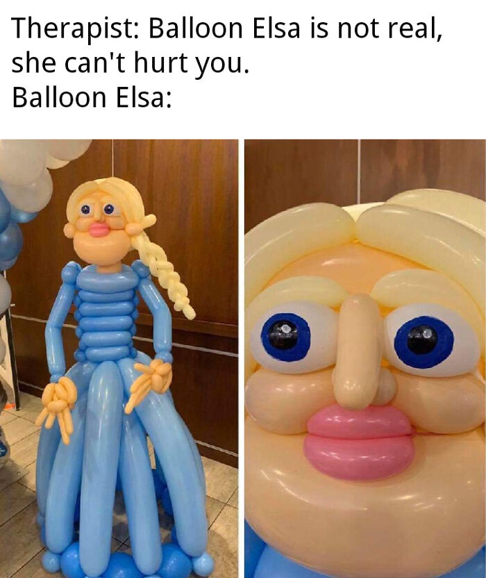
Balloon Elsa
The ‘Awful Taste And Awful Execution’ subreddit has been around since 2017. In the 5+ years since, the members of the ATAAE community have scoured the internet for some of the biggest insults to good taste to ever exist in our timeline. It’s truly puzzling how some people completely lack any and all aesthetic awareness.
Our tastes might play a large role in whether or not we find a design, product, or work of art appealing, but it’s important to remember that there are such things as objectively good or bad designs. Good design means putting the user first. Designs ought to be functional, pleasing, and ergonomic.
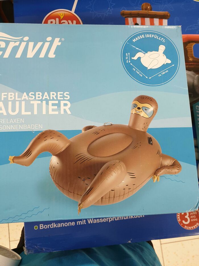
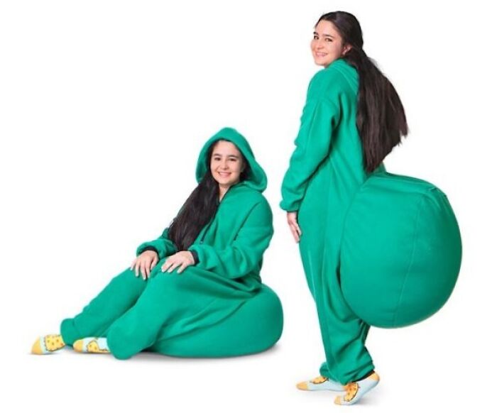
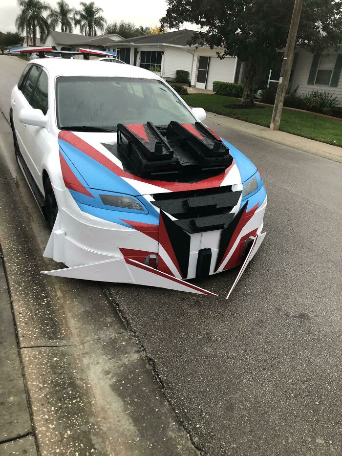
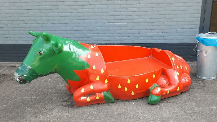
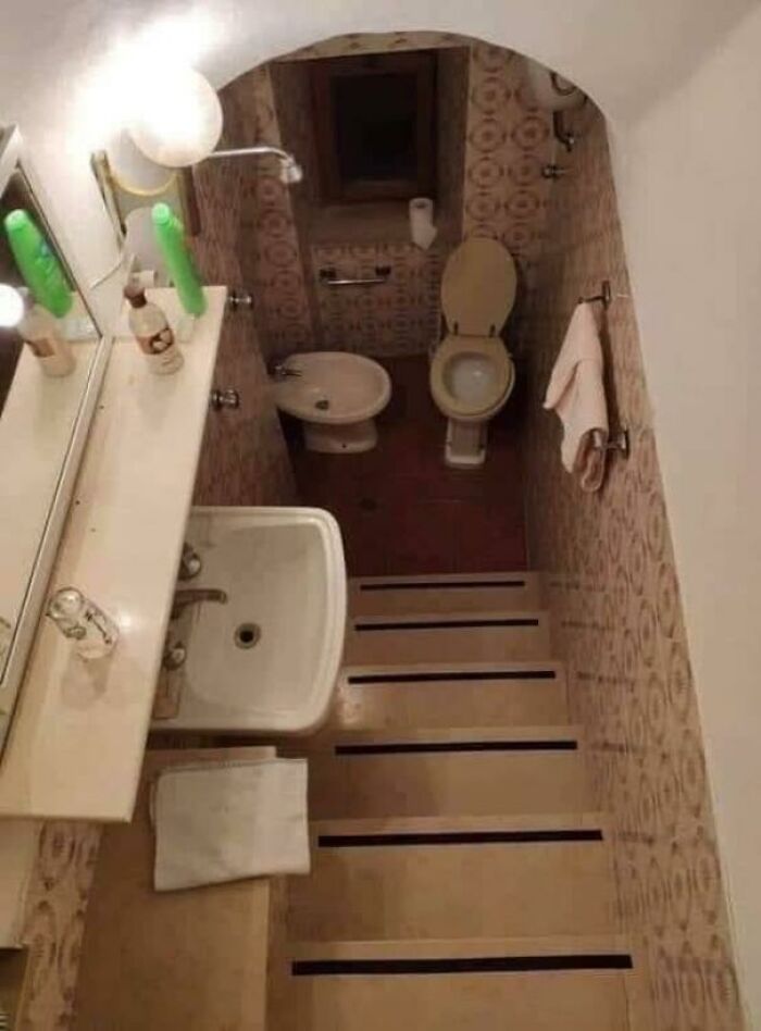
Somewhere Out There, A Circus Is Missing Its Clown Car
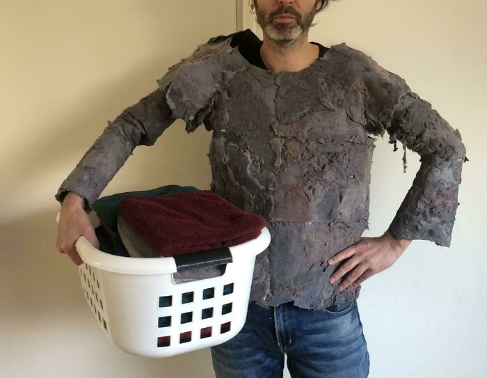
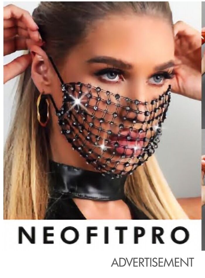
The Maskinator
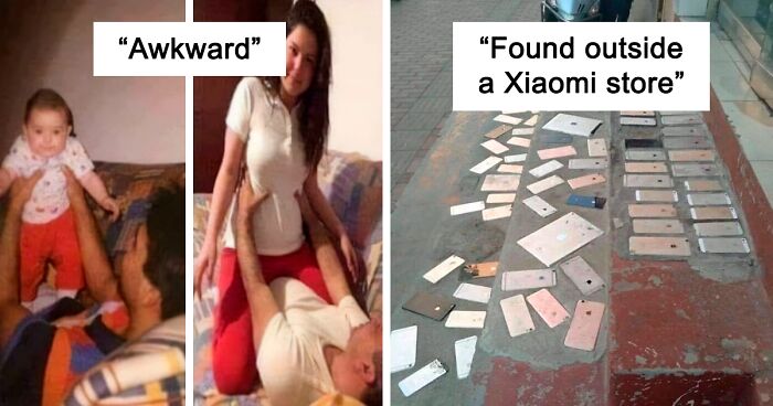
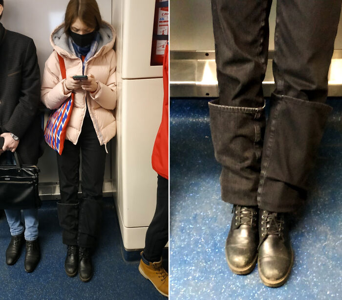
Awkward
Tim Antoniuk, an expert in Design Studies at the University of Alberta, previously spoke to Bored Panda about good and bad design. He noted that good designs ought to constantly adapt to a changing, modern world.
“Given the speed of change that we encounter today in our lives in the digital environment that we live in, I believe that some great design is not necessarily timeless. One example is seen in Interface Design, Ux Design, and in-service design. As new layers get added into our lives, things naturally have an evolutionary cycle,” the design expert told Bored Panda earlier.
“This is different from furniture which naturally can be more ubiquitous and designed to fit the human body. There is a great deal of fuzziness in this discussion but I do believe that the essence of this idea is true," the professor said that certain product designs have far more longevity than others, depending on the area.
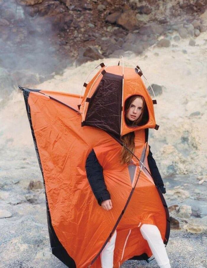
Don’t Actually Wear This
Yeah. Dumb
Originally Posted On Atbge, But Definitely Belongs Here
"The gray area comes in when people start to talk about taste and about degrees of aesthetic. I may love the design of Bauhaus furniture, for example, while somebody may feel that it is too cold and void of personality,” the expert accounted for people’s differing tastes.
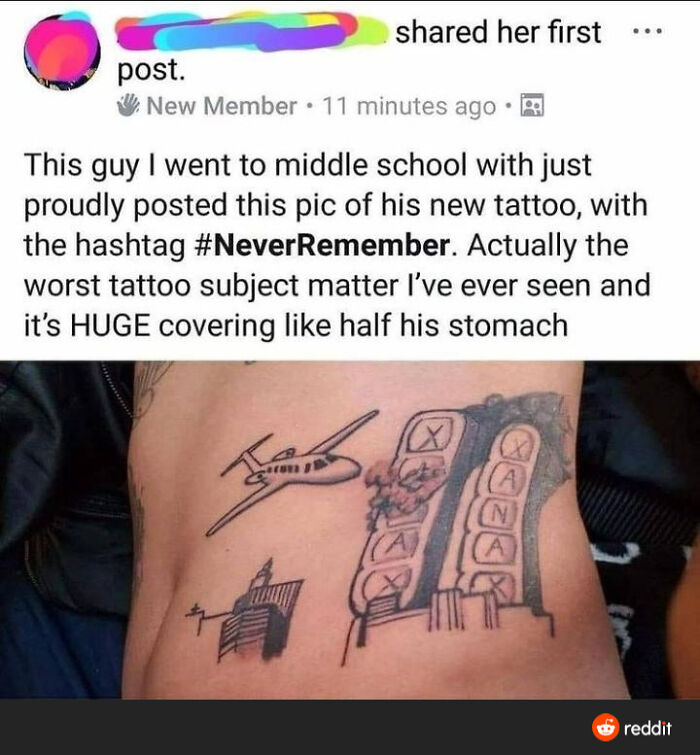
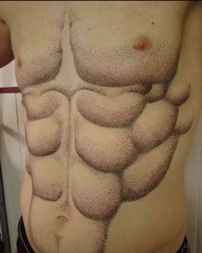
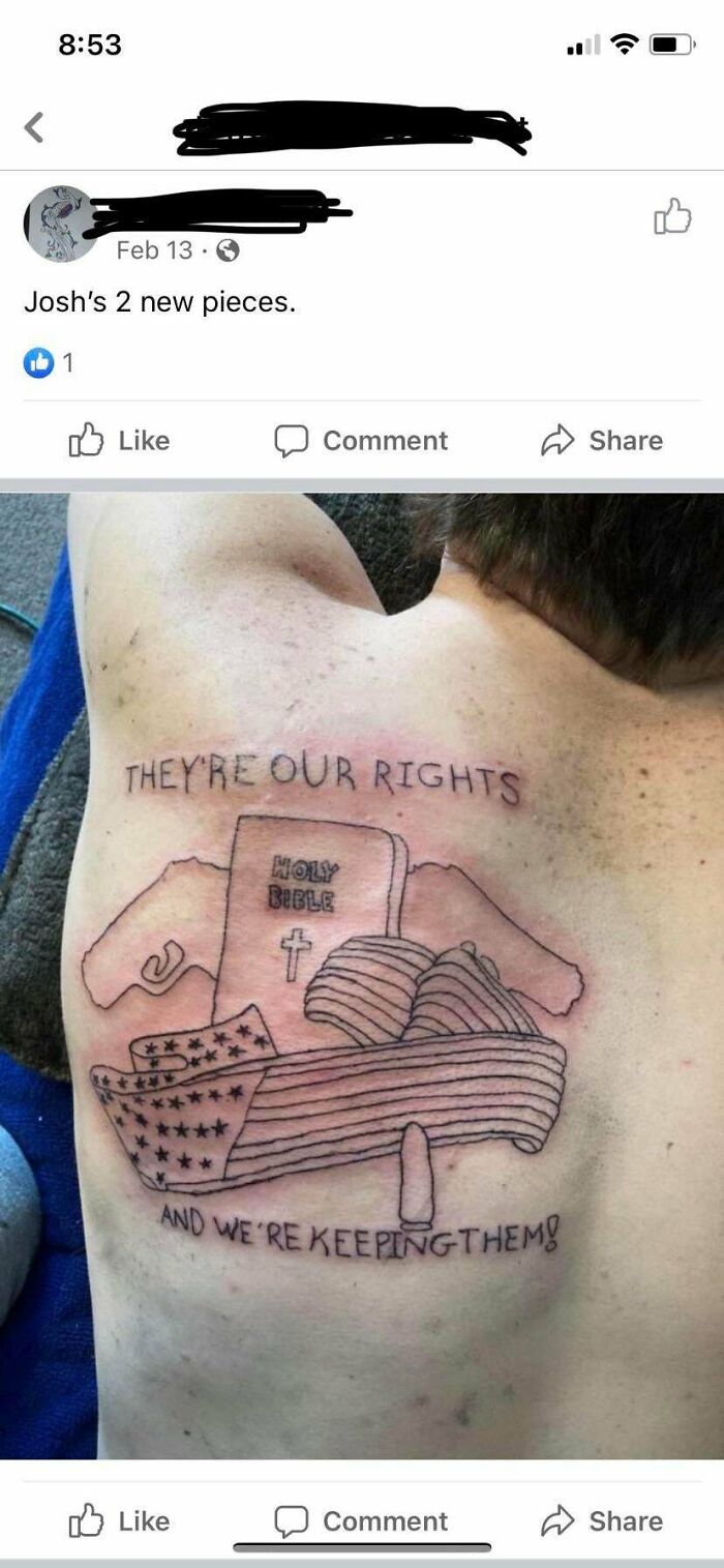
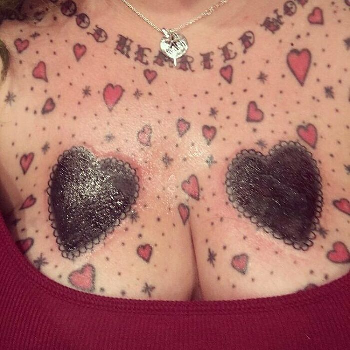
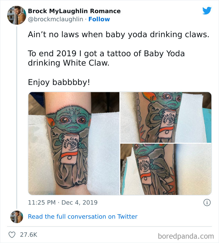
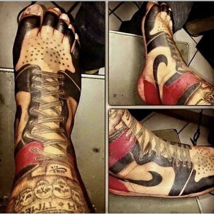
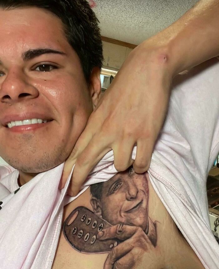
She Will Totally Not Regret That Tattoo
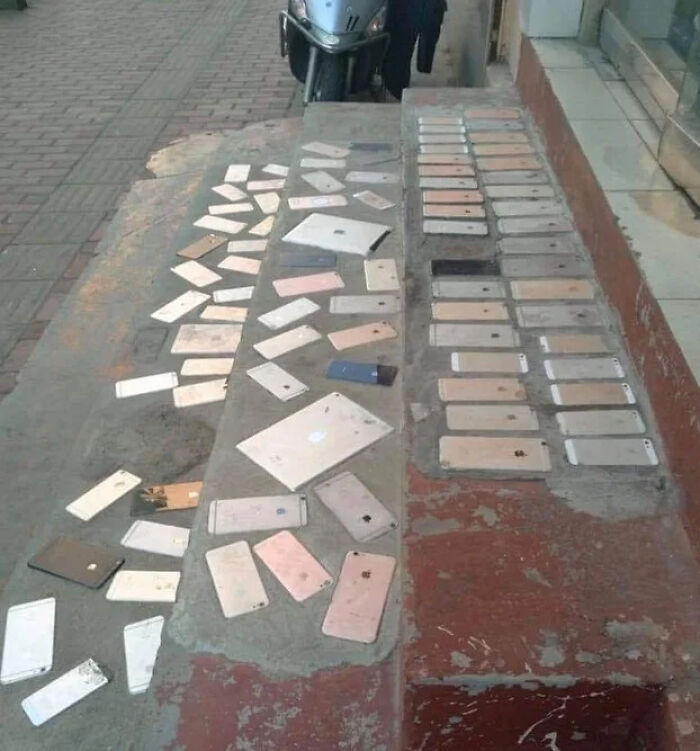
Found Outside A Xiaomi Store
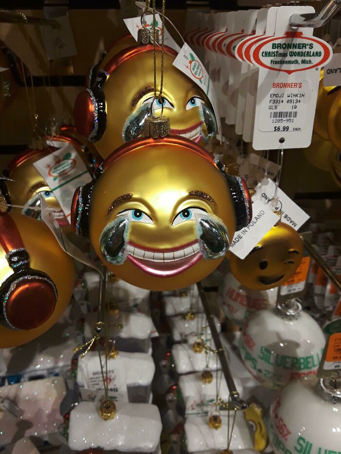
Music Festival Season Coming Up
“Not unlike great art, I believe that much of what came from this era is ‘great design,’ in part because it represents an era and a philosophy. When we start to mix in discussions of taste and preference, that is where the gray areas of good and bad design get blurred,” he said.
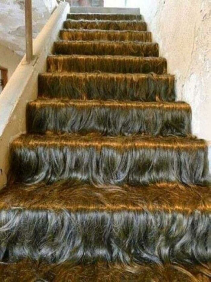
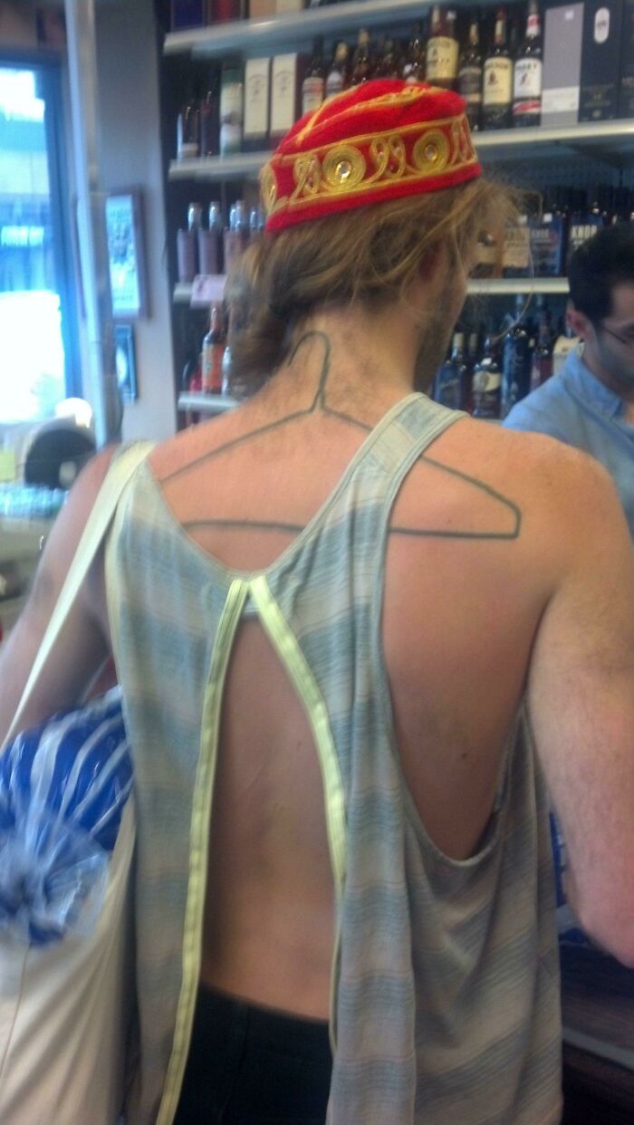
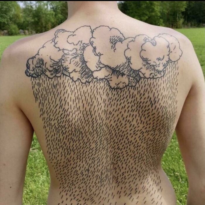
This Hairway To Heaven
Guess Which State
Renovations Done To 500-Year-Old Caldwell Tower In Scotland
This has been on here many times. I believe the owners had to do something modern to it (the planning department insisted) so that it was a renovation commensurate with the time it was carried out.
According to Antoniuk, from the University of Alberta, people can generally intuitively feel what designs are good and which ones aren’t.
"Quite often, this relates to ergonomics and the usability or functionality of the products and services and systems. Having said that, I think far too many people expect poor design that doesn’t really work well," he told us.
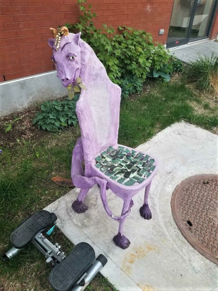
Poor Thing Needs To Be Put Out Of Its Misery
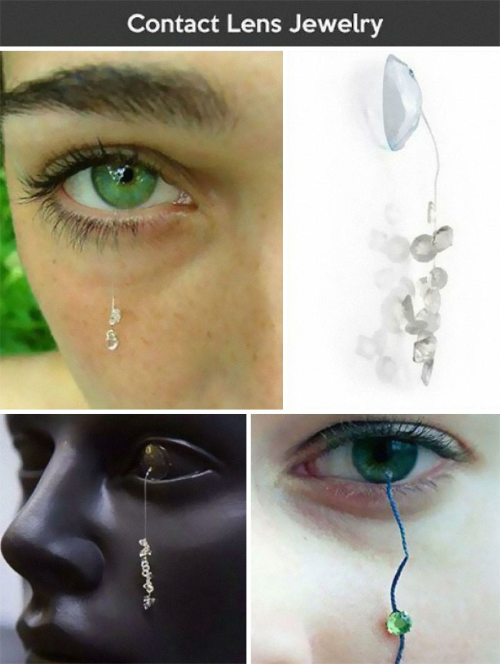
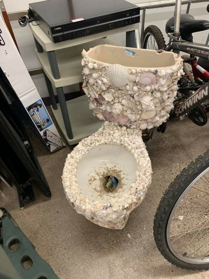
There’s A Lot To Unpack Here
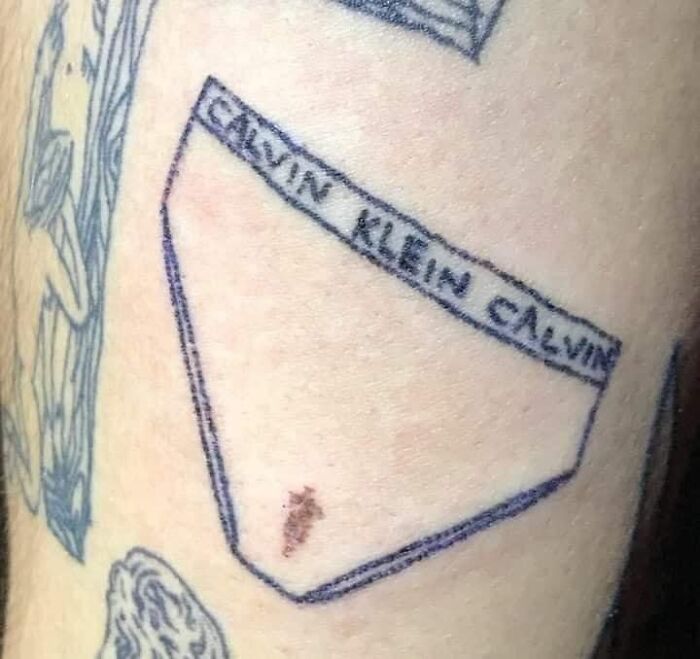
Horrible Tattoo And Use Of A Birthmark
"For me, great design is what Dieter [Rams] talks about—it is also intuitive, it is deeply sympathetic and empathetic to the user at all levels, and at some level, it is emotional. It is a catalyst for giving us feelings."
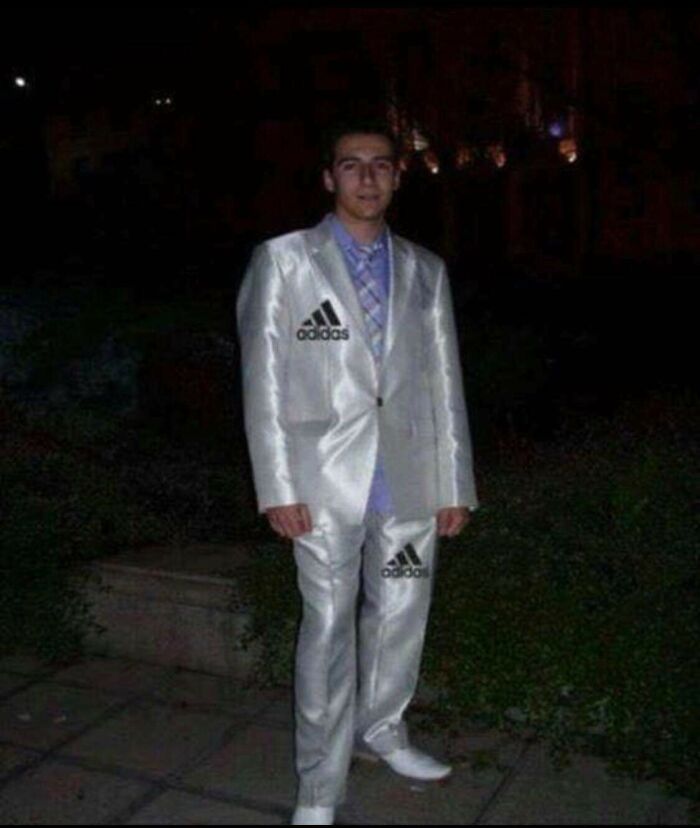
When You’re Trashy But Also Complex
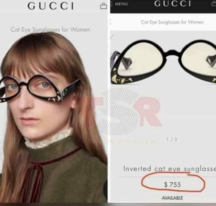
I found my glasses. Wish I hadn't. Can't look away. Send help. Or Valium. Prefer Valium.
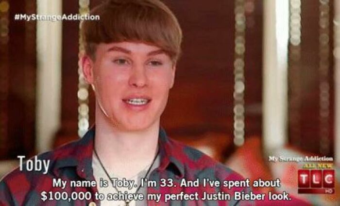
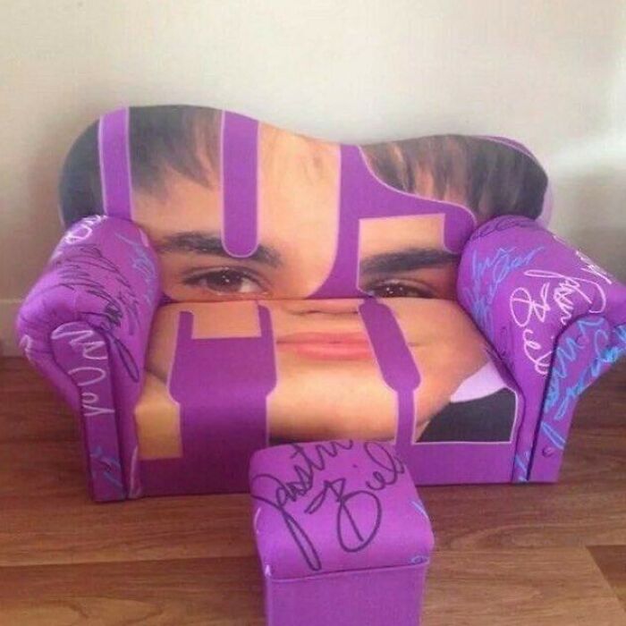
100k And He Still Doesn't Look Like The Biebs
F**k Me
Which of these pics did you find the most painful to look at, dear Pandas? Why do you think some people have such a hard time realizing that their sense of what does and does not work totally doesn't match what's actually aesthetic? How would you break the news to someone to tell that they might just lack taste and may need to develop it more? Let us know in the comments!
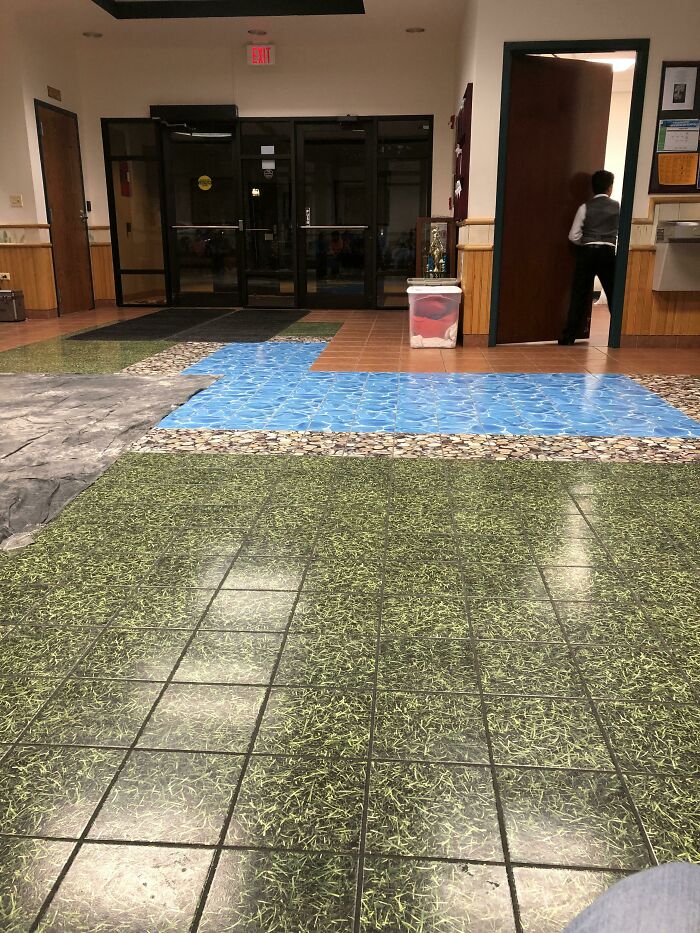
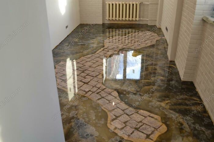
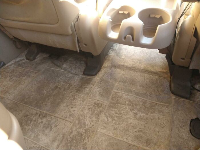
I Think The Flooring At This Banquet Belongs Here
This Is Disgusting
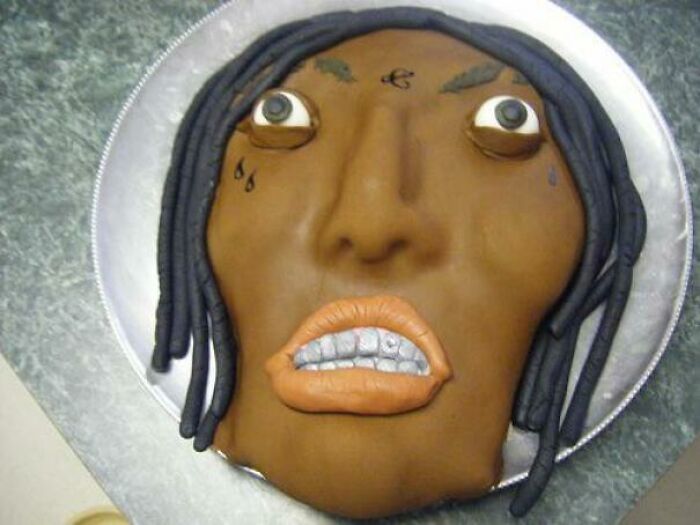
Lil Uzi Vert Pierced His Forehead With A $24 Million Pink Diamond
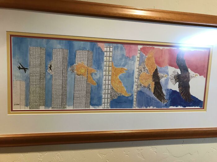
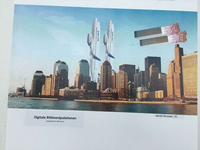
Camp Auschwitz
I'm Unsure If This Atrocity Has Made Its Way Here Yet.. I Can't Unsee
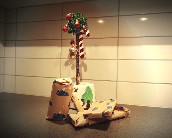
Toilet Brush Christmas Tree
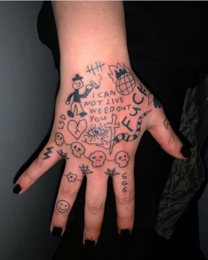
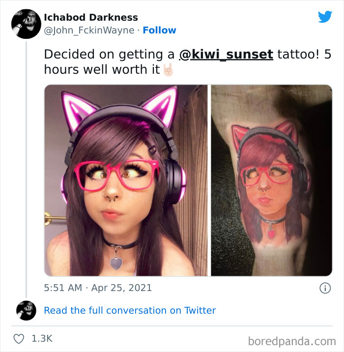
Getting A Bad Tattoo Of An Egirl Might Be The 2021 Version Of Hitting Rock Bottom
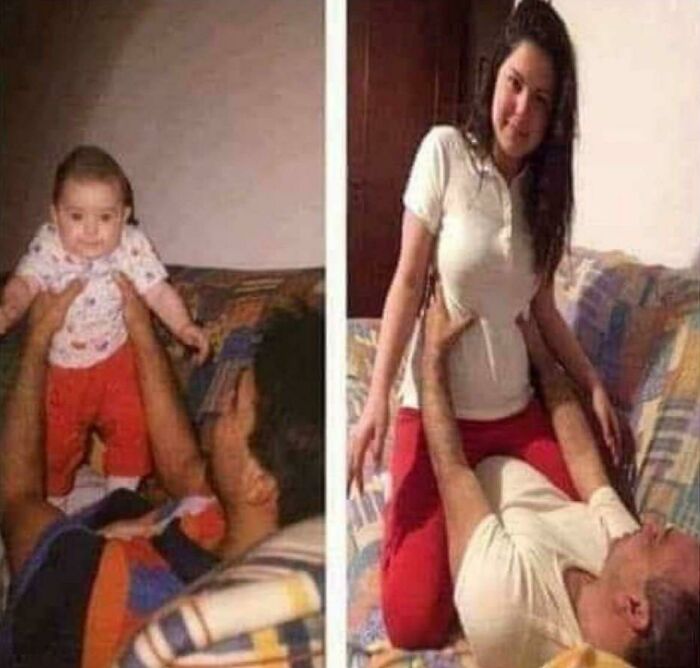
Happy Birthday! Here’s Some More Ptsd
Ouch. That was painful to see.Usually I click the link to show all the posts; but not today.
"Note: this post originally had 113 images." Not today, Satan! Man, some of those were pretty rough.
may i suggest posting on instagram or deviantart instead of boredpanda? they have much better algorithms for sharing art & making sure people see it, & you're able to tag your art so people will see it if they're interested in similar topics. it's quite easy to build a following there without resorting to begging & advertising on posts that have nothing to do with art (which, no offense, makes people less likely to check out your art because they weren't looking for art in the first place & weren't expecting an ad in the comments).
Load More Replies...Ouch. That was painful to see.Usually I click the link to show all the posts; but not today.
"Note: this post originally had 113 images." Not today, Satan! Man, some of those were pretty rough.
may i suggest posting on instagram or deviantart instead of boredpanda? they have much better algorithms for sharing art & making sure people see it, & you're able to tag your art so people will see it if they're interested in similar topics. it's quite easy to build a following there without resorting to begging & advertising on posts that have nothing to do with art (which, no offense, makes people less likely to check out your art because they weren't looking for art in the first place & weren't expecting an ad in the comments).
Load More Replies...
 Dark Mode
  No fees, cancel anytime


