50 Times People Didn’t Think Their Message Through And It Resulted In These Fails (New Pics)
Brevity! Clarity! Proper kerning (that’s the spacing between letters)! And no silly business with the fonts! At their core, signs are supposed to impart the biggest amount of information in the least amount of time. That sounds simple enough on paper (pun intended), but not everyone manages to rise to the challenge.
They follow through with their [cough] artistic vision [cough] and the result is a hot mess of utterly illegible chaos. The worst of the bunch end up being featured on the r/dontdeadopeninside subreddit, an online community that is dedicated to nonsense signs if read normally. We’ve collected some of their best posts to share with you. Scroll down, but be careful—if you’re a fan of order, you might end up facepalming way too much.
This post may include affiliate links.
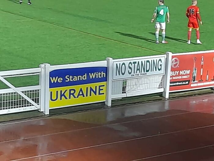
We Stand With No Standing Ukraine
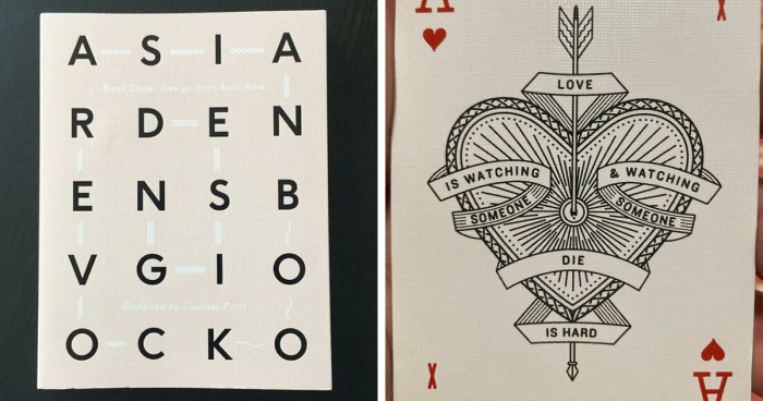
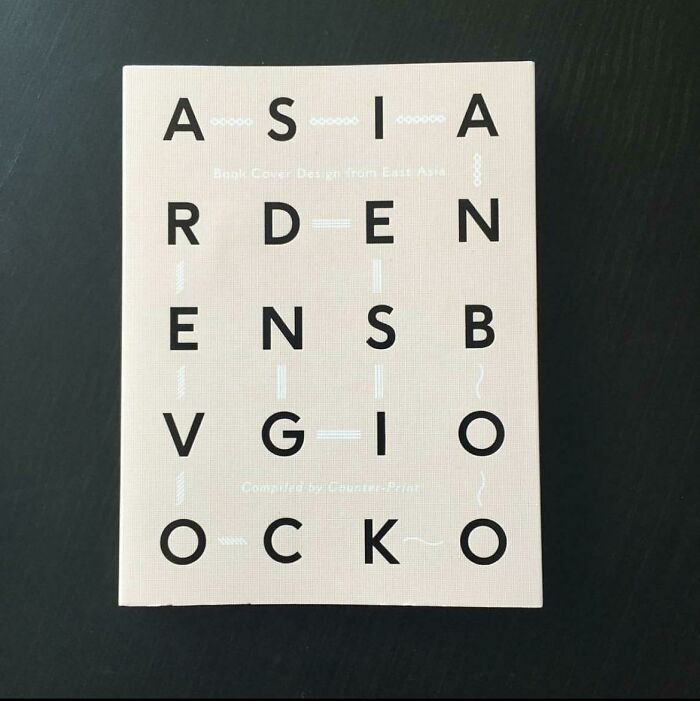
Asia Rden Ensb Vgio Ocko
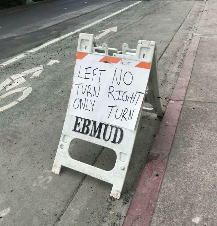
Left No Turn Right Only Turn
The r/dontdeadopeninside subreddit has been up and running for nearly a decade, all the way since mid-2014. Since then, the community has grown to encompass over 681k members from all over the world.
The name of the group is rooted in the hit TV series, ‘The Walking Dead,’ which had a promotional poster that had the words ‘Don’t Open’ on one half of the chained doors and ‘Dead Inside’ on the other. When read from left to right, due to the weird spacing, the message becomes ‘Don’t Dead Open Inside’ instead of the intended ‘Don’t Open Dead Inside.’
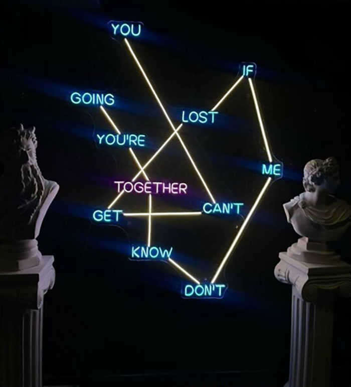
You If Going Lost You’re Me Together Get Can’t Know Don’t
Honk Ha Against Te
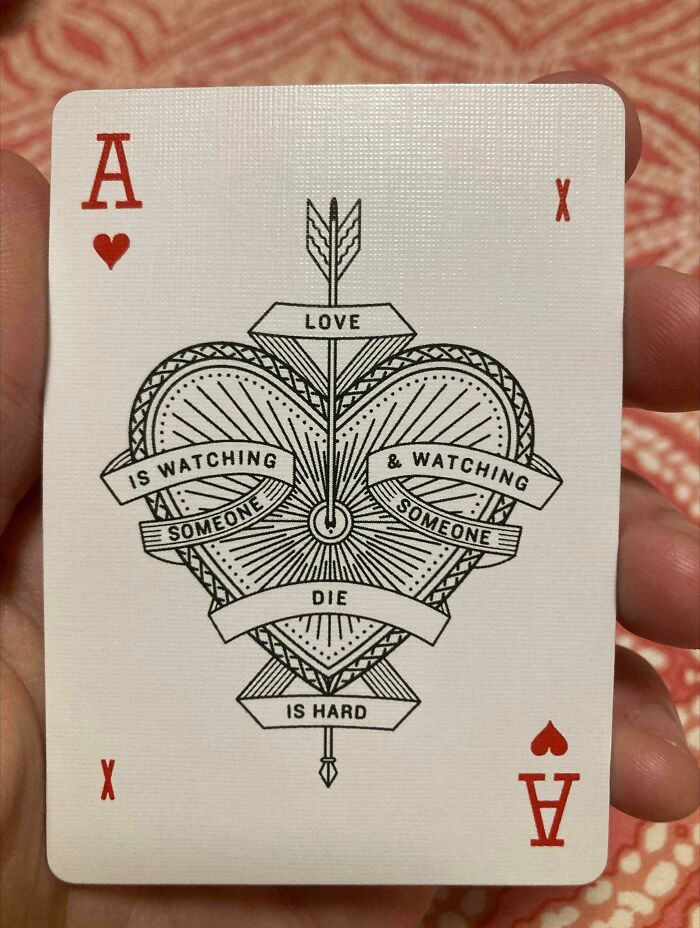
Love Is Watching & Watching Someone Someone Die Is Hard
According to Know Your Meme, ‘Don’t Dead Open Inside’ is one of the most well-recognized examples of messages that aren’t read as they should be because there’s no instantly-recognizable, clear way to tell what order the words ought to be in. It takes a moment to really get the message, by which time the impact the sign could have had is lost.
The meme spread on Twitter in 2010 as more and more people started realizing this. Throughout the next few years, internet users started coming up with memes and jokes based on this. Eventually, this led to the creation of r/dontdeadopeninside in 2014, which continues to be very popular to this day.
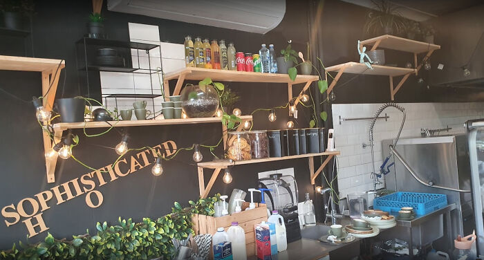
Sophisticated Ho
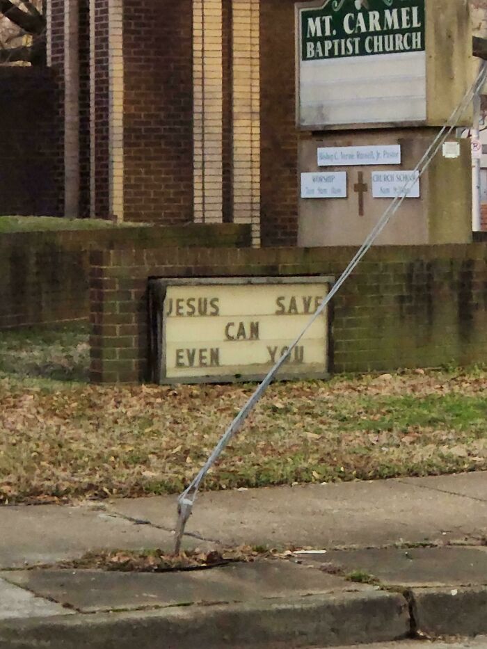
Jesus Save Can Even You
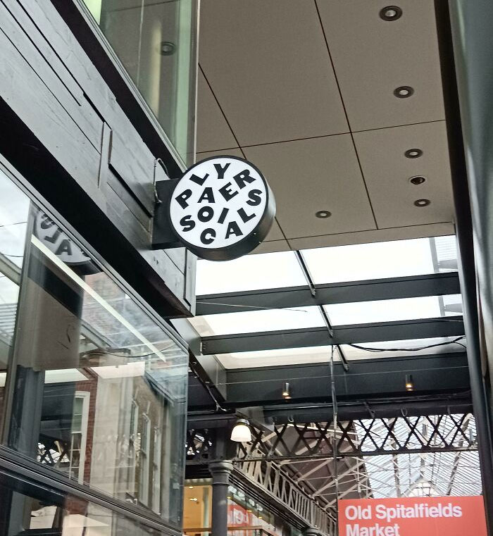
Ly Paer Soils Ca
There are a few main rules that the members of the DDOI community ought to follow. “Signs must be read correctly top to bottom, and incorrectly left to right, like any text usually. Though it does not matter how easily you can read them, it is highly encouraged to only post images with little separation or spacing between the columns of words,” the moderator team running the group explains.
Redshe Neckshed
Satan Jesus Is Is Defeated Lord! [oc]
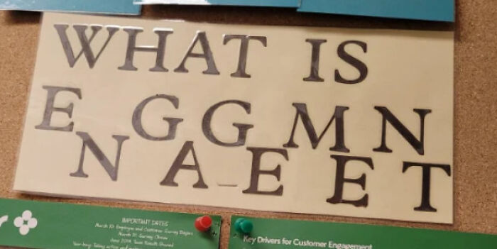
Eggmnnaeet
What is engagement. Why not use a smaller font to write in a straight line?
Meanwhile, redditors are encouraged to be original with their content: reposting the most popular pics of all time or signs from the last 4 months isn’t tolerated. Your posts might end up getting removed. Moreover, signs that have been staged or faked also have no place on this sub. Finally, internet users are asked to be civil to each other and to put the wrong way to read the message in the titles of their posts.
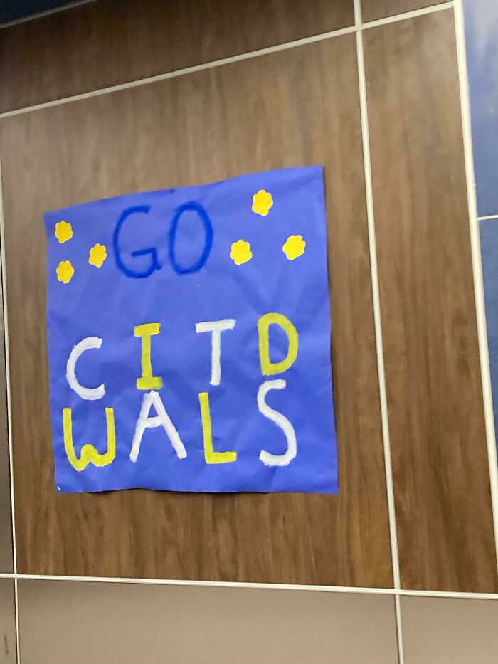
Go Citd Wals!
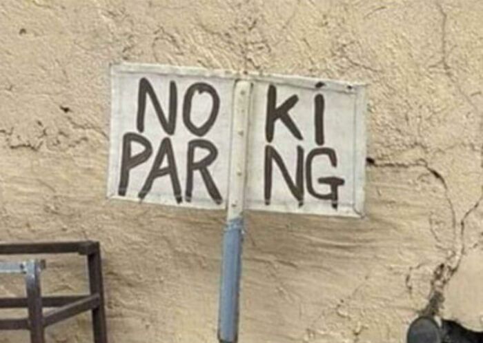
Noki Parng
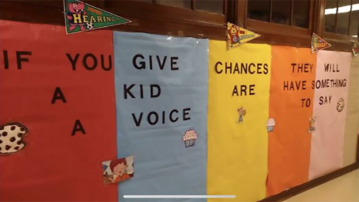
You Give Chances Kid Voice Are
If you teach children how to write sentences please make it easy to read
As we’ve covered on Bored Panda previously, clarity and brevity are absolutely vital when creating signs. Essentially, you only have a moment to get your message across. So if you cause even the slightest amount of confusion, you’ve basically negated the whole point of your sign, and it's best to start over.
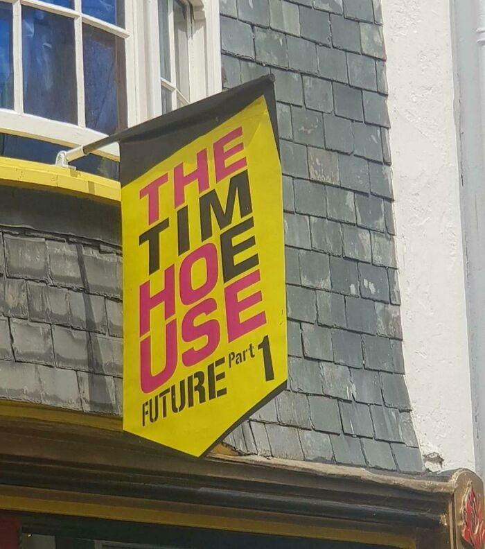
The Tim Hoe Use
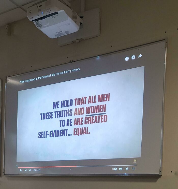
We Hold That All Man, These Truths, And Women To Be, Are Created Self-Evident... Equal
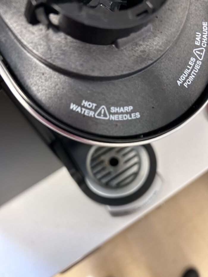
Hot Sharp Water Needles!!
What really helps avoid these errors is being patient and diligent. First of all, you need to put in the time and care to create the best possible version of the sign possible, along with a few alternatives. Then, take a break, come back to your design, and look at it with fresh eyes. You’re bound to see things very differently than when you’re face-deep into drafting the sign.
Feed Animals School Kids Parties Groups
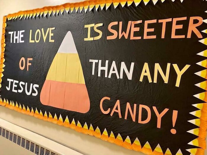
The Love Is Sweeter Of Than Any Jesus Candy!
Wildphot Lifeography
Secondly, you should definitely take the time to show your design to a few different people, whether they’re your relatives, close friends, coworkers, or—heck—even some passersby on the street. You’re essentially conducting a bit of research with tiny focus groups. They might catch a silly mistake you left in or might end up interpreting the entire sign very differently than you intended. It’s better to deal with a dash of embarrassment now than tons of it later.
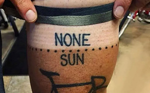
Always Forgotten Remembered Never
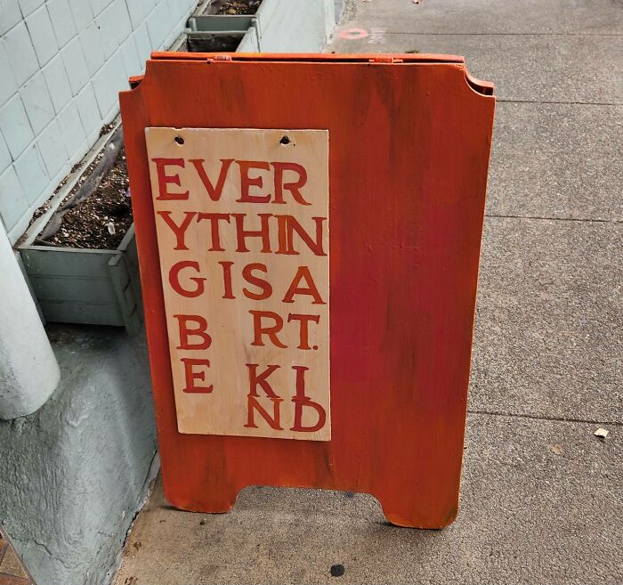
Ever Ythin Gisa B Rt E Kind
Pine Man Apple Go Nada Nada
If you’re working on a very important project, you might want to consider hiring some professionals to help you, instead of doing everything yourself. Find a designer with a decent reputation to flesh out some of your ideas. Meanwhile, consider getting in touch with a proofreader or editor as well. We all make silly mistakes from time to time, and it helps to have a real pro in your corner.
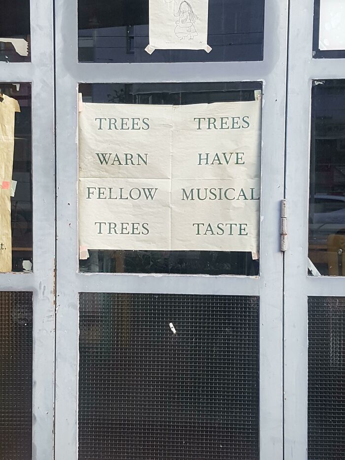
Trees Trees Warn Have Fellow Musical Trees Taste
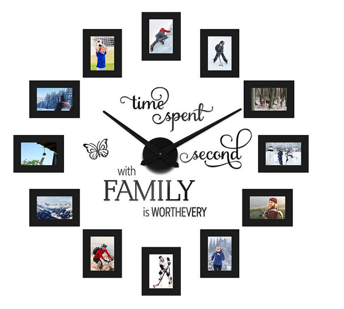
Time Spent Second With Family Is Worthevery
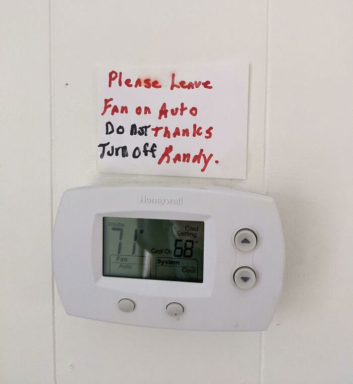
Do Not Thanks; Turn Off Randy
The fact is that if you just wing it, you might end up losing your audience or potential customers. The more fluent your font is, the clearer your message. And vice versa! How trustworthy and likable you and your business are depends a lot on how you brand everything. Ideally, everything should be as legible as possible. With a focus on readable fonts, good kerning, and an overall design that focuses people’s attention where you want it to.
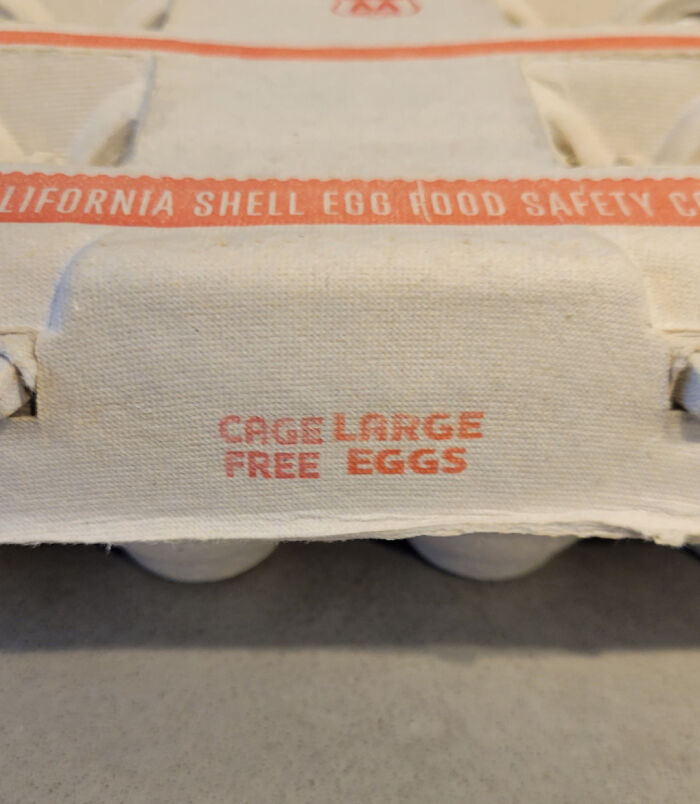
I Don't Know Why Everyone Has Been Complaining. My Cage Large Eggs Have Been Very Affordable
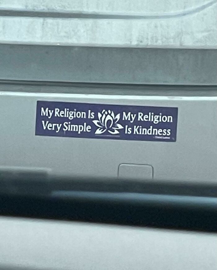
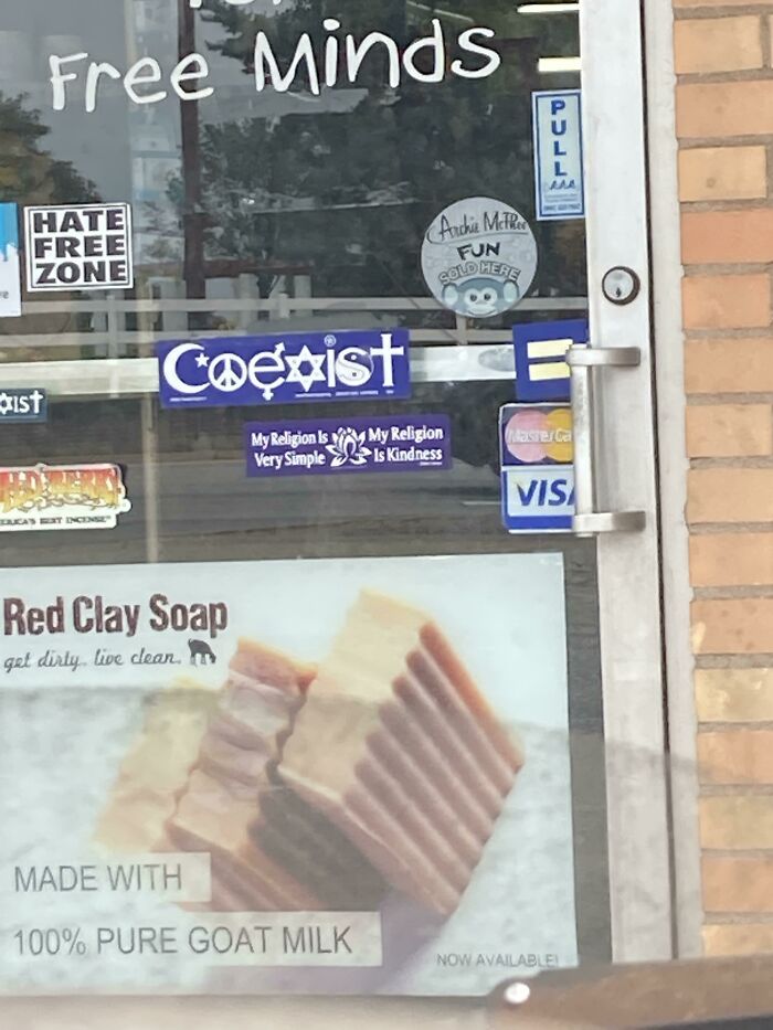
My Religion Is My Religion. Very Simple Is Kindness
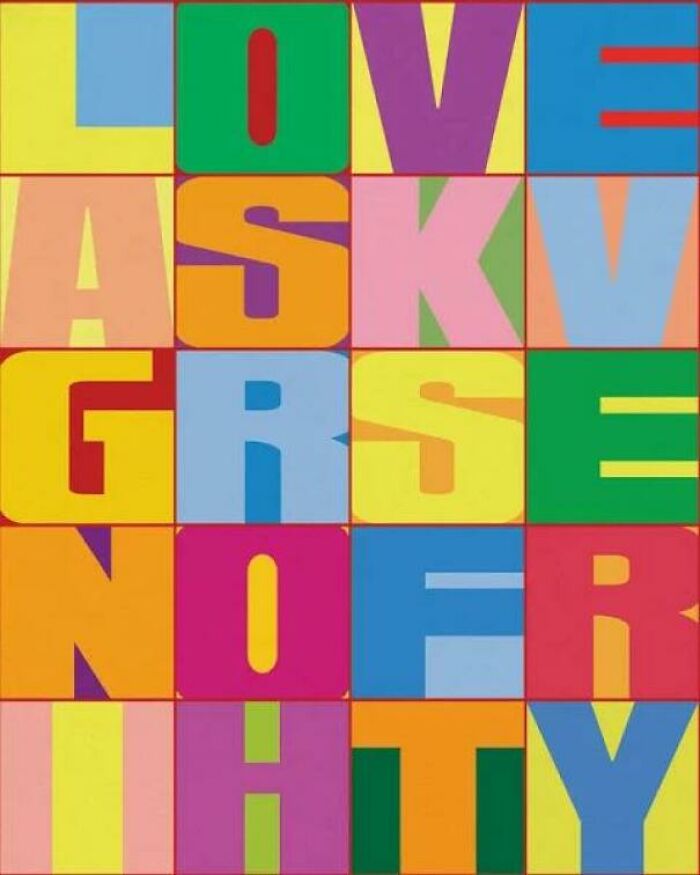
Love, Askv, Grsenofr? Ihty
Here at Bored Panda, we’re very big fans of poorly designed signs—we can’t get enough of these trainwrecks! As such, we’ve featured the genius of r/dontdeadopeninside time and again. If you’d like to see some more chaotic signs that are definitely going to be misinterpreted, check out our earlier lists here and here, as well as here and here.
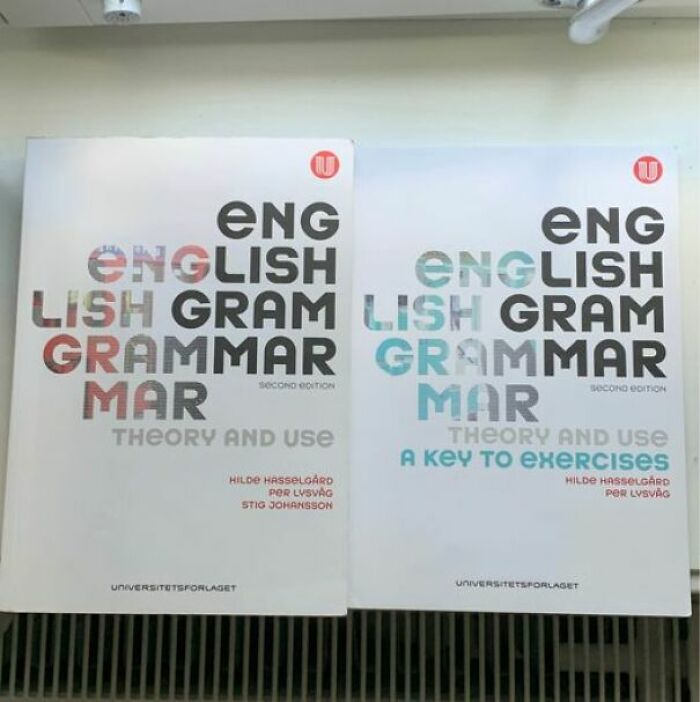
Eng English Lish Gram Grammar Mar
Who decided to make the cover of books to teach people grammar in a new language confusing. The target audience doesn't know what the base words are yet so they can't figure it out.
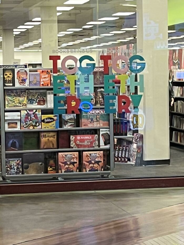
Tog Tog Eth Eth Er! Er!
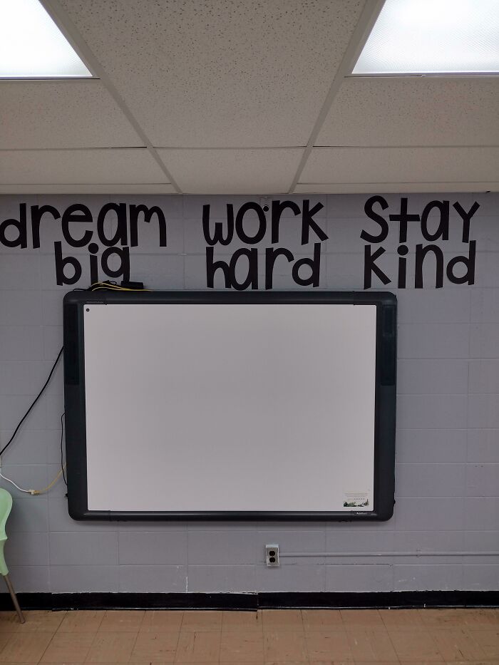
Dream Work Stay Big Hard Kind X.x
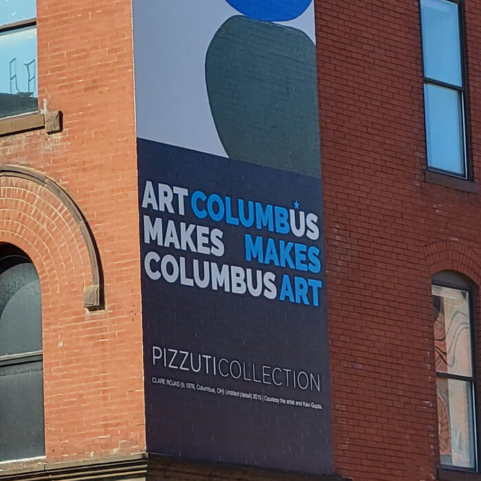
Artcolumbůs Makes Makes Columbusart
Pibu Zzarger
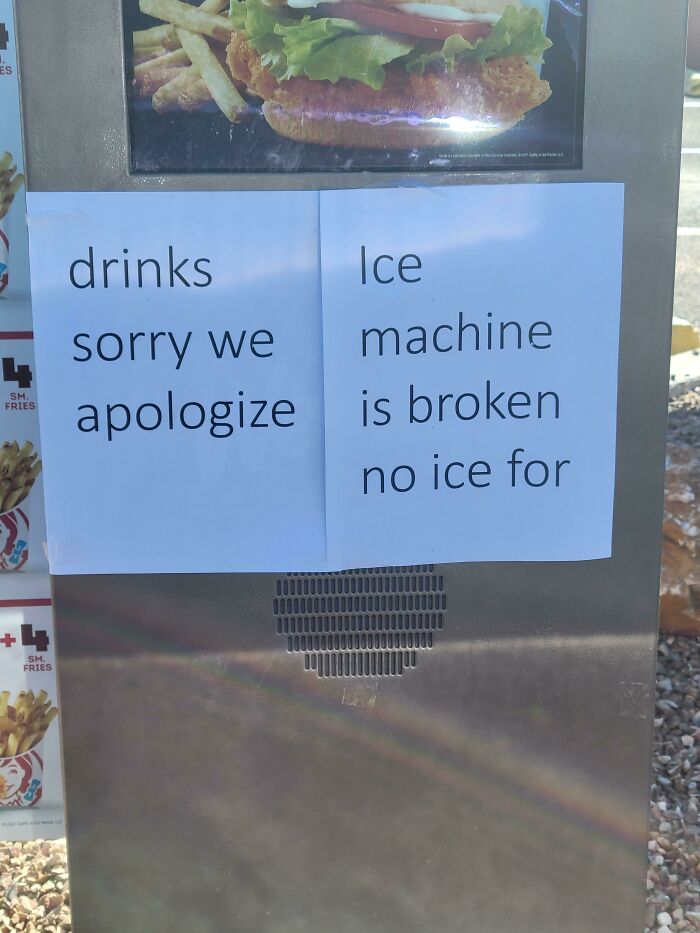
Drinks Ice Sorry We Machine
Burger Better Cause Maker You Built It
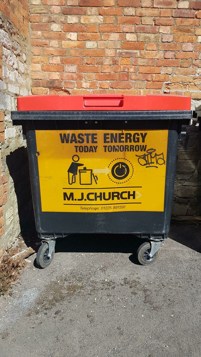
Waste Energy Today Tomorrow
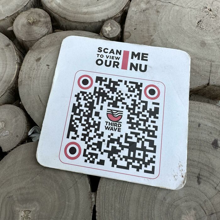
Scan Me To View Our Nu
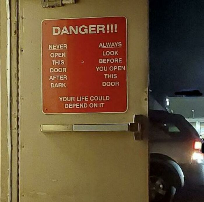
Never Always Open Look
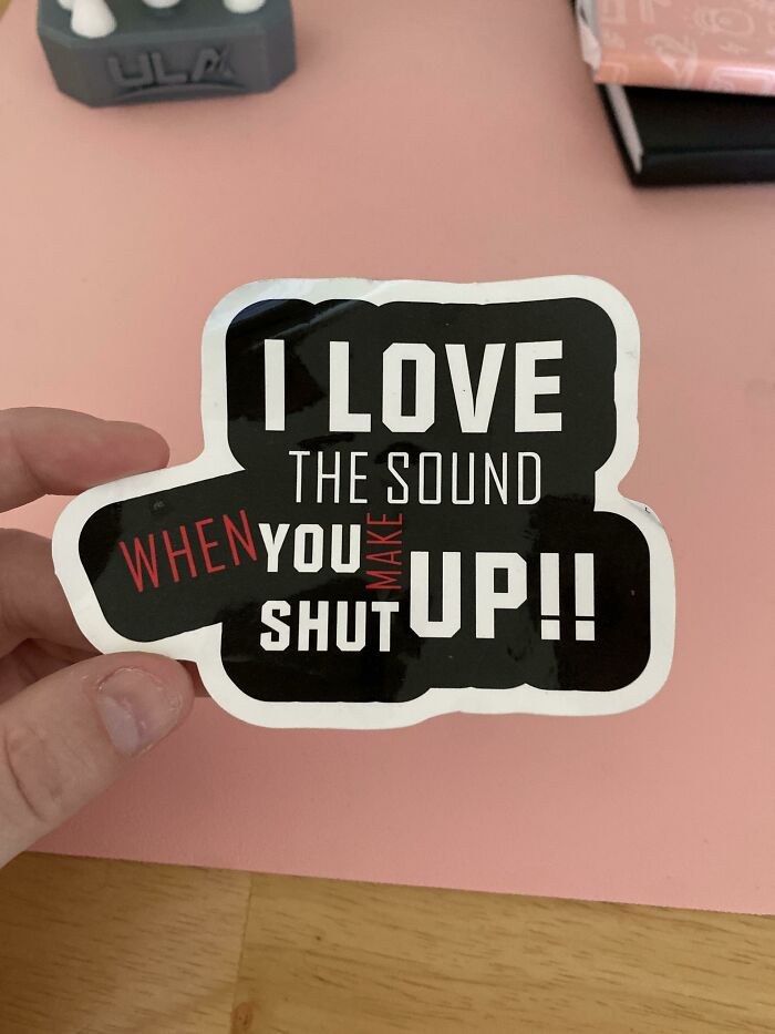
I Love The Sound When You Make Up Shut
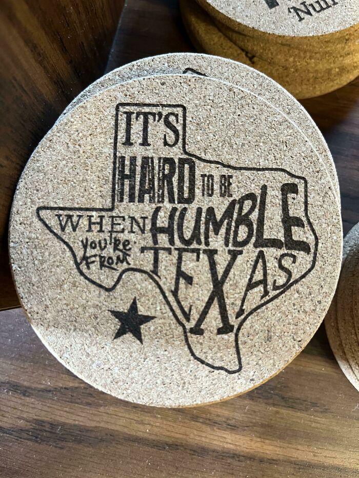
It’s Hard To Be When Humble You’re From Texas
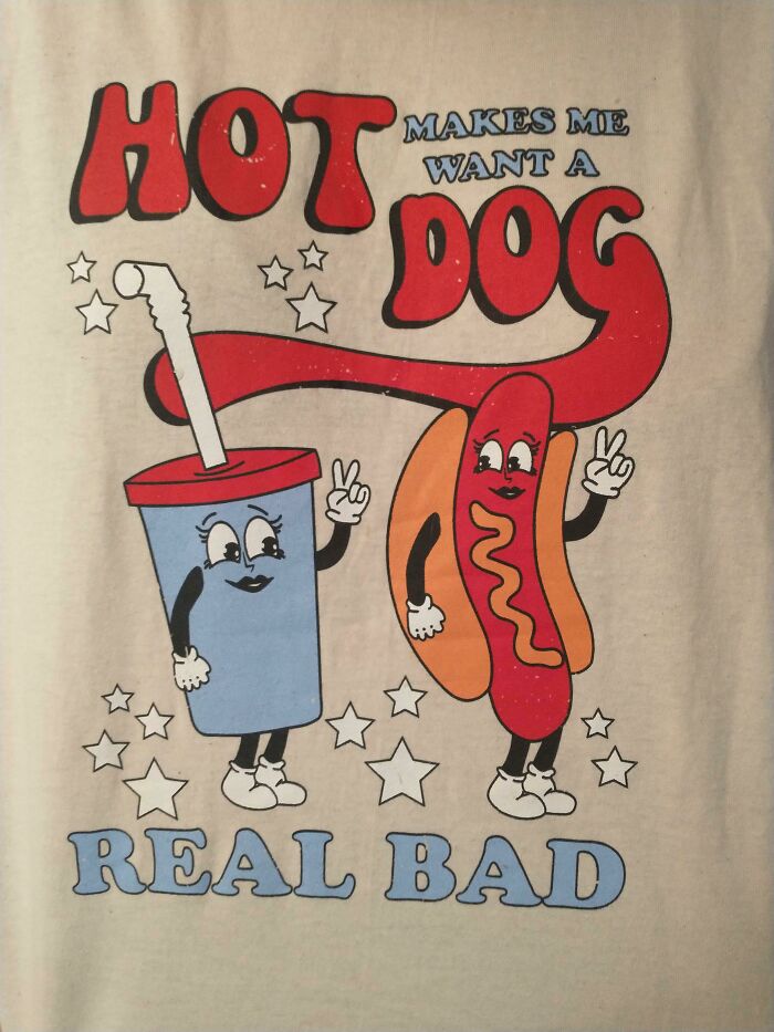
Hot Makes Me Want A Dog
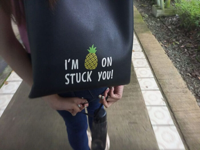
I'm 🍍on Stuck You!
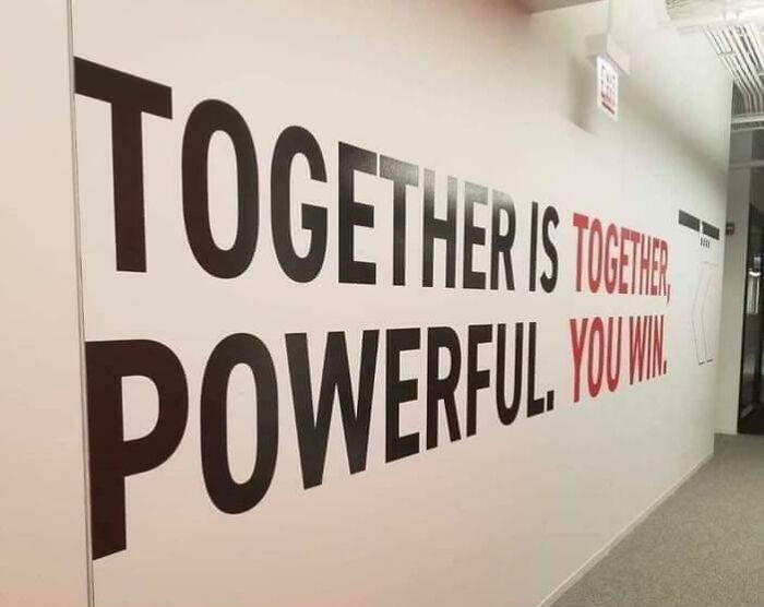
Together Is Together, Powerful You Win
Traditional Free Glass Horse Meat Of Wine
I know for a fact that this will be downvoted but horse meat is actually really good. I had it in France.
You're Like The Now One I
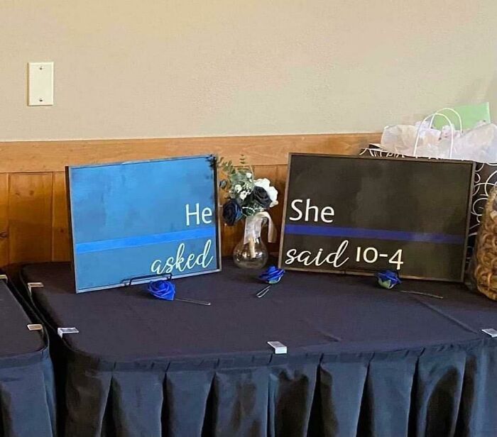
He She Asked Said 10-4
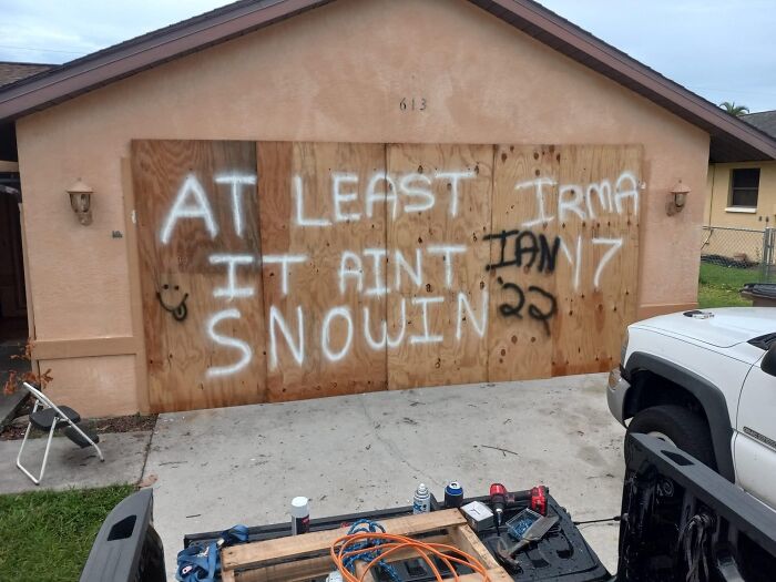
At Least Irma It Ain't Ian 17 Snowin 22
We like to name our hurricanes. Two different occasions Irma and Ian threatened the states, this person clearly made it through the first, 🤞 fingers crossed they made it through the second
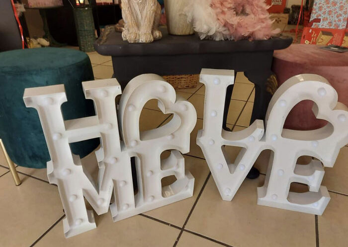
Holo Meve
This looks like stuff at a thrift store. Can't blame someone for putting two unrelated signs next to each other.
Palm For Trees Sale
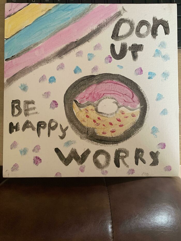
Donut Be Happy Worry
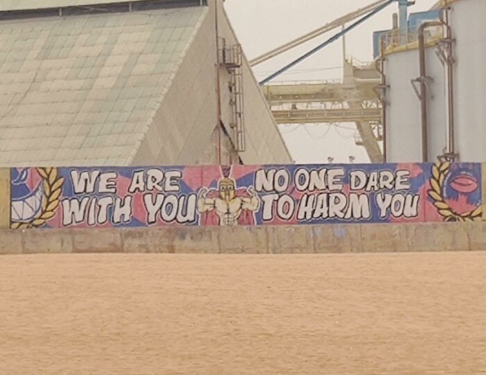
We Are No One Dare With You To Harm You
Not Sure If This Has Been Posted Here Already But Yeahh.. Lohovo Vepete
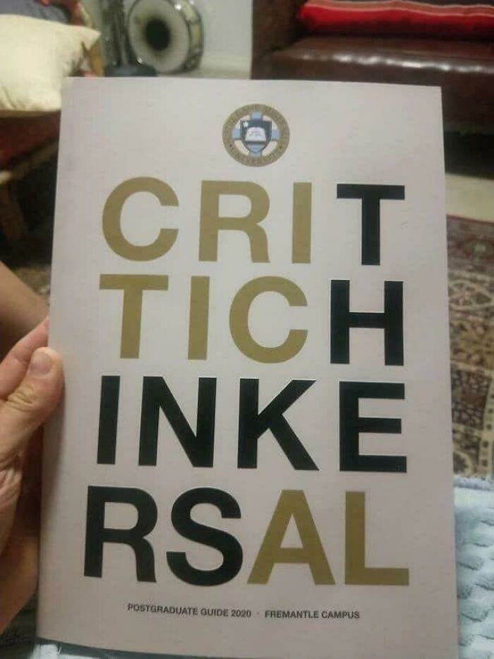
Critic The Ink Ersal
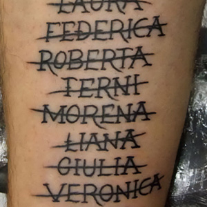
Working Like To Support The Crazy Lazy
Working like crazy to support the lazy. On behalf of the lazy I'm sorry, you really don't need to do that.
9/11 Was Arrest Treason The Bankers
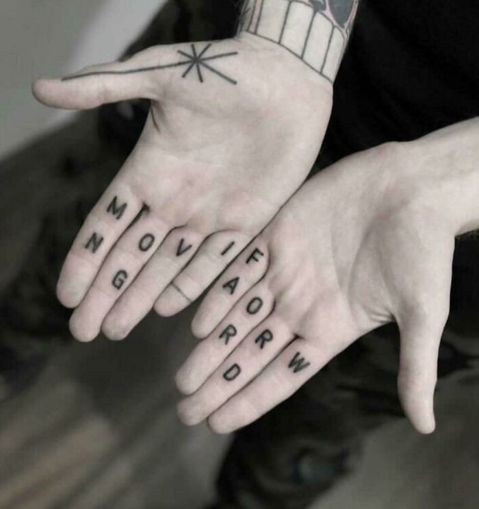
Moviforw Ngard
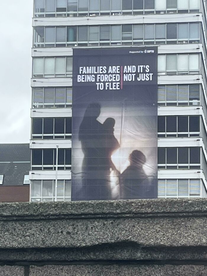
Families Are And It’s Being Forced Not Just To Flee
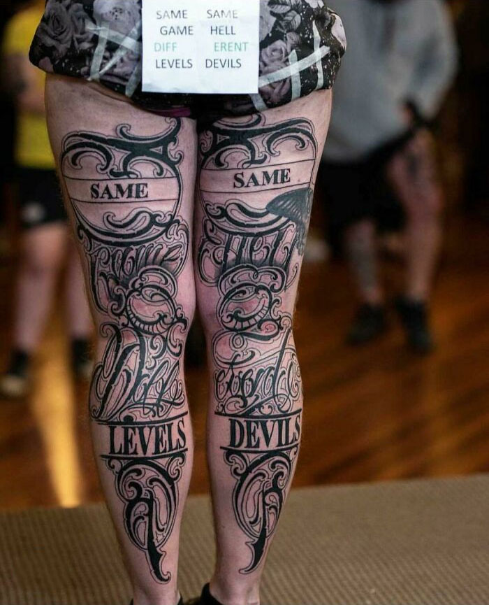
Same Same Game Dead Diff Erent Levels Devils
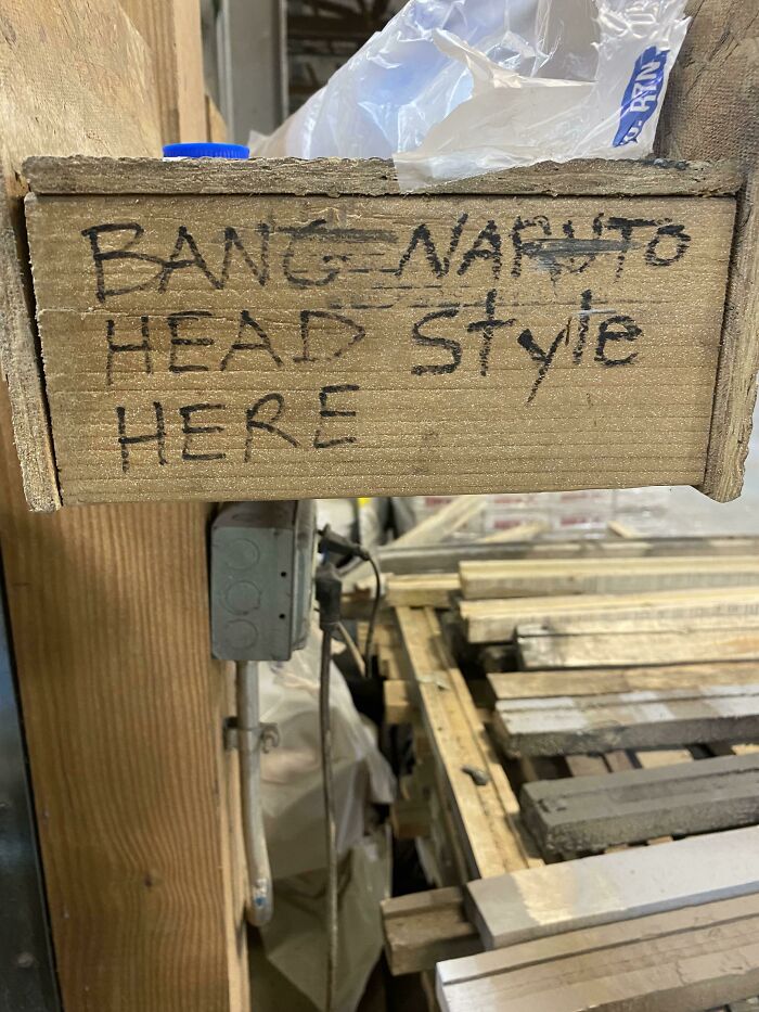
Bang Naruto Head Style Here (At Work)
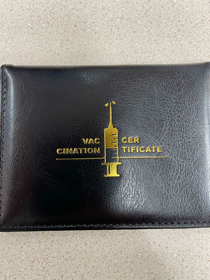
Vac Cer Cination Tificate
Roll Dice The
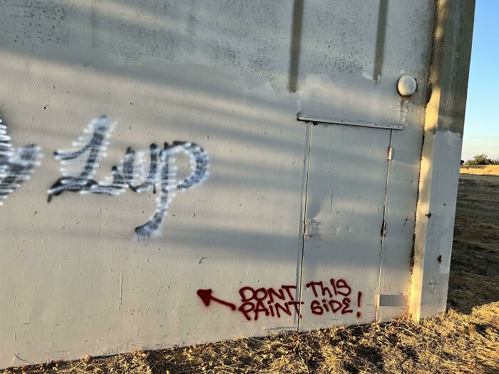
Don’t This Paint Side!
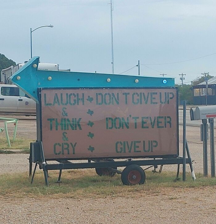
Cry • Give Up
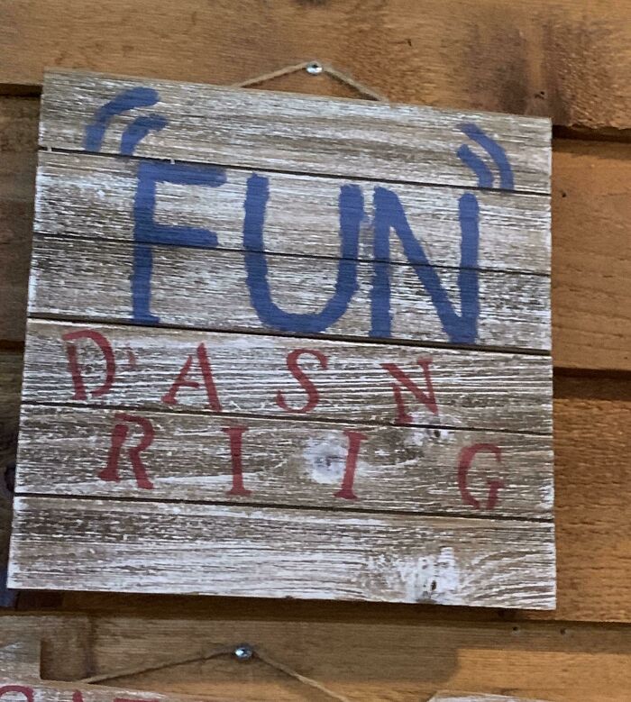
“Fun” Dasn Riig!
Red Blood Hot Sugar Chili Sex Peppers Magic
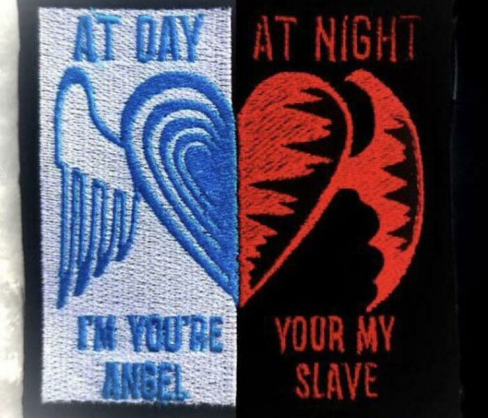
At Day At Night I’m You’re Your My Angel Slave
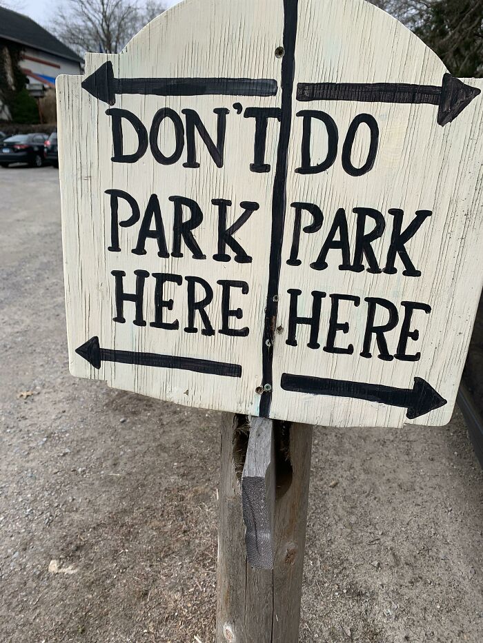
Don’t Do Park Park Here Here
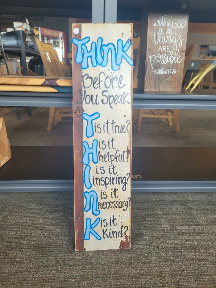
Tis It True? His It Hhelpful?
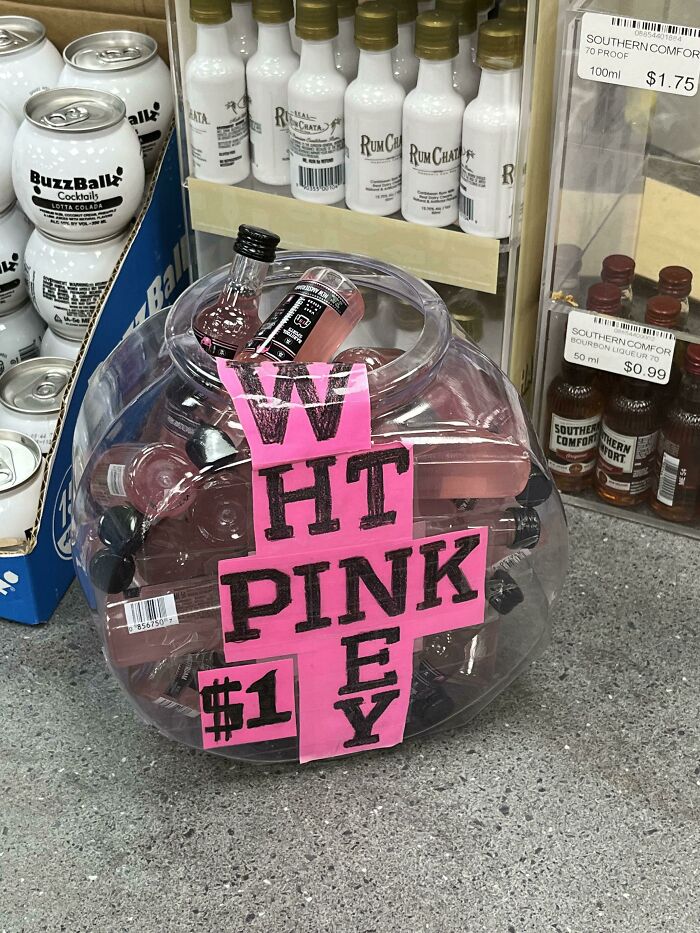
Wht Pink Ey
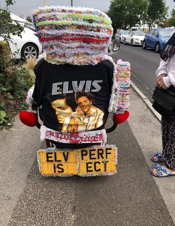
Elv Perf Is Ect
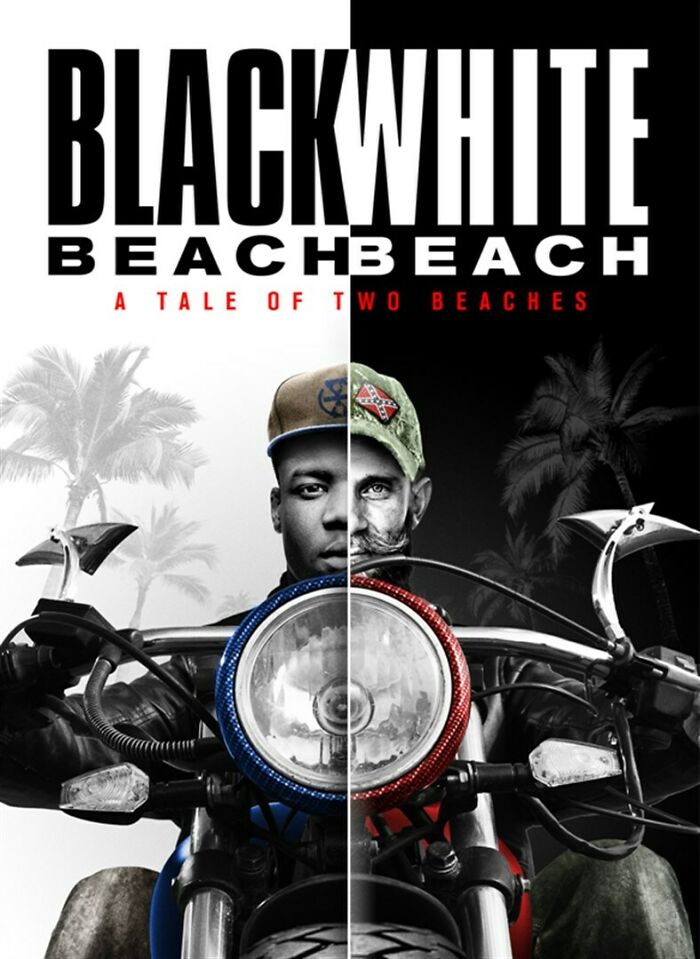
Blackwhite Beachbeach
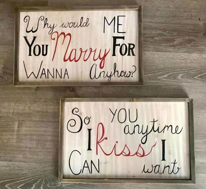
Why Would Me You Marry For Wanna Anyhow?
First one says "why would you wanna marry me for anyhow?" Slightly messed up grammar, but understandable once you put the words in th eright order. Second one is the response, "so I can kiss you anytime I want."
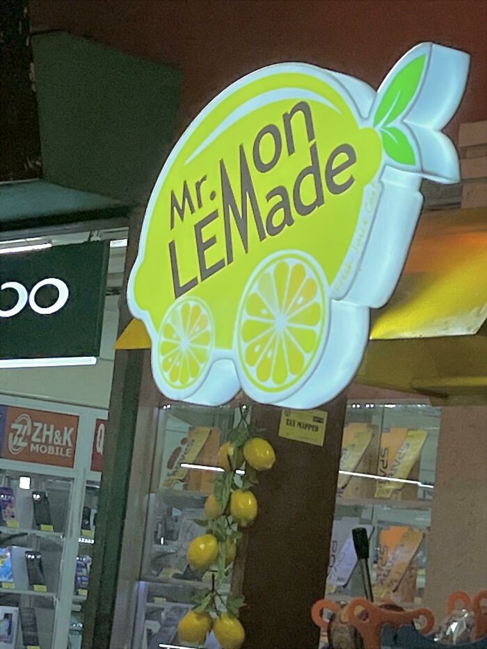
Mr.mon Lemade
Make No Art War
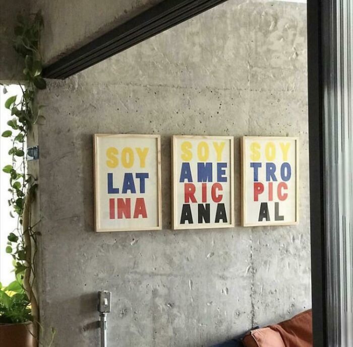
Lat Ame Tro
In spanish "yo soy" (often shortened to just "soy") means I am. These mean "I'm latina" "I'm american" and "I'm tropical."
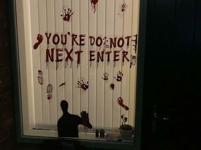
You’re Do Not Next Enter
Ah yes, "You're Do Not Next Enter", the lesser-known cousin of "Don't Dead Open Inside".
Because I’m Me
"You laugh at me because I'm different. I laugh at you because you're all the same." A little cringy if you ask me, and possibly photoshopped.
Honk You If Fart
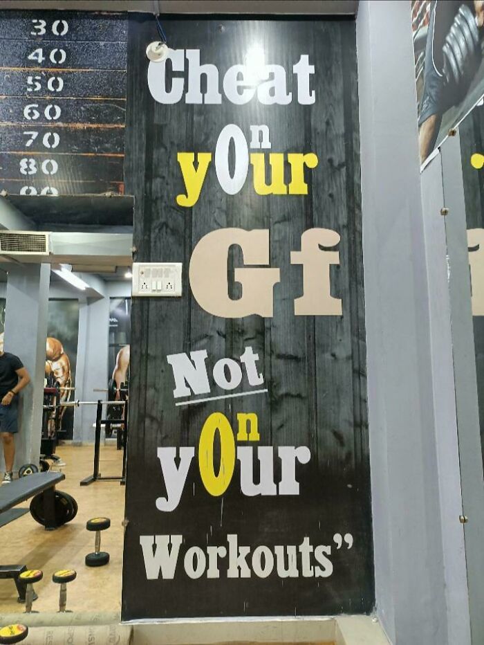
Cheat Yonur GF Not Yonur Workouts
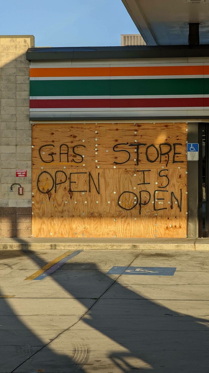
Gas Store Open Is Open
Pro Pro Pro Life God Gun
Postal Are Workers Thieves
No, Tom, your neighbor is the one stealing all your Amazon and Bad Dragon package deliveries, not the postal workers.
Xeln Eclet
Great Great Food! People
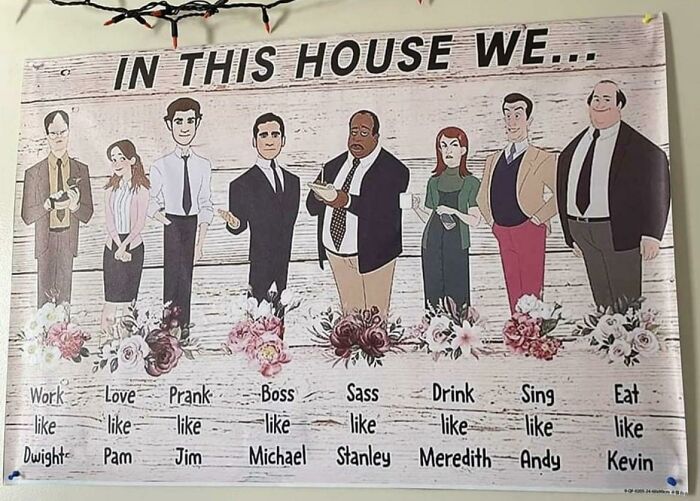
Work Love Prank Boss Sass Drink Sing Eat
That kinda c**p even makes that "Live, Laugh, Love" mess less cringey.
God Save #not The Working My Class King
My Religion Is My Religion, Very Simple Is Kindness
Total aside - Why is it a big deal to have soap made with 100% pure goat milk? What happens if the goat has been cheating on Billy, swears in Greek, and is racist against fainting goats?
The problem is that some of these are written to be read vertically and look funny horizontally; but if they were written horizontally, they'd look funny vertically. The only thing one can do is leave adequate space and don't try to be too clever.
These are what you get when you use a designer who feels a need to justify their fee for doing something that should be trivially easy.

 Dark Mode

 No fees, cancel anytime





![Satan Jesus Is Is Defeated Lord! [oc] Satan Jesus Is Is Defeated Lord! [oc]](https://static.boredpanda.com/blog/wp-content/uploads/2023/05/6465e8abd347e_seCOD1A__700.jpg)
