Get Premium
Dark mode theme is available exclusively for premium users. Learn more about the benefits of subscribing.
No fees, cancel anytime.

 Dark Mode Ad-Free Browsing Unlimited Content
 Ad-Free Browsing Unlimited Content Dark Mode
Join 1.2 million Panda readers who get the best art, memes, and fun stories every week!
When you’re neck-deep in your work, you can get so focused on a few details that you no longer see the forest for the trees. Before you know it, you’ve made some major mistakes that are glaringly obvious to practically any bystander. That’s true for any profession, including folks working in graphic and product design.
Created by David Delahunty (@delahuntagram), the ‘Design Fails’ (@designfailures) Instagram account has been amusing social media users for over a decade. The account does exactly what it says on the tin: it focuses on facepalm-worthy design fails that are as confusing as they are amusing. We’re featuring some of the most epic ones to brighten your day. Scroll down to check them out. Oh, and if you’re a designer, keep in mind that these pics might make you cringe extremely hard!
More info: Instagram | DavidDelahunty.com
This post may include affiliate links.
To play devil's advocate: since the paper can provide strength to the bottle, the plastic can merely be a relatively thin liner, somewhat like a bag inside a cardboard container. If the bottle is incinerated or ends up in a landfill, there is at least less plastic involved. Maybe it's actually less harmful to the environment. Maybe…
Always check how the logo and slogan will look when the door is open *before* you heat-seal the wrap.
I would have thought a company of that size, fame or infamy and 'notoriety' would have checked this aspect of design.
Load More Replies...Yeah, truly a fail. It would have been better if they had just put the author's whole name on the spine somehow
OMG snorted coffee out ma nose! Thats too funny. My nurse in the hospital was chinese, she asked where Im from I'm American with some German roots. Last name Otto. Anyway, right about then I was scrolling reddit and there was an old german commercial for chinese food on. We watched it together, these big burly germans would take a bite and POOF into a sterotypical looking chinese person. (bowl cut, bucked teeth). It was so racist but so hilarious I was super glad I got to share it with her we both laghed so hard. I really needeed that. edit:spelling
Delahunty created the ‘Design Fails’ account in July 2013. Over the past 11+ years, he’s amassed 31.2k followers on Instagram. The idea behind the account is very straightforward: “When design fails, we share it.”
Bored Panda has reached out to the curator via email to learn more about his project and what good design should look like, and we’ll update the article as soon as we hear back from him.
Not only are the photos that Delahunty shares useful for any current and future designers as examples of what not to do, they’re all also wildly enjoyable to look at. There’s a certain element of schadenfreude involved here, too. Like it or not, human beings get a bit of pleasure from another person’s misfortune. And many of us like to think we’d never make the same design mistakes that other professionals have… even though we probably inevitably would find another way to fail.
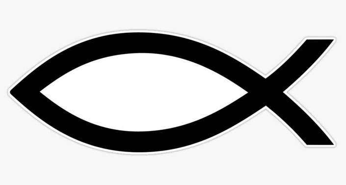
What's it meant to say? Ah, I'm ashamed to say I only just worked it out.
I'm more ashamed to stay that I remained mystified and MrTribble had to translate it for me. 😄
Load More Replies...Ive read this about 20 times and i still don't get it, someone please tell me
It’s meant to be a cross at the start then the word ‘unashamed’- saying they are unashamed to be Christian. The way it is laid out makes it look like it says ‘tunashamed’- with the cross looking like a ‘t’ I hope that makes sense!
Load More Replies...This would be a nightmare in a middle or elementary school classroom 🤣
Or high school or college or a rest home.
Load More Replies...I miss hearing that one every day in elementary school. I was the one who started the whole thing in my class.
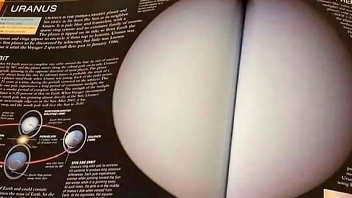
Load More Replies...The next version is going to introduce scratch and sniff of the planets (Venus is apparently hot and spicy). Wonder what Uranus smells like.
It's pronounced your-un-us... Not that a school kid it going to care
looks like it is upside down so that it would be plugged in without interfering with the bottom outlet. It looks loke the writing on the end is upside down too.
Aesthetics play a key role in consumer behavior because our brains are wired to respond to beauty. Something that is visually appealing is pleasant to look at, essentially. So, good design makes you feel that the product or service is reliable and has a group of competent people behind it. Meanwhile, the way something is designed can resonate (or not) with consumers’ sense of style and individuality.
On the other hand, visually messy designs—like logos that are hard to read—project unreliability, a lack of quality, and speak volumes about the lack of editing. In other words, bad design is a sign of untrustworthiness.
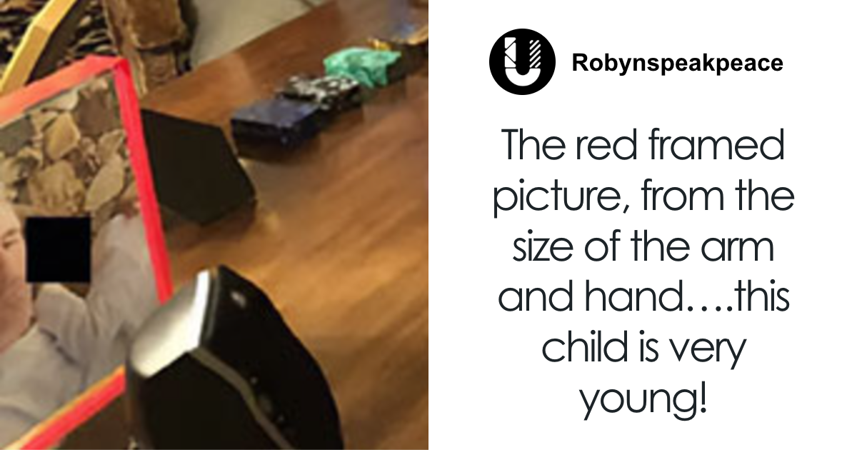
Notice that mom's 'elbow' is faded. I just think that in this spot, the child's hand rested against mom's arm before it faded.
Load More Replies...You have to purchase those doors if you want them to slide, luckily they're only 12.99 per movement!
i mean they might be manufacturing sliding doors, but this dont mean that they have a sliding d oor.
No matter how skilled, perceptive, and talented you think you are, nobody is immune to making mistakes. Everyone messes up from time to time. Nobody’s ‘flawless’ or ‘perfect.’
It’s how you react to the mistakes you make that says a lot about your character. Someone who has a growth-oriented mindset sees failure as an opportunity for growth instead of something that should continue to haunt them for years.
You should have seen her at New Year's parties from 2000-2009.
Load More Replies...The plot to Luigi's Mansion, you shoot ghosts with light and Mario is trapped in a painting
Messing up a design in a very embarrassing and public manner doesn’t have to be a fail. For one, you make a mental note of all the ways you’ll do things better the next time around. But on top of that, this is actually a good opportunity to connect with your audience, clients, and coworkers.
As we’ve covered earlier, displaying signs of mild embarrassment can be socially constructive because everyone is likely to be more sympathetic.
I have worked at a sign shop as the graphic designer... I have seen this pic on the web multiple times. It is a fake (the huge space between "do" & "it") OR the person ordering it thought they knew more than the designer and asked/forced for this layout... and has gotten sh!p for it ever since.
Just = 4 Do It = 5.... no reason DO needed to be on the side with JUST.... just saying :)
Load More Replies...Oh no, it is most certainly possible to do nothing and you don't even need any experience not to do it.
It actually is physically impossible to do nothing, because you are always doing something, no matter what it is.
I wouldn't be at all surprised if the Great Orange (Lemon) Buffoon was behind this.
The Lemon is a cross between a sour orange and a citron. And the sour orange is a cross between a mandarin and a pummelo. So the lemon is a hybrid of a hybrid.
Just think: somebody wrote this, somebody else probably signed off on it and it was then sent to a printer to get printed, then delivered and stuck into the boxes...and not one person did anything about the painfully obvious error that is now being humiliated online. 🤦🏻♀️
... on the other hand, my mom always added orange slices to our lemonade. Delicious!!
When you embrace your embarrassment (for instance, when the design you’ve worked so hard on gets called out for being ridiculously bad—oops!) instead of shying away from it, you show your human side and vulnerability, which is super relatable.
On the flip side, if you pretend that you haven’t messed up, your social capital can crash. Furthermore, that sense of embarrassment can continue to haunt you, eventually morphing into deep-seated shame. And that’s just plain unhealthy physically, emotionally, and mentally. Laugh it off if you can. And if you can’t find the humor, at least be honest about having made a mistake.
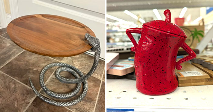
I have a cat one of these, the ears are more rounded, not pointed. I drink from it without a problem.
Load More Replies...Darwin Award for attempting to use this dangerous piece of c**p as a mug.
Upvoted due to the correlation of the commenters handle.
Load More Replies...True professionals always strive to get feedback on their work. It might be awkward. It might be uncomfortable. But unless you take the time to see how your ideas and designs are viewed by the outside world, you won’t grow. After all, designs meant for the public are meant to capture attention and bring in revenue.
So, unless you’re doing things purely for the sake of artistic merit, you need to keep your finger on the pulse of consumers. Ideally, you should find a balance between function and form, as well as what consumers want and what your vision as a professional is.
I just let my eyes wander and it doesn't appear solvable by any other route. If we start at the exit (bottom right) and work back, we'll end up at a dead end on the upper left. Going the other way around, a dead end just above the entry.
Probably made by AI. EDIT: Why can't we have a serif font?
You can go all the way thru but it doesn't say end. Nor does it say start for that matter.
The same type of person who thought it would be a good idea to take a photo of someone else using it and post it on the internet
They could easily put a poster or something at the appropriate height, possibly leaving a gap at top or something.
It is more realistic now, though. Spiders don't produce webs from their hands :P
Load More Replies...Test out a few designs with a focus group or two. Or, if you don’t have anything as fancy as that, run your visuals or sketches by your family and friends. Ask for some honest feedback and promise that you won’t get upset. Then, when you’ve got a bunch of feedback, sit down and evaluate what’s genuinely useful and what’s not.
Not every critic will be able to articulate why they (don’t) like your design (they might have a gut, instinctive reaction), but when someone offers semi-constructive feedback, it’s usually best to at least think about it.
Perfect t-shirt message for Americans under our new dictatorship. Actually, the way things look, these could easily go global, now that the US is becoming an isolationist country.
What a nice bank, they provide a nice back support for their customers
It always warms my heart to see accessible designs for the elderly and disabled.
Well, at least it should slow down the idiots who attach a chain and a pickup and try to yank the ATM out of the wall...
"If you see someone drowning, laugh in their face" according to this sign
I never knew that laughing out loud was the way to respond to a drowning emergency. Now, does this method work in other emergencies, say like a house on fire or a horrific highway accident?
Whether or not you end up implementing those changes will depend on your goals, timelines, and design philosophy as a whole.
Meanwhile, some comments are going to be negative no matter what. It’s impossible for everyone to love your designs. When you get hate for what you do, it’s healthiest to ignore it when there’s no genuine criticism there to help you improve.
Ok, let's see 1 + 2 + 3 = 6 + 3 = 9, then repeat steps 3X. No, that's stupid. 3 X 3 = 9, then repeat 3X. That's it. Much quicker.
Which of these design fails did you love to hate the most, dear Pandas? On the flip side, were there any designs in this list that you genuinely liked?
What is the very worst logo or product design that you’ve seen recently with your own eyes? We’d love to hear from you! If you’d like to share your thoughts, you can do so in the comments below.
The complete guide to go whore. Well you do have to find out from somewhere.
Velvet Jackson, "I wanna be a Ho" (Eddie Murphy SNL skit)
Load More Replies..."I want to whore, but just can't seem to figure out how to do so. If only there were a magazine I could subscribe to!"
Remindes me of the website whorepresents.com for finding the name of a celeb's agent.
took me a while to figure out its: —————— who represents.com
Load More Replies...Ooooh, it's the cover title... Sorry, I was distracted trying to figure out the weird-looking left arm placement...
The e in "where" is covered, so it can be read as an "o"
Load More Replies...Man proposing to girlfriend with a tyre? Not sure how that worked out. Did he tread carefully enough?
My first thought was an earlier song by that name https://www.youtube.com/watch?v=UPGiLsdWZdo&t=18s
Load More Replies...(am American) I watch a ton of UK shows & always wondered - is high street the equivalent to the USA’s main street?
Load More Replies...The least the bank could do is provide a step stool. Customer service is really going downhill.
Kareem Abdul-Jabbar: what are these non-tall people doing? This is a very normal ATM
They were going to use this in that TNG episode, but Picard yelling "There are SIX bananas" just didn't have the same gravitas as lights...
I roll my eyes when people try to listen to audio coming out of a book.
Load More Replies...If sham means fake and poo means poop, why do we put it in our hair?
I focused on scalp, re, sham trying to figure this... oh, freshing poo. I'll pass.
All jokes about this poorly worded sign aside, what are able-bodied adults suppose to do? Pee in the shoe department like a misbehaved pet?
AAAAAAAAAAAAAAAAAAAAAHHHHHHHHHHHHHHHHHHHHUUUUUUUUUUUUUUUUUUUUGGGGGGGGGGGGGGGGGGGGGGGGGGGGGHHHHHHHHHHHHHHHHHHHHHHHHHHHHHH
Yeah, try explaining that to Quiverfull (Christian Patriarchy movement).
Dont know if this is is worse than birthday date picker calendars that makenyou tap back month ny month for 40 years, they both make me mad lol
You can usually click on the year to get to the correct one. You don't have to scroll month by month.
Load More Replies...Just went through this aggravation on a site, finally got to the end, and the submit button didn't submit. Up yours!
IDK about the National Geographic but the New Scientist comes in a biodegradable bag. ;)
Looks like the same stuff we use for our club magazine - it is made from potato and maize starch.
Load More Replies...Visualizing irony. Nat Geo has declined so much over the years, nothing at all like it was back in the 60/70's. This sums up their decline perfectly.
You can request your magazines not be shipped in plastic. Also, your subscription date is on the label and you can even request the magazine company to not send reminders until just before your subscription expires. Poor senior citizens always order more and more thinking they are about to expire. So criminal.
This is an example of how bored graphic designers find joy in the little things in life! This is after when they first started they tried to explain it would be better to rotate the words and have the sentence start from the eraser end... and being told absolutely not! I am paying for it and want it THIS WAY! We learn to let the customer BE RIGHT when they insist...
Okay, which is better? American toilets with gaps around the door or Russian toilets with mirrors on the ceiling?
If it says there's a straf, how are they going to know who to strafen?
This is food poisoning personified. It begins with gas and lots of belching (the columns), followed by projectile vomiting and diarrhea (the ridiculously large overhang), then turns into an entire night of delirium and writhing on the cold tile floor in the bathroom (the rest of this hideous mess).
My mom had to have dental work done once and the sedative was so strong this is what she looked like for hours after. This was many many years ago, but we kids laughed and laughed because then she would laugh but only half her face would laugh. It was hilarious!
What I think I look like after several Novocain shots at the dentist's.
Yep. But the more embarrassing thing is them failing to remove the 'Shutterstock' marking.
Load More Replies...Seriously guys, this isn't that mind-boggling artistic. You could've come up with something. Heck, is there a 4yo with crayons in the neighborhood? Ask the kid for a design that doesn't include Shutterstock.
It's not a design fail though, it's a cheapo fail. They didn't pay the artist for the image and got what was coming to them.
There is a street in Hamburg (Neuer Wall, I think maybe Große Bleichen, too) that have double arches along the road in Christmas lights every year. We all call it Booby Street.
I saw a bridge decorated like that, it looked like a washing line with half a dozen pairs
This is a Christmas decoration. I think the town near my home has something similar. I have to say one by itself looks weird however when you have an entire row of these they do look pretty.
Load More Replies...That seems to be the point. See how at the edge of the frame there is an apple. It's probably a worksheet to teach kids to make healthy choices
Load More Replies...Let me guess, it was a New Yorkian company doing that - The continent of New York is crazy like that, wouldn't have happened in countries like Africa or Paris though
I"d be pretty pissed if I paid someone for this world map and this is the result
Apart from everything else that’s wrong with this, the scale is wildly disproportionate.
So close. Maybe reading a book in between weight-lifting is in order.
This came from a law school... must be run by maga...
Load More Replies...What in the heck are they trying to say? No matter what order I put the words in, it makes no sense.
My eyes are whirling trying to read this. I surrender to whatever cult this is.
Surely you mean most secure ladder anyone could build? LOL!
Load More Replies...This looks like the entry to an apartment hotel I stayed in in Tel Aviv once.
Well, the toilet and urinal on the right would be the most akward. Not a fan of any of it, though.
Those are for when you have vomiting and diarrhoea at the same time.
Load More Replies...Too bad bananas don't come in some sort of skin or peel that would protect it from the external environment. Such a shame we have to use plastic.
I still see people pack their bananas in a plastic bag and I`m like ...bruh
Load More Replies...This is only for people who like black bananas (yummm). The plastic bag is trapping the ethylene gas that promotes natural ripening produced by the bananas. Only the stems should be wrapped in plastic to slow ripening.
That doesn't sound like a statement from Ming the Merciless.
Nah it was the guy who made the pots. Nice pronouns btw.
Load More Replies...When you have to fix letters to a wall, but your only tool is a giant shotgun...
It took me a long time to decipher but in someone's brain that reads " Life liberty and the pursuit of happiness"
This is exactly what it will be like for us as life, liberty, and happiness are drained from our society by an orange solipsist and an unelected sociopath.
Nice to see that you got the reason why it's in this list. Good job!
Load More Replies...Not "just" gulls, but any of 54 distinct species all bearing the name "gull". But yeah, another QI factoid, thx.
Load More Replies...You just know someone will try to climb around this after a few beers.
Why do assume that's in America? Where does it say that?
Load More Replies...I really REALLY hate all the extremely basic "toes in the sand" decals people put on their Jeeps. It's always the same people.


 No fees, cancel anytime


")
")


")
")


