Get Premium
Dark mode theme is available exclusively for premium users. Learn more about the benefits of subscribing.
No fees, cancel anytime.

 Dark Mode Ad-Free Browsing Unlimited Content
 Ad-Free Browsing Unlimited Content Dark Mode
Join 1.2 million Panda readers who get the best art, memes, and fun stories every week!
When you’re neck-deep in your work, you can get so focused on a few details that you no longer see the forest for the trees. Before you know it, you’ve made some major mistakes that are glaringly obvious to practically any bystander. That’s true for any profession, including folks working in graphic and product design.
Created by David Delahunty (@delahuntagram), the ‘Design Fails’ (@designfailures) Instagram account has been amusing social media users for over a decade. The account does exactly what it says on the tin: it focuses on facepalm-worthy design fails that are as confusing as they are amusing. We’re featuring some of the most epic ones to brighten your day. Scroll down to check them out. Oh, and if you’re a designer, keep in mind that these pics might make you cringe extremely hard!
More info: Instagram | DavidDelahunty.com
This post may include affiliate links.
Delahunty created the ‘Design Fails’ account in July 2013. Over the past 11+ years, he’s amassed 31.2k followers on Instagram. The idea behind the account is very straightforward: “When design fails, we share it.”
Bored Panda has reached out to the curator via email to learn more about his project and what good design should look like, and we’ll update the article as soon as we hear back from him.
Not only are the photos that Delahunty shares useful for any current and future designers as examples of what not to do, they’re all also wildly enjoyable to look at. There’s a certain element of schadenfreude involved here, too. Like it or not, human beings get a bit of pleasure from another person’s misfortune. And many of us like to think we’d never make the same design mistakes that other professionals have… even though we probably inevitably would find another way to fail.
This would be a nightmare in a middle or elementary school classroom 🤣
Aesthetics play a key role in consumer behavior because our brains are wired to respond to beauty. Something that is visually appealing is pleasant to look at, essentially. So, good design makes you feel that the product or service is reliable and has a group of competent people behind it. Meanwhile, the way something is designed can resonate (or not) with consumers’ sense of style and individuality.
On the other hand, visually messy designs—like logos that are hard to read—project unreliability, a lack of quality, and speak volumes about the lack of editing. In other words, bad design is a sign of untrustworthiness.
No matter how skilled, perceptive, and talented you think you are, nobody is immune to making mistakes. Everyone messes up from time to time. Nobody’s ‘flawless’ or ‘perfect.’
It’s how you react to the mistakes you make that says a lot about your character. Someone who has a growth-oriented mindset sees failure as an opportunity for growth instead of something that should continue to haunt them for years.
Messing up a design in a very embarrassing and public manner doesn’t have to be a fail. For one, you make a mental note of all the ways you’ll do things better the next time around. But on top of that, this is actually a good opportunity to connect with your audience, clients, and coworkers.
As we’ve covered earlier, displaying signs of mild embarrassment can be socially constructive because everyone is likely to be more sympathetic.
I have worked at a sign shop as the graphic designer... I have seen this pic on the web multiple times. It is a fake (the huge space between "do" & "it") OR the person ordering it thought they knew more than the designer and asked/forced for this layout... and has gotten sh!p for it ever since.
When you embrace your embarrassment (for instance, when the design you’ve worked so hard on gets called out for being ridiculously bad—oops!) instead of shying away from it, you show your human side and vulnerability, which is super relatable.
On the flip side, if you pretend that you haven’t messed up, your social capital can crash. Furthermore, that sense of embarrassment can continue to haunt you, eventually morphing into deep-seated shame. And that’s just plain unhealthy physically, emotionally, and mentally. Laugh it off if you can. And if you can’t find the humor, at least be honest about having made a mistake.
True professionals always strive to get feedback on their work. It might be awkward. It might be uncomfortable. But unless you take the time to see how your ideas and designs are viewed by the outside world, you won’t grow. After all, designs meant for the public are meant to capture attention and bring in revenue.
So, unless you’re doing things purely for the sake of artistic merit, you need to keep your finger on the pulse of consumers. Ideally, you should find a balance between function and form, as well as what consumers want and what your vision as a professional is.
I just let my eyes wander and it doesn't appear solvable by any other route. If we start at the exit (bottom right) and work back, we'll end up at a dead end on the upper left. Going the other way around, a dead end just above the entry.
Test out a few designs with a focus group or two. Or, if you don’t have anything as fancy as that, run your visuals or sketches by your family and friends. Ask for some honest feedback and promise that you won’t get upset. Then, when you’ve got a bunch of feedback, sit down and evaluate what’s genuinely useful and what’s not.
Not every critic will be able to articulate why they (don’t) like your design (they might have a gut, instinctive reaction), but when someone offers semi-constructive feedback, it’s usually best to at least think about it.
What a nice bank, they provide a nice back support for their customers
Whether or not you end up implementing those changes will depend on your goals, timelines, and design philosophy as a whole.
Meanwhile, some comments are going to be negative no matter what. It’s impossible for everyone to love your designs. When you get hate for what you do, it’s healthiest to ignore it when there’s no genuine criticism there to help you improve.
Which of these design fails did you love to hate the most, dear Pandas? On the flip side, were there any designs in this list that you genuinely liked?
What is the very worst logo or product design that you’ve seen recently with your own eyes? We’d love to hear from you! If you’d like to share your thoughts, you can do so in the comments below.
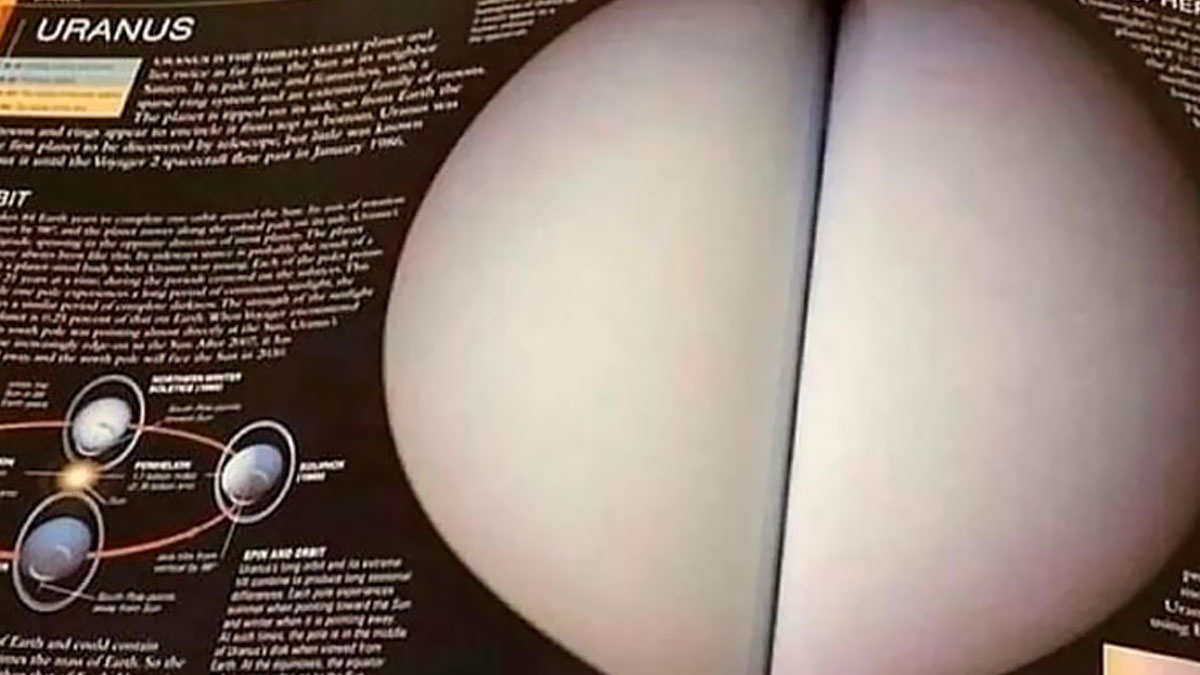
They were going to use this in that TNG episode, but Picard yelling "There are SIX bananas" just didn't have the same gravitas as lights...
Unlimited content Ad-free browsing Dark mode 


 No fees, cancel anytime


")
")


")
")


