ADVERTISEMENT

From two gay lions on Noah’s Ark to a bottle of boy syrup, these hilarious fails show that designers are always just a tiny step away from screwing up. These pics were collected from a subreddit called Crappy Design, which features some of the funniest examples of their work that prove the importance of every punctuation mark and other little details.

These designers don't necessarily have bad intentions (except the one who decided to install mirror ceilings in the bathroom). Still, their creations turned out to be better at amusing people rather than carrying out the tasks they were supposed to.

So, ready for some laughs? Here’s a collection of the funniest design fails, the kind of hilarious mix-ups that’ll have you laughing out loud and wondering, “What were the designers thinking?”

#1

Being Gay Was A Sin They Said

Illustration of animals boarding an ark with two lions humorously merged, highlighting a funny design fail.

TKZoroSantoryu Report

RELATED:
    #2

    This Amazing Pregnancy Test

    Pregnant woman and partner surprised by pregnancy test result, humorous design fail with Predictor branding.

    Explodinator580 Report

    #3

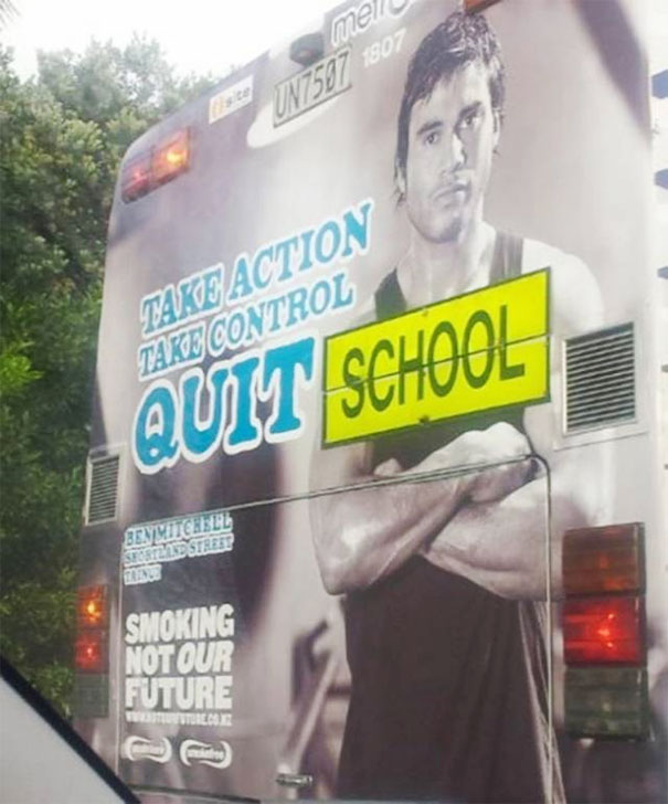
    A Graphic Design Fail? This Bus

    Bus ad design fail with confusing message: "Quit School" over a motivational backdrop.

    reddit Report

    What is Bad Design in Graphic Design?

    Let’s break it down. Bad design happens when it doesn't do what it’s supposed to—communicate effectively. 

    Like a website crammed with elements (excessive colors, a jumble of fonts, images everywhere, and text packed like sardines), clutter makes it tough for the viewer to focus on anything. Instead, good design gives each element space to breathe and be noticed.

    Inconsistency is another no-no. Mixing styles, fonts, and colors randomly can be jarring. Good design sticks to a theme, so users don't feel like they’re in a funhouse mirror maze​​—and that’s why many companies embrace style guidelines.

    Typography shouldn’t be overlooked, either. Ever seen a menu where it’s hard to tell the starters from the desserts? That’s bad typography. Good typography knows what to emphasize, what to whisper, and what to shout, making the journey through the content enjoyable​​ and effective.

    ADVERTISEMENT

    Last but not least, bad design fails to consider different cultural perceptions. Understanding the target audience and their cultural context is key to great design​.

    #4

    How Much Do You Trust Your "Multilingual" Ad Designer?

    Shop sign design fail with "Could Not Connect to Translator Service" instead of store name, featuring scissors graphic.

    badon_ Report

    #7

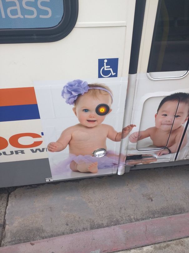
    We Are The Borg. Resistance Is Futile

    Baby design fail on bus ad alignment; traffic light covers one eye, creating accidental pirate look.

    Oceanus5000 Report

    ADVERTISEMENT
    #9

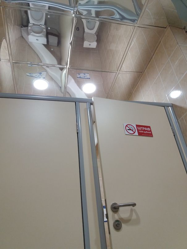
    And The Award For The Worst Design Fail Goes To… Toilets And Mirror Ceiling

    Ceiling mirrors reflect bathroom stalls, illustrating a funny design fail.

    zorton213 Report

    Add photo comments
    POST
    John L
    Community Member
    7 years ago DotsCreated by potrace 1.15, written by Peter Selinger 2001-2017

    Big Brother is Watching,...as well as uncle, neighbor, stranger,....................

    View More Replies...
    View more commentsArrow down menu
    #10

    This Flower Print Dress

    Woman wearing a dress with an unfortunate print resembling a stain, illustrating a funny design fail on a busy street.

    666 Report

    Add photo comments
    POST
    Nacho
    Community Member
    7 years ago DotsCreated by potrace 1.15, written by Peter Selinger 2001-2017

    This is too far BoredPanda. There should be no joking about menstruation ... PERIOD!

    View More Replies...
    View more commentsArrow down menu
    ADVERTISEMENT
    #12

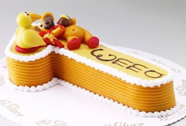
    Okay. I Know This Cake Is A Number 1 And It Says “emma," But It Looks Like A Dick With Balls That Says “weed"

    Cake design fail with a yellow fondant shape and toy figures placed awkwardly on top.

    lama579 Report

    Add photo comments
    POST
    Amanda Codlin
    Community Member
    7 years ago DotsCreated by potrace 1.15, written by Peter Selinger 2001-2017

    This reminds me of the f.r.i.e.n.d.s episode when pretty much the same thing happened lol.

    View More Replies...
    View more commentsArrow down menu
    #14

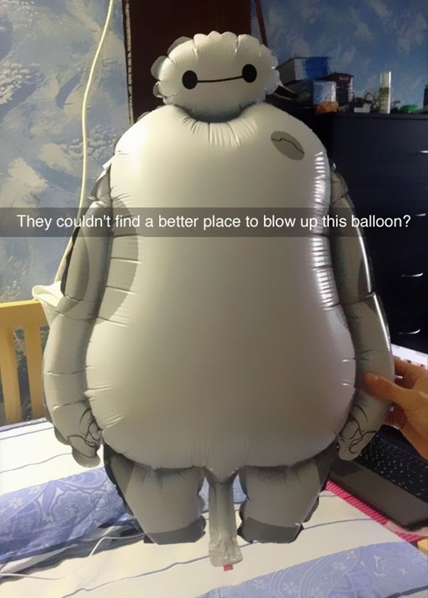
    Wanna See A Design Failure? This Kid’s Balloon

    Inflated balloon character with awkward design fail placement.

    ViolentThespian Report

    #15

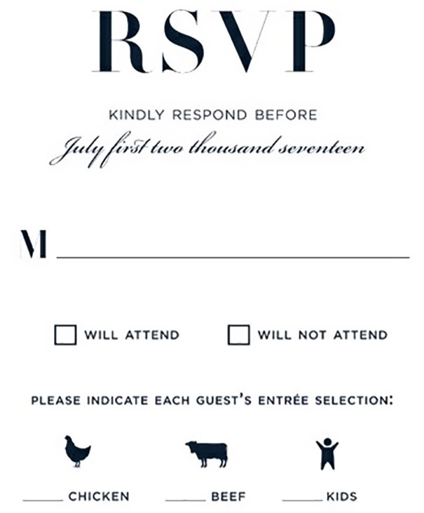
    Our Wedding Is Going To Have Three Delicious Meal Choices

    RSVP card design fail with meal options of chicken, beef, and kids as entrees.

    Siggy778 Report

    #16

    My Arms Are About 7 Feet Long, So This Crappy Design Wasn’t An Issue For Me

    Bathroom design fail with toilet paper dispenser awkwardly placed out of reach from the toilet.

    Tekki Report

    #17

    I Asked My Landlord To Install A Lock On My Door

    Person demonstrating a poorly designed door lock, showcasing a humorous design fail.

    Sil_Shelverstien Report

    ADVERTISEMENT
    #19

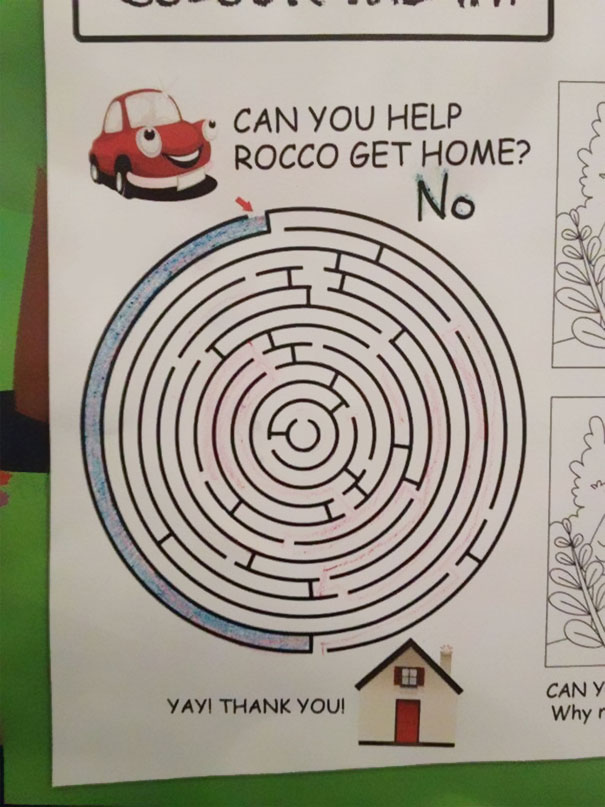
    Funniest Design Fail? This Maze Game

    Maze design fail with dead end, cartoon car, and sarcastic note saying "No" instead of helping Rocco get home.

    peggiep9pm Report

    Add photo comments
    POST
    Lara B.
    Community Member
    7 years ago DotsCreated by potrace 1.15, written by Peter Selinger 2001-2017

    Teaching children at a young age that there's not always a solution 🙈 Very encouraging ☝🏻

    View More Replies...
    View more commentsArrow down menu
    #21

    It's Better Because It Is All Automated

    Automatic door stuck in continuous loop, showcasing funniest design fails.

    voteforlee Report

    Add photo comments
    POST
    Michel M. Prins
    Community Member
    7 years ago DotsCreated by potrace 1.15, written by Peter Selinger 2001-2017

    I hope the employee near it gets is being paid extra for this. The (probable) sound has to make them insane after a while

    View More Replies...
    View more commentsArrow down menu
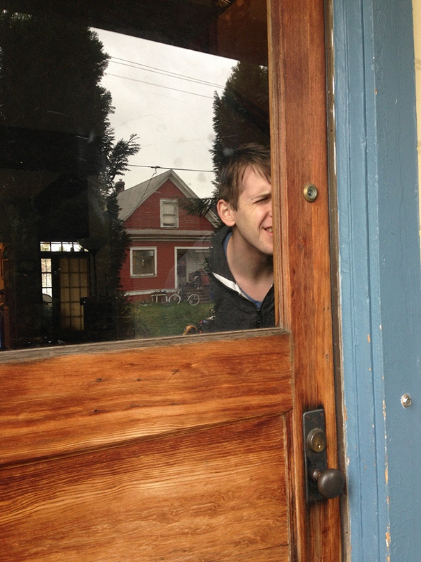
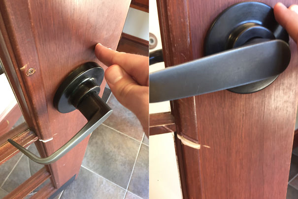
    #22

    If Only There Was An Easier Way To See Who Was Outside Your Front Door..

    Person stuck behind a misaligned wood door, showcasing a funny design fail.

    The_Magi_Carpy Report

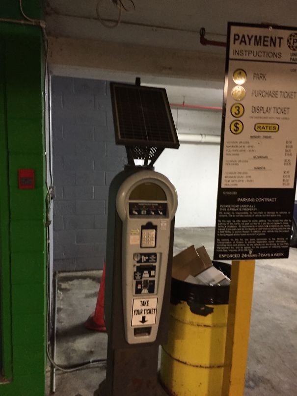
    #23

    A Solar Powered Parking Meter In An Underground Garage

    Parking payment machine with solar panel, awkwardly placed next to a yellow trash can, showcasing a design fail.

    Kadnify Report

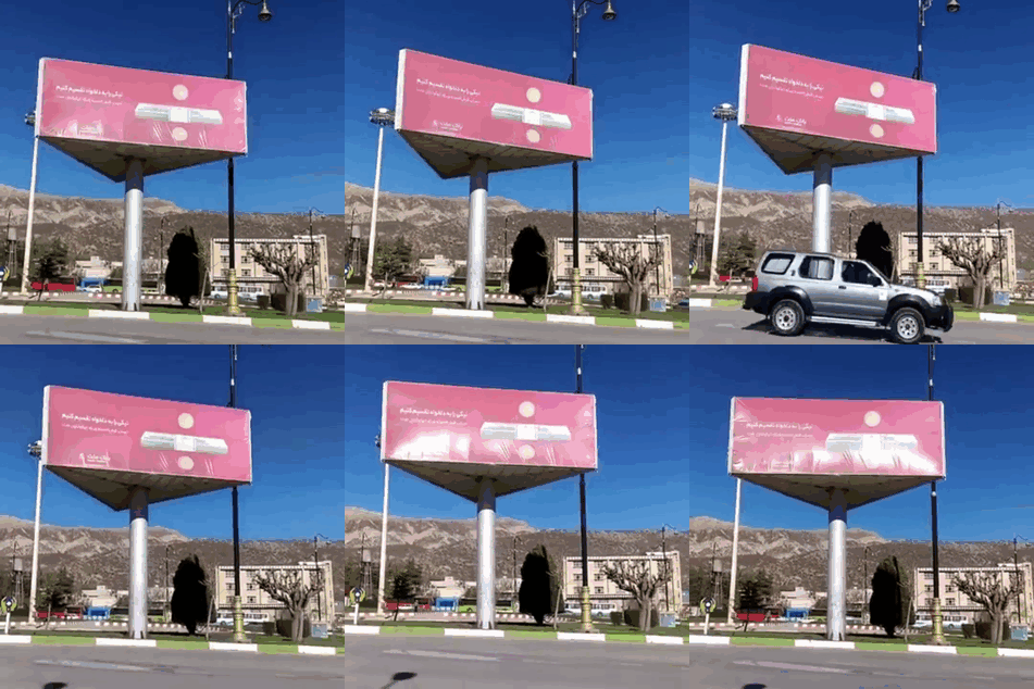
    #24

    "How About We Make That Billboard Rotate?"

    Billboard with design fail, showing upside-down message against clear blue sky background.

    throatfrog Report

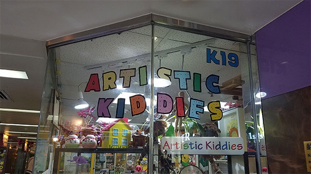
    #25

    Artistic Kid Dies

    Storefront with "Artistic Kiddies" sign featuring a humorous design fail due to spacing.

    Rosrit Report

    ADVERTISEMENT
    #27

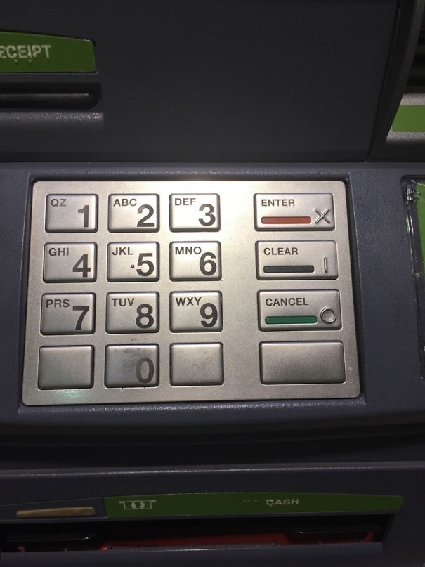
    I Cancelled My Transaction Twice In A Row By Accident. I Finally Found Out Why

    ATM keypad with design fail, displaying a non-functional Enter button marked incorrectly with an X symbol.

    KearBear Report

    #28

    I Needed Red. Guess Which One I Grabbed At First

    Two tubes with swapped colors: "Threadlocker Red" is blue, and "Threadlocker Blue" is red, showcasing a humorous design fail.

    bennythomson Report

    #29

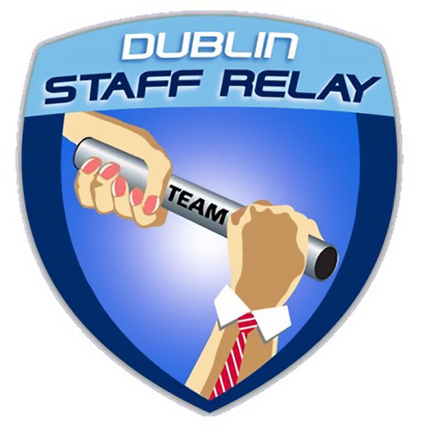
    "How Do We Make It Clear That It's A Male Hand Without Seeing The Nails?"

    Logo features a humorous design fail with mismatched gender roles in a baton handoff at Dublin Staff Relay.

    neverindoubt Report

    #30

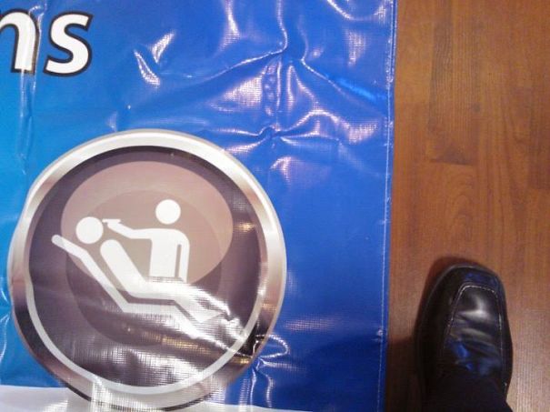
    When Your Dental Banner Features An Execution

    Hilarious design fail showing a confusing icon on a wrinkled blue banner and a shoe on a wooden floor.

    admiralnorman Report

    #31

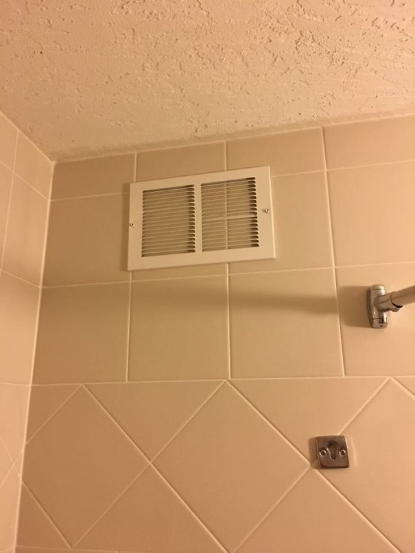
    The Vent In My Hotel Shower Doesn't Seem To Work

    Bathroom design fail with a ceiling air vent above the shower.

    eddygoombah Report

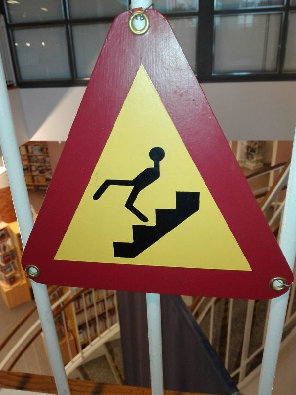
    #33

    Funny Design: This Warning Sign

    Funny design fail with a warning sign showing a person tripping over stairs, mounted in a public space.

    awesomefacepalm Report

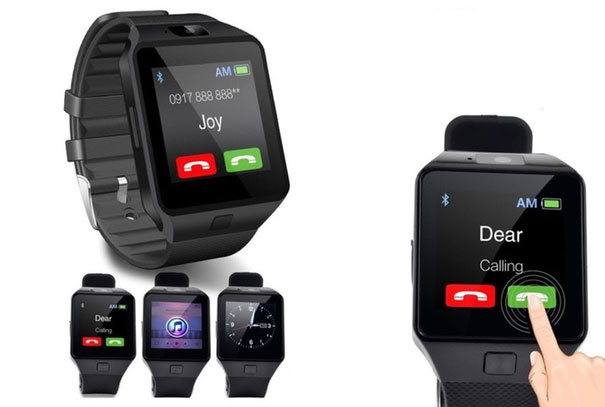
    #34

    Surely There Is No Better Way To Write Your Phone Number

    Dropdown menu design fail for entering a phone number with individual digits.

    aiden66 Report

    ADVERTISEMENT
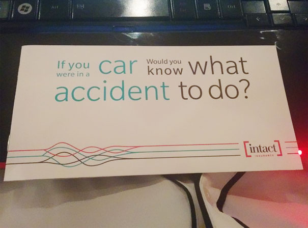
    #36

    If You Were In A Car, Would You Know What Accident To Do?

    Insurance brochure design fail with confusing accident advice slogan placed on a keyboard.

    JoJoeyJoJo Report

    #38

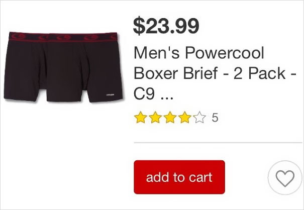
    Another Example Of Unrealistic Body Expectations For Men

    Price error on men's boxer briefs product listing, showing item marked at $23.99 with five-star review.

    deepshitgoeshere Report

    Add photo comments
    POST
    John L
    Community Member
    7 years ago DotsCreated by potrace 1.15, written by Peter Selinger 2001-2017

    If you have a middle leg that size, you have a REAL challenge. LOL!

    View More Replies...
    View more commentsArrow down menu
    #39

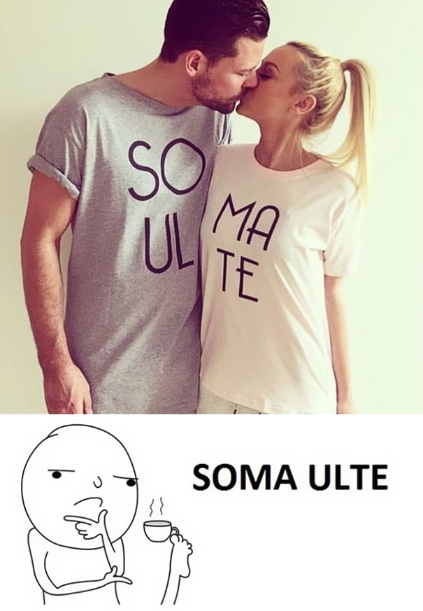
    Meme Says It All...

    Couple kissing in mismatched T-shirts with a cartoon pondering the design fail.

    TheBensonBoy Report

    #40

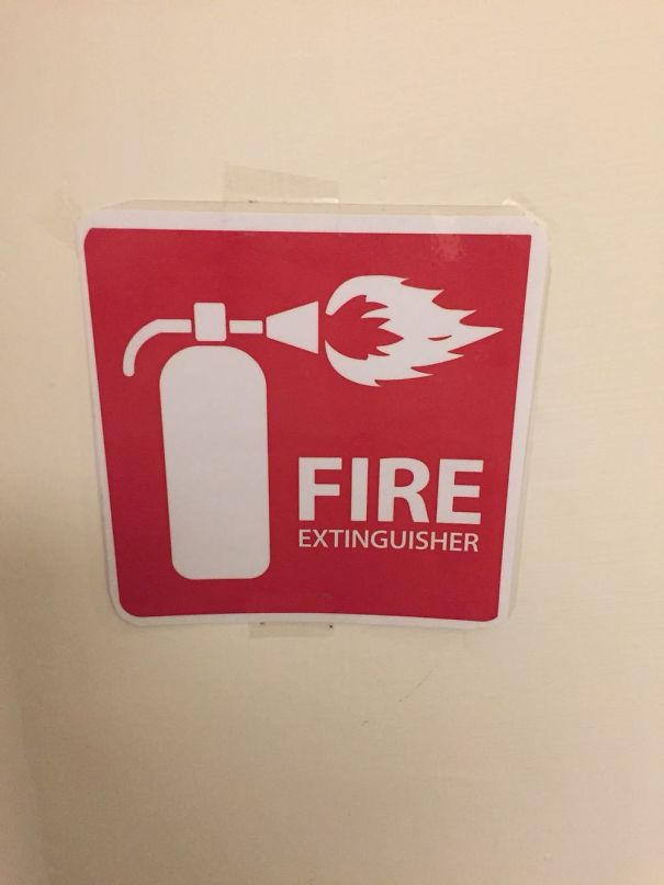
    Seems A Bit Counterintuitive

    Fire extinguisher sign with a misleading design showing flames emitting from the nozzle.

    cevanc Report

    #41

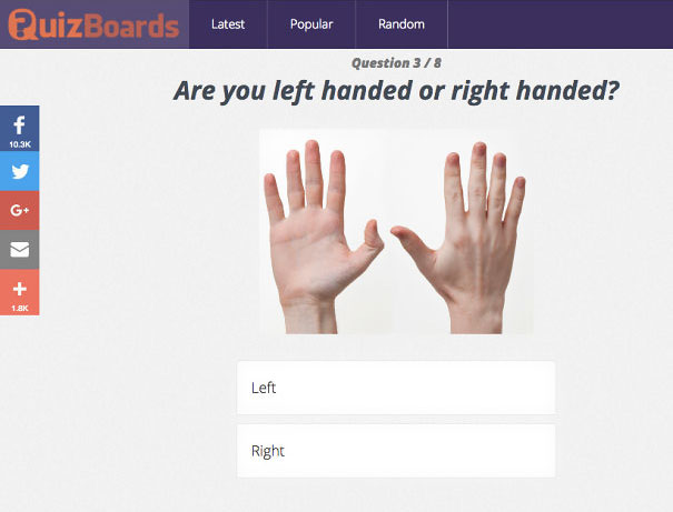
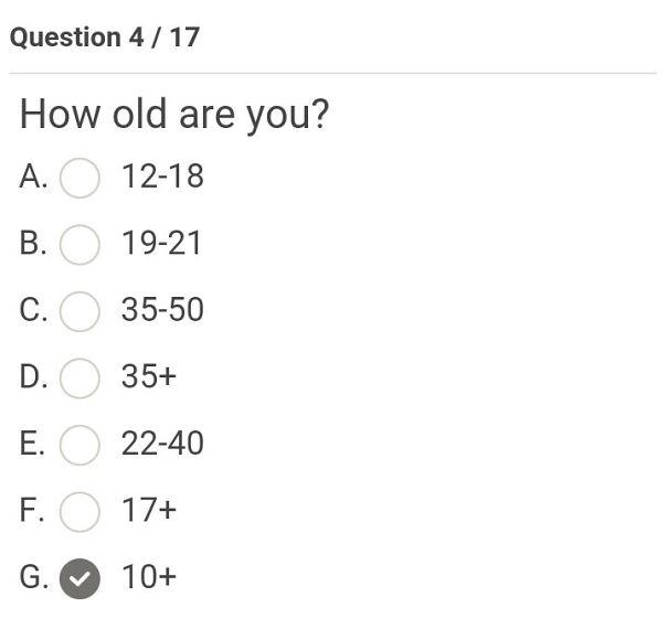
    But They Are Both Right Hands

    Quiz with a hand photo asking if you are left or right-handed, illustrating a funny design fail.

    flea123-rhcp Report

    #42

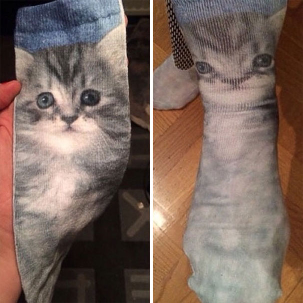
    Bad Graphic Design Examples - These Kitten Socks

    Cat face design fail on socks, distorted when worn, illustrating a funny design mistake.

    KevlarYarmulke Report

    ADVERTISEMENT
    #43

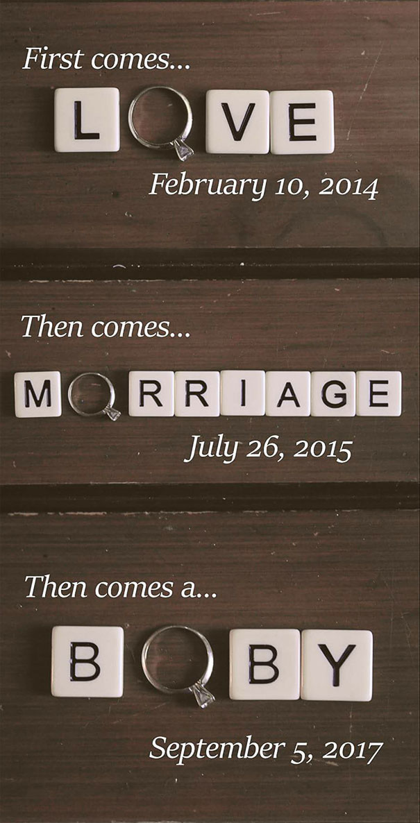
    Love, Morriage, Boby?

    Design fail with Scrabble tiles spelling "LOVE," "MARRIAGE," and "BOBY," featuring a ring and dates.

    redsox1524 Report

    Add photo comments
    POST
    Lara B.
    Community Member
    7 years ago DotsCreated by potrace 1.15, written by Peter Selinger 2001-2017

    I often daydream about my future Morriage and my beautiful Boby ☺️ Lofe's great

    View More Replies...
    View more commentsArrow down menu
    #45

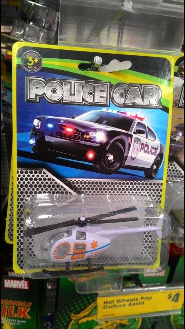
    Not A Car, Not The Police...

    Toy packaging labeled "Police Car" with a helicopter inside, illustrating a funny design fail in product presentation.

    LuffyTheAstronaut Report

    #46

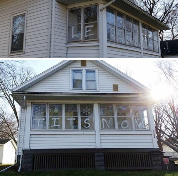
    Le Tits Now

    House with mismatched window lettering, showcasing a humorous design fail.

    Thee_Nick Report

    Add photo comments
    POST
    Michel M. Prins
    Community Member
    7 years ago DotsCreated by potrace 1.15, written by Peter Selinger 2001-2017

    ... I get the big feeling that this person knew EXACTLY what they were trying to do.

    View More Replies...
    View more commentsArrow down menu
    #49

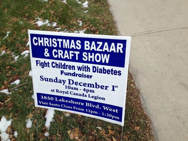
    I'm Pretty Sure The Odds Are In My Favor To Win The Fight

    Sign for Christmas Bazaar & Craft Show with a humorous design fail.

    VirtualKorean Report

    Add photo comments
    POST
    Hans
    Community Member
    7 years ago DotsCreated by potrace 1.15, written by Peter Selinger 2001-2017

    "Fight them before they fight back! Bring it on!" (Wow is that evil...)

    View More Replies...
    View more commentsArrow down menu
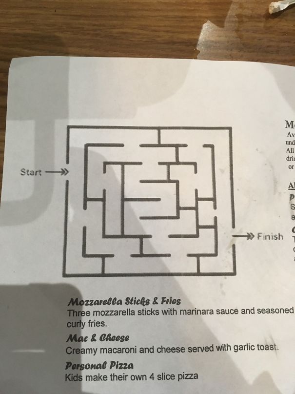
    #50

    Teaching Kids The Harsh Reality Of Life

    Restaurant menu featuring a maze design fail above the mozzarella sticks and fries section.

    MyBoener Report

    ADVERTISEMENT
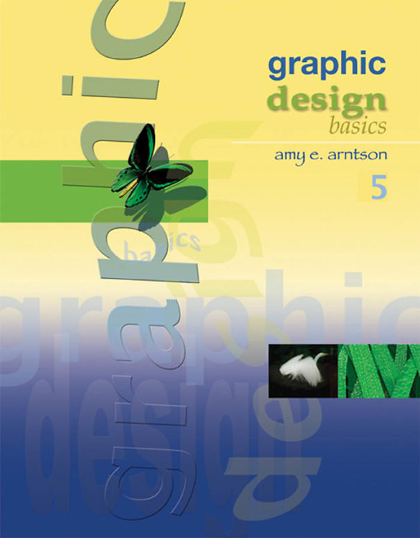
    #51

    Sometimes It's Okay To Judge A Book By Its Cover

    Colorful book cover with playful typography and a butterfly, showcasing graphic design elements.

    jaapgrolleman Report

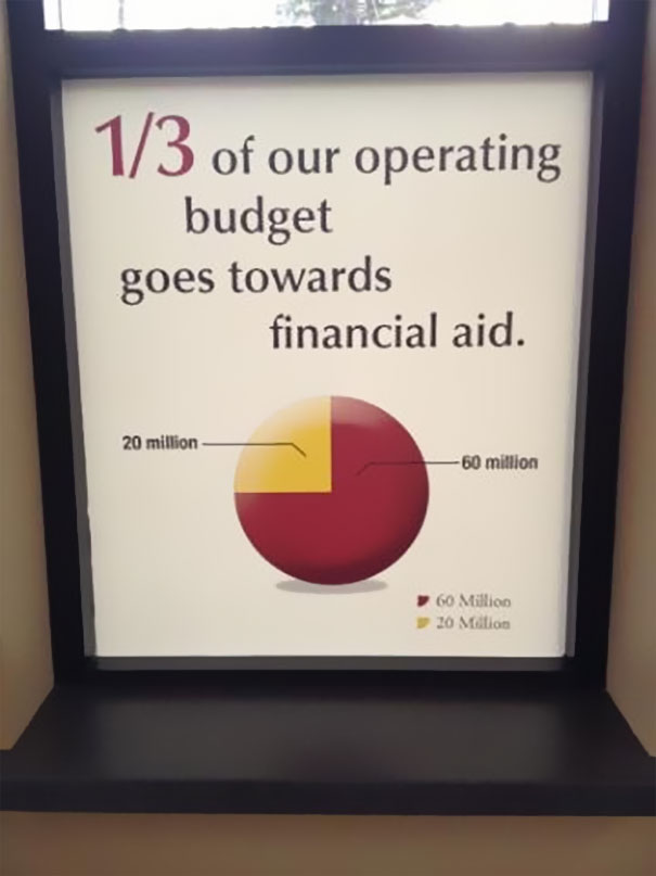
    #52

    This University Isn't Very Good With Fractions

    Pie chart showing a design fail: 1/3 of the budget labeled as 20 million instead of 60 million.

    Housson Report

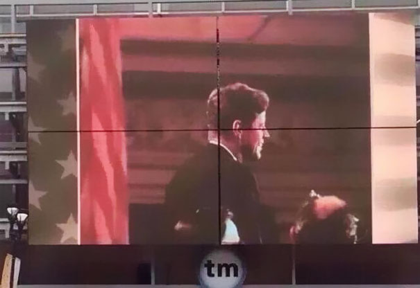
    #53

    This Jfk Memorial

    A misaligned billboard display with a split image for funniest design fails.

    -Tilde Report

    #54

    In Japan, You Have To Follow These Signs While Driving At 70 Mph

    Confusing road signs with complex arrows and directions, illustrating a funny design fail.

    tori_bird Report

    #55

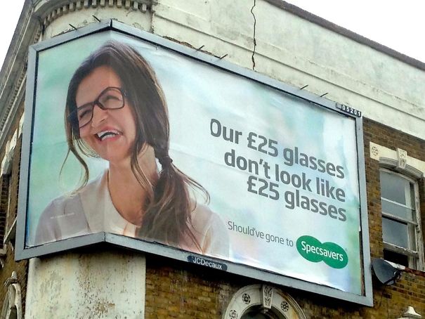
    Seriously?

    Billboard with funny design fail showing distorted glasses advertisement.

    GallowBoob Report

    Add photo comments
    POST
    Verena Heisenberg
    Community Member
    7 years ago DotsCreated by potrace 1.15, written by Peter Selinger 2001-2017

    Yeah, your glasses maybe don't look like £25, but the lady's face looks like it went through a blender or something.. :-D

    View More Replies...
    View more commentsArrow down menu
    #56

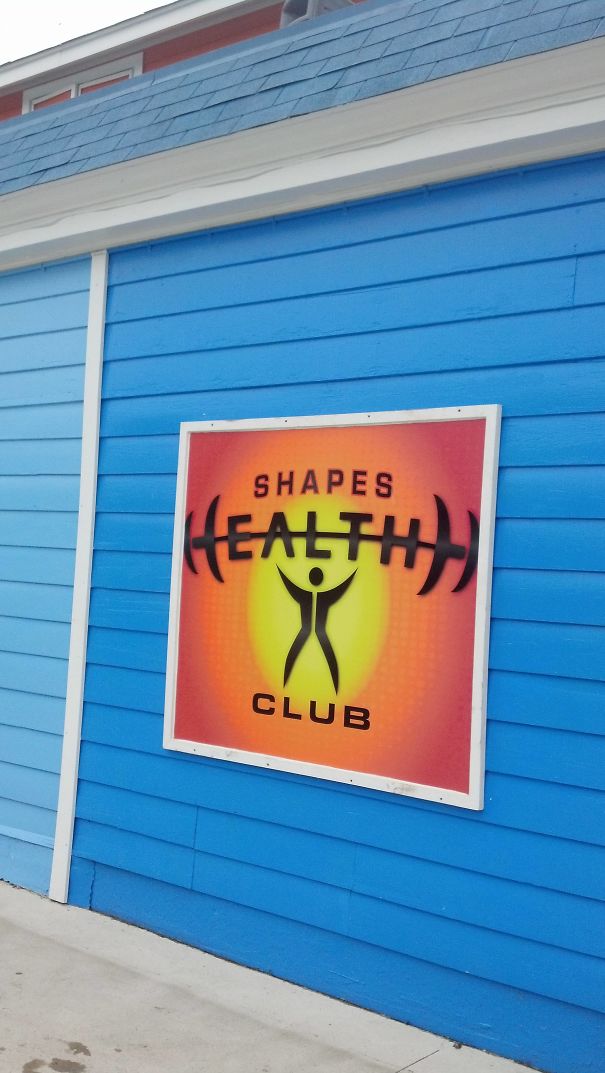
    Why The Hell Do The Weights Make Up The First H But Not The Last One?

    Sign on a blue wall reads "Shapes Health Club" with a humorous design fail.

    WoodPeckker Report

    #57

    This Music Poster Looks Like A Guy And Girl Being Hanged

    Design fail: music note connecting two figures, symbolizing "Music connecting people" concept.

    Mayafoe Report

    ADVERTISEMENT
    #59

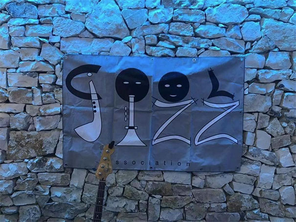
    Cool... What?!

    Jazz sign design fail on stone wall, with musical instruments forming letters.

    ledjimmypage Report

    #60

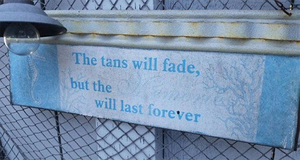
    The Tans Will Fade...

    Sign design fail with faded words, showing unreadable message on a weathered metal background.

    Roguecop Report

    #64

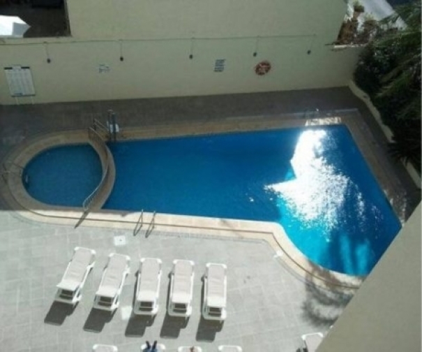
    While We're On The Topic Of Awful Pool Design...

    Swimming pool with an awkward shape, illustrating a humorous design fail.

    ericsinsideout Report

    #65

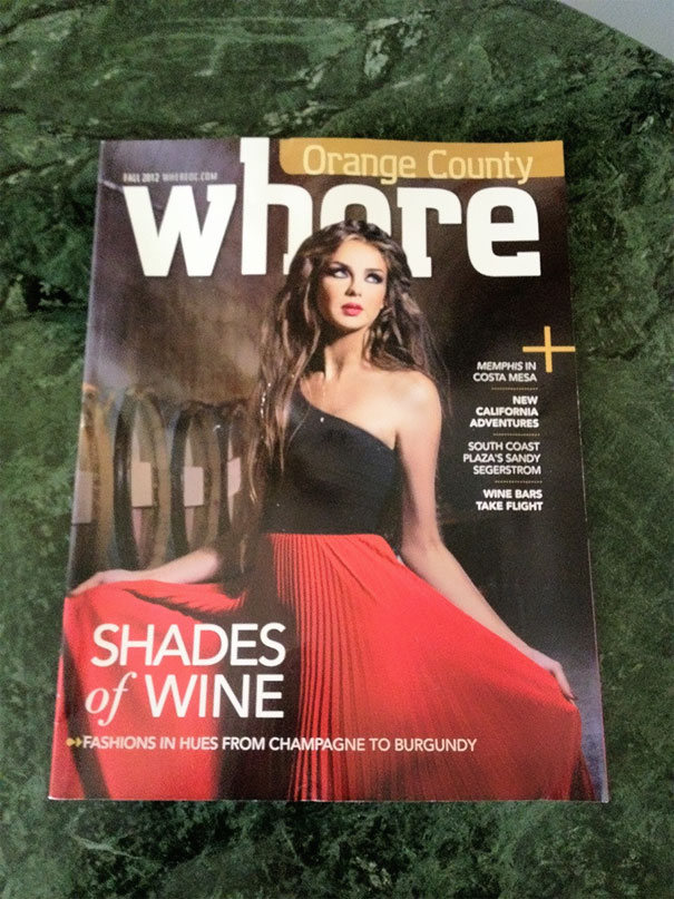
    Proof Your Layouts, People

    Magazine cover with amusing design fail, featuring a model in a red dress and bold title text saying "where".

    Estoye Report

    Add photo comments
    POST
    Intensive Panda
    Community Member
    7 years ago DotsCreated by potrace 1.15, written by Peter Selinger 2001-2017

    this might actually be on purpose. There was a magazine "SFX" about tech and video games and they placed a beautiful woman on every cover so that you might think that the magazine was calles "SEX"

    View More Replies...
    View more commentsArrow down menu
    #66

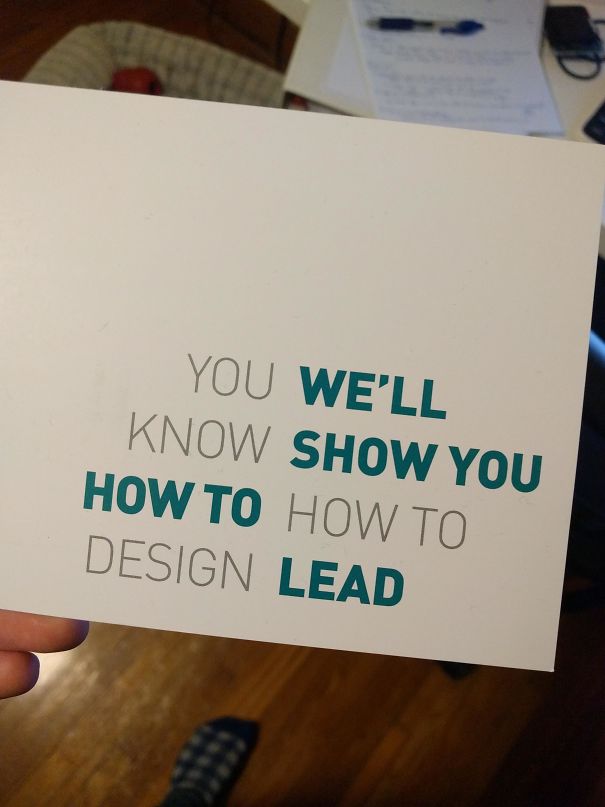
    The Design School I Graduated From Sent This Postcard Out

    Funny design fail with mixed-up text reading, "You know how to design. We'll show you how to lead" on a white card.

    edrini Report

    ADVERTISEMENT
    #68

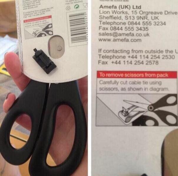
    If Only I Had Some Scissors...

    Scissors packaged with instructions requiring another pair to open, a classic design fail.

    BeardedMan32 Report

    #69

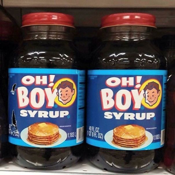
    Correct Punctuation Is A Must!

    Two jars of syrup labeled "Oh! Boy Syrup" with pancake image, illustrating a humorous design fail.

    hmm-cheese Report

    #70

    If You've Got It, Flaunt It

    Collection of oddly designed Speedo swim shorts in various colors, priced at 349 PHP, showcasing design fails.

    Momochichi Report

    #71

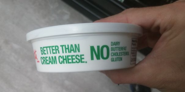
    Better Than Cream Cheese? No!

    Cream cheese container with humorous design fail text: "Better Than Cream Cheese. No Dairy Butterfat Cholesterol Gluten."

    ibegross Report

    #72

    Giant Is Seconds From Being Paralyzed

    Man diving into ocean with shorts blending into rocks, an amusing design fail.

    BIRDoS Report

    #73

    Measurement Lines On An Opaque Bottle

    Water bottle design fail showing inconsistent measurements: labeled as 1 liter, marked as 900 ml.

    sashley520 Report

    #74

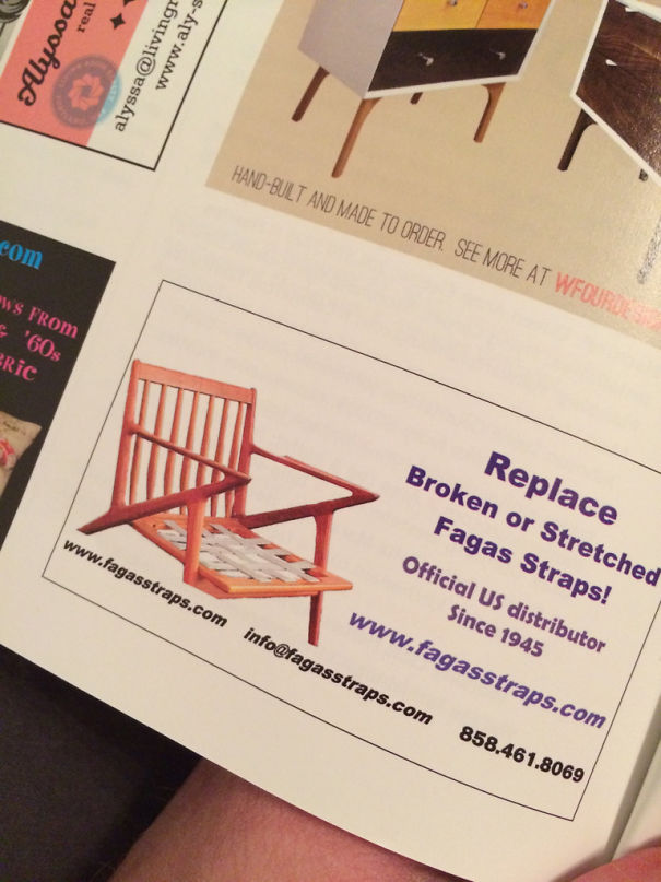
    Poor Url Choice By A Fagas Strap Company

    Ad showcasing repair service for chair straps, featuring a partially broken chair, highlighting a funny design fail.

    omicron7e Report

    ADVERTISEMENT
    #78

    50 Lanes? Lets Merge Those Into 4

    Aerial view of a massive traffic jam at a toll plaza, highlighting a funny design fail with overwhelming congestion.

    JackleBee Report

    #80

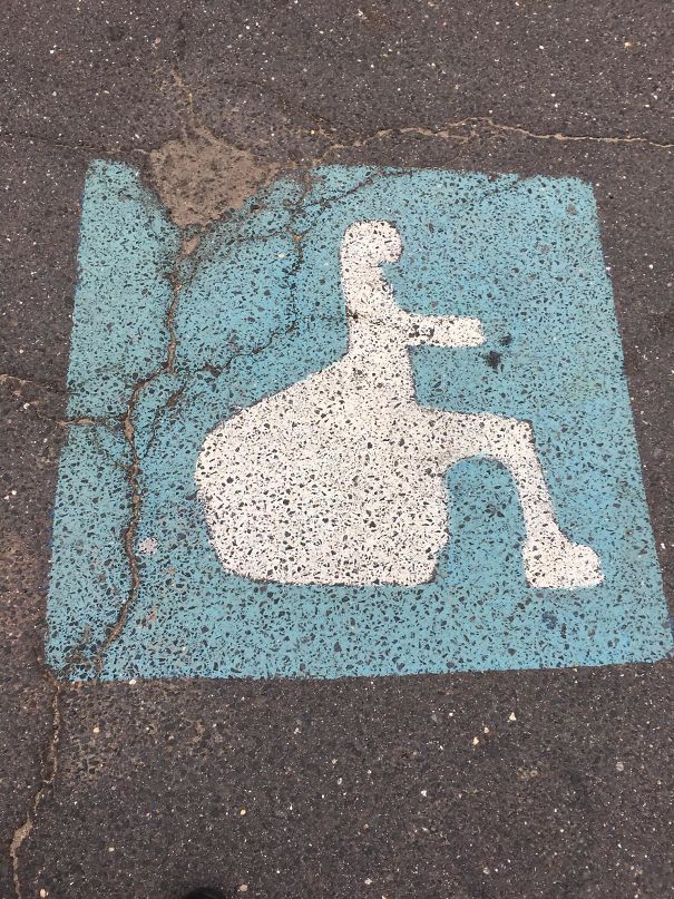
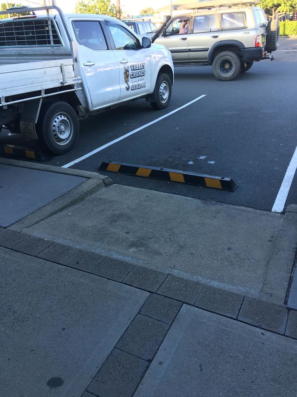
    This Handicap Parking Spot...

    Incorrect handicapped parking sign design fails with unusual shape on pavement.

    holddemaio Report

    #82

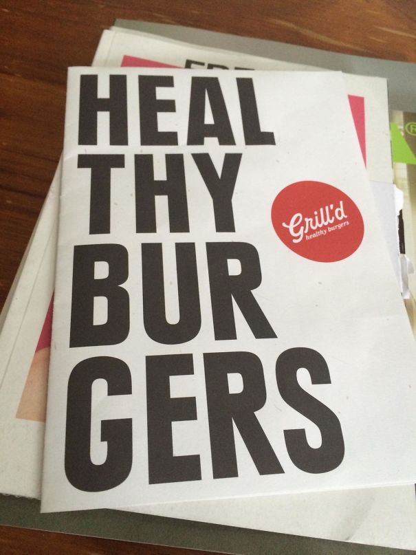
    All Ye Shall Come To Me For The Healing Of Burgers

    Brochure showing a humorous design fail with text reading "HEAL THY BUR GERS" for a burger restaurant.

    deadpoolyes Report

    ADVERTISEMENT
    See Also on Bored Panda
    #83

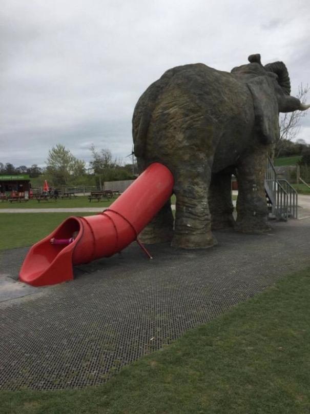
    This Awful Slide Placement

    Elephant-shaped playground slide with the exit awkwardly positioned at the rear, showcasing a design fail.

    unknown456 Report

    #84

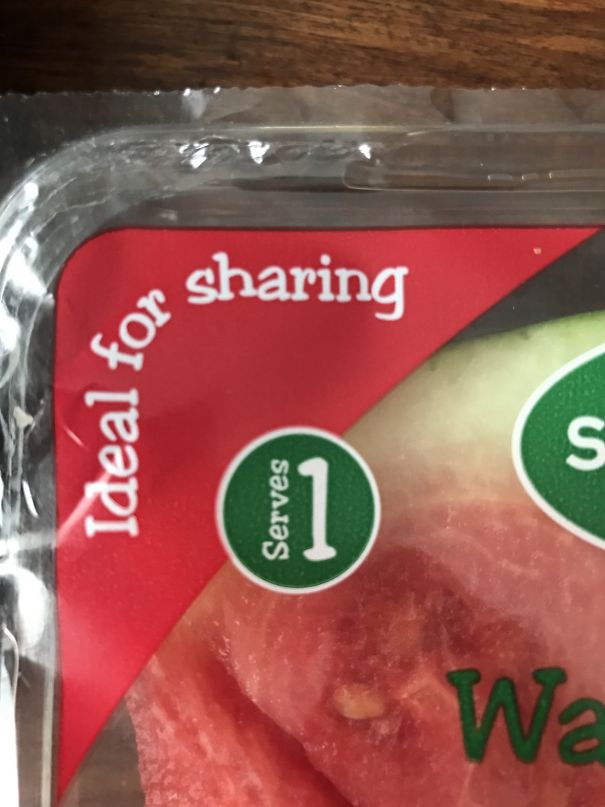
    Which Is It?!

    Packaging design fail: Watermelon labeled "Ideal for sharing" but serving size shows "1".

    Dcooper123 Report

    #87

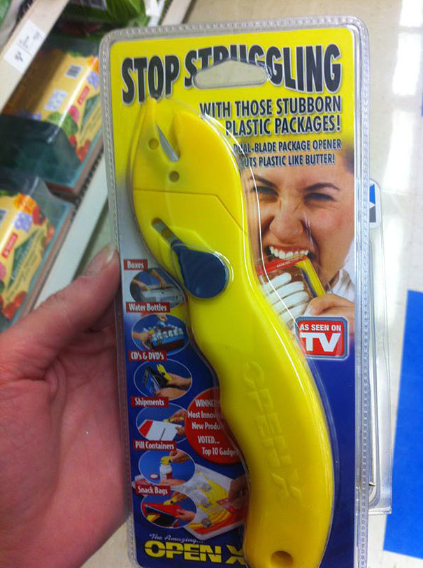
    What A Great Packaging Choice

    Yellow package opener labeled to stop struggling with plastic packages, a humorous design fail on display.

    bwaredapenguin Report

    ADVERTISEMENT
    See Also on Bored Panda
    #91

    From Afar, This Sign Has A Completely Different Meaning

    Lawn sign with a design fail: "We Support Child Abuse Prevention Month," humorous wording contradiction.

    tannerclary3 Report

    #92

    The Grill Being Sold On Amazon Is Only Supposed To Be A Foot Tall, But Can We Talk About The Gondola Silhouette?

    Group enjoying a picnic next to a tent with a barbecue, showcasing a humorous design fail of a boat on grass.

    IceCreamTacosPizza Report

    #97

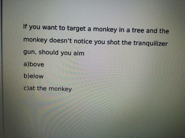
    The Three Multiple Choice Options My Physics Teacher Gave For This Example Problem

    Multiple choice question with a funny design fail about aiming at a monkey with a tranquilizer gun.

    justindi Report

    #98

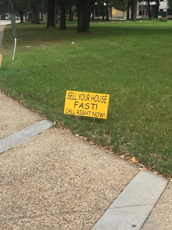
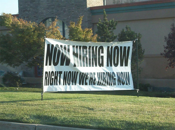
    Marketing Skills At Its Finest

    Yellow sign on grass reads, "Sell your house fast! Call right now!" showcasing a design fail on a city sidewalk.

    ArbitraryEnigma Report

    ADVERTISEMENT
    See Also on Bored Panda
    #99

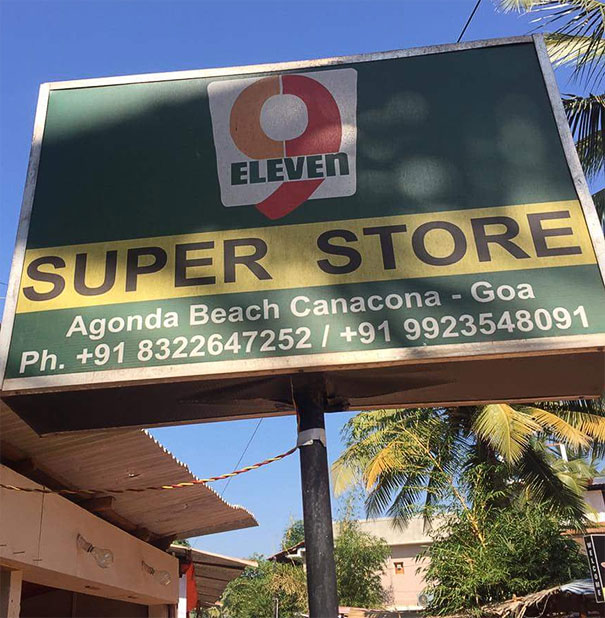
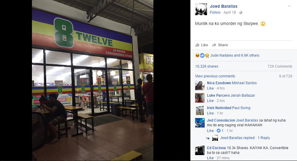
    I Want To Open A Shop In Goa That Slightly Copies A Popular Chain, What Should I Call It?

    Store sign design fail: "9 Eleven Super Store" in Goa, featuring mismatched branding elements.

    Munt_Custard Report

    Add photo comments
    POST
    Anne Madag
    Community Member
    7 years ago DotsCreated by potrace 1.15, written by Peter Selinger 2001-2017

    Oh I remember there is a 8/12 here in Philippines > https://pop.inquirer.net/2017/04/7-eleven-copycat-competitor-called-8-twelve-convenience-store/ 8-Twelve-s...da-png.jpg 8-Twelve-store-post-5912e1279d9da-png.jpg
    View More Replies...
    View more commentsArrow down menu
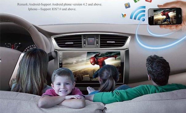
    #100

    The Scaling Is So Bad...

    Family in a car watching a movie on the dashboard screen, illustrating a funniest design fail of entertainment placement.

    Smiteside Report

    Add photo comments
    POST
    Verena Heisenberg
    Community Member
    7 years ago DotsCreated by potrace 1.15, written by Peter Selinger 2001-2017

    ahahahahahah :'D I... I just can't... I mean, why? And how? And primarily WHO?! :'-D

    View More Replies...
    View more commentsArrow down menu
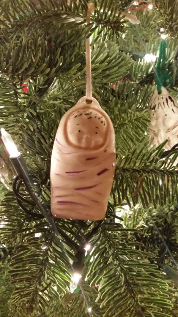
    #101

    Baby Jesus/severed Thumb Christmas Ornament

    Funny design fail: strange baby ornament hanging on a Christmas tree.

    Blenderhead36 Report

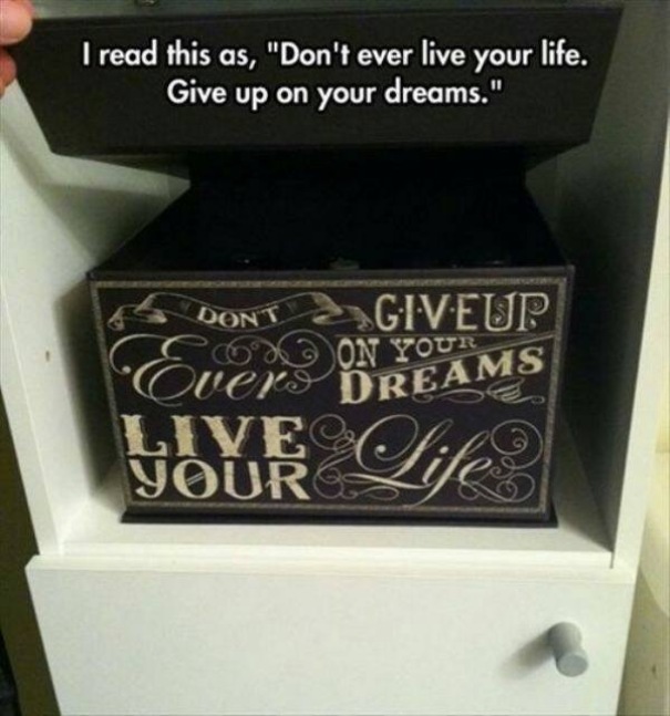
    #102

    Give Up On Your Dreams

    Decorative box with confusing design, banner text says, "Don't ever give up on your dreams. Live your life." Label reads opposite.

    Mage42384 Report

    #104

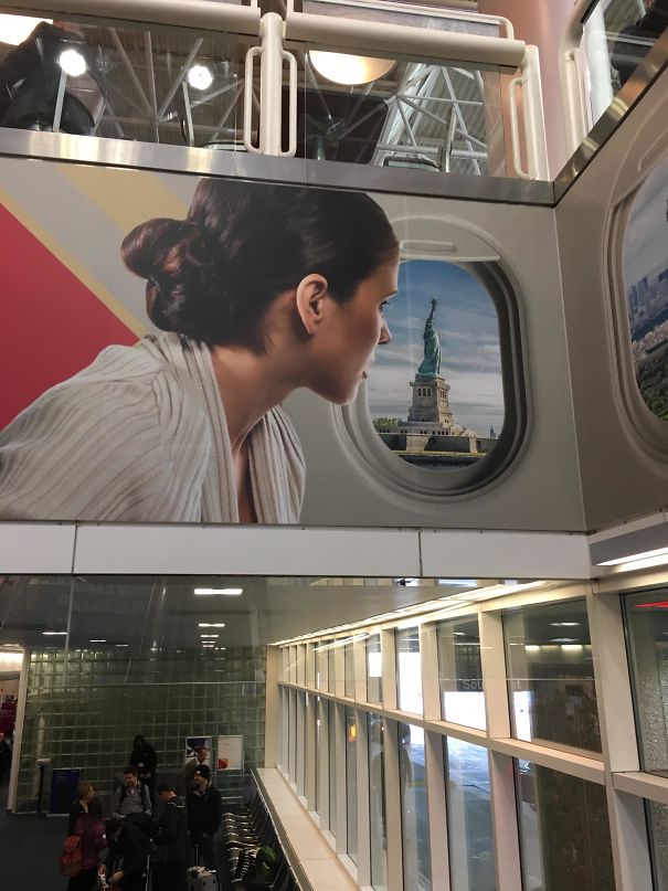
    This Woman Looking Out The Plane Is Very Calm Considering She's About To Crash Into The Hudson

    Woman on a poster appears to gaze at the Statue of Liberty through a window in a funny design fail.

    bmdelaune Report

    #105

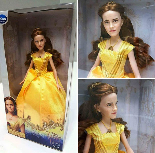
    The Official Emma Watson 'beauty And The Beast' Doll

    Belle doll from Beauty and the Beast with a humorous face design fail in a yellow dress.

    Yzre Report

    ADVERTISEMENT
    See Also on Bored Panda
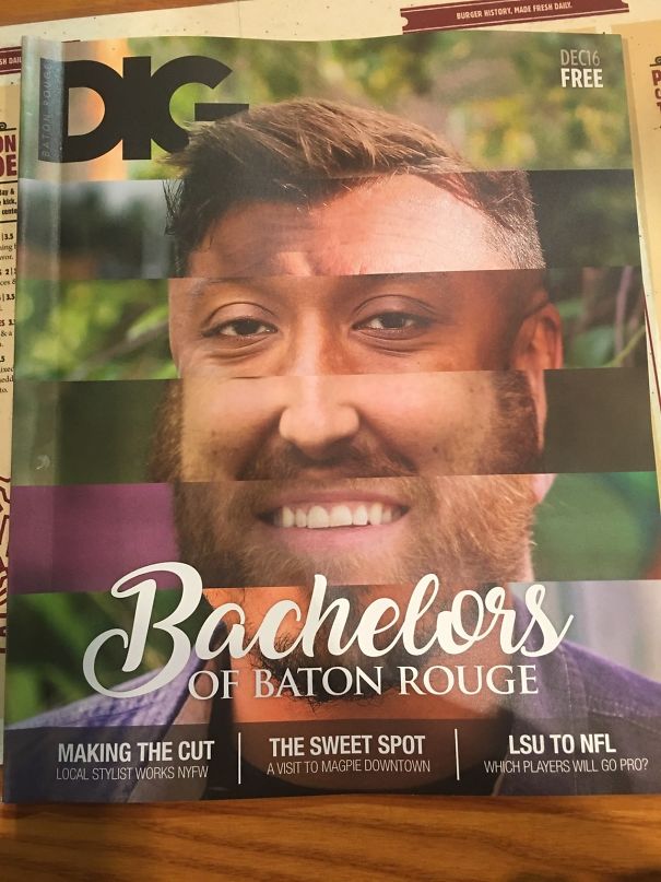
    #108

    This Monstrosity Will Surely Make Someone Want To Date These Handsome Men

    Magazine cover design fail with mismatched facial features on a Bachelors of Baton Rouge issue.

    lokiinthesky Report

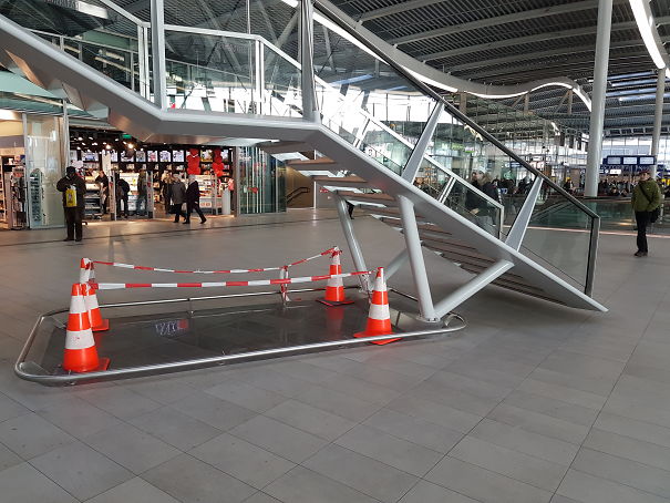
    #109

    The Rails Should Prevent People From Hitting Their Head, But Instead They Trip Over Them. So Now, Traffic Cones

    Staircase design fail with stairs leading to nowhere, surrounded by caution cones in a shopping center.

    domin8r Report

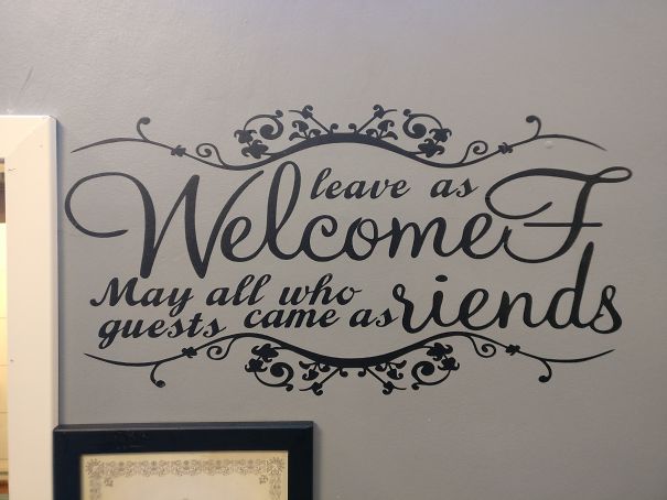
    #110

    Ate At A Local Restaurant

    Wall decal with design fail: "leave as WelcomF, guests came as riends." Decorative script on gray wall.

    Nopeasuoli Report

    Add photo comments
    POST
    Wyndmere
    Community Member
    7 years ago DotsCreated by potrace 1.15, written by Peter Selinger 2001-2017

    Its a conversation piece... helps ease the awkwardness of a first date by giving them something to talk about. -- If your date doesn't see anything wrong with it, don't go on a second date.

    Michel M. Prins
    Community Member
    7 years ago DotsCreated by potrace 1.15, written by Peter Selinger 2001-2017

    That moment when you make a sentence, change a word in between, but forget to make the rest of the words fit the change.

    Kati Lynn
    Community Member
    7 years ago DotsCreated by potrace 1.15, written by Peter Selinger 2001-2017

    I love when I meet new people and they say "leave as welcomeF may all who riends guests came as." That's how you know they're good company.

    Olivia W
    Community Member
    7 years ago DotsCreated by potrace 1.15, written by Peter Selinger 2001-2017

    It took me like 3 minutes to read this I couldn't stop laughing

    Liene Erdlāne
    Community Member
    7 years ago DotsCreated by potrace 1.15, written by Peter Selinger 2001-2017

    Did they mean - " Welcome! May all who came as guests leave as Friends" ?? :D

    Dave Blank
    Community Member
    7 years ago DotsCreated by potrace 1.15, written by Peter Selinger 2001-2017

    My head hurts. nope i cant get that to make any sense.. I'm going for a lay down in a darken room.

    Jess Reeves
    Community Member
    7 years ago DotsCreated by potrace 1.15, written by Peter Selinger 2001-2017

    It took me legit about 30 seconds to figure out wtf it was supposed to say

    John
    Community Member
    7 years ago DotsCreated by potrace 1.15, written by Peter Selinger 2001-2017

    Leave as WelcomeF May all who guests came as riends. Such beautiful poetry.

    Shawn Battmer
    Community Member
    7 years ago DotsCreated by potrace 1.15, written by Peter Selinger 2001-2017

    It's a decal, you're supposed to reposition the letters as the phrase best fits on your wall... obviously they just put it up as is smh

    Sondre Strøm Linde
    Community Member
    7 years ago DotsCreated by potrace 1.15, written by Peter Selinger 2001-2017

    "leave as WelcomeF May all who guests came as riends" I've always found this to be SO true!

    Who Am I?
    Community Member
    10 months ago DotsCreated by potrace 1.15, written by Peter Selinger 2001-2017

    leave as welcomef may all who guests came as friends???? what was this supposed to say???

    Liliauna Whitlock [STUDENT]
    Community Member
    1 month ago DotsCreated by potrace 1.15, written by Peter Selinger 2001-2017

    Welcome. May all who came as friends leave as guests/Welcome. May all who came as guests leave as friends

    Corbyn Wittig
    Community Member
    7 years ago DotsCreated by potrace 1.15, written by Peter Selinger 2001-2017

    I'm amazed this didn't get more upvotes; I easily laughed for five straight minutes. In no small part as a reaction to the comments by people trying to parse it, repeatedly

    Martin Haljaste
    Community Member
    7 years ago DotsCreated by potrace 1.15, written by Peter Selinger 2001-2017

    Welcome! May all who came as guests leave as friends - is what it's supposed to be, I reckon. Fail though.

    Alia Stephen
    Community Member
    7 years ago DotsCreated by potrace 1.15, written by Peter Selinger 2001-2017

    Leave as welcomef may all who guests came as riends. Yes, sounds right.

    View More Replies...
    View more commentsArrow down menu
    #113

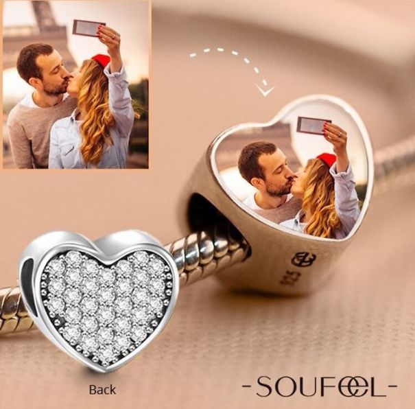
    Why Not Use The Selfie?

    Heart-shaped charm reflecting a couple's selfie, highlighting funniest design fails with unexpected photo placement.

    Eddiecreates Report

    ADVERTISEMENT
    See Also on Bored Panda
    #115

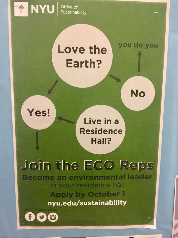
    One Of The Worst Flow Charts I've Seen In A While

    NYU flowchart design fail with eco reps recruitment message, featuring confusing options about loving the earth.

    Irate_Rater Report

    #116

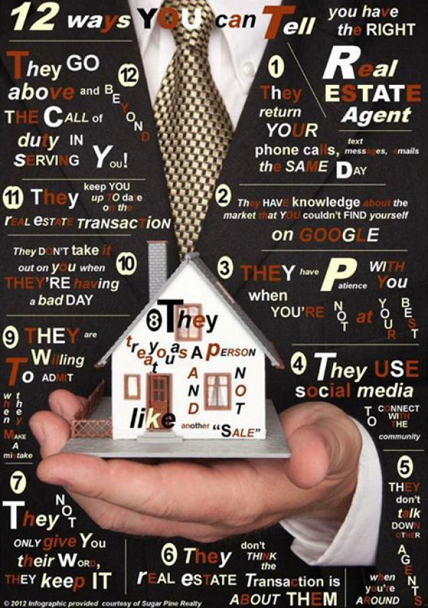
    "12 Wa S Y U Can Tell You Ha E Th Right"

    Hand holding a tiny house infographic, displaying multiple humorous real estate tips in a cluttered design.

    justinerwin Report

    Add photo comments
    POST
    Christine Blonowicz
    Community Member
    7 years ago DotsCreated by potrace 1.15, written by Peter Selinger 2001-2017

    #13, They create their ads by cutting letters out of magazines like a serial killer.

    View more commentsArrow down menu
    #117

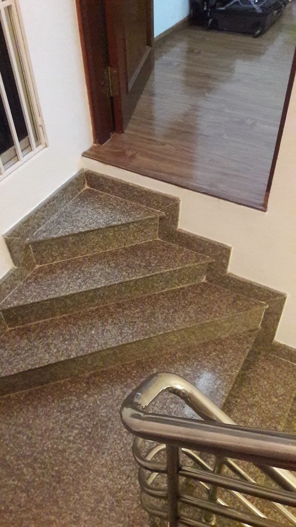
    The Stairs Leading To This Bedroom

    Staircase leading directly into a closed door, showcasing a funny design fail.

    reddit Report

    #118

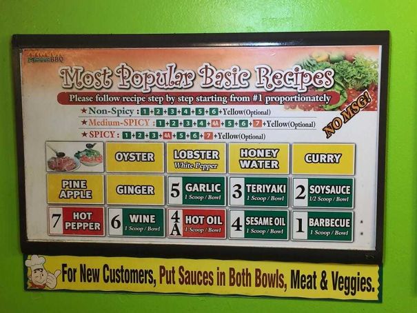
    There's A Line Forming Behind Me. I Have No Idea

    Funny design fail: a confusing recipe chart titled "Most Popular Basic Recipes" with mixed sauce instructions.

    samsuh Report

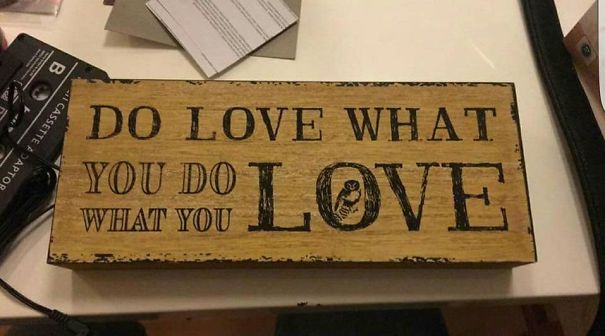
    #120

    Do Love What You Do What You Love

    Wooden sign design fail with repeated phrase "Do what you love, love what you do" causing confusion.

    alicecyan Report

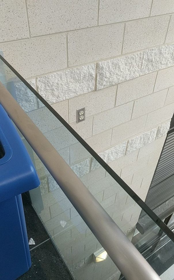
    #121

    This Fucking Outlet At My University

    Electrical outlet positioned behind a glass railing, illustrating a design fail.

    txglasgow Report

    #122

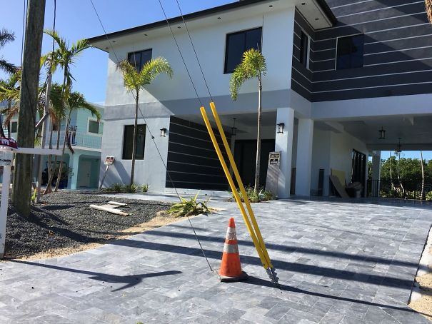
    Beautiful Driveway. Sucks You Can't Use It

    House with a driveway design fail, blocked by a pole and traffic cone.

    AsASymbol Report

    ADVERTISEMENT
    See Also on Bored Panda
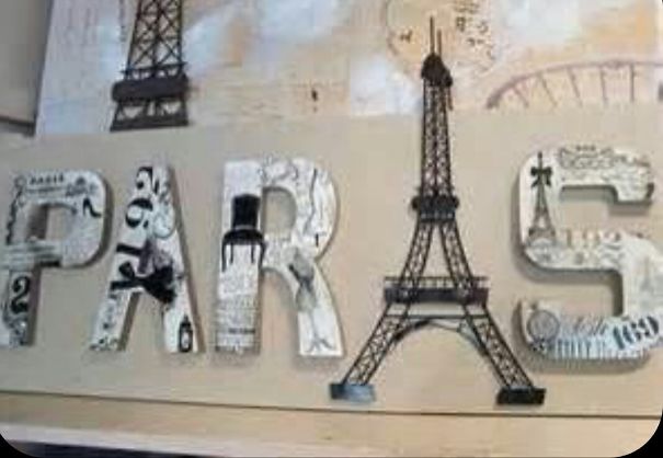
    #123

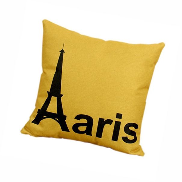
    Can't Possibly Think Of A Better Place For The Eiffel Tower

    "Sign reading 'PARIS' with the Eiffel Tower replacing the letter A, showcasing design fails."

    One-dapper-vagina Report

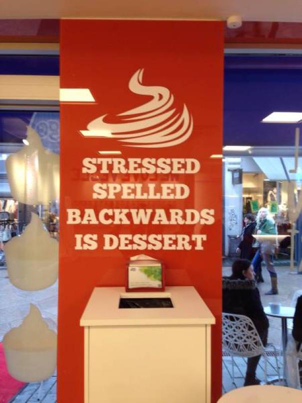
    #125

    Stressed Backwards Spells...

    Sign displaying "Stressed spelled backwards is dessert" in a shop, illustrating one of the funniest design fails.

    MarcXJF Report

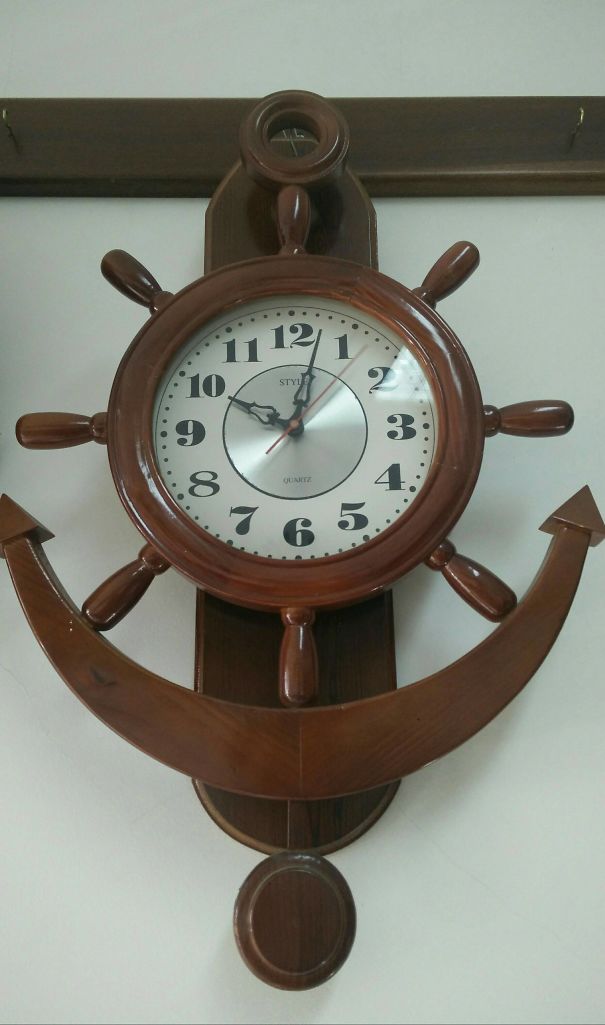
    #127

    The Eight In This Clock

    Wooden ship wheel clock with mismatched numbers, showcasing a funny design fail.

    macafeu88 Report

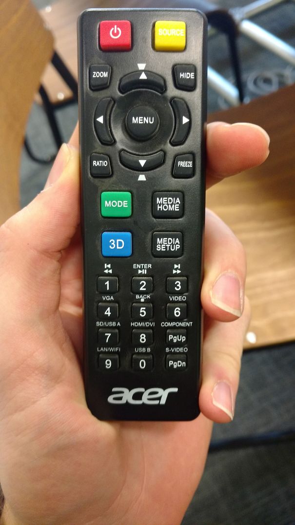
    #128

    I Just Want To Heat My Hot Pocket

    Microwave control panel with confusing symbols, showcasing a design fail.

    coconutgoat Report

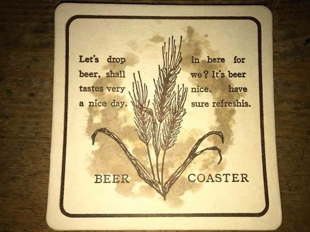
    #129

    Beer Coaster

    Humorous design fail on a beer coaster with garbled text and wheat illustration.

    _Hungry_Llama_ Report

    ADVERTISEMENT
    See Also on Bored Panda
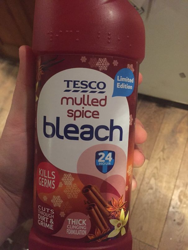
    #132

    Suicidal Holiday Introvert, Look No Further

    "Funny design fail with a limited edition mulled spice bleach bottle held in hand."

    George_E_Hale Report

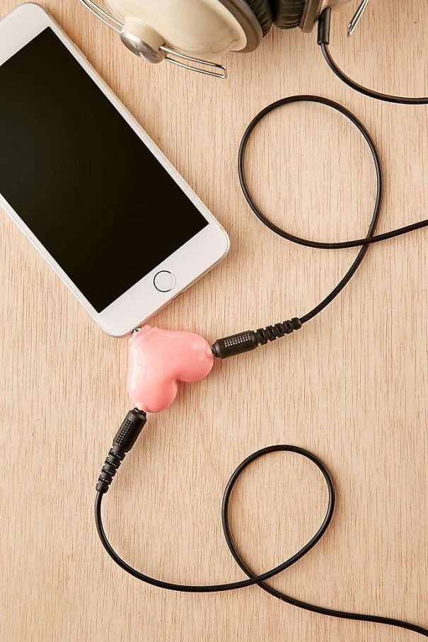
    #133

    Heart Shape Headphone Splitter Looks Like A Nut Sack

    Heart-shaped headphone splitter design fail with smartphone and headset.

    sksksk1989 Report

    #134

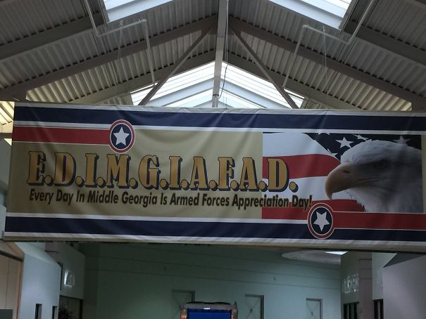
    Let's Come Up With An Easy Acronym To Let People Know We Support The Military

    Funny design fail: a banner with a lengthy acronym for Armed Forces Appreciation Day and an eagle in the background.

    DonSquirrelio Report

    #136

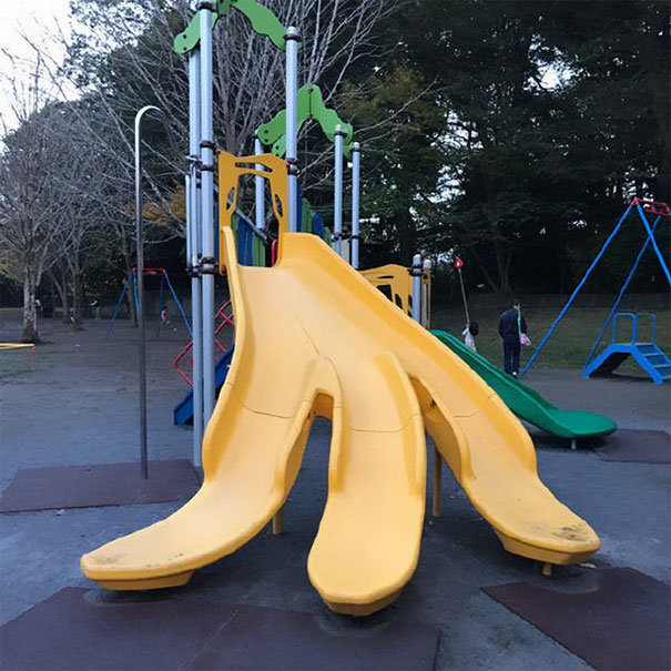
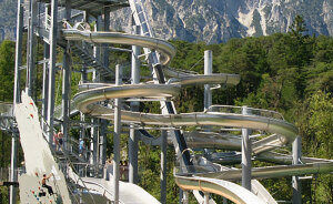
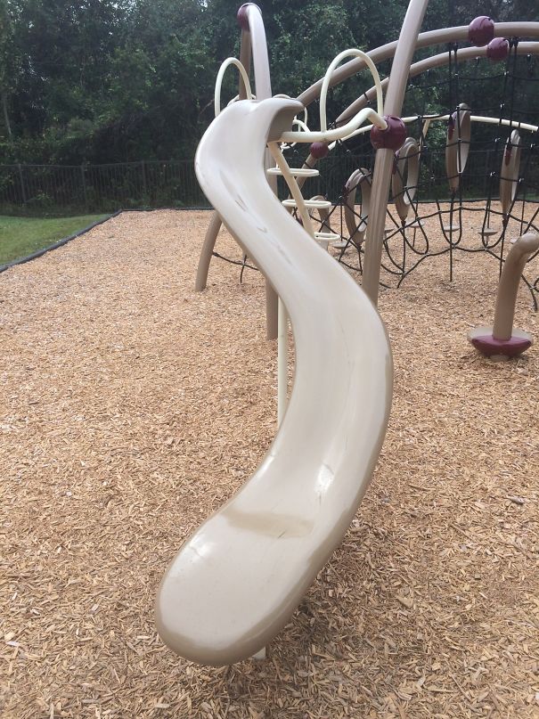
    This Slide With No Side Rails...

    Curved playground slide with awkward twist, illustrating a design fail in an outdoor setting.

    STR4NGE Report

    Add photo comments
    POST
    Jespren Ray
    Community Member
    7 years ago DotsCreated by potrace 1.15, written by Peter Selinger 2001-2017

    I keep seeing these and I can't figure them out, several of the parks in the area have them.

    View More Replies...
    View more commentsArrow down menu
    #138

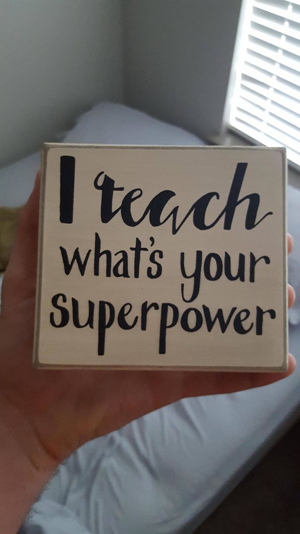
    My Gf Is A Teacher. This Sits On Her Desk And The Lack Of Punctuation Disturbs Me

    Sign with misplaced words creating a funny design fail: "I teach what's your superpower."

    mattym00 Report

    ADVERTISEMENT
    #139

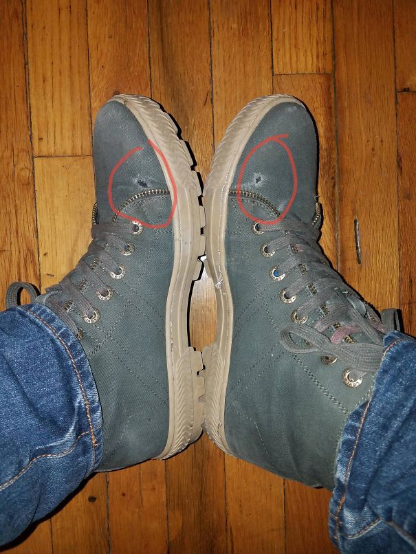
    Fake Zipper On Levi's Boots Makes Holes In Your Boot When You Walk

    Pair of hiking boots with mismatched eyelets, demonstrating a funny design fail.

    peppaz Report

    #140

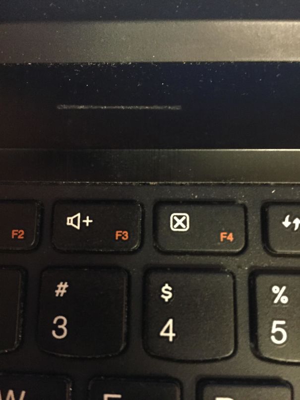
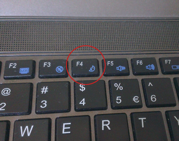
    The Worst Thing About Lenovo Laptops. A "Close Current Page Without Warning Button" Right Next To The "Volume Up" Button

    Keyboard showing a design fail with mismatched symbols on function keys.

    srcw624 Report

    Add photo comments
    POST
    Michel M. Prins
    Community Member
    7 years ago DotsCreated by potrace 1.15, written by Peter Selinger 2001-2017

    Use: "CTRL + SHIFT + T" to get back the exact page you just closed down. This works for Google Chrome, but there are similar ways on other browsers to re-open closed down pages. However, to get back to the picture, I have something similar, but a lot worse. I have this order: Mute Sound - Sleep Mode - Sound Down - Sound Up. IMAG1579-5...9e8e07.jpg IMAG1579-5912dda9e8e07.jpg
    View More Replies...
    View more commentsArrow down menu
    #141

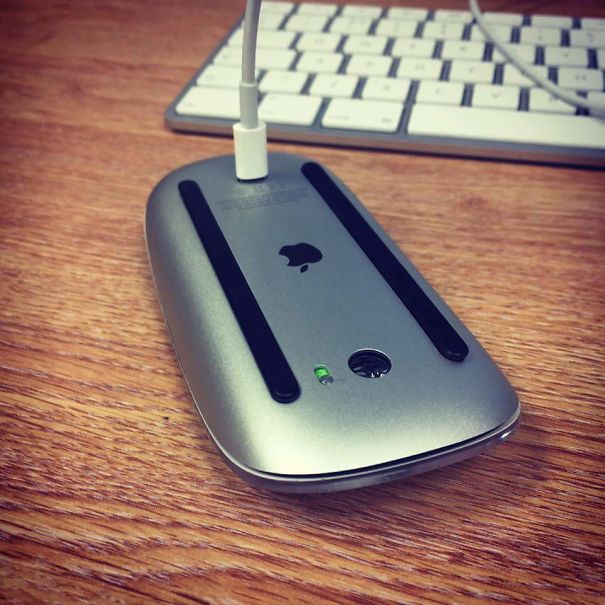
    No Use! Only Charge!

    Apple mouse charging awkwardly upside down, illustrating a design fail.

    RiggzBoson Report

    Add photo comments
    POST
    Virgil Blue
    Community Member
    7 years ago DotsCreated by potrace 1.15, written by Peter Selinger 2001-2017

    A classic. Just like my battery powered Apple blue tooth keyboard that needs a friggin coin to release the battery catch.

    View More Replies...
    View more commentsArrow down menu
    #142

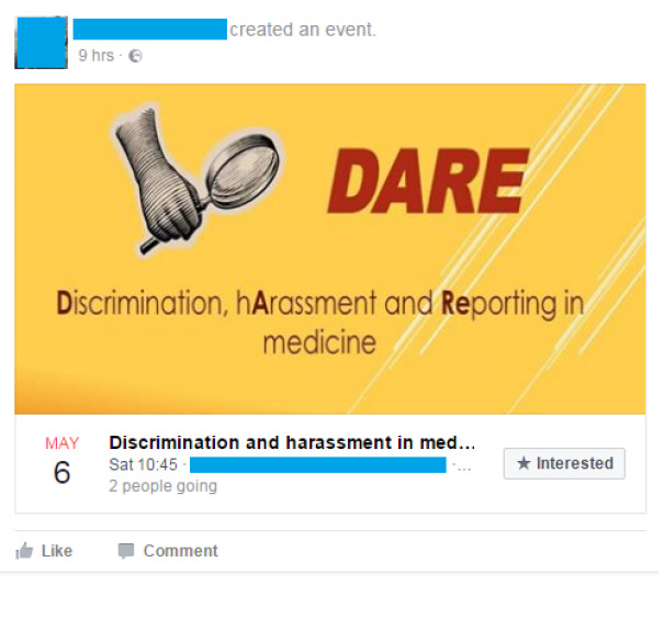
    This Forced Acronym

    Facebook event image with the text "DARE: Discrimination, hArassment and Reporting in medicine" in red and yellow.

    Whoopsie999 Report

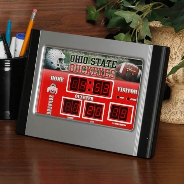
    #143

    An Ohio State Scoreboard Clock Where The Visitor Is Almost Always Winning

    Ohio State Buckeyes clock design fail shows nonsensical scores and times on a desk with office supplies and a plant.

    zharrhen Report

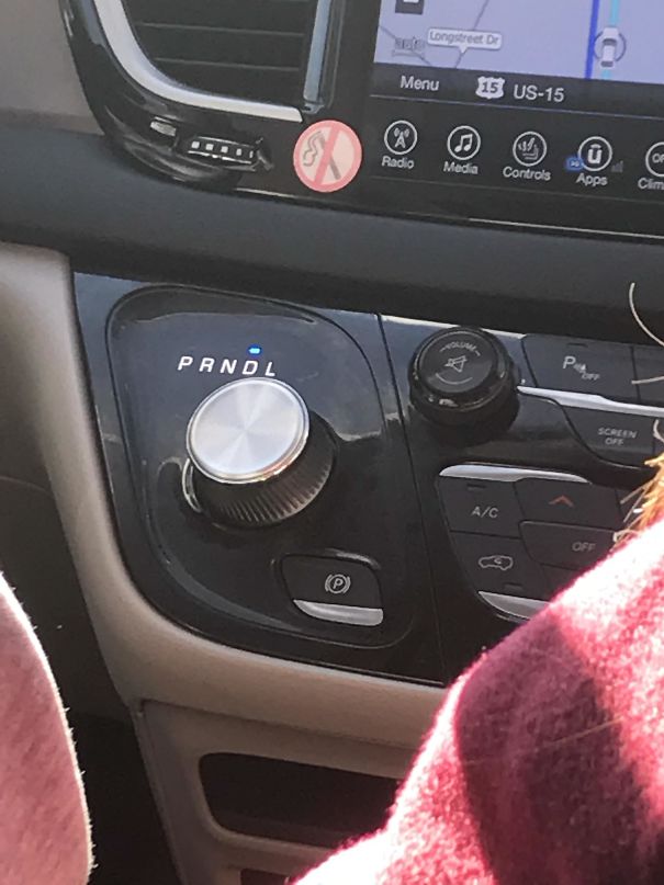
    #144

    This Abomination

    Car dashboard design fail with incorrect gear label marked "PRNDL."

    samtfischer2 Report

    Add photo comments
    POST
    Allison Galbari
    Community Member
    7 years ago DotsCreated by potrace 1.15, written by Peter Selinger 2001-2017

    Ooo! This is my favourite song! Let's turn it up! AAAAAAAAAAAAAAAAAAA!!!!!!!!!!

    View More Replies...
    View more commentsArrow down menu
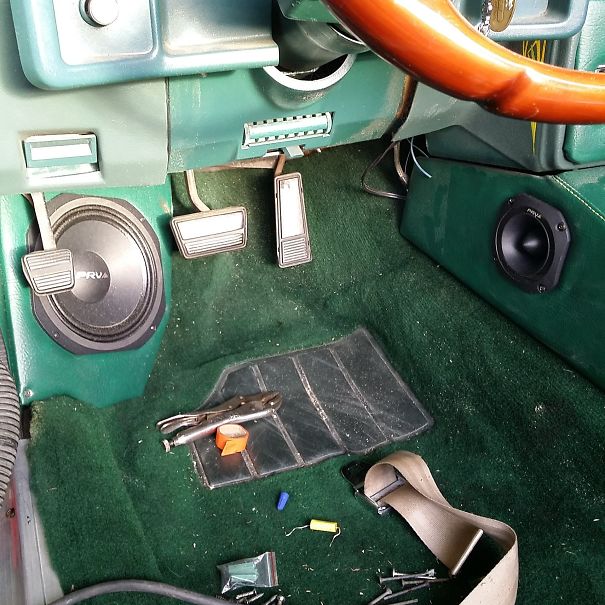
    #145

    That's Like Asking To Get Your Speaker Kicked In

    Car interior design fail with misplaced pedals and speakers on green carpet flooring.

    Malfaisance Report

    ADVERTISEMENT
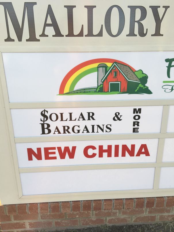
    #149

    I Made An Account Just To Post This Unforgivable De$ign Choice

    Sign with funny design fail: "Sollar Bargains" instead of "Dollar Bargains" and "New China" in red.

    The_Bronald Report

    Add photo comments
    POST
    Jespren Ray
    Community Member
    7 years ago DotsCreated by potrace 1.15, written by Peter Selinger 2001-2017

    I read this as sollar like six times and kept thinking (rainbow helped) that they had misspelled solar, like it was a farm supply store that sold solar adapters for gardens, barns, tractors, etc. Took me way too long to realize they meant dollar.
    View More Replies...
    View more commentsArrow down menu
    #150

    In The Shadow Of Every Yes Is A... Different Shadow?

    A humorous design fail with text: "In the shadow of every yes is a no," held by a hand against grassy background.

    Fineus Report

    Add photo comments
    POST
    Sarah Skinner
    Community Member
    7 years ago DotsCreated by potrace 1.15, written by Peter Selinger 2001-2017

    This doesn't actually bother me. Sure, it could use some polish, but I didn't have any trouble understanding the message. Just needs a professional treatment.
    View More Replies...
    View more commentsArrow down menu
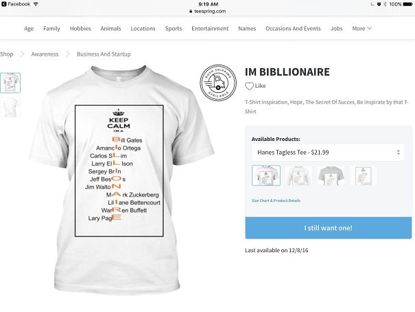
    #151

    Billionaire.

    T-shirt with text design fail reading "Keep Calm I'm a Bibllionaire," showcasing misspelled billionaire names.

    sickduck22 Report

    #152

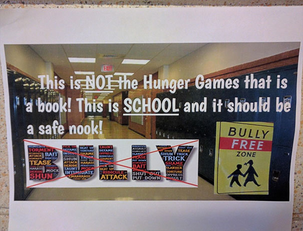
    This Sign At My Daughter's School

    Anti-bullying poster with humorous message in a school hallway, part of funniest design fails.

    tinsweep Report

    ADVERTISEMENT
    #155

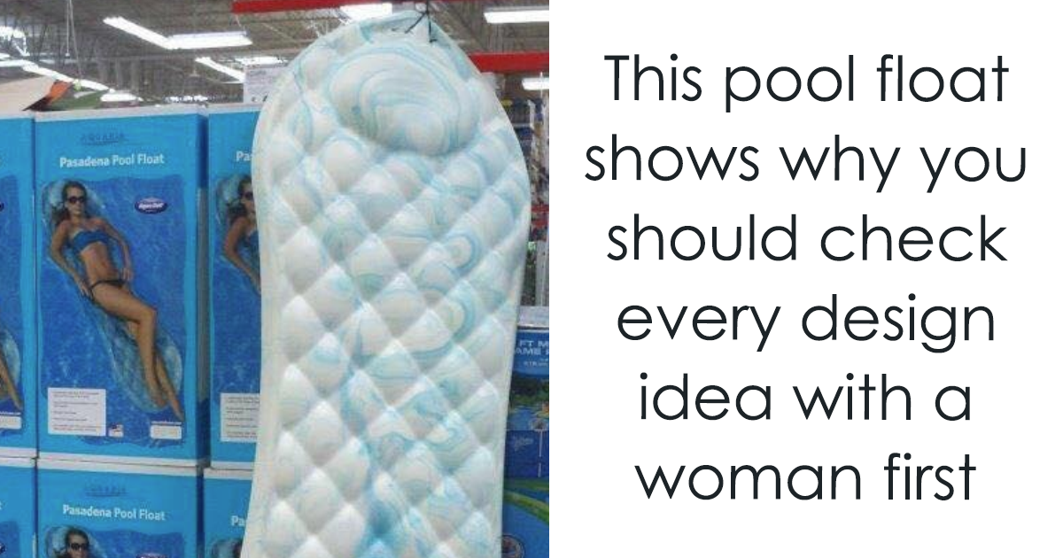
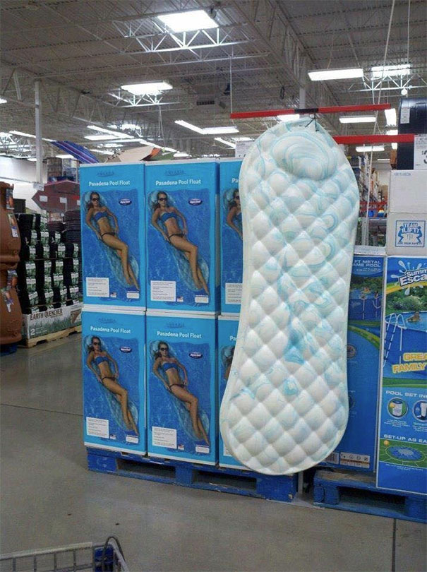
    This Could Have Been Avoided With 1 Focus Group (of Women)

    Giant pool float resembling a sanitary pad on display in a store, showcasing one of the funniest design fails.

    JillianDavid13 Report