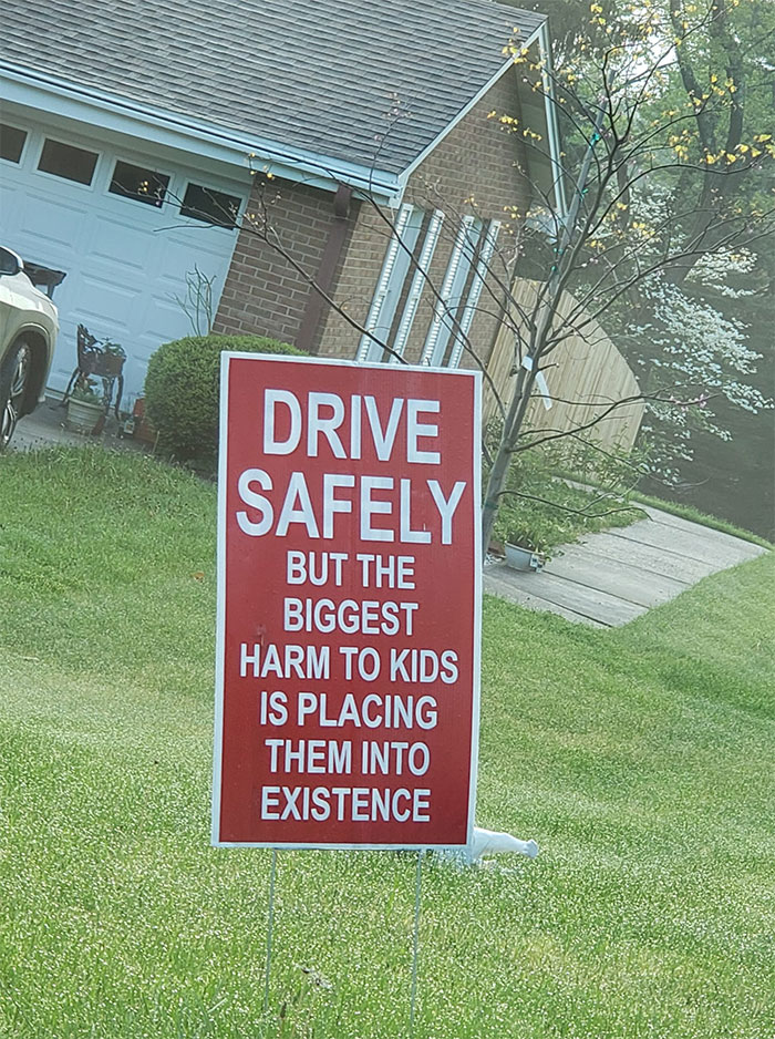
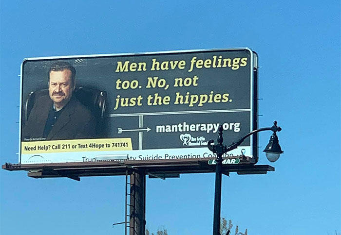
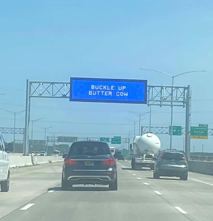
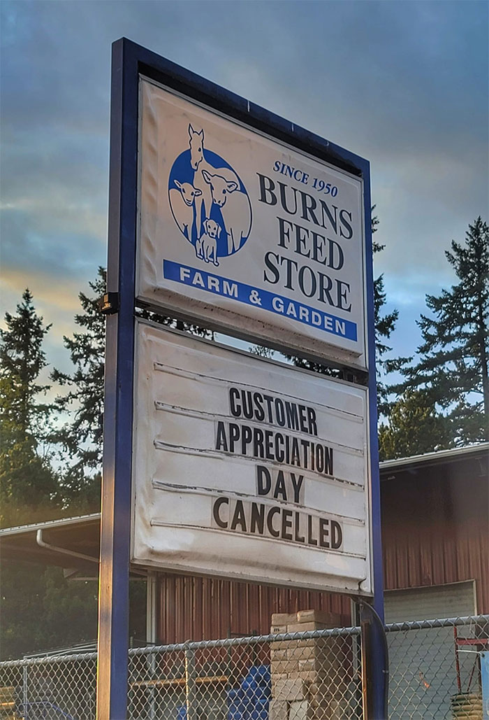
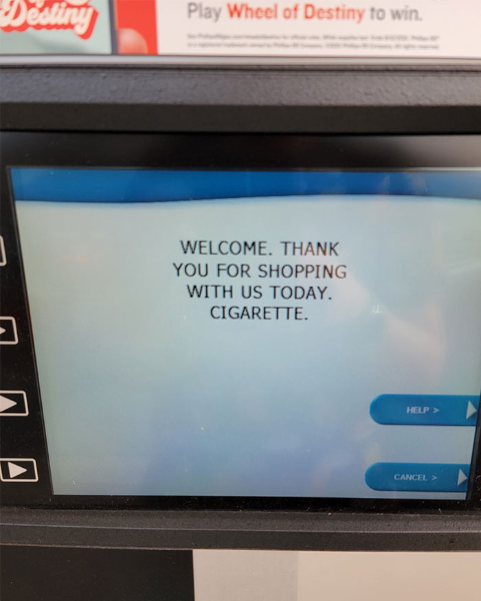
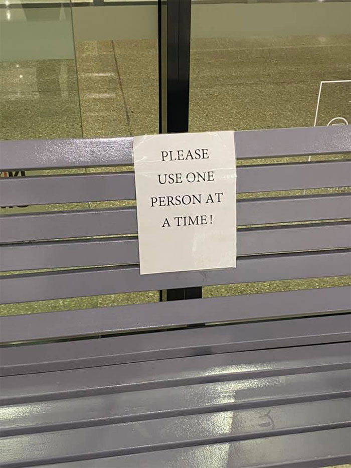
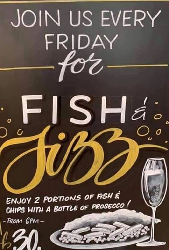
Communication is about clarity. The more muddled the message—the more confusion you’re bound to see on the reader’s face. When it comes to the signs you see in public, you normally expect all of them to be brief, precise, and informative. Alas! Nothing could be farther from the truth. Far from everyone’s a pro when it comes to writing and advertising skills, and the ‘Useless, Unsuccessful, and/or Unpopular Signage’ Facebook group is proof enough.
An online group bringing together nearly 191k members, the UUU Signage project has been around since November 2014. Since then, it has collected a vast archive of some of the very worst and funniest signs to be found on Planet Earth. We’re featuring a selection of the very best ones, so go on, have a scroll and a glance. Don’t forget to upvote the signs that made you laugh and made you more confused than you expected, and if you’re a fan, go ahead and join the UUU Signage group.
I had a friendly chat about the most important things when making a sign—any sign—with Lisa McLendon. She is the William Allen White Professor of Journalism and Mass Communications and the coordinator of the Bremner Editing Center at the University of Kansas. You'll find the insights she shared with Bored Panda below, dear Readers.
Remember… keep it simple—keep it short—keep it clear.
This post may include affiliate links.
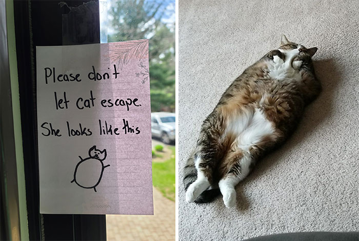
I Didn't See A Cat Going Out But I Did Observe A Walrus Sashay Towards The Door
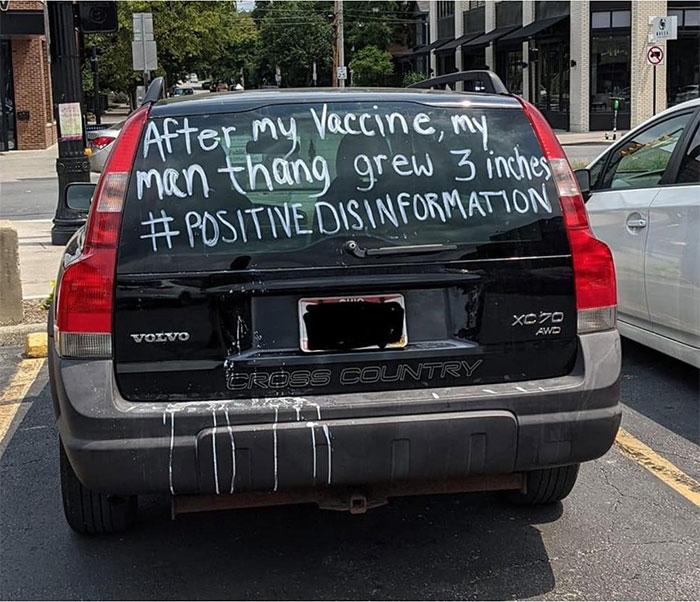
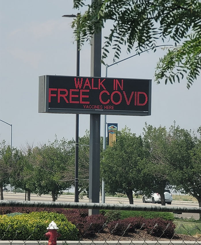
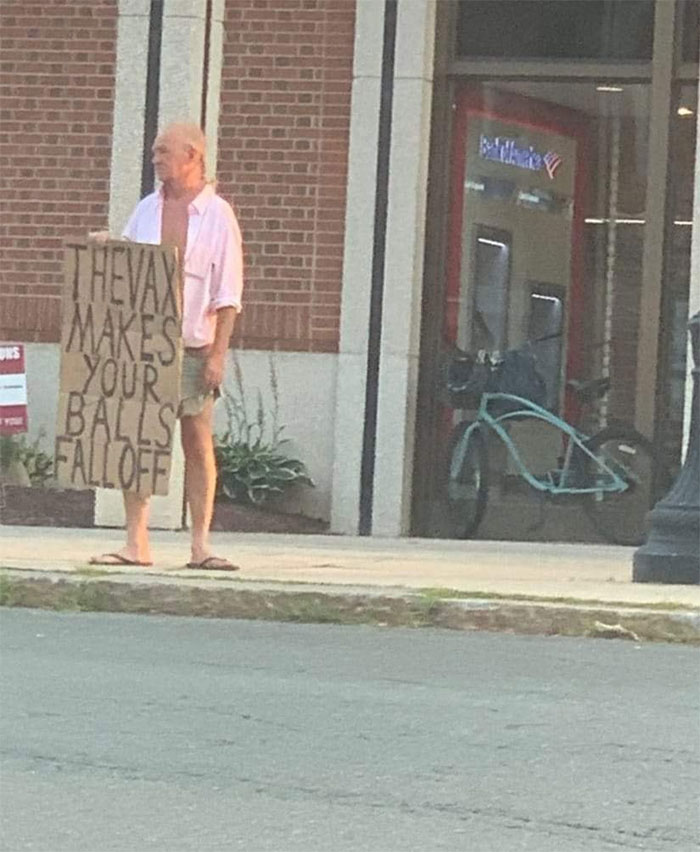
This Is The Kind Of Secret Doctors Don't Want You To Know
Hahaaa, that was good. I have my hair dyed in shades of purple and turquoise, which is pretty eye-catching. I once went to a hospital to get some papers, and had to wait in line for access. Several people were staring at my cheerful hair. I was tempted to tell them "It's the covid vaccine, this is what happens if you get vaccinated." :))) I refrained, though. Some people are prone to believe anything... except science. (I'm fully vaccinated.)
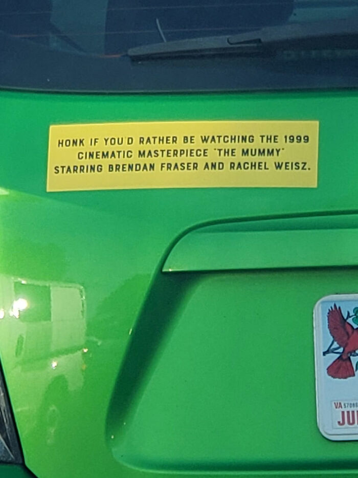
I Honked
Lisa, from the University of Kansas, highlighted to Bored Panda that when it comes to making signs, clarity and brevity are essential. This is because you don't have much time to get your point across and you need to be quick and sharp with your messaging.
"Clarity and brevity are essential. You only have a second or two to get your message across, so you want people to understand quickly with zero confusion," she told Bored Panda.
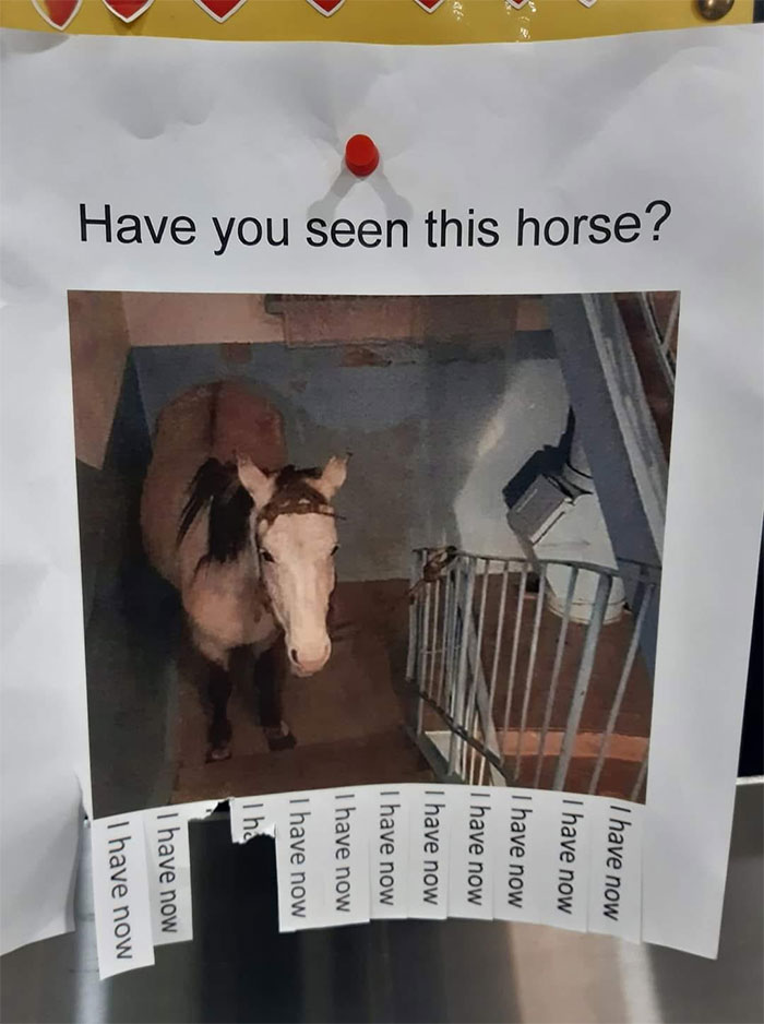
On The Community Noticeboard At My Local Shops
Ah, thanks. A new ear-worm. I was fed up with my last one 😁
Load More Replies...Poor horse. Why is he on the stairs? He's not built to climb stairs. I bet it was pretty scary getting there!
But the dealer is on the 3rd floor, how else is he going to get his special sugar lumps
Load More Replies...Da steeeht ein Pferd auf dem Flur🎶, eeein echtes Pferd auf dem Flur…🎶🐴 https://m.youtube.com/watch?v=tikoFcOei5Q
... what is the point of the 'I have now' things anyway, unless there's a phone number printed on the back? And are we all ignoring the fact this horse is in a STAIRWELL? This poster has to be a joke...
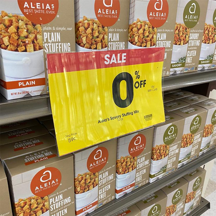
An Employee Caught Me Taking This Pic And Said “Ah Yes, Another One Of Our Many Exciting Deals!”
Make Good Choices
I was also interested to get Lisa's opinion about the types of egregious mistakes that the people putting up various signs should avoid.
"Don’t carve an error in stone. It’s embarrassing and expensive to fix. Proofreading before you produce, whether it’s stone or not, is absolutely necessary," she said that we should take the time to look over our work before making any permanent decisions. Proofreading is far cheaper than fixing a mistake later on.
Lisa also noted that the font that we choose for our sign is incredibly important. "Choose your font with readability in mind. It should be clear and readable at a distance; you don’t want to make people puzzle through a swirly script," she said.
Lmao You Go Girl
Yeahhhhh Right
Someone Had Enough
The UUU Signage page is part of the wider ‘Useless, Unsuccessful, and/or Unpopular’ community that encompasses a variety of different niches, from ads and screenshots to memes.
The group’s admins and mods note that they’re only interested in photos that people have taken themselves. So, for instance, screenshots have no place here (in fact, there’s an entirely separate UUU group for them specifically). Original content and exploration are encouraged. All for the sake of documenting signage that should have us laughing all the way till the weekend.
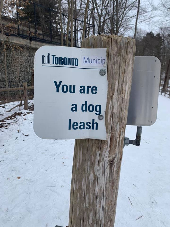
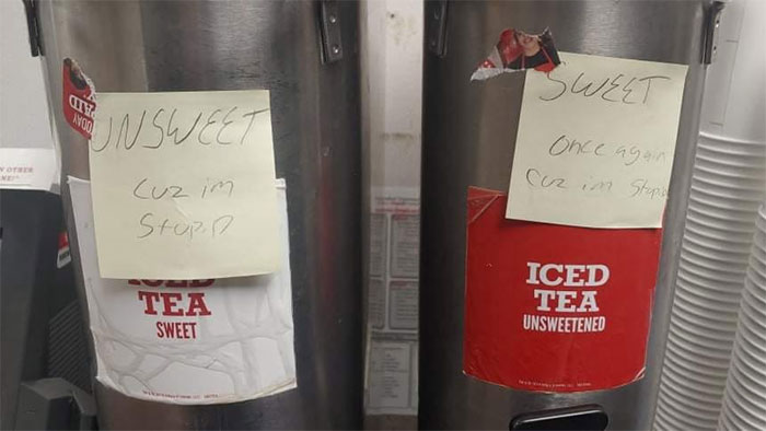
I’ve Been Called Many Things In Life. But This Is A First
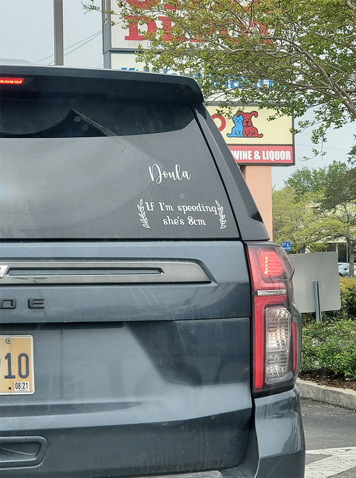
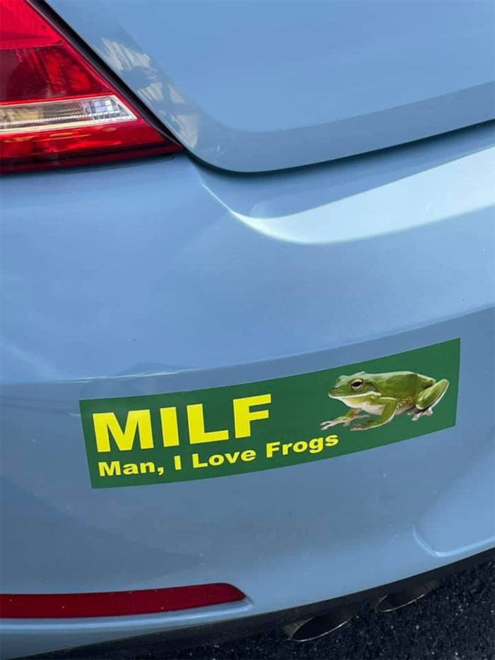
I've Never Seen A Bumper Sticker I Wanted More
Well That Escalated Quickly
It’s easy to sit back and chuckle at some of the silly (and sometimes downright mental) mistakes some sign-makers have made. However, we’ve all been in situations where we’ve made similar mistakes, for everyone to see and gently poke fun at.
Perhaps we didn’t edit our text enough (or at all…) because we were exhausted. Maybe our proofreading skills weren’t up to scratch anymore (thanks a bunch, Fifth Cup of Coffee). Or maybe, just maybe, all those silly mistakes snuck into our sentences the moment our backs were turned.
Frankly, I like this last theory the most, even if it’s the least likely. It suggests that there’s a Greater Force at work here, sprinkling chaos into our otherwise orderly word structures.
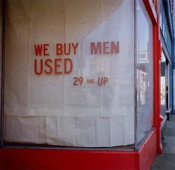
When You've Had Enough Of Your Man
Hey, the sign is very informative and direct. I would like to sell a neighbor who plays loud music all day long and smokes weed. He is a bit banged up and rusty, but not too shabby.
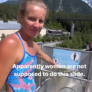
I Have A Bad Feeling About This Rest Stop Bathroom
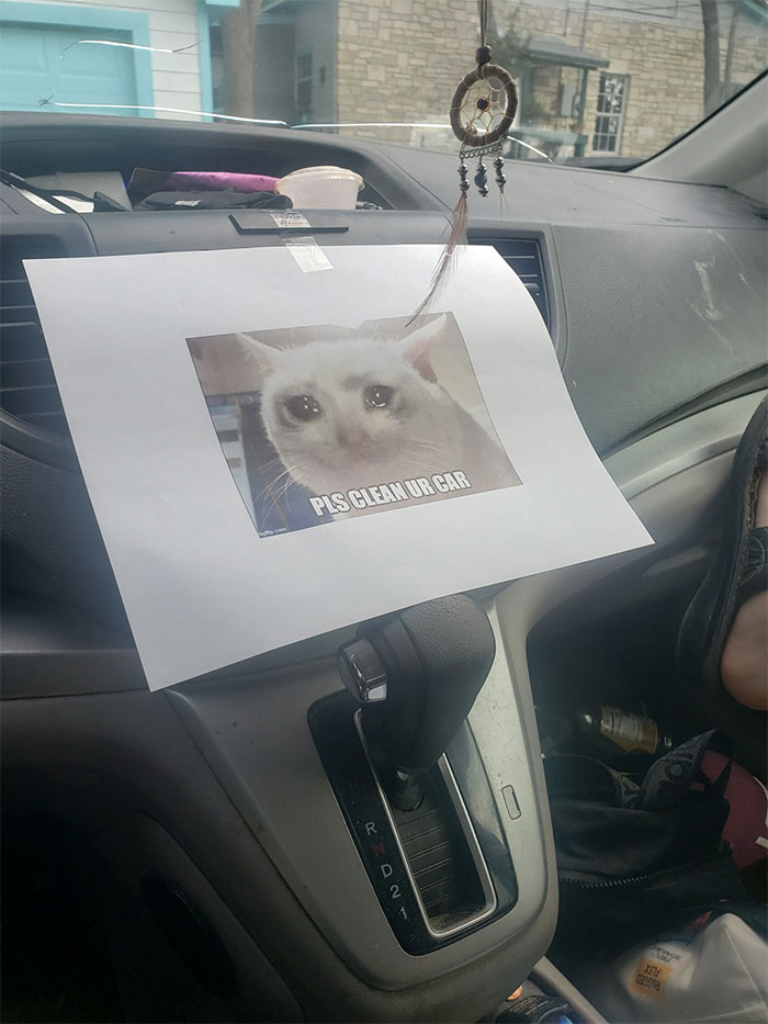
The Mechanic Left This In My Girlfriend's Car After Being Serviced... The Car Is Still Dirty
My garage doesn't even service dirty cars like this. You'll get a note saying that Dutch labor laws do not allow people to work in a contaminated area without protective gear and proper training. Because none of their mechanics qualify, they couldn't service the car.
A while ago, I had another chat about editing, proofreading, and kerning (it’s the spacing between letters, Pandas) via email with Lisa from the University of Kansas.
"Word placement, typeface, and kerning are crucial for effective, professional-looking logos and layouts. If it’s just a few words, all-caps is fine, but it’s harder for people to read longer blocks of text in all caps. It’s also harder for people to read italic or highly stylized type, or type along a curve instead of a line,” Lisa explained to Bored Panda.
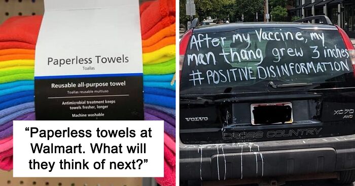
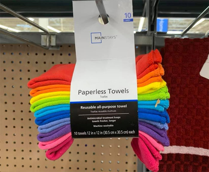
Found Some Paperless Towels At Walmart Today. What Will They Think Of Next?
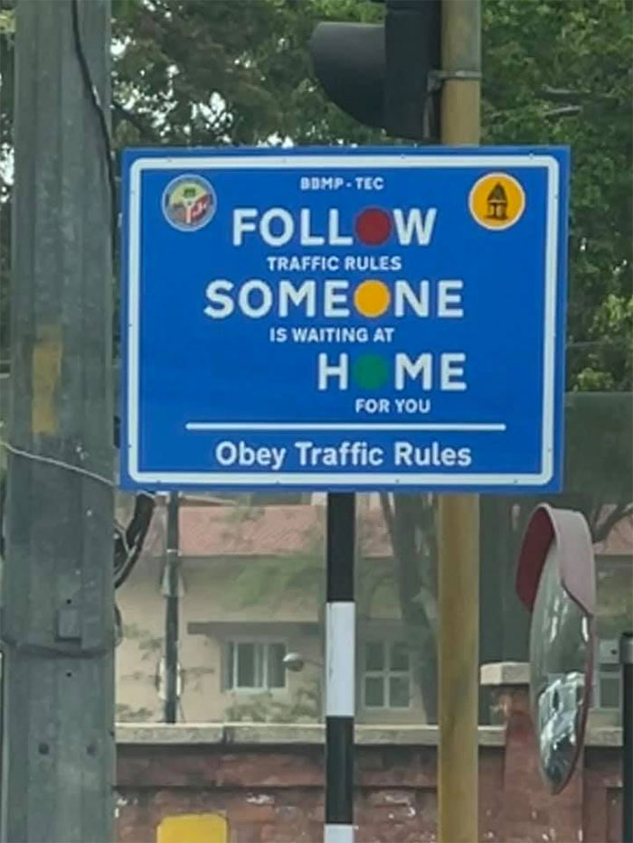
Please Don’t Follow Anybody Home
This Was A Couple Years Ago...and I Know What They Meant But... Still
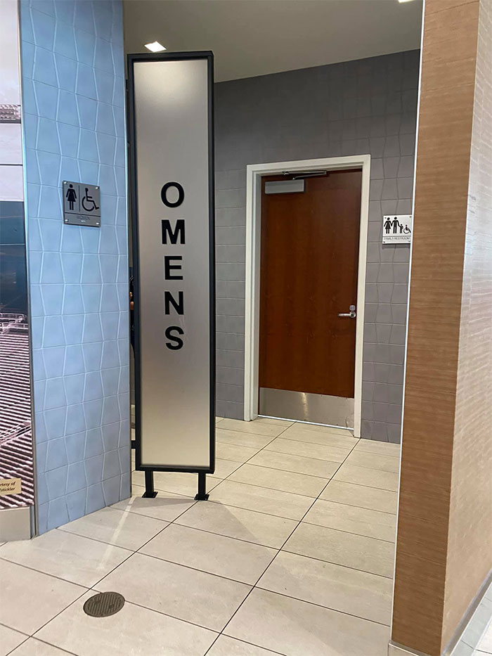
What’s more, Lisa noted that we should look at all the ways in which our words could be misread or read out of order if they’re circled or stacked on top of one another. Meanwhile, if the kerning happens to be too tight, some of the letters could merge into different symbols and result in some (hilariously) embarrassing misreadings.
One example of this is writing the word ‘FLICKERING’ in all caps. If the kerning is too tight, the ‘L’ and the ‘I’ merge into a ‘U’ and… well, it’s fairly obvious what happens, isn’t it?
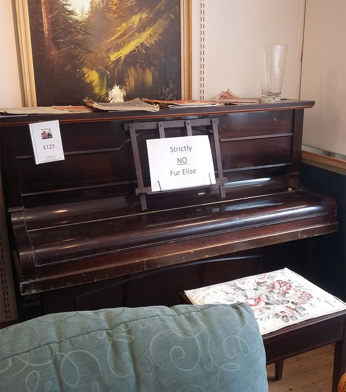
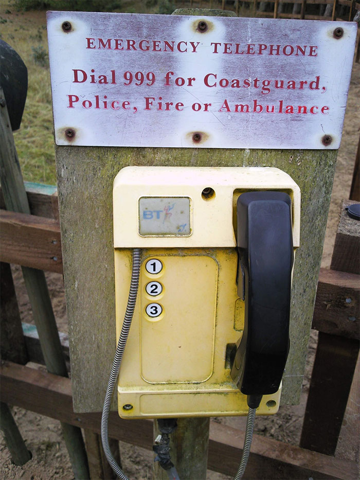
Just Press Three 333 Times
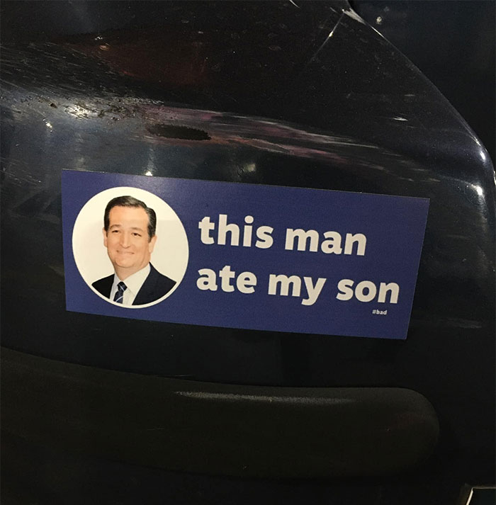
I Don’t Even Know
lmao I don't even get the joke or who that man is but it's so stupid it cracked me up hahaha
Oh No
Lisa suggests running a spell-check to catch any typos. It’s a very obvious step, but not everyone does it. However, the tool isn’t omnipotent. “Spell-check won’t catch typos that result in a word that is still a word, just not the word you want,” she warned that you should still get someone else to proofread the text.
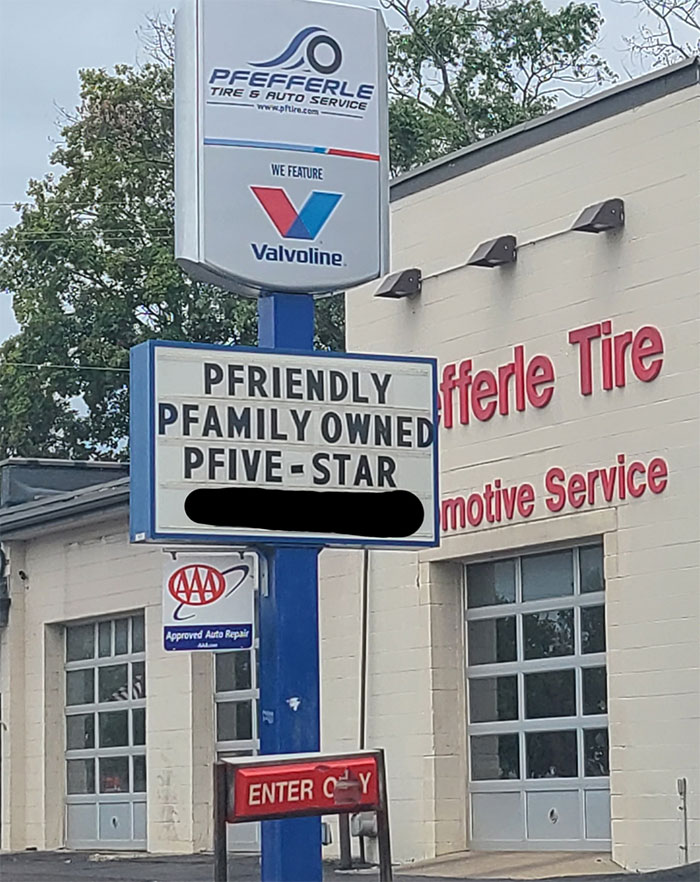
Pfantastic Signage
Um... I Guess?
Whatever Gets Them In Therapy I Guess?
Is This The New Saying Now?? Mandela Effect?
Do Not Teach Fish Man He Will Destroy Us All
"We Gave It A Second Thought And Decided That You Guys Suck"
Spotted At A Local Dollar Tree A Few Years Ago
This Was In Front Of My Town Hall For A Couple Weeks Before Anyone Realized And It’s My Favorite Thing To Ever Happen Here
No Thanks
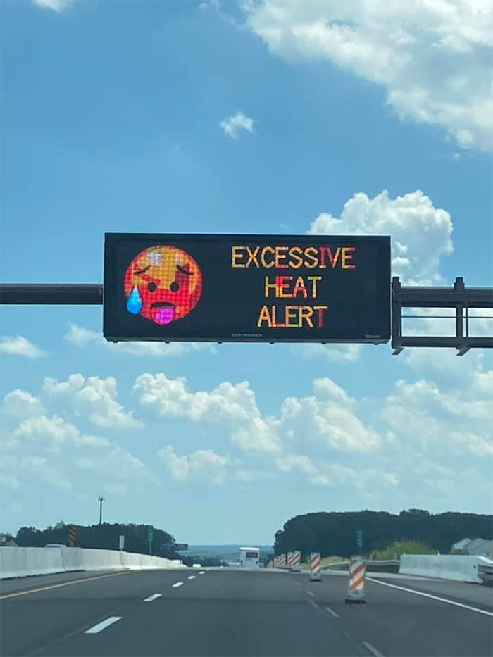
Pennsylvania Department Of Transportation Trying To Be Relatable
Typical Capitalism. Manufactured Scarcity
Are You Speaking From Experience, Sir?
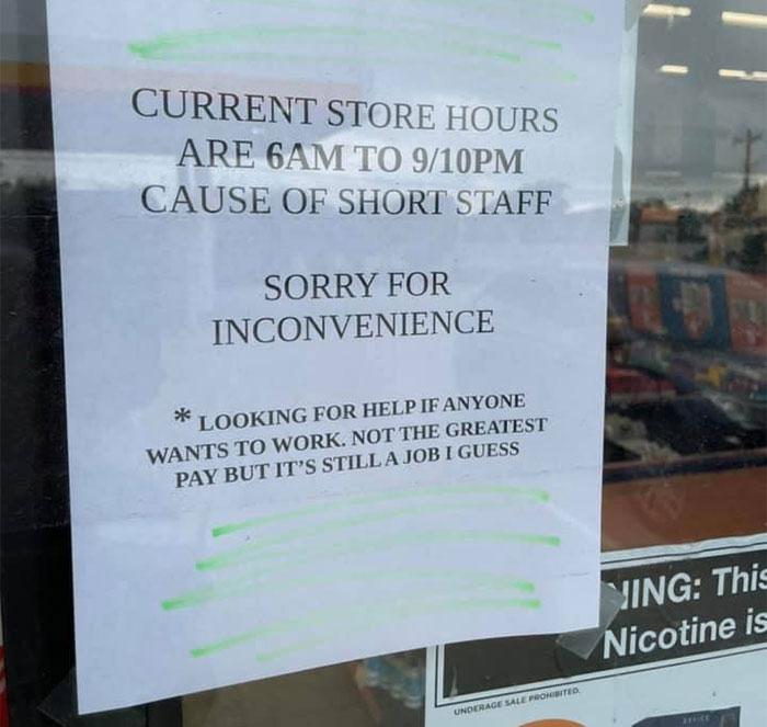
We Don’t Pay A Living Wage, But Work Is Work Right. This Is A Circle K By The Way
Baa Baa Black.. Clam?
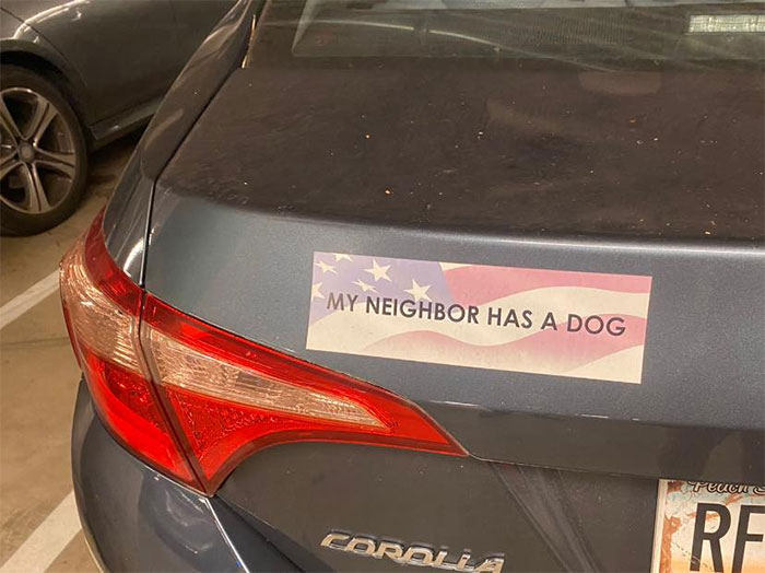
This Has Big "I Think Dogs Should Vote" Vibes
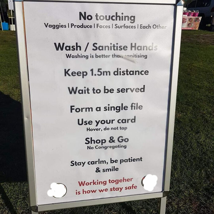
No Touching Vaggies
When You Want To Insult The Customer But Have To Be Politically Correct
Okay
Fish And Chizz??
Seen outside a mattress store in my city until recently: "Mask required, pants optional".
British English pants or American English pants?
Load More Replies...A funny sign I saw in a store in Colorado once: IMG_202107...46af3e.jpg 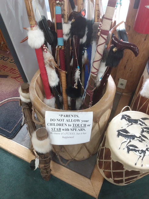
Then there was this warning sign for reasons unknown. dont-61213...521148.jpg 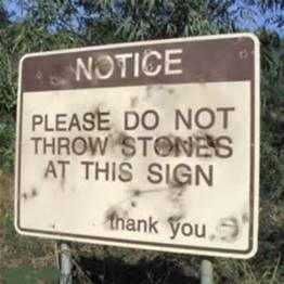
Some people at my work once decided to make informational signs that entailed a clip art image and a random work-related fact. So - to add a little extra flair - they put them on brightly colored paper, cut them into the shape of the image / words, laminated them, then stuck them up in the hallway every 5 to 10 ft. It didn't take long for most of us to realize the one important thing that they apparently didn't... several of the cutouts just so happened to be shaped like a penis / balls. Needless to say, the signs were definitely noticed... though I'm not so sure the message people received was the one they had actually been hoping for.
😂😂😂 Too funny! Especially if the penis/balls shaped ones were on pink or red colored paper, 😅😅😅😅
Load More Replies...After dying, on the first cloud you reach is a sign which says "We are sorry but god does not really exist. We apologise for the inconvenience"
Years ago, I saw a sign outside a local pub saying they were open 8 days a week.
Seen outside a mattress store in my city until recently: "Mask required, pants optional".
British English pants or American English pants?
Load More Replies...A funny sign I saw in a store in Colorado once: IMG_202107...46af3e.jpg 
Then there was this warning sign for reasons unknown. dont-61213...521148.jpg 
Some people at my work once decided to make informational signs that entailed a clip art image and a random work-related fact. So - to add a little extra flair - they put them on brightly colored paper, cut them into the shape of the image / words, laminated them, then stuck them up in the hallway every 5 to 10 ft. It didn't take long for most of us to realize the one important thing that they apparently didn't... several of the cutouts just so happened to be shaped like a penis / balls. Needless to say, the signs were definitely noticed... though I'm not so sure the message people received was the one they had actually been hoping for.
😂😂😂 Too funny! Especially if the penis/balls shaped ones were on pink or red colored paper, 😅😅😅😅
Load More Replies...After dying, on the first cloud you reach is a sign which says "We are sorry but god does not really exist. We apologise for the inconvenience"
Years ago, I saw a sign outside a local pub saying they were open 8 days a week.

 Dark Mode

 No fees, cancel anytime


