ADVERTISEMENT

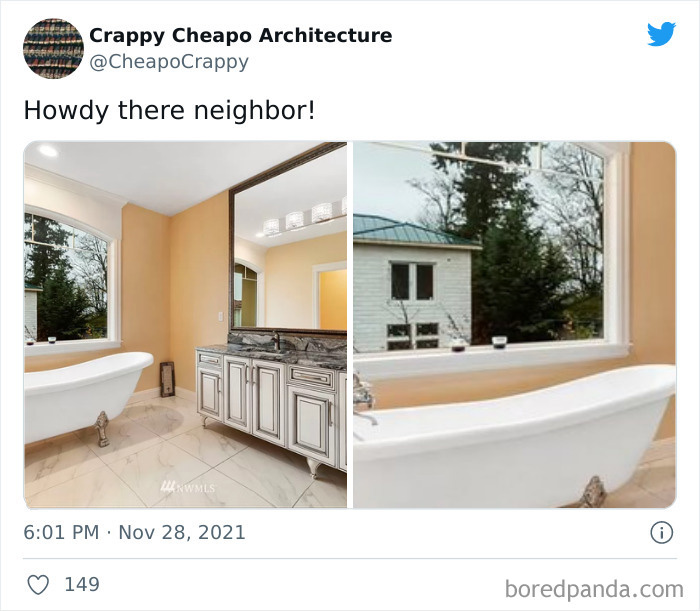
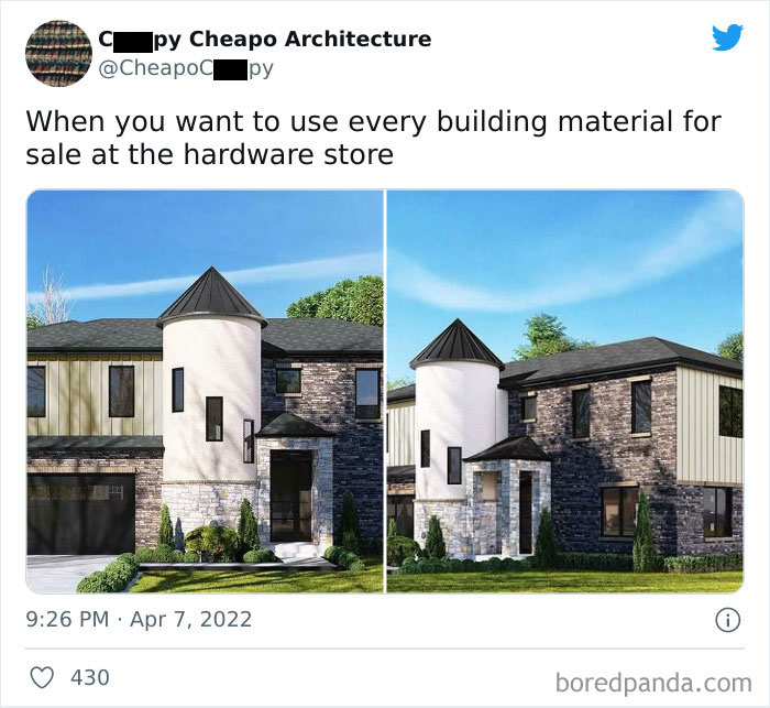
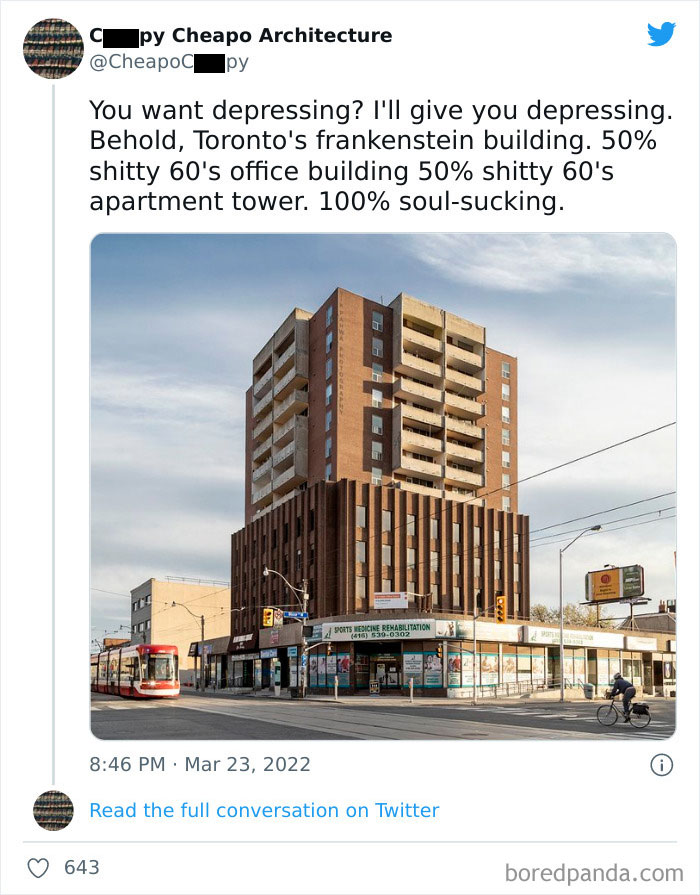
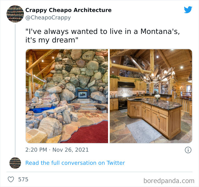
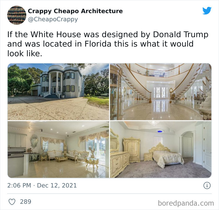
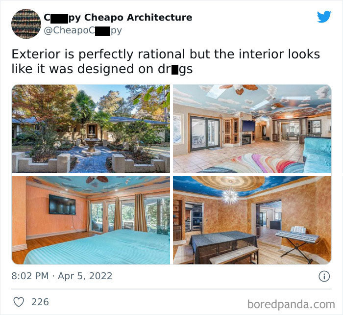
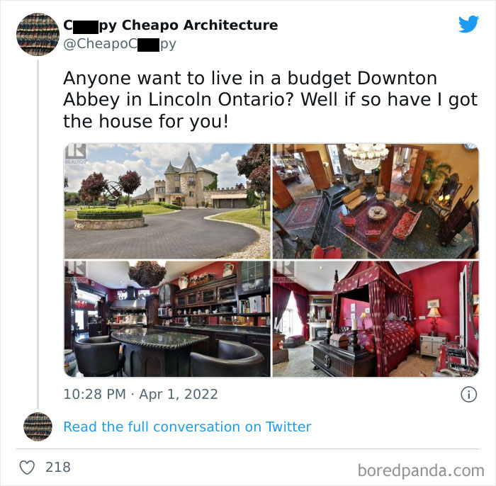
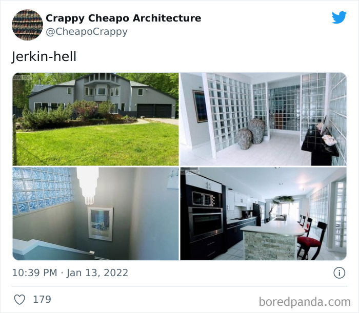
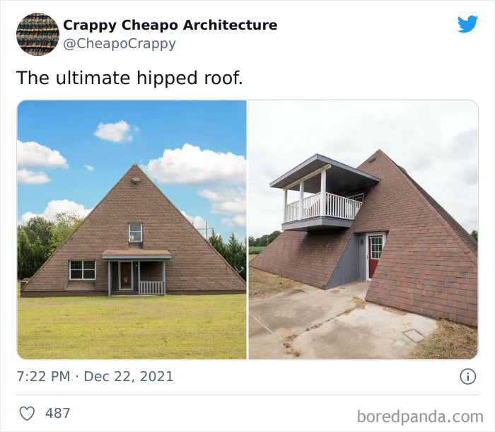
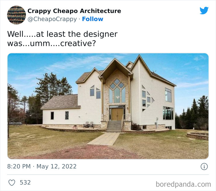
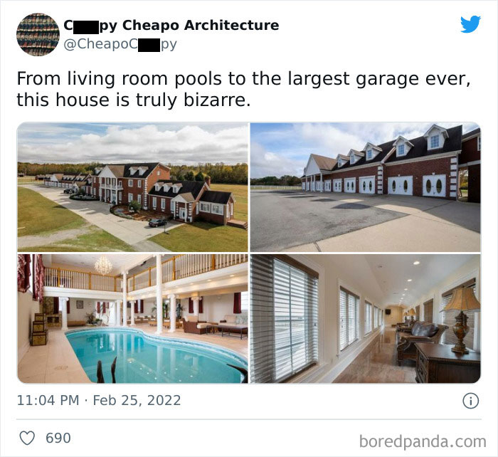
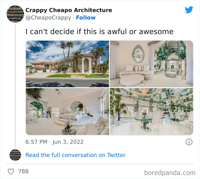
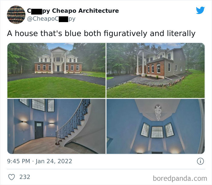
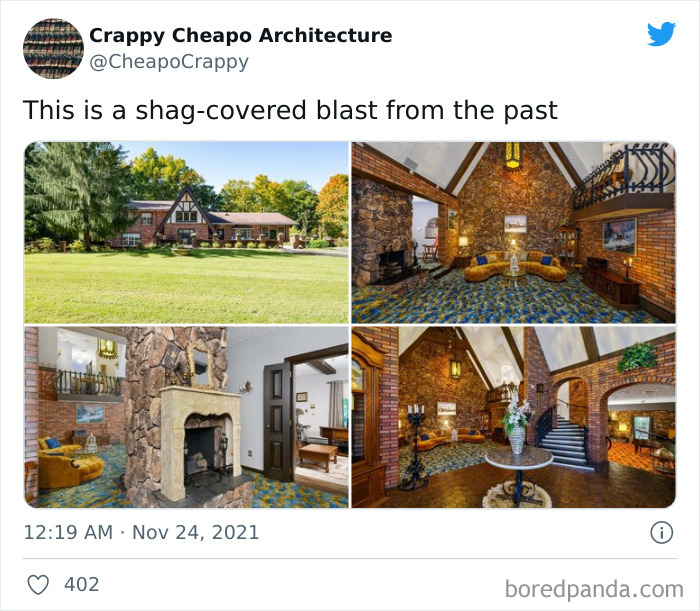
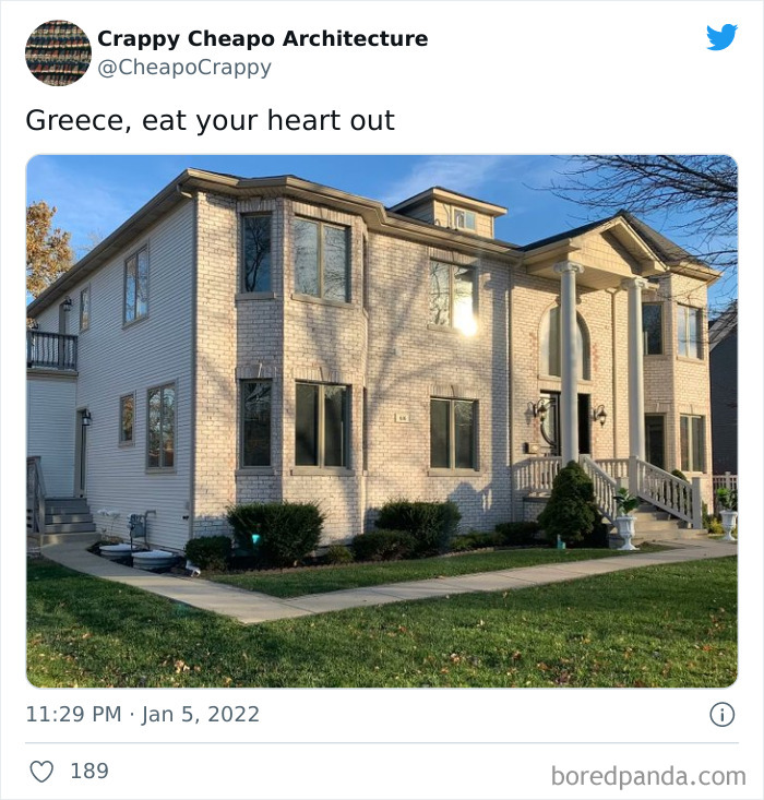
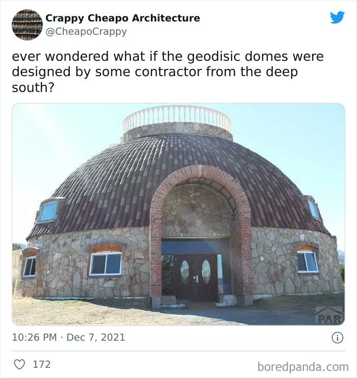
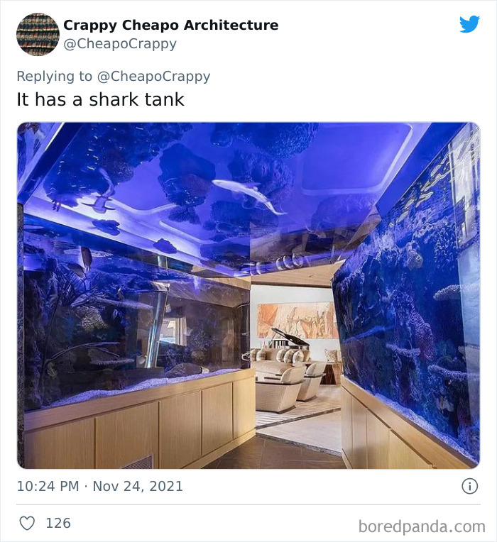
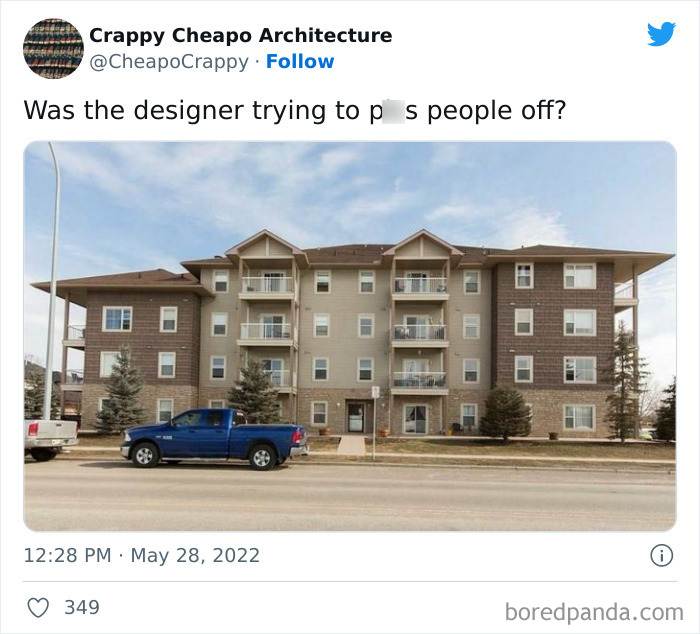
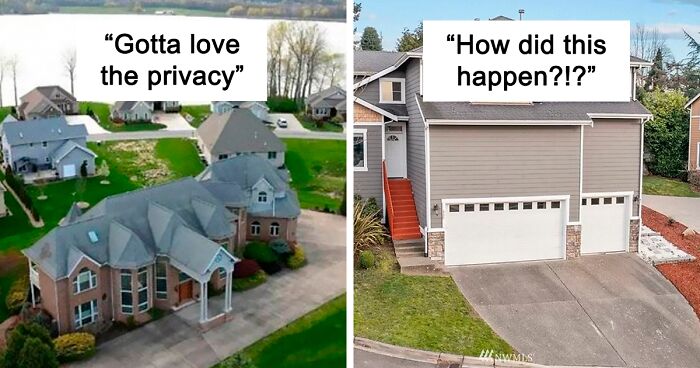
If you enjoy terrible pictures shared by real estate agents or social media pages like 'Ugly Belgian Houses', you're going to love this Twitter account too.

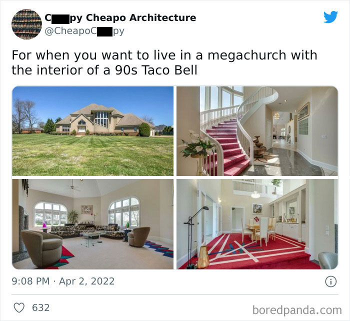
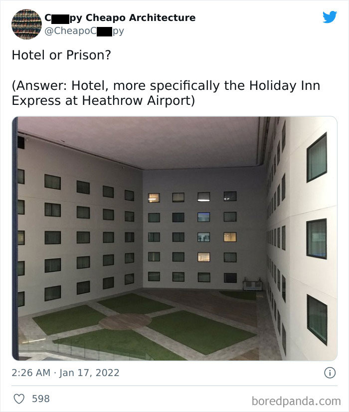
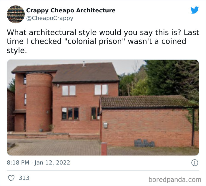
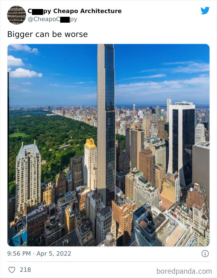
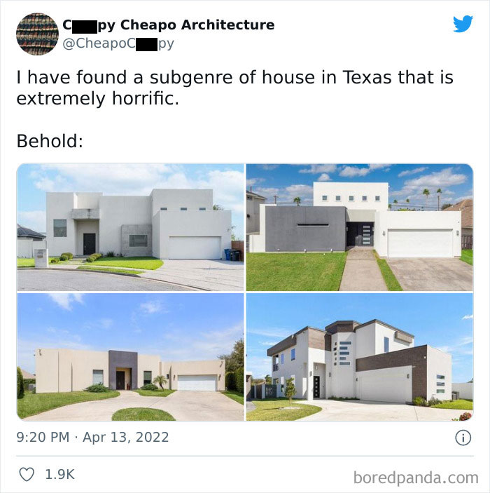
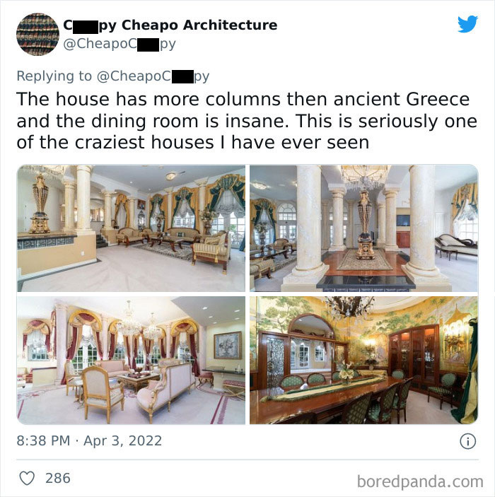
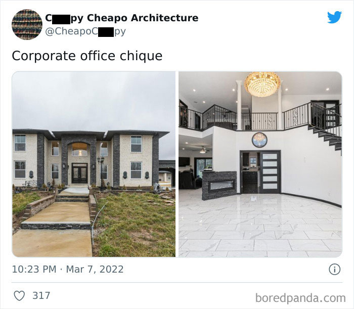
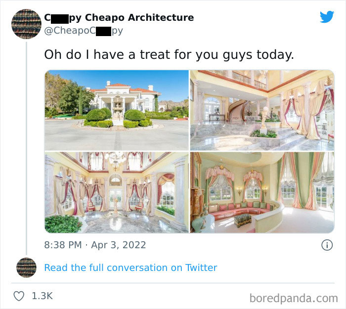
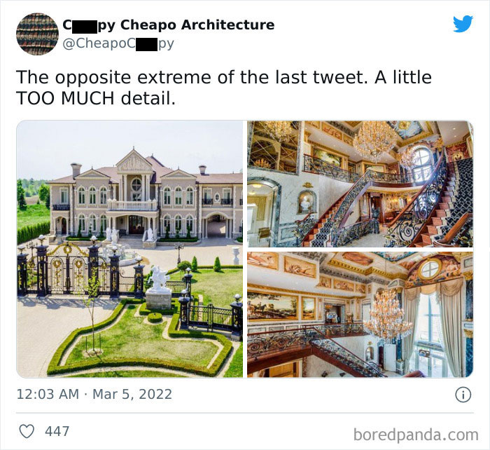
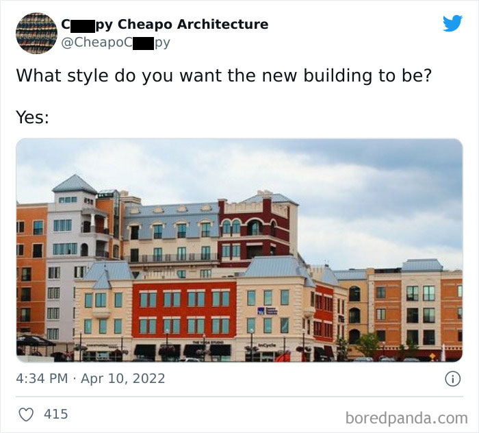
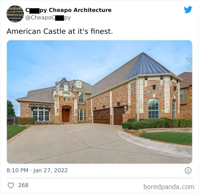
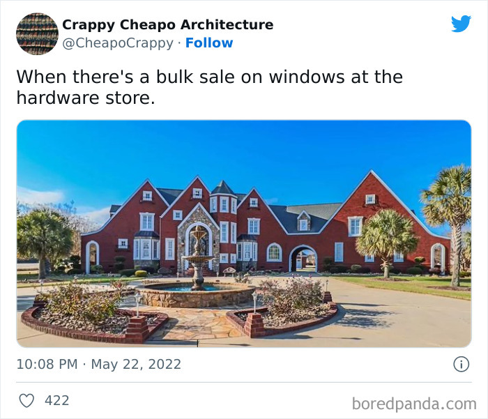
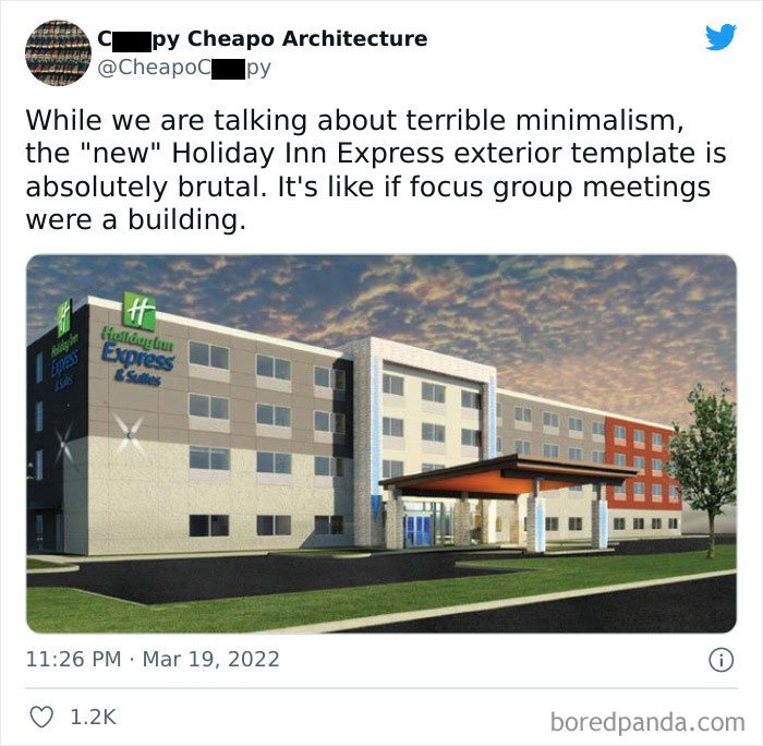
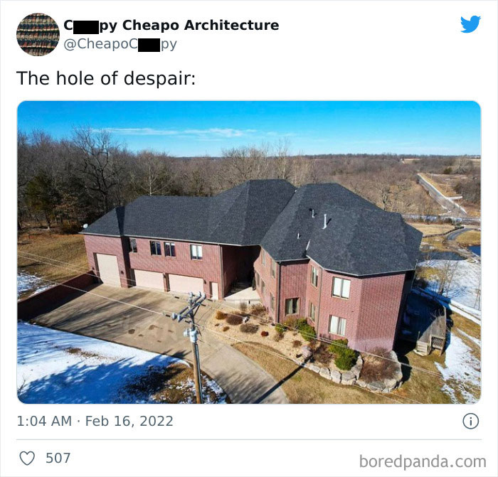
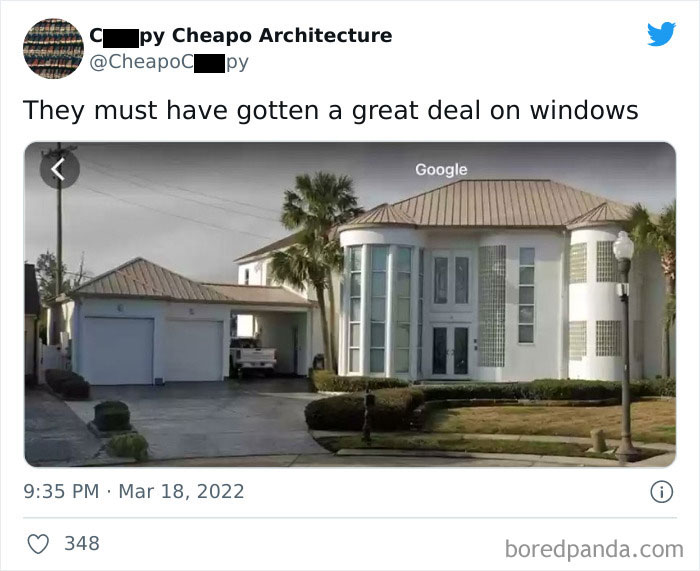
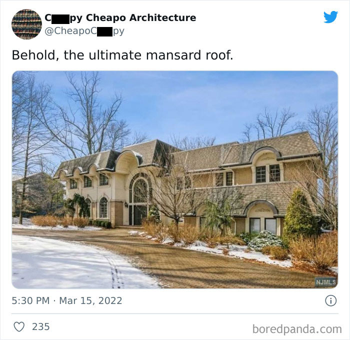
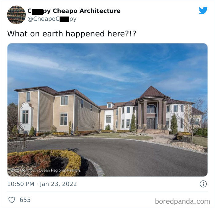
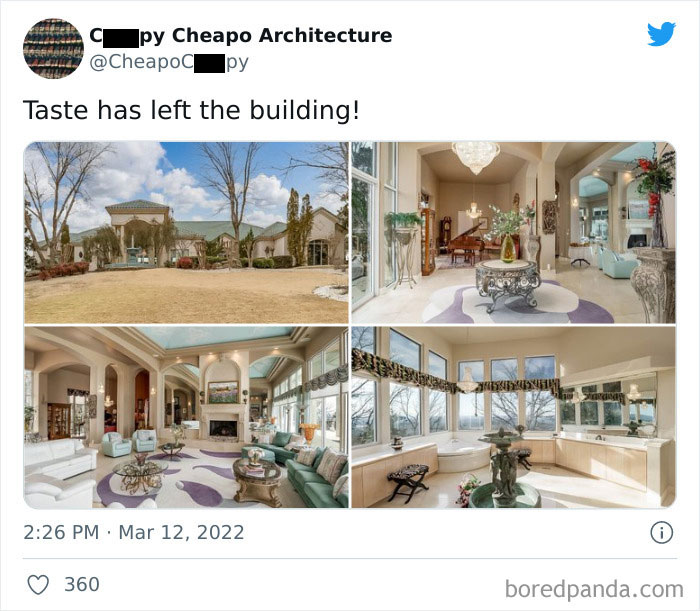
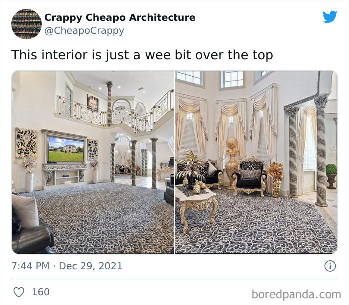
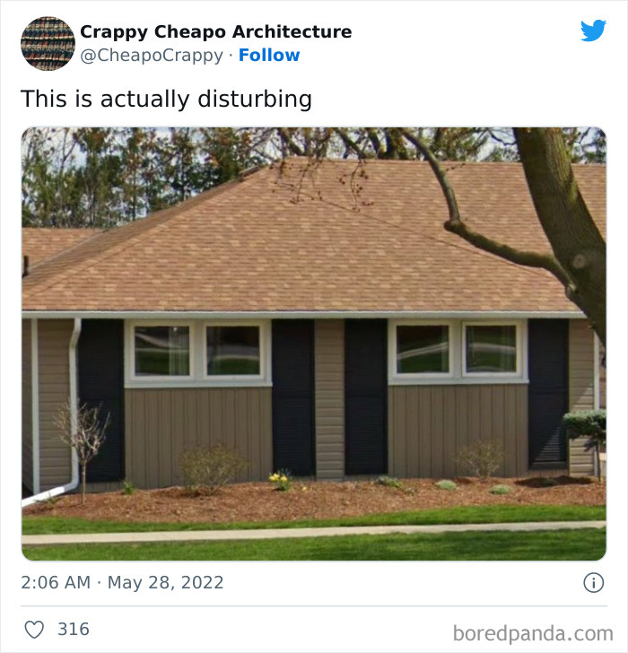
It's called 'Cheapo Architecture' and it has all the home ideas you love to hate. Like a very sad front lawn. Or a living room that looks like a corporate office reception room.
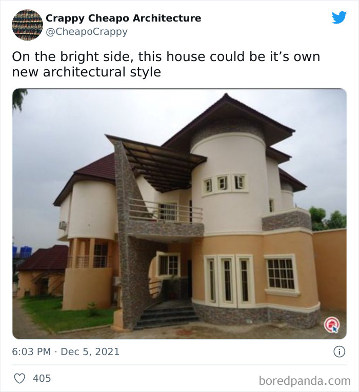
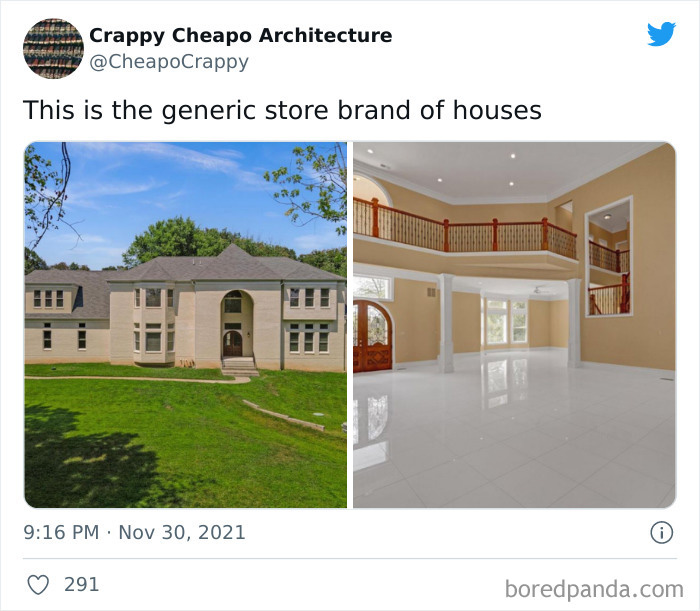
(Sure, taste is subjective and you might actually stumble upon something you actually like, but take this account's content as a whole and I think you'll agree with its main message).

So continue scrolling and who knows, maybe these interior and exterior, let's call them, solutions will actually make you feel better about your own place.

More info: Twitter

#2

Funny-Cheap-Architecture-Interior

CheapoCrppy Report

Add photo comments
POST
Peacemaker21
Community Member
2 years ago (edited) DotsCreated by potrace 1.15, written by Peter Selinger 2001-2017

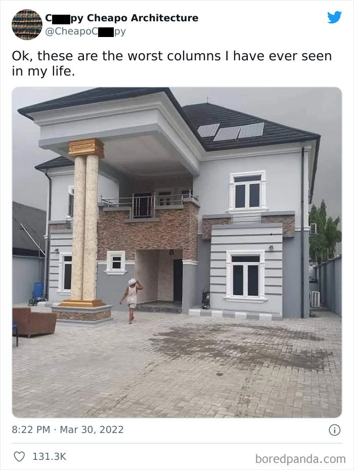
Yes, but why? Why would you want to do that? It looks like a freaking pair of chopsticks!

View More Replies...
View more commentsArrow down menu

To figure out how to choose the right person for decorating your home so it wouldn't end on 'Cheapo Architecture', we contacted interior architect and lecturer of interior design at Vilnius College of Design, Judita Striukienė.

"Architects and interior designers keep up with industry trends by reading special periodicals, following their colleagues' works, taking part in various competitions as well as attending seminars and exhibitions (new technologies often spill into creative fields, so the arts can be a good ground for discoveries). Also, manufacturers often organize product introduction events that also touch on the newest tendencies," she told Bored Panda.

#3

Funny-Cheap-Architecture-Interior

CheapoCrppy Report

Add photo comments
POST
Alessa Gillespie
Community Member
2 years ago DotsCreated by potrace 1.15, written by Peter Selinger 2001-2017

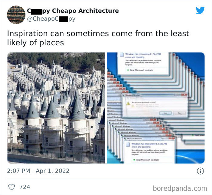
I've seen urban exploration videos of this place. Definitely weird. Not sure who was supposed to be their target buyer

View More Replies...
View more commentsArrow down menu
#4

Funny-Cheap-Architecture-Interior

CheapoCrppy Report

Add photo comments
POST
Me
Community Member
2 years ago DotsCreated by potrace 1.15, written by Peter Selinger 2001-2017

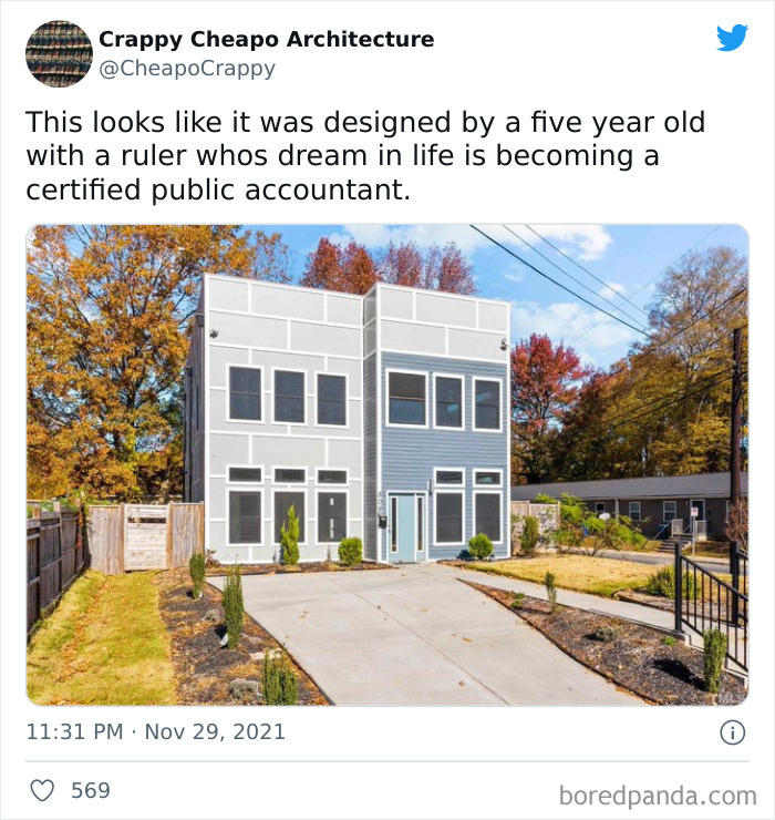
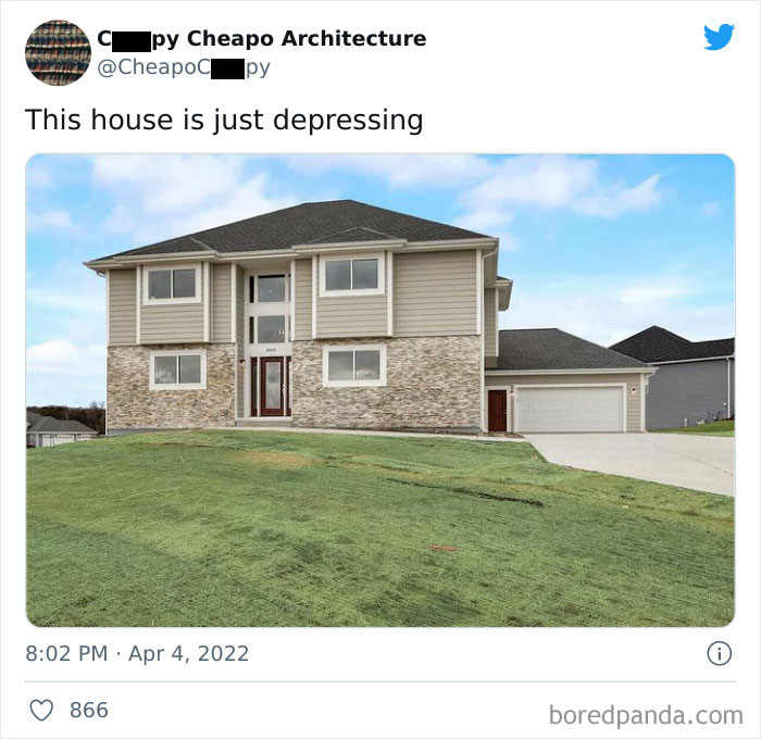
I like it. Full disclosure, I worked for an accounting firm for 8 years.

Choompie & Dottie Gonzales
Community Member
2 years ago DotsCreated by potrace 1.15, written by Peter Selinger 2001-2017

Not an accountant, but I like it as well. I find the shape soothing (until I get to the janky fence, at least).

Load More Replies...
Robert T
Community Member
2 years ago DotsCreated by potrace 1.15, written by Peter Selinger 2001-2017

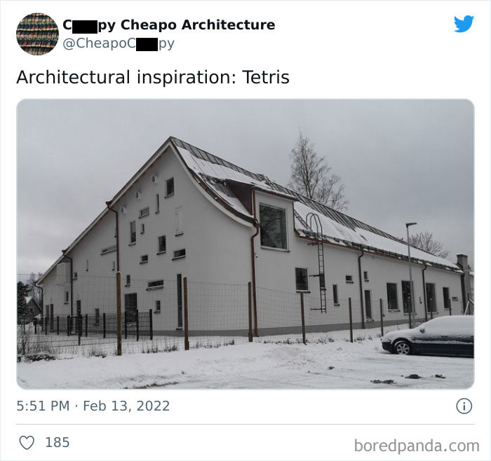
It looks like someone got a Lego set with no angled roof bricks in it. Even the windows look like Lego windows. All it needs is some Lego flowers in the garden and it will be complete!

Doug
Community Member
2 years ago DotsCreated by potrace 1.15, written by Peter Selinger 2001-2017

I disagree, an accountant would have had the windows the same size and aligned.... what's up with that upstairs window, 3rd from the left!

Tessb90
Community Member
2 years ago DotsCreated by potrace 1.15, written by Peter Selinger 2001-2017

Now I'm also annoyed about the lack of a little window above the door to match rest of the bottom row of windows.

Load More Replies...
RandomPanda
Community Member
2 years ago (edited) DotsCreated by potrace 1.15, written by Peter Selinger 2001-2017

looks like my first ever 'fancy' minecraft house when I was 7.

KindaSketchy
Community Member
2 years ago DotsCreated by potrace 1.15, written by Peter Selinger 2001-2017

Not a fan of the faux tile front, but the design itself is cool.

Rider
Community Member
2 years ago DotsCreated by potrace 1.15, written by Peter Selinger 2001-2017

Ouch. Pretty sure I drew that as a child. I'm an accountant at a public school.

tl gmc
Community Member
2 years ago DotsCreated by potrace 1.15, written by Peter Selinger 2001-2017

I used motherlode to buy my Sim the most expensive house and he hated it and was depressed looking at the rooms, he'd love this box

Load More Replies...
Monosyllabic girl
Community Member
2 years ago DotsCreated by potrace 1.15, written by Peter Selinger 2001-2017

I love it! I do hold an accounting degree though 🤣 the door should be taller or have one of those small rectangular windows above it to even the height

Brandi VanSteenwyk
Community Member
2 years ago DotsCreated by potrace 1.15, written by Peter Selinger 2001-2017

Reminds me very much of all the uglier-than-sin high-density-housing that is coming up in droves all along our Wasatch Front here in Utah. Really, what happened to offering privacy and green spaces in multi-family housing complexes? Like my son commented: 20 years from now it's gonna look like we've been overrun by the projects. No thank you.

🌵 Drazil
Community Member
2 years ago DotsCreated by potrace 1.15, written by Peter Selinger 2001-2017

Never knew a fifth grader who could draw a straight line with or without a ruler!!!! (taught for 35+ yrs!)

Memere
Community Member
2 years ago DotsCreated by potrace 1.15, written by Peter Selinger 2001-2017

This is a computer rendering! But I have seen actual houses built exactly like this, both in my hometown and in other cities. Soulless boxes, usually in very ugly, muddy colors.

Octavia Hansen
Community Member
2 years ago DotsCreated by potrace 1.15, written by Peter Selinger 2001-2017

At least when they are in the house they don't have to see it. The neighbors are probably really pissed!

View more commentsArrow down menu
ADVERTISEMENT

"When choosing an architect or interior designer, people should first consider their experience and professionalism," Striukienė said. "They should also have a similar set of values and aesthetics to you—something that can be seen in their portfolios."

"And, of course, a very important aspect of these relationships is psychological character compatibility. Without it, working together can become really challenging."

ADVERTISEMENT

All of this should then translate into a well-wishing and respectful cooperation, where everything goes smoothly. "To me, it's very important that the client allows creativity," Striukienė said.

ADVERTISEMENT

"You often have to educate them on essential architectural and interior design factors, help them navigate their own wants and preferences, understand. These things cost energy. However, if we've established a good relationship and there's room for creative exploration, the effort is worth it."

"What you want the least is to also work as a psychologist."

#11

Funny-Cheap-Architecture-Interior

CheapoCrppy Report

Add photo comments
POST
Jrog
Community Member
2 years ago (edited) DotsCreated by potrace 1.15, written by Peter Selinger 2001-2017

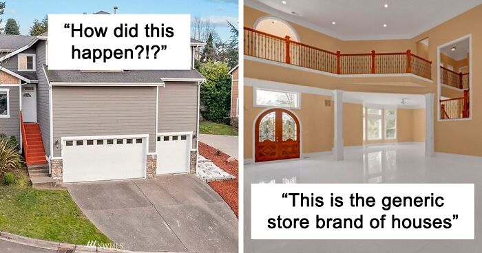
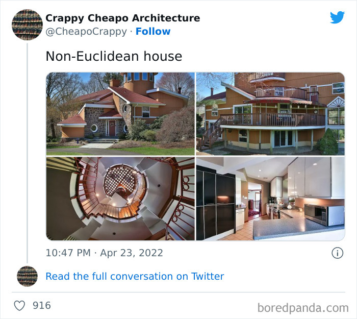
See the house on the left & at the back: this house is on a steep slope. The front entrance is clearly on the other side, where the street level is close to the level of the top floor. The car garage is at the back, where the street level is much lower. The door is just a backdoor leading to a mezzanine, and usually there is an internal staircase leading to an internal mezzanine and then to the top floor. It's not an unusual layout for houses built on hillsides.

View More Replies...
View more commentsArrow down menu

When you're settling in, oftentimes the final version of your home looks different from the initial vision. Which, according to the interior architect, isn't necessarily bad.

"That can happen due to many reasons. For example, as I already mentioned, since the client deepens their understanding of architecture and interior design, they might decide to take the project to a new direction themselves."

ADVERTISEMENT
#14

Funny-Cheap-Architecture-Interior

CheapoCrppy Report

Add photo comments
POST
Jrog
Community Member
2 years ago DotsCreated by potrace 1.15, written by Peter Selinger 2001-2017

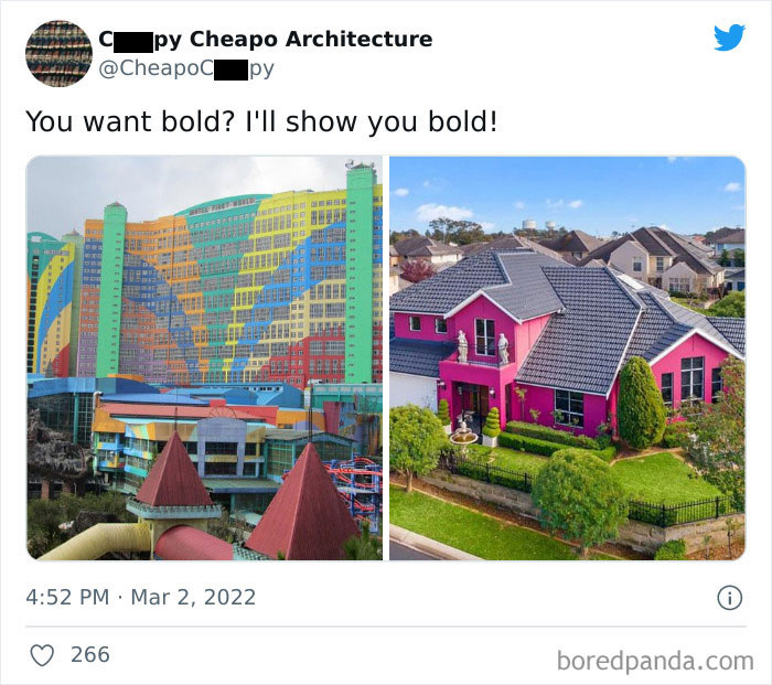
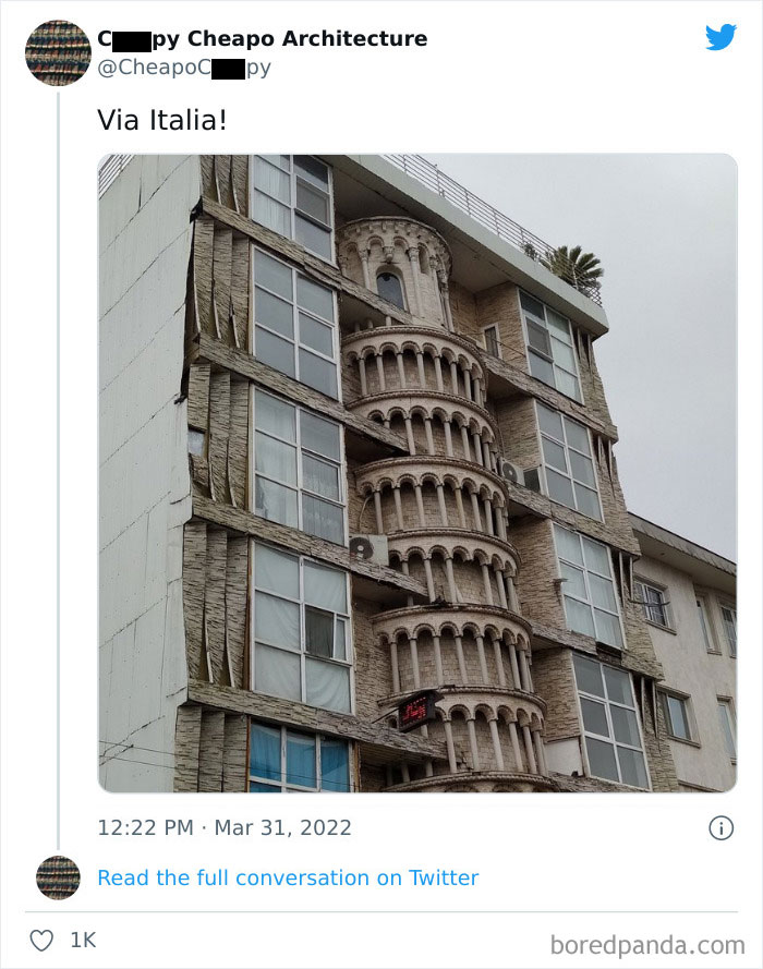
It's a novelty shop and restaurant in Lahijan, in the iranian Gilan Province, called Pizza Tower. Coordinates are 37.19984016362511, 50.01520654044357. The road is not mapped on google, but trust me, it's there. The photo is cropped, in the full photo the name of the restaurant is visible

View More Replies...
View more commentsArrow down menu
#15

Funny-Cheap-Architecture-Interior

CheapoCrppy Report

Add photo comments
POST
Elsker
Community Member
2 years ago DotsCreated by potrace 1.15, written by Peter Selinger 2001-2017

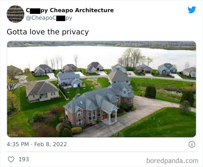
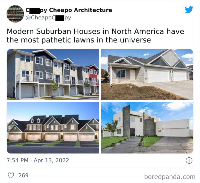
what is the purpose of those lawns anyway? do kids play there or are they just meant for aesthetical reasons? seems like such a waste of space

View More Replies...
View more commentsArrow down menu
#16

Funny-Cheap-Architecture-Interior

CheapoCrppy Report

Add photo comments
POST
Deborah B
Community Member
2 years ago DotsCreated by potrace 1.15, written by Peter Selinger 2001-2017

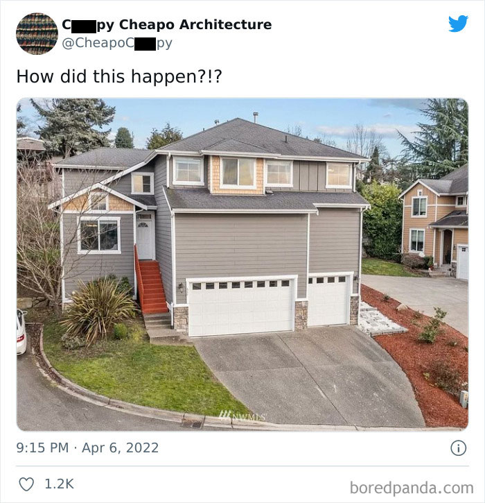
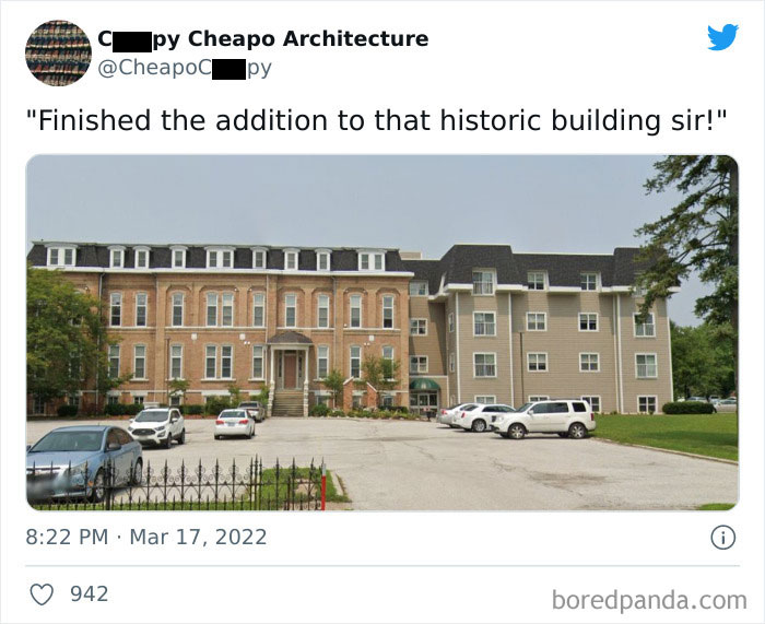
It's like they desined it to be a story taller, and then got told that it was only allowed to be the same height as the original.

View More Replies...
View more commentsArrow down menu

Another common reason for a change in plans, according to Striukienė, comes from decor materials. When you have a limited budget, you might need to swap what you want with what you can actually get and that, naturally, has an impact on the end result too.

#19

Funny-Cheap-Architecture-Interior

CheapoCrppy Report

Add photo comments
POST
ƒιѕн
Community Member
2 years ago DotsCreated by potrace 1.15, written by Peter Selinger 2001-2017

Well, with the material shortage still ongoing... ya gotta use what you can get.

View More Replies...
View more commentsArrow down menu
ADVERTISEMENT
#23

Funny-Cheap-Architecture-Interior

CheapoCrppy Report

Add photo comments
POST
Nimues Child
Community Member
2 years ago (edited) DotsCreated by potrace 1.15, written by Peter Selinger 2001-2017

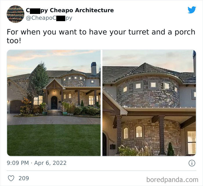
The roofline on that turret looks like mortarboard chic. It just needs a tassel.

View More Replies...
View more commentsArrow down menu
#26

Funny-Cheap-Architecture-Interior

CheapoCrppy Report

Add photo comments
POST
pink_panda
Community Member
2 years ago DotsCreated by potrace 1.15, written by Peter Selinger 2001-2017

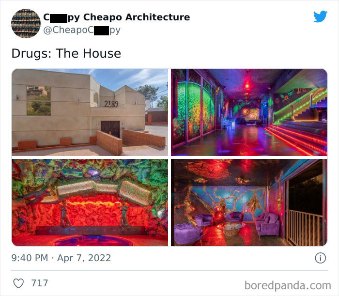
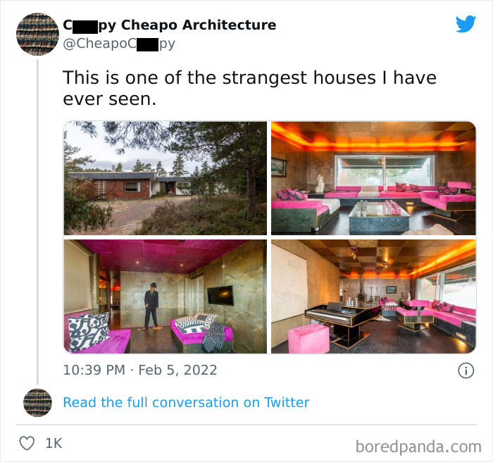
What is even happening with that black and white interior with single amber light?! Ugh!

View More Replies...
View more commentsArrow down menu
ADVERTISEMENT
#28

Funny-Cheap-Architecture-Interior

CheapoCrppy Report

Add photo comments
POST
Elsker
Community Member
2 years ago DotsCreated by potrace 1.15, written by Peter Selinger 2001-2017

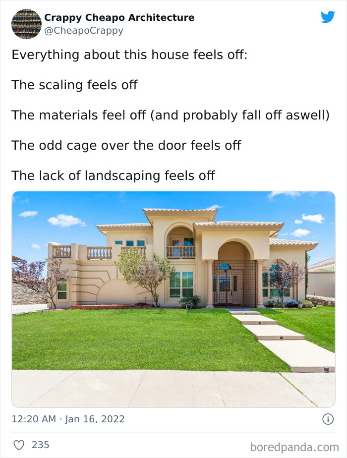
agree about the cage, but otherwise i've seen worse:) Also, i think i would turn that setting-sun-shape into a window:)

View More Replies...
View more commentsArrow down menu
#32

Funny-Cheap-Architecture-Interior

CheapoCrappy Report

Add photo comments
POST
Edgar
Community Member
2 years ago DotsCreated by potrace 1.15, written by Peter Selinger 2001-2017

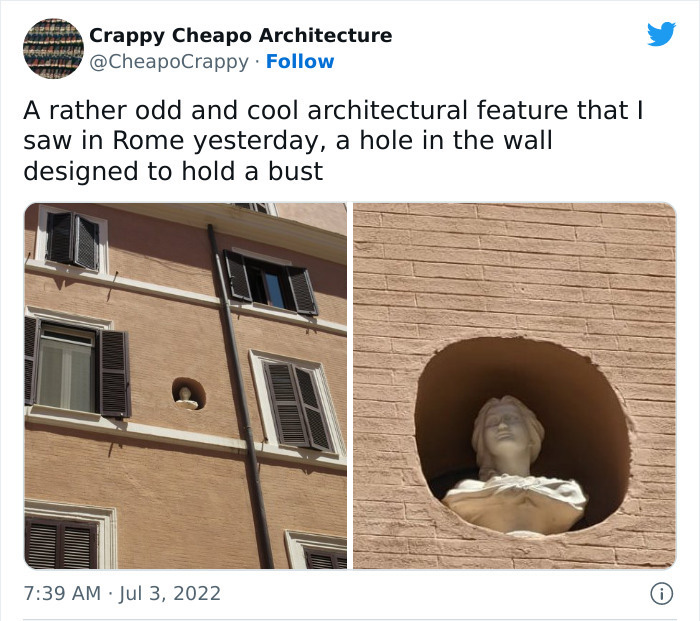
Usually, it's because the exterior of the house has been renovated, but they kept the statue, which probably was a part of more elaborated decoration prior damages. In Rome, it might be caused by war.

View More Replies...
View more commentsArrow down menu
#34

Funny-Cheap-Architecture-Interior

CheapoCrppy Report

Add photo comments
POST
Monique Reed
Community Member
2 years ago DotsCreated by potrace 1.15, written by Peter Selinger 2001-2017

Fill that with tasteful furniture with accents of color, beautiful art, and lots of books and plants and it will be wonderful.

View More Replies...
View more commentsArrow down menu
Continue reading with Bored Panda Premium
Unlimited content
Ad-free browsing
Dark mode
ADVERTISEMENT
See Also on Bored Panda
#37

Funny-Cheap-Architecture-Interior

CheapoCrppy Report

Add photo comments
POST
Nimues Child
Community Member
2 years ago DotsCreated by potrace 1.15, written by Peter Selinger 2001-2017

What, now? It looks like it was co-designed by an entire class of first-years.

View more commentsArrow down menu
#38

Funny-Cheap-Architecture-Interior

CheapoCrppy Report

Add photo comments
POST
Jennifer Barrett
Community Member
2 years ago DotsCreated by potrace 1.15, written by Peter Selinger 2001-2017

It kind of looks like the window ledges are designed as a climbing wall to make it easy to go window to window.

View more commentsArrow down menu
#41

Funny-Cheap-Architecture-Interior

CheapoCrappy Report

Add photo comments
POST
STress
Community Member
2 years ago DotsCreated by potrace 1.15, written by Peter Selinger 2001-2017

"Boss, where do I put windows?" "Just throw 'em, they'll stick somewhere..."

View more commentsArrow down menu
#42

Funny-Cheap-Architecture-Interior

CheapoCrppy Report

Add photo comments
POST
SkekVi
Community Member
2 years ago DotsCreated by potrace 1.15, written by Peter Selinger 2001-2017

I mean it's ugly but it's just the same boxy box that hotels have been for some decades now...?

View more commentsArrow down menu
ADVERTISEMENT
See Also on Bored Panda
#51

Funny-Cheap-Architecture-Interior

CheapoCrppy Report

ADVERTISEMENT
See Also on Bored Panda
#52

Funny-Cheap-Architecture-Interior

CheapoCrppy Report

Add photo comments
POST
Monique Reed
Community Member
2 years ago DotsCreated by potrace 1.15, written by Peter Selinger 2001-2017

If there isn't also a doghouse with a mansard roof, the deal is off.

View more commentsArrow down menu
#53

Funny-Cheap-Architecture-Interior

CheapoCrppy Report

#55

Funny-Cheap-Architecture-Interior

CheapoCrppy Report

Add photo comments
POST
ƒιѕн
Community Member
2 years ago DotsCreated by potrace 1.15, written by Peter Selinger 2001-2017

When you family has just continually refused to leave home over the generations...

View More Replies...
View more commentsArrow down menu
#58

Funny-Cheap-Architecture-Interior

CheapoCrppy Report

Add photo comments
POST
WordWeaver
Community Member
2 years ago DotsCreated by potrace 1.15, written by Peter Selinger 2001-2017

You wouldn't want to slip and fall against any of those surfaces.

View more commentsArrow down menu
ADVERTISEMENT
See Also on Bored Panda
#63

Funny-Cheap-Architecture-Interior

CheapoCrppy Report

Add photo comments
POST
WordWeaver
Community Member
2 years ago DotsCreated by potrace 1.15, written by Peter Selinger 2001-2017

Southern mansion wannabe at the front, no style at all around the side.

#64

Funny-Cheap-Architecture-Interior

CheapoCrppy Report

Add photo comments
POST
SkekVi
Community Member
2 years ago DotsCreated by potrace 1.15, written by Peter Selinger 2001-2017

Kinda love this? It knows what it's about, it's symmetrical, it all works together as a unit... idk it's weird but I respect it.

View more commentsArrow down menu
ADVERTISEMENT
See Also on Bored Panda