30 Signs That Turned Out To Be So Hilariously Absurd, People Had To Share Them With This Facebook Group (New Pics)
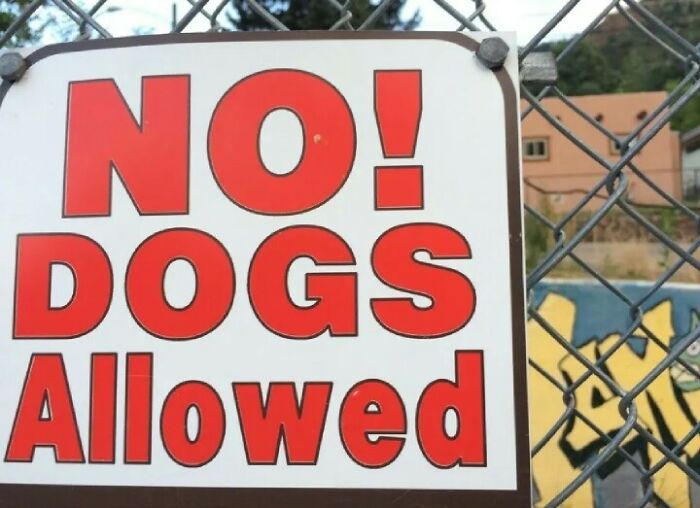
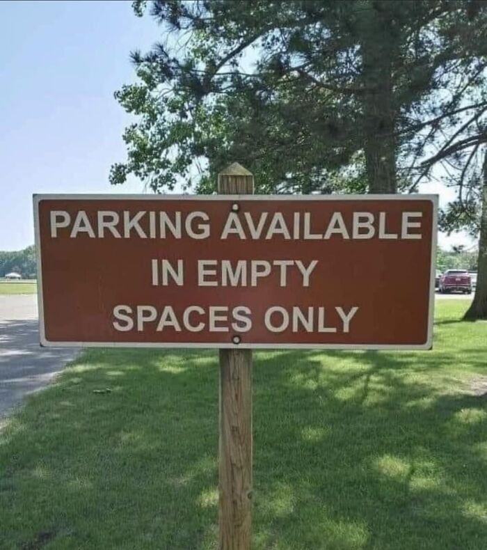
The Absurd Sign Project is a Facebook group that, as the name suggests, is dedicated to sharing photos of bizarre intentionally (and not) funny signs.
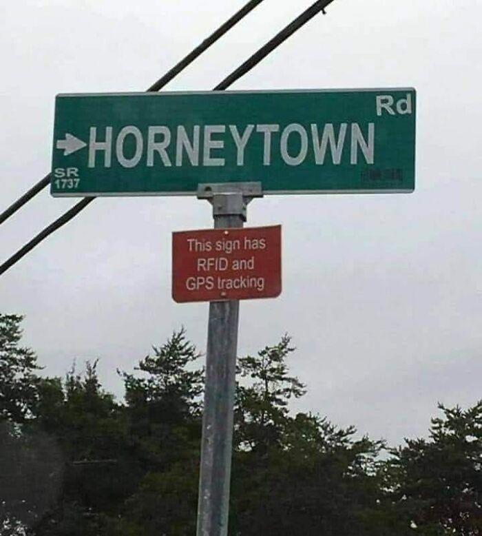
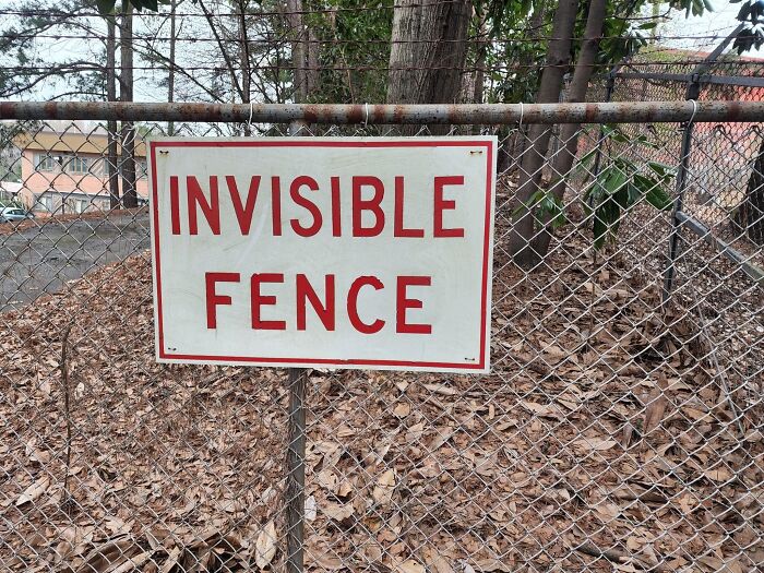
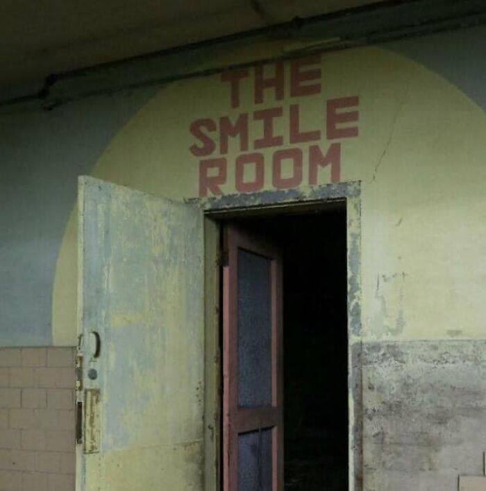
From pointing to Horneytown to warning about an invisible fence and advertising a definitely not haunted house, the group's 100,000 members stumble across all sorts of unexpected messages all over the world.
In a time when life can sometimes feel overwhelming, a lighthearted laugh might be just what we need to remember not to take everything too seriously. And this place can provide it.
This post may include affiliate links.
According to Signs & Lines, a company that has been making great signs for over 35 years, a good sign needs to be aware of these four critical things:
- Audience – a sharp focus on key users;
- Message – design, brand, location, and visibility;
- Environment – the sign's location and nearby architectural features;
- Function – durability, information, static or interactive.
Clearly, most of the signs we see in the pictures have ignored at least one of these aspects.
"Irrespective of the sign type the key premise of a sign is to convey a message," Signs & Lines wrote.
"Usually this is a relatively short, sharp communication. The number one task of any sign is to get a message across as quickly and effectively as possible."
Business owners should remember that their signs are kind of a big deal. "Whether static or digital signage, your customers, users, guests, staff, students, and visitors need you to have good signage ... [because] it's the first visual connection with your company," Signs & Lines explained.
Good signs will:
- help them find your business;
- assist in their navigation of your organization;
- convince them that you are professional;
- assure them that they are in the right place.
"Transitioning from good to great signage involves many different aspects of design including logo, creative, positioning, colors, and manufacturing ability," Signs & Lines added.
Once designed in detail, a typical sign may undergo a number of steps to achieve a high-quality result. These include:
- routering of materials to create precision shapes;
- fabrication of metals to form rigid structures and frameworks;
- spray painting of sign elements to automotive standards;
- graphics imagery to bring the messaging to life;
- illumination by LED or neon for 24/7 visibility;
- assembly of all components;
- installation on-site at height or in the ground.
Or, in other words, there are plenty of areas where they can fall short!
And I bet he's saving it for the giant turtle the earth sits on
I had an invisible pencil but I got rid of it, couldn't see the point of it.
If stupidness rode a bike some people´d have to pull the brake uphills here hahahaha, that´s a German saying.
If stupidness rode a bike some people´d have to pull the brake uphills here hahahaha, that´s a German saying.

 Dark Mode
  No fees, cancel anytime


