Formula 1 Changes Their 24-Year-Old Logo, Probably Doesn’t Expect Reaction Like This
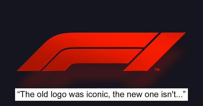
Whenever a company changes something that fans have been familiar with for years, there’s bound to be some backlash. World-famous racing company Formula 1, however, opened up the gates of hell this week by changing their iconic 24-year-old logo to a sleek, modern design.
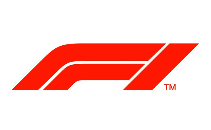
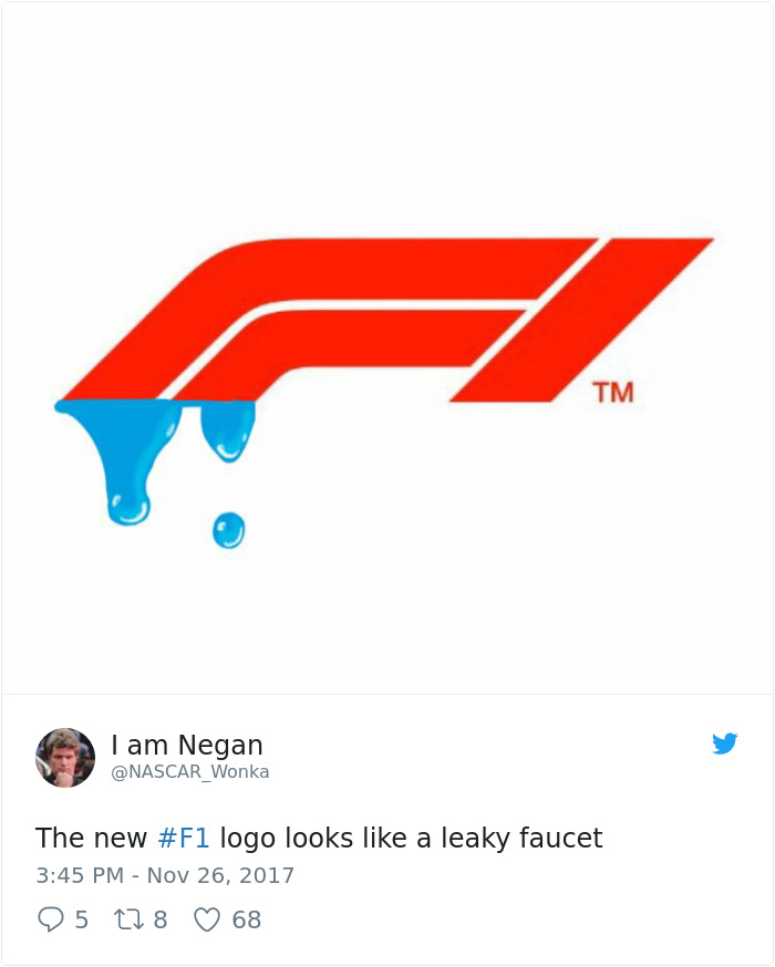
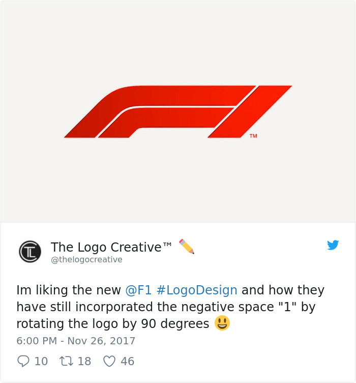
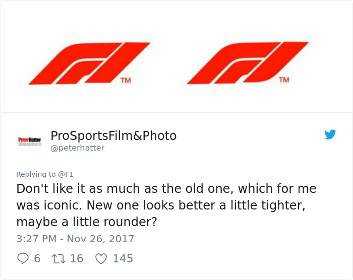
The slanted, all-red, CNN-like logo was unveiled in Abu Dhabi on Sunday after being implemented by company owners Liberty Media, in collaboration with marketing director Ellie Norman and ad agency Wieden + Kennedy. Though Norman later commented that feedback on the new look had been ‘incredibly positive,’ a quick trip to the Internet proves somewhat the opposite. Long-term F1 fans are crucifying the shift in aesthetics, calling the new logo ‘amateurish’ and comparing it to a leaky faucet. Even four-time F1 champion Lewis Hamilton reportedly ‘liked the old one better.’ Some, though, admitted that it ‘could have been worse.’
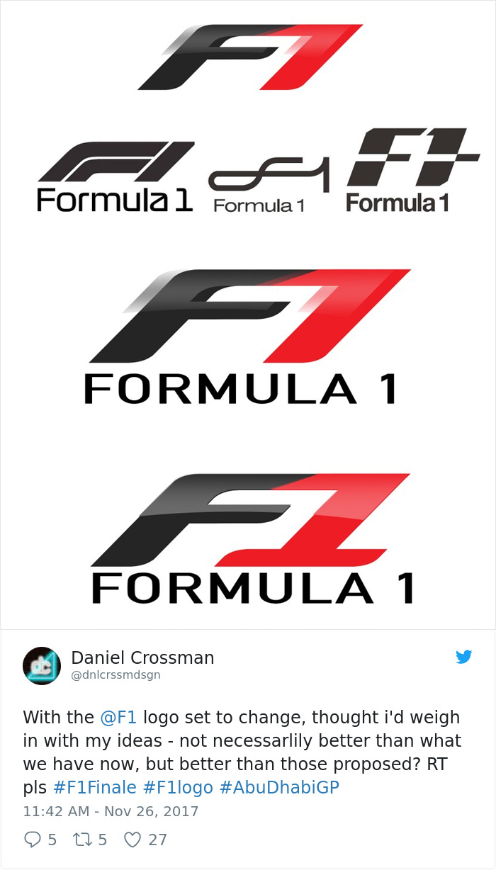
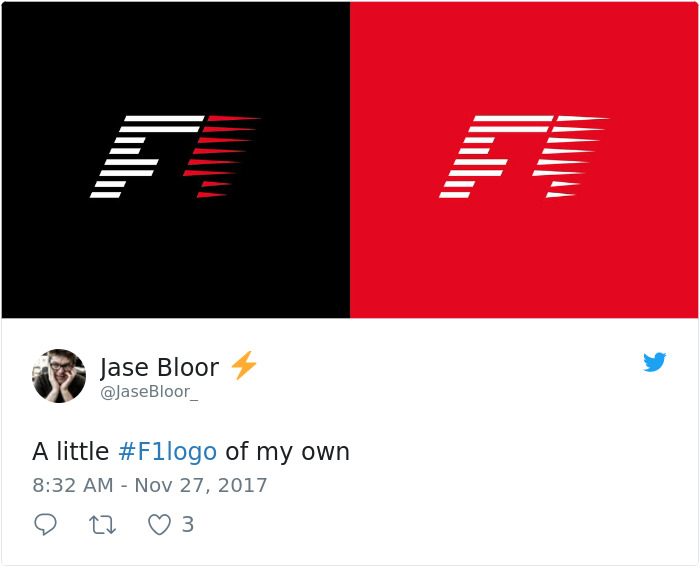
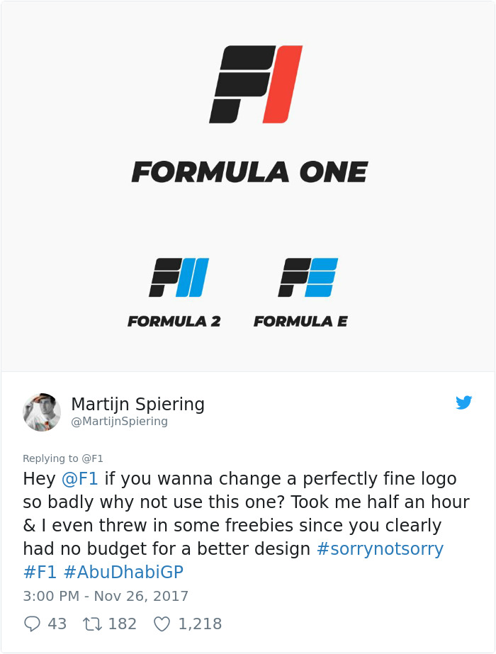
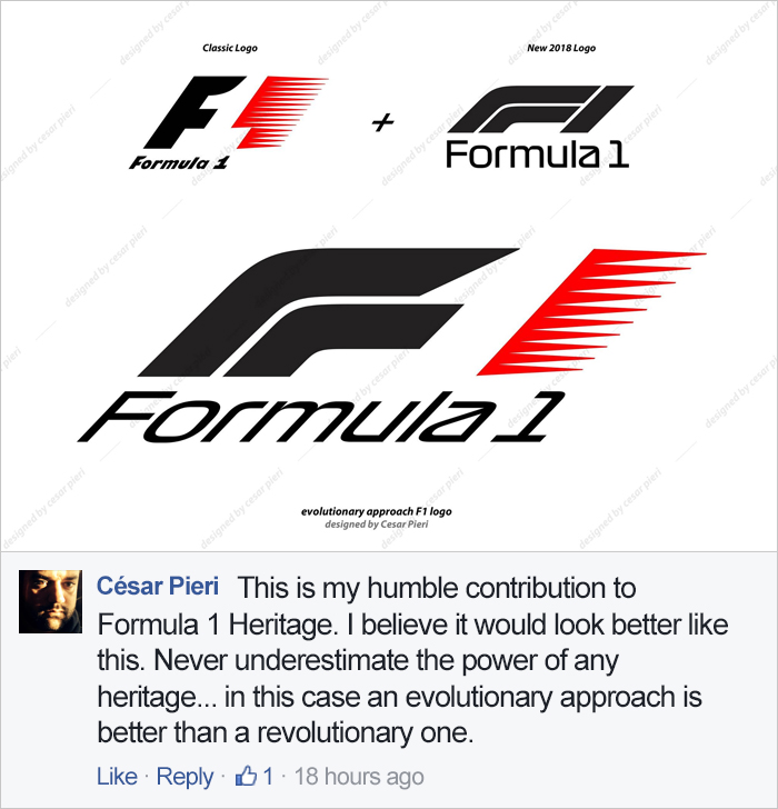
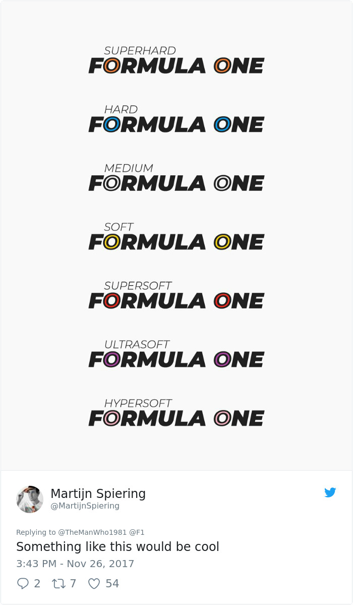
Arguably, the most entertaining part of this drama is the fact that creators have taken it upon themselves to ‘fix’ the logo. Twitter has now become flooded by suggested revamps, including one from Will Paterson, the hand letterer who recently predicted 2018’s biggest graphic design trends. What do you think of Formula 1’s fresh visuals? How will they respond to this wave of criticism? Tell us your point of view in the comments below.
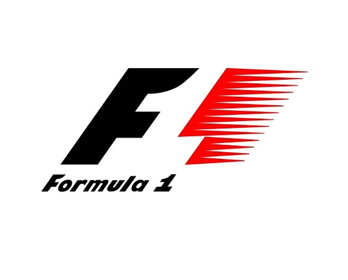
Recognize this iconic logo? World-famous racing company Formula 1 has been using it since 1993
However, some shocking news was delivered to the Internet on Sunday after the Abu Dhabi Grand Prix
Meet the new F1 insignia, a collaborative project between Liberty Media, marketing director Ellie Norman and ad agency Wieden + Kennedy (video below)
Image credits: f1
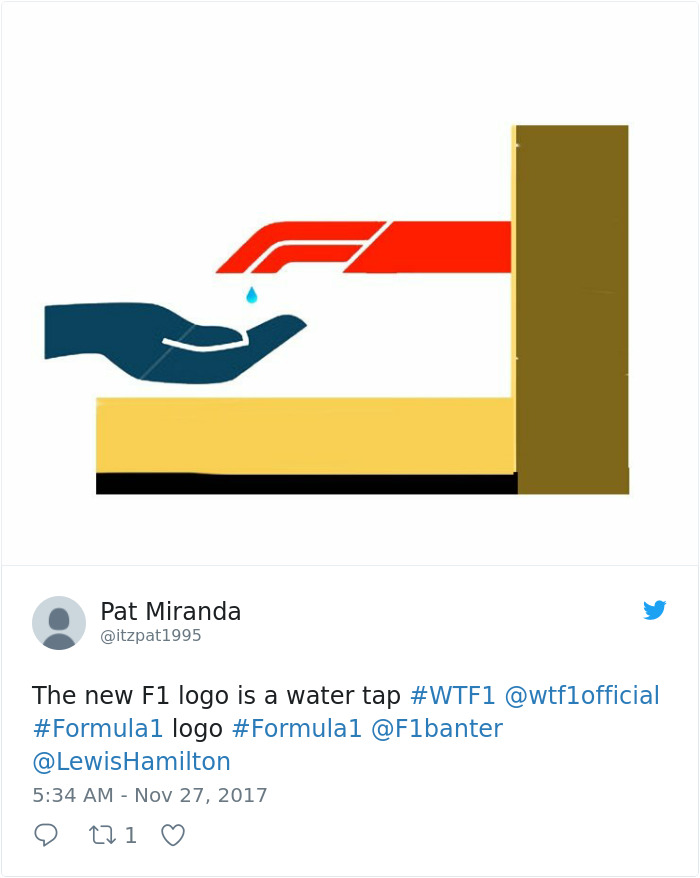
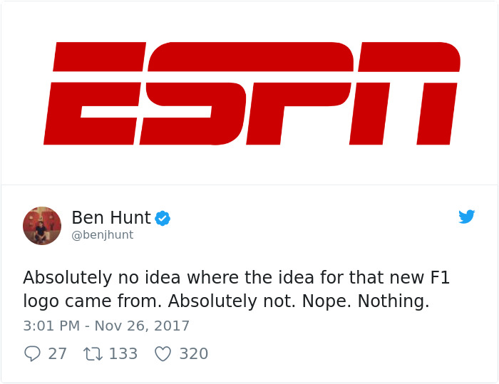
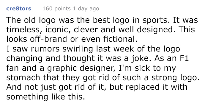
As with the end of any era, some fans took it hard, and proceeded to mercilessly troll the fresh emblem
Others, however, embraced the change
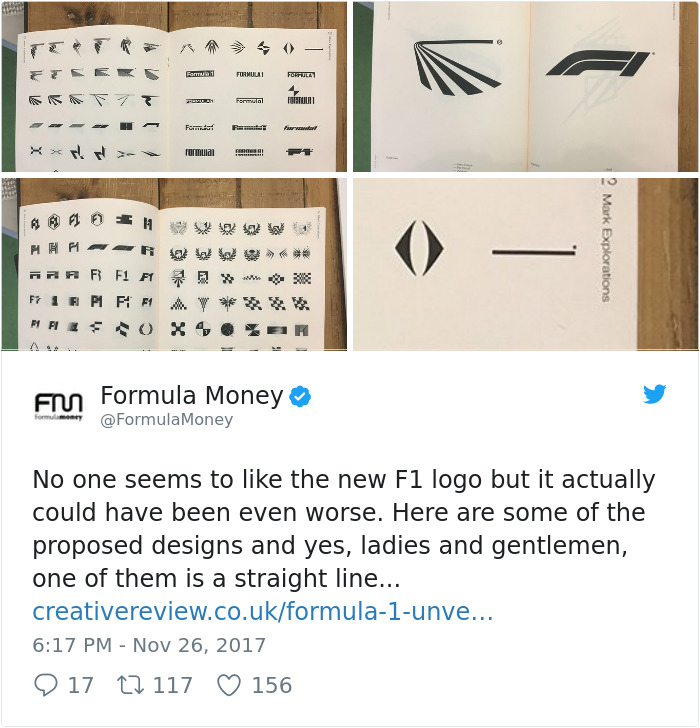
F1’s own industry monitor even came forward to put it all in perspective, adding that ‘it could have been worse’
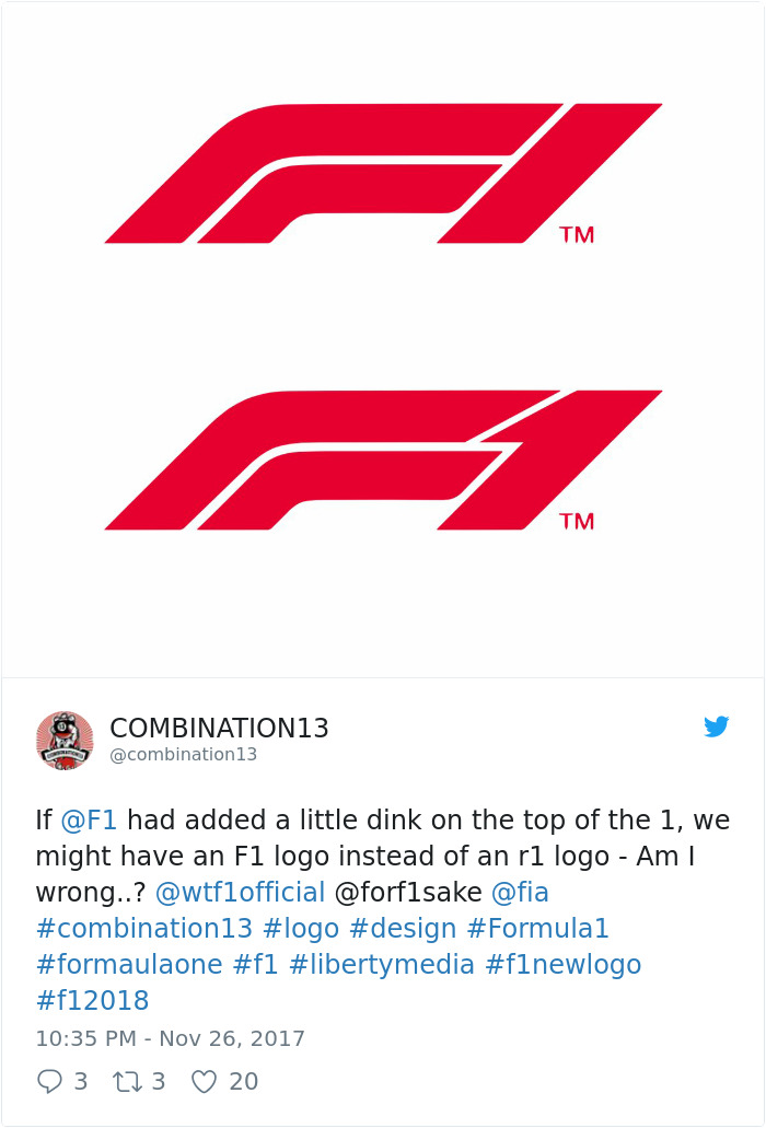
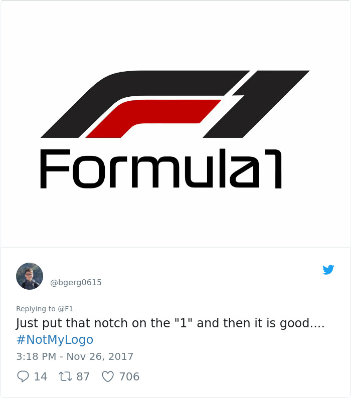
Designers and creators following the news decided to try their hand at ‘fixing’ the logo, and here’s how they did
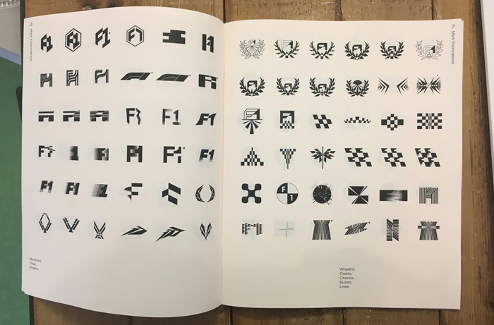
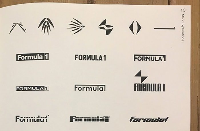
Some even proposed entirely new ideas
Here’s an in-depth analysis by graphic designer and hand letterer Will Paterson
What do you think of the new logo? Will F1 cave to the demands of angry fans? Tell us below!
35Kviews
Share on FacebookWhile updating the logo with time makes sense, I'm surprised that it was changed so drastically. A logo is such a huge part of brand recognition...
I like that some people actually contributed new logos instead of just complaining about it.
While updating the logo with time makes sense, I'm surprised that it was changed so drastically. A logo is such a huge part of brand recognition...
I like that some people actually contributed new logos instead of just complaining about it.

 Dark Mode

 No fees, cancel anytime



















75
39