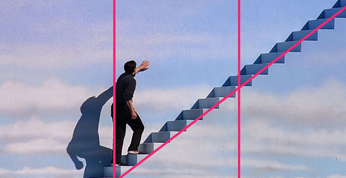
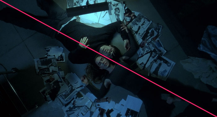
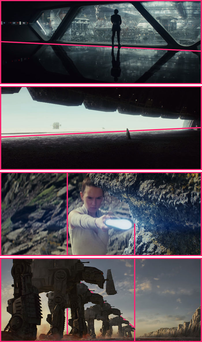
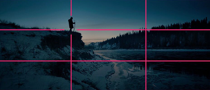
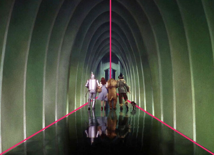
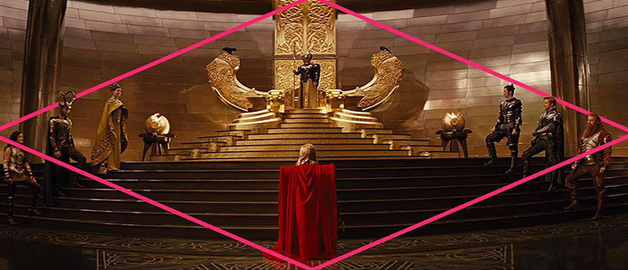
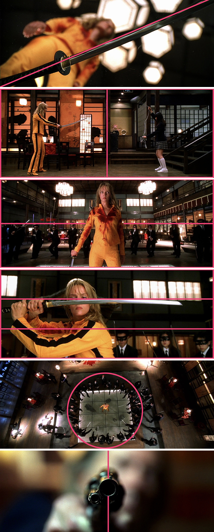
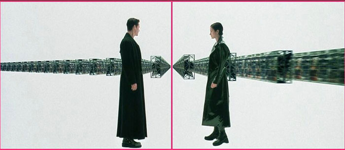
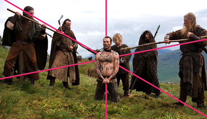
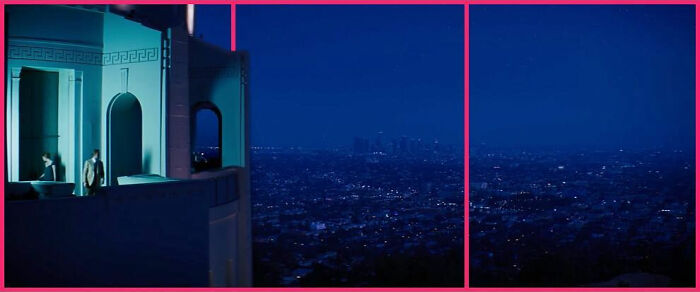
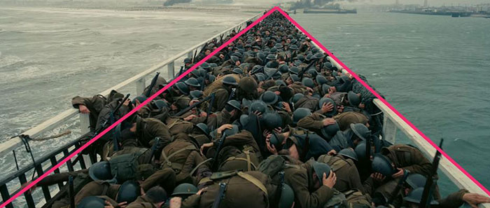
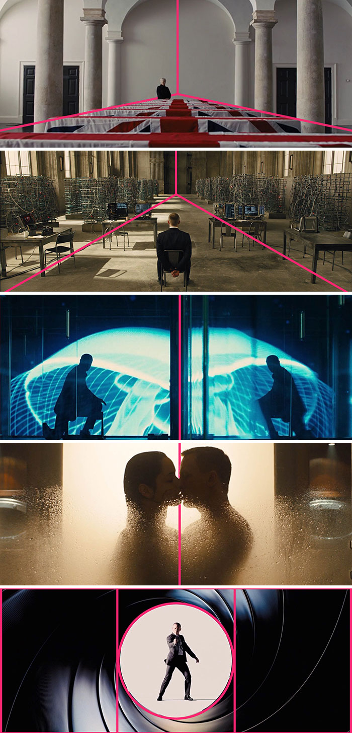
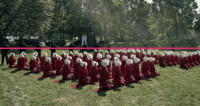
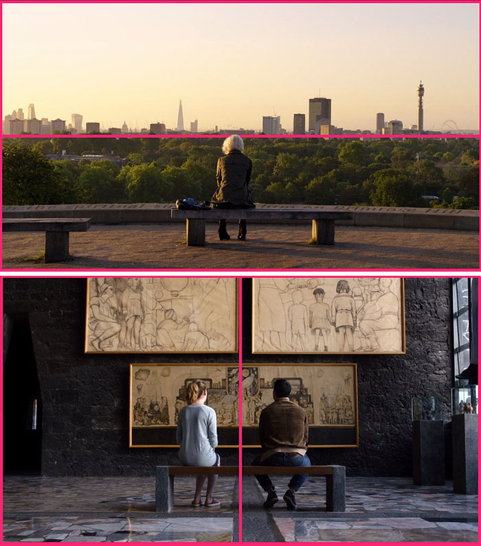
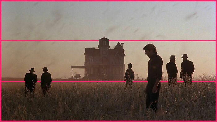
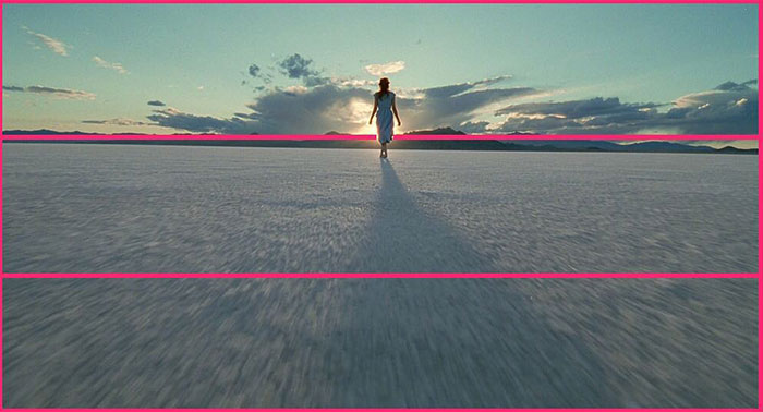
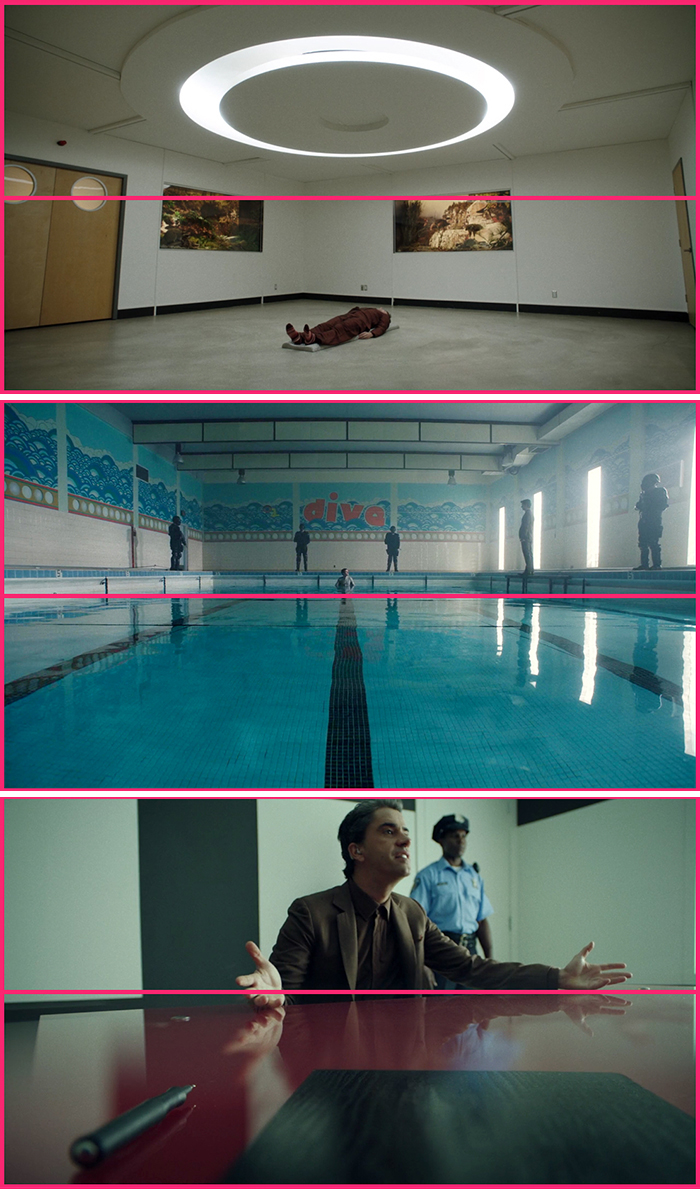
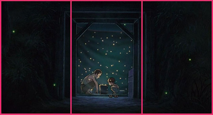
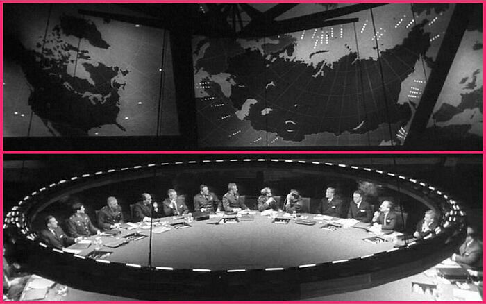
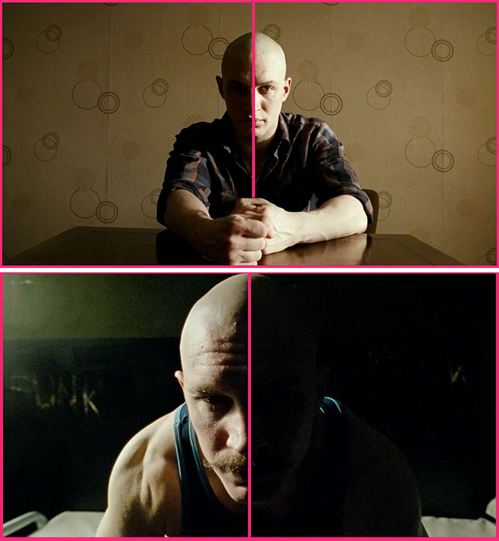
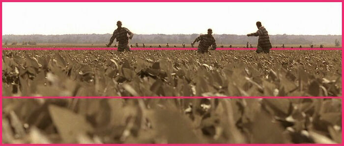
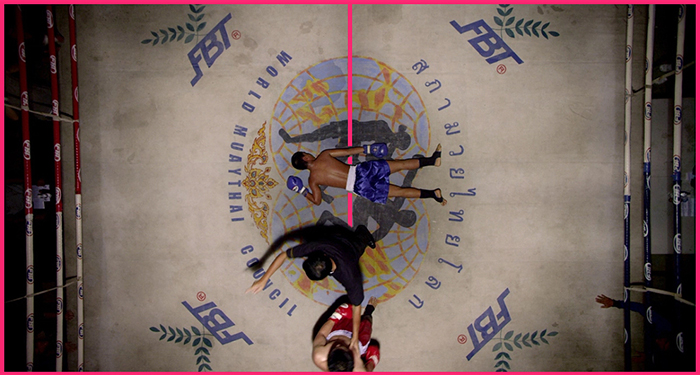
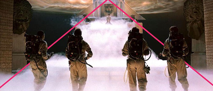
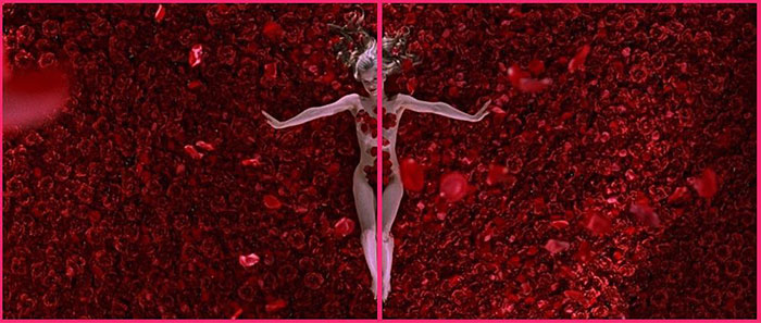
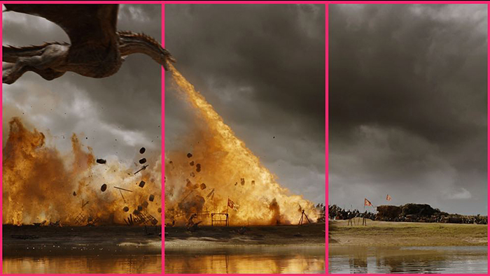
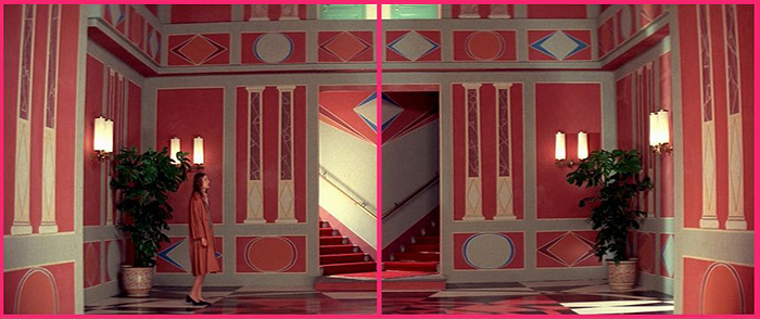
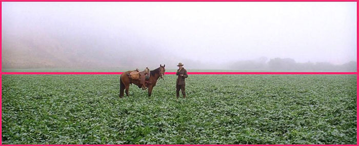
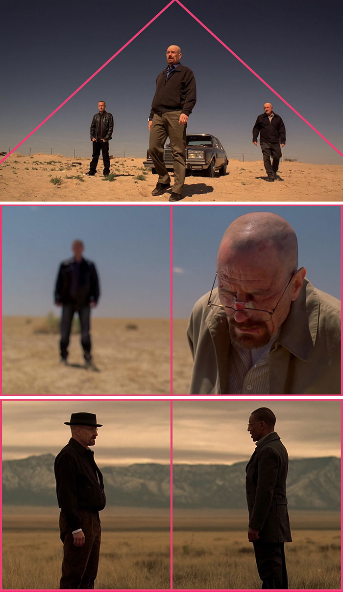
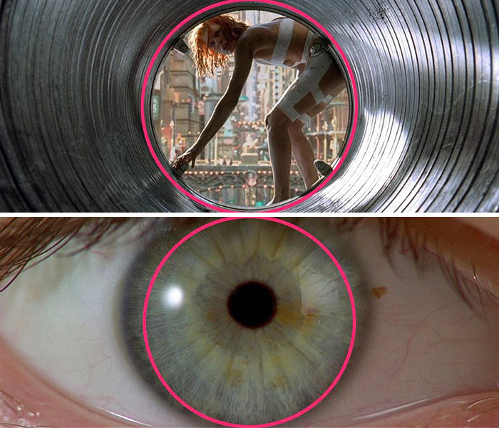
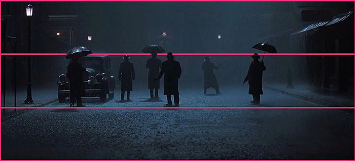
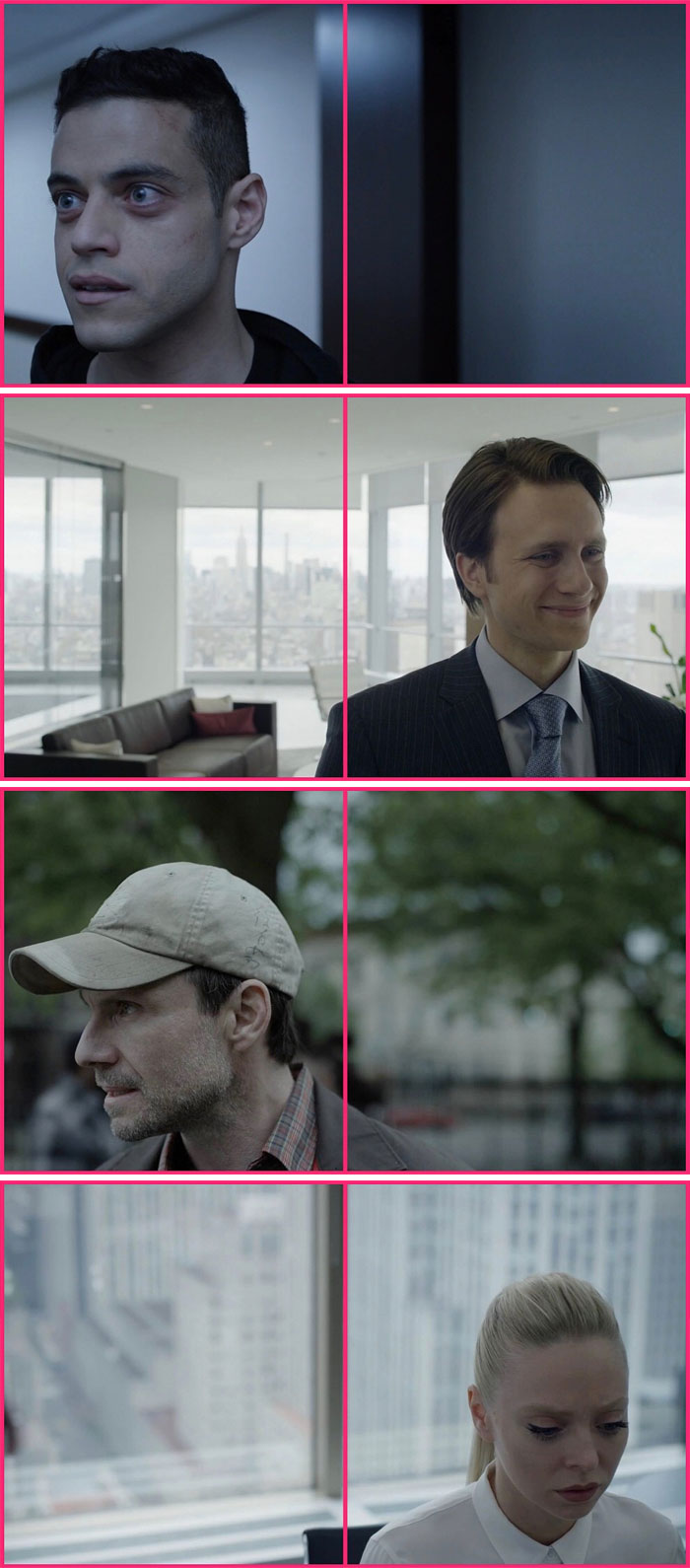
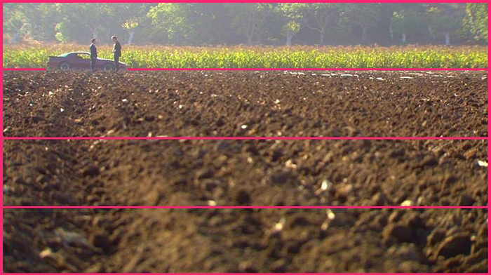
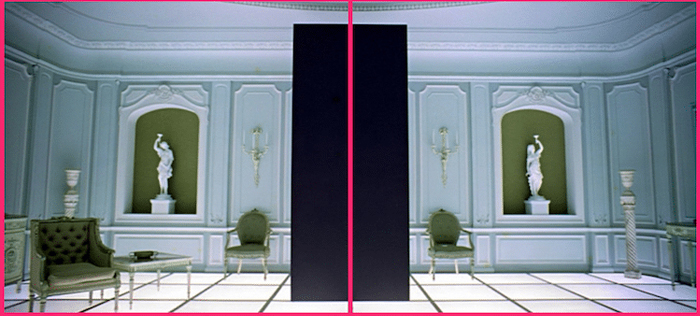
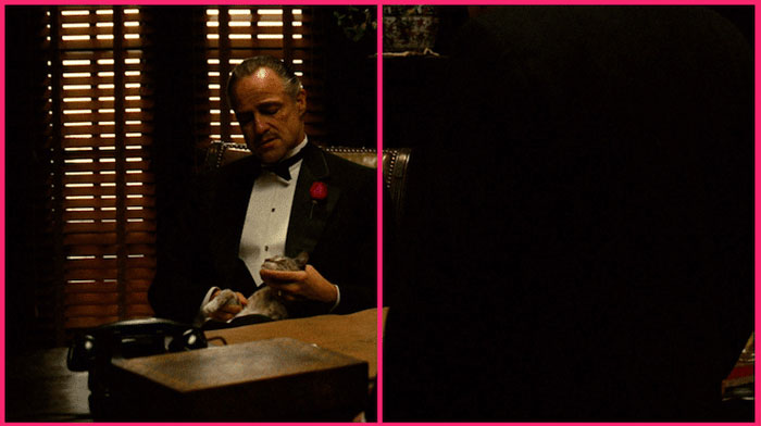
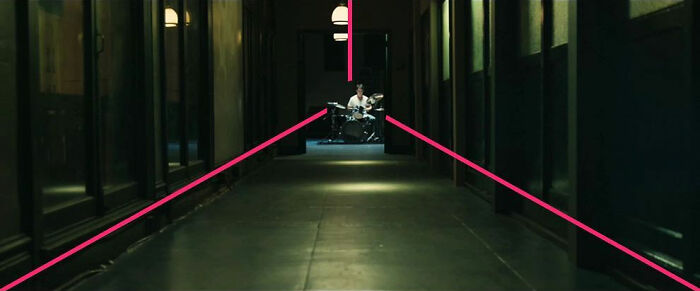
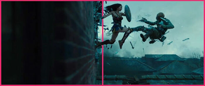
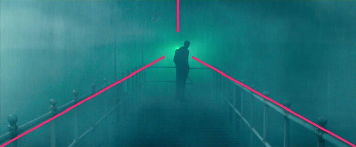
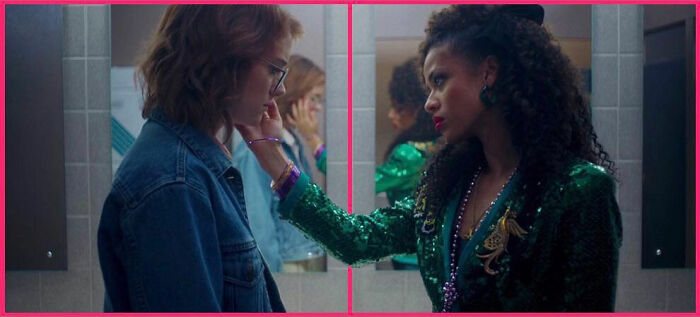
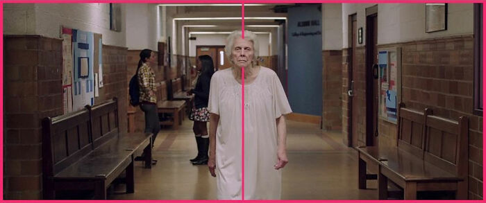
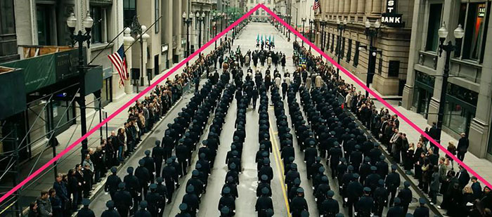
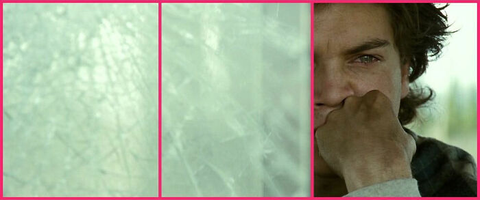
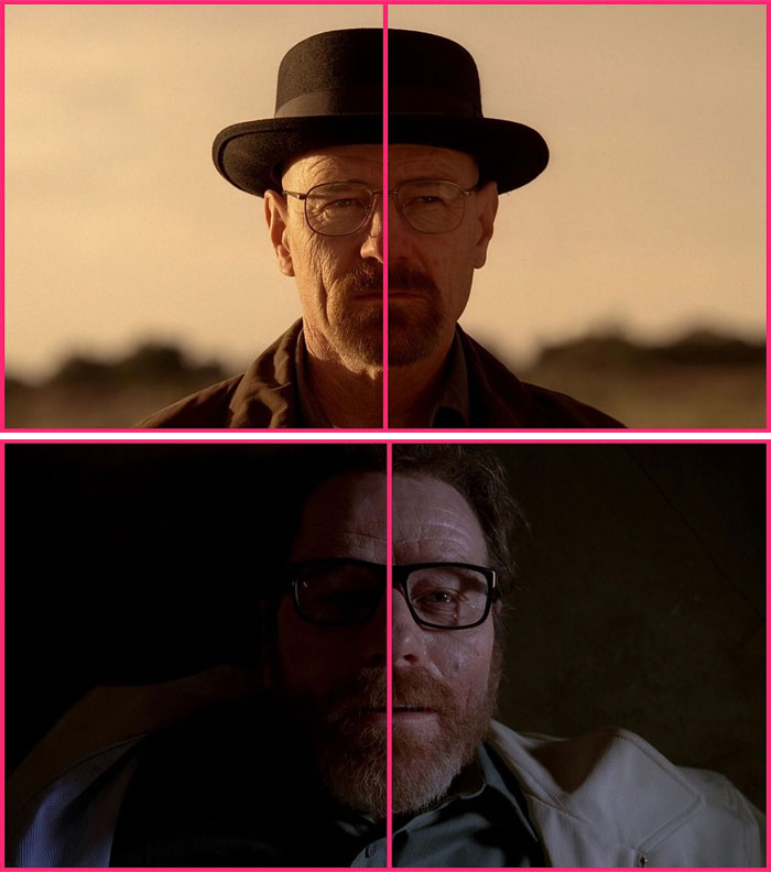
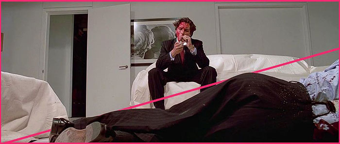
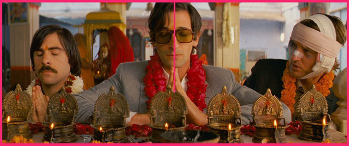
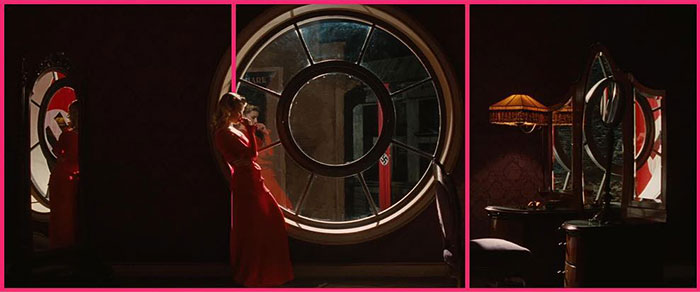
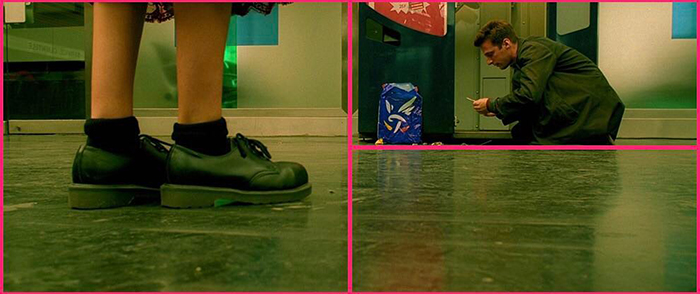
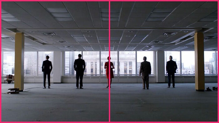
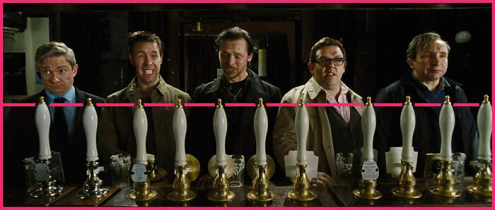
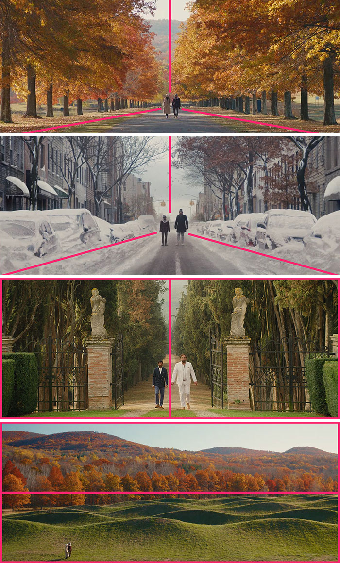
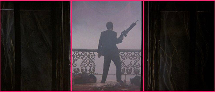
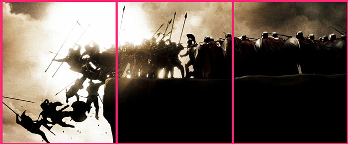
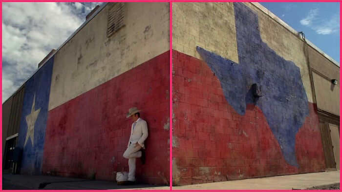
Master cinematographers approach every frame as an opportunity to convey the feel of the scene. And one of the things that really helps them to achieve it is composition—the way elements (actors, scenery, props, etc) are placed on screen in respect to each other and within the frame itself has a huge impact on our viewing experience.
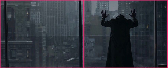
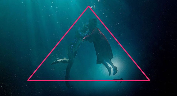
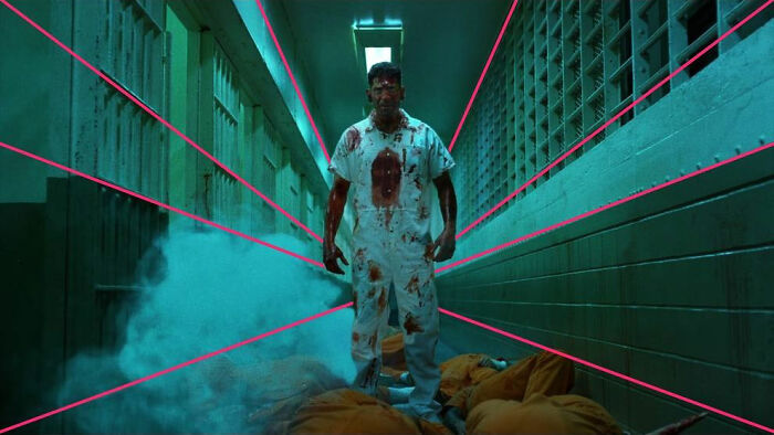
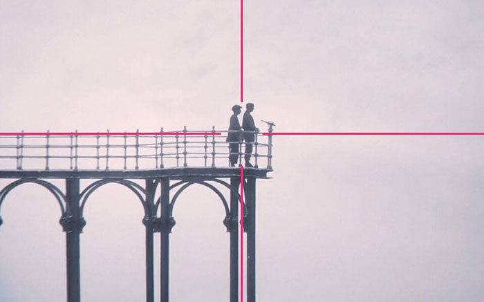
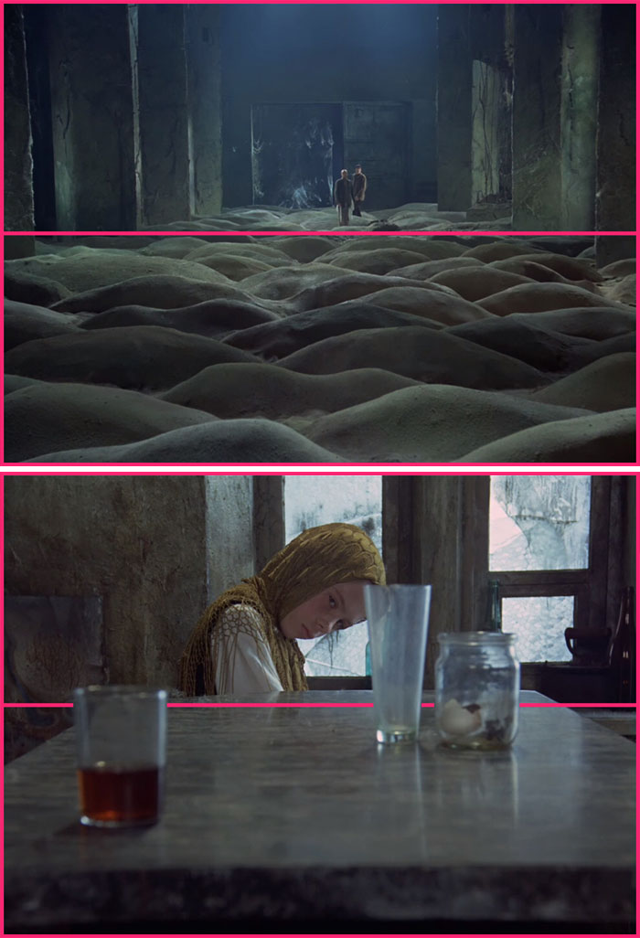
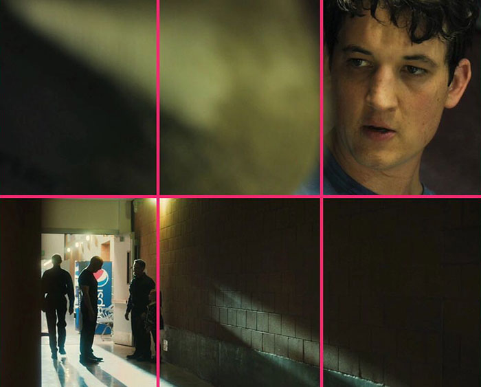
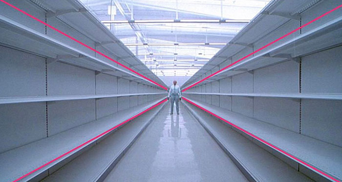
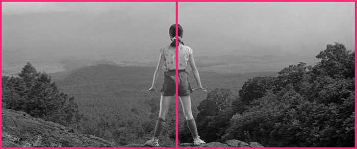
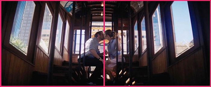
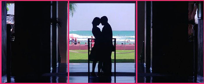
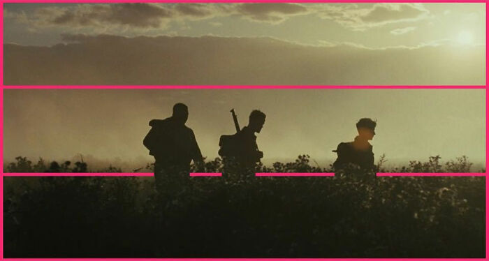
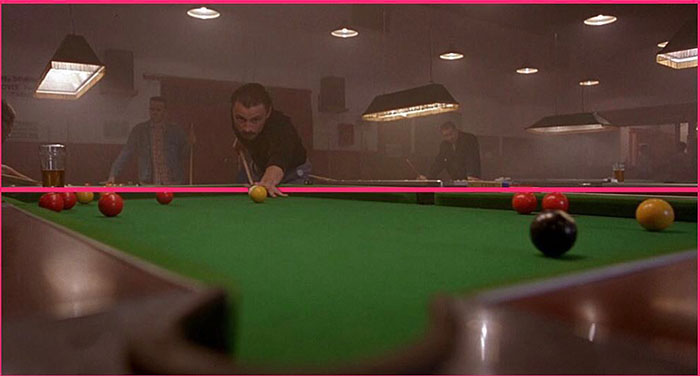
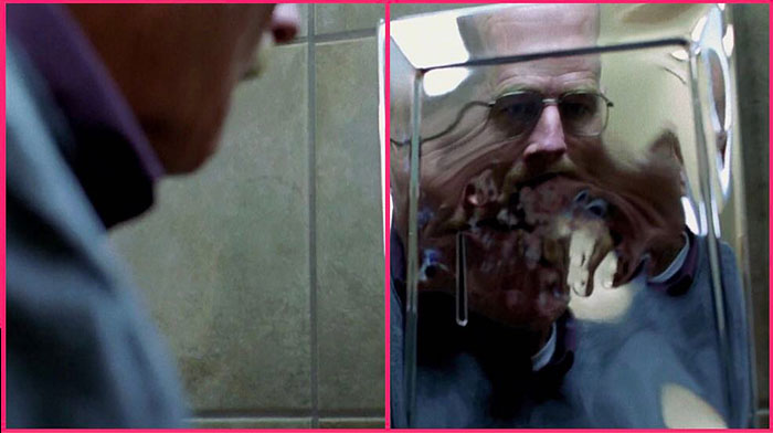
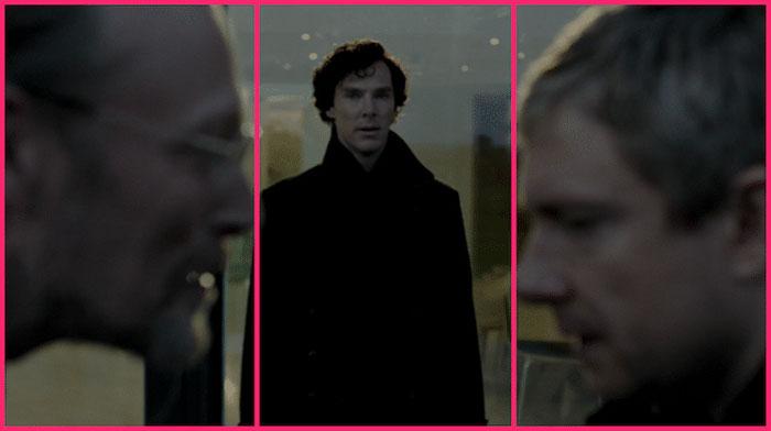
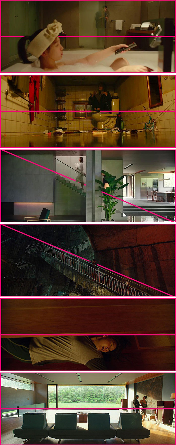
To show the brilliance behind a frame's layout, Raymond Thi of Composition Cam analyzes visually stunning films, adding simple, bold lines to demonstrate triangles, quadrants, and other geometric shapes that please our eyes.
As you will see, some pictures use the grid method to create balanced frames while others focus on a central character instead. Many of these films feature relatively simple compositions too, proving that a few elements can make a lasting impact. If you know how to use them.
More info: Twitter | Instagram
This post may include affiliate links.
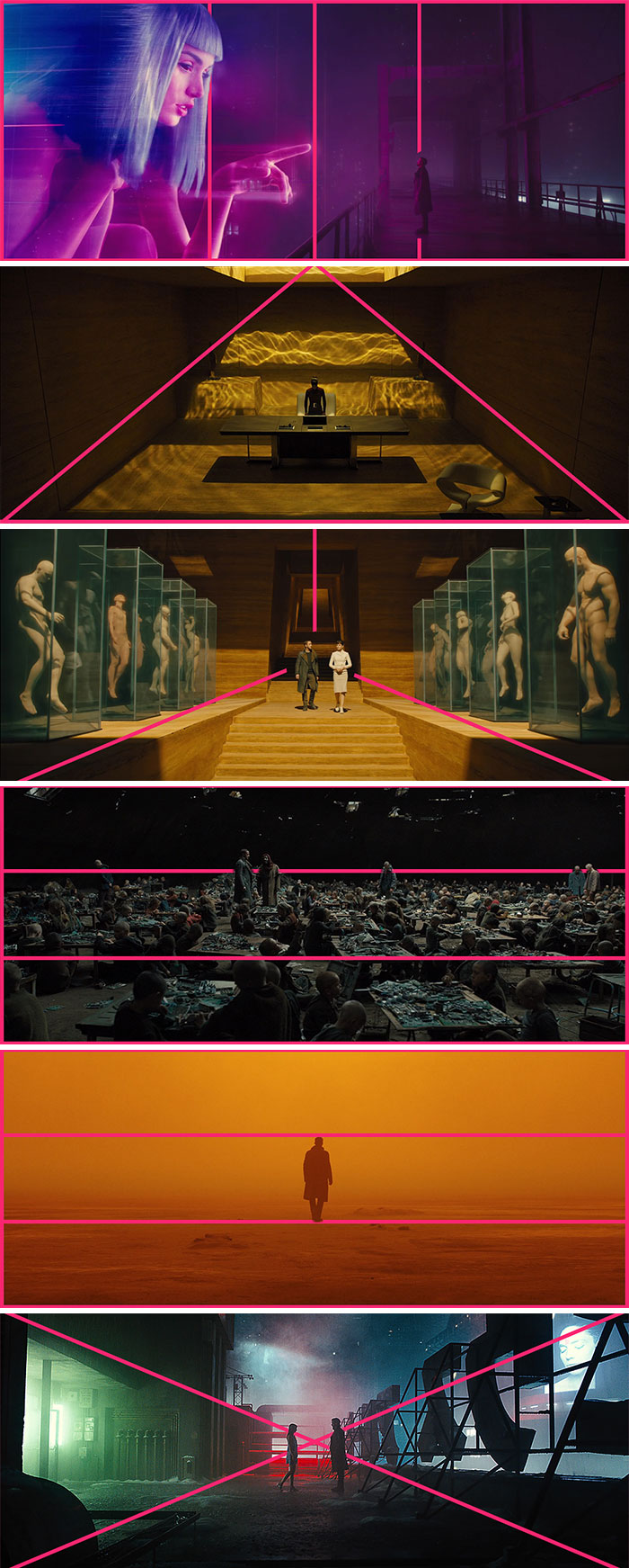
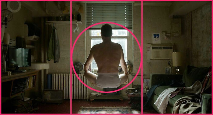
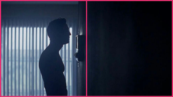
Blade Runner 2049
Film director and cinematographer (a combo that makes her a rare breed), Elena Rossini, appreciates Thi's work, putting the spotlight on frame composition. "Whenever people discuss the work of great directors, they often fail to mention the art of cinematography," she told Bored Panda. "But for me, it is truly essential and is what separates good from masterful directors. After all, film is a visual art."
Rossini's favorite filmmakers are also those who put a lot of effort into composition. "Stanley Kubrick, Wes Anderson, and Céline Sciamma [are probably at the top of this list]. 'Portrait of a Lady on Fire' was a masterpiece in my opinion, with every shot carefully composed as if it were a painting.
For her, the most successful compositions are those that help the storytelling, creating a sense of awe and wonder (Sciamma, Kubrick) or make you relate to a character (Anderson).
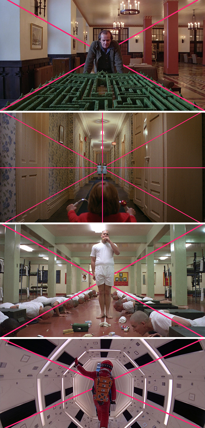
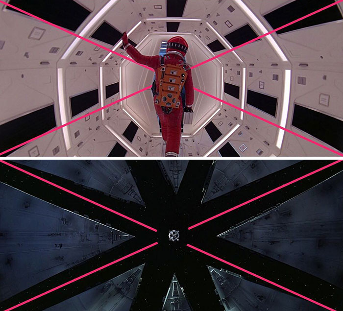
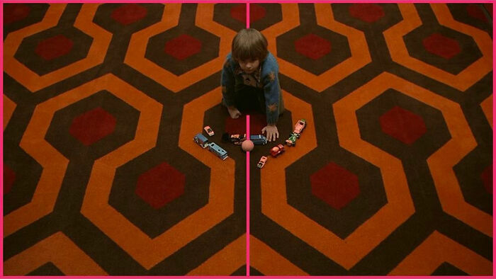
The Shining, Full Metal Jacket, Space Odyssey
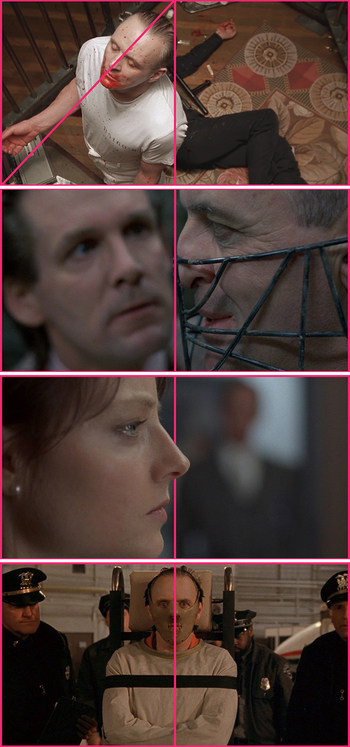
The Silence Of The Lambs (1991)
Jodie Foster was on the Graham Norton show and she talked about how she and Anthony Hopkins never talked to each other until the shoot was done because they were both so afraid of the other.
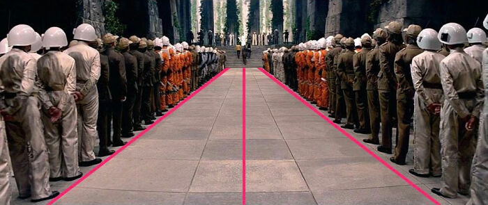
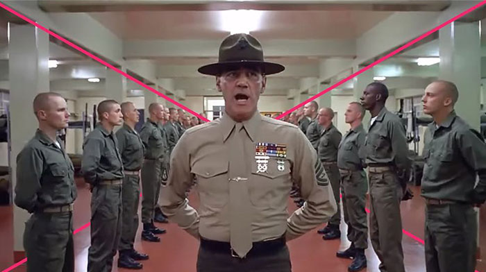
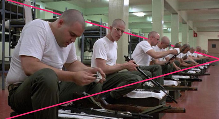
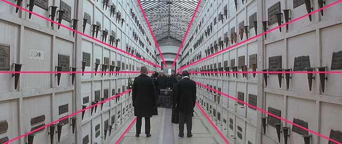
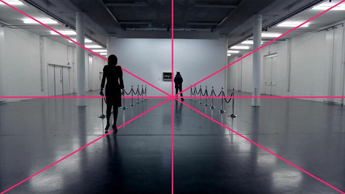
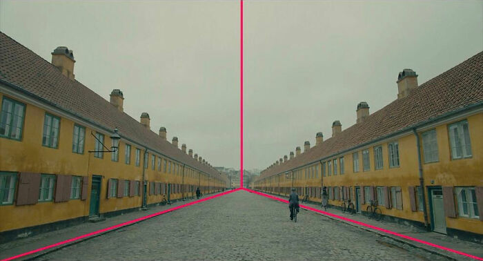
"My favorite composition technique is the one-point perspective," Rossini said. "It's Stanley Kubrick's signature shot (I talked about it in my blog), where all the lines in the composition harmoniously converge to a point in the distance. It is no coincidence that Kubrick's shots are so beautifully crafted, as he started working as a photographer and then made the transition to cinema."
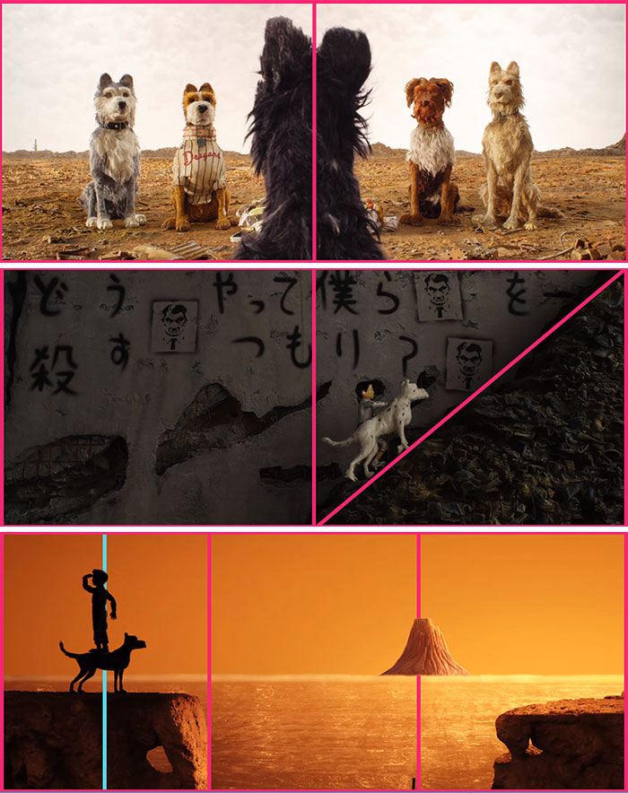
Since the filmmaker also admires Wes Anderson, Rossini loves his high-angle POV shots "as they put you in the shoes of the characters, creating an added sense of intimacy."
If you would like to try these composition techniques for yourself, Thi has created an app that applies these lines to your iOS device.
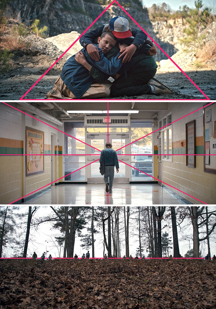
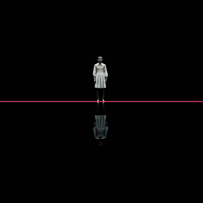
Stranger Things
Star Wars: Episode Iv - A New Hope (1977)
From 'Sherlock'
Actually, on the 8th pic (second from below), the focal point is the picture on the wall, not the ground.
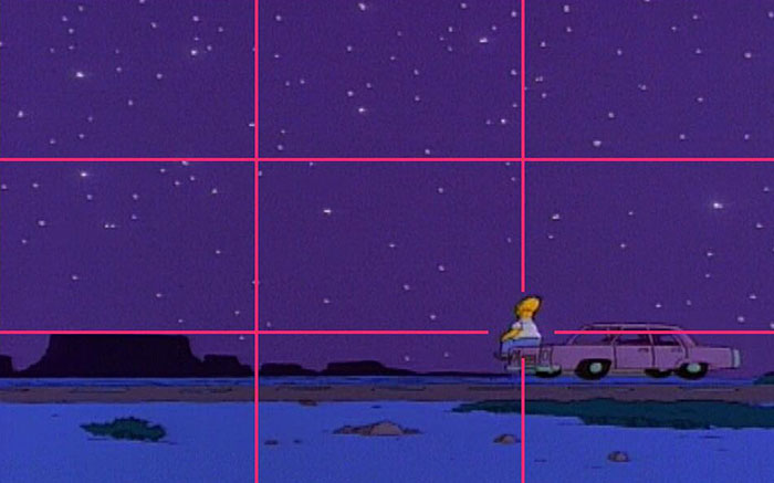
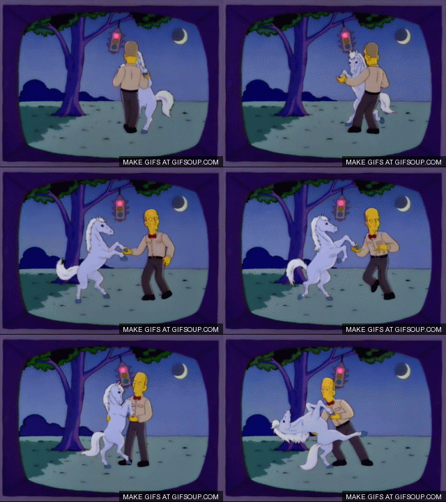
The Simpsons
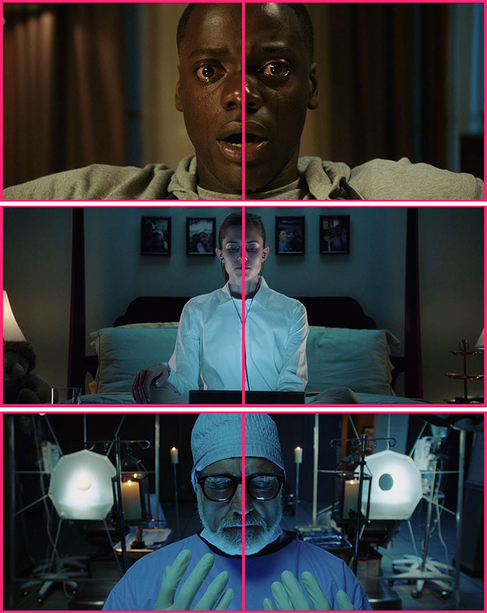
Get Out (2017)
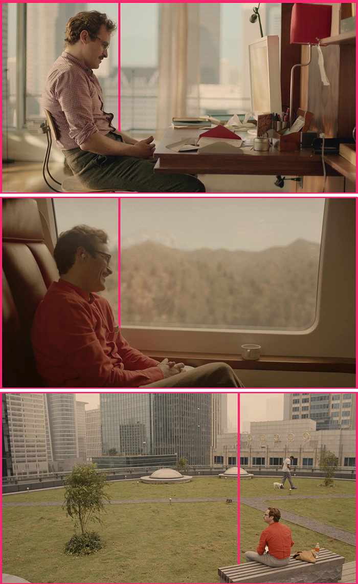
Her (2013)
Isle Of Dogs
I’m not a huge animation fan, but I liked this so much, that I was quite interested in a second viewing.
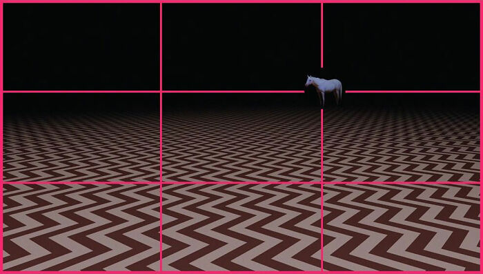
Twin Peaks (The Return, Part 2)
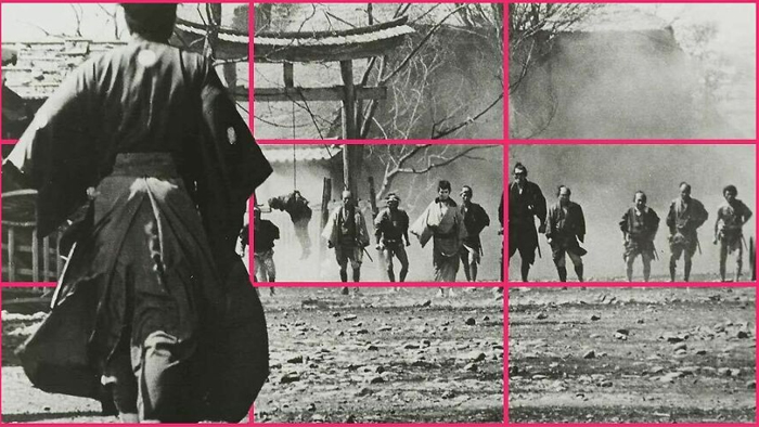
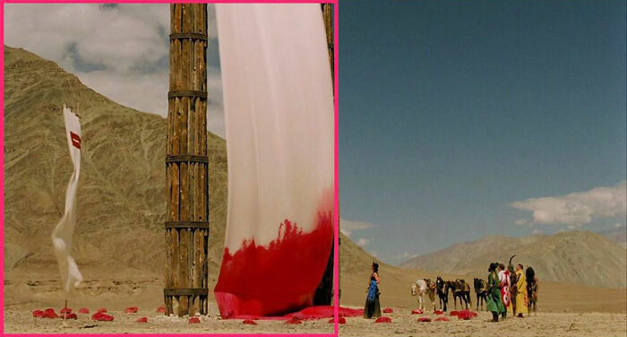
Yojimbo (1961)
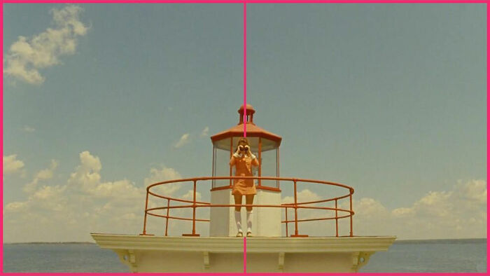
Moonrise Kingdom (2012)⠀
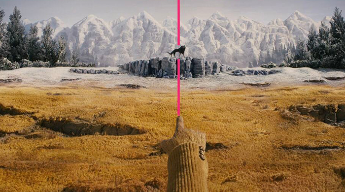
Fantastic Mr. Fox (2009)
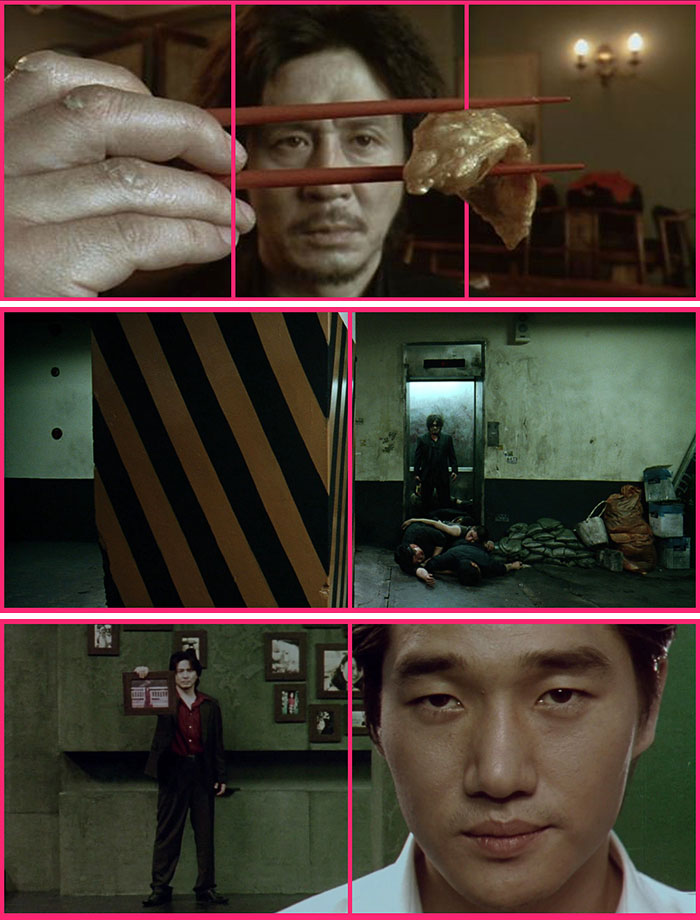
Oldboy (2003)
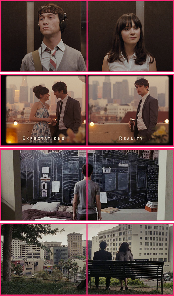
500 Days Of Summer (2009)
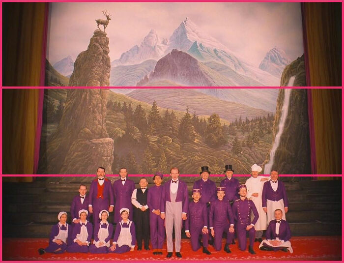
The Grand Budapest Hotel" (2014)⠀⠀
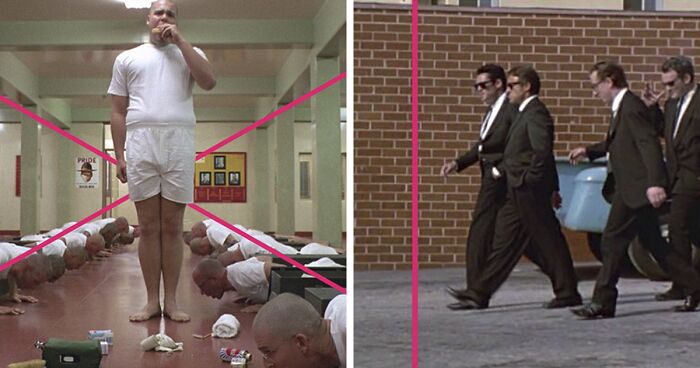
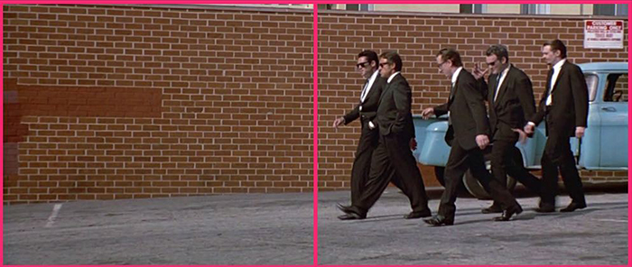
Reservoir Dogs (1992)⠀
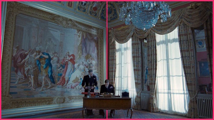
The King's Speech (2010)⠀
Birdman (2014)
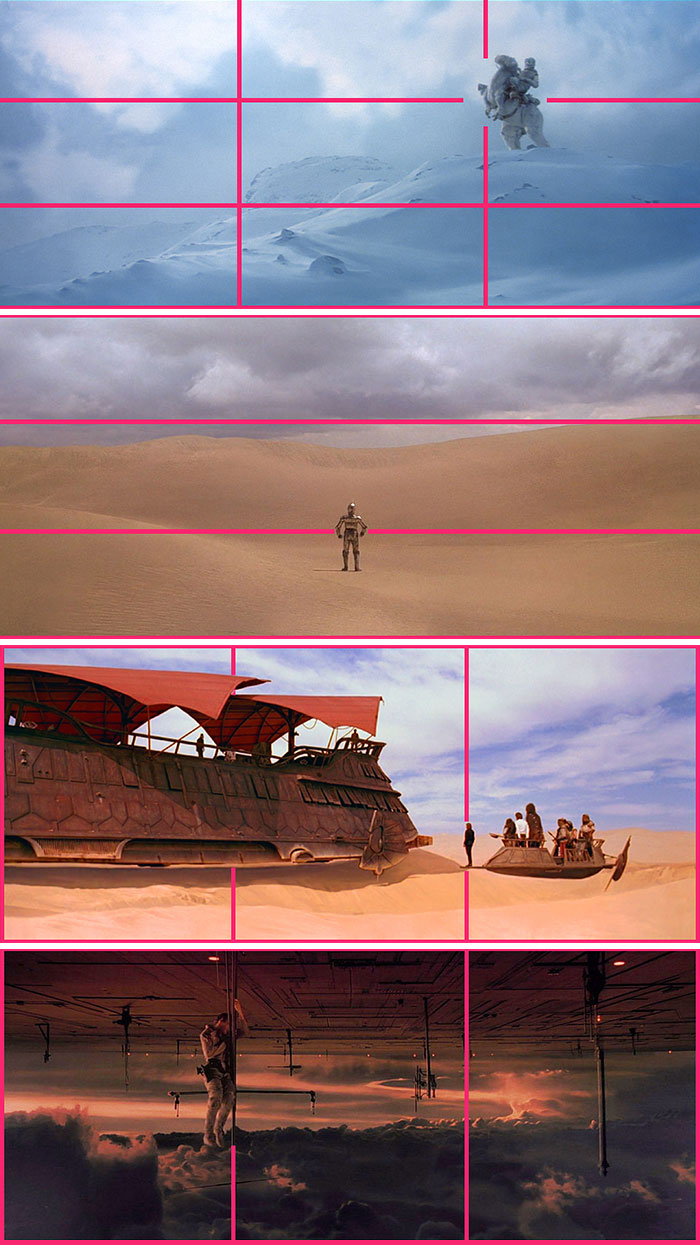
Rule Of Thirds In Star Wars (Original Trilogy)
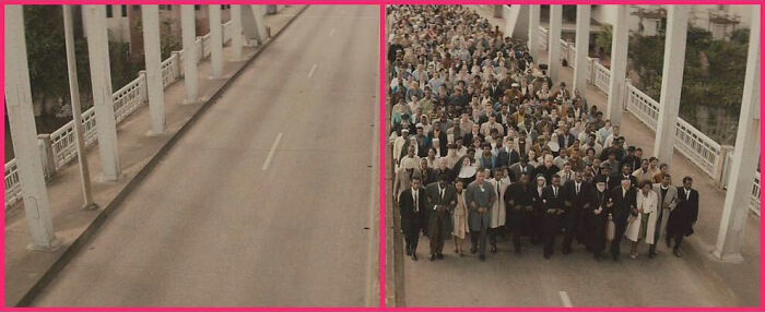
"Selma" (2014)
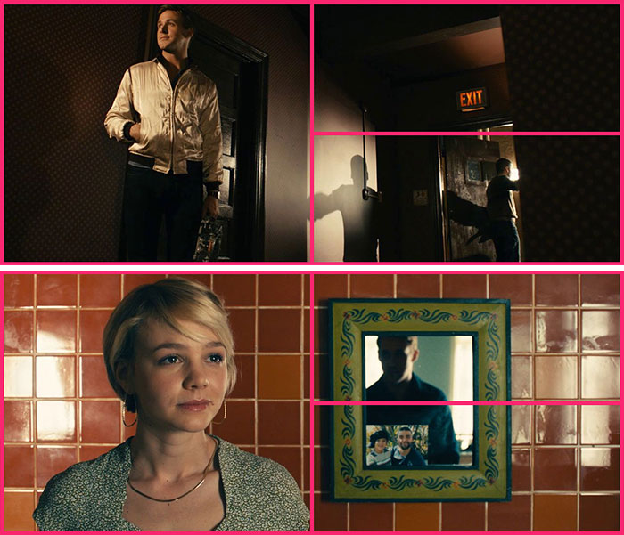
Drive
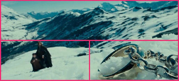
The Lord Of The Rings: The Fellowship Of The Ring (2001)
I've seen this movie a dozen times, and I never realized how perfectly framed that shot is before! I need to keep my eyes open for this.
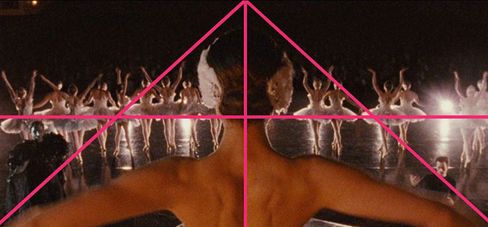
Black Swan (2010)
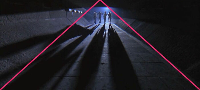
A Clockwork Orange (1971)⠀
Um... Am I missing things? Maybe I just don't understand this thing because it's pretty obvious to me that the group is the center of perspective??? !!!
Full Metal Jacket
I'm learning from all this that there are about five things that filmmakers do over and over and over.
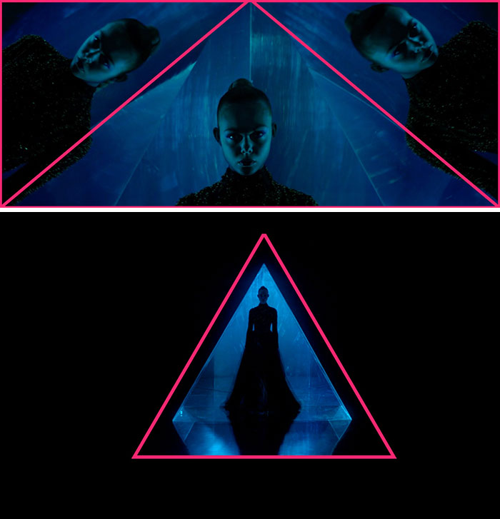
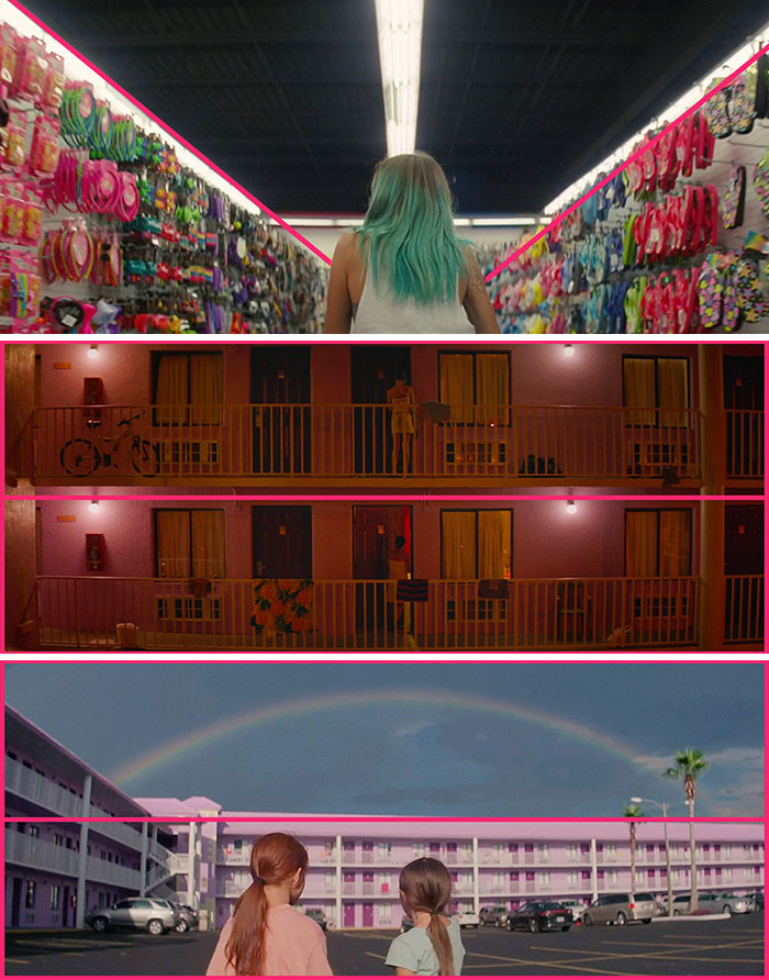
The Neon Demon
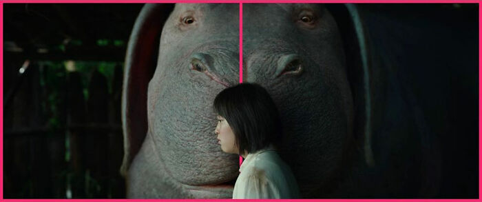
Okja (2017)⠀
Uh... what was everybody thinking? That those scenes happened randomly? Don't see the purpose of this post.
Exactly. I mean... many of these simply follow the rule of thirds, something every photographer, cameraman and director studied... as well as halving the image and golden ratio.
Load More Replies...I'm with you Aragorn. These shots just seem to me like what anyone would naturally do - on in the case of the hallways/rows of things, just now perspective works.
Load More Replies...Oooh...look how clever we are,putting the subject matter in the centre of the screen...utterly pointless post!
Wow what an amazing and intriguing post. This definitely was worth showing to the public.
So incredible. Let’s definitely get more posts like this...for the next time I can’t sleep and I need something to make me pass out from boredom.
Load More Replies...For those not understanding the point of this guy that takes time to draw lines on scenes: it is education. Some people may not realize how much work cinematographers put into their art form, so this guy is trying to bring that to light. This post is not stupid because "you already know this" or because you don't understand, this post is here to bring appreciation to an art form, which is what BP really started as.
Well, reading the comments I'm glad I'm not the only one who is closer to "meh" than to "wow".
You give me a picture. I'll draw pink lines on it. Regardless of where the focal point is, I can have the pink lines converge on that spot. We'll make a whole Internet post about it. It's certainly not a massive waste of time.
Some directors can't frame a shot to save their lives. This just showed the well-done ones. It would have highlighted the good ones if they'd included some of the awful ones, too.
Yes, I enjoy Wes Anderson films for the marvelous composition. And utterly nothing else.
Some of the higher posts were really cool- it just enforces what my best friend always says: Nothing in TV is accidental. (They want to be a movie director)
Maybe less pictures and more text could make this article a bit more interesting.

 Dark Mode
  No fees, cancel anytime


