Graphic symbols and elements we see in famous logos today are a result of numerous techniques studied in the last couple of centuries. Considering the evolution of our society and its demands the old Instagram logo, introduced in 2010, might just not cut it today. The original Apple logo with its realistic style drawing looks way too complicated and forgettable for us, while the old Starbucks logo shows some indecency in it. We, as a society, are more used to simplistic style these days. Also, since we've gotten better at understanding symbols, famous logos changed taking in mind our demands.
Take a look at this list compiled by Bored Panda for example. In it, you'll find some of the world's most famous logos, both how they look now and how they looked in the beginning. While you probably recognize all of the contemporary ones, many of their original counterparts aren't so easy to identify.
This post may include affiliate links.
Bored Panda
The new logo is much better. It's more iconic, and more obviously a logo. Old could be mistaken for a character from a kids book or cartoon
I agree with Alice, the old one fits your toics much better, and is more alive.
i like the old logo but i love the new logo , the new logo is Modern and professional.
Apple
Well so much for all the story's stating the Apple logo had noting to do with Newton
A personal assumption of mine is that the Newton logo was misleading about the overall concept behind the Apple's name (which, apparently has no concept), so they dropped it away. So the new logo has indeed nothing to do with Newton.
Load More Replies...Not the current logo. That was discontinued in 2013. The current logo is solid, not skeumorphic.
Thats not the current logo of Apple, the current one is solid without the line effect. Thats old.
Mozilla Firefox
No, the project began as phoenix, was renamed firebird due to a number of trademark issues, there were problems with that name too, and that's how we got to firefox.
Load More Replies...Starbucks
The first one got pulled because (cover your eyes if your under 21)..... boobies were involved
Maybe her boobs got saggier with age, and they chose to hide them..
I still don't get this logo of a f*****g mermaid spreading her tail! Like WTF seriously!
http://www.cracked.com/article_19688_7-horrifying-historical-origins-famous-corporate-logos.html
Load More Replies...Walt Disney
We have the walt in memory of Walt. At least have Disney and then walt at the bottom or change it back. Kids are forgetting about Walt. Bring him back
The original name was BackRub before changing to Google 2919154800...0bad02.jpg 
I actually thought these were 'fake', some kind of joke - until I saw the Google one and remembered that it did really look like that. :-D
The colors on the first one are wrong the colours were never switched. PS: You need an exlamation mark for the first one. PPS: The reson why the (e) in "Google!" has never had a perfect alignment is because the're trying to tell you that the're not perfect, or atleast from what I've heard.
Nokia
about as much as Starbucks was in the mermaid business...
Load More Replies...Nokia was making chairs, boots and all kind of stuff back in the days :)
Lego
but did you know that LEGO is short for "leg godt" in Danish, which means "play well"? :-)
i never seen the old lego logo i think compaines should bring back there old logos from time to time to suprise the people
"Trio" biscuits logo has the same colour combination as Lego. Never noticed that before.
Canon
So Canon started out as Kwanon, Guan Yin, what Westerners call the Buddhist goddess of mercy. Only Guan Yin is asexual, and not a god.
Amazon
Realised that the new Amazon symbol buys you stuff A-Z looking at where the arrow is going
I never realized that. Haha. I always see it as a face smiling.
Load More Replies...I like the first one which represents the symbol of the river and the letter "A".
Great example of a brand evolution to reflect the contemporary visual culture. Old one "feels" like an outdoors brand. New one definitely feels like a shopping brand.
The original reminds you of the awful tire tracks you see in the snow on a mountain road, going through the guard rail and over the edge.
Nintendo
Ford
The old logo reminds me of "Flubber" (if anyone remembers that movie)
Volkswagen
Cause that was goverment-linked Company/brand in Nazi Germany (Volkswagen States for car for (regular ) people and was created AS a part of pro social nazi propaganda
Load More Replies...was also named KdFwagen (Kraft durch Freude wagen = Force through happiness car)
Harking back to the good old days of supplying engines to the Nazi war machine (Luftwaffe) and not the emission test swindling generation of today eh? #germansRsoFUNNY
It IS a sylised swastika,. volkswagen was founded by the Nazis. Thankfully it's moved on
Coca Cola
Don't know who made this stuff up bit most of these old logos never existed. Coca-Cola was always in that distinctive script....http://www.coca-cola.co.uk/stories/our-story-1886-1892--the-beginning
Snapchat
When you make your account (the click the ghost in the picture thing), and sometimes just throught snapchat itself, it has the orig. ghost instead of new one.
Playboy
I remember back in the day when girls would tan, everyone had those little bunny stickers they would put on before they laid out, and would flaunt their little tan tattoo lol Anyone else remember that?
Mtv
When? It wasn't like that long. Early 80s already had a version of the current logo.
That logo was pre-launch. It never was used when the channel came online in 81
They should change the name Music television into reality c**p television...
I remember when MTV played music. Good music, not rap. Oh and when it didn't have shows about online dating and pregnant teenagers...
Kentucky Fried Chicken
Discovery Channel
So discovery channel started back when people still believed in a flat earth!
Neah, its shape of your oldschool tv screen...all the world in your tv...my guess
Load More Replies...I didn't get it. Then it clicked. Now I'm mad at you. VERY.
Load More Replies...So Discovery Channel started back when some people thought the world was rectangular?
Burger King
I think the current one could use an update. Buns don't need shiny streaks.
Adidas
The story of the Dassler Brothers is a fascinating side note of World War II. The brothers, Rudolph and Adolph, split the family company because one (I forget which is which) was a more ardent supporter of the Nazi party, while the other was more of a passive observer. The Dassler Brothers provided shoes at the '36 Olympics, including to Jesse Owens. Following the Split, Adolph -- whose longtime nickname was "Adi" -- formed Adidas (from "Adi Dassler") while Rudolph founded a company called Ruda (Similarly, from "Rudolph Dassler"). Both continued to operate in their hometown, which led to the "Shoe Wars." Ruda eventually became Puma. I forget some of the details, but it really is a fascinating story.
Load More Replies...There are actually two logos for adidas, this one indicates athletic wear, whereas the trefoil indicates "originals" or casual wear. The trefoil originated in the 50's I think, this one was started in the 90's.
Shell
Ikea
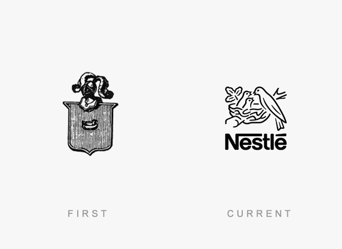
Nestle
Funny, they were probably a lot less evil when they had that sinister-looking logo.
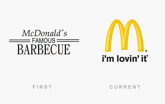
Mcdonald's
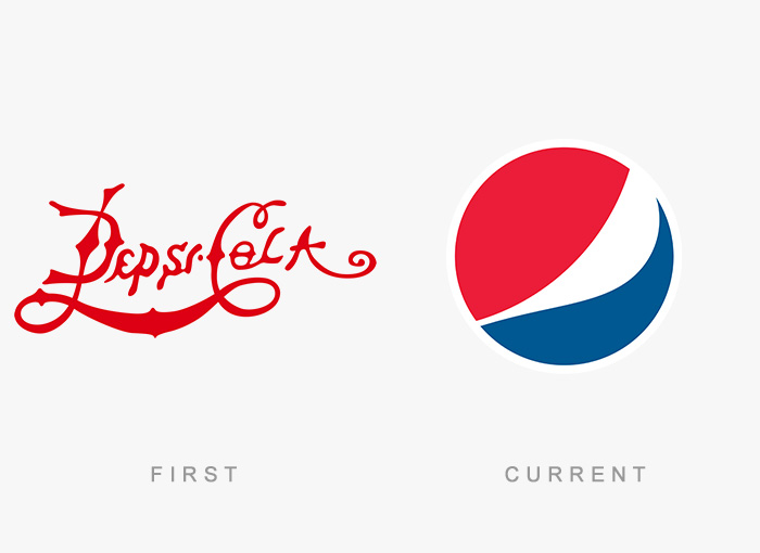
Pepsi
Is it me or the first pepsi logo is simmilar to the current coca-cola?
Pepsi was made by the same company that made coca cola
Load More Replies...My favorite explanation of the current Pepsi logo is a person in a red shirt and blue jeans with their gut sticking out lol
it looks like its been written with the hand the person's not used to writing with AKA my left hand
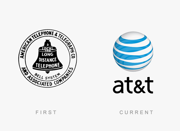
At&t
I don't know why it never occurred to me that AT&T was short for anything.
I know, right. It was always just AT&T...
Load More Replies...Not the same company. SBC (home of possibly the world's shittiest customer service) couldn't fix their bad image with customers so they bought AT&T's name, hoping to hide it's hideous past.
I don't know why it never occurred to me that AT&T was short for anything
telephone & telegraph ... both are obsolete ... the company exceeds the boundaries of it's name it's like naming a company paper books and selling e-books
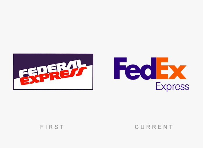
Fedex
Actually between the "E" and the "x" there is an arrow, the designer is a genius
There's a spoon in the small 'e' in Fed so we're being force fed lol
Load More Replies...the translucid arrow formed by the letters E and X is just pure genius
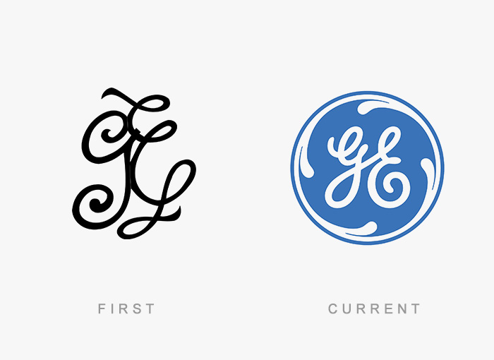
Ge Healthcare
I thought GE was General Electric? Household appliances, and later hospital equipment.
So all they did was put it in a blue circle? What has the world come to?
GE logo is one of my most favorite logos - but too much evil is going on in that company.
Heineken
Maybe they just believe in a world with beer for everyone.
Load More Replies...Continuity is a good thing in brand recognition
Load More Replies...Mazda
It's 'Matsuda kabushiki-gaisha' (マツダ株式会社) in japanese, Mazda is a shortening of Matsuda (マツダ), which is the founder's name.
Load More Replies...Visa
Wait... so Visa was there since the time of the netherlands?(1600's)
The first thing anyone could notice was the logo barely changed. The card has been removed, and the font was only slightly changed.
The "first" logo was actual "BankAmericard" -- "Visa" was the newfangled name and logo
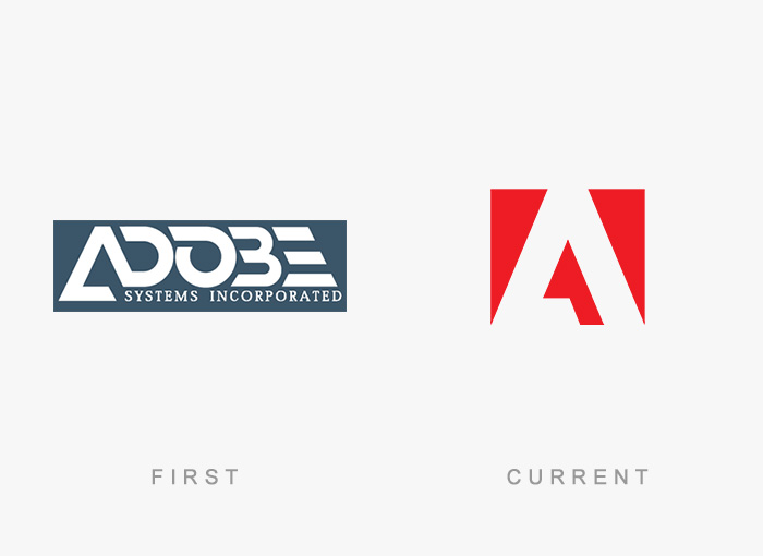
Adobe Systems
Probably just used Photoshop to make the first one because they thought indesign was too expensive for just one logo.
as a dessigner I cringed at this comment ...you tried to be witty but you effed up up... you use Adobe ILLUSTRATOR to make a logo
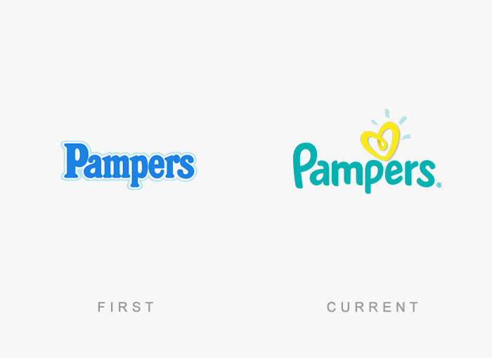
Load More Replies...Pampers
or is it a yellow splashing poop shaped like a heart?
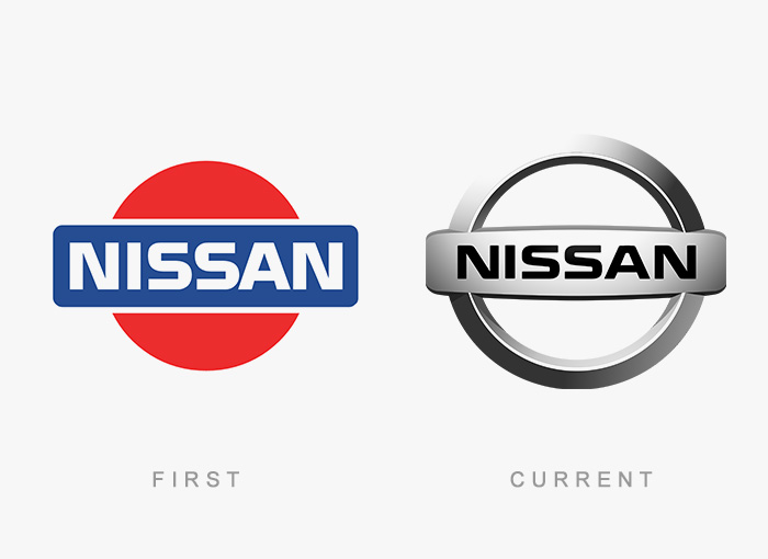
Load More Replies...Nissan
too simple to be a car's brand. i prefer current
Load More Replies...Lay's
As you people can see, the new logo has inflated with all the air they sell nowadays .
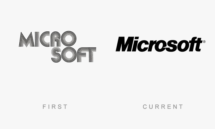
Microsoft
That aint Microsoft's current logo. Since 2012 they are using a new one without an italic font.
Eskimo
This brand is called Olá, here in Portugal, and it means Hello. lol! So many different and weird variations of its name around the world.
This company was founded in Hamburg as a german-chinese icecream company. Its original Name is Langnese, wich in northern german language means "long nose". As a company acting worldwide they sell their icecream under more than 20 different names. Eskimo is sold in Norway, Austria, Slovenia and Croatia. Algida is sold in South and South-East Europe.
And Italy. Algida, I mean. I remember the adverts on TV.
Load More Replies...yes it's all of them, and it all started in the Netherlands with a little icemaker from Hellendoorn which was quickly bought by Dutch-British conglomerate Unilever and then after many years, all these individual brands from many countries and logo's were bought one after another by Unilever and unified under the heart brand we all know today
Ok let me clear that, main name of this brand is Algida. And in every country, Algida buy the best ice cream producers. Then they take their name and put it under algida logo. Thats, why "Algida" have so much different names in different countries. for example in Czech Rep. They didnt bought the best producer and their name in CZE is Algida ;)
just call it Unilever.. they have 26 names for this brand.
Load More Replies...Kodak
Samsung
Audi
No it is not. The logo was create from four brand logo : ford and 3 other. They make audi "quarter auto compaany"
Load More Replies...British Airways
British airways was called - British Overseas Airways Corporation (BOAC) and had a completely different logo. check out british airways homepage they have some cool fotos from the early days.
OH yeah! I remember when I was a really little kid my uncle came over and gave me a flight bag with the BOAC logo... light blue and white.
Load More Replies...Dell
What I really remember were all the cow pattern boxes back when everyone was getting them shipped.
I HATE the new Instagram logo, they just had to ruin something good here
Procter And Gamble
It's like someone just hastily wrote it down, ripped the piece of paper off the top of their note pad, and moved on to something more important.
Load More Replies...The original looks this way because it a literally a BRAND - as in branding cattle. That is how the term derived - the mark farmers and cattlemen would but on their cattle or burlap bags of produce as a way to indicate what farm or ranch they belonged to. P&G painted this star "Brand" on the cases of soap they sold.
Rca
That logo is called "his master's voice" ... so he's confused because the voice coming out of the victrola is his master's :)
Load More Replies...Ibm
IBM stands for International Business Machines and still is called that in court cases.
Load More Replies...Walmart
I thought it was Kurt Vonnegut's a*****e painting.... 99d5ec6e3b...526d61.jpg 
I love how walmarts logo looks so happy but walmart is just sad, the old one looks oddly more modern for now but fits walmarts bland boring personality.
Xerox
Xerox the only company I know that sounds like bleach (besides Clorox, Tide, and Downy).
Would be interesting to see some of the logos in between the first and current. Like Apple, for instance, with their multi colored apple from the early 90's.
That's what I was told when I drew the Mastercard Logo years ago
Load More Replies...Do you think if some color was added to SOME of the old logos they would look better?
Load More Replies...Half of these logos are made up. The Coca-Cola advert definitely was always in the distinctive script. The website even tells their story!

 Dark Mode

 No fees, cancel anytime


