27Kviews
This Page Highlights The Best Of The Worst In Design (60 Pics)
InterviewWe often find that some contemporary designs can feel boring and overdone—whether in product design, interior spaces, fashion, or other areas that seem increasingly uniform, aiming to please the widest audience possible.
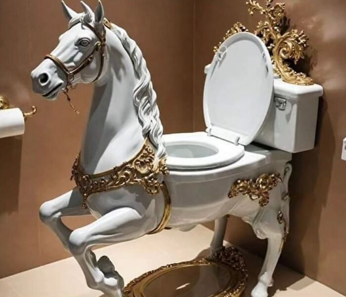
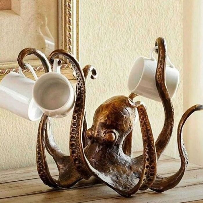
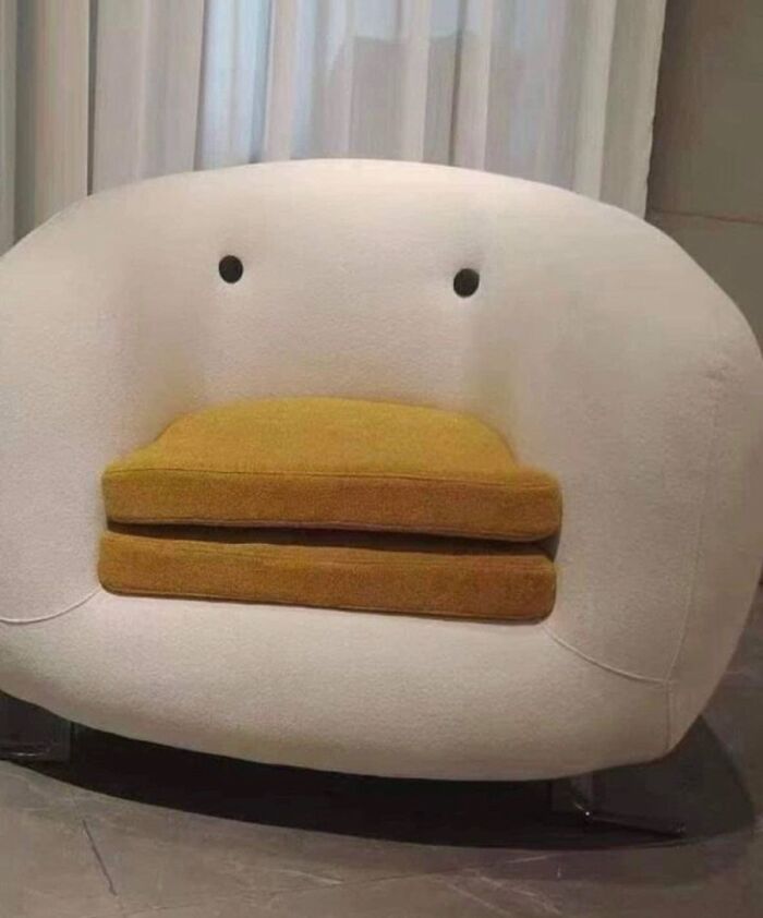
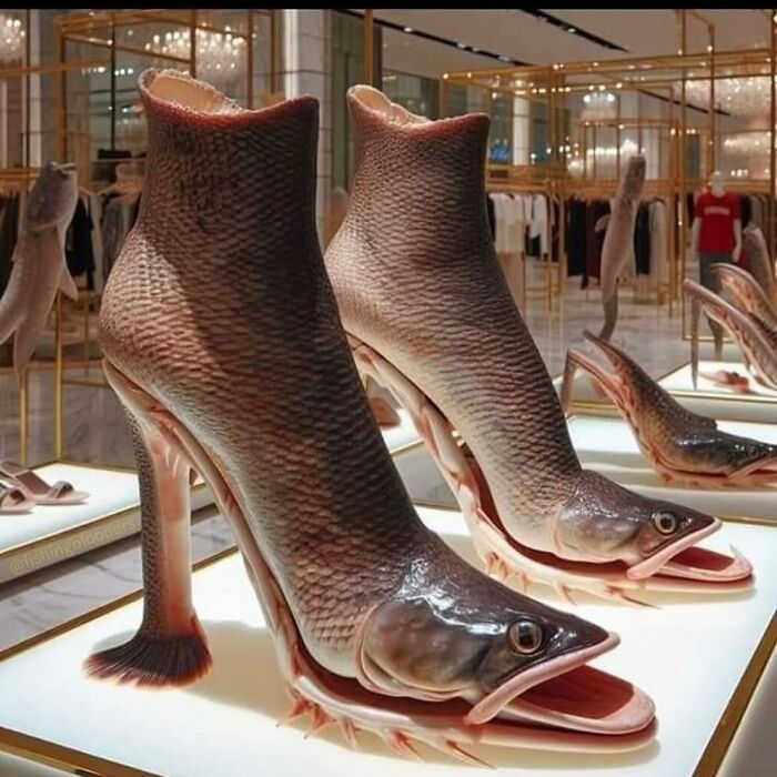
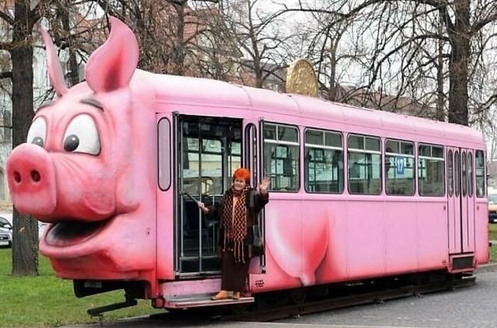
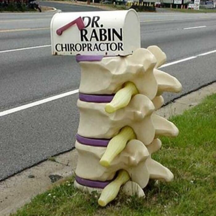
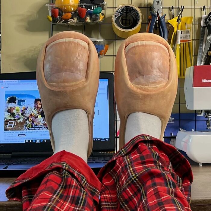
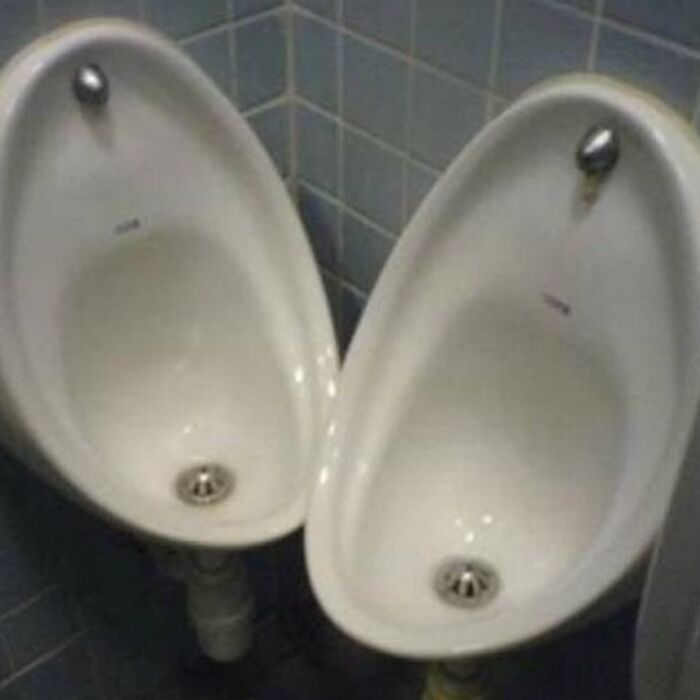
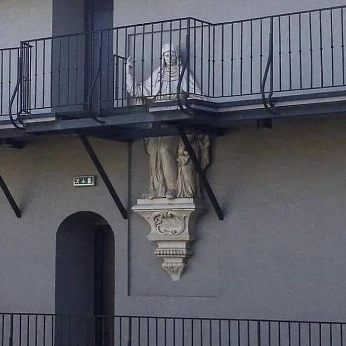
Yet, amidst this sea of ordinary designs, there are still gems that stand out, even screaming for attention. The ‘Ugly Design’ Instagram page is one such place, curating a selection of the best of the worst designs found online. From fashion flops to bizarre products, the account ensures we get to see striking examples of the ugly, awkward, and sometimes downright creepy things that people have created.
More info: Instagram
This post may include affiliate links.
We reached out to the person behind the ‘Ugly Design’ account to ask a few questions about moderating the page. We were curious about how it all started and if the admin remembers the very first post they shared on the profile. Here’s what we found out: “Our first post was a bathtub transformed into a sofa found at the design fair in Milan. Uglydesign started as a game between us. We never imagined that our passion for ugly would grow so big.”
When asked about the process of finding the best of the worst design flops online, the moderator explained that they’ve been searching for content for years, amassing a massive library of images to post on their page. They also added: “Today we mix posts between found content and submissions.”
We were also curious about what the moderators believe "ugly" really means. Here’s what they told us: "We do not define ugly—we don't want to. Ugly design is curated content with an alternative aesthetic to the highly standardized, Instagrammable look. Some are ugly, some fail, and some are ‘uglycool.’
For us, suitable means funny and ugly."
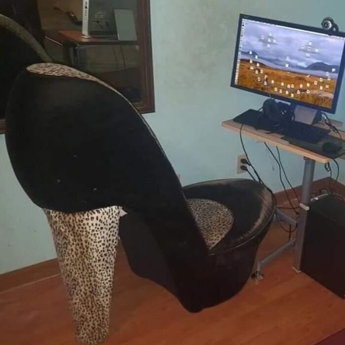
Finally, we wondered if any of the designs shared by the account had become the admin's personal favorite. The admin responded: “I think my last favorite post would be @ivanavladislava leopard pimped kitchen.”
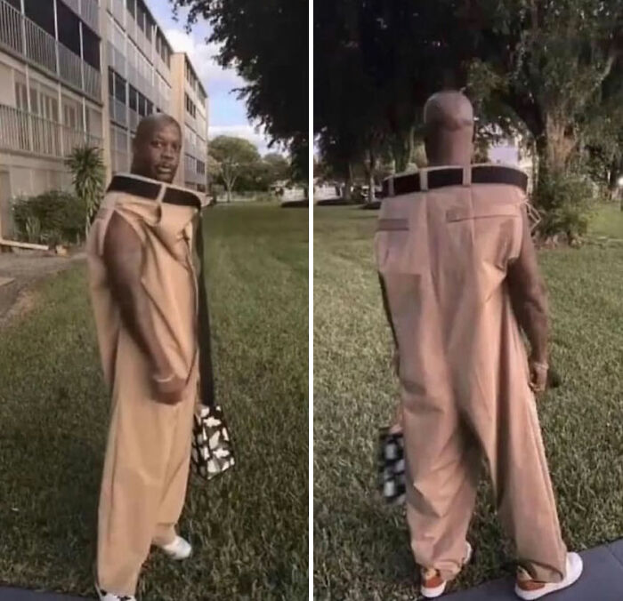
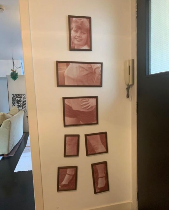
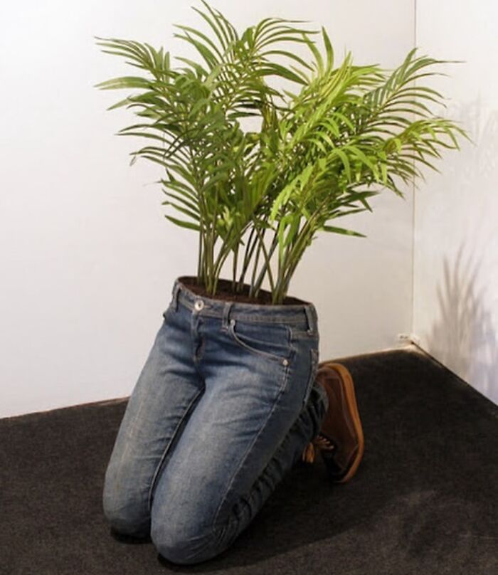
The counterpoint to the worn low pants peeps - Lord Harold Highpants
I have seen this picture in so many other lists. I've run out of witty comments to make about it.
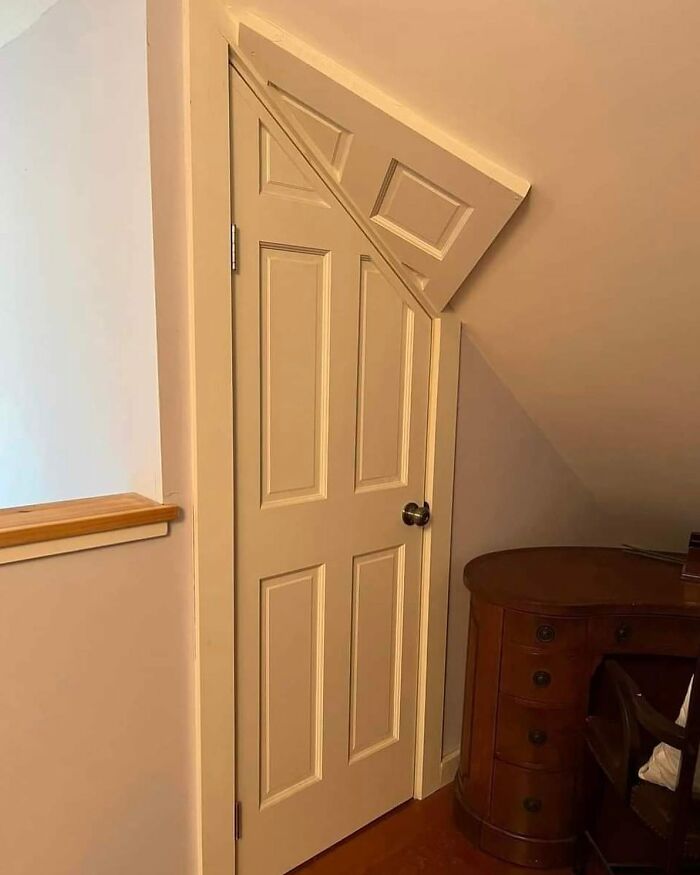
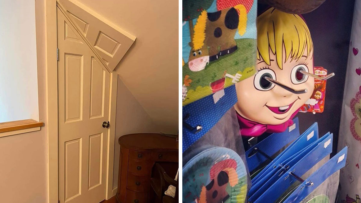
I don't know why this image is presented, on multiple sites, as something negative, or mistake, or in this case, ugly? Obviously it's deliberate, obviously they couldn't put the door at another place, and they used the unused door piece, as some art-like stuff, creating a weird interesting entrance to the room.
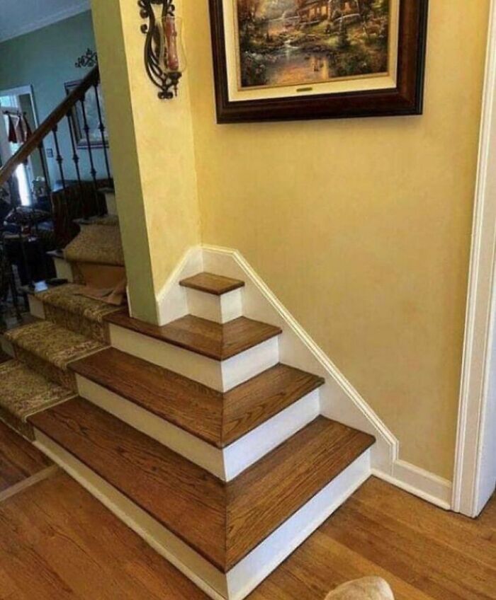
OK. If you have an accident, you will worry about scraping yourself as you slide along, but now you have to worry about splinters?
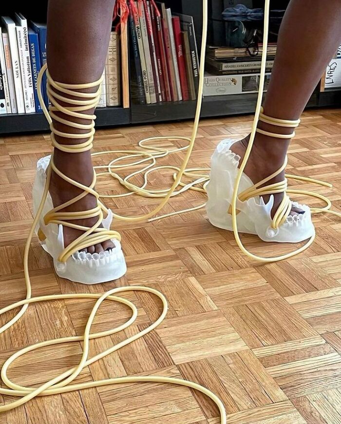
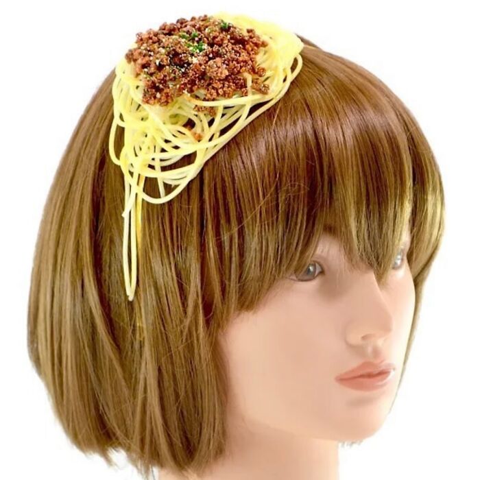
It's Long. It's Mean! And This Time It's Out For Sauce!! Attack Of The Killer Spaghetti!!!
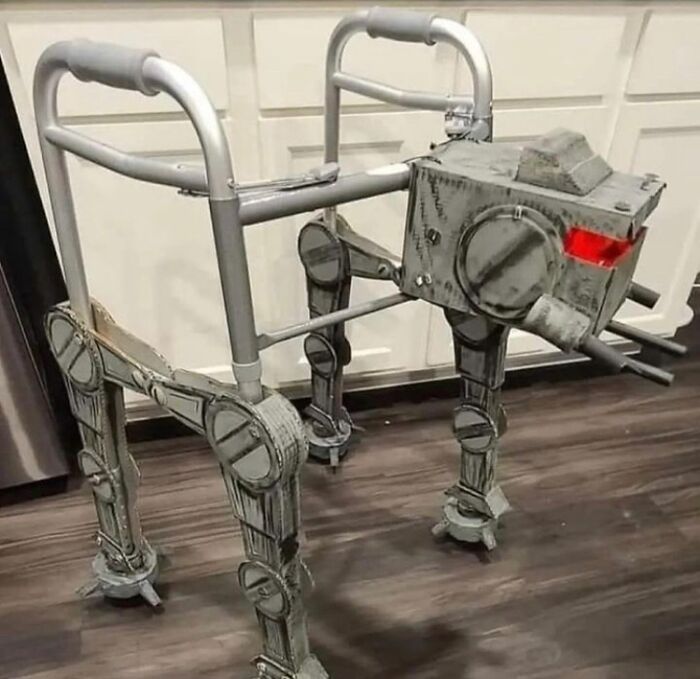
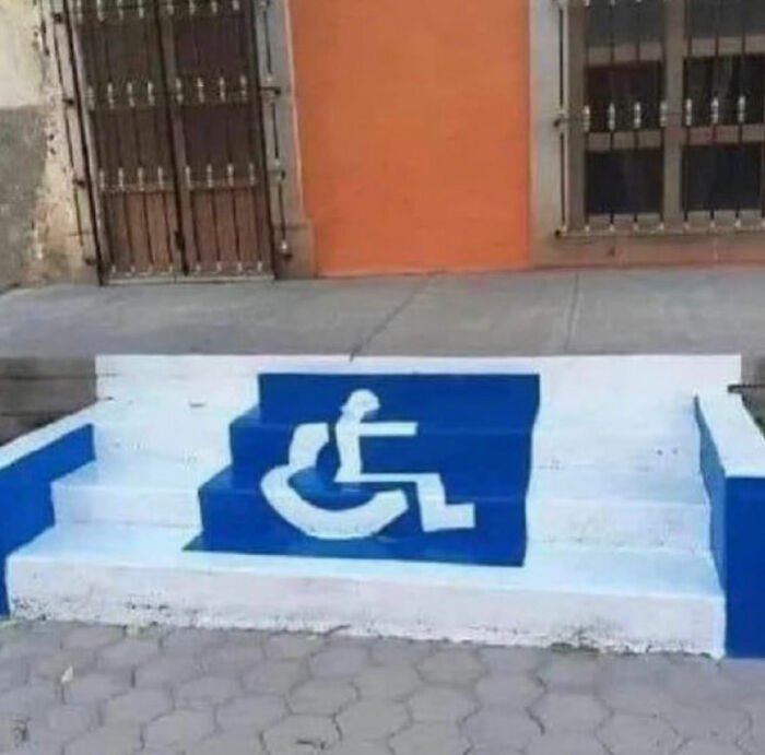
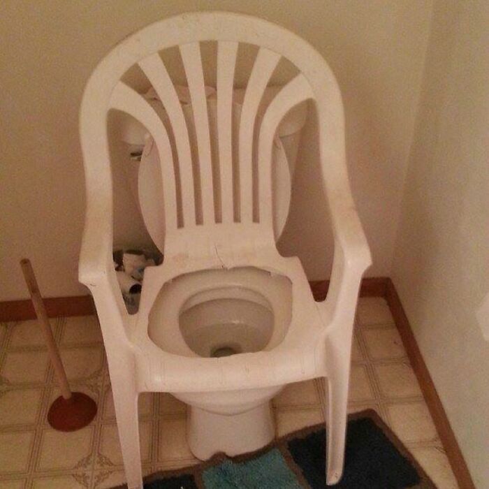
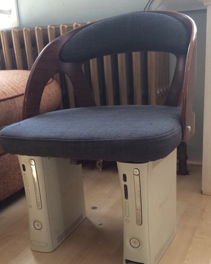
Not the first time I have seen this done when people could not afford a proper seat riser setup for a family member with a mobility issue
if that didnt break them this would be fine but that would break them
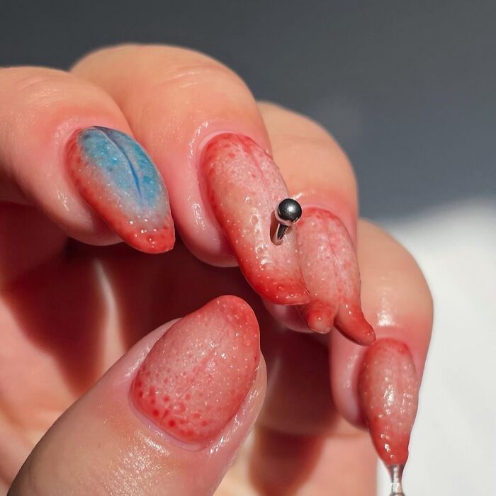
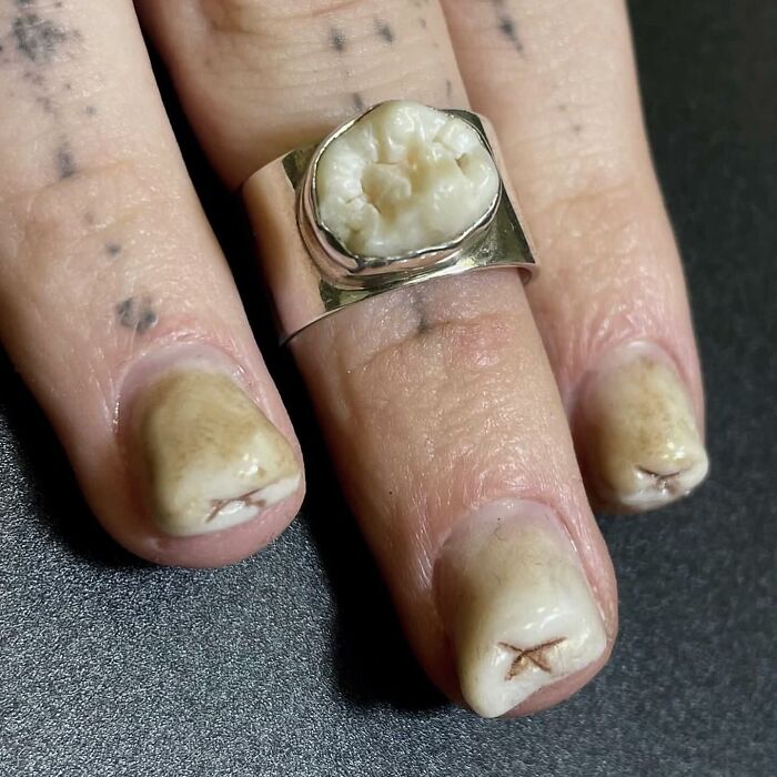
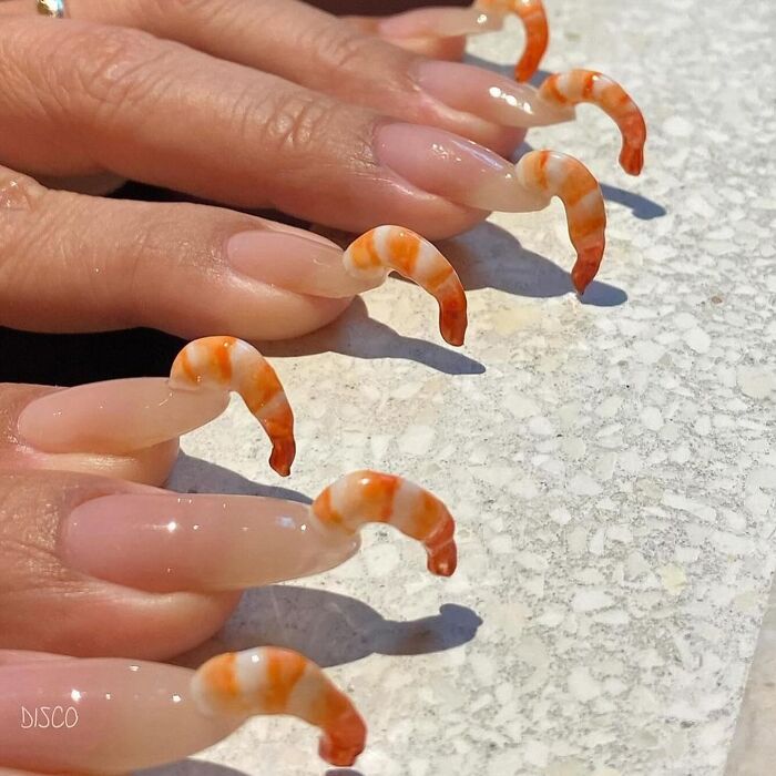
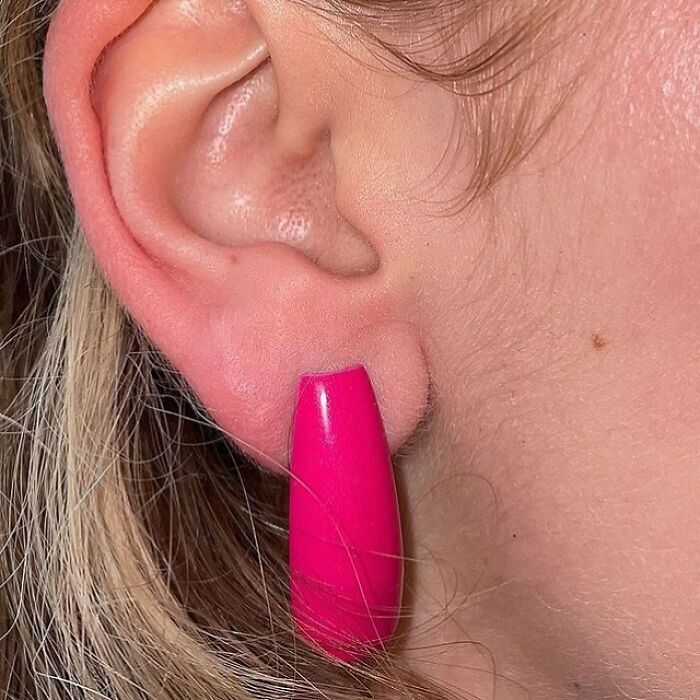
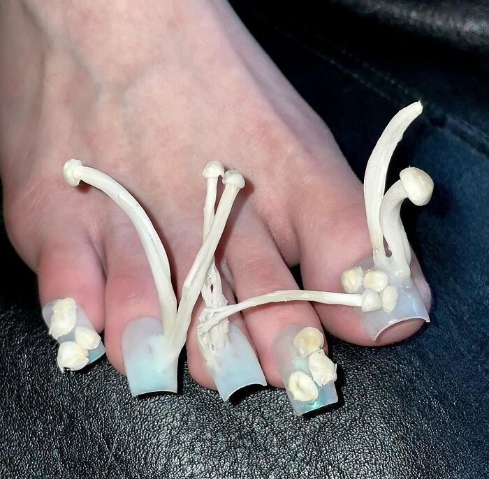
Why do people do stuff like this? Is there a contest for weirdest nail abominations?
I just kept scrolling and asking 'why?' Why did people even think most of these were a good idea.
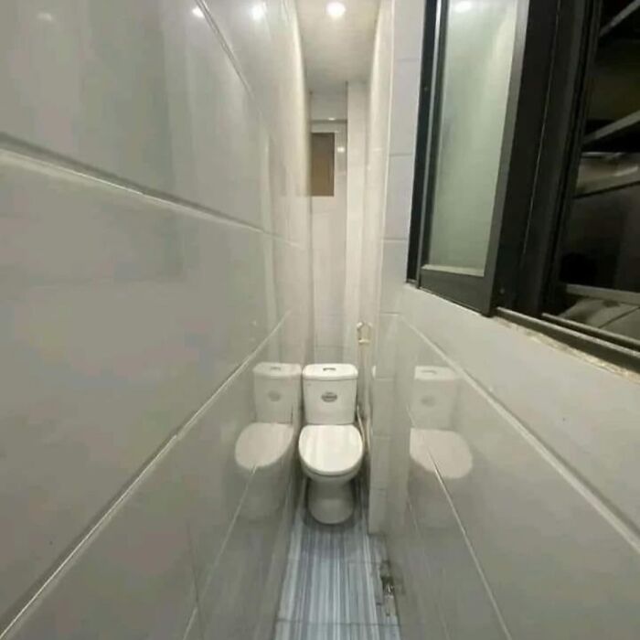
Hahaha IDK if it's just me, but I feel like theres a slight difference between very cool and quirky fashion, art, and furniture; ignorant ableist architecture; and legitimate design fails like a toilet in a tiny bathroom or a balcony that clips a window. And the first two were the majority of these posts.

 Dark Mode
  No fees, cancel anytime


