“I Straight-Up Tell Our Clients Not To Do It”: People Are Sharing 30 Of The Worst Interior Design Trends That Everyone Should Avoid
Interiors have trends, much like our wardrobes. So if you wouldn’t leave your house wearing JNCO jeans, leg warmers or pedal pushers (I didn’t just make that word up!), you shouldn’t decorate your house with outdated designs either.
And if your inner interior design is in a deep winter sleep and you’re about to do a renovation, this thread from the Real Estate subreddit may be a real savior. “What current aesthetic trends do you think will age poorly?” the question popped up in the community and the responses started rolling in with bad, worse and the worst interior trends that should be canceled.
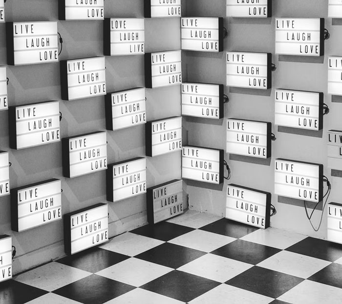
From any decor that says live, laugh, love to sliding barn doors, here are some of the most questionable interior details that, chances are, may not age that gracefully. Scroll down through the post below and share what design trend would totally ruin even the best interior for you!
This post may include affiliate links.
In the past couple of years, we have spent more time in our homes than we have in the past 60 years. It became obvious that our interiors had to adapt to better serve our needs with smarter design solutions, technology and organization. Our new more home-based lifestyles have inspired some fresh decor trends we may see more in the future.
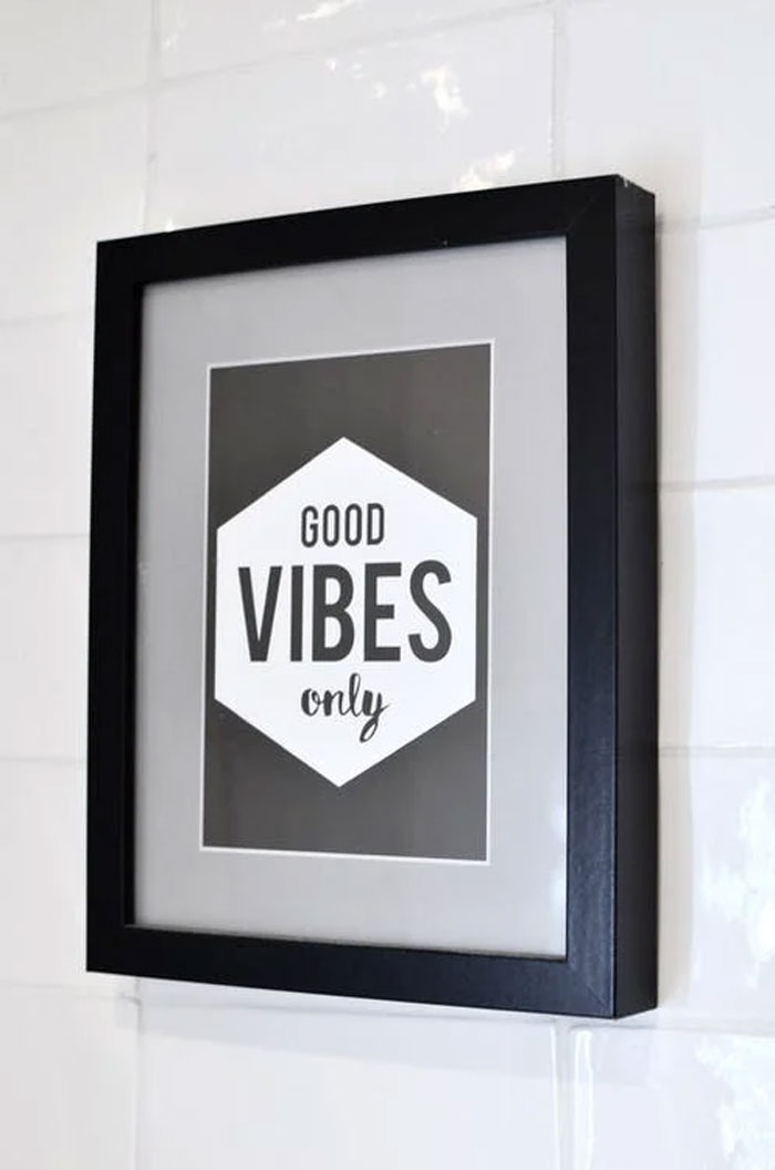
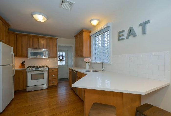 Word signs. Yes, we know you “eat” in the kitchen.
They have been around for decades so I don't see them going anywhere.
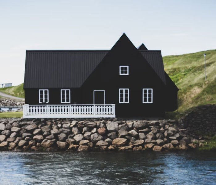
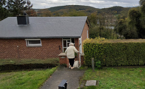
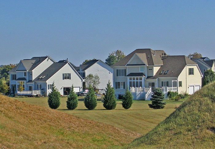 The McMansion.
* way too many roof lines and roof planes. high-pitched roofs where the whole house looks like roof.
* none of the windows are the same size or style.
* 5 different siding types. brick, stucco, faux stone, and vinyl, on the same house!
* the oversized entryway that dwarfs the front door itself.
* no trees, a huge yard which somehow doesn't provide any privacy because it's just a turf covered hellscape with nothing to block the view of the next McMansion.
According to interior designer Lisa M. Cini, a new trend we see in furniture design in 2022 is customization. “When more people are using a space, having flexible furniture is key,” she says. Cini says it may be anything from coffee tables that raise up and convert to a worktable to dining tables that transform into family-friendly tables to seat as many as 10 people.
Moreover, “The old tried and true Murphy’s bed is back and better than ever before, allowing you to have a full bookcase on the front, a dining table, and with a simple turn and fold down (not having to remove anything on your bookshelves), it converts to a full bed,” Cini argues.
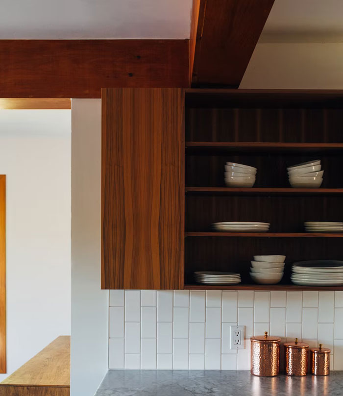 Open shelves in the kitchen.
I did try that, circa 2004, in Malaysia of all places. Within a couple weeks, everything was covered in dust and grease.
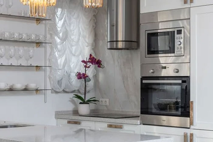
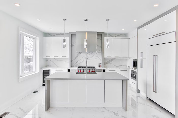 All white kitchens. White cabinets, white quartz countertops, etc. Looks great in magazines but if you're actually cooking meals most of the week, it has to be a nightmare to keep everything sparkling clean.
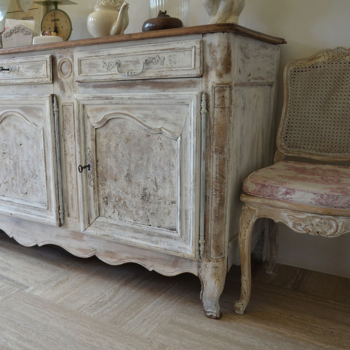 Anything manufactured to look like it was worn out, damaged, and re-purposed creatively.
Another trend interior designers are seeing right now is the comeback of earth tones, from dining rooms to living rooms and even kitchens. “Dark earth tones look best in large open spaces or areas with high ceilings. You want to make sure that there’s enough room for the color to breathe and appear as intended,” says Benjamin Stenson Norsemen home improvement studio.
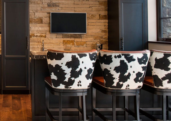 it’s not current but it definitely was an aesthetic trend that aged poorly—cow print, painting cow print on walls, doors, or any surface for that matter.
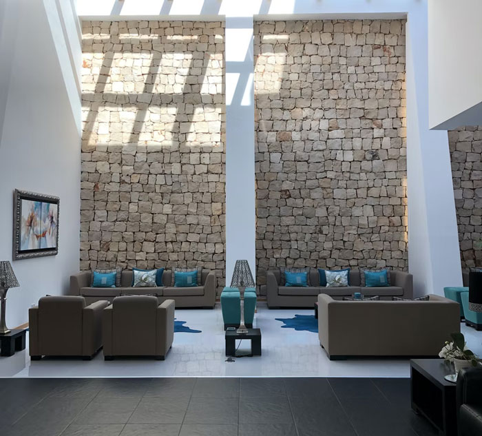 20-foot ceiling living rooms on 2-story homes. What a waste of space for a great extra room on the 2nd floor. Ceilings can max out at 10 feet and still feel high.
And you have to waste so much energy for heating those high rooms. I'm quite sure energy consuming stuff will soon be outdated.
Eco-friendly designs and materials have also become a hit in the last year with more and more people opting for sustainable lifestyle solutions. We are talking materials that have been recycled, reused, or made from reclaimed wood. This new trend is a result of people becoming more educated about the environmental impact of the choices they make. Moreover, eco-friendly materials are often allergy free.
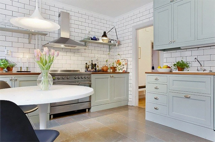 Kitchens that are floor to ceiling subway tile (and all it’s derivative tiles) on all walls. It resembles a rest stop bathroom and will start to feel as dated as taupe walls in a McMansion do now.
One of the most popular interior and lifestyle design trends, hygge, which became a hit throughout the world in the last decade, is likely not going anywhere either. Cozy spaces still reign on social media, where much of the interior design content is dedicated to this particular style.
This is largely because hygge, unlike other interior design styles, not just makes our homes look good. It rather creates a lasting feeling of safety and comfort, something we all lack outside our homes in these uncertain times.
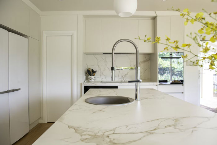 Marble countertops, literally. Not marble-look, but actual marble. People need to be ok with the kind of wear that occurs on marble and I think most people are not. Marble in a kitchen is especially going to quickly accumulate stains and etching.
If you want marble put it in a bathroom and use a more durable stone in the kitchen
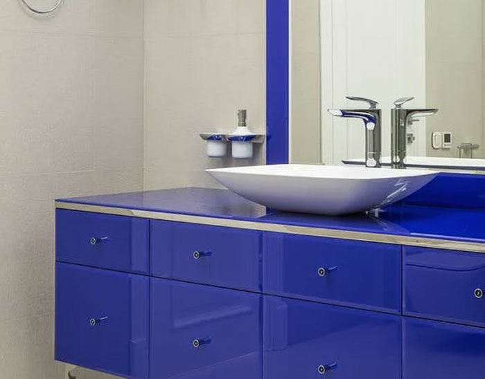 Vessel sinks, they’re an impractical use of space and always make me feel like I’m at a restaurant that probably still serves molten lava cake.
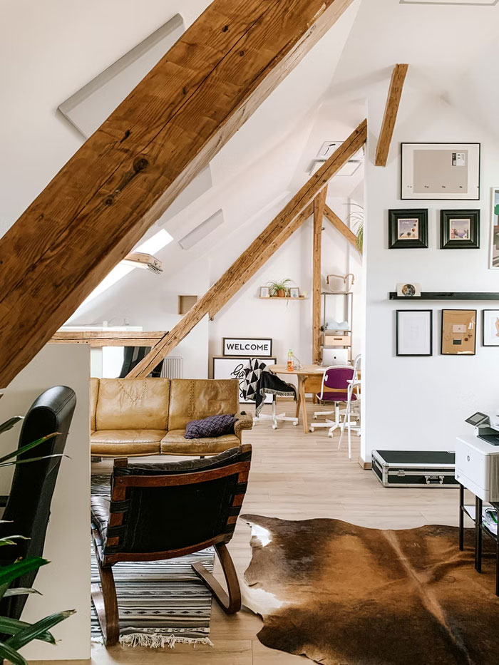 As much as I understand the need for cheaper alternative housing, I believe "tiny homes" will be viewed for what they are: mobile homes. They're nothing revolutionary. Also, so many of them are absolute fire death traps. Loft bedrooms with no means of egress.
I never thought about it like that, but you're right. Easy to get stuck up there with a kitchen fire.
In our previous interview with Eva Taute, interior designer and creator of “Hygge Styling” studio, which focuses on minimalistic design, natural elements, personal touch, and uniqueness, we talked about what makes hygge so popular.
“We have spent our whole lives gathering experiences of spaces. Some of them we felt more at home in than others. We cannot always put our finger on why, but we know it when we feel it,” Taute said, referring to the psychological effect our homes have on us.
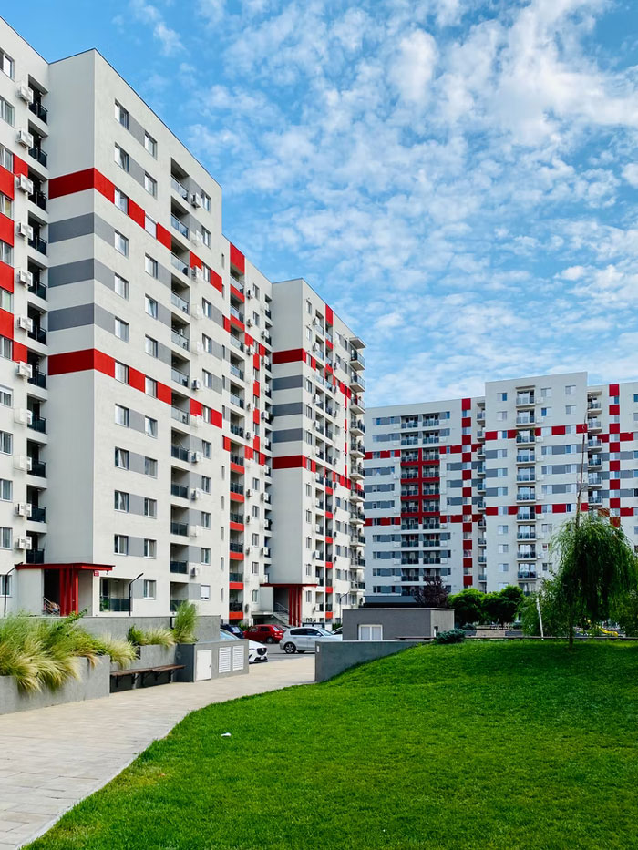 Ugly modern urban apartment exterior where everything is multiple colors/boxes/textures and the inside looks sad and basic.
I realize not everyone loves more period feeling houses, but god, at least Victorians and the like were INTERESTING. The current housing trend is like vanilla ice cream... no attitude, no flavor, and it looks like every other house out there.
And that's insulting to vanilla ice cream, frankly.
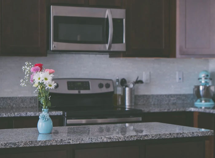 I don't know if this is everywhere but where I live the new trend in kitchens is to have the whole kitchen on one wall with a long island in front of it. No other walls in the kitchen because on one side is the dinning area and the other side is the living area. It's too open and to make things worse you get maybe 2 upper cabinets and maybe 3 lower cabinets because the appliances and sink take up most of the space. I can see where people might think it looks nice but it's completely not functional and gives such a small amount of storage.
Some people nowadays like to dismantle the upper kitchen cabinets and replace them with a simple shelf + artwork / paintings. It's playful, but if I did that I would end up with literally zero storage. Plus at 6'5'', I hate to bend down all the time.
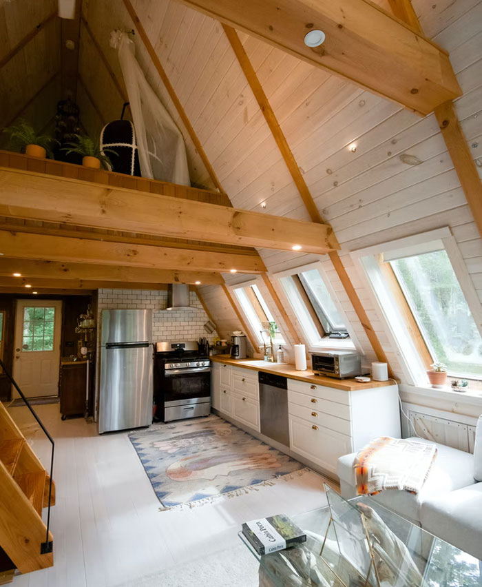 Open layouts make the house appear bigger, but I can't get over how much it makes a house echo. When you have more than a few people in the space it's impossible to have much privacy.
Taute explained: “Our home can reflect our inner world and how we feel about ourselves.” Not only that, but “We can also use our home to reflect the message we want our hearts to hear. It can be a place that supports our well being. We can do that by unraveling our experiences with space and finding those colors, textures, and materials that help us feel at home. Help us create that cozy feeling that brings us rest.”
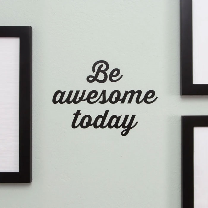 Vinyl signs and labels on everything. Everyone and their mother has a damn Cricut and those stupid vinyl cutouts are on everything at my school. Am teacher. It looks super trashy!
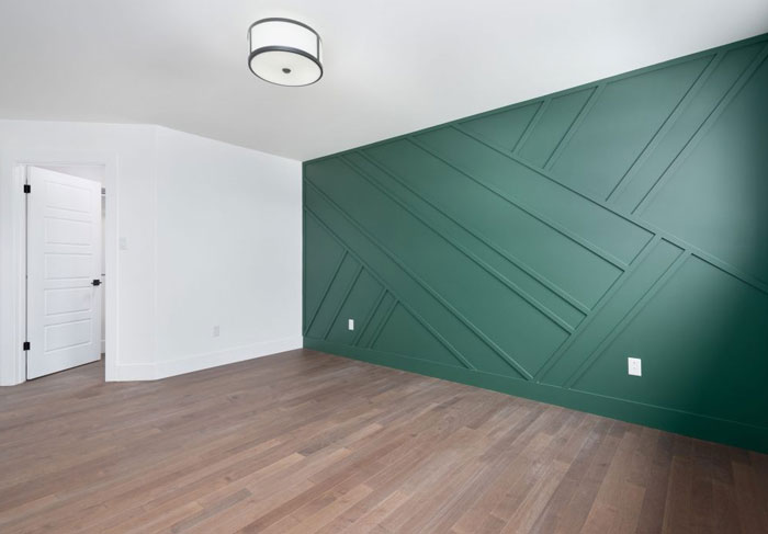 Those accent walls with the abstract diagonal lines. Will age like popcorn ceilings and wood paneling on walls
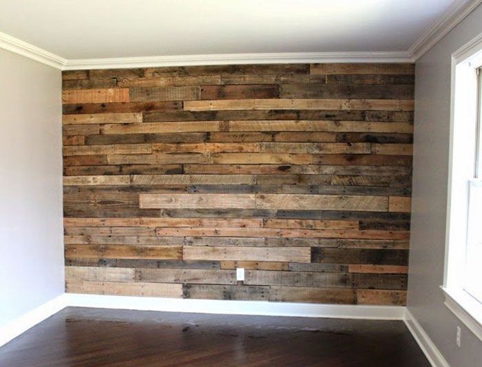 Pallet wood. You have no idea what the hell soaked into those things during their lifetime/transport.
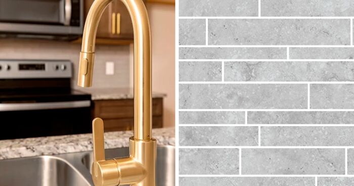
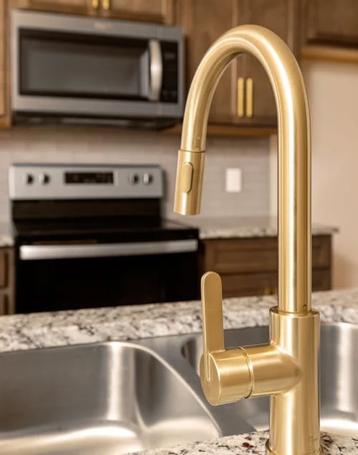 Brass faucets and other brass accents. It's part of that disgusting 80s retro look that has become popular along with hunter Green and mustard yellow colors. Stop it. It was gross back then, it looks no batter now in the 2020s.
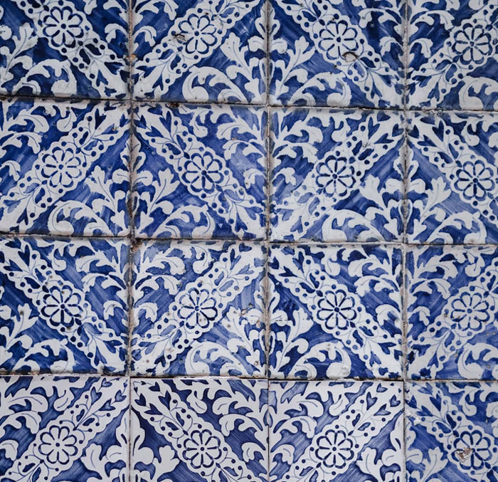 The Moroccan tile everywhere. It fits in some houses, but it's being put everywhere right now. I think it's not going to age well except in houses where it's aligned with the rest of the architecture.
This is true of any kind of decor. If you use it smartly, it will age well. If you don't, it will look tacky.
All these b******t minimalism facades that was made for Instagram. I hate it. It looks like a mindfulness guru took an architecture class. The buildings lack character and I can’t distinguish neighborhoods from each other. Every city also is now sort of looking the same because of this.
Yes, in my hometown I noticed people knocking down elegant prewar villas and replacing them with bunker/diner-type windowless white boxes. It looks awful.
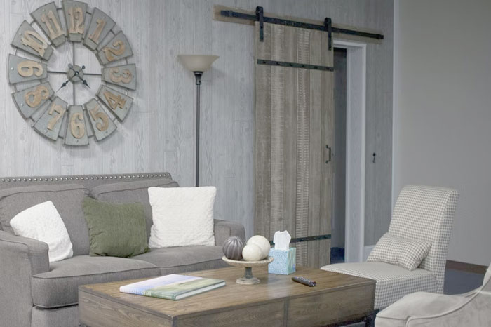 Barn doors and farmhouse sinks, unless the house is actually on acreage/a farm.
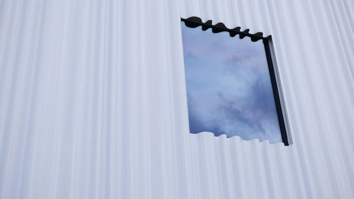 Corrugated metal siding. It's everywhere here in Alaska and it's ugly as s**t imo.
Gold faucets, gold knobs on kitchen appliances, gold light fixtures, etc. We tried this back 50 years ago and we agreed since that it sucked.
Well, what's the alternative? Silver toned metals, which are fine it you like cold colours but personally I would rather go for warmer gold.
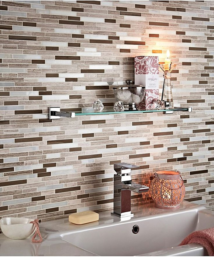 Linear mosaic. Oh god it’s f*****g ugly and there was a period where everyone was asking for it. I straight up tell our clients not to do it. It’s going to look like s**t in 10 years. It looks like s**t now but it will be so obviously dated.
I disagree, if used well I don't see something like this becoming dated so soon. And it's not a new trend either.
Shiplap. It’s literally just wood paneling but in white. I can’t stand it!
It reminds me of that awful couple Chip & Joanna and that makes me hate it and them even more!
—The New Construction Home... a bunch of random styles mashed together cheaply, usually some sort of gray with brown, a cheap looking garage plopped in front, and lots of open space inside, few walls —The Flipper Special, dystopian gray s**t everywhere, arguably tied with the above for the title of World’s Tackiest —The super bright white with some black and silver “could work as a background for THX-1138” interior —Houses that look beautiful in the front but are just a gray vinyl blob in the back —Abstract “modern” homes with tons of glass and right angles. Actually probably not, most people seem to love this sort of house and they’re usually really expensive, but I think they look like s**t
Can we talk about the fact that most of these new constructions have almost zero storage in kitchens? I'm sorry, but I like to cook and bake but there's no way that I'm paying $300,000 minimum for a house with a kitchen that has 6 cabinets and no pantry.
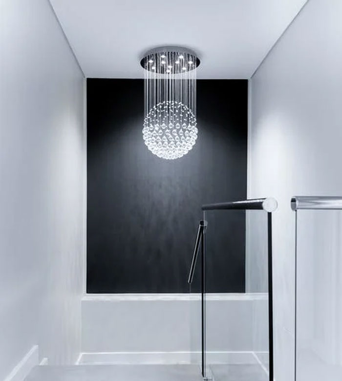 Painting everything bright white with an assortment of cheap black trinkets as decor. I hate modern farmhouse, and I hate painting over wood.
No eaves. In our rainy climate the siding stays permanently damp. You get mildew growing in the first year, moss by year five. I imagine by 8 or ten the mushrooms start popping out.
No eaves? Where are you supposed to sit with cup of tea or glass of whiskey and enjoy the rain?
Greige, live edge pieces, LED strip lighting everywhere.
Disagree about the live edge pieces, that is timeless furniture.
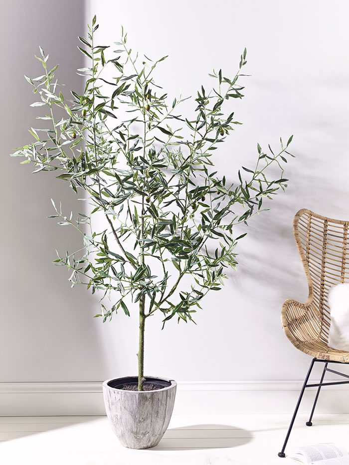 Artificial olive trees.
"Farmhouse" light fixtures where it's an empty square or rectangle frame around a bulb.
I don't mind this one. It's canned lighting that I don't like. Makes the house feel like an office.
Who thought pairing granite countertops with busy tile backsplashes was a good idea? Cant they see how they often clash? And what is with the distressed-look cabinet doors? In 30 years it will look like our generation never cleaned and had dust and gunk on our cabinets!
Brown granite countertops with white appliances.
Hunter green cabinetry & gold faucets and hardware.
80's FLASH BACK!!! Don't forget that awful magenta-ish red and rose borders...
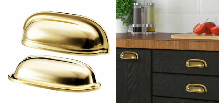 These drawer/cabinet pulls. They're literally everywhere and wildly overused. In ten years it'll be impossible to give them away, especially in oil rubbed bronze color
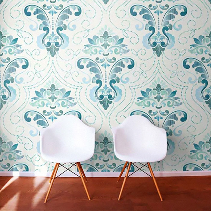 Wallpaper with bold prints. It goes in and out of fashion and has for decades. I think it can be super cute but don’t kid yourself that your big floral with the toucans is going to be timeless in some way.
Encaustic tile is having a moment but it’s too much of a pattern to have real staying power and will be the Tuscan kitchen of the 2020s. I think huge giant tile will also go off trend, not because I dislike it but just because it’s a particular look and looks cycle out.
I really hate the houses that look like someone started with a Tuffshed and then took a bunch of Sketchup shapes and just mashed them together on the facade.
Adding brick facing on the front of the house but using vinyl siding on the sides. Like, if you’re going to use fake brick, at least make it convincing.
All those skinny, multi colored tiles in black, blue, gray, white, etc. I’m not describing it very well but they’re everywhere now and the business makes me wanna vomit.
White farmhouse exterior with black windows - WAY overdone, which means people will get sick of it, and it will look dated in 5 years.
The houses where I live are mostly old brick cottages that are white with black window frames. I bought paint last year to paint it very pale blue with grey window frames, just waiting ever so impatiently for my husband to finally get around to doing it
Fake hardwood flooring will be the avocado shag carpet of our time.
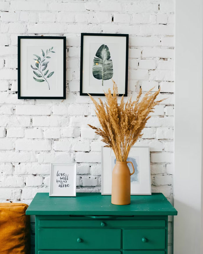 Painted brick, if you didn't want to look at it, render or stucco it, or if you want to see the out line of the brick, bag it. Painting is a quick and not well thought process of restoring brickwork.
I kind of like white painted brick -- it goes way back to lime washed walls.
Gray vinyl flooring. Wood isn't gray. Stop pretending it is.
Cottagecore
Doors that pop with color.
These are all a bunch of personal preferences, with just a couple of legit points (i.e. decor with words, subway tile, all white/gray interiors). To top it off, some of these decor choices have been around for years, if not decades, but they weren't as popular until now. So basically this is a list of people hating things just because they are popular.
I agree, with a few exceptions, a lot of these suggestions are just straightforward snobbery. Most people cannot afford to change tile, kitchen cabinets, paint colors, etc just because they are not popular with the fancy house magazines anymore. Some people, like renters, don't really even have a choice. This just seems so shallow and judgemental when people all over the place barely make enough money to cover rent.
Load More Replies...I don’t really understand the goal of this post. It’s impossible to know, for sure, what the trends are going to be in 10,20,30 years. Decorate your house how you enjoy it. And when it comes time to sell, update and flip what you can. Otherwise, calm down. Real estate in the US is skyrocketing. You could paint a cardboard box and it will go for $300k in many parts of the country.

 Dark Mode

 No fees, cancel anytime


