Welcome to my humble abode! Well, you're only welcome if you don't judge my design choices!
When decorating your home, the most important thing is that you feel safe, warm and comfortable there. Nobody else’s opinions should matter... Right? But if you’re an avid watcher or HGTV or you live vicariously through Bobby Berk when watching Queer Eye, you might have some opinions on how a home should be decorated. And if you do think you’re an expert on interior design, you’re not alone. Reddit users have been dishing about all of the home trends they hate or that they expect to become outdated within the next few years, so we’ve gathered a list of their hot takes down below.
Trends come and go all the time, so for all we know, the people who weighed in on this topic might end up with quite outdated homes of their own a decade from now. But it can still be fun to channel your inner Joanna Gaines and imagine how you would or wouldn’t decorate a home (even if you don’t own one at the moment!). Be sure to upvote the replies mentioning trends you would never put in your own home, and let us know in the comments what other design trends you hope will die out soon. Then if you’re interested in checking out another Bored Panda article on the same topic, you can find more modern home trends you might hate right here!
More info: Reddit | Reddit | Reddit | Reddit
This post may include affiliate links.
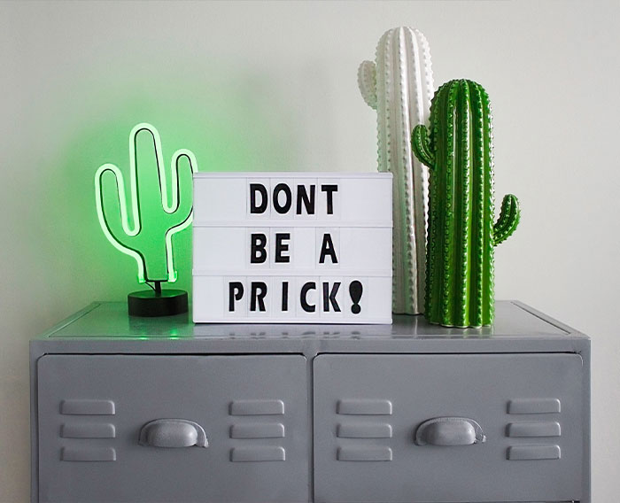 What's wrong with people just doing their home up however they like it and don't give a f**k what anyone thinks
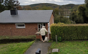
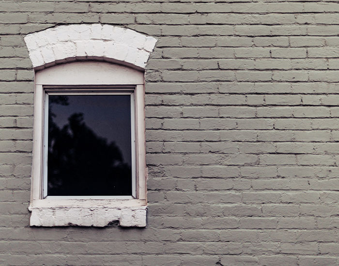 Painting red brick houses grey.
It stabs at my heart. And my eyes.
Living in a large Canadian city where the first 'permanent' houses were made from locally made bricks, I'd like to point out that some clays used in inexpensive (single-fired) bricks can be very susceptible to frost cracking - winter, obviously. They're porous, absorb a fair bit of water, and in the frosty morning, little bits break off. Paint is just a 'sealant' and coloured all-weather paint is cheaper than specialty sealers. It's called 'SPALLING' I think.
Meh, I have a ‘Safari’ style bedroom and I love it. Lots of plants, rattan (some old), one wall with a safari print wallpaper, wooden map on the wall, globe, animal lampshade etc etc. I don’t care if it goes out of fashion (was it ever in fashion? I don’t know) but I’ll always love it. If you love it and it’s your home, your safe cosy space why does it matter if it’s so called old fashioned? I mean unless your trying to sell it in the future I guess. But I live for what makes me happy in the now
It's lovely when a home is a reflection of the owner. Your unique touches give it character versus it looking like a hotel room.
If you’re not an expert on home design, it can be hard to determine what trends aren’t working anymore or what will be outdated soon. We can all tell that the popcorn ceilings and wood paneling at our grandparents’ home does not look cutting edge anymore, but when it comes to homes that were designed in the last decade or two, it might not be as easy to discern what needs a makeover from what could be featured in Architectural Digest. So if you need a little help from a home and design expert, we consulted this article about “How to Change Home Decor to Avoid Looking Dated” by Sacha Strebe.
Sacha’s first tip before getting down to the nitty gritty of designing your home is figure out your personal style first. “The key is to determine your personal style fundamentals first, then build on them,” she explains. Next, Sacha notes that having a flexible color theme as the base is also important. Many people assume that this means to pick neutral colors, but apparently, it’s actually about having a combination of warm and cool colors. “Once you settle on a preference, sticking to that constant color theme throughout your home should prevent it from looking dated too quickly and ensure it survives the seasonal trends,” Sacha says. “It's the perfect backdrop to feature period pieces, so you can still have fun with timely styles.”
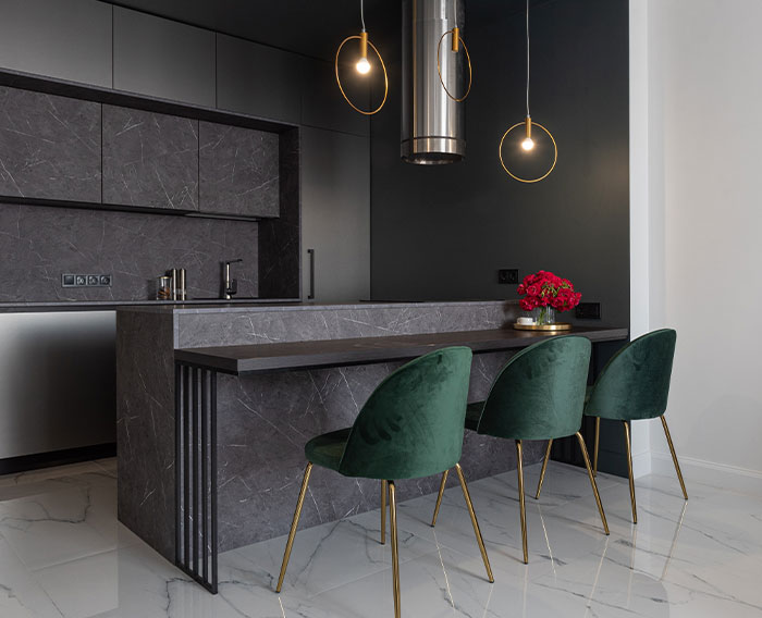 I've noticed a lot of modern renovated houses, espcially thr higher price ones, all look like laboratories inside- stainless steel, white and grey, hard edges. And not just in the kitchen, all the rooms. How can you relax and feel comfortable in a house like that?
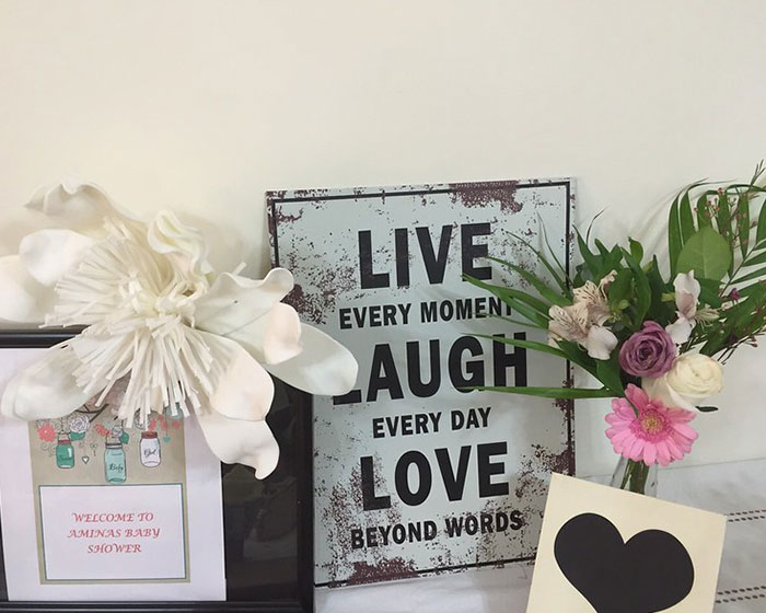 Love, Live, Laugh stencilled on the wall
I once saw a front door mat that said “Live, Laugh, Leave.” Much better, right? 😊
Load More Replies...LIVE Unlike that guy I just killed LAUGH Over his corpse LOVE The lawyer that got the charges against me dropped. Apparently I have a "dark" sense of humour. I still like my version better.
I live to laugh at your version, because I love it.
Load More Replies...I detest this sort of manufactured sentiment. It's not deep, it's not meaningful. It's plastic sentimentality, created to sell tat.
You perfectly put my thoughts into words.
Load More Replies...It's just a completely FAKE message that makes me want to slap someone.
Exactly. I would also like to slap the everlasting %¥@# out the person(s) who wrote the Charmin toilet paper slogan “Enjoy the Go” 👹
Load More Replies...Or when you have an entire house with "labels" written on the wall. Gather 'round, in this house we..., etc.
Anything can sound good once. Third time. Dude, shut up and sit down. And, people are still writing quite old nonsensical verse or popular song lyrics... or worse... a little poetry or prose they've written and must share. Walk in. See that. Feel my daughter give me that little pinch that says, "Do the old lady thing. We have to get out!"
hate any stupid preach sign, as well as an announcement of kitchen over a dining room table.. . hilarious inappropriately placed sentences that's another story
HATE being told what to do, sure don't want my walls getting in on the act.
I bought a house that had this and even before unpacking I peeled this off the wall! 😆
When I started making seasonal canvases, my son said "OMG. PLEASE tell me we are NOT going to be one of those 'blessed, live, laugh, loved' houses, are we?!?!" I assured him we are not and never will be. Lol
Our friends, as a joke, made a sign for our bathroom that says "Live, Laugh, Poop".
If you have one of these, I also imagine you don't have much room for emotional intelligence and won't talk to you about much
Nothing against a few signs, but I've been to someone's house where there were so many "inspiring quotes" I felt physically ill.
Tired of seeing it everywhere... Copycat decor is so boring
Or, like Dennis Liao of Linus Media Group: $400 custom sign that says "Live laugh Liao"
There's something almost ironic about "Love beyond words". It's literally explaining how you should love via unnecessary words on a sign. As if people need instructions.
God, this needs to die! Be burnt and bury 20ft deep and covered in concrete and then more concrete. Basically it needs to be buried as deep as the ET game.
At this point in the game, seeing that on a wall would say to me: "Yes, I know exactly what those words say about me, and yes, I'm cool with it."
Every person I've known who has this sign on their wall has been the most shallow, condescending human being too...
There are days where I have only time for the last one and I don't like to be remembered every then and now.
Where else would someone put it if they needed to be remined every single day....
I have one but it’s like a sticker you basically attach to the wall. However, on its own, it’s just useless, but if you have family pictures next to it or something like that, then it’s not pointless.
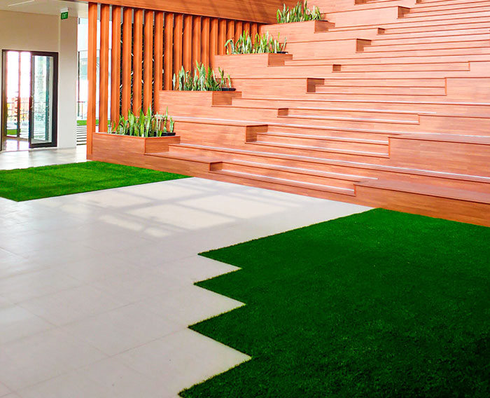 Fake grass. Please, please, let the fake grass be a passing trend. I understand it’s a faff to keep a lawn, but people hosing their dog s**t off their plastic “garden”… the world does not need more plastic.
Well, in my drought stricken California, it's better than real grass. But I agree, it's ugly and soulless. I'd rather see low water landscaping than AstroTurf.
A fresh paint job can also keep your home from looking outdated. This does not need to be white by any means, but painting your walls is one of the simplest and cheapest ways to update a room. So whether you choose to embark on the project yourself or hire a professional, Sacha notes that you can’t go wrong with a new coat of paint. One thing to avoid to keep your home from becoming dated is a themed room. Sacha warns not to commit an entire room to one particular theme that you may not love in 5 years, but rather, throw in some accents of that theme that can be replaced later down the line if you no longer feel connected to them.
Next, Sacha recommends utilizing layers in your spaces. “It creates a diverse space that keeps the eye moving,” she writes. So add that rug, that painting, those throw pillows or that cozy blanket on top of a chair! They can always be moved around or changed over time, but they keep your home cozy and more interesting. Sacha also notes that it is wise to declutter the items in each space of your home a few times a year. We tend to accumulate, but it’s important to also purge the things we no longer need or that might be dating our homes.
Open plan kitchen/living/diners. Eventually people will start to realise that they sometimes need to get away from the rest of the family for an hour or so.
ugh, this exactly. i love my home, but i’ve always wished there were a *few* more walls.. the common area is too open but my bedroom is too lonely- so i just sit with my headphones on
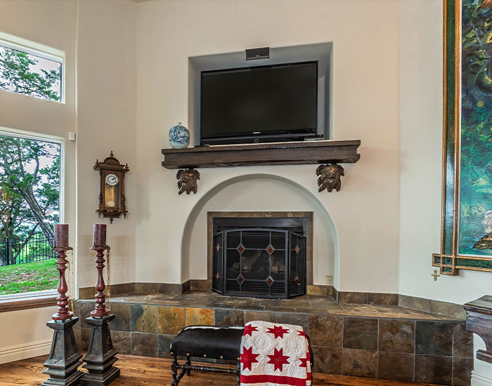 People mounting TVs above fireplaces or so high that they end up closer to the ceiling than the floor. After a decade of that s**t, their necks will be thanking them
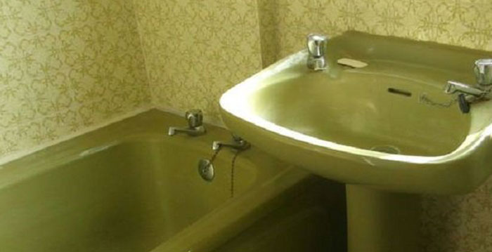 I hope avocado suites in carpeted bathrooms make a return, that way I won't have to redecorate my horrendous downstairs bog.
Perhaps introduce it to visitors as your retro bathroom versus bog. It can be a cool experience to be transported back in time through time capsule rooms. Though perhaps the carpet in the bathroom is to historically accurate and should be ripped out for sanitary reasons.
If you want to keep your home from becoming outdated, it’s important to be willing to embrace change. You can absolutely cling to the design you chose a decade ago when you first moved in if you still love it, but if you are looking to update your living space, change can be a good thing. “If you're open to change, you can adapt your home quickly to embrace newness as it arrives and find a way to intersperse it,” Sacha writes. “It can be simple things like changing your cushions, giving your living room a lift with some new artwork, or updating the hardware in your bathroom to bring it from drab to fab.” But if you do plan to be making changes often, keep in mind that you may need to have a running budget for these updates. If you set a little aside every now and then, you’ll be prepared to fund a fresher version of your home without breaking the bank.
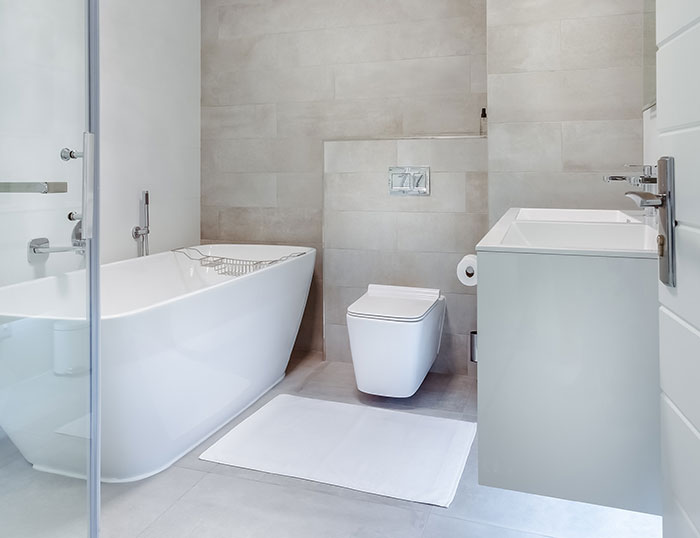 More bathrooms than bedrooms is a weird one that will seem like a waste of space eventually
I worked with a lady in like 2009 ish who spent THOUSANDS on upgrading her house to have Apple ports built into the walls and integrated speaker systems. That's all I can think about. What an absolute waste and also f**k apple
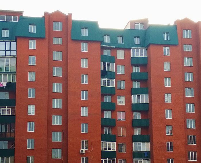 High density new builds.
I mean seriously - every single one in this area are crammed together, with tiny gardens, no parking, narrow access roads.
And then you go inside, and find the rooms only look spacious because the houses have 3/4 size furniture in it, or no furniture at all.
All the rooms you could want, just less square feet than ever.
Just a recipe for future slums.
I think this is actually the ideal if done right. High quality sound proofing between all units. First floor restaurant and other business. Right across the street a daycare, park, grocery store and public transportation. Within a short train ride, schools, hospital, community center etc. Aka the 15 minute city.
If you’re wondering what the experts say about which home design trends are reaching the end of their lifetimes in 2022, we’ll fill you in. We consulted an article that Sydney Meister wrote for PureWow noting trends designers are ditching in 2023, so I can pretend like I actually know anything at all about interior design. One trend that’s apparently seen better days is stacked floating shelves. What will be replacing these shelves is long linear shelving, according to interior designer Katelyn Fuller. “While I love a good floating shelf, I think that the stacked shelves in the kitchen are going to be completely out [in 2023],” she said in a TikTok. “[The long linear shelves are] still [kind of a] floating shelf, but instead of doing multiple shelves, [you’re] just doing one shelf all along the wall, which makes the space seem so much bigger.”
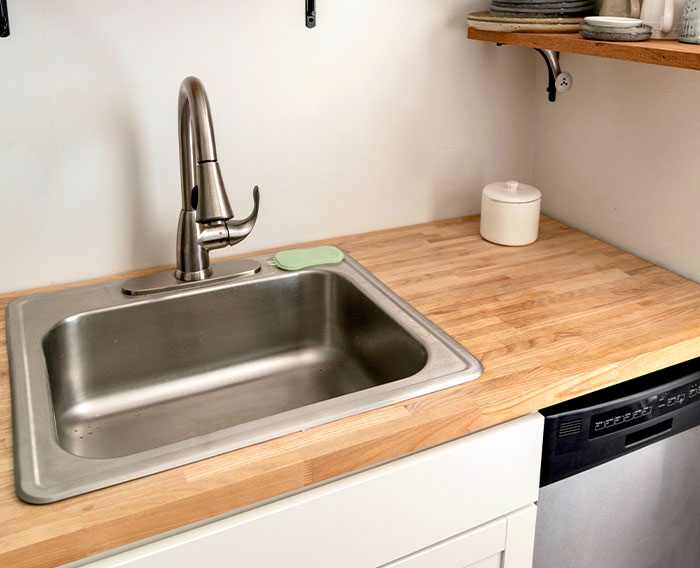 Kitchen sinks without draining areas. Super instagrammable and super annoying. Where do you put your wet dishes??
You go to the store & buy a drain rack to sit beside the sink. Another thing to spend money on, looks awful, & where do you store it when you aren't using it.
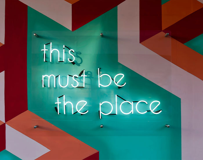 Geometric designs. Clinical white and grey everything. Words. What is it with words? In the bathroom: SOAK. In the bedroom: SLEEP. What goes in the bog? I also have a special hatred for decor with whimsical phrases or prose. Humourous house rules. Kitchen opening hours. I just can't hack it, it makes me cringe hard. Oh and don't get me started on f*****g bunting.
Absurdly high prices and shitty build quality. Oh no wait, those will still be around...
According to Katelyn, olive trees in the home are going to be less trendy in 2023 as well. “I have yet to see one well-produced faux olive tree. They all look extremely fake and bare to me,” she explained in a video. “I try to steer clear of oversaturated decorating [trends], and all olive trees have become that way.” On the other hand, Katelyn believes red oak trees will be on the rise. “To me, they're a little bit more unique, and since they're not so widely used, it makes [the piece] feel more interesting,” she explains. “If you're looking for a corner filler or a [textured] tree to add to your house, these [are the way to go].”
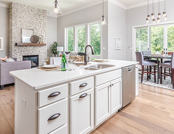 Open plan. With the rise in heating bills we'll all go for 'cosy' and want a nice tiny room where we can all huddle around the one electric fire we can afford.
Guess this one depends on the climate in which you live. Open plan is perfect for the places I've lived in in Australia.
I live in the west as a contractor. The amount of rich people that want to put reclaimed barn wood up on the interior of their home without considering that it is covered in horse p**s and s**t it too damn high.
Another trend Katelyn believes is reaching the end of its lifespan is the colorful plaster accent wall. Apparently this trend spread rapidly during the onset of the pandemic, as many of us were grasping for any excitement or joy we could possibly find, but their time in the limelight has come to an end. “Something about the texture on the bright plaster walls really shows contrast,” designer Nick Lewis explains in a TikTok. “[The look is] sort of gives a '90s textured wall that I think will look really dated very soon.” To replace this trend, Nick wants to see muted panel mouldings, that are the same color as a wall’s paint, become popular. “[They're a great way to add texture to a wall. Light plays off the panels in really interesting ways and can make your home feel really luxurious.”
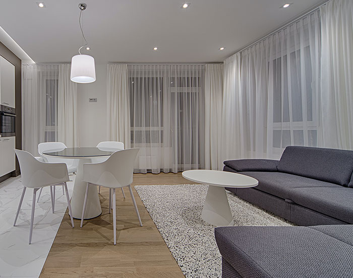 I’m gonna go against the grain and say that I quite like the upsurge of grey as a neutral! Wouldn’t have the whole house or room in it, but as one neutral colour I much prefer the cooler tone of grey to magnolia or cream. I chose a grey living room carpet (walls are white) and a black settee and everything else is just … a hodgepodge really lol. I needed one plain ‘colour’ (or lack of) to offset everything else! And I find brown and its variations a bit depressing
My house walls are all grey (rental so we're not repainting) and it's worked out. I have a yellow, cream and grey rug with bright throw pillows and lots of plants. Red and yellow kimono hanging on the wall. It can be a good neutral.
I've got a 1930s semi, with separate living room, kitchen and dining room. Would never want open plan. I like to be able to close doors on mess
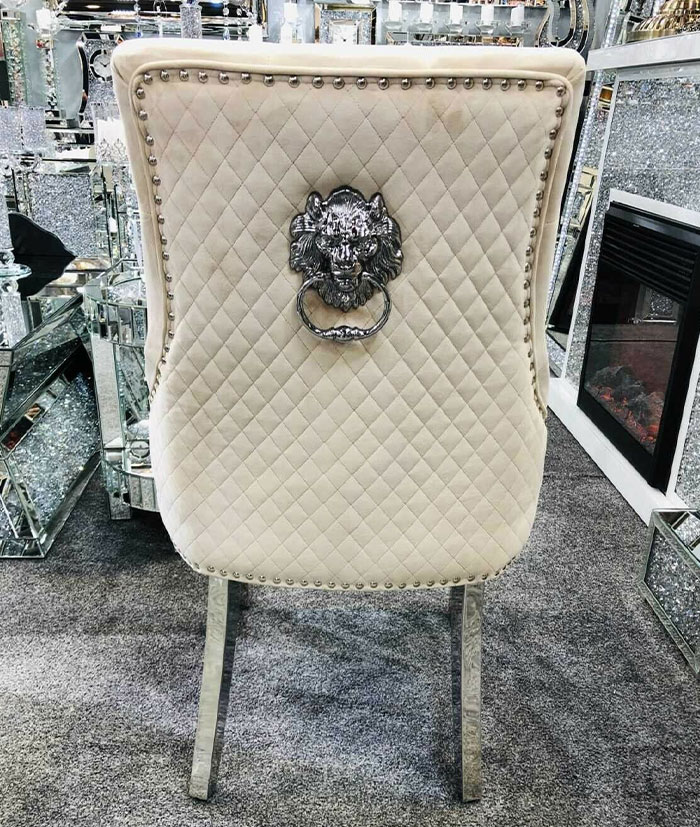 Those chairs with the lion head door knocker on the back…
I had never seen one until the photo above. Never knew it was a thing. You're right, they are pretty stupid looking.
At the end of the day, design is subjective, and you should stand by what makes you feel cozy and comfortable in your home. But if you just don’t know where to start when decorating your humble abode, you might want to take this list into consideration. Keep upvoting the responses featuring trends you wish would die out as well, and feel free to share your hot takes about current home trends in the comments below. Then if you want to check out Bored Panda’s last article on this same topic, look no further than right here.
Stone gardens. You lose the cooling effect of vegetation in the summer, bees are dying and most stone gardens just look ugly. Sorry, not sorry.
Not on houses but the little f*****g balconies on large apartment buildings. Not real balconies, the ones just for show. In 10 years they're going to be ugly as s**t and in need of repair, and nobody will want to keep them.
 Funny how things change isn’t it? I saw a house on Right Move recently which just screamed 1990s. The living room had that half wallpaper half painted style with a wallpaper border at the ceiling. The bathroom tiles with one random one with a flower design on and coloured bathroom suite ….
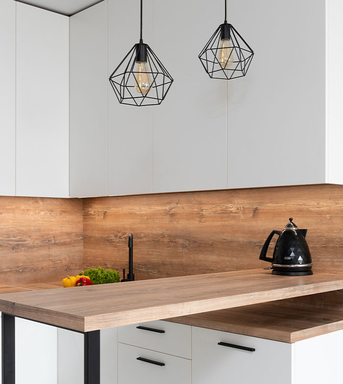
As for modern styles … those bloody obnoxious wall stencils can get in the bin. Live, Laugh, Love and all that bollocks. Everything seems to be bright white and grey and those geometric kitchen lights …
 Actually owning a house, so last decade.
 I'm sick of bloody bulbs everywhere. I've got a smallish kitchen and there are seven bulbs in there, with three different types of bulb and fitting. It's completely unnecessary and such a ballache. Rather than buying a box of generic bulbs to replace each one as it goes I have to buy and store boxes of all different types of bulbs and remember which ones go where.
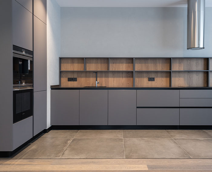 Grey everything. Grey windows, grey doors, grey kitchens, all of it. Dont quite understand why everything has to be grey these days.
Needlessly cladding perfectly fine properties with fake wood. Costs thousands, literally serves no purpose and looks dumb as f**k. As if we're supposed to believe your 1950s townhouse was supposed to have 'oak' cladding on it.
One I hope goes, but probably wont - mounting sockets half way up the wall to allow wall mounting of certain gadgets/tvs... no... just please no, I would rather go to the additional expense and effort to have to hide cables on the off chance I utilise it, than have these butt ugly mains sockets everywhere at eye level.
Not sure about specific things but my local area (West Sussex) has been covered in housing projects the past decade and there is practically no character in any of them. Just endless identical copy and paste boxes with tiny gardens and giant roofs that are designed to be turned into loft conversions in the future. There have been so many indentical developments across the county that I can tell which developer has built them from the house designs alone. The only differences I can see between the "affordable" and "premium" houses in the developments is that the premium ones come with some kind of cladding and occasionally with the extension already built in. They all get built in ~6 months with the exact same timber framing and breeze block construction and all the landscaping appears to be a case of how many meters of grass and homebase plants can we squeeze in in the week before the owner moves in. I'd be genuinely astonished if they maintain value anywhere near as long as the 80s/90s housing developments that are already here.
I think a housing trend that will go out of style quite soon will be being able to afford your energy bill.
Being mid-terrace has never seemed so good - only three sides to lose heart from.
“Look at my house” lights. Big flashy lights that people shine on their houses to show them off overnight.
Taking out the wall between the house and conservatory so there's no barrier, meaning you can't shut the door on the icebox room in winter or the blazing hot oven room in summer. And in the same vein replacing external walls with glass and knocking down internal walls. We do not have the climate for these arrangements!
Literally anything new build. Every single house is built like there's just one 25 year old man living there. Also, open plan. Good luck heating your 350 sq ft living room with your single modern column radiator pumping out 2500 BTUs.
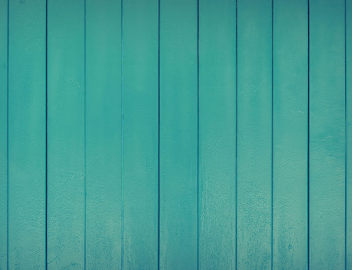 That trend of glueing strips of MDF to the wall as panelling and painting the whole thing in a safe sage green or disappointing blue. It’ll be a right s**t to get off, too.
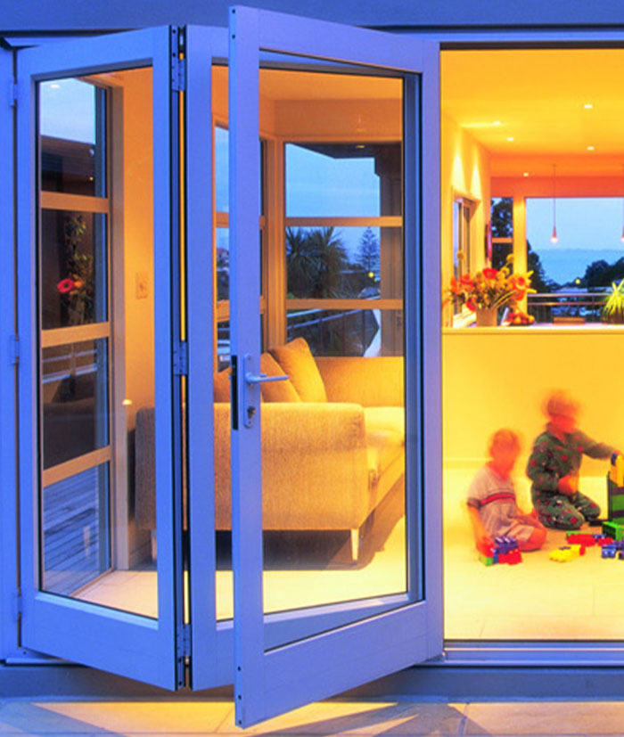 I’ll die on this hill: Bifold doors. Looks amazing in a magazine. However, if you have kids, sticky awful kids, they just become a wash of hand prints. It’s not energy efficient having a whole wall of windows. In the right kind of extension it works, but I’ve seen so many of these open plan diner things where you can’t open a window by the oven or release cooking smells - only a door - as they’ve gone all across the back. Prob fab for the 3 days of great weather you also happen to host a bbq this country gets, but it seems a design trend for a different climate.
Deep pile carpet can go do one as well. We inherited this on our staircase, and you can’t walk on it with a pair of socks without leaving a little trail of lint. Have to Hoover way more often.
Square toilets, sinks and baths. They look s**t, are so uncomfortable to sit on/lie in, but everyone has them.
I reckon all the pinterest pirates doing the geometric patterns with tape and paint samples. Which somehow then seems to make it into the metro newspaper as a "hack".
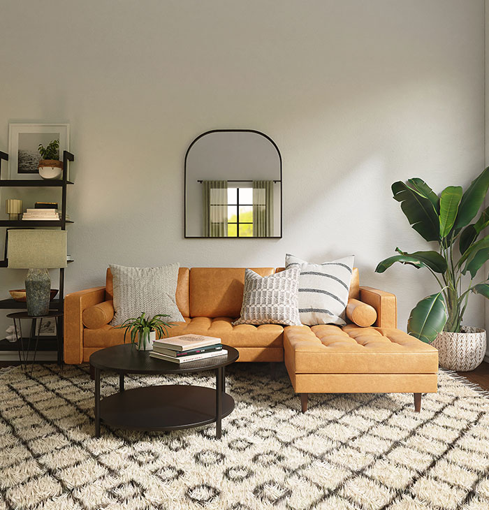 literally everything - that's how fashion works
Also fashion is inspired by past fashion fads. So just do what you like, if it's not in fashion, it might be soon in a couple of years.
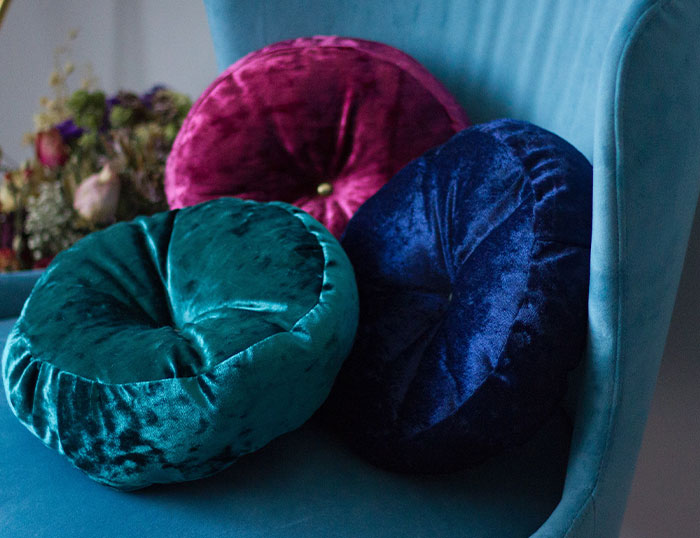
I hate this grey look, my wife started buying crushed velvet furniture and mirrored tables etc. I hate it
oOoOO especially the mirrored tables. I do not have kids, but I am so not wasting my life trying to keep that looking perfectly clean. I may not be a kid, but I have fingerprints too.
Shiny red kitchens. I’m sorry, red kitchen lovers, but strong colours are best reserved for walls, IMO, where they can be easily changed at minimal cost.
Apparently wrapping kitchen countertops in Vinyl is a thing now... Seen mainly on TikTok... Don't have to worry too much about it looking dated in the next decade or so, seeing as it will never last that long before peeling..
I know some cpuntertop wrapping is just a temp 'upgrade' to rental properties where you can't actually change things. It might also be good for very old, cheap laminate countertops as a quick fix until you can afford new ones. Not sure its *meant* to stay on for decades.
Probably the radiator, because no point in having it if we can’t afford to heat the f*****g thing
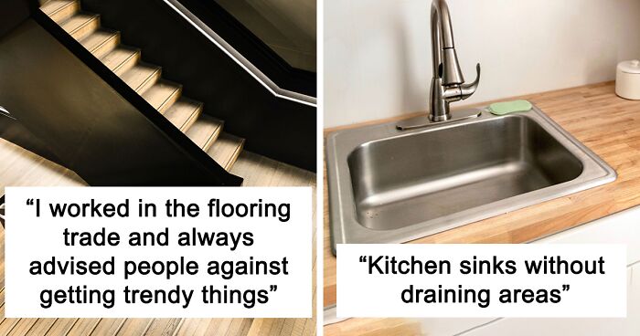
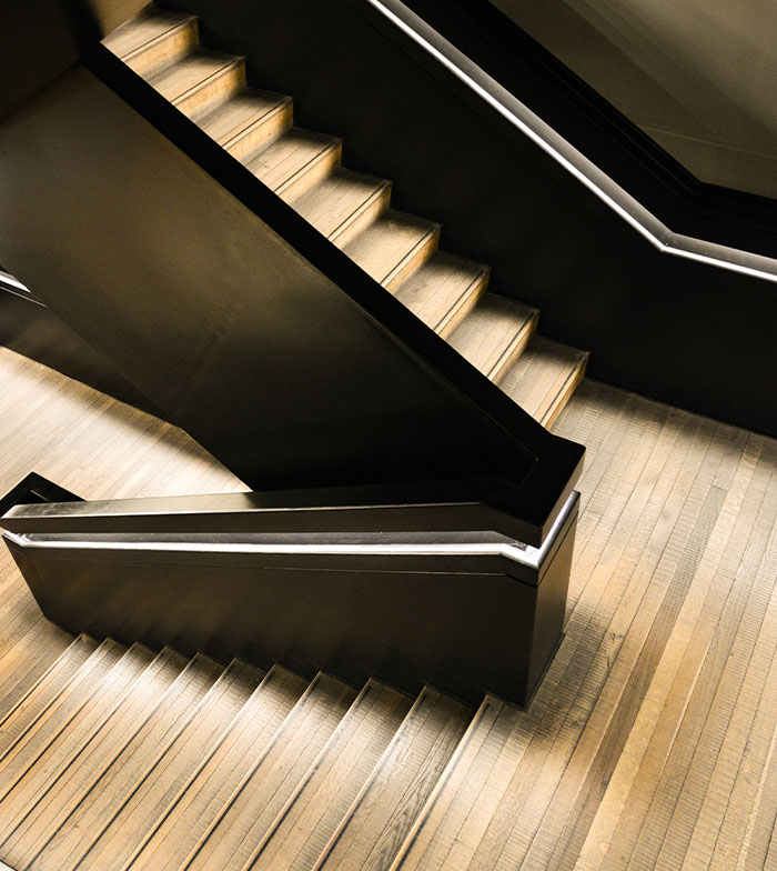 I worked in the flooring trade the last 20 years or so and have seen a lot come and go. Chocolate brown was popular for a while. Greys / silvers, aubergine, striped stair cases. I always advised against these things. I had a lot of customers come back after a few years, ripping up the chocolate brown to replace with silver etc....
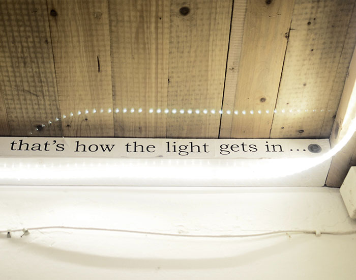 Terrazzo, brass, house plants & ply will be done soon. Also as someone else mentioned those LED light strips that some people have instead of personalities.
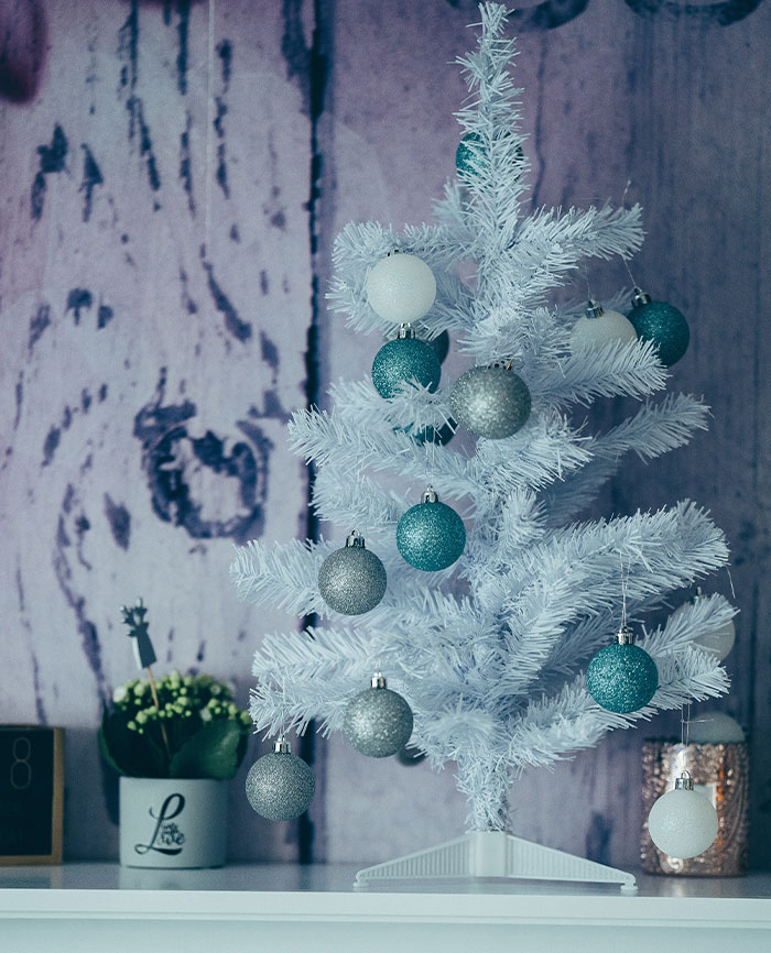 This is just at Christmas, but those lifeless grey and white Christmas trees and decorations! Ok, I can kind of understand making your living room grey, because it makes it easy to colour coordinate pillows, blankets, carpet etc and you can switch it up for the seasons. But why do the same thing at Christmas? Red, gold and green are warm and inviting and fit the Christmas spirit. Are some people really that concerned with their living room looking ‘aesthetic’ at the expensive of adding some Christmas spirit to your living room? You only have it up for several weeks! I feel bad for their kids, I bet their bloody clothes and teddies and toys are all grey and white too..
I use mainly silver and blue and some purple decorations on my tree. Because *I* don't like green and red and gold. I like blues and silver.
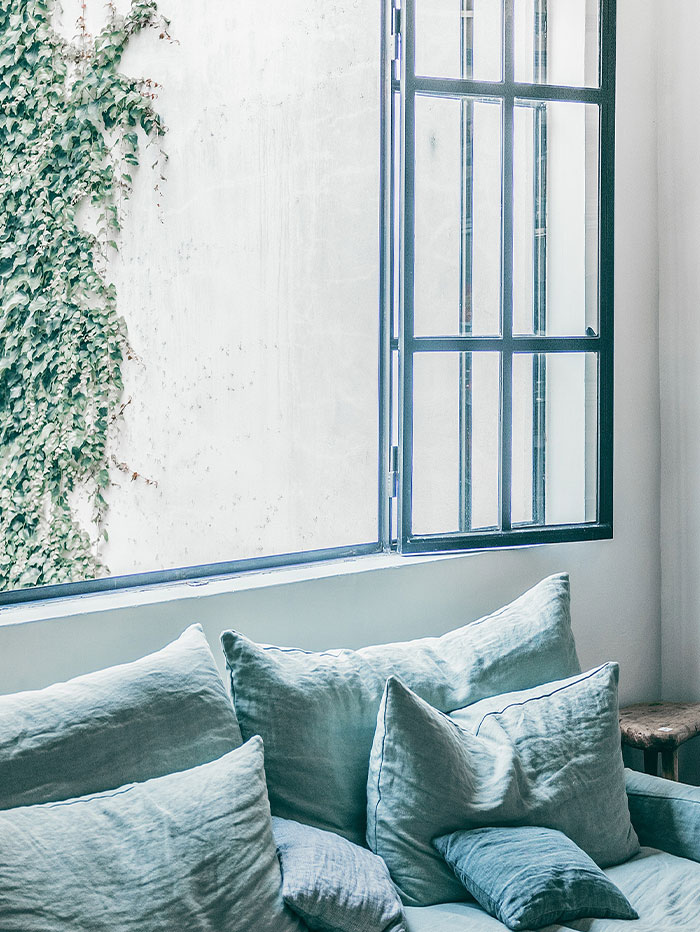 I see charcoal grey window frames/sills on a lot of new builds rather than white, I don't think they are going to age well at all.
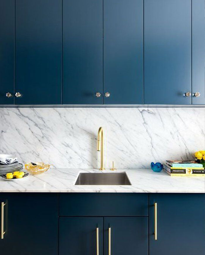
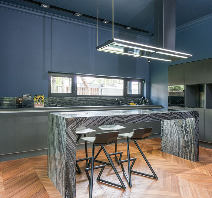 Pistachio green and strong navy blue kitchens seem popular at the moment, I think they look good now but will date soon enough.
LED surround lighting etc is going to be one of the worst, considering it already looks awful now.
Probably metro tiles sadly (I say sadly, as we had them put in our kitchen about 5 years ago).
I hope not, whenever I can afford to finish my bathroom, I was hoping to put them in the bathroom. They are plain white, timeless and easy to clean.
Copper, rose gold, pastels, grey, geometric designs - London circa 2018 = Wilko’s 2022.
An external trend, but I hope this horrible conceit of having spotlights/downlighters under the eaves of the roof becomes illegal. New build houses near us have them, no two houses apparently have the same 'colour' of LED and all of it is pointless, wasteful and fuc£-ugly.
 Conservatorys apparently. Cold in winter and boiling in summer. They are a terrible way to add space to your home according to our estate agent that's selling our house who now dreads trying to sell houses with one.
Another modern trend I'm not keen on is tiled floors downstairs, especially the fake wood ones. I get they are better than laminate or rel.wood flooring because of water spills, but they are cold and very slippery.
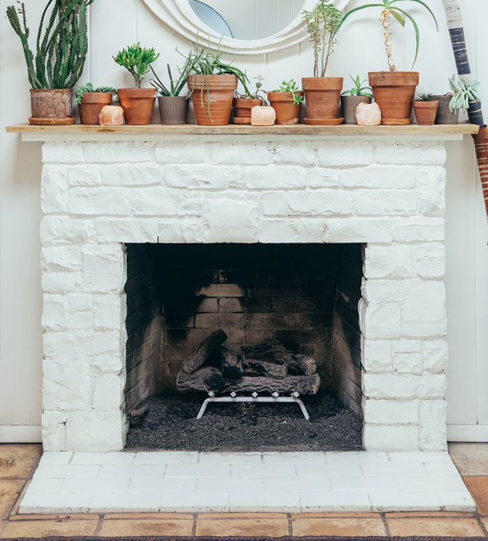
Other things we've been told have dated badly, textured plastered ceilings, brick fireplaces, and carpet downstairs.
Edit - just to clarify the fireplace, I mean those massive 60's brick stone monstrosities that require a jack hammer and ten strong men to remove!
The fake wood tile floors can actually be really nice, but you have to shop around. We have them in our house, and they fool a lot of people in to thinking they’re real wood. The trick is to get a style with a matte surface, but not heavily textured. The matte reduces cold and slip, and the mild texture keeps them from being a nightmare to clean. As much as I’d love real wood, my home’s geographic climate does not work with either snaplock style floors (laminate/composite wood) or real wood, and tile keeps the house at a much more comfortable temperature than carpet.
Grey floorboards 🤢
I disagree with this one. I want to do my floors in a stormy, weathered, ashy kind of color. I love the light grey kind of flooring, no matter how popular or unpopular it is.
Scandi coloured everything and all the muted tones. It looks nice but will fall out of fashion very quickly I reckon.
I work with bathrooms. 1. I'm glad that white shower enclosures are a thing of the past. 2. I'm all for the monochrome trend, and should definitely stay. (White with matt black fixtures) 3. Brushed brass is still around for the 3rd year, very popular this year, as well as green furniture. Blues were last year. But will hold. 4. Rose gold taps are dying out. But smokey black is coming in. 5. I'm not too sure on the natural coloured ceramics that RAK are supplying. 6. But then again I do love the look of the black sanitaryware ceramics. 7. I doubt it, but itd be nice the two taps, basin and pedestal packs would be non existing. More vanities 👍 I see white ceramics and chrome taps all the time. It's all so boring. I get excited when someone wants something different and unique. All fun and interesting.
The white ceramic and chrome may be boring, but it's timeline and easy to clean. Matt black anything will show every bit of grime and defect in the paint. I can say that bit with personal experience from my precision machine shop job. We have a company that specializes in earthquake detection and they order hundreds and hundreds of these Matt black knobs. They show every defect, we often have to strip and repaint them and the lint just sticks to them since they don't have that nice smooth glossy layer to protect them.
Those really busy Moroccan style tiles. There’s a time and place for them anyway, and in 10 years time we’ll be cringing
Wooden decking outdoors. All lovely when its gets covered in green algae and kids slip over and smash their face on it. Terrifying really. And patio decking areas with panels of glass....
Many of these are personal preferences. Open spaces, geometric designs, wording on walls, choice of colors etc. What's wrong if the homeowners like them that way.
Totally agree with this. All you people with words in/on your house because they resonate with something inside you, keep rockin’ it dude!
Load More Replies...Bored Panda is becomming a bitter place of negativity and ad blocker pop ups making reading articles a hassle. I'm done.
That’s just what BP is anymore Julianne…shaming, negativity, condescension if it disagrees with the mind-hive. I’ve mostly moved on too. I miss the days of uplifting and endless cute animal posts. Maybe it’s a result of the pandemic, not sure, but it’s not the same site it used to be. It’s a bummer.
Load More Replies...So, this is just “gray! white! neutrals! open floor plans” posted in about 52 different ways. On top of that, virtually all of this is cosmetic and people can do whatever the hell they want with their homes.
While it is true that all of this is "technically" a matter of taste, I have worked (carpentry) in enough homes to know that a LOT of people keep their walls and kitchen cabinets white or grey simply for "resale value." I always think "but you LIVE here now?" This, the boring clinical look... nah. Also, the trend of "no tub" and just a shower. No tub means NEVER taking a nice luxurious bath ever! Again, nah...
To be fair, sometimes the tub is removed if a person living there has mobility issues. When my Pop ended un in a wheelchair, my brothers redid the sole bathroom so he could still live at home.
Load More Replies...I enjoy the insight into people's likes and dislikes. These are, however, the owners' personal choices. The asterisks seem to be a lot overused. Maybe you can offer a thesaurus to aid those folks.
The only trend I'd really like to see disappear is the idea that the expensive, basic fixtures of your home should be trendy. Good quality appliances, floors, plumbing fixtures, windows, cabinets, etc. should last at least a decade, if not more. HGTV promotes the idea that it's perfectly okay to rip out all this stuff and replace it, not because it doesn't work or isn't energy efficient, but just because it's "dated." And trends are peaking faster and faster because of social media, so pretty soon people are going to be replacing all their faucets and cabinet hardware every 2 years to get the latest look. The environmental cost is huge.
Basically grey, open-concept spaces, geometric styles, words, lighting, starkness.
My design that must go is the floor to ceiling windows on the front of the house (usually on all floors) that looks onto the street. This isn't The Sims. Nobody needs to be able to see into your home and what your doing 24/7. At least get some drapes or blinds. We don't need to see the Mr. in the kitchen at 2am in his PJs (hopefully) from across the street.
My flat is a hodge-podge mix of furniture (nothing matches) and colour. I like colourful artwork (all my own). It may not be clinically pristine or minimalist, but it's comfortable and homely to me, and I feel safe and happy in my flat.
i agree to most of the comments. Sure, there are trends and most of them will be gone in a few years. People can redo/repaint the colors and change the decor then - if they like. Also i believe that if something is tastefully done, it will still look appealing in 10 years - even if it‘s not a trend anymore. Other than that, just let people do what they like ☺️.
Some people need darker and lighter shades for health reasons such as migraines in bright spaces and vision problems without bright spaces. Some people are more comfortable surrounded by tributes to a different era. I personally like a darker more sophisticated look like in high end cabins. My floors are red mahogany stained pine tongue and groove carsiding. My walls are a warm caramel and the dining room will have real board and batten half way up with 6 inch baseboards throughout, 4 inch wood trim around the doors and windows with a 6 inch header, and 4 1/2 inch crown moulding. My upstairs is all light and bright with touches of marble. I want the upstairs to feel cozy like Scandinavian minimalist and the downstairs comfy cozy upscaled cottage. And I love in Iowa.
If I managed to scrape up all my coins to purchase or rent a home in this day and age, I am going to decorate it however I see fit. If I want crushed velvet hanging planters for my fake plants in my green wood paneled bathroom, that's my choice, thank you.
I think the best thing to do with your home is have it how you like it and how it works for your household to live in. Who cares what others think? Unless you are planning on moving soon the perceived value of modern trends don't matter and whatever you do some will like it and some will not.
Why can't you just decorate how you want? What's these people's problem???!!!!!
This must be homes and places mostly in the UK. As a lifelong American, I've noticed lots of "trends" come and go in my 70 years, but most of us just live with what we like, and don't try to keep up with anyone's "hacks" or opinions on how things "should" be decorated. At least, that's what I notice in the homes and apartments I've been in over the years. If everyone just lets others live with what they prefer, then nobody would have to lose sleep, nor develop angst, in regard to "popular" trends. Really, why should anyone care what others like as long as it doesn't interfere with anyone outside their living space?
I thought this was interesting. All these trends I had no idea about, and things I've never heard of. And misconceptions galore. Fun all round, live and learn. 😉👩🦳
There are so many interior designer that know best and give you a list of does and don'ts (and I'm not sure why they keep popping-up in my "recommended"). If I was planning on selling my house, maybe I'll listen to you. But right now? I'm living in that house and I'll put whatever I want in it, thank you very much.
Horizontal fencing. It warps so easy and your dog/kid can climb over it so easily.
So basically this article is saying what's going to cost more and what's going to be difficult to find should you decide to remodel

 Dark Mode

 No fees, cancel anytime


