The Winners Of 2017’s A’ Design Award & Competition Have Just Been Announced, And They’re Genius
The A’ Design Award & Competition is a magnet for creativity, and every year the design contest attracts thinkers and inventors from all over the globe. The best designs of the 2016-2017 period have just been announced, and their creative ideas are so innovative they could change the world as we know it – or at least make it a little more functional.
The awards were doled out to over 1200 unique design projects spanning a wide spectrum of categories, including but not limited to furniture, packaging, graphics, architecture, and product design. The clever designs share common themes of practicality, modernity, and efficient use of space and materials. A’ Design is a unique concept in the competitive world, offering winners the prize of mass publicity rather than cash, and giving the young designers an arsenal of tools to forge success on their own terms.
Have a scroll through some of the handiest inventions from different types of design that won the 2017 A’ Design Award & Competition, and tell us which ones you’d love to have right now in the comments.
More info: A’ Design Award & Competition
A’ Packaging Design Award Winners:
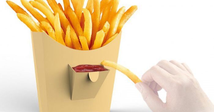
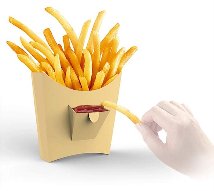
Little Pocket
This is a french fries box design.The “little pocket “on the front can guide user to squeeze ketchup in it, rather than on paper plate, provide a sanitation, environmental protection and healthy way to eat (Image credits: Dong Jiang)!
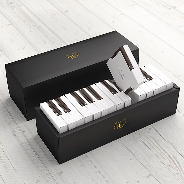
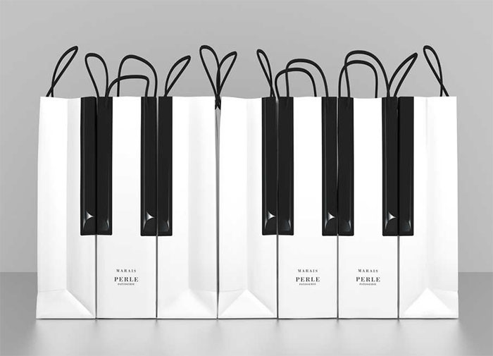
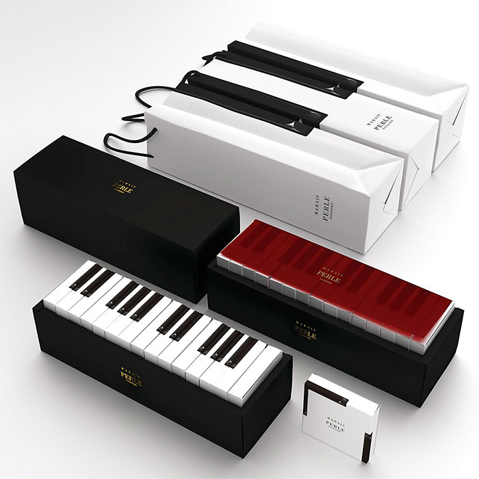
Marais Piano cake packaging
The inspiration for this design, the piano, is an instrument that creates beautiful harmonies from the combination of each individual key’s sound. You could say that society is a lot like this as well. We know that you will be giving this gift to someone important to you, and you want to give them something that was made with care. We’ve made each and every one of our gift boxes with our customers needs in mind. With each key of this gift box, your feelings are sure to be heard. All Japanese pianos are made here in Shizuoka Prefecture. In Japan, as well, the piano is considered to be a special symbol of elegance and splendor (Image credits: Kazuaki Kawahara).
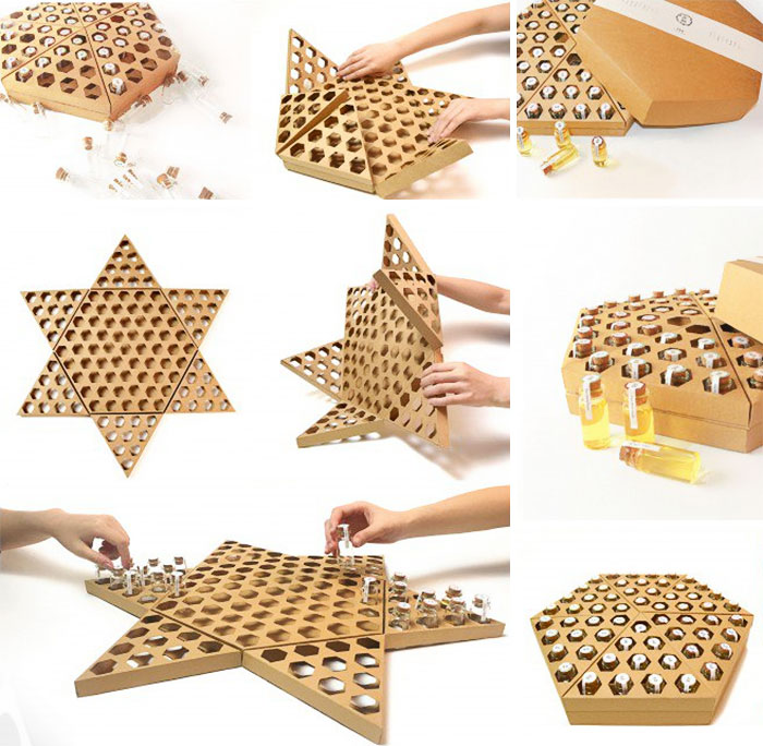
Honey packaging design Funny Honey
This seemingly honeycomb structure, through folding and reversing can become a checkerboard, while in the taste of honey, but also to experience the fun of life. Reduce the excessive waste of packaging, and increase the fun and interactive experience (Image credits: Lu Zhao, Jian Zhang, Lin Huang, Tingyue Yan).
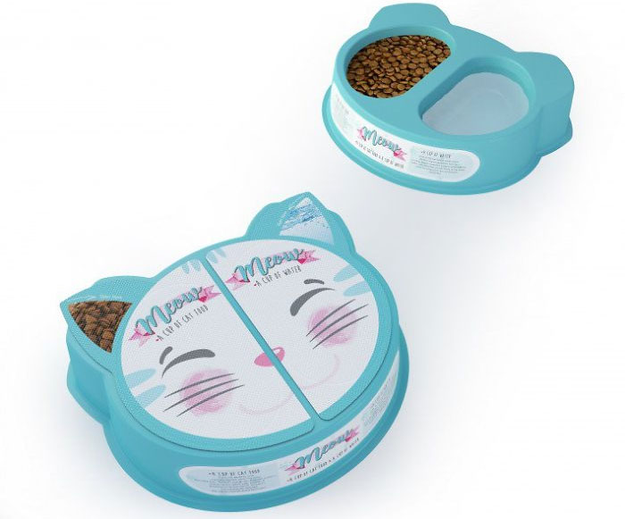
Meow – The Cat Nutrition for Stray Cats
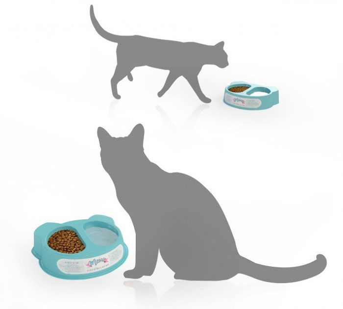
In Turkey, there are lots of stray cats in the streets even documentaries have been made about it. When we come across a poor stray cat in the street it is really hard for an animal lover to look another way and go ahead. We care about them so lots of people carry cat food in their bags. But the hardest part is not just feeding, it is mostly about giving them water or to find a container to pour fresh water for them. The idea with Meow is to supply both cat food and clean water in one package (Image credits: Bahar Bostancı, Evrim Uvacin Isik).
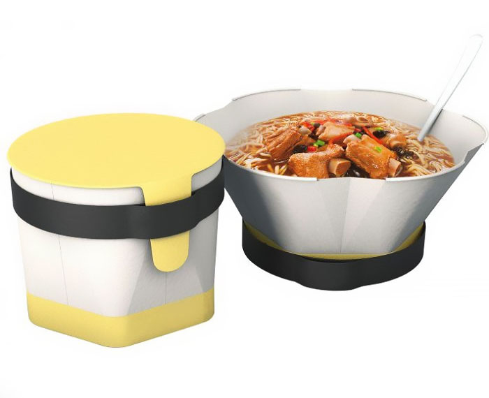
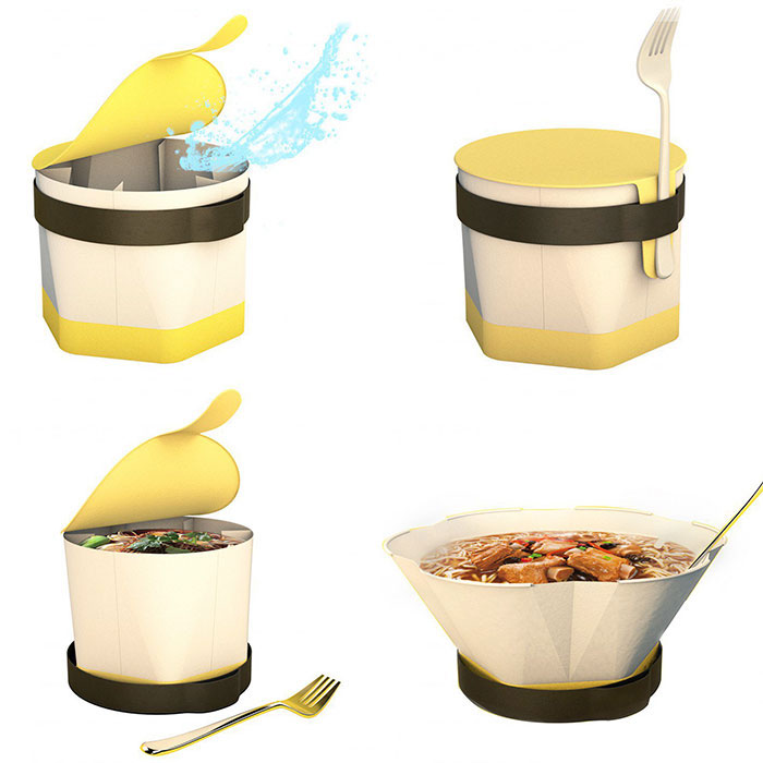
Instant noodle packing box
This is an instant noodle packaging box design, it is different from a normal instant noodle packaging.Firstly, when it is not being used, its size will be much smaller, but when we use it the volume will be larger .In addition, during preparing the fork,customers could hold the lids and keep them clean.Besides, expanding the size of the bowl can increase the user’s sense of comfort,so that a good user experience will be felt by the customer (Image credits: Cao Weizhi, Ding Jian, Chen Yuru).
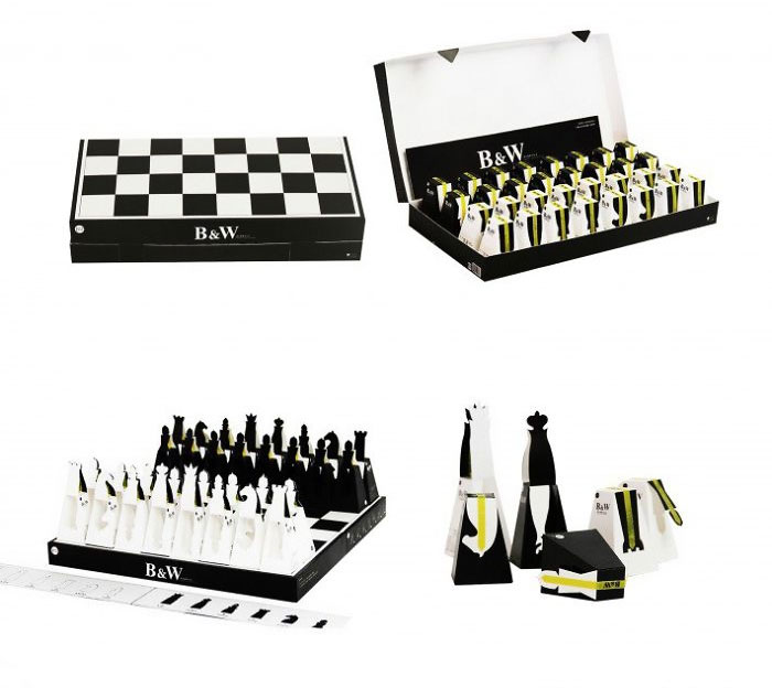
Whisky heart chocolate packaging design
This boutique chocolate box opened after the fold, that is, chess board, inside each chocolate monomer packaging along the polyline open, and then fold can become a chess pieces, will be delicious and entertainment together, Is the innovative design of this packaging design (Image credits: Lu Zhao, Jian Zhang, Chaoyi Wang).
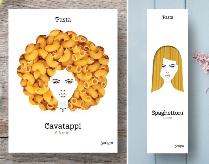
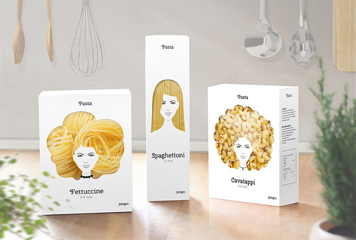
Pasta Nikita Packaging
I use the strands and shapes of pasta to create an interesting series of packaging that capture attention on the shelves. It emphasizes the high-quality & naturalness of pasta. An of course It should bring good mood for people with good taste (Image credits: Nikita Konkin).
A’ Fashion, Apparel and Garment Design Award Winners:
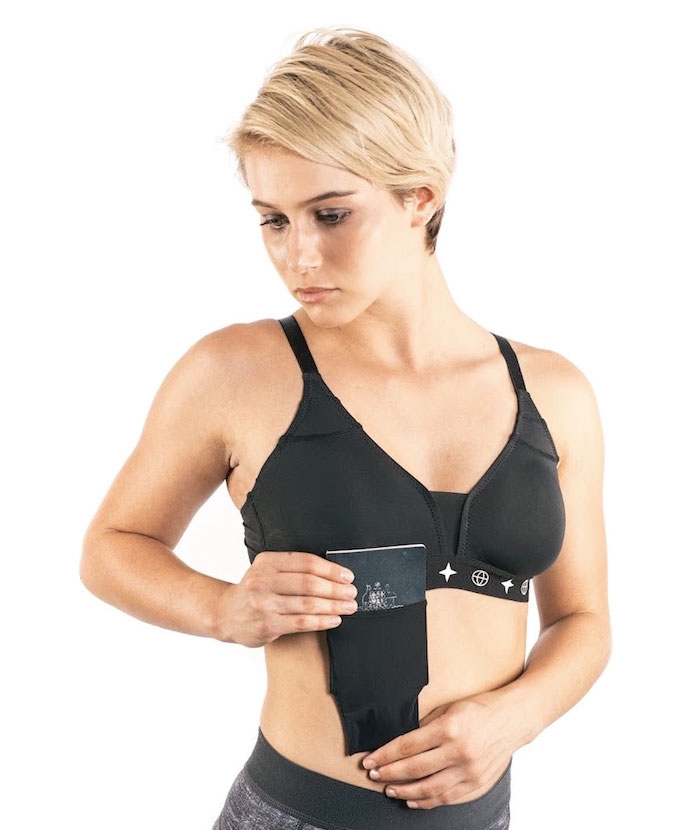
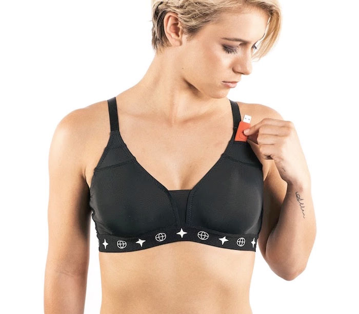
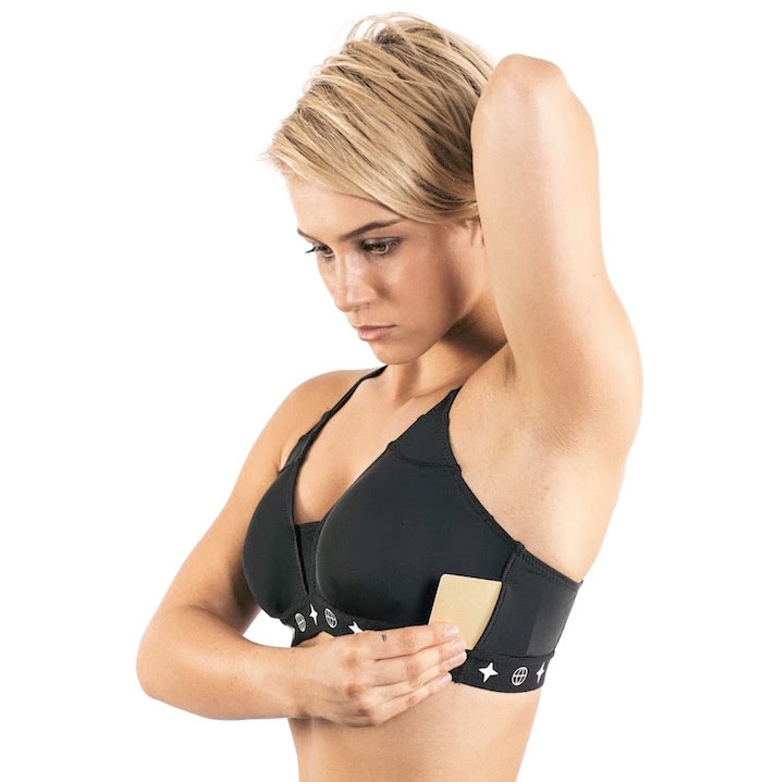
The Travel Bra Anti-theft and comfort
The Travel Bra has a patented drop-down mesh pocket that stores cash and even stretches to take a passport. It folds up under the band when not in use. It has a side mesh stretch sleeve that takes a credit card or hotel room key. It has mini-pockets integrated into the shoulder straps for jewelry or scan card. Extra storage is available under the cups for storing more cash. In one version it has a front pocket for storing lipstick. The Travel Bra has no underwire, is ant-odor treated and super soft (Image credits: Dr Annie Holden and Brenda Barnett).
A’ Bakeware, Tableware, Drinkware and Cookware Design Winners:
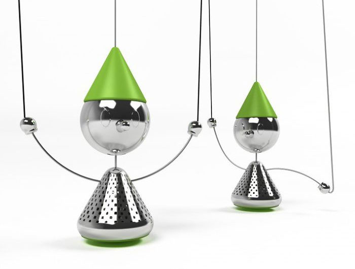
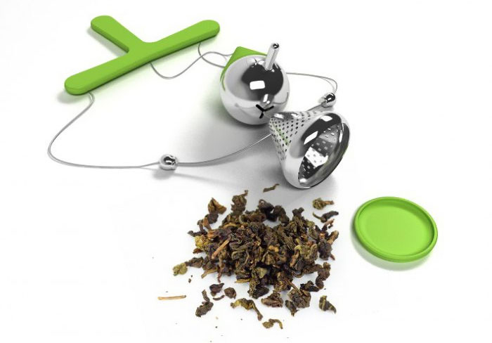
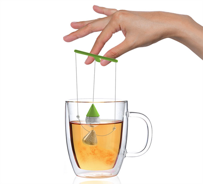
Teanochio Tea infuser
Teanocchio comes from puppet play, aims to change the way we prepare our drink and make teatime events more pleasurable. Adding some fun and nostalgia about old games while preparing tea, makes a joyful user experience and causes user feels he is making alive the character while drinking (Image credits: Soroush Vahidian, Mohammad Afkhami).
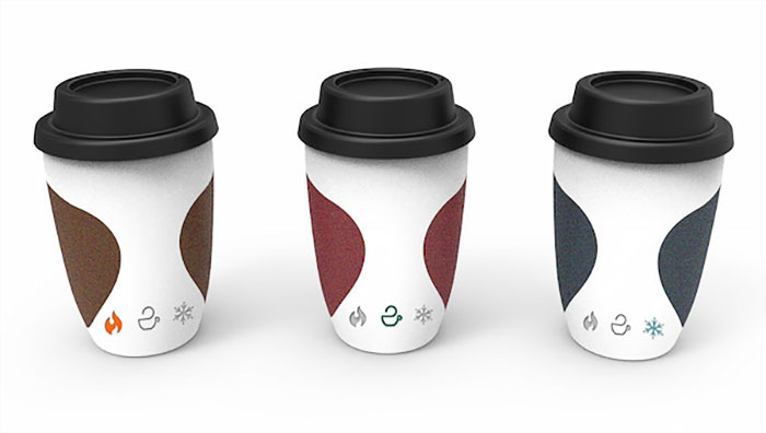
Coffee Cup Indicating temperature
Nowadays, people especially office workers like to drink coffee on the way to work. If they can know what temperature they can drink, it may give people good taste and avoid scaling people’s lip. Thus, this design is suitable for them especially for office workers. They can enjoy good taste coffee at suitable temperature with this indicative design (Image credits: Yi Teng Shih, Rengrui Xiang, Yuting Chen).
A’ Furniture, Decorative Items and Homeware Design Award Winners:
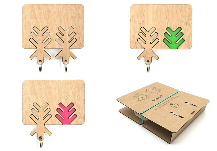
Keymotif Key holder
The idea that one’s absence from home or office could be transformed into a colour footprint by removing a key holder from it’s base was very intriguing to me (Image credits: Vassilis Mylonadis).
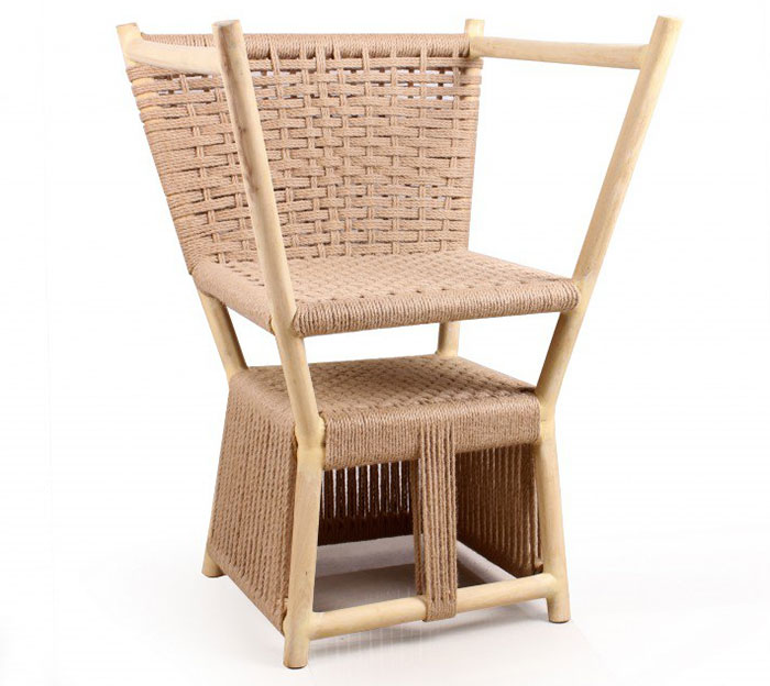
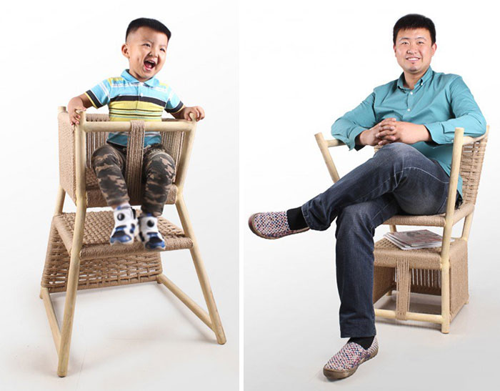
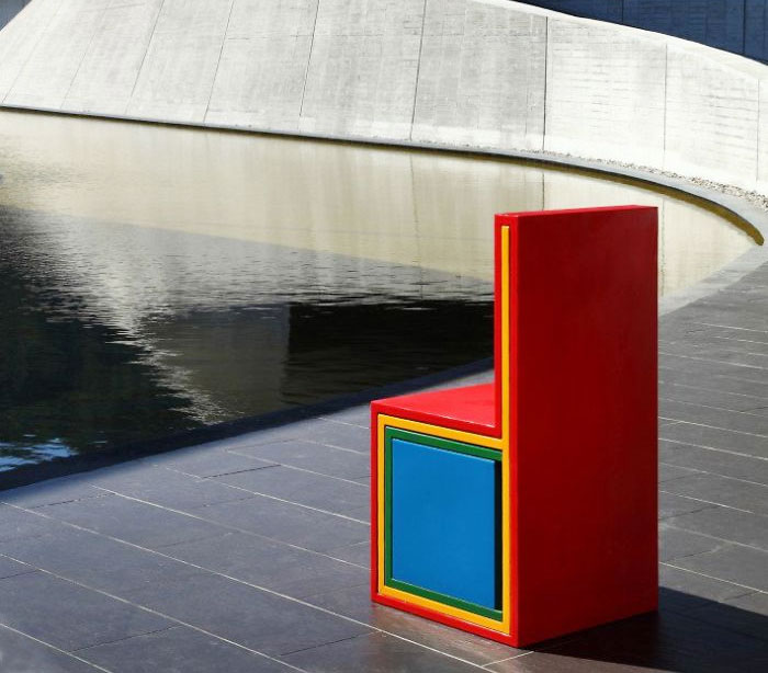
Grow up Multifunctional Chair
The rapid growth and development of children shorten the children products’ life , resulting in a waste of resources . The children’s dinning chair is designed into a dual-purpose chair through a reverse way to prolong the service life of the chair.From parenting chair to the adult chair , the change of this two using ways witnessed the parental process (Image credits: Yong Zhang,Ya-nan Shi).
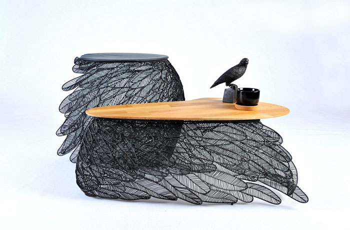
Feather Coffee and Side Table
The impression of the beauty of the plumage while drifting and overlapping layers. It has become to be the Feather collection. The collection consists of one side and one coffee table. Both have that hand-made welded stainless steel base with a laser cutting and a wooden top. The Feather table gives the sensation that is so light and it could be fly (Image credits: Apiwat Chitapanya-Asia Collection).
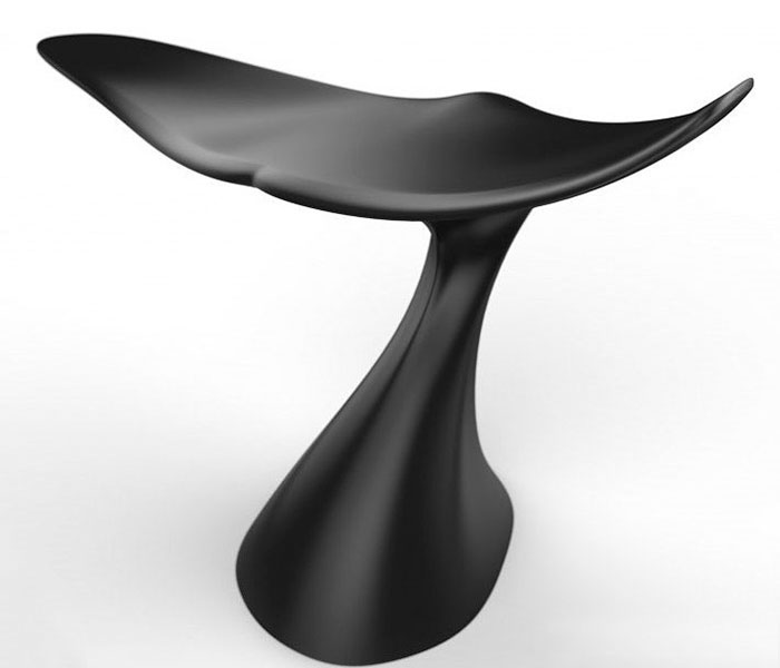
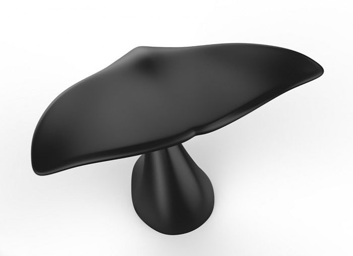
Whale Chair Stool
My goal was to make a connection between everyday life & the faraway nature; and to create a simple & modern stool inspired by the whale’s tale that can be quite comfortable & can help overcoming the tiredness made from sitting too much. A one leg plastic stool with two piece mold, the lower parts made from heavy materials and the upper parts made with light & durable materials (Image credits: Farzaneh Biazaran).
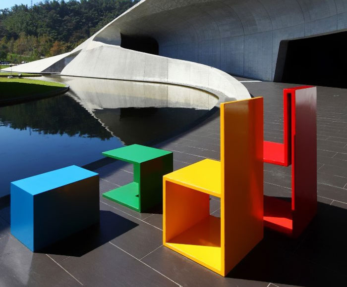
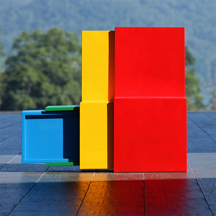
Multi functional chair
A chair that could modified according to environment setting. By pushing or pulling to make them four art installation pieces. The composition will be changed according to environment. With different viewer’s experience, it start to generated unlimited imagination. It will fit in any kind of space and create interesting spatial experience (Image credits: Yi-An Hung, Yestudio).
A’ Vehicle, Mobility and Transportation Design Award Winners:
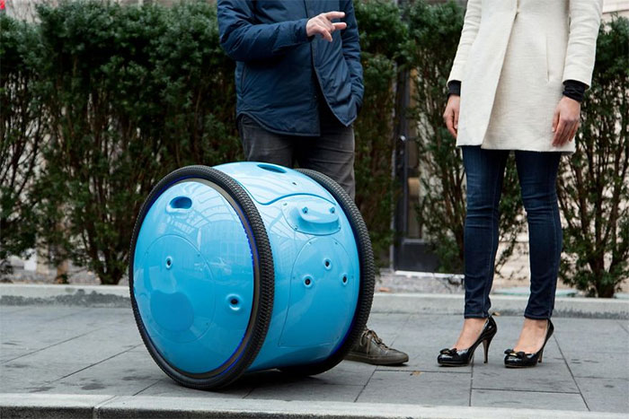
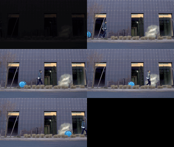
Gita Robotic Vehicle
Gita is an intelligent, robotic vehicle that extends a person’s cargo-carrying abilities. What is unique about the design is the integration of engineering and performance into an elegant form. The parent company is the maker of the legendary Vespa; Gita is inspired by that heritage, with an approachable, recognizable and attractive design (Image credits: Greg Lynn).
A’ Social Design Award Winners:
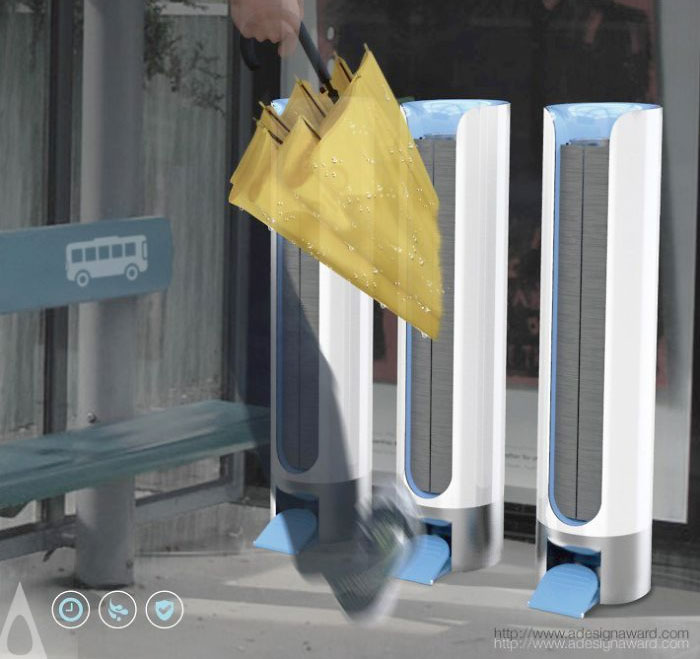
UltraDry Dryer in bus stop
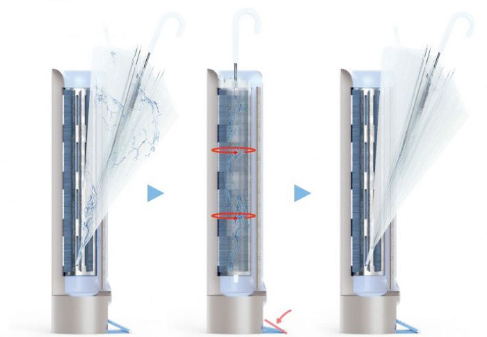
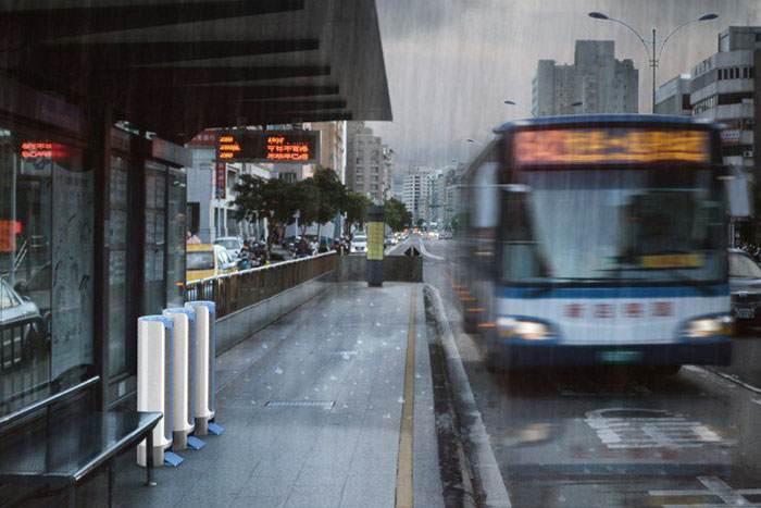
There’s very little to do while waiting for the bus. We propose using this time to ensure that umbrellas are properly dried before boarding. With UltraDry we can safely store away dry umbrellas and ensure a dry floor on the bus greatly decreasing the chances of slipping or falling. By placing the action in the most sensible place we can improve the experience of public travel (Image credits: National Taipei University of Technology).
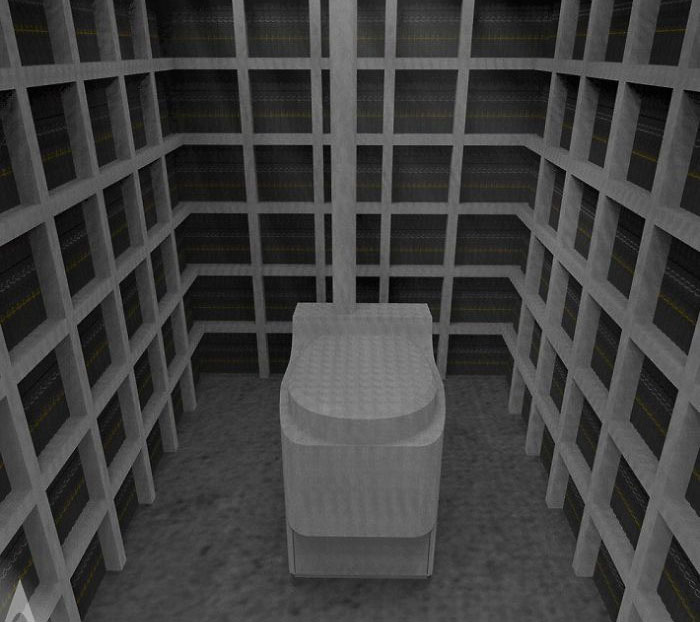
Bookhouse Latrine
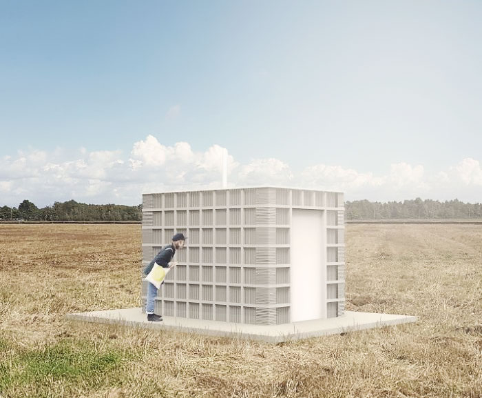
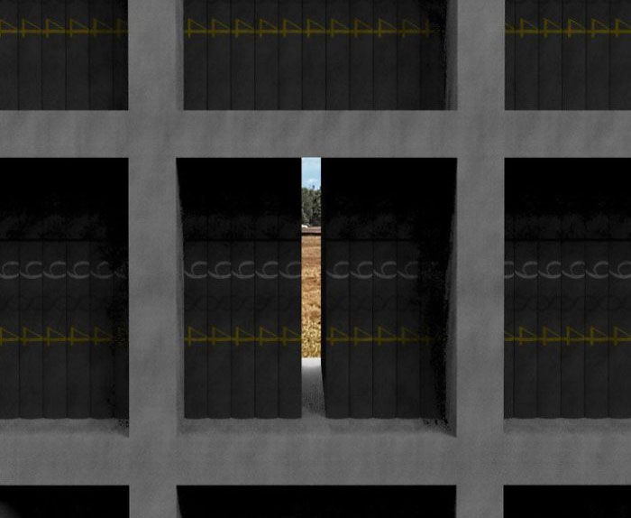
Bookhouse Latrine is the outhouse design exercise in the Garden City Lands, Richmond, Canada. As the usage of physical books is on the decline in the digital age, the Bookhouse Latrine project is the architectural attempt to recycle or recirculate physical books for public. A waterless composting toilet was placed in the centre. Wooden bookshelves were designed to be a load-bearing structure, and books on the shelves become “walls.” Depending on the types of books or materials used, a program of Bookhouse Latrine could be variously changeable. For example, it can transform into a chapel (bibles), a meditation retreat (sutras), a dvd storage (dvds), a thrift store (recycled clothes) or a stuffed animals house (stuffed animals), etc. (Image credits: Yongwook Seong).
A’ Sports, Entertainment and Recreation Equipment Design Winners:
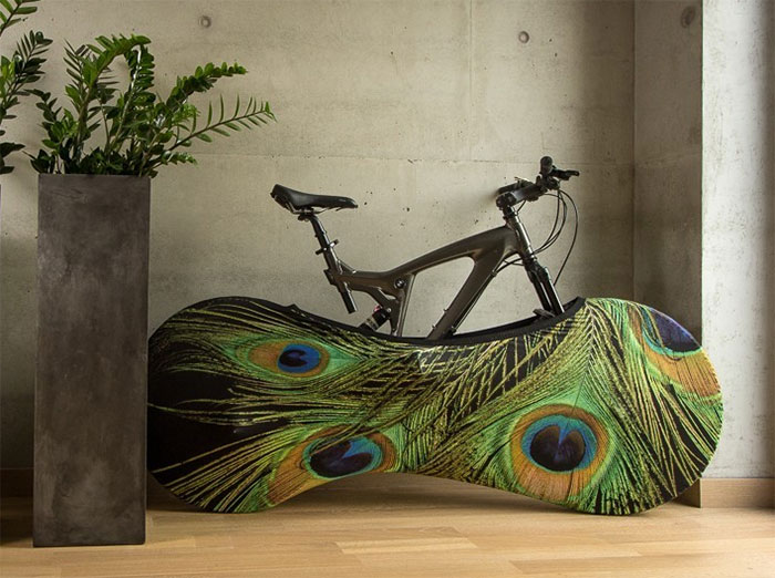
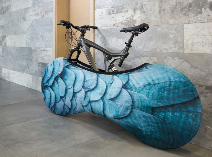
VELO SOCK Bicycle Storage Solution
Urban cycling is growing and more people are keeping their bicycles in their living quarters. Our idea was to create a solution which helps to store bicycle inside with function to keep floors and walls clean from dirt, mud, sand and other debris which stick to a bike after a ride (Image credits: Gvido Bajars).
A’ Bathroom Furniture and Sanitary Ware Design Award Winners:
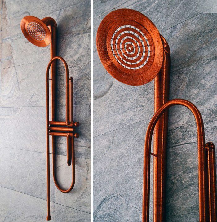
Jazz Shower
Jazz is an artistic and lavish design project that aims to challenge our perception on how do we imagine a shower. Jazz is designed to be the artistic object that fulfils the looks of a modern bathroom space by creating an unique experience for the user through the shape of a trumpet which carries water instead of sound. Its ideal dimensions make it highly practical in every home even if the space is limited (Image credits: Vlad Mititelu).
A’ Interior Space, Retail and Exhibition Design Award Winners:
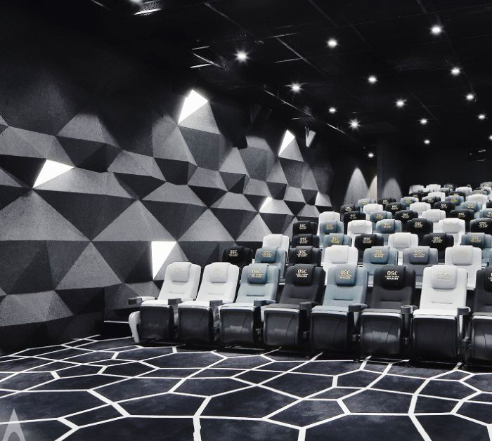
RECRYSTALLIZATION Movie Theater
Firstly, we took mountains into our consideration as the local physical geography features mountainous and rugged terrain. In order to stir visitors’ physical and mental enjoyment of the mountains, the features of mountains, being rolling, lofty, amazing and rugged, are adopted to give an eyes feast to visitors by means of deconstructuralism.There are many natural karst caves, natural formed crystal. The round stalactite and natural crystals are combined together to amaze film goers (Image credits: YANG WANG & HAO NIU).
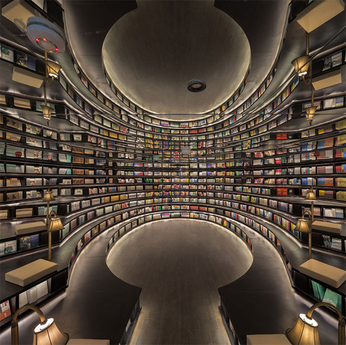
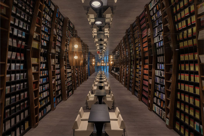
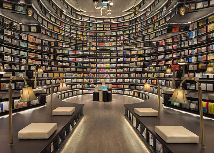
Hangzhou Zhongshuge Bookstore
Upon exposure to the forest of books, we intend to acknowledge readers the awareness of knowledge as indispensable as oxygen from trees in our lives. These tree-like pillars stand tall, and emit the light of knowledge to indulge every soul comes here. The ceiling is decorated with small lights that are dancing joyfully as the elves guarding the forest. The ground-stationed desks are mingled with the forest, flexibly as creek to allow people to read by sitting on or standing beside (Image credits: Li Xiang).
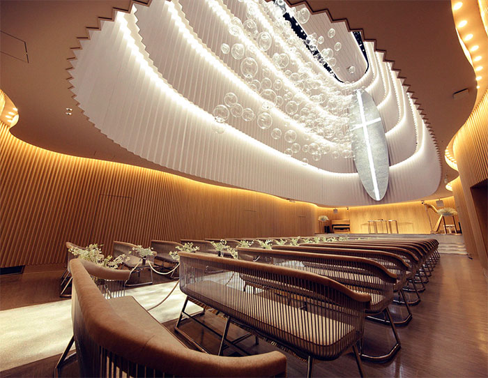
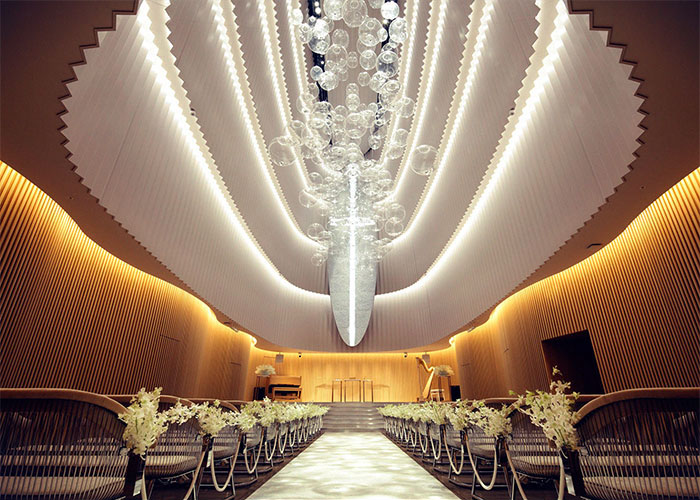
Ocean Chapel
The idea of a space that functions as a wedding hall to spend an extraordinary moment for once in a lifetime is materialized in a space that gives a feeling of ‘buoyancy’, free from “gravity”. Because it was designed in such a way that we may feel as if we stand at the bottom of the ocean, when we look up, there is an illusion of being sucked up to the surface of the sea. Ocean is the overall theme of this place (Image credits: Atsuhiko Sugiyama).
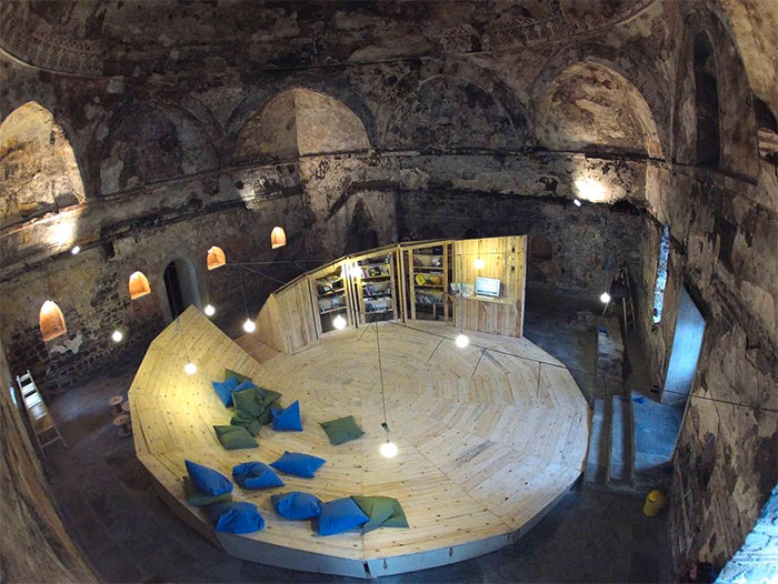
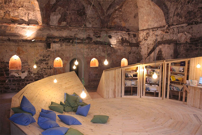
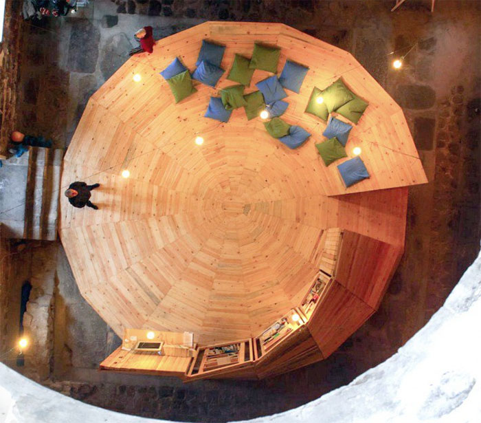
CONTemporary Library Exhibition Installation
The architectural installation represents a CONTemporary library containing solely books of contemporary art. It provides lots of comfortable places to sit or lay, bookcases, magazines and newspapers shelves, as well as computer with very rich and detailed multimedia and video archive of contemporary artists. It can be used also for presenting contemporary art performances (Image credits: studio 8 1/2).
A’ Architecture, Building and Structure Design Award Winners:
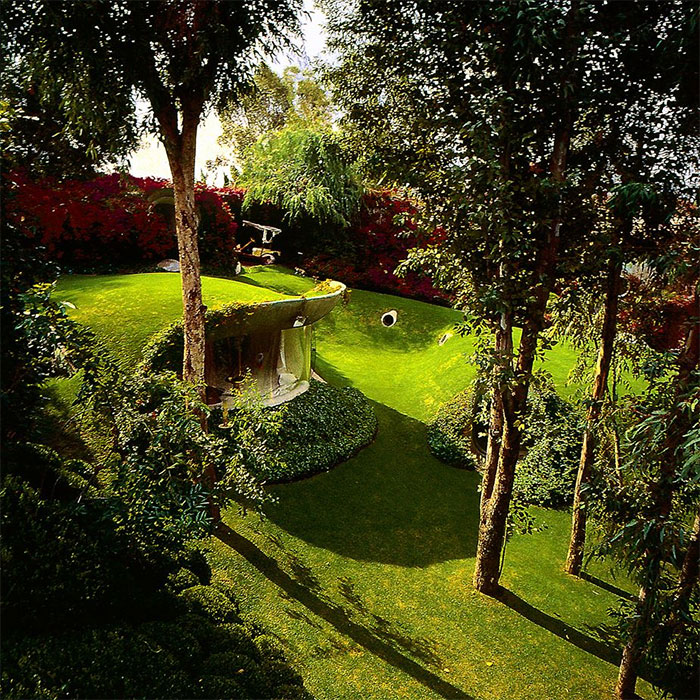
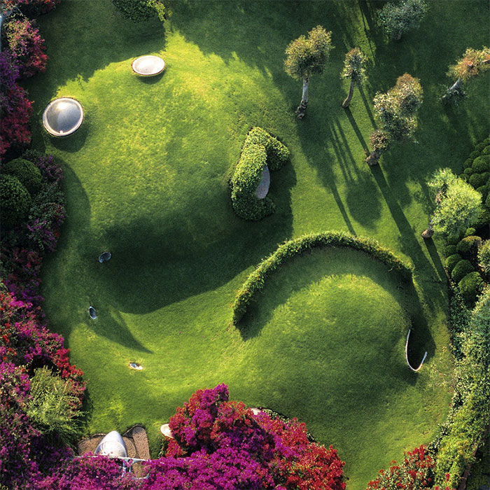
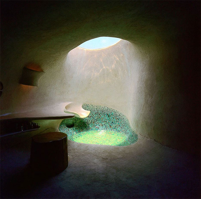
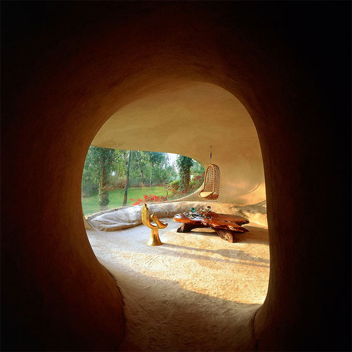
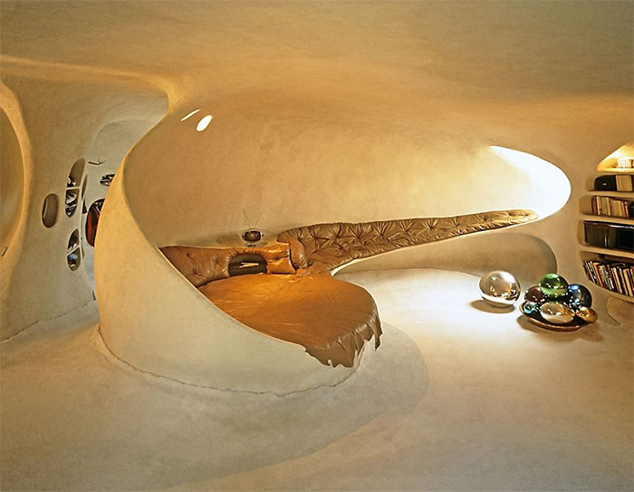
Organic House House
The organic house is born with the idea of creating an area adapted for man, according to his environmental, physical and psychological needs. Its origin is in nature, because it looks for areas similar to the maternal womb, to animal shelters, to those of man, who in the beginning, adopted the caverns without modifying its environment, to an igloo and to all the friendly spaces and concave that recall the arms of the mother that cuddles the child (Image credits: Javier Senosiain, Daniel Arredondo).
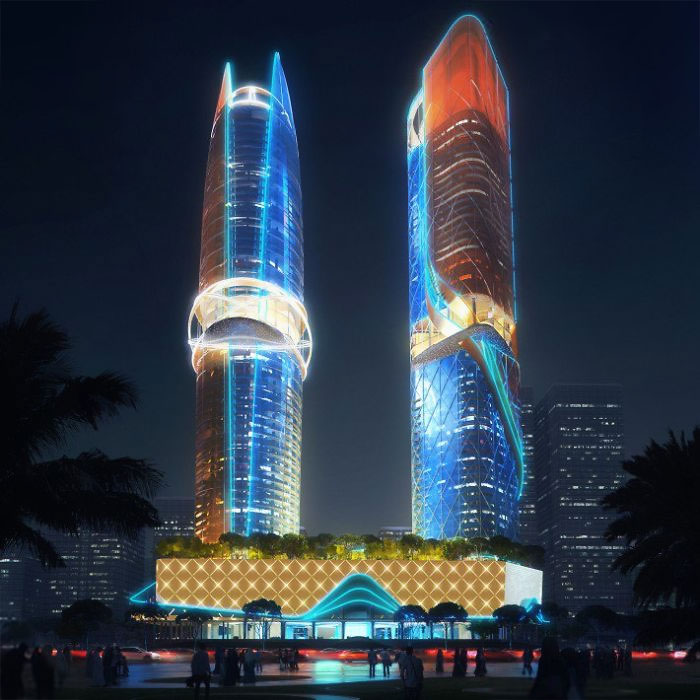
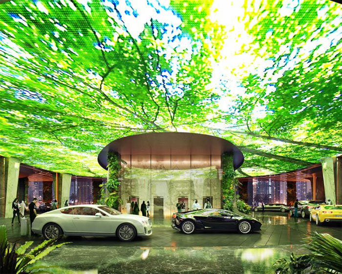
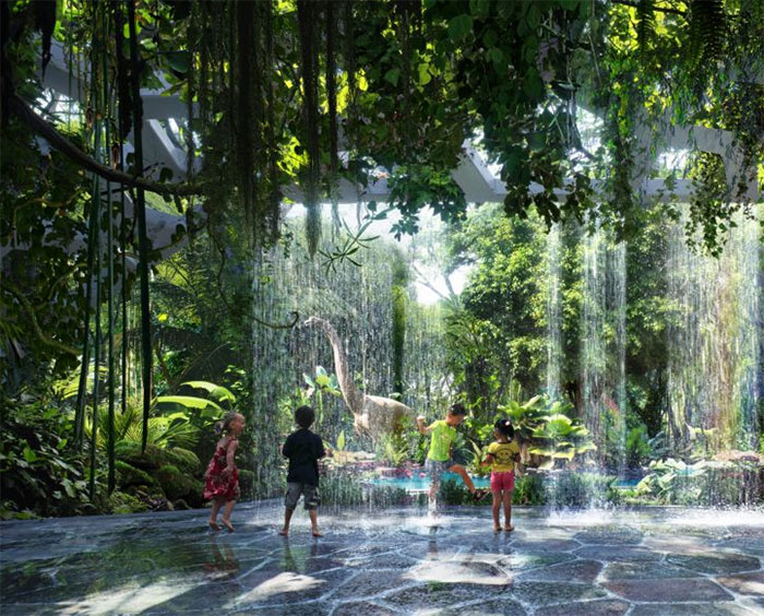
Rosemont Hotel and Residences Hotel and Serviced Apartments
Representing a shell & pearl, moving lights illuminate Rosemont’s five star 448-key, 53-storey hotel tower in a pattern inspired by atomic, orbital rings. Wrapping the tower, lighting spirals around the podium, shaping the dynamic form. Inspired by the element of water, the 280-key, 55-storey fully-serviced apartment tower is conceptualized as a flowing river – the façade’s dynamic lighting enhances its bold architecture (Image credits: ZAS Architects in association with K&P).
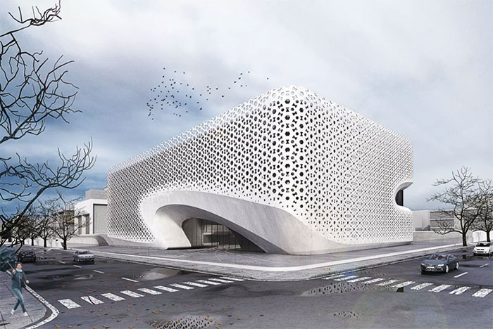
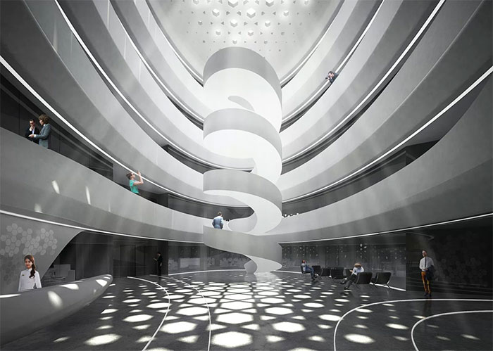
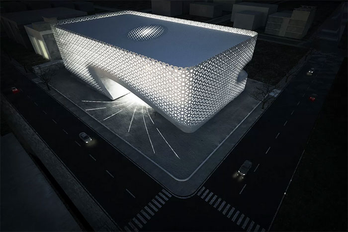
Punjab Kesari Headquarters Office
The inspiration was to translate a traditional Indian facade pattern by using digital simulations into an iterative processes to create a responsive built form. This traditional “Jali” screen creates culturally a sense of belonging. Sustainability is at the epicenter of the project embedded in form of, optimized natural lighting, cross ventilation and reduction of heat gain. An urban lobby is created whereby landscape flows inside the building and creating a seamless movement path (Image credits: Amit Gupta: Britta Knobel Gupta).
Explore more of these tags
It will be interesting to see how many of these genius creations manage to make it on the open market. Perhaps the first one on the ffs, as long as it doesn't raise the cost of the fries.
I thought that was the one that didn't make sense. French fry containers tip over all the time, with that design it now means that ketchup spills along with the fries.
Load More Replies...Would have been better if it had both men and women, of different ages and colors. Young white females aren't the only ones with hair or the only ones consuming pasta.
Load More Replies...It will be interesting to see how many of these genius creations manage to make it on the open market. Perhaps the first one on the ffs, as long as it doesn't raise the cost of the fries.
I thought that was the one that didn't make sense. French fry containers tip over all the time, with that design it now means that ketchup spills along with the fries.
Load More Replies...Would have been better if it had both men and women, of different ages and colors. Young white females aren't the only ones with hair or the only ones consuming pasta.
Load More Replies...
 Dark Mode

 No fees, cancel anytime
























767
69