256Kviews
45 Epic Design Fails That Are So Bad, We Can’t Believe They Actually Happened (New Pics)
By now, it looks like crappy design is something inherently human. There's such an abundance of design fails, we'll probably never run out of it. And that's not necessarily a bad thing. I mean, is there a better way of getting your daily dose of whahahahahahaha if not judging others for their mistakes? Bored Panda has prepared another bad design list for you, poking fun at some of the most ridiculous projects that saw the light of day. From coffee mugs that were created to poke your eyes out to photography services producing outdated leaflets and beyond, scroll down to enjoy the funny fails and upvote your faves.
This post may include affiliate links.
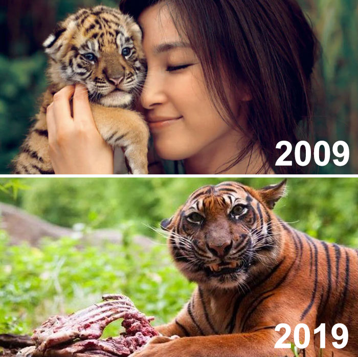
This Ad Was Meant To Depict How Much The Tiger Had Grown In 10 Years. Instead, It Looks Like....
So we've seen the consequences of bad design ideas, so what makes for good design? There are a few basic principles to stick to if you want to make sure your design is practical, relevant and makes sense!
According to Dieter Rams, a German industrial designer who was responsible for the design of Braun’s consumer products for many years, there are 10 principles of good product design, also known as the '10 commandments.' Even though they were written long ago and technology has advanced beyond his wildest dreams, Dieter's principles still apply today!
The Elders At My Brother-In-Law’s Church Got To Design The Church League Softball Shirts. The Thought “Cli” (Christian Life International) Alone Wouldn’t Signify A Church, So They Added The Cross. Magnificent
Seattle had a similar problem with their new rail transit .... South Lake Union Transit (S**T) .... luckily someone caught the acronym before it got too far down the pike.
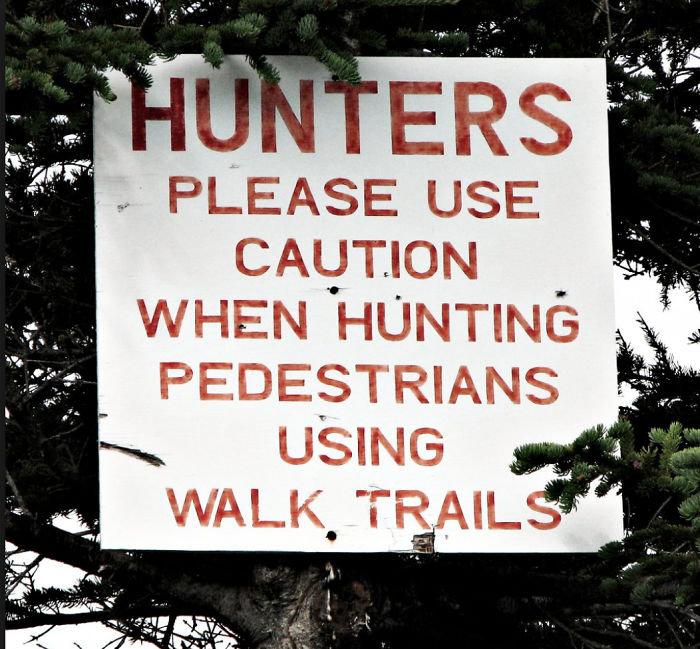
I’m Never Going To Find Any Help Here...
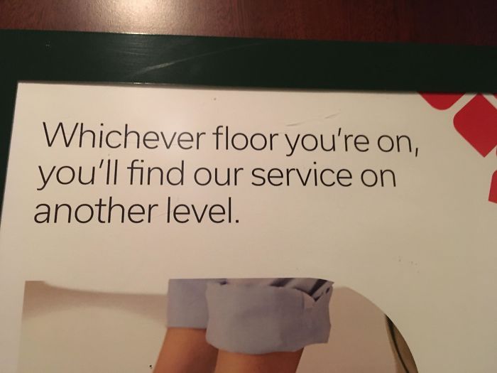
This Ad For Graduation Photography
Furniture designers Vitsoe have worked closely with Dieter Rams for decades, and helpfully summarize his founding principles of good design with the following explanations:
Good design is innovative The possibilities for innovation are not, by any means, exhausted. Technological development is always offering new opportunities for innovative design. But innovative design always develops in tandem with innovative technology, and can never be an end in itself.
Good design makes a product useful: A product is bought to be used. It has to satisfy certain criteria, not only functional, but also psychological and aesthetic. Good design emphasizes the usefulness of a product whilst disregarding anything that could possibly detract from it.
Good design is aesthetic: The aesthetic quality of a product is integral to its usefulness because products we use every day affect our person and our well-being. But only well-executed objects can be beautiful.
Nothing Like The Smell Of Coffee And A Good Eye-Stab In The Morning
Its a left handed mug. It'll teach those pompous right-handers not to use our mugs!
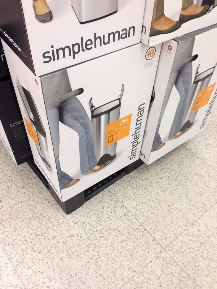
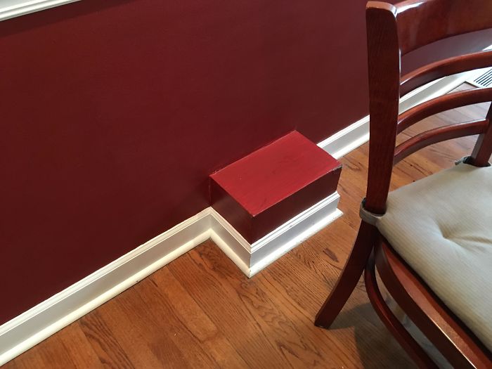
Unfortunate Hole Placement
Commas People
Paypal Fail
Good design is thorough down to the last detail: Nothing must be arbitrary or left to chance. Care and accuracy in the design process show respect towards the user.
Good design is environmentally-friendly: Design makes an important contribution to the preservation of the environment. It conserves resources and minimizes physical and visual pollution throughout the lifecycle of the product.
Good design is as little design as possible: Less, but better – because it concentrates on the essential aspects, and the products are not burdened with non-essentials. Back to purity, back to simplicity.
So three you have it, pretty simple right? If you are tasked with designing something and want to avoid the hilarious mistakes found in this list, check these principles off first and you should succeed!
Ah Yes I Was Looking For A Soap Dispenser Labeled "Ketchup" With A Picture Of Grapes
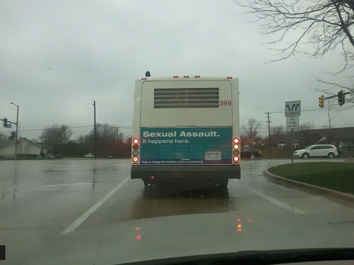
I’ll Take The Next Bus, Please!
More money could be spent bringing these monsters to justice, rather than paying for a sign on the back of the bus. Ugh 🙄
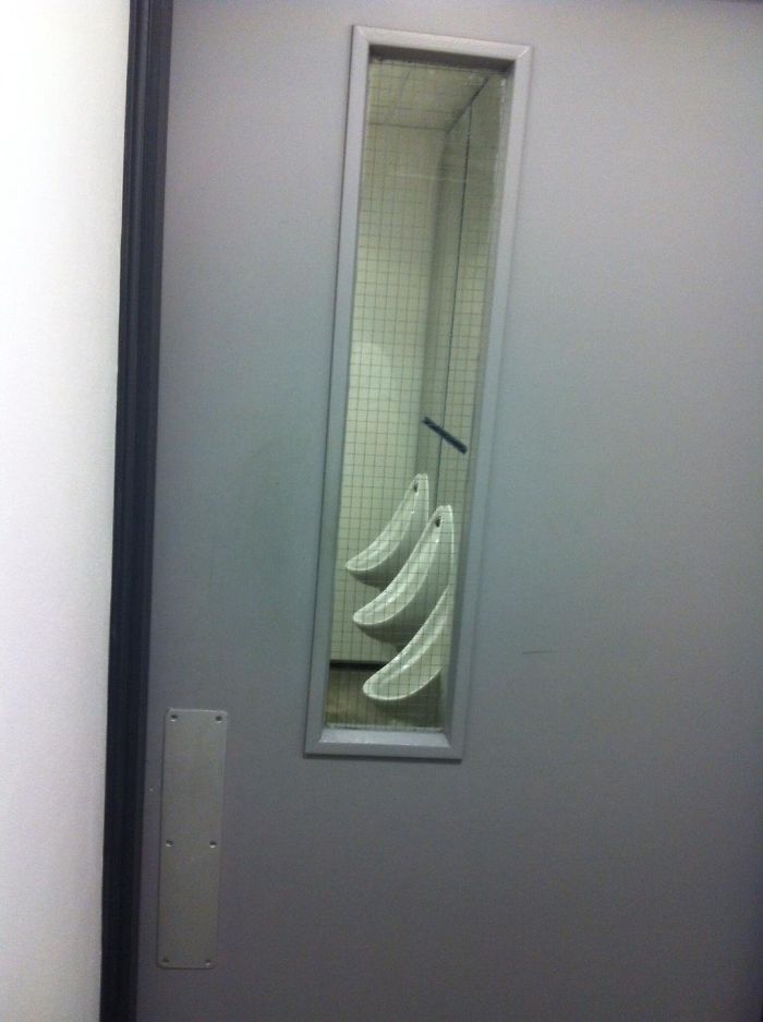
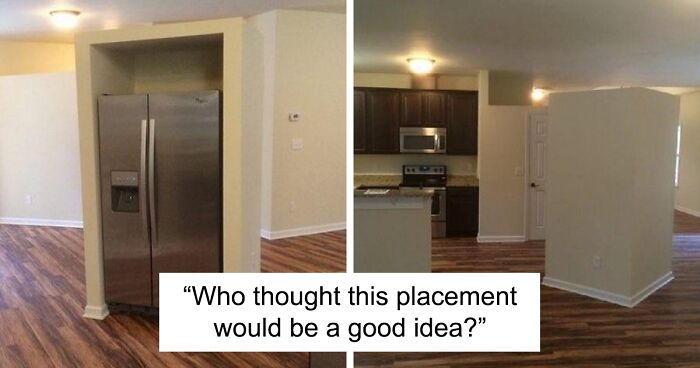
Who Thought This Placement Would Be A Good Idea?
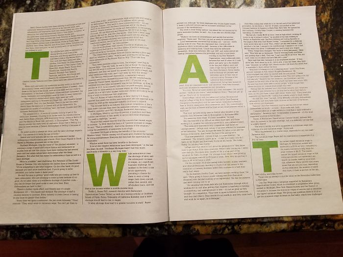
The Placement Of This Smaller Baby Care Booklet Within This Magazine Doesn’t Seem Very Well Thought Through
Found This Masterpiece At A Local Restaurant
That's Gonna Be An Easy Ride
Where’s The 0?
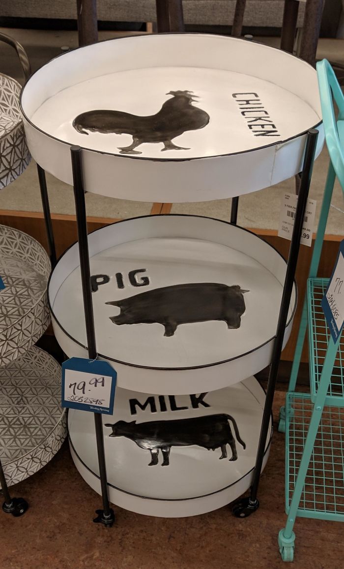
What Animal Is That?
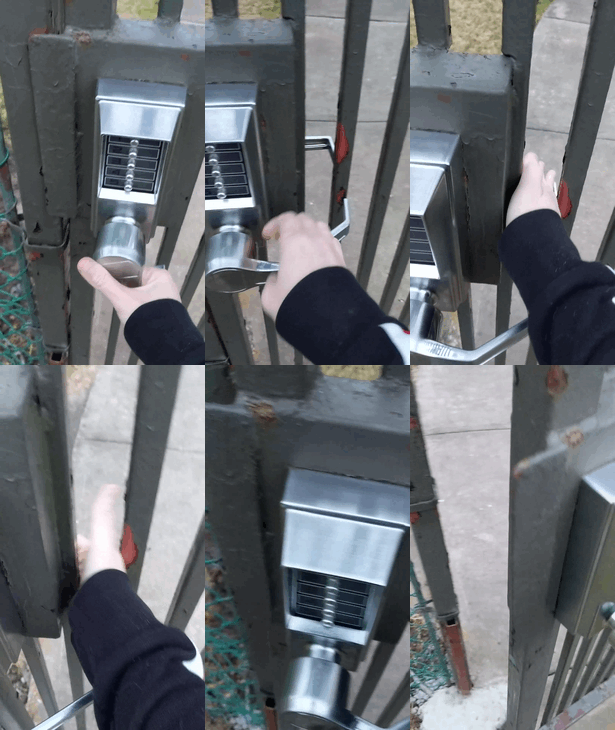
Maintenance Put New Locks And Handles On The Gates For Security
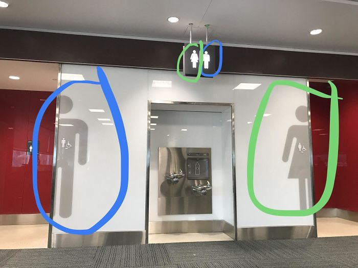
Just Watched A Guy Go Into The Wrong Bathroom At Toronto Pearson Airport. He Was Looking At The Top Sign
My Local Magazine's Editor Might Need To Double Check Some Stuff
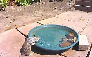
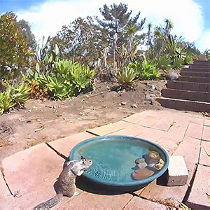
Lovely View
Mama Bear Is Welcoming Everyone
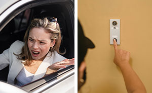
It’s Cool Just Do It At Night Mate
The Woman Isn't Driving In This Article About Women Being Better Drivers
Try Being Drunk And Walking Into This Place
The New Basketball Court In My Neighborhood
Very Unfortunate Straw Placement
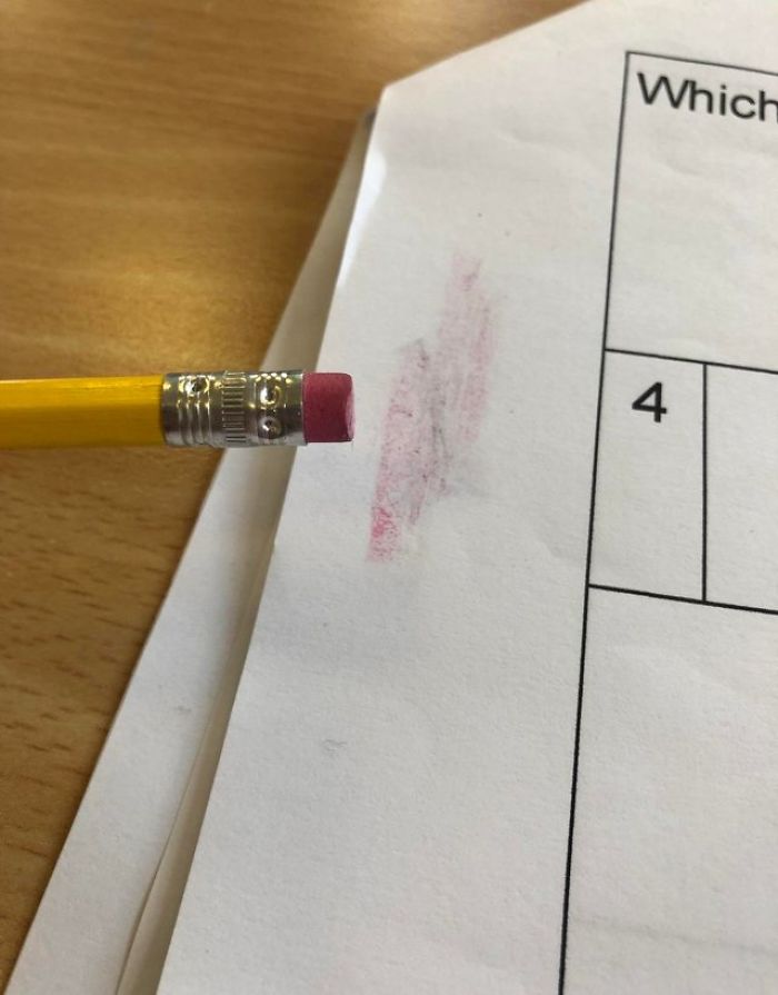
I Don’t Understand Why These Erasers Exist... They Just Ruin Everything
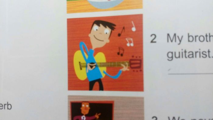
This Picture In My English Textbook
Alrighty Then
Our Charter Bus
Your Toe Isn't Stubbed Yet? Challenge Accepted
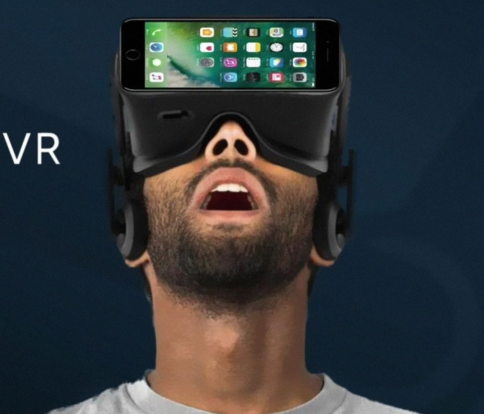
Yup I Love Looking At The Back Of My iPhone
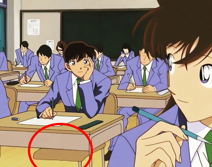
Anime Pewds
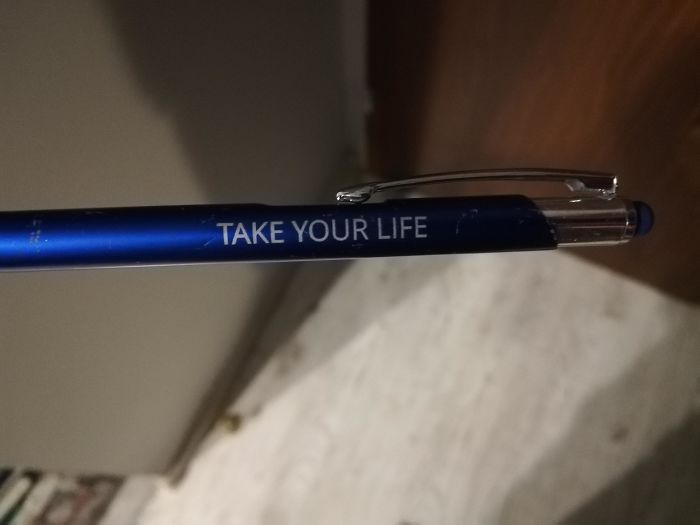
A Pen My Teacher Gave Me
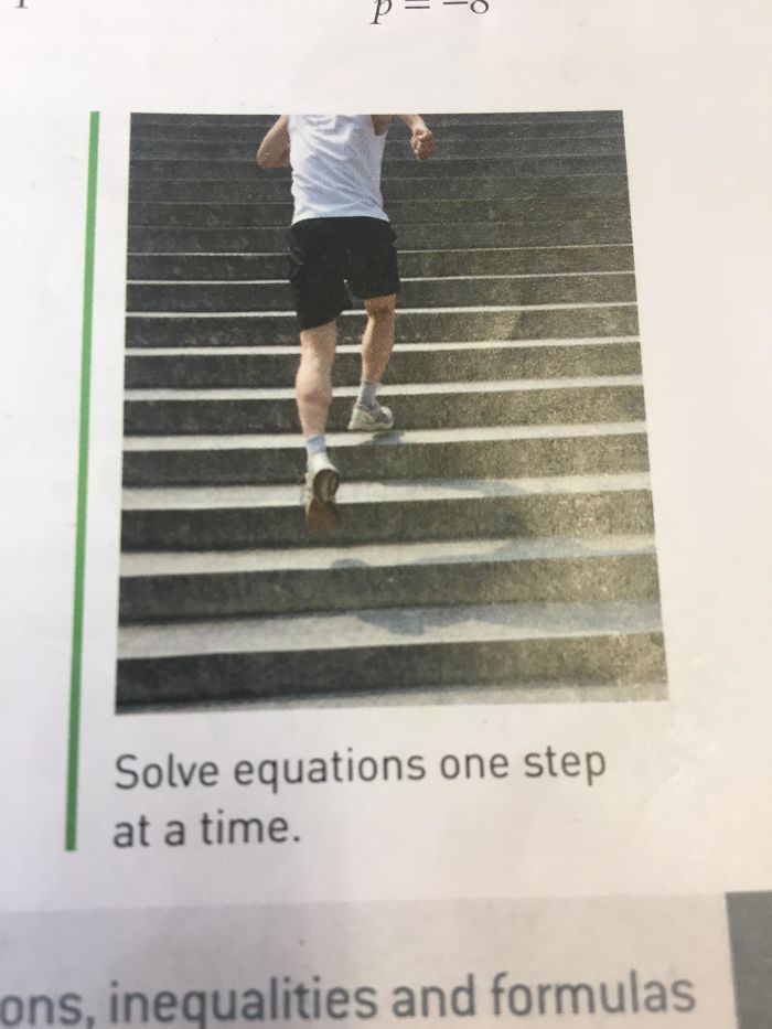
He’s Taking Two Steps
Are We The Baddies?
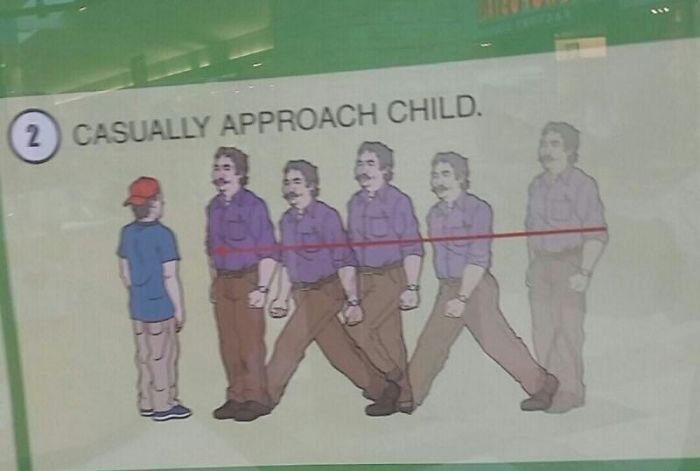
"Casually"
Three For The Price Of One
I Was Helping My Cousin With His German Homework And I Saw This Masterpiece
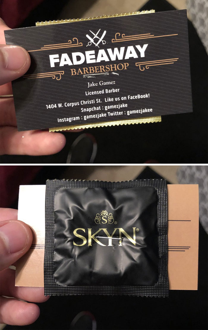
Gotta Include One Of These With Every Card! You’re Going To Need It After I Cut Your Hair
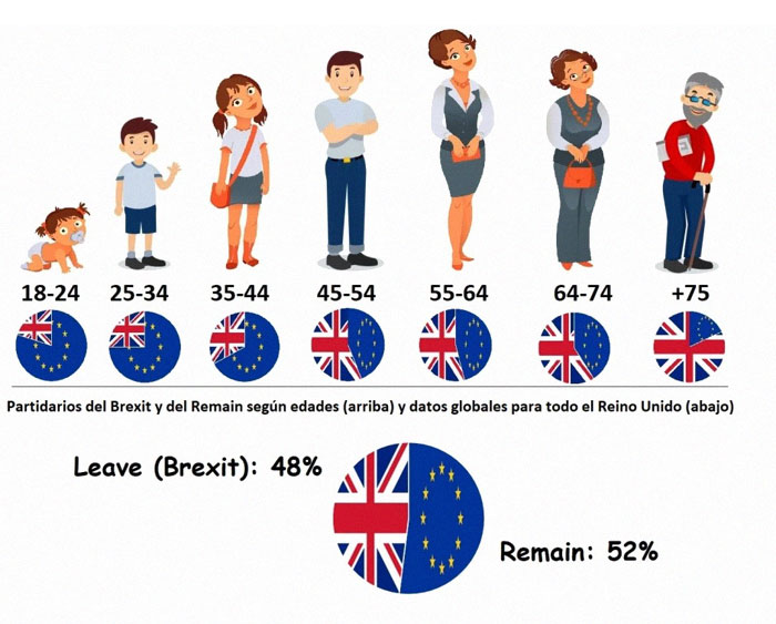
Ah Yes, The 18-24 Year Old Baby
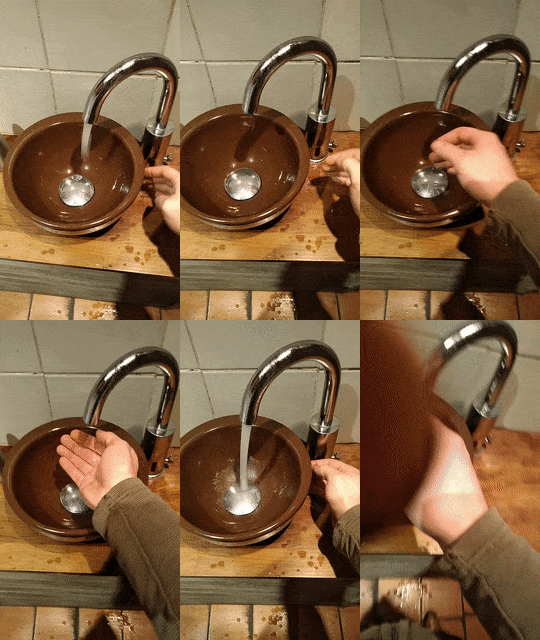
What Was This Sensor Original Meant To Do Anyway?
Replacing The Egg Shell With More Plastic To Go Into The Ocean
At A Bar. Almost Madea Terrible Mistake
May No Child Succeed
Are you talking about notifications? I raise my hand. They used to bring you directly to the entry where your comment was posted, now they just bring you to the whole post and you have to manually go through the whole list again, if you wanna see what people replied. It really sucks.
Load More Replies...BP does that. They cut lists down from over 100 to like 30 or 50 pics after a couple of hours or days. It sucks cause sometimes I save a fun list to look at it later when I have the time, but by then BP cut two thirds of it 👎
Load More Replies...Are you talking about notifications? I raise my hand. They used to bring you directly to the entry where your comment was posted, now they just bring you to the whole post and you have to manually go through the whole list again, if you wanna see what people replied. It really sucks.
Load More Replies...BP does that. They cut lists down from over 100 to like 30 or 50 pics after a couple of hours or days. It sucks cause sometimes I save a fun list to look at it later when I have the time, but by then BP cut two thirds of it 👎
Load More Replies...
 Dark Mode
  No fees, cancel anytime


