Genius designers are obviously made, not born - that's the thought that's likely to pop into your head after scrolling through the popular subreddit Crappy Design. Here you can find the most artistically deprived and esthetically sinister design fails, which will have you wondering just how on Earth any of these product design ideas were allowed to get made.
Obviously, not everyone was meant to be an artistic virtuoso, but these epic fails are so 'out there' and impractical that it's hard not to judge them while rolling on the floor laughing. Here are the bad designs that we think are the most interesting and the funniest. So scroll down, upvote your favorite funny photos and let us know if you've seen designs worse than these! And in case you're still hungry for some funny fails from backward-handed designers, check out more of Bored Panda's lists here, here, here, here, and here.
This post may include affiliate links.
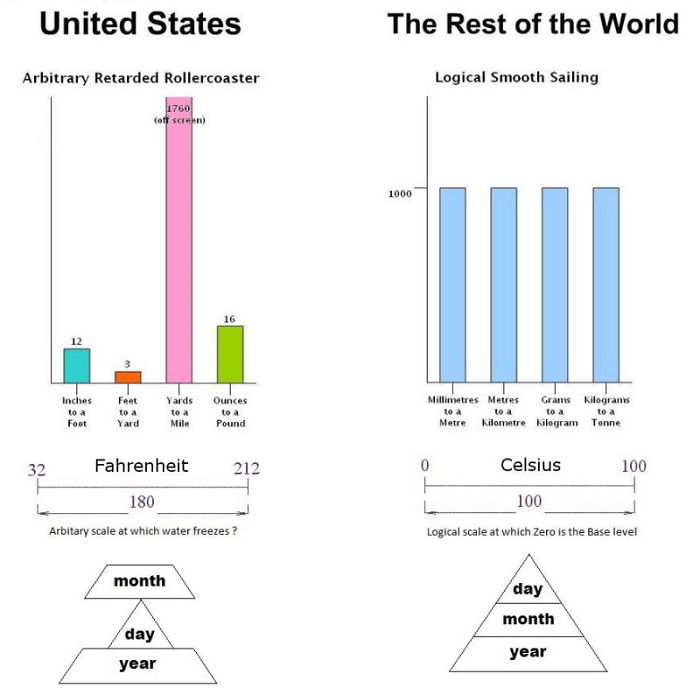
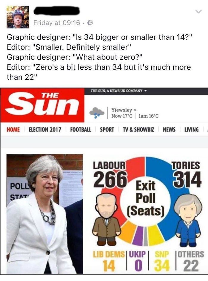
The Imperial System
Wow
I'm pretty sure they knew about this and just thought it would be fun to explain it all the time
Bored Panda reached out to Crappy Design’s community to learn a bit more about the subreddit. “The original motivation for the subreddit was to point out crappy designs. Nowadays, most subscribers probably come here for entertainment. However, it is common to have meaningful discussion here on why or why not something is crappy design,” the subreddit’s moderators explained.
They also added that “the subreddit was created 8 years ago. Currently, there are 1.7 million subscribers with over 2 million page views per month. It is very popular.”
While looking through the pictures, some of us are sure to be thinking that we could have done a far better job designing these things than the people who made them. The ‘Crappy Design’ subreddit's members most likely think the same.
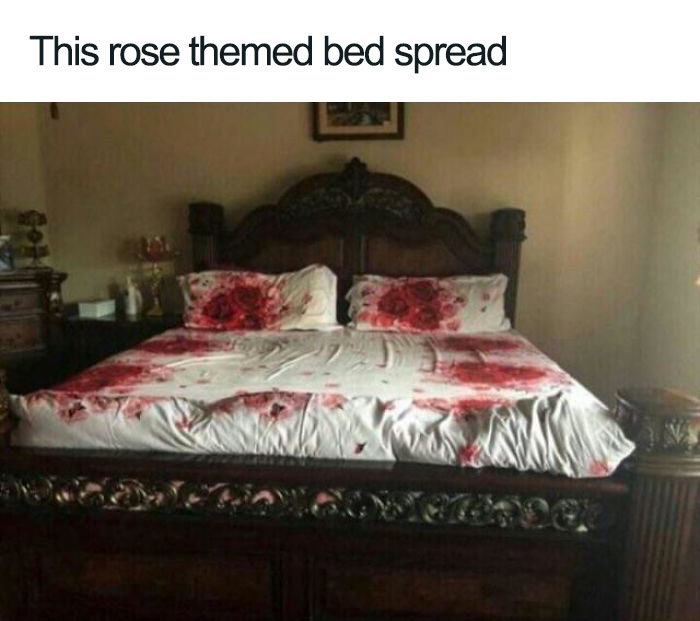
Rose Uh ?
Once again, a case of poor color choice. That bedspread looks more like homicide evidence.
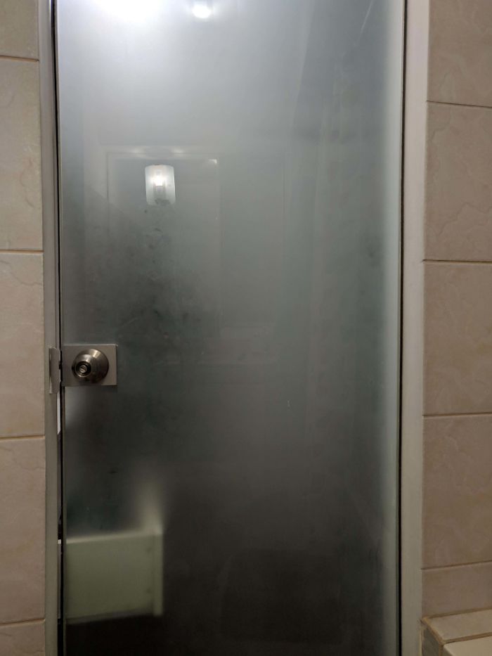
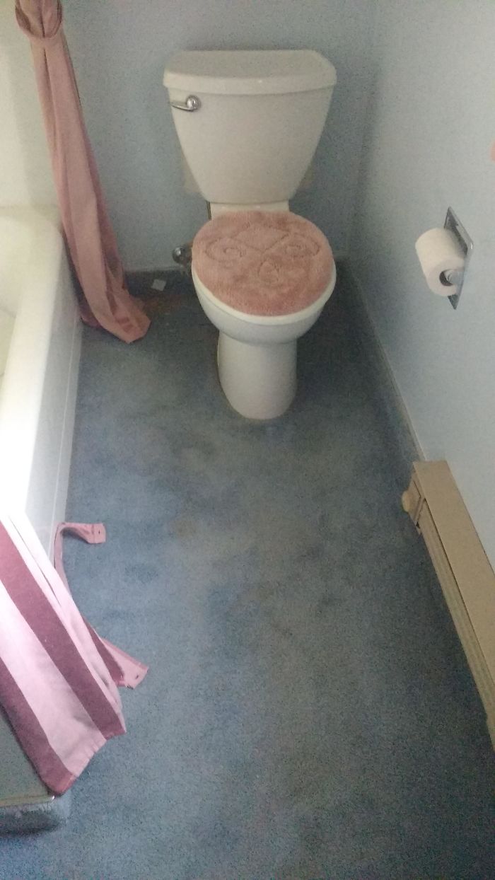
The Cat Just Trapped Me In The Bathroom By Opening A Drawer
According to researcher and author Don Norman, there are principles of good design which help people evaluate whether a product is a boon or a bust. For example, Norman believes all good designs are innovative and push the boundaries of what an object means to us. Naturally, well-designed objects also have to be useful, beautiful to look at, easy to understand and uncluttered in how they look.
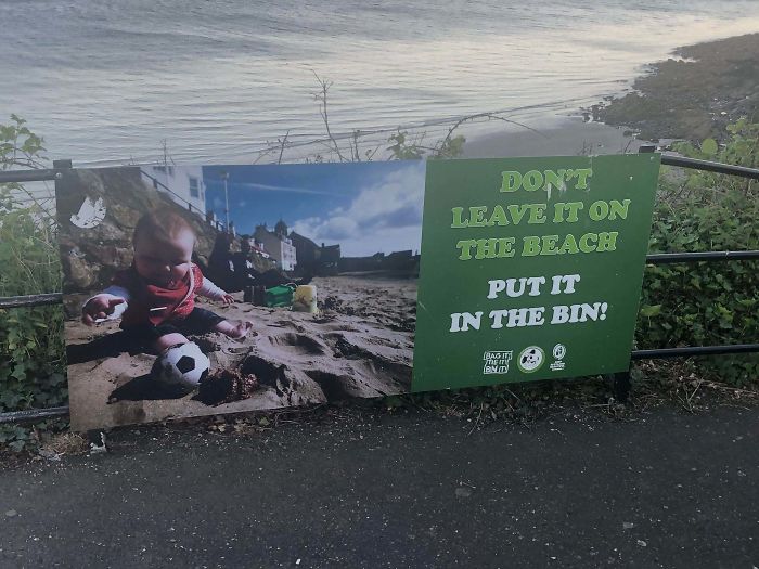
Sign At A Local Beach
...am i the only one who doesn't find anything wrong with dumping babies in bins on the beach? yes? ok then...
My School Blocked A Website Because It Was Labeled As Education
Furthermore, Norman explains in his book ‘The Design of Everyday Things’ that good design means being honest and upfront about what the object does.
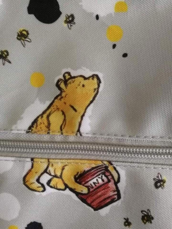
Take My Honey
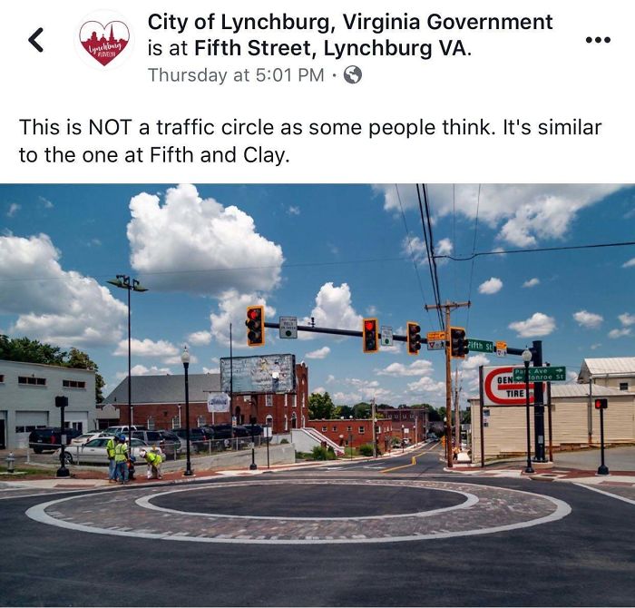
The Circle Of Life
Also, objects should be long-lasting, environmentally friendly, and well-designed to the tiniest detail. Finally, products shouldn’t be over-designed.
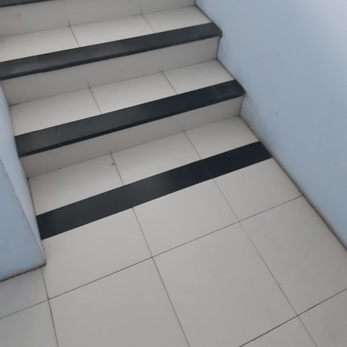
Almost Broke My Leg
Imagine Having To Wear This For Your Job
The Interaction Design Foundation explains that bad designs are overloaded with information and force the user to do more work than is necessary. Akshayta Rao writes that we all intuitively notice badly designed items but find it difficult to explain why good designs are, well, good. According to her, a well-known example of bad design would be USB cables. She’s right because we’ve all tried plugging them in the wrong way more than once. Some of us maybe even hundreds of times.
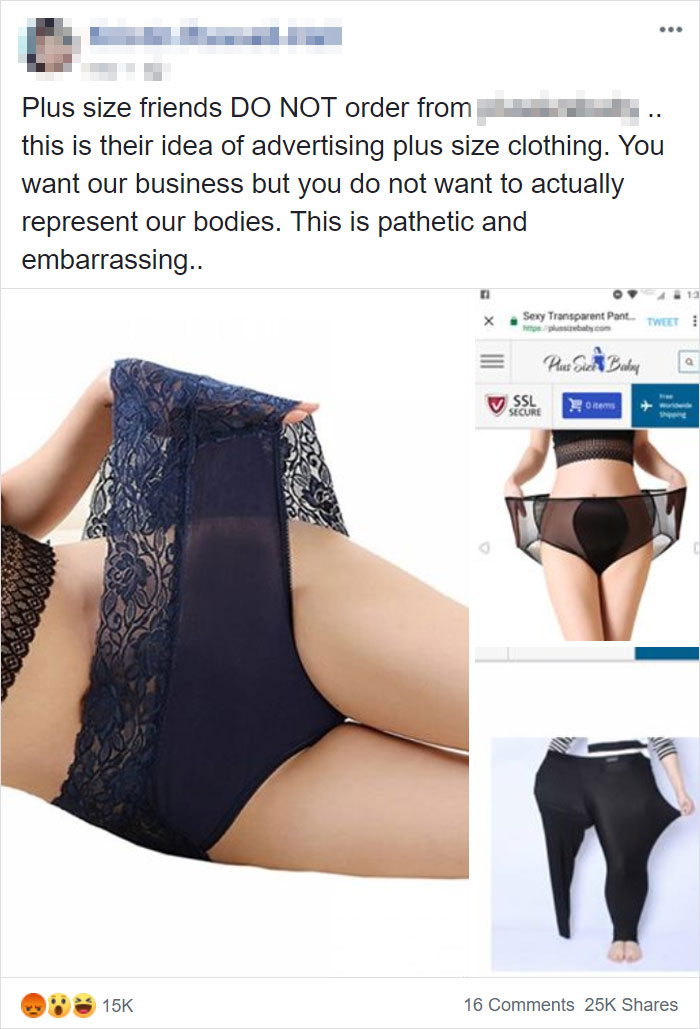
...to Advertise Plus Size Clothing
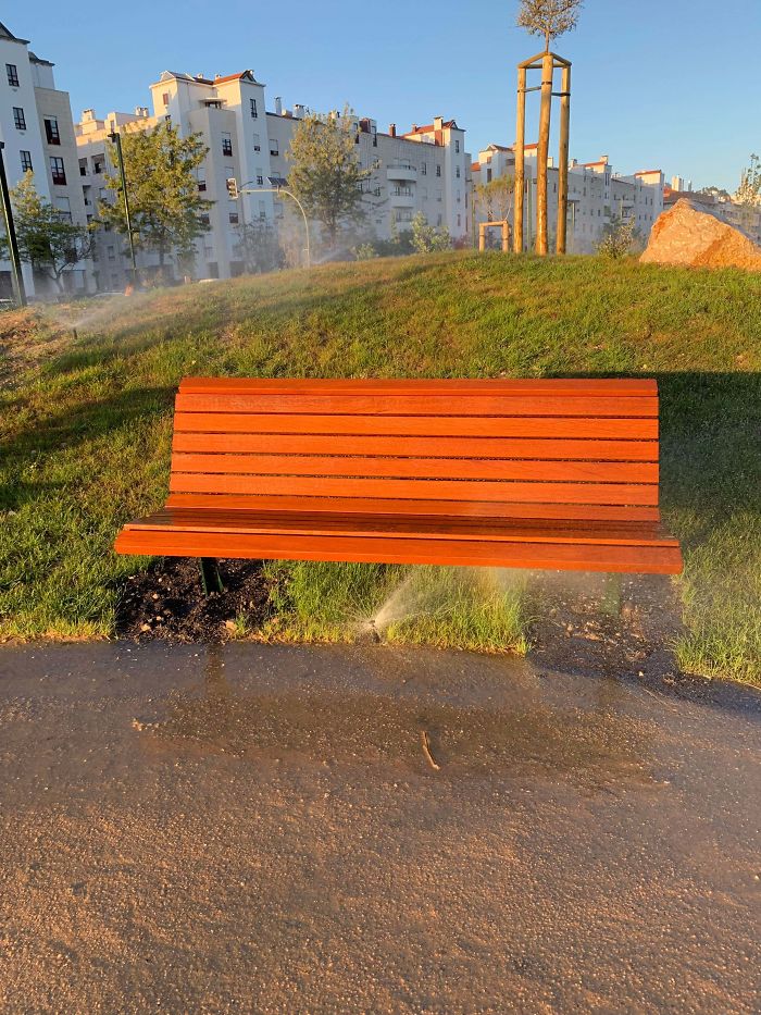
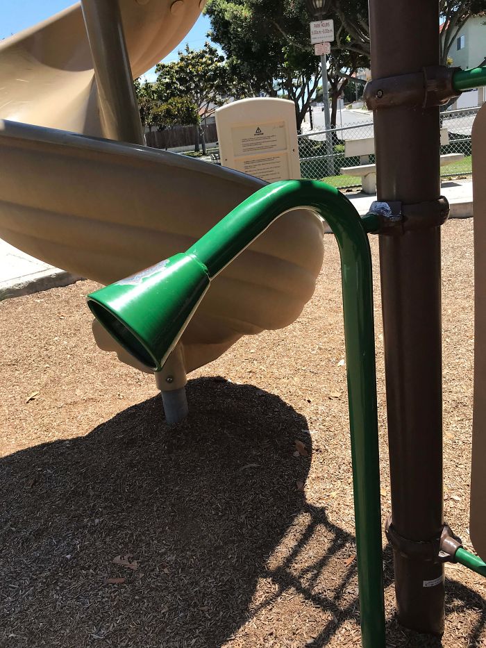
A New Park Opened In My City, Pretty Lovely, And This. Buttcleaner3000
What do you think about these principles of good and bad design? Do you agree with them? Which things in this list of crappy designs do you think are the worst offenders? Let us know!
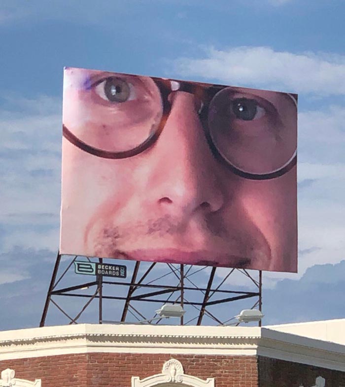
I Bought A Billboard To Promote My Business And They Screwed Up The Formatting
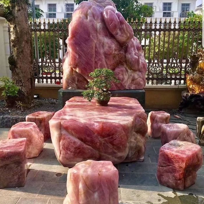
Crystal Furniture Set That Looks Like Raw Meat
The sad thing is that all that ugliness was probably also insanely expensive!
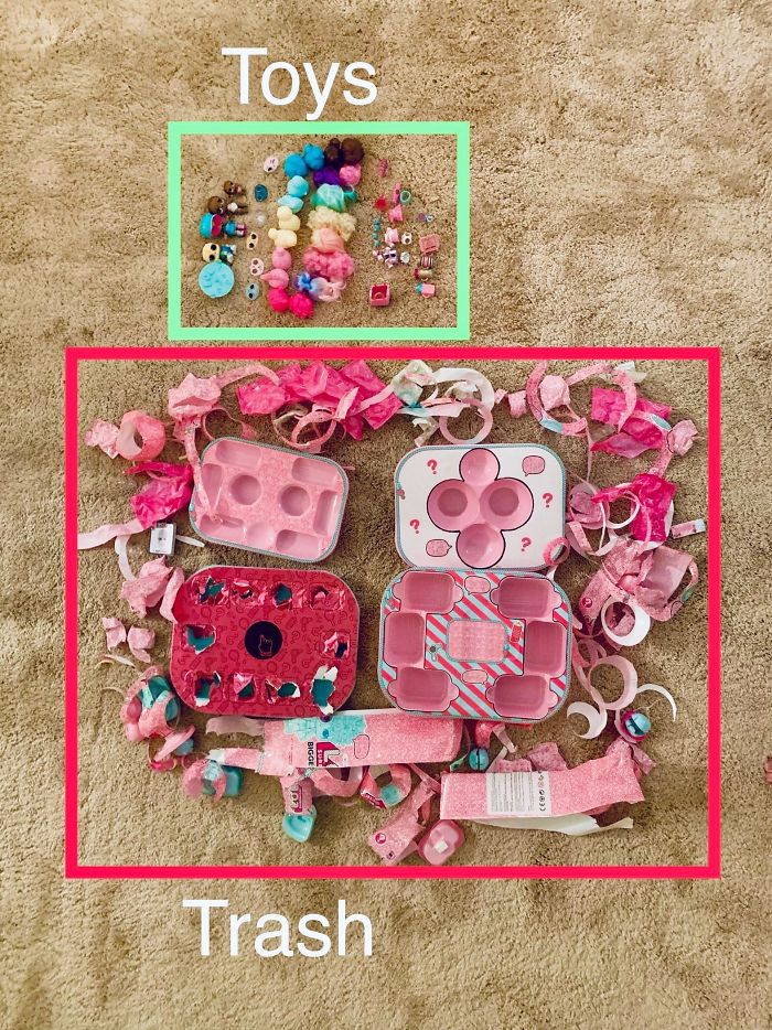
The Packaging Of Lol Dolls
So Proud Of My Country
Wow. I Laughed When I Saw This!
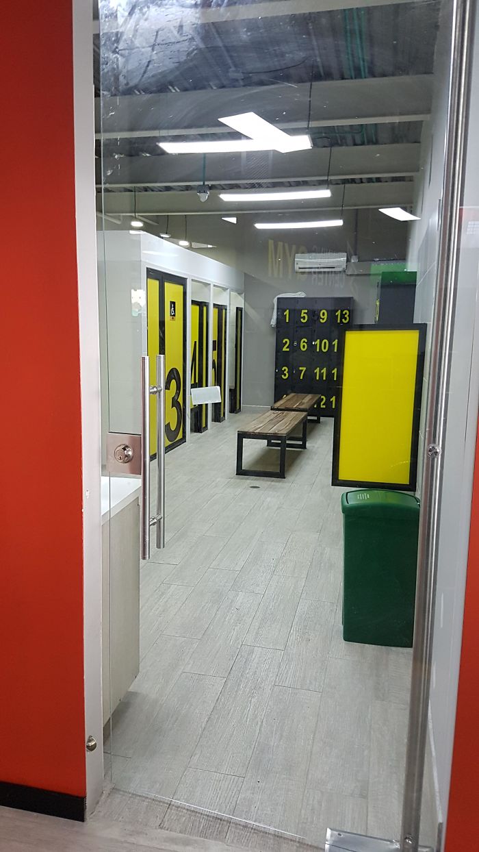
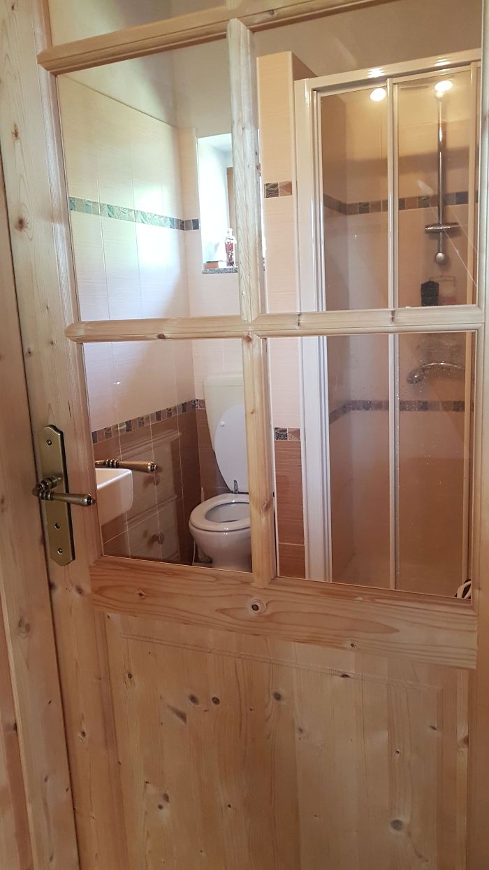
Was Worried About Privacy, So I Asked If They Could Put A Door Up To The Men's Change Room. Problem Solved
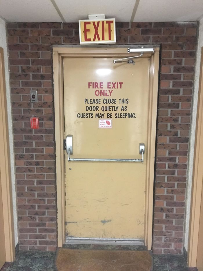
Don’t Wake Anybody Up If You’re Exiting The Motel During A Fire!
Sort of like the snooze button on your alarm clock?...yes, I'll exit, just give me a couple of more minutes sleep.
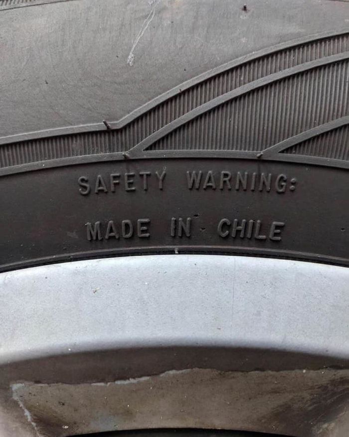
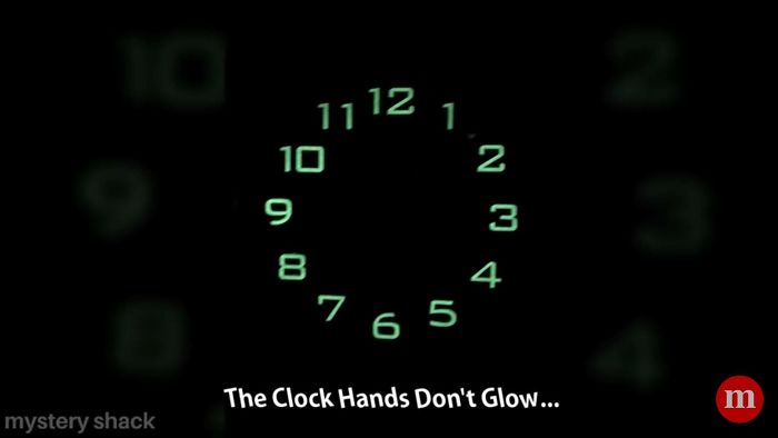
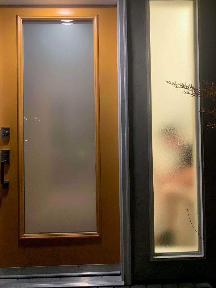
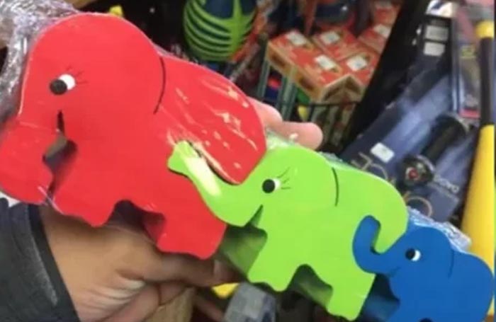
Who Thought Of This?
This Resculpted Head Of Baby Jesus
I Normally Enjoy Irony, But Not This Time
My Original Post Was Removed Because Everyone Thought The Backpack Was Real. Here’s Another Angle That Shows That The Bag Is Part Of The Design And Is Blocking The Phone Number
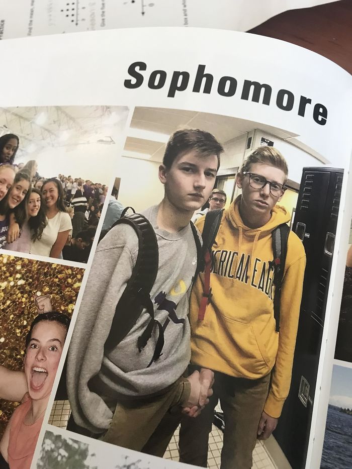
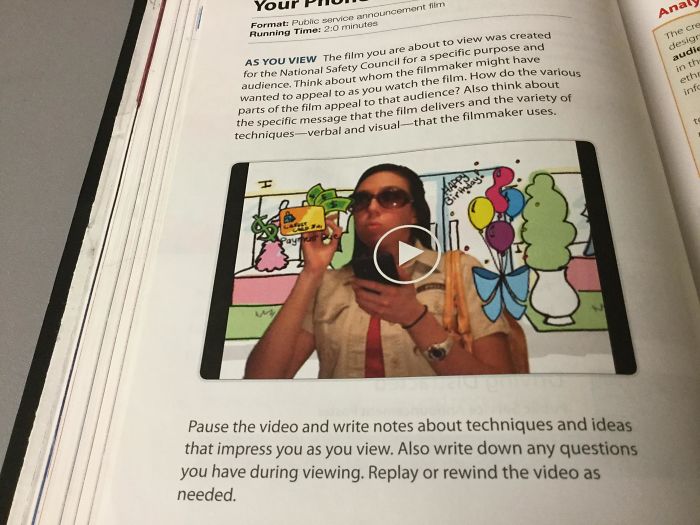
"I Don’t Know How Our Teachers Didn’t Notice This In The Yearbook. They Don’t Even Go To Our School."
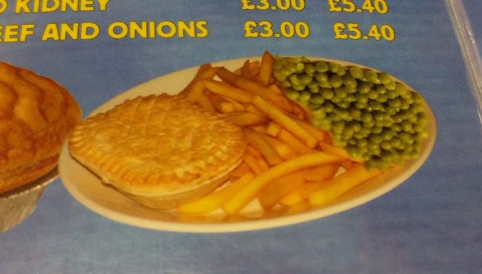
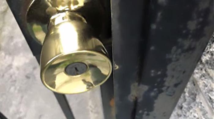
The Peas Are Upside Down...
Me And My GF Were Struggling With This Maze We Got When Watching The Pikachu Movie. We Checked The Solution In The Back And They Draw Through A Wall
Infuriating! I hated puzzle books that were wrong as a kid, it felt like such a betrayal
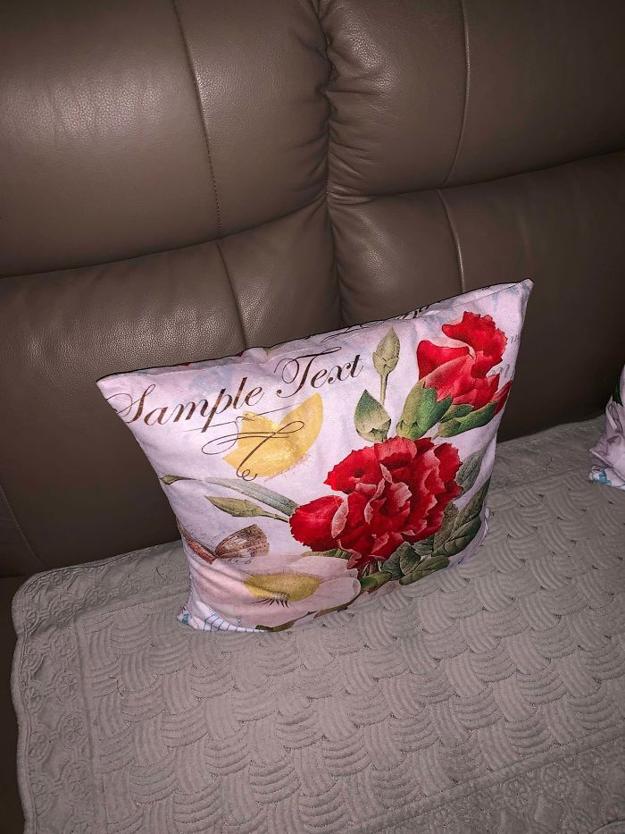
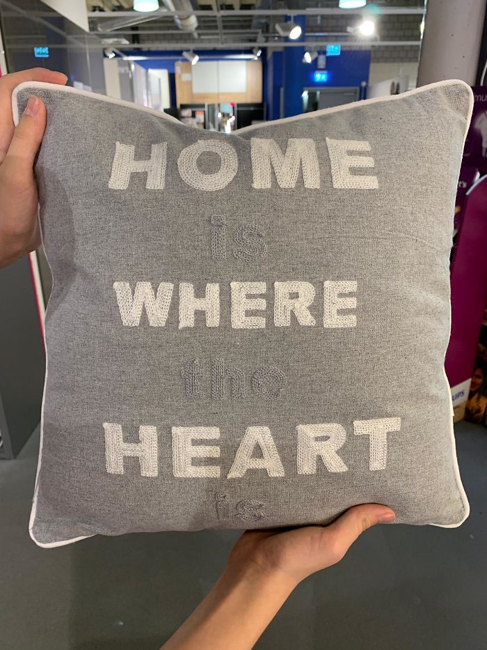
This Pillow At My Grandparents House
That is probably the most inspiring quote i've come acrossed since a while.
Hood On vs. Hood Off
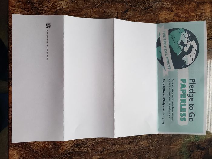
Let's Go Paperless
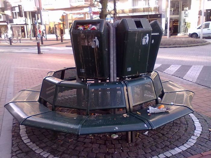
Cozy Seats In Belgium
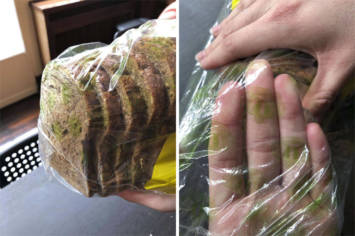
This Bread Packaging That Makes It Look Like It Is Moldy
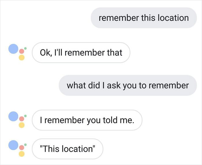
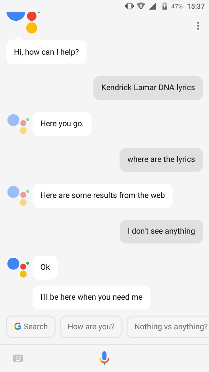
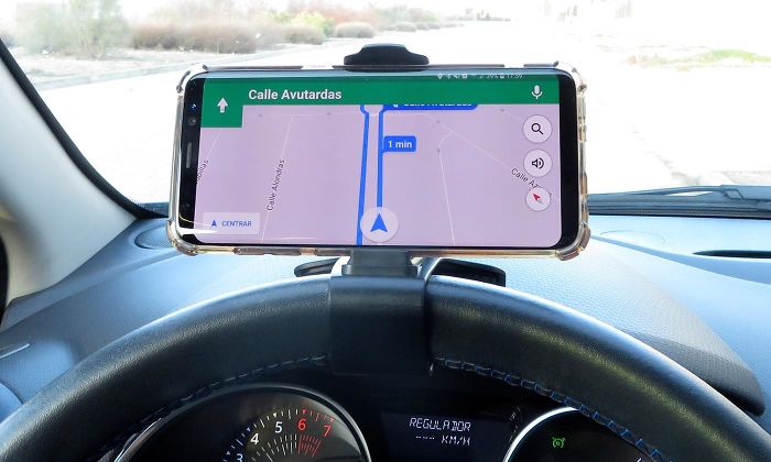
When You Get Lost Thanks To Google Assistant
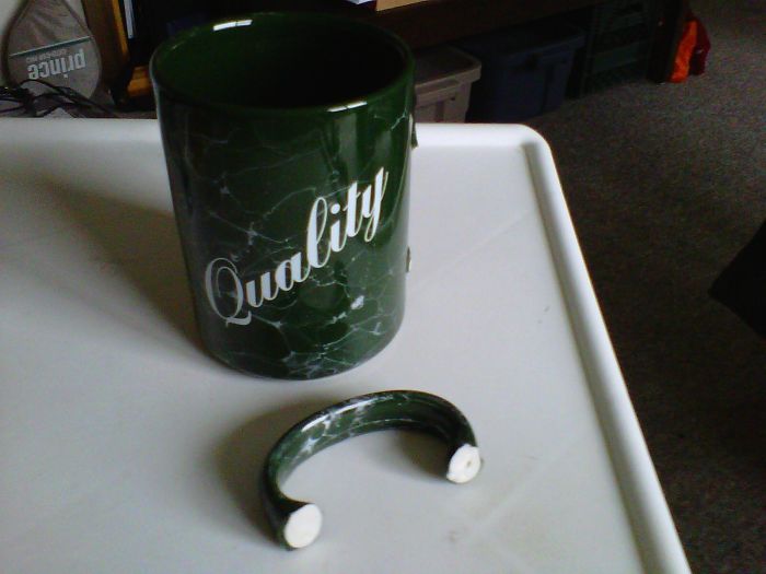
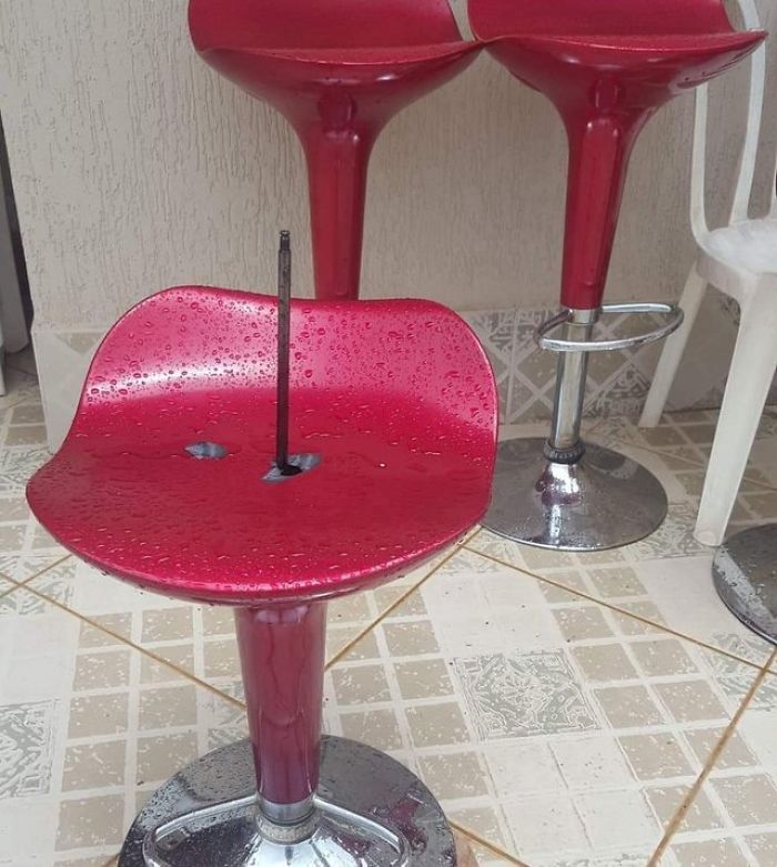
Reason Why You Should Be Careful In Using Such Type Of Chair. You Need To Make Sure You Got A Good Quality
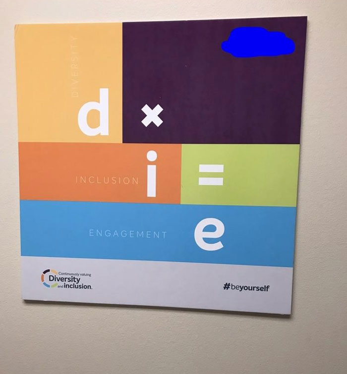
Motivational Poster At Work
No, I Don't Think I Will
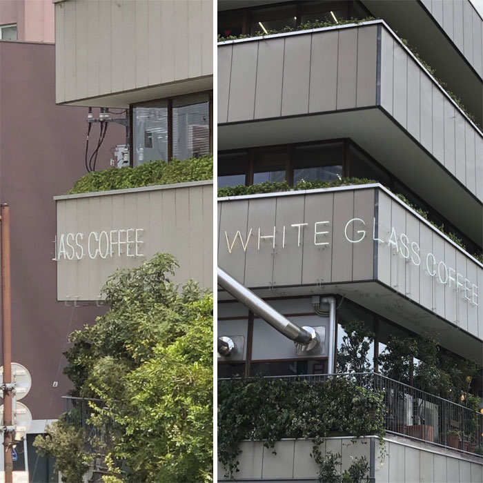
Laughed A Latte At This
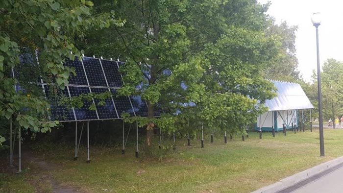
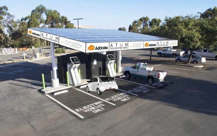
Totally-Nailed-It
It looks like it took a lot of effort to do something that stupid, unless of course, they only need the solar power during the winter when the trees are bare...unless the trees don't get bare.
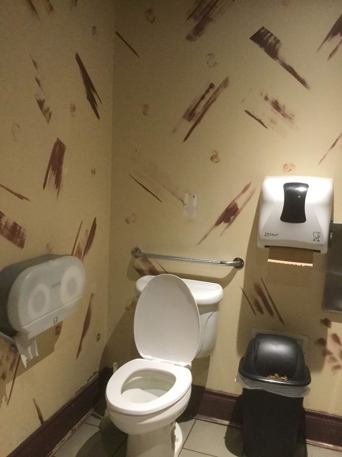
Went To Go To The Bathroom At A Local Restaurant And Found A Literal “Crappy Design”
Worst Placement
Judging by his reaction, people didn't seem to take it too seriously and think he was a pedophile.
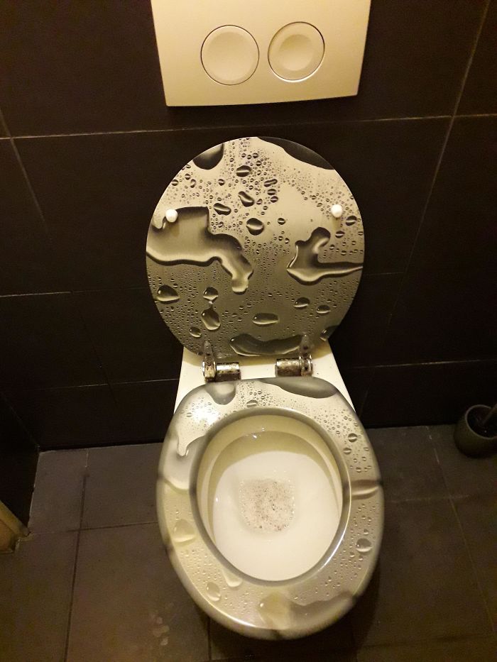
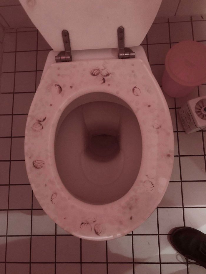
Ah Thats What I Want My Toilet To Look Like. Like Someone Peed All Over It
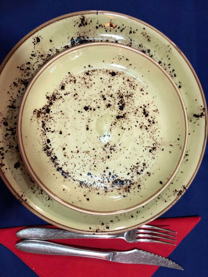
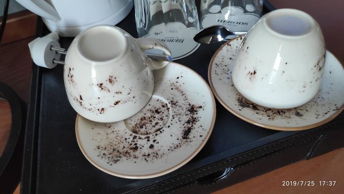
“Lets Just Make Our Plates Look Like They Haven’t Been Washed In 4 Years”
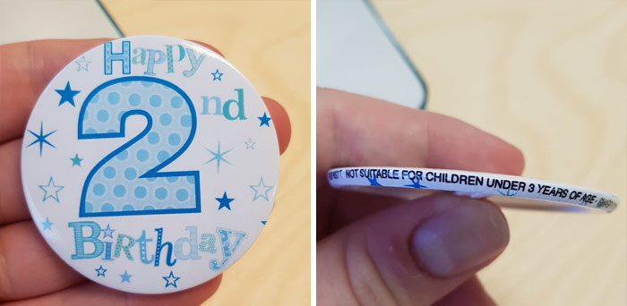
2nd Birthday Badge Potentially A Choking Hazard
Accidental Comedy
Hungary 101
Not Really “Crappy” But Still
I can't imagine on what planet the designer thought that would be appropriate.
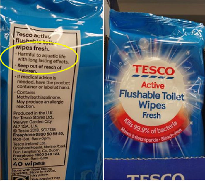
Why Is The Ocean Filling Up With Plastic?
The Way They Cut The Carpet To Make This Door Open Instead Of Just Cutting The Door. (Found In Basement Of Newly Bought House)
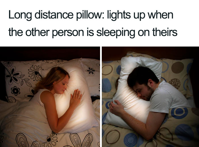
How... How Are You Supposed To Sleep With A Light In Your Face?
Hey, Look!
Fashion Is Evolving
Anyone remember this Victoria Secret ad? "Hey! Let's make a reflection with the letters since they will be on the water!" Someone didn't think this through... img_201205...8-jpeg.jpg 
Anyone remember this Victoria Secret ad? "Hey! Let's make a reflection with the letters since they will be on the water!" Someone didn't think this through... img_201205...8-jpeg.jpg 

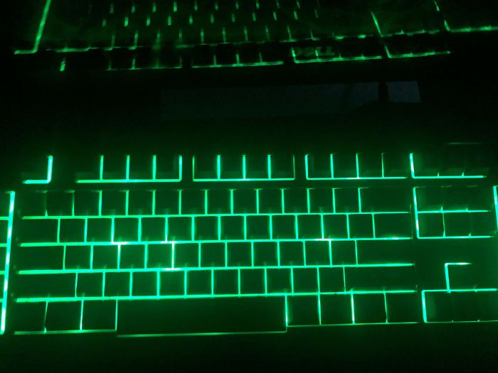
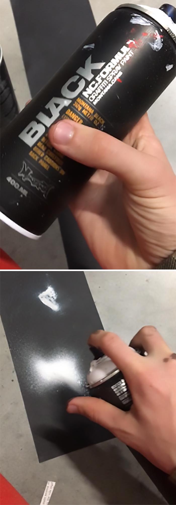
 Dark Mode
  No fees, cancel anytime


