Maps are deceiving. You see, the surface of a sphere cannot be represented as a plane without some form of distortion. Since the 1500s, scientists have been developing algorithms that would help transform the globe into something flat and to do this, they use a method called map projection. There is no right or wrong way to do it, and everything depends on the purpose of the map. But while every type of map preserves one thing, it messes up the other. Area, shape, direction, bearing, distance, and scale of the landmasses are the main properties map makers are constantly juggling. Most people usually look at the Mercator projection.
This post may include affiliate links.
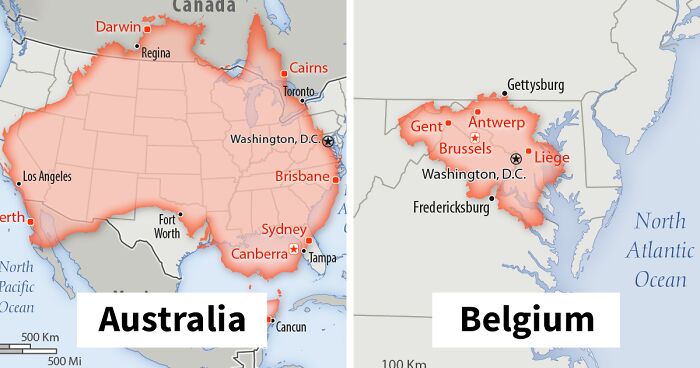
Australia
Population: 23,470,145, and all trying to buy a house in Melbourne it seems
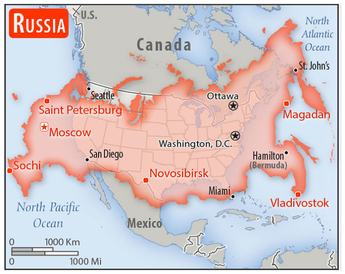
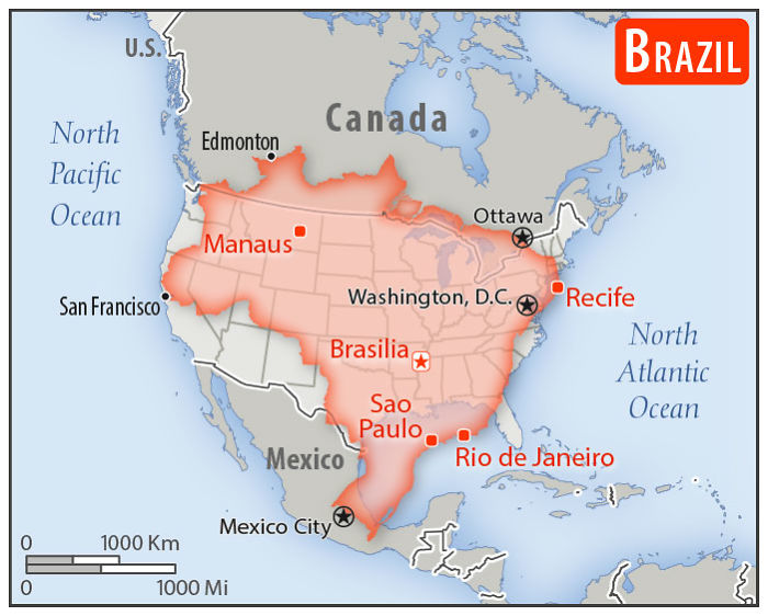
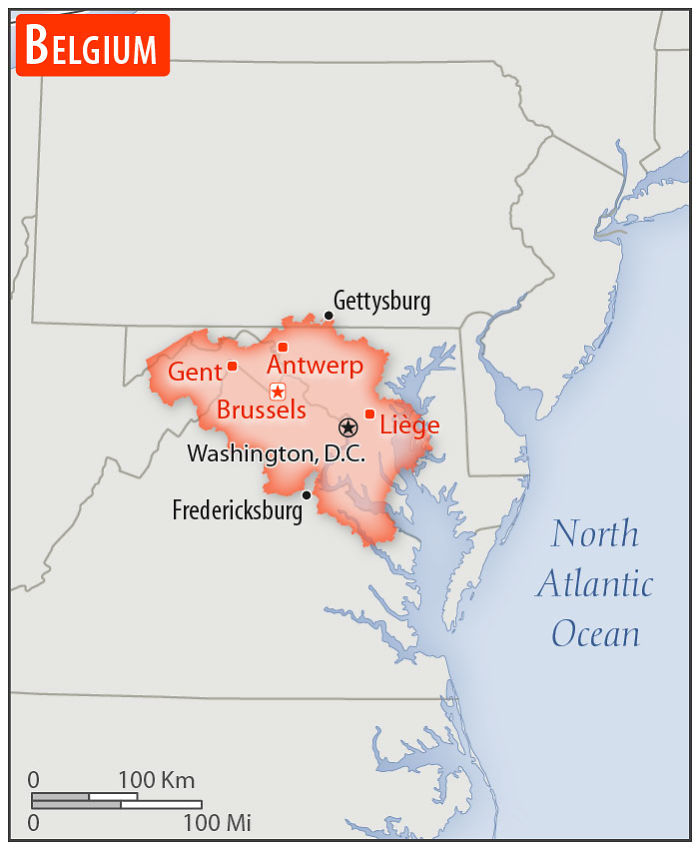
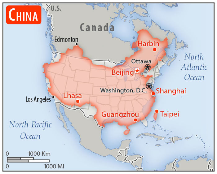
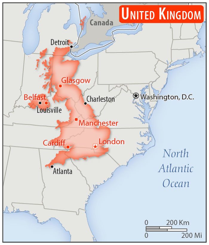
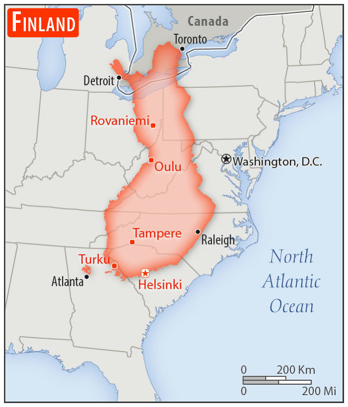
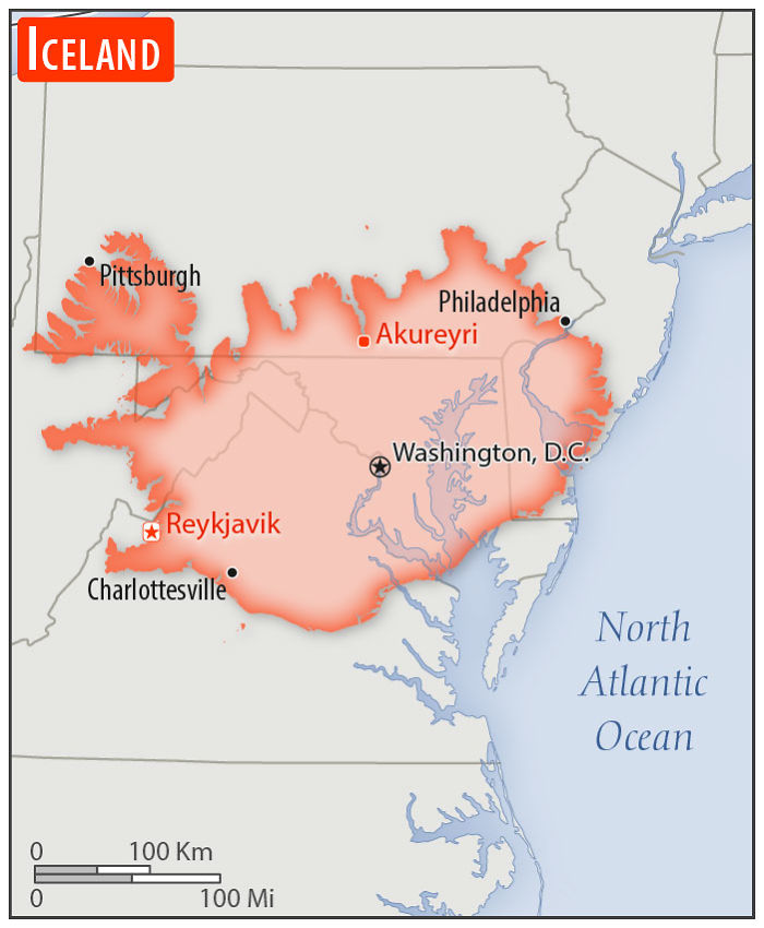
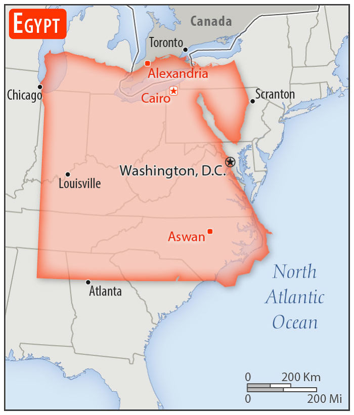
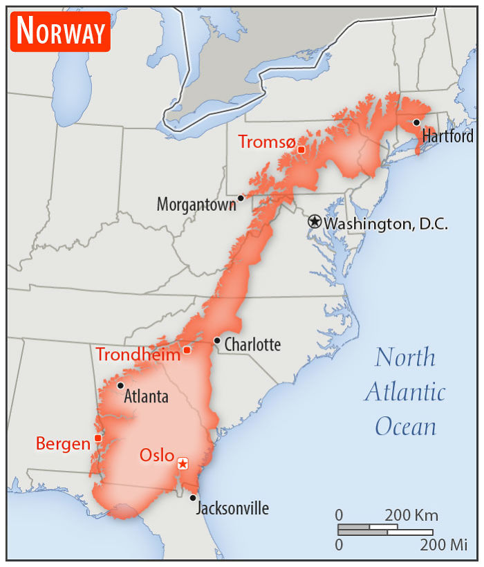
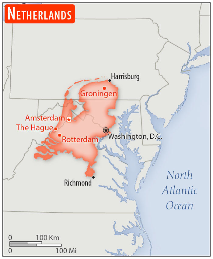
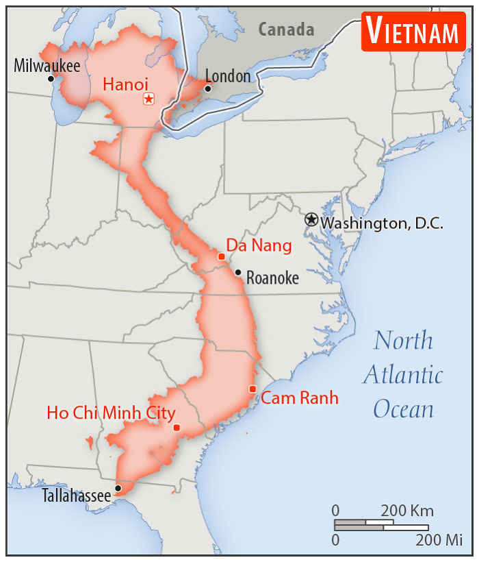
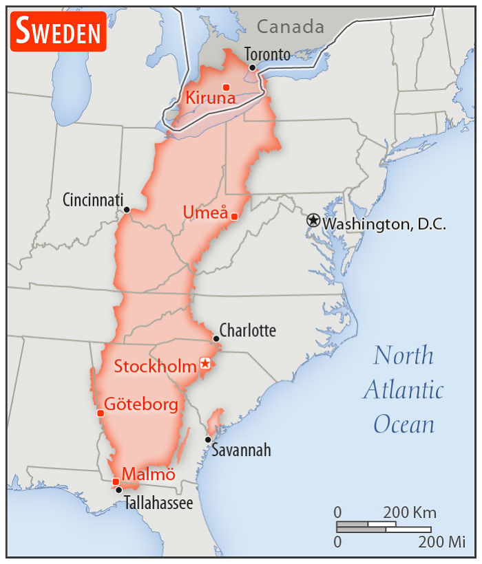
The Mercator map is widely used for navigation because of its ability to represent lines of constant course. A line drawn between two points on this map would provide the exact angle to follow on a compass to travel between these two points. It also preserves the shape of countries. However, it's less practical for world maps because the scale is distorted. And that's where the Internet comes into play. Imgurian and map lover Mkyner has compiled a series of overlapping maps showing countries from all over the world on top of the United States to give everyone a better understanding of just how huge it actually is.
New Zealand
Population: 4,545,627 people and about 30,000,000 sheep
New Zealand is also quite a bit larger than what I had in my head. Lovely country, with real leadership.
Most popular maps are created using cylindrical projection. Imagine putting a cylinder over a globe and projecting each of the points of the sphere onto the cylindrical surface. Then, if you unroll the cylinder, you end up with a flat rectangular map.
Flemish geographer and cartographer Gerardus Mercator created the Mercator projection in 1569. Gerardus preserved the direction of his map by varying the distances between the latitude lines and making them straight. However, as with every map, there are drawbacks. For example, on the Mercator map, Greenland and Africa look about the same size. But the actual size comparison to Africa shows that Greenland is smaller. 14 times smaller, to be precise.
But mapping services like Google Maps still use the Mercator. Again, because of its ability to preserve shape and angles. Close-up views of cities and roads are more accurate. A 90-degree right turn on the map is a 90-degree right turn on the street that you're driving on. And when you're close-up, the distortion is minimal. If you want, however, a map that shows the true size of things, fire up one that's created with a Gall–Peters projection.
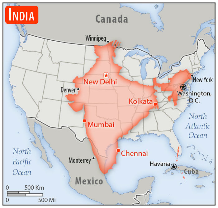
India
Population: 1,296,834,042
Expected to pass China in population within a few years. Stripped bit near Winnipeg is occupied by China.
"I've liked maps for as long as I can remember," Mkyner told Bored Panda. "I enjoy exploring distant places on Google Earth, I think it's important to have an understanding of the countries we hear about in the news, and I love sharing this interest with others (as I think many people do with their hobbies/passions)."
"I was looking up maps of South Africa yesterday (19 May 2019) when I came across the first comparison map. That quickly led to the CIA World Fact Book (a US government source). I was trying to procrastinate on some chores, so compiling those maps into a post seemed like a perfect idea."
"Note, I did not include every country in this USA size comparison post," they added. "I skipped Canada and Mexico, since they were on a lot of the maps anyway, and some of the smaller/more obscure countries (think Togo and Kyrgyzstan)."
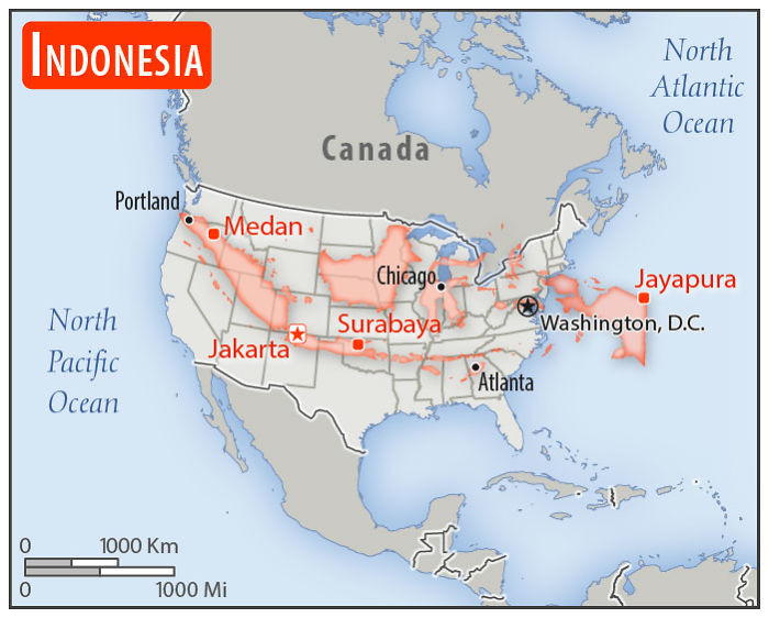
Indonesia
Population: 262,787,403
More than half the population is on that one island running from northern New Mexico to central Oklahoma. The big island in the upper Great Plains and that thing in the Atlantic are mostly jungle.
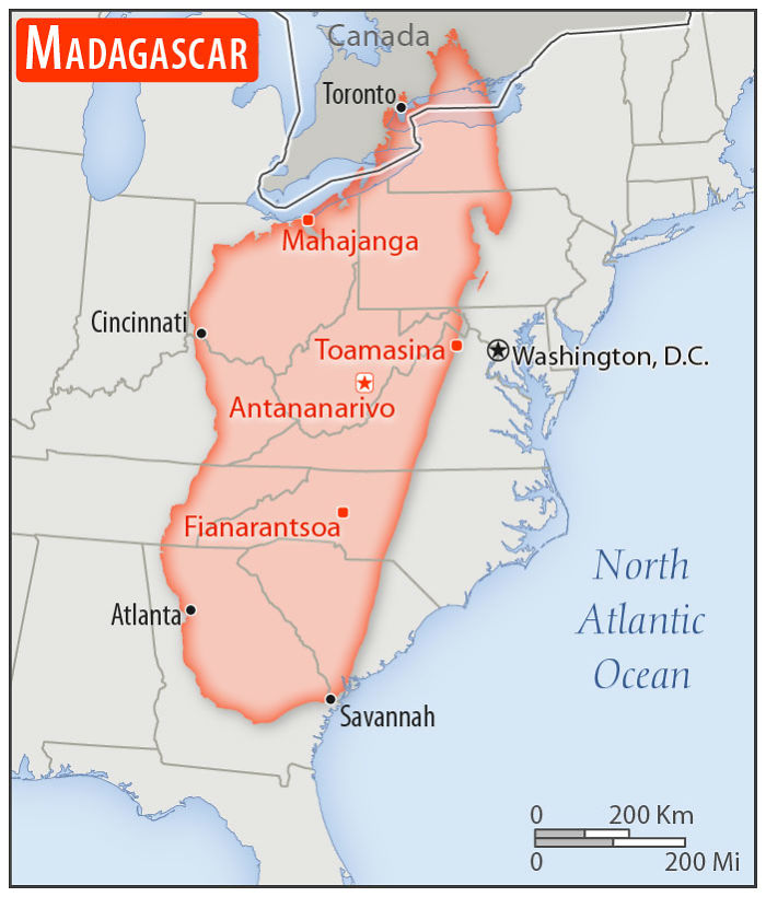
Madagascar
Population: 25,683,610
Ports: closed.
Now, this is something I had no idea of. Madagascar is much larger than I thought it would be.
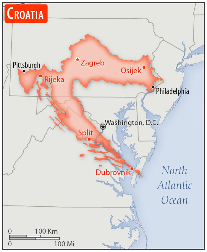
Croatia
Population: 4,270,480
One of the coolest-shaped countries, like a Needler from Halo.
Also, to drive from Split to Dubrovnik, you need to exit Croatia into Bosnia Herzegovina and back into Croatia.
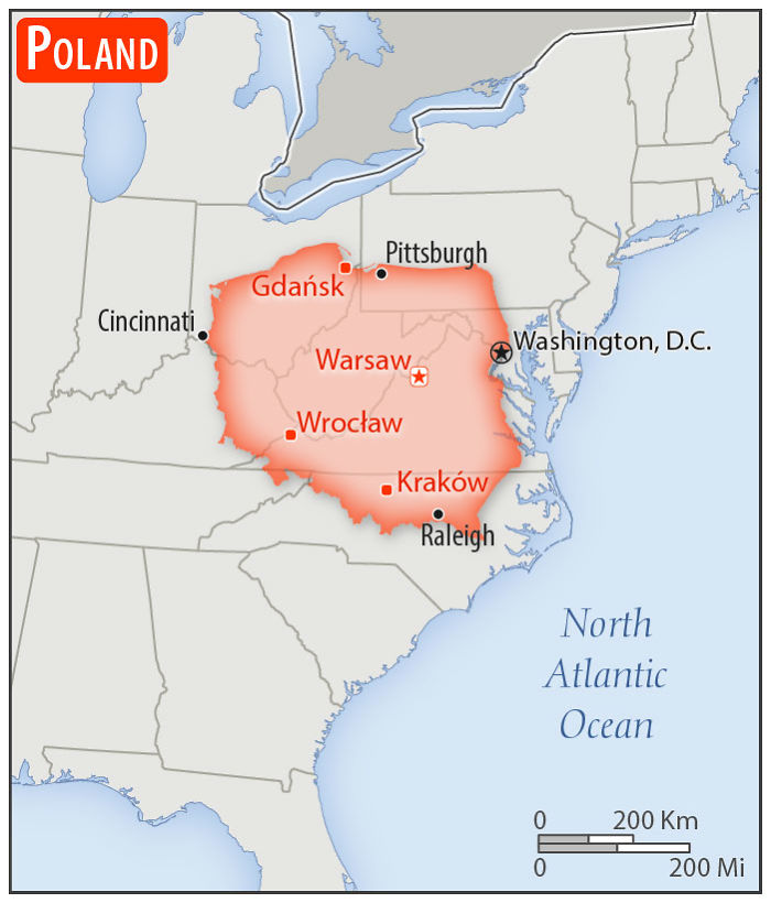
Poland
Population: 38,420,687
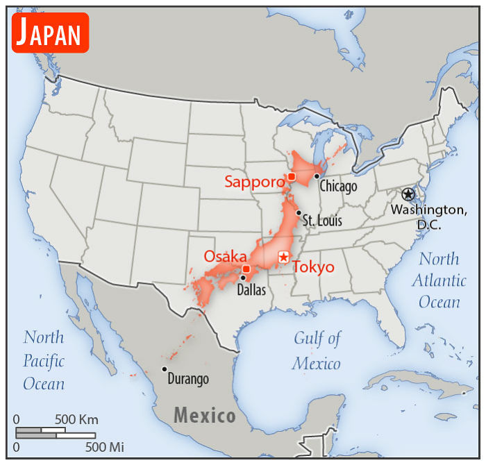
Japan
Population: 126,168,156 and 1 Godzilla
Bullet train will take you from Tokyo, Arkansas to Osaka, Texas in about 2.5hrs
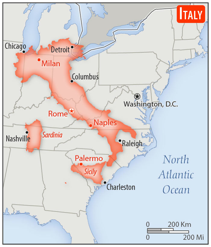
Italy
Population: 62,246,674
Giving South Carolina the boot.
If they'd flip the image, Italy could be giving Washington DC the boot...
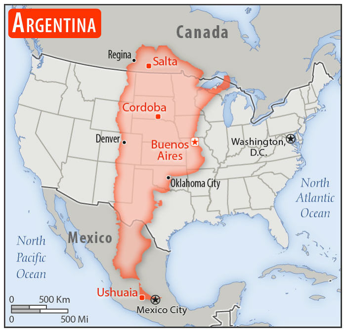
Argentina
Population: 44,694,198
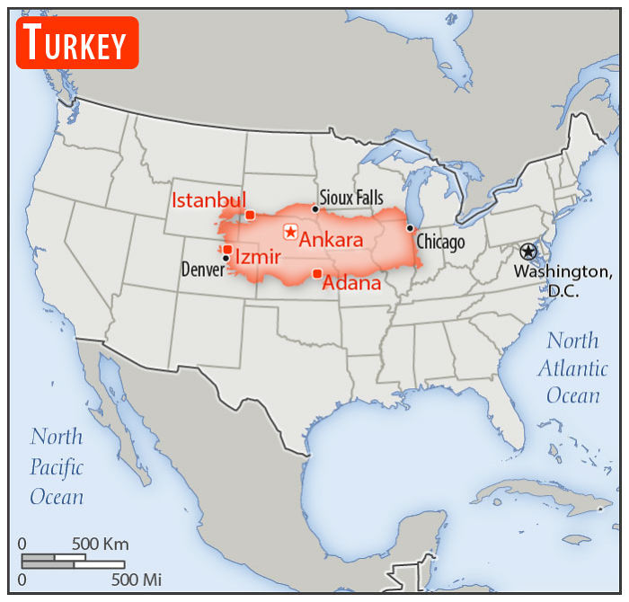
Turkey
Population: 81,257,239
*Constantinople
It's istanbul, not constantinople now, it's istanbul (umbrella academy anyone)
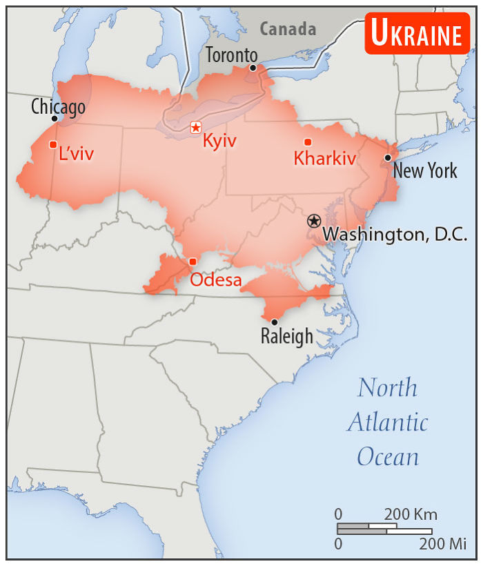
Ukraine
Population: 43,952,299
IIRC, the Russian-occupied part in the east is roughly New Jersey, Delaware, and a bit of Pennsylvania
Largest country in Europe, in fact (excluding countries that span both Europe and Asia).
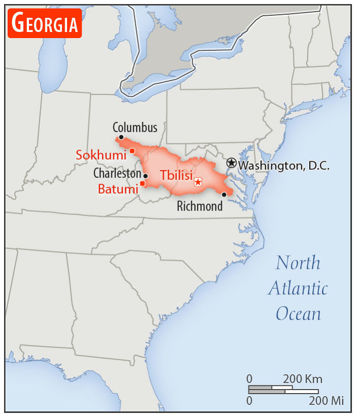
Georgia
Population of the country of Georgia: 4,926,087
Population of the US State of Georgia: 10,519,475
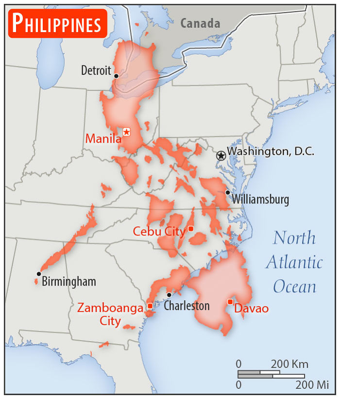
Philippines
Population: 105,893,381
Fun fact: Philippines is the world's largest island within a lake (Main Crater Lake) that is situated on an island (aka Taal Island) located in a lake, within an island (Luzon). I been there and is beautiful!
I wish you would have had the US map stay the same size for all the comparisons.
Eheheh! Some countries would have been invisible in that case. ♥
Load More Replies...Interesting fact, you could fit UK, France and Germany into Alaska and still have room to spare
Madagascar is much larger than I imagined. Also, I live in Virginia which was part of the scale for most of the countries shown, so that was cool. (Yes I know it is because of our proximity to D.C.)
Unsurprisingly just one African country :( (hold your horses cowboys, I am European myself)
I would have been interested in the population comparison with the paired areas!
Any one remember Fifty nifty United States (school play)🇺🇸
With 13 original colonies. Shout em, scout em, tell all about em
Load More Replies...So this led me to google. 10 biggest countries in the world, in order. Russia, Canada, USA, China, Brazil, Australia, India, Argentina, Kazakstan, Algeria.
Some countries are bigger than you think, and some are smaller!
This map may seem accurate but it should be noted that Alaska. Which is huge is not even on this map! I think a lot of Europeans do not know how big the US is. It can take three days of driving all day to go from one coast to the other.
where is Czech Republic, you have here almost all countries around but Czech is missing ...maybe we are too small for you to find us :D
I created a App that does something similar, check it out:
https://dribbble.com/shots/6359916-True-Country-Size-Compared Screen-Sho...11-png.jpg 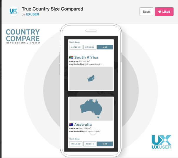
Gall–Peters projection is a messy and IMHO ugly projection on a world scale, even with it being a media darling lately... The Equal Earth projection (http://equal-earth.com/) is far superior
I wish the area of each country, and its proportion to the US had been included.
Am I the only one who took geography in public school and isn't surprised by any of this?
"You can't do that..." Related scene from The West Wing: https://youtu.be/QMlp8BeBJgg
This is wrong. Yes mercator is not true to scale, but widely used. I noticed in the article it listed Galls Peter as being accurate, which it is not. In the quest to remove size distortion the map stretched places near the poles horizontally to a shocking degree. It also stretched land masses vertically near the equator. The shapes and angles are all wrong, exactly why you don't see this map much. The most accurate map in existence is the AuthaGraph created in 1999.
It lists Galls-Peter as 'a map that shows the true size of things'. Nothing about angles or shapes being right, just that the size is accurate.
Load More Replies...Of course... Alaska is bigger then most of those countries too >.> https://matadornetwork.com/read/mapped-real-size-alaska/
Gall-Peters is an *ugly* projection on a global scale, poor shape representation, and very messy in other ways... even with it being a media darling recently... A *far* superior projection in this regard is Equal Earth (http://equal-earth.com/) P.S. as a kiwi, nice to see New Zealand up there P.P.S. thanks for explaining fully that the Mercator was a maritime aid with rhumb lines and the like - and NOT some way of somehow diminishing the 'influence' / size of Africa and South America by the Europe-centric :)
Adding Israel would REALLY have been informative. It's about NINE MILES across the middle, from the West Bank to the Red Sea.
I wish you would have had the US map stay the same size for all the comparisons.
Eheheh! Some countries would have been invisible in that case. ♥
Load More Replies...Interesting fact, you could fit UK, France and Germany into Alaska and still have room to spare
Madagascar is much larger than I imagined. Also, I live in Virginia which was part of the scale for most of the countries shown, so that was cool. (Yes I know it is because of our proximity to D.C.)
Unsurprisingly just one African country :( (hold your horses cowboys, I am European myself)
I would have been interested in the population comparison with the paired areas!
Any one remember Fifty nifty United States (school play)🇺🇸
With 13 original colonies. Shout em, scout em, tell all about em
Load More Replies...So this led me to google. 10 biggest countries in the world, in order. Russia, Canada, USA, China, Brazil, Australia, India, Argentina, Kazakstan, Algeria.
Some countries are bigger than you think, and some are smaller!
This map may seem accurate but it should be noted that Alaska. Which is huge is not even on this map! I think a lot of Europeans do not know how big the US is. It can take three days of driving all day to go from one coast to the other.
where is Czech Republic, you have here almost all countries around but Czech is missing ...maybe we are too small for you to find us :D
I created a App that does something similar, check it out:
https://dribbble.com/shots/6359916-True-Country-Size-Compared Screen-Sho...11-png.jpg 
Gall–Peters projection is a messy and IMHO ugly projection on a world scale, even with it being a media darling lately... The Equal Earth projection (http://equal-earth.com/) is far superior
I wish the area of each country, and its proportion to the US had been included.
Am I the only one who took geography in public school and isn't surprised by any of this?
"You can't do that..." Related scene from The West Wing: https://youtu.be/QMlp8BeBJgg
This is wrong. Yes mercator is not true to scale, but widely used. I noticed in the article it listed Galls Peter as being accurate, which it is not. In the quest to remove size distortion the map stretched places near the poles horizontally to a shocking degree. It also stretched land masses vertically near the equator. The shapes and angles are all wrong, exactly why you don't see this map much. The most accurate map in existence is the AuthaGraph created in 1999.
It lists Galls-Peter as 'a map that shows the true size of things'. Nothing about angles or shapes being right, just that the size is accurate.
Load More Replies...Of course... Alaska is bigger then most of those countries too >.> https://matadornetwork.com/read/mapped-real-size-alaska/
Gall-Peters is an *ugly* projection on a global scale, poor shape representation, and very messy in other ways... even with it being a media darling recently... A *far* superior projection in this regard is Equal Earth (http://equal-earth.com/) P.S. as a kiwi, nice to see New Zealand up there P.P.S. thanks for explaining fully that the Mercator was a maritime aid with rhumb lines and the like - and NOT some way of somehow diminishing the 'influence' / size of Africa and South America by the Europe-centric :)
Adding Israel would REALLY have been informative. It's about NINE MILES across the middle, from the West Bank to the Red Sea.

 Dark Mode

 No fees, cancel anytime


