30 Times Companies Left Many People Disappointed After Changing Their Logo Design
Times change, opinions evolve (or devolve), and businesses need to adapt. Whether they want it or not, modernity creeps up on everyone—and there are plenty of successful examples of such adaptations. Companies change their policies to fit the times, ensure their values match society's, and in general, receive praise for their efforts to pull their business practices into modernity.
However, in some cases, the desire to renew oneself with the times comes with a few steps backwards. A good example would be a change in a company's logo—those are usually easier to redesign than inner workings or policy, but they also display some movement forward, so plenty of businesses jump at the chance to showcase their newfound modern outlook.
However, sometimes eagerness to appear more in with the times and attempts to modernize the look of well-established brands end up creating something that feels flat and without any of the original flair. In some cases, it can be a change of color scheme, going from a bright and vibrant design to a black-and-white and muted logo that doesn't look anything like its source. And sometimes it's the overall simplification of the logo's design that turns it unrecognizable—older companies tended to have detailed logos, which were great to look at, but with the times and automatization, the logo ends becoming more flat (a good example would be Warner Bros' logo).
While the conversation about logos and their usability is nothing new, a comment from a Twitter user Liz Franczak sparked a now-viral discussion if the simplified logos had gone too far. An in this article, we compiled some of these redesign mishaps. Clearly the companies were aiming for the modern feel, but the end result often left the customers disappointed.
This post may include affiliate links.
Bored Panda
Warner Bros.
Gmail
Yea, I realized that. It's hard to differentiate the logos now that they all have the minimalist look and the same color scheme.
Burger King
Honestly I like the older Burger King logo, but then again that is just what I'm used to.
Pringles
Nickelodeon
J.m. Smucker
Petco
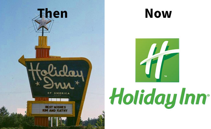
Holiday Inn
Didn't this happen a long time ago? I remember back in like 2010 I became familiar with the "now" icon.
Bmw
General Motors
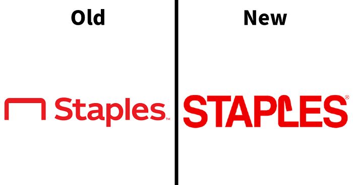
Staples
Starbucks
Mountain Dew
Wendy's
Pepsi
Best Western
Olive Garden
International House Of Pancakes
Los Angeles Rams
You can argue the new logo is clever if you already know they are the Rams, but no one is going to look at that logo cold and think "Rams". Modern or not, the first one is clearly a ram.
Wawa
Wawa is in Florida now and it is literally THE BEST convenience store/deli.
Taco Bell
Hellofresh
Yves Saint Laurent
Syfy
Syfy sounds a bit to much like Syphilis if you read it without context in my language. ^^'
Blue Point Brewing Company
Procter & Gamble
It was changed because back in the late 70's some sort of group thought the logo was Satanic because of the 13 stars causing decrease revenues. I remember this because as a kid I was so upset; thinking how stupid these people were because I love pretty much anything celestial.
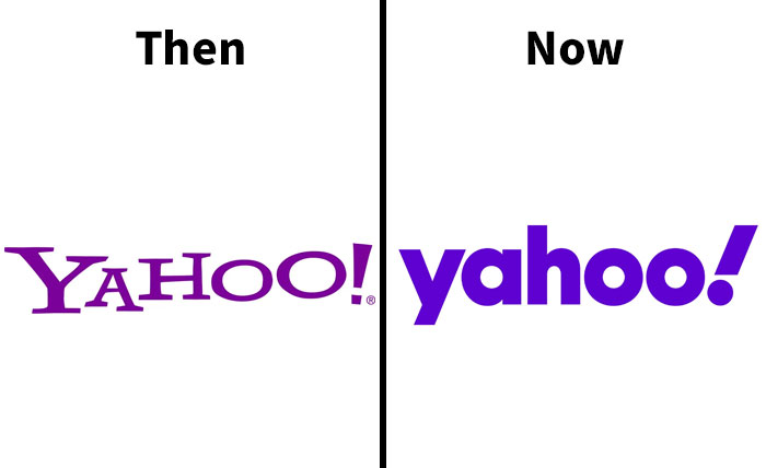
Yahoo!
tbh I don't liek the letters with lines at the edges. Just like google's old logo
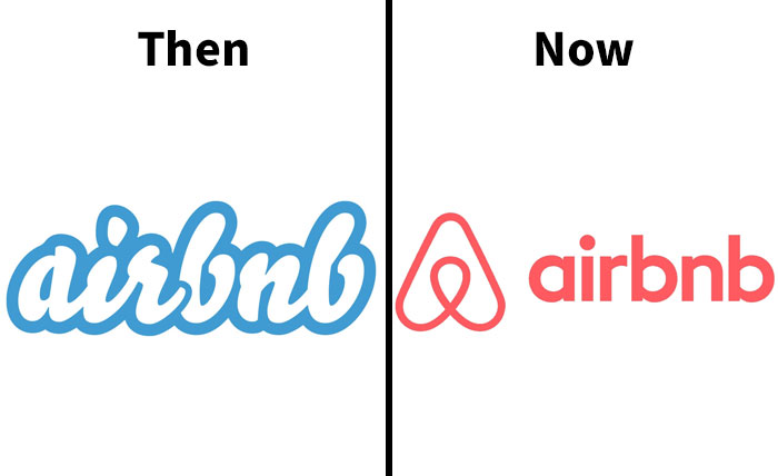
Airbnb
Citroën
The Metropolitan Museum Of Art
Burberry
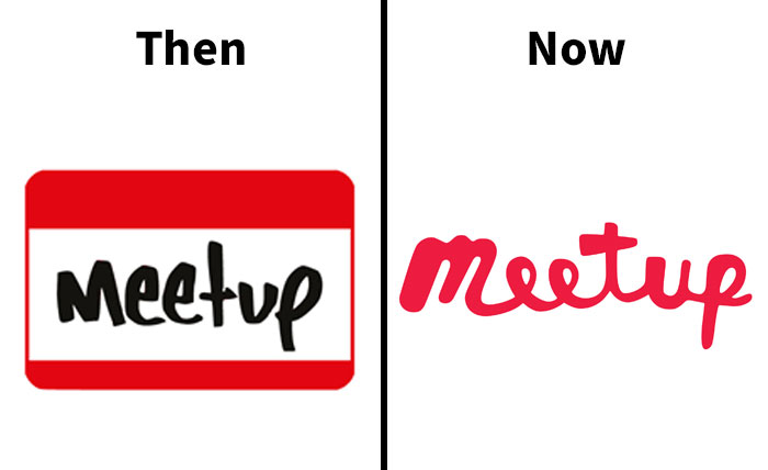
Meetup
The first one looks like a name badge with handwriting on it. The second one looks like someone had five seconds to make a logo but couldn't get any fonts to load in Photoshop so they scribbled on a napkin with a red Sharpie.
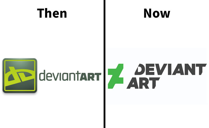
Deviantart
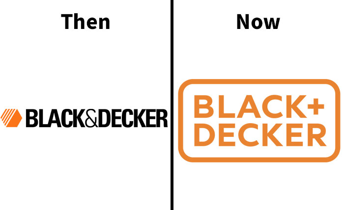
Black & Decker
Berluti
Disney Channel
Us Open
Where’s the tennis ball? You know, the whole point of the damn thing?
Northwest Airlines
Balmain
Bt Group
Balenciaga
Are all the high end fashion logo's designed by the same person?
My personal theory is that all those graphic designers went to art school in the 2000s and were taught that "the simpler the better" — which they implemented very carefully, for they hadn't notice that a new generation had arisen in the mean time, a very nostalgic one who loved nothing more than slightly outdated designs and small things that stay the way they always were.
Decisions to change and update are most likely based on brand positioning research conducted among consumers, i.e. what is the essence of our brand and how can that be communicated instantly with a tiny image? I've worked on the inside of that industry and the dive into the minds and emotions of consumers is fascinating and revealing of who we are.
Load More Replies...A lot of these are just "get rid of the classy, elegant serifed font and replace it with a homogenous sans serif font." Which, as a graphic designer, I dislike. Too many of the logos look alike now.
I thought that. The font and colours are pretty much all the same.
Load More Replies...My personal theory is that all those graphic designers went to art school in the 2000s and were taught that "the simpler the better" — which they implemented very carefully, for they hadn't notice that a new generation had arisen in the mean time, a very nostalgic one who loved nothing more than slightly outdated designs and small things that stay the way they always were.
Decisions to change and update are most likely based on brand positioning research conducted among consumers, i.e. what is the essence of our brand and how can that be communicated instantly with a tiny image? I've worked on the inside of that industry and the dive into the minds and emotions of consumers is fascinating and revealing of who we are.
Load More Replies...A lot of these are just "get rid of the classy, elegant serifed font and replace it with a homogenous sans serif font." Which, as a graphic designer, I dislike. Too many of the logos look alike now.
I thought that. The font and colours are pretty much all the same.
Load More Replies...
 Dark Mode

 No fees, cancel anytime


