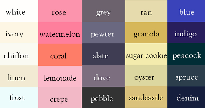
Writer Creates “Color Thesaurus” To Help You Correctly Name Any Color Imaginable
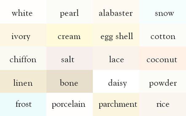
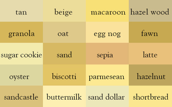
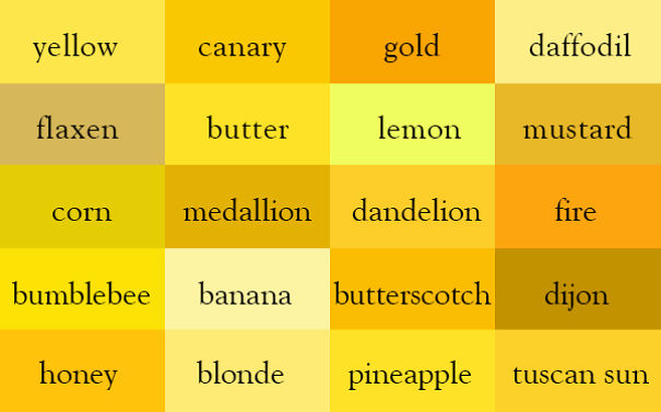
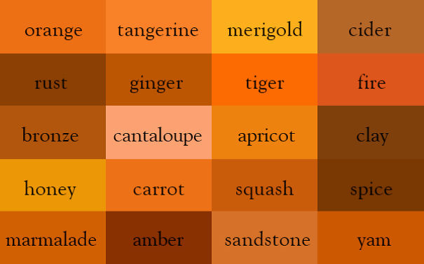
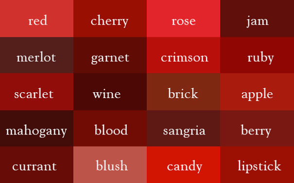
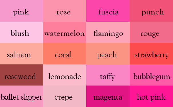
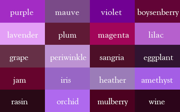
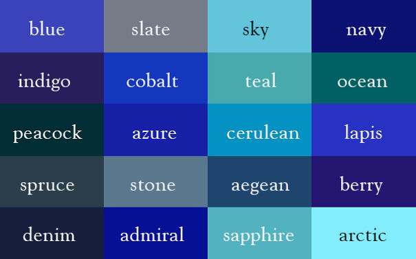
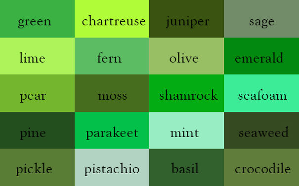
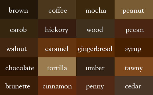
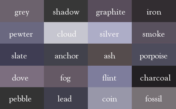
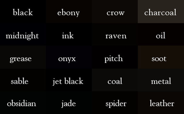
Ingrid Sundberg, a writer and children’s book illustrator, created a very useful infographic chart for anyone struggling with color names. The writer says that she loves to collect words that can help give her stories variety and depth.
“I’ve learned that we all have different associations with color words,” Sundberg told Bored Panda. “For example the color sapphire is a light blue to me (since that’s the color of the sapphire on my engagement ring), but a sapphire can also be a very dark blue. I doubt there can be an ‘official color guide,’ as color is so subjective.” Regardless of the subjectivity of color, however, Sundberg’s guide will help expand your descriptive vocabulary beyond green, red and blue.
Read on to see all of these colors’ names as well as Sundberg’s interview with Bored Panda.
More info: ingridsnotes.wordpress.com | sundbergstudio.com | Facebook (h/t: lustik)
“There was no official color guide,” Sundberg told Bored Panda. “This was something I made for myself based on color words I liked and the colors the words evoked for me.”
“I use it all the time when I write. It really helps in revision as I try to make my work fresh and vibrant. My blog readers say they’ve been using the thesaurus in their writing processes as well.”
“I’ve learned that we all have different associations with color words. For example the color sapphire is a light blue to me (since that’s the color of the sapphire on my engagement ring), but a sapphire can also be a very dark blue. I doubt there can be an “official color guide,” as color is so subjective.”
“I’m currently working on a visual hair-color thesaurus and a visual emotions/facial expressions thesaurus. They’re really fun to make.”
Love it, but see almost no difference in almost all of the 'black' ones.
I can see some variation in blacks, but yes, they are subtle. And I never heard of jade as black.
Load More Replies...I tried so hard but could not find MAROON & BURGUNDY, time to start over...
Absolutely love this. My skin is the color of salt. Sounds like the first line to a good poem.
charcoal is mentioned twice, as different shade :-) sea foam is wrong imho :-) should be more wh cedar is more pinkish reddish, for sure.
charcoal has the same shade even if it's mentioned twice~ it's just the illusions that make it look different
Load More Replies...As a blogger who has a designer in him, I like this effort.......... really good.........
This is incredible and much appreciated. My only regret is that both of my color blind sons will never be able to use it!
Hmmmm. "She brushed her long sandcastle hair and put on her lemonade dress and watermelon shoes. Then she looked into the mirror with her spruce eyes and smiled, and put on her pewter coat and frost hat." Not quite seeing it.
In different parts of the world colours of things appear different. My lemonade is much lighter, watermelon is cherry red, candy is rose red, ash is greyer and so on.... A lot more description and imagination and context is required to think of the right colour.
Jade belongs in the green/ blue section not black and leather would be more in a dark brown section. Those two are way off... But I can see that you are not an artist and this is your own guide for personal reference only and I would not put it out there for public use as the colors are not true... The names are similar to names given by several other references but that is all.
Thank you, this can increase a descriptive repertoire by volumes, a very valuable source of inspiration
I create dried flower bouquets and have been looking for this to communicate the colors that everyone can understand.
This is brilliant! The perfect color charts for various shades in each color spectrum that we can all understand and communicate. Thank you
This is so funny, people arguing over 'Black'. You should try to match-up a laundry basket full of 'black' socks...
Lemonade is a kind of rose? At least in my country (where we produce tones of lemons), lemonade is quite yellow...
Some colors have the same name but are completely differed end, such as "wine". So I don't the.ink Pantone has anything to worry about! Nice
I an Interior Designer who specializes in colorization. This is awesome and I am going to save it for sure. You did get saphire wrong though
Merigold is marigold... and crepes are never pink unless you cut your finger over the batter!
I think it's hard to identify the colour shade espectially dark tone
I really love this!!! I could see this being amazing for digital storytelling and poetry.
There are doubles here that are not the same color. One "sangria" is more brown, and one is more purple...
I can imagine a whole lot more colors. Where are the pastels shades?
If you want to make a color thesaurus you need to go through every color.
If you want to make a color thesaurus you to go through way more colors than that.
'wine' is mentioned twice with different color, once in reds, once in blues.
Idn't ebony supposed to be "blacker black than black" or "beyond black". This one here seems just...a bit brownish.
These are fun. To let you know, there is an official color guide. The Munsell color system gives every color you see a mathematical code.
Every color is broken down in 3 ways it's hue (color family) value (amount of black or white) and it's chroma (saturation).
Load More Replies...Love it, but agree with RebeccaAdkinson. Hard to see a difference between all the blacks.
The problem is: they posted jpg's. The colors would probably look better in tiff.
it may be hard to see the differences in the black ones. but if you look close enough you can see them
This is indeed a helpful reference, but blues could use more spaces. Maybe black could share.
all those colours 4 me: white / sth like skin / yellow / orange & brown / red / pink / purple blue / green / brown /grey /black I'm men.
Great color association! Someone said banana was incorrect, but actually it's perfect color for the fruit of the banana I thought.
I'd love to see a big full version of this to make it a poster.
Why is Jade in black? I've seen green and white and purple jade, but it doesn't come in black?
pointless and stupid for one thing Jade is a green colour not a black
I disagree with daffodil, amber, and mahohany. Furthermore, rose is listed twice. Perhaps a rose-red and pink-rose to distinguish them?
no turquoise? " Puice, puice where's puice?....oh that's puice"
For a Style Coach this color thesaurus is a true gem! Thank you, Ingrid Sundberg, for your great contribution.
Two Slate have been mentioned (one in blue color card and one in grey) and both are different! this thesaurus is a lie!
Real butter is almost white. It would have to be pumped full of additives to be that shade of yellow.
Load More Replies...Banana is wrong. It looks more like Vanilla. The beautiful Cornflower Blue is not shown. Stunning colour. It is still very interesting.
I think the shade for banana is referring to the fruit inside, rather than the yellow skin on the outside :)
Load More Replies...No, it looks right. Now, banana peel might be different.... ;)
Load More Replies...Amazing! it really does associate with the memory of things I have seen in that exact color! Brilliant!

 Dark Mode

 No fees, cancel anytime



































102
148