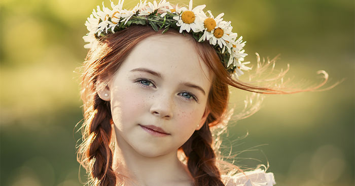
334Kviews
People Told Me My Photos Are Too Photoshopped… Here’s My Reply And The Original Images
I recently shared a photo I'm proud of on Instagram. Reactions ranged from very positive to those denying my work the title of “a photograph,” calling it “computer graphics,” or “photo-graphics.” This got me thinking. Do people really understand the concept of photography art and why are they so adamantly against photo manipulation?
I became passionate about creative photography after the birth of my twin daughters Annabella and Juliette; my little kids inspire me every day in my work. Through photography, I strive to enter the world of my two children, to grasp all the childhood whimsies, and to recreate these magical moments that we all look back on and smile. This means using whatever photographic tools will get me closest to that vision. Photo editing is just one of those tools.
Photography was invented over 180 years ago, but it's only with the relatively recent invention of digital editing software that creative photo manipulation has become the subject of popular controversy. Really though, this just shows our lack of awareness of the history of photography: image manipulation didn't start with Photoshop. In fact, it's always been an essential part of what photographers do.
As I dug a little deeper, I came to realize that art and news photographers have been manipulating their photographs since the very first days of photography. So the argument that a particular image is less of a photograph because it has been retouched didn't seem at all convincing to me. If we started ruling out retouched and photoshopped images from the category of photographs, we would be left with not a single photograph in the world.
Since the invention of photography, image manipulation has been a key part of it. The 19th-century photographers liked to call it “removing imperfections” from the shot, and they did it by painting directly onto the glass-plate negatives. Sometimes, an entire person would be “painted out”. Moreover, they would combine multiple frames in the darkroom to add dramatic elements to their stunning pictures.
Similarly, most new photographs, made over the course of the last century, will have been cropped, dodged, burned, and even painted to some degree. The photographer does this in order to better illustrate the story in the paper. Even the snaps in the family photo album vary, depending on the film, the chemicals, and the color settings used. Most photos are certainly not simply neutral, un-manipulated snatches of the real world. They are rather a real-world story told in a beautiful way.
Sure, I can see why heavy use of Photoshop might be worrying in the area of photojournalism, but I do not consider myself a documentary photographer. Far from it. In fact, I think my work is a little like making a still movie. Image manipulation has always been a part of filmmaking too, but nobody ever suggested that a movie using a blue - screen or CGI is not a movie (cinematography?). There is art in applying these techniques as well. Thus, I will use whatever photographic tools will get me closest to my photo ideas.
The word photography literally means writing or drawing with light. The process of making an entirely computer-generated image - such as a digital illustration or animation - couldn't really be described as "writing with light." This contrasts sharply with my way of working: in simple terms, I make images using a box with a hole that lets light in - so they can definitely be considered "photo-graphs". The fact that I edit these images afterward using software doesn't change this. In any case, it's not fundamentally different from what people were doing in the darkroom over a century ago.
Now that I have tried to raise awareness about the history of and about photography in general, I would like to hear your opinion. How would you define photography? Please share your thoughts on when a photograph stops being a photograph. How much manipulation is too much manipulation?
More info: Instagram
This post may include affiliate links.
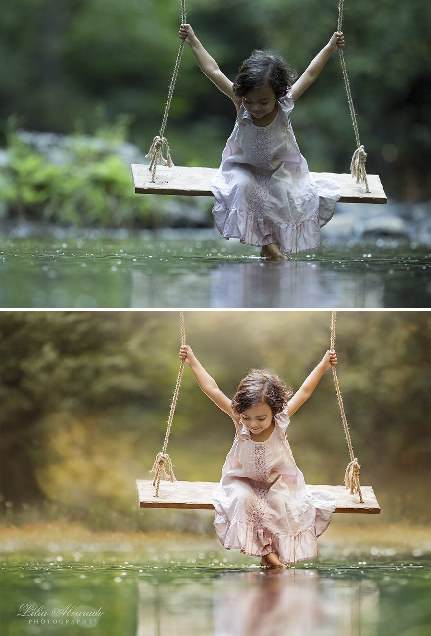
Happiness Is...
This one, for me, has the most dramatic change in mood. It goes from enjoying small moments despite adversity, to the sweet, pure innocence of childhood.
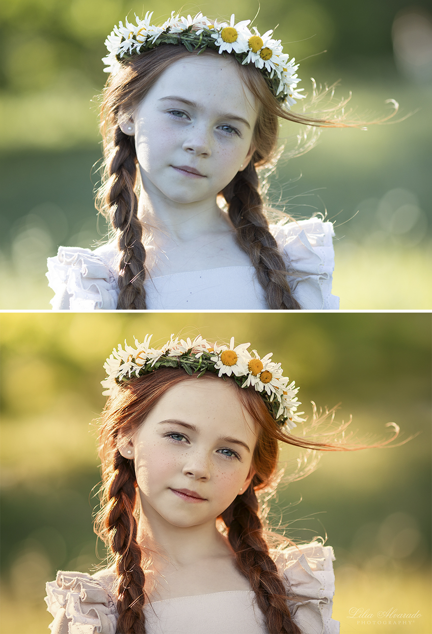
Spring Breeze
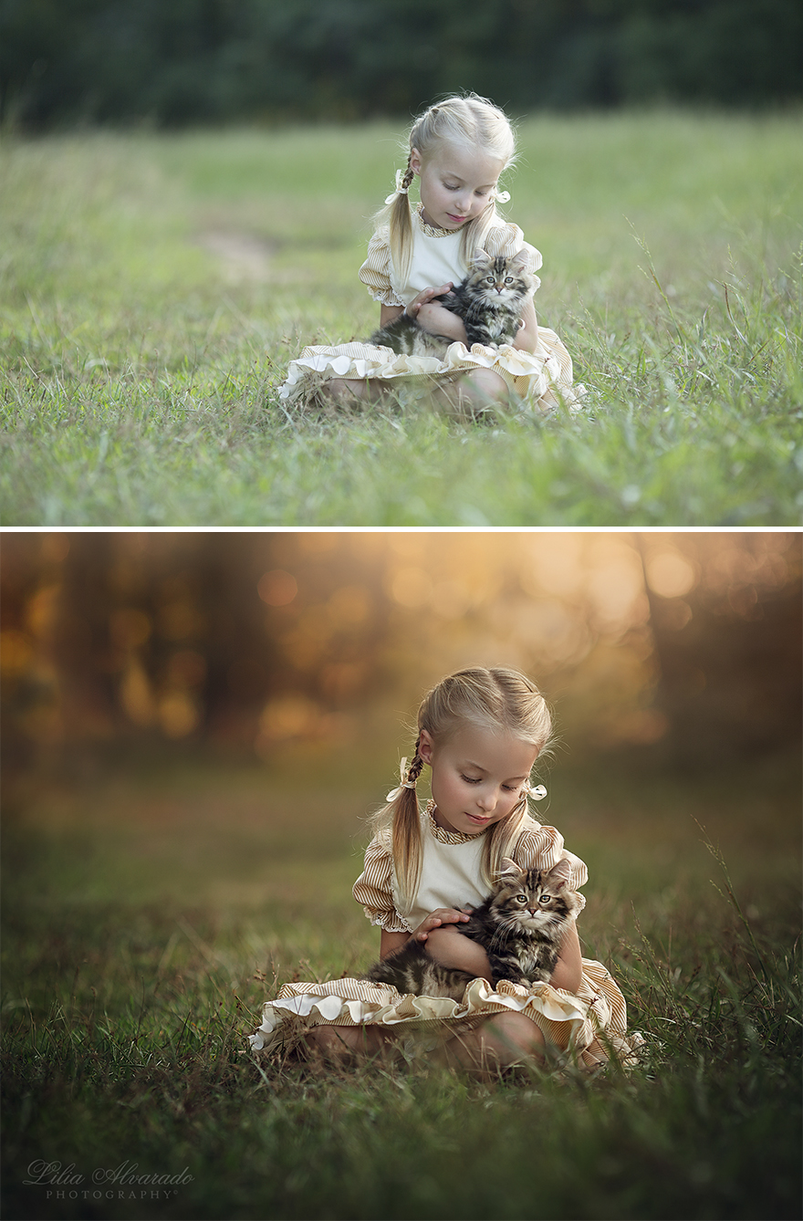
Softness
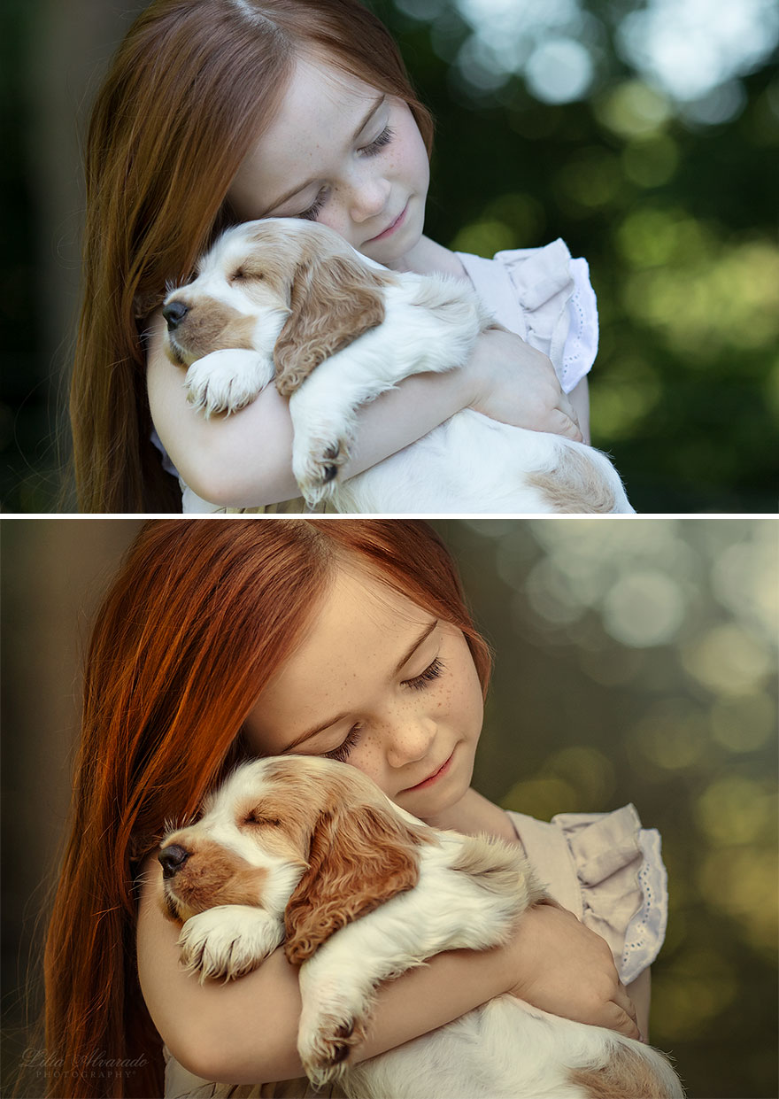
Happiness Is... A Warm Puppy
Breathe In The Ocean
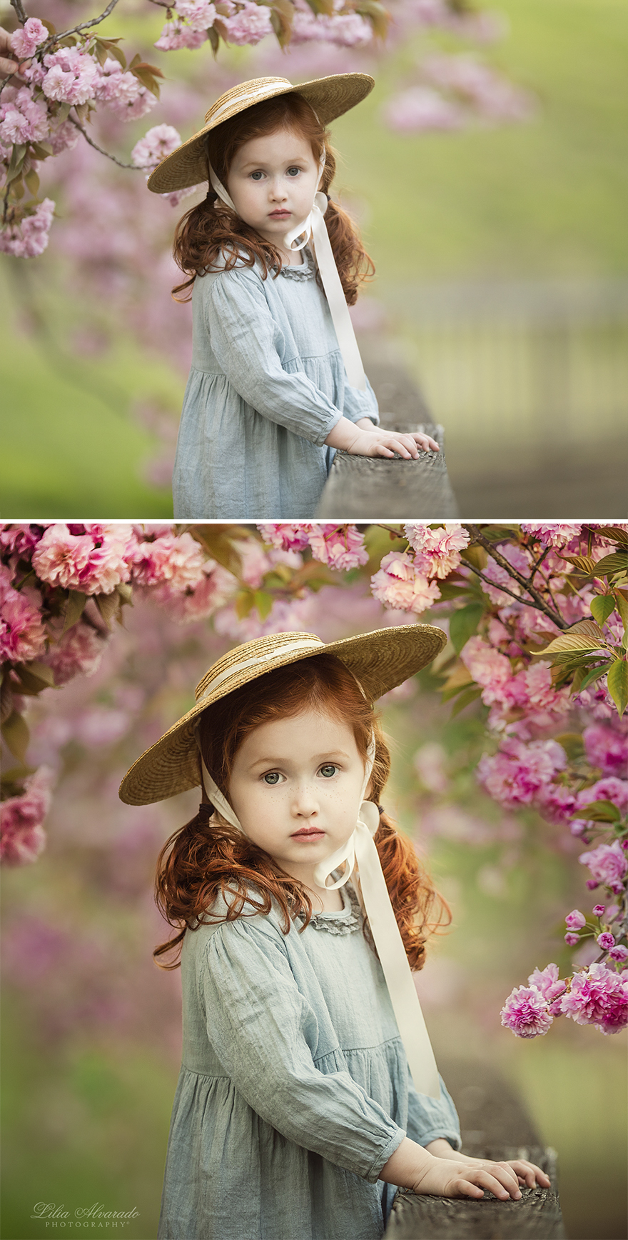
Spring Is Here
You did not just "remove imperfections from the shot"... This is a whole lot more of changing. It still is very beautiful work.
Photography is art and like all art forms it's the interpretation of the artist that matters. Everyone that views it will see it from their own perspective, which may or may not be like anyone elses or the artists. Framing the focal point of the pictures is also open to interpretation. I prefer to frame with photo manipulation instead of matting. I like the open and more natural look. I prefer to make images that evoke an emotion or tell a story instead of just capturing the moment. Painters have been doing this for thousands of years. These pictures are stunning.
And as an added side note to my previous post here...In my opinion, the object in these photos are not meant to be "natural, good ol' plain shots" ,rather, "whimsical, imaginative, creative, and bright". If you like, and PREFER, this kind of photo, these are perfect! If you like plain Jane photos, well, dont use this photographer. I think you capture creativity very well in your work! Love these!
If my parents were enhancing my eye and hair colour in my childhood pics Im not sure how I would feel. If you not happy about yourself and enhance your pics its one thing - doing it to your children is another..
I'd agree if these were photos taken just for memories of the children or a particular day but these are photo shoots and meant as art. The photographer isn't changing anything dramatic about the children - no new noses or anything.
Load More Replies...All of these pictures are absolutely beautiful, but I think this one is my favorite. Very pretty with the flowers added. Very nice work!
I love the added touch of flowers around the right side. Looking at the "touched up" version, I feel as if she is standing in an enchanted garden and surrounded by beauty. I love the effect you give off in ALL your photos, they literally feel magical. Some prefer more natural photos as far as light and filters but others want their photos "fixed up" and perfect. I prefer the latter and LOVE your work😍👍 keep the awesome photos coming, please!
What is the goal here? To make a commercial poster? A postcard? The original is very beutyful as it is. Just a little cropping at the right and that’s fine.
What's up with the flower movements, though? No offense though, I love the photo and the girl <3
All, thanks for your question! Flowers in the original image have a "poor look", it was a good reason for me to replace them.
Load More Replies...Prefer the original. This one touched up gives the impression that the photographer things that even little girls' slightly darker tones under their eyes need covering up / photoshopping. They certainly do not, she would have been lovely as is.
The originap is already beautiful, no need to edit this actually
You brought her closer to the foreground and enhanced the color. No matter what, it is beautiful!
This is a beautiful example that shows the difference between good photography and art. While both are very good, an true artist transforms the ordinary into extraordinary.
Everyone's views and opinions are different. I'm a photographer. The technique you use in your photographs adds a fascinating effect to your photographs. Although the originals are beautiful for me, I was amazed at how all the photos are transformed by your perspective.
Ok, here is one that I will say needs a tiny bit of work. Depth of field issue with the flowers on the right side of the picture. Adding them not an issue. But you have a very narrow depth of field and the look of the flowers that were added look wrong. They're too in focus and seem out of place. I like the picture but I think that maybe you could have adjusted the focus of the pic a little bit.
I prefer the original shot, Lilia! I don't know why, really! I guess that's why you are showing both, I suspect.
To me, the original looks better, more ethereal. Just needed cropping.
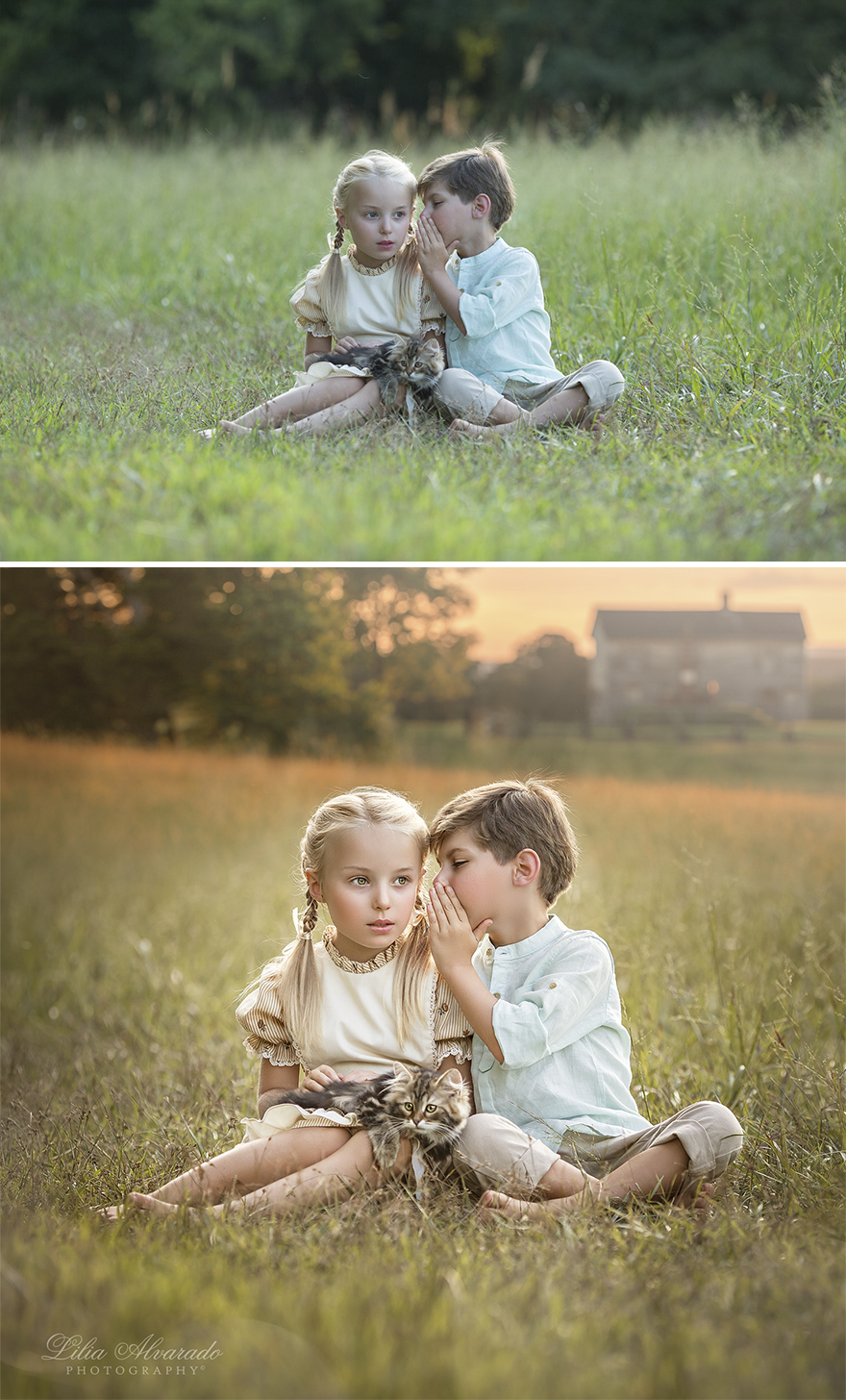
Can You Keep A Secret?
Lilia, these are all beautiful photographs! The different tonal qualities you show make each one so different! They are amazing! Most people don’t understand the definition of the word photograph or photographer. A picture does not a photographer make! But you, are a true photographer! Thank you, for these amazing sweet pictures!
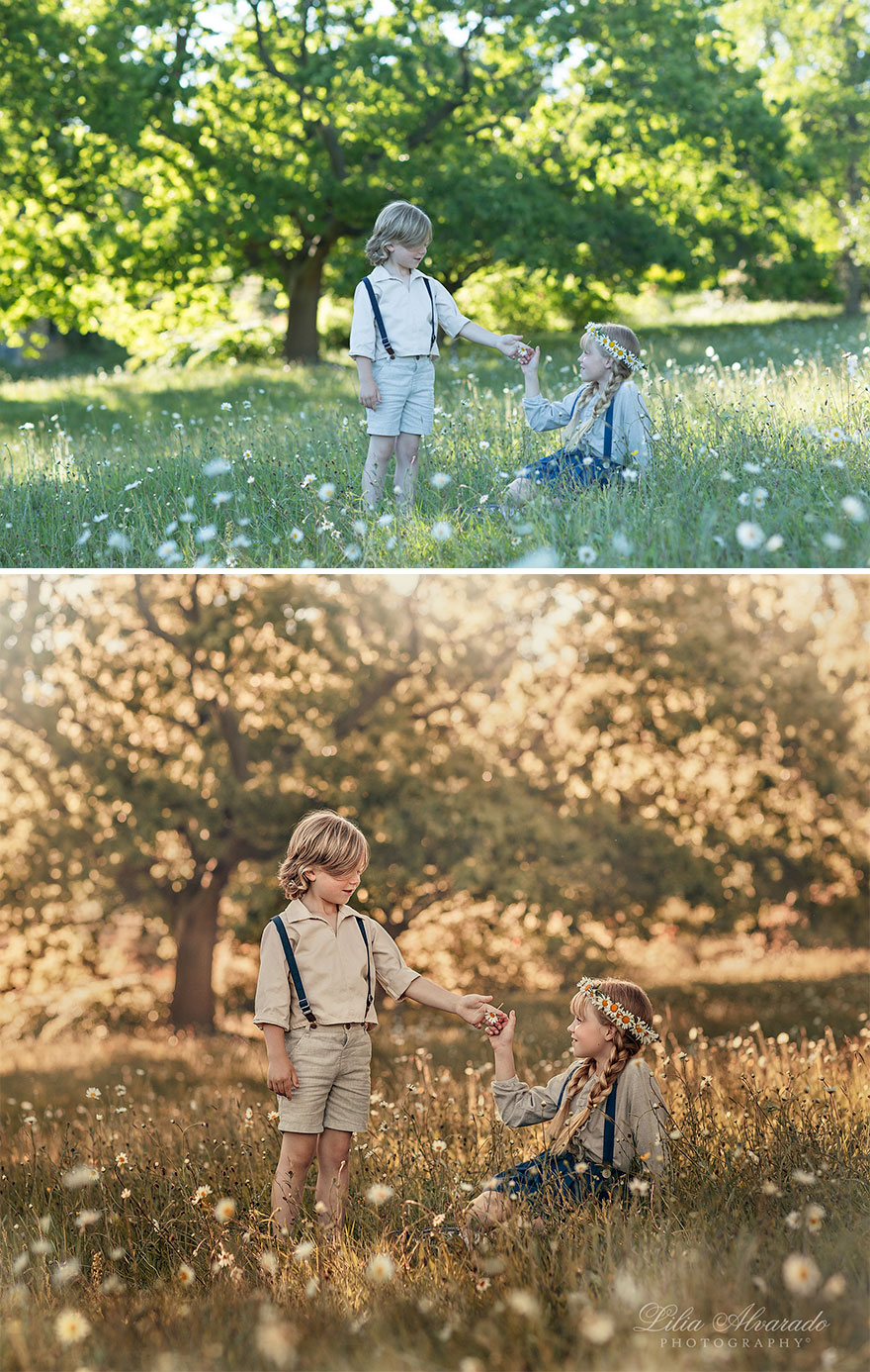
Boy And A Girl
What Does The Tide Bring
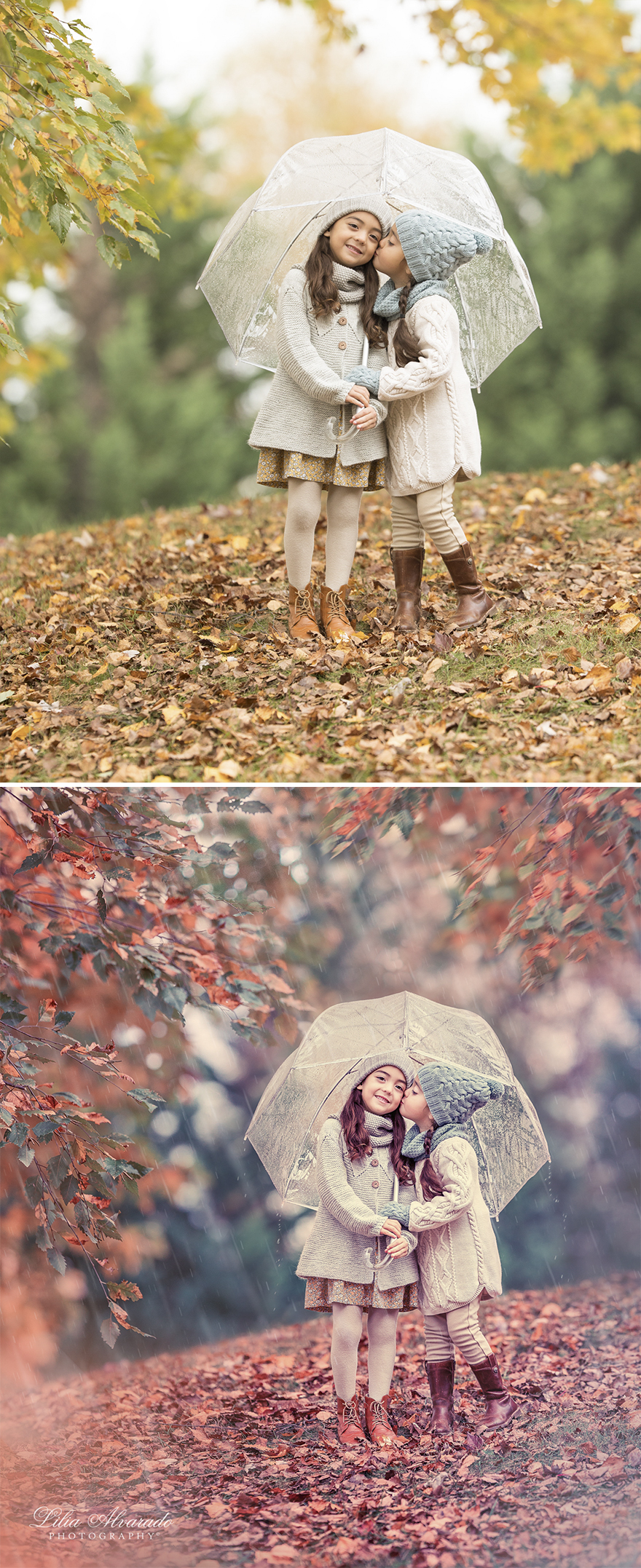
Sister's Kiss
I actually much prefer the unaltered photo on this entry. There's authentic, cheerful fall crispness about it that quite draws me in. I think this is lost in all the red tones applied in the altered photo and the rain effect comes off as very false. For some reason it reminds me of those rather tacky Sears Family Photo pics circa 1970's & '80's where the subject was placed in a champagne glass or something with a loved one in profile looming them. Again, just my opinion and the original photo is lovely in its own right.
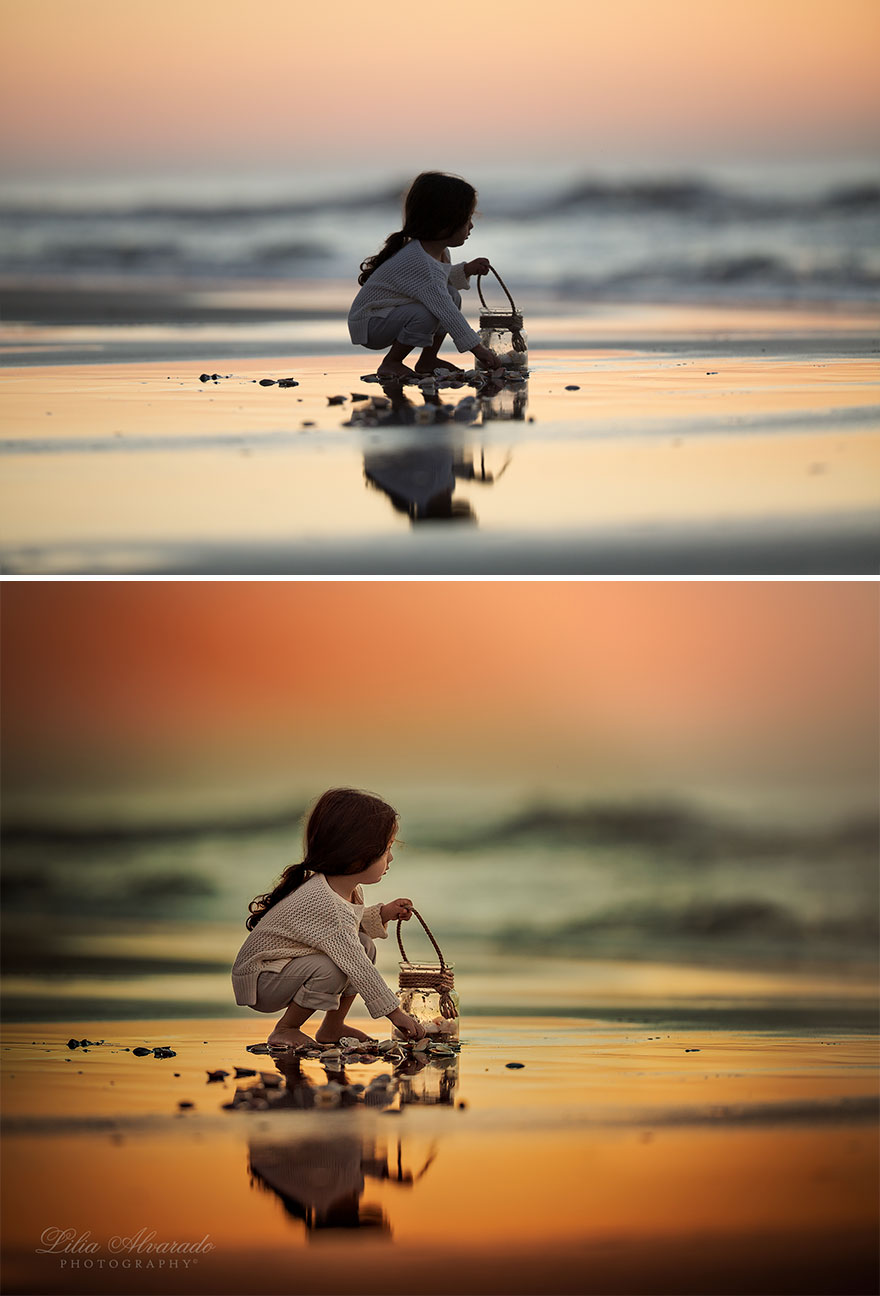
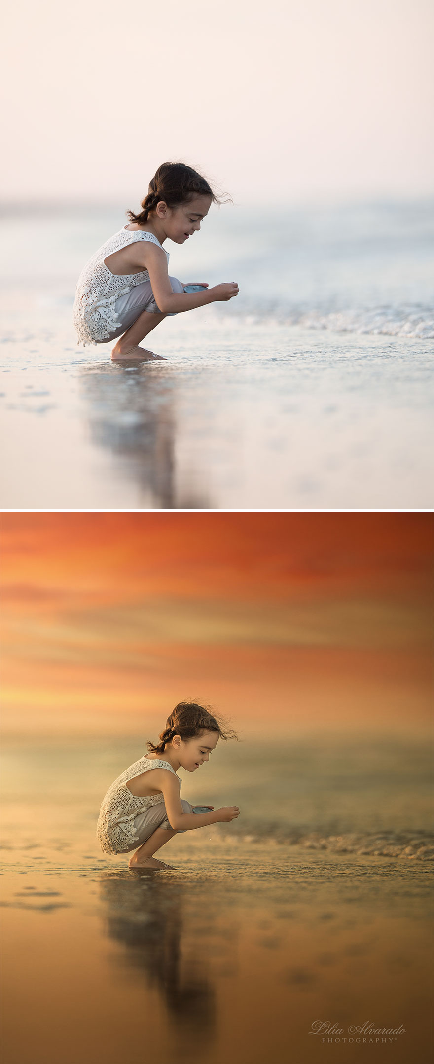
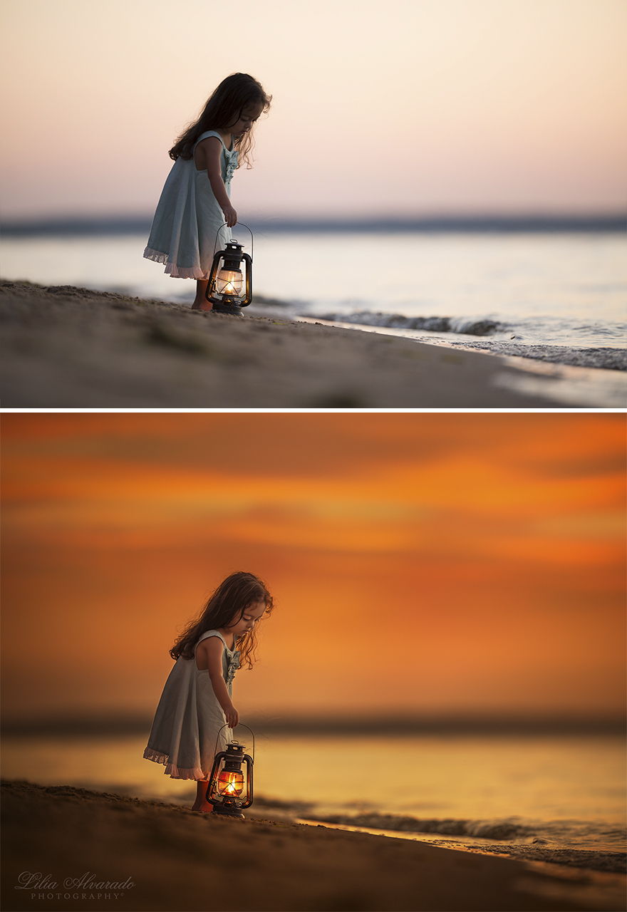
Dawning
I actually prefer the original photo here. It's much more ethereal and pleasant to my eye than the second one, which changes to an almost hellish, bizarre feel. I mean no offense, it's just my opinion. From all the shots, this one with the girl on the beach is the one that I think it's been worked a bit too much. Very beautiful photos, though.
Unfortunately we can't always take a picture of what the reason was that brought us to the location. We can't always recreate the beauty when it is time to take the photo. By editing it, we can let the picture reflect the true beauty the artist sees.
I'll give my take on photo manipulation, and the 3 levels of it: The first level is what I would consider a normal part of real photography. This is just upping the exposure or reducing the contrast on an entire image, or cropping or zooming; stuff one can do in the Photos app on OSX without any real photo manipulation software. The second level is Lilia's work here: adding hues, tones, effects, etc. Even adding or removing bits of the images counts as second level. And this is the most controversial because it makes beautiful art, but a lot of people pretend they didn't manipulate their photos, and that these are the originals. That's why there was backlash to your photos: people thought you were claiming they were unedited. the third level is like Eric Johansson's art: using Photoshop to combine several, dozens, or even hundreds of photos and images into one piece of art. In conclusion, image manipulation software is a great tool to improve photos, but it needs to come with honesty.
Very interesting, Django! Thanks for sharing! What do you think about this: https://gajitz.com/fake-history-6-photo-manipulations-way-before-photoshop/
Load More Replies...I believe everyone deserves the right to express their vision and creativity. Just because someone doesn’t agree with your work doesn’t mean it’s wrong. Jealousy is often expressed through negativity which is sad. It would be pretty boring if everyone would do things the same. I know for a fact that you inspire a lot of people, creatively and professionally. You are enhancing your subjects by letting them shine, giving them the full attention in the photography without distractions. All the edits are gorgeous and you can be very proud of yourself!
Love these before and afters, your editing is sublime, the completed portraits are simply amazing, love each and every one!
Thank you so much, dear Clare! <3
Load More Replies...I completely disagree with the negative consensus put across in a lot of the comments here. The second I saw this photo next to the original it swept me back to my childhood. All that she has done to this photo is give us as adults, the outlook we had on the world as innocent, carefree children. Don't you remember the world looking like the second photo when you were a child? Every flower was bursting with colour and beautiful smells, the waters of the lakes we explored with our friends and families sparkled with an irredeccent magical light. Every strand of grass and each one of the leaves was as fluorescent as we drew them in our artworks! These photos don't scream fake or overly edited to me. Instead they lift me up to a level of joy and beautiful innocence that was my entire childhood, before the wonder, and the colour, and the joy faded into the muted reality we see today.
I think they are beautiful photos. Some had too much editing for my taste, but it's just my personal preference.
Thanks a lot! We all have different preferences! :)
Load More Replies...This debate will never end. There are those that feel like they are some how better than you because the do not edit their images. Oh wait, except everyone of them will tweak the color temp, the contrast, the white and black points since RAW images are so flat looking out of the camera. So then they draw lines of what is acceptable editing and what ventures into the world of art. Oh wait - aren't photographers artists?? We just paint with a different media than others types of artists. So at the end of the day - you do what creates your vision and what satisfies you and stop listening to the critics who think your work is somehow not "pure" enough to be considered photography.
I think a photograph "stops being a photograph" when the picture looks unreal-- like making the moon look five times larger than normal, for example. Let me be clear that such an image would still be art, but a photograph, edited or not, reflects the real world. I don't think making things pop or editing out a fence with extra flowers makes it not a photograph. I do agree with some of the comments that the reds are a bit much, but that's a matter of preference and style. I would say "it's too much for me," but I wouldn't go so far as to say it's not a photograph anymore.
Your an accomplished digital artist. Love the images but calling them'Natural Light' is a bit of a stretch.
Thanks a lot! I did not use flash or a strobe while capturing this set of images.
Load More Replies...One thing I can understand complaints about, is that they're children, they don't really need beautification. But the skin changes in these photos are subtle enough that I have no problem. Could be bias. My dad is a professional photographer, and never removes anything like acne or skin spots on Photographs of me despite carefully touching them up in Photoshop. IMO, Photoshop is important for touching up photos as long as they don't do something drastic like how some Cosplayers and "ulzzang" (selfies for face beauty) Photoshop their face to look unrealistic like thinning/sharpening their nose, enlarging eyes, thinning jaw, unnaturally-whitened skintone, etc... Then try to pass it off as their "real self". Or how magazines for celebrities or fashion can Photoshop their bodies to be much thinner than they really are without the natural skin folds from being in certain poses. At that point it becomes more digital art than photograph.
I can understand that about children especially, or anyone trying to pretend it's really them. Though there's a place for great and creative digital art too, and I do think cosplay is one (They aren't trying to trick you into thinking they're really the spitting image of a anime warrior babe in real life lol, it's fun and art). In these though I didn't see her doing body editing or that sort of thing, mostly changing the mood and feel of the overall photo with lighting and some background manipulation, which I think is a good use of editing for this style of photography.
Load More Replies...Your photos are not to my taste...but why is that a problem? That's just a matter of personal taste. /// These are YOUR photos of YOUR kids, and if someone sneers, tell them to get lost. Don't be defensive about it, just tell them you're not interested in hearing it. /// One thing I've learned over years of being an artist is that people are going to get snotty, no matter what you say or do. I have a stock answer for them that shuts them down instantly and makes them look like idiots, "I'm sorry you feel that way". /// Then walk away. End the conversation. Don't bother with their nonsense, and have fun taking pictures. You don't owe these people anything.
Aunt Messy- Your response made me smile. My response to impertinent idiots for years has always been "I'm sorry you feel that way." and to leave them to wallow in their idiocy. My response to nosy idiots is always "Why do you ask?" and then look them directly in the eye and wait for an answer as the uncomfortable silence stretches out.
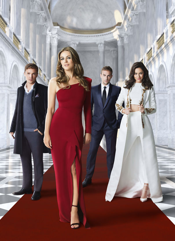
Load More Replies...I'm not a photographer by any stretch, but that's what I think: far too many things these days are artificial. Both men and women use ridiculous amounts of make up and body and hair products and the photos get further edited to the point where they look more like wax figures than real people. I suppose you can call it a form of "false advertising." For example look at these two photos of an older woman- especially notice her hands- in the second one you can barely see her knuckles. Elizabeth-...407192.jpg 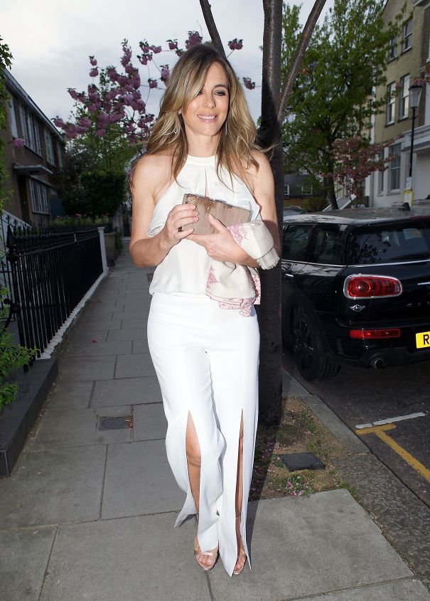 Elizabeth-...407192.jpg
  To me personally editing is fine as far as making the photo brighter/ darker and adding some saturation for richer colours. More than that and I think the author needs to just say he edited the photo as a kind of warning that it isn't an accurate representation of reality. Putting the original and the edit side to side is also a good idea and I like the way you have done it.
"Older woman" - that's Elizabeth Hurley! Also maybe she's not the best example because (hands aside perhaps?!) she's age-defyingly stunning ;)
Load More Replies...they are great before and after. my only problem is that you can take a truly great photograph just by knowing your way around the camera. People who take those great photos need to be recognized for their skill with the camera while people who rely on editing have a different set of skills and should be recognized for that. two different skill sets, two different art forms among many,many other forms of art.
This is an interesting topic. I used to experiment with photomanipulation as the media itelf, years ago. My goal was not to make the photos look pretty, it was to make them look weird on purpose, or collage, or to make them look like paintings/drawings. Through various filters, selection, objects, masks etc. That's digital art, not when you enhance the colours to make the photos closer to your vision. Afterall... The eye of the camera is different from our eyes. While on the topic of retouching pictures, I draw a lot using coloured pencils. After scanning, they usually look pretty rough, so I tend to do a littoe retouch to make them look more clean. What do people say about that? That my drawing skills aren't true? Tsk tsk Thank you for this article, I've been tired of all the hatred towards a tool.
As a seasoned photographer, it is about capturing the mood and feel, which requires enhancement. What I say to every single client is - "I want to capture the way the world sees you, not how you see yourself." Because perceptions are quite different between the subject's view of him or herself, and how they are actually seen by everyone else.
i love our photos. don't let anyone tell you this isn't photography. this absolutely is. if anyone tries to tell you it's not again, just dab on them haters
Awe thank you so much for your uplifting comment! <3
Load More Replies...If you want a 70's effect, use Instax (old Polaroid): shoot and print as it is. Yours is manipulation, but these pictures are better than the original with colours well balanced. So, why not?
Polaroid and other instant cameras (Instax) are around and the photos are really fun. It's more fun than mucking around on the computer, but the film is expensive - about a buck a shot.
Load More Replies...I like the original ones better. Most of the time actually still, the photoshopped ones are skilled an good looking aswell
Hello Lilia, your composition and balancing of the subject matter in every shot is well executed! You are also very skilled at create seamless composites, however, and this is just my opinion, it seems that your strong suit is creating less dramatic environmental portraits, like the first entries. I feel like the last shots are a bit heavy handed and could benefit from trying a different approach. Think of changing tactics when retouching like changing vantage points while shooting, every shot is vastly different. Give it a shot, you may be surprised by what you find. All in all, great work!
My response is a short and hopefully helpful one. The only thing I notice in these pictures is the theme of adding a red like hue to the pictures. That said everything thing else is gorgeous and I loved the end results. I would simply say it's your style. It is you work and I think most people would have a style. I find your style very pleasing. Thanks for sharing your works and your thoughts with us.
These are beautiful Lilia! I wish I had the skills to edit this way, often times a photo just doesn't have the depth of what you see when you take the picture. You are able to really enhance the crispness of the subject with a background of gorgeous colors.
I think you have real talent. The original photos are beautiful, and you really know how to enhance them. Absolutely gorgeous in my opinion. Keep up the good work!
There is a sickness in the creative community, I call it creative elitism. New grads usually graphic designers or journalism school kids getting into marketing feel entitled to creative work and shun anyone with a different background. These people are toxic AF, run from them.
You might be better off to consider why this "controversy" is an issue for you. If it is the end result that matters, why the before and afters? Why does it matter why some people don't like your work or don't consider them to be photographs? Are you doing photography? Yes, but some are clearly composite images. Someone once defined a photograph as a capture of a particular viewpoint at a particular moment in time. If you follow this definition (as I do) then composite images are not photographs as the viewpoint of a composite image does not exist. Personally, and FWIW, I don't consider photography to be Art, but I think your work looks gorgeous. Isn't that all that really matters?
Thank you for sharing your opinion and feedback! John, it is not an issue for me :) What do you think about this: https://gajitz.com/fake-history-6-photo-manipulations-way-before-photoshop/
Load More Replies...This looks more like lightroom rather than photoshop. However - absolutely brilliant pictures.... even without the rework!!!!! Well done! (from someone who studied photography)
I do post-processing on my images. When asked if I Photoshop them, I say, "Yes! the human eye sees things so differently than the camera can capture. I manipulate the image so it looks like what I saw, rather than what the camera recorded."
I wish I could take photos like these originals, but I wouldn't edit them to replace beautiful natural lighting with colors that looks like they are from an alien moon in Doctor Who, or swap out the backgrounds so the people in the photo can't recognize the place if they go back later.
I'm a photographer. I remember the days of no "Live-view". We dealt with manual lenses too, but nowadays its a WHOLE NEW WORLD. Very good work. I have heard of people swearing against any photo-manipulation at all. These are truly beginners for ALL OF US manipulate our stuff now! Thank God for the photo-finishing revolution!
Photography is a visual art - this is like arguing that Da Vinci is 'real' art and Monet isn't.
Beautiful photos. I wish I could learn Ps like this for my photos.
I honestly dont see a lot of photoshop. I see a a lot of relighting where if you didnt the pictures wouldnt be a bright. I love them! very pretty.
Lilia, professional photographer myself I can tell that I like a lot most of your photos (I just find the face of the girl on the #7 is too much “plastic” for my personal taste). What many people don’t understand is that Photography is an Art, and so as any artist a photographer has a different vision and interpretation of the reality. Any good artist uses the instruments he has at his disposal, and in the today digital photography Photoshop, Lightroom and similar are the instruments that a photographer can use (I don’t say “must” because this should be a personal choice, depending on your needs to get the result you want). Don’t worry too much about what people say, sometime you will be confronted to people able to do a constructive analysis and critic of your work, but most of the time the negative critics are no more than jealousy…
Your photoshopped images are amazing. I find a good majority of those that belittle photoshopped images are the ones that cannot do it. Keep up the good work. I wish I could finish images like that. Alan
Gorgeous photos! Perfect moments! Clearly any criticism is pure envy!
Both pictures for each of your examples art Amazing and I'd be more inclined to see every one as beautiful photographic art. If someone doesn't appreciate your talent, they should look at something else and keep their opinions to themselves. ...just my opinion...
Honestly as a fellow photographer I have to go against the general opinion and say that the originals are not good at all. The end result is absolutely amazing and you should be proud of yourself for being a really talented digital manipulator. That requires a lot of skill and vision.
In my opinion there should not be any limit in manipulation, as long as It allow you to express your feelings about the shooting,the use of whatever existing tool Is fair enough 😀
I think the camera is just a tool. You can use it in a lot of ways. A photographer takes photos. And to me, when you present something as a "photo" it should be as true to the original as possible. A "picture", "digital art" etc. doesn't have to be. Extensiva digital manipulation, however pretty the result, can not truthfully be called a "photo".
What do I think? I think you're an artist and the stories you write with your photography are beautiful and indeed, well written. Don't listen to the negative. Keep making beautiful photos.
After looking at the before and afters , either way they are truly beautiful photographs!!!
Lilia, I think all of your photos are beautiful!! You have a wonderful eye for your subjects and colour. Don't let the bastards wear you down!! I'm jealous, I would love to be able to do what you do, and they are probably jealous, too!! You are wonderful!!!
There is a differnece bwteen photojournalism and art /editorial photography. Photojournalism is required to be minimally edited to engender trust and integrity. Her art is her representation of the image she wants. I do not agrtee with making people skinny or more curvy or changing eye colors etc., but ther eis not propblem with correcting skin tones and fixing blemishes, fixing wrinkles/folds/bulged in clothing and altering the tonal contrasts to create a more pleasing image. Her work is almost all shot with no light manipulation (strobes or reflectors), so she must contend with green color casts from the trees and grass, extreme levels of contrast between light and dark that digital cameras struggle with (compared to film). and with bad skin tones (red faces, etc.). At the end of the day the only people shees to please is her client, her future clients and herself. The rest can moan and groan because they either do not have the vision, the editing skills or the photographic talent.
Often when you take a picture, the light and colours are not the same in the picture as what your eyes see. They can be washed-out I like the ones where background and the kid’s clothes and hair were fixed so they are closer to what they would look like in real life, the first four I liked, and the fifth one and the last ones liked too (not so much the background, but lightening the girl so she’s easier to see and not in shadows.) The other ones, I didn’t really like what was done to them, I would have personally preferred to see similar effects to the first five, making them closer to what they would have looked like to the naked eye.
That's what editing is all about.. it's making true and real things look like fairy tales. I can't paint or draw, but I can take photos and then edit them to look ethereal and beautiful. The way I see them in my soul, rather than with my eyes. I'm not talented in anyway shape or form compared to this person here, but I know what she's after. These are stunning photos, both before and after. And rather a good way to advertise your business too.
Thank you for posting these before and after photos. I have admired your work for years.
As long as you are telling people the truth, so what. If you are saying you took these pictures as they are shown, you are lying. If you say you only adjusted the saturation, lighting, crop, etc... you are lying. But if you are just saying I used photoshop to take pictures and make them more interesting and art-like, then I see no harm.
I think you hit the nail on the head - it’s all about how she is putting them out there. I understand her argument how photos have been manipulated in the past, but it’s all about presentation. If you present the work as being altered, then there’s nothing to hide. And the person that criticized her on Instagram may have done so because they were expressing their personal opinion. For me, these photos are too altered - I would prefer just enhancing the colors and that’s it - not adding to the background, etc. but that’s my aesthetic and it’s different. That’s what makes the world go round.
Load More Replies...In the past when Photoshop didn't exist yet people edited there photo's in a DOKA or Darkroom or whatever you may call it! :) But, people already edited the photo's a lot, maybe not as big as the photo manipulation we see nowadays but they did it! I don't think people who are not really into photography understand that, they could change colors in there, or add some part of another photo. To me (a photographer as well) this is just 'necessary' basic manipulation of a photo and nowhere near what I see as a Computer Graphic, since you didn't make the photo's with a computer, you just made them look beter. Since the definition of Computer Graphic is 'pictures and films created using computers' I can see where people get confused. Nonetheless, I'm rambling and your pictures are gorgeous! :)
It is eye and talent, and using different skills in and out of camera. to gain the after photo the initial shot cant be a complete s**t storm of bad lighting, composition etc. Im always really impressed by great editing. Like anything we want people to see our great finished product. I dont do graphic design and just give them my rough sketch, I use l more tools less or more as needed to get a great final product.
These are beautiful. I wish you could take pictures of my kids. Not going to be in Kansas doin are you?
Many thanks for your feedback, Sarah! We are there for all of our clients - no matter your whereabouts. Please get in touch with me and I can provide details. LiliaAlvaradoPhotography@gmail.com
Load More Replies...as a photographer myself and artist I have to say that these are stunning! And I studied under a great master who told me all photographs are tweeted including the old school bw in the dark room. Also to be able to make stunning pics even with editing u need to have a great photo to start with. I believe this.
Полностью согласна с этой статьей. Мне очень нравятся ее фотографии, которые можно смотреть долго и внимательно, рассматривая каждую деталь… Все ее идеи, взяты из нашей жизни - и я вновь через ее фотографии возвращаюсь в свое детство и благодарна ей за эти волшебные и красочные воспоминания. Да фотография - это творчество, видение, самовыражение каждого кто этим увлечен! У нее есть свой узнаваемый почерк, а это о многом говорит. А как работать и чем работать - это право любого творческого человека! Всегда жду с интересом ее новых работ!
The photos are of course lovely, but.......I think I would love to see your work with little ones in more normal situations, not these glamour shots. Because your work is beautiful, I bet your everyday pictures of kids not in Edwardian garb is awesome too. Me, I don't want glamour shots of my kids, I want to remember all their goofy little eyes shut smiles and missing teeth and the firemens hat my two year old wore for 6 solid months. But I want to see all that by someone who can edit the lighting and make it more eye catching, but just a little? I have no talent or skill in photography but I would love to see what talent like yours can do without Edwardian lanterns and garb?
If you don't have anything kind to say, don't say it all. These photos are lovely, both the originals and the altered ones. Great work!
She asked for people's opinion, so she should hear it, right? Good or bad, it doesn't matter. Stop being such a snowflake.
Load More Replies...I used to think, the world must be really ugly because we are in need to recreate pictures; then again I am thinking, it is the way our imagination works, so in this kind of pictures there is no need to be pure, but I hate when they want to manipulate us with those little tricks, because we are so easily to lead, and somehow it is good that we are questioning this
While I partially agree with the article, I can understand the other side of the argument as well, Photoshop has created a lot of lazy photographers because it is easier to make changes in post-processing than it is to use the camera to get the photo you want. Sure, the photos look pretty but rather than capture the moment and feeling, a lot of photographers manufacture the moment and feeling. I say this as someone who uses Photoshop a lot. I've done magazine covers, book covers, and other projects. My opinion...and I repeat, opinion, is less art and more craft. The artistic skills needed are minimal as the software does most of the work.
Thank you for sharing your opinion! I wish my version of Photoshop did most of the work :)
Load More Replies...You are so kind, thank you so much, Brittney! <3
Load More Replies...I can understand fixing lighting or tone, but most of these were better before alterations. Don't fix it if it ain't broke.
I'll probably get down voted, but for most of these, I liked the original better. The "fixed" ones look fake to me.
These are beautiful but for the beach ones the natural feel is much nicer; the orange tones are simply too much for the originally soft and gentle vibe. The colour also doesn’t quite bring out the whole idea of the beach - water.
I don’t mean any offence towards your photos and style by the way, it’s just my personal preference. Your photos are beautiful and creative.
Load More Replies...yes, you use too much PS. And I am an amateur photographer too. Those pics share almost nothing with the originals.
I wonder if a lot if the people who commented on each of the images actually read your explanation in the begining. For one, it is very long and detailed. What I gather for it is you aim at a kid's perspective and with that in mind you have achieved your goal (if we judge by the comments). The one reoccurring critique I seem to see in the comments is also one of my problems with your processing - and it is that you seem to try and run from "natural" colours and oversimplify them. Your final results do look a lot like a children's paintings (a very talented paintings mind you) but with the basic colours and sharp focus. It is fine in your case, cause you clearly aim at that effect, but you should realize that different people look for different content. And as much as there are people who love Van Gogh (Who aims at your specific technique) there are also people who prefer Monet with a search for more "natural" colours.
Some photos may require editing, depending on the theme. Honestly, I like the original than the photoshopped images, there's something captivating in those unaltered photos.
What you're doing is photo manipulation. You are extraordinary at it, but you are definitely manipulating it beyond the point of just calling it photography. My two cents.
I think people have an issue with over editing on photos because photography should be capturing a moment in time not artificially creating one, which may come across from the over saturation of colours. Some of the editing you have completed on your photos greatly improves them such as how you changed the lighting to brighten up the face and show off the emotions of the girl in the first image. I think you may over edit however when you add previously absent features to the scenery of the picture such as in #10. I think the original picture is much more effective without the added leaves and red-orange tinge added to the image. Although pretty, it seems to be lacking the simplistic and more realistic charm to the first image. Although, this is just my opinion. Regardless of how you choose to edit these photos they are beautifully constructed and effectively reflect a sense of childhood bliss and wonder
I'm sorry. But, I'm not the type of person to give false virtue for virtue's sake. I'm blunt and to the point. In all of these, the top one is a beautiful photograph all by itself. They're natural, they're real. And that is what photographs should be. The bottom images, while beautiful as well, are no longer photographs. They're digitally manipulated images more akin to a painting. Honesty is the best policy. And, if someone is going to post images and claim they're simply "photographs" without acknowledging that they've been heavily edited., that is dishonesty. Period.
And, the most important thing, which I forgot to mention above, If you are going to be an artist, you need to to learn to take criticism.
Load More Replies...The children's faces are perhaps a little too smoothed out. They look as though they had a ton of make up on. Apart from that, they are lovely pictures.
The first few are simple color corrections. There's no room for relevant criticism any more than criticizing a photo lab for corrections to it's prints. As the gallery descends, the simple corrections begin to morph into surprisingly maudlin compositing. The photographs themselves are sensitive, seen nicely, and self-sufficient, I don't get the need to turn them into Thomas Kinkaid kitsch.
I prefer the originals, that is what life really looks like, not the over blown fake color s**t..it is like fake news and is at the point where you can not trust anything you read or see anymore
Look, if you are claiming these are "real", then that is a problem. If you are just trying to make art, have at it.
You may be experiencing what I call creative elitism. Usually new grads with graphic design or journalism degrees get this entitled attitude about creative work. They dismiss anyone with different backgrounds and are toxic AF, run from them.
well i know, that editing a photo definetly makes sense most of the time and i can't say anything against it. but i too do believe that this photos are just to much photoshopped. not because there is photoshop used, but because this photos don't look natural in any way. there is never a setting, in which the scenec look that way. i would play around with the lighting and the colors too, but this is just to much. you never see the world like this and thats why i don't think, that you can justify this use of photoshop by saying you try to better illustrate the story on the paper. it just makes me feel a little uncomfortable, which is sad, because the photos are strong by themselfes. i don't think anyone wants to criticize that you use photoshop at all, but that the spirit of the pictures get a bit lost trough all of the filters
I prefer the original versions of almost all of these, but I'm impressed that the photographer can actually take great shots in the first place. I'm not sure why one would want to take beautiful natural-looking pictures of children and make them look like wax dolls that someone photographed with their camera's "sunset" filter accidentally left on, but to each their own. Personally, when I edit a photo I'm usually trying to bring it closer to the way the scene actually looked to me at the time. I also think the author's argument might have been more convincing without hyperbole like "If we started ruling out retouched images from the category of photographs, we would be left with not a single photograph in the world"! When is a photograph not a photograph? Tough question, but I do think there's a line somewhere. For example, I would not call this attached image a photograph, though it's based on one. quatrojazz...866e7e.jpg 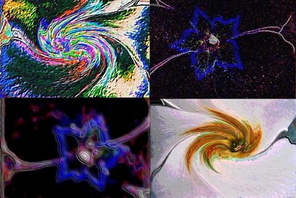
It is too much. Too much photoshop gives a plastic, two dimensional feeling to photos. I'm personally not a fan.
I don't really care what you do with your photos. But I personally prefer the originals. More pure and natural. The edits seem too boring for me to look at, to examine. They are like a postcard. I don't buy postcards, don't pay attention to them and consider them too bad a taste to be of any use.
The original photos are nice, but the photoshopped ones are overly photoshopped for sure.
... and cropping and dodging and burning and re-touching and filters and combining and... Get the picture?
Load More Replies...Unfortunately we can't always take a picture of what the reason was that brought us to the location. We can't always recreate the beauty when it is time to take the photo. By editing it, we can let the picture reflect the true beauty the artist sees.
I'll give my take on photo manipulation, and the 3 levels of it: The first level is what I would consider a normal part of real photography. This is just upping the exposure or reducing the contrast on an entire image, or cropping or zooming; stuff one can do in the Photos app on OSX without any real photo manipulation software. The second level is Lilia's work here: adding hues, tones, effects, etc. Even adding or removing bits of the images counts as second level. And this is the most controversial because it makes beautiful art, but a lot of people pretend they didn't manipulate their photos, and that these are the originals. That's why there was backlash to your photos: people thought you were claiming they were unedited. the third level is like Eric Johansson's art: using Photoshop to combine several, dozens, or even hundreds of photos and images into one piece of art. In conclusion, image manipulation software is a great tool to improve photos, but it needs to come with honesty.
Very interesting, Django! Thanks for sharing! What do you think about this: https://gajitz.com/fake-history-6-photo-manipulations-way-before-photoshop/
Load More Replies...I believe everyone deserves the right to express their vision and creativity. Just because someone doesn’t agree with your work doesn’t mean it’s wrong. Jealousy is often expressed through negativity which is sad. It would be pretty boring if everyone would do things the same. I know for a fact that you inspire a lot of people, creatively and professionally. You are enhancing your subjects by letting them shine, giving them the full attention in the photography without distractions. All the edits are gorgeous and you can be very proud of yourself!
Love these before and afters, your editing is sublime, the completed portraits are simply amazing, love each and every one!
Thank you so much, dear Clare! <3
Load More Replies...I completely disagree with the negative consensus put across in a lot of the comments here. The second I saw this photo next to the original it swept me back to my childhood. All that she has done to this photo is give us as adults, the outlook we had on the world as innocent, carefree children. Don't you remember the world looking like the second photo when you were a child? Every flower was bursting with colour and beautiful smells, the waters of the lakes we explored with our friends and families sparkled with an irredeccent magical light. Every strand of grass and each one of the leaves was as fluorescent as we drew them in our artworks! These photos don't scream fake or overly edited to me. Instead they lift me up to a level of joy and beautiful innocence that was my entire childhood, before the wonder, and the colour, and the joy faded into the muted reality we see today.
I think they are beautiful photos. Some had too much editing for my taste, but it's just my personal preference.
Thanks a lot! We all have different preferences! :)
Load More Replies...This debate will never end. There are those that feel like they are some how better than you because the do not edit their images. Oh wait, except everyone of them will tweak the color temp, the contrast, the white and black points since RAW images are so flat looking out of the camera. So then they draw lines of what is acceptable editing and what ventures into the world of art. Oh wait - aren't photographers artists?? We just paint with a different media than others types of artists. So at the end of the day - you do what creates your vision and what satisfies you and stop listening to the critics who think your work is somehow not "pure" enough to be considered photography.
I think a photograph "stops being a photograph" when the picture looks unreal-- like making the moon look five times larger than normal, for example. Let me be clear that such an image would still be art, but a photograph, edited or not, reflects the real world. I don't think making things pop or editing out a fence with extra flowers makes it not a photograph. I do agree with some of the comments that the reds are a bit much, but that's a matter of preference and style. I would say "it's too much for me," but I wouldn't go so far as to say it's not a photograph anymore.
Your an accomplished digital artist. Love the images but calling them'Natural Light' is a bit of a stretch.
Thanks a lot! I did not use flash or a strobe while capturing this set of images.
Load More Replies...One thing I can understand complaints about, is that they're children, they don't really need beautification. But the skin changes in these photos are subtle enough that I have no problem. Could be bias. My dad is a professional photographer, and never removes anything like acne or skin spots on Photographs of me despite carefully touching them up in Photoshop. IMO, Photoshop is important for touching up photos as long as they don't do something drastic like how some Cosplayers and "ulzzang" (selfies for face beauty) Photoshop their face to look unrealistic like thinning/sharpening their nose, enlarging eyes, thinning jaw, unnaturally-whitened skintone, etc... Then try to pass it off as their "real self". Or how magazines for celebrities or fashion can Photoshop their bodies to be much thinner than they really are without the natural skin folds from being in certain poses. At that point it becomes more digital art than photograph.
I can understand that about children especially, or anyone trying to pretend it's really them. Though there's a place for great and creative digital art too, and I do think cosplay is one (They aren't trying to trick you into thinking they're really the spitting image of a anime warrior babe in real life lol, it's fun and art). In these though I didn't see her doing body editing or that sort of thing, mostly changing the mood and feel of the overall photo with lighting and some background manipulation, which I think is a good use of editing for this style of photography.
Load More Replies...Your photos are not to my taste...but why is that a problem? That's just a matter of personal taste. /// These are YOUR photos of YOUR kids, and if someone sneers, tell them to get lost. Don't be defensive about it, just tell them you're not interested in hearing it. /// One thing I've learned over years of being an artist is that people are going to get snotty, no matter what you say or do. I have a stock answer for them that shuts them down instantly and makes them look like idiots, "I'm sorry you feel that way". /// Then walk away. End the conversation. Don't bother with their nonsense, and have fun taking pictures. You don't owe these people anything.
Aunt Messy- Your response made me smile. My response to impertinent idiots for years has always been "I'm sorry you feel that way." and to leave them to wallow in their idiocy. My response to nosy idiots is always "Why do you ask?" and then look them directly in the eye and wait for an answer as the uncomfortable silence stretches out.
Load More Replies...I'm not a photographer by any stretch, but that's what I think: far too many things these days are artificial. Both men and women use ridiculous amounts of make up and body and hair products and the photos get further edited to the point where they look more like wax figures than real people. I suppose you can call it a form of "false advertising." For example look at these two photos of an older woman- especially notice her hands- in the second one you can barely see her knuckles. Elizabeth-...407192.jpg  Elizabeth-...407192.jpg
  To me personally editing is fine as far as making the photo brighter/ darker and adding some saturation for richer colours. More than that and I think the author needs to just say he edited the photo as a kind of warning that it isn't an accurate representation of reality. Putting the original and the edit side to side is also a good idea and I like the way you have done it.
"Older woman" - that's Elizabeth Hurley! Also maybe she's not the best example because (hands aside perhaps?!) she's age-defyingly stunning ;)
Load More Replies...they are great before and after. my only problem is that you can take a truly great photograph just by knowing your way around the camera. People who take those great photos need to be recognized for their skill with the camera while people who rely on editing have a different set of skills and should be recognized for that. two different skill sets, two different art forms among many,many other forms of art.
This is an interesting topic. I used to experiment with photomanipulation as the media itelf, years ago. My goal was not to make the photos look pretty, it was to make them look weird on purpose, or collage, or to make them look like paintings/drawings. Through various filters, selection, objects, masks etc. That's digital art, not when you enhance the colours to make the photos closer to your vision. Afterall... The eye of the camera is different from our eyes. While on the topic of retouching pictures, I draw a lot using coloured pencils. After scanning, they usually look pretty rough, so I tend to do a littoe retouch to make them look more clean. What do people say about that? That my drawing skills aren't true? Tsk tsk Thank you for this article, I've been tired of all the hatred towards a tool.
As a seasoned photographer, it is about capturing the mood and feel, which requires enhancement. What I say to every single client is - "I want to capture the way the world sees you, not how you see yourself." Because perceptions are quite different between the subject's view of him or herself, and how they are actually seen by everyone else.
i love our photos. don't let anyone tell you this isn't photography. this absolutely is. if anyone tries to tell you it's not again, just dab on them haters
Awe thank you so much for your uplifting comment! <3
Load More Replies...If you want a 70's effect, use Instax (old Polaroid): shoot and print as it is. Yours is manipulation, but these pictures are better than the original with colours well balanced. So, why not?
Polaroid and other instant cameras (Instax) are around and the photos are really fun. It's more fun than mucking around on the computer, but the film is expensive - about a buck a shot.
Load More Replies...I like the original ones better. Most of the time actually still, the photoshopped ones are skilled an good looking aswell
Hello Lilia, your composition and balancing of the subject matter in every shot is well executed! You are also very skilled at create seamless composites, however, and this is just my opinion, it seems that your strong suit is creating less dramatic environmental portraits, like the first entries. I feel like the last shots are a bit heavy handed and could benefit from trying a different approach. Think of changing tactics when retouching like changing vantage points while shooting, every shot is vastly different. Give it a shot, you may be surprised by what you find. All in all, great work!
My response is a short and hopefully helpful one. The only thing I notice in these pictures is the theme of adding a red like hue to the pictures. That said everything thing else is gorgeous and I loved the end results. I would simply say it's your style. It is you work and I think most people would have a style. I find your style very pleasing. Thanks for sharing your works and your thoughts with us.
These are beautiful Lilia! I wish I had the skills to edit this way, often times a photo just doesn't have the depth of what you see when you take the picture. You are able to really enhance the crispness of the subject with a background of gorgeous colors.
I think you have real talent. The original photos are beautiful, and you really know how to enhance them. Absolutely gorgeous in my opinion. Keep up the good work!
There is a sickness in the creative community, I call it creative elitism. New grads usually graphic designers or journalism school kids getting into marketing feel entitled to creative work and shun anyone with a different background. These people are toxic AF, run from them.
You might be better off to consider why this "controversy" is an issue for you. If it is the end result that matters, why the before and afters? Why does it matter why some people don't like your work or don't consider them to be photographs? Are you doing photography? Yes, but some are clearly composite images. Someone once defined a photograph as a capture of a particular viewpoint at a particular moment in time. If you follow this definition (as I do) then composite images are not photographs as the viewpoint of a composite image does not exist. Personally, and FWIW, I don't consider photography to be Art, but I think your work looks gorgeous. Isn't that all that really matters?
Thank you for sharing your opinion and feedback! John, it is not an issue for me :) What do you think about this: https://gajitz.com/fake-history-6-photo-manipulations-way-before-photoshop/
Load More Replies...This looks more like lightroom rather than photoshop. However - absolutely brilliant pictures.... even without the rework!!!!! Well done! (from someone who studied photography)
I do post-processing on my images. When asked if I Photoshop them, I say, "Yes! the human eye sees things so differently than the camera can capture. I manipulate the image so it looks like what I saw, rather than what the camera recorded."
I wish I could take photos like these originals, but I wouldn't edit them to replace beautiful natural lighting with colors that looks like they are from an alien moon in Doctor Who, or swap out the backgrounds so the people in the photo can't recognize the place if they go back later.
I'm a photographer. I remember the days of no "Live-view". We dealt with manual lenses too, but nowadays its a WHOLE NEW WORLD. Very good work. I have heard of people swearing against any photo-manipulation at all. These are truly beginners for ALL OF US manipulate our stuff now! Thank God for the photo-finishing revolution!
Photography is a visual art - this is like arguing that Da Vinci is 'real' art and Monet isn't.
Beautiful photos. I wish I could learn Ps like this for my photos.
I honestly dont see a lot of photoshop. I see a a lot of relighting where if you didnt the pictures wouldnt be a bright. I love them! very pretty.
Lilia, professional photographer myself I can tell that I like a lot most of your photos (I just find the face of the girl on the #7 is too much “plastic” for my personal taste). What many people don’t understand is that Photography is an Art, and so as any artist a photographer has a different vision and interpretation of the reality. Any good artist uses the instruments he has at his disposal, and in the today digital photography Photoshop, Lightroom and similar are the instruments that a photographer can use (I don’t say “must” because this should be a personal choice, depending on your needs to get the result you want). Don’t worry too much about what people say, sometime you will be confronted to people able to do a constructive analysis and critic of your work, but most of the time the negative critics are no more than jealousy…
Your photoshopped images are amazing. I find a good majority of those that belittle photoshopped images are the ones that cannot do it. Keep up the good work. I wish I could finish images like that. Alan
Gorgeous photos! Perfect moments! Clearly any criticism is pure envy!
Both pictures for each of your examples art Amazing and I'd be more inclined to see every one as beautiful photographic art. If someone doesn't appreciate your talent, they should look at something else and keep their opinions to themselves. ...just my opinion...
Honestly as a fellow photographer I have to go against the general opinion and say that the originals are not good at all. The end result is absolutely amazing and you should be proud of yourself for being a really talented digital manipulator. That requires a lot of skill and vision.
In my opinion there should not be any limit in manipulation, as long as It allow you to express your feelings about the shooting,the use of whatever existing tool Is fair enough 😀
I think the camera is just a tool. You can use it in a lot of ways. A photographer takes photos. And to me, when you present something as a "photo" it should be as true to the original as possible. A "picture", "digital art" etc. doesn't have to be. Extensiva digital manipulation, however pretty the result, can not truthfully be called a "photo".
What do I think? I think you're an artist and the stories you write with your photography are beautiful and indeed, well written. Don't listen to the negative. Keep making beautiful photos.
After looking at the before and afters , either way they are truly beautiful photographs!!!
Lilia, I think all of your photos are beautiful!! You have a wonderful eye for your subjects and colour. Don't let the bastards wear you down!! I'm jealous, I would love to be able to do what you do, and they are probably jealous, too!! You are wonderful!!!
There is a differnece bwteen photojournalism and art /editorial photography. Photojournalism is required to be minimally edited to engender trust and integrity. Her art is her representation of the image she wants. I do not agrtee with making people skinny or more curvy or changing eye colors etc., but ther eis not propblem with correcting skin tones and fixing blemishes, fixing wrinkles/folds/bulged in clothing and altering the tonal contrasts to create a more pleasing image. Her work is almost all shot with no light manipulation (strobes or reflectors), so she must contend with green color casts from the trees and grass, extreme levels of contrast between light and dark that digital cameras struggle with (compared to film). and with bad skin tones (red faces, etc.). At the end of the day the only people shees to please is her client, her future clients and herself. The rest can moan and groan because they either do not have the vision, the editing skills or the photographic talent.
Often when you take a picture, the light and colours are not the same in the picture as what your eyes see. They can be washed-out I like the ones where background and the kid’s clothes and hair were fixed so they are closer to what they would look like in real life, the first four I liked, and the fifth one and the last ones liked too (not so much the background, but lightening the girl so she’s easier to see and not in shadows.) The other ones, I didn’t really like what was done to them, I would have personally preferred to see similar effects to the first five, making them closer to what they would have looked like to the naked eye.
That's what editing is all about.. it's making true and real things look like fairy tales. I can't paint or draw, but I can take photos and then edit them to look ethereal and beautiful. The way I see them in my soul, rather than with my eyes. I'm not talented in anyway shape or form compared to this person here, but I know what she's after. These are stunning photos, both before and after. And rather a good way to advertise your business too.
Thank you for posting these before and after photos. I have admired your work for years.
As long as you are telling people the truth, so what. If you are saying you took these pictures as they are shown, you are lying. If you say you only adjusted the saturation, lighting, crop, etc... you are lying. But if you are just saying I used photoshop to take pictures and make them more interesting and art-like, then I see no harm.
I think you hit the nail on the head - it’s all about how she is putting them out there. I understand her argument how photos have been manipulated in the past, but it’s all about presentation. If you present the work as being altered, then there’s nothing to hide. And the person that criticized her on Instagram may have done so because they were expressing their personal opinion. For me, these photos are too altered - I would prefer just enhancing the colors and that’s it - not adding to the background, etc. but that’s my aesthetic and it’s different. That’s what makes the world go round.
Load More Replies...In the past when Photoshop didn't exist yet people edited there photo's in a DOKA or Darkroom or whatever you may call it! :) But, people already edited the photo's a lot, maybe not as big as the photo manipulation we see nowadays but they did it! I don't think people who are not really into photography understand that, they could change colors in there, or add some part of another photo. To me (a photographer as well) this is just 'necessary' basic manipulation of a photo and nowhere near what I see as a Computer Graphic, since you didn't make the photo's with a computer, you just made them look beter. Since the definition of Computer Graphic is 'pictures and films created using computers' I can see where people get confused. Nonetheless, I'm rambling and your pictures are gorgeous! :)
It is eye and talent, and using different skills in and out of camera. to gain the after photo the initial shot cant be a complete s**t storm of bad lighting, composition etc. Im always really impressed by great editing. Like anything we want people to see our great finished product. I dont do graphic design and just give them my rough sketch, I use l more tools less or more as needed to get a great final product.
These are beautiful. I wish you could take pictures of my kids. Not going to be in Kansas doin are you?
Many thanks for your feedback, Sarah! We are there for all of our clients - no matter your whereabouts. Please get in touch with me and I can provide details. LiliaAlvaradoPhotography@gmail.com
Load More Replies...as a photographer myself and artist I have to say that these are stunning! And I studied under a great master who told me all photographs are tweeted including the old school bw in the dark room. Also to be able to make stunning pics even with editing u need to have a great photo to start with. I believe this.
Полностью согласна с этой статьей. Мне очень нравятся ее фотографии, которые можно смотреть долго и внимательно, рассматривая каждую деталь… Все ее идеи, взяты из нашей жизни - и я вновь через ее фотографии возвращаюсь в свое детство и благодарна ей за эти волшебные и красочные воспоминания. Да фотография - это творчество, видение, самовыражение каждого кто этим увлечен! У нее есть свой узнаваемый почерк, а это о многом говорит. А как работать и чем работать - это право любого творческого человека! Всегда жду с интересом ее новых работ!
The photos are of course lovely, but.......I think I would love to see your work with little ones in more normal situations, not these glamour shots. Because your work is beautiful, I bet your everyday pictures of kids not in Edwardian garb is awesome too. Me, I don't want glamour shots of my kids, I want to remember all their goofy little eyes shut smiles and missing teeth and the firemens hat my two year old wore for 6 solid months. But I want to see all that by someone who can edit the lighting and make it more eye catching, but just a little? I have no talent or skill in photography but I would love to see what talent like yours can do without Edwardian lanterns and garb?
If you don't have anything kind to say, don't say it all. These photos are lovely, both the originals and the altered ones. Great work!
She asked for people's opinion, so she should hear it, right? Good or bad, it doesn't matter. Stop being such a snowflake.
Load More Replies...I used to think, the world must be really ugly because we are in need to recreate pictures; then again I am thinking, it is the way our imagination works, so in this kind of pictures there is no need to be pure, but I hate when they want to manipulate us with those little tricks, because we are so easily to lead, and somehow it is good that we are questioning this
While I partially agree with the article, I can understand the other side of the argument as well, Photoshop has created a lot of lazy photographers because it is easier to make changes in post-processing than it is to use the camera to get the photo you want. Sure, the photos look pretty but rather than capture the moment and feeling, a lot of photographers manufacture the moment and feeling. I say this as someone who uses Photoshop a lot. I've done magazine covers, book covers, and other projects. My opinion...and I repeat, opinion, is less art and more craft. The artistic skills needed are minimal as the software does most of the work.
Thank you for sharing your opinion! I wish my version of Photoshop did most of the work :)
Load More Replies...You are so kind, thank you so much, Brittney! <3
Load More Replies...I can understand fixing lighting or tone, but most of these were better before alterations. Don't fix it if it ain't broke.
I'll probably get down voted, but for most of these, I liked the original better. The "fixed" ones look fake to me.
These are beautiful but for the beach ones the natural feel is much nicer; the orange tones are simply too much for the originally soft and gentle vibe. The colour also doesn’t quite bring out the whole idea of the beach - water.
I don’t mean any offence towards your photos and style by the way, it’s just my personal preference. Your photos are beautiful and creative.
Load More Replies...yes, you use too much PS. And I am an amateur photographer too. Those pics share almost nothing with the originals.
I wonder if a lot if the people who commented on each of the images actually read your explanation in the begining. For one, it is very long and detailed. What I gather for it is you aim at a kid's perspective and with that in mind you have achieved your goal (if we judge by the comments). The one reoccurring critique I seem to see in the comments is also one of my problems with your processing - and it is that you seem to try and run from "natural" colours and oversimplify them. Your final results do look a lot like a children's paintings (a very talented paintings mind you) but with the basic colours and sharp focus. It is fine in your case, cause you clearly aim at that effect, but you should realize that different people look for different content. And as much as there are people who love Van Gogh (Who aims at your specific technique) there are also people who prefer Monet with a search for more "natural" colours.
Some photos may require editing, depending on the theme. Honestly, I like the original than the photoshopped images, there's something captivating in those unaltered photos.
What you're doing is photo manipulation. You are extraordinary at it, but you are definitely manipulating it beyond the point of just calling it photography. My two cents.
I think people have an issue with over editing on photos because photography should be capturing a moment in time not artificially creating one, which may come across from the over saturation of colours. Some of the editing you have completed on your photos greatly improves them such as how you changed the lighting to brighten up the face and show off the emotions of the girl in the first image. I think you may over edit however when you add previously absent features to the scenery of the picture such as in #10. I think the original picture is much more effective without the added leaves and red-orange tinge added to the image. Although pretty, it seems to be lacking the simplistic and more realistic charm to the first image. Although, this is just my opinion. Regardless of how you choose to edit these photos they are beautifully constructed and effectively reflect a sense of childhood bliss and wonder
I'm sorry. But, I'm not the type of person to give false virtue for virtue's sake. I'm blunt and to the point. In all of these, the top one is a beautiful photograph all by itself. They're natural, they're real. And that is what photographs should be. The bottom images, while beautiful as well, are no longer photographs. They're digitally manipulated images more akin to a painting. Honesty is the best policy. And, if someone is going to post images and claim they're simply "photographs" without acknowledging that they've been heavily edited., that is dishonesty. Period.
And, the most important thing, which I forgot to mention above, If you are going to be an artist, you need to to learn to take criticism.
Load More Replies...The children's faces are perhaps a little too smoothed out. They look as though they had a ton of make up on. Apart from that, they are lovely pictures.
The first few are simple color corrections. There's no room for relevant criticism any more than criticizing a photo lab for corrections to it's prints. As the gallery descends, the simple corrections begin to morph into surprisingly maudlin compositing. The photographs themselves are sensitive, seen nicely, and self-sufficient, I don't get the need to turn them into Thomas Kinkaid kitsch.
I prefer the originals, that is what life really looks like, not the over blown fake color s**t..it is like fake news and is at the point where you can not trust anything you read or see anymore
Look, if you are claiming these are "real", then that is a problem. If you are just trying to make art, have at it.
You may be experiencing what I call creative elitism. Usually new grads with graphic design or journalism degrees get this entitled attitude about creative work. They dismiss anyone with different backgrounds and are toxic AF, run from them.
well i know, that editing a photo definetly makes sense most of the time and i can't say anything against it. but i too do believe that this photos are just to much photoshopped. not because there is photoshop used, but because this photos don't look natural in any way. there is never a setting, in which the scenec look that way. i would play around with the lighting and the colors too, but this is just to much. you never see the world like this and thats why i don't think, that you can justify this use of photoshop by saying you try to better illustrate the story on the paper. it just makes me feel a little uncomfortable, which is sad, because the photos are strong by themselfes. i don't think anyone wants to criticize that you use photoshop at all, but that the spirit of the pictures get a bit lost trough all of the filters
I prefer the original versions of almost all of these, but I'm impressed that the photographer can actually take great shots in the first place. I'm not sure why one would want to take beautiful natural-looking pictures of children and make them look like wax dolls that someone photographed with their camera's "sunset" filter accidentally left on, but to each their own. Personally, when I edit a photo I'm usually trying to bring it closer to the way the scene actually looked to me at the time. I also think the author's argument might have been more convincing without hyperbole like "If we started ruling out retouched images from the category of photographs, we would be left with not a single photograph in the world"! When is a photograph not a photograph? Tough question, but I do think there's a line somewhere. For example, I would not call this attached image a photograph, though it's based on one. quatrojazz...866e7e.jpg 
It is too much. Too much photoshop gives a plastic, two dimensional feeling to photos. I'm personally not a fan.
I don't really care what you do with your photos. But I personally prefer the originals. More pure and natural. The edits seem too boring for me to look at, to examine. They are like a postcard. I don't buy postcards, don't pay attention to them and consider them too bad a taste to be of any use.
The original photos are nice, but the photoshopped ones are overly photoshopped for sure.
... and cropping and dodging and burning and re-touching and filters and combining and... Get the picture?
Load More Replies...
 Dark Mode

 No fees, cancel anytime


