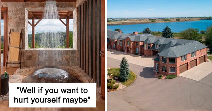
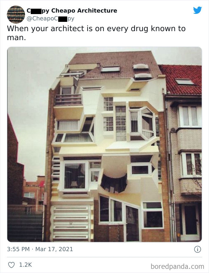
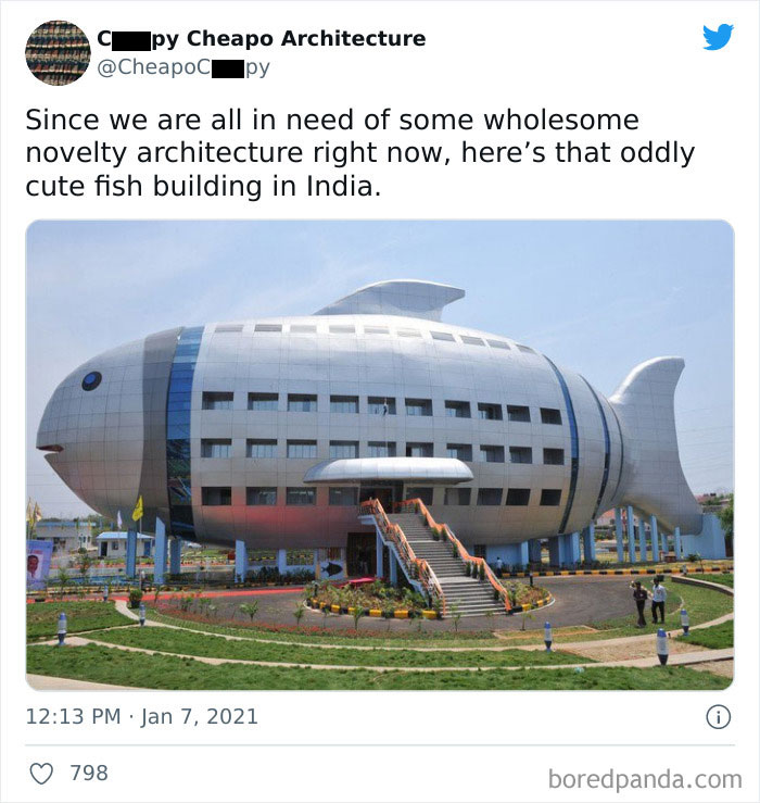
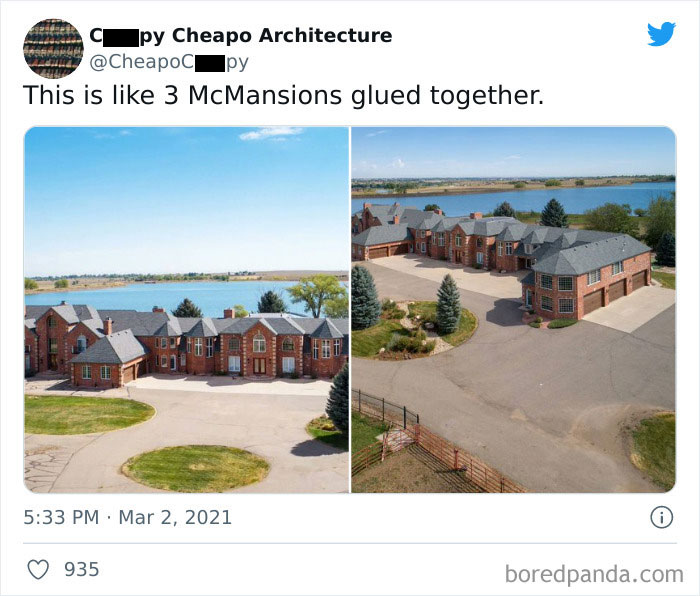
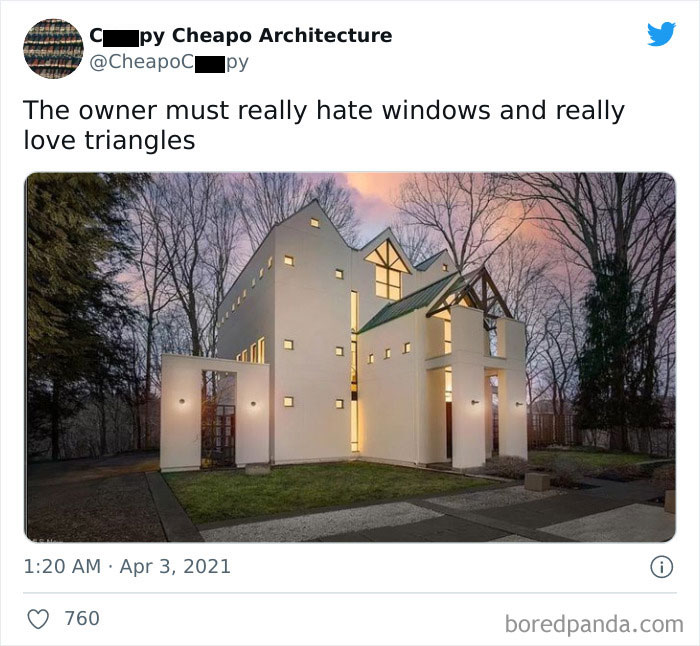
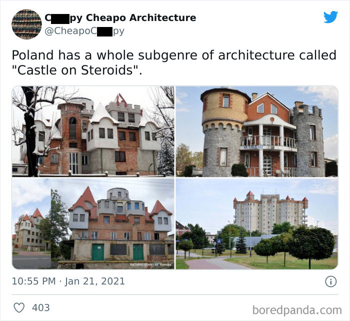
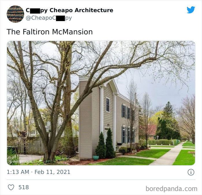
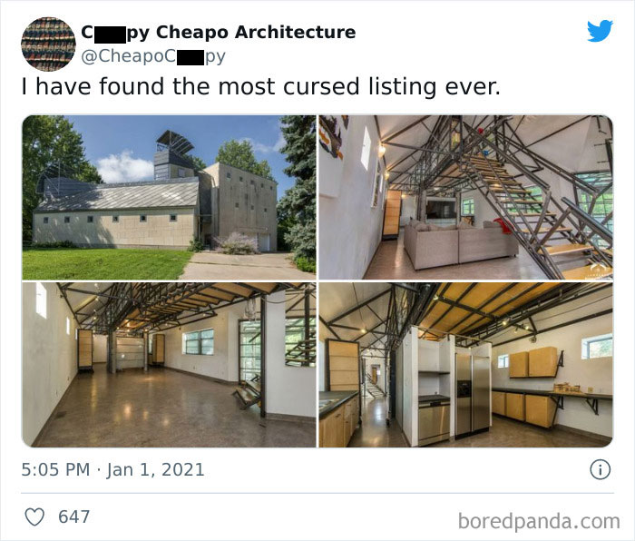
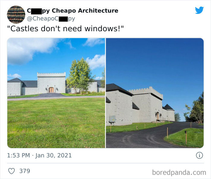
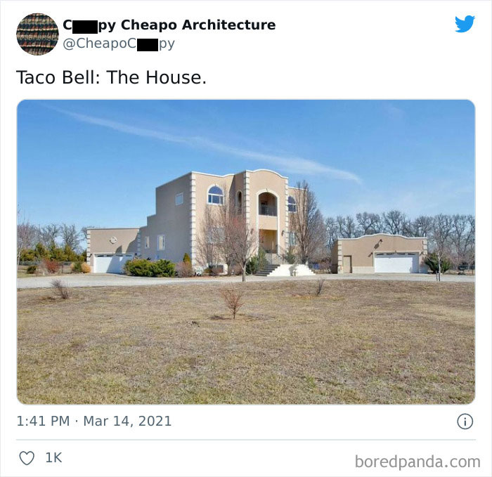
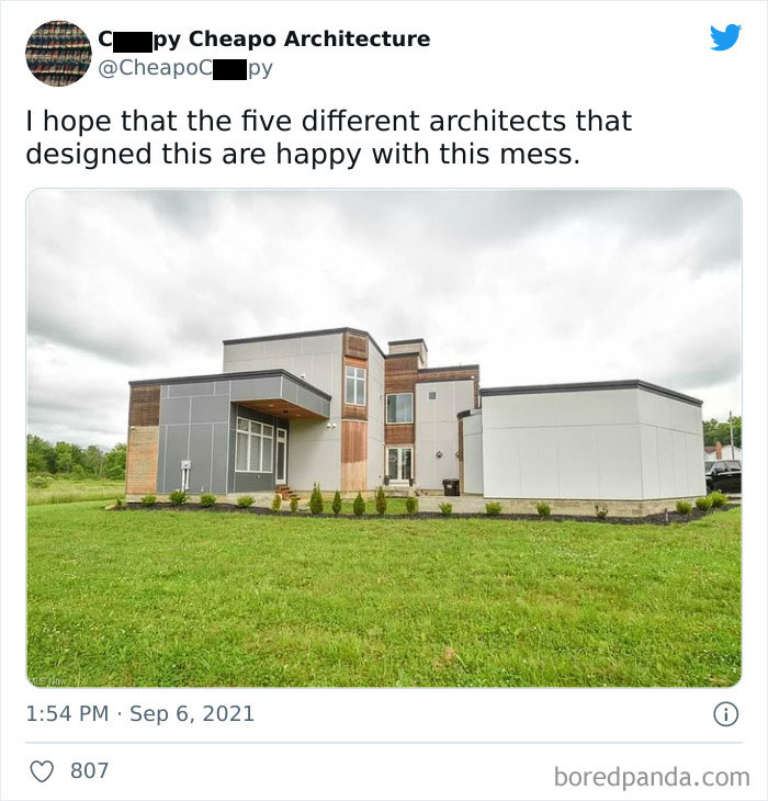
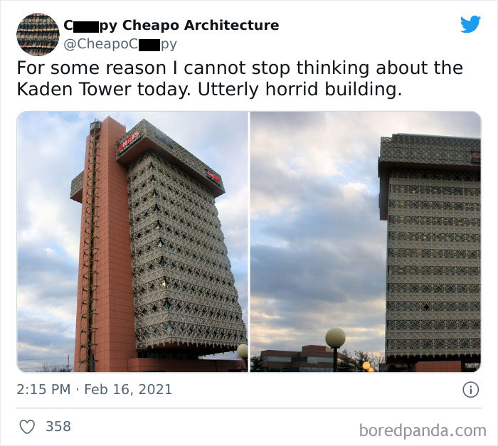
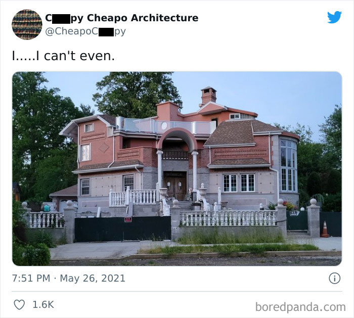
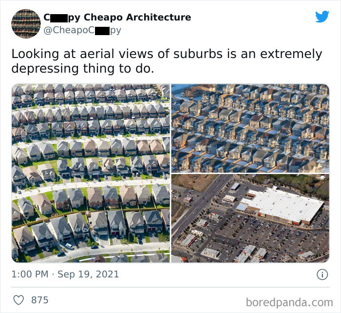
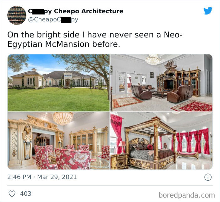
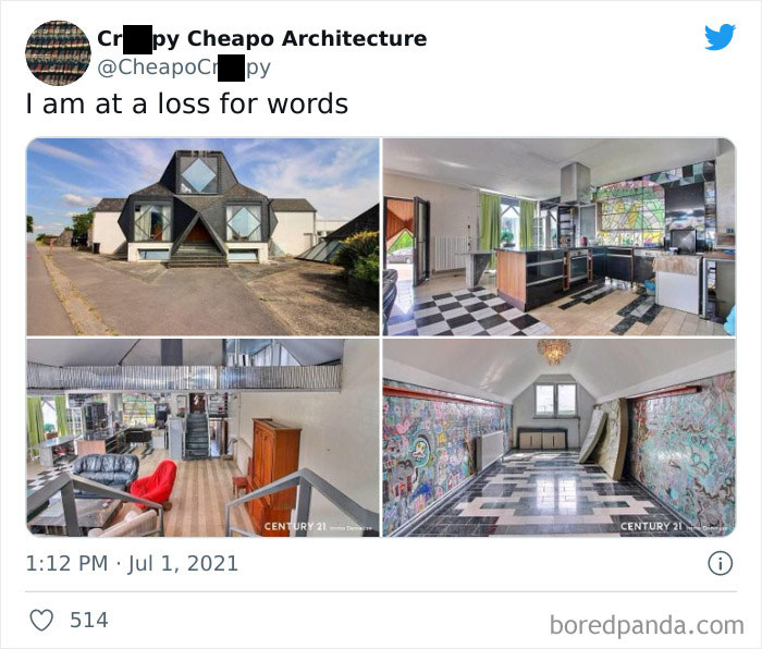
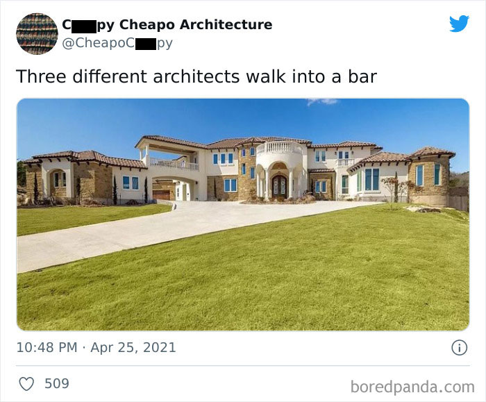
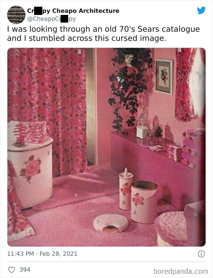
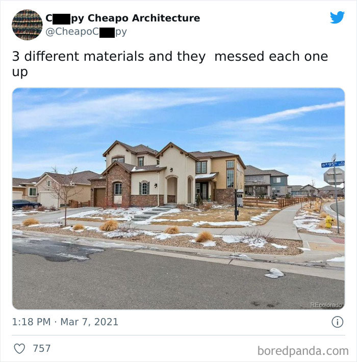
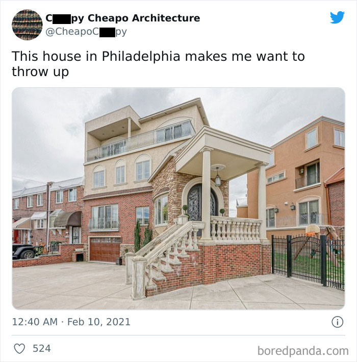
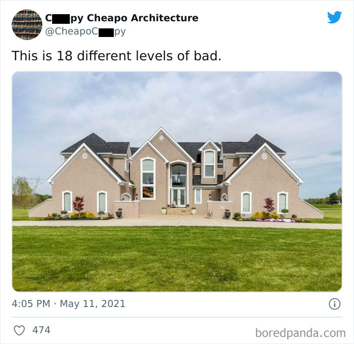
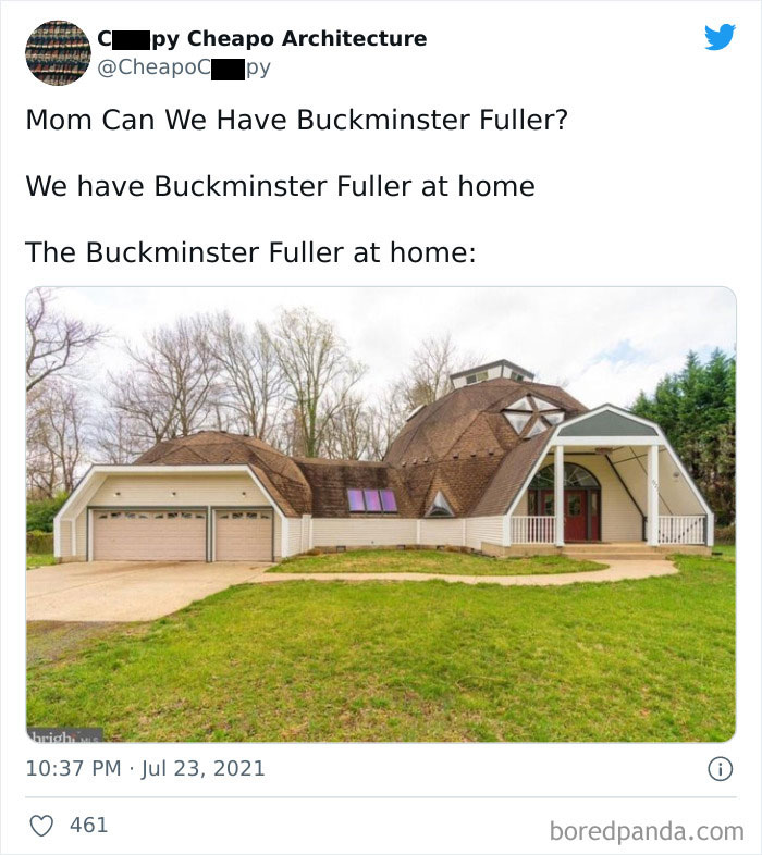
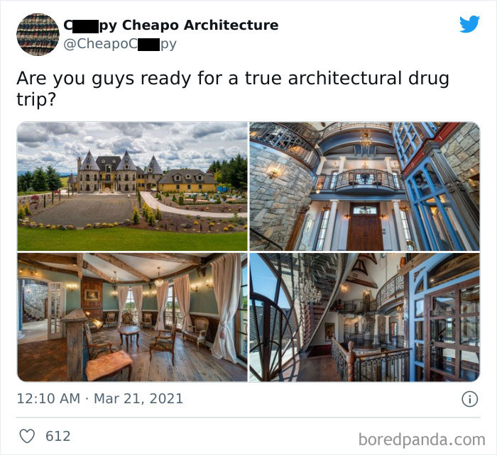
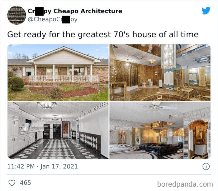
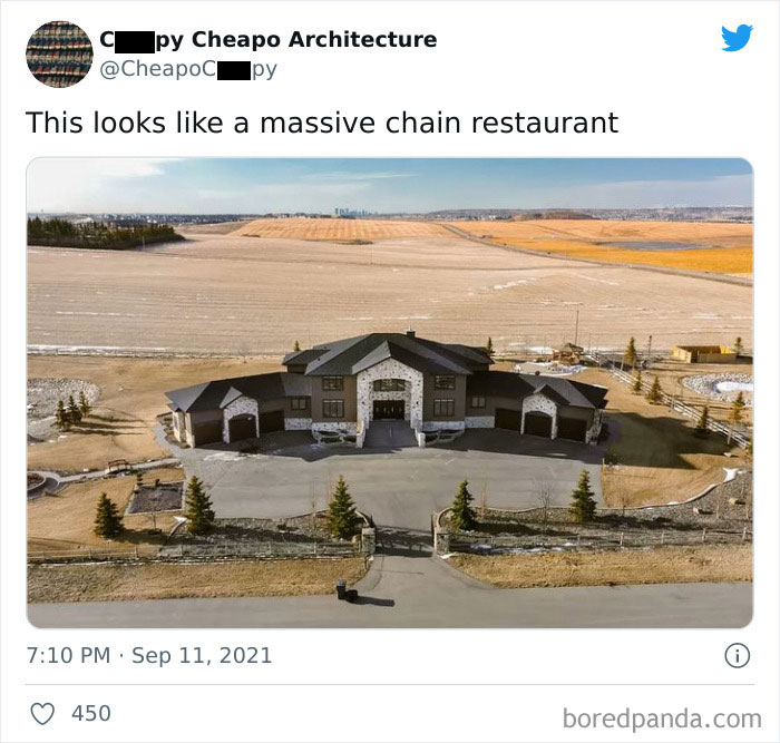
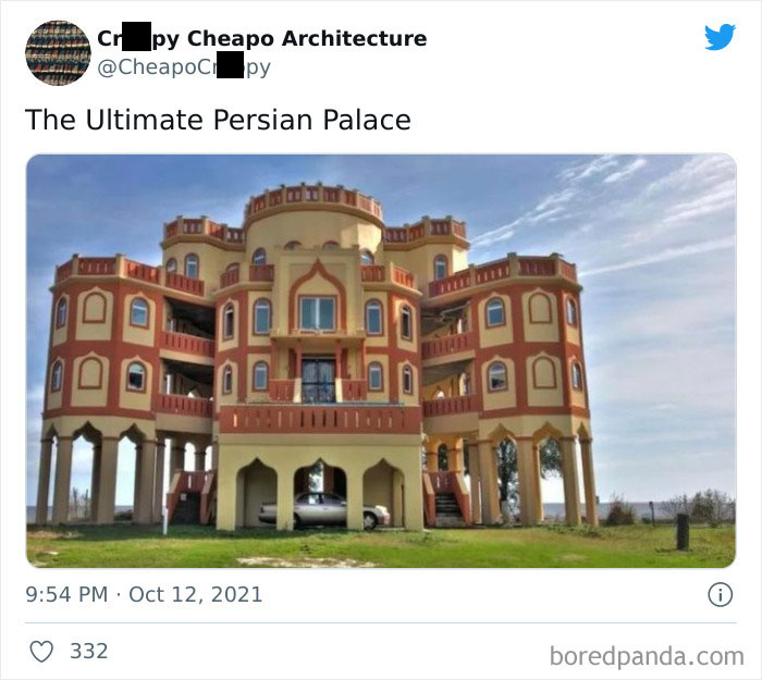
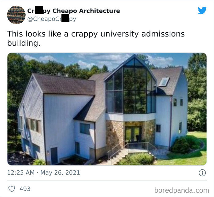
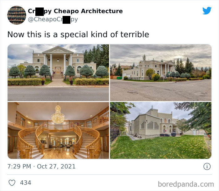
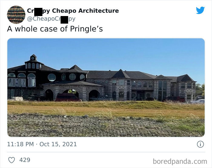
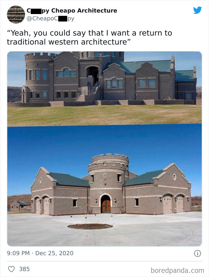
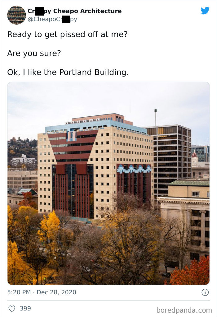
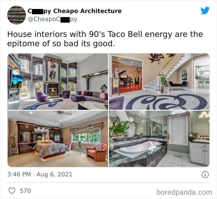
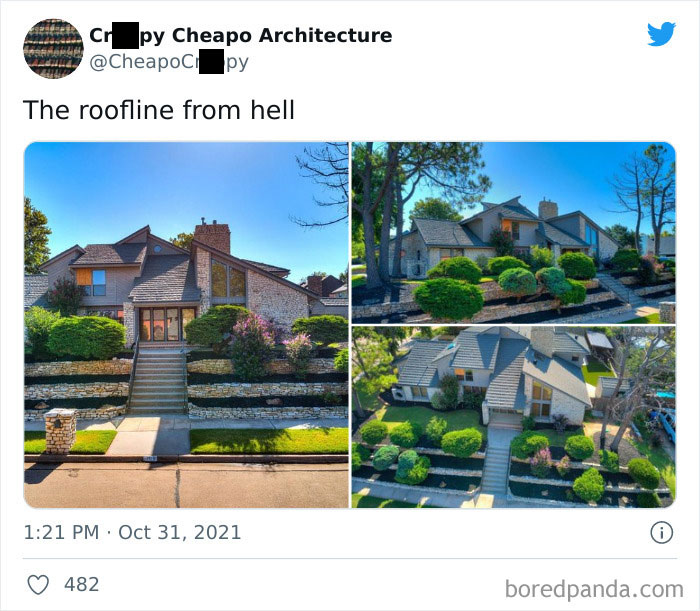
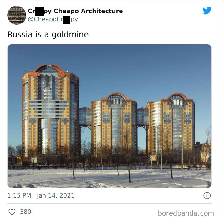
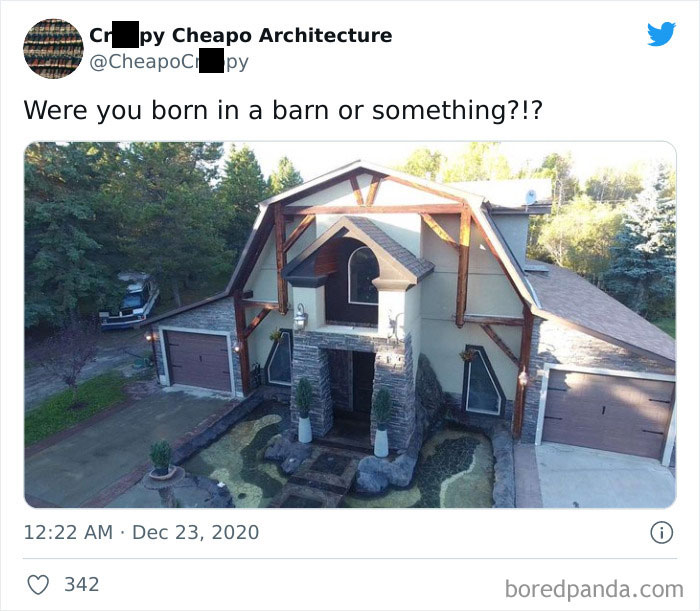
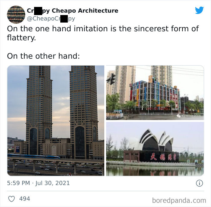
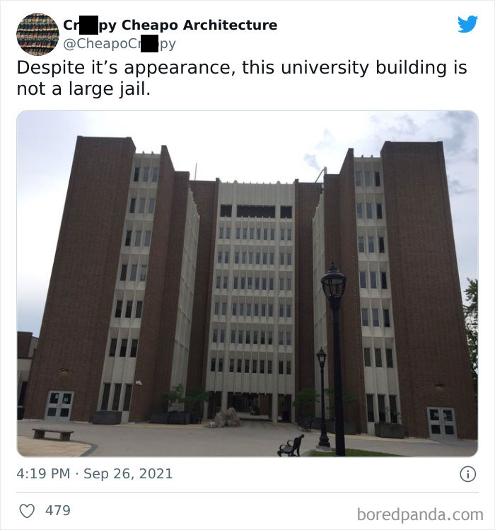
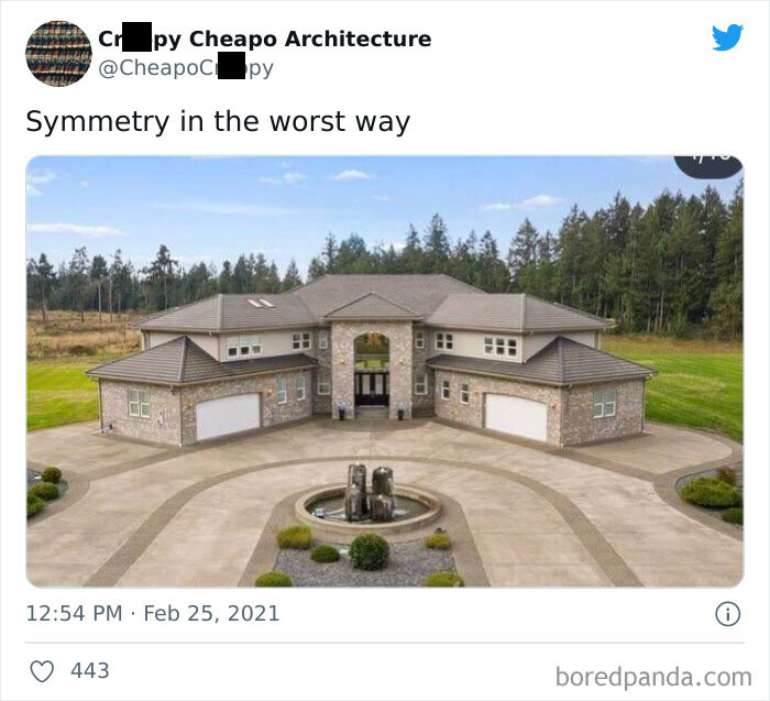
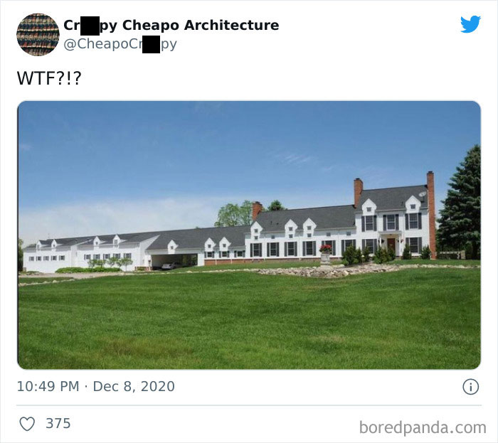
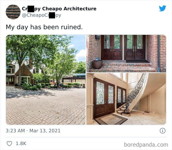
Bad design comes in all shapes and sizes. Even if we agree that taste is subjective, we can't help but scratch our heads looking at weird furniture, pointless products or just really, really awful buildings. Sometimes designers can have so many ideas that they end up choosing them all at once. And it shows.
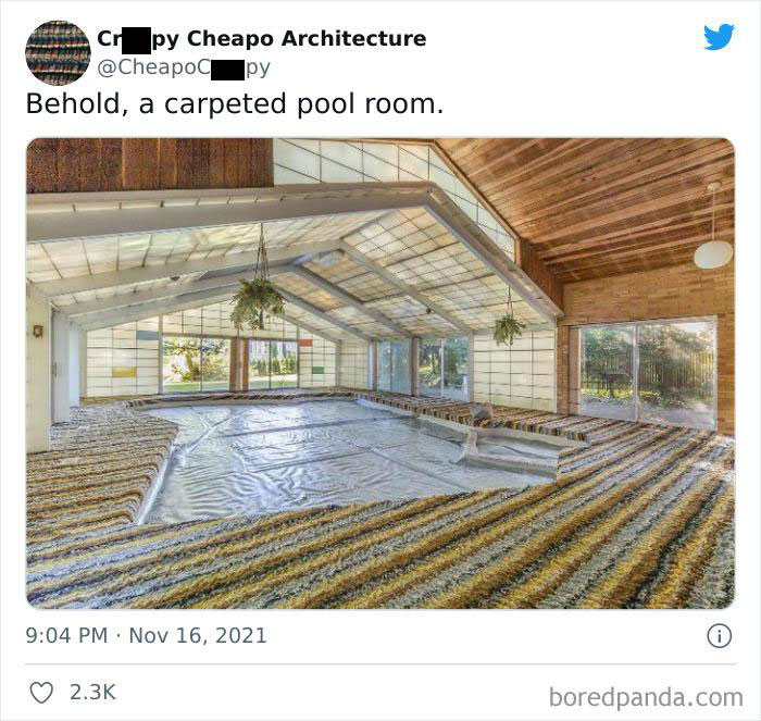
For our entertainment, lots of terrible building examples have been documented on this Twitter account. As the creator said, "I review cheaply designed buildings online. Loves good architecture and loathes walmartification and awful design." From overly busy facades and carpeted pool rooms to doors that lead to nowhere—the list goes on.
Bored Panda has collected some of the worst house design hiccups shared by the account, so keep scrolling, upvote your favorites and let us know what you think in the comments!
This post may include affiliate links.
The founder of this account describes himself as a Google street-view globetrotter who reviews tasteless buildings online. As stated on the official website, "You can put down a bad book; you can avoid listening to bad music; but you cannot miss the ugly tower block opposite your house". And the worst of the worst examples end up getting posted on this account.
Huge ugly mansions, awful interior design, and walmartification—short for turning something into a Walmart—are just a few things that the curator of the account loathes. And not only the creator but also the people watching. Since joining Twitter in 2019, the account has gained more than 53K followers who enjoy tacky buildings and their interiors being publicly shamed. And awful design definitely deserves it.
How could we define what constitutes "bad architecture"? There are a few basic architectural concepts that explain why some houses just look wrong. We can start by looking at the mass, which is the largest portion of a building: "The primary mass is the largest shape in the building block. The secondary masses are the additional shapes that form the facade of a building." So if there are too many of them, the house has no concept and looks bizarre. Also, buildings need balance. Good-looking houses are usually symmetrical or asymmetrical. Any other way of designing them could result in conflicting rooflines and other architectural elements.
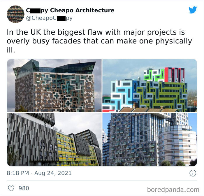
Even though today we have countless tools to make a design work, a few mistakes still end up getting made quite too often. According to Build It, it's not a good idea to save some money on parts of construction that will be difficult to upgrade later, like bricks or roof tiles. Also, employing too many different materials could be one of the reasons a house turns out wrong. It can make it seem overly "busy" and distract from other features.
Another thing to have in mind is the proportions of the house. You should have a well-prepared brief that shows accurate numbers on the amount and size of the rooms. Failing to do that is a pretty classic mistake which "can cause awkward furniture arrangements and wasted space due to circulation paths across a room." Not being able to adapt to the existing landscape is also a common error. Quite too often, people don't think about the impact of the trees or hills to get the best views that the location offers.
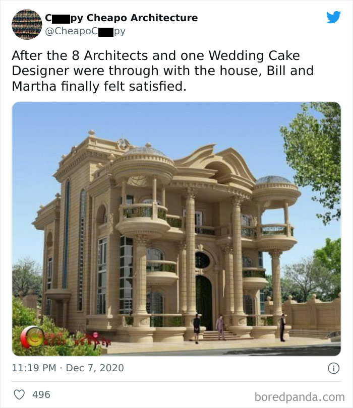
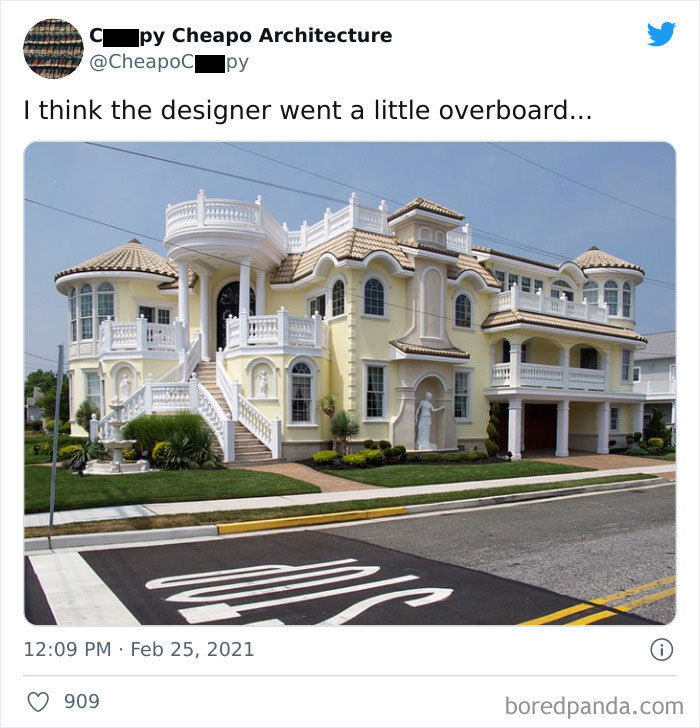
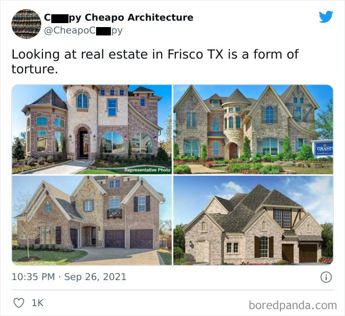
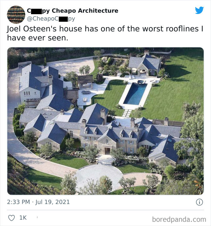
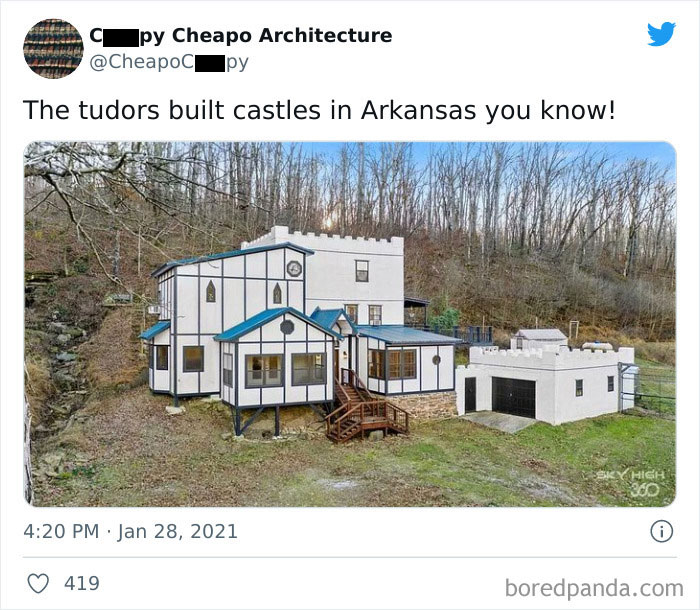
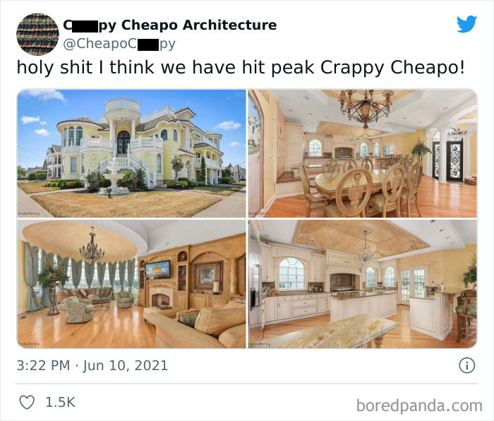
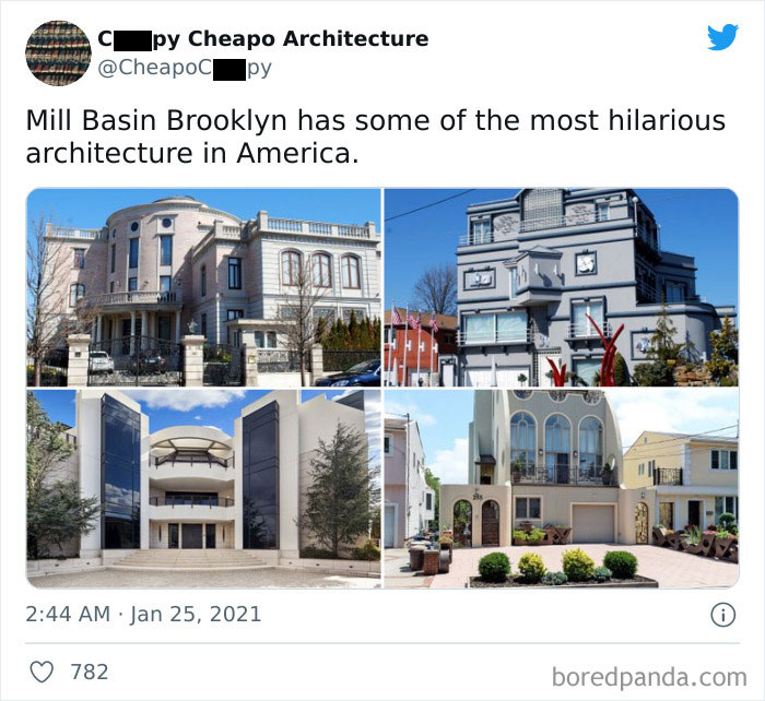
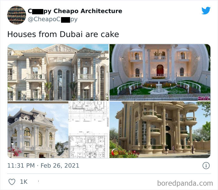
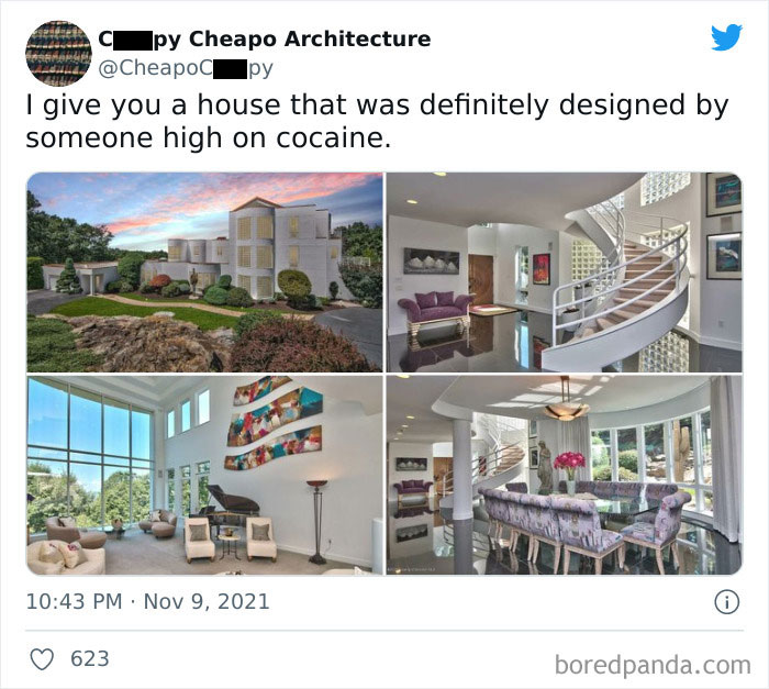
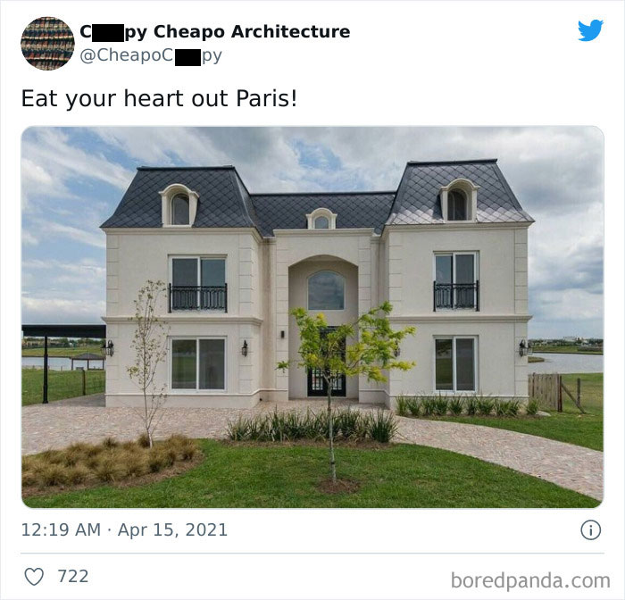
With the coloring, it almost looks like an award winning sand castle.
Moreover, rhythm is one of the most important aspects that define a properly designed house. If the style is inconsistent, if there is no flow throughout the rooms, it can make us feel uncomfortable and annoyed. Since a balanced building is easy to understand and look at, we can immediately detect if something seems off.
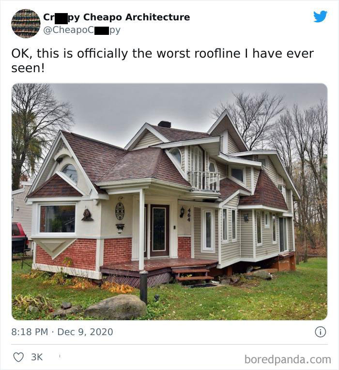
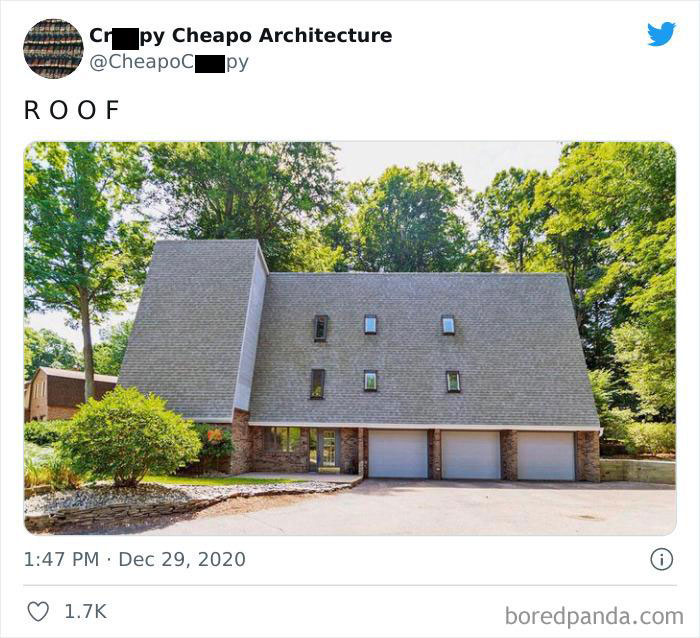
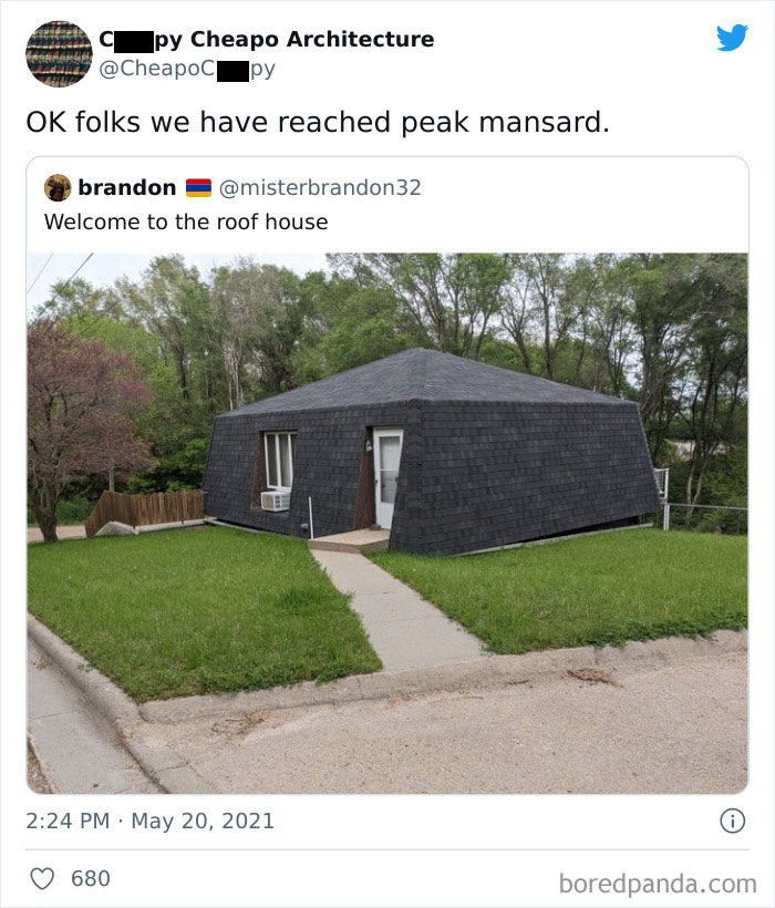
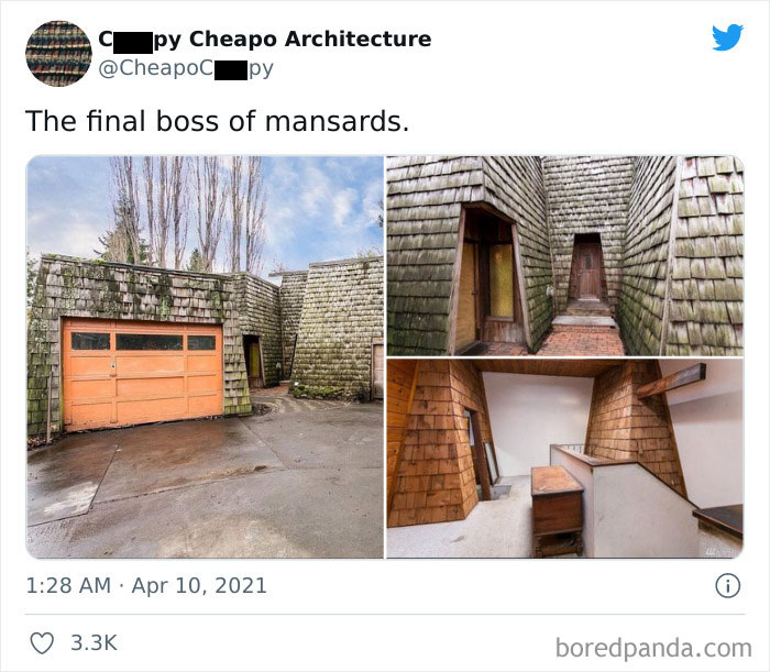
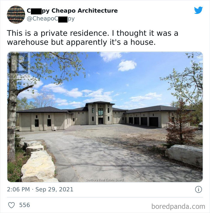
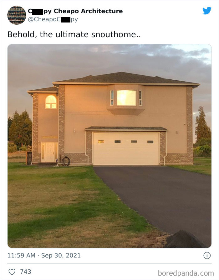
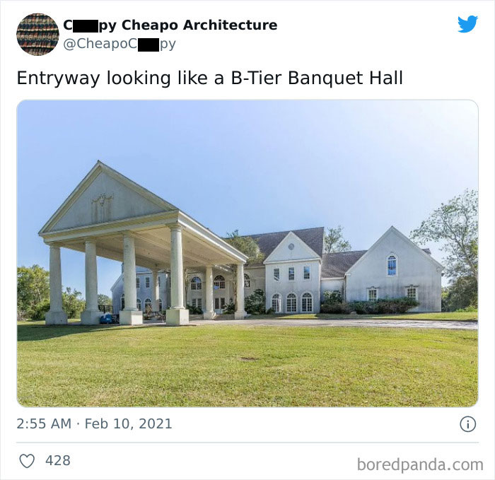
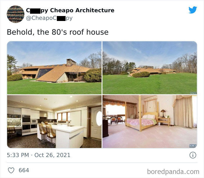
It might be useful for places with heavy snow. It still looks kinda weird though.
Now that we've established what a bad house looks like, let's see how it affects us as human beings. When you see an example of bad architecture, you feel it. Low ceilings, lack of windows, or dead-end corridors can make your head spin. You might even get a headache and look for the quickest way to get out of that place. BBC Future states that "buildings and cities can affect our mood and well-being, and that specialized cells in the hippocampal region of our brains are attuned to the geometry and arrangement of the spaces we inhabit."
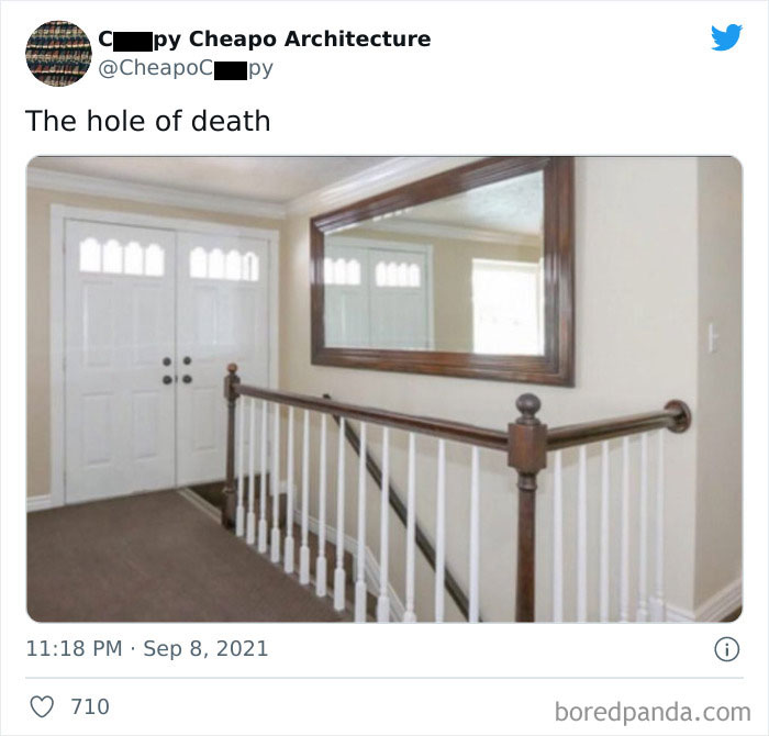
If the owner likes you, they'll open the right-hand door. If they don't, well, down you go!
Thanks to modern psychological studies, now we know the kind of urban environments people find stimulating. It seems that city life might be one of the reasons why people are prone to mental illness and stress. Colin Ellard, a researcher at the University of Waterloo in Canada, said, "When we ask people about their stress, they say it’s no big deal yet when we measure their physiology, we discover that their responses are off the charts. The difficulty is that your physiological state is the one that impacts your health."
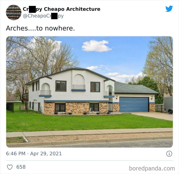
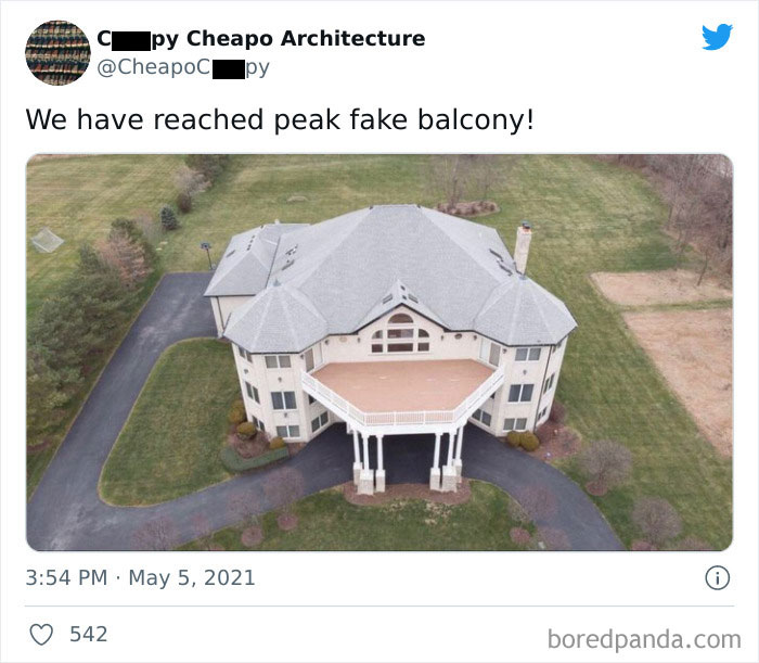
Plenty of balconies to throw yourself off when life gets too much.
One of the most important findings of Ellard's research was that people are strongly affected by building facades: "If the facade is complex and interesting, it affects people in a positive way; negatively if it is simple and monotonous." And it's no surprise when you think about our cities where colorful blocks are constantly getting replaced by dull and cold spaces.
In a previous article, Bored Panda spoke to an expert in urban planning about what separates good and bad building design. According to her, “There are circumstances where the architecture should create a sense of calmness and safety, yet there are instances in which it is not bad if the architecture provokes us and makes us think, ‘Why don't I like the look of this building?’”
Of course, everyone has the right to express themselves when it comes to their private property. “Quirky architecture comes from our innate desire to demonstrate our uniqueness. However, not everyone who has the means has an average taste for aesthetics. Yet, as long as it is for the people who inhabit or use their private space, I mean why not?” she told Bored Panda.
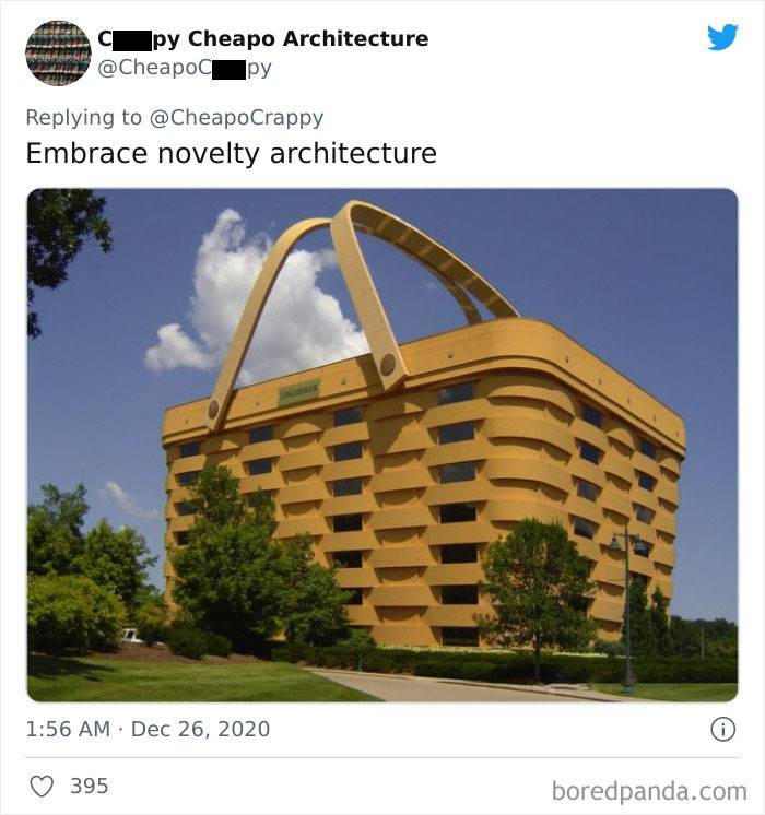
This is not a house. It is an office building: the world headquarters of Longenberger Baskets.
The urban planning expert was kind enough to give some advice on what good design should feel like: “Firstly, even though I often advocate for unconventionally looking buildings, I do not encourage purposefully provocative architecture. The building should be designed with the intention to accommodate and protect society. It should create a sense of safety but not be boring.”
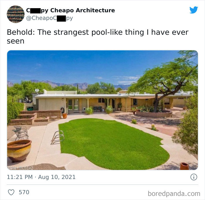
Looks like they decided to fill in the pool. Or is that a pool cover made to look like grass?
Architecture should be neither bizarre nor boring, neither ugly nor impractical. It should be good. If you're building a new house, remember that taste is subjective but there's no denying the flaws once you see them.
Some of these buildings are the architectural equivalent of those AI-generated movie scripts and this is definitely one of them.
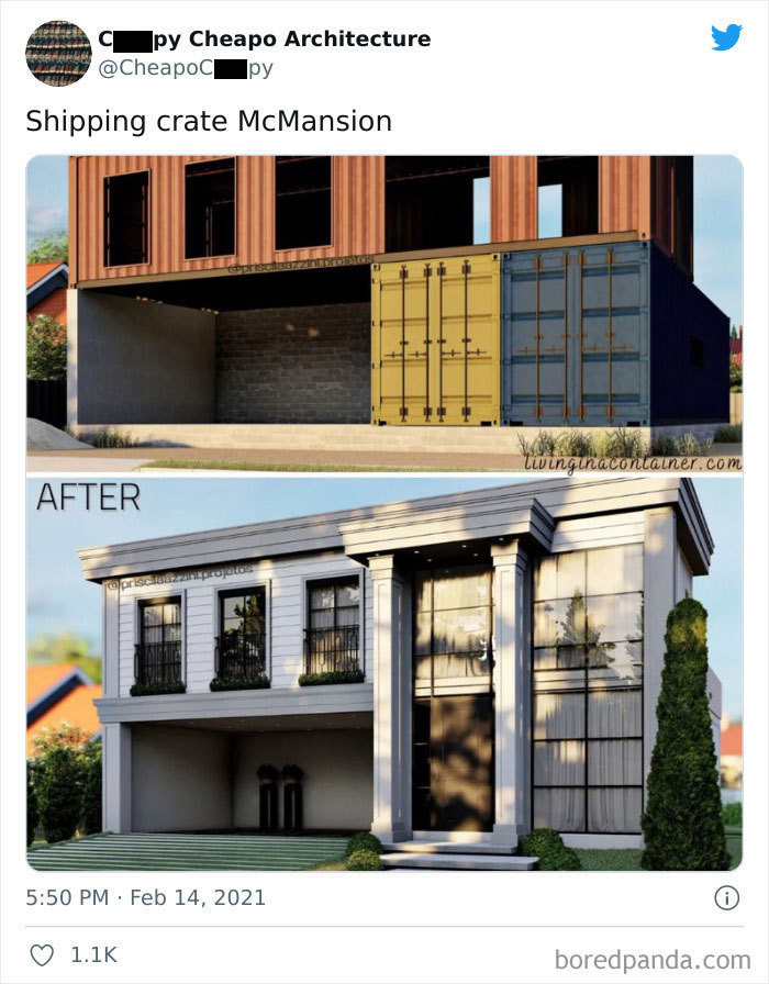
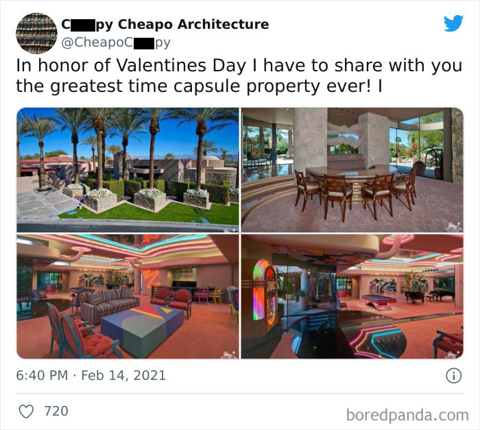
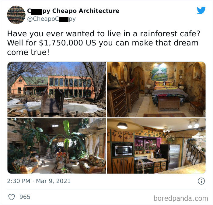
Bottom right picture looks like a KFC chicken bucket if you look quick
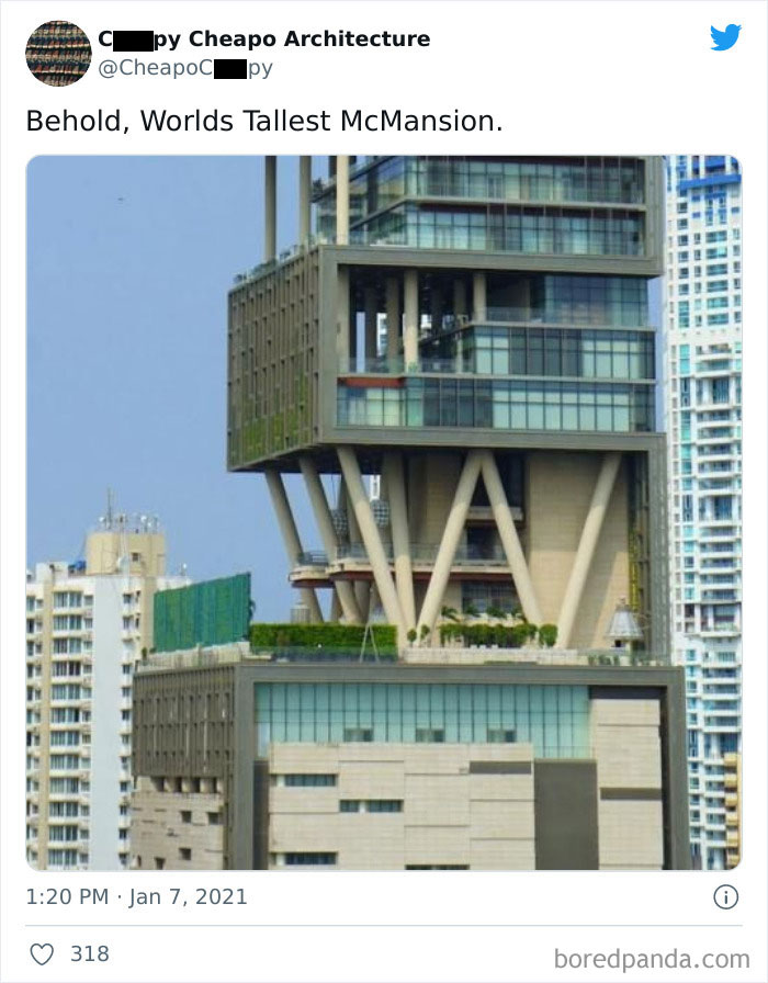
This one is interesting. It's Mukesh Ambani's house. The richest man in India. The 27-storey home is the most expensive residence in India and is currently valued at $ 2.2 billion. It is also the second most expensive residential property in the world after Buckingham Palace. Although the residence, named after a phantom island in the Atlantic Ocean near Portugal and Spain, has 27-storeys, the extra high ceilings make it stand as tall as an ordinary 60-storey high building. Mukesh Ambani’s home in South Bombay’s Altamount Cumballa Hill area has three helipads, air traffic control, a 168-car garage, a ballroom, 9 high speed elevators, a 50-seat theater, terrace gardens, swimming pool, spa, health centre, a temple, a snow room which has actual snow falling from the walls and has accommodation for a staff of 600 who are on call 24x7. The architectural design of the house is mainly inspired by the sun and lotus designs, but other than aesthetics it also has other features like the fact that it can withstand an earthquake of magnitude 8 on the Richter scale
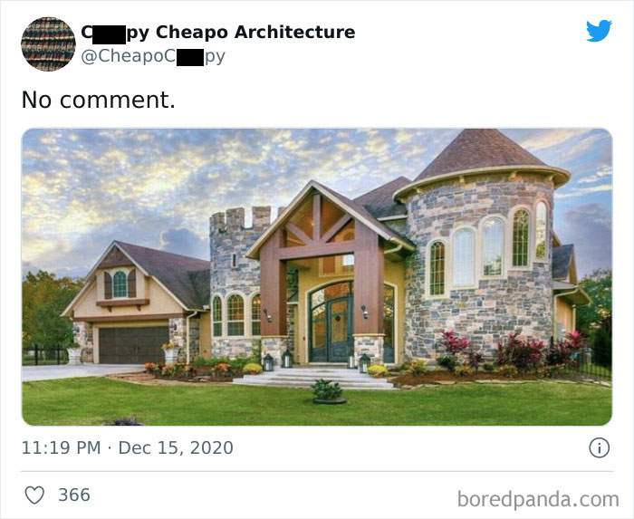
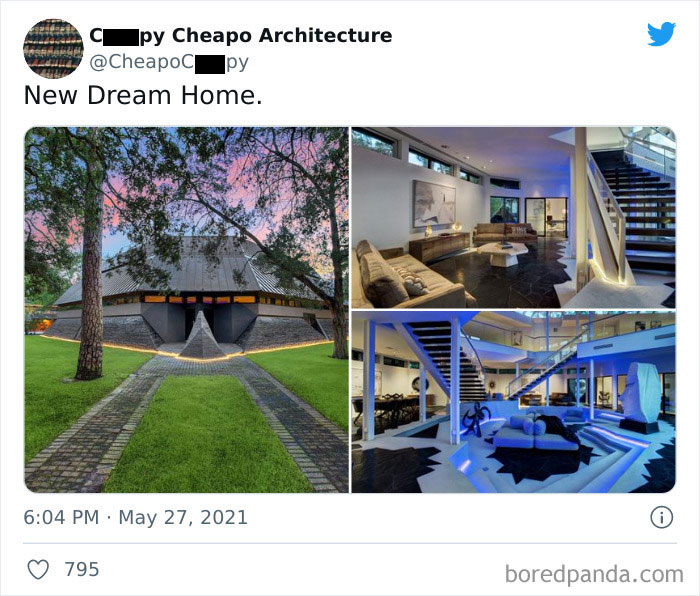
"Dream" home? Am I the only one who finds that exterior a bit sinister?
if you played too much GTA like me i know what your thinking seeing that roof
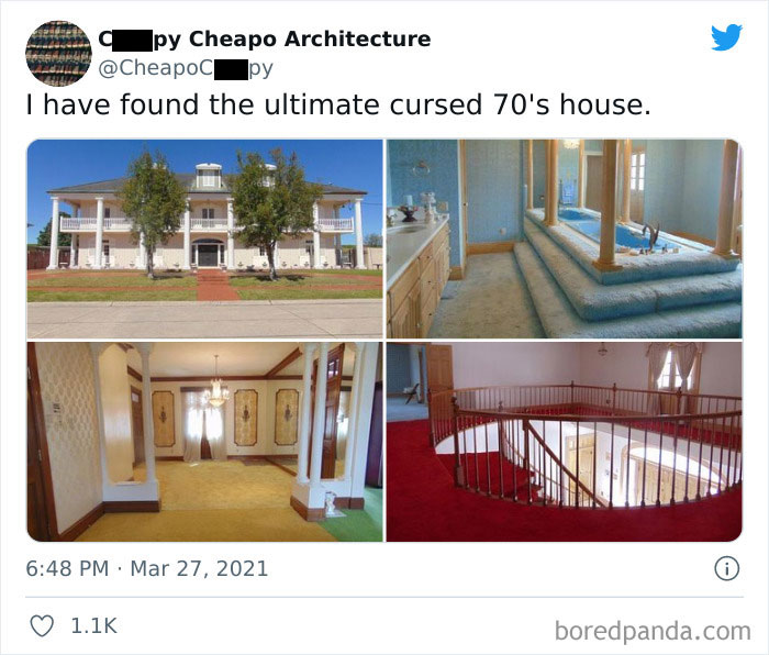
Every previous owner died by falling downstairs and smashing their heads on the marble floor
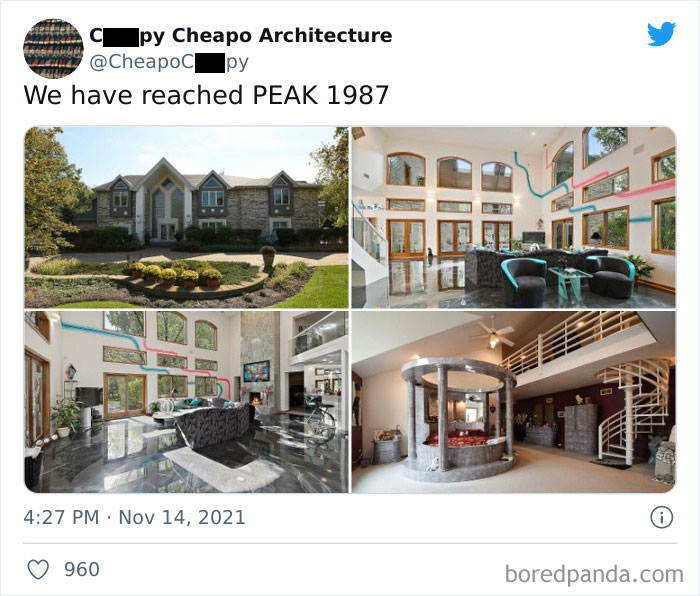
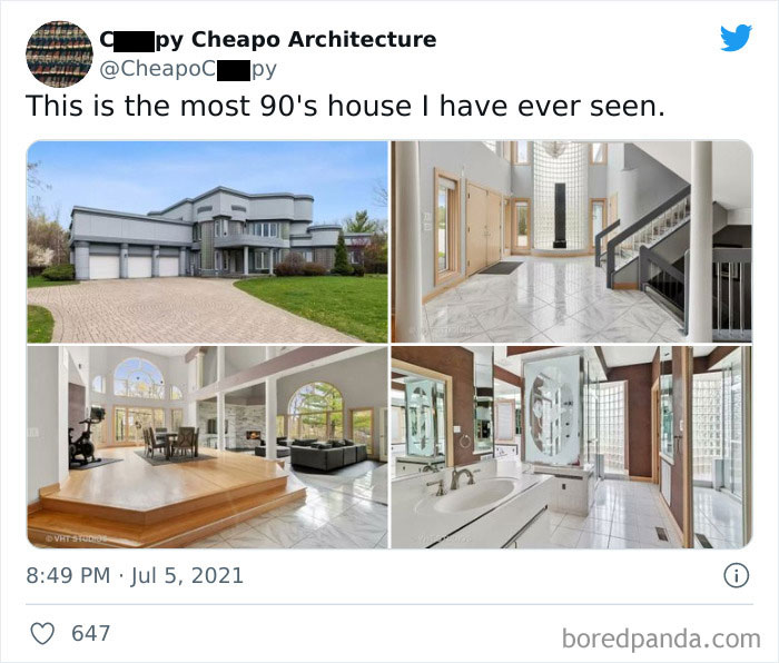
When your living room is so big it swallows a grand piano and two conversation areas.
Every year, there are less and less people with architectural taste. It's such a monstrous disease.
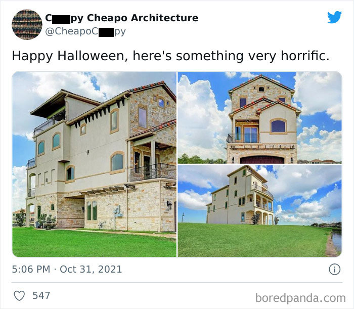
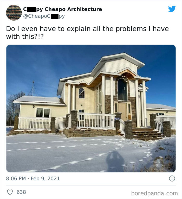
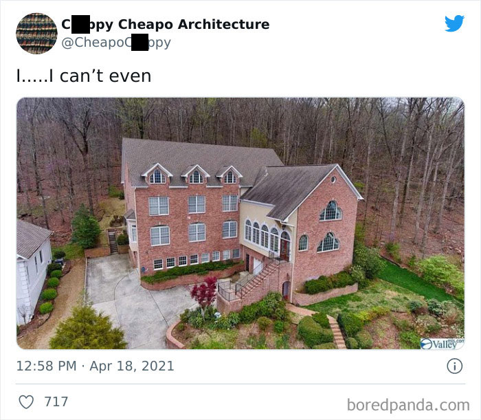
Unwanted visitors have to slog up the stairs, everyone else can use the ground floor entrance
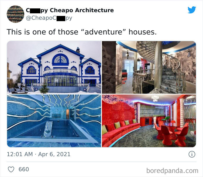
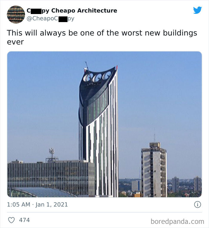
It looks like a smiling owl with three eyes got imprisoned in metal and stabbed with a spear
Farmer Jed may be a millionaire now but he hasn't forgotten his roots
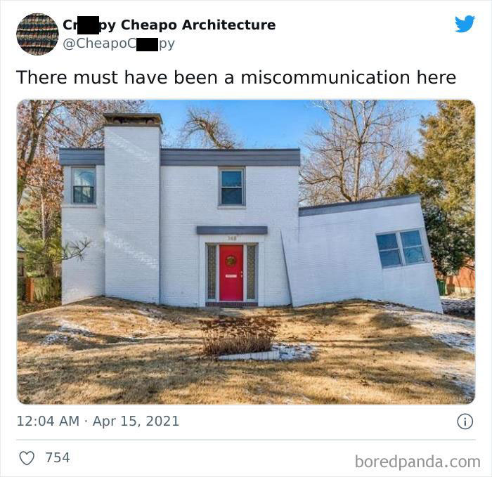
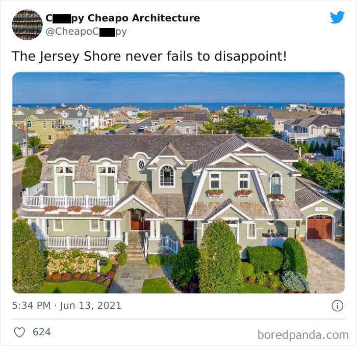
It's undergoing mitosis and will soon split into two identical ugly houses.
I kind of liked a lot of these houses. Sure, they look very impractical and very extra, and I would never live in any of these, but they were unique and eccentric.
I liked a lot of these. If I had the money to build a house that I enjoyed and would simultaneously upset the conventional fuddy duddies it would be a double win.

 Dark Mode

 No fees, cancel anytime


