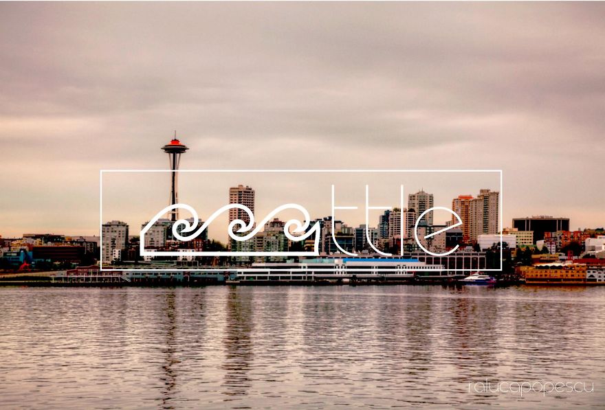
I was trying to create a representative banner for a travel agency, and while doing some research I started asking myself how can I creatively represent a city's name with an image.
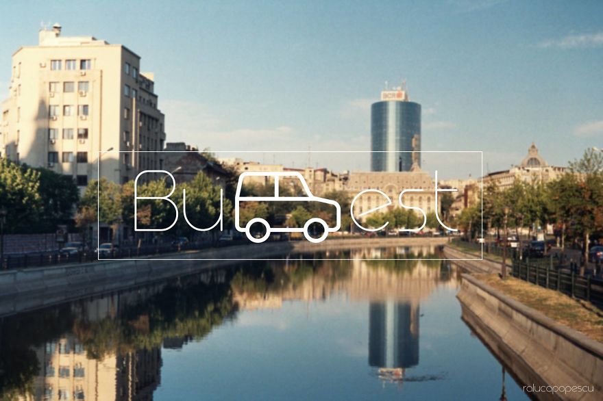
I started with Bucharest. What best represents the city I live in? How can it be drawn? See results bellow!
More info: ralucapopescu.wordpress.com
This post may include affiliate links.
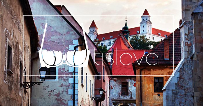
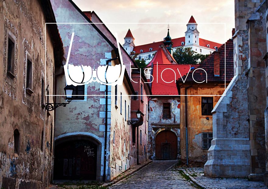
Bratislava
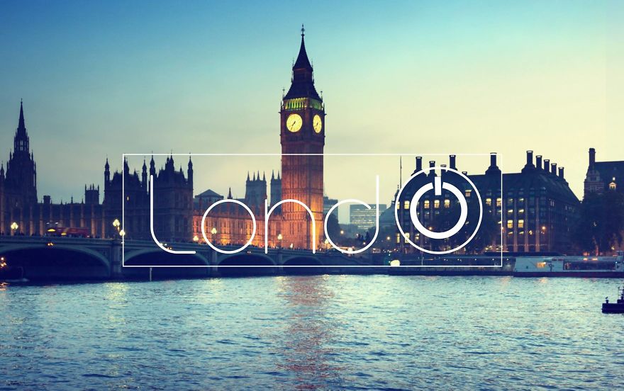
On And Off
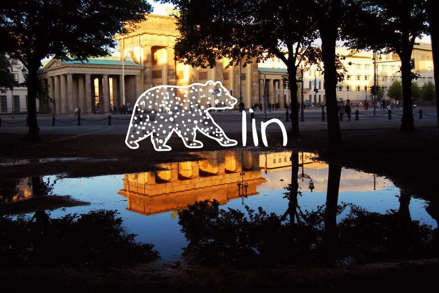
Berlin
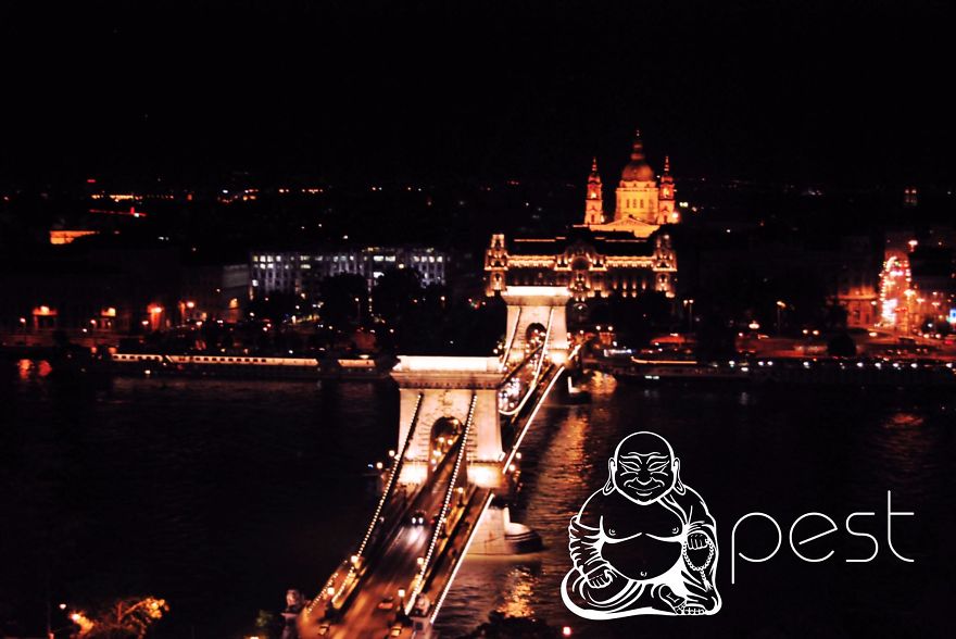
Keep In Mind. Bu-car-est Is Not Buda-pest
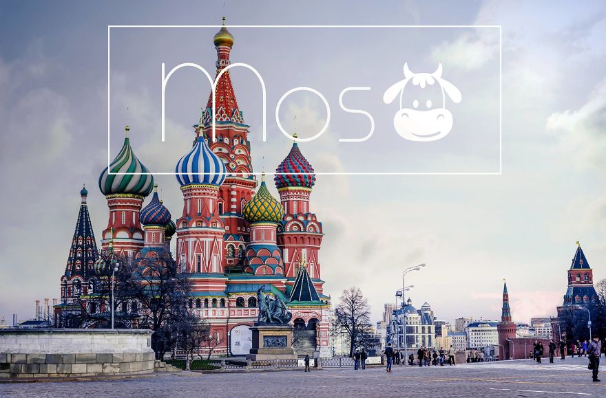
Moscow
Winter Is Coming
Bucharest
By The Sea
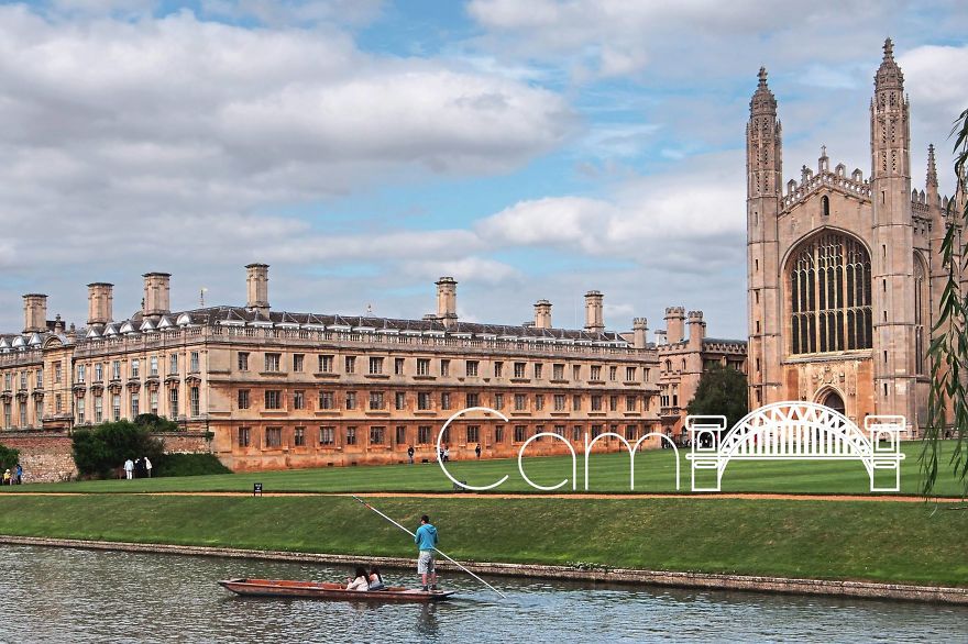
Cambridge
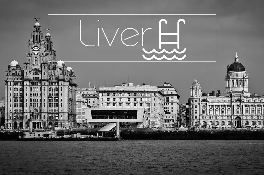
Liverpool
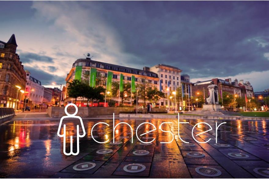
Manchester
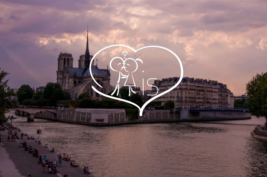
Paris
They might mean "pair", as it's how you pronounce Paris.
Load More Replies...Yes, that was the first option. Thought this one works better. :)
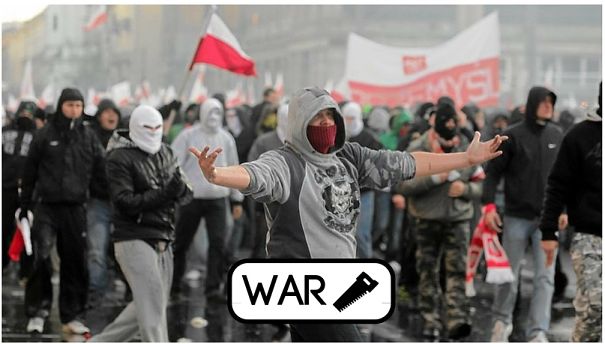
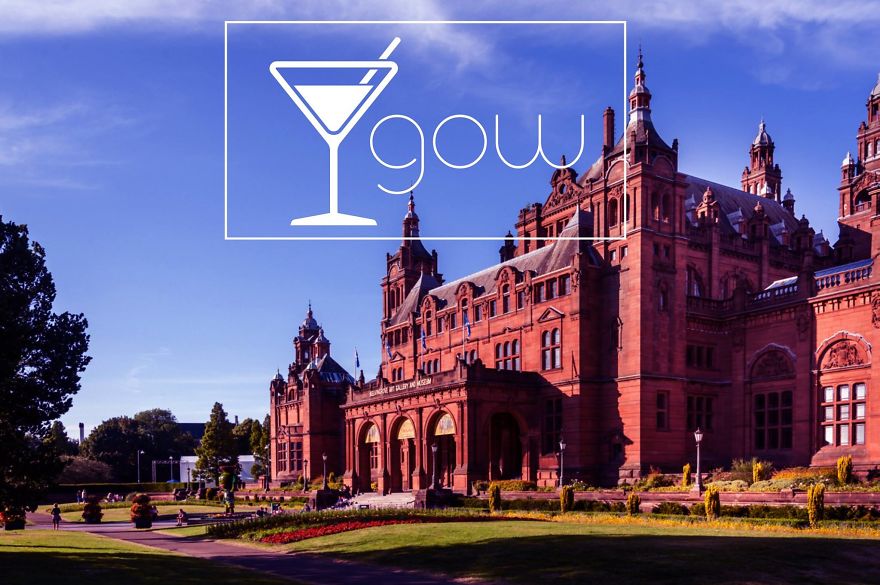
Load More Replies...Glasgow
The idea itself is good, but I was annoyed by the inconsistency -- sometimes the icon is taken from spelling (e.g. Seatle) while others from pronunciation (e.g. Bu-cha-rest with a car). Chinese and Japanese place name would look interesting if they can put an icon showing the meaning, say Shang-hai with sea icon.
Here is Plovdiv, Bulgaria - P/love/div. There is a global social campaign pLOVEdiv as Plovdiv city has been selected for an European Capital of Culture for 2019 - www.plovediv.bg. Image: http://zdravkoyonchev.com/ Plovdiv-57...2a-png.jpg 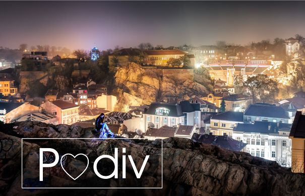
Interesting concept. But I think that the visual can be execute better. For an example, some text are hard to read on top of images.
It would be better if you didn't put there the city's real name. It could be a kind of quiz.
I think they chose pretty good the sign for Berlin, since the bear is also the symbol of the city :P
The idea itself is good, but I was annoyed by the inconsistency -- sometimes the icon is taken from spelling (e.g. Seatle) while others from pronunciation (e.g. Bu-cha-rest with a car). Chinese and Japanese place name would look interesting if they can put an icon showing the meaning, say Shang-hai with sea icon.
Here is Plovdiv, Bulgaria - P/love/div. There is a global social campaign pLOVEdiv as Plovdiv city has been selected for an European Capital of Culture for 2019 - www.plovediv.bg. Image: http://zdravkoyonchev.com/ Plovdiv-57...2a-png.jpg 
Interesting concept. But I think that the visual can be execute better. For an example, some text are hard to read on top of images.
It would be better if you didn't put there the city's real name. It could be a kind of quiz.
I think they chose pretty good the sign for Berlin, since the bear is also the symbol of the city :P

 Dark Mode

 No fees, cancel anytime


