50 Truly Facepalm-Worthy Designs That Actually Got Presented To The Public (Best Of All Time)
Interview With ExpertDieter Rams, the godfather of industrial design, defined ‘good design’ as making the product useful, understandable, innovative, aesthetic, unobtrusive, honest, and long-lasting. But that’s not even close to being all! It also has to be thorough to the last detail, environmentally friendly, and involve as little design as possible. Over time, these ten principles have become the blueprint for design, inspiring many creators worldwide.
However, not all stick to such guidelines, producing many various design failures, which this successful subreddit takes pride in collecting. We, at Bored Panda, have published quite a few articles reviewing them, and today we are treating you to a list of some of the best, or perhaps worst ones, that make people scratch their heads from confusion. To find them, all you have to do is scroll down.
While you're at it, don't forget to check out a conversation with lead industrial designer Elodie Delassus, who told us what good design means to her.
This post may include affiliate links.
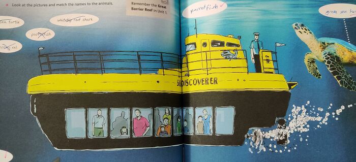
This Captain Of The Submarine In My English Book
"Good design to me is both people- and planet-centric," said lead industrial designer Elodie Delassus to Bored Panda. "As designers, we understand the user needs, their aspirations, the context, and the use requirements to bring to life a meaningful product that people will love having in their lives."
She adds that it's not only about the people but also the planet, as designers' responsibility is to understand the lifecycle of the product they create. Picking the right material and manufacturing techniques allows them to have a conscious impact on our world. "A good design, to me, is not only making sense in use and aesthetics, it is also a sustainable product in the long run."
On the other hand, a bad one "doesn't take into account the above, is often flawed, and has a short life in actual use. A bad design breaks easily, gets out of trend, and ignores the user's needs or context," says Delassus.
Spoiler
One of the most common mistakes Delassus notices in bad design is the poor choice of materials, like a product blending two different plastics. A toothbrush with hard plastic and a soft silicone overmold is a great example of this.
"This might look attractive, BUT it makes the plastic or product unrecyclable," she explained. "You can also think about products that mix organic material with plastics. It basically makes the plastic unrecyclable, and the product will end up in landfills or incineration."
Another aspect that creators overlook is the long-term appeal of the product. Designers should produce a product that is easy to maintain and clean (reducing any nooks and crannies), which also adds to its longevity. "One example could be a product using soft-touch paint - very desirable at first but becomes sticky over time, especially in humid and hot environments," said Delassus.
In addition, bad design adds unnecessary and unjustified complexity. "The design of a product is the voiceover that talks about what the product can do, guides how it can be used, etc. Design that doesn't guide its users ends up being confusing," explains the industrial designer.
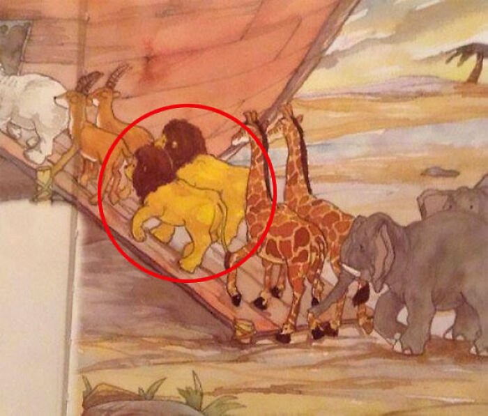
This Amazing Pregnancy Test
Moreover, bad design choices ignore the context of use. One example is a fan with a bright LED that can't be turned off when the fan is working. Users may be placing it in their bedroom and be disturbed by the light at night.
The last feature of a poorly designed product that Delassus mentions is exclusivity. "We usually design for the 50th percentile. However, the golden standard in design should be inclusive.
The best designs often start with an extreme user/context and have benefits to the broader community (it is called the curb-cut effect). Good design provides enough space between buttons, good ergonomics, and visibility."
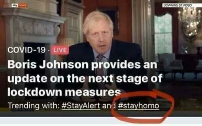
Being Gay Was A Sin They Said
Dieter Rams, a German industrial designer known for his less but better approach to design, outlined the characteristics of good design so creators know what is expected of them. He had immense influence in this field and helped to shape how products in the 20th and early 21st centuries looked and worked. Alarm clocks, toothbrushes, and coffeemakers are just a few of his hallmarks.
In the late 1970s, Rams tried to figure out the world around him, asking himself the important question, “Is my design good design?” The answer led him to his ten principles, which we’re going to discuss more below.
A Scene From An Indian TV Show
First, a designer should always strive for innovation. The world is constantly progressing, and new technologies are offering plenty of opportunities for novel and inventive ideas. Therefore, design has to keep up by taking these creative ideas and turning them into useful solutions to modern problems.
Innovation in design can take many forms. It can involve new materials or technologies, rethinking traditional ways of designing, or finding fresh solutions to impractical issues. By embracing innovation, creators can come up with products that aren’t only functional but also sustainable and cost-effective.
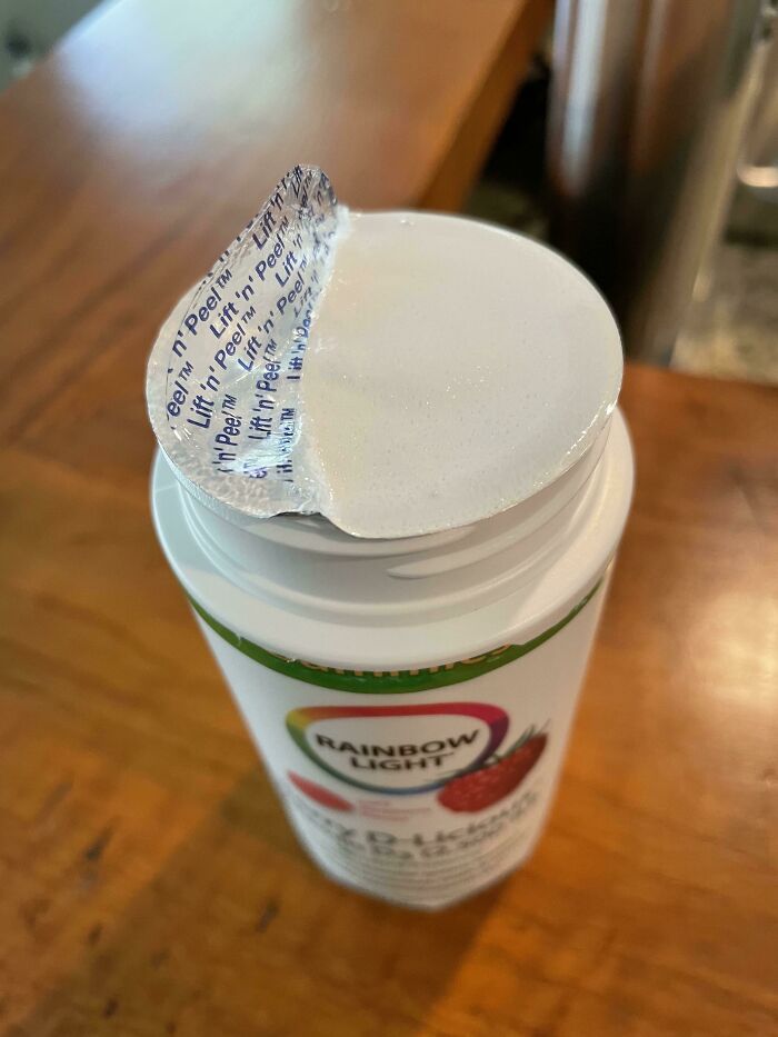
These Pull Tabs That Never Come Off
Smh
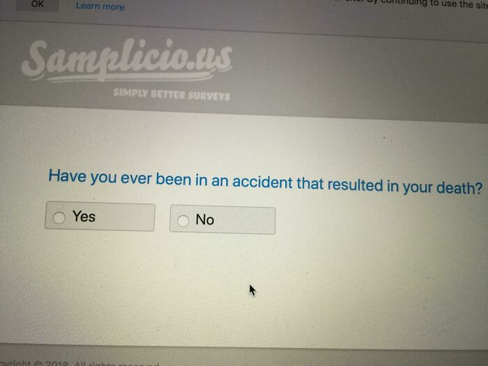
I Didn’t Qualify For This Paid Survey After Selecting “No”
Even in the 1970s, Rams was concerned with the environment, waste, and consumer culture. In his 1976 speech, he said, “I imagine our current situation will cause future generations to shudder at the thoughtlessness in the way in which we today fill our homes, our cities, and our landscape with a chaos of assorted junk.”
Tunashamed
No need to be ashamed of tuna, but if you are, just bat it under the sofa
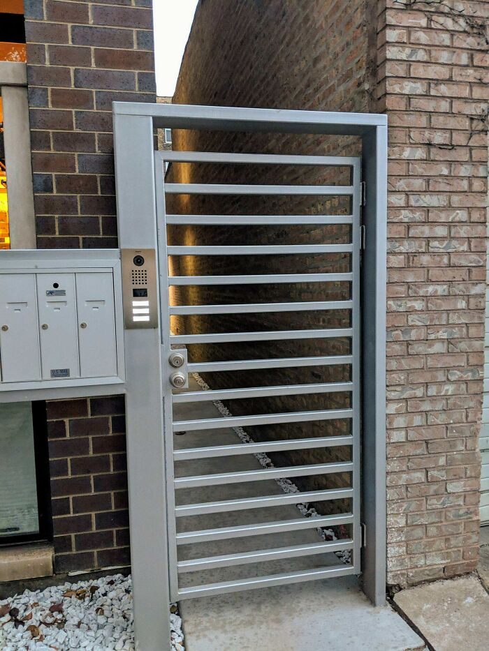
When Your Security Gate Is A Ladder
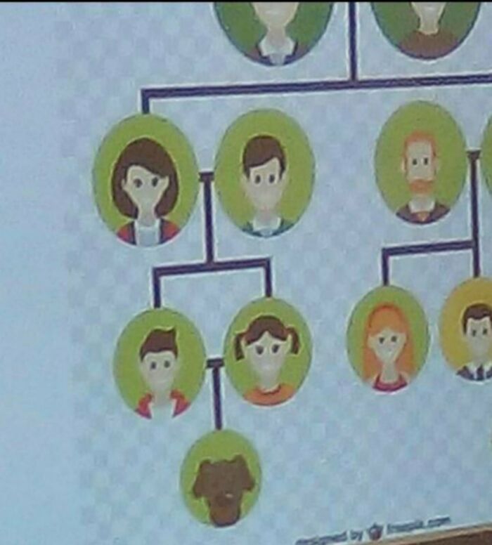
Unfortunate Dog Placement
With fewer and fewer natural resources, he believes that both buyers and designers should take responsibility for the state our world is in. He calls for an end to wastefulness and continues to advocate sustainable and innovative creations.
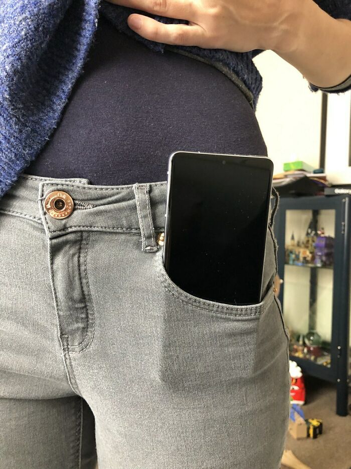
The Pockets On Women's Trousers
I think it's pretty safe to say that we all know this and we hate it. /sincerely all women on earth
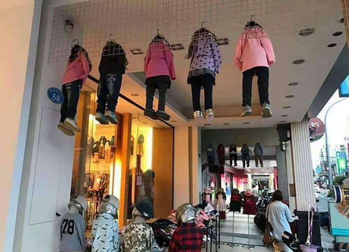
This Clothing Display
The Elders At My Brother-In-Law’s Church Got To Design The Church League Softball Shirts. The Thought “Cli” (Christian Life International) Alone Wouldn’t Signify A Church, So They Added The Cross. Magnificent
I sense that Satan is laughing his a.r.s.e off over this one.
It's self-explanatory that the main reason people buy a product is so they can use it. That’s why design shouldn’t detract from its usefulness either. However, an item that is considered useful to one may be entirely useless to others, so the specific criteria that determine this remain difficult to define.
I Think I Know Why
Do you remember the early nineties when we start having some bipper for text messages but we had to call a special center and just dictate our message to a person whom send it as a text on the bipper. That was so weird ^^
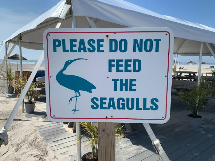
Sign At A Local Beach
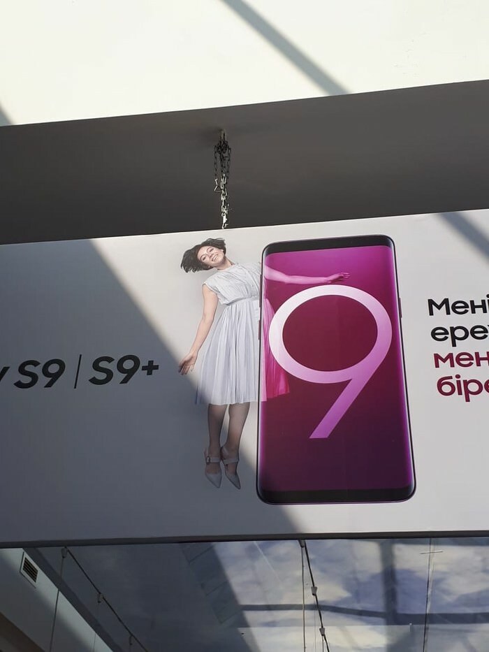
This Ad Placement
Something that makes buyers use the item more is if it’s aesthetically pleasing. When we don’t enjoy the look of it, we are less likely to pick it up.
Without a doubt, it should also be easy to utilize without any details interfering with the user's experience. By saying that design should be unobtrusive, Rams is emphasizing the importance of simplicity and usability. Choosing a classic design that never looks outdated also prevents more products from ending up in landfills.
Pretty Sure He's Using It Wrong
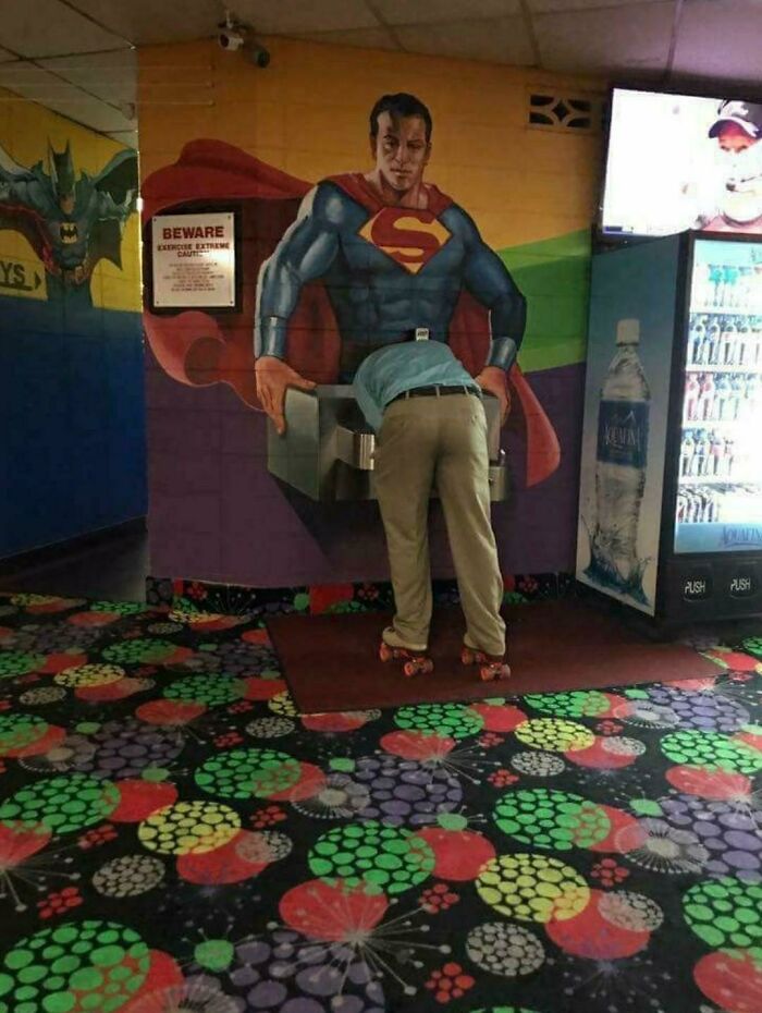
Just Why
Full energy blowjob on Superman while wearing some rollers skate on a psychedelic carpet is not something you can see every day
To Motivate
Finally, the product should be honest with its consumers, meaning that a person shouldn’t feel disappointed when an item doesn’t work as well as they hoped. So the design should be as innovative, powerful, or valuable as it claims to be. According to Rams, products should be reliable, durable and allow people to use them as they were intended to be used.
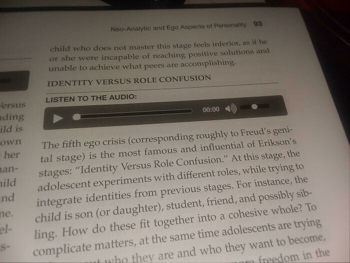
Professor, I Can't Get These Audio Files In Our Textbook To Play
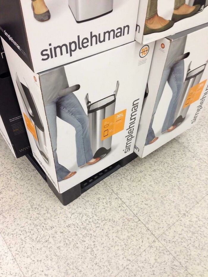
Love Handles
They absolutely knew what they were doing with this placement!
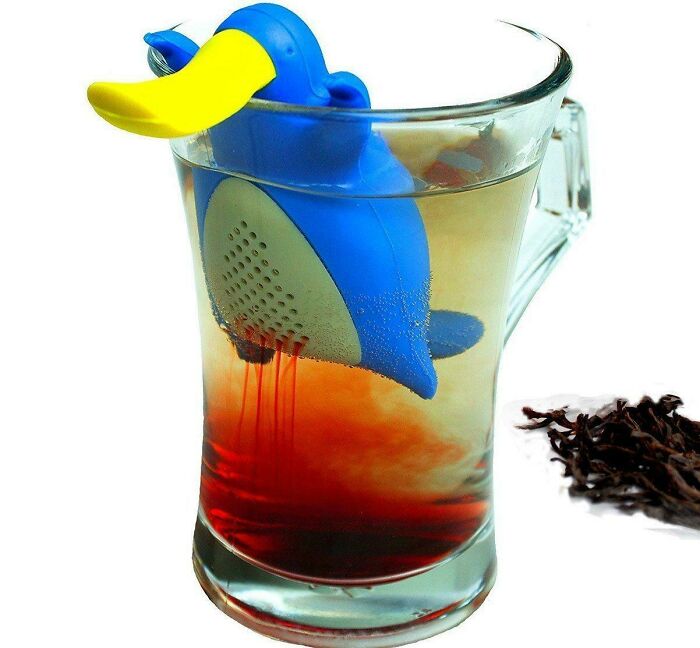
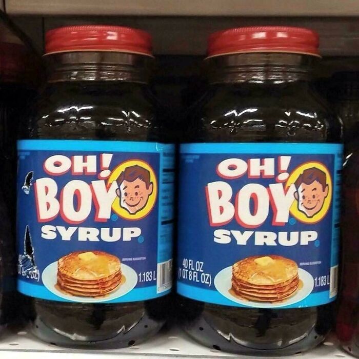
Oh Boy, There's Platypus Period In My Tea!
Platypus is a weird animal, part duck, part beaver, have eggs but a mammal and just bright under black light. Maybe platypus periods got some special effects ^^
In a nutshell, the best design won’t require extra explaining to its users, who will very much appreciate how simple yet thoughtful creations understand the people they are designed for. Jared Spool, the American writer, researcher, and usability expert, put it best, “Good design, when it’s done well, becomes invisible. It’s only when it’s done poorly that we notice it.”
Noted
We Are The Borg. Resistance Is Futile
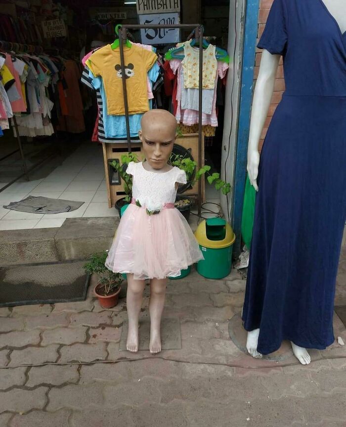
This Kid Mannequin
So, It's Fine Then?
It's A Trap!
My Company Wanted To Make Our Fountain Pink For Breast Cancer Awareness. Didn't.... Quite Get It Right
We All Party Down Here
Idk I'm European
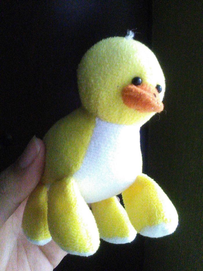
My Four-Legged Duck
Commas People
Rose Uh ?
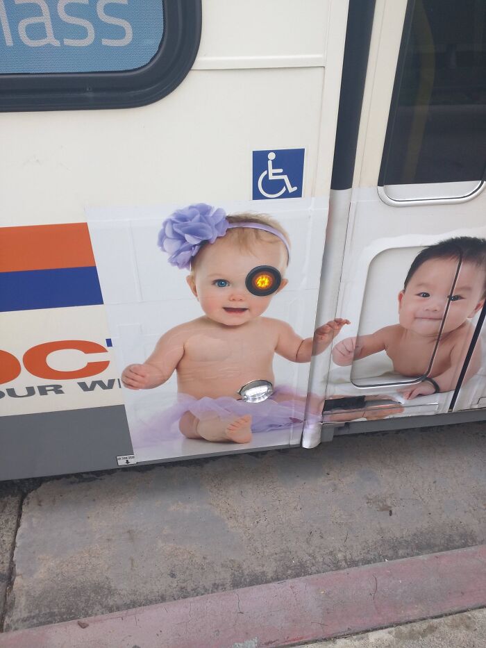
This Bus
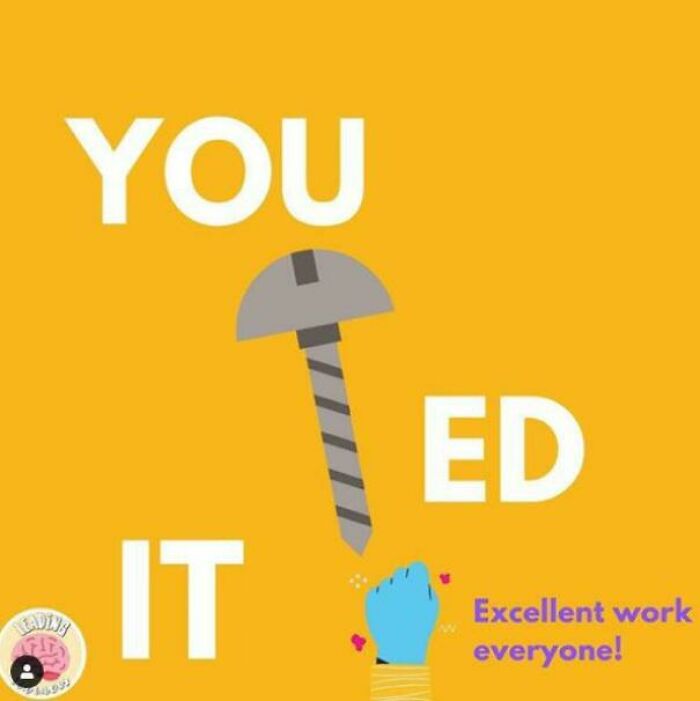
A Nail Or A Screw
Ho Ho-No
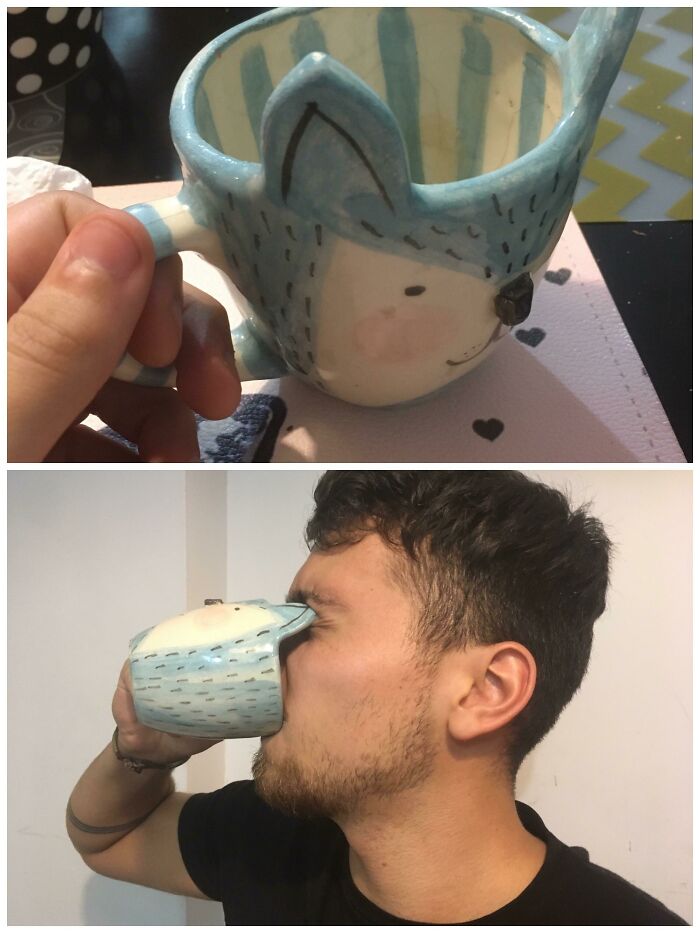
Nothing Like The Smell Of Coffee And A Good Eye-Stab In The Morning
There are quite a few people I'd like to give one of these to. After sharpening the ears, that is.
This Ad For Graduation Photography
The Clock Hands Don’t Glow
Will i be early, will i be late? Que sera sera, whatever will be will be....
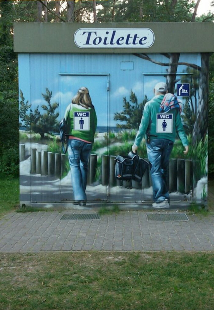
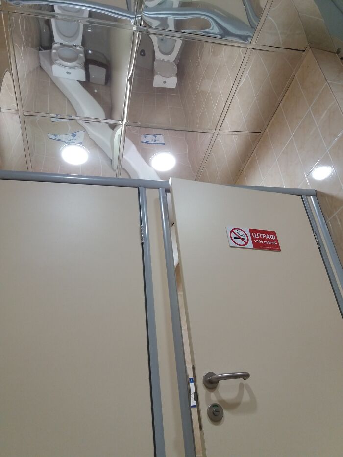
Toilets And Mirror Ceiling
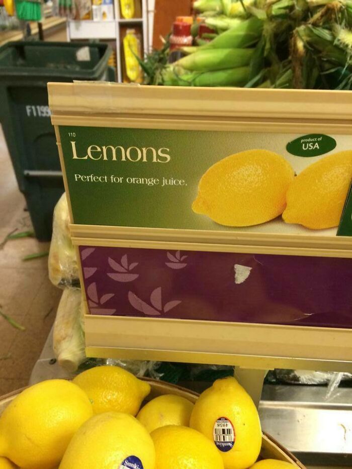
When Life Gives You Lemons
When lives gives you lemons, just make orange juice to confuse everybody
I Bought A Billboard To Promote My Business And They Screwed Up The Formatting
It's a win. Free billboard next time and this time everybody knows his face.
Our Municiplaity Made Bike Lanes For Us Finally!
I don't even have a bike now but somehow i would manage to trip over this.
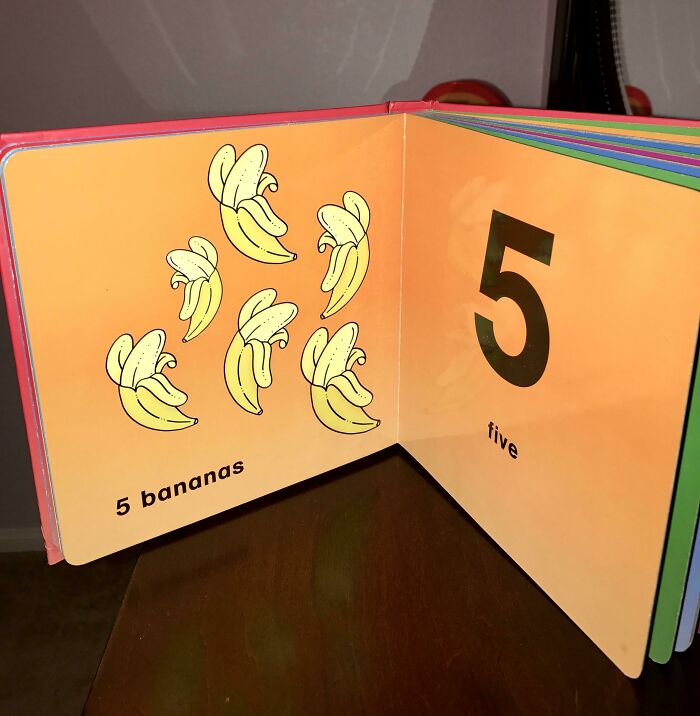
Proofreading This Book Couldn't Have Been That Hard
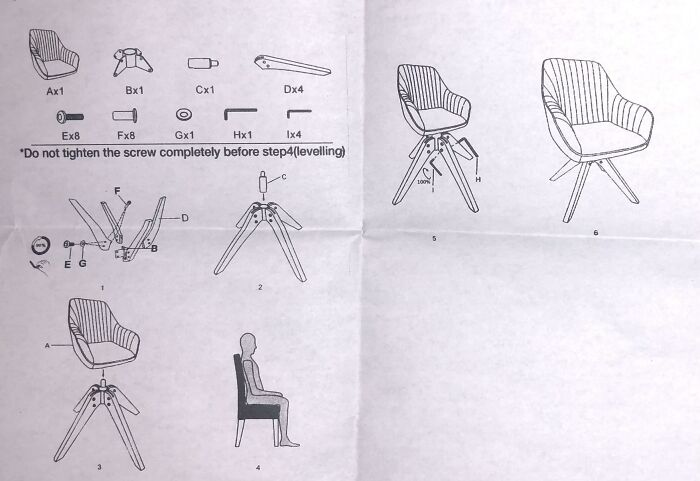
Step 4: Just Go Sit In Some Other Chair
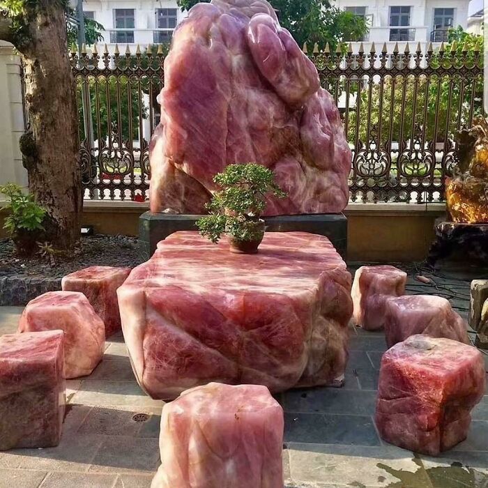
Crystal Furniture Set That Looks Like Raw Meat
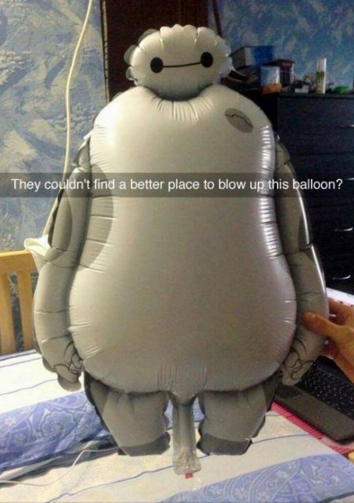
This Unfortunately Designed Kid's Balloon
i can totally figure my wife coming back from work and finding me red faced with this inflatable robot c**k in my mouth with my daughter cheering of excitement.
"inflatable robot c**k" sounds like a great name for a band....
Load More Replies...This must have been designed on purpose by some twisted f...k. Laughing all the way to the packaging department.
it is most definitely deliberate, but if you ask, they'll all say "it's the only practical way to do it", lol. Most character balloons have these and it cracks me tf up. I worked in a store that sold balloons like this in high school, I am no less mature now than I was then about it (to be fair, neither were the customers when they saw me inflate them, lol).
Load More Replies...That's because there's no brain, hence the problem!
Load More Replies...Once I saw a dinosaur ballon like this. “Dinosaur gender reveal!!!”
It wouldn't be so bad if it was just the valve. Adding the... Ahem, shaft, really is the icing on the cake!
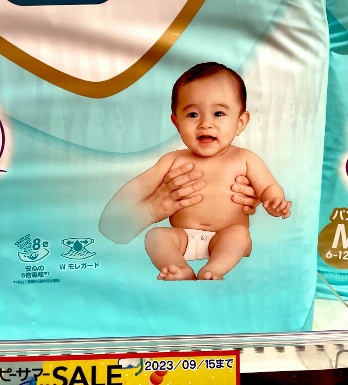
Diapers For Mutant Baby
Well it’s an ad from Japan… to soon for Fukushima jokes? … yeah I think so.
This Catholic School Logo
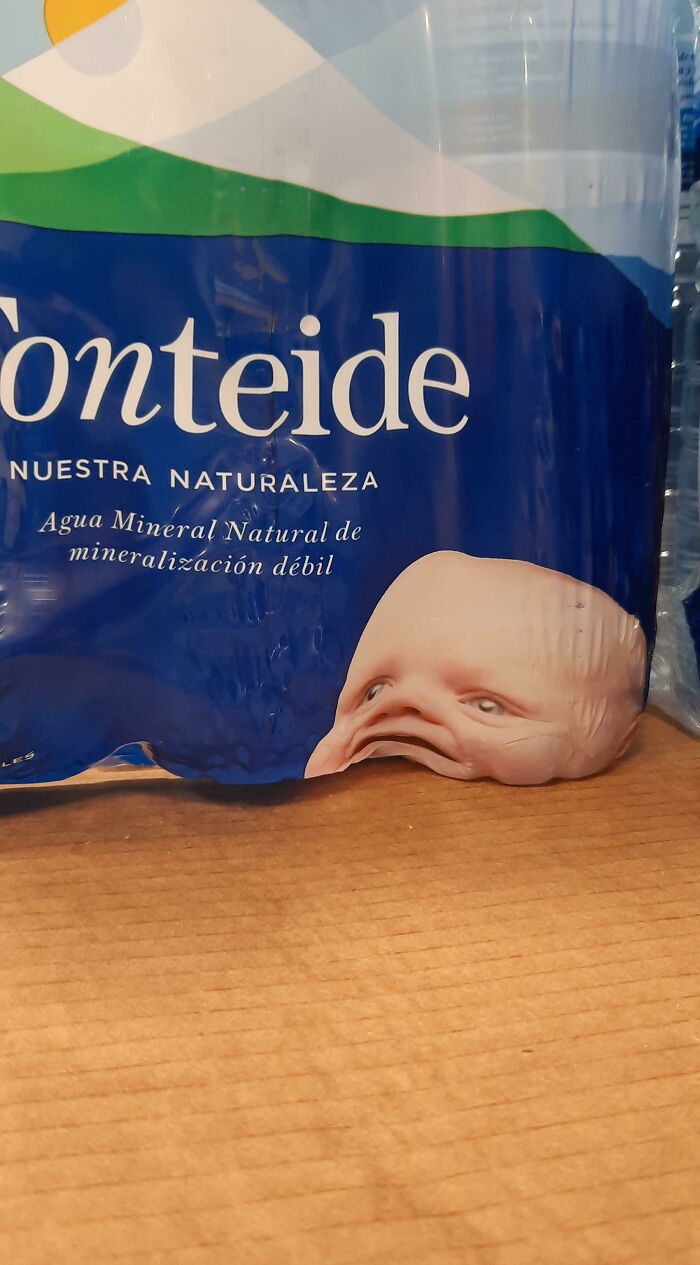
The Placement Of This Baby's Head Wasn't Quite Thought Through
Can’t fool me, that’s a blobfish out of it’s rightful environment.
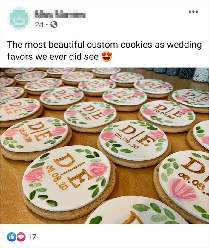
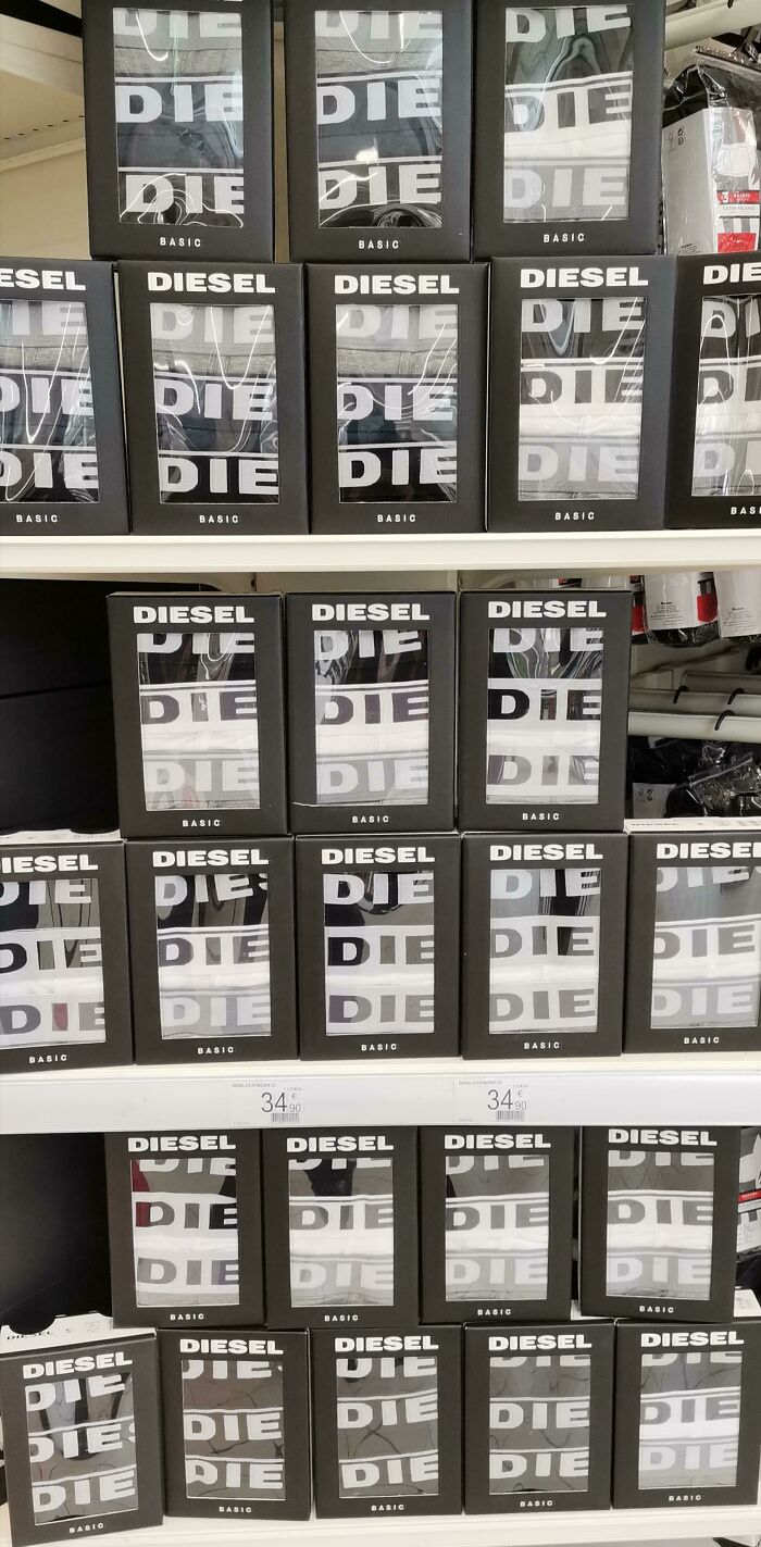
Tell Your Wedding Guests To Die
Winnie
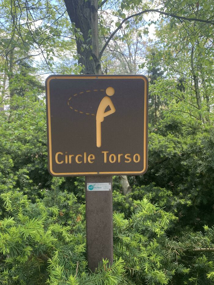
This Sign At The Akron Zoo That Looks Like A Man Peeing In His Own Face
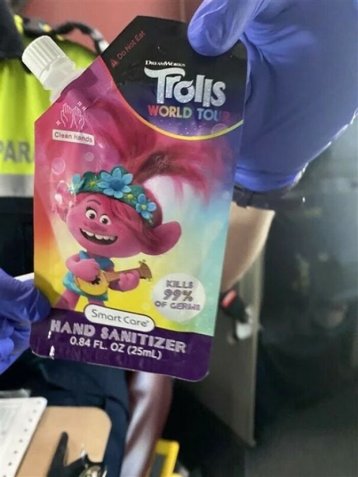
This Kid Friendly Hand Sanitizer Package. Looks Like One Of Those Apple Sauce Things, No?
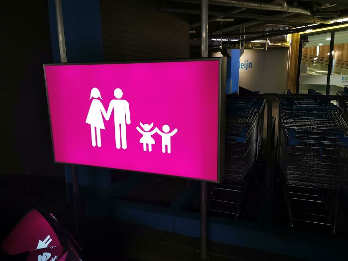
One Armed Mother And A Demon Child
Pulling Tissues From This Box Feels... Uncomfortable
Take My Honey
A New Park Opened In My City, Pretty Lovely, And This. Buttcleaner3000
Honey, You Really Shouldn't Have
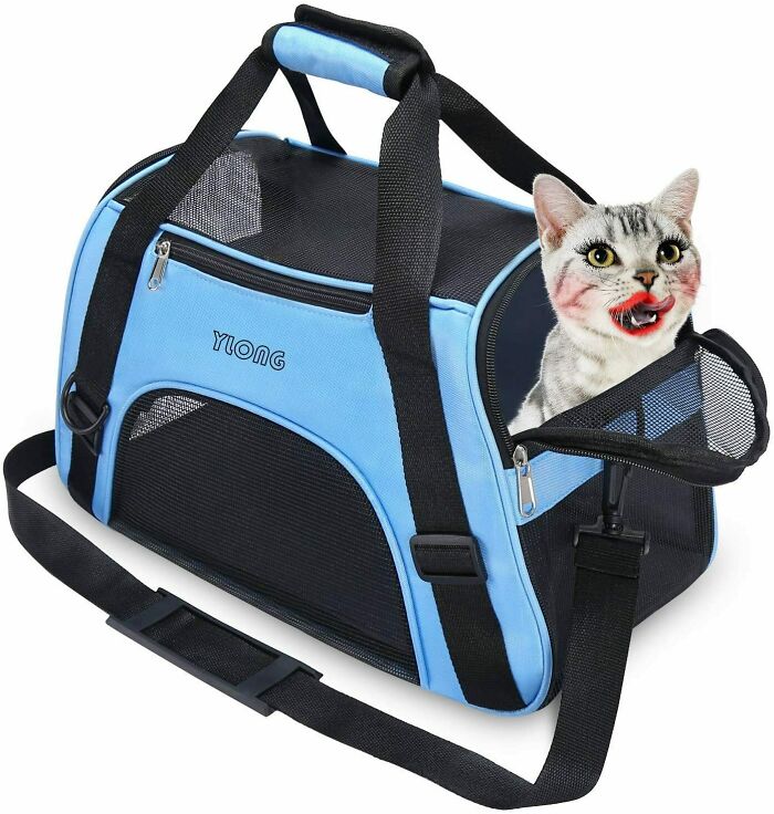
Best Cat Carrier To Contain Your Sexy Cat
I'm Just Gonna Let The Fire Consume Me
This must be the twelfth time I see this one, and everytime there's one person commenting the same thing. Let me be the one this time; it only locks TO the hand, she is still free to move away. It's not attached to the box.
This Flower Print Dress
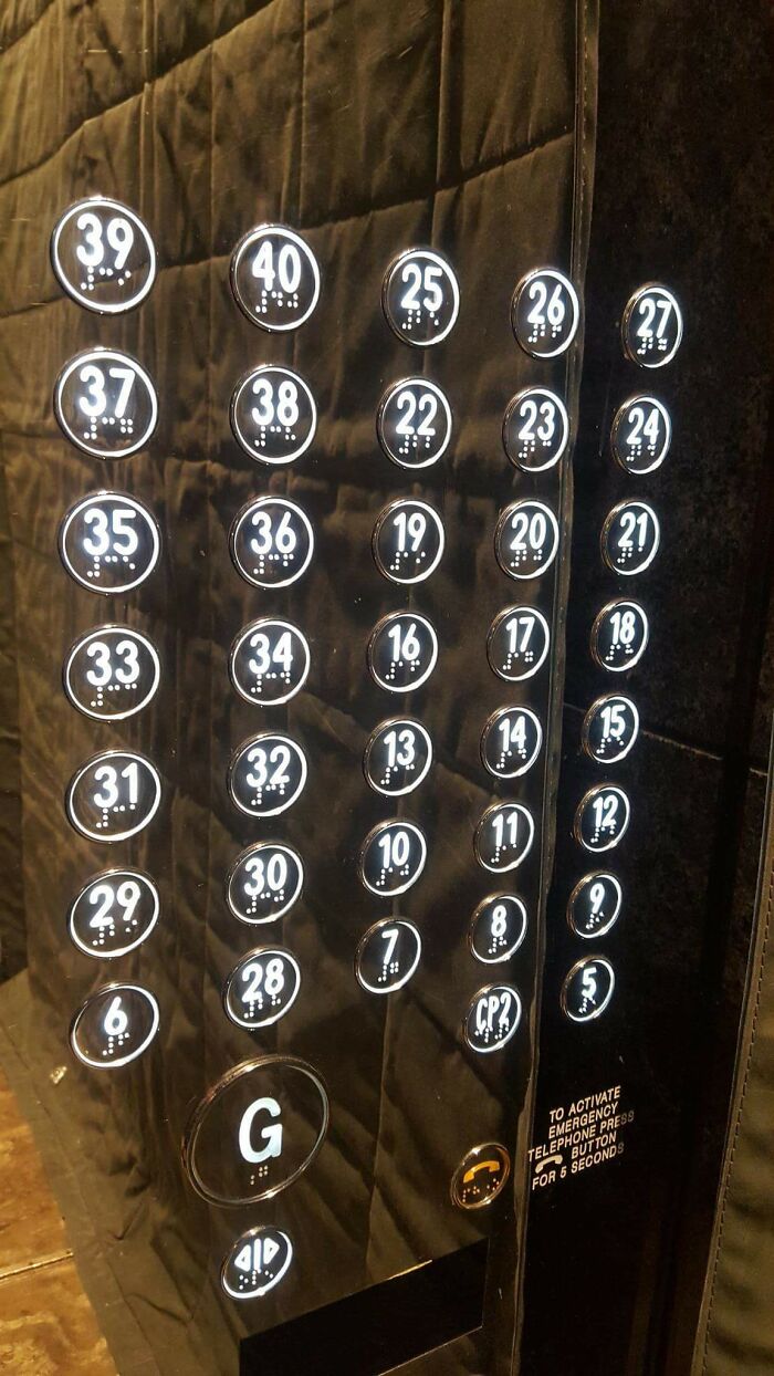
This Elevator
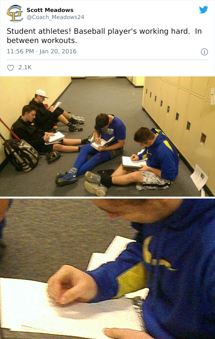
I Can't Even
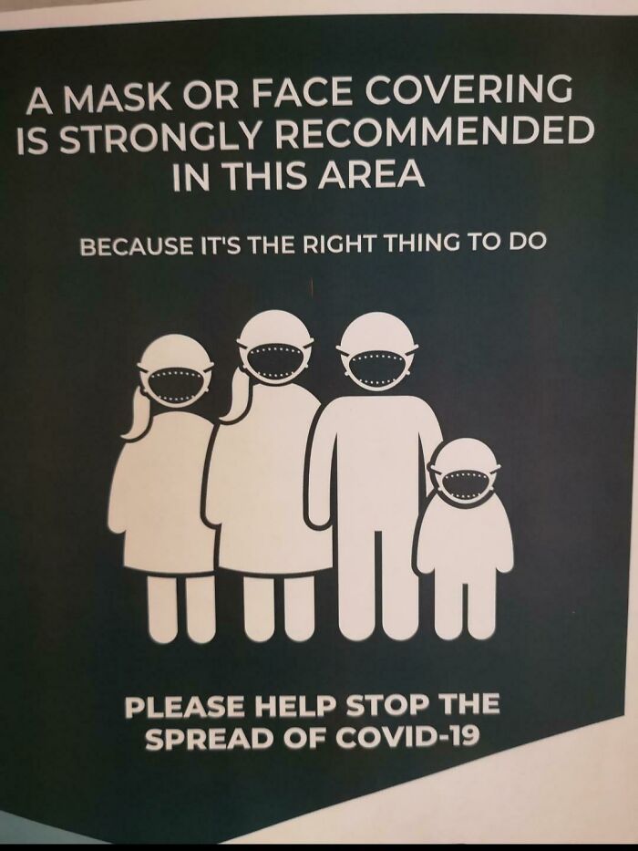
People Wearing Face Masks Looking Like Monsters
This Bath Bomb's Final Color
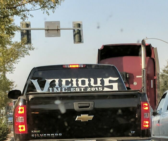
Vicious Incest?!
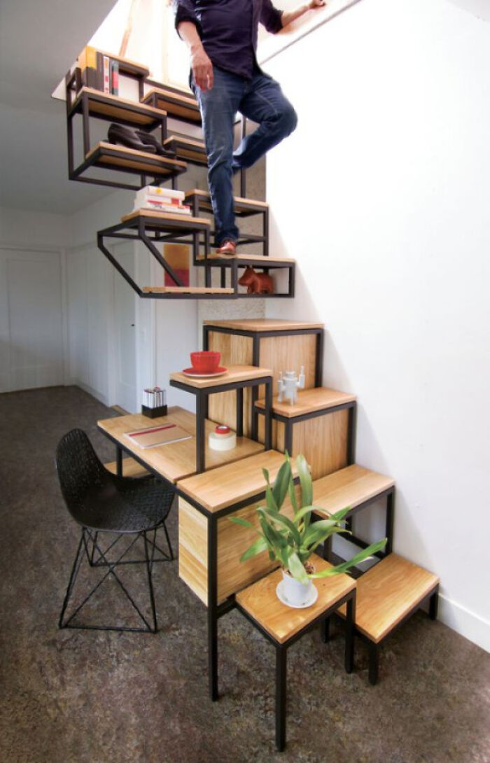
For When You Want A Near Death Experience Every Time You Use The Stairs
If the layout and lack of rails weren't enough, this guy also added an obstacle on the third step. That little statue looks like it has a few pointy bits pointing straight up.
Closer Than You Think
Unfortunate Hole Placement
I Don't Know If This Fits Here, But Do Not Leave Children Unattended At Whole Foods
Somebody finally taking Jonathan Swift's 'A Modest Proposal' seriously.
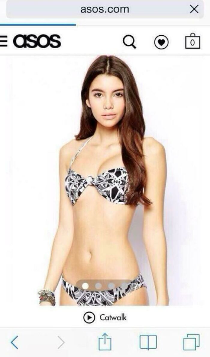
Forever 21 Does Not Know How To Use Photoshop Or What Women Actually Look Like
That's Not How It Works
I Needed Red. Guess Which One I Grabbed At First
My High School Commissioned A Bulldog Statue! This Is The Result
Architect: So How Many Windows We Thinking? Client: Yes
How Much Do You Trust Your "Multilingual" Ad Designer?
Parking Fee Just Gotten Real
Put Barbed Wire Across The Top Of The Gate. We Don't Want Anyone Climbing Over It
They Stopped Construction On The New Burger King In My Hometown Because The Building Is Backwards. They Put A Whole Building Up Backwards!
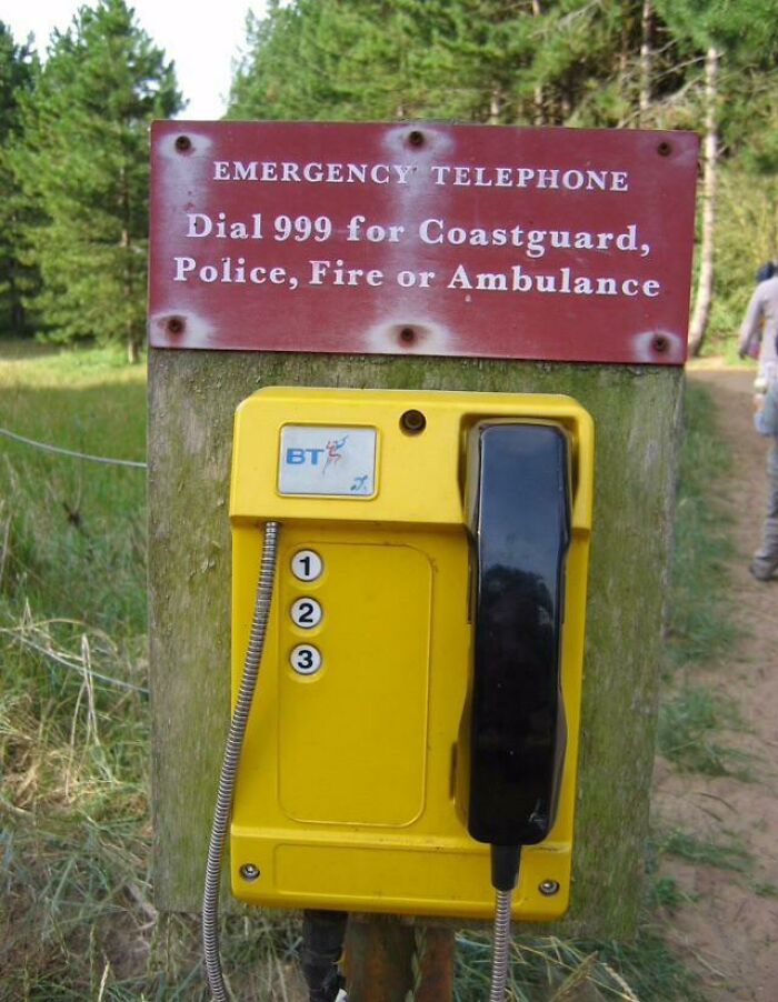
Dial 999 For...oh
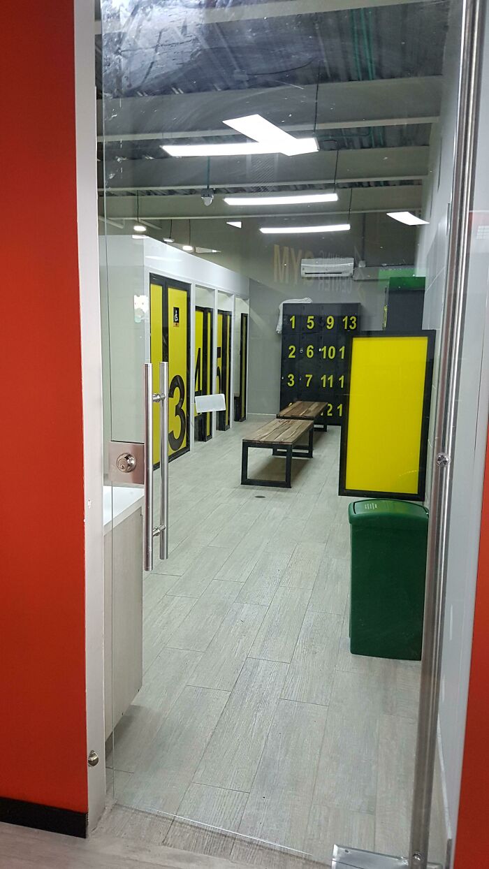
Was Worried About Privacy, So I Asked If They Could Put A Door Up To The Men's Change Room. Problem Solved
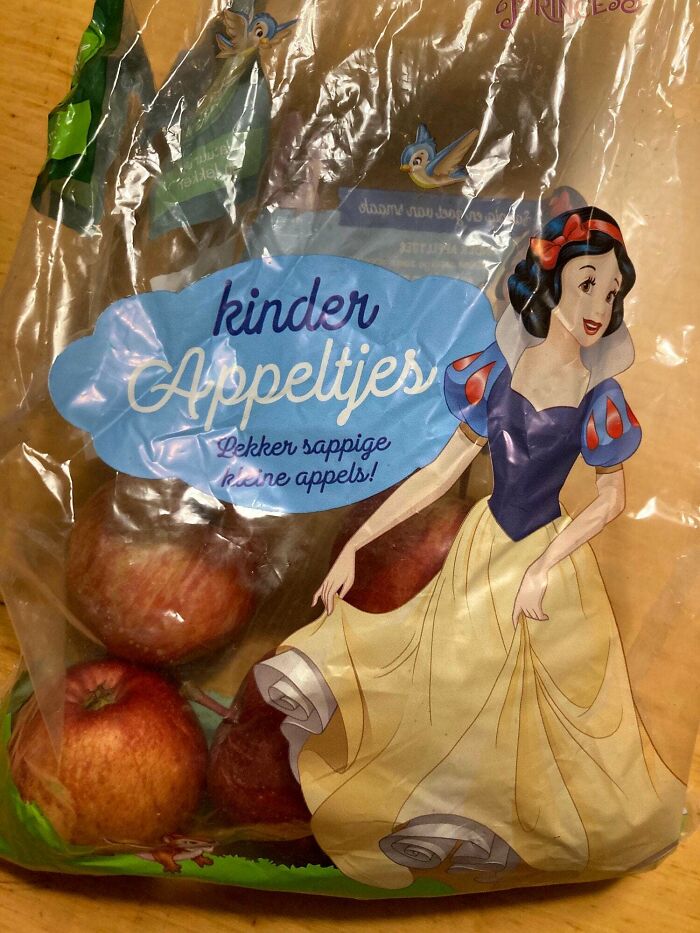
A Bag Of Apples With A Character On It That Got Poisoned By An Apple
Hey High School Bulldog, Meet My High School Wildcat
This Isn't Even My Final Form
Stay Home!
My Son Just Asked Me Why This Lady Is Reading Poop Magazine. I'm So Proud
I’m Pretty Sure That’s Not How You’re Supposed To Hold A Scythe
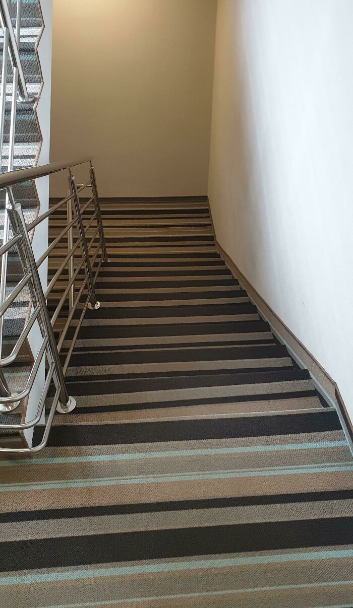
Striped Carpet On Hotel Stairs. Hard To Use Even After Two Weeks And Completly Sober
Correct Punctuation Is A Must!
I Think They Forgot To Photoshop The Other B**b
Don’t Wake Anybody Up If You’re Exiting The Motel During A Fire!
Sub-Par ATM Placement. Way Sub-Par
Gas Station In Nebraska. The Station's Color Scheme Was Red. They Tried To Get Artsy
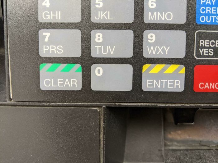
Why Is Clear A Green Button While Enter Is Yellow? I Kept Accidentally Clearing My Pin
My Arms Are About 7 Feet Long, So This Wasn't An Issue For Me
Probably It's More Convenient
It took my way too long to work out that he wasn’t holding it by the stick. I was distracted by the hand on the right with the floating one!
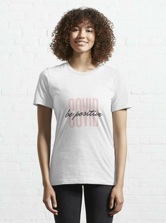
Be Positive?
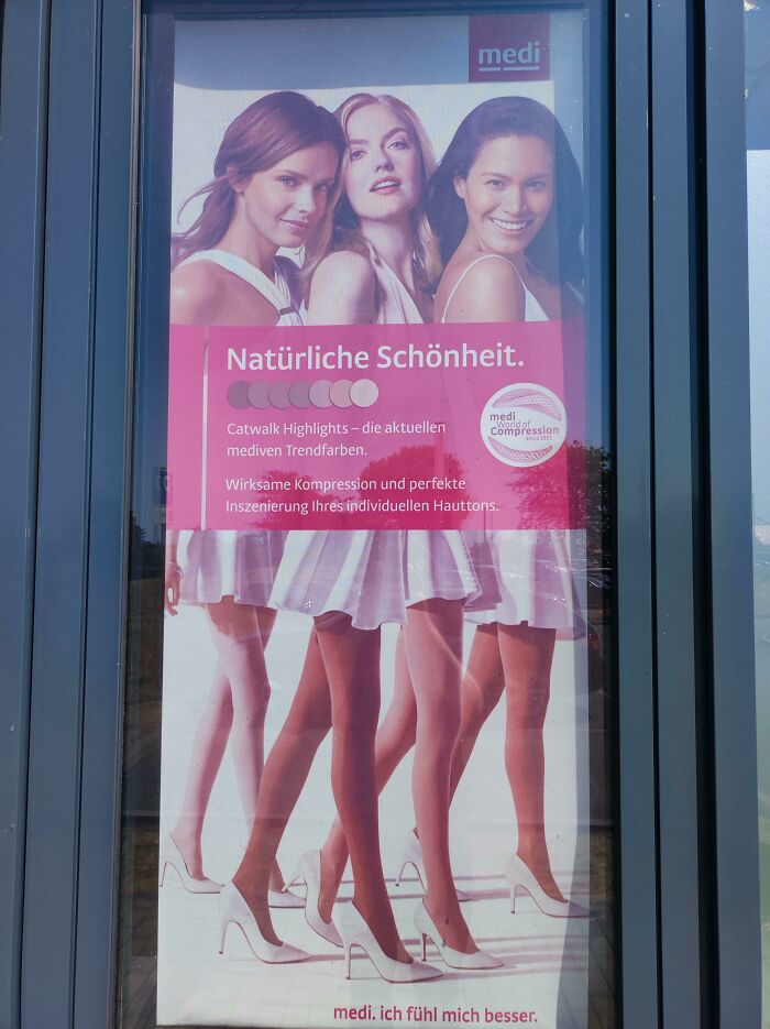
Natural Beauty - Four Pairs Of Legs For Three Enourmous Torsos
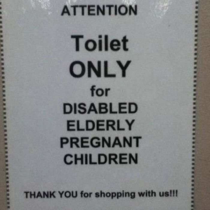
Attention
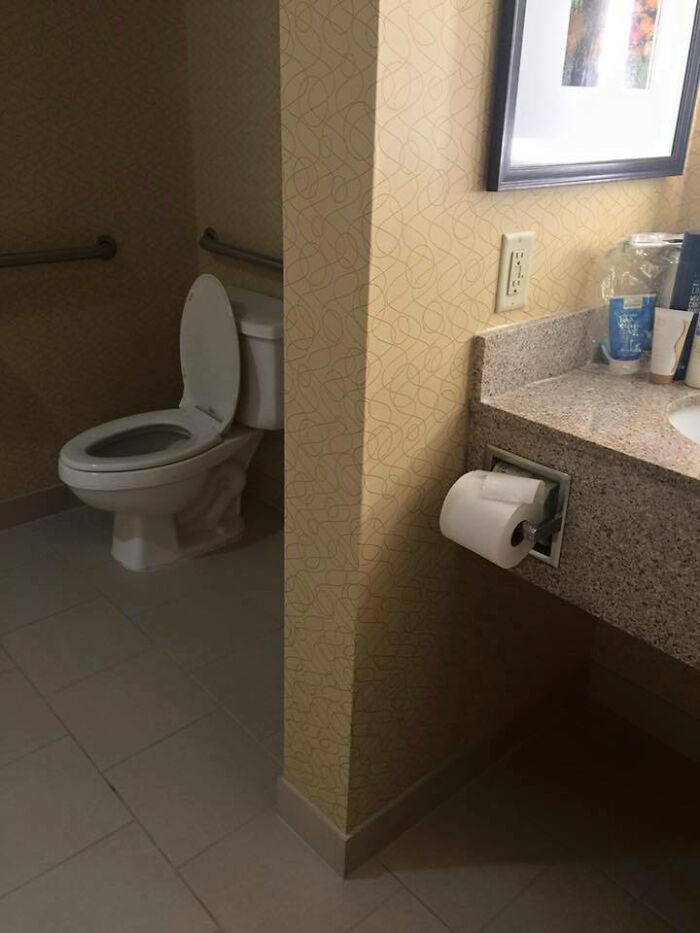
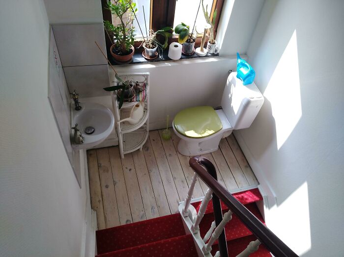
The 'Bathroom' In My Airbnb Will 100% Result In Shi**y Encounters With The Host
Perfect Design
That's Gonna Be An Easy Ride
Looks like and old video game from the 80's, you have to die and retry !
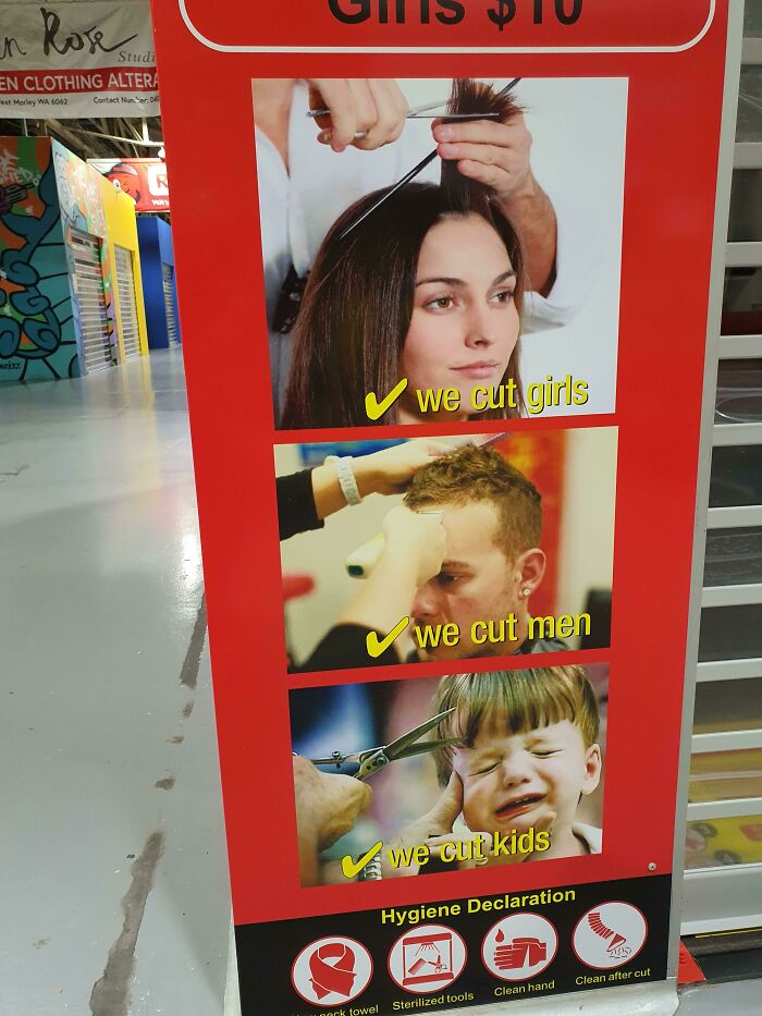
We Cut Kids
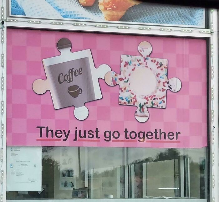
They Just Don't Go Together
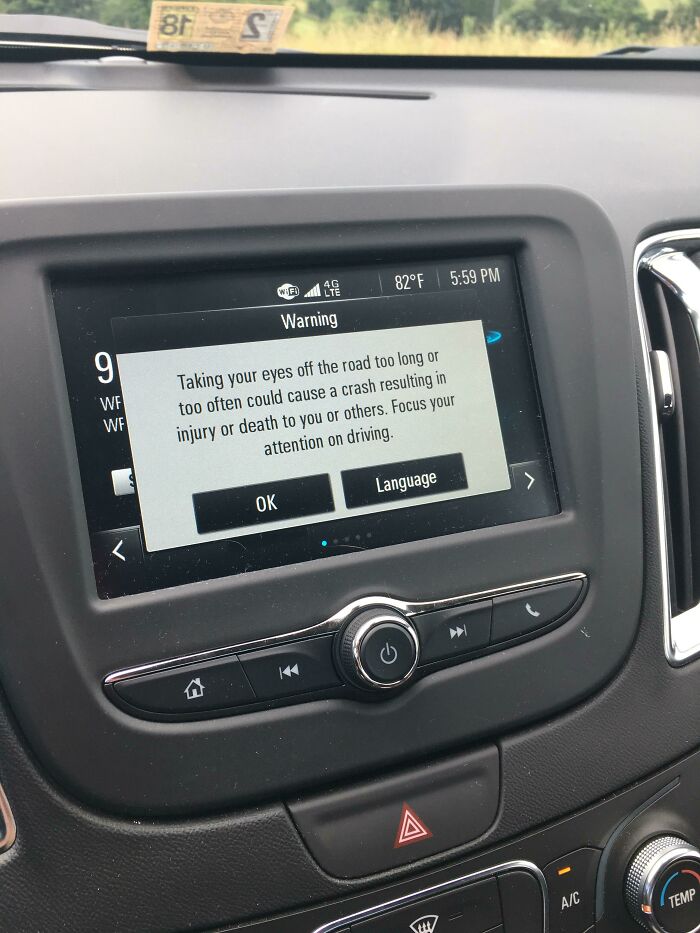
Very Long Message Warning (While Driving) Not To Take Your Eyes Off The Road For Too Long
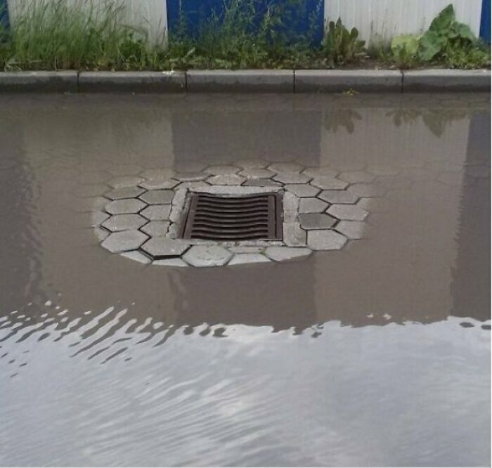
Urban Planning
Once again, this is Not a sign of poor design, but of age. Drainage inlets don't just sit on the ground. There is a concrete structure beneath them. Over time, the ground erodes or gets compressed, but concrete does not. You can see in the picture how the bricks are seperating due to the fact that the ground away from the structure has lowered over age. That is what causes this. And no, it isn't possible to design a way to prevent this. Soil is always going to change faster than concrete. The only option is to periodically regrade.
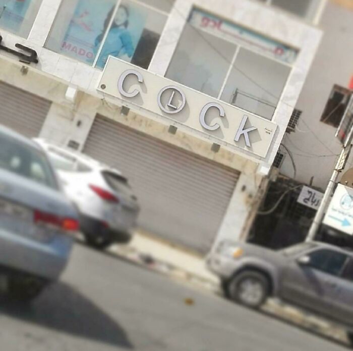
This Clock Store In Benghazi, Libya
Wow! What A Bargain!
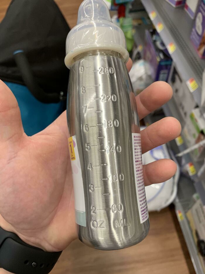
Because I Can See Through Stainless Steel
Obviously, doesn’t everyone have Superman x-ray vision? /s
I Was Having A Good Day Until I Went To The Supermarket
Where’s The 0?
The O exists only In your head, when you think oh, there’s no 0…
The Circle Of Life
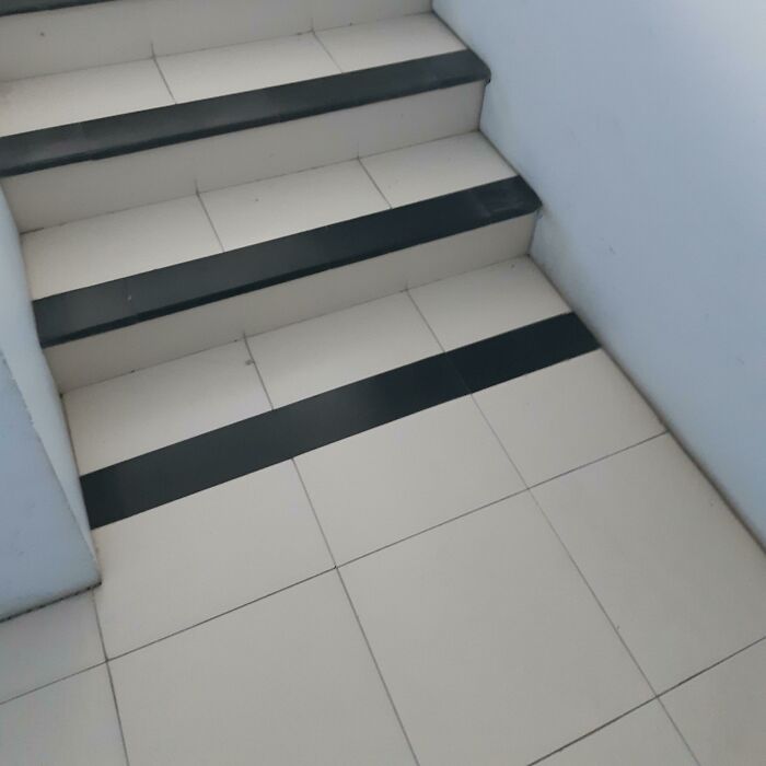
Almost Broke My Leg
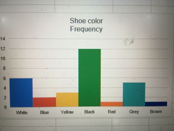
This Graph
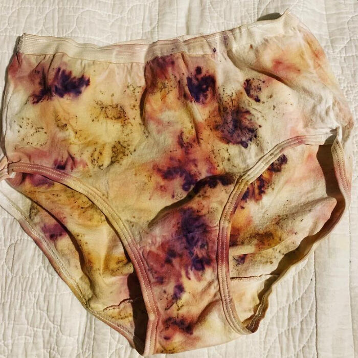
Plant Dyed Underwear On Etsy
Lex? Sex? Derp? Lox? Nope, It's Supposed To Say Jax For Jacksonville, Florida For $18 Million Dollars
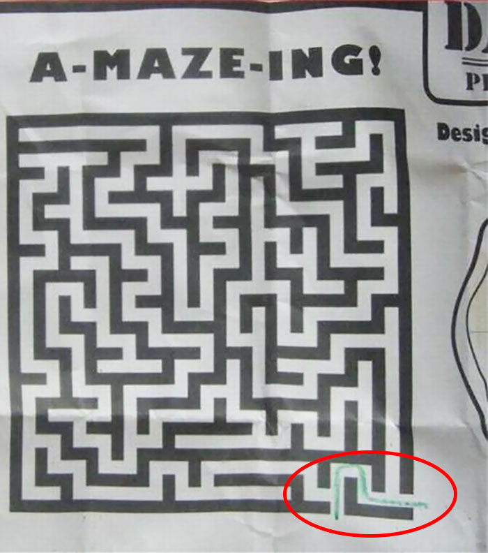
A-Maza-Ing - Design
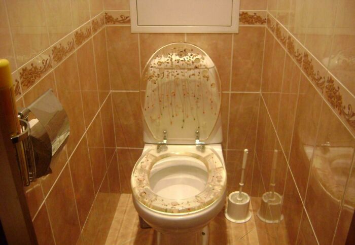
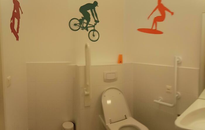
"We Need To Decorate The Toilet For The Disabled." "Say No More"
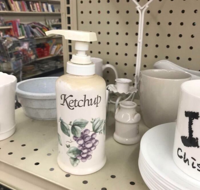
Put Barbecue Sauce Inside For Extra Confusion
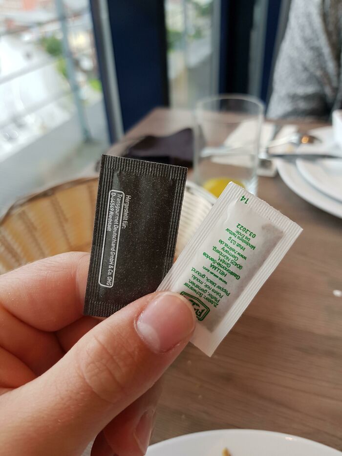
Black One Is Salt, White One Pepper
Well. Depends. My salt from Hawaii is black and I prefer the white pepper.
It Almost Seems Intentional
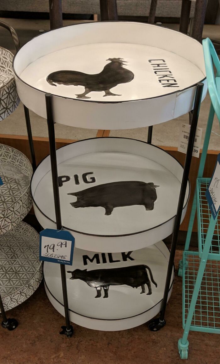
What Animal Is That?
The New School In My Community Has A Wheel Chair Access Button For The Door, But No Way For A Person In A Wheel Chair To Reach It
Sometimes It's Okay To Judge A Book By Its Cover
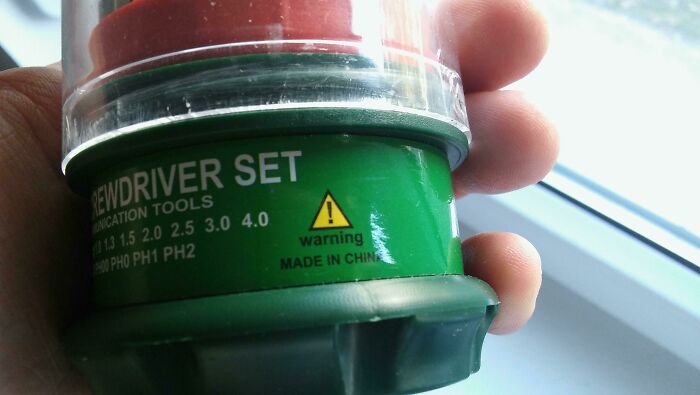
I See Your "Use Before: Made In China" And Raise You "Warning - Made In China"
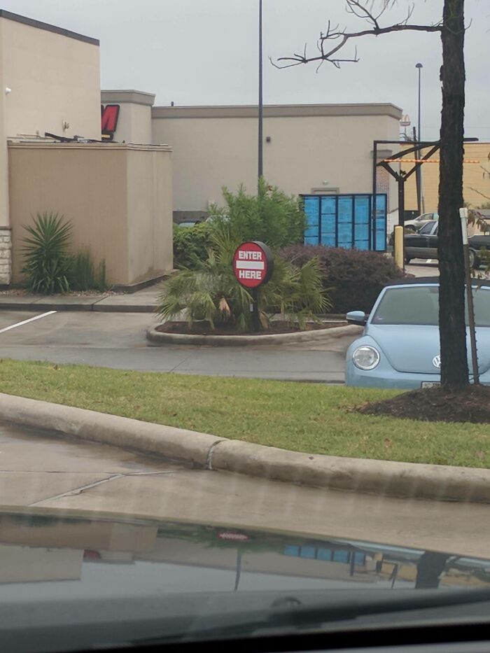
I've Been Conditioned To Recognize This As "Do Not"
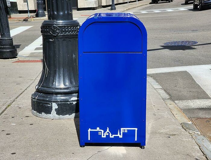
These New Public Trash Cans In The Us City I Live In (Binghamton, NY) That Definitely Won't Confuse Older Folks Trying To Send Mail
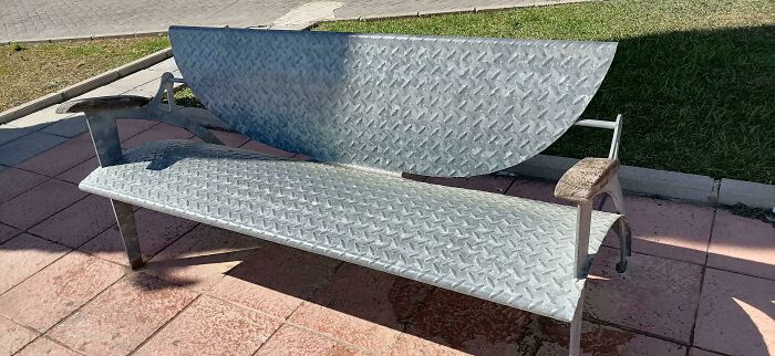
This Bench. Where I Live It Is Very Hot And It Is Impossible To Sit In This Park
Mate, I Don't Think That's A Seagull
I guess the sign writer thought "bin chicken" wouldn't fit in the sign (but "ibises" would fit nicely)
Some of these product designers knew what they were doing; no one is that dense.
I mean have you seen the people who have been elected lately?
Load More Replies...Some of these product designers knew what they were doing; no one is that dense.
I mean have you seen the people who have been elected lately?
Load More Replies...
 Dark Mode

 No fees, cancel anytime