25 Times The BBC Show ‘Changing Rooms’ Thought They Nailed Their Room Makeovers, But Now The Designs Look Dreadful
There are many ways to renew your room. A trip to Ikea or a call to your mom are the most popular options. Other times, a new furry carpet will do the job. Rarely will you need some assistance from the outside world, and in that case, dad and Home Depot may be the only option.
But you never, ever entrust your room’s makeover to your neighbor. Below, we’ve got a fair amount of evidence to back up this claim. If you've ever heard of the BBC show Changing Rooms from the late ‘90s and early ‘00s, and its American variation Trading Spaces, you’d know what it’s all about.
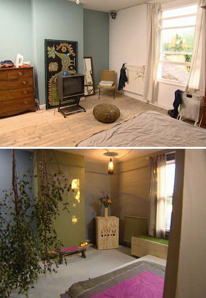
‘Cause swapping houses to redesign the room of the person next-door sounds like a disaster waiting to happen. From covering the floor in strips of silver tape to casually hanging birch trees from the ceiling, these are just a few examples of letting your neighbor think outside the box. And your room is the one getting the hit.
This post may include affiliate links.
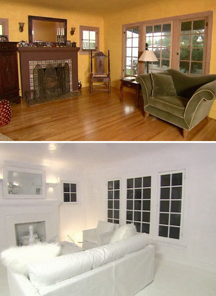
Room Where They Painted It All White
Designer's explanation: "We thought it would be interesting to see what an all-white and an all-black room would be like."
Owner's review: "I hate it. Get this mic off me."
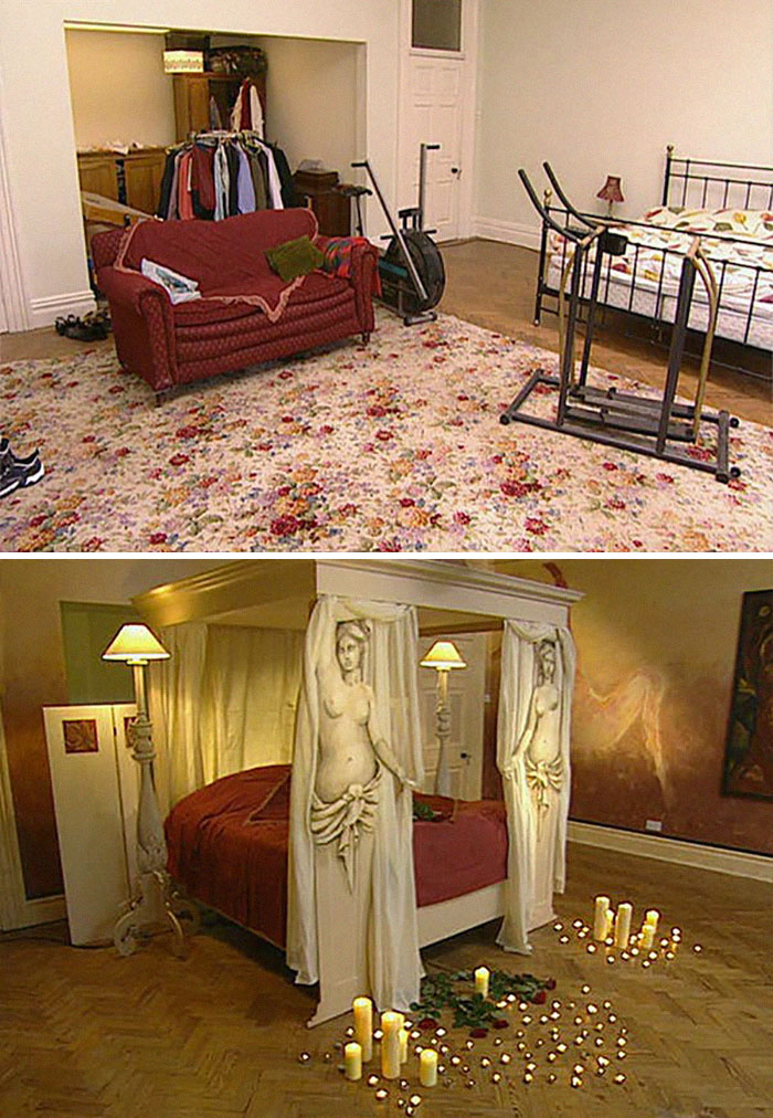
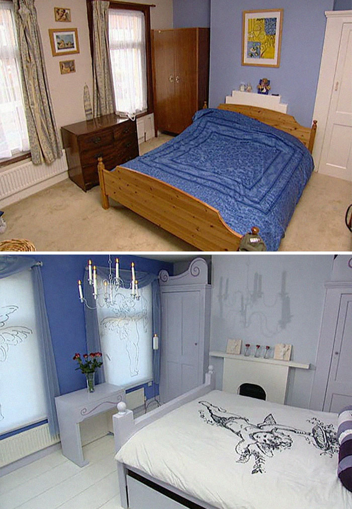
"Touch Of Art" Bedroom
Designer's review: "It's quite a statement."
Owner's review: "Good grief."
The after picture is Tacky. Tacky. Tacky. Looks like the Caligula room in a brothel.
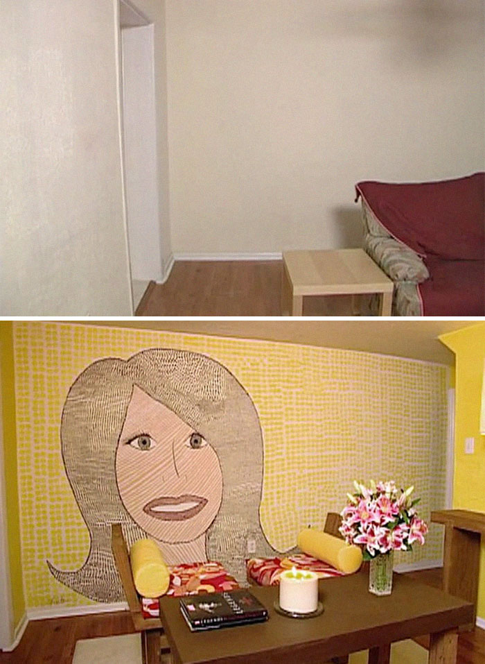
Room Decorated With The Designer's Actual Face
Designer's explanation: "I wanted to throw in an element of fun."
Owner's review: "How................random."
The cult makeover show Changing Rooms is remembered for some of the most disastrous transformations ever seen onscreen. It ran from 1996 to 2004, and it surely gave viewers a lot of material to chuckle at throughout those years.
One of the participants, Caroline Hicks, who opened the door to her newly renewed living room twenty years ago, had only one thing on her mind: “I mustn’t swear, I mustn’t swear, I mustn’t swear.” These scandalous revelations were made after a speedy renovation process that took only two days.
The show’s presenter, Carol Smillie, recalled that when runners went from house to house, she would roll white paint over their jeans so that contestants wouldn’t get any clues as to what color their room was being painted. “There were a whole lot of us, 20 or more, that you didn’t see on screen,” she told The Guardian.
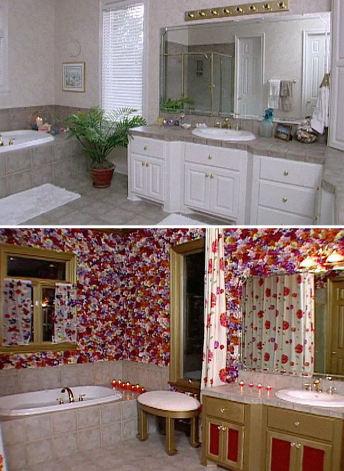
Bathroom Decorated With More Than 6,000 Flowers
Designer's explanation: "All rooms look great with flowers."
Owner's review: "There's so many."
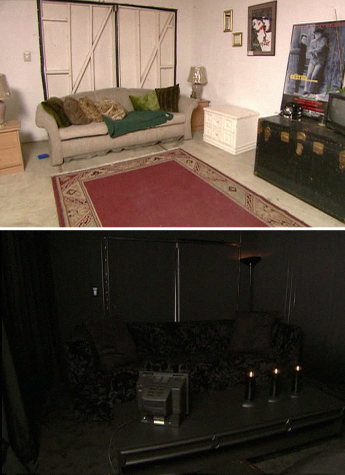
The Designer Mentioned An "All-Black" Room. Here Is The "All-Black" Office In The Other Couple's House
Presenter's explanation: "I knew they would be up for a dramatic change. I'm very, very proud of this room."
Owner's reaction: "It's [friggin] amazing."
Remove the TV from the table and rearrange the candles and you got a nice altar there for summoning demons.
They could of shown a better picture with some lights so we could actually see what it looks like, instead they went with a more dramatic picture. Yes it's all black and the light doesn't reflect as well, but 1 light in the ceiling would at least show us the rooms general design.
Maybe the designer thought the owner was a vimpire, ya know? anythings possible
thats even worse as the all white one. And I love black and dislike white.
Just a couple pops of white or silver and the bottom one would be perfect
Go on Airbnb to see if any vampires are interested in renting the room!
Looks like there's curtains, might look better when you let in some natural light
It looks s****y and you have a cheap looking torchier shoved in the corner. This might be the worst one.
Speaking as a Goth, this is far too much black. You'd be constantly banging your shins on the desk.
It's a home Rave room, they're the new home theater room for today's elite
What in the actual Interview With A Vampire movie set is this mess ?
I know that some people would absolutely love the all black room. Even though it's not most ppl's cup of tea
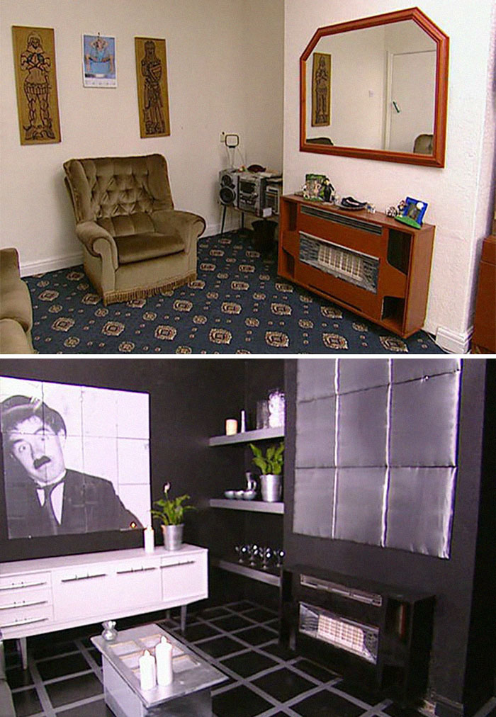
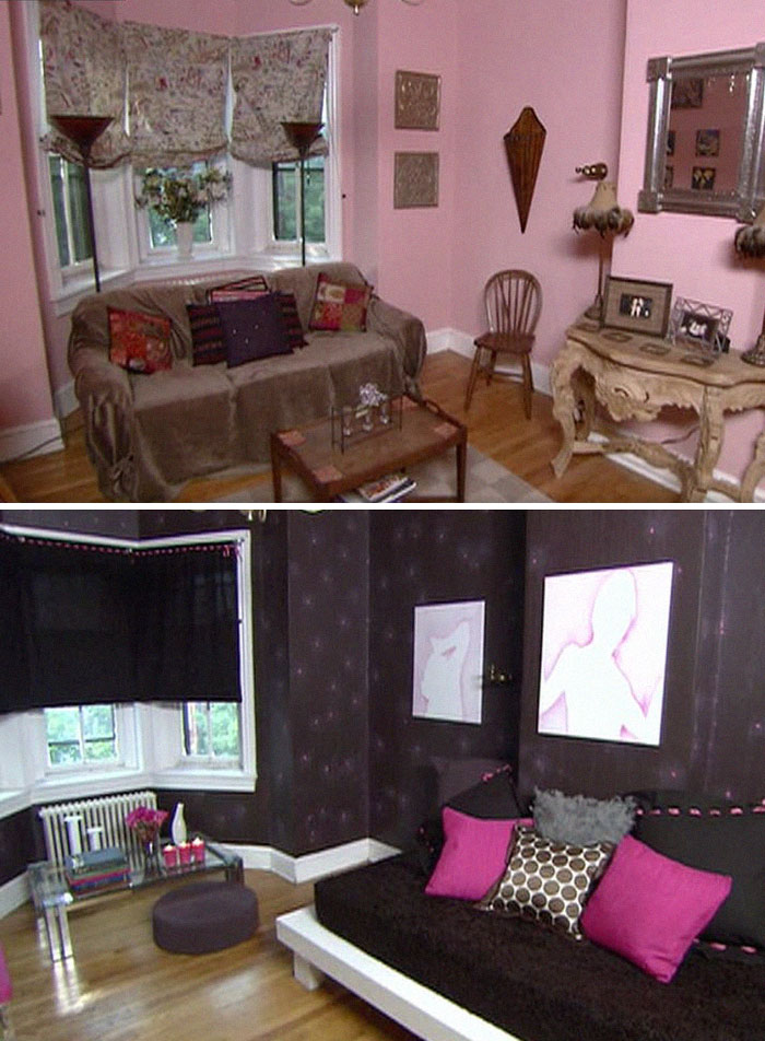
"Very Strong Black And White Themed" Room
Designer's review: "I think it is very classy."
Owner's review: "Bloody hell."
With so many “unhappy” room owners, it may come as a surprise that there were many members of the public who wanted to take part in the show. “Most people’s rooms that they asked us to change were in such dire straits, even a bit of paint was a vast improvement,” the producer Smillie said.
In reality, only the very first participants wouldn’t suspect what the makeovers were all about, but since the program ran almost 10 years, most of the entrants really knew what they were getting themselves into.
On rare occasions, the participants were genuinely happy with their room makeovers. Aidan Ruff from Northumberland, in fact, loved his renovated bedroom since the family were looking “to get a room done on the cheap.” The Changing Rooms redesign got Aidan so excited that he even described the result as a “Mediterranean love nest.”
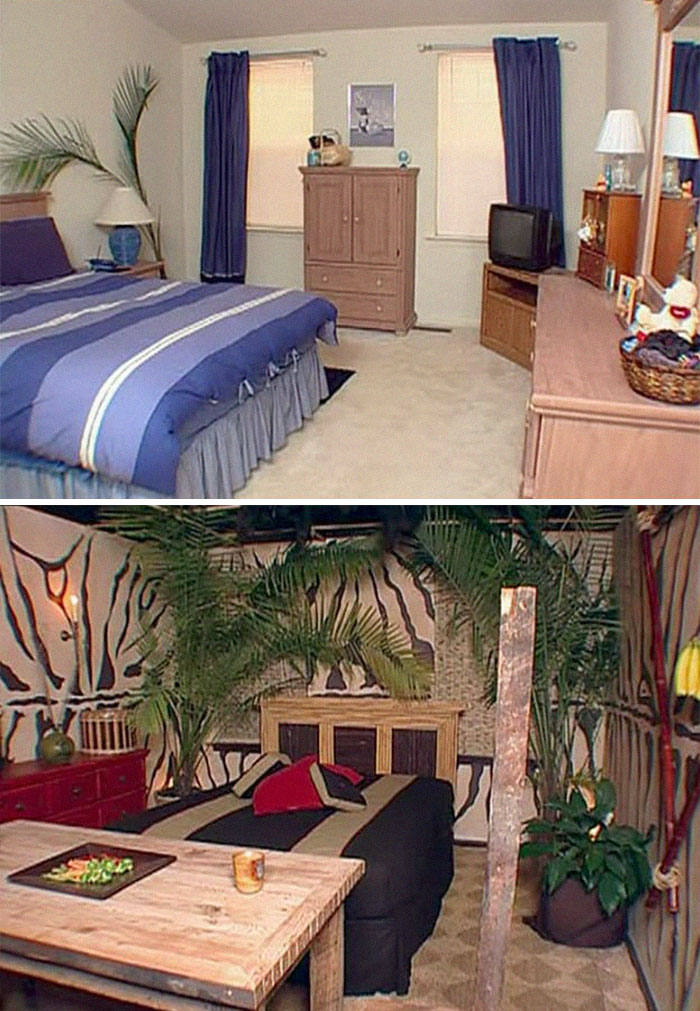
This Room, Apparently Inspired By Safari Adventures
Designer's explanation: "It just all fits together."
Owner's reaction: [screams] (clarification: in excitement)
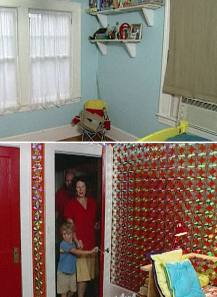
This Room That Was Decorated With 1,800 Cds. That's Cds On Every Single Part Of The Walls
Owner's reaction: "Oh cool" [the child]. "Ohhhhhh my god" [the parent].
"Funky Family" Room
Designer's review: "We have to see how it looks at the end."
Owner's review: "Oh no, it's horrible."
This could have been dope as f**k if they just painted that plywood. And got drapes that didn’t look cheap.
But one disastrous incident has surely stuck with us to this day. In 2000, Clodagh, a woman from London, appeared on show and asked the producers to be super careful with her precious teapot collection worth £6,000. But the hosts hung a suspended shelf to house her pots and the construction collapsed.
The Guardian stated that the insurers reimbursed Clodagh, but she never risked having another collection since she “couldn’t bear it to happen all over again.”
"Out Of This World" Sexy Room
Designer's review: "This is a sensual, sexy room."
Owner's review: "I don't like the bed." "The colour is horrible."
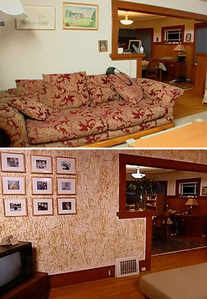
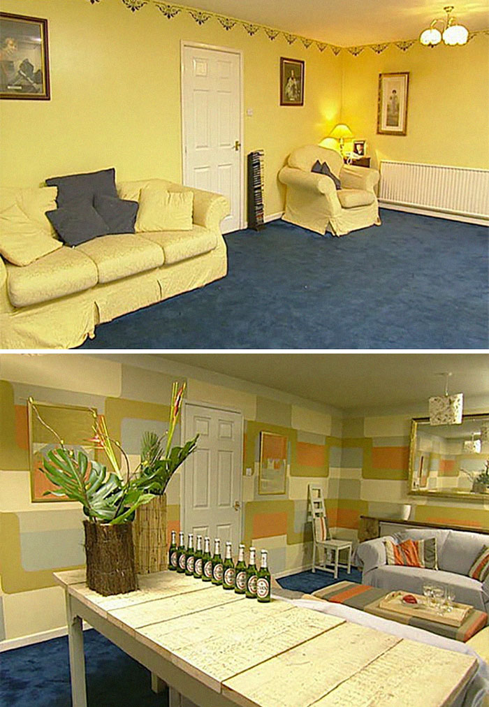
Playroom For A Baby, Decorated With Hay
Designer's explanation: "I really wanted to bring out the straw colour of the sofa as the whole room has been designed around the sofa."
Owner's reaction: "It smells great in here." [opens their eyes] "Oh god... oh [crap]."
I remember reading about this one. It's the same designer that decorated a wall with her own face. If I remember correctly, the owners hated it and it costed the production company a fortune to get the straw of the walls
"Romanto Panto"
Designer's review: "They needed somewhere to escape from their three children."
Owner's review: "What a change. Crikey."
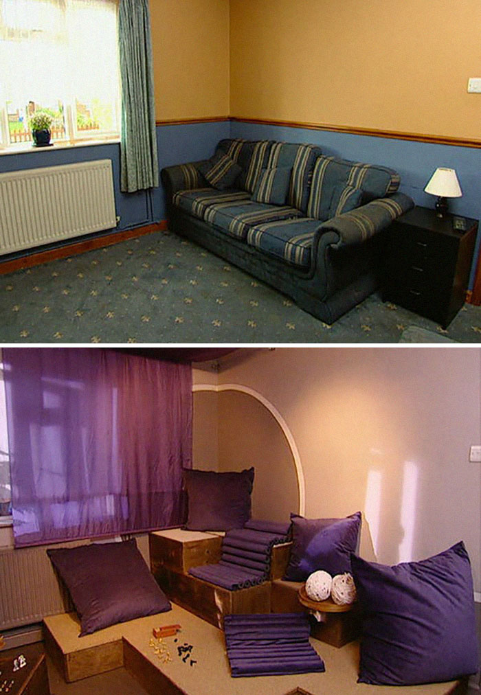
"Hot Purple Passion"
Designer's review: "It's very passionate."
Owner's review: "This is absolutely brilliant."
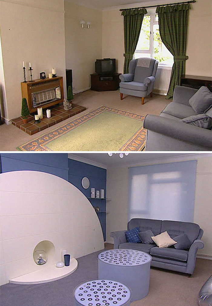
"Tribute To All Things Circular" In Doncaster
Designer's review: "I absolutely love it. I like circles."
Owner's review: "Am I in the same room? This is amazing."
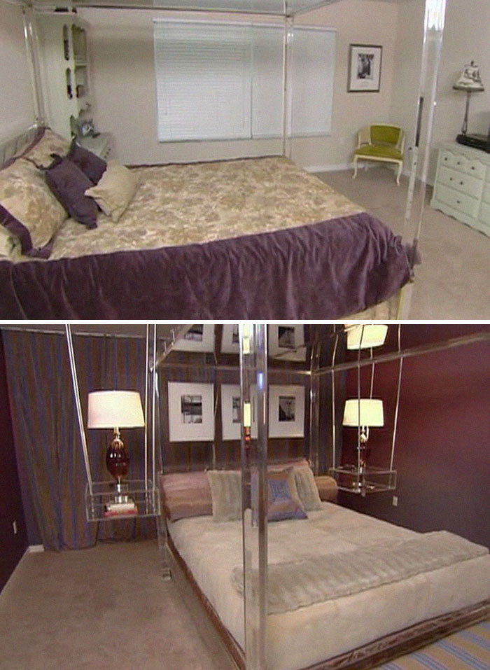
Room That Was Decorated With Hanging Lamps
Designer's explanation: "I love the way that they are suspended because it brings the ceiling to the level of the bed and the floor."
Owner's reaction: "Look at it. It hangs."
The "Tenthouse Penthouse"
Designer's review: "They love being outside...so I went along with that."
Owner's review: "Not what I expected."
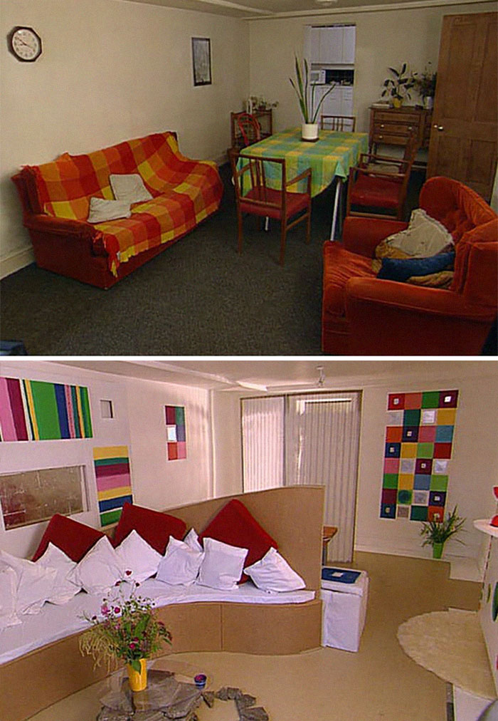
"New York Gallery Sitting Room"
Designer's reaction: "It's very serene, isn't it?"
Owner's reaction: "There is nothing I would change. This is fabulous."
The materials look a bit basic, but the way the space is laid out is much improved.
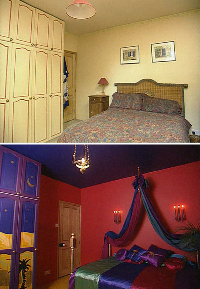
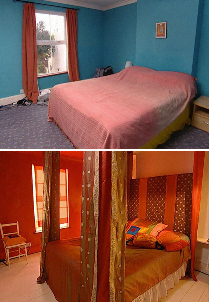
"Love Nest" Bedroom
Designer's review: "They like spending a lot of time in the bedroom."
Owner's review: "It is red, isn't it?"
Room That Was Decorated With A Paintball Gun
Designer's explanation: "I wish the paintballs would have stayed, but in this heat."
Owner's review: "I love it. I love it. I love it. I love it. I love it."
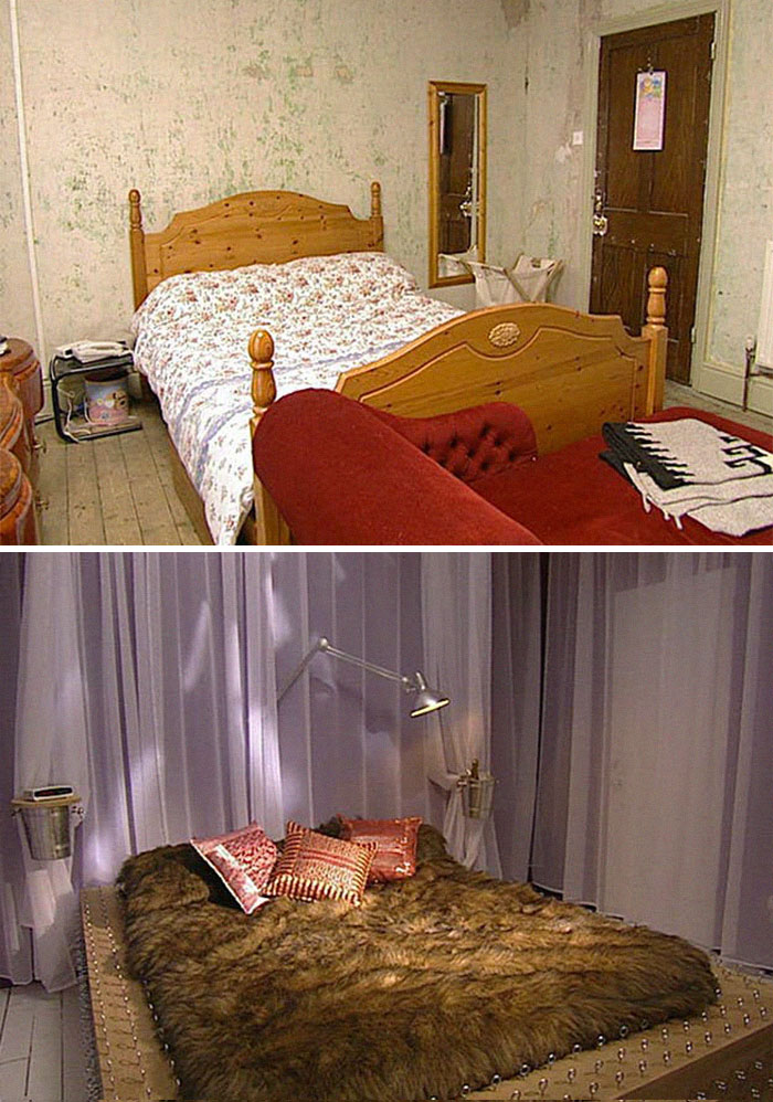
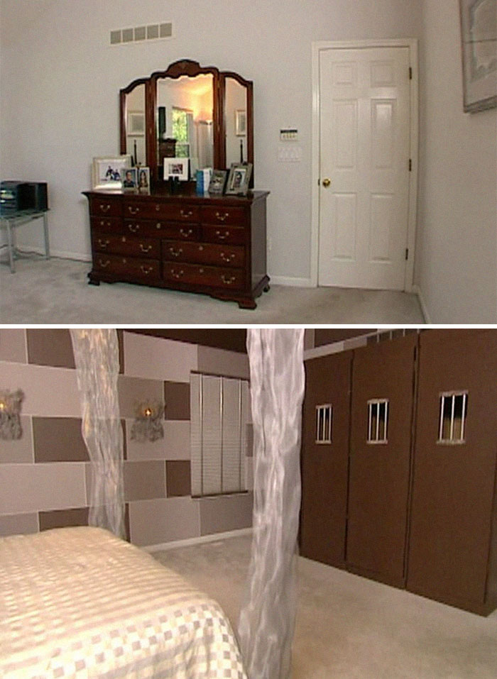
"Prisoners Of Love" Solitary Confinement Bedroom
Designer's explanation: "I wanted to do something really interesting."
Owner's reaction: "Hahahahahahaha... This is WILD."
Owner: "Welp, I thought we'd kept our bedroom activities discreet, but looks like I was wrong."
"Art Gallery–inspired" Living Room
Designer's review: "It's Tate Modern mixed with '70s chic."
Owner's review: "Barbara, it's gorgeous." "Look at the wall."
Tumbleweed
This western themed room is certainly not the best. The room appears to have shrunk down from its former size.
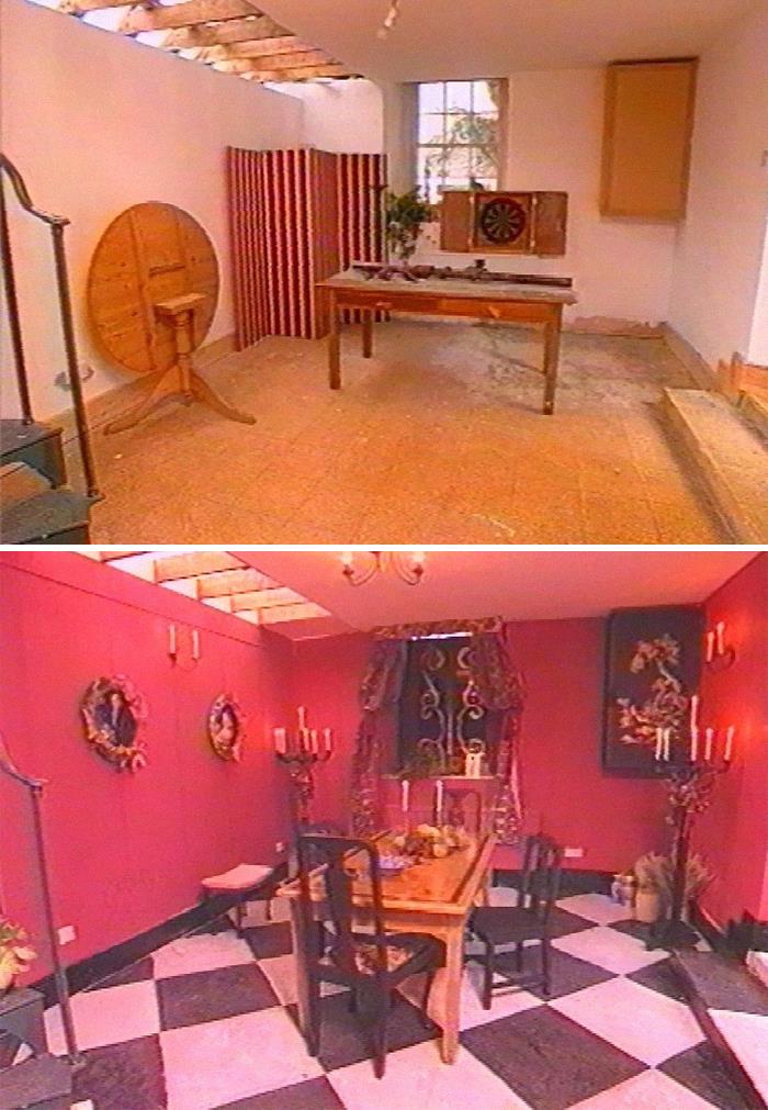
Red Or Dead
At least the floor could double as a chessboard.
This has "where the backstreet boys phantom of the opera feast was filmed" vibes
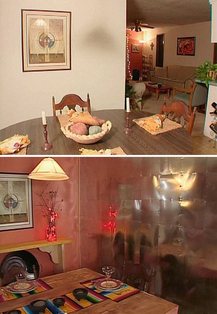
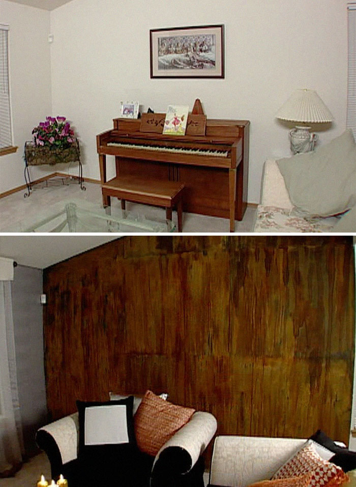
Kimono-Inspired Room Decorated With Actual Rust.
Designer's explanation: "These people needed some change."
Owner's reaction: "Look at the wall! Look at the WALL!"
Well, both the before and the after of every single room look like c**p on toast. What kind of "designer" does this?
I want to know how long these lasted before they were changed again - and what they were changed to.
Load More Replies...All of the makeovers always looked terrible and cheap. I never understood why anyone would agree to go on the show.
They missed the one with Laurence Llewelyn-Bowen where the room was called "A tarts boudoir" before the couple cried so much they had to cut the cameras and 'fix' the room at the BBC's expense. I can't seem to find it but the bedroom was decked out in purple and was really vile
i'm a bit surprised to read that the BBC has to pay for the ones that dont end well. Good for the homeowners, but ... what do you expect when you join a tv program like that?
Load More Replies...I remember one show from Trading Spaces where they went into a 1920's craftsman home and knocked out the built-ins surrounding the fireplace and painted all of the beautiful original woodwork a bright blue. The wife was in stunned silence and the husband was going to kill the neighbors and the designer.
I remember one where they were TOLD not to mess with a fancy carved wooden starcase, and they cut out half of the vertical pillars and painted the steps with industrial black/yellow chevrons, the owner practicaly wanted to kill someone. (UK btw)
Load More Replies...They should do this with 60 minute makeover. They've got a lot to choose from. The worst was when they changed this room completely and the guys wife had only died a few months ago. He was devastated at it being changed as she'd picked it all out and obviously they couldn't put it back the way it was because it was all sentimental. I tell you, you'd never get me on one of these programmes! I know what I like and I like what I know haha
Why do people hire egocentric interior designers who never listen to the clients' concerns, needs, and wants? Even if you know nothing about design, do not give them carte blanche because no matter they do, it will reflect their personality, not yours.
Not discussing what they wanted beyond a few simple 'please don't do this' and 'I would quite like that' was very much the point the programme made. People hoped their neighbours would dial the designers back a bit but they were usually ignored.
Load More Replies...I only watched this for the times when the people absolutely HATED what (usually) Laurence Llewelyn Bowen did. And really, what did they expect with a budget of £500!
I didn't like the US version of the show much more than the original UK. (Trading Spaces, I think?) My question was always: How do they clean this?!
I used to watch the British version, and the U.S. version - so much fun to see the wacky & pure stupid stuff they would do! On the U.S. show "Trading Spaces", Hildy was a real life walking nightmare - one time she turned a basement rec room into a beach themed tiki bar room - it actually looked great...until she dumped about 100 bags of play sand on the floor! What a freakin' mess that was, and the homeowners were furious!
"I have an Asian girlfriend, now my house is impossibly racist." *oriental chimes*
I swear, I saw all of these on the US-based show Trading Spaces. I guess there are no new, HORRIBLE designs! Good grief!
The English do NOT have a flair for decorating. Not even the professional decorators. I've been in enough English homes to have seen this firsthand.
Not familiar with this show at all but did people volunteer to have their homes wrecked? Who was responsible for correcting the disasters?
I loved the show, the rooms were mostly awful, but I loved the show. I remember every one of these rooms!!
And then there are the rooms by Verne Yip. Leather on the walls, beautiful finishes. He may have has one miss in many years. Don't show us Hildi.
I'm not familiar with the show but judging from these, it seem to be punishment for people under house arrest.
who are these "designers"? hire me, I'll fake an accent and we'll stop making rooms that looked like they used prison labor.
I feel bad for the lady with the teapot collection. But seriously, if you have something worth that much money, why the hell would you risk having it destroyed?
None Brits please remember this show was on in the 90's-00's not present day
I didn't care for any of them. For one thing who wants to spend all that time dusting and cleaning all that bric a brack?
I remember watching the episode with room #25 - the 'medieval' room with the chessboard floor, a 'design' by Laurence Llewelyn-Bowen. The owners were NOT happy, not happy at all. If I remember correctly the wife cried. It was hilarious!
some of these were not really my taste but still nicely done, and they really looked nice, others are just a big mess. What were these people thinking?
The first few weren't so bad, after that, they became much, much worse.

 Dark Mode

 No fees, cancel anytime


