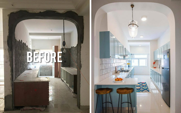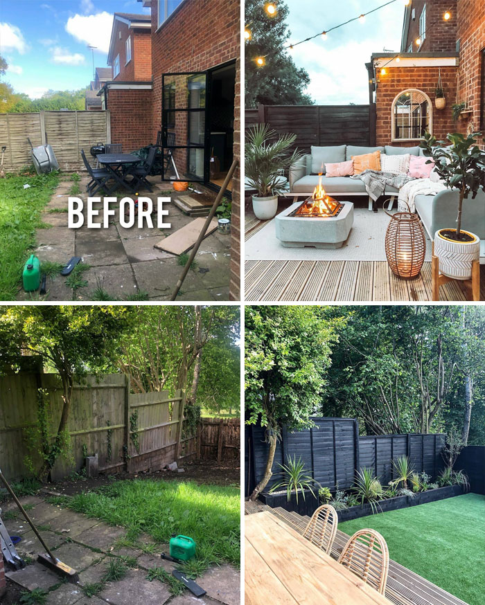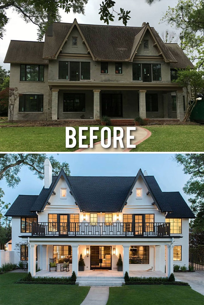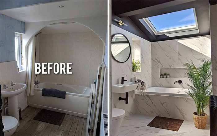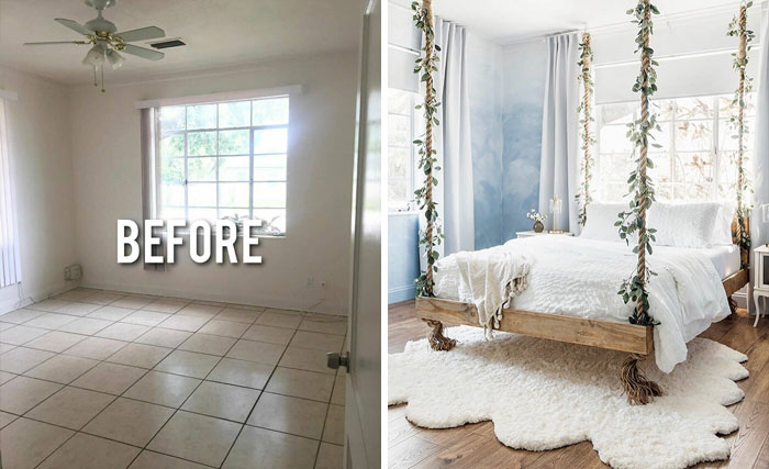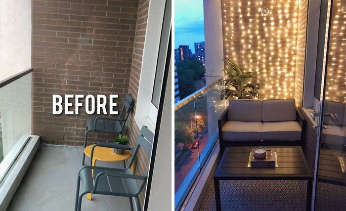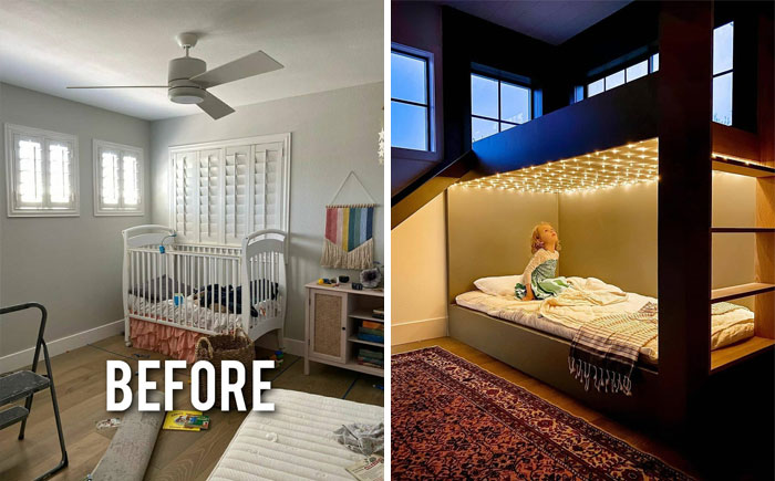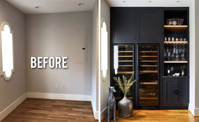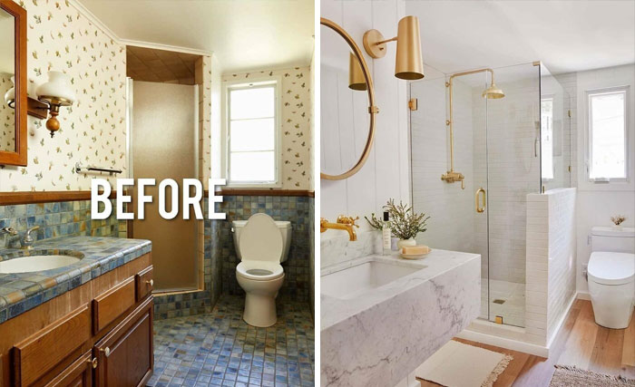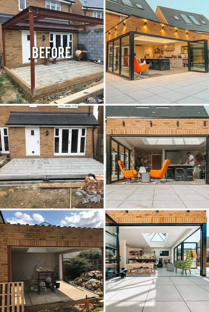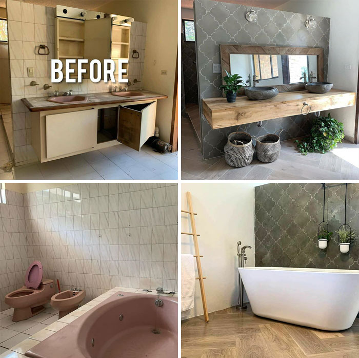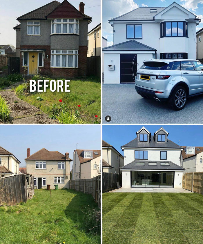
“Before And After Design”: This Instagram Account With 1.3 Million Followers Is Showcasing Incredible Redecorations
What defines your interior style? Is it your love of antiques or your hate for clutter? Your desire for entertainment or your preference for all things bohemian? Truth is, no matter the answer, you will find something you like on the Instagram account Before & After Design.
There's a reason it has 1.3 million followers: showcasing well-executed home makeovers, it has a massive collection of cool ideas for every taste. So whether you are looking for a little something to put on your shelf or planning to completely transform your living spaces, take a look!
This post may include affiliate links.
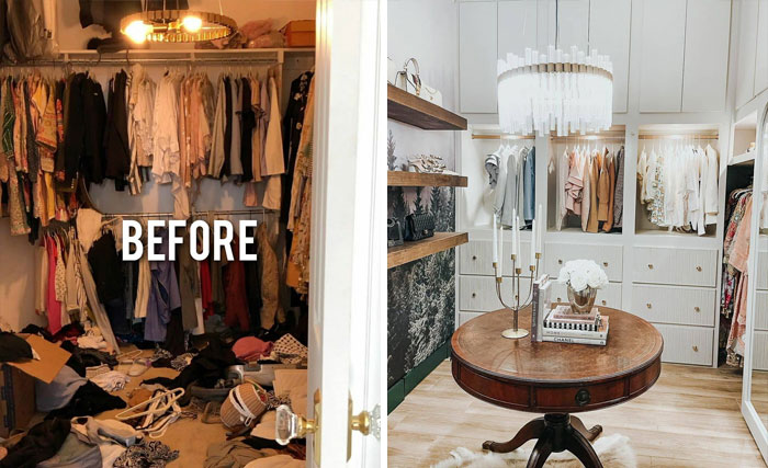
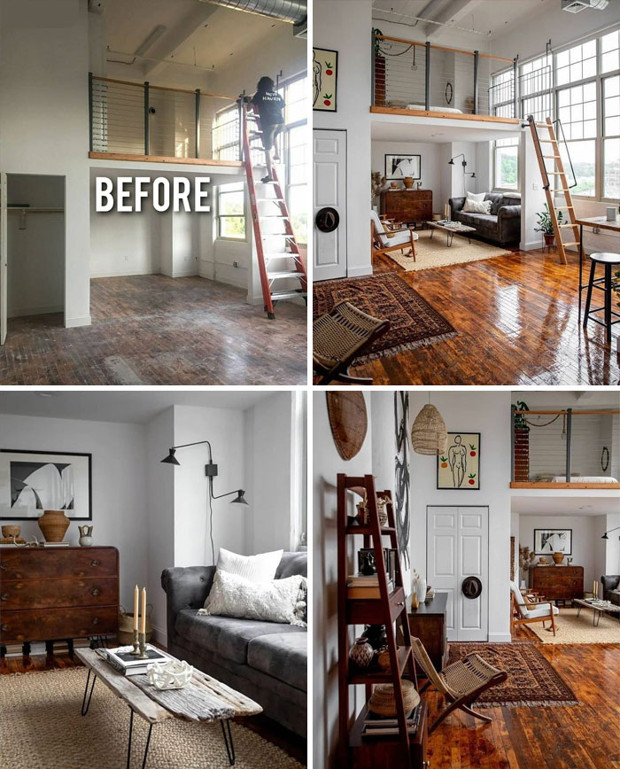
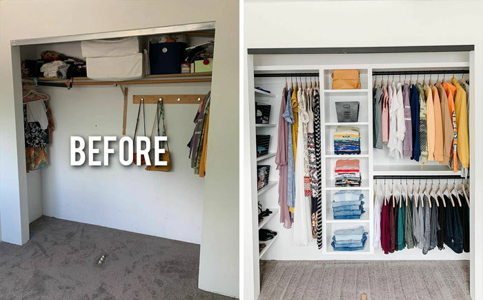
all it takes is a lot of money (and someone with good taste to design it)
Jeanine Hays and Bryan Mason, a husband-wife duo of professional interior designers who work under their brand, AphroChic, say everyone should start transforming their place by selecting a style; thinking of the entire home with a unifying theme will promote unity and harmony. "It can be as simple as choosing casual instead of formal or traditional instead of contemporary," Hays and Mason wrote. "From there, you can refine it to a more specific style, such as French country, Tuscan, modern Victorian, or shabby chic."
Another principle is balance—distributing visual weight. "You can do it symmetrically, as is common in traditional interiors, or with asymmetrical balance as seen in casual interiors."
"Within each room, there should be a focal point. In a living room, it could be a fireplace or a piece of art. It sets itself apart by scale, color, or texture," the couple explained.
To add visual interest to a room, think of contrast and variety. "Keep a rhythm in mind with repeating elements of the same color, texture, or pattern, and a progression of sizes or colors."
An essential part of interior design is choosing a color palette. You could have a different style and color scheme in each room, but often you will want to tie the whole dwelling together. Think what colors and patterns would suit a small room as well as a large one.
"Mixing patterns in home decor is one of the more advanced parts of interior design," Hays and Mason said. "Patterns do not have to match, but they need to complement and coordinate with each other. This is done by considering color, size, and scale."
Just remember that nobody was born with the ability to reimagine a room. Settling on furniture placement, wall hangings, as well as rug and accent choices is something you can learn over time!
When I was young I had fantasies about doing this. Nice to see someone who actually did it!
I really like the makeovers, but it seems less "before and after design" but more like "before and after huge amounts of money". I'd like to see some redisigns made with a small Budget. ;_;
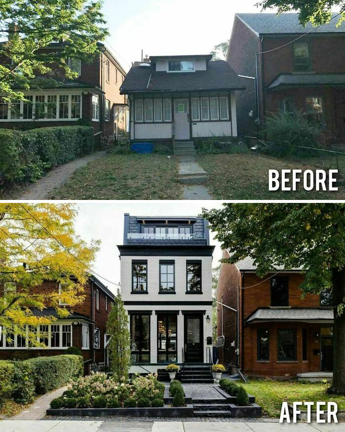
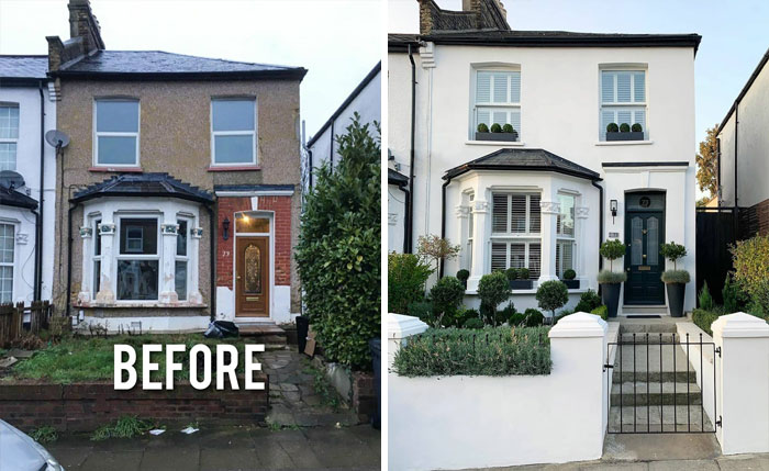
Not a big fan of stucco, but this looks nice and clean in white with black? slate gray? trim and roof.
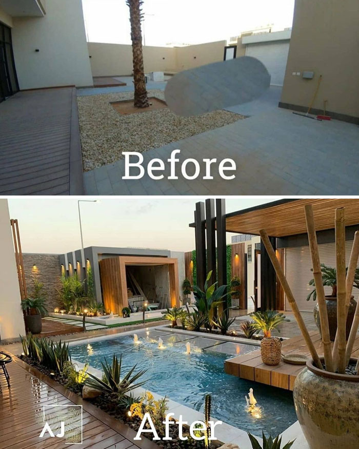
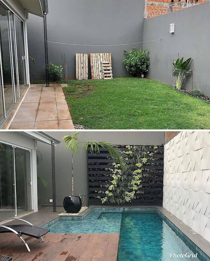
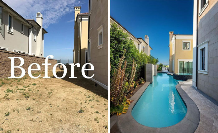
Oh yes! A pool is another thing I want. Doesn’t need to be Olympic size either. Not sure of the length of this one, but long enough for laps and wide enough to turn is good enough for me.
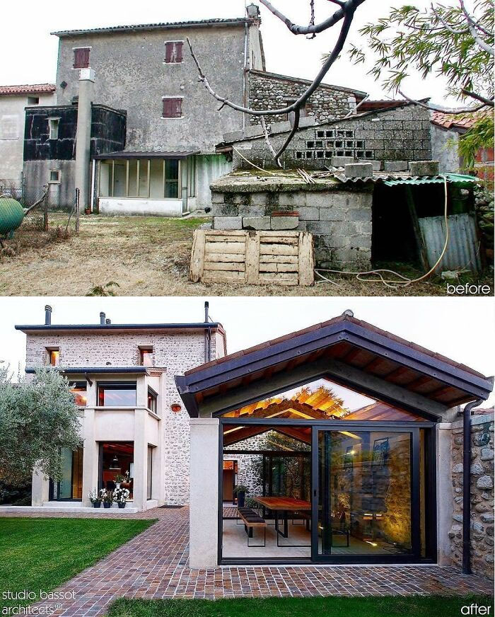
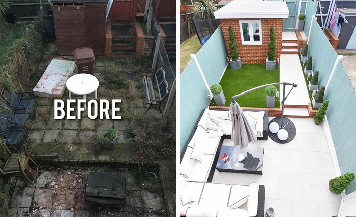
Almost a complete demolition and rebuild. But it's nice to see the old large building still standing with it's cobblestone addition. They did a fantastic job blending old with new. I especially love the brick walkway and how they built up the stone wall to the right of the outbuilding.
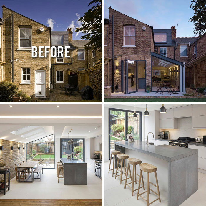
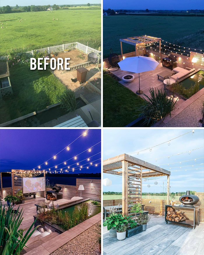
Seems like a british house... actually most of these look like british houses
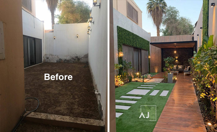
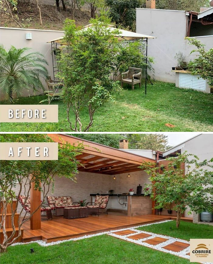
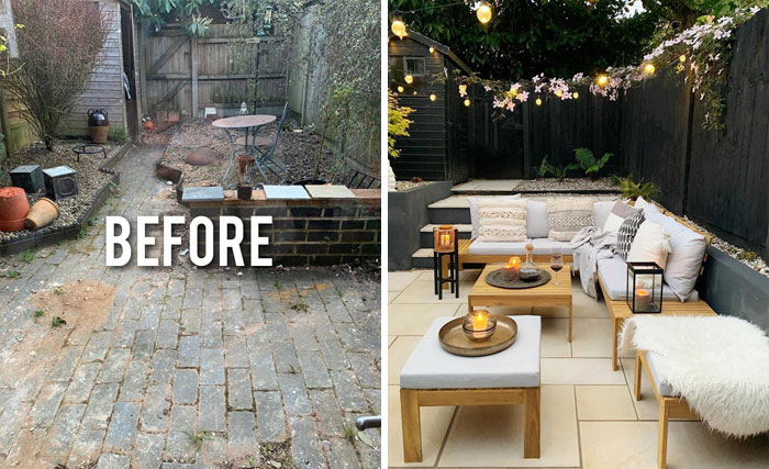
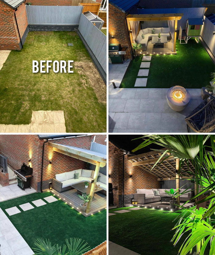
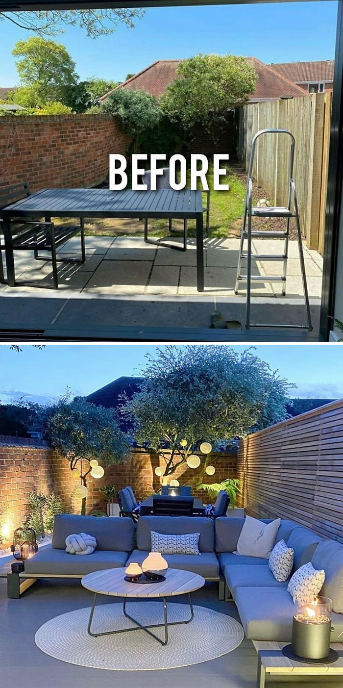
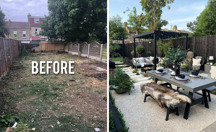
The ground in the first picture seems very uneven. What a terrific use of landscaping.
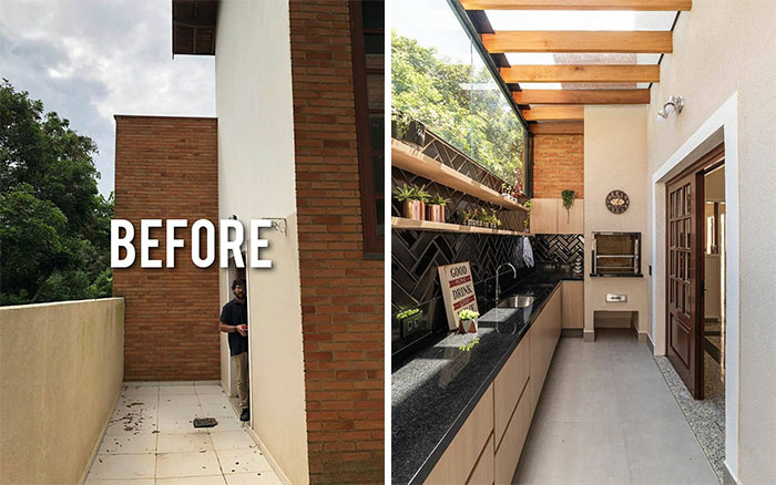
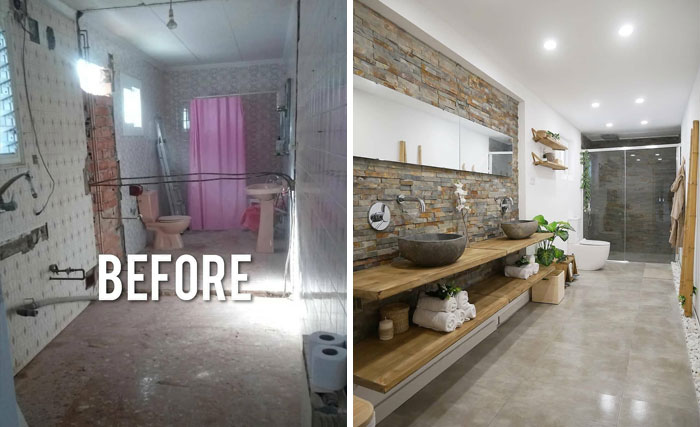
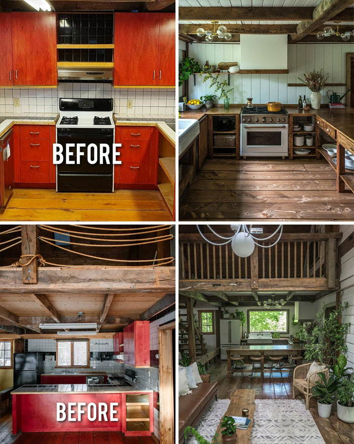
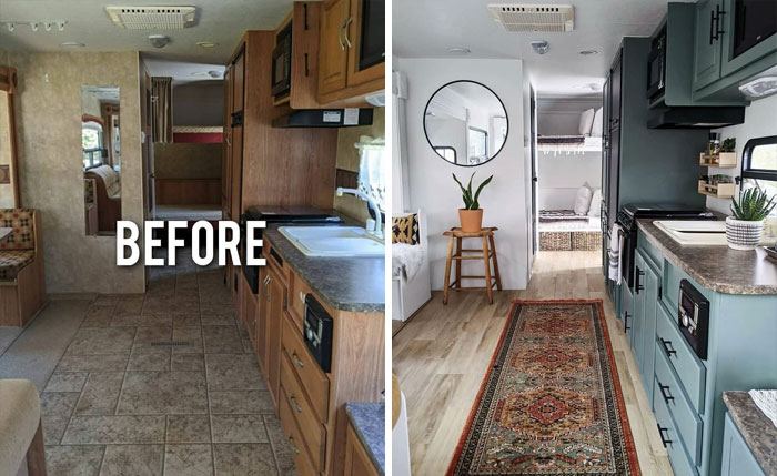
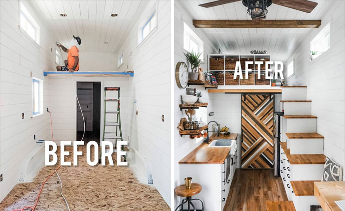
I hate this after so much. looks a damn mess and cheap as hell. I want cabinetry, not open shelves with greasy, dusty dishes. we have cats-cat hair would get into everything. not my cuppa.
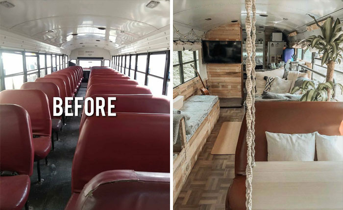
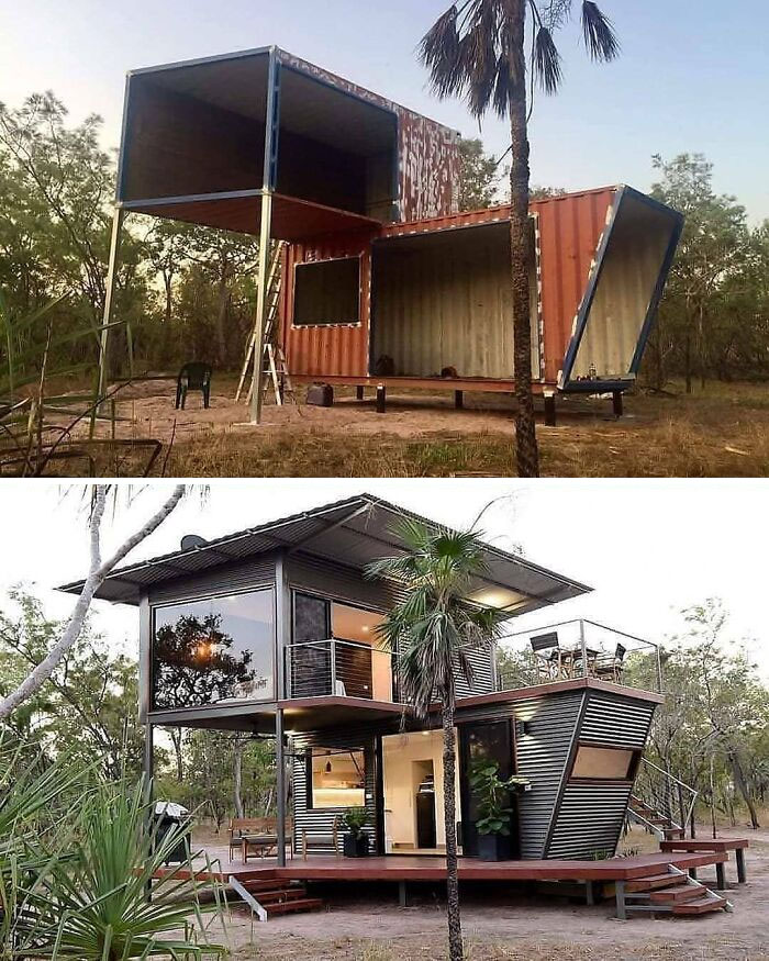
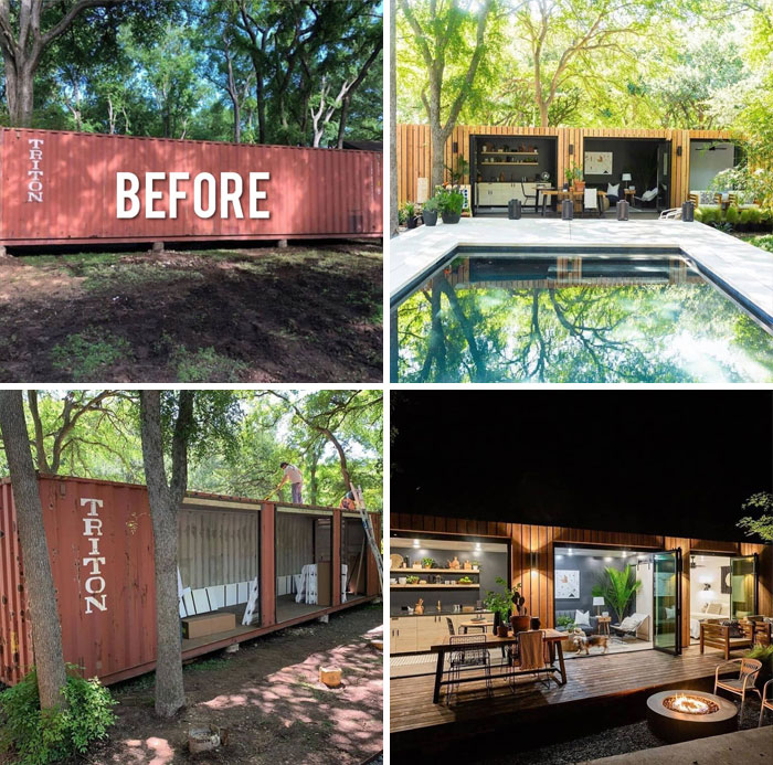
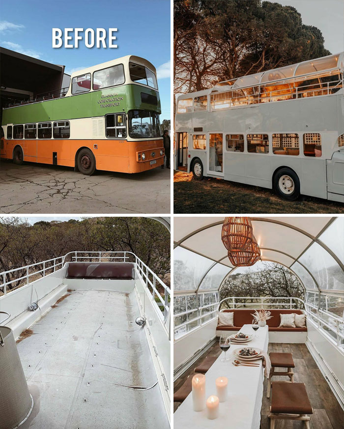
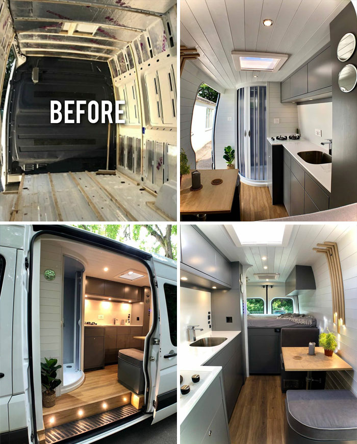
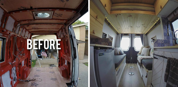
What a project! It's like a "wedding bus" or somthing. It's that a thing?
If it wasnt before, it will be now. That's a great idea!
Load More Replies...Excellent use of space, and a lap pool means you can actually exercise rather than just lounge.
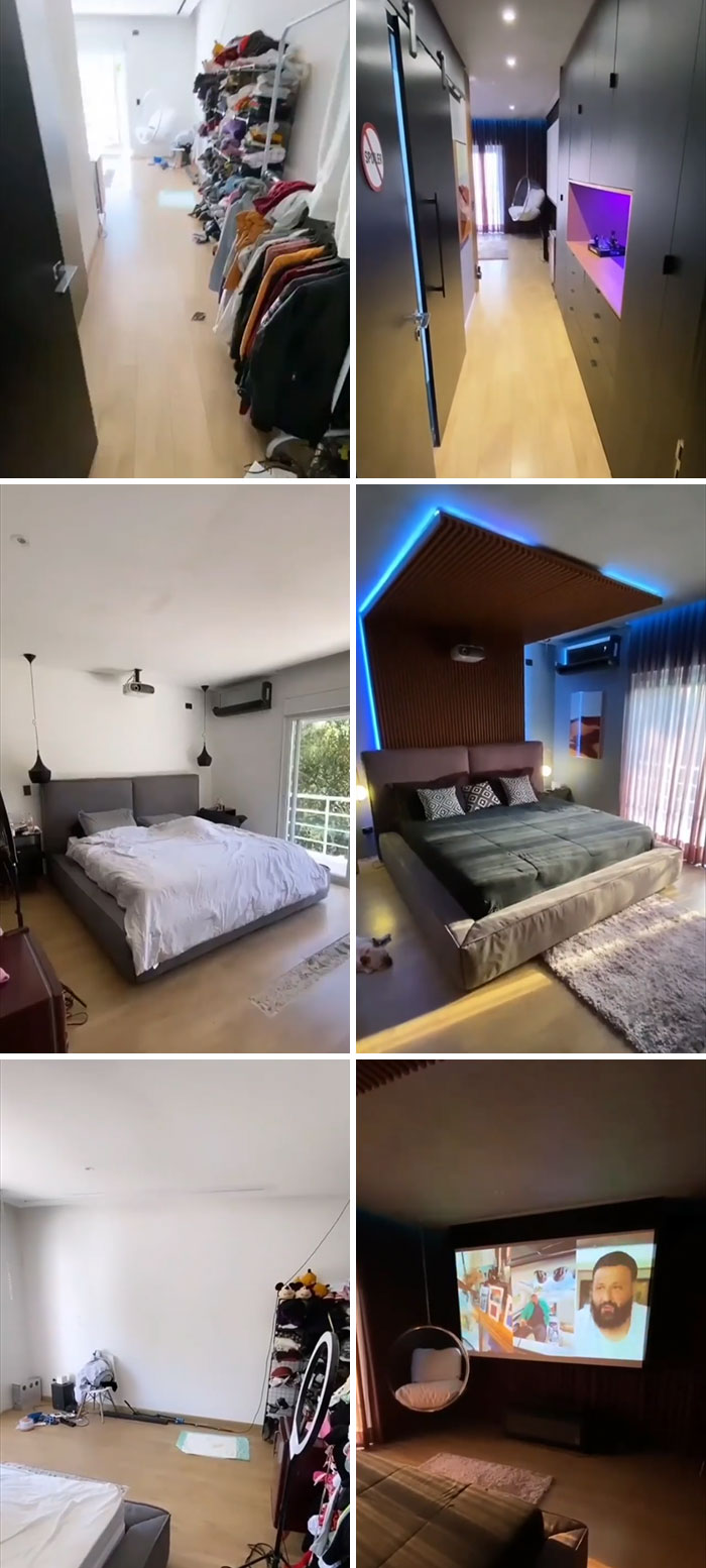
I already don't like leaving the house, so imagine if I had this. I would never leave ever again!!
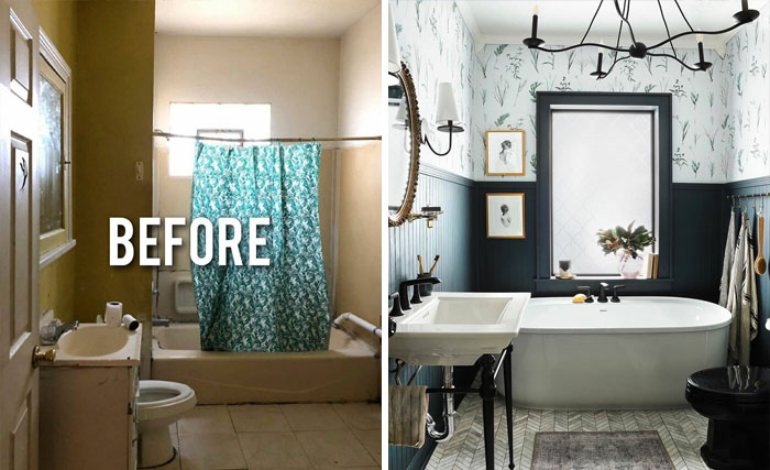
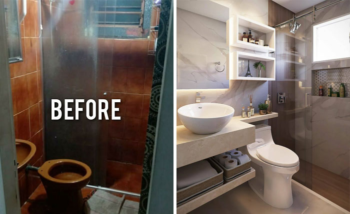
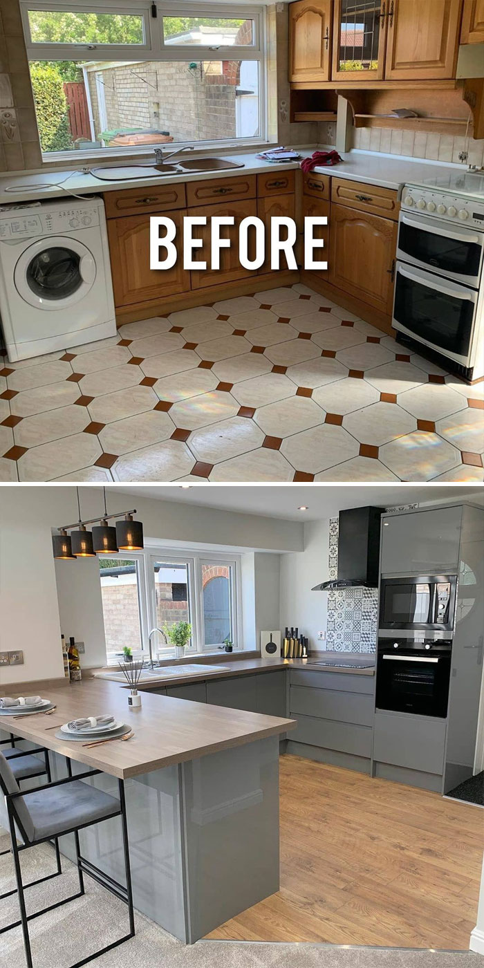
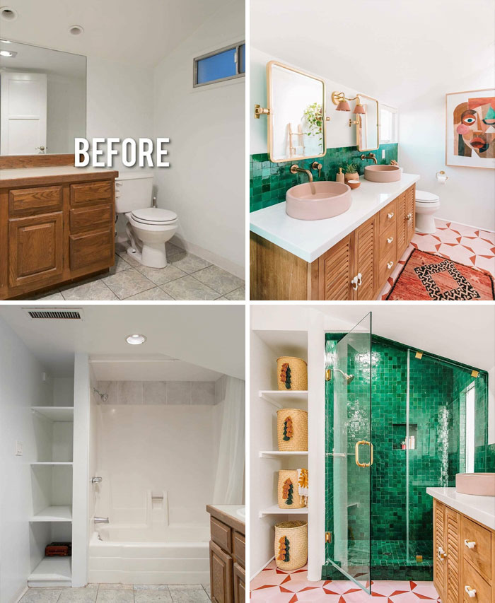
great, exept for the tiny sink. They could have put in one twice the size without looking crowded.
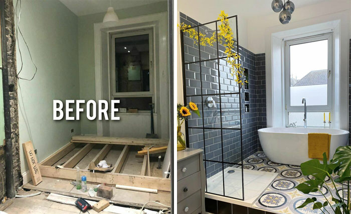
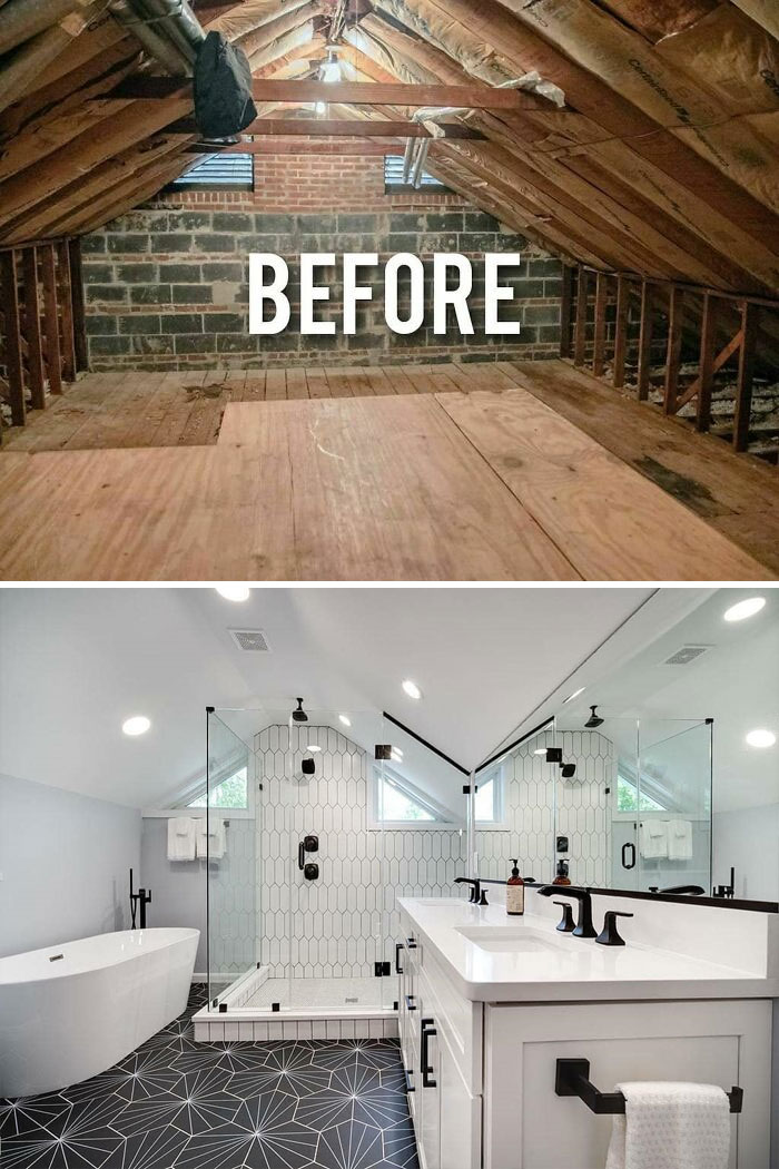
I would definitely trip on that step every time I went to take a shower.
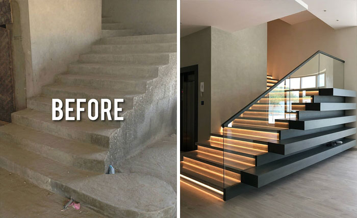
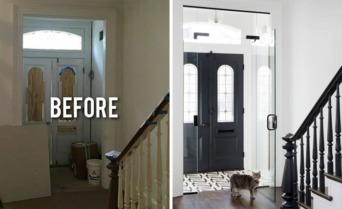
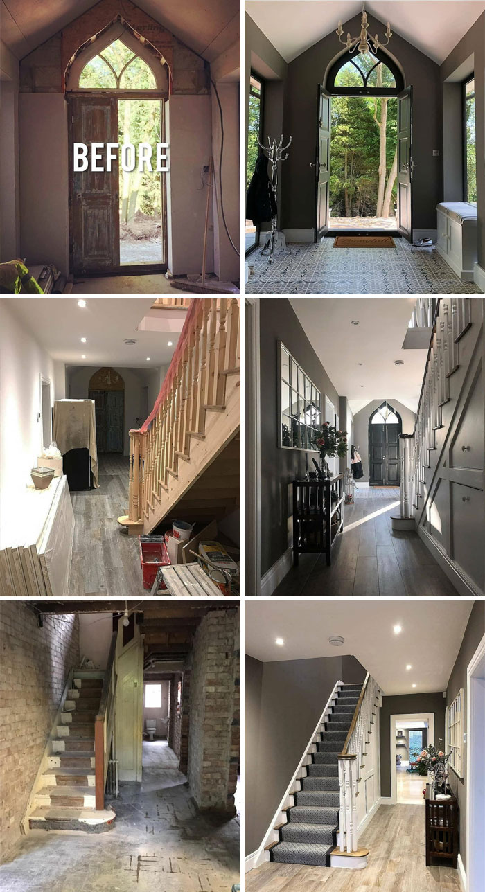
Pic one is just "under construction", IMO. But nice use of under-stair storage.
I can't find any reference points in the pictures. How do we know it's the same place?
Personally, I really dislike when homes are stripped of their architectural design - especially the front facade and ESPECIALLY when it throws off the feel of a whole block. The front of this home was perfectly nice (although needed TLC) yet the owners completely scrubbed it of it's Art Deco roots. So now there's this post-modern facade that completely interrupts the overall architectural feel of the building. BOO.
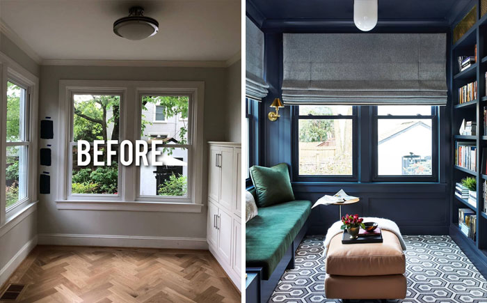
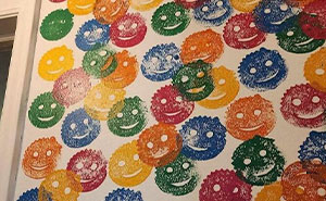
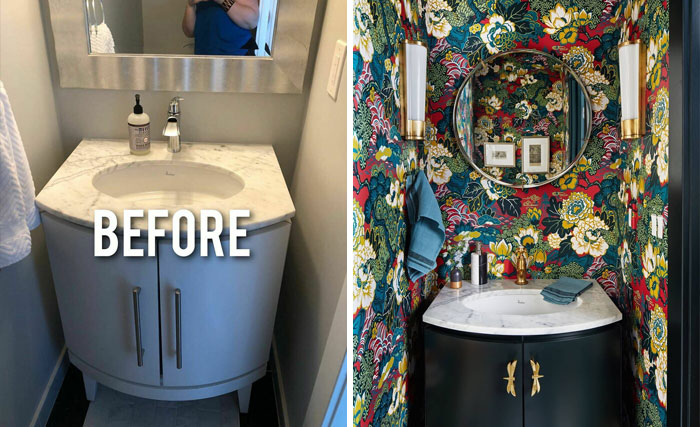
We no I don't like the wallpaper it looks way too crowded and it makes the room look smaller
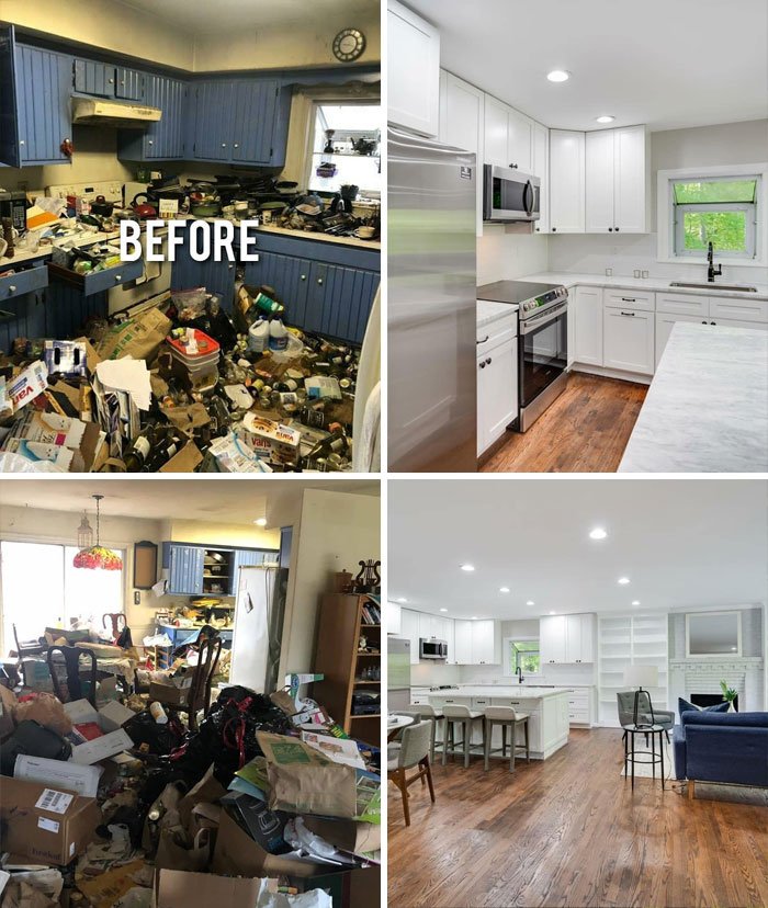
I think of a makeover as something you can do with a little money and some hard work. These are renovations - with huge budgets. Strange title, but some cool spaces for wealthy people!
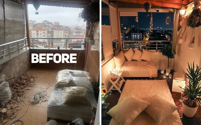
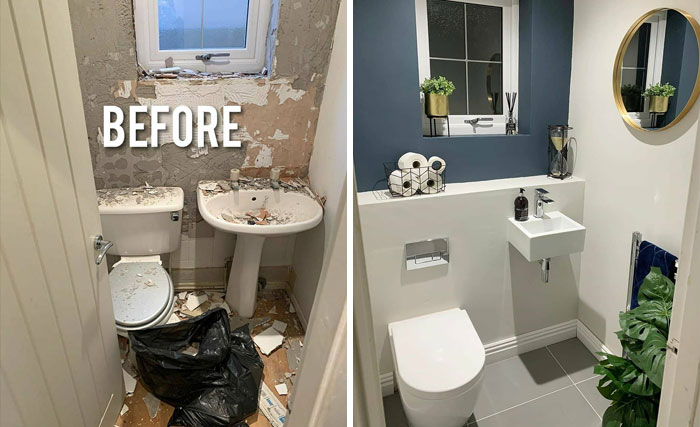
Some look like a work in progress, as if in the middle of the work they decided to take a photo, happened to me. The Befor photo didn't look so shocking cause we've already cleaned up a little.
Load More Replies...While these designs are undoubtedly appealing, it's crucial to acknowledge that not all homeowners have the budget to indulge in such luxurious renovations. The term "affordable" varies for everyone, and practical, cost-effective solutions should be at the forefront of any renovation discussion. Visit us: tps://www.ottawa-renovation.ca/
So many negative comments! It's not titled "Before and After: On a Budget". Nor is it "Before and After: After Everybody Voted For Their Favorite". It's just what it says -- Before and After design makeovers. Not all of them were my cup of tea, but it was an interesting post. At least there weren't any Disney characters. (And clearly not everyone here agrees on what "makeover" means. If you've ever watched Grand Design you know a "makeover" can cost hundreds of thousands of dollars (or Euro or whatever your currency is, some of which might clock up into the millions).

 Dark Mode

 No fees, cancel anytime


