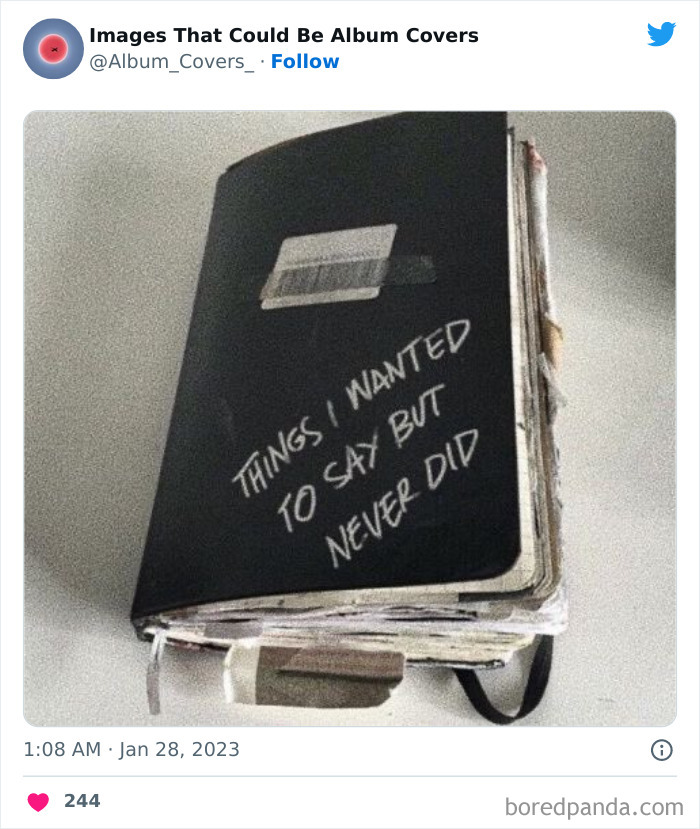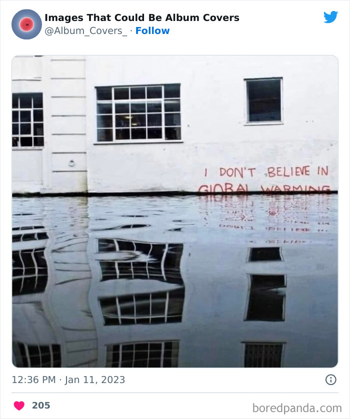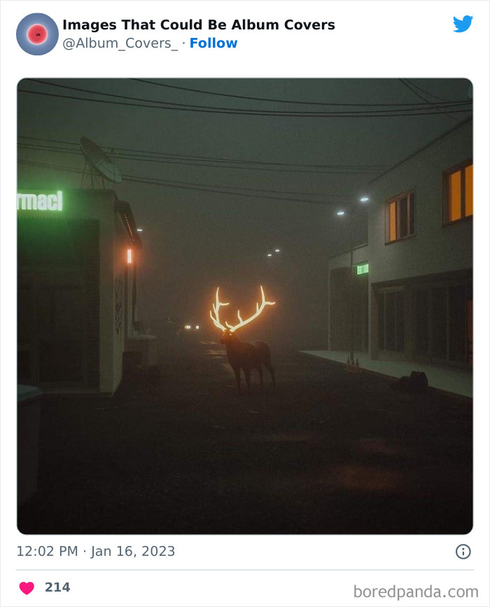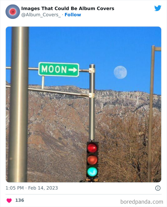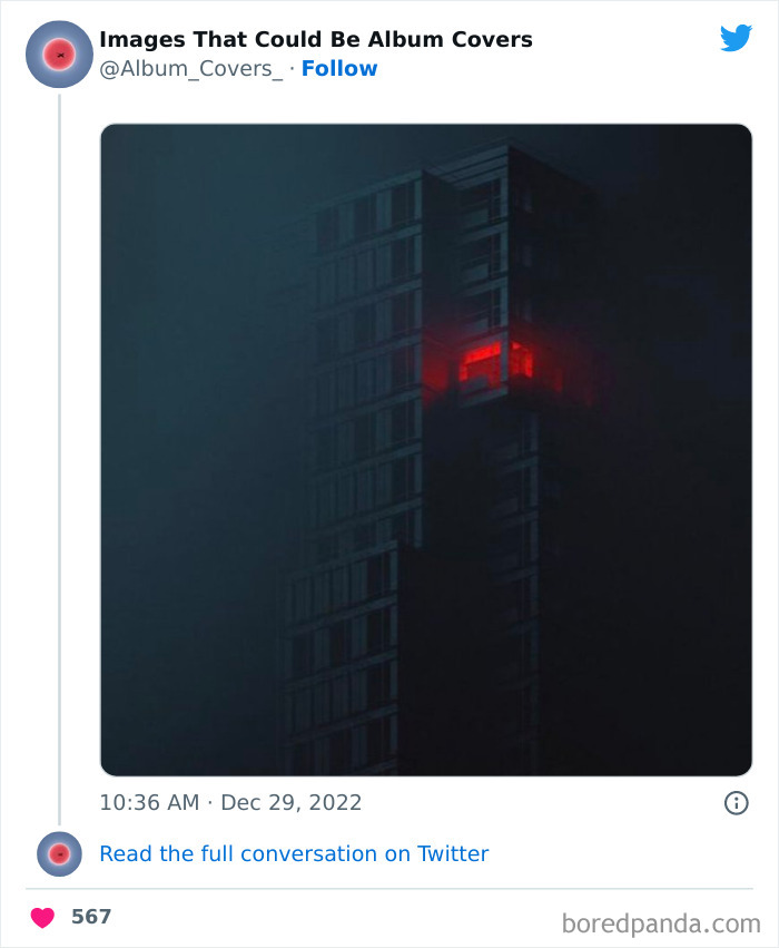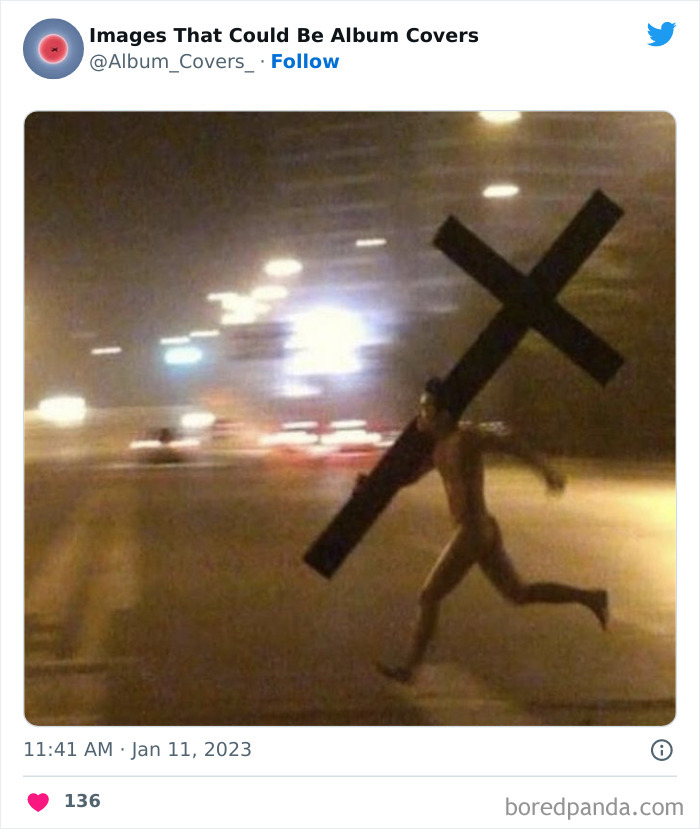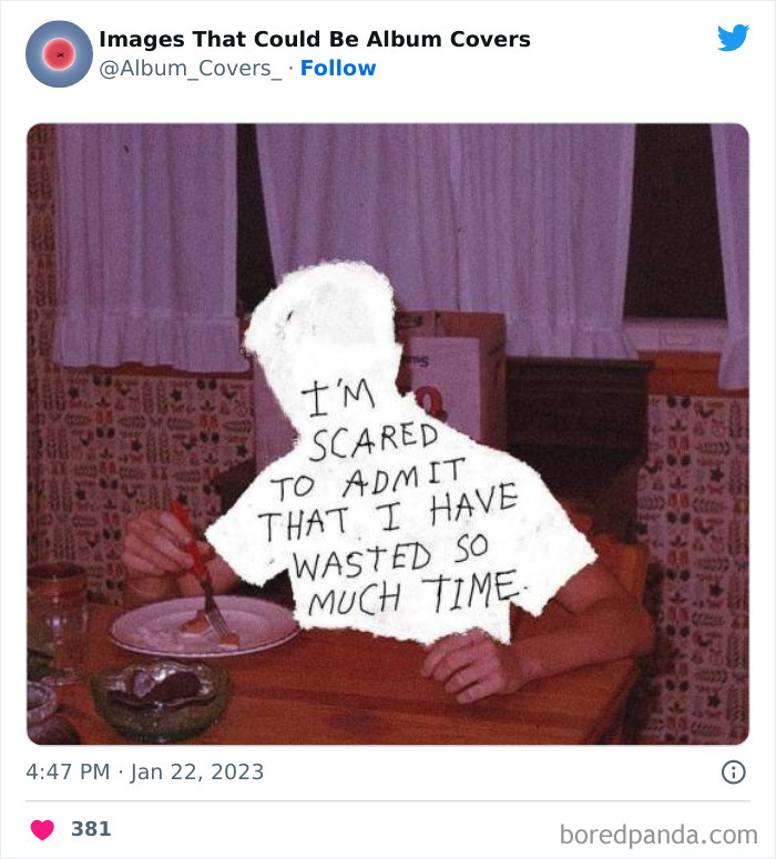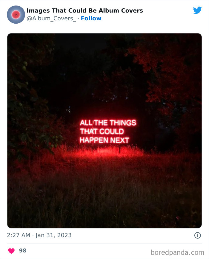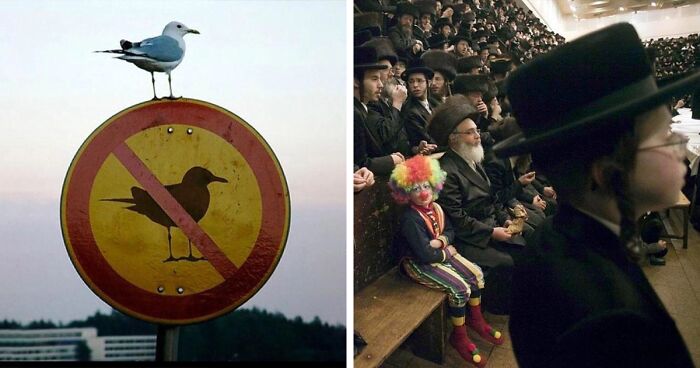
40 Images That Are So Cool And Unusual They Could Totally Work As Album Covers
They say that an image is worth a thousand words. And we tend to think that’s true. But how many quality rock and pop songs could you write with all those words?
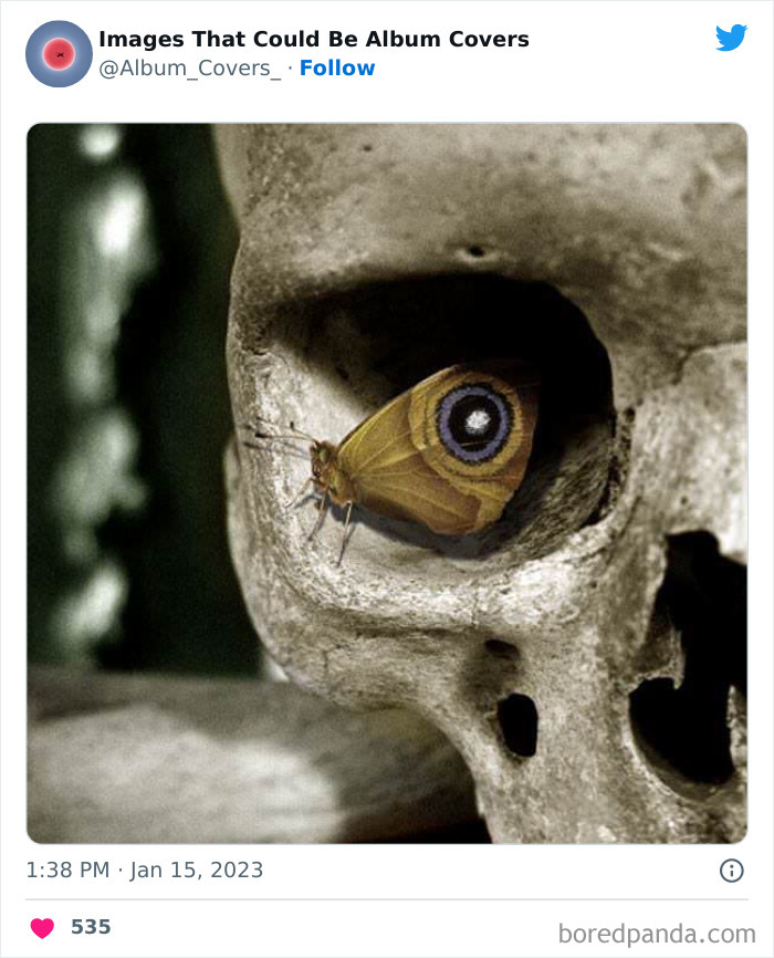
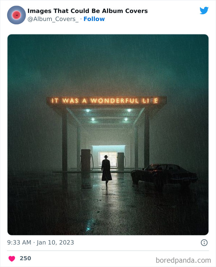
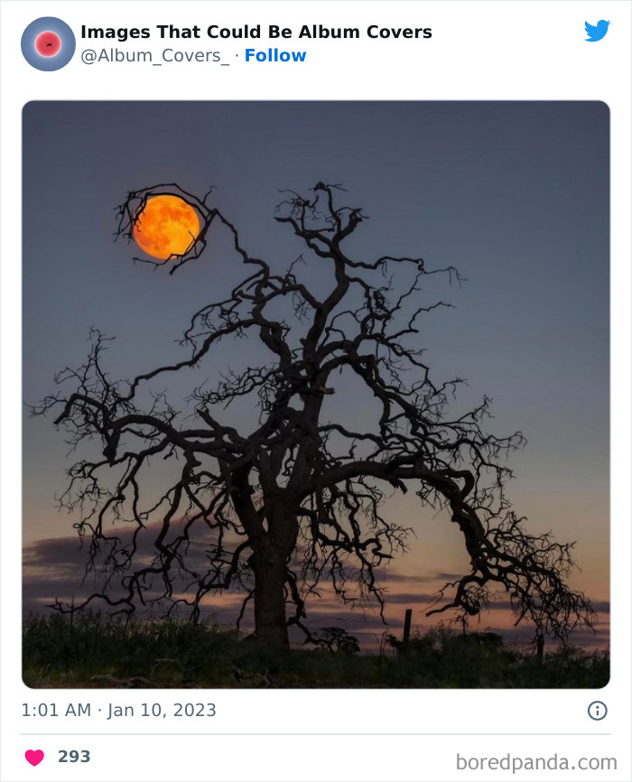
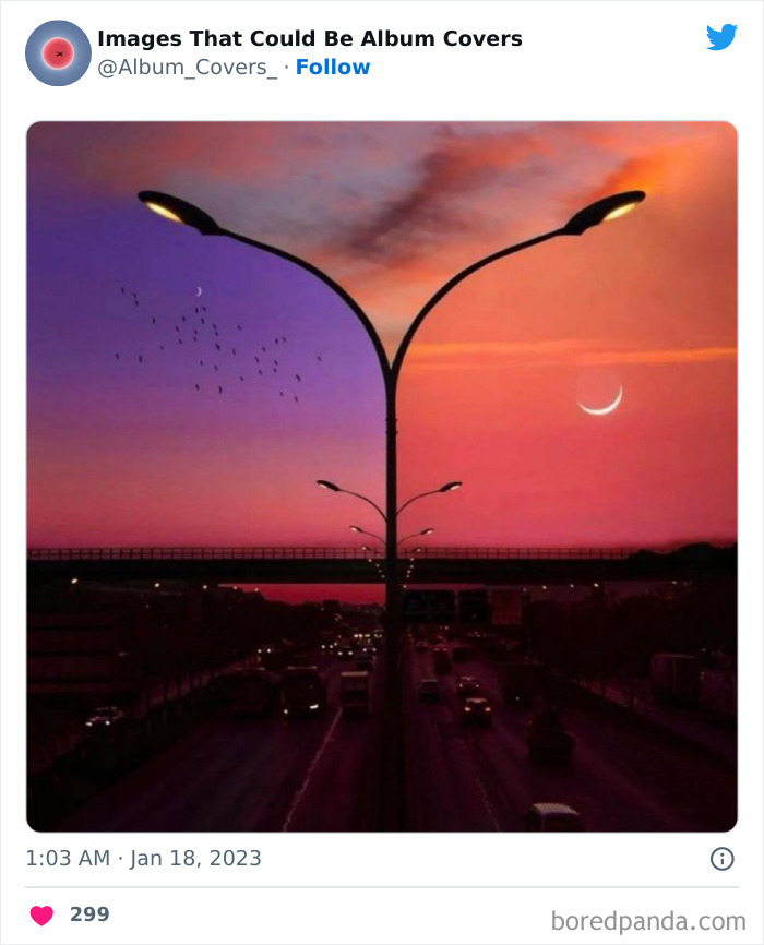
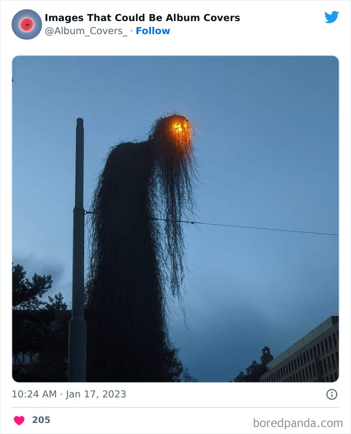
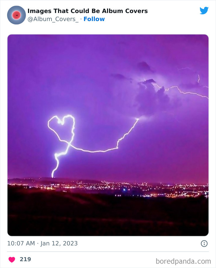
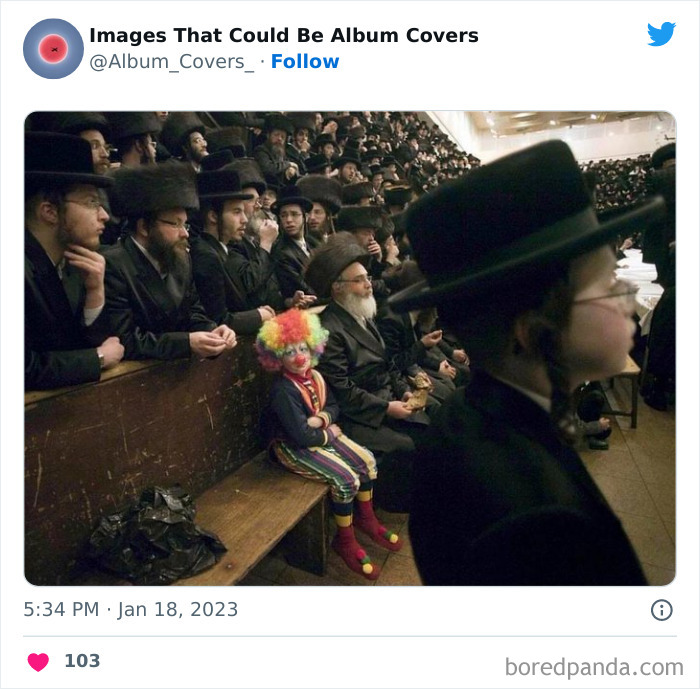
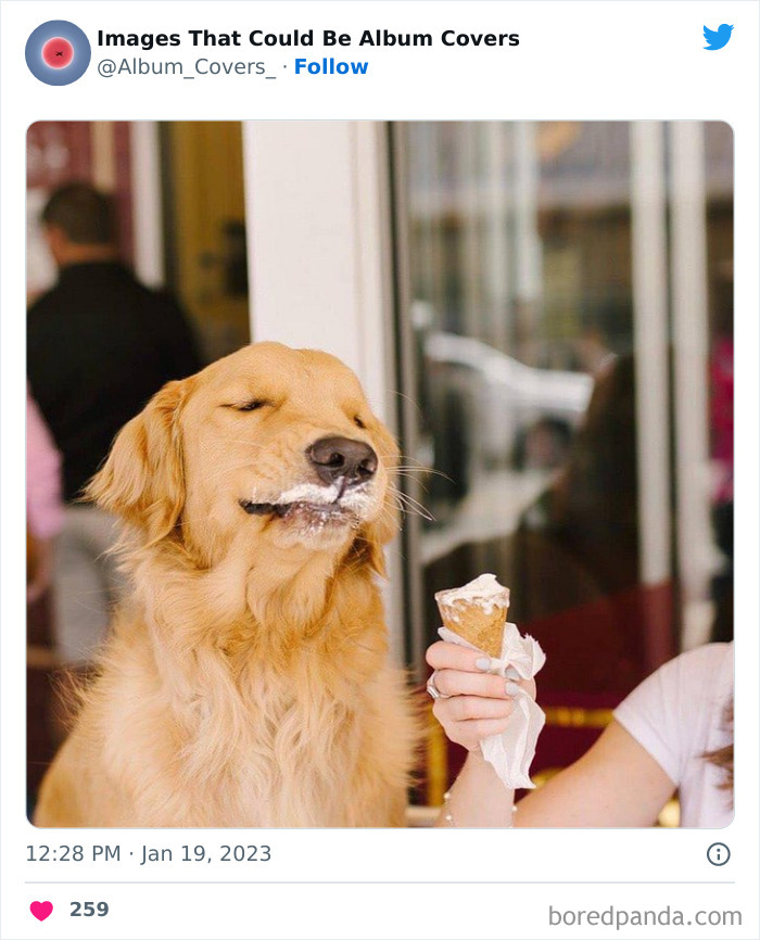
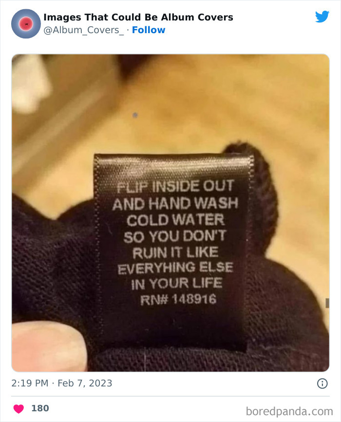
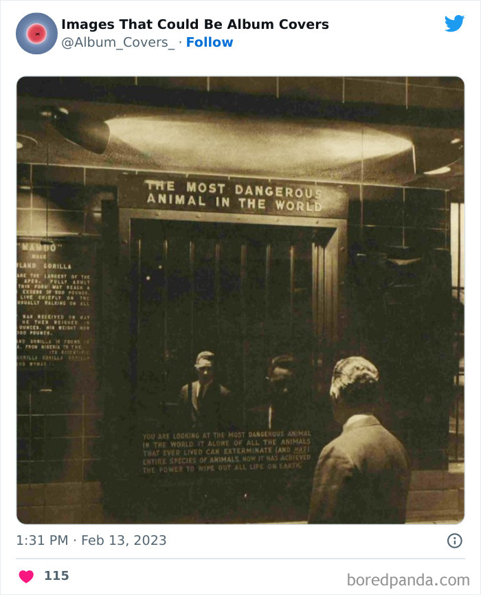
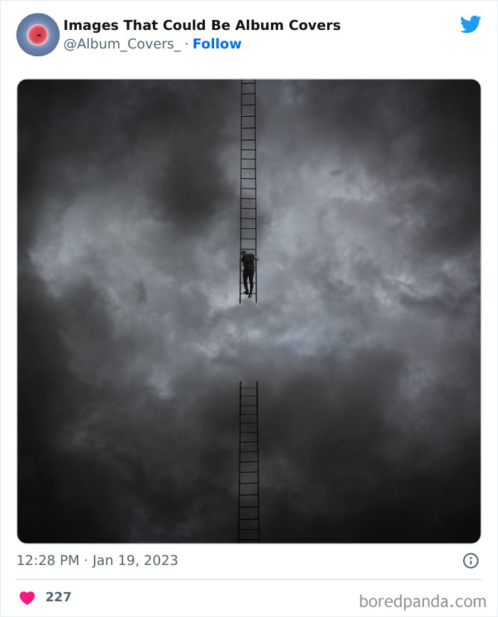
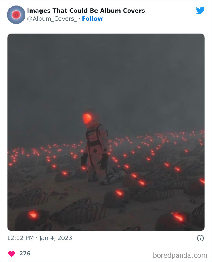
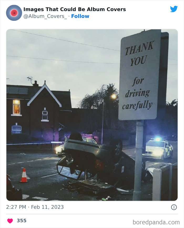
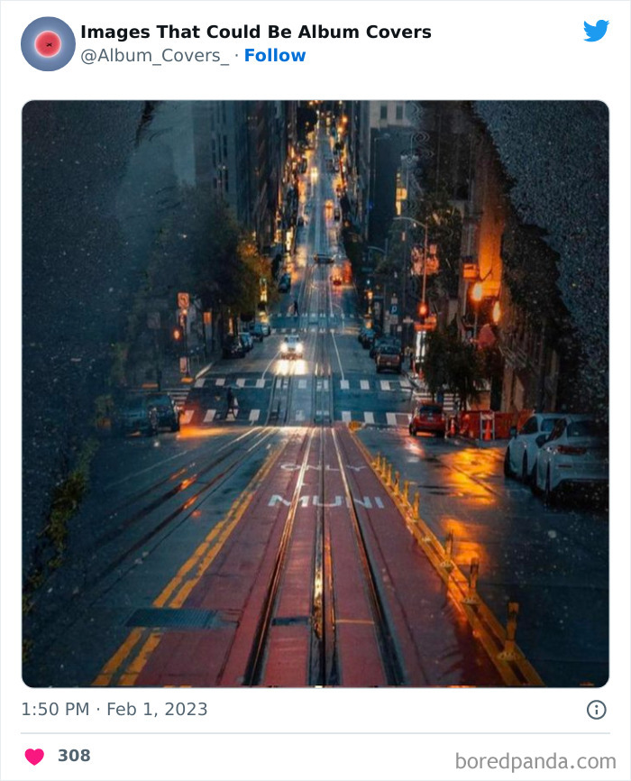
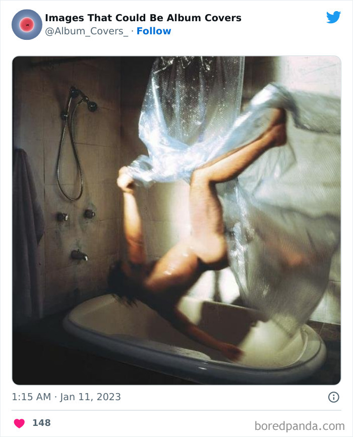
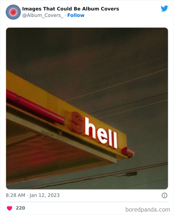
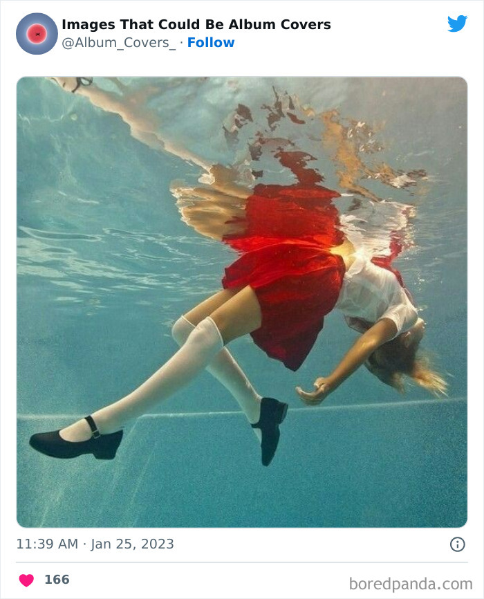
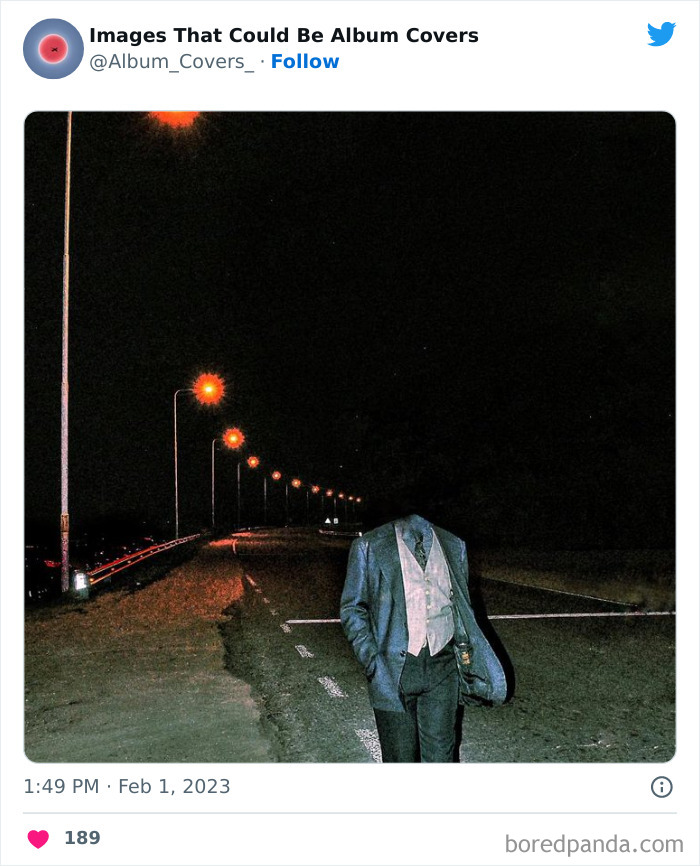
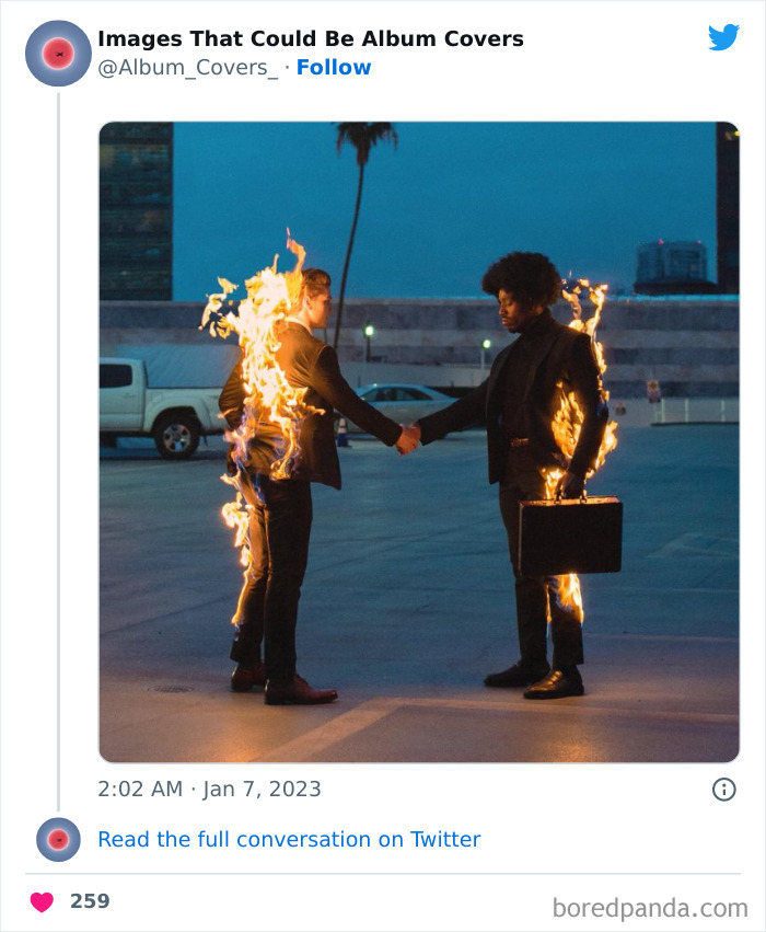
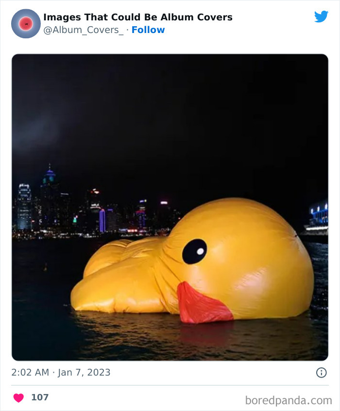
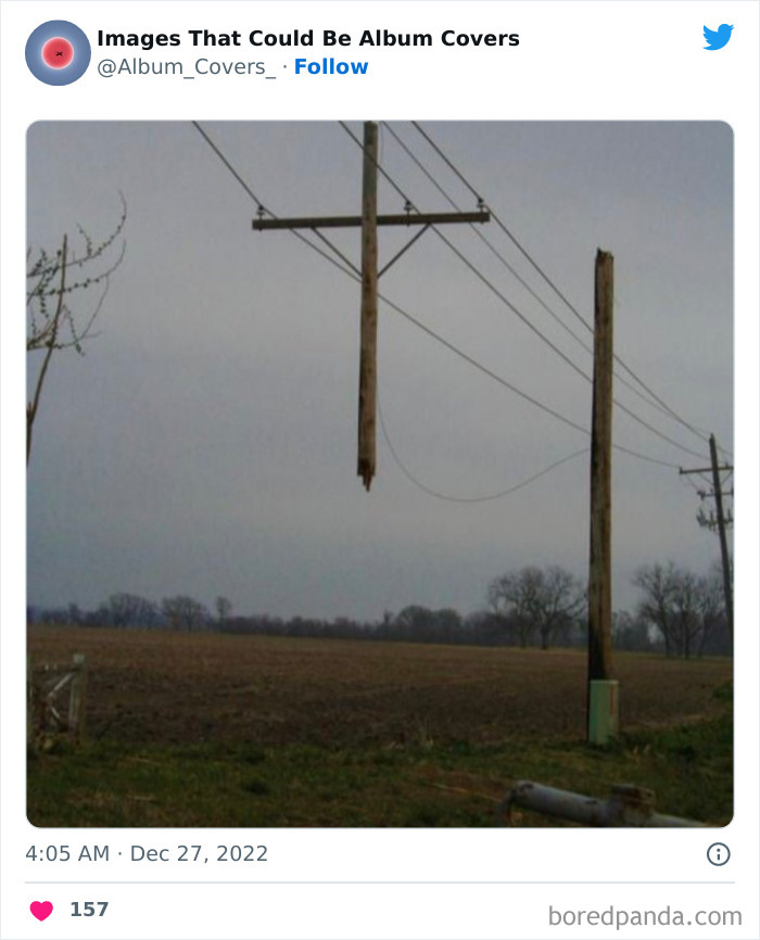
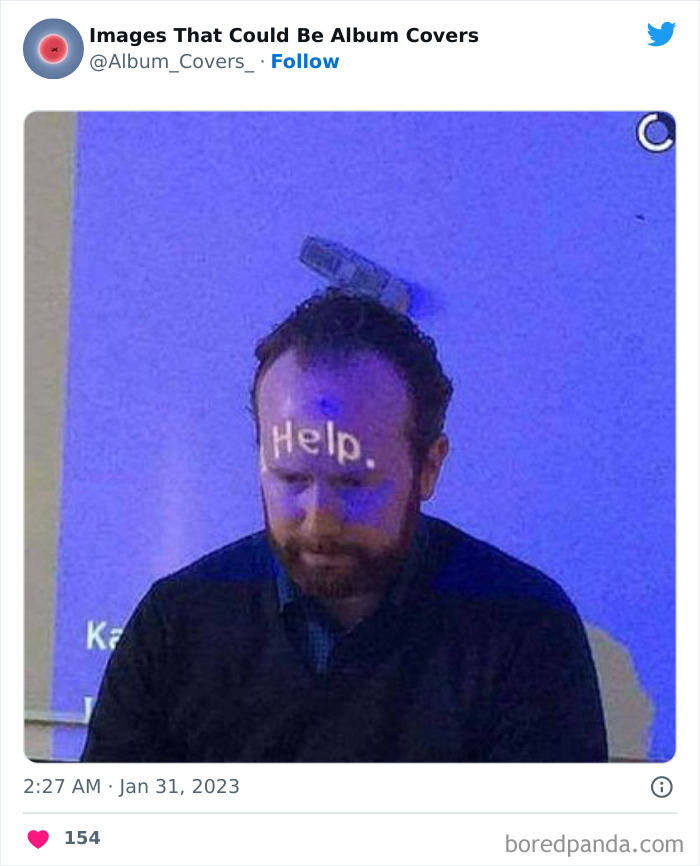
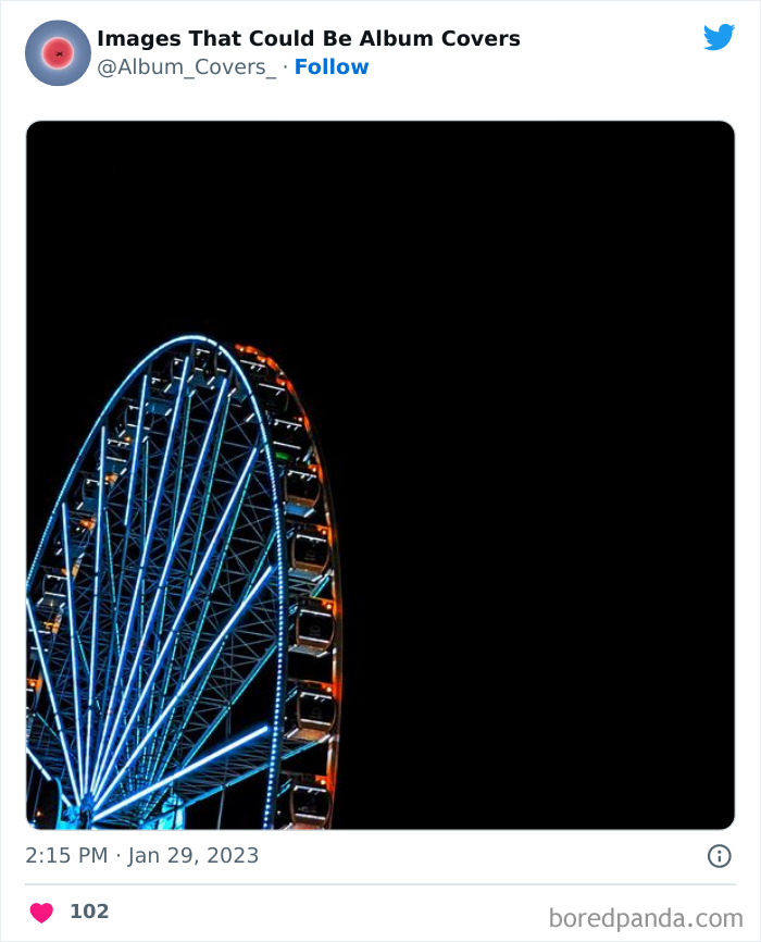
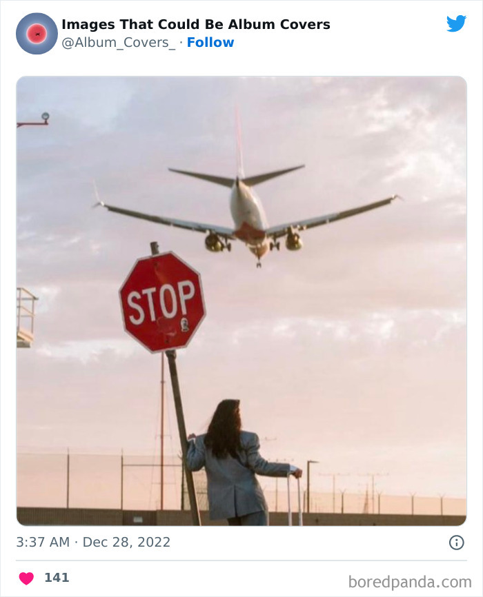
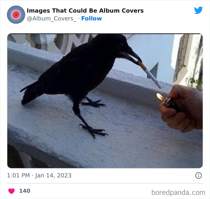
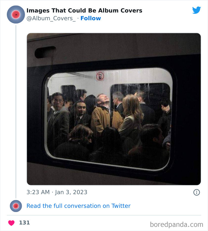
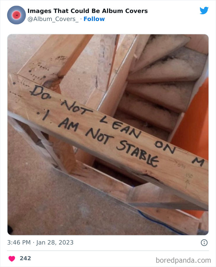
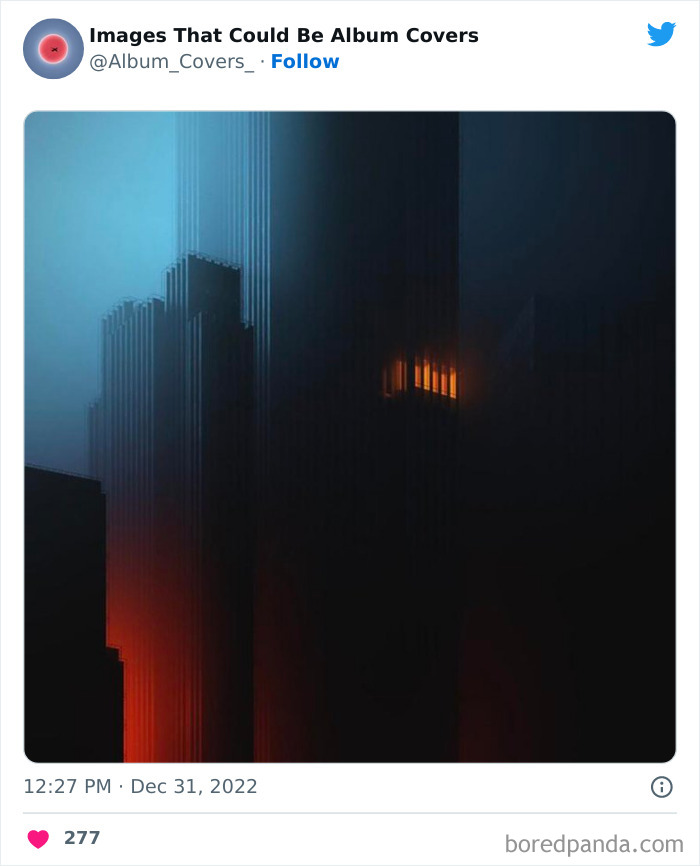
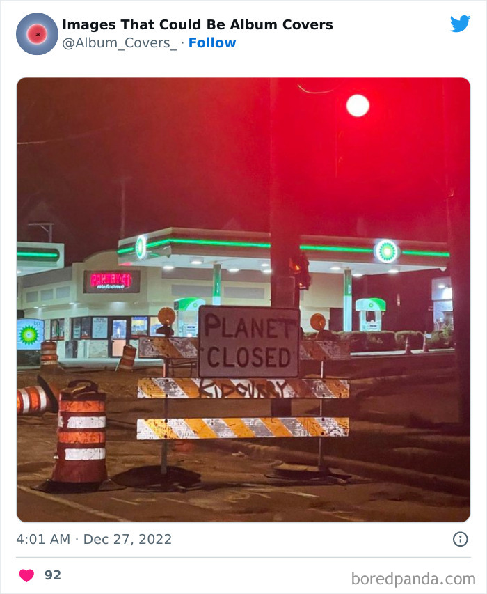
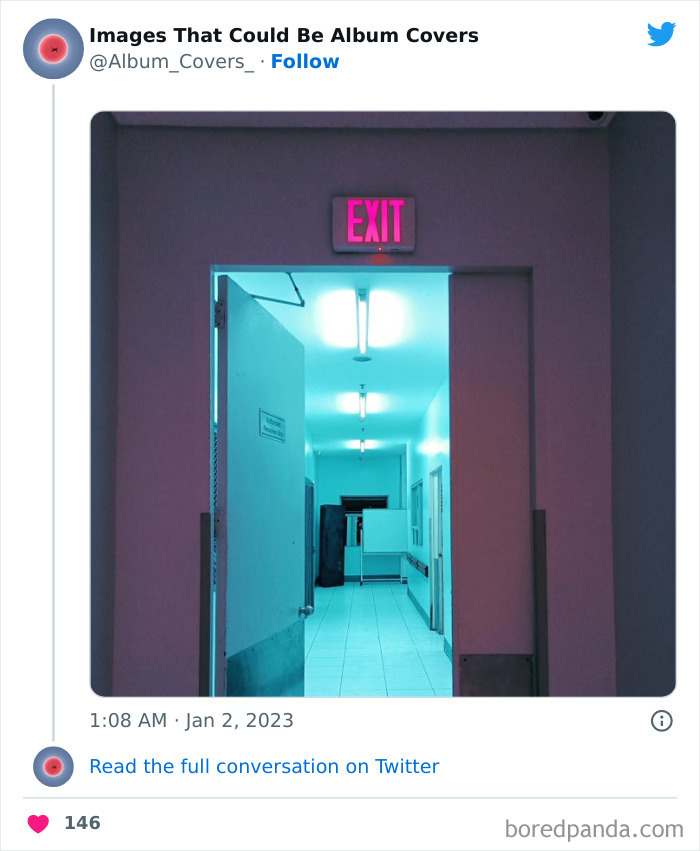
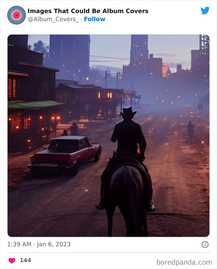
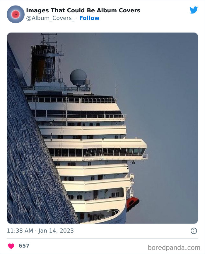
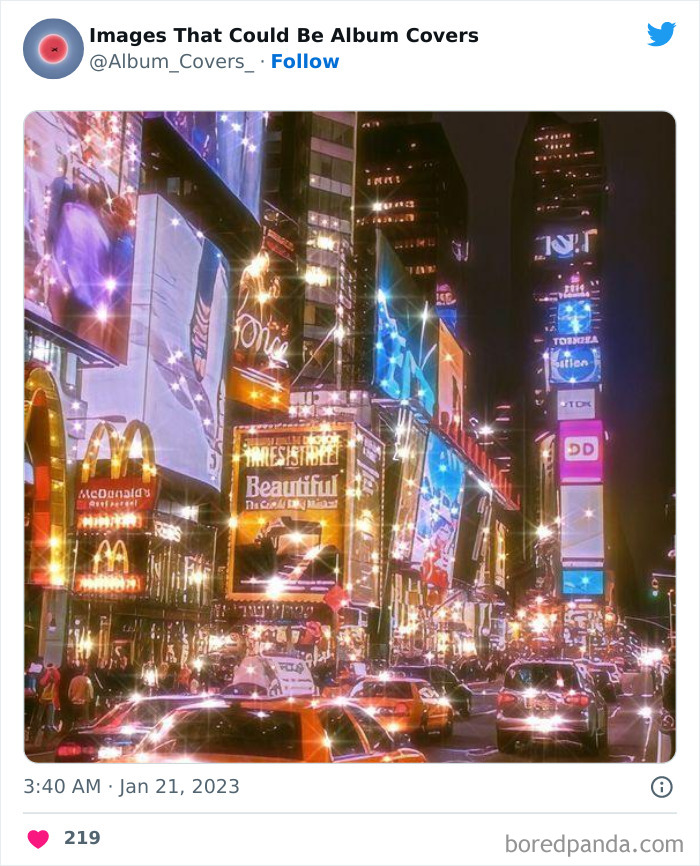
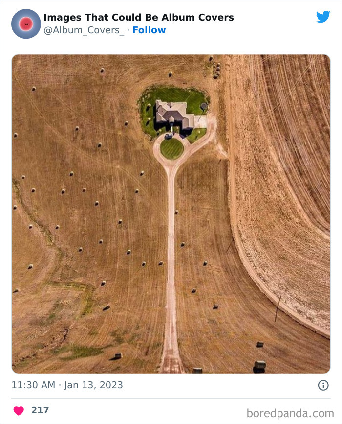
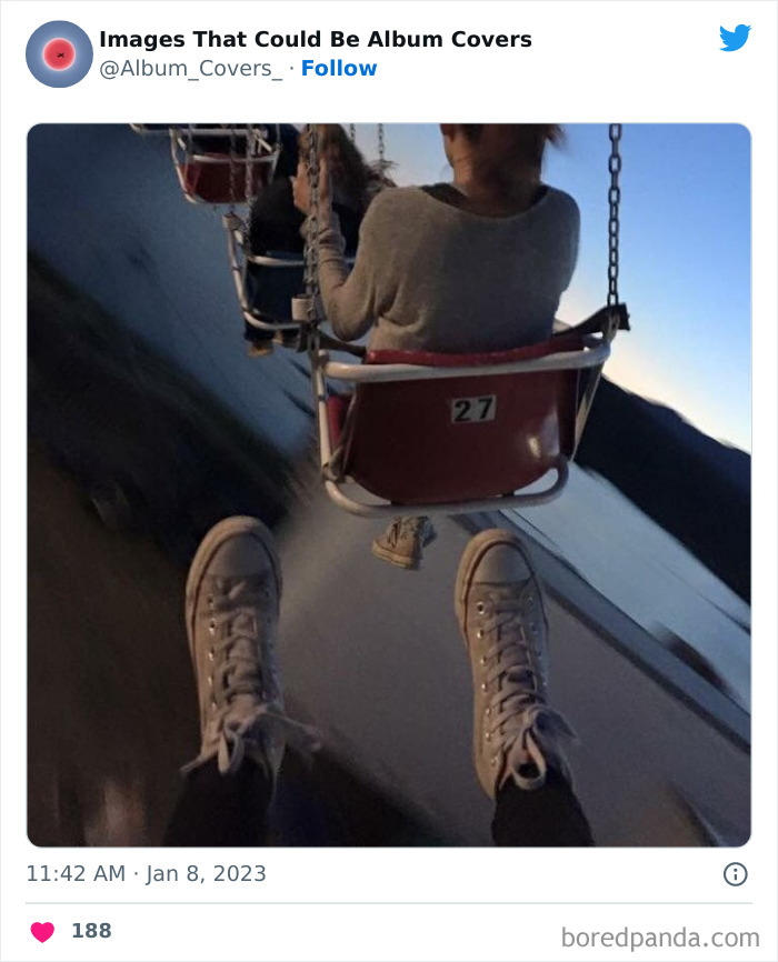
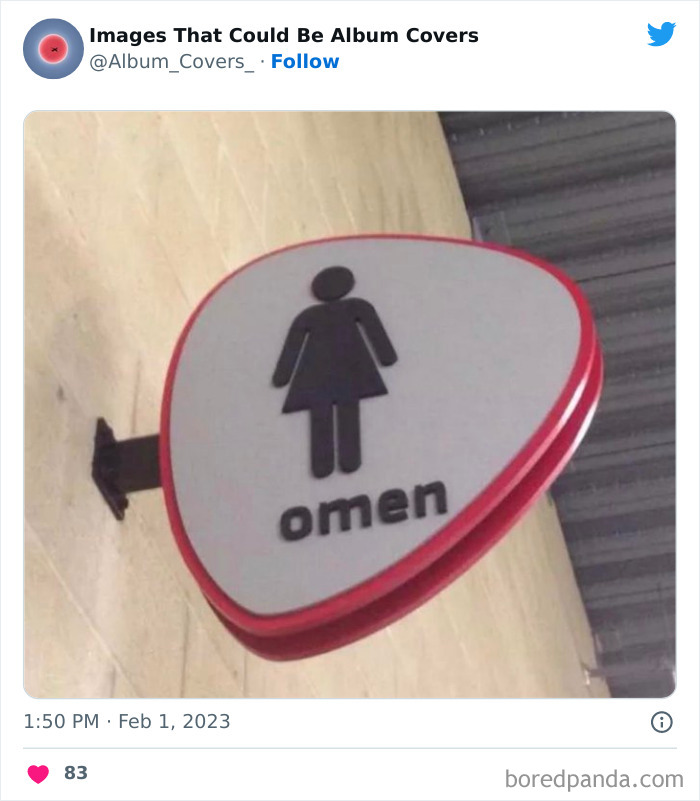
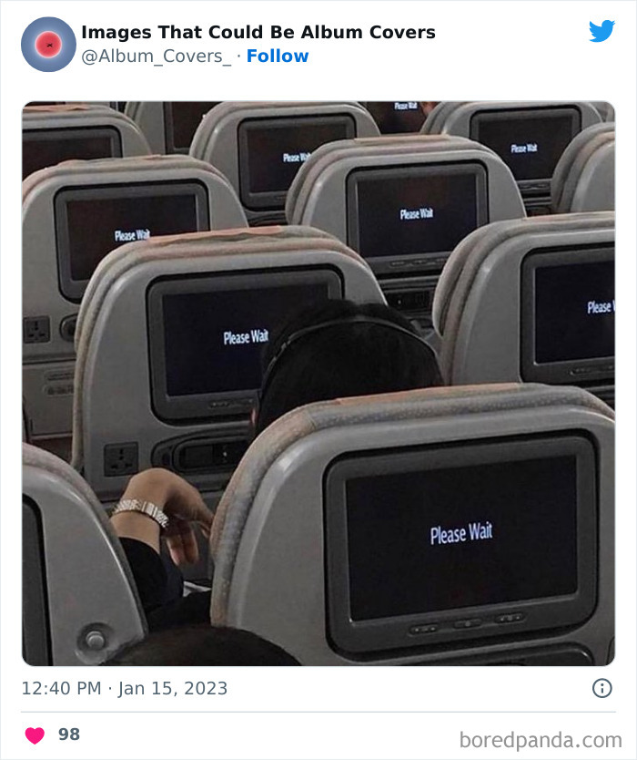
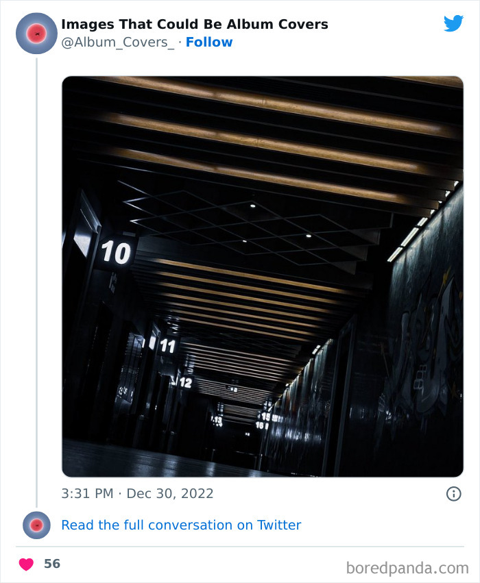
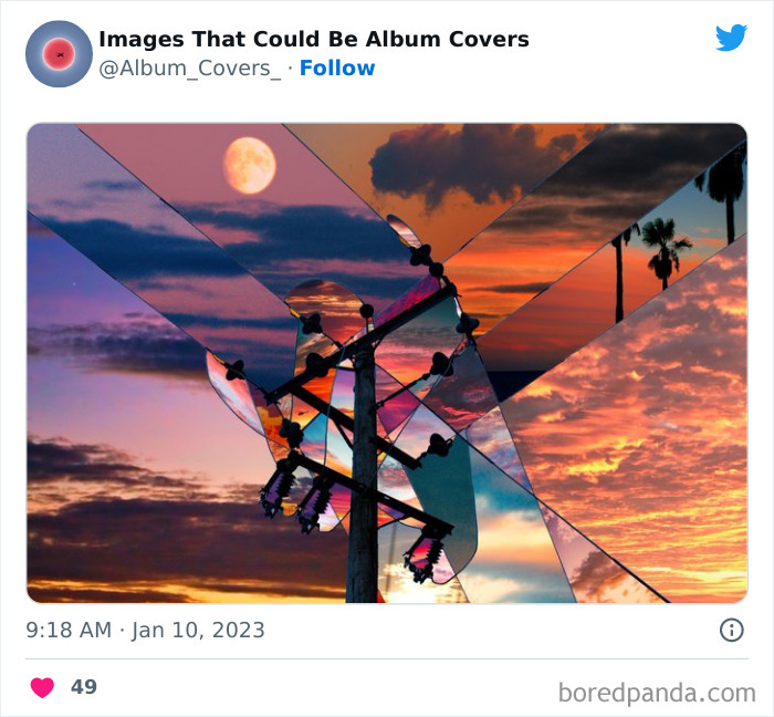
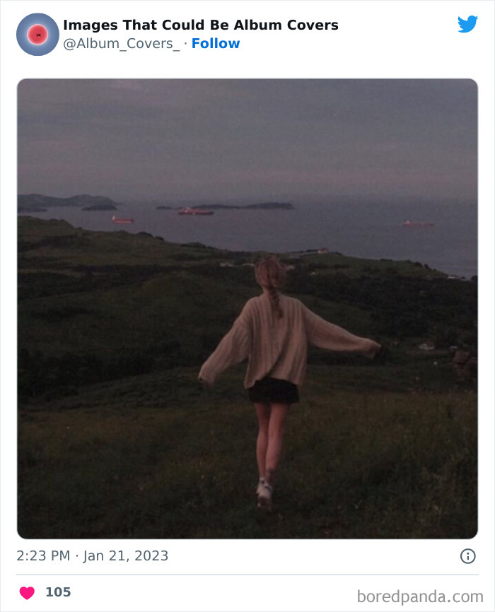
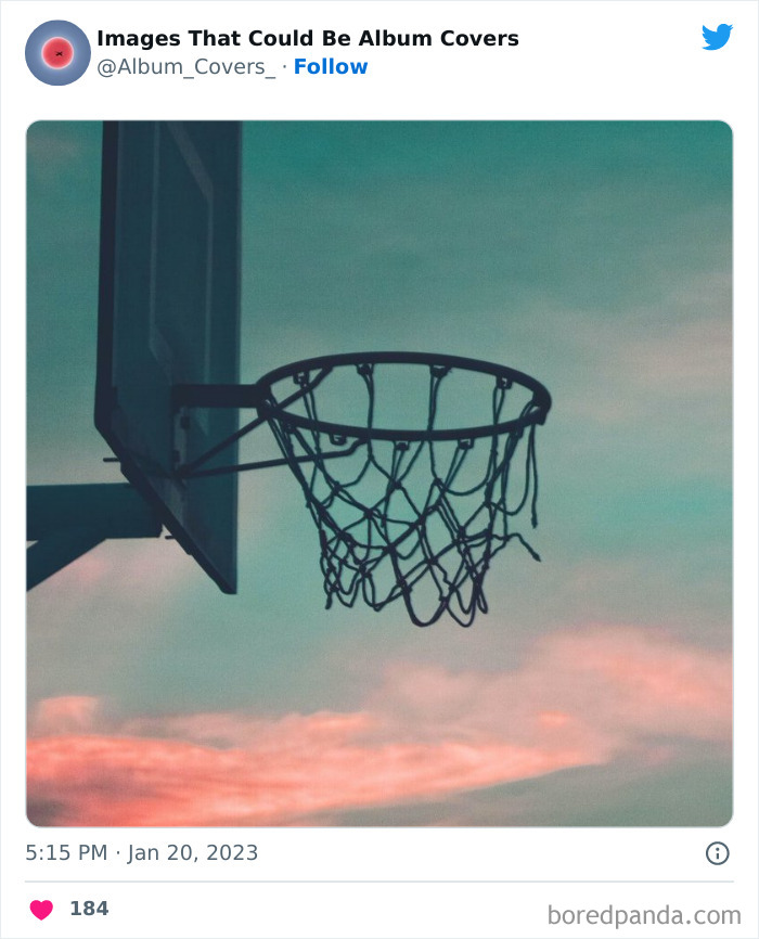
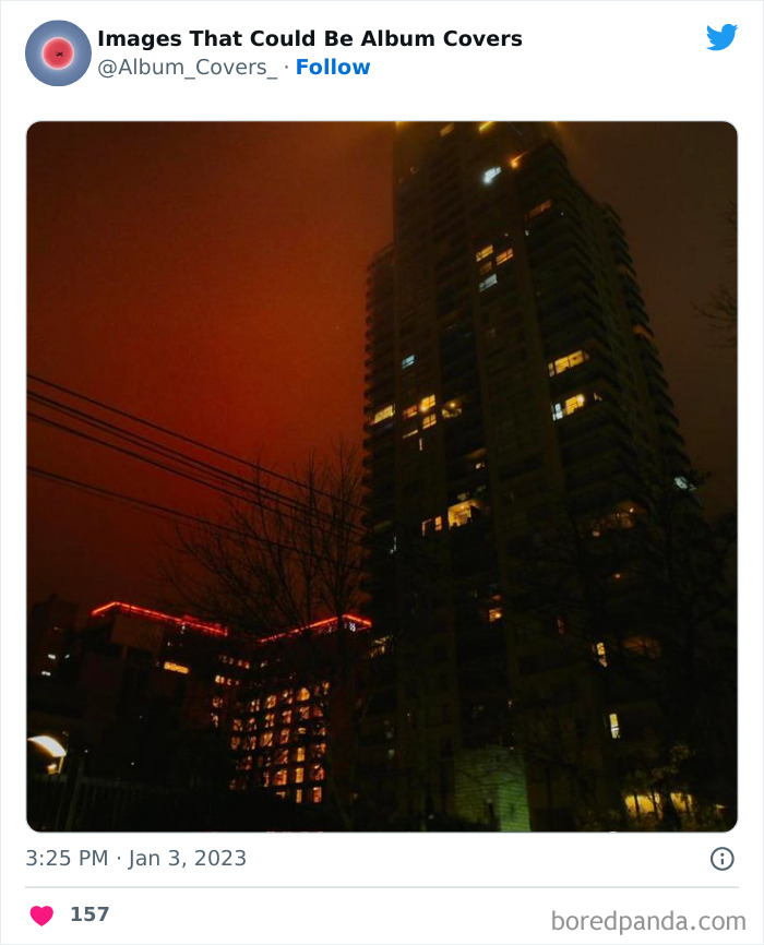
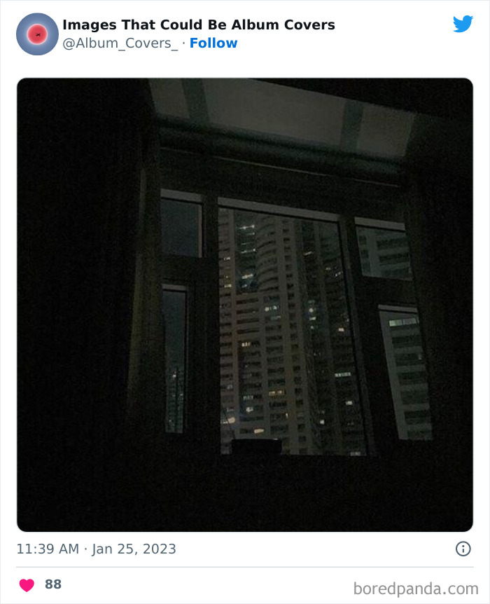
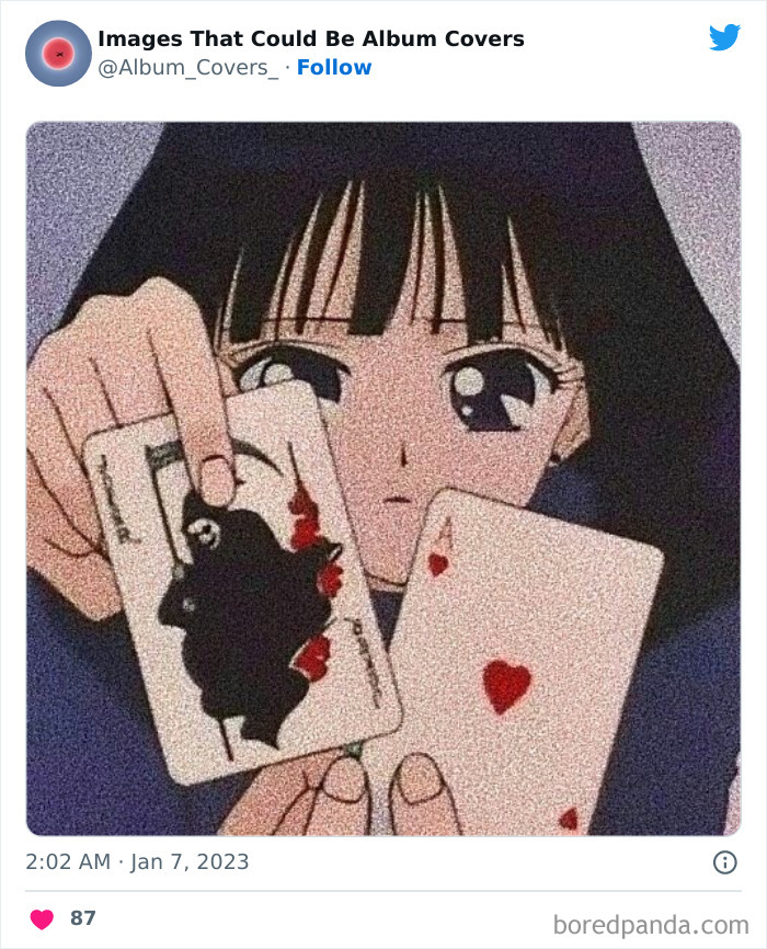
The ‘Images That Could Be Album Covers’ Twitter page is a fabulously funky social media project that does exactly what it says on the tin, without any frills. It documents photos that are so unusual and artistic that they could easily be used to make some jaw-dropping album covers.
We were interested to learn more about what makes photos artistic and unique, as well as how to help potential album covers get people's attention, so we reached out to professional photographer Dominic Sberna, a fan of both music and album artwork. You'll find Bored Panda's interview with him below.
This post may include affiliate links.
Pro photographer and music-lover Dominic, from Ohio, shared some of his thoughts with us on what makes some photos particularly artistic and what people can do to make their album covers stand out from other competitors, visually. From his perspective, what can and can't be considered artistic really depends on the person looking at the photo or cover. There's a lot of subjectivity involved!
"I'd say anything abstract and out of the ordinary would fit the bill here. If it disrupts a lackadaisical scene or is not of the norm of anything, I'd consider that an artistic approach or even avant-garde if you will," he told Bored Panda.
"Lighting, framing, all of the elements of a good composition would typically be thrown out the window to make something 'artsy.' But, on the other hand, maybe they need to be confined to that," he stressed that there's a lot of what people consider to be art will depend on their subjective experiences and opinions.
According to photographer Dominic, in order to get your audience's attention in this day and age, you really need to do something to make you stand out from the crowd.
"If you fall in line with the norm, you'll be hard to be noticed. By doing something different than your peers, you'll stand out. Another way to get noticed is to make your work THAT MUCH better than others. Keep plugging away and take your work to the highest level," he explained. However, no matter what happens, focus on what really matters: your creativity and meeting your own standards.
"Most importantly, do what you want to do and don't crumble to the pressure of your peers. So long as you're happy with the art that you're creating, that's what matters the most. No amount of money can create happiness within yourself as an artist. It is extremely important to take care of yourself by being true to your own artistic vision."
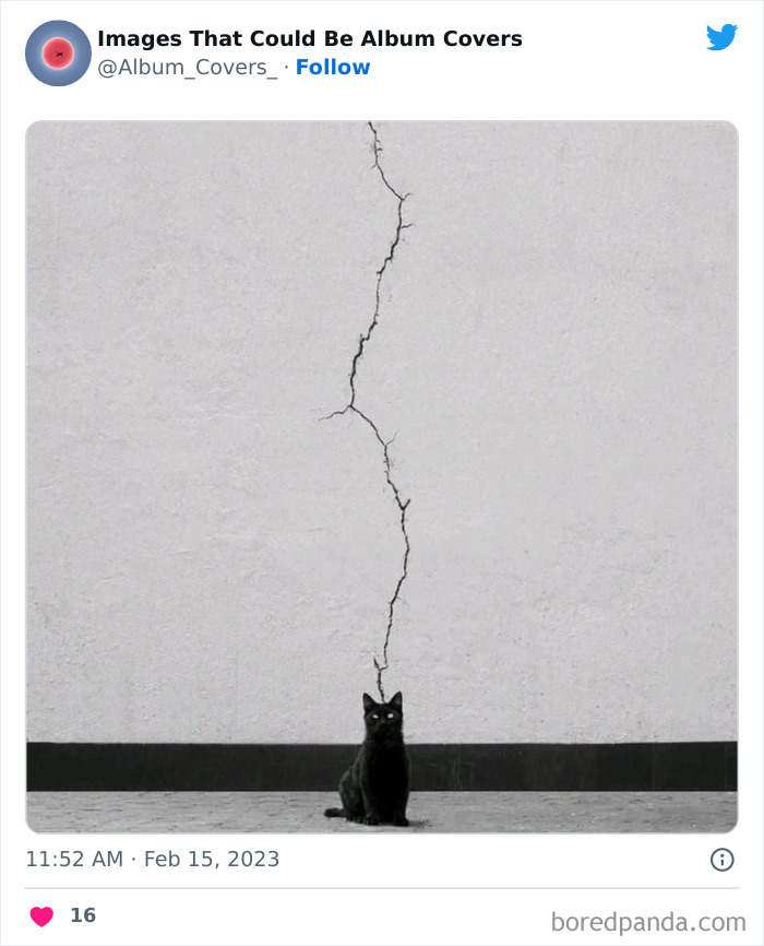
And black lightning struck. As it descended upon the earth, at the end of the bolt appeared a feline black as night with eyes as bright as the sun.
The ‘Images That Could Be Album Covers’ account is a great niche on Twitter that combines art, humor, photography, and a love of music in a fun and engaging way. If you’ve taken a quality picture (or found an unusual one online), feel free to send the founder of the page a direct message—your image might even get featured in their feed.
The account was created all the way back in September 2017, and it’s still active to this day. New photos get posted nearly every day, and the account’s 68.7k followers enjoy it a bunch! They love the energy and quirkiness that the pics exude. It’s also some inspiration for future pop stars to start working on their own album covers.
As more and more people start using the internet and social media, it becomes increasingly more difficult to stand out with your content. It forces creators to adapt and think creatively about how they can best get everyone’s attention.
Some social media projects choose to cast a wide net and post a little bit about everything. Their goal is to be as relatable as possible and appeal to a very broad audience. Others, however, home in on a single niche that they enjoy and focus specifically on that and that alone. The strategy used will vary from creator to creator. It’s always best to do something that brings you joy, not just something that nets you the most popularity. There’s a need to find a balance between the two.
Out, je regret plusieurs choses ( apologies for my GCSE french, half remembered from 30 years ago!)
Similarly to photos on social media, album covers also need to stand out from the crowd. It’s quite a challenge when everyone’s doing the exact same thing: trying to seem as unique as possible. Somehow, you need to make your cover pop! You might have the best music in the world, but it won’t get people’s attention unless you know how to market it, both online and in the real world.
You not only need fantastic music and awesome lyrics, but you also have to have a catchy band name, a great title for your album and songs, and, of course, an album cover that wows the crowds. It’s a lot of work, no matter if you're going for a photo or a painting!
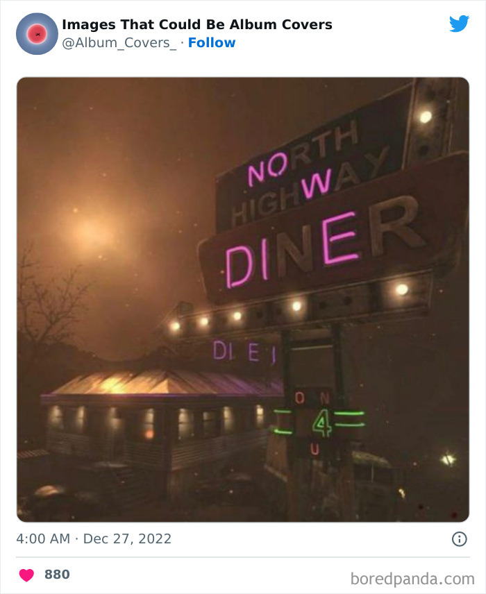
Is there also a message "hidden" further down? Something with "on for you" (O N 4 U)?
Some of the things that you could keep in mind when crafting an album cover include the subject matter and how it relates to your music, how you frame everything, and what colors you use. Some color combinations are likely to stand out more than others and might fit thematically far better with your work and ‘image’ than others. Play around with them and see what works best.
But no matter how important the photo is, you shouldn’t ignore the word part of the cover! You ought to think of words as part of the entire visual ensemble. Consider how the size of your album name, the kerning (that’s the spacing between the letters), and the font you use might all affect how your intended audience thinks and feels.
The questions that you should be asking yourself are about the type of message that your album cover is sending. Is your album title legible, clear, and brief? (Or, alternatively, if you want to be chaotic, unclear, and long-winded, are you creating exactly the atmosphere you want to?) In essence, you want to get your message across to your audience.
Opt for a font that’s instantly readable, otherwise, you’re leaving people confused and they’ll move on to the next album at the music store. That swirly script you love might look fancy, but can anyone actually read the name of your band?
Something else that you should really keep in mind is reaching out for help. You might have designed the most perfect album cover in the history of commercial music. Or… at least that’s what you tell yourself. However, everyone needs an editor, no matter what industry they work in.
Show your album cover to a few friends whom you can trust to be open and honest with their opinions. Get in touch with some industry professionals to see what they think. Heck, ask someone to proofread what you’ve written! It’s better than realizing that you’ve made a silly grammar mistake once you’ve printed a thousand covers.
After asking for other people’s input, you might find that some things that look incredibly cool to you simply confuse others. You might not be getting the message that you want across to others. This means it’s time to get back to the drawing board and refine some of the visuals and the font. Now, that’s not to say that you should completely scrap your ideas.
People have different opinions on art, and you shouldn’t silence your voice. However, the sign of any good artist is that they’re open-minded when it comes to criticism: they take the advice that’s useful and ignore everything else. It’s scary to put your work out there! But it can help you edit your work into something that’s elevated—on a whole other level.
1/2 Totally off topic but I wanted to post this for all to see. I have emailed the BP staff about the downvoting - suspensions - banning and this is the reply: Hello CaroCaro, Thank you for your email! We have recently made some changes to our community moderation system.Previously, if a comment received 10 downvotes, the comment author was assumed to have violated our guidelines and could face temporary or permanent suspension. However, we have now implemented a more effective approach. Instead of relying solely on downvotes, we have created a report button that allows our team to more easily identify and review comments or posts that potentially violate our community guidelines. This way, our dedicated team of moderators can more effectively and efficiently review all reported comments to identify those that spread hate speech or any other inappropriate content, and take appropriate action to maintain a positive and safe community.
2/2 Please feel free to review the updated community guidelines: https://www.boredpanda.com/community-guidelines/.
Load More Replies...There is a Twitter account about these. I follow it. Great photography.
Load More Replies...I know some of these are AI generated, but glad they're not another "10 famous cartoon/book characters and how they'd look as real people!" posts.
Agreed. I know some of them were manipulated but I still enjoyed them way more than all AITA c**p.
Load More Replies...1/2 Totally off topic but I wanted to post this for all to see. I have emailed the BP staff about the downvoting - suspensions - banning and this is the reply: Hello CaroCaro, Thank you for your email! We have recently made some changes to our community moderation system.Previously, if a comment received 10 downvotes, the comment author was assumed to have violated our guidelines and could face temporary or permanent suspension. However, we have now implemented a more effective approach. Instead of relying solely on downvotes, we have created a report button that allows our team to more easily identify and review comments or posts that potentially violate our community guidelines. This way, our dedicated team of moderators can more effectively and efficiently review all reported comments to identify those that spread hate speech or any other inappropriate content, and take appropriate action to maintain a positive and safe community.
2/2 Please feel free to review the updated community guidelines: https://www.boredpanda.com/community-guidelines/.
Load More Replies...There is a Twitter account about these. I follow it. Great photography.
Load More Replies...I know some of these are AI generated, but glad they're not another "10 famous cartoon/book characters and how they'd look as real people!" posts.
Agreed. I know some of them were manipulated but I still enjoyed them way more than all AITA c**p.
Load More Replies...
 Dark Mode

 No fees, cancel anytime


