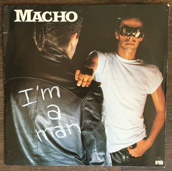
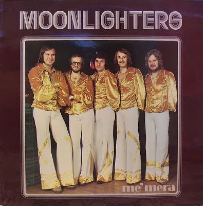
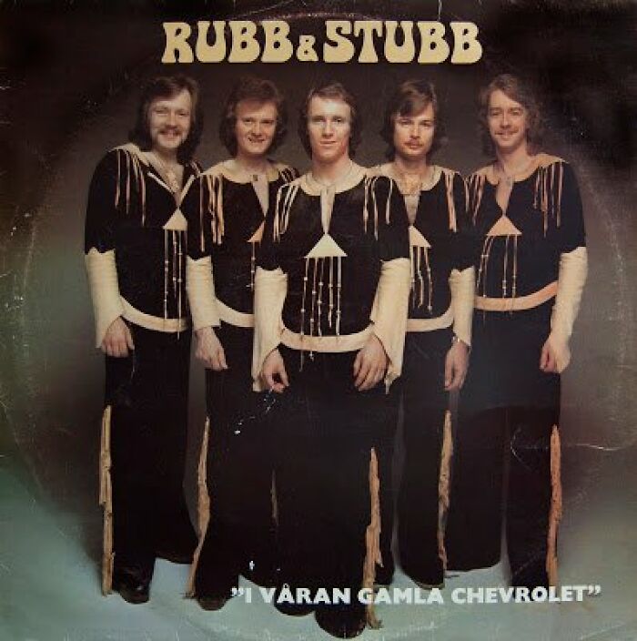
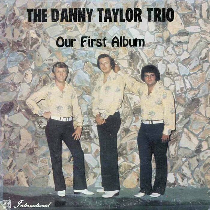
Say all you want—you can’t go wrong with art. Even if it’s bad, you can still appreciate the effort, the amount of time and talent it took, and other aspects. Even getting to a point where it’s so bad, it’s good becomes an art form in and of itself in that sense.
Consider music album covers: there is a certain kind of approach to album cover art, yet folks still manage to create something that makes you scratch your head. For any reason. Calling it bad would be wrong because at least you can laugh about it, and bad doesn’t make you laugh. It’s still good. Right?
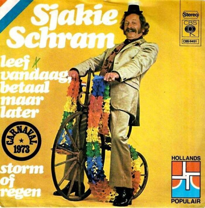
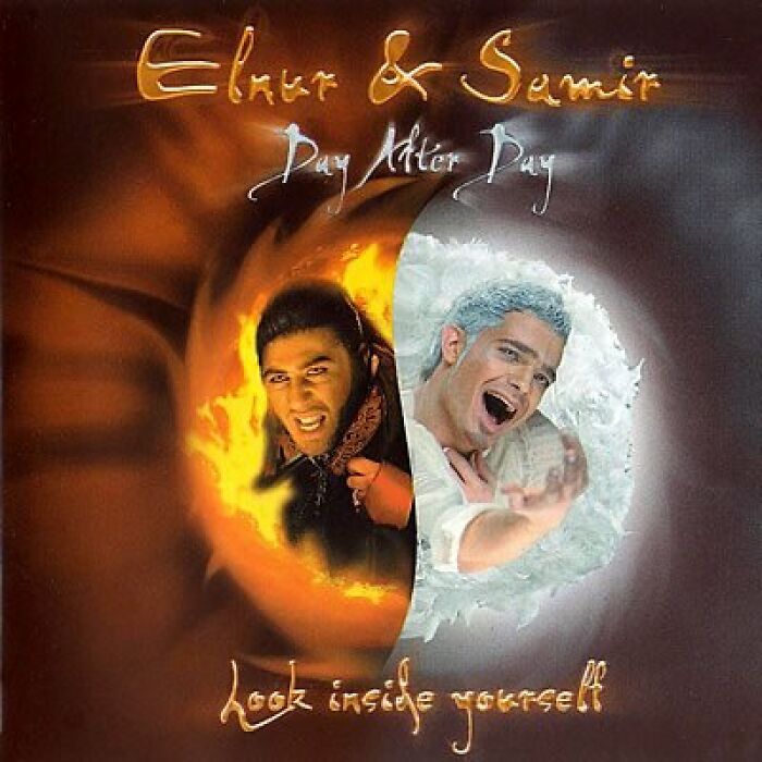
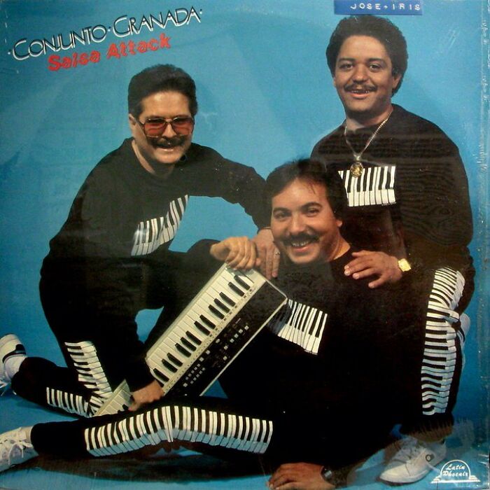
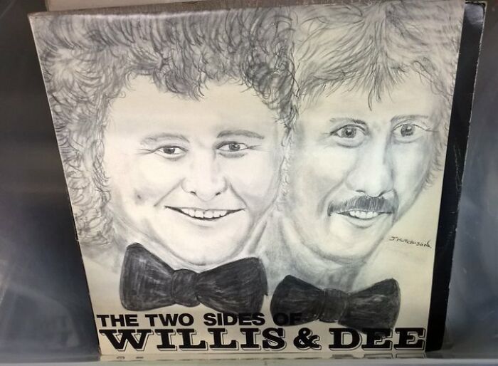
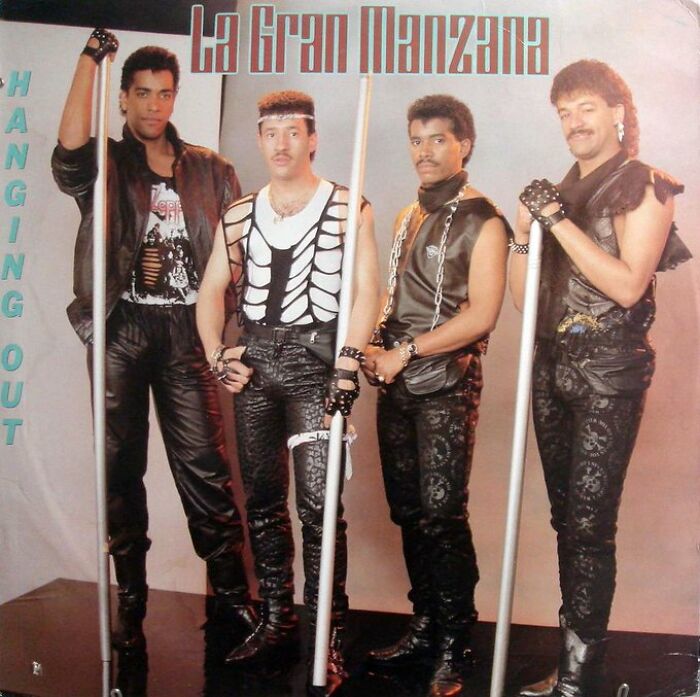
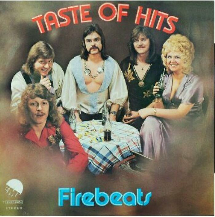
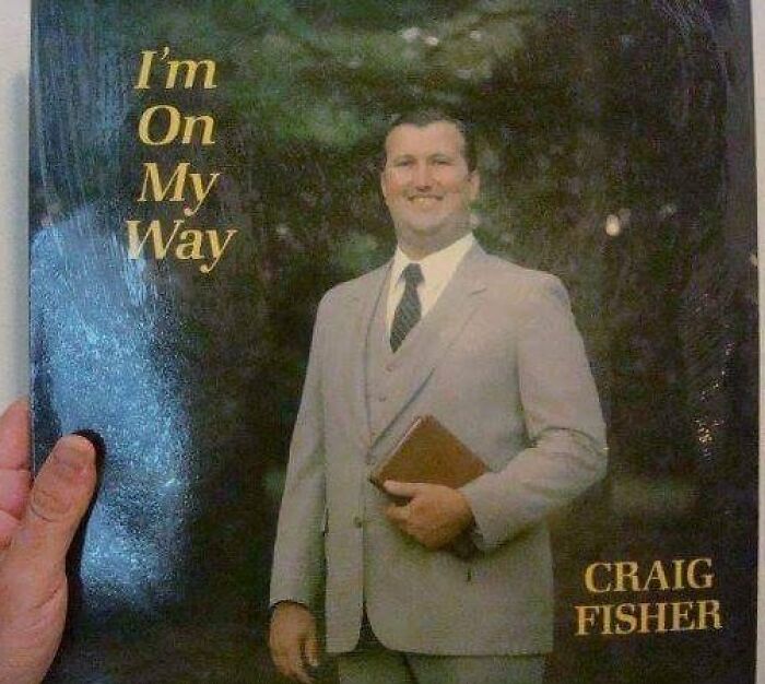
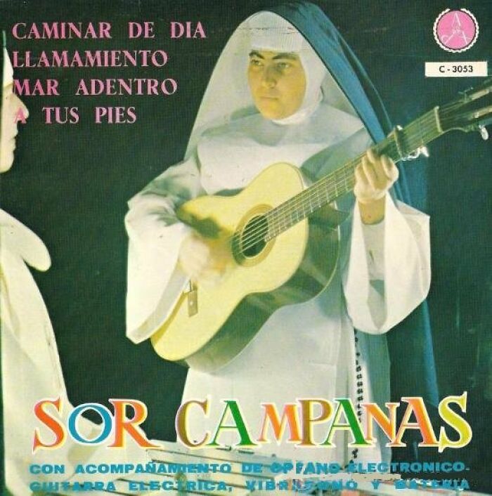
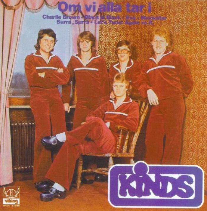
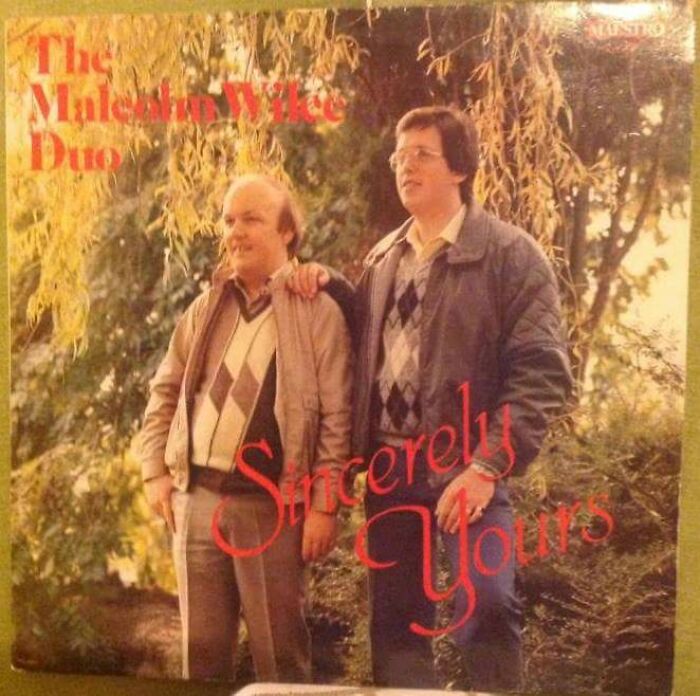
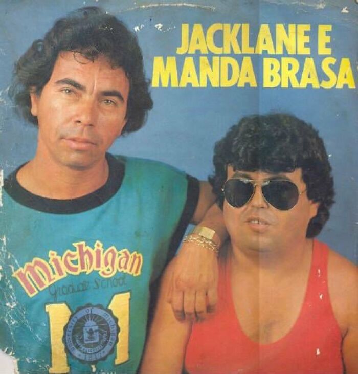
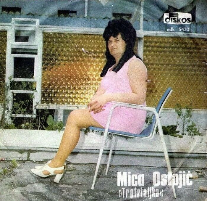
So, with that said, scroll down to have some laughs at questionable album cover art, as seen on the Bad Record Covers page.
This post may include affiliate links.
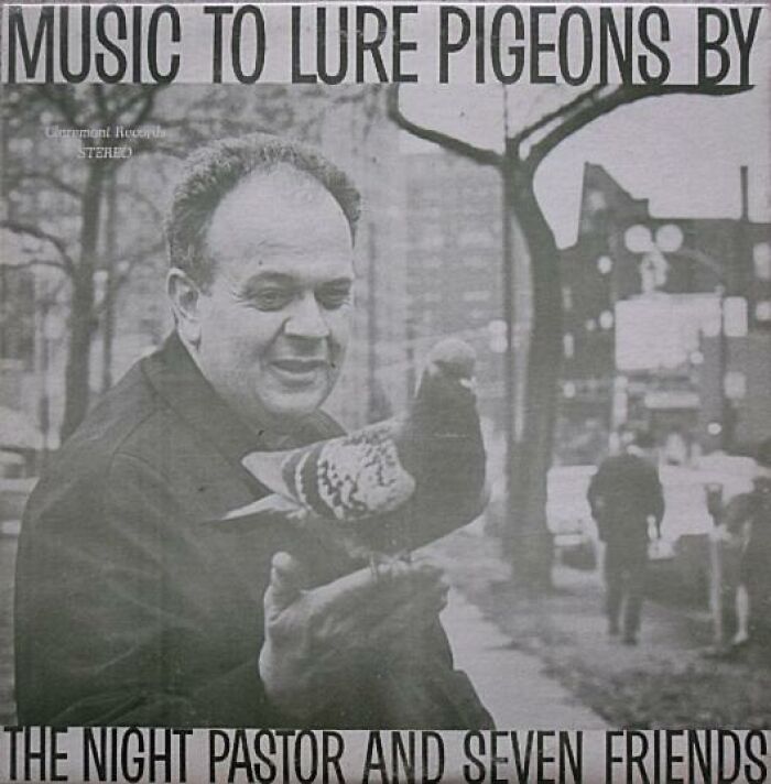
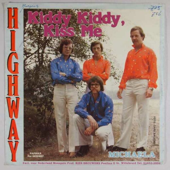
One Of My All Time Favourites
As an alternative, I recommend Tom Lehrer's "Poisoning Pigeons in the Park".
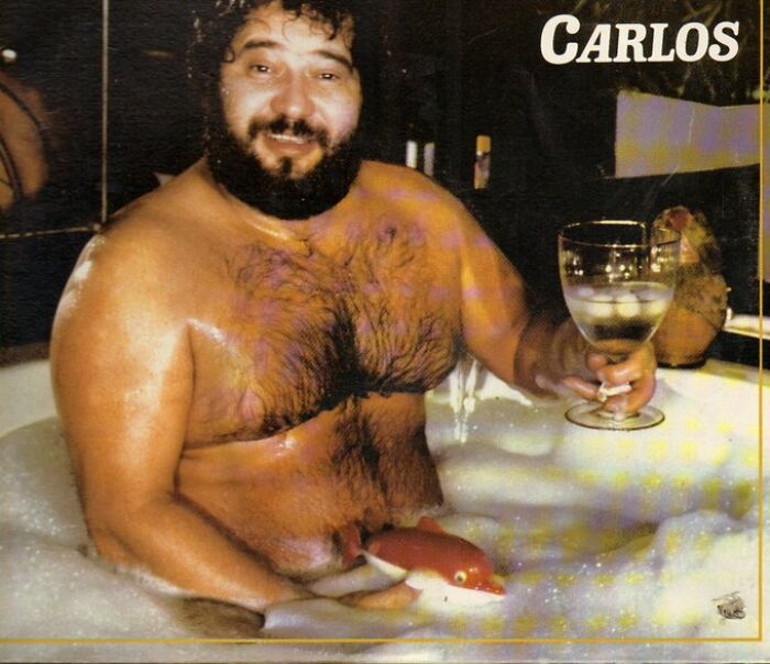
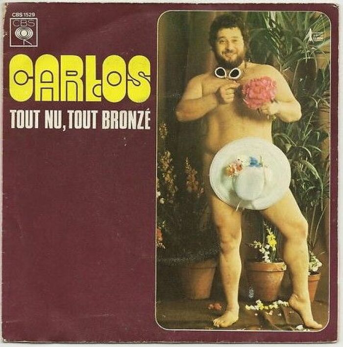
Here's A Classic From Carlos
Incredible Albums No.1
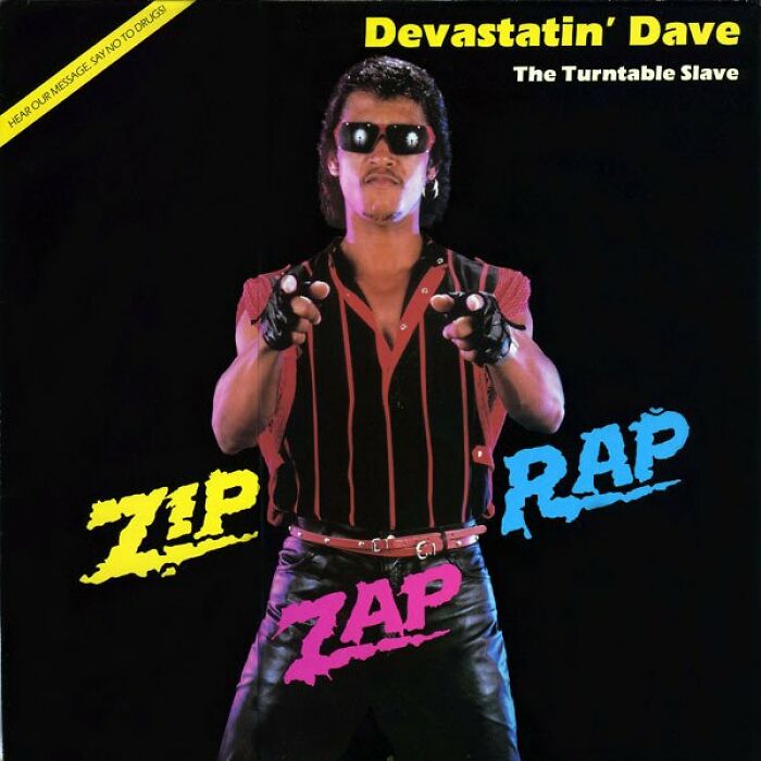
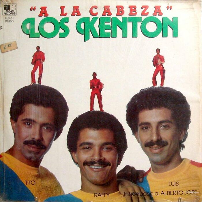
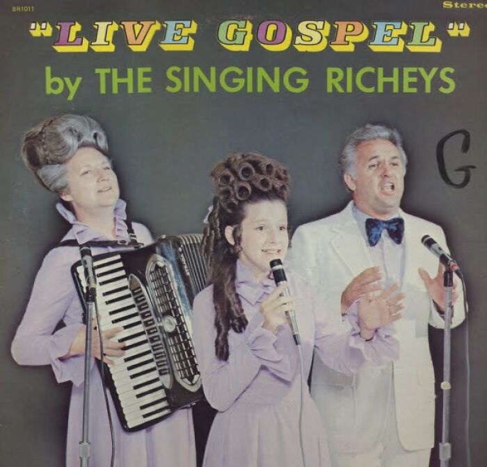
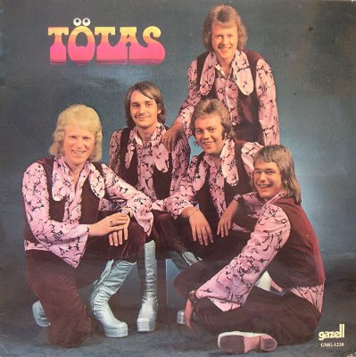
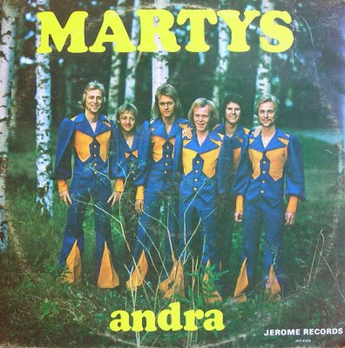
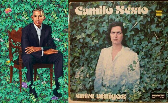
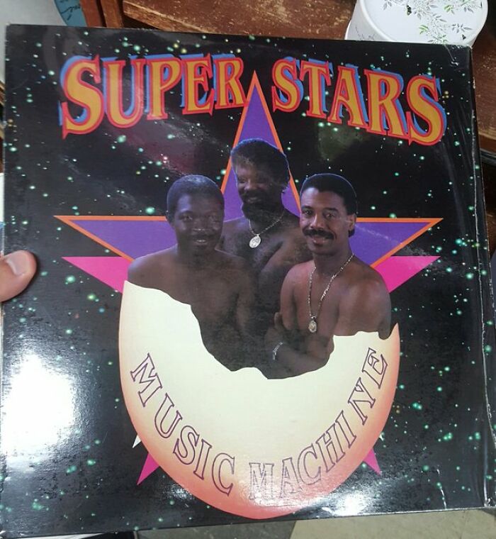
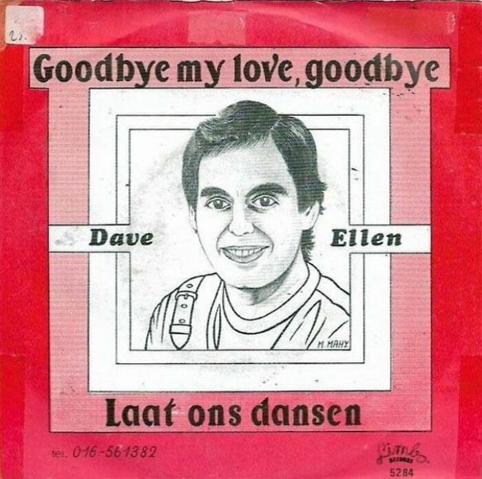
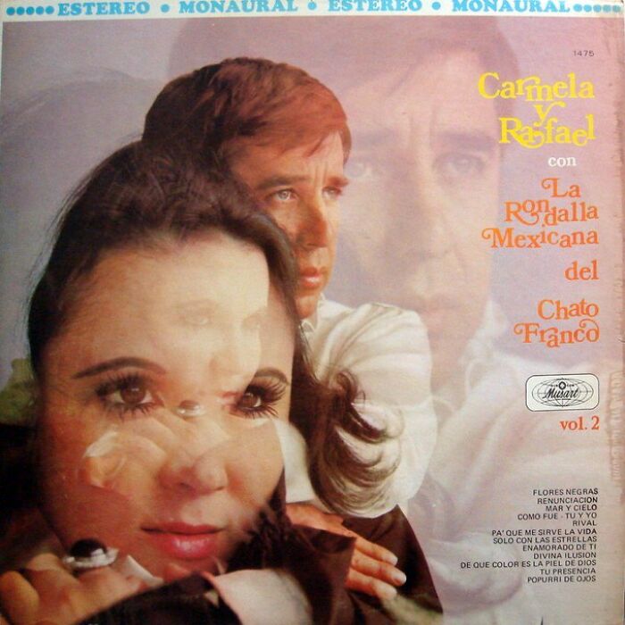
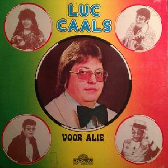
So, there’s this page on X as well as Facebook that’s all about sharing, let’s just say, very questionable album art. It doesn’t have to be bad, it doesn’t have to be weird, heck, it even doesn’t have to be flat out are you seeing this [shirt]? But it can. And often is at least one of that, but bad is just a matter of taste.
The page has been around for nearly 10 years now and amassed nearly 30,000 followers since its launch in December of 2013. However, two years ago, it announced that the page had run its course and that it was fun while it lasted. There was a seemingly brief return as per nostalgia, sharing some of the older stuff and considering a resurrection of the page, but it's been radio silence since then.
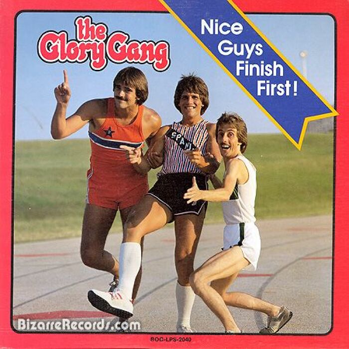
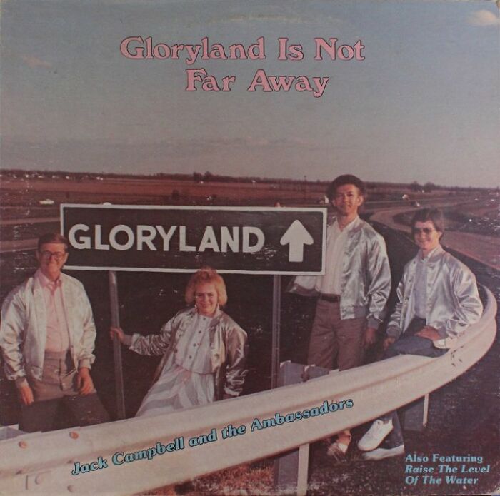
The Whole Glory Gang
How much coke do you you have to do to make this album sound good?
About Time, I've Nearly Worn Out My Stylus Playing This While Waiting
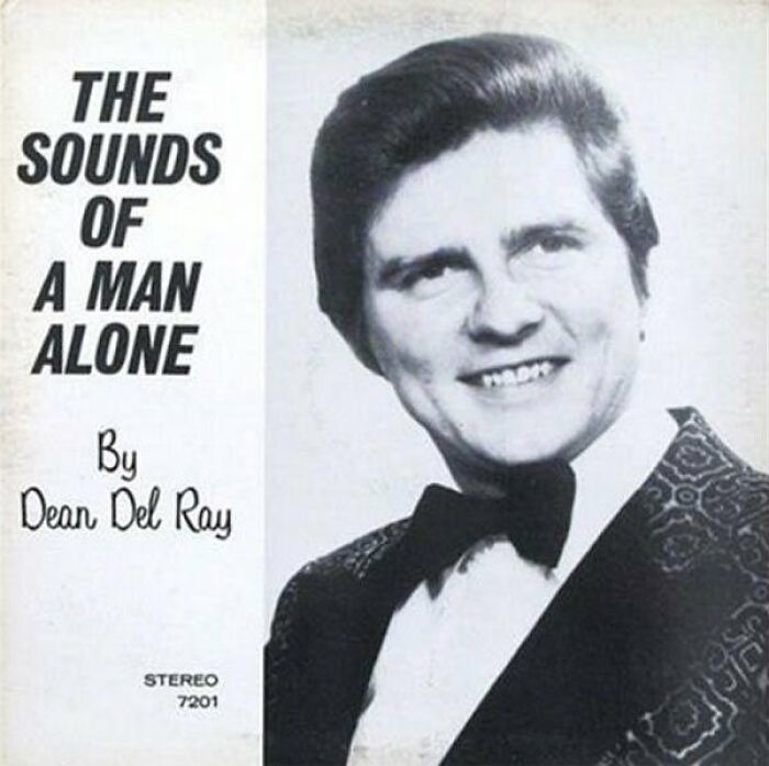
I Really Don't Want To Know, Thank You Very Much Dean
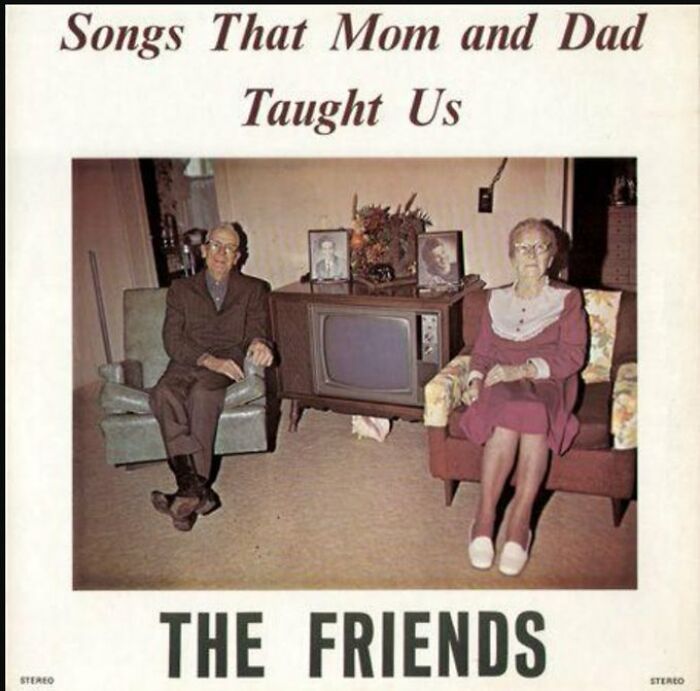
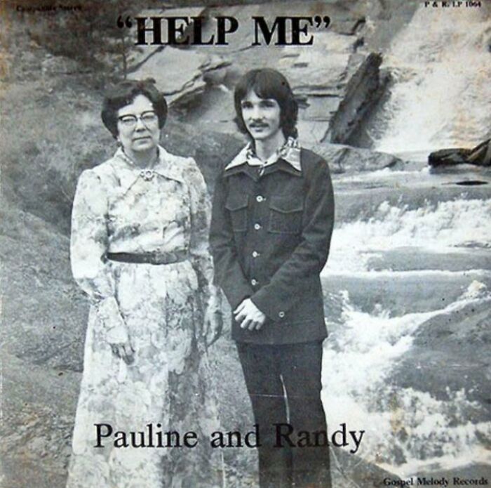
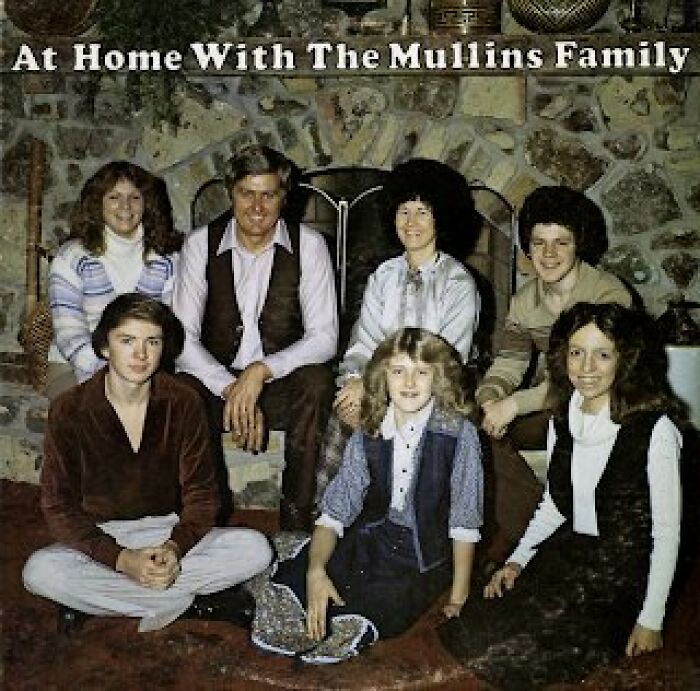
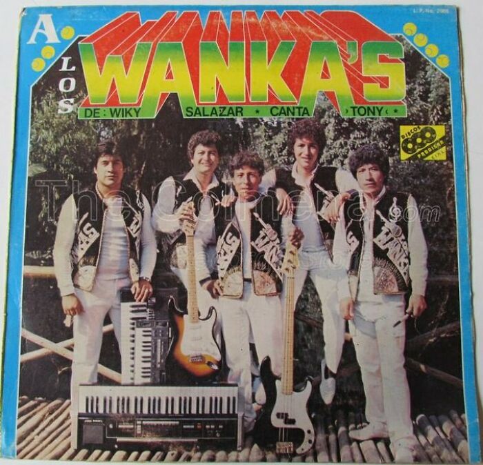
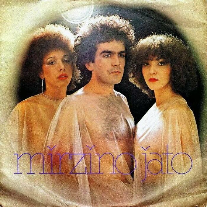
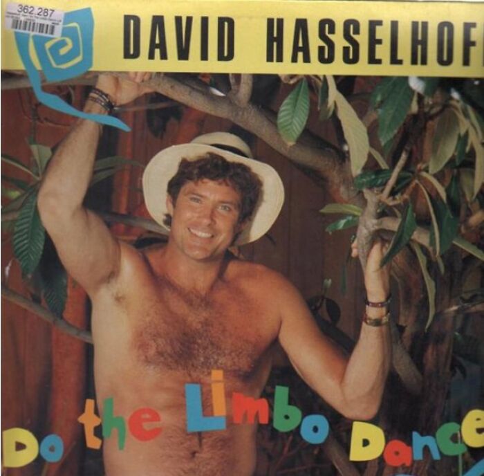
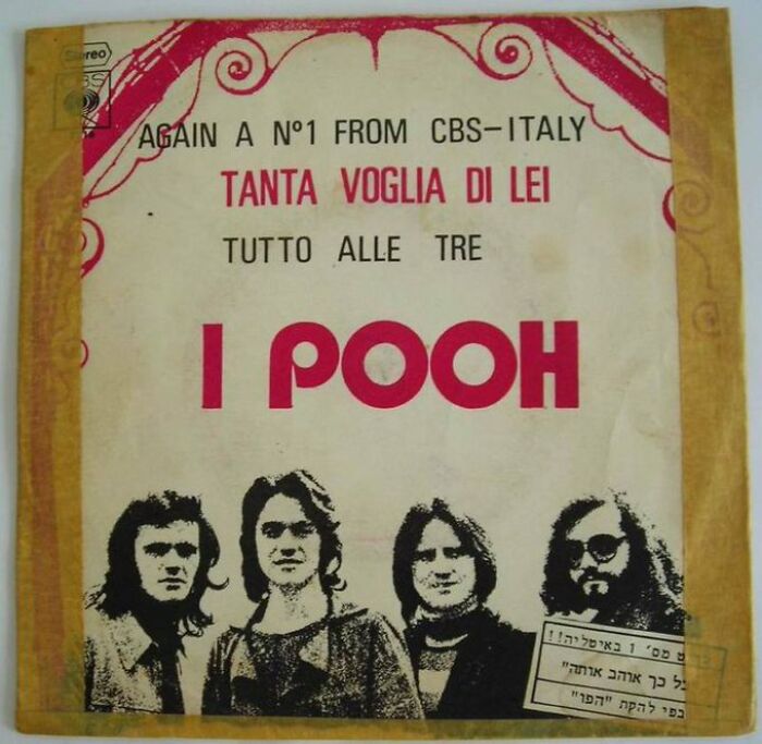
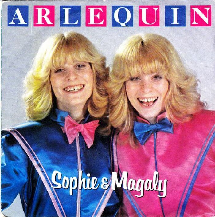
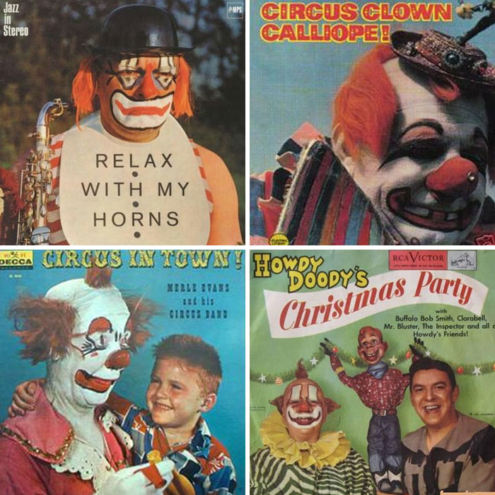
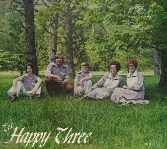
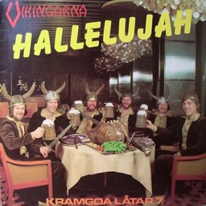
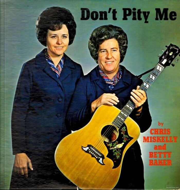
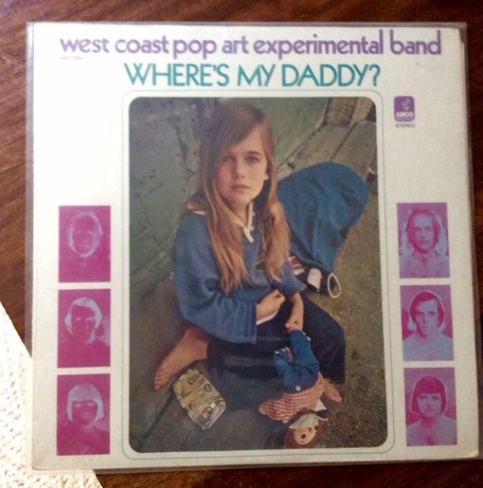
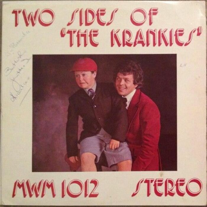
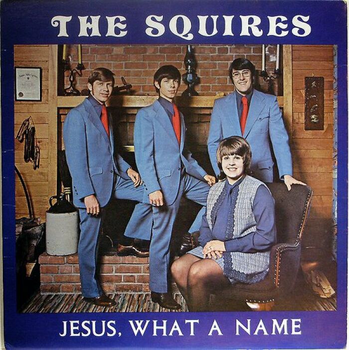
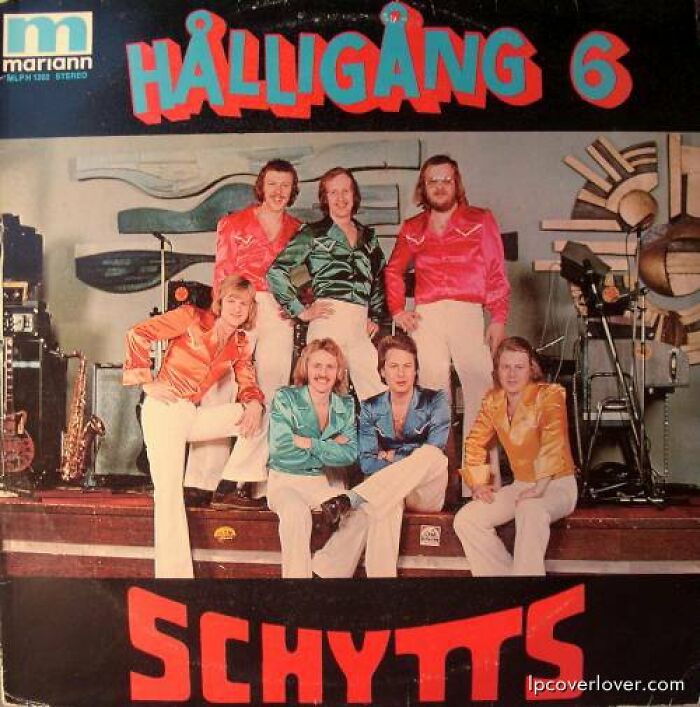
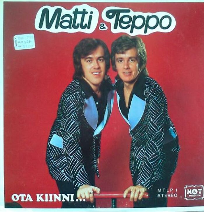
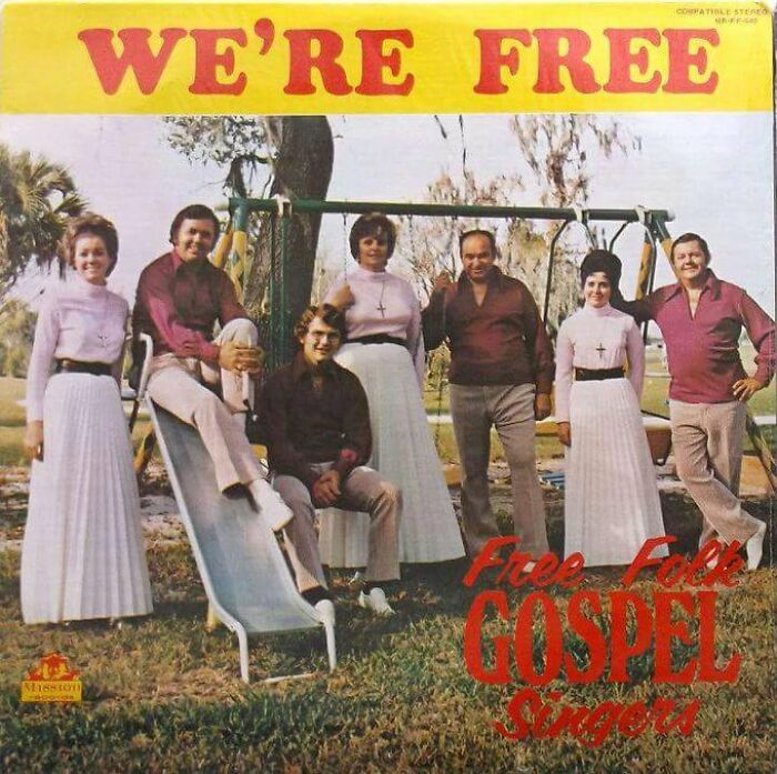
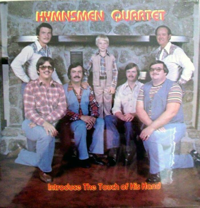
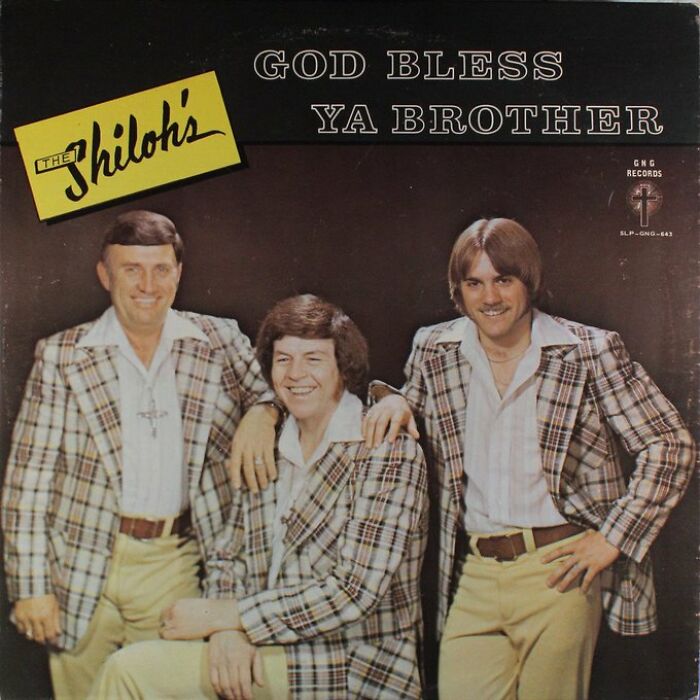
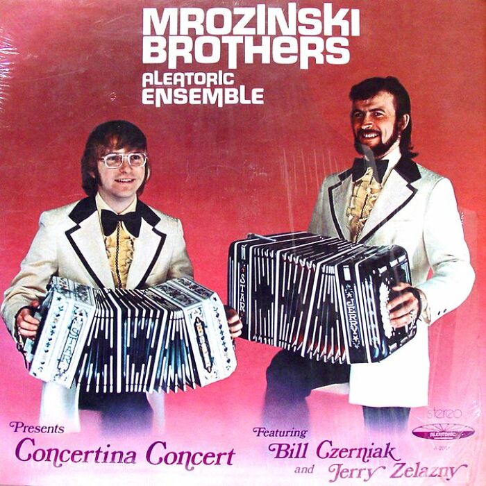
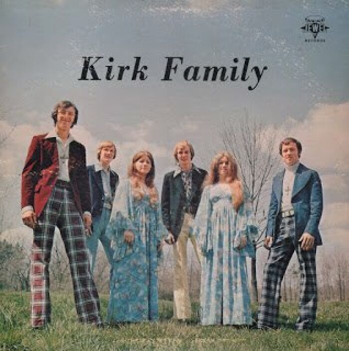
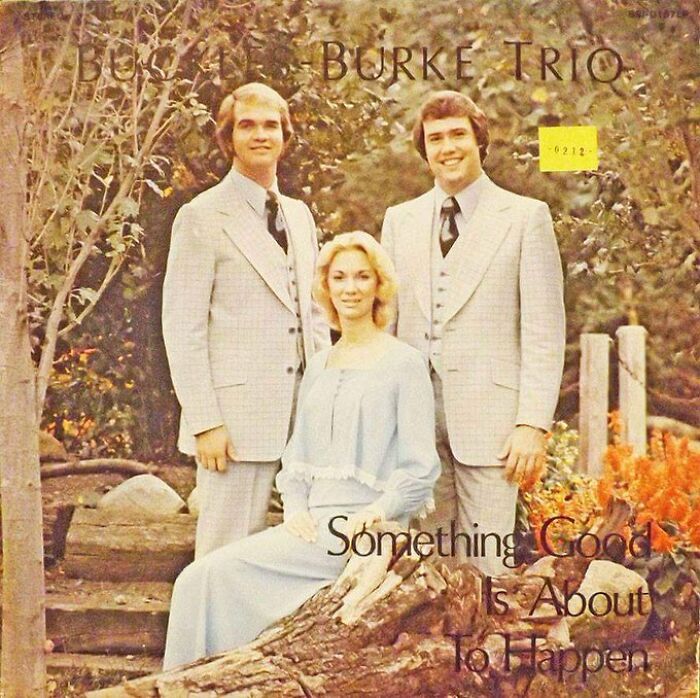
As you’ve probably understood by now, the page shares old album cover art that asks more questions than it answers. These are typically albums from older generations of music, back when deliberate posing while mom snaps a picture in your living room, your backyard or with a view of the creek outside your house was considered the bees knees. And while the '60s-'80s aesthetic (maybe even '90s) has aged well for the most part, there’s this other entire contingent of wow album art that we just can’t help but appreciate, but not for the usual reasons as it aged as well as the economy.
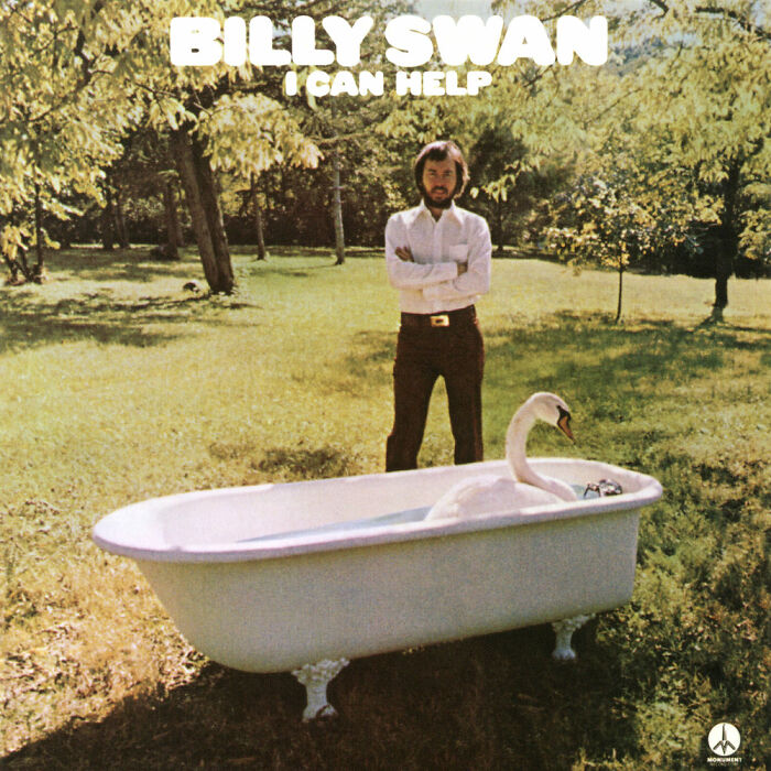
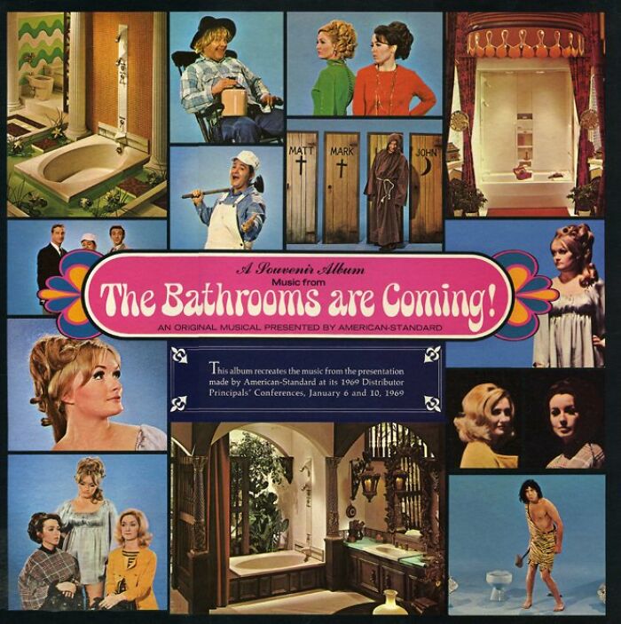
I Can Help..... Bath Your Swan
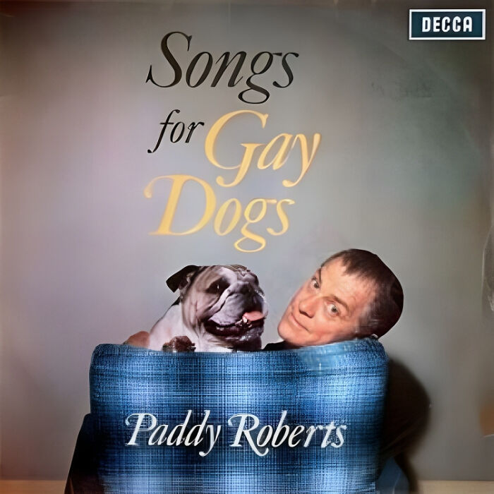
Shame
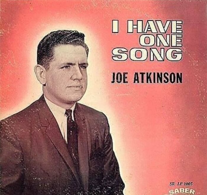
He What?
So, what makes an album cover bad? Let’s flip this around and start from what makes it good.
An article on Creative Review explains that the music on the album as well as what the album looks like physically have a symbiotic and vital relationship. While a record becomes famous because of the music on it, there can’t be an album without a cover. And it doesn’t really have to be anything—it just has to be there. It’s the first contact people have when looking up songs.
Snigger, Snigger
My 'Favourite'
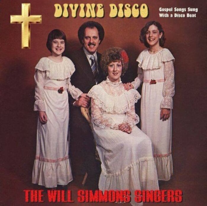
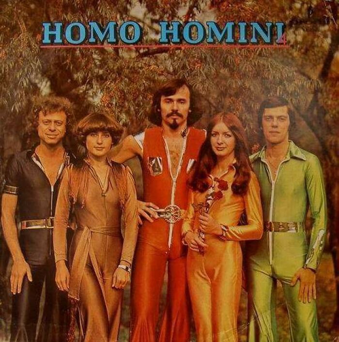
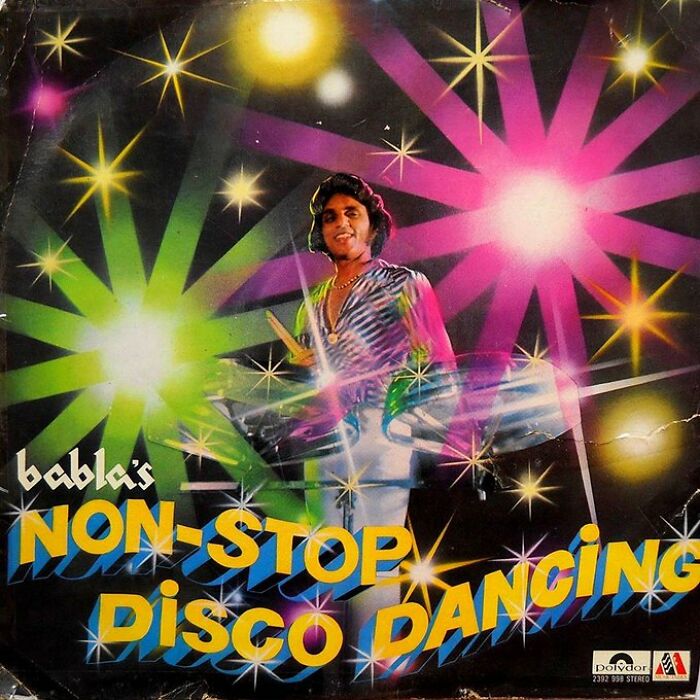
Divine Disco
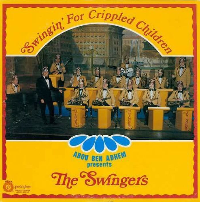
Christian Rock. Christian Metal. But Christian Disco is a new one for me.
And while there is a claim that cover art can elevate the brand of the musician, it can go the other way too—the music can elevate the album artist. By proxy, folks speculate that it can go the other way—if one is bad, the other can become tainted by it.
Folks on a “music nerds” subreddit—one for a music critic named Fantano—have raised this question. The general consensus is the above statement, but bad albums can have good art. However, because of the little attention bad albums get, the artwork gets forgotten just as fast. And good albums, even if their art is bad, tend to still make it memorable.
You Can Leave Your Hat On
Goodnight. Sleep Well
Do What, Mate?
One Redditor in the same thread pointed out that Radiohead’s The Benders album is great, but the album cover art is oof. They’ve seen bad albums with better cover art than that.
Others, however, were quick to joke about it and it’s a question of if it’s actually that bad or just a little bit. One thing’s for sure—The Benders does have a very meme-like aesthetic.
Moose Knuckle Alert
See how even on these outfits it's only the man that gets pockets!
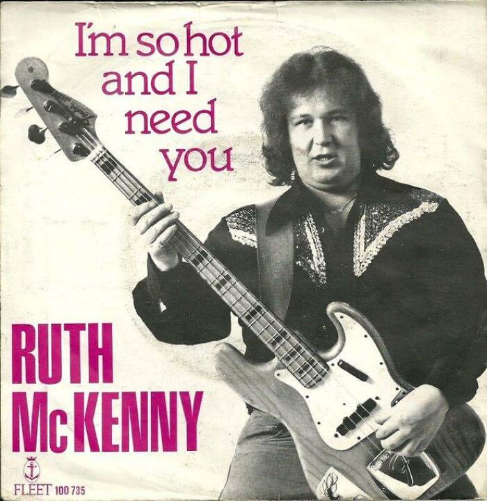
What?
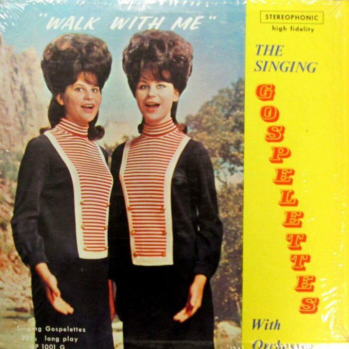
Check These Gals Out
The conclusion most reach when it comes to what makes album art bad is the sheer fact of it being not fit for what the album is. It can be too weird, cringe or cursed, plain or uninspired, poorly photographed or crafted, inappropriate for what the album stands for (thematically or content-wise) or, if it doesn’t fit any other criteria, it’s all a matter of taste. And that includes poor taste, but that already alludes to the above.
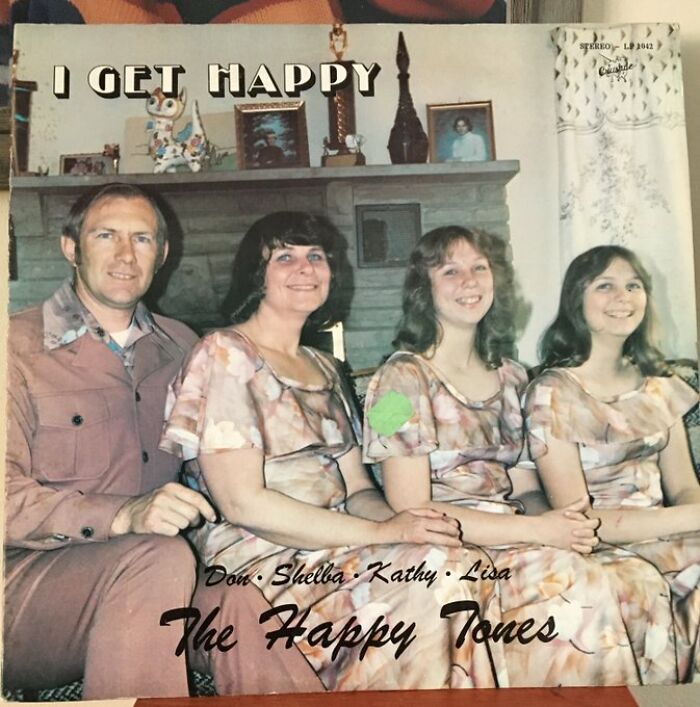
Get Happy, It's Friday
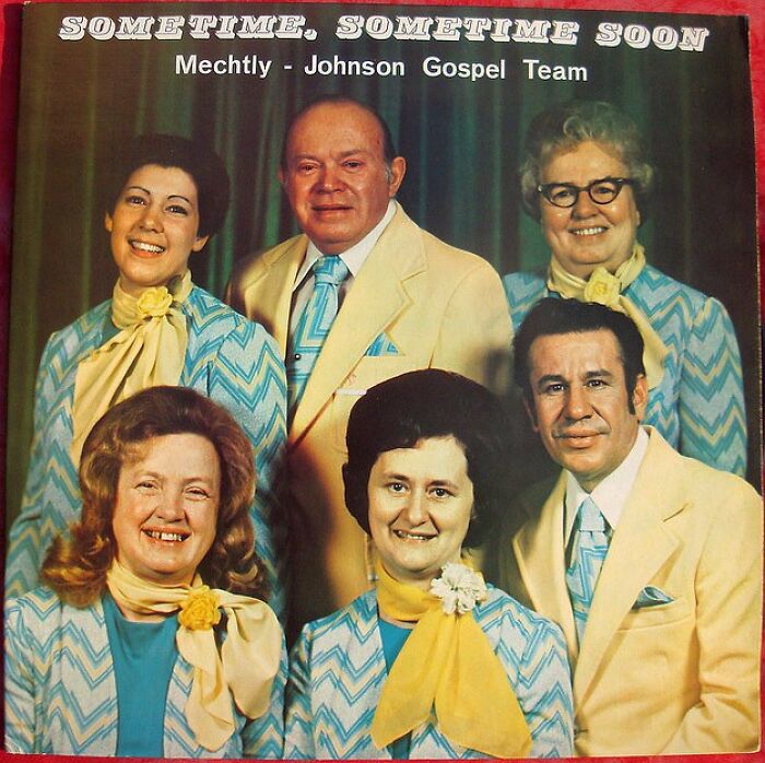
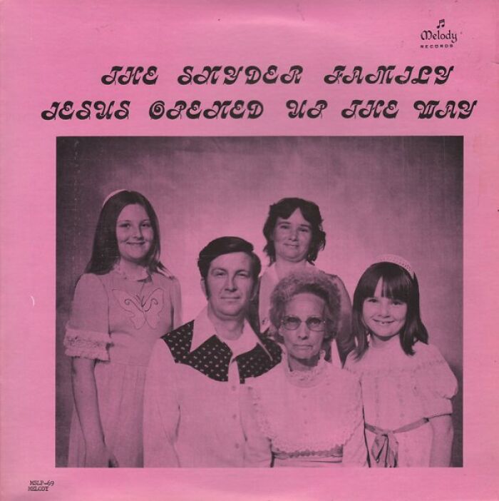
Wow! The genetics are strong with this family! I could match the daughters with the mother in a crowd of 10.000!
That Would Make For A Great Hardcore Album Cover
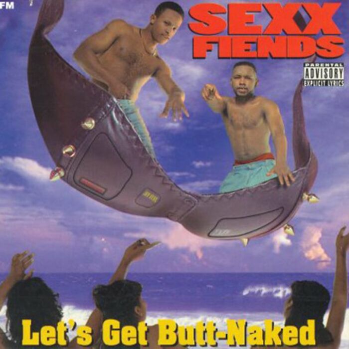
The Title Says It All
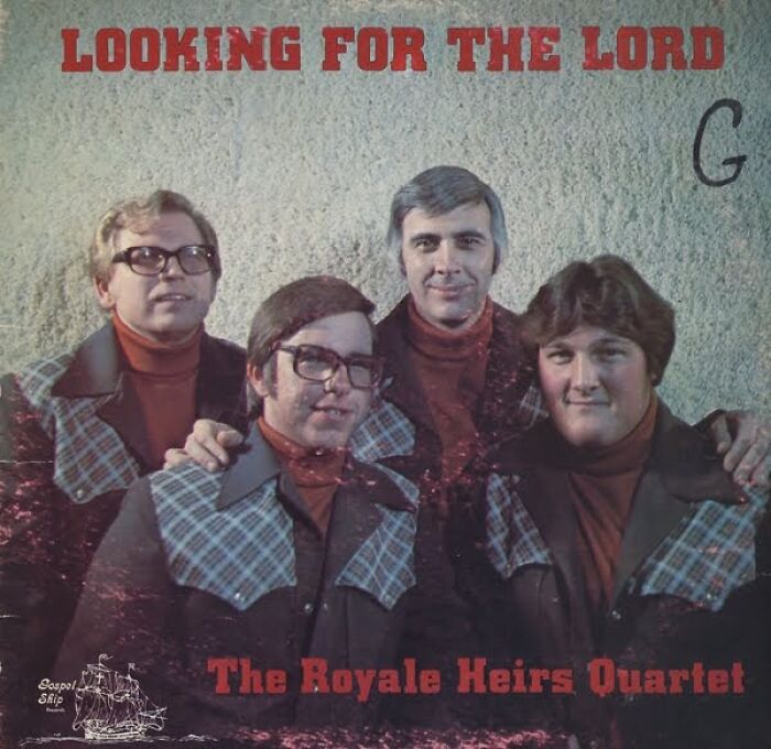
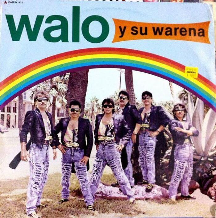
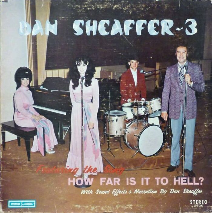
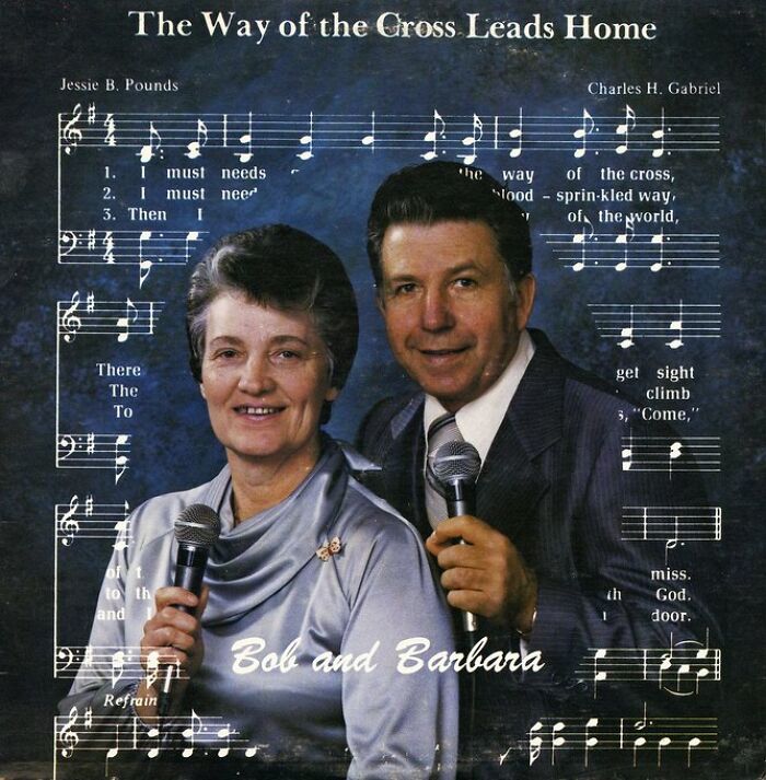
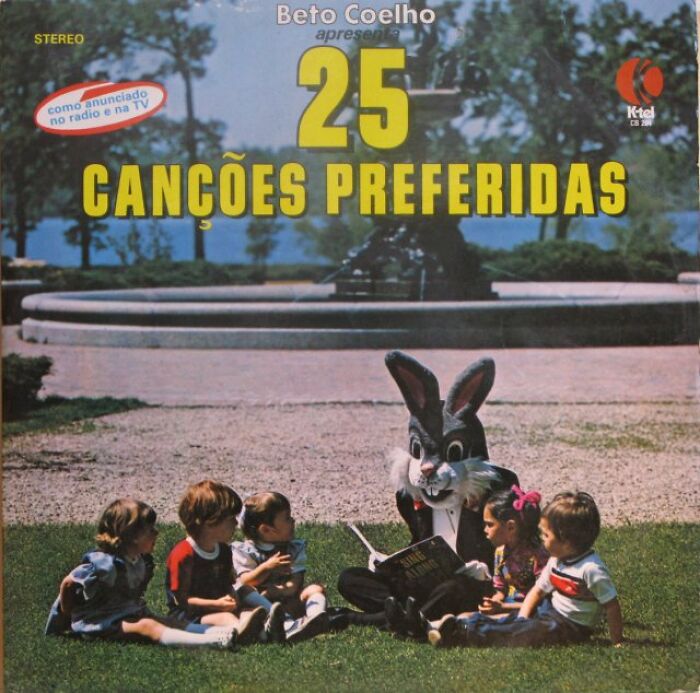
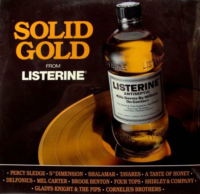
And that’s pretty much what Bad Record Covers is all about. You've got inappropriate wording, Christian cringe, sponsored albums, trying to be relatable, being too self-aware, just being too much in general, and you don’t even know how funny this one really is. A lot of it is religious, family, or a product of its time. The rest is something that we all wish we could have listened to in order to bring context as to why we’re laughing.
Yeah
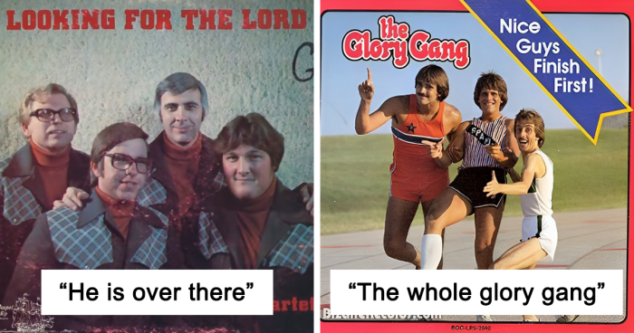
He Is Over There
Dudes
Another side of what might make album art bad (or good, depending on how you look at it) is the controversy that it spurs. And there are a lot of examples in history.
These can include album covers that display explicit nudity and sexuality, takes a taboo spin on religion, glorifies violence or flat out infringes on copyright. Other themes in album cover art that can get flak are politics, tobacco, cultural offense, plagiarism and indecency.
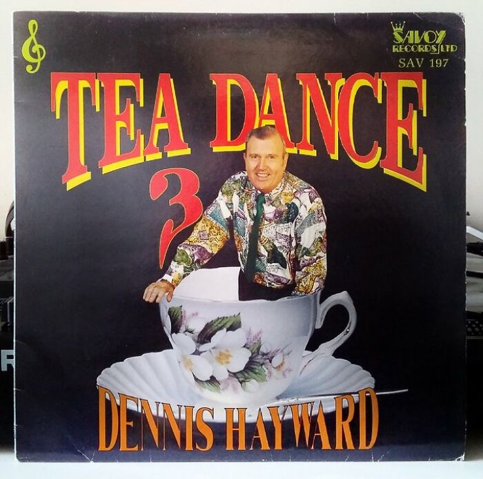
Fancy A Brew?
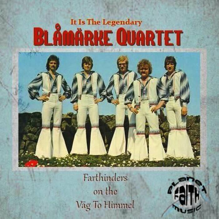
The Village People Of The Corn
Creepy! Hella cursed. Now Idea who they are but they vibe like children of the corn.
No Mother's Day Is Complete Without A Bit Of Heino
Alice Cooper’s Love It to Death (1971) is one that stirred quite a bit of controversy as the original art featured Cooper himself sticking a finger out of his zipper, making it look like a part of him is exposed, but later versions airbrushed it out.
Slayer’s Christ Illusion (2006) takes a jab at religion, specifically Christianity by portraying Jesus Christ as a zombie all the while body parts are scattered around the figure.
There are also more tame cases, like Richard Pryor’s self-titled album from 1968 which featured Pryor himself in the style of a National Geographic cover. He later got 2 letters about it—one from NG suing him for defamation and the other from the Grammy awards nominating the album for best cover.

 Dark Mode

 No fees, cancel anytime


