“Really Bad Design Memes” Is A Place Online Where Designers Go For A Good Laugh (30 Pics)
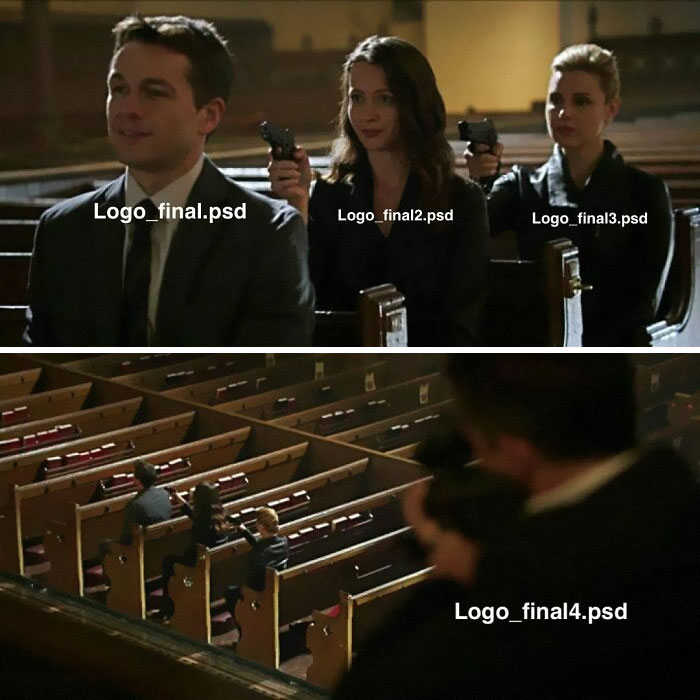
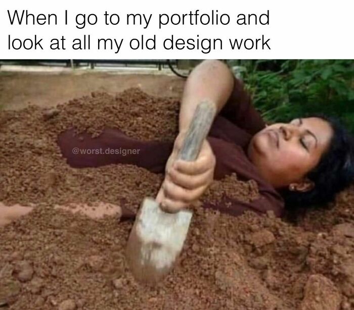
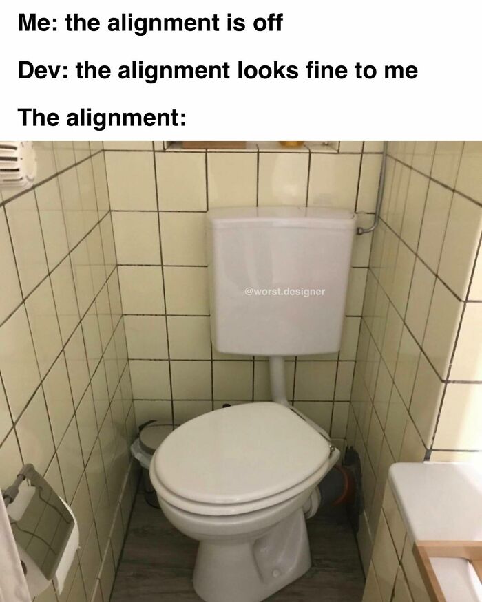
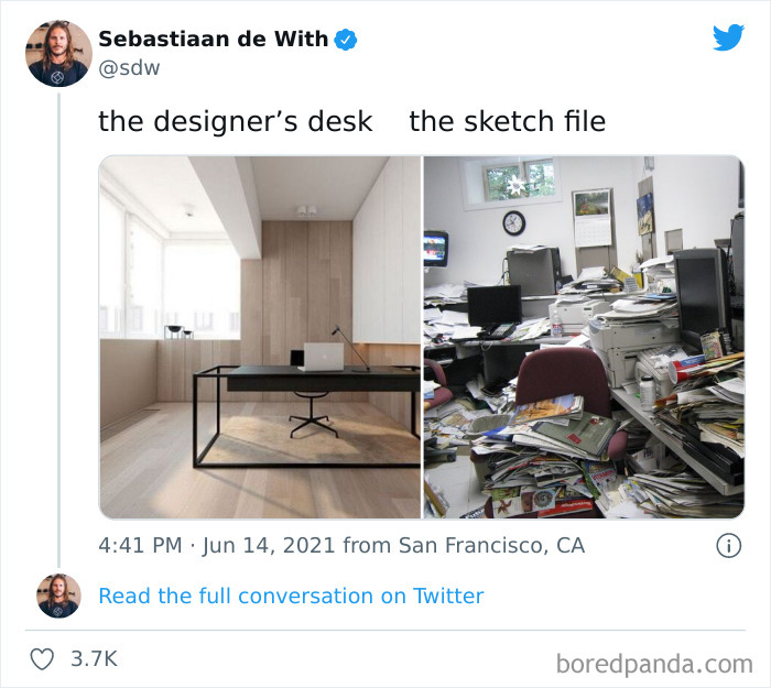
Whether you're a freelancer or in-house designer, chances are, you've experienced quite the amount of annoying situations on the job. After all, working in a fast-paced environment, dealing with unreasonable clients and ridiculous demands can be challenging. But even when these struggles seem overwhelming, it's always good to lift our spirits by poking fun at them and letting out a few genuine laughs.
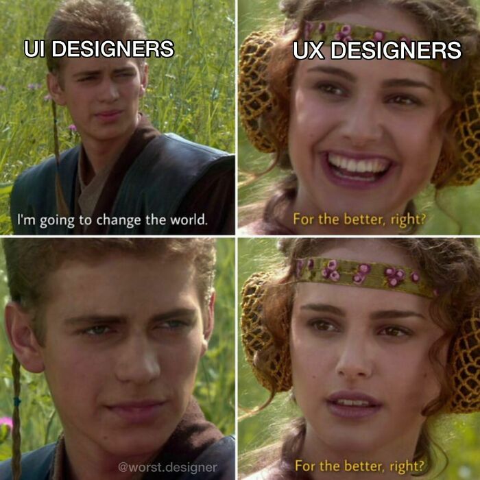
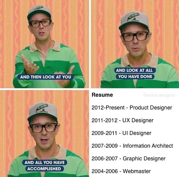
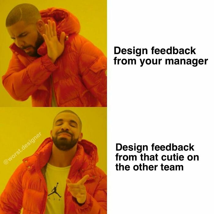
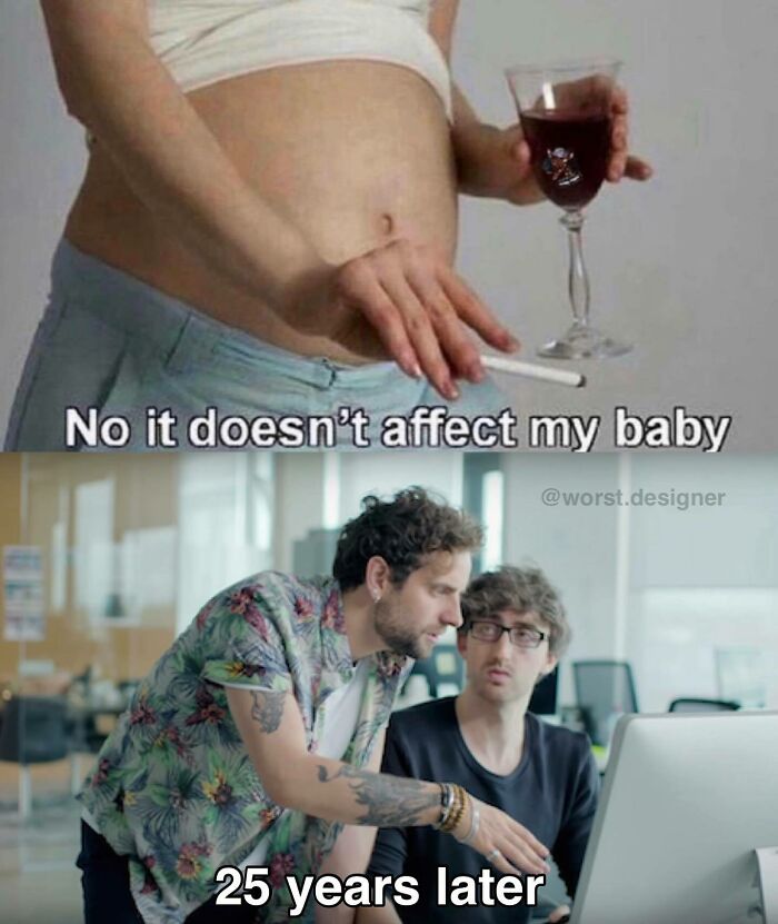
Enter the Really Bad Design Memes Instagram account, dedicated to sharing hilarious pics about what being a User Experience (UX) designer is all about. Self-naming themselves as "The Cleveland Browns of meme pages," the creators ask you not to take your job too seriously and offer you a variety of jokes to ease everyday stress.
So get ready to dive into the best and most hilarious posts we have collected from the account. Upvote the ones that cracked you up, and let us know what you think about them in the comments below!
This post may include affiliate links.
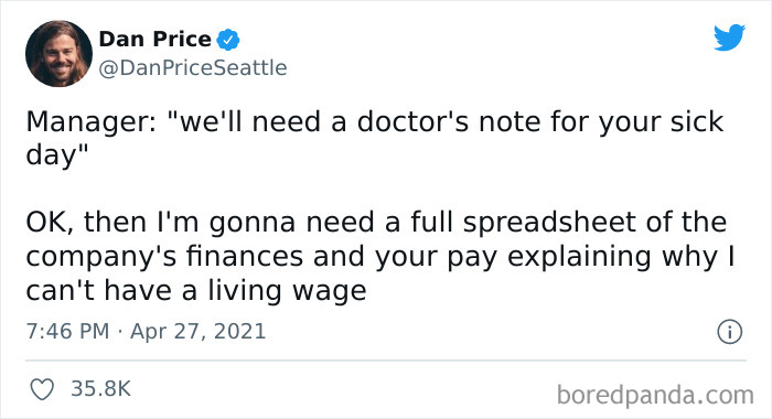
This has always bothered me because I'm already not getting paid when I'm sick, and now you want me to pay for a doctor's appointment, and not only that, but a last minute one? That means immediate care, which means an even bigger bill. You want a note? Pay for it.
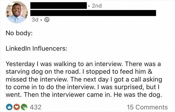
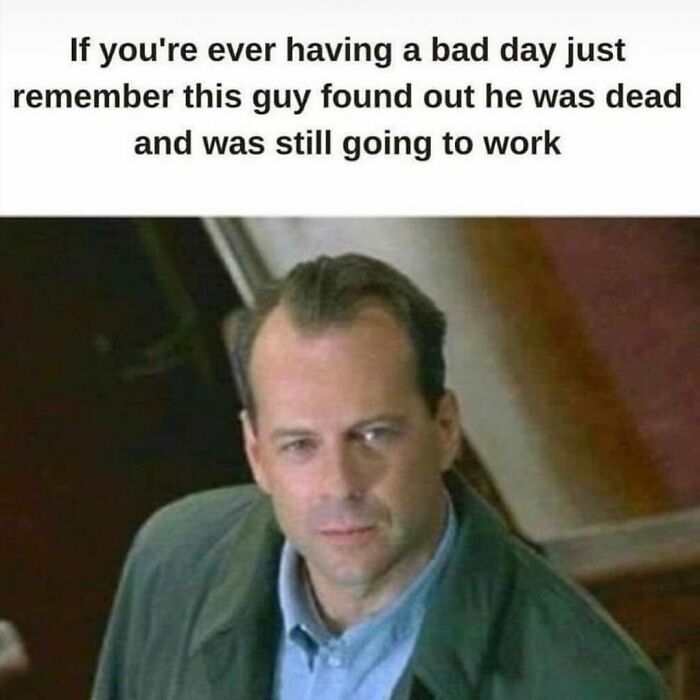
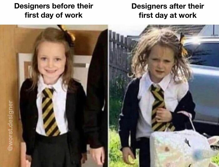
That actually sounds like a great premise twist on a reality TV show. A hidden cam show about how long someone can pose as an employee before getting caught.
To find out more about the struggles of this profession and how bad design can lead to unfortunate results, we managed to get in touch with Jonathan Shariat, a designer with more than 10 years of experience in the field and co-author of Tragic Design: The Impact of Bad Product Design and How to Fix It.
He told us that when a design "harms people physically, angers them, excludes people, or causes injustice", it is regarded as terrible. "Design is the decisions made about how someone will use and experience the things we make, sometimes we fail to think through the implications of those decisions and it ends up causing harm to others," he added.
We also reached out to Nick Babich, a product designer and a blogger, who also had a few thoughts to add. He mentioned that lack of communication and creativity are also the root causes of why some designs end up looking bad. "Lack of communication leads to bad product design decisions, while lack of creativity leads to poor aesthetics." While dozens of new products are released daily, he assured that "not all of them are created by experienced product teams."
This explains why sometimes it can start to feel like poorly designed products are all around us. Shariat said that one reason behind it is that good design isn’t easy. If people want to create something that has a purpose and is delightful to interact with, it takes a lot of learning and experience in the field. "Good design requires us to think about and understand others," Shariat explained. "That doesn't come naturally for most of us but always makes things better."
So when professionals fail to do that, certain choices they make can seriously affect other people. When a product has flaws, "the negative impact can be pretty severe," Babich told us. "Just imagine a medical device (i.e., heart rate monitor) that shows incorrect data about the user’s health (i.e., shows a status "Everything is okay" while the user experiences problems with his health)." The outcome can be rather dramatic.
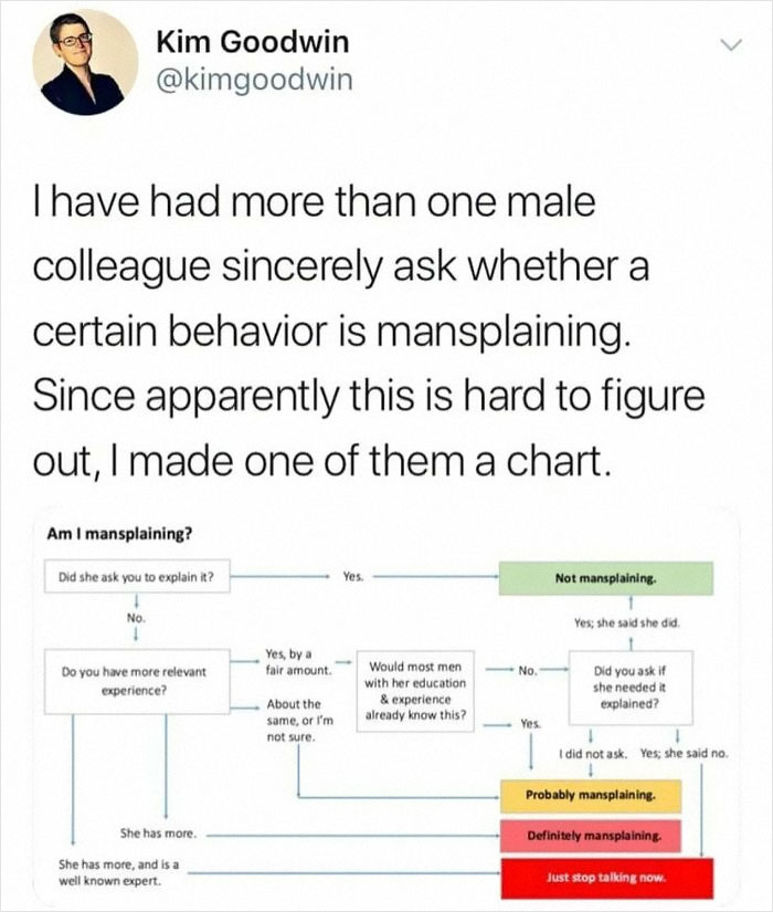
The "would you have explained the same thing if she had been a man?" part is missing.
Shariat also provided a few examples of how bad design can impact our lives. "A confusing control in your car could distract you and cause an accident. Hospital staff could accidentally enter into a pump 10x the medication for a patient. A confusing voting system can cause people's votes to be thrown out or worse, vote for the wrong person."
"We rely on design every day for critical things, and sometimes they fail us and people get hurt, or it causes major financial damage," he said. But when it comes to design ethics, being concerned about them "isn't just about avoiding harming others," Shariat added. "Ethical design has also been shown to be much more effective and builds long-term, sustainable business growth!"
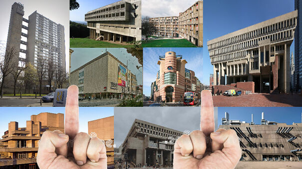
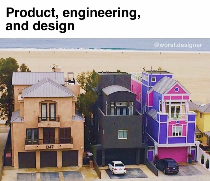
Blame the council. This was the only design they approved.
Load More Replies...This isn't an architectural design. It is a repaired fort or castle. Many such buildings were damaged by war, & rebuilt. I don't know where this picture was taken, but my parents took me to Germany in the 80s & all of the old town & churches were repaired with modern materials such as cinder blocks. They don't tear down their ruins. Also, many of my German relatives hate old buildings & restrictions placed on exterior colors. In the more historical areas they must fit in with the landscape; earth tones. It's possible they don't have such restrictions & went for it. The newer buildings there & in personal homes, much of the furniture & design is modern. Would you like one of your own? You can own an old historical building such as this in Germany as well, some on the Mosel river. ALL you have to do is sign a contract agreeing keep it up, & update it with plumbing & electricity. I'd think more rich people would do something like that, but that's just me.
Who the hell thought it was a good idea? Reminds me of "renovation" of this small castle: zmek-620e5...399842.jpg 
Blue siding on stone tower. It burns my eyes. Look away people save yourselves.
Wash it,weed the area,make a cute little path! Why did that do this crap?!!?!
Ugly, an improvement would at least had the siding colour matched to the stone
Raynovations is what it would sound like… AH YES MY BATHROOM IS BEING RAYNOVATED
When you want to live in a castle, but a WHOLE castle is kind of out of your budget
I så this episode on grand designs, the ones the owner wanted was very nice, and he tried to apply so many different ones to the counsil. And this is what they approved. You could see the dead in his eyes when they did the final visit.. i totally understand why he was hating on it, especially when you see his original visjon..
Well, that's cheap for you! I guess your counsel couldn't be bothered to put some more blue vinyl siding on the rest of the building to protect and make it last a few more years! That building might be very important some day!
So that's the thing. Depending on the country they HAVE TO be different by law. The council will NOT accept anything that isn't visibly different in style and color from the original
So, I am guessing there was already an outside staircase. And someone wanted to be able to get to the second floor without having to go out in the rain.
I feel your comment doesn't contain enough expletives for this horror.
I wanna know how this addition actually improved the living space inside???
In Drumnadrochit, Scotland, which is the home to Nessie, on Loch Ness, Urquhart Castle wanted to have a new gift shop, but the residents wanted to maintain the integrity of the ruins. So, they flew in a giant red gift shop. I am sure Nessie wasn't pleased.
Could they not find Bricks anywhere? Wtf. Ruined a beautiful castle
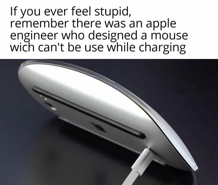
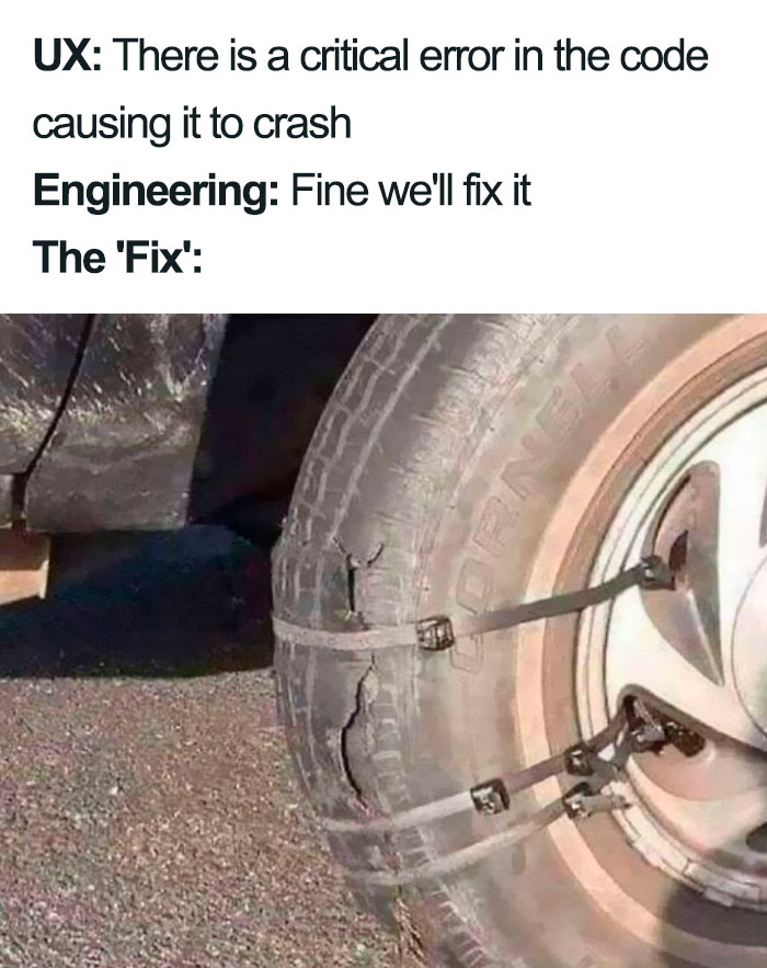
Not just an engineer. I imagine this went through a whole multi-step approval process.
When it comes to the struggles of being a UI/UX designer, one of the biggest challenges is "seeing things from other people's perspectives. Different people can experience the same thing much differently," he added. "It's the job of a designer to understand their users and find what works best for all of them."
Meanwhile, Nick Babich believes constant learning is both a blessing and a curse of product design. "You have to process a lot of information on a daily basis to create a good design," he told Bored Panda.
When we're dealing with such struggles, memes are a great way to find shelter from the burdens of our everyday lives. They help us unwind, connect with other people, and, of course, let out a laugh or two. Jonathan Shariat admitted that jokes absolutely help to get into a better mood. "For example, when I was stressed about how frustrating it can be to see your design fail as you watch people test it out and your assumptions become evident, it can feel [difficult]. When you see something that perfectly expresses how you are feeling, it's very therapeutic," he said.
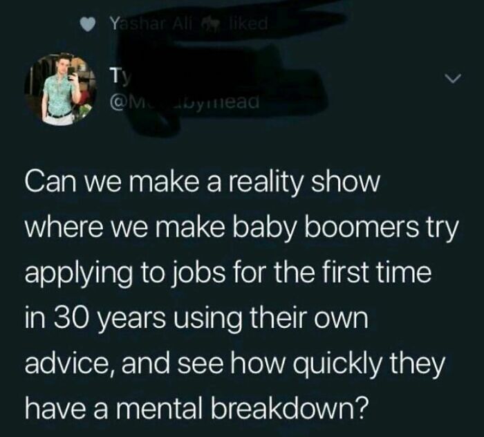
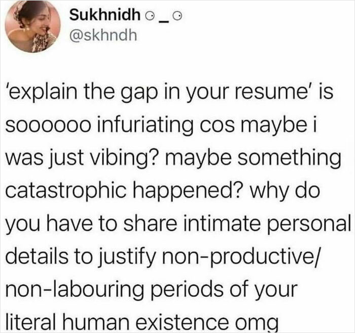
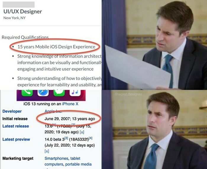
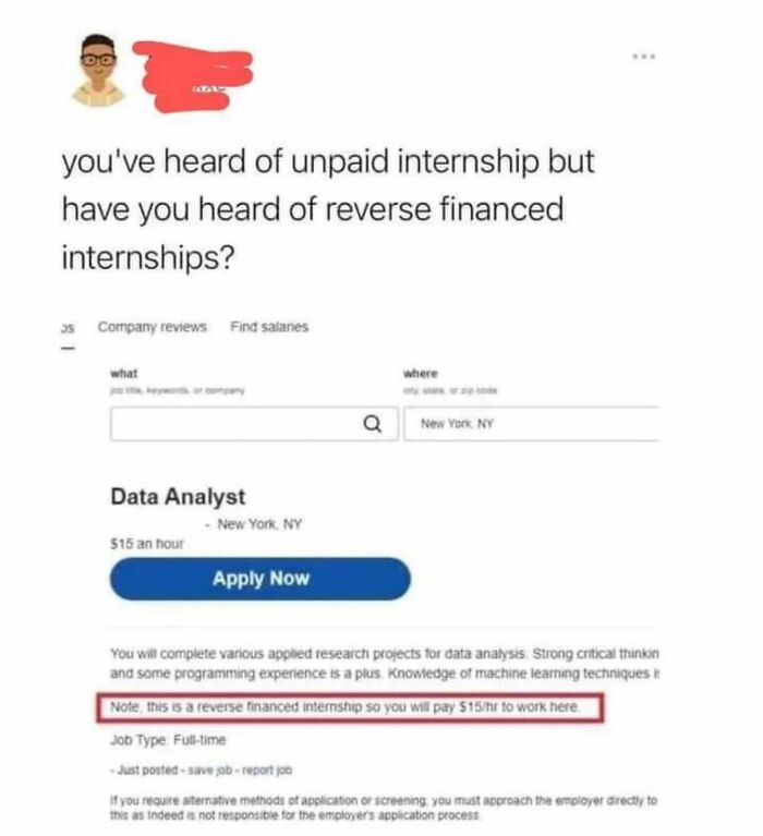
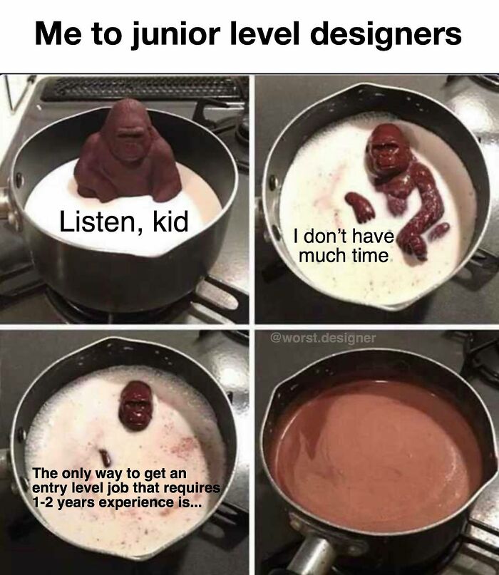
I just read a comment from a guy who said he was not qualified to apply for a job because they required 5 years experience with a software program that HE INVENTED 2 years ago. 😂
And Babich also agrees with this line of thinking. He mentioned that he recently researched anxiety and depression in product design, and found that it’s a serious problem in the field. "I think humor is an integral part of our lives, and we need to smile more when we work," he added. "A positive mood gives us an energy boost, protects us from anxiety, and helps us create good UX."
So it’s not surprising that category-specific meme accounts are becoming more and more popular. Such images and jokes are the perfect "bites" of content that always allow us to distract ourselves from our troubles. After all, there’s nothing like looking at a few hilarious pictures to improve our mood.
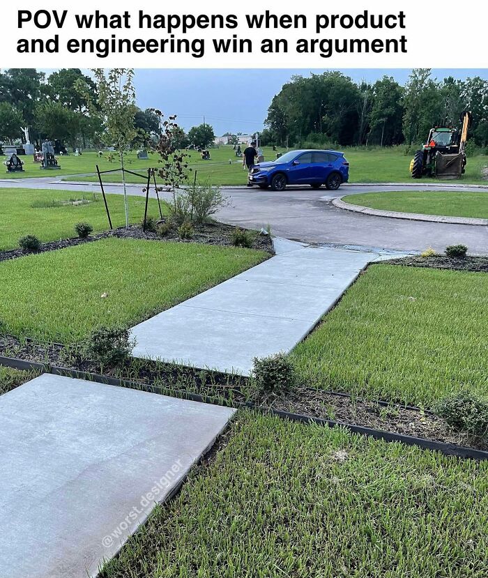
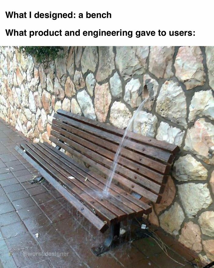
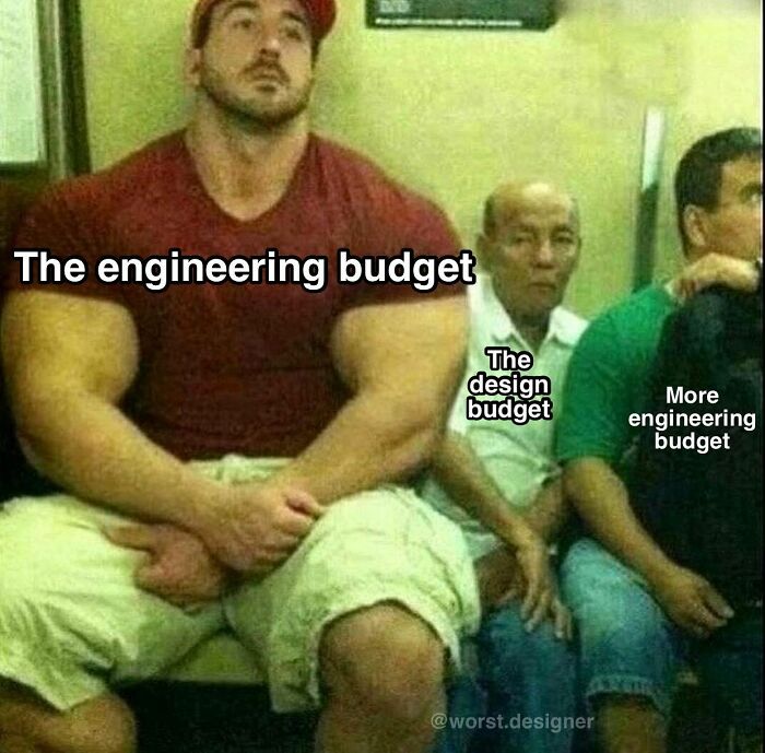
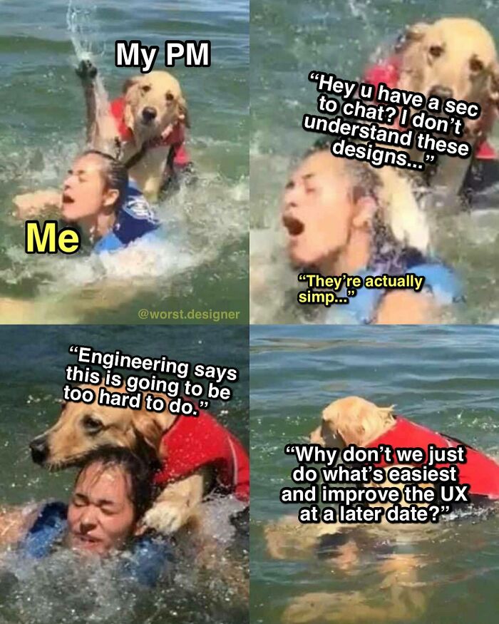
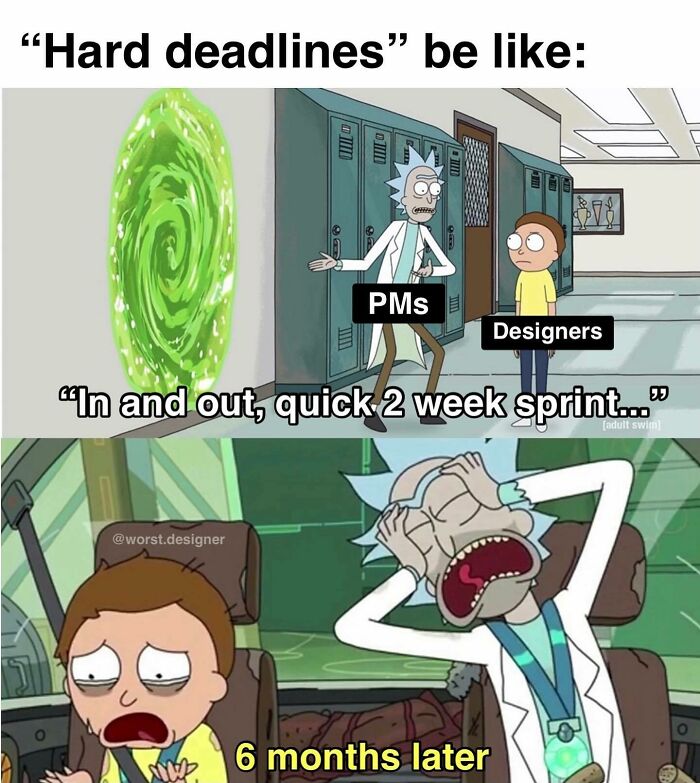
The designer can design anything they want, but if it isn't technically feasible or is prohibitively expensive you have to do what you have to do.
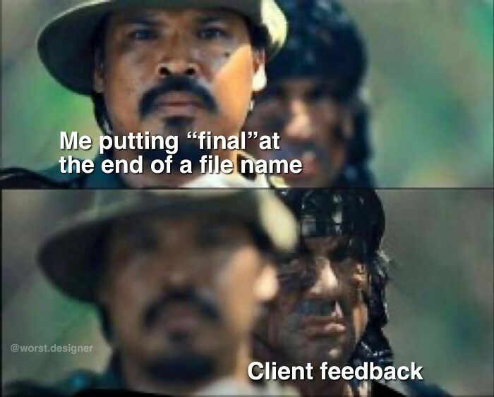
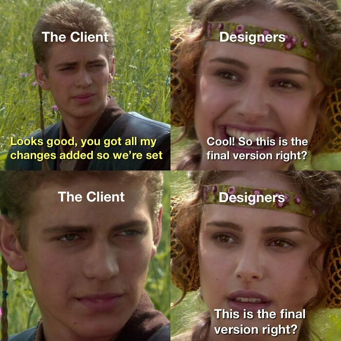
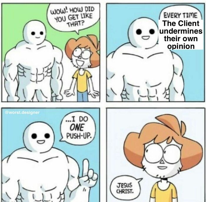
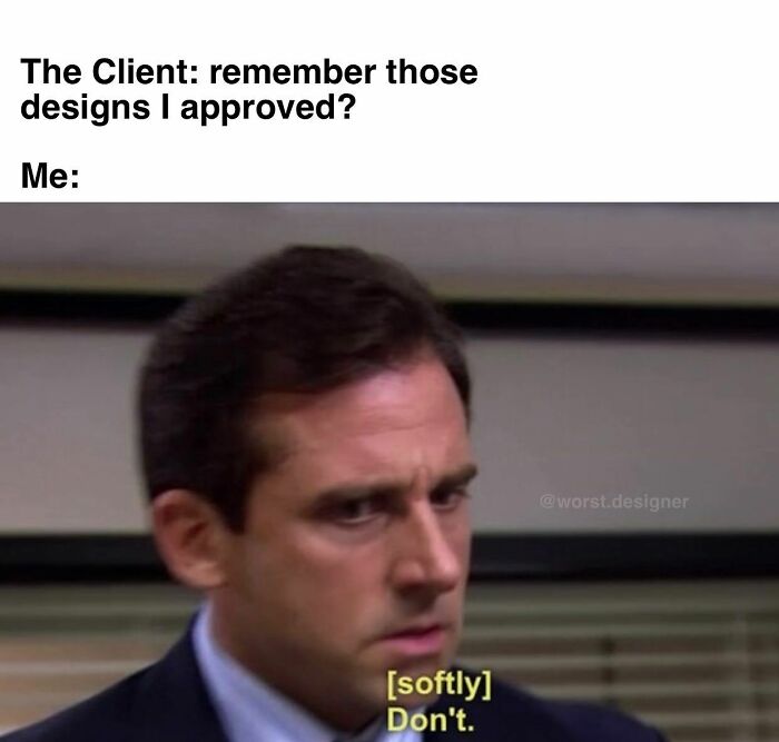
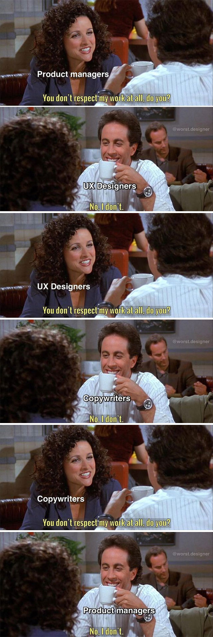
Then 1 month later: "Hey you know how I said that the project you laid out and designed and I approved of was great? Juuuust kidding, we hate it and need you to make a bunch of urgent changes immediately!"
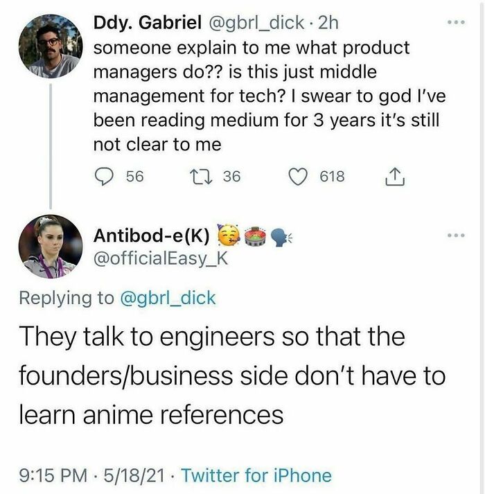
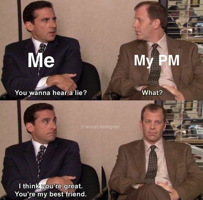
Being good at designing something doesn't mean you're good at organizing or keeping track of information or communicating or delegating tasks or all the millions of other things that come with projects that aren't the actual project itself. Project managers do all that for you!
Leave me alone hooman, I found my true calling as a bleating potato!
I would only eat the one on the right... So it would no longer exist, I would be fed, and the first one would be preservec because it is to beautiful to be destroyed.
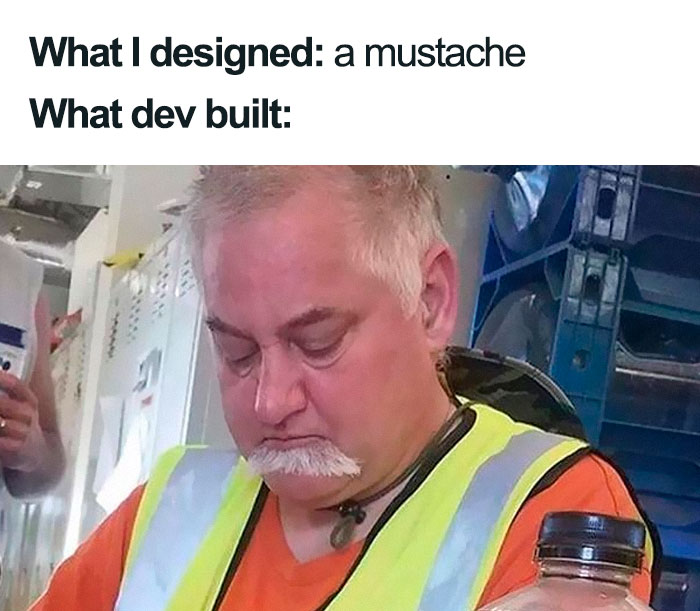
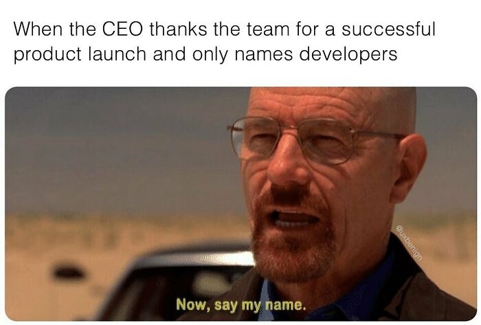
Only names developers.. yeah right. I have been in the situation several times where the CEO has named all the designers, and the freelancer by name and skipped me and the other devs.
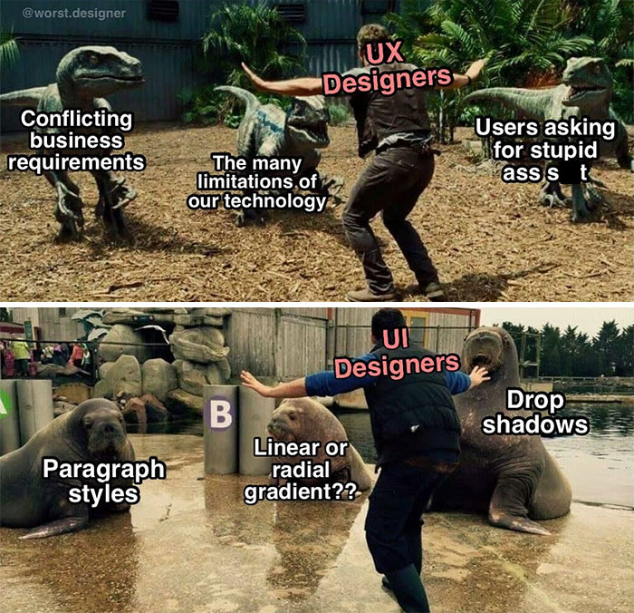
How about no gradient at all. Just present the information in a clear, concise and properly formatted manner. Buttons should be buttons and text boxes should be text boxes, ill-defined white squares really aren't obvious or helpful to anyone. I would prefer entirely different UX for desktop and mobile platforms. Instead of something that looks good on a small screen and is optimized for touch, and something that looks good on a large one and is optimized for mouse and keyboard we have one single thing that sucks everywhere.
Oh my god! There's a F O R B I D D E N word on this! My eyes! How will I go on living?!
Too bad most of them have nothing to do with the headline
Load More Replies..."The Design of Everyday Things" by Don Norman. It's a 20+ Year old book, probably dated in some parts, but still worth a read.
These are good... but what happened to the bad design memes. We need more of those 😁
Young people today have a huge opportunity to set themselves apart from their peers by simply showing up for work and showing initiative.
Old people today have the same opportunity, though most people are pretty pleased when someone over 50 just isn't actively trying to make everyone else feel bad to cover for their own lost sense of self.
Load More Replies...Too bad most of them have nothing to do with the headline
Load More Replies..."The Design of Everyday Things" by Don Norman. It's a 20+ Year old book, probably dated in some parts, but still worth a read.
These are good... but what happened to the bad design memes. We need more of those 😁
Young people today have a huge opportunity to set themselves apart from their peers by simply showing up for work and showing initiative.
Old people today have the same opportunity, though most people are pretty pleased when someone over 50 just isn't actively trying to make everyone else feel bad to cover for their own lost sense of self.
Load More Replies...
 Dark Mode

 No fees, cancel anytime


