40 Designs That Are So Bad That It’s Hard To Believe Someone Came Up With Them (New Pics)
Human beings don’t always build things to last. Sometimes, they make such obvious mistakes that casual observers can’t believe they didn’t notice their design idea flaws from the get-go. Alas, we’re all flawed (much like some designs!) and most of us have a blind spot when it comes to the things we’re involved in.
Nonetheless, bad designs are a lot of fun to look at and laugh at. And there’s no place who does it better than the ‘Crappy Design’ subreddit! We collected some of the best, newest, crappy design fails from the Reddit community, so scroll down and enjoy. Remember to upvote your fave product designs gone wrong, and drop us a comment telling us why you loved hating them.
We at Bored Panda love creative designs, but we also adore really bad ideas, too. When you’re done looking through our awesome list, check out our posts about epic design fails, the very worst kitchen designs, epically bad bar and restaurant designs, and structural nightmares. We’re sure you’ll love these funny fails.
This post may include affiliate links.
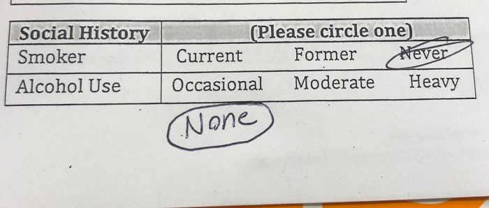
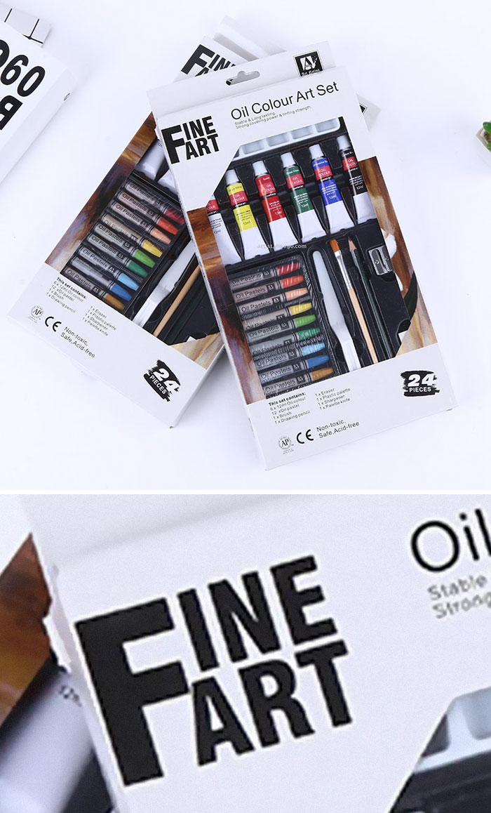
If Only They Realized
What kind of place were you shopping at to buy penis pasta.
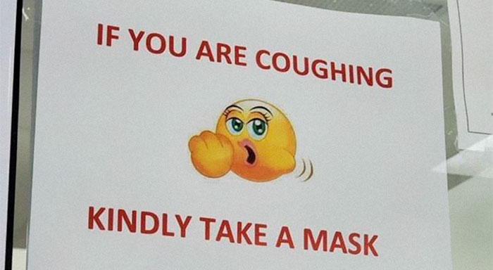
My Sister’s School Health Clinic May Need Some Emoji-Education
Sounds Like An Invite To Your Own Murder
There are plenty of examples of bad design out there, but we can find some excellent designs here and there. And good design involves uniting the concept you have with the physical end-result of the product.
For instance, Ikea talks about how its design is “democratic” in that the company believes “good home furnishing is for everyone.”
Honestly, If I Am Booking For Boston, That’s Kind Of Where I Would Like To End Up.
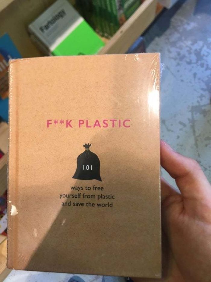
Anti-Plastic Book Wrapped In Said Plastic
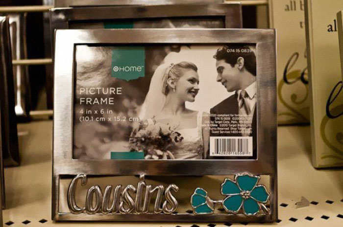
Cousins...
Meanwhile, Apple values quality craftsmanship through and through. Company founder Steve Jobs said that “for you to sleep well at night, the aesthetic, the quality, has to be carried all the way through.”
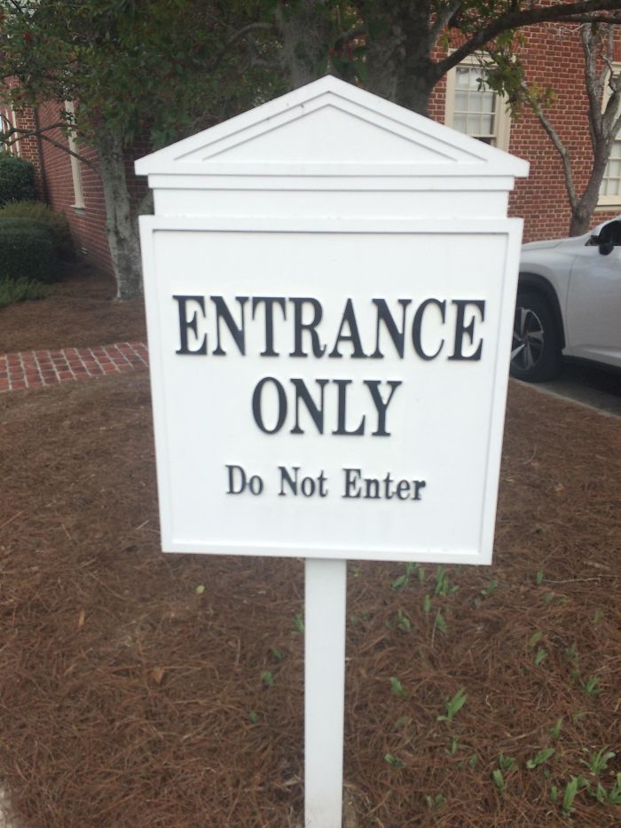
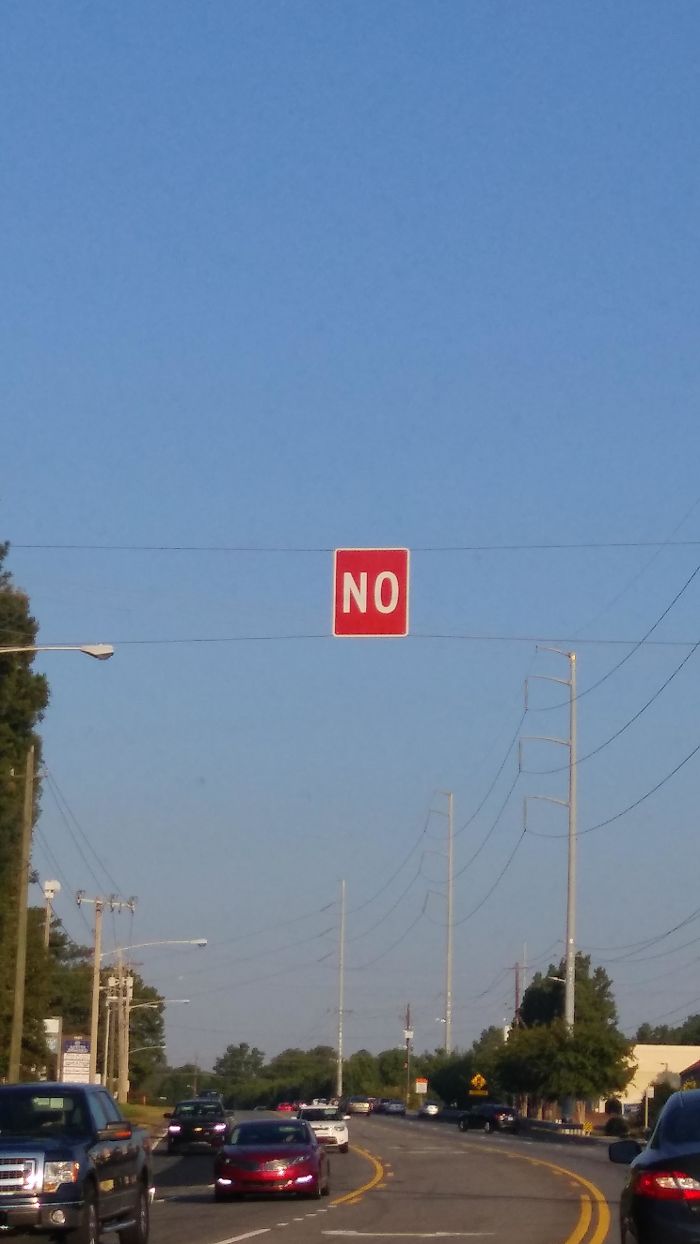
Trying To Figure Out What This Sign Means For The Past 5 Years
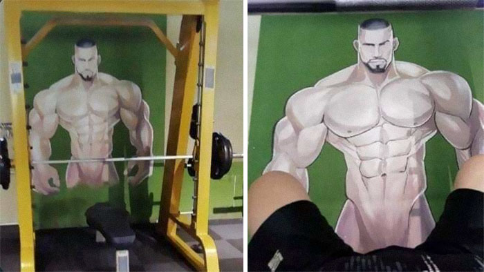
At The Local Gym
That's How I Broke My Leg
You’ve heard that “function over form” is an important aspect of design, but have you ever considered that they can be (and should) united into one seamless whole?
Postmodernist Frank Lloyd Wright, who dedicated his life to crafting organic designs, coined the phrase “form and function are one.” According to him, form and function ought to be in “a spiritual union” instead of vying for dominance over one another.
Ladies And Gentlemen, The Pinnacle Of Human Stupidity
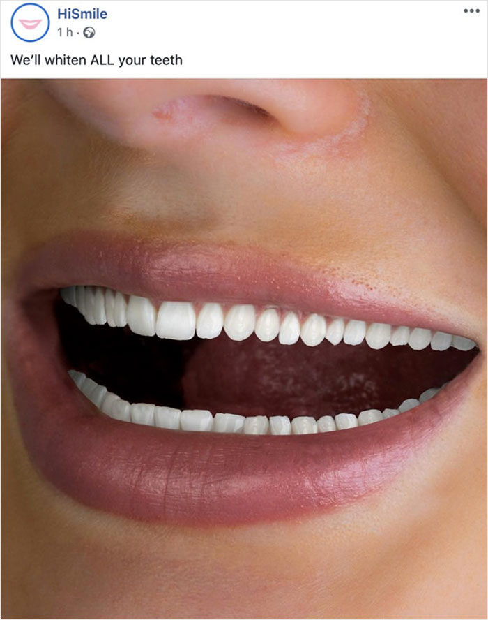
This Ad For Teeth Whitening
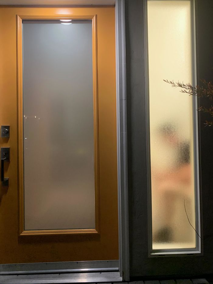
My Friend’s Apartment Has A 1/2 Bathroom On The Ground Floor. This Is The View From The Street.
In a previous interview with Bored Panda, the moderators of the ‘Crappy Design’ subreddit said that the community changed over the years.
“The original motivation for the subreddit was to point out crappy designs. Nowadays, most subscribers probably come here for entertainment. However, it is common to have meaningful discussion here on why or why not something is crappy design,” they said.
I Hope The Electrician Knows The Sprinklers Schedule
Ladies And Gentlemen Take A Look At This Gem
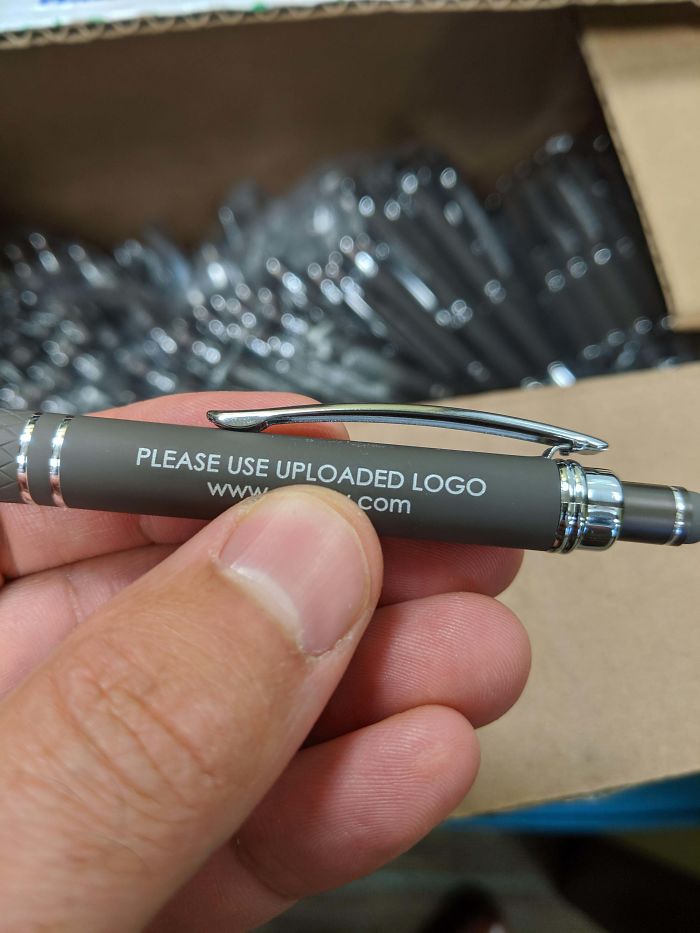
Our Company Now Has 900 Of These Pens
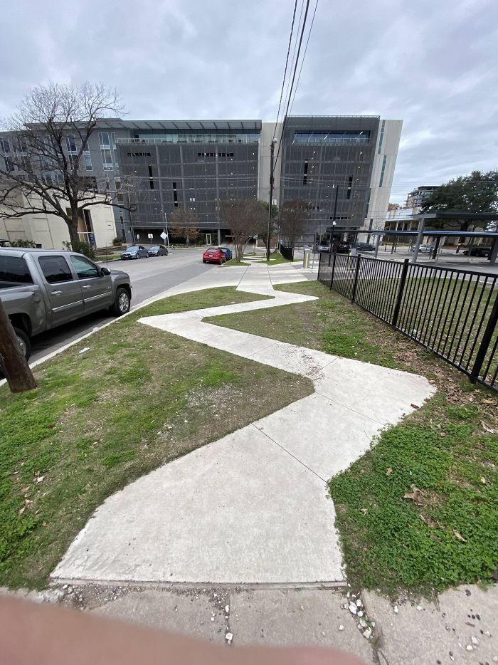
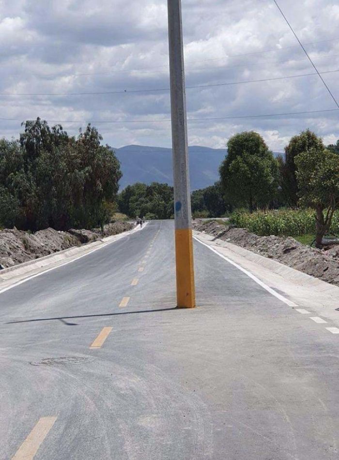
This Backroad Near My House
Straight Pride Flag Looks Totally Gay
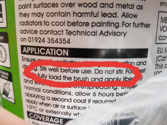
To Stir Or Not To Stir. That Is The Question
This Plaque Near My House
Those Are Some Interesting Arms You Got There...
The Implication That This Tooth Has Something Down There
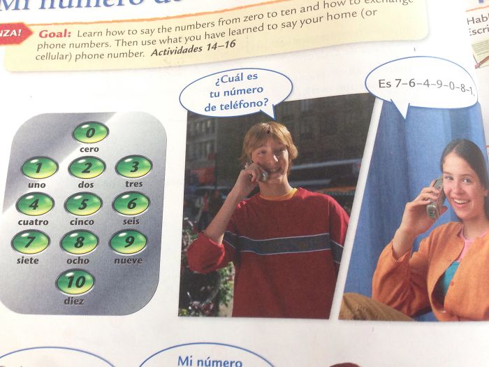
He's Calling Her To Ask Her For Her Number?
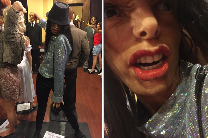
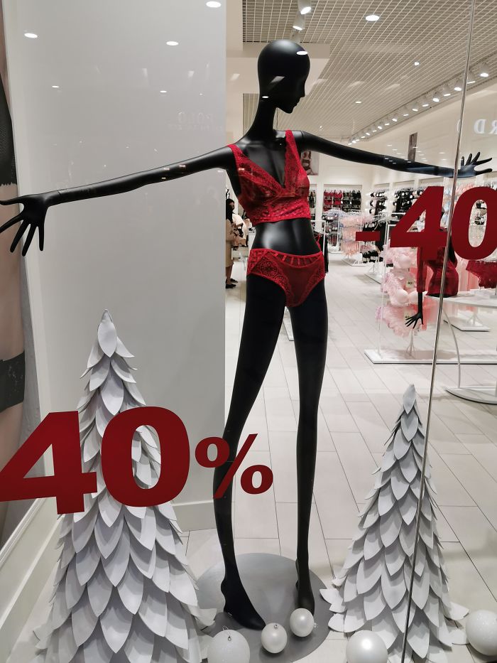
Finally A Realistic Mannequin In Women's Lingerie Store
Imagine Being Drunk
The Us Space Force Has Olive-Green Camouflage Uniforms ... For Outer Space.
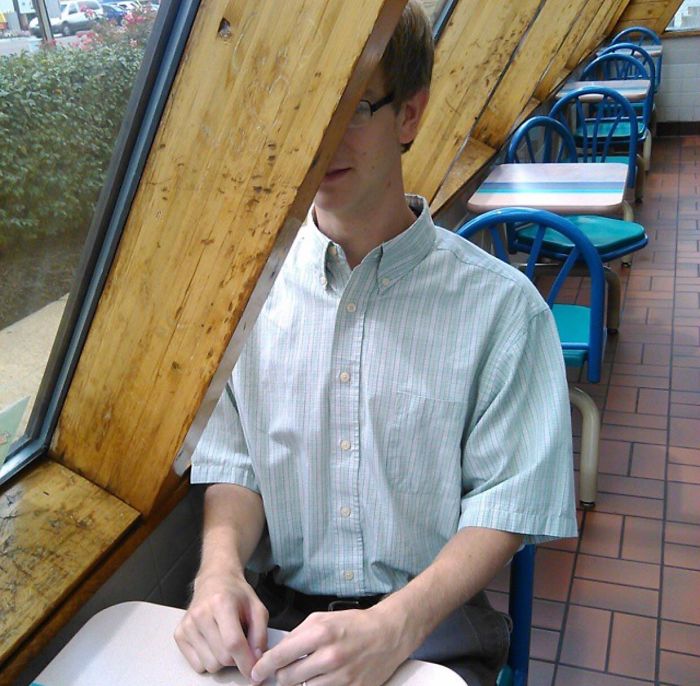
Waiting To Engage In A Dining Experience At My Favorite Taco Establishment
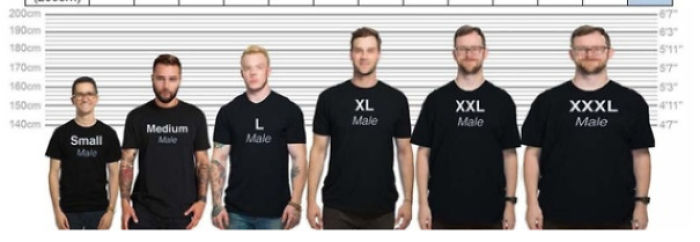
So Xxxl Is Just A Stretched Xxl?
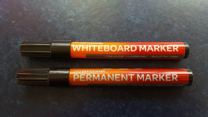
These Two Pens At My Office... Nothing Can Possibly Go Wrong
If you ever use Permanent marker on a whiteboard, just go over it in the whiteboard marker. It will come off when you wipe then.
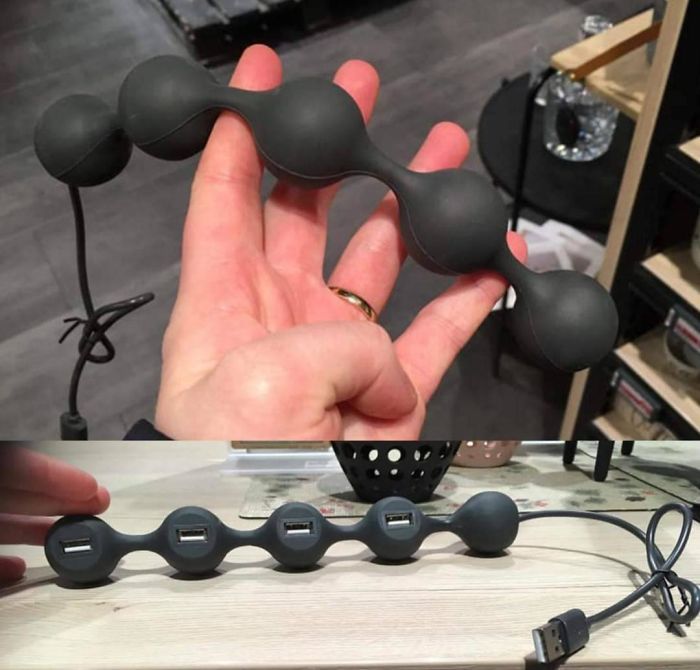
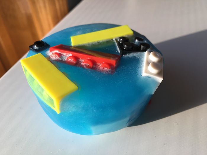
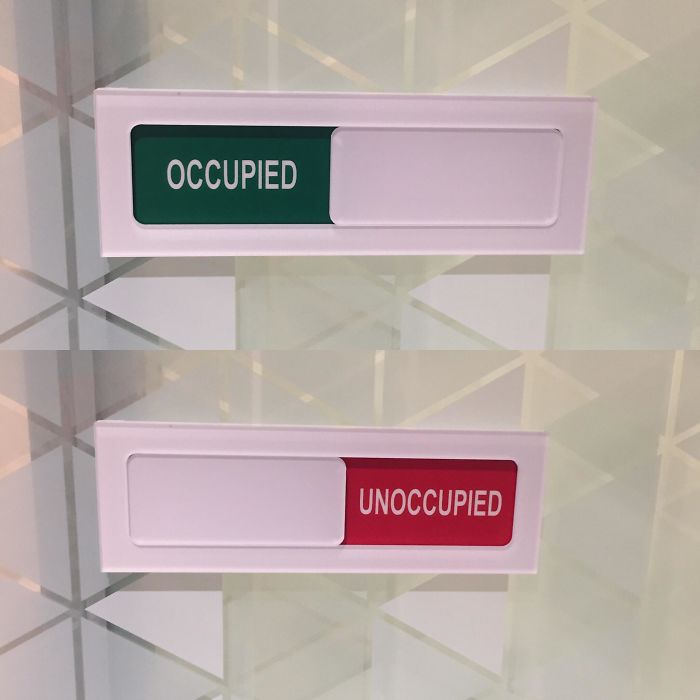
[oc] This Won The Design Competition
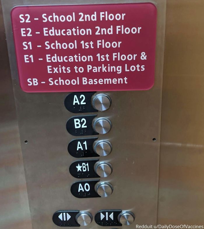
This Elevator
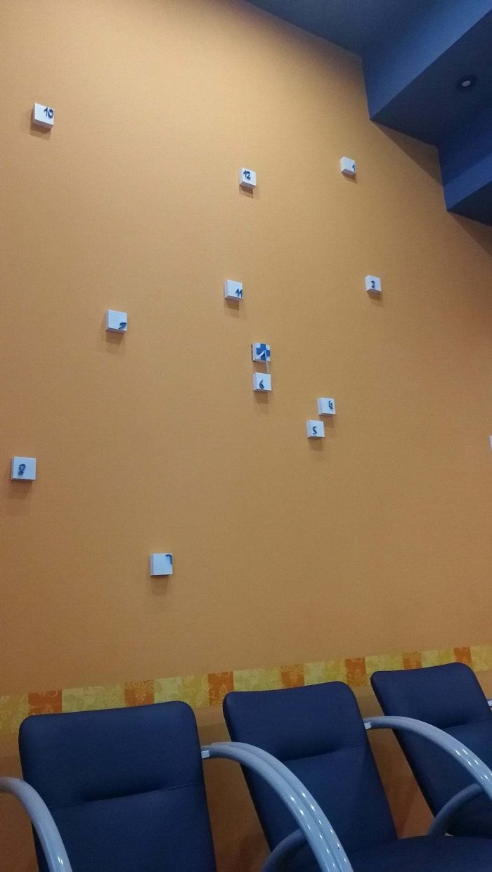
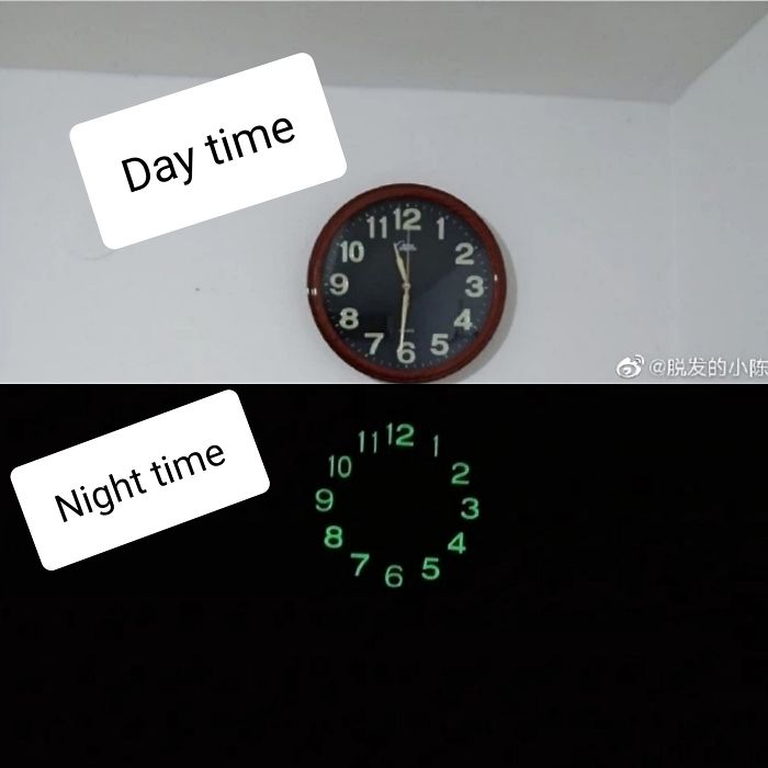
The Single Worst Clock I Have Ever Seen. I Actually Said Aloud "Whyyyy"
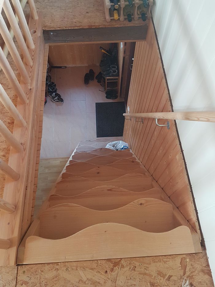
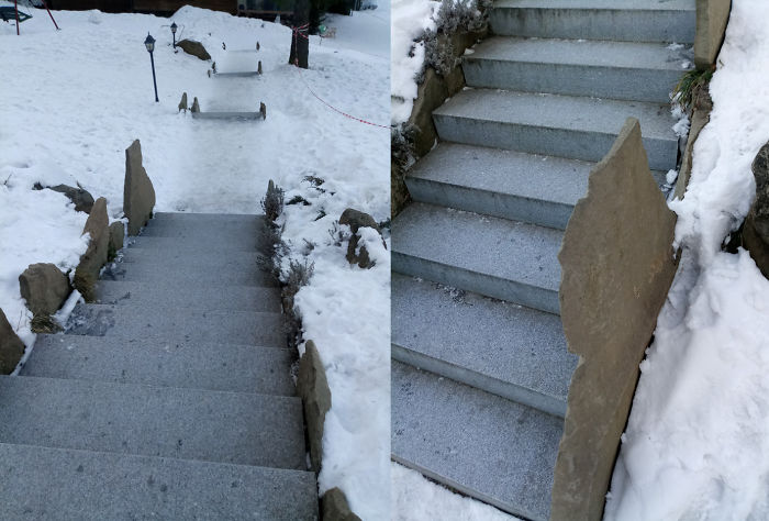
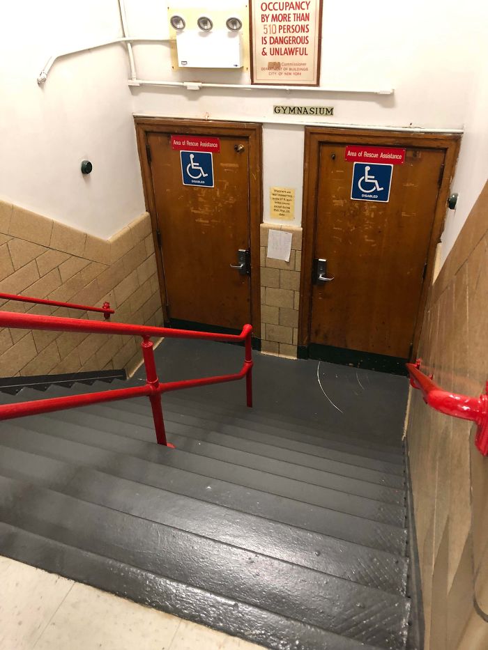
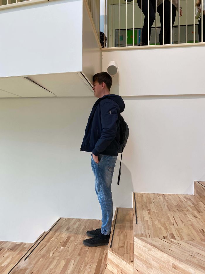
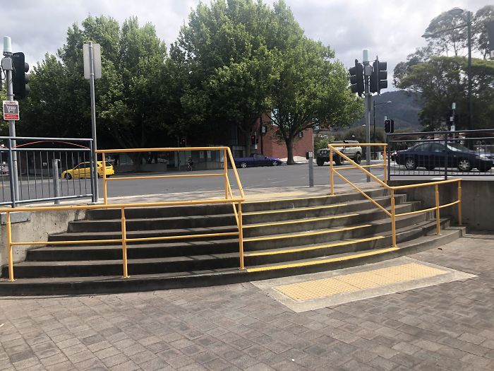
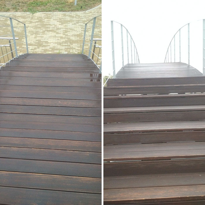
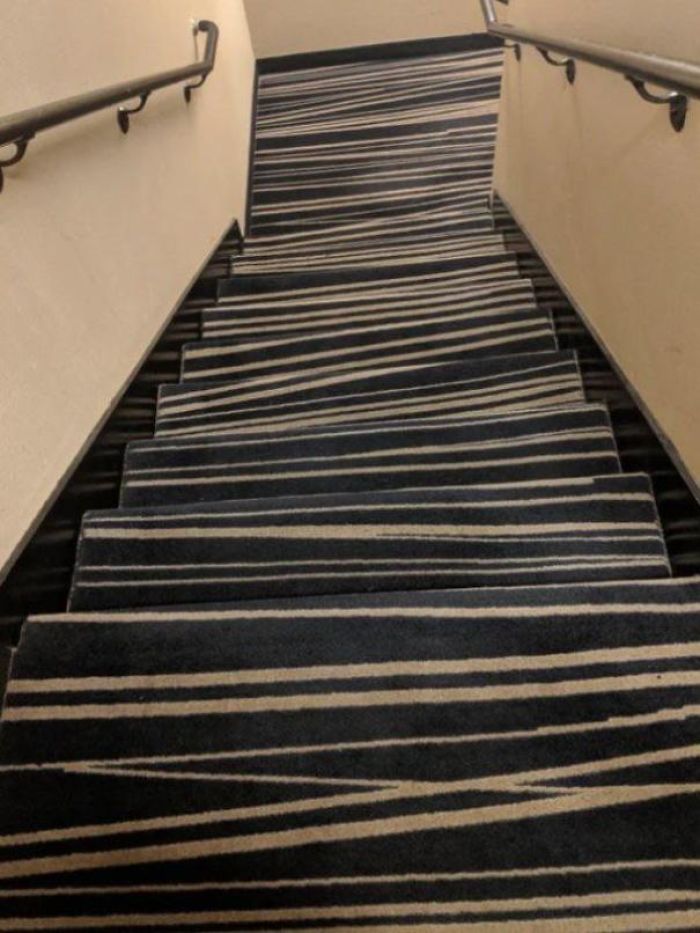
These Stairs In My In-Laws Summerhouse. We Have Parties Here So Going Down These Stairs Drunk Is A Challange
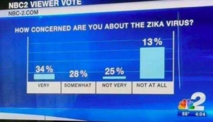
Let's Use Red To Indicate The Coldest Temperatures And Blue To Indicate The Warmest
In China when market goes up, it's red, when it goes down, it's green... Same here
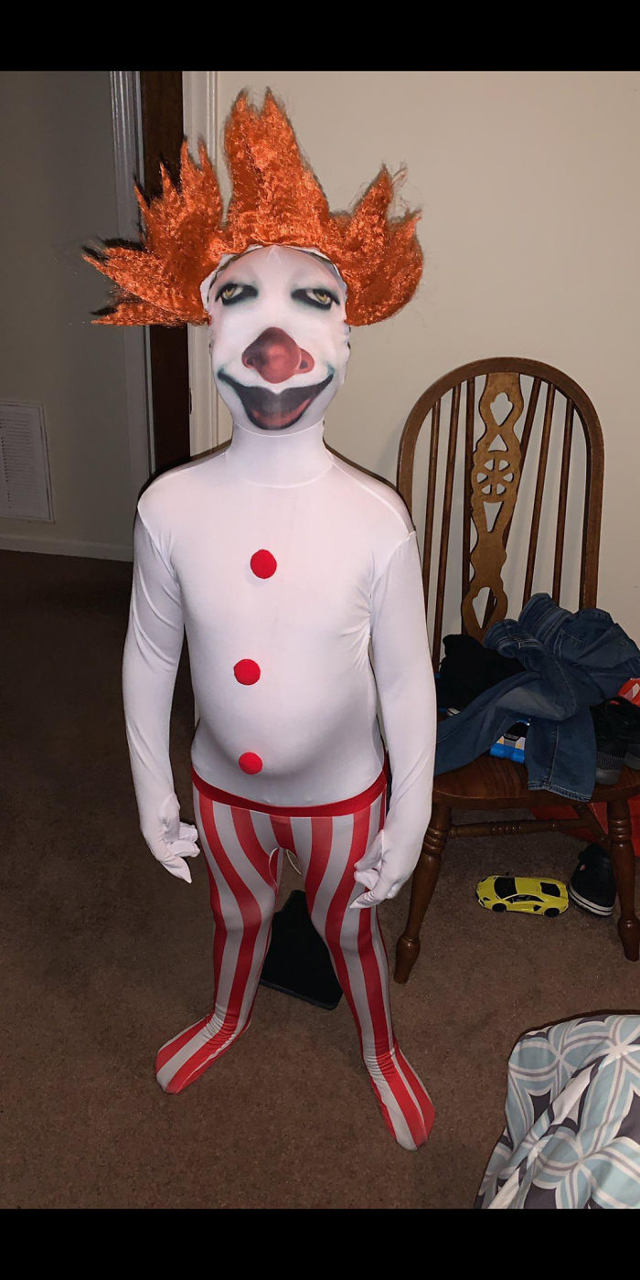
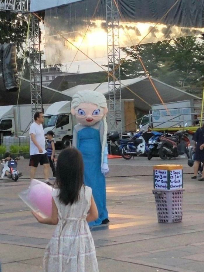
This Pennywise Halloween Costume
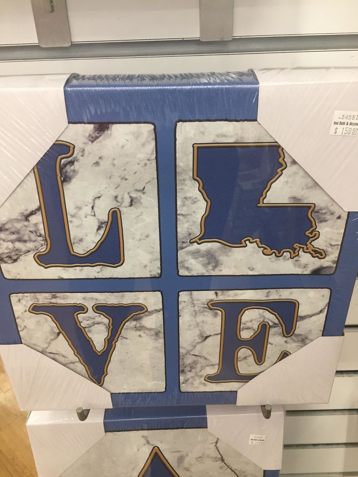
If Only Louisiana Were Shaped Like A Letter In The Word Love, This Would Have Worked Much Better
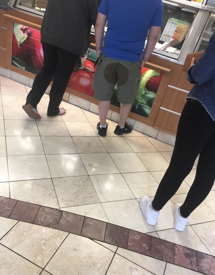
Someone Was Wearing These At The Mall And I Had To Double Take
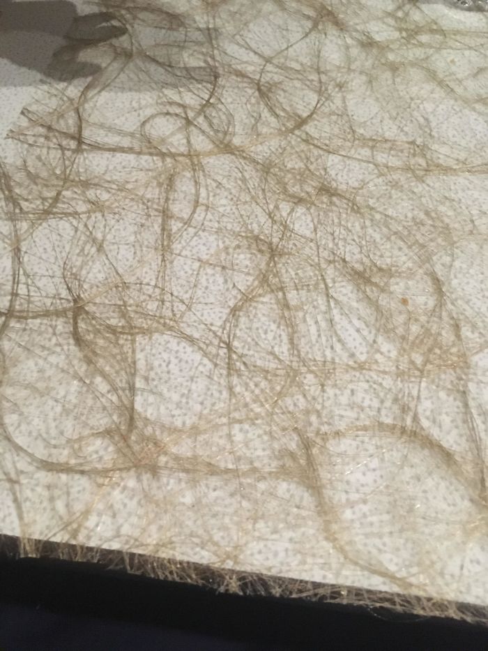
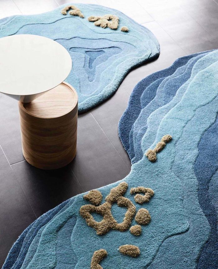
This Tablecloth That Looks Like A Hair Carpet
That doesn't look like a hair carpet, that is in fact an actual hair carpet.
It’s Supposed To Say Shoemaker
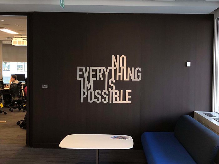
This New Wall Art In My Office
It is supposed to mean "nothing is impossible - everything is possible." But jeez, it took me some time to figure it out...Who designs sometnhing like this? Who BUYS something like this?!
Washing Machine
Either that... or this is the result of aliens visiting us.
Load More Replies...Always, this type is interesting and gave me a few laughs !!!
Either that... or this is the result of aliens visiting us.
Load More Replies...Always, this type is interesting and gave me a few laughs !!!

 Dark Mode
  No fees, cancel anytime











![[oc] This Won The Design Competition [oc] This Won The Design Competition](https://static.boredpanda.com/blog/wp-content/uploads/2020/01/5e2186e088bc7_axawzoe51pb31__700.jpg)
