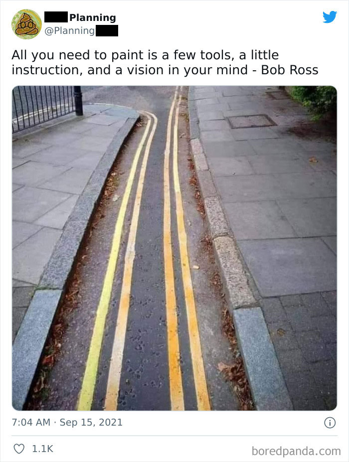
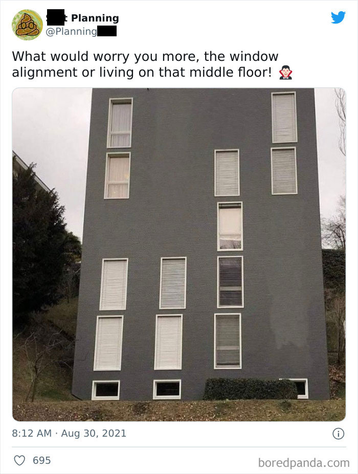
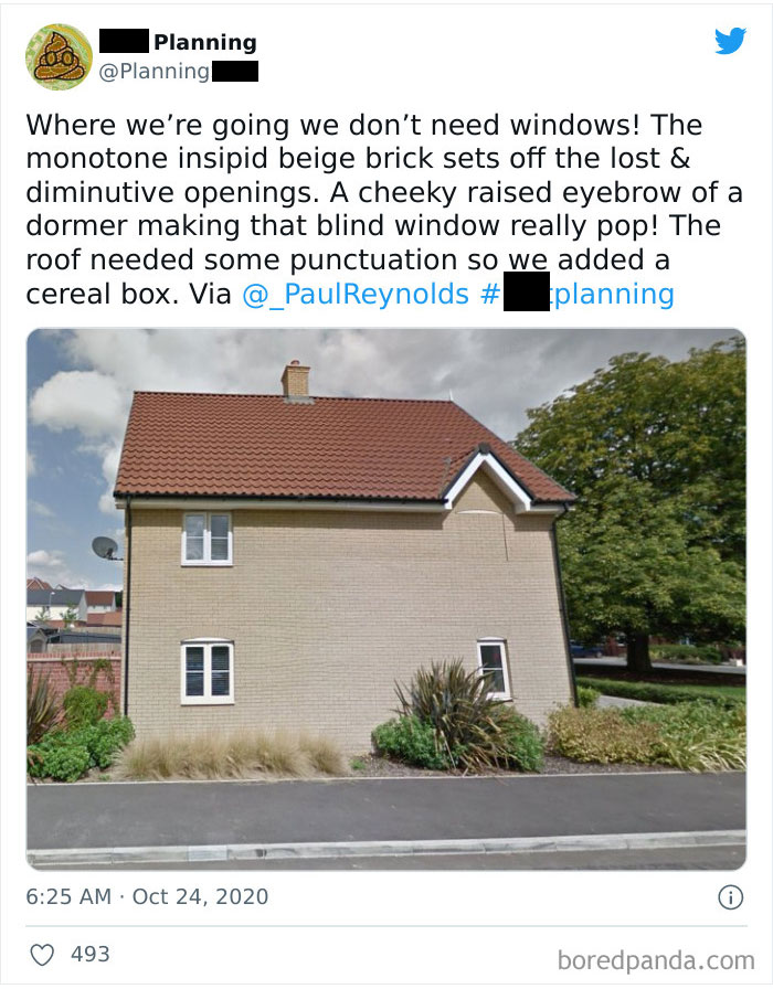
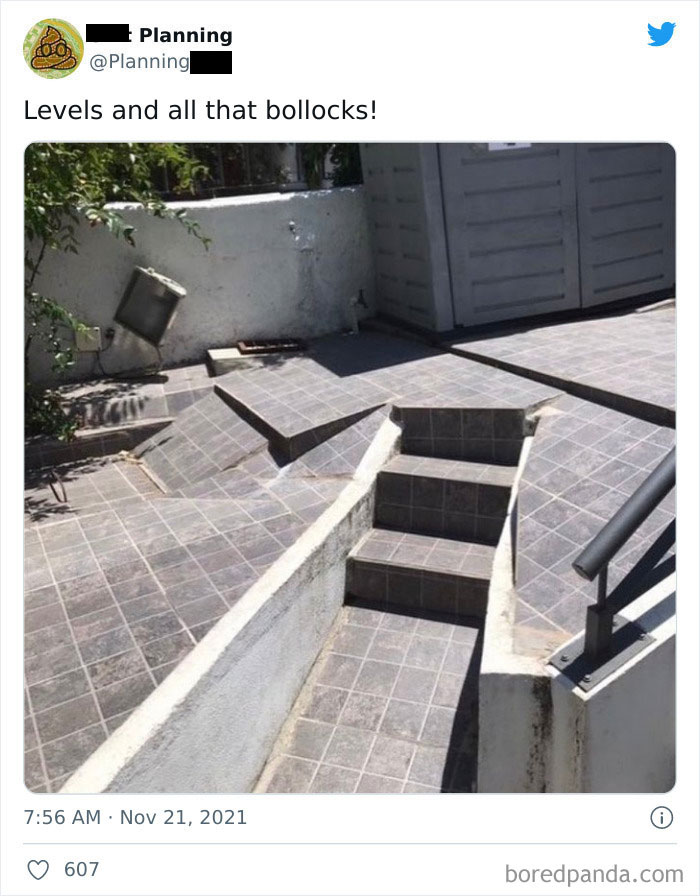
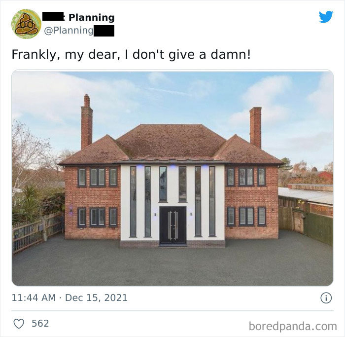
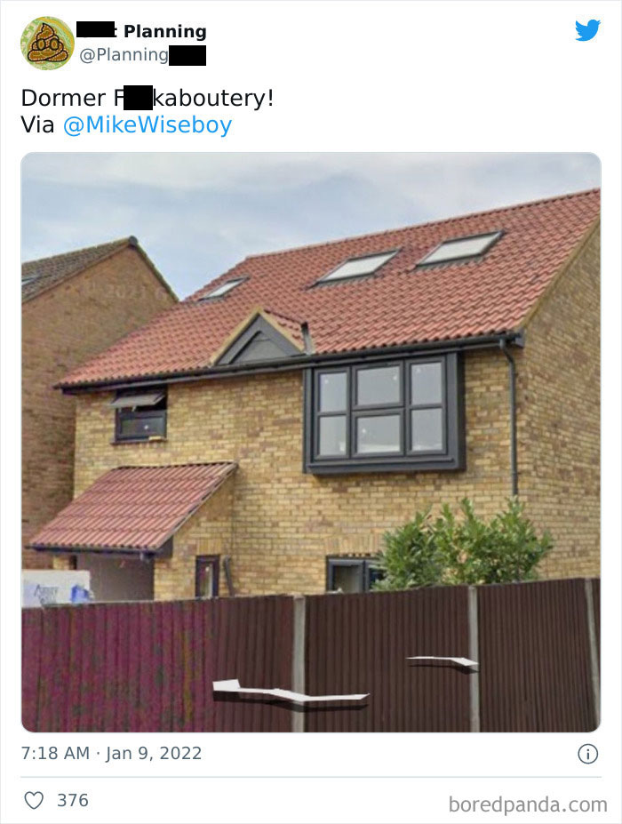
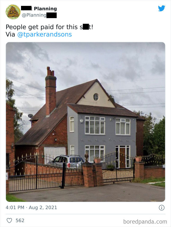
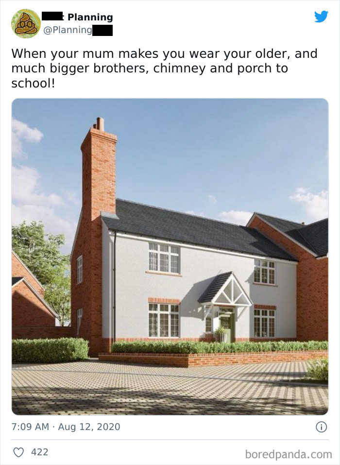
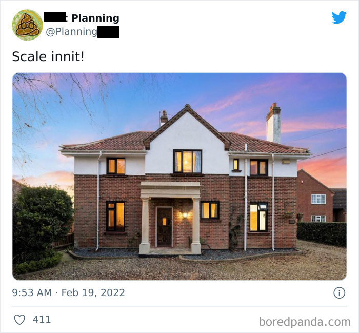
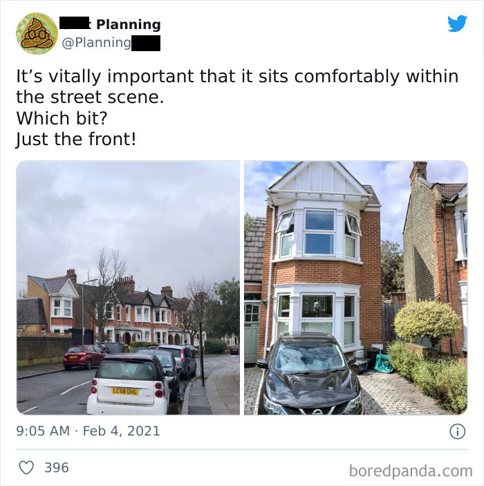
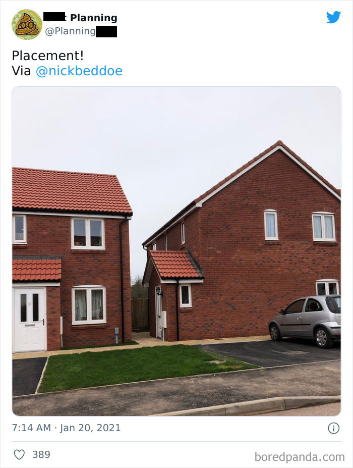
When you have a planner drafting your house, a roof over your head is the bare minimum you expect. I wouldn’t call a set of windows a luxury either. But in reality, even in the most precise universe of architecture and engineering, errors happen. And the results are the monstrosities you’re about to see.
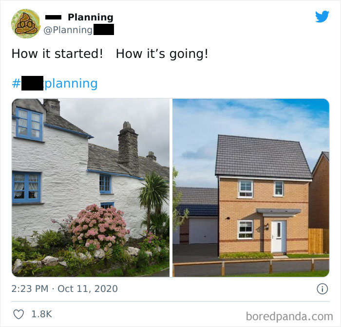
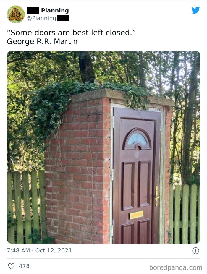
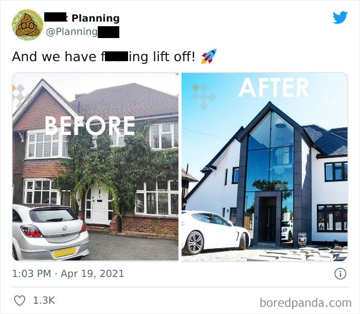
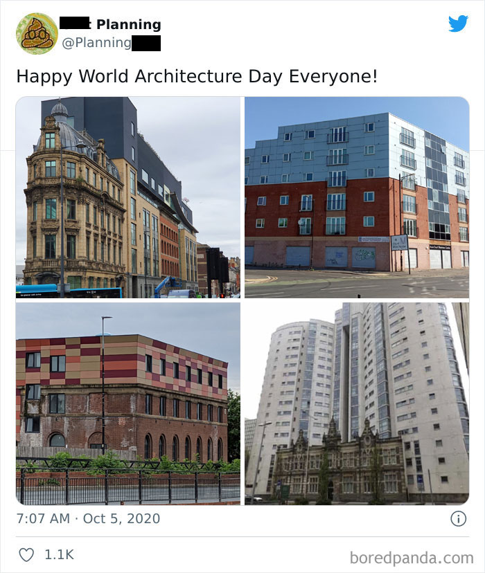
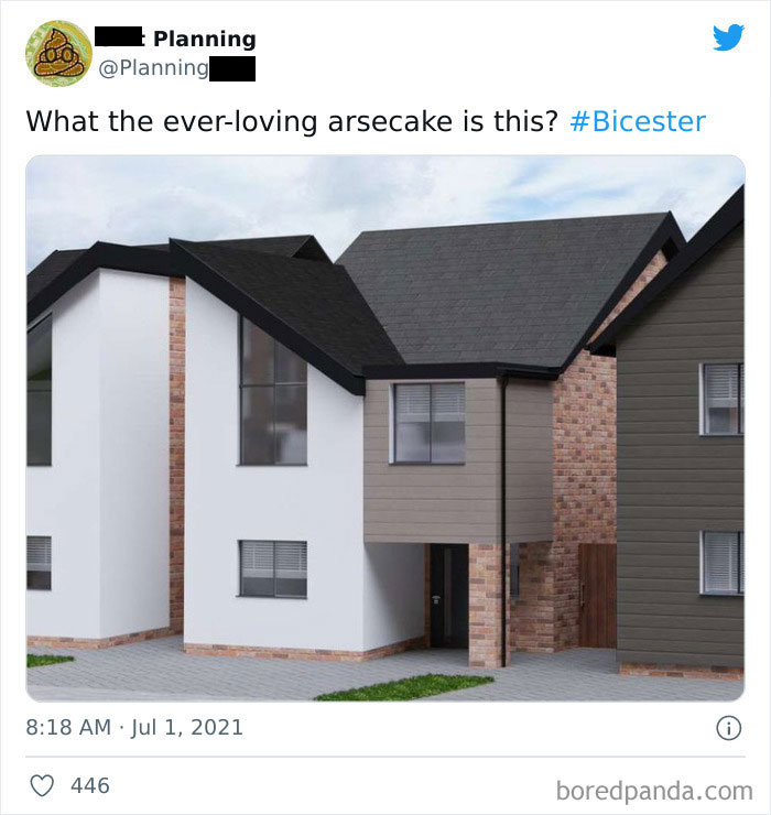
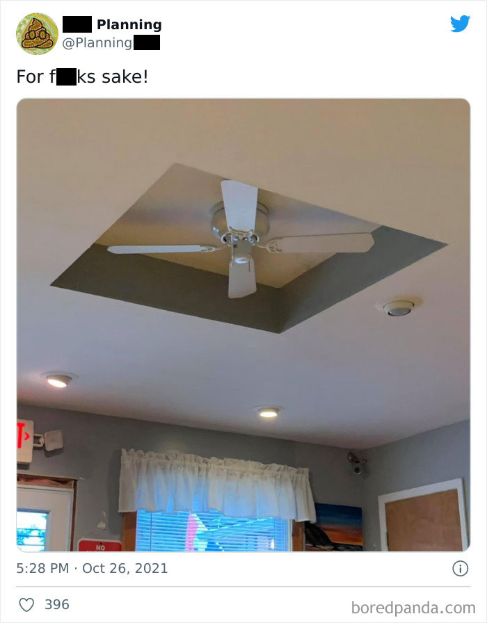
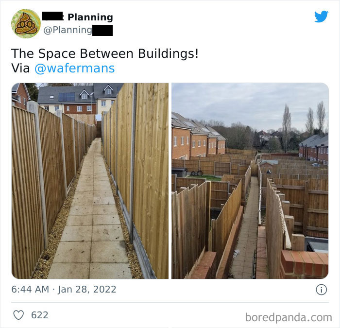
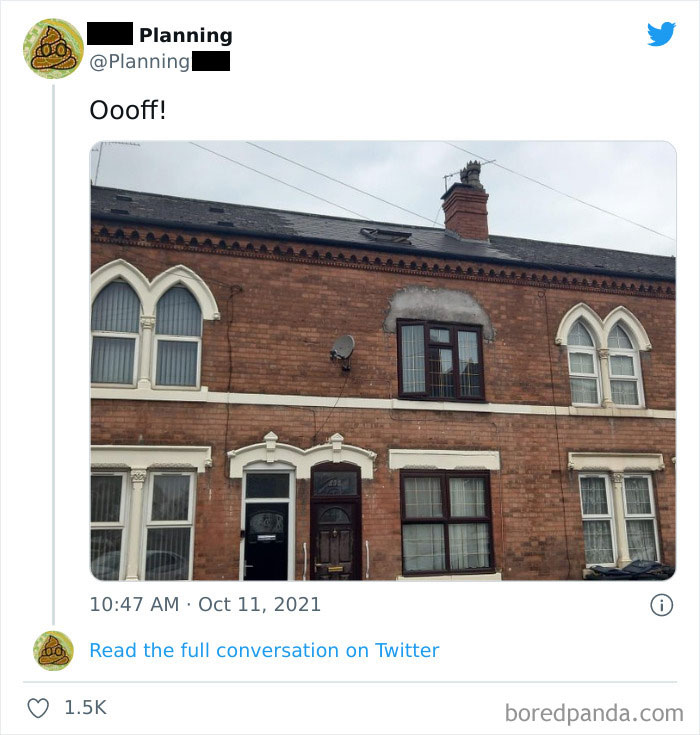
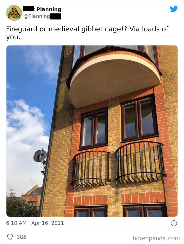
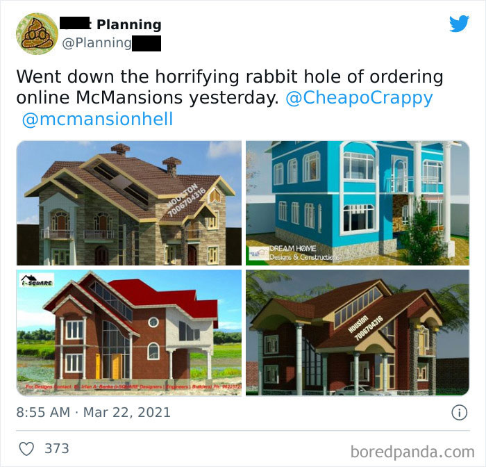
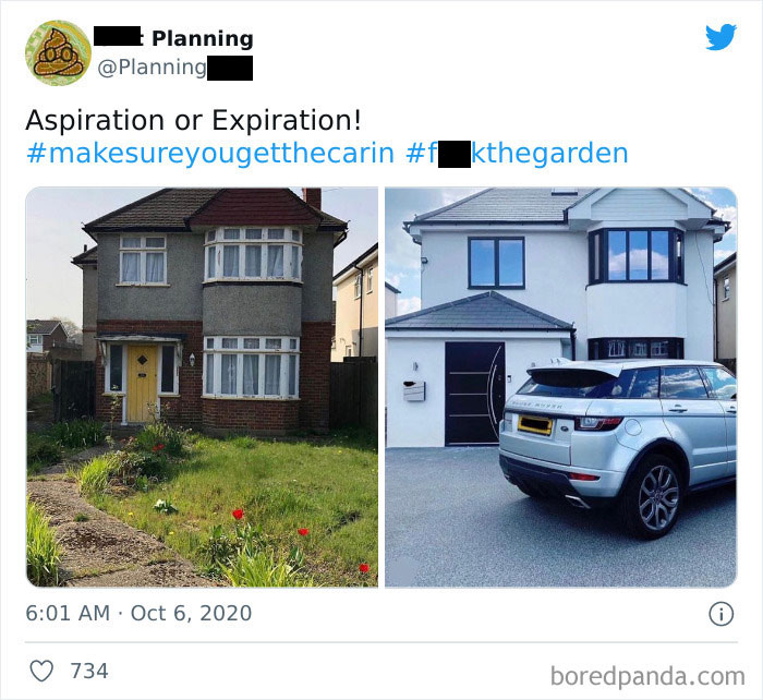
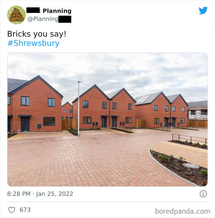
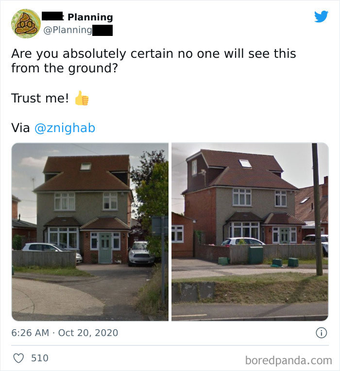
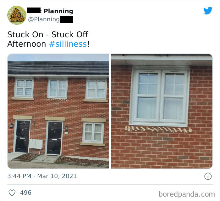
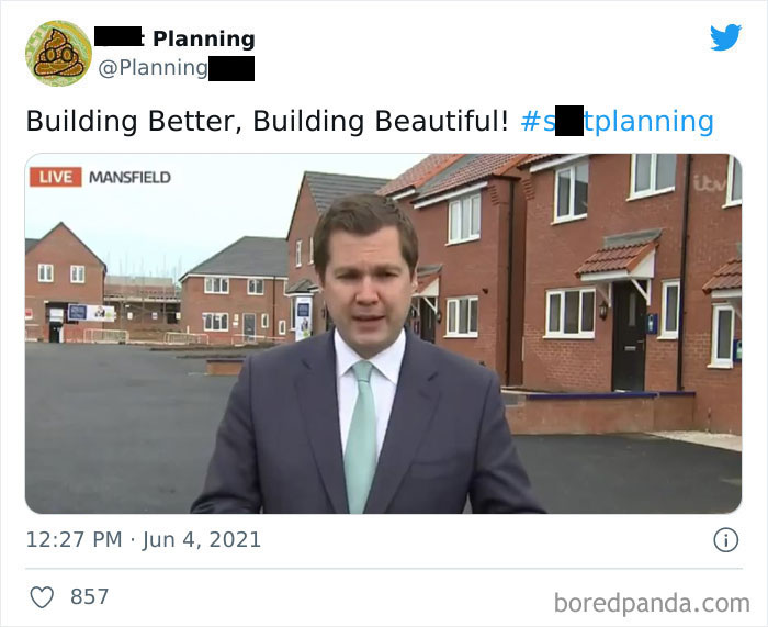
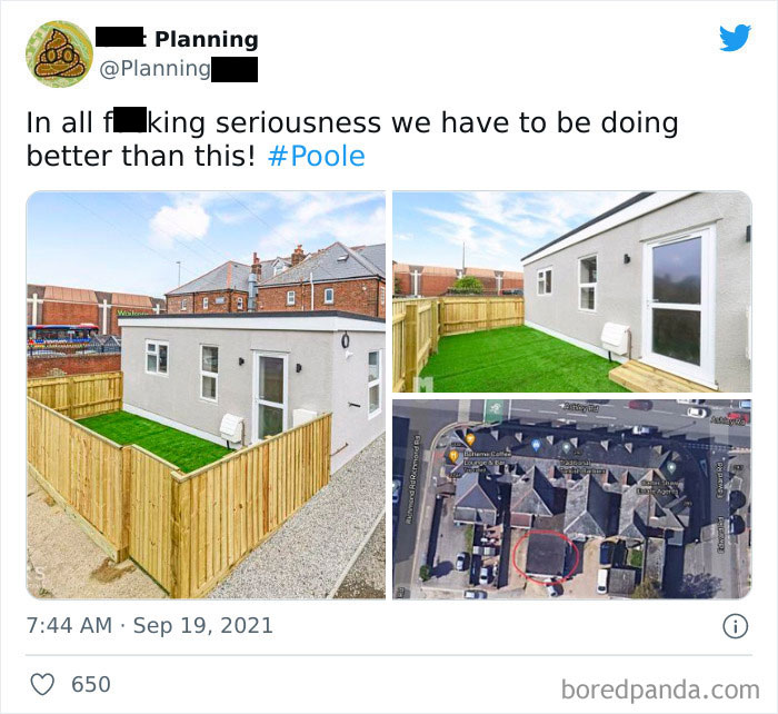
Thanks to the Twitter page “Bad Planning,” we have quite a split collection to look at. The page sarcastically describes itself as “a celebration of all the ‘smelly’ stuff imposed on our environment.” It adds that: “Perpetrated by Architects, Planners, Surveyors, Engineers & other environmental ne’er do wells.” Whoever created this page appears genuinely unforgiving.
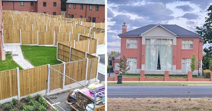
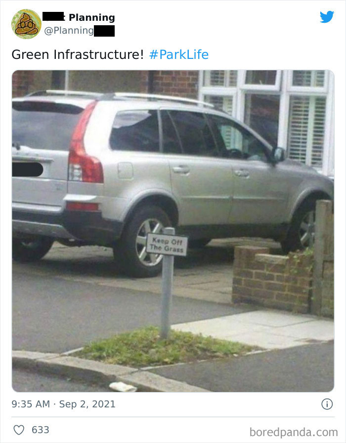
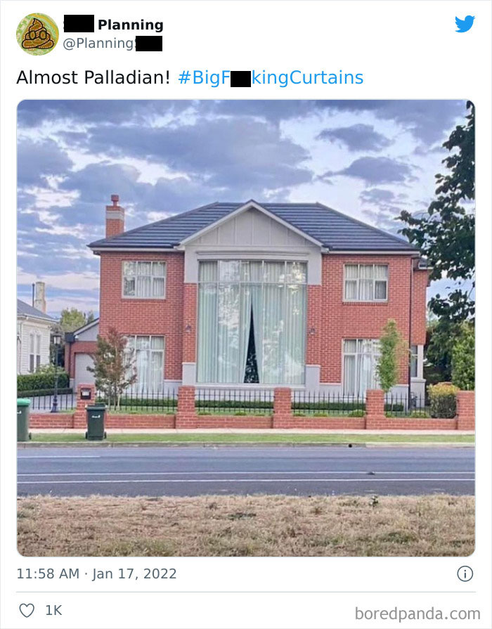
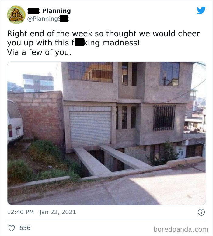
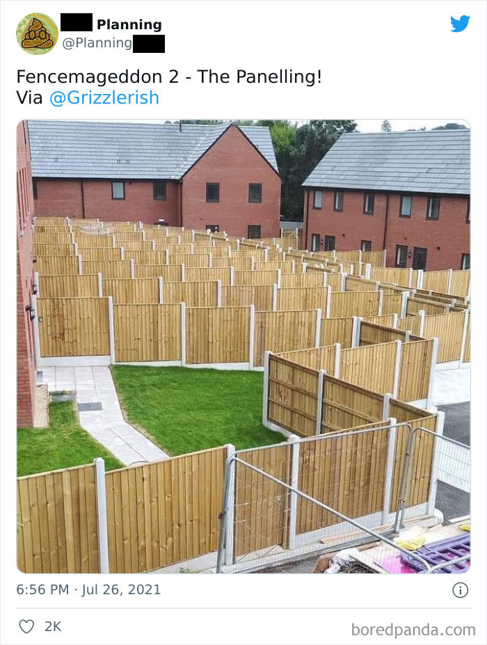
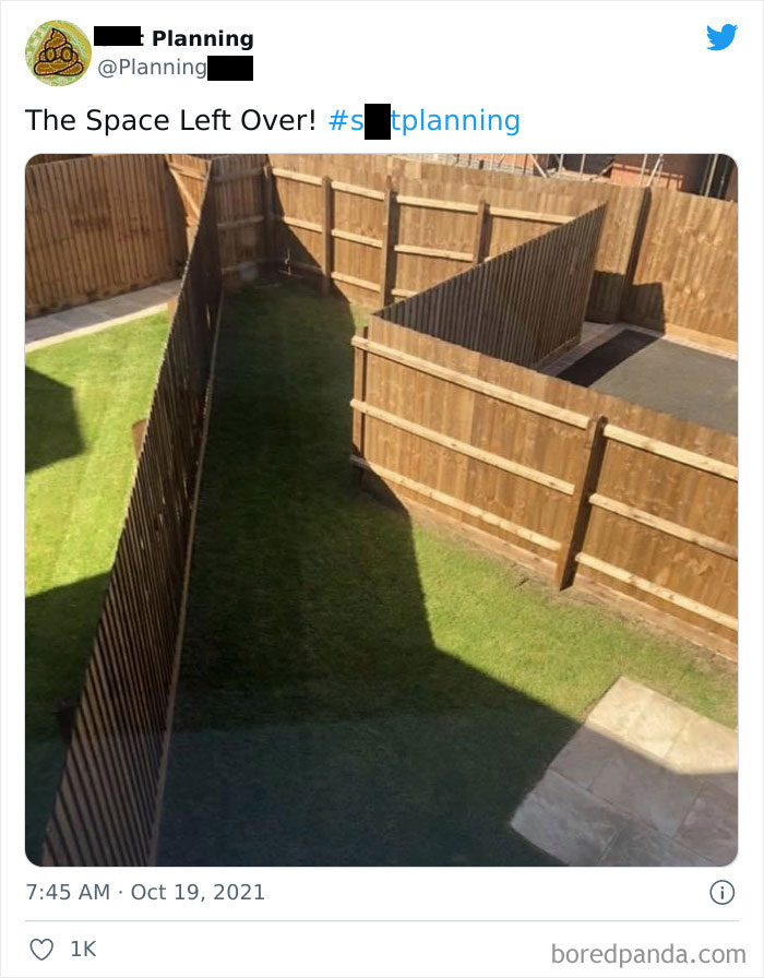
Get ready to meet ‘Fencemageddon,’ heaters rising up the stairway, the house of all the planet’s windows, and other peculiar specimens. Scroll down, enjoy and upvote your favorites as you go!
This post may include affiliate links.
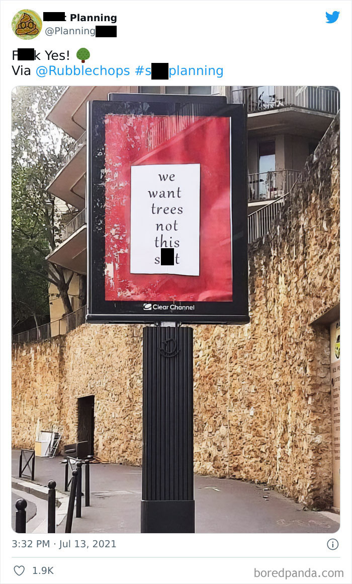
If you are upset, you just had to do it the French way : unite to create a company that will buy and preserve the building.
In order to find out how bad planning and design examples like these end up in public and private spaces, we have to break down where they start from. Maybe it’s a client who ordered a questionable design and turned it into reality. Maybe it’s a designer who forgot the functional part of the design. Or it may well be the planners who didn’t take what was needed into account.
“We never realize how much even the smallest detail can affect our everyday lifestyle,” Laura Vanagaite, a Portugal-based graphic designer, told Bored Panda. She shared a couple of insights of what happens and why when objects, buildings, and spaces are designed with such big flaws. “Every single object we use from the morning until the night is designed specifically on how it is supposed to be. But that is not always the case. Functionality is the number one rule in the design and architecture world,” Laura explained.
Yeah... that grabbed me first too... I thought that was the mistake we were supposed to see, until I read Mimi's comment.
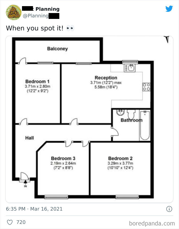
Load More Replies...My thoughts exactly... why would you want to walk down a long (wasted space) hallway past a bedroom to reception? If they'd just reversed bedroom 1 and reception it would work better... still not great, but better.
Load More Replies...Well, just give me a fridge and then I will sleep forever anyways.
Load More Replies...Bedroom 3 is a walk-in closet with two doors, bedroom 2 has no doors...
A way to get in or put of bedroom 2. It doesn't even qualify as the roach motel where guests check in, but never check out. There's not even a way to slide under something to get in that room. Maybe the builder just walled himself in. Kind of like painting oneself into a corner. The smell should go away eventually. If there was a window.
Load More Replies...No door in Bedroom 2. I believe the dimensions for Bedroom 3 are incorrect. The plumbing in the kitchen should share a wall with the plumbing in the bathroom.
Besides the obvious door issue, why do the bedrooms have no closets? Is the "reception" area supposed to be a living room/kitchen combo? If so, where do the appliances go? If it's just a living area, why does it have a stovetop and sink?
In addition to tje obvious, there is no way to get from the reception to the balcony, unless you go through the window.
They keep the shamed "secret son" in Bedroom 2. The one chained up whose moans can sometimes be heard.
The whole thing is strange. Aside from the lack of access to Bedroom 2 and two doors into Bedroom 3, you have to go through bedroom 1 to reach the balcony, and what with the kitchen/dining/living room being labeled "reception"? And why does it need a hall that's walled off from everything else?
Have fun getting into bedroom 2. And no wall was required for the reception area. No closets or storage area either. The door going out on the balcony could be in the reception area as well. Someone playing with design program without having common knowledge of what is required.
Bedroom two is for privacy, like Hotel California ... check in before construction and never check out?
Did this to one of my sims once. They ended up peeing their bedroom floor
What is the reception area? Dr. Demento or Dr. Frankenstein moving in?
1.) Balcony's spelt wrong. 2.) There are two doors in bedroom 3. 3.) There are no doors in bedroom 2
ahhh bedroom 2 is a secret room that the 5th owners will discover because a weird draft is coming from behind a mirror or painting. this happens a lot in NYC lol
Reception? In a house? With a stove? Nothing about this floor plan makes any sense.
Scaling is terrible too. Those doors would only be about 30cm wide.
So many questions. The least of which is that’s not how to spell balcony… is it?
No bedroom door there sport. I guess they didn't think there needed to be an entrance to bedroom #2 . Lol
Maybe the door to bedroom 2 is hidden. You know, like when you pull a book and the bookshelf opens a secret door.
Apparently not to scale, since BR1 is allegedly larger than BR3, but looks considerably smaller. Also misspelled '"balcony", and as other posters have mentioned, BR2 is apparently inaccessible and unusable due to lack of door. Overall layout is basically a jumbled mess that does not take function or traffic flow into account.
How i maths? Bed 2 and bed 3 should be the same size in one dimension
Also bedroom #2 needs a door. Bedroom # 3 has 2 of them. This house is a mess! Lol
Load More Replies...Let's go down the list: 1-Balcon(e)y 2-No closets in any bedroom 3-No door on bedroom 2 4-Two doors on bedroom 3 5-Bedroom Two and 3 are the same length but have different measurements 6-No closet for coats and shoes at the door 7-No door to the balcony from the reception room but there is from bedroom 1 8-No place for a fridge 9-Bedroom one shows a wider width than bedroom 2 but it is narrower 10-No dining space 11-No laundry machine 12-Both doors for bedroom three, the door for bedroom 1, reception and balcony open in to the middle of the room instead of against a wall. This is clearly a house designed for the UK based on the room names and the fact that there is a door to the reception room. This has to be a single level row house because there is no place for a common hallway if it were an apartment.
Maybe it's a secret panic bedroom you can only enter through a sliding door hidden behind a painting?
The kitchen is right there just above the bathroom. The square with four circles in it represents the stove top.
Load More Replies...I assume bedroom 2 without the door is for the famed mother-in-law, But how you gonna get the old cow in?
“But sometimes,” Laura said, “some creative choices are made that make the function not the priority.” And that is where the confusion happens. “From what we have seen in the past, some design solutions are made without thinking of the actual client, a person that will use the product. It applies to everything: website or app design, interior design, furniture, architecture and spatial planning.”
Laura also said that if any of the end product is made without thinking much about the user, it loses its value. “For example, a person downloads an app, it looks nice, the design is modern, it looks beautifully done, but the letters are done in a light color and it is hard to understand what information needs to be filled in. The client gets annoyed and decides to delete the app. In this case, the designer should have thought about the app function and how user-friendly it would be.”
“Another example can be spatial planning,” the graphic designer said. “Let's say that the architects were hired to create a modern working space for a tech company. The finished result looks modern, innovative and... not enough space for the workers to sit properly. Sitting areas are a crucial part of offices because the physical health of the workers determines how productive they will be.”
According to Laura, these types of mistakes can be found in every area: “maybe the logo was wrongly designed and did not reflect the values of the company, maybe the cutlery was designed without thinking about whether left-handed people would be able to use it.”
She also stressed the fact that every designer should think first about the function and the person who will be using the product. “Whether it is a simple app or a huge architectural building, you as the professional should ask ‘What does the client need and what issues do I need to solve to make it easier for them to use it?’” Laura concluded.
In my language, it's the Devil who is in the details. We always try to see the bad in every thing, to see the clouds behind the silver lining, in order to be prepared for when the smallest defect in the greatest plan will make everything backfire and fail miserably.
We call this bedroom, “the wind catcher”. Lively during storms.
I think this is more about height of smoke evacuation legislation. it’s still ugly
All the rainwater, where does it go? What about droughts? And flooding?
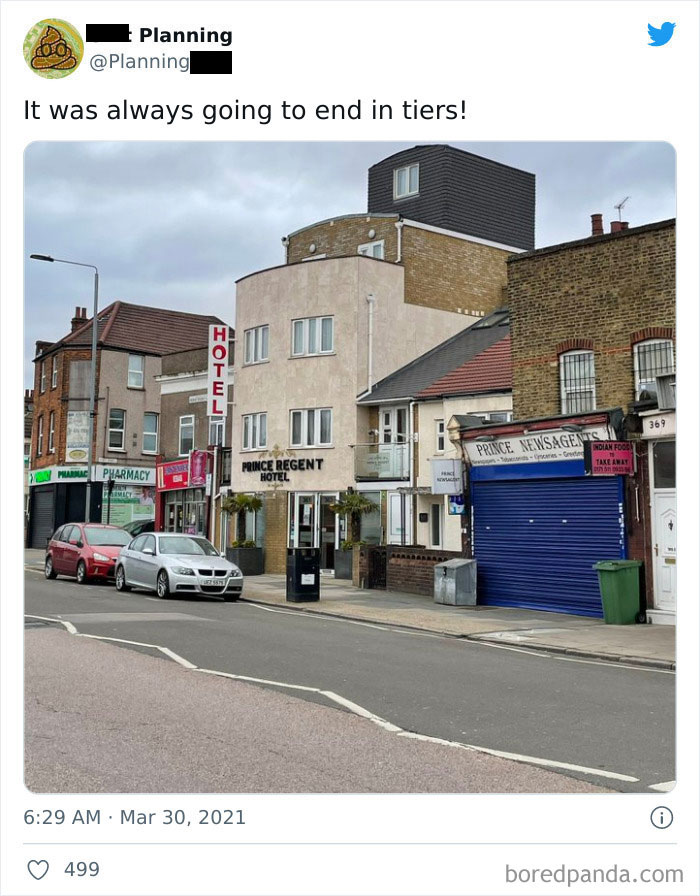
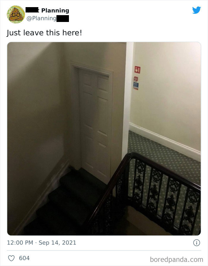
=.= Hello again this picture. This is a building that was converted into a hotel, and this door is a fire safety legal requirement for all hotels. It indicates the level of the fire exit and blocks inescapable floors. Placed there so in the event of an emergency people don't run all the way down the stairs, end up in the basement with no exit, and die horribly.
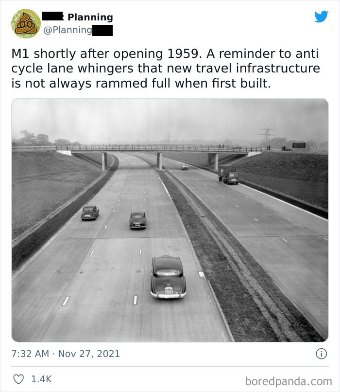
My dad was on a jury for someone who flew a small plane under one of the bridges, before the motorway actually opened. Seeing this photo makes me think that he’d have been ok, even when it did open.
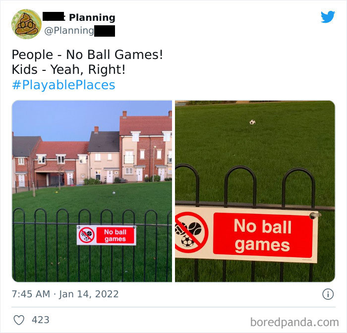
Well, no games this side of the fence, that is fine. Why would the sign apply to the other side of the fence? That’s not how signs work.
That door had a bad breakup with the one across the street and now can't even look at it anymore.
I ended up having to look at older farmhouses and cabins after this to see good architecture and style.
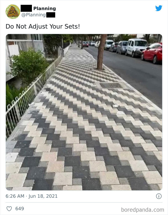
One of them actually made my eyes all wonky which made mean little nauseous.
Load More Replies...This is named inappropriately. Should say, “what happens when no one was willing to fork over money for an actual architect.”
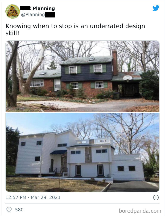
I think a better title is what happens when you hire a terrible contractor. Most of these photos are not because of the Architect - they are either a terrible contractor or people with bad taste in renovating.
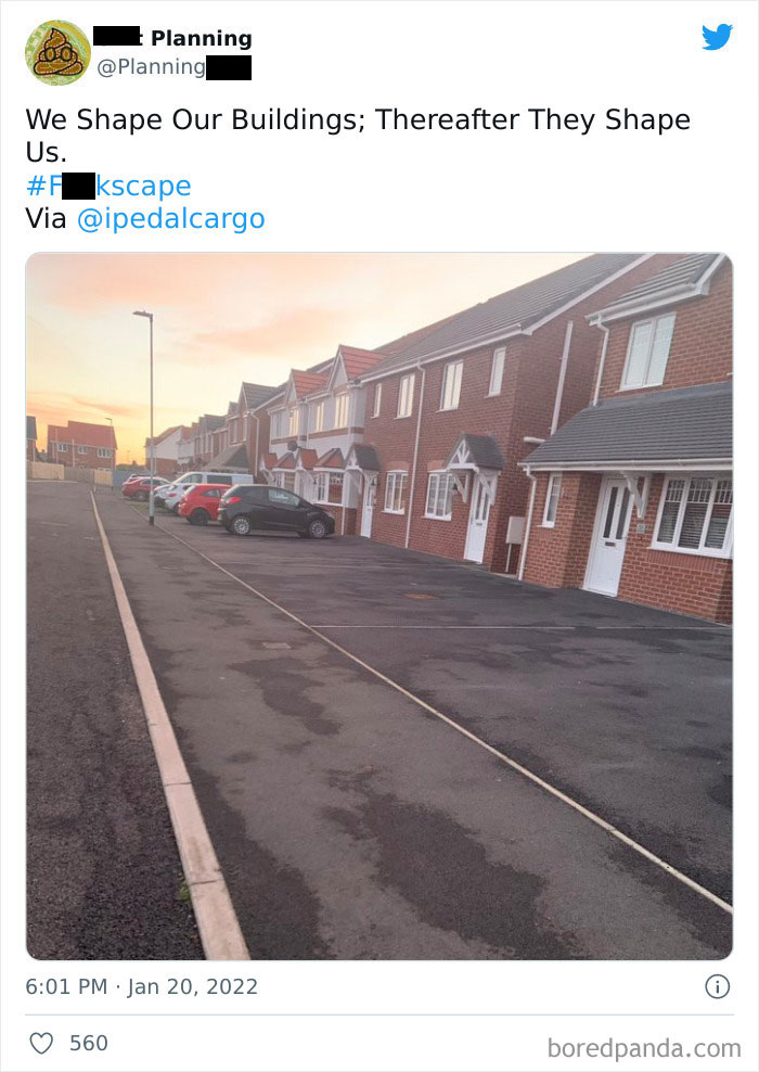
Load More Replies...I'm far more concerned with the floor plan than I am with the exterior. So many newer houses seem as thought they weren't designed to actually be lived in.
Every building project should be submitted to Prince Charles for approval, in order to avoid... All that s**t.

 Dark Mode

 No fees, cancel anytime


