Get Premium
Dark mode theme is available exclusively for premium users. Learn more about the benefits of subscribing.
No fees, cancel anytime.

 Dark Mode Ad-Free Browsing Unlimited Content
 Ad-Free Browsing Unlimited Content Dark Mode
Join 1.2 million Panda readers who get the best art, memes, and fun stories every week!
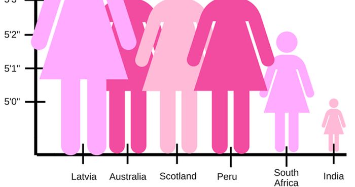
The world’s tallest man, Sultan Kösen, from Turkey, clocks in at 8 feet 3 inches, while the world’s tallest woman was Sandy Allen, towering at 7 feet 7 inches. And while there’s little arguing about the tallest and the shortest of us, getting the average height right may be slightly more difficult. Not only does it vary in every country across the globe, it can also stir some controversy.
So when someone shared a pictograph of the average female height per country, everyone on social media was left scratching their heads. You see, the graph, all painted in pink, showed symbols of ladies laid out according to their height in inches. But the proportions were so off that Indian women looked like tiny smurfs compared to Latvian giants.
And one Indian woman named Sabah Ibrahim was not buying into any of this. She tweeted the graph with a hilarious caption and sooner than you knew it, that questionable piece of data was having the roast of a lifetime. So let’s take a look at how this viral thread unfolded down below.
Image credits: reina_sabah
Bored Panda reached out to Sabah Ibrahim, an environmental scientist and photographer who tweeted this bizarre pictograph and it went viral. Her tweet got 104.7K likes and 14.5K retweets.
Sabah told us that her initial reaction when she saw the pictograph was that it was a silly example of how data is often presented in a way that dramatically distorts its true meaning. “I shared it on Twitter with what I thought was a throwaway sarcastic comment.”
She explained that the graph is misleading “because the y axis starts at 0 and jumps to 5 foot—the space between zero and 5′ is massively compressed.” Apparently, this happens a lot when data is presented to make small differences look more significant than they really are.
Sabah said that on this graph, “because whoever made it used these pink icons, it’s just more obvious what the issue is, but that’s not always the case.”
Image credits: ConnorBlades
Image credits: reina_sabah
Image credits: z3tina
The photographer added that misleading data visualization like this “is a major reason why so many people have an inaccurate or incomplete understanding of scientific research and why so many people justifiably don’t trust results presented like this.”
Meanwhile, Sabah’s reaction to her tweet going viral is mostly disbelief. “I’ve seen many much funnier things posted online that haven’t received nearly this level of attention. But I’m glad that people are engaging with it and, at a time when things are really difficult for so many people, that it’s brightening people’s day a bit when they see it.”
She believes that the fact that her tweet has been shared so widely may help people spot misleading data visualizations next time and realize when the information they’re being shown is not what it seems to be.
Image credits: alexmegami
Image credits: moniza_hossain
Image credits: Toirtis
Although the actual author of this pictograph is not known, it’s fair to say that what they tried to convey didn’t quite work out. This is because making a pictograph can be quite challenging, especially if you want to make sure your message will reach your audience.
Data visualization specialist Gregor Aisch suggests choosing icons wisely to make sure they represent your data well. He also claims that a good pictograph needs to be arranged carefully and in a logical manner, which this example is clearly lacking.
However, the pictograph in general can be a very useful tool to make the reader understand the subject without reading the legend or the by-text. The choice of icons clearly plays the most important role here, since they function as a form of visual language that can be understood around the world by virtually anyone.
Image credits: SublightMonster
Image credits: alicemarkie
Image credits: SallyHawker12
The height of Latvian women has surely got a lot of attention thanks to the viral pictograph. But it turns out, the country is indeed the home of the tallest females. A recent study from Imperial College, London showed that Latvian women rose from 28th place in 1914 to become the tallest in the world a century later, with an average height of 169.8 cm (5 ft 6.9 in).
But it’s not only Latvia that has seen a rise in average height. A comprehensive global study looked at the average height of 18-year-old men and women in 200 countries between 1914 and 2014. The researchers observed that both men and women have grown taller over the last century in every country around the world.
James Bentham, a co-author of the study, toldThe Guardian that this global trend is likely due to improvements in nutrition, hygiene, and healthcare. “An individual’s genetics has a big influence on [their] height … but once you average over whole populations, genetics plays a less key [role].”
Interestingly, he said that “most populations would grow to roughly similar heights if they were all in the same conditions.”
Image credits: waxwingeco
Image credits: Ercoman
Image credits: jordan314
Image credits: T_MattixB
Image credits: HarleyTraister
Image credits: Tawbphleb
Image credits: bre3nergy
Image credits: The_Alien
Image credits: LymeandCoconut
Image credits: GayestTiefling
I'm 13 years old and 5'10"... I think if I stepped on the Latvian lady by accident I would kill her
And don't even mention me stepping on the INDIAN lady by accident. She would just be obliterated into nothing. Like, ashes.
Load More Replies...Cutting of the axis not at the zero point but wherever it fits for making the impression that is wanted is a common technique, frowned upon by anyone who would rather get an own, fact-based impressin. Admittedly, it is done by classical media a lot, too.
Here is an un-cut off chart. Screenshot...877714.jpg 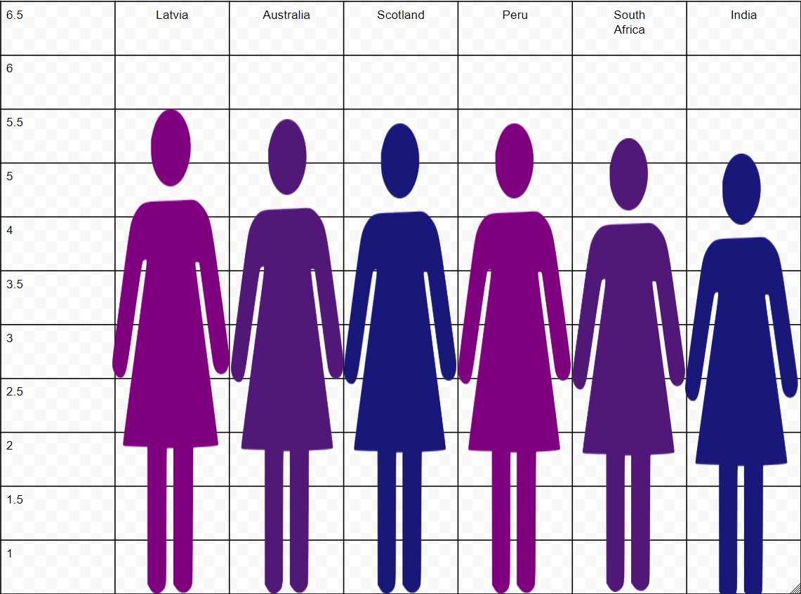
I'm 13 years old and 5'10"... I think if I stepped on the Latvian lady by accident I would kill her
And don't even mention me stepping on the INDIAN lady by accident. She would just be obliterated into nothing. Like, ashes.
Load More Replies...Cutting of the axis not at the zero point but wherever it fits for making the impression that is wanted is a common technique, frowned upon by anyone who would rather get an own, fact-based impressin. Admittedly, it is done by classical media a lot, too.
Here is an un-cut off chart. Screenshot...877714.jpg


 No fees, cancel anytime


231
54