50 Times Architects Failed So Badly, They Got Shamed In This Facebook Group (New Pics)
InterviewGood taste doesn’t grow on trees. It takes years to develop properly. Bit by bit, brick by brick. Alas, some architects start designing buildings without having all of that sorted first. Meanwhile, others experiment with the limits of good taste and accidentally end up driving the aesthetics of the entire project off the cliff. The very worst examples of architectural designs end up on the ‘That’s It, I’m Architecture Shaming’ Facebook group that gently pokes fun at Really Bad Decisions.
Scroll down for the best of the worst examples of architectural madness and remember to let us know in the comments if there are any buildings here that you’d give a presidential pardon.
Matthew Brühn, the founder of the Facebook group, was kind enough to share his thoughts about the community, the line between good and bad architectural designs, and what the future holds. He told Bored Panda that it has been "truly incredible" watching the group grow. We also got in touch with Ariane Sherine, the editor at ‘These Three Rooms.’ We had a chat about buying and redecorating properties, as well as the concept of the ‘perfect’ home and when we should compromise. Read on for both exclusive interviews.
If you still haven’t had your fill after this entire list, then we kindly invite you to check out Bored Panda’s previous feature about ‘That’s It, I’m Architecture Shaming’ right over here.
This post may include affiliate links.
Stop Calling These “Phallic-Shaped Architecture.” Save Your Breath. It’s A Buildo
Matthew, the founder of 'That's It, I'm Architecture Shaming,' shared with Bored Panda that the members of the Facebook group are eager to share their thoughts and opinions on crazy architecture. Facebook, however, has interpreted some comments left by members of the group to be serious rather than, obviously, the jokes they were meant to be.
"We got in trouble with Facebook for promoting what they saw as 'violence' which in reality was hundreds of sly, truly harmless comments saying, 'Burn it down!', 'Light it on fire!' every single day. They even started dinging us for swear words. So our team’s response was to go full 'Good Place' and auto-block any swear words and any words pertaining to fire! It’s been great so far and has really boosted creativity in the comments," Matthew explained the situation to us.
"Some people can still be mean in the comment sections, as will happen with so many people, but very rarely anymore do we have to break up fights. We get anywhere from 200 to 600 posts submitted each day now as well, and it takes our awesome moderator Carol, who has generally taken charge of post approval, a good week to get through the lineup. Laura, my amazing co-admin, and I have even added a few moderators to help out with general housekeeping and moderation. Between the 7 of us, we now have folks from Hawaii, Canada, Colorado, Massachusetts, Vermont, and of course Portland, Oregon, where I started the group right before Covid hit," the founder praised his team.
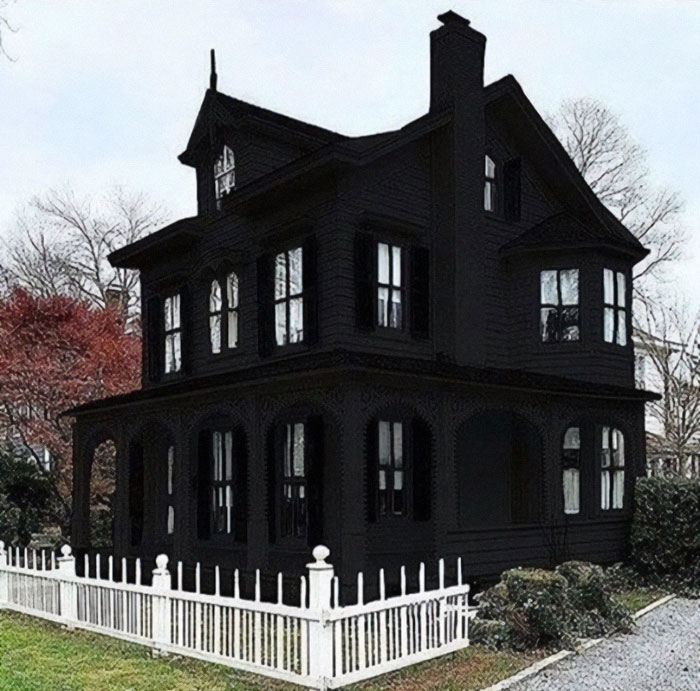
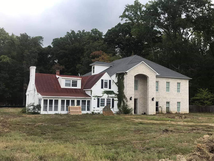
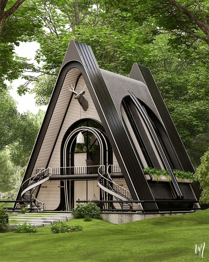
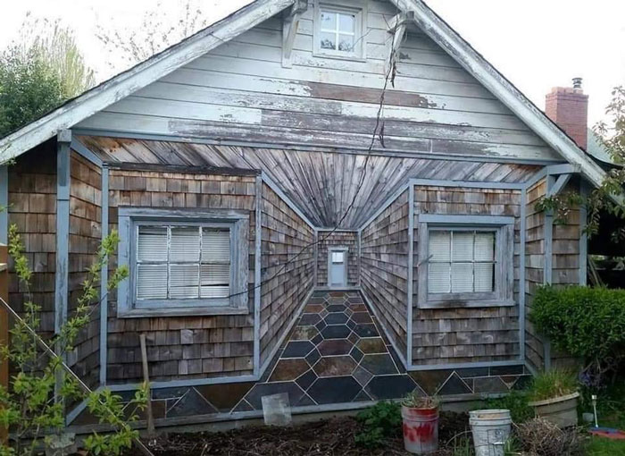
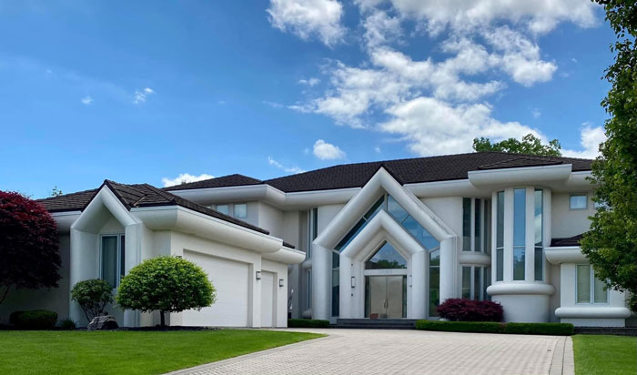
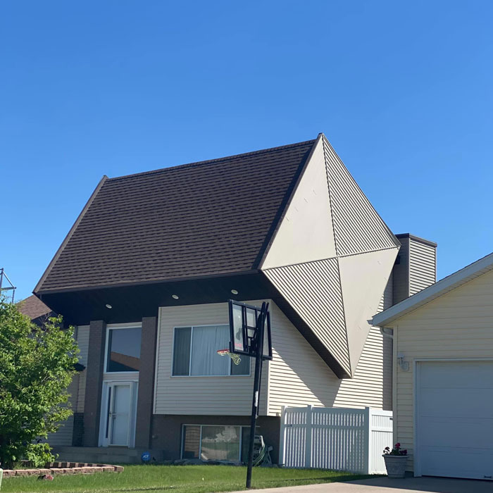
I Found It! The House I Always Drew As A Kid. I Knew It Existed
The White Picket Fence Kinda Throws Me Off...
Honestly I think it's kinda cool, the way the black and white contrast. It would be even cooler if the inside of the house was decorated in a rainbow scheme
Though the group's membership seems to have plateaued (for now!), their engagement has skyrocketed. "It’s not uncommon to see a post get 1,000 reactions every hour now! I think, overall, we’ve really created a place where people can feel safe and welcome to have all the wholesome opinions and discussions they want. That’s exactly what I’ve aimed for since Day One," Matthew shared with Bored Panda his sense of pride in the entire project and the brilliant community.
In the founder's opinion, the line between good and bad architectural design is "a thick one, one that is constantly moving and shifting depending on the specific style, the location, and the viewer’s specific tastes." There's a lot of subjectivity in play here.
"Part of why I love this group is that someone could post the most beautiful building in the world and someone will hate it, or someone could post the ugliest conglomeration imaginable and someone will fall in love with it. Personally, I love balance. May that be symmetrical, asymmetrical, or something in between," he said.
"When I see a remodel or addition I prefer the design to either be flawlessly cohesive in both material and overall aesthetic and mass, or enunciated to the point where it almost appears separate. Having just started my first design job at a local firm, I try to follow balanced proportions and massing the way I see them, often using the Rule of Thirds. I also used this when I remodeled my own house," Matthew told us.
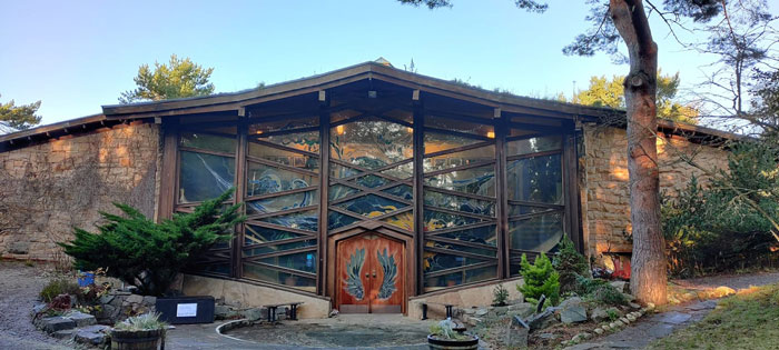
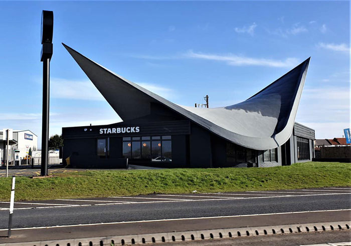
I Could Never Shame This, I Just Wanted To Share My Local Community Hall/Coffee Shop/Theatre (Findhorn, Scotland)
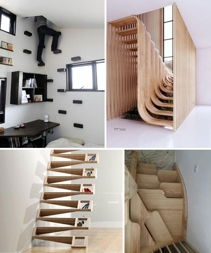
Sir, Show Me Stairs Designed By Architects Who Hate Drunks
According to Matthew, the Facebook group has taken off because of one main reason—kindness. "We all share a love for art and architecture, but the uniting factor between our members, who come from 99 different countries, is that we all treat each other and our differing opinions with kindness and respect."
He continued: "Politics has for the most part never been allowed in the group, which has also really united this group globally. I would love to see the group hit 1,000,000 members, but I’ll still be satisfied if it doesn’t. I hope that we get back on Facebook’s good side, so we can once again let loose and have the most fun we can. After over two years of running this wonderful space with a small group of people who are now my friends, I also really hope to meet some more moderators in person!"
Matthew revealed to us that his moderator, Carol, is moving to Oregon, where the two of them have recently started designing her family's dream home. "I plan on doing a cross-continental road trip at some point too to meet some of my other TIIAS friends. Overall, I hope the group maintains the kind, friendly, and opinionated banter that we’ve all come to form and love as a collective," the founder shared his hopes for the future. And it looks like it'll be bright.
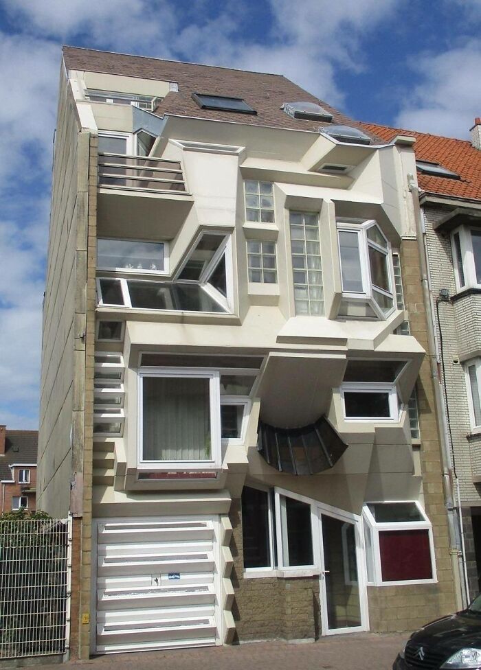
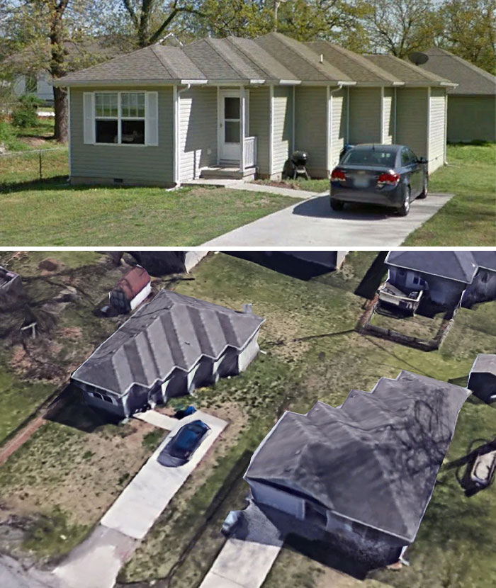
I Can Finally Contribute. Two Houses Got Married
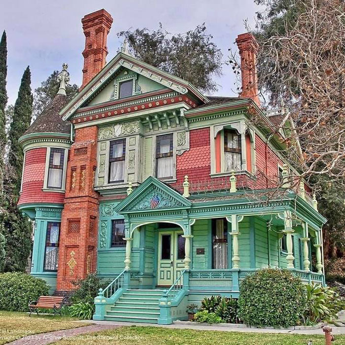
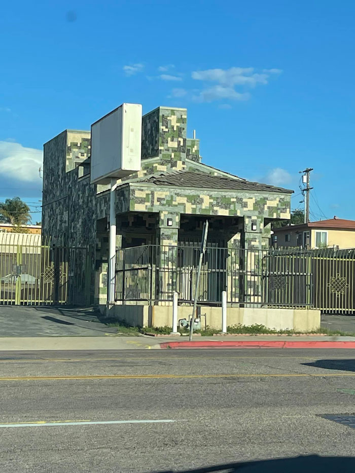
Of Course This Is In Los Angeles. Of Course It Is
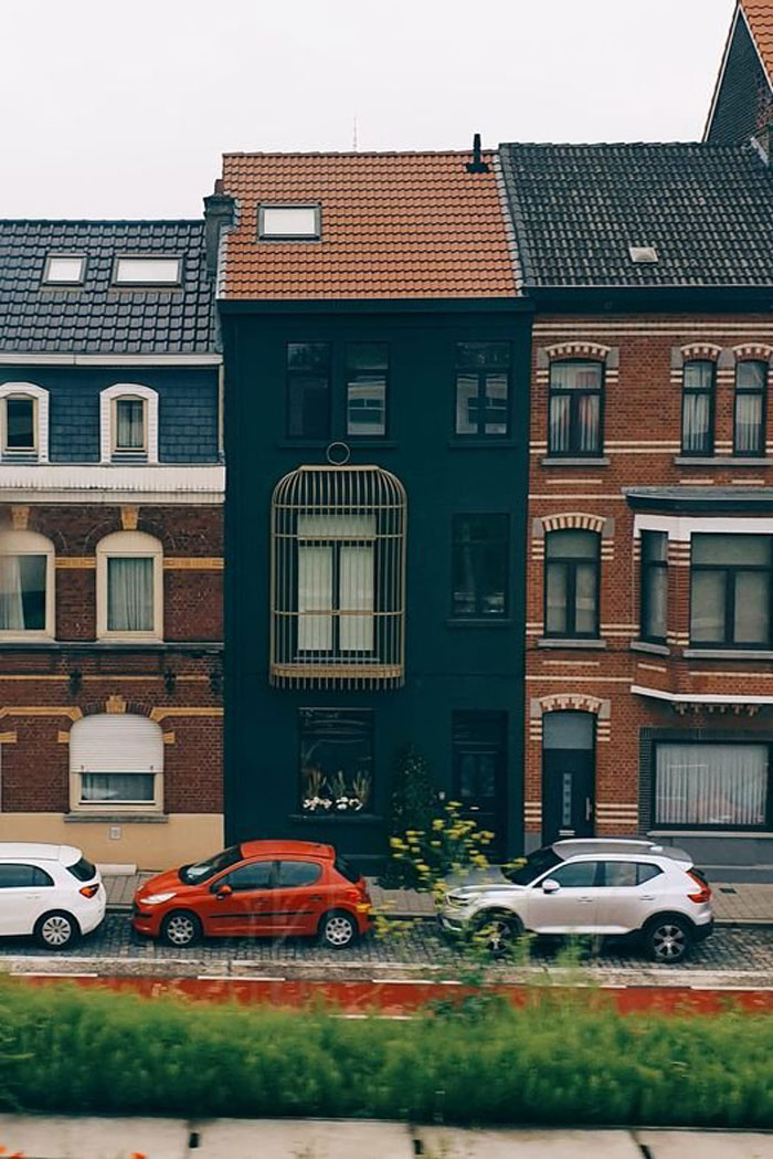
Spotted From The Train! This Is A House In Ghent, Belgium. The Cage Was Clearly Inspired By The Surrealist Painter René Magritte
The ‘That’s It, I’m Architecture Shaming’ Facebook group has seen explosive growth. Just over a year ago, it had 64.1k members. Now, it has 10 times that, clocking in at an impressive 644.8k members. It just goes to show that founder Matthew’s vision has been a complete success. And the content that’s shared resonates with a ton of people around the globe.
However, just because a house doesn’t look great and elicits a ‘yuck!’ reaction doesn’t mean that it’s alright to leave over-the-top comments beneath the photos. The Facebook group has been having some trouble with that.
Specifically, the main issue for the Facebook group is that the social network flags comments that obviously aren’t threatening but might be deemed to be. Saying ‘burn it down’ about a house isn’t helpful. So much so that the team running the group had to implement super strict protocols regarding comments. (It also says a lot about Facebook’s ability to sense humor, too.) In short, the comments have to be super polite and no swearwords are allowed for the time being. The entire future of the group depends on this.
Ariane, the editor at ‘These Three Rooms,’ told Bored Panda that there’s really no accepted definition of what a ‘perfect’ home is. The only thing that you can aim for is a perfect home for you.
Never Piss Off Your Architect
Modern A-Frame Cabin In Bedford Hills, NY
Personally, I Think This Building Is A Work Of Art
It's in the uptown part of Grand Rapids, MI, known as Eastown, which was once a big hippie haven and stomping ground for many interesting and creative transient folks.
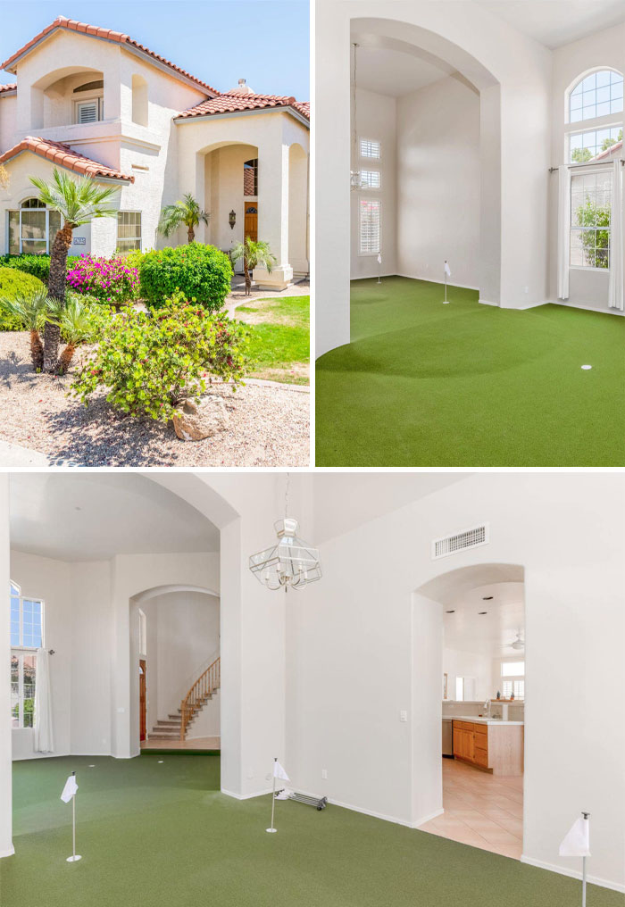
So if you happen to spot a house in this list that you personally love, that’s awesome; ignore all the haters. Who needs friends when you can live in a house that looks like a boat or has a golf course inside? Societal approval is overrated anyway.
“That said, a home which functions perfectly in terms of everything working correctly and has a beautiful design aesthetic is the dream,” she said that there has to be a good mix of functionality and a gorgeous look. When you have both, you can’t help but feel happy.
Bored Panda was interested to find out what new homeowners can do to make their new house or apartment feel like it’s truly theirs if they happen to have bought a property with an atrocious interior.
Here’s what Ariane had to say about redecorating: “Strip any hideous wallpaper, take up any awful carpet, and start over. I'm a fan of neutral decor with white or cream walls and oak flooring, but that's not everyone's thing.”
She continued: “Create a mood board featuring decor you like. Choose four colors maximum per room, stick them on the board and see if they all go together. Everyone has their own unique sense of style; the important thing is that you love your home's interior. Don't worry about what anyone else thinks.” In other words, don’t compromise your own sense of taste just to please others.
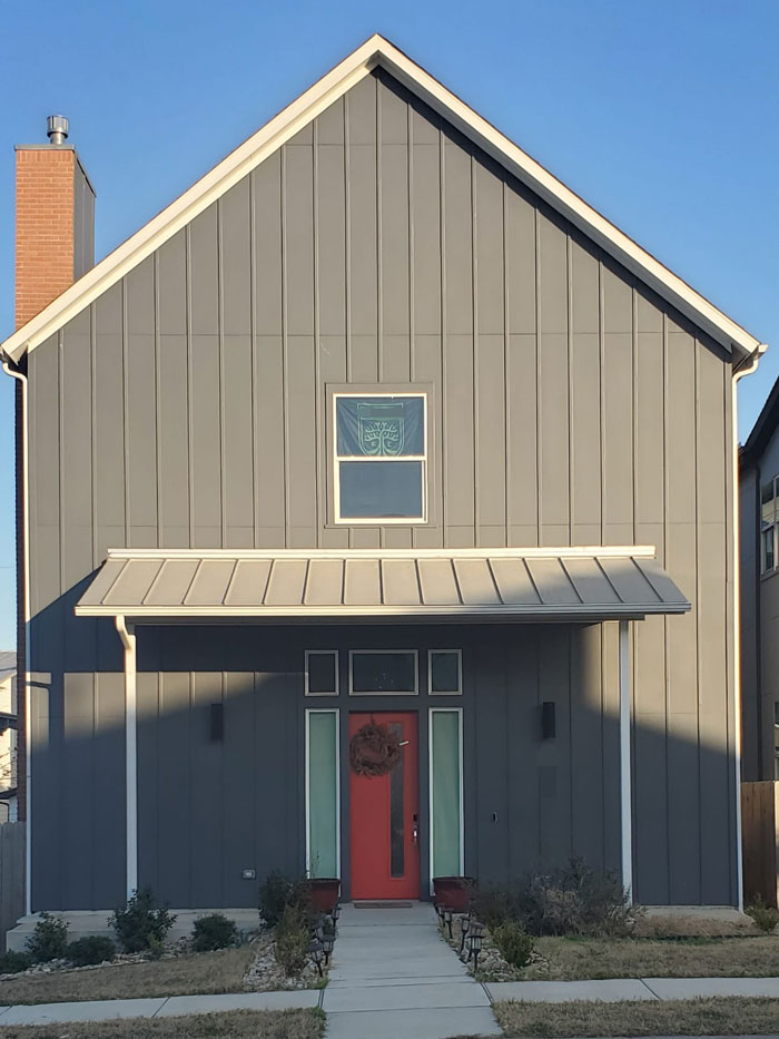
Personally I Like The Way It Looks But Feel It Belongs In This Group
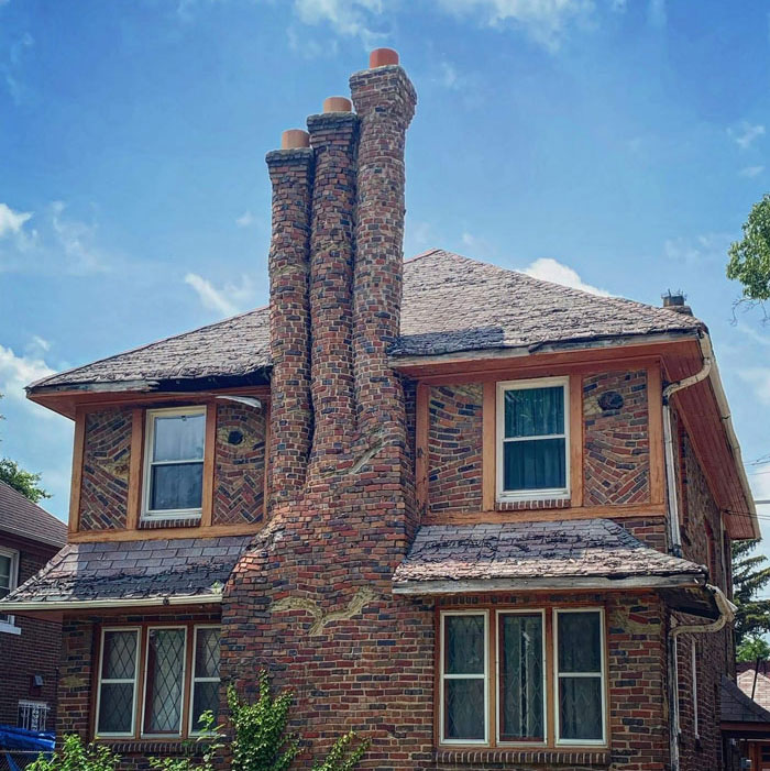
Crooked Home In Detroit
I Just Couldn’t Resist This When I Saw It On My Friends Newsfeed Yesterday- Australia
With property and rent prices in a confusing place right now, we were curious as to what potential homeowners might do if they want to find a decent place to live in without breaking the bank.
“If you're struggling to find somewhere within your budget, it may be worth looking at Help to Buy schemes if you're a first-time buyer, and shared ownership schemes if not. Alternatively, explore downsizing, or look in different locations,” Ariane, from ‘These Three Rooms,’ explained to Bored Panda.
Looks Like Something From The Multiverse Of Madness
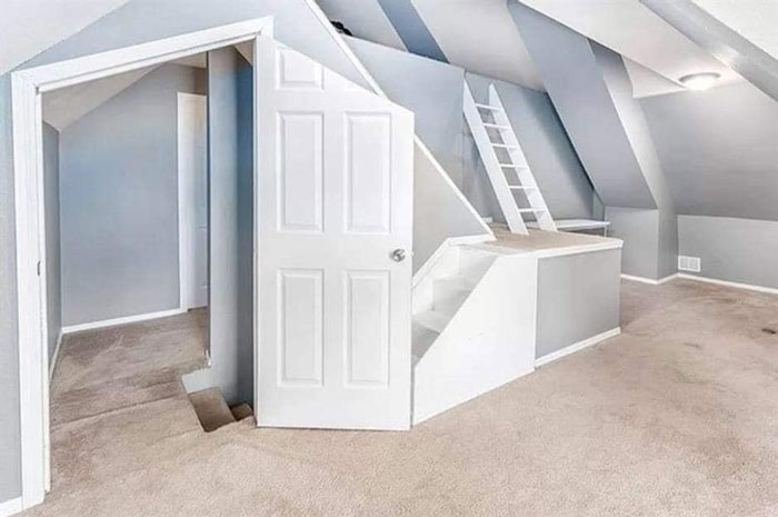
Idk What The House Looks Like, But This Room Makes Me Hyperventilate
Mike, I Take Your Tea Pot Gas Station And I Raise You A "Last Remaining Shell Station"
I grew up a couple miles from this old Shell Gas Station. It is the only one of it's kind left. I'm 67 so that's around how old it is.
“The further you are from a city, the cheaper property usually is. Though any savings may be obliterated by the cost of commuting to work and traveling generally, so do factor that in,” she warned.
She also shared her own experiences with moving from property to property. “There are often compromises to be had. For instance, I moved from a tiny flat in expensive and pretty North London to a three-bedroom house in much-cheaper East London. The area isn't as nice and the exterior of the house isn't as impressive, but now I have over twice as much space and a garden,” said Ariane.
I Mean, I Kind Of Like It...
Truly A Wonder Of The World
Wot In Tarnation
“Only you know what compromises you're willing to make, but it really is worth getting on the property ladder as early in life as possible. Though I appreciate that can often be extremely difficult.” If you’re planning on moving in the near future, you might want to take a peek at Ariane’s advice guide about that right over here.
Someone Recently Posted The National Fisheries Development Board Building In Hyderabad, India
welp, i think i found the artist's rendering of what it was originally intended to look like...and while originally i thought it was odd but kinda cool, now i find it shameful, because it could have (and apparently, should have) looked like this.
(rendering on top, actual on bottom.)
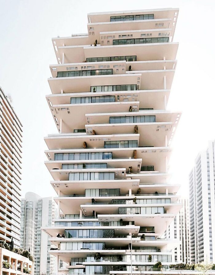
Beirut, Lebanon... Feeling Dizzy! This Is A Post Appreciating Interesting Architecture
They're Real Houses, 1,100 Square Feet. Encinitas, Ca
A Sweden-based urban planning expert previously told Bored Panda that aesthetic standards can be far more fluid for buildings, so long as all the safety and accessibility standards are maintained. There’s a lot more freedom when we’re talking about privately owned buildings compared to public spaces.
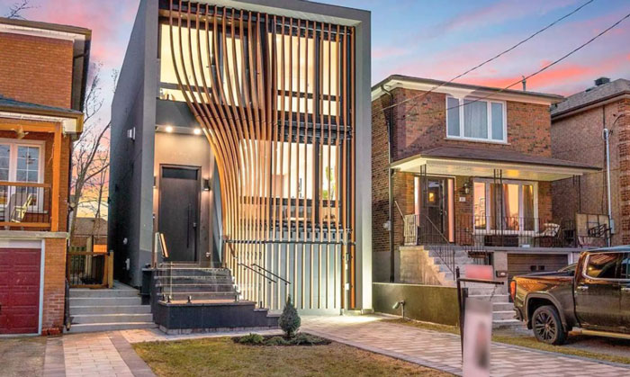
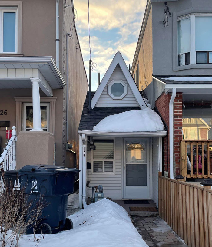
Located In Toronto's East End
South Bass Island, Ohio. A Seamless Addition That Blended In Perfectly With The Original Structure
Why? Just Why?
“Most of the time, the elements of the built environment should be in harmony amidst each other and with the surroundings. However, sometimes, something bolder and out-of-the-box might form an engaging contrast,” she told us.
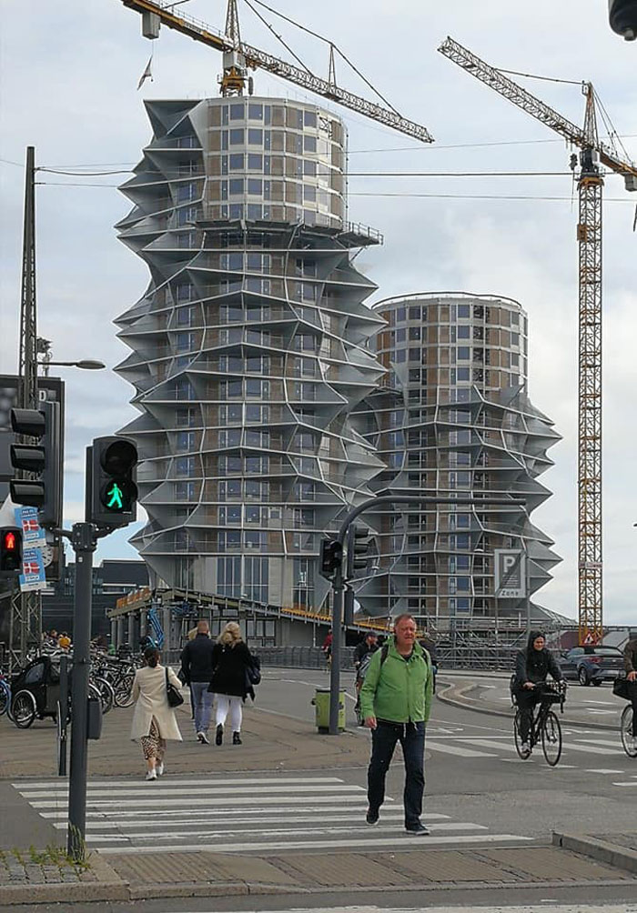
I Think I Found A Glitch In The Matrix
Directly From A Science Fiction Movie
I like it. Perfect fortress for Introverts. Just needs a pair of visitor extermination turrets at the front gate.
Somewhere In Greece (Thessaloniki) After Acropolis... This Masterpiece
According to the expert, built environments should engage, stimulate, and challenge our minds and senses.
“There are circumstances where the architecture should create a sense of calmness and safety, yet there are instances in which it is not bad if the architecture provokes us and makes us think, ‘Why don't I like the look of this building?’” she stressed that the freedom of expression is a vital part of architecture as a whole.
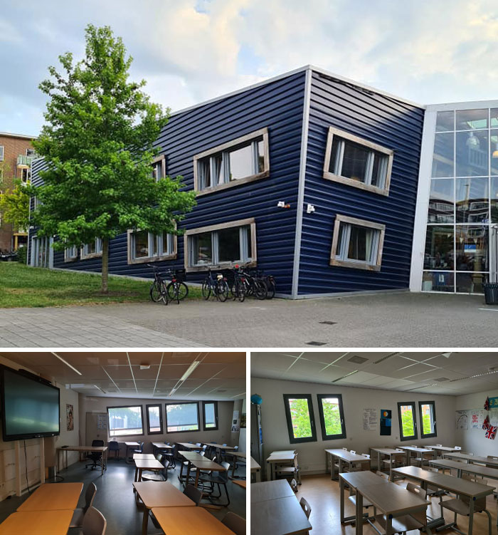
A While Ago I Posted My Kid's School And Everyone Got Seasick And Wondered About The Interior
Kid gave me a tour last week and so I present you all some crappy photos of the out- and inside of this high school (Utrecht, Netherlands).
I Am 100% Sure A Cat Designed This
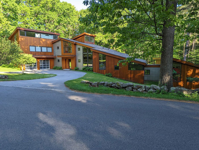
Found This In The Middle Of The Woods On A Very Rural Road. Stuck Out Because Of How Modern It Is But I Dig It
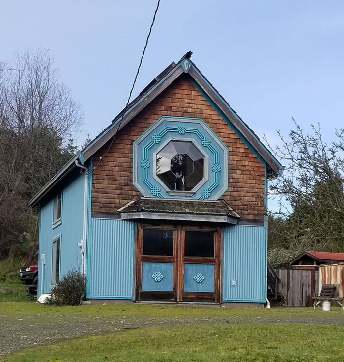
We Called This One The Eye Of Sauron
Drove By This House In My Old Neighborhood Growing Up. It’s So Bizarre, I Think I Love It
Meanwhile In North Louisiana
This one is a restaurant with a problematic history: https://en.wikipedia.org/wiki/Mammy's_Cupboard?wprov=sfti1
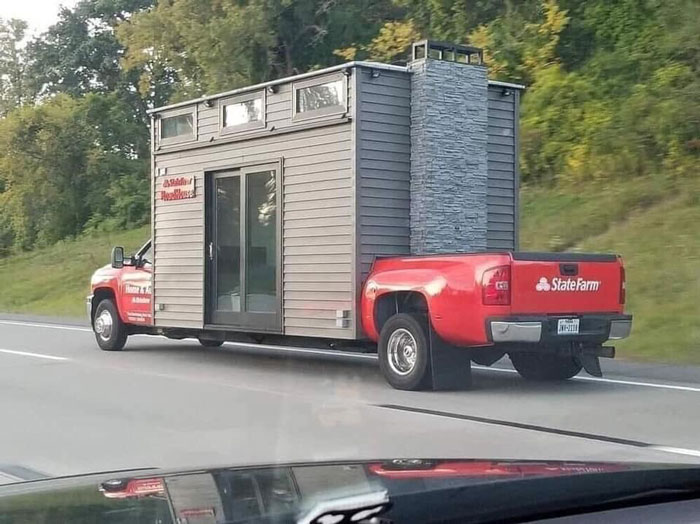
These Tiny Houses Are Getting Out Of Hand
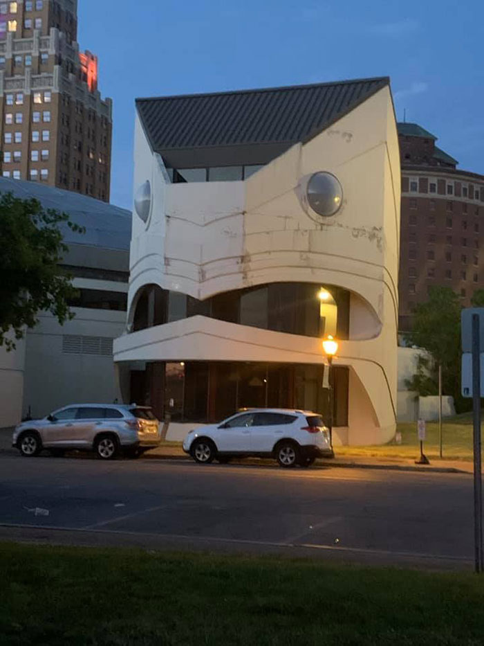
Seen In Niagara Falls, NY. It Looks Terrified
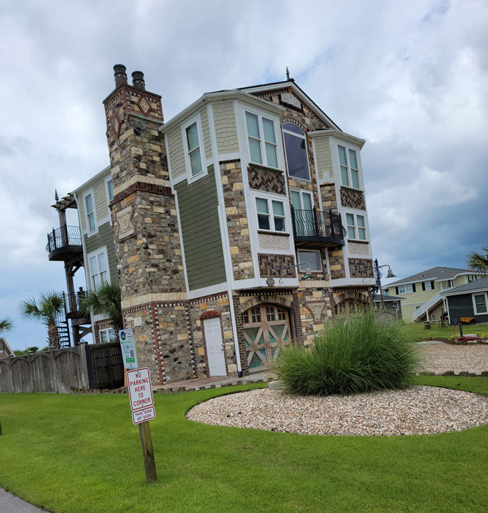
Oceanfront We Call It The Siding Sample House
Why Why Why?
This House Is Near Where I Used To Live, Clear Lake, Iowa
Coffee Pot Coffee Shop
Oi, this is in my hometown! It's a legendary bar/music venue, don't hate!
I Just Do Not Get This Design. At All. Brutalist Design Doesn’t Have To Be Like This
Rococo Architecture Chinese Tea House, Sanssouci Park Potsdam - Germany
I took LOTS of art history and architectural history classes in college. This era always confounded me because of the sheer unabashedly over the top aesthetic of the period, the architecture in particular just had no room for restraint. Incredible craftsmanship and yet the whole manages to be less than the parts.
Frederich the Great had it built in 1764.
Why Just Why?
I’ve Often Thought The Police Station In My Hometown Of Chorley Must Be The Most Atrocious Building In Britain
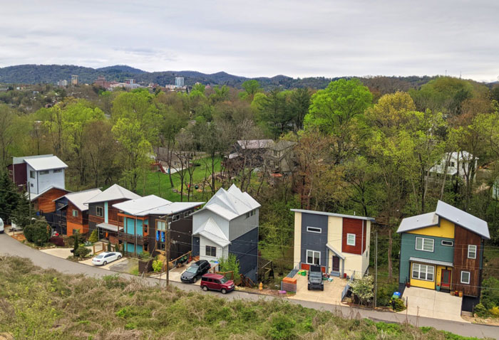
New Homes In West Asheville, Nc...
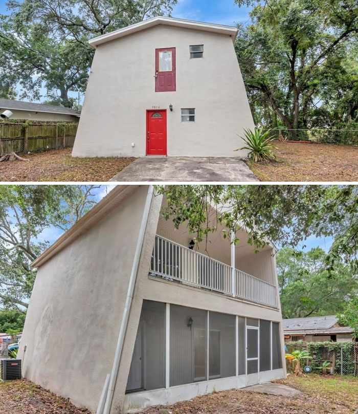
Just Browsing Zillow Listings Near Tampa
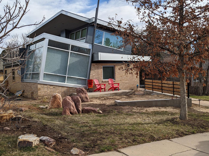
In Boulder. I'm Sure It Must Be Aligned With Something
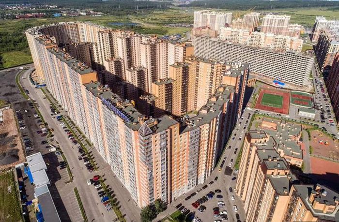
18,000 People, 1 Building. Saint Petersburg, Russia
BP really needs to do something about list names not matching the content. This one is quirky architecture, not necessarily shameful architecture.
I'll take a house with character over these giant, identical looking mcmansions and acres upon acres of beige townhomes that are being built in my area. (suburbs outside Allentown, PA)

 Dark Mode
  No fees, cancel anytime


