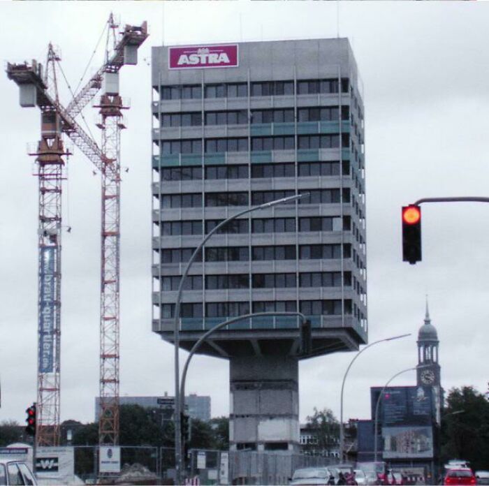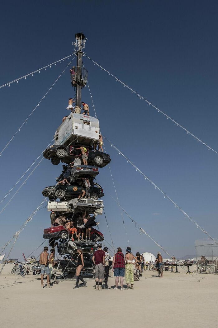
“Unsafe For Morons But Safe For Everyone Else”: 40 Examples Of Architecture And Design That Don’t Prioritize Safety
Architecture and design are fascinating topics. There’s a seemingly never-ending discussion about the right balance between function and form, and we’ve recently written about the importance of ordinary beauty, as well as the disturbing trend of design homogenization. So naturally, we believe that aesthetics and artistic expression are definitely worth protecting. Here’s the issue though: should aesthetics trump safety?
To help you ponder this question, we’re featuring some of the very best posts from the r/ArchitectureForAdults subreddit (and a select few from elsewhere). It’s a niche online community that has a very unique perspective on the world. The members share photos and videos of truly gorgeous architectural and engineering designs that flirt with the line between safe and unsafe.
Scroll down and upvote your fave pics! Let us know which of these designs wowed you the most… and which scared the bejesus outta ya! If you’re anything like me and have a not-so-subtle fear of heights and falling, then you might want to hang on to your hats, Pandas. You’re about to get a big dose of vertigo. Go on ahead, I’ll be right with you, I just need to collect myself for a bit.
Bored Panda got in touch with an urban planner and designer from Sweden to get her opinion about the r/ArchitectureForAdults subreddit. She was kind enough to share her thoughts about safety and security in public spaces, as well as why the sub's tagline might not work in real life.
This post may include affiliate links.
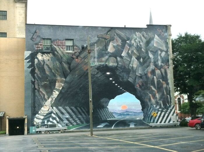
Mural On The Back Of Acme Incorporated
The Swedish urban planner and designer asked Bored Panda to remain anonymous due to the sensitive nature of her job but was otherwise happy to shed some light on the entire debate regarding safety and security. Bored Panda was interested to get her opinion as to where safety lies in the hierarchy of priorities for someone like her.
"Safety is self-evidently a top priority to an urban designer. I doubt this hierarchy is ever questioned besides the occasional self-centered architect and designer who de-prioritize safety in favor of an original design. However, if a space is to be usable and livable, at least a threshold of safety compliance has to be achieved," she told us.
At the same time, the expert noted that there may be instances where governments might decide that, unfortunately, safety 'should' be overlooked for a "more cost-effective choice."
"Each government establishes and enforces safety guidelines that the built environment must follow," the expert told us, adding that the discussion then moves on to what safety entails to different governments and societies.
Almost Pulled A Michael Scott While Delivering Groceries Today
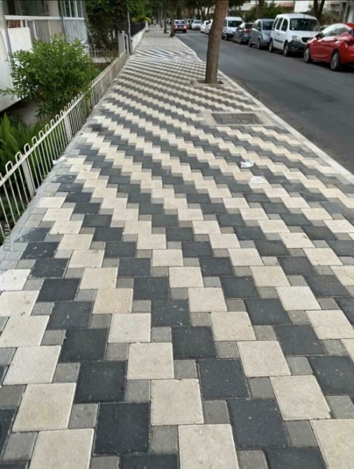
You Don‘T Need To Be Drunk Anymore
"The concept of safety and security in urban design conversations usually primarily refers to crime prevention (for example, decent night-time lighting, CCTV cameras), transportation infrastructure safety ( traffic accident prevention, walkability), or more social aspects like livability (how the environment can foster a healthier and more inclusive society)."
According to the urban planner, small-scale objects like railings on a bridge or warning signs "usually follow straightforward building regulations and do not generate much debate."
The expert stressed that the perception of whether or not something is 'safe enough' will differ from government to government and society to society.
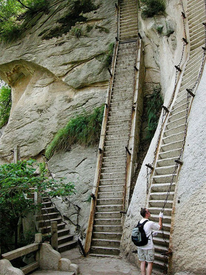
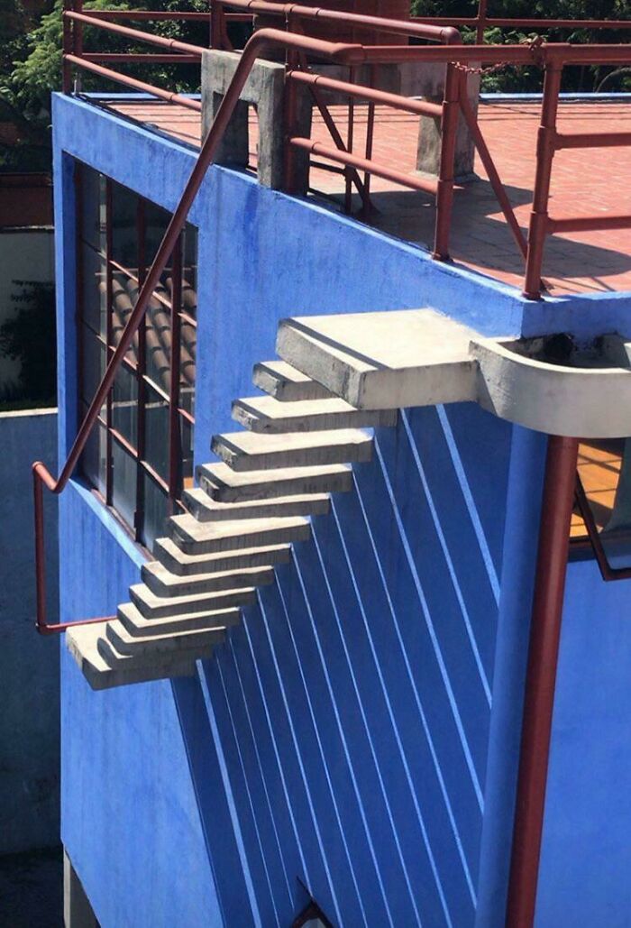
"Stairs"
Dude, i'm blind from my left eye which means i have no depth perception, which causes me vertigo, in sum, i would probably die of broken neck syndrome on these stairs....
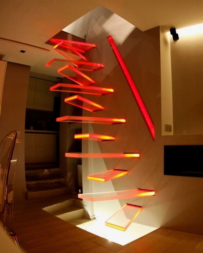
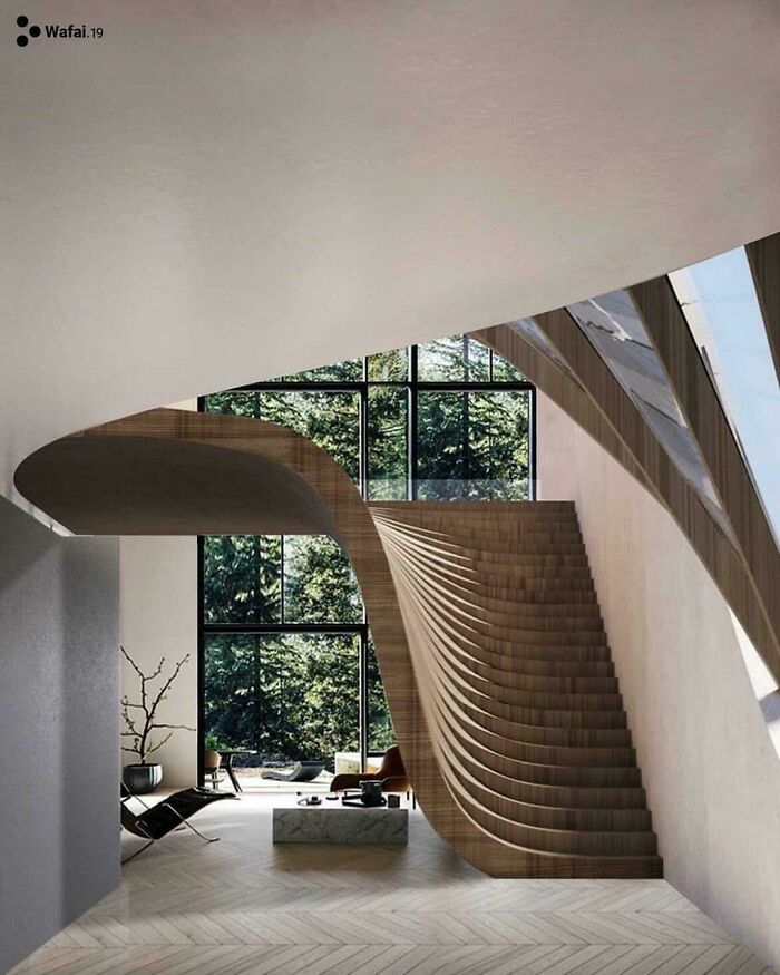
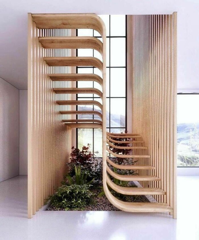
This Staircase
Forget about walking on them while drunk, I couldn't do it if I was sober.
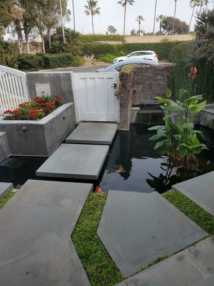
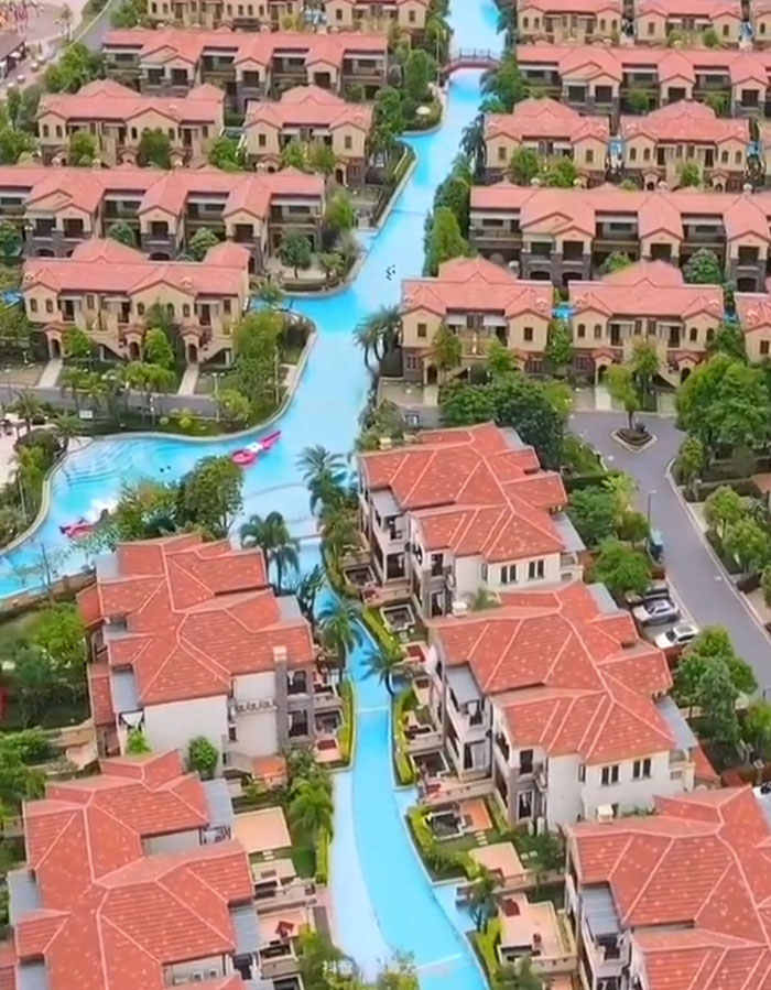
All These Houses Are Connected By A Pool
On the one hand, this is really cool. On the other, maintenance and changing water must be hell, and stupidly wasteful.
"Meanwhile, judging ethically, ‘safe enough’ cannot be achieved until there are absolutely no more traffic accidents and other types of injuries caused by the built environment. Therefore, an urban designer will always strive to achieve more safety."
The urban planner and designer also added that she sees an issue with the tagline that the r/ArchitectureForAdults subreddit uses, about how only 'morons' would feel unsafe. "Adults, too, can suffer from clumsiness. Even intelligent adults are not safe from this curse."
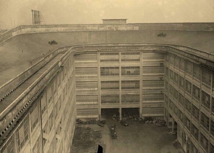
In The 20’s, Fiat Had A Test Track On Top Of Their Production Warehouse
Bruh
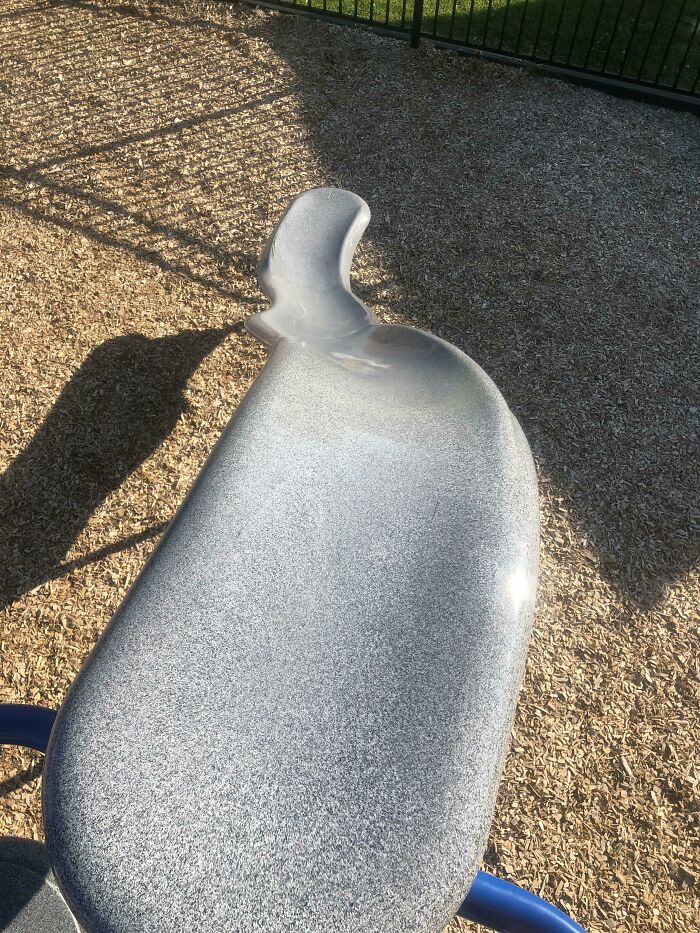
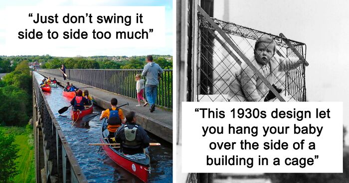
Just Don’t Swing It Side To Side Too Much
At the time of writing, r/ArchitectureForAdults had exactly 3,761 members. We hope that the community grows and expands over time because the content they share is very interesting. It’s also good mental prep for when you go traveling abroad!
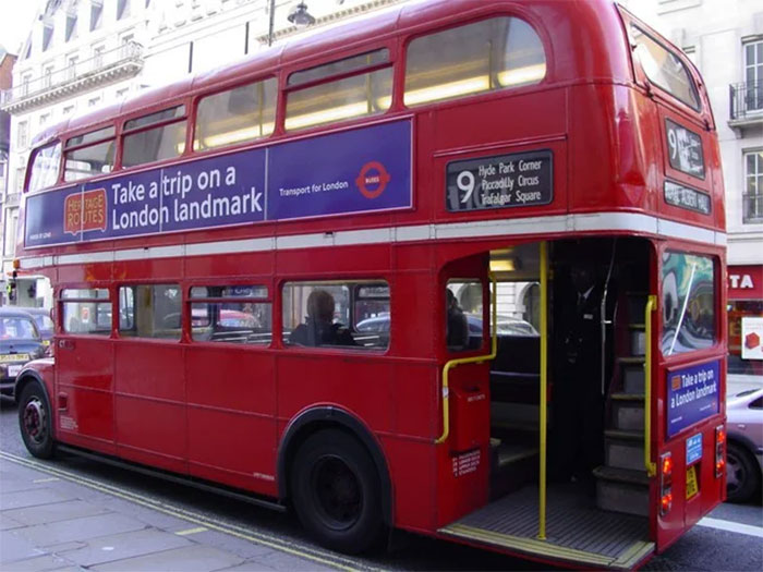
You can’t expect every single place to have the exact same safety standards that you’re used to. You have to focus and not wander about daydreaming when you’ve got tiny stone steps in front of you, railings that don’t even come up to your knees, and double-decker buses that you can just hop on by grabbing the pole.
From the perspective of r/ArchitectureForAdults, we shouldn’t have to sacrifice beauty and ingenuity for the sake of safety. The subreddit claims that all of these designs are “unsafe for morons but safe for everyone else.”
Though, personally, I feel like it’s ridiculous to have railings too low. Safety and beauty can coexist, you don’t necessarily have to sacrifice one for the other, I feel. And, to be honest, just because a design is unique doesn't automatically make it beautiful.
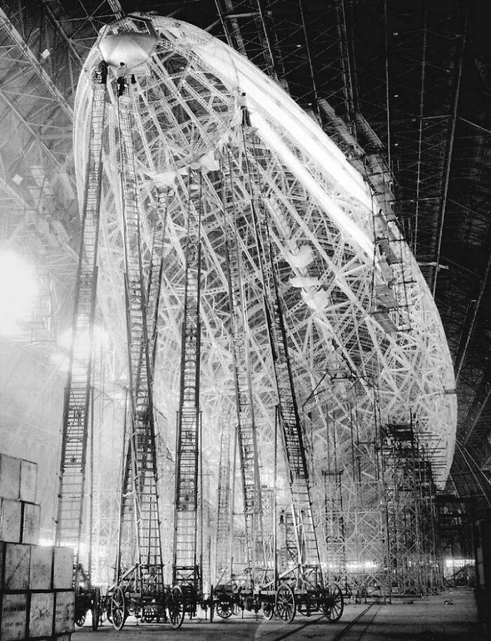
Construction Of The Hindenburg- Yes, Those Are Ladders
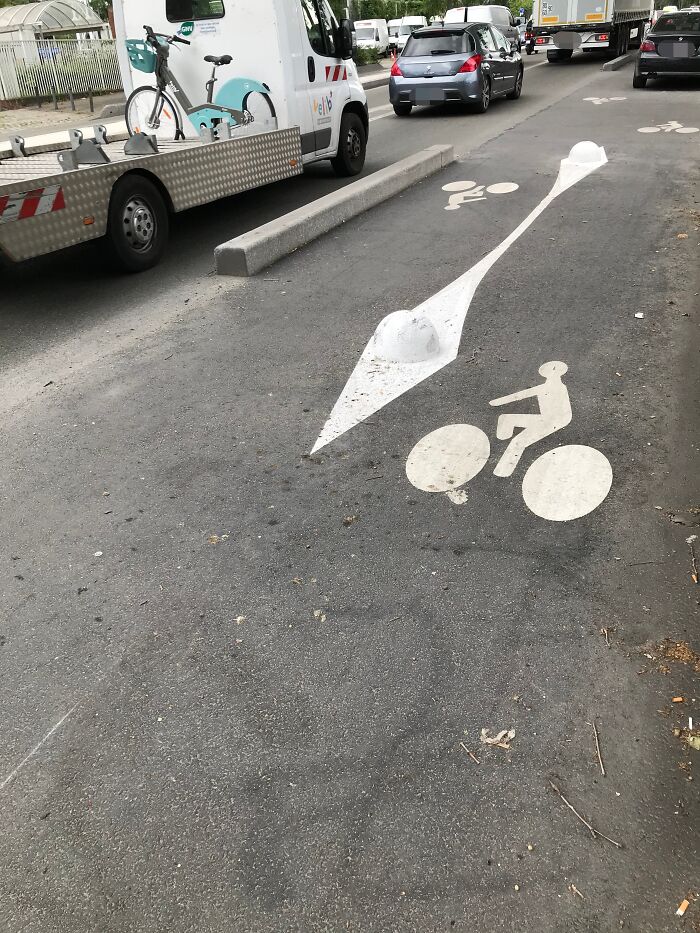
These Obstacles Are Almost Invisible On The Bike Lane
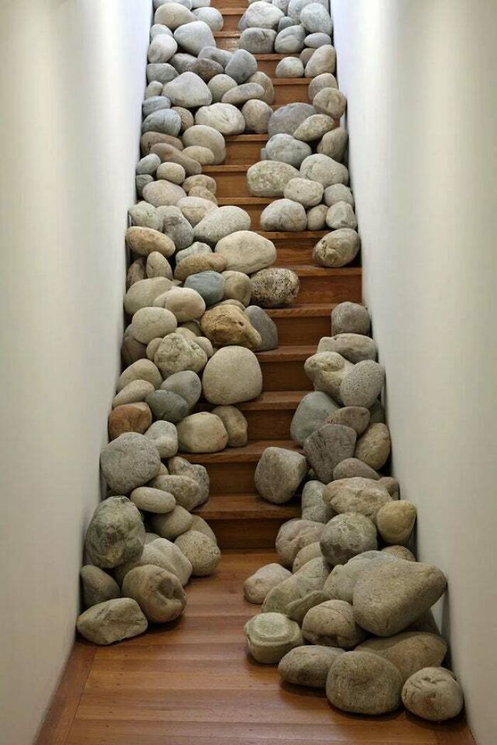
What Was Their First Idea, Stairs Made Made From Piles Of Rusty Nails?
Well this actually makes sence If you want to cover all your bases, off you fall down a flight of stairs you may brake your neck and die but its not a sure thing, but here it is, even if you don't die from a broken neck, sure as f**k you Will die from brain trauma, after hitting those boulders with your head...
Whatever your feelings towards safety, you can’t deny that there are certain minimalist trends sweeping the world. Designs are starting to look and feel homogenized. Not just in architecture and in corporate art but also in urban spaces, as well as corporate logos. Everything’s starting to feel a bit too functional, with less emphasis on the form.
Consumer psychology specialist Matt Johnson, a professor at Hult International Business School and Harvard University, very recently explained to us why we’re seeing a certain level of design homogenization, especially in terms of brand logos. He saw a few reasons for this trend that has led to fewer unique designs being used.
“The first is that as we move towards a more digital environment, there’s a need to make brand logos as legible and as easy to identify as possible. The consumer’s attention is strained even more in the online world, so logos can’t afford to be disfluent or challenging to process,” he told Bored Panda earlier.
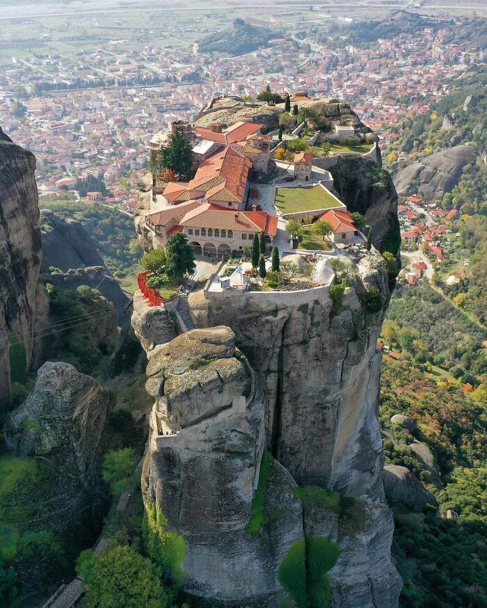
Meteora Monasteries, Greece
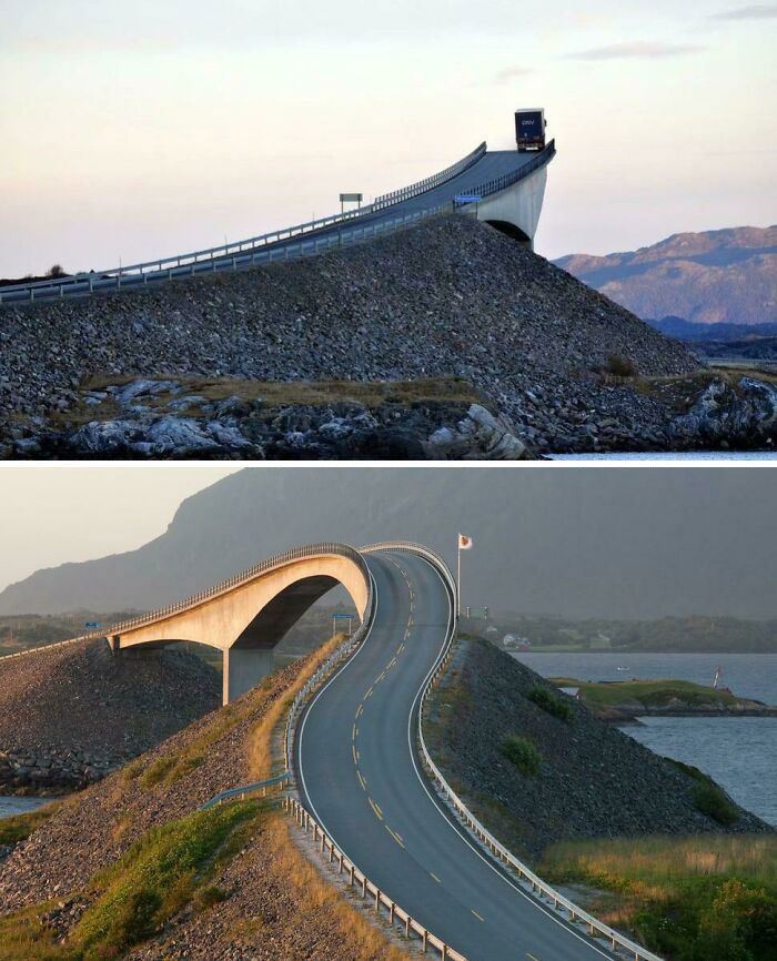
The Storseisundet Bridge In Norway
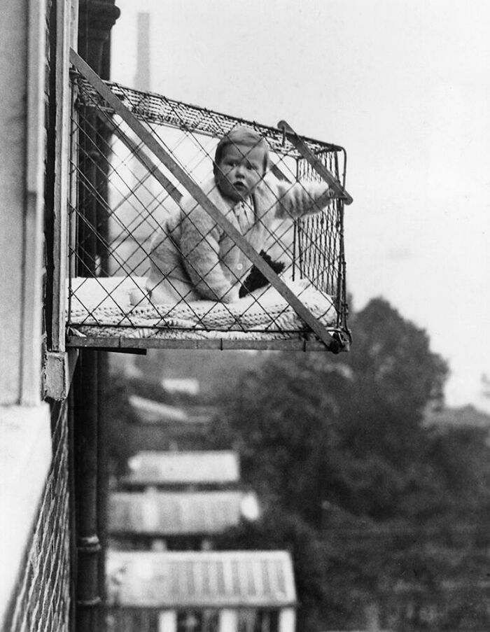
This 1930s Design Let You Hang Your Baby Over The Side Of A Building In A Cage
Fresh air,.. check. Sunshine,.. check. Pigeon droppings,.. check. Lifelong acrophobia,.. check.
“Secondly, there also may be a growing realization of the ‘fluency effect’: the relatively robust behavioral science phenomenon that the more fluent a font is written in, the more likable and trustworthy the message. As more brands become familiar with this phenomenon, they may want to test new, more fluently written logos to capitalize on this effect,” the professor told us.
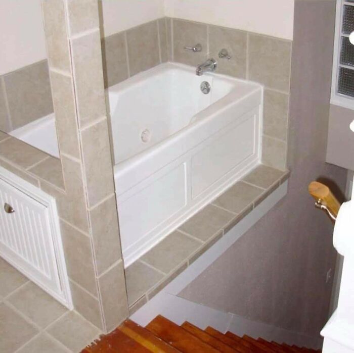
Step Out Of A Bathtub Down A Flight Of Stairs, Anyone?
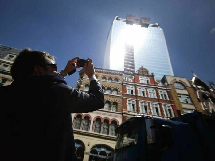
This Architect Accidentally Built A Death Ray That Melts Cars And Fries Eggs... Again
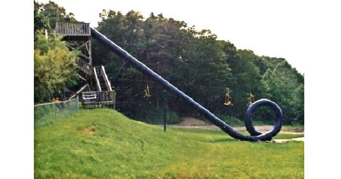
The Cannonball Loop Waterslide, A Slide So Dangerous It Was Shutdown Almost Immediately After Opening
“While this logo trend is seen across a wide array of industries, there may be only one or two within each industry that may make this change, since if everyone did, they would not be differentiating as well. There may be a broader implication of this: if companies begin to recognize that consumers, at least in digital environments, prefer more basic logo designs, brands will rush to be the first in their industry to do so to plant their flag first. While all brands want to be at the razor’s edge of consumer preferences, no brand wants to be seen as the copycat of their competitor,” Professor Johnson noted.
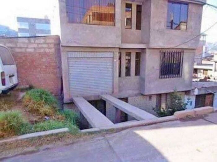
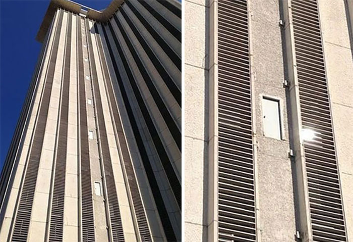
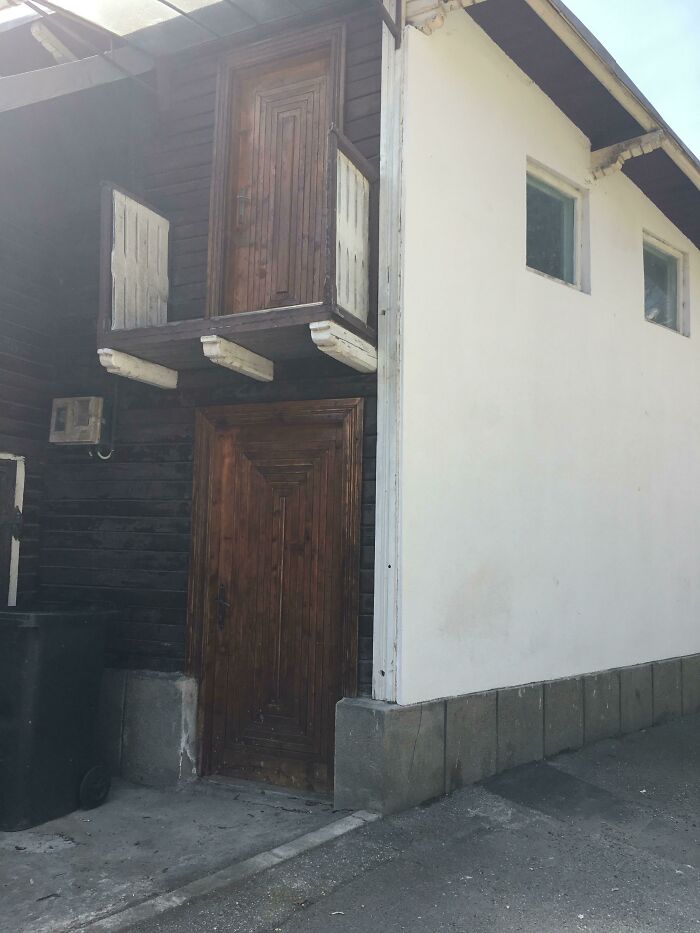
Yes, It’s A Door
Hope You Don’t Drop Anything
On The Floor Of Doctor's Office. If You Trip On It, You're In The Right Place
Ok, I own up. I love this but it would have to be on a part of the floor where no one walks.
“I imagine the general trend will persist, especially in the digital environment. If it turns out to be the case that more basic, legible logos are more suitable for online preferences, we may also move to a system where each major brand has at least two distinct brand logos: one in the digital world, and one for the physical world. This is already happening to a certain extent since many brands that have gone to a more basic font haven’t completely jettisoned their originals and retained them for specific uses,” the consumer psychology specialist said.
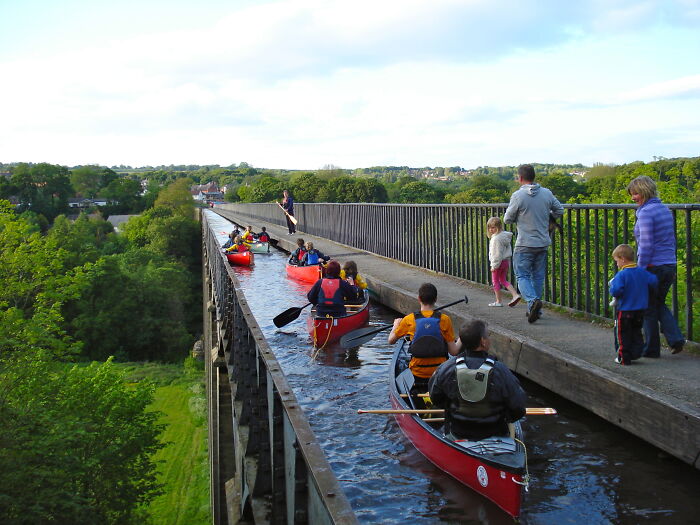
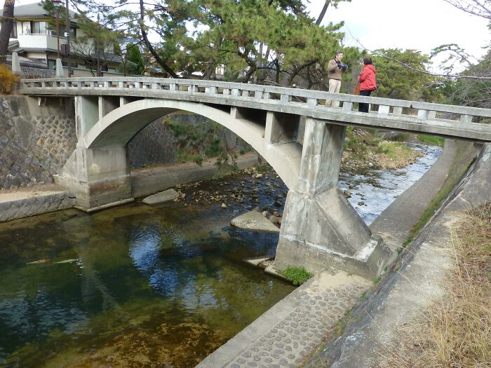
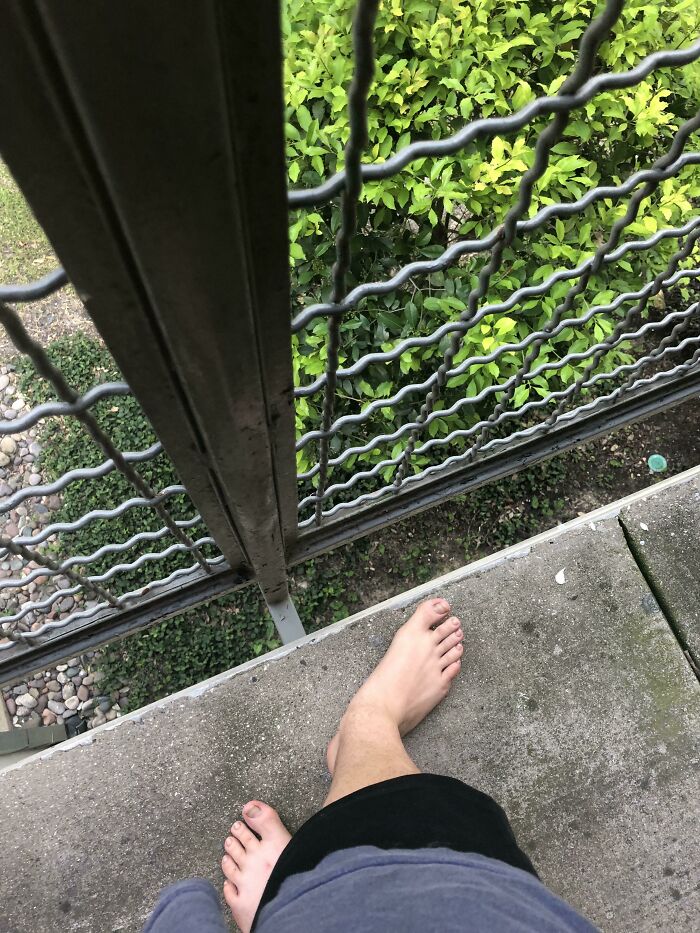
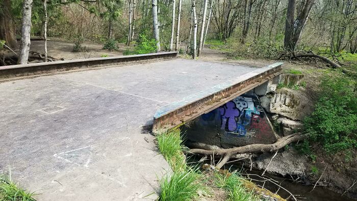
A Footbridge With Knee-High Sides
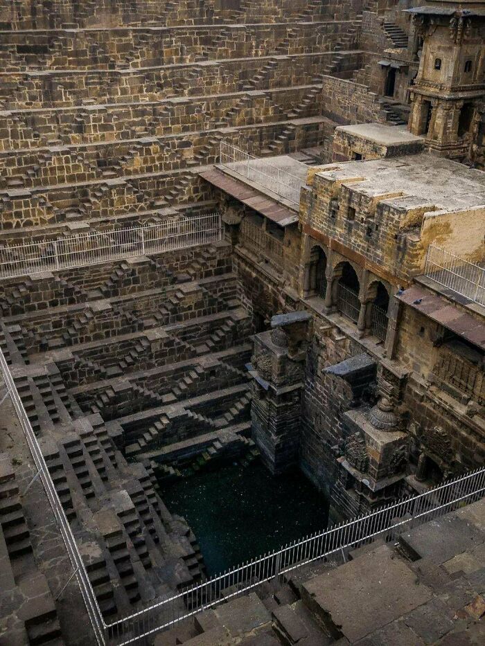
Indian Stepwells | The Construction Of Stepwells Is Mainly Utilitarian, Though They May Include Embellishments Of Architectural Significance, And Be Temple Tanks
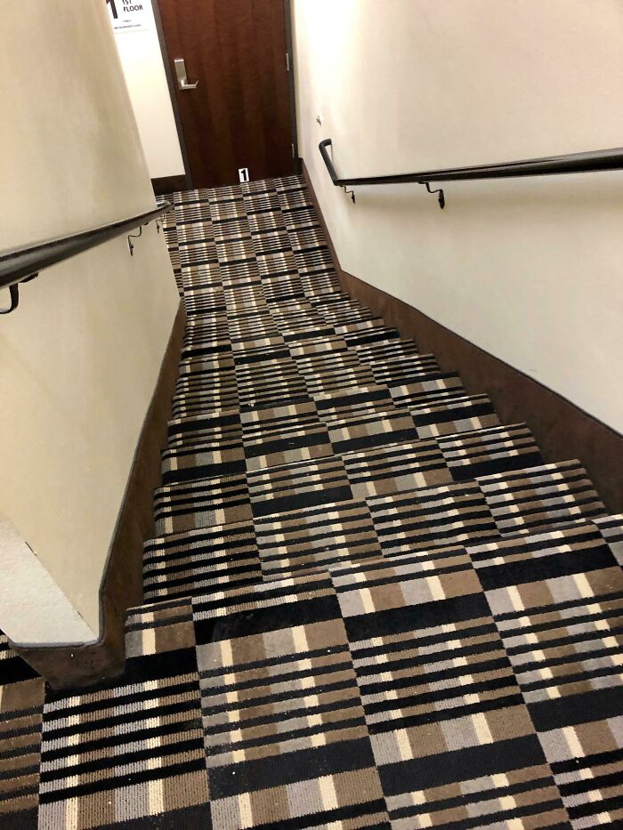
Stairwell In A Hotel I Stayed In
I will probably be gripping on to the handrail like a baby koala riding the back of a cat walking across a tightrope upside down while having fire being thrown at it while being 500.00000000000000001million metres above a pool full of dolphins and skinwalkers.
“Since branding is fundamentally about differentiation, there will be an upper limit to how much brand logos can homogenize and go together on a single dimension. It’s great to adapt to new consumer preferences, but if every brand does that in the same way, it fails to differentiate in a significant way. This is why I think there is a ‘race’ within each industry to be the first to do so, which then makes things more difficult for their competitors: should they persist in making their logo more basic, at the risk of looking like a copycat? Or should they cede that positioning and devise a way to differentiate by some other means?” he mused.
Oh No
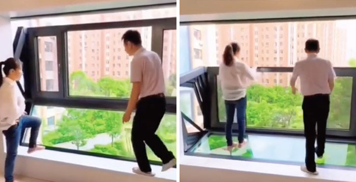
Window That Turns Into A Balcony
I Don't Even Know Where To Begin
I actually like this a lot. I would fall and die the very first time I used the stairs, but I do like the aesthetic
Looks Too Easy To Slip And Fall
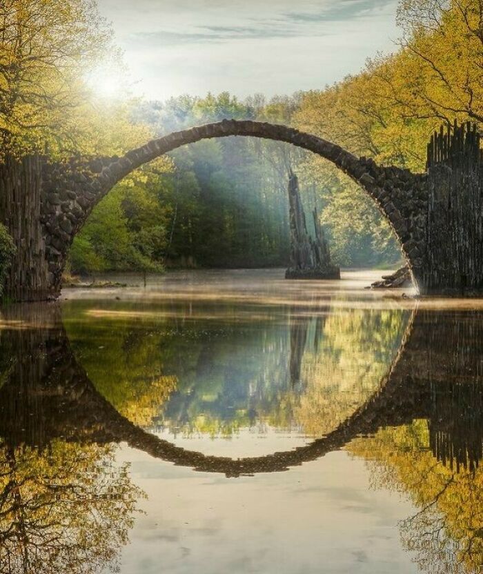
the Rakotz-Bridge was not intended to be used - stepping onto it is prohibited. It was only built to look nice as a garden architecture highlight.
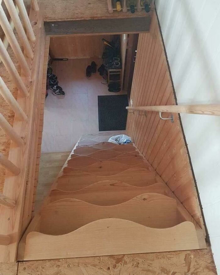
Wavy Stairs To Make Going Downstairs More Fun
The way I'd step in every wrong spot and plummet down the stairs
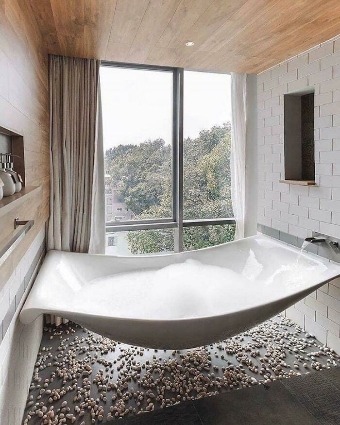
Hammock Bathtub
My big concerne would be : how to clean under it with all of the dusty Peebles ?
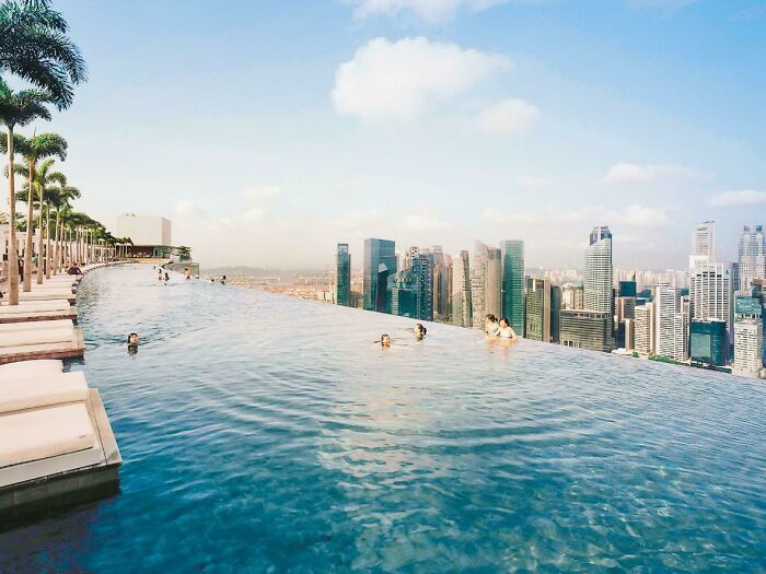
This Infinity Pool
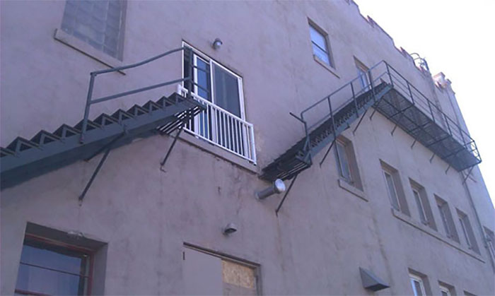
Emergency Exit Looks Like Emergency By Itself
If there's a fire or anything you just have to do some parkour! Super easy when there is impending doom! :D
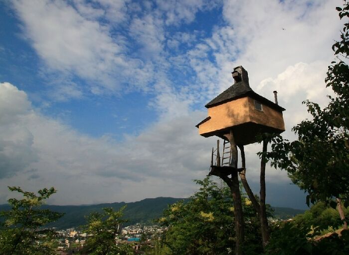
I Always Wanted A Treehouse
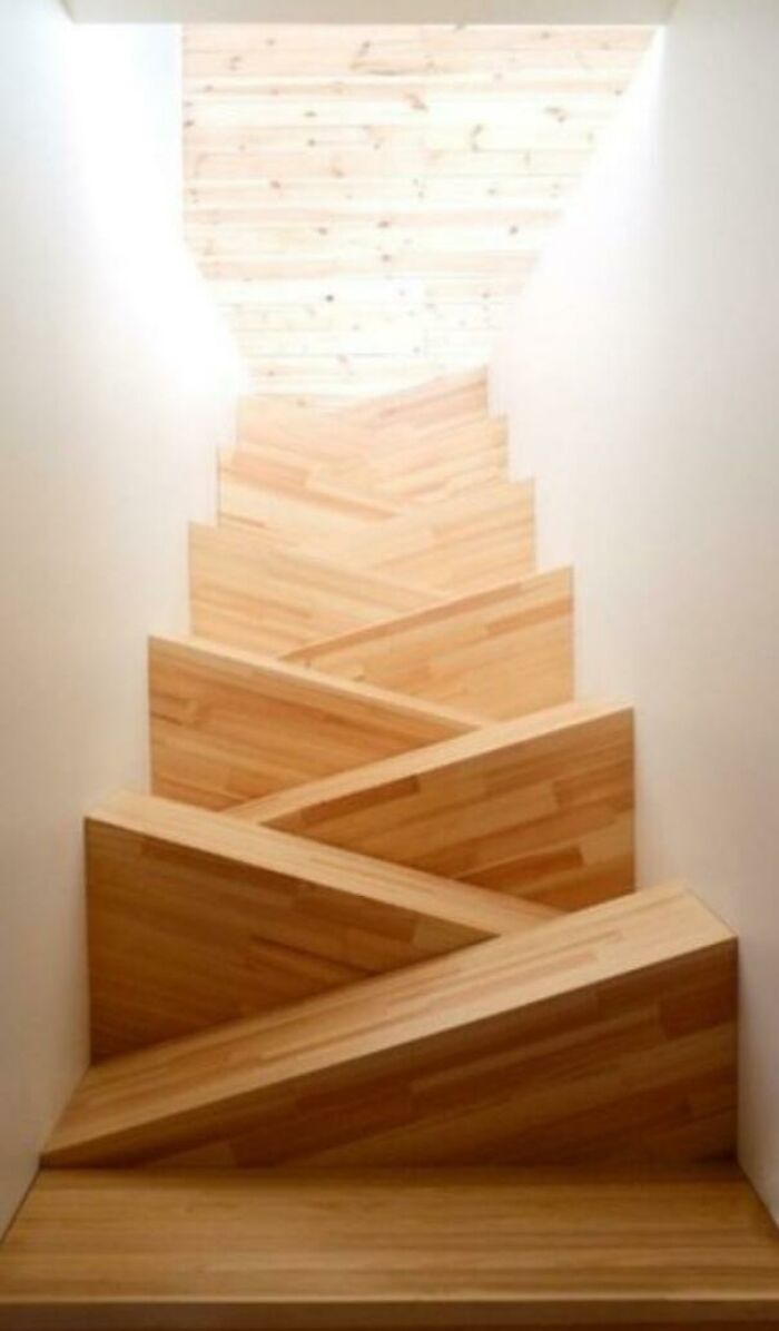
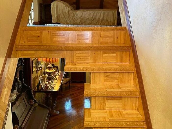
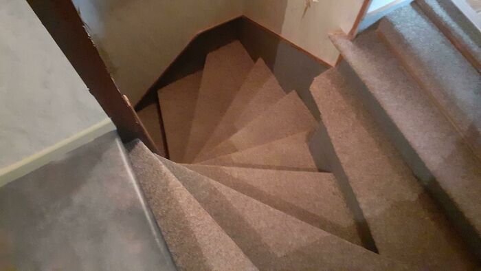
What Kind Of Stairs Is That Even????
These stairs are great. Instead of each tread using up the width of the staircase, you can fit in two steps. This is wonderful for confined spaces. It takes up about the same space as a ladder, but it's steps instead of rungs. The photograph has been taken from the top of the stairs, looking down. The steps are flat triangles. Start of with your right foot, then left on the next step down, continue until the bottom of the stairs.
Train To Machu Picchu With A Balcony
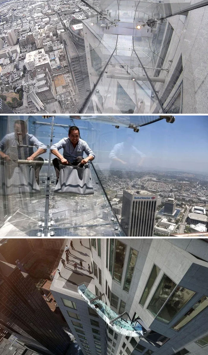
Skyslide At OUE Skyspace In Los Angeles, CA | An Outdoor Glass Slide That’s Attached To The Exterior Of The U.S. Bank Tower. The Skyslide Is 45 Feet Long, About Four Feet Wide And Made Entirely With 1.25-Inch Glass. Visitors Glide From The 70th To The 69th Floor. Now Permanently Closed
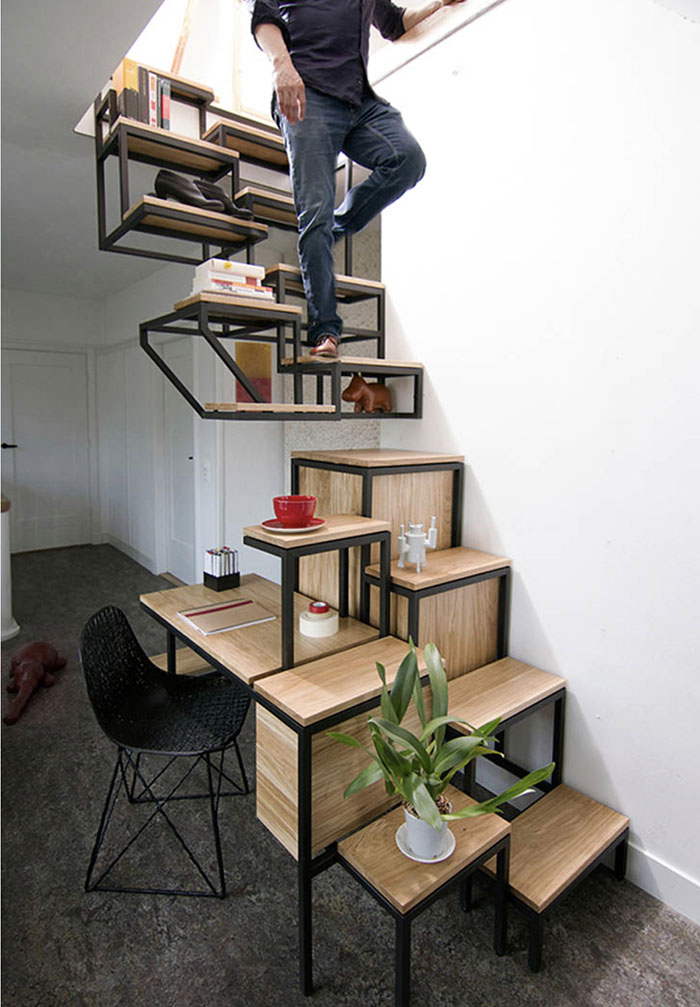
Internal Staircase For People Who Like Every Trip To Be An Adventure, And No Longer Have Children
Who needs kids when you can have... ✨Fancy stairs!✨ Now with even less railing!
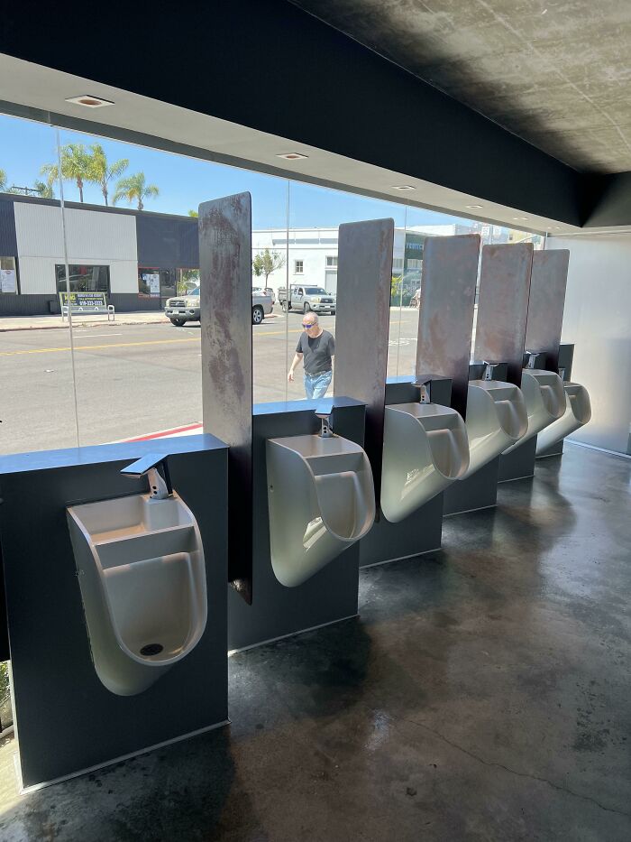
These Urinals Where You Can Look Out To The Street. Windows Aren’t Tinted At All So You Can Also See In. Even Has A Sink On Top Of Each One
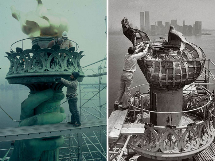
The Statue Of Liberty’s Torch, New York, NY
The torch has been closed since the "Black Tom" explosion of July 30, 1916, which was one of the largest acts of sabotage to our nation prior to the event of pearl harbor on December 7, 1941
It was closed because shrapnel from the explosion struck the statue, and caused damage to the arm. Visitors were putting undue stress on that part of the statue anyway, and the decision was made to close it off. You can visit the original torch (replaced in 1986) in the museum.
Adult Transportation
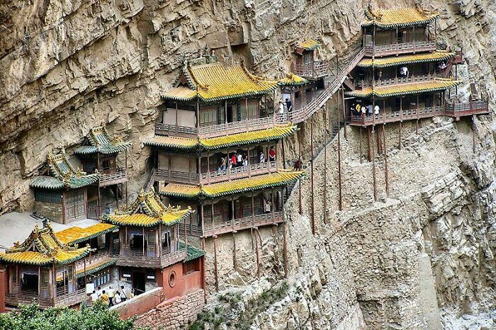
The Hanging Temple In China, And It’s Thigh High Guard Rails
Going up there would definitely make me suddenly feel the need to get religion.
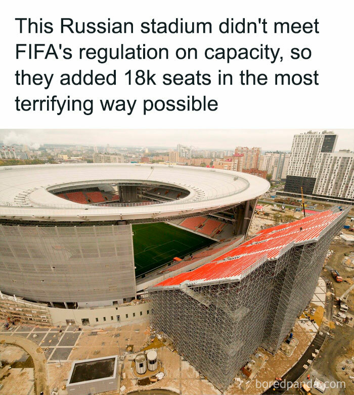
Couldn’t Get A Good Seat? Risk Your Life Trying To Watch The Game!
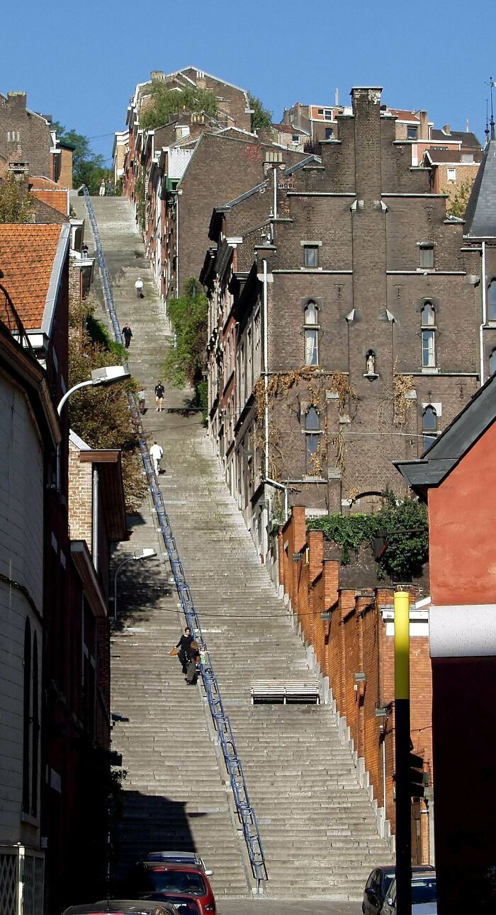
Montagne De Bueren Staircase In Liège, Belgium | In 2013, It Was Ranked As #1 On The Huffington Post's List Of Most Extreme Staircases
God Forbid You Have A Baby Or A Little Dog
I Can See Many Kids Falling
Ohh there was a park by my house with one of those... Scared the c**p out of my 8yo self lol
Imagine Going Down On These Stairs
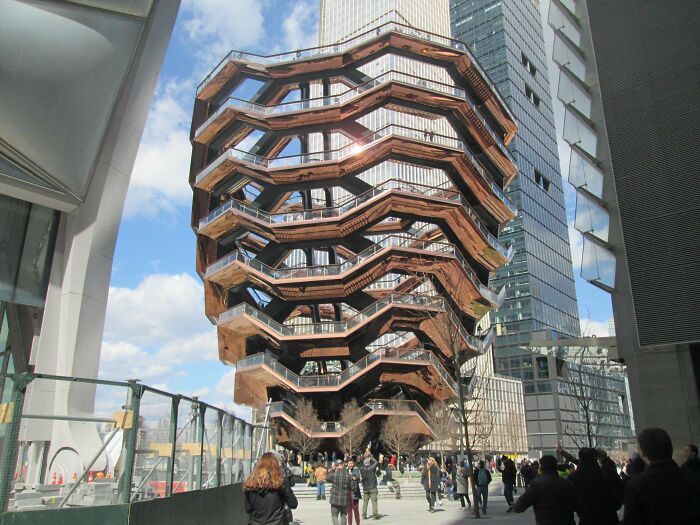
Hudson Yards Vessel, In New York City, NY | Often Debated On Its Construction For Being Too Easy For Imbeciles To Jump/Fall Off
Accident Prone
Somebody Told Me To Post This Here
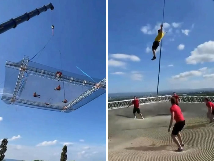
They Put A Trampoline In The Sky
This ones actually not that bad, they built the largest trampoline in the world and if you look at a video in which they use the trampoline the rails are actually pretty high. (it's Drew Dirkson's trampoline btw if u want to look it up)
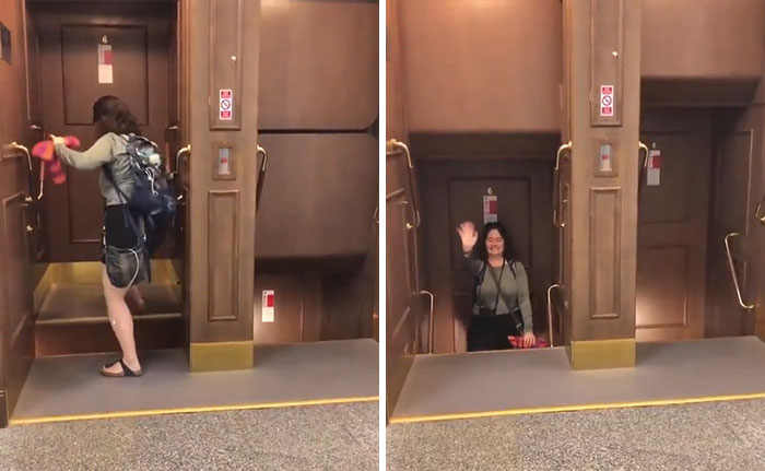
Paternoster Lifts At Prague City Hall
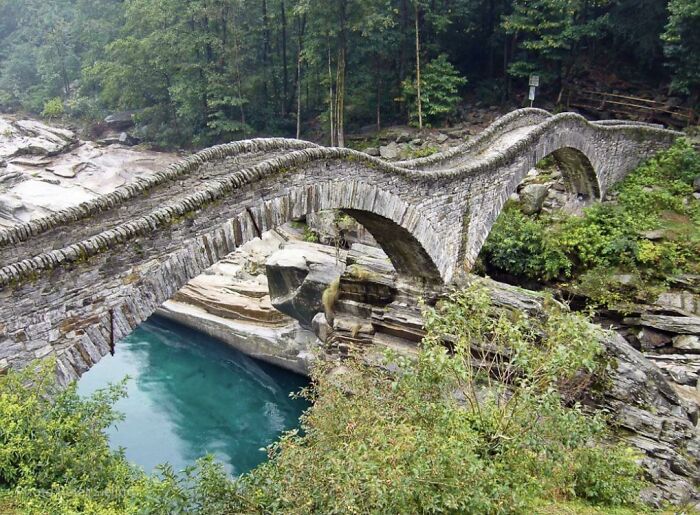
Ponte Dei Salti A Bridge With Knee-High Sides In Ticino (Southern Switzerland)
People really are afraid in this post with all the "knee high" bridge photos. You go your whole life without giant walls around you. It's this weird thing called walking
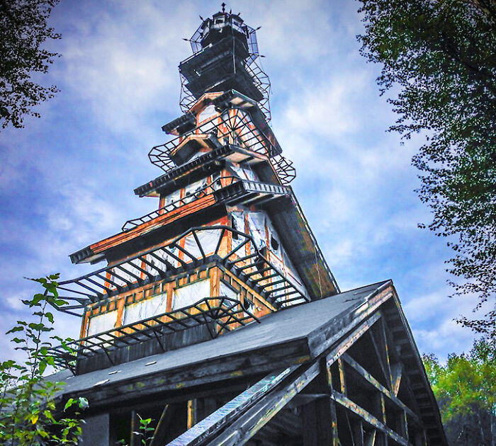
This House Near Goose Creek, Alaska
That is pretty cool. It looks like you could take an old mine cart from top to bottom!
Let Me Show You Around The House.. Wait Don’t Go There!
Is it a house or a business? Way back it was pretty common to unload goods to a second-floor warehouse above a store. They would already be on a wagon or truck 1/4 of the way up and it was easier than hefting them down to ground level and then back up stairs.
Zen Yikes
Not as bad as some of the stairs on here. At least you have poles to hold onto.. And it looks so beautiful and neat.
It’s Fine, Nothing To Worry About
Looks like my 3 year old's Lego towers that cause him angst when falling over immediately after construction.
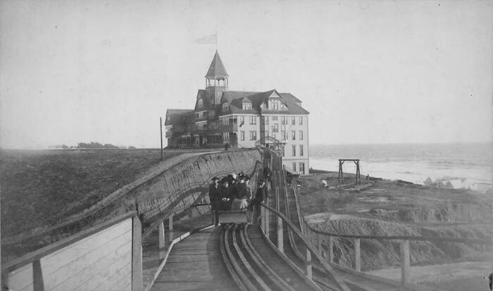
1880 Switchback Railway At The Hotel Arcadia, Santa Monica
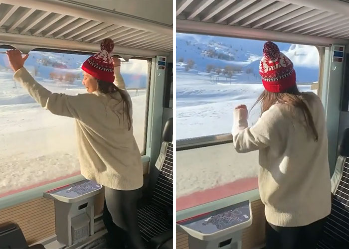
Massive Retractable Windows On This Train In Switzerland
Night At The Drive In
Just Hop On And Off The Back As The Bus Slows Down
Guardrails? We Don't Need No Stinking Guardrails
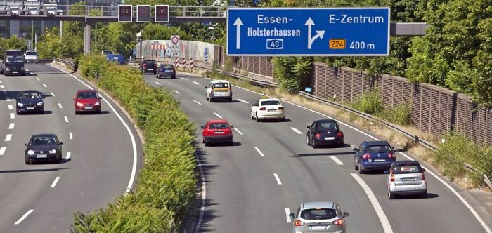
Autobahn, Germany's Highways, Have No Speed Limits
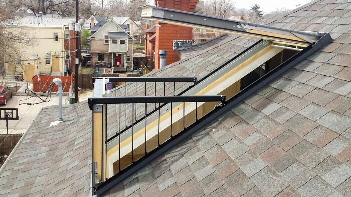
Skylight For Adults
What‘s so bad about this? Are you all really so scared? Don‘t you have common sense anymore?
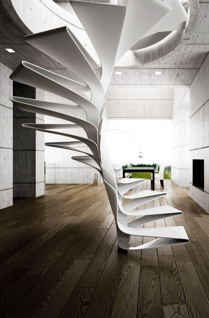
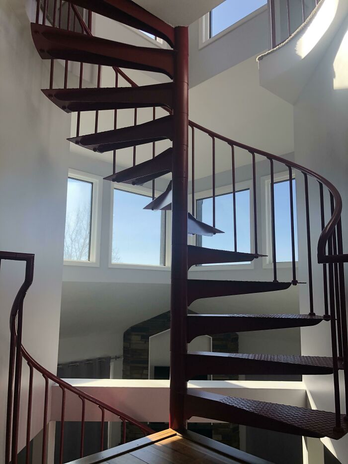
Spiral Staircase In The Middle Of The House
I think this should be architecture created BY morons and unsafe for reasonable, logical people
Architects trying to be original and clever but just big fails.
Load More Replies...As is the case with so many boredpanda threads - regurgitation of previous posts.
Load More Replies...yeah I got tingles just looking at some of the pix.
Load More Replies...I think this should be architecture created BY morons and unsafe for reasonable, logical people
Architects trying to be original and clever but just big fails.
Load More Replies...As is the case with so many boredpanda threads - regurgitation of previous posts.
Load More Replies...yeah I got tingles just looking at some of the pix.
Load More Replies...
 Dark Mode

 No fees, cancel anytime


